Quantcast
Channel: Telerik Blogs
Viewing all 4126 articles
Browse latest View live

What's New and What's Coming in PdfViewer for Telerik UI for Xamarin

$
0
0

This blog post will get you familiar with what has been added to our Xamarin PdfViewer control, and what is coming next in the official R3 2019 release.

Looking for an update on the latest improvements to the PdfViewer for Telerik UI for Xamarin, and a preview of what you can expect in next month's release? This post will get you up to speed with everything you need to know.

What’s New in PdfViewer?

With the second release of the year, the PdfViewer control went from beta to official. During this period, we continue improving the control and added a set of new features to it. Here is a list of features that were shipped with the R2 2019 release and the Service Pack:

  • Command improvements, including a new Double-Tapped command
  • Mechanism to detect when a document is loaded/unloaded
  • Read-on-demand feature
  • Automatic Fit-to-width
  • Various performance improvements in hardware acceleration and scrolling performance - so now the scrolling is significantly smoother, with no stutter or delay.

Pdf Viewer for Xamarin.Forms

Let’s take a closer look at some of the listed features above.

Commands Improvements

The FitToWidthCommand was improved. Now you can choose between two options:

  • FitDocumentToWidthCommand (default one) – The purpose of this command is to lookup the widest of all pages and set a zoom level, so that this page is fit to width. For example: If the document has pages with different width, as a side effect, when you are currently viewing a page that is not the widest, this page will not occupy the whole horizontal space.
  • FitPageToWidthCommand– This gives you the ability to execute fit to width on the current page, disregarding the width of the other pages in the PDF document.

DoubleTappedCommand

This command is different from the other PdfViewer Commands. It is triggered from within the PdfViewer on double-tap action. On the first double-tap the document is zoomed 2.5 times at the tapped location, another double-tap triggers the FitToWidth command.

Read-On-Demand Mode

This feature allows you to load each page of the document when needed to be shown in the PdfViewer. The page will be unloaded once it becomes invisible. Check here for more information on this.

You can take a look at other new PdfViewer features, which I described in my previous blog post: View PDF Documents with PdfViewer for Xamarin.Forms

What’s Coming to PdfViewer in the Official R3 2019 Release?

We have great news for you. In the middle of September our PdfViewer will include two new features: Selection and Link Annotations. We look forward to sharing more with you after the R3 2019 release. Hope you are as excited as we are!

Tell Us What You Think

We would love to hear what you think about the Telerik UI for Xamarin Pdf Viewer Control. If you have any ideas for features to add, please do not hesitate to share this information with us on our Telerik UI for Xamarin Feedback portal.

Don’t forget to check out the various demos of the controls in our SDK Sample Browser and the Telerik UI for Xamarin Demos application.

If you have not yet tried the Telerik UI for Xamarin suite, take it out for a spin with a 30-day free trial, offering all the functionalities and controls at your disposal at zero cost.

Try Telerik UI for Xamarin

Happy coding with our controls!


Manual Accessibility Testing: Keyboard and Screen Reader Navigation

$
0
0

Some aspects of accessibility can be tested with tooling but others, such as keyboard navigation, are better tested manually. Let's walk through best practices for keyboard navigation testing and explore navigation with VoiceOver, a popular screen reader.

When we talk about accessibility in the context of the web, we talk about building sites and apps that everyone can navigate and interact with. Many developers treat accessibility as an afterthought, thinking that only a minority of their userbase would benefit from the effort. They don’t realize that 15% of the world’s population lives with some form of disability. That’s one billion potential customers you’re turning away.

While some aspects of accessibility can be tested automatically with tooling, others, such as keyboard navigation or compatibility with various assistive technologies, are better tested manually. In this article, we’ll describe how to navigate our apps using the keyboard, and how to use VoiceOver, a popular screen reader that comes built into Apple’s iOS and macOS operating systems.

Why would someone navigate our app using the keyboard exclusively? Users with motor disabilities may not be able to rely on mice or trackpads to interact with their computer, because those devices require fine finger control. Users with visual disabilities may not be able to locate the cursor on the screen. You can probably think of other scenarios where navigating using the keyboard is preferred.

Navigating a web app using the keyboard is relatively straightforward:

  • Press Tab to move the focus through links and form controls, and Shift + Tab to move the focus backward.
  • Press Enter while focused on a link or button to interact with it.
  • Press Space while focused on a checkbox or dropdown to interact with it.
  • Press , , , and to scroll vertically and horizontally, or to cycle through lists of options.
  • Press Escape to dismiss dialogs.

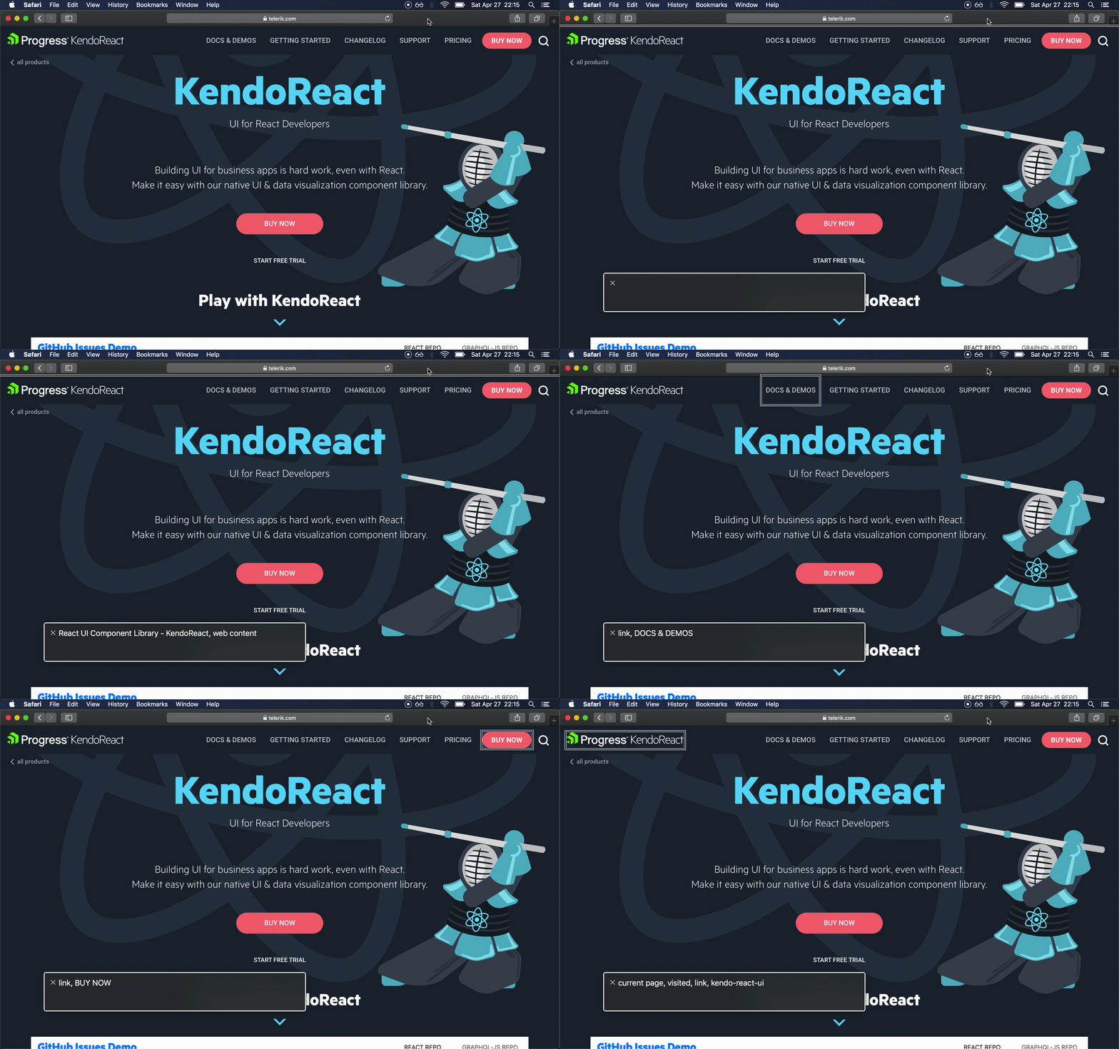
Image shows picture of a screen and shows the selections cycling

Here are the main things to watch out for when building our app so that we don’t break keyboard navigation:

  • Make sure it’s clear which element currently has focus. Sighted users rely on some kind of visual indicator to know where their focus is.
    • Avoid removing the default outline of focusable elements with things like outline: 0 or outline: none.
  • Make sure all items on the page can be reached. Use the right tag for the job.
    • Use <a> for navigation links.
    • Use <button> for actions that don’t take the user to a new page.
    • Use <input>, <textarea>, <select> and friends for form controls.
    • Avoid building custom interactive controls using catch-all tags like <div> or <span>, unless you really know what you’re doing.
  • Make sure all sections of the page can be navigated to and from.
    • Be careful when implementing dialogs and popups. Make sure they trap focus, and can be dismissed with the Escape key.
    • Be careful when implementing features like infinite scroll. If you have an infinitely scrolling feed in the middle of the page, and a sidebar on the right, keyboard users may get trapped in the feed, and not be able to reach the sidebar.
  • Make sure the user can skip directly to the main content, especially if you have a lengthy navigation section. Keyboard users have to press the Tab key to navigate all interactive elements before they can get to the content they want. If all your app has a lengthy navigation, that experience can be extremely frustrating.

A screen reader is a tool that reads out loud the contents being displayed on the screen. Visually impaired users rely on screen readers to be able to interact with their devices.

There’s quite a few screen readers in the market, but the top three players are JAWS, NVDA, and VoiceOver. The first two work on Windows, while the third one is included as part of Apple’s operating systems, such as iOS and macOS.

Screen readers are very complex tools, and becoming proficient with them can take a long time, but I want to give you a taste of what it’s like to consume a web app through a screen reader. We’ll be using VoiceOver on macOS in this article, but feel free to read the documentation for your screen reader of choice, and follow along.

The first thing we need to do is turn VoiceOver on by pressing Cmd + F5 (you may need to press Cmd + fn + F5 if you’re on a laptop). VoiceOver will start reading the contents of the active window. If you’ve never done this before, it can be an overwhelming experience, so know that you can turn it off by pressing the same key combination we used to turn it on.

Ok, now that you know how to turn it on and off, here are’s the most common shortcuts you’ll want to use to navigate a web app:

  • Press Ctrl + Alt + A to start reading content.
  • Press Ctrl to stop reading content.
  • Press Ctrl + Alt + to read the next item, and Ctrl + Alt + to read the previous item.
  • Press Ctrl + Alt + Space to interact with the current item (e.g. click on a link).
  • Press Ctrl + Alt + Shift + to go into objects (e.g. sections of content, iframes), and Ctrl + Alt + Shift + to go out.
  • Press Ctrl + Alt + Cmd + H to jump to the next heading.
  • Press Ctrl + Alt + Cmd + L to jump to the next link.

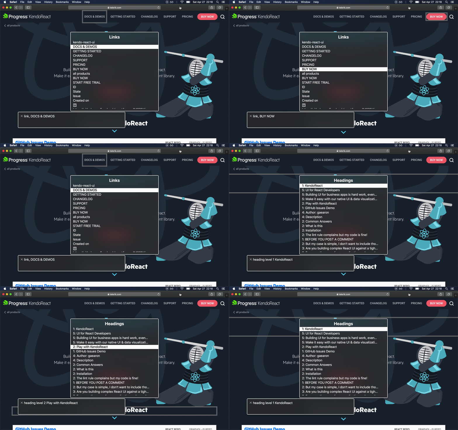
animated image of screen showing how voiceover works as you cycle between the different buttons. The description of each button is displayed in a pop-up screen

VoiceOver has one cool feature called the rotor. It’s a dialog that allows you to navigate content by type (links, headings, landmarks, etc.). You can open the rotor by pressing Ctrl + Alt + U. You can rotate between content types with and , and you can select an item by pressing and , and then pressing Enter.

animated image of a screen showing the use of lists of elements by types. The demo shows someone cycling through elements of the same type in a menu and then shows how to cycle between lists of different types. Examples are shown for links and headings on the page

Using a screen reader as a sighted user doesn’t quite compare to how a real user would use it, but it can help us understand how our app is being consumed by part of our userbase.

Conclusion

By manually testing our web sites and apps for keyboard and screen reader navigation, we’re making sure we’re building an inclusive experience that can reach the widest audience possible. We also get a better understanding of the different ways in which our users consume the experiences we build, and we can think of options to improve them.


Learn More about Accessibility

We have created a comprehensive whitepaper on accessibility for developers that covers everything from laws to coding to testing.

Download the whitepaper:Accessibility for Developers

Adding Accessibility to Your Apps

One easy way to make sure that you are creating accessible web apps is to start with components from the Kendo UI libraries. Our components are all WCAG complaint and give you great functionality from grids and charts to schedulers and pickers. Get a head start on your app's UI and a head start on accessibility compliance at the same time.

Learn more about: Kendo UI

Demystifying the v-model Directive in Vue

$
0
0

Learn about the v-model directive in Vue.js, and get to know the basics of two-way binding and how you can use it in your own app development.

More often than not I get comments and messages asking me to go into detail about v-model by people that have read an article or attended a workshop and the magic of v-model is touched on but not thoroughly explained.

Today, we will go into detail on what exactly this directive does for us in Vue, and a top-level glance at how it works behind the scenes.

This article is intended for novice and intermediate users who want to further their understanding of the directive, and I am assuming a general basic knowledge of Vue as a whole.

Two-Way Binding and the Basics

Oftentimes we find ourselves describing the v-model directive as a magical entity that allows creating a two-way binding to an input element. But what exactly does the two-way binding mean? And why should you care?

Vue and other frameworks like it have a bunch of magical methods and ways of doing things. v-model is a great example of this type of thing.

The entry-level knowledge required to use it is minimal because, frankly, you don’t really NEED to understand how it works in order to use it - but when you fully grasp the concept behind it, the way you use it or think about it changes.

Listen to User Input

Let’s start with a simple input element, using type email.

<inputtype="email"/>

The problem is simple: We need to be able to know what the user types in here. And we may need to send it to the back end for them to log the user in, or to capture it for a registration form.

How would you approach this using jQuery or vanilla JS?

In jQuery maybe you would add an id attribute to the element, and target it directly to extract the value.

<inputtype="email"id="email"/>
$('#email').val();

The problem with this approach is that you are stuck having to then add an event listener if you want to react to keystrokes, because so far you are getting a static value at the moment the code is executed. It is NOT reactive.

Let’s try this again with an event listener and vanilla JS.

const el = document.querySelector('#email');
el.addEventListener('input',function(event){// when the user types this will fireconst inputValue = event.target.value;doSomethingWith(inputValue);});

Alright, we’re getting somewhere! So far we are able to call the function doSomethingWith with the event’s value (what the user typed). This seems like a lot of code though, and what happens if we have a form with 30 different inputs?

Let’s do it the Vue way. We are going to add an event listener to the input and call our fake doSomethingWith function every time it fires.

<inputtype="email"@input="doSomethingWith"/>

I don’t know about you, but this seems like magical avocado mischief to me. How does Vue accomplish the same thing behind the scenes?

First of all, notice that we don’t need an id anymore. In fact, I would argue that using id in Vue is a terrible idea!

If you use ids in Vue and you use the component in several places, then you are going to have several instances of an element with the same id - which spells out CHAOS.

Your developer avocado has gone bad, frand. GG. ☠️

Let’s go back to our example though when we add @input to our element. Vue is smart enough to attach the necessary event listener to this particular element via reference. It will also handle removing this event listener for us!

Finally, it will call the function that we passed inside the " " whenever the event is fired, and it will pass it the event object. Neat!

Changing the Input Programmatically

Let’s move on to problem #2.

You managed to listen to the events of the user making inputs on your field - good work! (Hopefully using Vue and not jQuery, come on. I am disappointed. ☹️)

Now, part two of “two-way binding”. What if we want to dynamically do something with the user’s email and have the input reflect the change?

Maybe we have some sort of form autocomplete, or validation, or we have another input element that will prepopulate their name from the database. There’s a lot of possible scenarios.

Let’s approach this problem with jQuery first.

// This is the value we are storing somewhere// So that later we can send it to the backendconst userEmail ='somevalue@theuserentered.com';$('#email').on('input',function(){
    userEmail =$('#email').val();});// Now what if we want to change the email on the input programmatically?functionchangeEmail(newEmail){$('#email').val(newEmail);
    userEmail = newEmail;}changeEmail('your-email@is-wrong.com');

You can see from this last example how quickly this can start to get really messy. Monolithic files of jQuery for event handling and input validation are a thing of the past!

You can also appreciate how it’s going to be a problem keeping a state. We have a high-level variable userEmail that is keeping the value, and we have to be careful that we are orderly about our code. Now do this 40 times for a big form, please.

One thing that you may have also not considered at this point is that we are trying to be really careful about setting the .val of our input when we change it on the changeEmail function. But what if another dev, or even ourselves, makes another function that modifies the userEmail variable somewhere else?

We have to keep in mind that every time this variable changes the input has to be updated, or we have to get into some rather advanced JavaScript that will set up getters and setters for us to fix that reactivity problem.

Let’s approach this second problem in Vue. We are going to create first a local state in our make-believe component.

data(){return{
        email:''}}

Now that we have our local state, we have to tell the input to use it and bind it to the value.

<inputtype="email":value="email"@input="doSomethingWith"/>
methods:{doSomethingWith(event){this.email = event.target.value;// Do other stuff, eat avocados, play zelda and admire a raccoon}}

That’s it! Every time the email state changes, the input will be updated accordingly. We now have two ways of binding to the input.

First, when our local state changes. Second, when the user types on the field, the input listener will update the state with the value. When the state updates, it will update the input.

Do you see the cycle? DO YA?

Enter v-model

The kind folks at the Vue realized that this pattern of adding two one-way bindings, one that feeds into the input, and one that feeds out of the input was very common when dealing with forms and user data.

Thus, the magical avocado and the v-model directive were born. Both were cared for and nurtured, and the magical avocado went bad during the night and we had to toss it out. But such is life.

What happens then when you have to two-way bind your inputs? Do you have to go through this double process where you bind the :input to some sort of state, and then listen to an event and rewrite the whole state?

The answer is no! v-model, your friendly neighborhood avocado, to the rescue.

We currently have this for our form input.

<inputtype="email":value="email"@input="doSomethingWith"/>
data(){return{
        email:''}},
methods:{doSomethingWith(event){this.email = event.target.value;// Do other stuff, eat avocados, play zelda and admire a raccoon}}

And with the power invested in me by Vue, and the blessing of Captain Planet (yes, I’m old), we can make it all nice and simple.

<inputtype="email"v-model="email"/>
data(){return{
        email:''}}

That’s it! v-model will make sure that the correct event is being listened to (in the case of native elements like inputs, selects, etc.) and then bind our local email data property to it! Ah-two, ah-way, ah-binding.

Conclusion

Keep in mind, v-model has some caveats regarding which property it has to bind to and which event it has to listen to.

Vue is super smart regarding this behind the scenes when it’s used on inputs, selects, checkboxes and radio buttons - but when you are working with custom components, you are going to have to do this heavy lifting yourself.

This, however, is out of the scope of this beginner article. But you can check out this reference on v-model on custom components on the official documentation, or the last part of my Vue for Beginners Series where I touch on v-model.

Telerik UI for Blazor 1.6.0—Menu, TimePicker and Grid Enhancements

$
0
0

In the latest release of Telerik UI for Blazor, we've got new controls for you as well as major upgrades to the Grid, Preview 8 compatibility and more. Check it out to see what's new.

With the version 1.6.0 release of Telerik UI for Blazor, our offering is expanding with two new controls in the Menu and TimePicker, as well as major enhancements in the Grid! In this blog post we will reveal more details about the latest additions to the Telerik UI for Blazor component family and how you can use them to enhance your Blazor application.

We also have some exciting news for all of you planning to attend one of the major .NET conferences in September - BASTA.

New Blazor Components

With the 1.6.0 release we are introducing two new essential components: Say hello to the <TelerikMenu> and <TelerikTimePicker> tags!

New Blazor Component: Menu

Blazor apps can now have a stylish menu and built-in navigation effortlessly.  Simply add the TelerikMenu tag and provide a collection of models to its Data property.  

<TelerikMenu Data="@MenuItems"> </TelerikMenu>

For each Blazor Menu Item you can control the structure, look and feel, as well as the behavior using the following fields in their data binding: id, ParentId, HasChildren, Items, Text, Icon, URL and the OnSelected event.

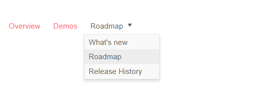
The Blazor Menu component can be bound to data and display flat or hierarchical information.

Telerik Blazor Menu

Telerik UI for Blazor Menu (Flat Data)

We know that data models may have properties that do not map to the same name as the fields found in the Telerik UI for Blazor components, which is why we allow for you to simply define your own fields in the configuration of the menu component. You need to provide the relationship between the menu item properties and the model field to which the menu is bound. To achieve this in flat data binding, use the properties in the main TelerikMenu tag like in the example below:

  • IdField => Id
  • ParentIdField => ParentId
  • TextField => Text
@using Telerik.Blazor.Components.Menu
<TelerikMenu Data="@MenuItems"
             ParentIdField="@nameof(MenuItem.ParentId)"
             IdField="@nameof(MenuItem.Id)"
             TextField="@nameof(MenuItem.Text)">
</TelerikMenu>

For more information on how to achieve data binding to hierarchical data in the Menu component, check out the details in our Blazor documentation.

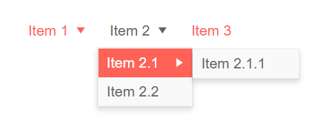
erik Blazor Menu With Hierarchy

Telerik UI for Blazor Menu (Hierarchical Data)

To enable navigation in the Telerik Blazor Menu you are equipped with two options:

  • As a straightforward approach you can use the built-in property UrlField to populate the URLs in the anchors
  • For a more custom and fine-tuned approach you can use a Template to generate the desired links which gives you more control over customizing the look and feel of each menu item

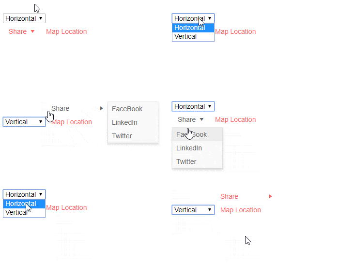
Considering that menus can be used in various scenarios and layouts we have enabled horizontal and vertical orientation to suit all application scenarios.

Telerik Blazor Menu Horizontal and Vertical Orientation

Telerik UI for Blazor Menu (Horizontal and Vertical Orientation)

And because with Menus we always want to be able to execute some custom code when clicking on an item, in the Telerik Menu for Blazor we have exposed the OnClick event. When a user clicks/taps on a menu item, the OnClick event is fired, passing along the underlying data item as an argument. Depending on your use case you can then load some different content, or respond with any other particular logic.

New Blazor Component: TimePicker

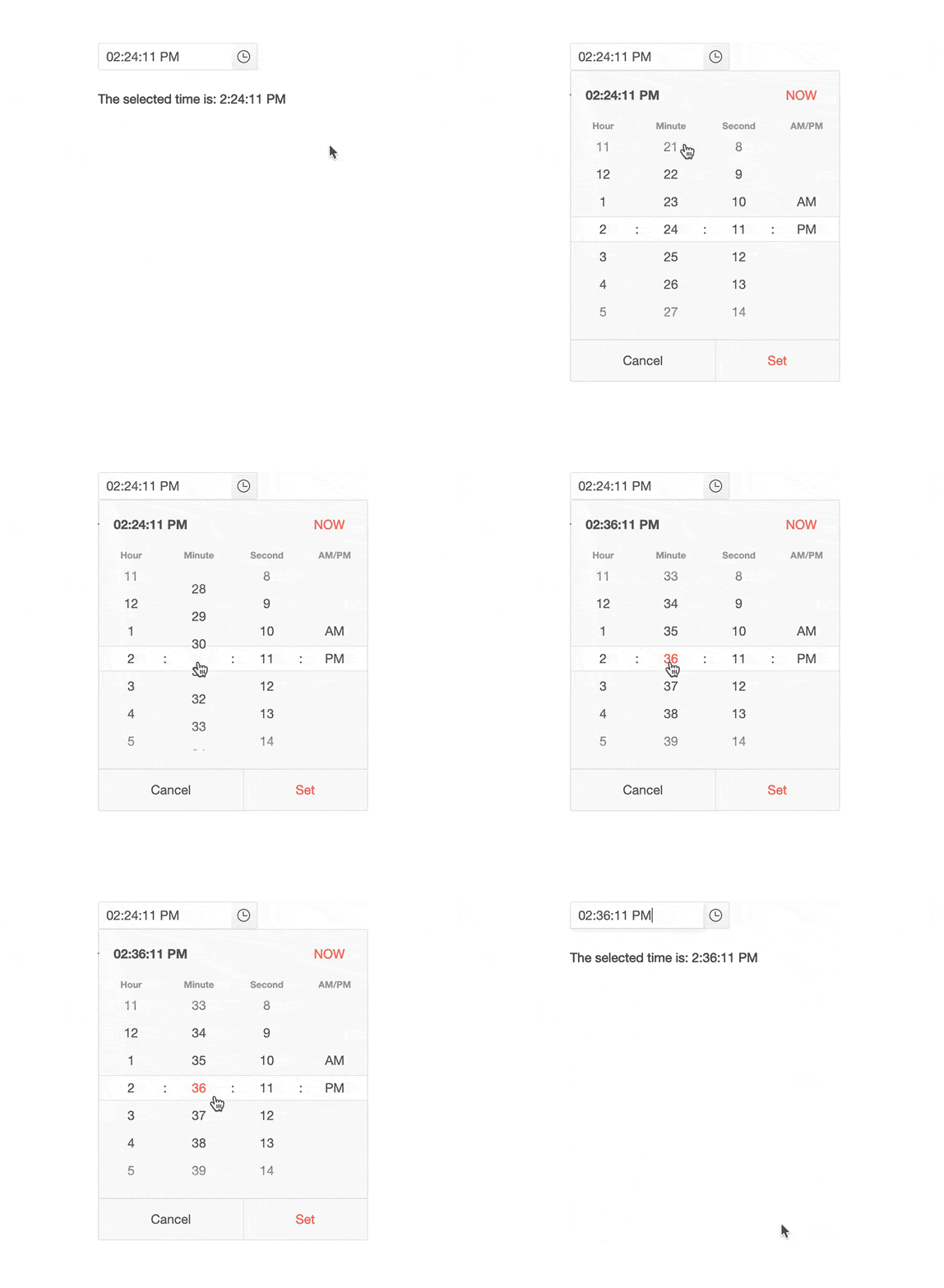
With our 1.2.0 release we introduced the Blazor DatePicker component, and with this release we are enriching the suite with time preference control. The Blazor TimePicker component allows for the selection of time from a visual list in a dropdown, or typing into a date input that accepts only DateTime values. 

Telerik Blazor TimePicker Telerik UI for Blazor TimePicker

You can use the standard datetime format:

<TelerikTimePicker Format="t" @bind-Value="@DateTime.Now" Width="100%"></TelerikTimePicker>

Or customize the format based on the application needs:

<TelerikTimePicker Format="HH:mm:ss tt" @bind-Value="@ DateTime.Now" Width="100%"></TelerikTimePicker>

There are multiple properties that you can configure to further adapt the usage of the component such as: Min, Max, Value and Width.

If you need to handle with specific logic the changes in the input such as keyboard stroke, Set or Now buttons in the dropdown you can use the ValueChangedEvent

@using Telerik.Blazor.Components.TimePicker
<TelerikTimePicker ValueChanged="@( (DateTime d) => ChangedValueHandler(d) )"></TelerikTimePicker>
<br />
@result
@code {
    string result;
    private void ChangedValueHandler (DateTime userInput)
    {
        result = string.Format("The user entered: {0}", userInput);
    }
}

Blazor Grid Enhancements

With every release, the Telerik UI for Blazor Team makes sure that the most significant and desired Blazor UI component – the Grid – gets better and richer in functionality too.

Grid Grouping

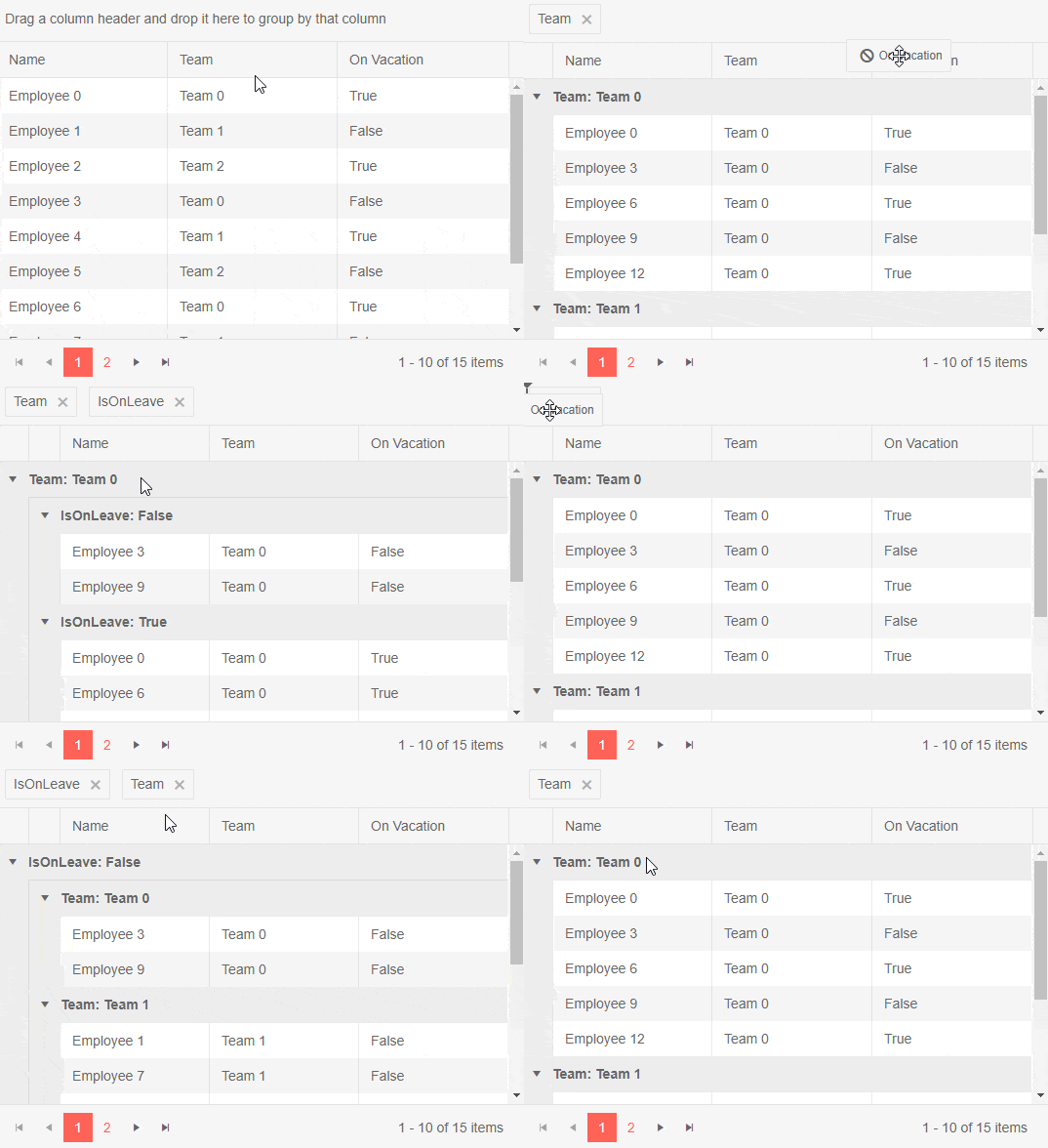
In the 1.6.0 release we focused our efforts on ensuring that grouping in Telerik Blazor Grid component is breezy – just set the Groupable property to "True". This will enable your users to simply drag one or more column headers to the group panel and the Grid will visualize the grouped data.

Telerik Blazor Grid Grouping 

   Telerik UI for Blazor Grid Grouping

To remove a group setting, click the [x] button on its indicator in the group panel and the corresponding data will no longer be associated with that group.

For more complex scenarios you can also nest groups and reorder selected groups in a desired position, all of which happens with a simple drag of a column header.

Grid Rows Selection

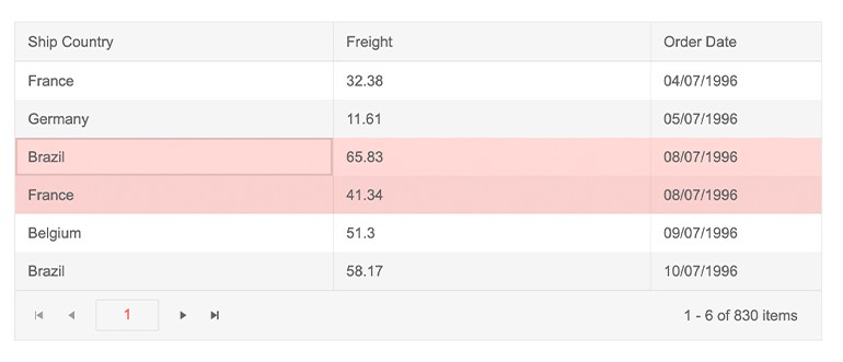
Grid rows now support single and multiple selection options which can be configured by setting the SelectionMode to SelectionMode="GridSelectionMode.Single" or SelectionMode="GridSelectionMode.Multiple" (or disable Selection by setting SelectionMode=”GridSelectionMode.None”)

To track user selection in your applications you can use two-way binding through the SelectedItems property, or SelectedItemsChanged event. 

Telerik Blazor Grid Row Selection Telerik UI for Blazor Grid Row Selection

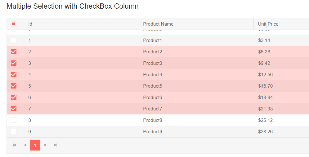
The Grid also supports an option for row selection via a checkbox column. To define it, add a TelerikGridCheckboxColumn in the TelerikGridColumns collection of the grid.

@using Telerik.Blazor.Components.Grid

<TelerikGrid Data=@GridData

             SelectionMode="GridSelectionMode.Multiple"

             Pageable="true"

             PageSize="10">

    <TelerikGridColumns>

        <TelerikGridCheckboxColumn SelectAll="true"></TelerikGridCheckboxColumn>

        <TelerikGridColumn Field=@nameof(Product.Id) />

        <TelerikGridColumn Field=@nameof(Product.Name) Title="Product Name" />

        <TelerikGridColumn Field=@nameof(Product.Price) Title="Unit Price" />

    </TelerikGridColumns>

</TelerikGrid>

Telerik Blazor Grid Row Multi-Selection Telerik UI for Blazor GridRow Selection via Checkboxes

In Multiple SelectionMode, selection can be made using the following approaches:

  • Select the checkbox of each desired row
  • Press and hold Ctrl, and click the desired rows
  • For range selection, you could use the Shift key and click the row you want to be the last in the range

Preview 8 Compatibility

Looking ahead to the official release of ASP.NET Core 3.0 next month, we are aiming at continuously providing you with interim versions of our Blazor components compatible with each official preview by Microsoft.

Last week we announced that we are fully compatible with the latest changes included in ASP.NET Core 3.0 Preview 8.

Let’s Meet at BASTA

For those of you who plan to be in Mainz at end of September, the Telerik UI for Blazor Team will be part of the BASTA conference. Come meet our team at the Progress Telerikbooth to chat about the future of Blazor and participate in our “Code for Charity” game.

We encourage you to attend the engaging and provocative keynote speech by our Manager of Software Engineering, Pavlina Hadzhieva: Goodbye, Client-side JavaScript – Hello, Blazor.

Experience Telerik UI for Blazor 1.6.0

If you are new to Blazor, visit the Telerik UI for Blazor overview page and sign up for a trial experience - it’s as easy as a single button click! Then, just follow the Blazor demos and documentation.

Start My Trial Now

Share Your Feedback!

We encourage all our early adopters and fans to continue providing valuable feedback! If there are features you are missing, or components you need, please head over to the official Telerik UI for Blazor feedback portal and submit your ideas.

Happy Blazor Coding from the Telerik Blazor Team at Progress!

Angular Localization Using ngx-translate

$
0
0

Sponsored by the Kendo UI for Angular team

KUI_Angular_670x150

Want to learn more about creating great Angular web apps? It all starts out with Kendo UI for Angular - a complete UI component library that allows you to quickly build high-quality, responsive apps. It includes everything you need, from grids and charts to dropdowns and gauges.

We on the Kendo UI for Angular team are committed to bringing you the latest tips and tricks in the world of Angular development. We hope you enjoy the post!


In this post you'll learn about internationalization and localization, the ngx-translate library and how to set it up in your Angular application. You’ll also see step-by-step instructions for how to work with multiple languages or locales.

In this step-by-step tutorial, I will demonstrate how to create an Angular project and use an ngx-translate library for localization. This tutorial covers the following topics.

  • What are internationalization and localization
  • What is ngx-translate?
  • Create an Angular project
  • Install ngx/translate library
  • Set up the Angular project
  • How to use or work with localization
  • How to get browser language

What are Internationalization and Localization?

“In computing, internationalization and localization are means of adapting computer software to different languages, regional peculiarities and technical requirements of a target locale.”

Wikipedia

What is ngx-translate?

ngx-translate is the library for internationalization (i18n) and localization in Angular. It simplifies your Angular application to work for localization. It’s easy to set up and use in an Angular application. (For more details, visit GitHub.)

Create an Angular Project

Following are the steps to create the Angular application using CLI:

  1. Create an Angular project, using the following CLI command.
> ng new angular-localization-demo
  1. Once this CLI command executes, next move to the created project path using the following command:
> cd my-localization-demo
  1. Run your created application easily using the following command. It directly opens the Angular application in the browser.
> ng serve -o
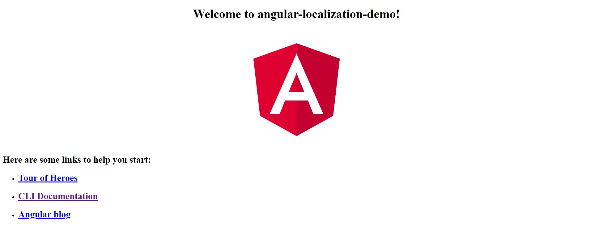
  1. It will show output as below image in the browser.

ng_browser_run_init

Install the ngx-translate Library

Following are the steps to install the ngx-translate library:

  1. Open a command prompt and move to your application path.
  2. Type the below command to install the npm module:
> npm install @ngx-translate/core --save
  1. There is no loader available by default. You need to do translation manually by using setTranslation, so it’s better to use a loader. There are two ways you can use loader: You can create your own custom loader or use existing one provided by ngx-translate library. In this example we are using an existing one.

  2. To use the existing loader, type below command to install the module:

> npm install @ngx-translate/http-loader --save
  1. Finally, we are done with the installation part. Now we can see how to use it in an Angular application.

Set up the Angular Project

To use the ngx-translate library in the Angular application, follow these steps.

  1. Open app.module.ts file and import the translate and loader modules as shown in the code below:
import { BrowserModule } from  '@angular/platform-browser';
import { NgModule } from  '@angular/core';
import { AppRoutingModule } from  './app-routing.module';
import { AppComponent } from  './app.component';
// localization module import
import { TranslateModule, TranslateLoader, TranslateService } from  '@ngx-translate/core';
import { TranslateHttpLoader } from  '@ngx-translate/http-loader';
import { HttpClientModule, HttpClient } from  '@angular/common/http';

// loader module
export  function  HttpLoaderFactory(http:  HttpClient) {
  return  new  TranslateHttpLoader(http, './assets/i18n/', '.json');
}

@NgModule({
  declarations: [AppComponent],
    imports: [
      BrowserModule,
      AppRoutingModule,
      HttpClientModule,
      TranslateModule.forRoot({
        loader: {
          provide:  TranslateLoader,
          useFactory:  HttpLoaderFactory,
          deps: [HttpClient]
        }
      })
    ],
    exports: [TranslateModule],
    providers: [TranslateService],
    bootstrap: [AppComponent]
})
export  class  AppModule { }
  1. In the above code, you can see we have used useFactory, provided the HttpLoaderFactory function to it for automate translation, and provided the locale.json file path to load.
  2. It loads translations from ‘/assets/i18n/[lang].json’. Here ‘[lang]’ is the language we are using; for example, for Dutch it would be nl.
  3. Create .json file in the above path. Here you can create many files of language you want to support in the application. In this example I have created two files — the first is English(en.json) and second Dutch(nl.json).
  4. Finally, we have set up ngx-library to be used in our Angular application.

How to Use or Work with Localization

So far, we have seen how to create an Angular project, install ngx-library, and set it up in the Angular project. Next, we are going to learn how to play with it in components using the library. Following are the basic and simple steps for localization.

  1. Open the app.component.ts file, import TranslateService and inject this service in constructor for translation.
import { Component } from  '@angular/core';
import { TranslateService } from  '@ngx-translate/core';

@Component({
  selector:  'app-root',
  templateUrl:  './app.component.html',
  styleUrls: ['./app.component.css']
})

export  class  AppComponent {
  title  =  'angular-localization-demo';
  constructor(translate:  TranslateService) {}
}

  1. Next, add the two lines below in constructor for setting the default language for localization and using it.
translate.setDefaultLang('en');

translate.use('en');
  1. In this step we are going to define the translation in .json file to use in localization. Following is the syntax to add translations in .json file; we are storing in key-value pair format.
  • Add in en.json file.
{
  "WelcomeMessage": "Welcome to Angular Localization Demo"
}
  • Add in nl.json file.
{
  "WelcomeMessage": "Welkom bij de demo voor hoeklokalisatie"
}
  1. Next, we are ready to play with it. We are going to change the current title Welcome to angular-localization-demo! to a localized translation. This translation service we are using as a pipe in HTML. The below code shows how to use in HTML; add it in the app.component.html file.
<h1>
  {{ 'WelcomeMessage' | translate }}!
</h1>
  1. In the above code, you can see ‘WelcomeMessage’ is the key of .json file, as we see in the previous step after that pipe symbol and object of translation service.

  2. Finally, we are done with changes. Now run the application with the following command.

> ng serve -o
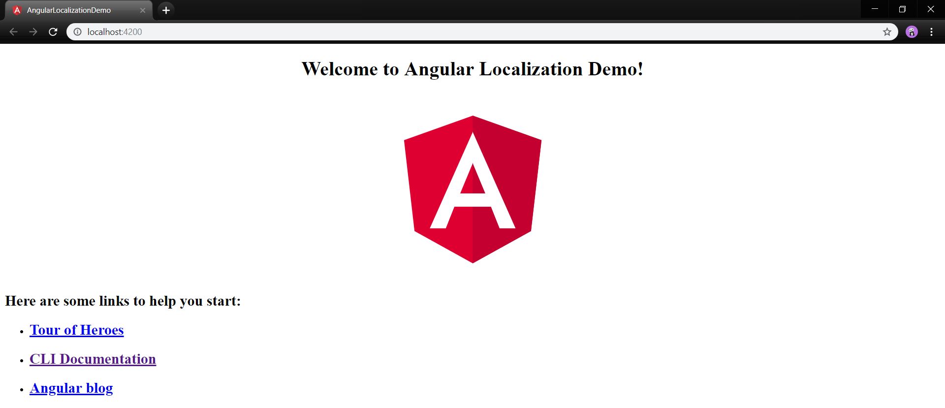
  1. Once you run the above command you will see the output as below image in the browser.

en_title

  1. It shows text in English, but now we can change the default language and language to use as ‘nl’ as below code.
this.translate.setDefaultLang('nl');
this.translate.use('nl');

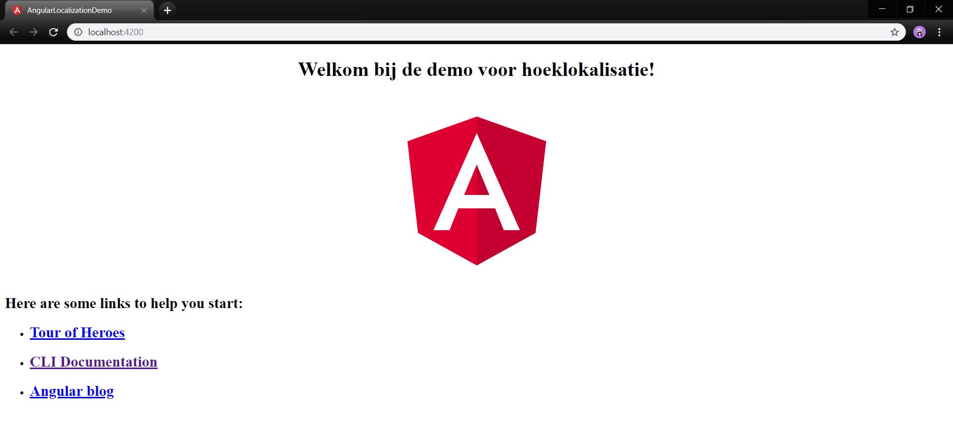
Once you change it as above and check in the browser, you will see the output as below image.

nl_title

How to Get Browser Language

In the previous steps, we have seen that we have directly set the language in the constructor using the below two statements.

this.translate.setDefaultLang('nl');
this.translate.use('nl');

But, if you want your application localization to work on the basis of browser language, then what? Use the below method of TranslateService to get current browser language to set the default language.

const  currentLanguage  =  this.translate.getBrowserLang();
this.translate.setDefaultLang(currentLanguage);
this.translate.use(currentLanguage);

Once you are done with the above changes, run your application. It will get your first browser language and apply it to the library. If you want to check for other languages, change your browser language from English to Dutch and restart the browser and hit the application URL. It will set Dutch as the language as per browser.

Note: This demo application is only working for English and Dutch language. If you want another language, you need to add that language JSON file and set that language as default.

You can also download this example from here.

Conclusion

In this article, we discussed what ngx_translate is and how to use it in Angular applications. After that we saw how to work with browser languages. If you have any suggestions or queries regarding this article, please contact me.

“Learn it, Share it.”

A Look Back at React Rally 2019

$
0
0

It's been one week since React Rally in Salt Lake City. Join me for a review from a attendee perspective. We go over the events and talks for each day of the conference and provide links on where to watch everything.

Congrats to React Rally on their fifth year hosting the most amazing React event on the planet. Definitely one of the premier React events each year, the conference took place in Salt Lake City on August 22nd and 23rd at the Sheraton Salt Lake City Hotel. It was a two-day, single-track conference for developers of all backgrounds using React.

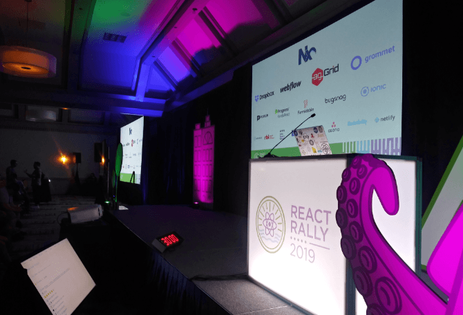
React Rally Stage

SaltLakeJS

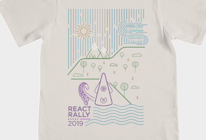
I have been following React Rally events, watching the videos afterward for several years, but this was my first chance to attend one in person. As always, the event is held in SLC, and this was not my first time being in the city for an amazing JavaScript event. I had been to NG Conf in 2018 and been to the City in my travels a few years earlier, so I already have been acquainted with the downtown area, and it's a wonderful place to have a conference. The JavaScript community in SLC is legitimate, between SLC and Provo, I like to call it the JavaScript Belt. There is an abundance of amazing JavaScript developers, meetups, and companies to work at that are highly involved in the tech industry. Another thing i wanted to note is that I was really amazed by their nature theme (designed by Gary Wilkerson). Check out the awesome T-shirt design.

Image of React Rally T-Shirt

Pre-Conference

I arrived the day before the conference, a Wednesday, and the whole city was pretty lively. Still pretty warm in late August, rarely did it get down to a cool breeze even in the middle of the night. But it also wasn't as hot as it could have been with temperatures getting into the triple digits just a few weeks earlier. Checked into my hoteland got our booth set up for the next day - my company Progress and our KendoReact UI tools were sponsors of the event.

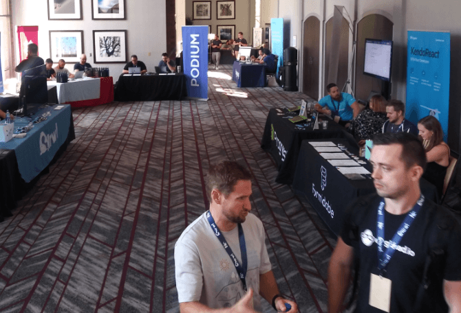
Sponsor Hall at React Rally 2019

Most of the vendors and sponsors were setting up too, so we got to talk to some of them and learn more about each other. The organizers were very helpful and excited to get the event underway. It was a nice afternoon and I set out on foot from the hotel - my first order of business was to find a local meetup. I didn't have anything else to do and no major events were going on yet. Luckily for me, there was a meetup within walking distance. I met a number of developers, a few of which would be at React Rally the next day, they even asked me to present a demo that I was working on. We had a lot of fun with the Downtown Coding SLC Meetup, a very welcoming group and we all learned a lot about PWAs! After having a positive experience at a local meetup, I was headed back to the hotel. Want to be fresh for day one!

Registration & Vendors

I had already retrieved my Swag bag the day earlier, but on the first day of the conference, attendees got a shirt, some food and drink tickets for the after-party and a $40 VISA card for lunch provided by Nrwl, the main sponsor of the event. The idea was to get people outside of the hotel and eating in the downtown area. They gave two hours for lunch and this is the best idea I have heard of for lunches at a conference.

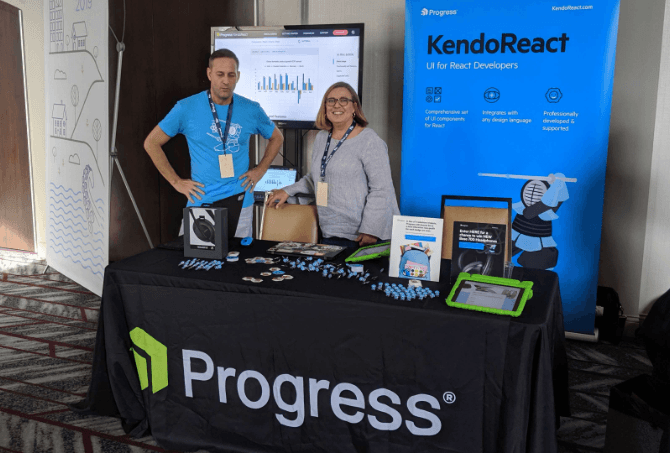
KendoReact Booth

Attendees had a chance to make their way through the Vendor hall and I was super happy to talk about React components and work through demos of our product with conference-goers. This first portion of the day is the most engaging. Everyone is happy to be there learning about new technologies, component libraries, whatever.

It should also be celebrated that this conference raised more than $8600 for Black Girls Code as a percentage of ticket revenue - check out Black Girls Code on Twitter. A special thanks to the organizers for choosing such a deserving organization to donate to.

Michael Chan React Rally 2019 Host

Pro Tips to Conference Goers by Michael Chan

  1. The best way to insert yourself into a discussion is first to listen and then ask an awesome question
  2. Count down from five when there is something you want to do and get from A to B in that five seconds
  3. Everyone should learn to give a talk and narrative can help you go a long way in communicating an idea for a talk
  4. You can upgrade a circle into a Pacman to make others feel invited to join your conversation
  5. Sit up close and support our awesome speakers

React Rally on YouTube

I'll be honest, it would be really hard for me to do a detailed review without the conference making sure that their talks get online immediately after the conference. So I want to thank React Rally for doing an awesome job on the stream and getting videos up afterward. You can check this year and all prior years talks out on the React Rally YouTube Channel.

Day One

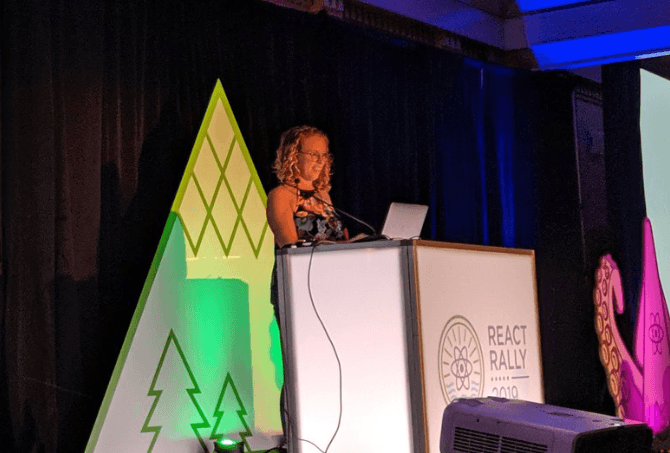
The conference was kicked off with a talk by Nicole Sullivan.

Nicole Sullivan at React Rally 2019

This review of React Rally starts with the first slide of the conference and ends with the last one. Nicole kicked off the talks with a fitting slide that said: Chrome Loves React.

Google Chrome Loves React JS

Nicole works on the Chrome team and was here to highlight the work being done on various fronts, including bringing a scheduler to the browser and helping to make frameworks work better in Chrome specifically. She spoke about how the React team and other frameworks were on board and helping in many ways including feedback and contributions to their projects. In her own words, they are “collaborating to make the web awesome” and this first talk gives you a great insight into some of amazing things coming to a browser near you!

Glen Maddern - FAB: The Docker of Frontend. After Nicole, we heard from Glen Maddern. He shared a story about his first gig writing code for the web, and how when that code reached so many people and helped them to achieve something it shifted the way he saw his role in the process. Glen talks specifically about React and what role it's played for us as developers, giving us a new level on which to build upon. We often copy from somewhere else and then find a good adaptation, and this is what React has done.

In his mind, React has won the frontend battle and now is gaining real traction in web UI development, a similar process that happened with Docker on the backend a few years ago. The idea that you can put something in a box and create a standard around how it is used, just like the intermodal shipping container revolutionalized shipping. Docker revolutionized DevOps and React has revolutionized web UI. Glen is very excited about how React will change the way we do server rendering, saying that when the new features around that drop-in React - and it may take some time to come - but when it does it will be good when it comes out. To find out why he thinks static sites and in some cases, the frameworks are holding us back, check out his talk about frontend application bundle!

Mihai Cernusca - Interactive Storytelling with React. A self-taught web developer with a five-year attention span for technologies, having started in web development, moving onto computer animation then taking a stab at iOS development and finally back to the web. Mihai's presentation is about a product he developed in conjunction with the Hoover Institution (a Stanford School), which is a social impact design studio. So what exactly is he building? He shows us “Off Balance”, his latest project in this endeavor - something like a digital pop-up book. His work on this project has helped to build a tool that has elaborate transitions between states. Animations that focus on shape generation, dynamic interpolation, orchestration.

He breaks down the challenges he faced during this project. It's an amazing look into dynamic SSVG generation techniques, animation, line drawing, math and much more. This talk taught me a lot about not only animations but performance and I was very fortunate to spend more time at this conference with Mihai and learn more about his journey in web development as a self-learner. Check out his talk slides here: Off Balance – Interactive Storytelling with React (slides)!

Micheal Chan (the host), clearly had his mind blown by Mihai's presentation. It seems that Mihai's presentation around shapes and animation reminds him of the next speaker's talk from React Conf 2018: Playing With Polyhedra. He notes that it was a huge runaway success and how inspired he was by the shapes that she created using React.

Nat Alison - Is React Translated Yet?. This year, Nat speaks to us about all the places that React is saying “Hello World” or in which languages the React documentation has been translated. Nat wrote a similar article on the subject at ReactJS.org and took the same article premise to the conference and got us all fired up about contributing to open source by way of documentation. He brought us information and stats as well as what the challenges were during this project, dealing specifically with how to work on and deploy the different language doc sites.

Josh Comeau - Saving the Web 16ms at a time. I was lucky enough to catch this similar talk of his at React Europe in Paris as well as get a peek into his workshop that touched on a lot of the same concepts. Josh starts his talk off by emphasizing how important load times are for our applications. We also hear about the period in which a site has to respond to seem responsive. Just 50-100 milliseconds for interactions, and that time is significantly less for animations, giving us only 16.67 milliseconds to draw each frame for our brain to perceive that as fluid jank free movement.

Josh sets out to show the different options we have to animate things like expanding navigations and the like button on Twitter that shows hearts bursting from an icon. We explore the idea of using sprites, steps, and keyframes to pull this animation off. He also shows us a cool project that he created called TinkerSynth that I sat and played with for about an hour after I first saw it. Check out his talk slides here: Saving the Web, 16ms at a Time

Joel Denning - Helping Governments And Nonprofits With Our Coding Superpower. A great talk from Joel about living your passion and using your superpowers to build up communities and help people and organizations that really need it. This very inspiring talk covers how he quit his comfy tech job and started helping others through his organization and with surprisingly small effort, he thinks that we can all make an impact in our local communities.

Danielle Carrick - Battle for the DOM: D3 vs. React. Daniel graces the stage to a very upbeat song from Lizzo “Good as Hell”, a great song that gets us all feeling good as hell, I must admit I'm a huge Lizzo fan! Anyways, Danielle wastes no time getting into her topic of D3 vs React. Anyone who has tried to use the two libraries together has run into the issue of which library to delegate the responsibility of DOM manipulation. She breaks down why for her and her projects, React is the clear winner. Beyond talking about how specifically to use D3 and React together, she gives us some insight into the projects she has been working on at Conde Nast and wows the crowd with her amazing data visualizations. Check out her talk slides here: Battle for the DOM: D3 vs React

Johnny Bell - A11y And React, Why Is It Important?. A very funny guy during his intro, Johnny talks about one of the most important subjects touched on at React Rally, A11y (accessibility). Johnny is missing his left forearm and hand since birth making it challenging at times to use technology, and even though he doesn't believe it slows him down because he has always had to deal with this issue, he notes that a wide array of people that do use our technology have similar or other disabilities that make it very hard to use our sites and applications. His presentation talks about how accessibility is often overlooked and that there are a lot of things that we can do, small things, to make a site more accessible.

These things should be considered by everyone building anything on the web. We would all be surprised if we just turned the screen reader on once in a while, and tested our sites and products, at how easily we can make them accessible. Check out his talk slides here: A11y And React, Why Is It Important?

Feather Knee - Creating Awesome UX with Observables. A talk about creating awesome user experiences with observables and RxJS, Feather breaks down a conceptual understanding of how to work with observables and streams, practical applications and implementations for this pattern. Her motivation for the talk comes from her background as an artist and helps her to explain how streams and observables give us the chance to be interactive with our users. Observables and streams can be confusing, so definitely check out this talk and help yourself understand the operators in RxJS and how you can start using streams in your everyday React code! Check out her talk slides here: Creating Awesome UX with Observables

Revel Carlberg West at React Rally 2019

Revel Carlberg West - So You Think YOU'RE a Junior Dev?. Maybe one of the only legit 10xer developers, Revel is 10 years old and he isn't scared to live code and knows his way around the Hooks API. Revel had the crowd hanging onto every line of code in his demos. It was inspiring to see someone of such a young age taking programming very seriously but at the same time just having fun. He and his brother, mother and father are 'the salt of the earth' and we all had such a great time with them at the conference. I hope you listen to his talk and love it as much as I did!

Anthony Frehner - Horrible Interfaces and How to Build Them. From another very funny guy, our last talk of day one is about horrible interfaces and how to build them. It's all about building crappy things on the internet and Anthony makes this a very amusing topic while also adding value by pointing out interfaces that we use every day how to build them with HTML and vanilla JavaScript. Not only are the interfaces horrible, but he guarantees that the code is just as bad! With all joking aside, he likes torturing people with his demos and that will hopefully help us all learn something right by looking at what things are very wrong in UI design. Check out his collection of horrible interfaces: Horrible Interfaces and How to Build Them

At the end of day one, we have another opportunity to use our $40 gift cards and everyone heads out to restaurants in the area. By the way, one thing I should not forget to mention about SLC that I love is the amazing choices for lunch and dinner, all great restaurants in and around the area of the conference. I caught up with Mihai Cernuska and friends at a restaurant called The Bayou, they had amazing beers on tap, IPA's and delicious Louisiana inspired cuisine. There were so many options and everyone from the conference out doing their own thing, hanging out together and that is what I think one of the great ideas from React Rally to not have lunch and dinners on property is that it creates an atmosphere where we can be social and just grab someone, go eat and talk shop!

A party took place at the end of the first day inside the Sheraton ballroom. There were milkshakes which I skipped out on, board games and karaoke. This was a blast and again allowed me to sit down and have a beer with one of the speakers (Johnny Bell). You can meet some amazing people by just grabbing them and asking them where they are from. Once we realized we were from the SF Bay Area, we hashed out plans to talk about a11y at one of his next meetups. I love when we can stumble into opportunities like this at a conference, this is another example of how these conferences can be great networking opportunities. After a late day, I checked in to my room and got some good sleep for another amazing day.

Day Two

The second day of React Rally couldn't have started with more energy, Anjana (first time speaker at React Rally, but a seasoned Mozilla TechSpeaker), took the stage with the perfect level of enthusiasm and energy needed to get the crowd energized, thinking, and using their brain but overall having a great time and a lot of fun.

Anjana Vakil - The Universe in a Single Arrow. Anjana's talk was an exercise of functional programming. A dive into the Lambda Calculus and in her opinion, a very cool abstraction in the history of computer science. She makes it clear that what we are about to do is not very useful for everyday programming, but I disagree and think that it's a wonderful exercise to get us thinking functionally and creatively and that's always useful. I get her point though, this is not how you would normally use the Lambdas and the code we write is just for fun. We learn to count all over again pretending that arrow functions are Lambdas and feeding them other functions and arguments to achieve mathematical computations! I will let her show you the rest, it's a great talk, just check out the video.

Sarah Lime - All The Memory Safety Of C Combined With All The Blazing Speed Of JavaScript. I'll be honest, this talk was way over my head. Sarah is an amazing developer with an abundance of energy that you can tell she just pours into learning everything she can about programming. The best I can do with this talk is just to tell you that Sarah is an extremely professional JavaScript developer and if you want to learn more about Web Assembly and her fascination with programming languages, just sit back and listen. This is an amazing talk with an abundance of energy from this very talented engineer. Check out her talk slides here: All The Memory Safety Of C Combined With All The Blazing Speed Of JavaScript

Princiya Sequeira - Debugging the Debugger If you find yourself constantly using console.log to debug your JavaScript, Princiya has a talk for you! Using the console is easy and convenient and it gets the job done, but it is hard to catch things as they happen and getting deep into the code to understand what is broken. She takes us on a journey of using the debugger to leverage our testing and debugging of our code. A wonderful talk that has a value that you can take back to work next week! Check out her talk slides here: Debugging the Debugger

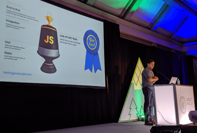
David Khourshid React Rally 2019

David Khourshid - Write Fewer Tests! From Automation to Autogeneration. One of my favorite talks of the conference comes from a two time React Rally veteran speaker and has to do with automated test generation. David Khourshid (@DavidKPiano on Twitter) wants to eliminate the majority of test writing by autogenerating it. As your lines of code in your app grow, your test code grows exponentially. Eventually, you will not be able to keep up. He has a solution and he's way better at explaining than me, so please check out this amazing talk around re-envisioning how to test your code. Check out his talk slides here: Write Fewer Tests! From Automation to Autogeneration

Emily Plummer - Harnessing React to Build Consistently Designed Applications. A member of the Primer Design System team, Emily works at GitHub and brings us an amazing talk on what design systems are and how we approach building them with React in mind teaching us general API design philosophy with things like accessibility and styling along the way. Check out her talk slides here: Harnessing React to Build Consistently Designed Applications

During the lunch break on the second day, Chantastic let slip where they were going to lunch and a mob descended on Pretty Bird a local restaurant and gave them a little more business that day than they might have been anticipating. He joked that he probably made a mistake as so many people showed up there, luckily I was over at Spitz with my colleague having amazing lamb street cart wraps! A must if you are in Salt Lake City. Enough about food.

Kent C Dodds at React Rally

Kent C. Dodds - React Hook Pitfalls One of my absolute favorite talks of the conference was from Kent. I always walk away from his presentations with the knowledge I didn't have before showing up. In this talk he goes over five pitfalls you will indeed run into when developing in React with Hooks, we also get some basic rules and suggestions for how to use and think about React Hooks. This is one you will want to watch over and over from the comfort of your own home. That's what I'm doing now, I'm on my third viewing! Check out his talk slides here: React Hook Pitfalls

Justin Falcone - Code is a User Interface. Justin gets right to business in this presentation by showing us the hardest problem in frontend web development. And he shows us a form. But wait? We have been building forms since the dawn of computing, in fact, it may have been why we created computers in the first place. This should not be hard anymore. He talks about how forms have an infinite number of possible states but only some are valid. He has many great points and tells us why he thinks that getting it right is a matter of getting user experience right and that what we need to understand is that software is just a matter of conversations between programmer and user. If we can get this right, we can make frontend web development much easier.

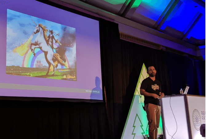
Will Klein at React Rally 2019

Will Klein - Follow the (Full)stack Trace. Will's talk is about understanding your app with distributed tracing by following a user request, from a page-load in the browser, to your backend, through services, to the database, and back. Developer tooling is his jam, enjoy this wonderful talk and find out how we can better understand our applications and easier to do our jobs as full-stack developers.

Jen Luker - Weaving Tapestries of Code. Jen shows us how deeply intertwined programming and fiber arts are. This is a talk that explores the history of the loom, teaches basic concepts around patterns in knitting and ties that all together (no pun intended) with a nice bow in many shades of beautiful yarn. This is one of my favorite speakers at any conference because I know how much she puts into each talk and she always delivers amazing and interesting subjects that help you learn and make you think. She's an advocate for accessibility and an amazing frontend developer who just cares a whole lot. Her talk shows how rich and diverse our history is as programmers. Check out her talk slides here: Weaving Tapestries of Code

As the conference winds down and we get ready for the last talk, our host Michael Chan reminds us how special this conference is, he thanks the premier sponsor Nrwl for bringing us lunch and dinner. I gotta say, lunches at this conference were amazing. He also thanks Alex Anderson and Rob Neeland who were backup speakers for the event that did not get to present but had the same pressure of preparing and showing up just in case React Rally needed them and I think this is amazing, these guys deserve all the thanks they get!

Brian Holt - Human React. The last talk of the session was so fitting to take us home and close out the event. Brian Holt is a developer from Microsoft and his talk is mainly about people and React. How special React is, where it's been and where it's at now. How the community is so very special. I know that you may only watch a few of these talks, but I strongly encourage you to listen to this one. It's such a great message to leave off on and so very thoughtful and funny I might add. Check out his talk slides here: Human React

Brian Holt's last slide at React Rally 2019

Wrap Up and After Party

So that's the conference, it ended o a very positive note, everyone went out afterward to Gateway Plaza in downtown to celebrate the end of another year of React Rally. We had wonderful food, deserts, drinks and some of us even got together for a comedy show afterwards which was such an amazing experience to just hang out with some of the great speakers and attendees and then all of us that stayed out late took a nice walk back to the Sheraton where we were all staying. A beautiful, not too cool, not too hot night. We all knew that this would be the last time a bunch of us see each other until the next big conference and we just had a really good time talking on our way back to the hotel, meeting new people and asking amazing questions to guys like Kent C Dodds, Michael Chan and David Khourshuid. It's just not every day that you get this type of opportunity and I felt very special to have had them all come out for one last event before putting React Rally behind us.

KendoReact Booth

Our KendoReact team was a sponsor of this years React Rally and had a drawing for a pair of Bose noise cancelling headphones. For everyone who signed up for this raffle we donated $5 to a local charity to help purchase school supplies for local back to school efforts.

Headphone Raffle Winner

We had a raffle for a pair of Bose Noise Cancelling headphones, and our winner, Justin, had a long trip back to Canada where so hopefullly he was able to put those headphones to use on his flight back home. We sure do appreciate all of the people who signed up. In the end we rounded up our donations to $1000 to a favorite local SLC charity providing back to school supplies to students in the area!

Thanks for reading if you made it this far, send me a tweet and let me know if you liked this type of review of the events. How many talks did you watch? Did you make it to React Rally? Hit me up and let me know what you think!

Eric Bishard @ReactRally SLC Airport

I'm hoping that the article will be helpful for those thinking about attending the next React Rally event in 2020 or just gave you a quick and easy way to explore the talks and watch after the event. This conf is truly .

An Introduction to Accessibility Testing

$
0
0

Learn all about what accessibility testing is, how to perform it and why it's so important.

Over 40 million individuals are living with disabilities of some sort in the United States alone. When it comes to the internet, it’s important to cater to people with disabilities to ensure websites are usable for all users. When you make your website accessible, you’re helping those with disabilities stay active and included in society. Plus, you’re making your website easier to read and navigate for people without disabilities.

What is Accessibility Testing?

Accessibility testing, a subset of usability testing, involves performing tests via software to ensure people with disabilities are able to use a website without experiencing any sort of barriers. Essentially, accessibility testing is the process that must take place prior to addressing accessibility issues on any given website. This is necessary to ensure you’re meeting the WCAG guidelines.

For nearly any website, a combination of manual and automated accessibility testing should take place as early as possible during the design and development phase, as well as often throughout design and development.

Why Perform Accessibility Testing?

Products, including websites, should be delivered to people of all types, including people with disabilities, to ensure inclusivity. For those with disabilities, assistive technologies are available to help them better leverage the internet. However, websites must be designed with these assistive technologies in mind—from screen magnification software to screen readers to speech recognition software and everything in between.

Accessibility testing helps to ensure websites are user-friendly and accessible to everyone, including people with disabilities who rely on assistive technologies. Ultimately, accessibility testing will ensure usability for all disabilities, including visual, auditory, speech, cognitive, and more, as well as usability for individuals who do not have a disability but can still benefit from websites being easier to read and navigate.

So why, aside from being inclusive, should you make sure your website is accessible through accessibility testing?

Boost Visibility to a Greater Market

Chances are, your product and/or service would be of interest for persons with disabilities. Think about how much of the population has a disability of some sort. You don’t want to eliminate such a large portion of the population from becoming a potential customer.

Lower Site Development and/or Maintenance Costs

If you make your website accessible from the beginning, you’ll spend much less money on development and/or maintenance in the long-run. It’s also much quicker to make changes as needed to a website that’s already accessible from the start. After all, compliance with applicable standards and guidelines will be mandatory eventually.

Improve Usability on Different Browsers and/or Devices

Websites that are accessible will operate better on a variety of browsers and/or devices than those that aren’t accessible. They will work better for those in situationally challenging circumstances as well, such as noisy airports or natural lighting that causes glare.

Common Disabilities

A disability is any condition of the mind or body that makes it difficult for the individual to perform certain activities or interact with society and/or the world around them. Disabilities are known for resulting in limitations in terms of participation and activity. There are many different types of disabilities, including but not limited to:

1. Cognitive

Cognitive disabilities are the most common form of disability an individual can experience. They often result from conditions present at birth or conditions developed at some point in life, such as chemical imbalances, infections, traumatic injuries, and more. There are approximately 16 million people impacted by a cognitive disability in the United States, although two people with the same cognitive disability may experience entirely separate challenges.

Most individuals with a cognitive disability will require assistance, to some degree, to help them approach their day-to-day lives. Cognitive disabilities are classified in two ways: clinical and functional. The clinical category includes Down syndrome, autism, dementia, and traumatic brain injuries, as well as various other less severe conditions. The functional category, on the other hand, focuses on the individual’s abilities and challenges resulting from the disability, such as:

  • Memory
  • Problem-solving
  • Reading/verbal comprehension
  • Attention
  • Math comprehension
  • Visual comprehension

The functional category is particularly helpful to be aware of when developing websites. This allows us to review the types of barriers those with cognitive disabilities face—helping to ensure websites address those barriers in all technical and navigational aspects.

2. Blindness

Blindness is characterized as sightlessness or loss of vision. When we speak of blindness, we generally are referring to a total loss of vision, whereas partial blindness refers to low vision. Blindness has several potential causes, including but not limited to the following:

  • Glaucoma
  • Stroke
  • Diabetes
  • Macular degeneration
  • Accidents or injuries to the eye
  • Retinitis Pigmentosa

Approximately 285 million people are visually impaired to some degree worldwide. Of those 285 million people, 39 million are completely blind. Those who are blind use the internet with a range of assistive technologies, such as screen readers, braille devices, and keyboards.

When web developers don’t consider blindness while developing websites, those who are blind aren’t able to use those websites unless they’re gathering information from someone else.

3. Vision Disabilities

Vision disabilities, also known as visual impairment, refers to a decreased ability to see that cannot be solved with medication or glasses. Visual impairment can result from trauma, disease, as well as degenerative or congenital conditions. Some eye disorders leading to visual impairment include:

  • Glaucoma
  • Cataracts
  • Retinal degeneration
  • Albinism
  • Muscular problems
  • Infection
  • Diabetic retinopathy
  • And more

In addition, visual impairment can result from brain and nerve disorders. When this happens, it’s known as cortical visual impairment. As mentioned above, there are approximately 285 million people with visual impairment worldwide. Of those individuals, 246 million have low vision as opposed to being completely blind.

Similar to blindness, web developers must consider those with visual impairment as they often use various assistive technologies to access the web. Websites must be made accessible and able to support those assistive technologies.

4. Deafblindness

Deafblindness refers to having little or no sight and hearing. Those who are deafblind may experience varying degrees of sight and hearing impairment. A person may be deaf or blind at birth and lose the other sense at some point throughout life. A person who is born deaf/blind has congenital deafblindness, while a person who loses one or both of the senses at some point in life has acquired deafblindness.

Helen Keller is a very well-known example of someone who had deafblindness. There are approximately 35,000 – 40,000 individuals who are medically deafblind in the United States. Congenital deafblindness can be caused by the following:

  • Genetic conditions from birth, such as trisomy 13
  • Illness or infection, such as AIDs or rubella
  • Pregnancy-related problems, such as fetal alcohol syndrome
  • Complications related to prematurity

Those who end up with deafblindness at some point in life usually acquire it due to a variety of reasons:

  • Genetic conditions, such as usher syndrome
  • Meningitis
  • Illness
  • Age-related loss of sight and/or sound
  • Physical damage
  • Stroke
  • Brain damage

Those who are deafblind rely on various assistive technologies, such as braille displays or screen readers, to leverage the internet in life-changing ways. Web developers must consider those with deafblindness during the design phase of any given website.

5. Physical Impairments

A physical impairment refers to any disability that limits a person’s ability to remain mobile or active. Essentially, physical impairments impact functioning, mobility, stamina or dexterity. This can include:

  • Brain or spinal cord injuries
  • Cerebral palsy
  • Multiple sclerosis
  • Respiratory disorders
  • Epilepsy
  • And much more

Physical impairments significantly impact the individual’s ability to take part in various activities throughout day-to-day living. They usually fall into one of two main categories:

  • Congenital: The physical impairment occurred due to inherited genetic problems or other issues at birth.
  • Acquired: The physical impairment occurred due to an accident, disease or infection at some point in life.

Those with physical disabilities make up a large amount of the population. In fact, approximately 75 million people have some type of physical disability throughout the United States. Physical disabilities often include weakness and limitations in terms of muscular control. This means web developers must consider any design and/or functionality aspects that would be impossible with involuntary movements, tremors or lack of coordination.

How to Do Accessibility Testing

The web is an incredibly important resource for everyone, including people with disabilities. It makes many aspects of life—from healthcare to recreation to employment—much easier than they would be without the web. The benefits of performing accessibility testing are clear, but where do you start? As web accessibility becomes a more prevalent topic, training programs are popping up all over the place to help teach individuals how to create accessible content.

Most training programs focus on the WCAG 2.1 guidelines, which provide various technical specifications and techniques for web developers to follow when it comes to creating accessible content. So how do you perform accessibility testing?

1. Start Learning about Accessibility

The first step to performing accessibility testing is learning how to create accessible content. After all, you don’t want to go through the process of testing something that isn’t even close to accessible. This article about “where to learn web accessibility” is a great start. It reviews various resources to help web developers and businesses learn more about web accessibility, many of which are free of charge. Here are a few resources to consider:

  • Google’s Introduction to Web Accessibility

Google offers an introductory guide, as well as practice design labs and samples for those looking to learn web accessibility. There is no requirement of prerequisite knowledge, but it is helpful to have some background in web design. The course teaches what accessibility is, advanced accessibility techniques, and more important information to create usable and accessible websites.

  • International Association of Accessibility Professionals Certification (IAAP)

The IAAP offers a certification program that helps individuals add to their professional qualifications with proof of capabilities and/or knowledge of accessibility. The IAAP offers two types of certifications: a professional level credential and a technical level credential. You don’t have to be a member of the IAAP to take any certification course, and prior experience is not necessary but helpful.

  • Microsoft’s Training Teachers to Author Accessible Content

Microsoft offers an hour-long course, separated into ten modules, on web accessibility. A valid Microsoft account is necessary to complete the course on their website. Each module has course notes and a video provided to individuals taking the course. You will learn how to create and revise documents so everyone, including those with disabilities, can access them.

2. Perform Manual Testing

There are a lot of accessibility issues that might be missed with a computer program. Manual testing involves having human testers perform a range of tests to ensure the website is actually usable for individuals with disabilities. Similar to any type of editing or quality assurance, you’re able to get an entirely new viewpoint with each person who performs manual testing. Testers will look for:

  • Compatibility with various assistive technologies
  • Navigation that is simple and easy to understand
  • Content that is meaningful and clear/concise
  • Coordination with color adjustment plugins for various web browsers
  • And much more

Any testers used should be familiar with the latest standards when it comes to web accessibility. That means they must understand WCAG 2.1 to ensure they’re looking for the right factors that matter to people with disabilities.

3. Perform Automated Testing

Automated testing is the process of using software tools designed to find accessibility issues. These tools have evolved quite a bit over the past few years. It’s not difficult to find a range of tools available to help you adhere to accessibility guidelines. In fact, there are browser extensions, command-line tools, and much more. These tools should be used at the beginning of the design process and periodically throughout to catch issues before they go into production.

Why Use Manual and Automated Testing?

Manual and automated testing should be used in combination with one another in order to ensure a thorough testing process that doesn’t miss anything important. Automated tools are great for finding:

  • Images without alt text
  • Content that doesn’t have headings
  • HTML code that isn’t valid
  • Form fields that are missing labels and/or descriptions
  • And much more

However, as much as technology has advanced, human intervention can help find issues that no software tool is able to pinpoint, such as:

  • Alt text that isn’t accurate given the context
  • Descriptions that aren’t clear or easy to understand
  • Headings that don’t make sense given the hierarchy
  • And much more

From a usability standpoint, something like a misleading alt tag makes a world of difference, even though it’s not findable with an automated tool.

Automated Accessibility Testing Tools

As mentioned, there’s a wide range of software tools available for automated testing. The process of testing for accessibility should be ongoing throughout all stages of development. If you have the means, a continuous integration solution can be very beneficial. Some common tools for automated testing include:

1. Dyno Mapper

Dyno Mapper allows you to test entire websites for WCAG 1.0, 2.0, 2.1/Section 508 compliance, as well as various other guidelines:

  • BITV 1.0 (Level 2)
  • Stanca Act

The tool offers various features to ensure you’re able to fix any known errors in web content and design:

  • The ability to visualize: Use a browser to view accessibility tests with icons showing over the website image to indicate known, likely, and potential issues.
  • Check public or private applications: Check public or private applications with basic authentication, CMS authentication or custom form authentication.
  • Perform ongoing automatic testing/monitoring: Use the schedule feature to ensure automatic testing and reporting on a monthly basis.
  • Receive notifications when issues arise: If an issue is found, you will receive notifications sent to your email to alert you of known, likely, and potential issues.

2. SiteImprove

SiteImprove allows you to ensure your website is inclusive and usable for every visitor that comes your way. This helps you adhere to various global accessibility guidelines, including WCAG 2.1, with features such as:

  • Accessibility diagnosis: Use practical recommendations, your own criteria or the tool’s scoring system to decide which issues you want to fix first.
  • On-page and in-code highlights: View issues with on-page and in-code highlights that make it simpler than ever to fix errors.
  • Quality assurance/accessibility dashboards: See how far you’ve come in terms of accessibility with customizable dashboards and automated reports.

The tool lets you see every link, page, and media file at a glance—locating issues that could impact your site’s accessibility level.

3. Monsido

Monsido scans your website for any issues that may be stopping you from reaching ADA compliance with Section 508 and WCAG 2.1 standards. You’re able to leverage this tool to:

  • Choose the compliance level you need: Not all sectors have the same compliance requirements, so you’re able to check for WCAG 2.1 or Section 508 accessibility issues.
  • Leverage a built-in help center: A help center is available via an icon for times when you’re not quite sure how to fix an issue and would like some detailed information or instructions.
  • View your accessibility status: Compliance standards are organized by levels, such as A, AA, and AAA—allowing you to fix low-level issues first and foremost before putting time into high-level issues.
  • Reach out for training sessions: Take advantage of training and one-on-one support options available to you and your team to ensure you’re up-to-date on the latest best practices.

The tool will scan your domain on a weekly basis to help ensure compliance at all times. This information can be found in the dashboard wherein you can see a total count of issues and which pages they’re found on.

Accessibility Testing Checklist

When it comes to accessibility testing, it might feel like there’s a lot of work to do, and while that’s true, a checklist can make the process a lot easier. Here’s an accessibility testing checklist to follow.

TEXT

  • Can users enlarge the text if needed?
  • Is there enough contrast between the text color and the background color?
  • Does the website use bold, underlined, and italics when needed?
  • Are the navigation items labeled clearly in a way that’s understandable?
  • Is the font easy to read, and if not, can the user override fonts for text displays?

VIDEO AND AUDIO

  • Do all video and audio clips used fit with the content shown on the page?
  • Are subtitles or transcripts available for any form of multimedia used?
  • Can video and audio clips be stopped once the page loads?
  • Are video and audio clips dangerous for those sensitive to light and sound?
  • Are users able to adjust audio or video controls as needed?

COLOR AND CONTRAST

  • Do background and foreground colors have enough contrast?
  • Is color-coding used as a means of conveying information or indicating actions?

IMAGES

  • Do all images used have a purpose (to convey information)?
  • Is the site loading slowly because of too many images?
  • Do all images have alternate text to go with them?
  • Are there low contrast/extremely bright colors that may be difficult to view?
  • Do any images flash, rotate or move without the ability to stop them?

LANGUAGE

  • Are you using a higher than average vocabulary?
  • Is the language clear and concise without confusing terms?
  • Are there links to explain words that might be advanced?

FORMS

  • Are text boxes within forms clearly labeled?
  • Are text boxes organized properly and predictably (name, address, city, etc.)?
  • Can forms be filled out using the keyboard to go from one box to the next?

HEADINGS

  • Are headings simple and descriptive so the meaning is clear to users?
  • Is there a linked table of contents on pages with a lot of information?

For more information on what to look for when accessibility testing, check out this complete web accessibility testing checklist.

Conclusion

Web accessibility testing is fundamental to ensure people with disabilities are able to use your website without barriers. Once your website is made accessible, you can rest assured knowing you’re meeting your legal obligations while helping to improve inclusivity for all individuals, including the millions of people around the world with one or more forms of disability.


Learn More about Accessibility

We have created a comprehensive whitepaper on accessibility for developers that covers everything from laws to coding to testing.

Download the whitepaper:Accessibility for Developers

Adding Accessibility to Your Apps

One easy way to make sure that you are creating accessible web apps is to start with components from the Kendo UI libraries. Our components are all WCAG complaint and give you great functionality from grids and charts to schedulers and pickers. Get a head start on your app's UI and a head start on accessibility compliance at the same time.

Learn more about: Kendo UI

How to Target the DOM in Vue

$
0
0

A very common practice in web development is to target an element in your DOM and to manipulate it in some way. Let's check out the power of ref in Vue with an easy to follow example.

A very common practice in web development is to target an element in your DOM (Document Object Model) (aka all your HTML elements and the logical structure they represent) and to manipulate it in some way.

In this article we are going to check out the power of ref and some of its edge cases. Get your toast ready, and let’s peel this .

Knights of the Old Vuepublic

For those of us that come from the old ways, aka jQuery, we were very used to targeting a DOM element in our page to modify it or use it in any certain way. In fact this was almost unavoidable in cases where you wanted to use any type of plugin that would make use of an element in your page.

In jQuery, you would select an element by targeting it with the $()function, and that would open up a wide variety of methods for manipulating this object. Take the example of a div, where you would like to set or toggle the visibility by switching around the display CSS property.

Let’s consider the following markup for our example.

<body>
    <div id="datOneDiv" class="myCoolClass" style="display: none;">I is hidden</div>
      <div>I is shown</div>
    <div>I is </div>
    </body>

In jQuery, this would look like the following.

    $('#datOneDiv').css('display', 'block');

A couple of interesting things to mention here. First of all, notice that we’re targeting a very specific div in our document, the one with the id of datOneDiv as seen by the selector #datOneDiv (the # here works just the same as a CSS selector, it denotes an id).

The second thing to note is that, as fantastically easy as this was, it prevented a lot of people from actually learning how to JavaScript, which as time went by became a problem.

Do you even JS, breh?

In actual vanilla JavaScript, the same result can be achieved by using querySelector and some property manipulation.

    document.querySelector('#datOneDiv').style.display = 'block';

The key thing to notice about this example is that once again, we are making use of an id to target a very specific div inside of our document. Granted, we could have also targeted the div with its class by doing .myCoolClass, but that as you will learn will present the same problem.

The Vue Awakens

We are going to do some Sith killing today. Don’t worry, no actual horned cool-looking dudes were harmed in the making of this article.

Consider the following Vue component Sith.vue.

<template>
      <div>
        <p class="sithLord">I is Sith</p>
        <button @click="keelItWithFire">Kill the Sith DED!</button>
      </div>
    </template>
    
    <script>
    export default {
      methods: {
        keelItWithFire() {
          document.querySelector(".sithLord").style.display = "none";
        }
      }
    };
    </script>

I KNOW, I KNOW. Amaga, I should be using dynamic classes, your example is so bad, the avocado is mad and you are no longer my bff. It’s alright, I didn’t like you anyway. However, for purposes of example, let’s pretend that we didn’t know about all that Vue goodness and that we actually were trying to target the DOM this way to make some changes to it. (Jokes aside, if there is a way you can apply classes or styles dynamically, you should ALWAYS opt for doing it with dynamic properties! We are just doing this as an easy-to-follow example.)

If we instantiate this component in our App.vue or our main app entry point, and we click the button, you will notice that it actually works. So why exactly have we been told time after time that it is SO BAD to target the DOM directly in Vue like we are doing here?

Try modifying your main template (or wherever you’re testing these components) to actually hold two or more Sith lords, like so.

<template>
      <div id="app">
        <Sith/>
        <hr>
        <Sith/>
        <hr>
      </div>
    </template>

Now go ahead and click on the second one to kill it ded. HUH. The force is weak with this one. Do you know what happened?

When the component method keelItWithFire triggers on the second component, the querySelector method is going through the DOM and trying to find the first instance of an element with the class sithLord, and sure enough it finds it!

The big issue with targeting the DOM directly in Vue is first of all that components are meant to be reusable and dynamic, so we can not guarantee that the class here is going to be unique.

Well, we can use an id you see! And you are partially correct, assigning an id attribute to a template in Vue will sort of guarantee its uniqueness, proven that you don’t instantiate more than a single one of those components in your whole application (or else you’re basically going to run into the same problem as above).

The second caveat is that you will also have to guarantee that no other thing in your app, no other developer, and no other library is going to create an element that can potentially hold the same id.

The Way of the Vuedi

Vue or do not, there is no try.

In Vue we have plenty of tools to modify the template dynamically through computed properties, local state, dynamic bindings and more. But there will come a time where you will be faced with the need to actually target the DOM. A couple of common reasons are to implement an external-party plugin that is not Vue specific, or to target a field in a form and focus it, for example.

When such a case arises, we have a pretty cool attribute we can slap to elements called ref. You can check out the official documentation for it here.

We are going to make a new component, this time a Jedi.vue, and this time we are going to do things as we are meant to in Vue.

<template>
      <div>
        <p ref="jedi">I is Jedi</p>
        <button @click="keelItWithFire">Kill the Jedi DED!</button>
      </div>
    </template>
    
    <script>
    export default {
      methods: {
        keelItWithFire() {
          this.$refs.jedi.style.display = "none";
        }
      }
    };
    </script>

What, you thought because they were Jedi we weren’t going to ? Ain’t no one mess with tiny hippo, ain’t NO ONE .

Now, the important thing here is to understand what is going on when we add a ref attribute to one of the elements on our <template>. In simple terms, each component instance will now hold a private reference pointing to their own <p> tag, which we can target as seen on the keelItWithFire function via the $refs property of the instance.

Other than the problems that arise with class and id targeting, it is of utmost importance to know that the biggest issue of all is that modifying DOM directly can lead to those changes being overwritten by Vue when there is a re-render cycle of the DOM, either on that component or its parent.

Since when we target the DOM directly Vue doesn’t know about it, it won’t update the virtual “copy” that it has stored - and when it has to rebuild, all those changes will be completely lost.

If you don’t want a certain piece of your DOM to constantly become re-rendered by Vue, you can apply the v-once attribute to it - that way it will not try to re-render that specific part.

So far this example doesn’t seem super exciting, but before we jump to a real case scenario, I want to touch up on some caveats.

Caveat 1

If you use ref on top of a Vue component, such as <Jedi ref="jedi">, then what you get out of this.$refs.jedi will be the component instance, not the element as we are here with the <p> tag. This means that you have access to all the cool Vue properties and methods, but also that you will have to access to the root element of that component through $el if you need to make direct DOM changes.

Caveat 2

The $refs are registered after the render function of a component is executed. What this means is that you will NOT be able to use $refs on hooks that happen before render is called, for example on created(); you will however have it available on mounted().

There is a way to wait for created() to have the elements available, and it is by leveraging the this.$nextTick function.

What this.$nextTick will do is hold out on executing the function you pass to it until the next DOM update by Vue.

Consider the following example.

<template>
      <div>
        <p ref="myRef">No</p>
      </div>
    </template>
    
    <script>
    export default {
      created() {
        if (!this.$refs.myRef) {
          console.log("This doesn't exist yet!");
        }
    
        this.$nextTick(() => {
          if (this.$refs.myRef) {
            console.log("Now it does!");
          }
        });
      },
      mounted() {
        this.$refs.myRef.innerHTML = "";
        console.log("Now its mounted");
      }
    };
    </script>

We have a <p> tag with a ref of myRef, nothing fancy there. On the created() hook though there’s a couple of things going on.

First, we make a check to see if this.$refs.myRef is available to us, and as expected it will not be because the DOM has not yet been rendered at this point - so the console.log will be executed.

After that, we are setting an anonymous function to be called on $nextTick, which will be executed after the DOM has had its next update cycle. Whenever this happens, we will log to the console: “Now it does!”

On the mounted() hook, we actually use this ref to change the inner text of the <p> tag to something more worthwhile of our savior, the magical avocado, and then we console log some more.

Keep in mind that you will actually get the console logs in this order:

  1. This doesn’t exist yet!
  2. Now it's mounted
  3. Now it does!

mounted() actually will fire before nextTick because nextTickhappens at the end of the render cycle.

The Dark Side

Well, now that you have the whole awesome theory, what we can we actually do with this knowledge? Let’s take a look at a common example, bringing in a third-party library, flatpickr, into one of our components. You can read more about flatpickrhere.

Consider the following component.

<template>
      <input
        ref="datepicker"
      />
    </template>
    
    <script>
    import flatpickr from 'flatpickr';
    import 'flatpickr/dist/themes/airbnb.css';
    
    export default {
      mounted () {
        const self = this;
        flatpickr(this.$refs.datepicker, {
          mode: 'single',
          dateFormat: 'YYYY-MM-DD HH:mm'
        });
      }
    };
    </script>

First, we import the library and some required styles, but then the package requires that we target a specific element in our DOM to attach itself to. We are using ref here to point the library toward the correct element with this.$refs.datepicker.

This technique will work even for jQuery plugins.

But beware of the dark side. Angerlar, jFear, Reactgression; the dark side of the Force are they. (Disclaimer, this is a joke. I don’t actually dislike the other frameworks. Except maybe jQuery. jQuery is evil.)

Wrapping Up

Hope you had some fun learning about ref today. It’s a misunderstood and underused tool that will get you out of trouble when used in the right moment!

The sandbox with the code examples used in this article can be found at the following link: https://codesandbox.io/s/target-dom-in-vue-r9imj.

As always, thanks for reading and share with me your ref experiences on Twitter at: @marinamosti

P.S. All hail the magical avocado

P.P.S. ❤️☠️


Accessibility Case Studies

$
0
0

It's critical to implement accessibility the right way from the start. In these case studies, we can learn from how other companies have succeeded (or not) and how we can do it better ourselves.

The Case for Accessibility

According to authorized research, about 18% of the world’s population has a disability that inhibits access to digital content, with seniors making up about 50% of those people. [1] That 18% has to fight through digital interactions that can leave them frustrated and isolated. [2]

So these numbers tell us that there is a significant portion of the population that relies on accessibility. However, if that’s not enough to encourage your client, boss or project manager to abide by the rules of accessibility, let them know how great of an opportunity they’re missing.

Implementing accessibility increases traffic and improves search engine ranking. [1]Legal & General Group or L&G has witnessed it firsthand. In a matter of 24 hours after implementing some accessibility fixes based on an accessibility audit, they saw a 25% increase in traffic coming from search engines. It soon increased to 50%, and their conversion rate doubled within the first three months. In terms of ROI, the investment they made in their site’s accessibility resulted in 100% return on investment in only one year. [1] I was a digital marketer in the past, and I haven’t heard of anything as simple as this that could land such results.

Also, you don’t really have a choice. Especially if you’re big in your industry. Target learned its lesson the hard way: They only agreed to make their site accessible after having to pay roughly $10 million to settle a class lawsuit with the National Federation of the Blind. [3]

But web accessibility is not just about avoiding lawsuits or being inclusive – there is also a business case to be made out of it. The global market of people with disabilities is estimated to be worth $6 trillion. [4] So think twice if you consider accessibility to not be a priority.

Mobility Impairments ✋ Case Study

A lot of us think that accessibility is rules and best practices to respect when designing and developing an interface. Well, like for mobile interfaces, the best results come when you think about accessibility from day one by including user personas that include people with disabilities.

A great example is CityMaas Assist. CityMaas Assist’s mission is to provide city travel information primarily to people with “varying abilities and disabilities” through features that are designed to answer the need of their target users. [2]

The design team started by collecting information on the different obstacles users usually encounter while traveling around the city. Their designers travelled a whole afternoon with their founder (who is wheelchair bound and unable to use his arms), using different types of transportation to understand the pain points he encounters and what features could help overcome them. [2]

With this information in hand, the designers were able to create a user persona to which they can relate to carry out the UX and UI design process. [2]

The essential features that came of this process were: [2]

  1. The ability to plan one’s journey from a to z, including the information that must be known regarding his needs
  2. Book and pay for all his tickets in advance from one app
  3. Checking the availability of wheelchair access throughout the whole journey
  4. Calling for assistance from any point on the app

In terms of design requirements, the team took the following considerations: [2]

Source: City Aide — A UX/UI Case Study

  1. Choosing “FS Me,” a typeface specifically designed to improve legibility.
  2. Going for a color palette that consisted of a strong green (buttons/CTAs), a bright blue for important CTAs and a dark blue-gray for the background. This was because:
    • Yellow affects people with autism
    • Orange and red are off limits for colorblind people
    • Need to keep a high level of contrast
  3. Keeping a clean and concise layout, by keeping the onscreen info to a minimum (to not overwhelm users who are sensitive to a large flow of information)
  4. Simplifying the directions on the navigation screen but also enlarge the most important instructions
  5. Add an SOS light blue button visible on all screens throughout the app in the top right corner (visible but not getting in the way)
  6. Using easy-to-understand iconography accompanied with its text description, to avoid confusion
  7. Buttons were made much larger than the 44*44pt recommended by Apple’s Human Interface Guidelines

Even though this is an app that was specifically designed for people with disabilities, it gives us an insight on how we can include specific user personas in our design thought and process since day one.

Hearing Impairments Case Study

We could think that how we can accommodate people who have hearing impairments is quite straightforward, but there are some details that can make a difference and obstruct them from fully experiencing a product or a service.

For example, of course Netflix offers closed captioning, but it has to take into consideration not only closed captioning for dialogue but also for surrounding sounds. [5]

Another simple feature that makes a huge difference is the option on Apple products to use Mono Audio (playing both left and right audio channels through the one of your choice) or adjusting the audio balance in both ears. This allows people with hearing disabilities to not miss on a basic experience like listening to or even practicing music like anybody else. It’s simple but it’s no small feature. Remember how frustrating it was when one of your earphone’s earbuds wasn’t working? Well imagine having to deal with that for life! [6]

Visual Impairments ️ Case Study

A study has reported that 30.4% of disabled people are just losing so much time when using a web platform. This could because there is no alternative text (ALT) for pictures, or, in some cases, the page design can cause the screen reader to give wrong feedback to the user, ending up causing the user to click on the wrong link. [7]

An interesting case I came across is the one of the BBC iPlayer. It shows that even when you have “all of the traditional ingredients [best practices and guidelines] of an accessible page in place,” it doesn’t mean that its accessibility is best optimized for a screen reader user. [8]

For example: [8]

  • Navigation links like “categories”, “channels” and “A to Z” are located way down the page, so screen reader users have to go through the whole page before being able to get to know where they need to go to fetch the content they want.

Source: Accessibility Originates With UX: A BBC iPlayer Case Study

  • Links were read twice because the thumbnail image and the heading had separate links that both redirected to the same program. This made it confusing to the screen reader users.
  • When keyboard access users clicked the first time on the “categories” link, a panel with only four items would be shown and they had to click again to see the whole listing. How would they know? This one just resulted in users giving up ALTOGETHER on using the platform.

So accessibility guidelines were respected in the development of the website, but accessibility wasn’t being truly considered during the design process. [8]

As Henny Swan (the author of this case study) puts it: “Part of the issue is that standards and guidelines tend to focus more on code than design, more on output than outcome, more on compliance than experience. As such, technically compliant pages could be built that are not the most usable for disabled users.” [8]

This was a great lesson for the BBC team that we can also learn from.

What they did next was to reconsider their whole design framework. Instead of basing their accessibility efforts on standards and guidelines, they used these standards to inform their newly conceptualized design framework from the inside out. [8]

This new design framework consisted of four UX principles: give users choice, put them in control, design with familiarity in mind, and prioritize features that add value. [8]

This translates into not assuming which way the user wants to access certain content or features, be it in terms of navigation or comprehension. [8]

It also means that the visual patterns and the language used must be familiar. Of course designers should not restrain their creativity, but they also need to keep a certain balance between the new and the old to not confuse users, because they rely on familiar design patterns to navigate pages and access features. The same goes for wording – consistent labeling should be used for headings, buttons, navigation links, and alternative text too. [8]

Finally, we should keep in mind that features we consider small for users without disabilities can have tremendous impact on a user’s experience who does have a disability. You may directly think of closed captions, but there are other features out there that have the same impact.

For example, adding a favorites page on the BBC iPlayer platform may seem like a “nice to have” for users without disabilities, but it made a huge difference for users with a disability. It was even the single most requested feature from that user group because it allowed them to access their favorite content without the usual hassle they had to get through every time. [8]

Taking one step further into what great features look like, let’s talk one second about Facebook’s automatic alternative text. [9]

It’s a great testimony of the potential contribution of artificial intelligence to accessibility.

Previously, screen reader users on social media only heard the word “photo” or “video” when they came across them on their newsfeed. [9]

It’s quite reducing (to say the least) as a social media experience, because that’s almost all we share all day long on social media.

But now, Facebook has implemented object recognition technology (a computer vision technique for identifying objects in images and videos), so people who use screen readers on an iOS device will hear, “Image may contain three people, smiling, outdoors.” [9] This allows them to join in in the conversation!

Cognitive Disabilities Case Study

So far, we went through sensory and physical impairments, but the user experience can be as complicated for people with cognitive disabilities as it is for the other impairments.

Among the issues users with cognitive disabilities encounter are:
- Inability to remember passwords if the user has a short-term memory impairment [10]
- Not understanding instructions when unfamiliar or complicated language is used. This is common to people with language and communication related disabilities [10]
- Difficulty to focus on tasks when a page is full of distracting elements or interrupting popups / notifications [10]

Although I’ve come across a lot of best practices and guidelines to build accessible platforms for people with cognitive disabilities, I am actually a little disappointed because I wasn’t able to find a true example of designing accessibility from day one for cognitively disabled people.

If you come across an interesting case, share it with us in the comments.

However, I was able to find a study made by the Institute on Disabilities that showed what people with cognitive disabilities prioritized as top access guidelines: [11]

  1. Use pictures, icons and symbols along with text
  2. Use clear and simple text
  3. Use consistent navigation and design on every page
  4. Use headings, titles and prompts
  5. Support screen readers. Use alternate text tags
  6. Use larger fonts – fonts in minimum 12pt or 14pt
  7. Uncluttered, simple screen layout
  8. Maintain white space: Use wide margins
  9. Make your website customizable, giving users control of: type size, placement of navigation (right, left side), contrast, large print, sound
  10. Use exit, home, help, next page buttons on every page
  11. Use sans serif fonts, such as Arial, Verdana, Helvetica, Tahoma
  12. Make navigation buttons clear, large, and consistent
  13. Use numbered lists rather than bullets
  14. Support font enlargement for web browsers
  15. Use color for contrast
  16. Check reading level with automated tools
  17. Don’t right justify text; use ragged-edge righthand margins
  18. Use lower case, no ALL CAPS
  19. Provide voice captions (audio files) for text
  20. Provide audio/voice-overs where the words are read aloud
  21. Use navigation methods (i.e. “undo” or “back button” to help user recover when lost)
  22. Give feedback on a user’s actions (e.g. confirm correct choices, alert users to errors or possible errors)

Lastly, I want again to go through some built-in features Apple provides, because they really do a great job building simple features that let users with impairments have almost a similar experience using their products as users without disabilities:

  • People with cognitive disabilities find it easier to learn using hearing rather than reading. Text to Speech reads aloud anything you highlight across 42 languages and in any voice and rate that suits the user’s preferences, and Speak Screen reads the whole content on a page to the user. [6]
  • Darker backgrounds help users with cognitive impairments focus, so when they activate the Dark Mode on Mac OS, text turns white and the background turns dark on built-in apps like the Calendar and Mail apps. [6] I actually use it just because it’s much better in my opinion.
  • Sometimes we come across this feature by accident and may find it annoying when that’s the case and we weren’t trying to look up a word. But for many users with learning impairments, the Dictionary feature is helpful because they can access it from anywhere on their computer without disrupting their reading experience. [6]
  • For some people, the web experience is overwhelming – even people with no focus impairment find the internet overwhelming. Using Safari Reader, users can focus on the content they want by stripping away ads, buttons, and navigation bars. [6]

Conclusion

I think that we can all agree that developing true accessibility for users with disabilities is not only about following guidelines, it’s about relying on a design framework that empowers all users regardless of their condition.

This means that accessibility is also about letting users access features and content in any way that they see fit, keeping their options open.

Because, at the origin of it all, technology is about giving more control to people, not restricting them with our pre-made assumptions of what’s right for them and ignoring the other possible options they may prefer.

The good news is that technology is the gift that keeps on giving – to all of us if we use it right. It can bridge the divide between differing levels of instead of reinforcing that divide.

P.S. I didn’t mention per say neurological disabilities, because, when talking about sensory, physical and cognitive impairments and disabilities, we cover the implications of living with a neurological disability.


Learn More about Accessibility

We have created a comprehensive whitepaper on accessibility for developers that covers everything from laws to coding to testing.

Download the whitepaper:Accessibility for Developers

Adding Accessibility to Your Apps

One easy way to make sure that you are creating accessible web apps is to start with components from the Kendo UI libraries. Our components are all WCAG complaint and give you great functionality from grids and charts to schedulers and pickers. Get a head start on your app's UI and a head start on accessibility compliance at the same time.

Learn more about: Kendo UI


Sources:

[1] Make-Sense - Web Accessibility Benefits – Case Study
[2] Jimmy Hay - CCity Aide — A UX/UI Case Study.
[3] Jonathon Hensley - The high cost of digital discrimination: why companies should care about web accessibility
[4] W3C Web Accessibility Initiative (WAI) - The Business Case for Digital Accessibility
[5] Adina Katz - Accessibility and Usability: A Case Study With Netflix
[6] Apple - Technology is most powerful when it empowers everyone
[7] Mohammed Saleh Hassouna, Noraidah Sahari & Amirah Ismail - University Website Accessibility for Totally Blind Users
[8] Henny Swan - Accessibility Originates With UX: A BBC iPlayer Case Study
[9] Facebook Newsroom - Using Artificial Intelligence to Help Blind People ‘See’ Facebook
[10] W3C Web Accessibility Initiative (WAI) - Making Content Usable for People with Cognitive and Learning Disabilities
[11] Mark G. Friedman and Diane Nelson Bryen - Web accessibility design recommendations for people with cognitive disabilities

What's Happening with Telerik UI for ASP.NET AJAX

$
0
0

Telerik UI for ASP.NET AJAX is loaded with updates, from a modern look and feel with custom styling to new controls like conversational UI integration. WebForms developers continue to get love from a continuously improving UI suite.

You may have heard some rumors like: “WebForms is dead?”, “AJAX is no more!”, “the AJAX suite evolution is abandoned” or others like it. With the new suites for ASP.NET Core and Blazor, it is natural for people to talk, but be sure, these are only rumors.

The purpose of this blog post is to bust that myth and show that the oldest Telerik product continues to get the love and attention it deserves. It receives new functionalities, bug fixes and new controls to allow WebForms developers to have a modern look and feel just like the new products for the recent frameworks.

New Controls

The Telerik UI for ASP.NET AJAX suite was one of the first Telerik products. Over the last 15 years, a lot of controls have been added to it. Now the suite is one of the richest, with more than 100 feature-rich, flexible and performance-optimized components for the rapid development of high-quality, professional looking projects. That shows how mature and complete this product is. Despite that, we continue to enrich the controls portfolio and add new components to make your development even easier and faster.

Here are some examples that confirm my words:

RadChat

Immediate communication on websites is a trend these days. As of the R2 2018 release, ASP.NET AJAX users can leverage a Conversational UI control. You just need to get a bot service, or you can build your own and easily connect it to the RadChat control. It will take care of the visualization and client interaction for you.

RadMultiColumnComboBox

You know how hard it is to show tabular data in ComboBox, the limitations it has and all the custom code you need to write and maintain, right? Not anymore, thanks to the RadMultiColumnComboBox control that can show a grid of data with not a single line of custom code. Yes, that’s true, you need just to configure which columns you need visualized, pass the data source and you are good to go. You have a beautiful looking dropdown representing table data. Check it out in our online demos: Telerik ASP.NET MultiColumnComboBox.

Control Improvements

Themes and Server-Side Events for MultiColumnComboBox

The R2 2019 release gave us a full set of Skins for the MultiColumnComboBox control along with built-in server-side events. Now you can choose from various colors and styles for the control and let it blend in easily with your existing project.

MultiColumnComboBox Filtering in multiple columns

Built-in Confirm Dialog in Telerik Buttons

The HTML confirm dialog is wonderful, it stops the postback execution while prompting. Great! But as you know, the dialog is one of the browser things that you do not have much control over, neither appearance nor functionality and positioning. On top of that, each browser has its own understanding of its appearance.

Luckily, the new built-in confirm dialog in the Telerik buttons allows you to use the RadConfirm dialog to keep the postback from happening until the user confirms it. And all that with just setting a few properties of the buttons, you keep the functionality of the default dialog, but have the appearance and control over the RadConfirm control.

RadButton ConfirmDialog

Toolbar for RadChat

You have the Chat in your app, all is working fine, but you need some custom buttons that have specific action, for example, attaching an image in the chat. The new Toolbar feature has got you covered. Check the RadChat Toolbar functionality integration with the AsyncUpload to create the chat image attachment ability: Chat - Toolbar

GenerateXlsxOutput Method for RadGrid

The RadGrid has its “Export to Excel” button, you click it and an Excel file starts downloading. Perfect! But what happens when you need to export multiple grids to the same file? Easy – use the new GenerateXlsxOutput() method to get the exported content for the grid and combine it with the content of the other grids. Here is the Grid - Export Multiple Grids online demo that shows how easy it is to implement.

Latest Internal Builds are Available Once Again

The Latest Internal Build, also know as LIB or Nightly Build, contains some bug fixes for the latest official release. It is useful in development environments to test some fixes addressing issues in the official release. If you want to to download it and review the release notes for that, you can check out the Latest Internal Builds knowledge base article.

Knowledge Sharing and Public Resources

Our company culture encourages collaboration and sharing knowledge among colleagues. We are taking this to the next level, and we share our knowledge and best practices with our developer community in the support threads or by creating public resources. For example, if we encounter the same scenario reported from two different people, we aim to create a publicly available Knowledge Base article or a Code Library project with the solution and the explanations.

Here are just a few examples, showing that we are also sharing general knowledge resources, unrelated to our controls.

  1. How to import/export SQL database to .sql script via the SQL Management Studio
  2. Read arbitrary text to impaired users via Screen readers
  3. Execute a custom script when a file starts downloading

Periodically we post the new articles in the Latest Online Resource sticky note in our forums. Logged in users have the option to subscribe to this thread and get an email notification for every post in the thread we create.

Another great way for us to share useful info is here on the Telerik blogs. Here are some of the recently created ones that you may want to check out.

  1. Improve Your Debugging Skills with Chrome DevTools Part 1 and Part 2
  2. RadGrid Bound to Azure's CosmosDB
  3. Web Accessibility Guidebook for Developers
  4. Accessibility Regulations You Need to Follow, Section 508

What to Look Forward to in R3 2019

In just weeks, the R3 release will be a fact and you can have it in your hands. Its focus is on Accessibility but it will also bring more fixes, new features and a brand-new control – the long awaited RadDrawer.

You are excited, aren’t you? Follow the What’s New and the Release History pages for more information when the release is officially live.

If you're new to Telerik UI for ASP.NET AJAX, be sure to check out the latest version today with a free 30 day trial.

Build a File Upload Button in Angular Forms Using Kendo UI

$
0
0

We'll go step-by-step and build a file upload button for your Angular application using the Upload component provided by Kendo UI. We'll also learn how to utilize the component's API to add extra features.

Introduction

One of the common features of most web applications is the upload functionality. As important as it is, implementing it and handling file submission in any of your web applications shouldn’t be a difficult task to accomplish.

In this post I will show you how to build a file upload button in Angular forms using the Kendo UI Upload component. Furthermore, we’ll also explore and make use of the Upload component API to add few extra features to the upload button.

Install Angular CLI

First you need to install the Angular CLI on your machine in order to start creating an Angular application. Run the following command for that purpose:

npminstall -g @angular/cli

This will add the Angular CLI globally on your machine.

Creating the Angular Application

For the purpose of this demonstration, let’s create a new Angular application by running the command below to generate an application with the name kendo-angular-upload-button:

ng new kendo-angular-upload-button

Once the installation process is complete, change directory into the newly-created project as shown below and start the application:

// change directory
cd kendo-angular-upload-button

// start the application
ng serve

You may experience an error with the message below in your console:

ERROR in node_modules/rxjs/internal/types.d.ts(81,44): error TS1005: ';' expected.
node_modules/rxjs/internal/types.d.ts(81,74): error TS1005: ';' expected.
node_modules/rxjs/internal/types.d.ts(81,77): error TS1109: Expression expected.

This is a known issue on GitHub and it’s due to a lack of compatibility between the current version of TypeScript on your machine and rxjs. The quick way to fix this is to delete the node_modules folder. Now, open the package.json file and within the dependencies object, edit the rxjs by removing ^ :

"dependencies":{..."rxjs":"6.0.0",// remove the `^`"zone.js":"^0.8.26"},

Save the file and run the npm install command again. Once the installation process is complete, you can now proceed to start the application with ng serve.

This will compile your application and start the development server. To view the default page of this Angular application, navigate to http://localhost:4200 from your favorite browser and you will see this:

angular-home 

Install Angular Upload Component

Next, we’ll use the ng add command to add and install the Kendo UI for Angular Upload component to our application. Hit CTRL + C to stop the application from running and run the following command to install the upload component:

ng add @progress/kendo-angular-upload

The preceding command will install the package and import UploadModule, BrowserAnimationsModule and HttpClientModule into the application within the app.module.ts file:

// ./src/app/app/module.ts
    
import { BrowserModule } from '@angular/platform-browser';
import { NgModule } from '@angular/core';
import { AppComponent } from './app.component';
import { UploadModule } from '@progress/kendo-angular-upload';
import { BrowserAnimationsModule } from '@angular/platform-browser/animations';
import { HttpClientModule } from '@angular/common/http';
    
@NgModule({
  declarations: [
    AppComponent
  ],
  imports: [
    BrowserModule,
    UploadModule,
    BrowserAnimationsModule,
    HttpClientModule
  ],
  providers: [],
  bootstrap: [AppComponent]
})
export class AppModule { }

Add the Kendo UI File Upload Component

To add the file upload component to our Angular application, we’ll create a div wrapper and then place the <kendo-upload></kendo-upload> inside of it as shown below:

// ./src/app/app.component.html
    
<div class="wrapper">
  <div class="content">
    <kendo-upload>
    </kendo-upload>
  </div>
</div>

Before you start the application, add the content below to the ./src/app/app/component.css

.wrapper {
  margin-top: 50px;
}
.content {
  width: 800px;
  margin: 0 auto;
  line-height: 20px;
}

Now proceed to start the application again by running ng serve from the terminal within the application’s directory. Once the application is built and served on http://localhost:4200 you will see this:

upload-home

Rendering a proper file upload button in an Angular application is as simple as this. We will leverage the Kendo UI Upload component API to add more functionality to the button. At the moment, if you click on the Select files button, it will automatically upload the selected files. This is the default configuration and it can be changed by setting autoUpload to false as shown here:
// ./src/app/app.component.html
    
<div class="wrapper">
  <div class="content">
    <kendo-upload [autoupload]="false">
    </kendo-upload>
  </div>
</div>

With the autoUpload set to false, the upload of files will occur only when explicitly confirmed by the user through a button-click as shown below:

confirm upload

Restrict File Upload Using Extensions and Sizes

You can also configure the restrictions for files that can be uploaded by specifying allowed extensions. To achieve that, import the FileRestrictions module from @progress/kendo-angular-upload. Update the ./src/app/app.component.ts file as shown below:

// ./src/app/app.component.ts
    
import { Component } from '@angular/core';
import { FileRestrictions } from '@progress/kendo-angular-upload';
@Component({
  selector: 'app-root',
  templateUrl: './app.component.html',
  styleUrls: ['./app.component.css']
})
export class AppComponent {
  myRestrictions: FileRestrictions = {
    allowedExtensions: ['.jpg', '.png']
  };
}

This will ensure that the files with extensions not defined within the allowedExtensions property will not be uploaded. To make it work, you need to add the restrictions property to your Kendo UI upload component:

// ./src/app/app.component.html
    
<div class="wrapper">
  <div class="content">
    <kendo-upload [autoupload]="false" [restrictions]="myRestrictions">
    </kendo-upload>
  </div>
</div>

not allowed

Conclusion

In this post you have learned how to easily build a simple file upload button in an Angular application by using Kendo UI. The official documentation contains details about the Kendo UI file Upload components API and more features that can be added to enhance the upload functionality.

Feel free to explore the source code here on GitHub and add more functionality as you deem fit.

Forms in React

$
0
0

Form Development in React comes down to three things: Data, Validations, and Submission. See how to handle these yourself or using Formik to make things simpler.

As your form in React becomes more complicated, you will find yourself reinventing more and more of the functionality that comes with Formik. If you find manually controlling a form and its validation painful, it may be time to switch to Formik or another form package to help make this process a bit easier to manage. In this article we'll investigate forms in Vanilla React and compare that to forms with Formik. 

When you’re thinking of forms in React, there are three things to keep in mind:

  1. How do I access what the user entered?
  2. How do I ensure what they entered is valid?
  3. How do I submit their data to the server?

That order is important because you can’t do step two unless you have first done step one, and you wouldn’t want to submit invalid data to the server.

This article will show the basics of Forms in React, both with and without the help of additional packages. We’ll see how to do “Vanilla React Forms”, and then how to accomplish the same thing using the Formik package from Jared Palmer.

My thesis is that the simpler the form, the more you can lean on React without additional packages, but as the number of fields increases and the validations get trickier, we’ll tend to stick with Formik to avoid rebuilding Formik ourselves!

All examples in their entirety can be found here on GitHub.

Vanilla React Forms

When I say “Vanilla React Forms,” I am referring to nothing else other than React… no additional packages. As you’ll see in this section, it could start to get out of control pretty quickly, as with just a single input that has some validations, it’s already turning into a decent-sized component.

Controlled Components

To answer “How do I access what the user entered?” we will use Controlled Components. Controlled Components are where the user’s input will trigger an update to the component’s state, which will cause a re-render of the component, displaying what the user entered.

By using the onChange event on an input field, we can update the state. Then, having the value prop equal to the value in our state, we can display it to the user.

exportdefaultfunctionControlled(){const[value, setValue]= React.useState("");return(<form><inputtype="text"placeholder="Controlled Name"onChange={event =>setValue(event.target.value)}value={value}/></form>);}

Validating Data

To validate our user’s input, we’ll maintain an object of errors in our state. This will get populated any time the user changes a value in the form and prior to the form’s submission. Leaving aside form submission for now, let’s look at the validate function. It will start fresh every time, populating an errors object based on the current values in our form.

functionvalidate(values){let errors ={};if(!values.name){
    errors.name ="Required";}return errors;}

Using the useEffect hook, we can detect when any of the input values change, calling the validate function and placing its result into our state. With an errors object, we can optionally add a class to our input field by looking to see if the field has an error: className={errors.name ? "has-error" : null}. Below the input field, we pass the error message to a component called Error which will render the message (if it exists) into an element with the correct classes.

exportdefaultfunctionVanillaForm(){const[submitting, setSubmitting]= React.useState(false);const[name, setName]= React.useState("");const[errors, setErrors]= React.useState({});// Recalculate errors when any of the values change
  React.useEffect(()=>{setErrors(validate({ name }));},[name]);return(<formonSubmit={event =>{
        event.preventDefault();}}><h2>An Average Form</h2><divclassName="input-row"><label>Name</label><inputtype="text"name="name"onChange={event =>{setName(event.target.value);}}value={name}className={errors.name ?"has-error":null}/><Errormessage={errors.name}/></div><divclassName="input-row"><buttontype="submit"disabled={submitting}>
          Submit
        </button></div></form>);}

Submitting Data

Finally, with our input value inside of name and the validation handled, it’s time to submit the form. A normal HTML form uses the form’s action prop, containing a URL to POST the data to, but in this case we will use the form’s onSubmit event to take matters into our own hands.

In order to stop the form from submitting via the normal method, we’ll call event.preventDefault(). Just to ensure our validation is completely up to date, we can call the validate check one last time. After that, it’s just a matter of posting the data somewhere using fetch, Axios, or perhaps with a mutation in GraphQL. In this case we’ll alert the data so we can see it in the browser.

event =>{// Stop the form from submitting
  event.preventDefault();// Validate the data one last timeif(Object.keys(validate({ name })).length >0){return;}// Update the submitting state to truesetSubmitting(true);// Time to process the datasetTimeout(()=>{const values ={ name };alert(JSON.stringify(values,null,2));setSubmitting(false);},500);};

Formik

For more complicated forms - perhaps with multiple fields or validations - it’s time to reach for a package called Formik. The principles are the same as we covered above, but it handles a lot of the heavy lifting for us. In this form, we’ll consider some more advanced use cases, including conditionally displaying fields and validating them, based on a value from an Autosuggest field.

In order to focus on the functionality we are discussing, I am going to slice and dice this somewhat large component to show what is important to the specific example. You can find the entire component here.

Accessing Data

Formik provides us with a values object. It gets its initial values using the initialValues prop, and then is updated automatically by the onChange event on each individual field. An important thing to keep in mind is that Formik uses the name prop of each input to know which value to set.

exportdefaultfunctionFormikForm(){return(<FormikinitialValues={{
        name:"",
        email:"",
        country:"",
        postalCode:""}}>{({
        values,
        errors,
        handleChange,
        handleBlur,
        handleSubmit,
        isSubmitting,
        setFieldValue
      })=>(<formonSubmit={handleSubmit}><h2>A Great Form</h2><divclassName="input-row"><label>Name</label><inputtype="text"name="name"onChange={handleChange}onBlur={handleBlur}value={values.name}className={errors.name ?"has-error":null}/><Errormessage={errors.name}/></div>{/* Additional fields here */}<divclassName="input-row"><buttontype="submit"disabled={isSubmitting}>
              Submit
            </button></div></form>)}</Formik>);}

Validating Data

Formik provides two main ways to validate user data: The first approach requires us to populate an errors object, similar to how it was done in the Vanilla React examples. The second approach uses Yup to define a validation schema, handling validation in a structured and simple way.

const ValidationSchema = Yup.object().shape({
  name: Yup.string().min(1,"Too Short!").max(255,"Too Long!").required("Required"),
  country: Yup.string().min(1,"Too Short!").max(255,"Too Long!").required("Required"),
  email: Yup.string().email("Must be an email address").max(255,"Too Long!").required("Required")});

With our validation schema in place, we can pass it to the Formik component. At the same time, we’ll pass a function to the validate prop so we can add errors ourselves when Yup doesn’t cut it. This will be explained in further detail when we discuss conditional fields.

<Formik
  validationSchema={ValidationSchema}
  validate={values =>{let errors ={};// Validate the Postal Code conditionally based on the chosen Countryif(!isValidPostalCode(values.postalCode, values.country)){
      errors.postalCode =`${postalCodeLabel(values.country)} invalid`;}return errors;}}>{/* Fields here... */}</Formik>

Errors are then accessed with the errors object passed via the render prop function. You can see how they are used to add a class to the input and display errors below:

<divclassName="input-row"><label>Name</label><inputtype="text"name="name"onChange={handleChange}onBlur={handleBlur}value={values.name}className={errors.name ?"has-error":null}/><Errormessage={errors.name}/></div>

Autosuggest with Formik

A common use case when building a form is to have an autosuggest/autocomplete field, where, as you type, the suggested values are displayed below for the user to select. For this we’ll use react-autosuggest. The field will allow the user to search from a list of countries (retrieved from a JSON feed).

In this case we won’t update our Formik country value as the user types each character, but instead set it ourselves using the setFieldValue function. This means that Formik is only aware of the country value when the user selects a suggestion. The react-autosuggest package requires us to control the input values, so we’ll declare country and suggestions state values.

Before looking at the entire example, we’ll see what happens when a user makes a selection. Using the onSuggestionSelected prop, we can call setFieldValue:

(event,{ suggestion, method })=>{// Stop form from submitting by preventing default actionif(method ==="enter"){
    event.preventDefault();}// Update country state, this is used by us and react-autosuggestsetCountry(suggestion.name);// Update country value in FormiksetFieldValue("country", suggestion.name);};

Note that when the “method” (how the suggestion was selected) equals “enter,” we’ll prevent default for this event, because otherwise the form will be submitted, when the user just wanted to select a suggestion.

Below we have the full example, which may seem rather long, but there are a number of props that control how the suggestions are fetched and then rendered. Notice that I still use errors provided by Formik. Because of our use of setFieldValue, Formik will view it as invalid until the user selects a suggestion from the list.

exportdefaultfunctionFormikForm(){const[country, setCountry]= React.useState("");const[suggestions, setSuggestions]= React.useState([]);return(<Formik>{({
        values,
        errors,
        handleChange,
        handleBlur,
        handleSubmit,
        isSubmitting,
        setFieldValue
      })=>(<formonSubmit={handleSubmit}><divclassName="input-row"><label>Country</label><Autosuggest
              suggestions={suggestions}
              onSuggestionsFetchRequested={async({ value })=>{// An empty value gets no suggestionsif(!value){setSuggestions([]);return;}// Try to populate suggestions from a JSON endpointtry{const response =await axios.get(`https://restcountries.eu/rest/v2/name/${value}`);setSuggestions(
                    response.data.map(row =>({
                      name: row.name,
                      flag: row.flag
                    })));}catch(e){setSuggestions([]);}}}
              onSuggestionsClearRequested={()=>{setSuggestions([]);}}
              getSuggestionValue={suggestion => suggestion.name}
              renderSuggestion={suggestion =><div>{suggestion.name}</div>}
              onSuggestionSelected={(event,{ suggestion, method })=>{if(method ==="enter"){
                  event.preventDefault();}setCountry(suggestion.name);setFieldValue("country", suggestion.name);}}
              inputProps={{
                placeholder:"Search for your country",
                autoComplete:"abcd",
                value: country,
                name:"country",
                onChange:(_event,{ newValue })=>{setCountry(newValue);},
                className: errors.country ?"has-error":null}}/><Errormessage={errors.country}/></div></form>)}</Formik>);}

Conditional Fields

Now that the user has chosen their country from the autosuggest list, we will optionally display a Postal Code field. Due to “budgetary restrictions,” our boss only wants to show this field to users from USA and Canada. Because the US uses ZIP Code, and Canada uses Postal Code, each with their own set of validation rules, we’ll be using the country value to determine which label to display and which validation rule to use.

I have found Yup perfect for straightforward “fixed” validations, but in this case it made sense to handle validations ourselves in Formik:

functionisValidPostalCode(postalCode, country){let postalCodeRegex;switch(country){case"United States of America":
      postalCodeRegex =/^([0-9]{5})(?:[-\s]*([0-9]{4}))?$/;break;case"Canada":
      postalCodeRegex =/^([A-Z][0-9][A-Z])\s*([0-9][A-Z][0-9])$/;break;default:returntrue;}return postalCodeRegex.test(postalCode);}functionpostalCodeLabel(country){const postalCodeLabels ={"United States of America":"Zip Code",
    Canada:"Postal Code"};return postalCodeLabels[country]||"Postal Code";}functionshowPostalCode(country){return["United States of America","Canada"].includes(country);}exportdefaultfunctionFormikForm(){return(<Formik
      validationSchema={ValidationSchema}
      validate={values =>{let errors ={};// Validate the Postal Code conditionally based on the chosen Countryif(!isValidPostalCode(values.postalCode, values.country)){
          errors.postalCode =`${postalCodeLabel(values.country)} invalid`;}return errors;}}>{({
        values,
        errors,
        handleChange,
        handleBlur,
        handleSubmit,
        isSubmitting,
        setFieldValue
      })=>(<formonSubmit={handleSubmit}>{showPostalCode(values.country)?(<divclassName="input-row"><label>{postalCodeLabel(values.country)}</label><inputtype="text"name="postalCode"onChange={handleChange}onBlur={handleBlur}value={values.postalCode}className={errors.postalCode ?"has-error":null}/><Errormessage={errors.postalCode}/></div>):null}</form>)}</Formik>);}

Submitting Data

Formik provides us with an onSubmit prop to handle form submission. We don’t have to “prevent default” like we did when managing this directly ourselves, and instead we are provided with all of the form’s values, along with a function called setSubmitting to control a Boolean value of whether or not the form is being submitted, and resetForm to set the form back to its initial state.

(values,{ setSubmitting, resetForm })=>{setSubmitting(true);setTimeout(()=>{alert(JSON.stringify(values,null,2));resetForm();setCountry("");setSubmitting(false);},500);};

Conclusion

Forms in React — when you strip everything else away — involve the onSubmit event on the form element and the onChange event on each individual input. As your form becomes more complicated, you will find yourself reinventing more and more of the functionality that comes with Formik. If you find manually controlling a form and its validation painful, it may be time to switch to Formik or another form package to help make this process a bit easier to manage.

Keep Reading

Keep learning about Formik with this next post, Build Better React Forms with Formik.

So You’re Being Sued for Accessibility Non-Compliance

$
0
0

Compliance with web accessibility requirements is good for many reasons—not least of which is potential legal considerations. If you're wondering how to begin with accessibility, here are some tips to get you started.

It’s a day like any other when you open your email or pick up the phone to a real day-ruiner from the legal department: Your organization is being sued because your site or web application doesn’t comply with accessibility guidelines, most commonly WCAG Level AA standards. The only way to protect yourself and your company from legal action? Get to work on making your site or app compliant. Now.

Accessibility Is No Longer Something You Can Ignore

If this hasn’t happened to you yet, it’s only a matter of time. Accessibility compliance is no longer restricted to public agencies and financial institutions. Law firms are working down a very long, industry-specific list. You’re on it somewhere.

This isn’t just a legal headache, of course. Improving the accessibility of our sites and apps is a worthy and excellent goal. After all, everyone deserves a good user experience. But under the stress and deadline of legal repercussions, the undertaking can seem completely overwhelming.

Pro Tips for Accessibility Beginners

Don’t worry. We’ll get you started. If you absorb these pro tips, you’ll have a much better idea of how to make your site or app accessible for all.

1. Don’t Rely on the Lawyers’ Scans

The lawyer sending you compliance nastygrams knows just about as much about accessibility as you do. (Fun fact: Dollars to donuts, their website isn’t compliant either.) Overzealous lawyers will be quick to point out items that aren’t issues, and they may miss things that actually do hurt accessibility.

Pro Tip

Get your own scanner and run your own scan. You don’t have to spend a fortune. At truematter, we use Powermapper Accessibility Checker and Validator. It does a good job for a reasonable price.

2. Prepare for a Lot of Gray Area

Getting a scanner and running a scan is the easy part. The trick is interpreting your scan. Don’t expect a simple checklist where you can mark each item pass or fail. Accessibility guidelines are often open-ended and sometimes confusing. You’ll have to make decisions about the best way to resolve issues. The more extensive and complex your site or app, the more of these tough decisions you’ll have to make.

For example, let’s say you have a PDF printout that contains the same content that can be found on your site. The on-screen content is compliant, but you still fail a guideline because the PDF is not accessible. What do you do with that PDF? Make it compliant? Hide it from screen readers? Omit it? Change your content strategy so you never use a PDF again? These are tough questions. You need expert advice to be sure you’re satisfying accessibility standards without hurting overall usability.

Pro Tip

Find an accessibility expert to help you interpret findings and guide you through the tough issues. You can cultivate in-house accessibility expertise, but that will take quite a while. If you’re looking at a lawsuit, hire an expert now and build internal skills later.

3. Don’t Sacrifice Usability

Some accessibility guidelines can lead the inexperienced to make decisions that fly in the face of good overall UX. It’s no good to fix your site or app for a certain percentage of people only to hurt the experience for the majority of users. Always focus on what makes the best experience for everyone, not on what merely passes a generic scan.

You may have to significantly change content, functionality, or overall strategy to maintain balance between accessibility compliance and overall user experience.

Pro Tip

Involve a UX expert. They will evaluate whether your proposed accessibility solutions will hurt overall user experience and come up with strategies to ensure ease-of-use for everyone.

4. Real People are the Best Judges

Software is just a starting point. We don’t judge usability exclusively with bots, and neither should we judge accessibility exclusively with software

Pro Tip

Run a scan, then test your digital product with real people. Only a person with limited vision can evaluate user experience for people with limited vision. Test your solutions with real people, and you will learn more than any software product can tell you.

5. Be Aware of Common Problem Areas

You will encounter many accessibility issues specific to your digital product and your digital product. But you can prepare for certain accessibility problems that affect almost every site or app. In fact, you can get started fixing these issues before you ever run your first scan.

Alternative Text

For your digital product to pass an accessibility scan, every image must have alternative, or alt, text.

If an image is purely decorative and doesn’t contribute to information on the screen, your alt text should simply be left blank.

Screen shot of sun icon in an image editor with the “Alt Text” field highlighted and blank 

Empty Alt Text: This sun icon doesn’t add information the user can’t get another way on the screen. The “Alt Text” field, therefore, is blank.

In code, this would look like:

<imgsrc="/theImage.jpg"alt=""/>

This tells screen readers to skip the image as not important. On the other hand, if the image provides information you can’t get through words on the screen, you’ll need to write descriptive alt text that clearly explains what the image is communicating.

Let’s say your screen is about a new dog park. One image shows people sitting at a table in the park that’s mentioned in the written content. That image would have empty alt text, because it’s not adding new information that low vision users or blind users couldn’t get another way. But let’s say you have another image that shows dogs getting treats at the park’s concession stand. Your written content never mentions that dog treats are for sale at the park. You’ll need to write alt text for the image that says something like “Dogs getting treats for sale at the park concession counter.” People with low vision or blind people won’t be able to get that information any other way. (Alternatively, you could add that information to your written content and skip the alt text—just another one of those tough decisions we mentioned earlier.)

Watch out, you can annoy your user with too much or too little information, same as any other online text. It’s crucial to consider context, brevity, and your users’ tasks as you write alt text. Your UX expert can help you with this too.

Pro Tip

We could talk about alt text for an entire article. Fortunately, WebAim already did and it’s super useful. We like this list of quick tips from The A11Y Project too. Bookmark both and reference them often.

Color Contrast

WCAG level AA guidelines specify that text must have a contrast ratio of at least 4.5:1 (or 3:1 for large text). This also means that link color must stand out distinctly from regular text. It’s very likely that the text on your site or app utterly fails color contrast guidelines. You can check it out right now. Once again, WebAim comes to the rescue with their Contrast Color Checker.

Pro Tip

Be prepared to fudge on your brand colors. This might make your marketing team angry. Believe us, no one will know that you had to use a blue two shades off from your brand standard for accessibility compliance. But the accessibility scan and users with limited vision or color blindness will know if you don’t do it.

This guideline actually warms our content team’s heart. Your button and link text must say specifically where a given link goes. Chuck “Read More” and “Click Here” right out the window. When link text is vague, it’s hard for someone using a screen reader to know where exactly they’re going. (Heck, it’s hard for everyone else too.

Pro Tip

All links should be concise and descriptive. Tell users precisely where links go and what they do. This doesn’t give you license to create nine-word buttons. If you’re doing that, you have entirely separate content strategy problems.

PDF Accessibility

Surprise! Any PDFs on your site or app must be accessible too. Forewarned is forearmed: Making PDFs accessible is not easy. Set time aside to deal with this issue – you’ll be glad you did.

So how do you make a PDF accessible? There’s a lot to it (and your accessibility expert will help you) but here are some things you should know right away:

You need Adobe Acrobat Pro. It will be your best friend. The accessibility tools the software provides will allow you to make any PDF accessible and test for accessibility. Adobe offers strong resources for both. In fact, if you have Acrobat now, you can check your PDFs with their Accessibility Checker

Start at the source. Making a PDF accessible after it’s been created is much harder than making it accessible from the beginning. The latest version of Adobe InDesign and Microsoft Word have accessibility features to help you as you create your document.

Be cautious when using the “Make Accessible” Action Wizard in Acrobat. It will do most if not all of the work for you, but you still need to manually review things like color contrast, reading order, and tags for accuracy.

Pro Tip

Keep your PDFs simple. The more images, charts, and interactive form elements you have, the more hassle it will be to make your PDF accessible. If that content is truly important, put it on your site. It’s much easier to make a web page accessible than a PDF.

6. Document Everything

Because guidelines and their solutions can often fall into those pesky gray areas, write down all your decisions and reasoning behind them. If you ever need to present your rationale to a lawyer or judge, you’ll be ready to go. And bonus – if you ever need to solve a similar problem again, you can refer to your documentation to figure out what you did and why you did it. You are essentially creating accessibility governance guidelines.

Pro Tip

Always cite the specific WCAG guideline when documenting your solution. Not only will this make internal reference far easier, it will also make things convenient for the aggressive lawyers in your life.

7. Stay on Top of it

Making your site or app accessible is just the start. You now have to keep your site or app accessible, and that means vigilance. Scan your product regularly and fix problems as they arise. Incorporate the WCAG accessibility standards into every digital product project you build from here on out.

Pro Tip

Schedule a quarterly internal accessibility audit. This is essential to keeping your site or app user-friendly for everyone (and keeping lawyers at bay).

8. Train Your Maintenance Team

Nothing will sink your compliance faster than releasing your site or app to content authors and maintenance professionals with no understanding of accessibility guidelines or your commitment to them. You must build internal accessibility awareness and enforce your newfound standards.

Pro Tip

Add accessibility to internal maintenance training programs, documentation, and governance guidelines. If you don’t have any of these, now is the time to create them.

Build With Accessibility In Mind

Accessible digital products are long past due. Moving forward, make sure you never have to go through the cost and frustration of a full accessibility remediation again. Instead, define and design your digital products to comply with accessibility standards from the very beginning.

You’ll need regular input from both accessibility and user experience experts (either internal or external). This means your process and documentation must change. But fear not, the added time and budget this requires will more than pay for itself in much-improved digital products and happier customers.

You’ll also know you’re serving all customers excellently – a solid business benefit, and a show of proper good will and respect.


Learn More about Accessibility

We have created a comprehensive whitepaper on accessibility for developers that covers everything from laws to coding to testing.

Download the whitepaper:Accessibility for Developers

Adding Accessibility to Your Apps

One easy way to make sure that you are creating accessible web apps is to start with components from the Kendo UI libraries. Our components are all WCAG complaint and give you great functionality from grids and charts to schedulers and pickers. Get a head start on your app's UI and a head start on accessibility compliance at the same time.

Learn more about: Kendo UI

A Practical Guide to Angular: Environment and Project Setup

$
0
0

Angular is a framework for building client-side applications using HTML, CSS, and JavaScript. In this post, the first of a series, I cover how to set up an Angular app using the CLI, the various CLI commands and options, and what most of the files generated by the CLI do.

Angular is a framework for building client-side applications using HTML, CSS, and JavaScript. It has features that support development for the web, mobile web, native mobile, and native desktop. It is similar to some other JavaScript libraries such as React and Vue, both of which are also good to work with. While React, Vue, and Angular are on the top charts of JavaScripts frameworks to use/learn, I think Angular has got a good spot because of some features such as:

  • Native mobile and desktop development using products like Ionic and NativeScript
  • Encourages organizing logic into modules — this makes it easier to organize and re-use logic
  • Increased developer productivity because of the tooling support

If you want to learn how to use Angular to build feature-rich applications, you’re in the right place. In this post, and future ones, I’ll guide you through building an Angular application using HTML, CSS, and TypeScript. No prior experience with Angular, React, or Vue required. You don’t need to understand TypeScript because I’ll be explaining whatever TypeScript feature you’ll use as we go along. However, you’ll need to have some knowledge about HTML, CSS, JavaScript, and have Node and npm installed.

Throughout the blog series, you’ll learn Angular concepts while building an Expense Tracking application. At the end of it all, you should have a working Angular application that works like what you see below.

completed-et-angular-app

Set Up the Angular Application

We will use the Angular CLI to generate an Angular application. The Angular CLI is a command-line interface program used to generate an Angular application, generate files for the application, run tests, execute the application, and build the application for deployment. Before you can use the CLI, you need to have Node and npm installed. If you don’t have Node.js installed, you can download and install it from the official download page. This will also install npm alongside Node. At the time of this writing, the latest Angular CLI version is 8.2.1, which requires Node.js version 10.

The CLI

Install the CLI using npm:

npm install -g @angular/cli

When the CLI is installed, run the ng command, which should display a list of available commands for the CLI with their descriptions. We’re interested in the command to create a new Angular application, which is ng new. Before we run that command, let’s see the options available for it.

Run ng new --help command. This will list the options available for the command with a description for each. We will use some of these options with the ng new command to create an Angular web application.

Go to the command line, switch to the directory where you want to have your Angular project and run the command below:

ng new expense-tracker-angular -v=true --skipTests=true --skipGit=true --style=css --routing=true --prefix=et

This will create a new Angular application according to the options you specified. Below is the description for those options:

  1. -v=true: The -v option is the short form for --verbose. It is used to specify if you want the CLI to output more information to the console while running, generating the necessary files and installing the needed packages.

  2. –skipTests=true: This configures the application such that when you use the CLI to generate files, it won’t include test files for them. We used this option because I won’t be covering how to test Angular applications in this tutorial.

  3. –skipGit=true: When set to true, it does not initialize a git repository for the project.

  4. –routing=true: Setting this to true tells it to generate a routing module for the application. You’ll get to see how this works later.

  5. –style=css: Sets the file extension or preprocessor to use for style files.

  6. –prefix=et: Sets the prefix to apply to generated selectors for the project. The selectors are the names you give to Angular components and are used when they’re rendered as HTML elements on the page. You’ll get to see more of this when we cover Angular components in the next post.

The Project Files

In the previous section, we used the ng new command to create an Angular project. That command creates an Angular workspace folder and generates a new app. A workspace can contain multiple apps, with the initial app that is created to be at the root-level of the workspace. The root-level application has the same name as the workspace, and the source files reside in the src subfolder of the workspace. In our case, the application is called expense-tracker-angular.

The workspace root folder contains the application source files as well as configuration files for the workspace and applications. The tslint.json contains the default TSLint configuration for projects in the workspace. TSLint is a static analysis tool that checks TypeScript code for readability, maintainability and functionality errors.

The tsconfig.json contains the default TypeScript configuration for the projects in the workspace. The karma.conf.js is the configuration file for the karma test runner. The .editorconfig contains configuration for code editors.

The angular.json file contains workspace-wide and project-specific configuration defaults for build and development tools provided by the Angular CLI. The e2e/ folder at the top level contains source files for end-to-end tests that correspond to the root-level application, along with test-specific configuration files. The browserlist file configures the sharing of target browsers and Node.js versions among various front-end tools. See the GitHub page for more information.

Open the angular.json file and take a look at some of the configuration. The following list describes some of the properties you see in that file:

  1. defaultProject: The value is set to the root-level application name expense-tracker-angular. This value will be used as the project name for commands where the project name is not specified as part of the arguments.

  2. newProjectRoot: Specifies the path where new projects are created. Absolute or relative to the workspace folder.

  3. projects: This contains a sub-section for each application in the workspace, with the per-project configuration options. We only have one project in the workspace, which you’ll see under it. The project also has its own specific configuration options, which are described below.

  4. projectType: This specifies whether the project is an application or a library. An application can run independently in a browser, while a library cannot.

  5. schematics: A set of schematics that customize the ng generate sub-command option defaults for the project. Angular generation schematics are instructions for modifying a project by adding files or modifying existing files. You should notice "skipTests": true for some of the schematics. This is in respect to the --skipTests=true which we set when we ran the command ng new. This command tells the CLI that when it’s generating those files, it should not add test files for them.

  6. root: This specifies the root folder for this project’s files, relative to the workspace folder. It is empty for the root-level app, which resides at the top level of the workspace.

  7. sourceRoot: The root folder for this project’s source files. For the project we’re building, it’s src, the root-level application.

  8. prefix: This is the name that Angular prepends to generated selectors for components. Remember the --prefix=et option we set for the ng new command.

You can read more about the angular.json config file in the documentation.

Moving on to the files for the application in src folder, you should see the style.css file which contains the CSS definitions for the application. In it, you can add/import styles you want to be applied globally. You may have noticed it in the styles definition in angular.json.

The src/index.html file is the main HTML page that is served when the application is opened in the browser. The CLI automatically adds all the JavaScript and CSS you define when building the app, so you typically don’t need to add any <script> or <link> tags here manually. Instead of adding them manually here, you can define them in the angular.json config and they will be injected automatically.

The src/environments/ folder contains build configuration options for different target environments.

The src/assets/ folder contains images, and other asset files to be copied as-is when you build the application.

The main.ts is the entry point for the application. It compiles the application using Angular’s JIT compiler and bootstraps the application’s root module (AppModule) to run in the browser. This root module is defined in app/app.module.ts. This module is what Angular uses to package your application with the logic and data you define for the projects. In the app/ folder, you also have the app’s root component declared with a selector of et-root, which is what gets used to display the root application view in index.html. In the body of index.html, you will notice the custom directive <et-root></et-root>, which is what’s used to display what gets rendered to the screen.

I won’t go into modules and components in this post. I will cover those concepts as we build the expense tracker application in later posts.

Running the Application

You have used the Angular CLI to generate an Angular app. It generates a root module and component needed to run an Angular web app. To build and run the Angular app, go to the command line, switch to the directory of your Angular workspace and run ng serve -o. This compiles the application and starts a development server to serve the application files.
initial-angular-screen (002)

The ng serve command is used to build and serve the Angular application. Similar to the other commands you’ve used here so far, this also has a couple of options. The -o options you just used will open the application in the browser when it’s done building the application. There are a host of other options you can use. You can learn more from the documentation.

What’s Next?

We’ve covered some interesting concepts about Angular. You learned about why you will need the Angular CLI, how to set it up and use it to generate a new Angular app. You walked through most of the individual files generated by the CLI and what each of them does. I showed you some options you can use with the ng new and ng serve commands. You also got to understand the different configuration files generated for the project and what some settings in angular.json mean.

We didn’t add anything related to the expense tracker application we intend to build. We will start getting into it in the next post where I’ll talk about Angular components.

You can get the source code on GitHub.

Six Questions About Accessibility for Web Developers

$
0
0

Web accessibility can be a complex topic for new and experienced web developers. Here are six questions (and answers) to some of the most important web accessibility questions.

Accessibility has rapidly grown from an afterthought at best to a major concern for developers. It’s being driven by a combination of the creation and enforcement of accessibility laws, a growing awareness of the accessibility needs of the web user community, and the fact that providing accessibility to those with disabilities is good for business. In this post we’ll answer six questions about accessibility to help define what it really means and if you should be concerned about it.

1. What is Accessibility and Why Should You Care?

The convenience of conducting life over the web from shopping and sharing to banking and business is a timesaver for most, but what if you are not able to use the web? And just like ramps on the sidewalk and braille on elevator buttons have made physical movement easier for those with disabilities, so too have accessibility efforts made the web usable for those who are not able to surf the web in the same way the rest of us do.

Do we really need to worry about a handful of people with disabilities that may be unable to use our app when we are under so much pressure to get it done? There are three reasons the answer to that question is YES. First is basic human consideration for those who have more difficulty navigating life. Second, there are more than 56 million people alone in the US that have some form of disability—so it’s good for business. And third, it’s the law. Did you know that in 2018 more than 2,200 federal lawsuits were filed in the US for web accessibility violations that fall under the Americans with Disabilities Act? 

2. What Exactly Defines a Disability?

There are five primary types of disabilities to consider:

  • Physical– poor or no motor function
  • Hearing– deaf or hard of hearing
  • Visual – low-vision, blind, color blind
  • Cognitive– dyslexia, autism, ADHD, etc.
  • Speech– unable to speak or have a speech impediment

Additionally, we need to consider combinations of disabilities, which can create even greater accessibility challenges.

3. What Specific Laws have been Enacted Regarding Accessibility?

As the web has evolved from a useful, mostly static nice-to-have tool to one that is essential to life in the form of online banking, education and government services just to name a few, regulations have evolved along with it. Going back to the 1980s, laws and guidelines have been put in place by worldwide organizations like the United Nations as well as individual governments and even industries.

On a global level, back in 1982 the United Nations created the World Program for Action, a global strategy to enhance disability prevention, rehabilitation and the equalization of opportunities. That was followed by The Standard Rules on the Equalization of Opportunities for Persons with Disabilities, adopted by the UN in 1993, which specifically added that the member states’ action programs should include, “Support for the use of new technologies and the development and production of assistive devices, tools and equipment and measures to facilitate access to such devices and equipment for persons with disabilities to enable them to gain and maintain employment.”

In addition, standards organizations like the World Wide Web Consortium list 40 countries that have adopted governmental policies related to web accessibility. Those include the UK with its Equality Act of 2010, and the US with the Americans with Disabilities Act, the 21st Century Communications and Video Accessibility Act of 2010, and the all-important Section 508 of the Rehabilitation Act which requires federal agencies to make their electronic and information technology (EIT) accessible to people with disabilities.

Although standards can vary from country to country, many have standardized around the Web Content Accessibility Guidelines (WCAG). The WCAG has been approved as an international standard by the International Organization for Standardization (ISO) and the International Electrotechnical Commission (IEC). In the long run, if you are WCAG compliant you should be in good shape.

And with laws, come enforcement. According to a search of court cases conducted by Minh N. Vu, Kristina M. Launey & Susan Ryan of law firm Seyfarth & Shaw, the number of lawsuits concerning website accessibility nearly tripled from 2017 to 2018 and hit a total of 2,258 cases. Some of these cases have received public attention as well and highlight the growing need to adhere to accessibility standards.

4. What is the Role of Assistive Technologies?

Assistive technologies are defined as equipment or a type of product designed to improve or maintain the functional capabilities of people with disabilities. There are various assistive technologies available, including tools like adapted pencil grips and automatic page turners; and cognitive aids, such as electrical assistive devices, created to help memory skills.

In terms of web accessibility, assistive technologies can be used to help ensure the individual is able to leverage the internet and any web-related content. Some examples include:

  • A mouth stick: A simple device that users can manipulate with their mouths to type or control a mouse

  • A head wand: A simple device strapped to the user’s head that enables them to type, navigate and otherwise maintain control over web services
  • Oversized trackball mouse: A device that lets users move their cursor easily, despite any fine motor movement limitations
  • Adaptive keyboard: A popular technology featuring raised areas in between keys to help slide the finger into the correct key
  • Voice recognition software: Software that enables users to control web services with simple voice commands

There are also a number of application-specific tools that function as assistive technology. A good example is the Xbox Adaptive Controller from Microsoft for gamers.

5. What are Digital Accessibility Requirements?

Digital Accessibility Requirements (or Guidelines) are part of a series of guidelines published by the Web Accessibility Initiative of the World Wide Web Consortium. They fall into four major principles that define what the content on your site or app must be in order to be usable for those with disabilities:

The guidelines can be challenging, vague at times and require expertise to implement. Requirements and guidelines range from color contrast, alt text, page structure, focus states, forms, PDFs and more.

  • Perceivable: Is the information presented in a way that people can access and perceive it with at least one of their senses?
  • Operable: Can users navigate and find content, and can people use your interface without a mouse? Are they given plenty of time to complete tasks and read content? Is the content safe from causing a seizure or physical reaction?
  • Understandable: Can people understand both your information and how to operate your interface, no matter how they’re accessing your content?
  • Robust: Can all kinds of user agents and assistive technologies interpret your interface for those using it? Will you evolve your content as assistive technology evolves to ensure new technologies can interpret it for those trying to access it?

6. What is the Best Way to Test for Compliance?

Web accessibility testing is fundamental to ensuring people with disabilities are able to use your website without barriers. There are both manual methods and automated testing tools available to help bring your site into accessibility compliance.

Manual testing involves having human testers perform a range of tests to ensure the website is actually usable for individuals with disabilities. Similar to any type of editing or quality assurance, you’re able to get an entirely new viewpoint with each person who performs manual testing.

Automated testing is the process of using software tools designed to find accessibility issues. These tools have evolved quite a bit over the past few years, so it’s no longer difficult to find a range of tools available to help you adhere to accessibility guidelines. In fact, there are browser extensions, command-line tools and much more. These tools should be used at the beginning of the design process and periodically throughout to catch issues before they go into production.

Best practices dictate using both.

Next Steps

In this post we have only scratched the surface of accessibility. It should be considered an ongoing effort of continuous improvement. It is one of those areas where we get an intersection of “things you have to do” and “things you can feel good about doing.” By helping to gain a better understanding of how accessibility works, you will hopefully keep these techniques in mind when working on your next app. You’ll wind up with a better app, generally increased usability overall and a satisfied user community, now that a larger portion can use your app.

For an in depth look at the topics we covered and much more, download a copy of our whitepaper, Accessibility for Web Developers. It also includes numerous links to helpful resources to get you on your way.


Learn More about Accessibility

We have created a comprehensive whitepaper on accessibility for developers that covers everything from laws to coding to testing.

Download the whitepaper:Accessibility for Developers

Adding Accessibility to Your Apps

One easy way to make sure that you are creating accessible web apps is to start with components from the Kendo UI libraries. Our components are all WCAG complaint and give you great functionality from grids and charts to schedulers and pickers. Get a head start on your app's UI and a head start on accessibility compliance at the same time.

Learn more about: Kendo UI


Using Telerik Reporting with Kinvey's BaaS

$
0
0

Telerik Reporting enables developers to quickly report on data from their applications. Follow along to go through an example using Telerik Reporting with Kinvey's BaaS.

Using Telerik Reporting with Kinvey's BaaS provides an efficient data to reporting workflow. Let’s imagine, after using Progress Kinvey to quickly build and deploy your application, people are using it, they love it and then comes the need for some reporting about the application and its users. This is where Telerik Reporting shines.

In this post, we are going to use the sample application from Kinvey Studio to build a couple of reports using Kinvey’s BaaS. The Kinvey Studio sample is a vehicle fleet manager application. As the Senior Report Designer, our task is to create one report for Vehicle Inspections and another for Ticket Requests. Although before we start, there are a few house cleaning items.

Prerequisites

  1. Kinvey Account
    • Create a free account at console.kinvey.com
    • NOTE: Use the same credentials as the Telerik Account
  2. Kinvey Studio Installed
  3. Telerik Account
    • Create a free account at www.telerik.com
    • NOTE: Use the same credentials as the Kinvey Account
  4. Telerik Reporting Installed

Getting Started with Kinvey's BaaS

After we have all the prerequisites set-up, we need some data and a backend before we can start building our reports. Kinvey Studio has a nice sample that takes just two clicks. To do this, open Kinvey Studio and create a Sample App. The following is a visual walk-through.

1. Start by opening Kinvey Studio from the Windows Start Menu
Open Kinvey Studio

2. Log in and Create an App
Create Sample Kinvey App

3. Name it, store and describe it

Progress Fleet Manager Sample Details

Voilà! That’s it. We have a RESTful API backend, some data, and a couple of users to work with.

Understanding the Data

An important aspect of using Telerik Reporting with Kinvey’s BaaS is understanding the data. Because of this, it deserves its own section. The key items are Collections, Querying the API and the Data Model. Let’s review them next.

Collections

The backend is a MongoDB (NO-SQL) database that contains collections of Entities. For the “non-mongo” aficionados, collections are sets of JSON documents and Entities are the basic unit of data in the form of key-value pairs.

Querying

Since Kinvey’s REST API is the interface to the MongoDB database this enables Mongo’s powerful query language. The general format of the RESTful API is as follows:

https://console.kinvey.com/appdata/[APP_KEY]/[COLLECTION_NAME]/?query=[FILTERS]&[MODIFIERS]

Additionally, using the Kinvey API Console we can test our queries.

Kinvey API Console For more details on how querying works in Kinvey, see the Querying the Kinvey Data Source documentation.

Data Model

The model we are working with here is simple. There are collections of Inspections, Tickets, and Vehicles. Below is a screenshot of the Kinvey Console and another for the table representation.

The Kinvey Collections View

Kinvey Collections Console

The Table Representation

Table View Data Model

Bringing it All Together

Let’s look at what some actual queries against our Kinvey Back-end would look like.

A query used to get all the vehicles would be:

https://console.kinvey.com/appdata/[APP_KEY]/vehicles/

A query used to get a single entity would look like below:

https://console.kinvey.com/appdata/[APP_KEY]/vehicles?query={"[KEY]":"[VALUE]"}

The following is the query for getting a single vehicle:

https://console.kinvey.com/appdata/[APP_KEY]/vehicles?query={"vehicleId":"[VEHCILE_ID]"}


All right, we have a basic understanding of what our backend is, what it looks like and how to get data. Let's build some reports.

Building Reports in Telerik Reporting

We’ll focus on two simple reports. The first is a Vehicle Inspections Report and the second is a Ticket Requests Report. I’ll go over each in more detail as we build them. But first, let’s review connecting the API.

Connecting the Data

We’ll use the Web Service Data Source in Telerik Reporting. The data source uses two types of authentication, Basic and 2-Step (Bearer). For simplicity, we are using the Basic configuration. This is a username and password combination which has been provided for us in the sample. Let’s review setting this up.

1. Open the Stand-Alone Designer
2. Select the Data Tab
3. Choose the WebServiceDataSource
4. Configure the Data Source as Follows

NOTE: This demo backend will be deleted by the time this goes live.

1. Enter the URL Query String Enter the URL Query String

2. Enter the Username and Password
NOTE: The demo username and password combination is UN: admin and PWD: admin
Configure Basic Authentication

3. Preview the data
Preview the Data

That's all we need to configure the Web Service Data Source. Let's build some reports.

Creating the Vehicle Inspections Report

With this report, we are going to display the inspections that have been completed for each vehicle. This will require a filter on the data at the table level. Additionally, we’ll need a dropdown to select the Vehicle number and view the inspections.

  1. Create the Vehicles Data Source
    • URL: https://baas.kinvey.com/appdata/[APP_KEY]/vehicles
  2. Create the Inspections Data Source
    • URL: https://baas.kinvey.com/appdata/[APP_KEY]/inspections
  3. Create the Vehicle Id Report Parameter
    • Use the Vehicles Data Source
    • Properties:
      • Display Member: = “VIN: “ + Fields.vin
      • Value Member: = Fields._id
      • AutoRefresh: true
      • Visible: true
      • Value: = First(Fields._id)
  4. Create Table to display Inspections
    • Use the Inspections Data Source
    • Filter the Table based on the report parameter
      • Filters: = Fields.vehicleId = = Parameters.vehicleId.Value
    • Sort the data in ascending order
      • Sortings: = Fields.data Asc
    • Set the No Data Message
      • NoDataMessage: = “No Inspections”
    • Drag desired fields to respective columns
Here is an animated view of Using the Vehicle Inspections Report.

Vehicle Inspections Report Animated

Creating the Maintenance Ticket Requests Report

With this report, we are going to display Ticket Details by type of Ticket. The filter will apply at the data source level and will filter by a property value and not a unique identifier. In most cases, this would provide a list of duplicate items. However, a nice feature is Reporting automatically configured the query to select distinctly. This is nice for non-indexed properties.

  1. Create the Type Data Source
    • URL: https://baas.kinvey.com/appdata/[APP_KEY]/tickets
    • Create Query Parameters with the below name and values
      • Parameter 1: Name=query; Value={}
      • Parameter 2: Name=fields; Value=type
  2. Create the Tickets data source
    • URL: https://baas.kinvey.com/appdata/[APP_KEY]/tickets
  3. Create the Report Parameter
    • Use the Type Data Source
    • Properties:
      • Display member: = Fields.type
      • Value member: = Fields.type
      • AutoRefresh: true
      • Visible: true
      • Value: =First(Fields.type)
  4. Create Table to display tickets
    • Use tickets data source
    • Filter Table data based on the report parameter
      • Filters: = Fields.type = = Parameters.Types.Value
    • Drag desired fields to respective columns
Here is an animated view of using the Ticket Maintenance Report.

Using the Ticket Maintenance Report

What's Next

As seen in this post, Telerik Reporting is a powerful tool for designing reports from many different data source types. But reports are not useful unless they communicate information. This leads to another important feature of reporting; the delivery. Telerik Reporting can deliver reports in many different form factors with a Build Once, Deliver Everywhere approach. Let’s look at how this might work.

Reporting can host reports in various applications using Report Viewers. These include mobile-friendly Web, Windows Forms and WPF applications. With the use of Report Viewers, reports can be easily shared in different formats like PDF, XLSX, and Word. Additionally, these formats can be delivered via export or email. The best part is that all this functionality is available to the user directly from the Report Viewer with minimal code and configuration.

For Enterprise scenarios, our Report Server allows for collaborative delivery. Viewing reports is the same through a Report Viewer except designers work on a report that is a single source of truth and the report is delivered as it is updated. Additionally, the Report Server includes a RESTful API that can be used to build custom application integrations.

Conclusion

In closing, integrating Telerik Reporting with Kinvey’s BaaS enables an efficient data to report workflow. Nowadays, web data is moving rapidly and with the use of NO-SQL databases, the shape of the data is ever-changing as well. Telerik Reporting and the Web Service Data Source provides seamless integration with a RESTful API that can be used to build and deliver reports at a speed compatible with web data.

How Can We Ease Your Development with Flutter?

$
0
0

Many of you already use Flutter as your cross-platform mobile development solution. If you do, in this post I’d like to explore your thoughts on how we can improve the development experience for Flutter.

For those of you unfamiliar with us, the mission of the Telerik and Kendo UI brands is to empower developers and make development easier and faster for them to deliver amazing application experiences. This is something we are already doing for .NET and JavaScript developers and here I want to explore how we can do the same thing for Flutter developers.

Is There Something We Can Do to Improve Your Development with Flutter?

We believe the answer is yes and have some ideas we’d like to share with you.

As technologists and developers like you, we’re always excited to try out new technologies. Building beautiful UI is in our DNA, and that informed our approach when trying Flutter ourselves. We have analyzed and picked a couple of the most commonly used screens, designed them with slick animations and now we’re ready to share these concepts with you. Our hope is that, by providing you the stepping stones that every app will need, it would help you to jumpstart your new app or improve an existing application. 


If you are interested in these screens and want to try them, please subscribe below or send your email to flutterdevelopement @ progress.comto claim your early access and we will send them your way in the near future.

Subscribe for early access 

We Love to Listen

At Progress, we want to make you more productive, no matter what technology stack you use. And we love to listen, so talk with us and share how we can help. We want to hear your feedback, comments or questions, whether about the templates above or anything else that might make your job easier when developing for Flutter. Contact us at flutterdevelopment @ progress.comor leave a comment below. 

Contact us with any feedback

*By sending us email to flutterdevelopement @ progress.com you agree to receive email communications from Progress or its Partners, containing information about Progress products. Consent may be withdrawn at any time.


Meet the Kendo UI and PWA Experts at jsMobileConf 2019

$
0
0

While our summer vacations are winding down , it's important to look at the bright side: the kids are headed back to school!

But even more importantly, the fall tech conference season is upon us! If you've been following Progress and Telerik closely over the years, you know we only go big during conference season. DevReach is a massively popular event we host in Sofia, Bulgaria. ProgressNEXT is our flagship customer and partner conference. And jsMobileConf is back again this year!

jsMobileConf is a two-day, two-track event focused on all things JavaScript (including Kendo UI and PWAs!).

jsMobileConf will be held on November 12th and 13th in Boston, MA. Skip the details and check out jsMobileConf.com for speakers, sessions, and pre-conference workshop info.

Come and meet some of the very best speakers from the broader Kendo UI and Progressive Web App community. You'll find folks from the Telerik Developer Relations team and a variety of community experts ready to engage you on all things JavaScript (view the full speaker list).

JavaScript FTW

JavaScript means more to developers and reaches more technologies than ever before. So it's time to bring together some of the experts in a variety of fields to talk about how you can leverage JavaScript to hack on:

  • Native Mobile Apps and PWAs
  • Machine Learning
  • Chatbots
  • Serverless
  • AR and VR
  • Artificial Intelligence

Who is Speaking?

We've lined up some amazing speakers for you from Microsoft, Adobe, Progress, Netlify, a variety of Google Developer Experts, and more.

Here is but a small sample of the topics that may interest you most:


max firtmanMax Firtman

Keynote: How to Survive 20 Years Developing Apps
alyssa nicollAlyssa Nicoll

Dark Patterns in UI — What NOT to Do to Your Users
jen looperJen Looper

Lucy in the Sky with ML: Building the Ultimate Beatles Tribute App
carl bergenhemCarl Bergenhem

Why Every Web App Should be a PWA


For the full schedule be sure to check out jsMobileConf.com.

Don't miss the pre-conference workshops as well!

See You in Boston!

jsMobileConf will be hosted at the Seaport Hotel & World Trade Center. Due to space restrictions we do anticipate selling out, so grab your tickets today and we will see you in Boston this November!

And if you've read this far, we are happy to provide a 20% discount code: "TELERIKBLOG"!

Seaport World Trade Center

# .NET Core 3.0 Will Launch at .NET Conf

$
0
0

In this post, we will see some glimpses of .NET Conf 2019 along with what is happening with the latest release of .NET Core — version 3 preview 9, which was announced last week, on September 4th.

Picture1

Note that these are early releases before the .NET Core major release of version 3, which is going to be launched during .NET Conf. The free event is organized by Microsoft and runs September 23 to 25. This also means preview 9 mainly involves polishing before the major version 3 release.

.NET Conf 2019

.NET Conf is one of the major events for the .NET community, which provides live streaming of different .NET sessions given by the community or the .NET product team.

.NET Core 3.0 will be launched during .NET Conf, so this also means preview 9 is the last release before major version 3 releases.

There will be around 75 live sessions, featuring speakers selected from all over the world. Different cities organize local events related to .NET Conf, so you may want to check for such events in your city [here](https://www.dotnetconf.net/local-events).

You have a chance to win some cool prizes by visiting Twitter with hashtag #dotNETConf where you can answer questions to win prizes from Microsoft partners, interact with the community, and talk about all the new announcements.

It is free to attend these live sessions, so if you are keen to know what is going on with the Microsoft stack and know what is coming in the future, I recommend you attend those sessions.

You can find more details here: https://www.dotnetconf.net. I recommend you tune in as much as you can those days!

Major Features coming with .NET Core 3.0

There are many awesome features coming with .NET Core 3.0. I remember writing about .NET Core 3 one year ago when it was announced for the first time, and since then many nice features have been added for this major release.

Here are some of the major features coming with .NET Core 3.

● Windows desktop, WPF and winforms support in .NET Core

● Support for the newest version of C# (8.0)

● MSIX deployment and self-contained EXE executable

●  Support for .Net Standard 2.1

● Winforms with high DPI

● Fast built-in JSON support

● HTTP/2 support

● Support for AES-GCM and AES-CCM cryptography ciphers

● Tiered compilation

● Performance improvements

IDE for Preview 9

Visual Studio code always updates its C# extension to support the latest .NET Core version. Just make sure you have the latest version of C# extension.

Though most of the previews for .NET Core 3 work in Visual Studio 2019 16.2, the .NET team suggests upgrading to 16.3 for best results.

Microsoft .NET Site is Using Latest Preview 9

The [.Net site](https://dotnet.microsoft.com/) is always updated with the latest .NET Core version, so this should mean it is safe to put the latest version in production. But please test thoroughly before you do.

Got Issues with .NET Core 3? Report Them to the Team!

The .NET Core 3.0 release is very near, so if you face any issues with latest .NET core version, please file a [GitHub issue](https://github.com/dotnet/core/issues) and/or contact [Microsoft support](https://support.microsoft.com/en-us/supportforbusiness/productselection?fltadd=sps-business-1&sapId=4fd4947b-15ea-ce01-080f-97f2ca3c76e8).


Telerik UI for Blazor 2.0.0 – Grid Hierarchy, DateTimePicker, 3.0 RC Compatibility!

$
0
0

As Blazor technology is rapidly evolving, so is our suite of Telerik UI for Blazor controls. After just a few months since the first release we are happy to provide you the top 25 (and continuously growing) native Blazor components. In this blog post we want to share with you what’s included in the new 2.0.0 release – just a week before the official release of Blazor by Microsoft. Read and find out more about Blazor Grid Hierarchy, DataTimePicker, compatibility with ASP.NET Core 3.0 RC and some important changes.

Blazing Fast Compatibility with ASP.NET Core 3.0 Release Candidate!

The official Release Candidate of ASP.NET Core 3.0 is here and Telerik UI for Blazor is not only getting bigger, but also stronger. We are now fully compatible with all RC updates published by Microsoft.

Breaking Changes

We aimed to simplify your work and increase the usability of the components so with the 2.0.0 release we are introducing the following amendments:

  • Namespace change – to use any of the components in the views you are creating just include @using Telerik.Blazor and @using Telerik.Blazor.Components in the ~/_Imports.razor file .
  • Change of inner tag names - the root-level components keep their names following the convention<TelerikComponentName>, and, for brevity, the Telerikprefix is removed from all child tags.
  • Collections and state manipulation - some methods that manipulated collections or state are now gone. The way to alter collections is to use conditional markup and loop over collections from a view model. To alter state, use parameter binding.

For further details and demo code examples you can refer to complete article Breaking Changes in Telerik UI for Blazor 2.0.0.

New Blazor Grid Hierarchy  

As the Blazor Grid component has been the first or most requested item by our customers and adopters, we are placing effort to regularly take into consideration your feedback and roll it into our in the component.  

With the 2.0.0 release data no longer has to be flat, as we are introducing Blazor Grid Hierarchy– now you can organize your records into a parent-child relationship structure and make use of the master - detail templates.


@page "/grid/hierarchy"
 
<h4>Hierarchy</h4>
 
<TelerikGrid Data="@GridData"
             Height="550px"
             Pageable="true"
             PageSize="10"
             Sortable="true"
             >
    <GridColumns>
        <GridColumn Field=@nameof(Product.ProductName) Title="Product Name"/>
        <GridColumn Field=@nameof(Product.UnitPrice) Title="Unit Price"/>
        <GridColumn Field=@nameof(Product.UnitsInStock) Title="Units in stock"/>
        <GridColumn Field=@nameof(Product.CreatedAt) Title="Date created"/>
        <GridColumn Field=@nameof(Product.Discontinued) Title="Discontinued"Width="150px"/>
    </GridColumns>
 
    <DetailTemplate>
        @{
            var product = context asProduct;
 
            <TelerikGrid Data="@product.OrderDetails"
                         Height="300px"
                         Pageable="true"
                         Sortable="true"
                         PageSize="5">
                <GridColumns>
                    <GridColumn Field=@nameof(OrderDetails.OrderId) Title="Order ID"/>
                    <GridColumn Field=@nameof(OrderDetails.UnitPrice) Title="Price"/>
                    <GridColumn Field=@nameof(OrderDetails.Discount) Title="Discount">
                        <Template Context="order">
                            @(String.Format("{0:P2}", (order asOrderDetails).Discount))
                        </Template>
 
                    </GridColumn>
                    <GridColumn Field=@nameof(OrderDetails.Quantity) Title="Quantity"/>
                </GridColumns>
            </TelerikGrid>
        }
    </DetailTemplate>
</TelerikGrid>


In the <DetailTemplate>, you can access the model for the row through the context, apply custom formatting of data or use other components to visualize related detailed data. The example below uses in its <DetailTemplate> another <TelerikGrid Data="@product.OrderDetails"> component for showing detailed data related to each main record in the master grid <TelerikGrid Data="@GridData">.


Telerik UI for Blazor Grid Hierarchy

                                                             Telerik UI for Blazor Grid Hierarchy

When you define a detail template, users can expand and collapse the detailed data via a button that is rendered at the beginning of each row.

New Blazor Component: DateTimePicker

A couple of weeks ago we introduced with the 1.6.0 release the Blazor TimePicker component, and with the current 2.0.0 release we are adding DateTimePicker.
Telerik UI for Blazor DateTimePicker Component

The Telerik TimePicker for Blazor exposes two events for handling custom logic:

  • ValueChanged - fires upon every change (for example, keystroke) in the input, and upon clicking the Set or Now buttons in the dropdown.
  • OnChange - fires when the new value is committed by the user either by pressing Enter while the input is focused, or when the input loses focus.

Blazor Keynote at BASTA Conference

We are excited to invite you to the compelling keynote speech by our Manager of Software Engineering Pavlina Hadzhieva  Goodbye, Client-side JavaScript – Hello, Blazor at BASTA conference.

Come meet us at the Progress Telerik Booth to chat about the future of Blazor and take part in our “Code for Charity” game.

Download Telerik UI for Blazor 2.0.0

We encourage you to visit the Telerik UI for Blazor overview page and download the Telerik suite of 25+ native Blazor components! We are continuously working on expanding the Blazor demos and enriching the  documentation, so that you have a smooth experience.

Share Your Feedback!

We encourage all our early adopters and fans to continue providing valuable feedback! If there are features you are missing, or components you need, please head over to the official Telerik UI for Blazor feedback portal and submit your ideas and have a direct impact on our roadmap!

Happy Blazor Coding!

Viewing all 4126 articles
Browse latest View live


<script src="https://jsc.adskeeper.com/r/s/rssing.com.1596347.js" async> </script>