Quantcast
Channel: Telerik Blogs
Viewing all 4338 articles
Browse latest View live

Understanding the Difference Between Asyncdata and Fetch in Nuxt

$
0
0

Nuxt provides two useful hooks for fetching data: AsyncData and Fetch. They’re available at different times in the Nuxt lifecycle, affecting how we use them.

Fetching data in your application is not just about loading it but also doing so at the right time (i.e. server-side vs. client-side). ⏰

To load our application data, Nuxt provides us with two useful hooks: AsyncData and Fetch (and that is not the JS Fetch API we’re talking about). The main difference between these two hooks is that they are available at different stages of Nuxt’s lifecycle. Which, of course, has its implications, as we’ll see together.

‍ We will start by “locating” these two hooks in the Nuxt lifecycle before diving into each hook’s specificities and how to use them. Then, we will compare them to see which one is a better fit for each use case.

Nuxt Lifecycle

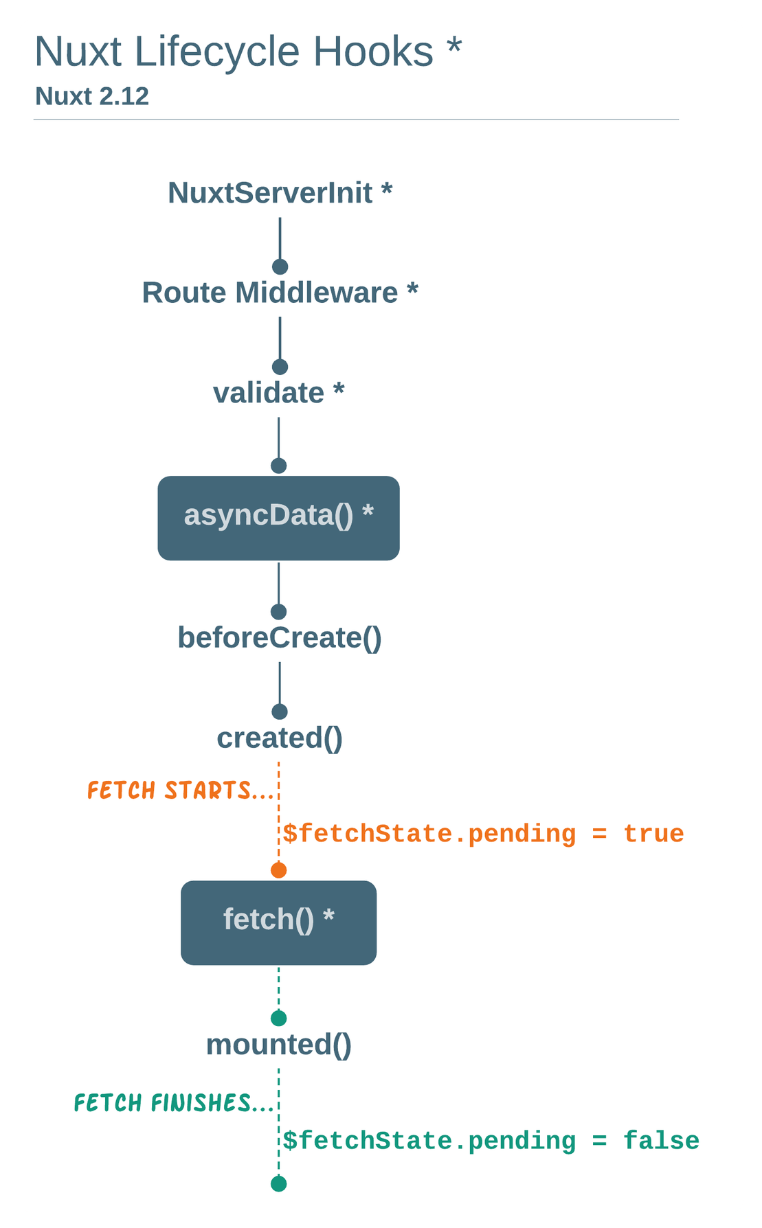
As you can see in the diagram below, fetch becomes available after the component instance is created. On the other hand, asyncData is available before that.

NuxtLifecycle.png

The main implication is that the fetch hook can be called in any component (page or UI components alike), while asyncData can only be called from page components. This means that inside fetch, the component context (this) becomes available so we are now able to mutate the data of a component directly.

Fetch

The fetch hook can be called, as the diagram above shows us:

  • On the server-side, when rendering the route, and
  • On the client-side after the component is mounted.
export default {
  data() {
    return {
      articles: [],
    };
  },

  async fetch() {
    // Fetch a random list of articles
    this.articles = await fetch("https://jsonplaceholder.typicode.com/posts").then((res) => res.json());

    // You will be able to access articles anywhere with this.articles and loop them v-for inside your template
  },
};

You can also call fetch on demand using this.$fetch() anywhere inside your component (e.g. inside your watchers, your methods, etc.).

<template>
  <!-- called from the template -->
  <button @click="$fetch">Refresh</button>

  <!-- called using a method -->
  <button @click="refresh()">Refresh</button>
</template>

<script>
  export default {
    methods: {
      refresh() {
        this.$fetch();
      },
    },
  };
</script>

You can customize your fetch API calls using the following options:

  1. fetchOnServer (Boolean / Function | defaults to true): When true, the fetch call will be initiated on the server-side as opposed to client-side only.

  2. fetchDelay (Integer | Default to 200 milliseconds): This option sets a minimum delay time to execute our fetch call, so we don’t have a quick sort of flash when our data is loaded into the page. I don’t think you’ll need to use it, as I think that the default value is enough to avoid it.

  3. fetchKey (String / Function | Defaults to component’s ID or name): If you need to keep track of your API calls, you can use fetchKey to provide you with a key. You can also generate a unique id through a function.

export default {
  data() {
    return {
      articles: [],
    };
  },

  async fetch() {
    this.articles = await fetch("https://jsonplaceholder.typicode.com/posts").then((res) => res.json());
  },

  fetchOnServer: false,

  // Generates a random key using a function
  // Altenatively you can set up a static key
  // fetchKey: 'homepage-article',
  fetchKey() {
    const randomKey = Math.random().toString(36).substring(7);

    return randomKey;
  },
};

To make your application more performant, you can cache several pages and their fetched data, adding the keep-alive directive to your nuxt template. This way, fetch will only be triggered on the first visit, and the rest of the time pages and their data will be rendered from stored memory. You can also set the number of pages to be cached using keep-alive-props.

<template>
  <nuxt keep-alive keep-alive-props="{ max: 10 }"></nuxt>
</template>

To further optimize your page performance and user experience, you can use $fetchState's properties :

  1. $fetchState.pending is a Boolean that you can use to set a placeholder when its value is true (by the way, have you heard about Vue Content Placeholders? ). $fetchState.pending returns true until the data is loading.

  2. $fetchState.error will allow you to detect errors and thus be able to display an error message.

  3. $fetchState.timestamp is, as the name states, a timestamp of the last fetch called. Why would you need that? Well, when you’re using keep-alive, you can combine $fetchState.timestamp with the activated() hook to optimize your data caching. This way, you set up a specific number of seconds before you can call fetch again.

<template>
  <div v-if="$fetchState.pending">Placeholder</div>
  <div v-if="$fetchState.error">Error Message</div>
  <div v-else>Loaded Data</div>
</template>

<script>
  export default {
    data() {
      return {
        articles: [],
      };
    },

    activated() {
      if (this.$fetchState.timestamp <= Date.now() - 60000) {
        this.$fetch();
      }
    },

    async fetch() {
      this.articles = await fetch("https://jsonplaceholder.typicode.com/posts").then((res) => res.json());
    },
  };
</script>

AsyncData

The asyncData hook is another way to fetch data server-side. It waits for its promise to be resolved before rendering the page and directly merges the return value to the local state (you know, the data function you use in every component ).

export default {
  async asyncData({ $content, params }) {
    articles = await $content("https://jsonplaceholder.typicode.com/posts").then((res) => res.json());

    return {
      articles,
    };
  },
};

This means that:

  • There are no placeholders you can set up;
  • If an error occurs, you will be redirected to the error page instead of showing an error message on the page route you’re supposed to land in; and
  • As we’ve mentioned before, you can fetch data using asyncData only in page components.

You can get around this last limitation by either: 1️⃣ Fetching your data in the mounted hook, but you lose server-side rendering. 2️⃣ Or passing the data fetched through asyncData as props to the pages block components, but again, the downside this time is code readability (and thus maintainability) if you have countless data calls for each block component.


Fetch vs. AsyncData: Comparative Table

Options Fetch Hook AsyncData Hook
Can be called from any component
(only in page components)
Access to context (this)
Listens to query string changes
Fit for dynamic components
(dynamic footers and navbars, filters and sorters, etc.)
Caching
Use of a placeholder
(can be replaced by a loading bar when navigating from one page to another)
Detects errors
(can only redirect to an error page when an error occurs)

Fetch vs. AsyncData: Pertinent Use Cases

As we’ve mentioned earlier, the fetch hook will be perfectly fitting to make an API call that serves a list of articles. But this list may need to be refreshed by adding new articles and/or loading more articles as the user scrolls down.

In this example, we’ll fetch data and add it to the store. It’s the most common use case, in which we use fetch to retrieve data and update the store (or the component’s local state).

export default {
  mounted() {
    window.onscroll = (e) => {
      if ((window.innerHeight + window.scrollY) >= document.body.offsetHeight) {
        this.$fetch();
      }
    };
  }

  async fetch() {
    try {
      // Fetch articles and add them to the Vues store
      this.articles = await this.$store.dispatch('Articles/fetchArticles');

      // Or fetch articles and update the component local state
      this.articles = await axios.get('/articles');
    } catch (error) {
      const message = error.response.data.message;

      console.error(error);
    }
  }
}

I usually stick with fetch, but there is a case when I switch to the AsyncData hook. It is when I need to retrieve the data of a markdown file with the Nuxt Content package. Here is a quick example:

export default {
  async asyncData({ $content, params }) {
    const article = await $content("articles", params.slug).fetch();

    return { article };
  },
};

Conclusion

I hope that with this article you can better grasp the differences between Fetch and AsyncData. I am also always happy to read your comments and your Twitter messages @RifkiNada.

And in case you are curious about my work, you can have a look at it here NadaRifki.com.


Working With Images in Telerik RichTextEditor for Xamarin—More Than Easy!

$
0
0

Quickly and easily add, edit and remove images and more with Telerik UI for Xamarin RichTextEditor control.

With the R3 2021 official release of Telerik UI for Xamarin, we introduced a new feature in our RichTextEditor control. This feature gives you the option to work with images. You can quickly and easily add, edit and remove images in your mobile and desktop apps. In addition, these options come with built-in toolbar items.

This blog post will get you familiar with all the built-in tools you can use to make your work with images in the document easier. You can work with the following image formats: PNG, JPEG, SVG, GIF, WebP.

Toolbar Items for Editing Images

edit-image-toolbar-items

Let’s review the power of the built-in toolbar items for working with images. Of course, we have prepared a sample demo for you!

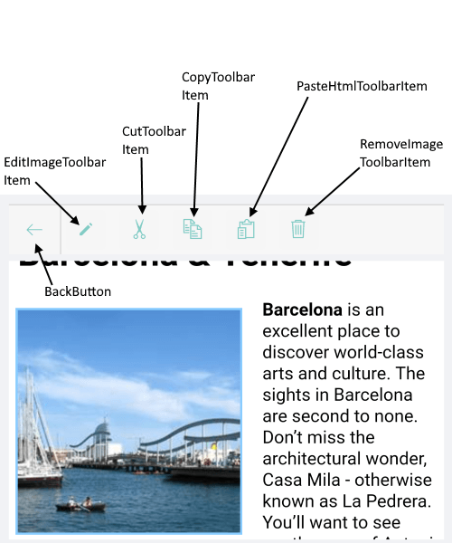
The built-in Toolbar items for working with images are:

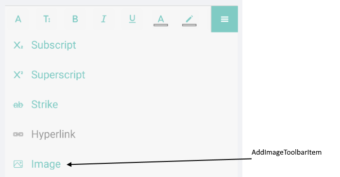
  • AddImageToolbarItem – add an image.
  • EditImageToolbarItem – resize the image. Additional dialog is visualized when the toolbar item is tapped/clicked. You can also add images from the dialog.
  • CutToolbarItem – cut the selected HTML/image to the clipboard.
  • CopyToolbarItem – copy the selected HTML/image to the clipboard.
  • PasteHtmlToolbarItem – paste HTML/image from the clipboard.
  • RemoveImageToolbarItem – remove the currently selected image from the document.
  • ImagePickerToolbarItem – additional toolbar item for inserting images from a collection of pre-defined images.

AddImageToolbarItem

add images in editor for xamarin

When the AddImageToolbarItem is tapped/clicked, a PickImage event is fired. If you want to work with images from the device gallery, then you have to grant permissions. You need to manually implement the logic for selecting an image inside the PickImage event handler. The steps needed for permissions are described in our help article.

A sample demo with permissions can be found in our SDK Browser Application and Telerik UI for Xamarin Samples Application.

EditImageToolbarItem

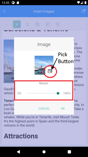
Mainly the EditImageToolbarItem helps you to resize the current selected image. If you haven’t selected one, the toolbar allows you to pick an image (the RichTextEditor.PickImage event is fired) using the PickButton.

edit dialog for images in editor for Xamarin with pick button and resize slider

The edit image dialog is highly customizable. For more details visit our help topic.

CutToolbarItem, CopyToolbarItem, PasteHtmlToolbarItem and RemoveImageToolbarItem work in the scenario when there is a selected image. You can cut, copy, paste or remove the currently selected image.

Demo

For the demo I will use the ImagePickerToolbarItem. As I shared, this toolbar item can be populated with predefined images.

Here are the RichTextEditor and the RichTextEditor Toolbar definitions in XAML:

<Grid RowDefinitions="*,Auto">
<telerikRichTextEditor:RadRichTextEditor x:Name="richTextEditor"/>
<telerikRichTextEditor:RadRichTextEditorToolbar x:Name="richTextToolbar"
Grid.Row="1"
RichTextEditor="{x:Reference richTextEditor}"
AutoGenerateItems="False">
<telerikRichTextEditor:ImagePickerToolbarItem x:Name="imagePicker" Text="Select"/>
</telerikRichTextEditor:RadRichTextEditorToolbar>
</Grid>

Our HTML document:

<html>
<head />
<body>
<h1>Sign in for the tournament!</h1>
<p>Legend:</p>
<p>Will attend: <img src="data:image/png;base64,iVBORw0KGgoAAAANSUhEUgAAABkAAAAZCAYAAADE6YVjAAAAAXNSR0IArs4c6QAAAARnQU1BAACxjwv8YQUAAAAJcEhZcwAADdYAAA3WAZBveZwAAAAYdEVYdFNvZnR3YXJlAHBhaW50Lm5ldCA0LjEuMWMqnEsAAAHvSURBVEhLtVTPK0RRGP1E+ZEfSdmwsRDZECU7xR9gI0uxUVYWFpaTkrK1tZSS7PwoG1YzzE9GgzRqshBNmoWkjHzXueOje98808y8ceqrd+853zn3vnffpf9ARNFMmOkxxJSMMY3KdOVwytQN82xYkdKF5zuhKgfsYPsnQELSQlUGUUVDMGVHyIrQlQEMj8wA7OoZ36dFaO84YxqzAlBBpkWhvUMpqsKqQ2YAdnUfYKoXiXcgYNIM0BVlmhXaO04U1SDk1gzALq6wu2qReEdI0ZwZkCumCaG9AyenAat+MAMwDuhvJBLvwIqXzAAJcb9GIB7U5E4J7/FSUSv6MlYI077QNmDuM0THONttQhUE+tYcAZ/4V/qFtgGxtRqMk6geoV1xztQB0zezD+NNofMBMmaJvxsyOOfjIskDFrFh6jF+v2DqEjofuO/7YJoym6Qxi/l5kf3Cr6gX8x8O7brQf8PP1I7GgNloGugfTqR657uWhulF9wtdGClFdTDcsgykMH9ww9QEw2E8W1c5DsqyWBQH/RPBxOc0yhVTAvPWbjFO40Q1S3tpiDBNwdQ+PS4F3YK0lAcYjCDoyc1cF3aROmSqFXn5wKvoRFDcLQTz0yLzjoSiRqx6zxEQL+UKKgraEMarqFfUdVDRgFBFgOgLiDAiqWaRTWAAAAAASUVORK5CYII=" /></p>
<p>Won't attend: <img src="data:image/png;base64,iVBORw0KGgoAAAANSUhEUgAAABkAAAAZCAYAAADE6YVjAAAAAXNSR0IArs4c6QAAAARnQU1BAACxjwv8YQUAAAAJcEhZcwAADdYAAA3WAZBveZwAAAAYdEVYdFNvZnR3YXJlAHBhaW50Lm5ldCA0LjEuMWMqnEsAAADqSURBVEhLvdbBDcIwDAVQj9Z70jV64cCBuXroPh2AKVLsJl9IoSaxS/mSUUmCHxBQQxuFIVFYuZ4bjRP9INJH+klf6U/5Im4ofn4va12R11f9VhnkT/AeLBMuqAZKr6d8XVM9USZN0BGQK+QtSBRvXKlekGh87Asa0YCPN+qFugHECpkBpBdyA0gLOg0gOhSXeiyPGwFEg+pyA0gLOg0gjMzHQFzKknPRNhnV+4dV0wJQbkgDeHw+2iMz9AXYN1n7MXRDLQBxQ70AYoasANINeQGkCf3lzsiT19/j+eH604qci+SC66JzVxhet9WBr/JOEy0AAAAASUVORK5CYII=" /></p>
<p>Count on me: <img src="data:image/png;base64,iVBORw0KGgoAAAANSUhEUgAAABkAAAAVCAYAAACzK0UYAAAABGdBTUEAALGPC/xhBQAAAAlwSFlzAAAN1QAADdUBPdZY8QAAABh0RVh0U29mdHdhcmUAcGFpbnQubmV0IDQuMS4xYyqcSwAAAg9JREFUSEutVU1PU0EUPbAxiBGCK1ckFdrXmQcaSIh/gPgD1IV/AYyR31OUDWzcuHAD7CQmJsCKsJACfV99NDGYuKkNLaWc+zpNaDKAbd9NTua9d889982duTPoWAWzoz5yr32orwF0JYCq8Tni8xc+vz3F/JihJnaOhcf0vxG/4dUkTuIj6hxCPTLUtp0iM+Yhv34Gt1bGTCuE2woIGWO+l+HWI6gtD1lH+CXkcky8WYaui/8mX+JFx0d+w8PkeJIgxMsRH/oz/6IpxLsQQhdDqHccj2z+buhmBL0m+pyFs8iXqp3YDT8Zdb093g/OtFqCfoUA+UJsIaSBtq5aBUt13Klp2hBd6heZRP2zEdICk1RZLvXX5kwLHvQfWZMfkcWZBrj1ORP1HR6cFS7QlY00KNgvbAv9ESfITzPjiY00KKh7zCTP0AKG2J0f2GANG7F/6EsPakX0k66/wtSDEs8cqaE9oDe0ddS3GE8fJgk6FmA6U4H7c9CekXjq7PL4mTLS3RbCcaV5+k1kmu8Xy/TCSNothjMXQ+/1uq2lRGfQ+z7jjdTdJlPl3+z0MiP2ww4P26yR+D/jpTPBRAUmurgtmXwXP3fSpzKcJya0Nyty13GdlngV/LYlke8sz7LwTEh/xn0+HCE7yxJuc60asla8Jxp83wqRmxG/oQ5uHp6PU/g9a3/Axl2SK9u47jHgGrx8LucFX4aOAAAAAElFTkSuQmCC" /></p>
<p>Maybe, not sure <img src="data:image/png;base64,iVBORw0KGgoAAAANSUhEUgAAABkAAAAZCAYAAADE6YVjAAAABGdBTUEAALGPC/xhBQAAAAlwSFlzAAAN1QAADdUBPdZY8QAAABh0RVh0U29mdHdhcmUAcGFpbnQubmV0IDQuMS4xYyqcSwAAAuFJREFUSEu1Vs1u00AQdiPgAu0FIU4k9a6jlsCNp2iKuPECHDigpk28doJQIfAibbn15wFatc2dA4q9azdOOUJJJWguERARVTLfbtyiUKM0aTLSKFl7Z8bz981osVQuJzJP/RspU8xSS+R0i2/ozBWEuU3K+C+d8aZuco/YYpMwsZgy67PyvpSLNPShcphIsmqGML4M3oESH78NYrotGOng/6n67Z4b0fsdkhevkzk/I+UjTfF0l7k3SaGapRZfgfAXo1gL06V6aBQPQsP2Q8MSf1me8bz7vhbi/hFlYpUURDbzwr8VqeylmWfBZIpV5/BVu9SuddLFIFLIe5Vf4Og97tNi0EE49/S8mL9tB5OR6ojK4TUiDVieMmBY3j+KLsueMkSYt5tifE7qjSyEEwZygOSuGKV6e3gDEdueDGFbN901laMwnNC05x+vo1JegY+ky7GCA7IMtSoKU5RV1SWZj0oS2xTJixMYhlEACFstxIdXaN55oMk+ICY/MEqHuNAvyZdl6EHVwZu6zpwFjZpiCzXfMGyUaazAkIzyxscfI0rrGuLm49C6csIvsCeNtHQmhAaXmvDkd/zFq7HUi7470ZCknzB0Orp8nDFHAbin8ObH+D2x+DcY4ciJO76cmC5yYokthOzr2Kqr4G7AE7GIA/oEaDrqPjFFnRbEgnYPHYky21ZwHiswOMuOl/APPKyQRfehwi7CnGXkpTFS7EKoACvvMmVgF3A+YQAtKVBzJCgM+XTpsI0R/V7iYheFQY+UN1wOrD1qB6OYJ3spW2RllJSBMzJyH6aQm3llqDj4ZFT31WQU+9Mmf2LkPk1FqntJzvgkc+Yp81ZR2p/VjH85wIy3xBr64vGd/834c8K2kVry7gMJ3lDm7MOzAHwsGwvPOlgyom1FniXKegE1nQpy8FZuOX23lXOSexeqYnopmIH7C7rlrKP6OCDiu8I6i5+oPQz7GEZFTu5nqopiDWjaH+xTATZqdUK4AAAAAElFTkSuQmCC" /></p>
<hr>
<h2>Your options:</h2>
<p style="font-size:16px">Running: </p>
<p style="font-size:16px">Cycling: </p>
<p style="font-size:16px">Paint-ball: </p>
<p style="font-size:16px">Football: </p>
<p style="font-size:16px">Voleyball: </p>
</body>
</html>

And here is the code I used to populate the ImagePickerToolbarItem with images:

private void InitializeImages()
{
var resourceNames = this.currentAssembly.GetManifestResourceNames();
var imageSources = new List<RichTextImageSource>();
foreach (var resourceName in resourceNames)
{
if (resourceName.Contains("sign"))
{
var imageSource = RichTextImageSource.FromStream(() =>
this.currentAssembly.GetManifestResourceStream(resourceName), RichTextImageType.Png);
imageSources.Add(imageSource);
}
}
this.imagePicker.ItemsSource = imageSources;
}

Then Inside the Page’s Constructor, call the InitializeImages() method, then load the HTML document from a stream and assign the result to the Source property of the RichTextEditor. All this after the InitializeComponent():

InitializeComponent();
InitializeImages();
Func<CancellationToken, Task<Stream>> streamFunc = ct => Task.Run(() =>
{
string fileName = this.currentAssembly.GetManifestResourceNames().FirstOrDefault(n => n.Contains("pick-image-demo.html"));
Stream stream = this.currentAssembly.GetManifestResourceStream(fileName);
return stream;
});
this.richTextEditor.Source = RichTextSource.FromStream(streamFunc);

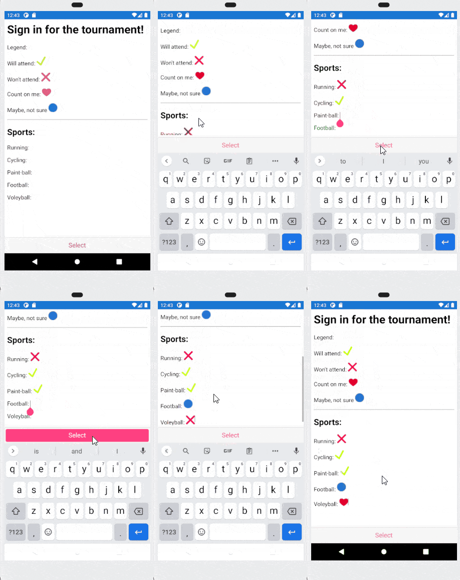
This is the result:

images in editor for xamarin - user is selecting response icons for whether they will attend or not, etc. various sports on a tournament signup app

Share Your Feedback

We would love to hear what you think, so should you have any questions and/or comments, please share them in our Telerik UI for Xamarin Feedback Portal.

If you are new to Telerik UI for Xamarin, you can learn more about it via the product page. It comes with a 30-day free trial, giving you some time to explore the toolkit and consider using it for your current or upcoming Xamarin development.

More From the World of Cross-Platform Application Development: Telerik UI for .NET MAUI

Still in a preview stage, our library of UI components for .NET MAUI is growing. We have added new controls and support for macOS. Now your desktop and mobile applications can target Android, iOS, macOS and Windows.

Check out the Telerik UI for .NET MAUI product page and official documentation.

Happy coding with our controls! ‍‍

Introducing the New and Amazing Office2019 High-Contrast Variation for WPF

$
0
0

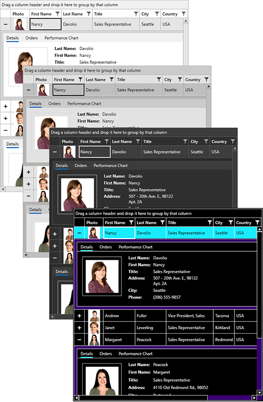
The brand new high-contrast variation of the Office2019 theme has been shipped to help with less eye strain and more productivity for your users. This article will cover the new variation as well as some new features of the Office2019 theme.

The R3 2021 release of Telerik UI for WPF came out a couple months ago. Have you had a chance to test our brand-new built-in HighContrast color variation of the Office2019 theme (inspired by the black high contrast mode in Windows 10)? This article will go through the new variation along with some of the new features of the theme.

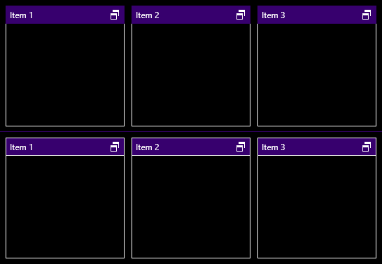
high-contrast variation WPF Office2019

You can check out how it looks directly in your WPF application. Simply add the following line before the InitializeComponent method:

Office2019Palette.LoadPreset(Office2019Palette.ColorVariation.HighContrast);

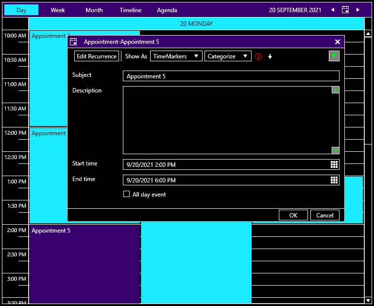
And here is the result:

ScheduleView with HighContrast theme

Why High Contrast?

The main purpose of high contrast is to increase text legibility and improve readability. Low-contrast text can be difficult to read for some people and even impossible for those with vision disabilities. If you target a big audience with your application, your users can benefit from having a high-contrast theme.

There are many other reasons to use a high-contrast theme in your applications, from increased readability of elements on screen to reduced visual noise, migraines, eye strain—or, simply because you like it.

Our high-contrast theme has a simplified UI that uses a small set of colors compared to other dark themes:

  • Contrasting colors for text and background
  • Disabled text is green
  • Reduced set of gray colors

What’s New in the Office2019 Theme?

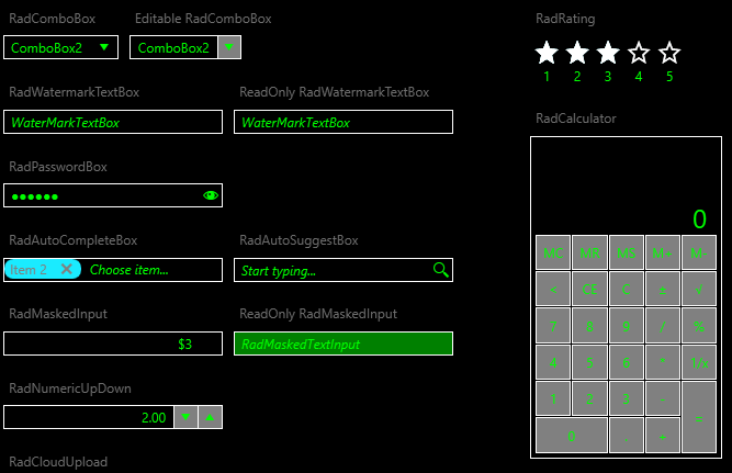
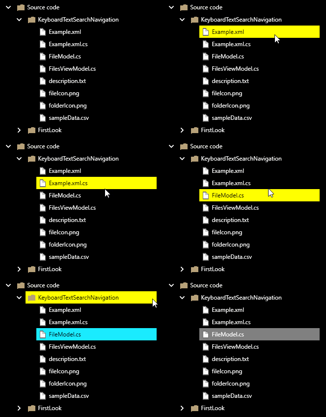
  1. For the very first time in this theme, we exposed theme palette brushes that can be used to customize the foreground when an element is disabled—DisabledForegroundBrush, DisabledIconBrush and DisabledCheckedForegroundBrush. This way you can easily change the components’ disabled style.

    Disabled state  preview with HighContrast theme

  2. Since the Office2019 theme uses a background for its headers, adding borders around them is time-consuming. But not anymore! With the new HeaderBorderThickness property from the palette, you can wrap all header elements extremely easily. You can modify HeaderBorderThickness with the setting below:

    Office2019Palette.Palette. HeaderBorderThickness = new Thickness(1);

    See what it looks like:

    HeaderBorderThickness wrap border around header elements

  3. Last but not least, we have expanded the palette with SelectedUnfocusedBackgroundBrush which is responsible for the background color of the unfocused elements (e.g., the GridViewRow, TreeListViewRow and the TreeViewItem).

    Background color of unfocused elements

If you want to find more information about new features, check out our help article of the Office2019 theme.

Deliver Reports With the Office2019 High-Contrast Theme and the Telerik Report Viewer

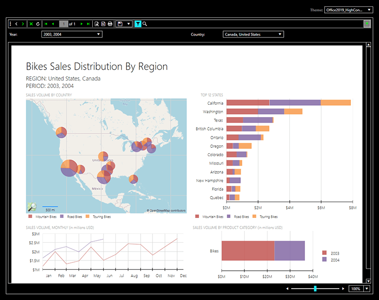
As you already know, we have Telerik .NET ReportViewer Controls that help create great interactive reports for your desktop applications. You can find all reports with the latest HighContrast color variation. Take a sneak peek:

ReportViewer with HighContrast theme

Try it Out and Share Your Feedback

We would love to hear what you think about the new HighContrast color variation in Telerik UI for WPF, so make sure to get the latest version and try it out.

Getting the Latest UI for WPF

You can also take a look at it with our WPF Color Theme Generator tool or in our Demo App on the Windows Store.

Sands of MAUI: Issue #33

$
0
0

Welcome to the Sands of MAUI—newsletter-style issues dedicated to bringing together latest .NET MAUI content relevant to developers.

A particle of sand—tiny and innocuous. But put a lot of sand particles together and we have something big—a force to reckon with. It is the smallest grains of sand that often add up to form massive beaches, dunes and deserts.

Most .NET developers are looking forward to .NET Multi-platform App UI (MAUI)—the evolution of Xamarin.Forms with .NET 6. Going forward, developers should have much more confidence in the technology stack and tools as .NET MAUI empowers native cross-platform solutions on mobile and desktop.

While it is a long flight until we reach the sands of MAUI, developer excitement is palpable in all the news/content as we tinker and prepare for .NET MAUI. Like the grains of sand, every piece of news/article/video/tutorial/stream contributes towards developer knowledge and we grow a community/ecosystem willing to learn and help.

Sands of MAUI is a humble attempt to collect all the .NET MAUI awesomeness in one place. Here's what is noteworthy for the week of November 15, 2021:

.NET 6

Welcome to .NET 6. After a year of work from the .NET teams and the developer community, .NET 6 is out in full glory and proudly carries the Long Term Support (LTS) badge. Richard Lander wrote up the epic .NET 6 announcement post and the key point to take away is massive gains in performance.

.NET 6 is the first .NET release that natively supports Apple Silicon for MacOS and Windows Arm64, paving the path for .NET apps to run on new frontiers. .NET 6 is a massive unification effort with web, cloud, desktop, IoT and mobile apps all using the same .NET Libraries—this makes it easy for developers to share code easily across apps/platforms.

Tooling for .NET 6 development gets better across the board, with Hot Reload support everywhere and tons of new language features in C# 10 and F# 6. Just one word sums it all up: yay!

Net6

.NET MAUI Preview 10

Sitting pretty on top of stable .NET 6 LTS runtime is the next iteration of .NET MAUI—Preview 10 is now out. David Ortinau wrote up the post announcing .NET MAUI Preview 10. The key to note here is how easy it is to get started. The best developer experience with .NET MAUI is through the latest Visual Studio 2022 Preview 17.1, which shipped alongside the GA VS 2022 17.0 version.

All one has to do to get started is to install the 'Mobile development with .NET' workload during VS 2022 setup—all of the .NET MAUI dependencies and mobile platform runtimes/SDKs/simulators are included with a simple checkbox.

.NET MAUI Preview 10 release brings in the Handler implementations of the popular CollectionView and IndicatorView controls, as well as property implementations and improvements with a bunch of other UI controls. The .NET MAUI GA goal is looking closer every single day with platform and tooling updates.

Maui10

.NET Conf 2021 Keynote

Modern .NET is the developer platform for building anything for anywhere and nothing celebrates .NET quite like .NET Conf. In its 11th year, .NET Conf was held Nov 9-11 this year—2 days of awesome content from Microsoft folks, before a full 24 hours of non-stop livestream with passionate community speakers from all around the world.

Scott Hunter opened .NET Conf with a wonderful keynote, tapping into some well-known faces from the .NET team and together, they did kick up the excitement around the .NET ecosystem. The keynote covered a plethora of topics—.NET 6, C# 10, Minimal APIs, Blazor updates, .NET MAUI updates, Hybrid Apps with Blazor/.NET MAUI, Azure support and a whole lot more. Want to get the latest scoop on .NET? This is the keynote to start with.

NetConf

Introduction to .NET MAUI

After the .NET Conf keynote, Maddy Leger Montaquila took the stage to talk about something dear to all our hearts—all things.NET MAUI. Maddy started with the basics and provided the latest updates with .NET MAUI Preview 10, including the ease of development with Windows Subsystem for Android.

Tooling for .NET MAUI is catching up fast. While Maddy may be a little uncomfortably fond of her Mac, Hot Reload (both XAML and C#) is starting to work just about everywhere. Add the promise of Hybrid apps bringing Blazor goodness and code sharing into desktop, you can see why developers and enterprises cannot wait for the .NET MAUI GA release coming early next year.

MauiIntro

C# 10

No matter the platform or tooling, developer experience is largely shaped by the programming language—C# does not disappoint for .NET MAUI. Along with .NET 6 and VS 2022 launch comes the next language update—welcome to C# 10. Kathleen Dollard wrote up the C# 10 announcement post—covering all the features that make your code run faster and be more prettier/expressive.

The plethora of improvements in C# 10 include some key features that aid in big mobile/cross-platform projects—such as Global Usings, Implicit Usings, File-scoped namespaces, Improvements for Lambda expressions, better parity between Structs and Classes and more. C# 10 is here to allow .NET MAUI developers write cleaner and more easily maintainable code.

C10

That's it for now.

We'll see you next week with more awesome content relevant to .NET MAUI.

Cheers, developers!

Test Studio Step-by-Step: Creating Tests

$
0
0

Learn how to integrate Test Studio into your testing process, including how to handle typical issues when using an automated E2E regression testing tool.

It doesn’t matter if you’re a programmer, a tester or an end user involved in application development—you’re not going to release your application until you know that all the parts work together: the part of the testing methodologies path called integration or end-to-end (E2E) testing. In fact, the only testing that matters is the E2E testing that proves that your application can complete whole business transactions correctly.

The problem is that, while you might have time to do E2E testing once in one release, you don’t have time to repeat every E2E test after every change to your application—or even in every release. At least, you don’t have time if repeat those tests manually.

Which is where a tool like Telerik Test Studio steps in and lets you “re-execute” your E2E tests as often as you need. Provided, of course, you know how to use the tool.

So, here’s how to integrate Test Studio into your testing process, including how to handle the typical problems that are part of using an automated E2E regression testing tool.

Case Study: Contoso University

For this case study, I’m going to use a variation on the Contoso University application. I picked Contoso University because there’s so many versions of the application available (there’s both .NET Framework and .NET Core versions, including implementations Views-and-Controllers and Razor Pages). Test Studio will work with all of them.

For this guide, I moved the application’s Data Access Layer into a web service to make the application into a case study that requires integration. The case study for my tests focuses on updating information about the university’s departments, so I’ve stripped the other functionality out of the application. Feel free to download both my version of the Contoso University application and the Test Studio project I used to test it.

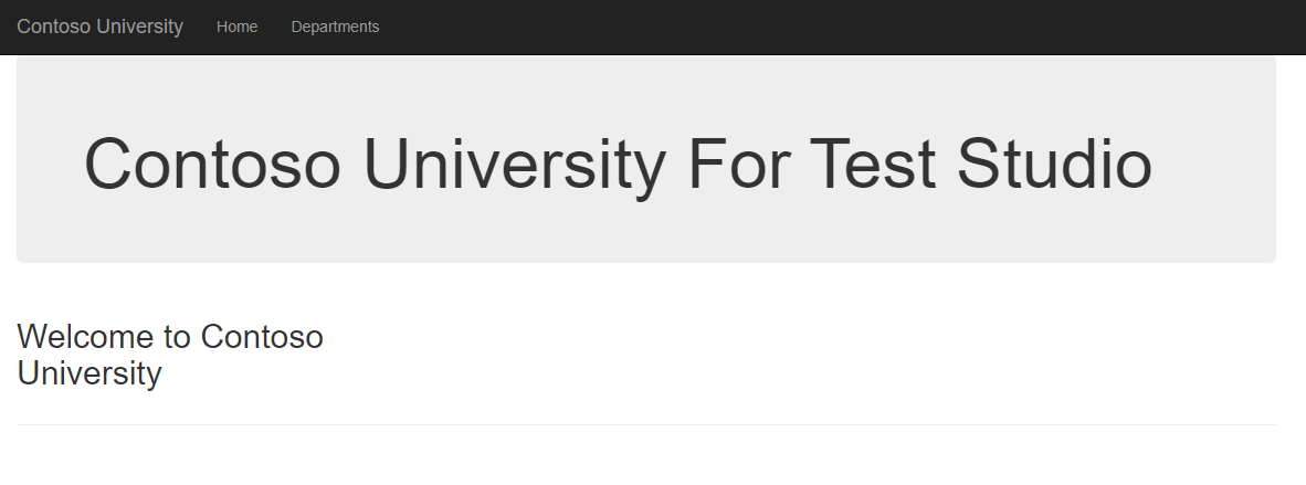
First, a quick overview of the update department functionality: After starting the application, click the Department link in the upper right corner of the application’s main menu.

The menu for Contoso University with Department at the right hand end

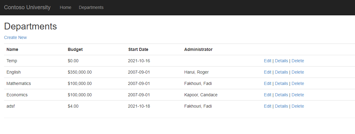
That link leads to the part of the application that calls the Contoso University’s web service that retrieves a collection of Department objects. The application then formats that collection into a list of departments that’s displayed to the user.

The Contoso University list of departments

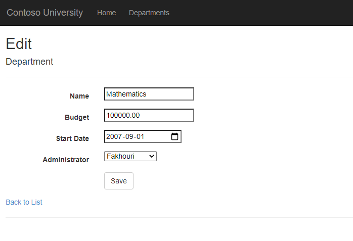
Once that list is displayed, the user clicks on a department’s Edit link to have the application retrieve the related Department object (again, through the Contoso University web service). The application then displays that object to the user for update. The code also retrieves a collection of instructor objects to populate a dropdown list displayed on the Edit page.

The Edit Departments page with all of the fields for a department displayed—name, budget, start date, and administrator—so that the data can be changed. Most data is in textboxes but the start date has a datepicker and the administrator uses a dropdown list. At the bottom of the form is a button labelled save

The user can then make whatever changes are required to the department data and click the Save button at the bottom of the page to have the application save the data through the web service. The application then returns the user to the list of departments.

My E2E test will exercise that functionality to prove that a user can successfully complete the transaction that integrates the web frontend and the web service backend to update a department’s information.

Step 1: Designing the Test(s)

Test Studio doesn’t change the process for creating your tests (the International Software Testing Qualifications Board probably has the most exhaustive—and exhausting—process). For example, at the very least, you’ll still need to:

  1. Decide what parts of your application require testing
  2. Do exploratory testing to make sure the application does work correctly
  3. Decide on the critical values you’ll use in your tests (equivalence partitioning)
  4. Put together a test script that proves the application works correctly with one set of critical values
  5. Execute the test
  6. Repeat the test with other critical values

For this case study, my test script will confirm that a user can:

  1. Access the list of departments
  2. Edit the English department’s information
    a. Change the budget to $200
    b. Change the start date to today’s date
    c. Change the administrator to Zheng
  3. Save the changes and return to the list of departments
  4. Confirm that all the changes were saved by accessing the department’s Details page

Step 2: Setting Up Your Project and First Test

For this case study, I’m going to assume that you’re using Test Studio itself (if you’re a developer, you can use the Test Studio Visual Studio plugin—installed with Test Studio—to create your tests). Before you begin, you’ll need, of course, to install Test Studio. You’ll also need to install the Progress Telerik Test Studio Extension on the browsers that you’ll be using for testing your application.

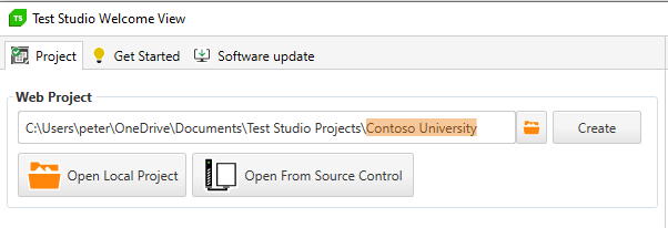
With everything installed, your next step is to create a Test Studio project to hold your tests: Start Test Studio, enter your project’s name in Web Project textbox and click the Create button next to the project name. I called my Test Studio project “Contoso University.”

The top left corner of the initial Test Studio screen, showing the Web Project textbox with the full path to the project (including project name) and the Create button

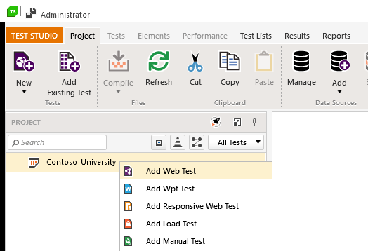
Once your project is created and opened in Test Studio, you can add your first test to the project: Right-click on your project in Project Explorer and, from the popup menu that appears, select Add Web Test.

Test Studio’s Project Explorer window, showing the Contoso University project with a popup menu that has its first option—Add Web Test—selected

Once you’ve selected Add Web Test, your test is added to your project and appears in the Project Explorer list on the left side of Test Studio. You can now give your test a name (I called my test “Update Department”).

Test Studio showing, in Project Explorer, a project called Contoso University with an initial Web Test called Update Department. The central panel of Test Studio shows a tab also called Update Department with nothing in it

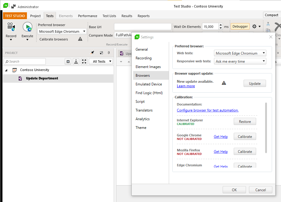
While it’s not essential, before you start your tests, it’s a good idea to let Test Studio have a look at your browsers and calibrate its settings for them. In the Test Studio window, click on the Tests tab and then on the Calibrate Browsers button. That opens a dialog that lists all the browsers that Test Studio will work with.

Any of those browsers installed on your computer will have a Calibrate button beside their name. Just click the Calibrate button beside any browser you want to use that’s flagged as Not Calibrated to let Test Studio finish setting up working with that browser. The process will close each of those browsers’ windows, so make sure you’re willing to give up those pages.

The Test Studio window showing the Test tab selected and the Settings window displayed. In the Settings window, four browsers are listed, each with a Calibrate button. One browser is flagged as Calibrated and two as Not Calibrated

You’re now ready to record your first test.

Step 3: Recording the Test

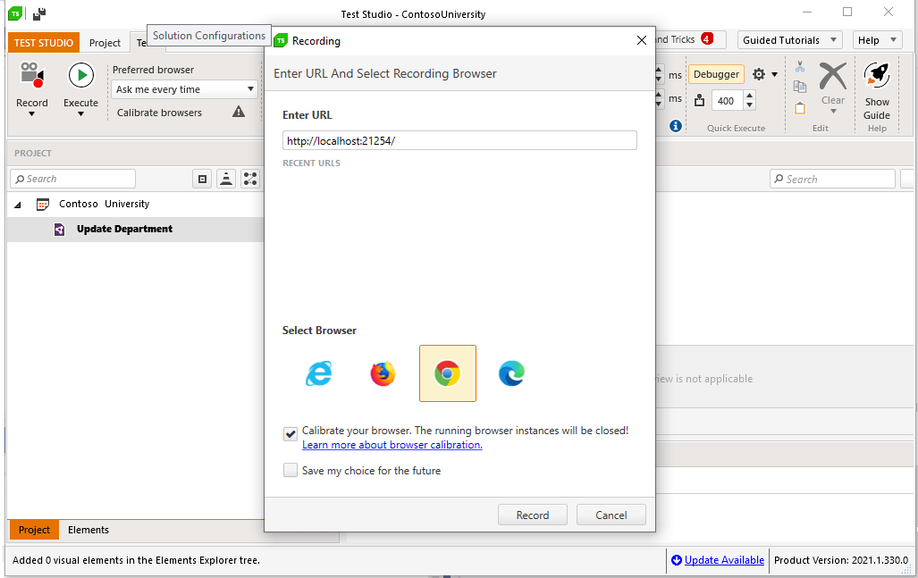
The easiest way to create a test is to right-click on your Web Test’s name in Test Studio’s Project Explorer window and pick Record from the popup menu. That opens a dialog box where you can enter the URL for the start point of your test.

The Recording dialog with a text box labelled Enter URL at the top. Near the bottom are the icons multiple browsers with the label Select Browser. At the bottom of the window is a button labelled Record

This dialog remembers URLs that you’ve used in the past so, if you need to create a new test at this URL, you can just select it from the dialog’s list. Again, Test Studio is going to close any open windows you have with the browser you select, so make sure you’re willing to give those windows up.

Once you’ve set the URL for the start of your test, you can pick the browser you want to use to record your test from the list of icons near the bottom of the dialog. Then click the Record button at the bottom of the dialog to start recording.

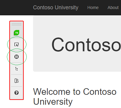
Test Studio will open the page at the URL you specified. You’ll notice a menu bar appear as the browser window opens.

The upper left hand corner of the Contoso University page showing the Test Studio recording menu bar floating over the page. The top two buttons (the “Enable or disable hover over highlighting…” and the “Pause” button) are circled.

This recording menu is the link between your browser and Test Studio (it’s also a good signal to indicate that Test Studio is ready to start recording your test). There are some useful buttons on this menu—for your first recording, make sure that you know where the Pause and “Enable or disable hover over highlighting…” buttons are.

You can now work through your test script. As you interact with your pages, you’ll get visual feedback indicating that Test Studio has recorded your actions (for example, clicking on a link will display a black box with “Click” and the name of the link). You can also switch back to Test Studio to see your steps appear as you perform them. If you don’t get that visual feedback, don’t panic! You probably started before Test Studio was ready. Just go back to your initial page and start over.

Which leads to a key point: Don’t be concerned if you don’t execute your test script flawlessly. If, for example, you accidentally go to the wrong page and have to navigate back to the page you meant to use, don’t stop and restart your recording—just carry on with your test. Even if you miss a step in your test completely, you can fix all these problems later, as you’ll see. If you get interrupted, click the Pause button on the recording menu and resume your test when you’re ready.

Step 4: Verifying the Application

As part of your test, you’ll want to check that you were not only able to get to the right pages in your application but that the application did the right things on those pages (i.e. save changes to your data). The simplest way to check your results is, as part of your test, to surf to some other page in your application that shows the results of your changes.

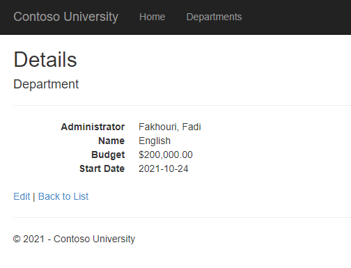
In the Contoso University application, for example, each department’s Details page shows all the information for a department. As I record my test (and after updating the department information), I’ll surf to the Details page where all my saved test data should be displayed. Once there, I can use the data displayed on this page to check the results of my test.

The Department Details page showing the saved data for one department: administrator, budget, and start date

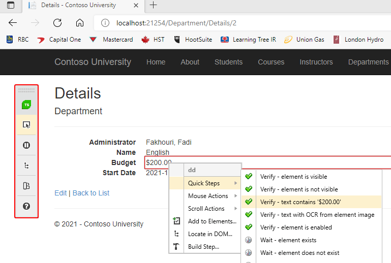
To capture data on a page to be used to check your results, click on the “Enable or Disable hover over highlighting…” option on the recording menu bar that appeared when you started your test. Then move your mouse to the element on the screen you want to use to check your result. As you do, Test Studio will highlight the currently selected element. In my case, I first want to check the Detail page’s Budget table cell, so I move my mouse until that element is highlighted.

When you highlight the data you want to use, a dropdown list will appear. From that list select “Quick Steps | Verify - ” to create what Test Studio calls a verification step. In my case, I pick “Quick Steps - text contains ‘$200.00’” to check that my change to the department’s budget was saved. You can then repeat that for any other items on the page you’d like to check. When you’re done, on the recording menu bar, click the “Enable or disable hover over highlighting…” button again to turn off highlighting so that you can continue to record your test run.

The Department Details page with the Test Studio recording menu displayed. The second button (Enable or disable hover over highlighting…) is selected and the Budget amount of $200 is enclosed in a red box. The box is showing a popup menu with Quick Steps highlighted. In the submenu for that Quick Steps choice, the Quick Steps Verify—text contains ‘$200.00’ is highlighted.

To ensure that you capture all the pages you need in your test, you may need to go “one page past” the last page you need in your test. For example, as part of my test, I might want to confirm that a user can return to the list of departments page after saving their information. To make sure that page is saved in my test run, after bringing up the list of department page, I would click on the link that returns me to the application’s home page.

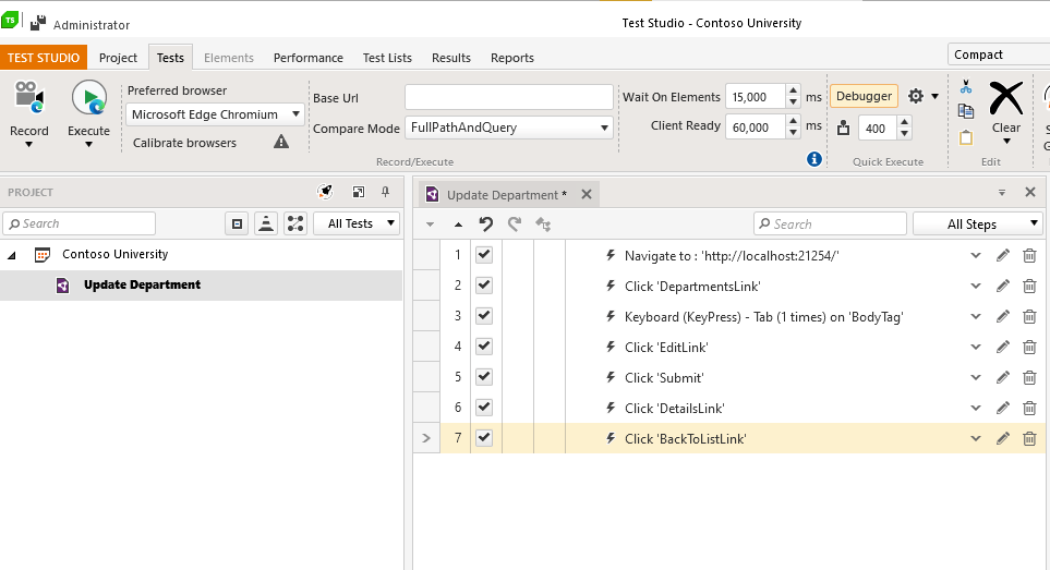
When you’ve recorded everything you need, just close down the browser to end your test. After you close your browser, you’ll return to Test Studio. You’ll find all the steps you recorded in your test listed in your Web Test.

The Test Studio window with the Update Department test selected in Project Explorer. The tab to its right shows all of the steps from recording a test run: Navigate to a URL, click on an anchor tag, etc.

Step 5: Creating a Clean Test

Now that you have the steps from your test run recorded in Test Studio, you can review those steps and either delete any steps that aren’t necessary to your test or reorder them to get the “perfect” test.

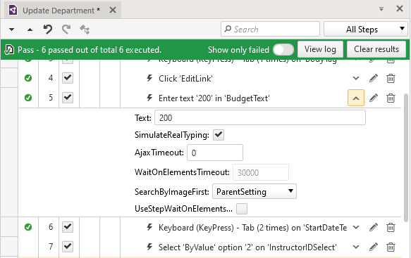
You can even change the content of individual steps. Individual steps have a down arrow that, when clicked, expands to show the detail for that step. Expanding the step that corresponds to entering some text allows you to review what was entered into a textbox and change it. If, for example, you discover that you entered the wrong data in a textbox, you can expand that step and change the Text textbox in that step to the right value. Now, when you run your test, your updated value will be used.

The list of steps in Update Department test. A test step labelled “Enter text ‘200’ in ‘Budget Text’” has been expanded and shows 200 in a textbox labelled “Text”

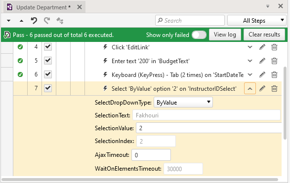
For dropdown lists, expanding the step reveals the value you selected during your test run. By default, the selected item is recorded ByValue in the SelectDropDownType field. That means that Test Studio used the hidden value associated with the choice you selected in its recording to record your choice. If you want to change that value and know the hidden value for the choice you want, you can just change the value in the step to the choice you want. If you don’t know the value, you can change the SelectDropDownType to ByText and enter the text displayed on the page for the choice you want.

The list of steps in Update Department test. A test step labelled “Select ‘ByValue’ option ‘2’ in ‘Instructor ID Select’” has been expanded. The expanded entry shows a Select DropDown Type listbox set to ByValue, a Selection Text textbox set to an instructor’s name, and a Selection Value textbox set to 2

Do be aware that using ByText can be dangerous if the dropdown list’s content will be affected by, for example, internationalization. For my Edit Department page, ByText works because the dropdown list displays a list of instructor’s names. However, the text in a dropdown list that displays, for example, “High, Medium, Low” could vary from one locale to another.

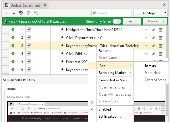
Even if it turns out that you missed a step in your script, you don’t have to re-record the test. If you realize you’re missing one or more steps, then, in Test Studio, first find in your list of steps where you want to insert your missing steps. Once there, right click on the step before the “missing” steps and select “Run | To Here” from the popup menu. Test Studio will re-execute your script, walking the browser through to the step you selected, and then stop, waiting for you to continue. You can now resume executing your test script and Test Studio will fill in the missing steps as you execute them.

The center window from Test Studio, showing the steps for the Update Department test. The third step is highlighted and shows a popup menu with the “Run” option selected. The Run option has a submenu with “To Here” selected

You can use this same process if you need to stop before you can finish recording your test. Shut down the browser to save your test and have Test Studio save your project to keep what you’ve recorded so far. When you return, you can use Run | To Here to run the part of the test you’ve recorded and then carry on from there to finish your test.

The reality of HTML is that a) the specification is implemented in different ways in different browsers and b) developers are constantly innovating in how they exploit that specification. It’s all euphemistically referred to as “rich web content.” Fortunately, Test Studio can deal with the challenges that “richness” creates. The Contoso University application provides a trivial example of those challenges: The datepicker on the Start Date textbox on the Edit Department page is, in some browsers’ implementations, invisible to Test Studio’s recorder. In this case, the solution is easy: When making your recording, just enter the date directly into the textbox.

While the Contoso application doesn’t provide other examples of the challenges of similar “rich content,” Test Studio can handle them all. That includes HTML drag-and-drop operations, dynamically rewritten HTML, random JavaScript events, waits for a page to load as Ajax requests complete, and more (all described here with their solutions).

Step 6: Running Your Test

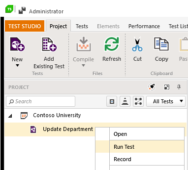
Finally, after you’ve finished editing your test (and you may not need to do anything), you can run it: Right-click on your test in the Project Explorer, select Run Test, and then sit back to watch Test Studio walk the browser through your test.

The test project in Project Explorer with a popup menu showing several options. The “Run Test” option is highlighted

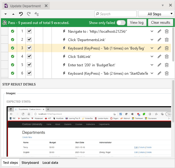
When the test is done (and assuming Test Studio found no problems), Test Studio will display a green banner that begins with the word Pass at the top of your test steps—always a good thing.

The Update Department test tab with a green box displayed at the top of the test steps with the text “Pass  - 9 passed out of a total 9 executed.” Also displayed is a toggle labeled “Show only failed” and two buttons labelled “View Log” and “Clear Results”

You’ll get different feedback if Test Studio finds a problem, of course. You can try that out in my sample application: To create a bug in my test case, I added a “Create bug” checkbox on the Edit Department page. When that box is checked, the budget amount entered on the screen is ignored and the budget for the department is set to zero. As part of my test run, I added a step to my test that sets or unsets the checkbox. To simulate a bug in my test, you can change that test step to have the checkbox set. If you do, then, when you run my sample test, the recording will still enter a value of $200 in the budget field but, when the test run gets to the verification step, the budget will be set to zero dollars and the verification step will fail.

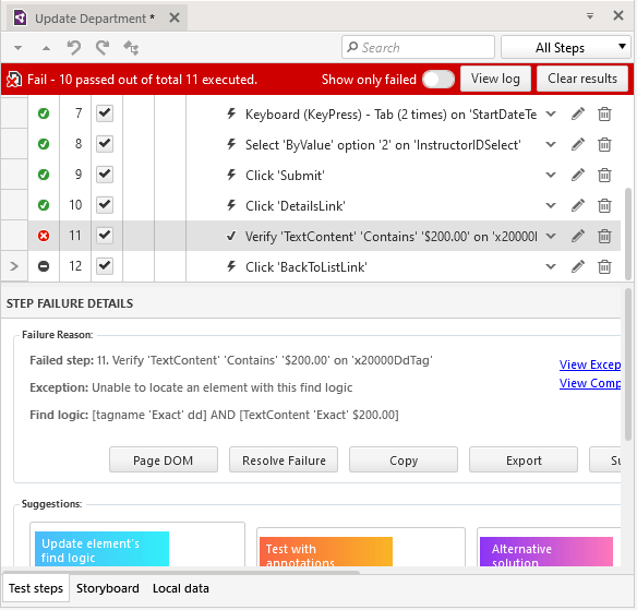
Now when I run my test, it stops on the Verify “TextContent” step and waits for 15 seconds for the correct data to appear (just in case my page is just being slow). When the correct value doesn’t appear, my test is stopped and Test Studio shows my problem: A red banner appears at the top of my list of steps beginning with the word Fail and specifies how many steps completed successfully. The failing step will be highlighted and a Failure Details box is displayed with the step describing the error and providing multiple options for dealing with the failure.

The Update Department test’s list of steps with a red banner at the top containing “Fail—10 passed out of 11 executed”. The step beginning “Verify ‘TextContent’ ‘Contains’ ‘$200.000’ is highlighted. A Step Failure Details box is displayed below the list of steps.

By the way, if you decide that a 15-second wait to check the result is unnecessary, you can turn that wait off, too. Just expand the verification step, select the UseStepWaitOnElements option, and set the WaitOnElementsTimeout to zero. You might as well get the bad news as soon as possible.

Step 7: Dealing With Failure

To understand what can cause Test Studio to report an error, it’s worth taking a look at the log file available from View Log button at the top of your list of steps. The relevant part of the log for my failed test looks like this:

'2021-10-24 10:18:15 AM' - 'Fail' : 10. Verify 'TextContent' 'Contains' '$200.00' on 'x20000TableCell'
------------------------------------------------------------
Failure Information:
~~~~~~~~~~~~~~~
Unable to locate element by Find Expression!
Attempting to find [Html] element using
Find logic
(Html): [tagname 'Exact' td] AND [TextContent 'Exact' $200.00]
Unable to locate element. Search failed!

As the log file the error message implies (“Unable to locate element”) when a test fails, there may not be a problem with my application logic—it may just be that Test Studio can’t find the element it’s supposed to check. That can happen because, for example, the element’s attributes have changed. Changed attributes might, of course, signal a bug in the code because altered attributes could affect both client-side and server-side processing. The Page DOM and Resolve Failure buttons in the Failure Details box can be helpful in determining the problem here.

However, changed attributes might also be an unimportant difference triggered by dynamically generated HTML. Test Studio provides several options for altering the conditions used in this verification to deal and can even deal with HTML that dynamically generates the ID attributes typically used to flag elements in your page.

If you determine that there really is a problem with the application (the usual case when a test fails), you can use the step’s buttons to share information about the failure:

  • The Copy button lets you grab the information in the step to paste into a bug report.
  • The Export button drops the error into a file to be pulled into some bug-tracking system or emailed to the appropriate person.
  • The Submit Bug button will send the bug directly to whatever bug tracking system you’ve attached to Test Studio. (Test Studio supports Team Foundation Server and Jira out of the box, but you can create a plug-in for the system of your choice.)

You’ve now created your test, executed it, enhanced it and dealt with both success and failure. It’s time to start thinking about your next tests.

Next Steps

You may, for example, decide that your “next test” is really to run this test again but with a different set of data. Test Studio will let you do that without having to record a new test—just bind your test to a data source (which can just be an Excel spreadsheet).

It’s also possible that you may find that you can’t create every test you want using Test Studio’s recorder. If, for example, there’s no way to verify your test results by checking some page in your application, then you may need to create a coded module that will access the data in the database. That’s going to require some simple coding skills.

After you’ve got your test working, rather than create a new test, it’s tempting to extend your existing test into a larger one that checks lots of things. Don’t. Instead, create focused tests like the one in this case study that prove one business transaction works. Test Studio will let you put together test runs that combine multiple focused tests, each of which checks one of your application’s transactions. Having an inventory of lots of focused E2E tests is a better strategy than having one big test that checks everything.

And that’s really your next step: putting tests together and running them as often as you want in order to confirm that your application runs as expected. You could always return to Test Studio to re-run your tests. But the real power of having these automated tests comes from having them run automatically—you can do that, too.

Which means, not only can you now re-run your E2E tests whenever you want … you don’t even have to be there. That’s the best result of all.

Automating Angular Firebase Deployments With GitHub Actions

$
0
0

In this post, we will learn how to use GitHub Actions from the Actions Marketplace to automate deployment to Firebase.

In our last post here, we looked at how to deploy Angular apps to Firebase. In this post, we’ll learn how to automate that process, seeing as changes get made to projects after the first deployment.

What Is GitHub Actions?

GitHub Actions is the continuous integration and continuous delivery tool built and used by GitHub. It allows you to build, test and deploy your code straight from GitHub, taking care of all the automation that enables this to happen smoothly without any third-party CI/CD tools. The possibilities you can build and automate using this are endless, and for the ease of working directly from where your code is stored—GitHub cannot be matched.

Why Is GitHub Actions Important?

GitHub Actions offers a lot of instant benefits to you, the developer. The first is the flexibility of building out automation workflows right from GitHub. That is an awesome value-added service layered on top of a service you already use and know your way around. You set up actions in the same place you set up PRs—how cool is that?

The next thing that will excite you is that GitHub Actions is free, forever, for any public project you have on GitHub. It also has Docker support and you can run actions in different virtual machines inside of the GitHub infrastructure.

The last thing I think is super valuable is the presence of so many automation templates—there is even a whole marketplace for that, where you can create a custom automation and share it with your community.

Before You Start

Make sure to check out the first post about Deploying to Firebase here, as this article builds on that deploy knowledge.

You also need:

  • VS Code for your integrated development environment
  • Node version 11.0 installed on your machine
  • Node Package Manager version 6.7 (it usually ships with Node installation)
  • Angular CLI version 8.0 or above
  • Angular version 11 or later
  • To download the starter template project here

Introducing GitHub Marketplace

GitHub Marketplace is a new way to discover and purchase tools that extend your workflow. Find apps to use across your development process, from continuous integration to project management and code review.” — GitHub Blog

Companies with great products like Google with Firebase already have automation actions hosted on GitHub that you can take advantage of to organize your workflow. Anyone or any team who has a product can also use the Marketplace docs and get their actions on the Marketplace—a lot of people are already doing it, and it reminds me of the VS Code extensions Marketplace.

The Marketplace has an extensive search function and cool categories where you can explore and find more ways to automate your workflow.

GitHub Action for Firebase on the Marketplace

GitHub Action for Firebase is the action we will be using to automate our build and deploy workflow. In this post here, we learned how to deploy our Angular apps using Firebase hosting. We will be automating that process in this post with GitHub Actions.

The Initial Flow

If you started this post from the beginning, you would have downloaded the starter template. If you have not, kindly download it here.

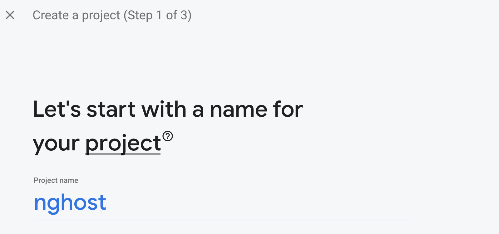
Now open the Firebase Dashboard here and log in with your Google credentials. Then click “Add project” and go through the process of creating a new project.

Create a project, step 1 of 3. Name your project.

First provide the project name, in our case nghost, and then click “Next.” You’ll be asked to choose if you would like Analytics, which you can toggle off, as we do not need Analytics for this tutorial.

Toggling off analytics grays out A/B testing, user segmentation, predicting user behavior, crash-free users, event-based cloud functions, free unlimited reporting.

Then click “Finish” to generate your new project called nghost.

In your VS Code, open the folder you downloaded earlier and run these commands below:

npm install
ng build --prod

This creates the dist folder with the generated files to upload. Now to connect our project to Firebase, you have to install the Firebase tools and then confirm your identity to be able to access the project you created from the CLI in VS Code.

npm install -g firebase-tools
firebase login

The login will open up an authentication service in your browser, and once you are done, you will see a success message.

Woohoo! Firebase CLI Login Successful. You are logged in to the Firebase Command-Line interface. You can immediately close this window and continue using the CLI.

Then you can deploy the app with this command:

firebase init

This shows you a series of prompts and you can respond based on your needs.

Deployment

The first prompt asks you what service you want to use. We’ll choose the hosting option.

?**Hosting: Configure files for Firebase Hosting and (optionally) set up GitHub Action deploys**

The next one asks if you have created a project on Firebase before.

? Please select an option: Use an existing project
? Select a default Firebase project for this directory: nghost-68106 (nghost)
i Using project nghost-68106 (nghost)

Choose “Yes” and select nghost (or whatever you named your own project).

The last few questions are about deployment details.

? What do you want to use as your public directory? dist/kendo-angular-seed 
? Configure as a single-page app (rewrite all urls to /index.html)? Yes
? Set up automatic builds and deploys with GitHub? No
? File dist/kendo-angular-seed/index.html already exists. Overwrite? No

After hitting enter, you should see a success message with a link you can visit to view the app live.

✔ Deploy complete!
Project Console: [https://console.firebase.google.com/project/nghost-68106/overview](https://console.firebase.google.com/project/nghost-68106/overview)
Hosting URL: [https://nghost-68106.web.app](https://nghost-68106.web.app)

Now the application is live. Let’s automate this process so that we do not have to repeat it all over again on every new change to the project.

Continuity

The first thing to do is to create a GitHub repository and push the project to it—actions only work with projects hosted on GitHub. You can see a step-by-step guide to doing this here.

Back to VS Code, in the root folder, create a new directory called .github. Inside it create a workflows folder and then a file main.yml.

Under .github/workflows is main.yml

Open your terminal, and run this command below to fetch your Firebase token:

firebase login:ci

This will ask for your Google authentication details. Once it confirms it is you, you’ll see a success prompt, and inside the terminal you will see your token. Keep it safe.

Inside the main.yml file, copy the code block below into it:

name: Build and Deploy
on:
  push:
    branches:
      - master
jobs:
  build:
    name: Build
    runs-on: ubuntu-latest
    steps:
      - name: Checkout Repo
        uses: actions/checkout@master
      - name: Install Dependencies
        run: npm install
      - name: Build
        run: npm run build --prod
      - name: Archive Production Artifact
        uses: actions/upload-artifact@master
        with:
          name: dist
          path: dist
  deploy:
    name: Deploy
    needs: build
    runs-on: ubuntu-latest
    steps:
      - name: Checkout Repo
        uses: actions/checkout@master
      - name: Download Artifact
        uses: actions/download-artifact@master
        with:
          name: dist
          path: dist
      - name: Deploy to Firebase
        uses: w9jds/firebase-action@master
        with:
          args: deploy --only hosting
        env:
          FIREBASE_TOKEN: * DELETE THIS AND PUT YOUR TOKEN HERE*

What this does is basically replicate all the steps we have taken, from installing dependencies to building for production and finally pushing to Firebase Hosting every single time there is a push to the master branch. We have an introductory post on Actions that explains every step. Check it out here.

After you save the file, commit and push the changes to GitHub.

Corrections Build and Deploy has been pushed successfully.

Now, every time you push new changes to master, your app gets deployed automatically without your input. And if there is an issue, you will be alerted by GitHub just as you would for any repo you have.

Conclusion

In this post, we learned about GitHub Actions and the Marketplace where we can create actions and host them for others to use. We saw how to use actions straight from the Marketplace and make our dev life easier.

Replace Text With Any Other Elements Easily With the Telerik WordsProcessing Library

$
0
0

With R3 2021, we introduced a new functionality in the WordsProcessing library—replace text with other document elements.

This functionality allows you to easily find any text inside the document and replace it with a table, image, paragraph or just other text. All that functionality is encapsulated in a single method that has different overloads for maximum flexibility.

Today I will show how you can use the Replace Text functionality to generate a document representing an online purchase using a predefined template for the static data. Here is the template that we will be using in this post:

Template document to replace contents inside - with '[customer name]' and '[product table]' fields

As you can see, we will need to fill in the customer’s name and the products they purchased. Let’s see how this can be achieved.

Our first task is to import the template into a RadFlowDocument instance. I have it in DOCX format, thus I will use DocxFormatProvider:

RadFlowDocument document;
using (Stream input = File.OpenRead("template.docx"))
{
    DocxFormatProvider provider = new DocxFormatProvider();
    document = provider.Import(input);
}

Now it’s time to populate the data. In the following snippet, you can see the class that holds the information we need to populate. Bear in mind that, for the purpose of the example, I will be using static data, but you can populate it from anywhere—server, database, user input, etc.

public class Order
{
    public long ID { get; set; }
    public string CustomerName { get; set; }
    public List<ProductInfo> Products { get; set; }
  
    public static Order GetSampleOrder()
    {
        List<ProductInfo> products = new List<ProductInfo>() {
            new ProductInfo() { Name = "Jeans", Price = 33.6M, Quantity = 1, ImagePath = "../../jeans.jpg" },
            new ProductInfo() { Name = "T-shirt", Price = 10.99M, Quantity = 1, ImagePath = "../../t-shirt.png" },
            new ProductInfo() { Name = "Socks", Price = 2.99M, Quantity = 3, ImagePath = "../../socks.jpg" },
            new ProductInfo() { Name = "Dress", Price = 52.99M, Quantity = 1, ImagePath = "../../dress.jpg" }
        };
  
        Order order = new Order() { ID = 123456, CustomerName = "John", Products = products };
        return order;
    }
  
}
  
public class ProductInfo
{
    public string Name { get; set; }
    public decimal Price { get; set; }
    public string ImagePath { get; set; }
    public int Quantity { get; set; }
}

Having the needed data, let’s start filling in our template. The first placeholder in the template is the customer name. It can be replaced in a pretty straightforward way:

Order order = Order.GetSampleOrder();
RadFlowDocumentEditor editor = new RadFlowDocumentEditor(document);
editor.ReplaceText("[customer name]", order.CustomerName);

To generate the table, we will need to iterate the products inside the order, extract their data and populate the table with it.

private Table CreateTable(RadFlowDocument document, Order order)
{
    Border border = new Border(1, BorderStyle.Single, new ThemableColor(Colors.LightGray));
 
    Table productsTable = new Table(document);
    productsTable.PreferredWidth = new TableWidthUnit(TableWidthUnitType.Percent, 100);
    productsTable.Borders = new TableBorders(border, border, border, border);
 
    // Generate the header row
    TableRow firstRow = productsTable.Rows.AddTableRow();
 
    AddCellWithTextContent(firstRow, "Product", true);
    AddCellWithTextContent(firstRow, "Image", true);
    AddCellWithTextContent(firstRow, "Quantity", true);
    AddCellWithTextContent(firstRow, "Price", true);
 
    // Generate row for each product
    foreach (var product in order.Products)
    {
        TableRow row = productsTable.Rows.AddTableRow();
 
        this.AddCellWithTextContent(row, product.Name);
 
        TableCell cell = row.Cells.AddTableCell();
        cell.Borders = new TableCellBorders(null, border, null, border);
        cell.Padding = new Telerik.Windows.Documents.Primitives.Padding(5);
 
        ImageInline image = new ImageInline(document);
        image.Image.ImageSource = new ImageSource(File.ReadAllBytes(product.ImagePath), Path.GetExtension(product.ImagePath));
        image.Image.SetHeight(true, 40);
 
        Paragraph paragraph = cell.Blocks.AddParagraph();
        paragraph.Inlines.Add(image);
 
        this.AddCellWithTextContent(row, product.Quantity.ToString());
        this.AddCellWithTextContent(row, product.Price.ToString("C"));
    }
 
    return productsTable;
}
 
private void AddCellWithTextContent(TableRow row, string cellContent, bool isHeaderCell = false)
{
    TableCell cell = row.Cells.AddTableCell();
 
    ThemableColor lightGrayColor = new ThemableColor(Colors.LightGray);
    Border border = new Border(1, BorderStyle.Single, lightGrayColor);
    cell.Borders = new TableCellBorders(null, border, null, border);
 
    Run run = new Run(row.Document);
    run.Text = cellContent;
 
    if (isHeaderCell)
    {
        run.FontWeight = FontWeights.Bold;
        cell.Shading.BackgroundColor = lightGrayColor;
    }
 
    Paragraph paragraph = cell.Blocks.AddParagraph();
    paragraph.Inlines.Add(run);
}

In addition to each specific product and its details, the total sum is also very important. That is why I decided to add a paragraph after the table to show that information as well. Here is how I generate that paragraph:

private Paragraph CreateParagraphTotal(RadFlowDocument document, Order order)
{
    decimal total = 0;
 
    foreach (var product in order.Products)
    {
        total += product.Price * product.Quantity;
    }
 
    Run run = new Run(document);
    run.FontWeight = FontWeights.Bold;
    run.FontSize = 20;
    run.Text = string.Format("Total: " + total.ToString("C") + "\t\t");
 
    Paragraph paragraph = new Paragraph(document);
    paragraph.Properties.TextAlignment.LocalValue = Alignment.Right;
    paragraph.Inlines.Add(run);
 
    return paragraph;
}

The only thing left to do is to put the pieces together and replace the placeholder with the generated elements.

Table productsTable = this.CreateTable(document, order);
Paragraph paragraphTotal = this.CreateParagraphTotal(document, order);
 
List<BlockBase> blocksToInsert = new List<BlockBase>() { productsTable, paragraphTotal };
editor.ReplaceText("[products table]", blocksToInsert);

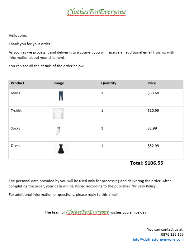
That’s all. Now the filled document is ready to be exported in one of the supported formats and sent to your customer. In the following picture, you can see what the document looks like:

The replaced content

I hope that you like the new functionality and that you will agree that this feature will make creating the documents your users need much easier.

Share Your Feedback

In case you still haven’t tried Telerik Document Processing, use the button below to obtain a trial version and explore all the features and possibilities of the libraries.

The libraries ship for free with all our web and desktop product bundles as well as with each individual product.

Download a Free Trial

If you are already familiar with the package, don’t forget that we are eager to hear your feedback. Feel free to drop us a comment below sharing your thoughts. Or, visit our Document Processing Libraries Feedback Portal to let us know if you have any suggestions or if you need any particular features.

Managing a Parent Component in Blazor

$
0
0

How does a child component inside a TelerikWindow close the window when the user is done with dialog?

An interesting conversation on one of my previous posts about Telerik UI for Blazor got me thinking about how a component nested inside a Telerik Window can control the window (or any parent component) that uses it. While the Telerik Blazor team has immediately taken into consideration the customer feedback and is already working toward the Dialog component, for this case study, I’ll stick with the original scenario: How does a child component inside a TelerikWindow close the window when the user is done with dialog?

I’ve got three solutions but they aren’t nearly as slick as the one suggested on my previous blog post. But this also lets me talk about a best practice when creating components: These are the tools you should be using to let your parent components know when something happens inside your component. And letting your potential parents know what you’re doing is a good thing.

Before I get started (and as long as we’re on the topic of creating dialogs), don’t ignore the Telerik Predefined Dialogs. If you’re creating a custom dialog with the TelerikWindow component to provide information (an alert dialog), get approval for some action (a confirmation dialog), or accept a string (a prompt dialog) from the user … well, you don’t need to create that custom dialog. The Predefined Dialogs make those common tasks easy to do.

But let’s say you’ve got a more interesting UI inside your dialog than the Predefined Dialogs support.

Integrating Controls

I’ll start with the simplest case: You have a dialog consisting of one or more components and a button that triggers processing. When the user clicks the button, you want the dialog to disappear. The easiest way to handle that is to bind the TelerikWindow’s Visible property to a class-level variable (a field) and, in the code attached to the button, set that field to false.

That solution looks like this:

<TelerikWindow  Visible="@windowVisible">    
    <WindowContent>
         …other components…
        <TelerikButton OnClick="Process">Finish</TelerikButton>
    </WindowContent>
</TelerikWindow>

@code {
    bool windowVisible = true;

    private void CloseWindow()
    {
        windowVisible = false;
    }

Integrating Components

But what if you want your dialog to close because of something that happens inside one of the dialog’s components? What if, for example, your dialog looks like this and you want the window to close because the user has done something inside of the DoSomething component:

<TelerikWindow>    
   <WindowContent>
     <DoSomething></DoSomething>
  </WindowContent>
<TelerikWIndow>

If you’re in luck, the DoSomething component exposes an event or property that you can use to control your window. And that’s great … but how do you make that happen if you’re the one creating the DoSomething component? The easiest solution is the typical one: If the child component doesn’t care what’s happening in the parent component, then all you need is one-way event binding.

For this solution, the DoSomething component just has to declare a property as an EventCallback, flag it as a parameter, and call that EventCallback’s InvokeAsync method when the component wants to notify its parent that something has happened (and, optionally, pass some data). If your event is returning data, you need to specify the kind of data you’re returning as part of declaring the EventCallback.

Here’s the code to create a DoSomething component that notifies its parent when the user clicks on the component’s button by raising a ProcessingCompleted event and passing a Boolean value:

…other components…
<TelerikButton OnClick="@DoProcessing">Finish</TelerikButton>

@code {
    [Parameter]
    public EventCallback<bool> ProcessingCompleted { get; set; }

    private async Task DoProcessing()
    {
        …processing code…
        await ProcessingCompleted.InvokeAsync(false);
    }
}

The parent component now has a choice. If all the parent component wants to do is react to the event and run a method, this example sets my windowVisible field when the component fires its ProcessingCompleted event:

<TelerikWindow  Visible="@windowVisible">    
   <WindowContent>
      …other components…
      <DoSomething ProcessingCompleted="@CloseWindow"></DoSomething>
   </WindowContent>
</TelerikWindow>

@code {
   bool windowVisible = true;

   private void CloseWindow()
   {
      windowVisible = false;
   }
}

If the parent actually wants to use the data passed by the event, the code is only slightly more complicated. You need to use a lambda expression when catching the event and the method used in the lambda expression needs to accept the data passed from the event.

Here’s some code that uses the value passed from the event raised in the child to set the windowVisible field:

<TelerikWindow  Visible="@windowVisible">    
   <WindowContent>
      …other components…
      <DoSomething ProcessingCompleted="@(p => CloseWindow(p))"></DoSomething>
   </WindowContent>
</TelerikWindow>

@code {
    bool windowVisible = true;

    private void CloseWindow(bool close)
    {
        windowVisible = close;
    }
}

So, by adding an EventCallback to your component, you can notify any parent that uses your component that something interesting has happened in your component. Of course, what the parent component does with that information is up to the parent (in this case: closing the window).

Sharing Information

There’s a slightly more complicated solution available to you if you want the parent to share information with your component.

For example, you may not want your DoSomething child component to fire its event if, for example, the window is already closed. I recognize I haven’t got a great example in this case study, for two reasons. First, there’s no harm in closing an already closed window, so why bother checking? Second, how exactly would someone click the button in a component inside a closed window? However, this is the scenario I’ve got, and you can probably imagine a better one than I’ve used here.

To have the parent share information with the child the DoSomething component, you need to add two-way event binding inside your component. To implement two-way databinding, you need two parameters in your component. One parameter holds the data you want to share (I’ll call it the data parameter). The other parameter is just an EventCallback as we’ve seen before (I’ll call this parameter the event parameter). The two parameters are joined by name: the EventCallback must be called <data parameter name>Changed.

Now, in your DoSomething component’s code you can check the value of the data parameter and raise your event. Here’s an example with a data parameter called windowState and a matching event parameter called windowStateChanged. In my button’s code, I only raise the event if the window’s state shows that the window is open:

<TelerikWindow  Visible="@windowVisible">    
   <WindowContent>
      …other components…
      <TelerikButton OnClick="@DoProcessing">Finish</TelerikButton>
   </WindowContent>
</TelerikWindow>

@code {
   [Parameter]
   public bool windowState { get; set; }
   [Parameter]
   public EventCallback<bool> windowStateChanged { get; set; } 

    private async Task DoProcessing()
    {
        …processing code…
        If (windowState)
       {
          await windowStateChanged.InvokeAsync(false);
       }
    }
}

The payoff is that you don’t need to write a method in the parent component to set the windowVisible field: you can tie the event directly to the field. The markup required, as a result, is different from what you use with one-way binding. With two-way binding, the DoSomething component uses the data parameter’s name (prefixed with @bind-) and bind directly to the field you’re sharing between the components. The event parameter ensures that the field in the parent is updated whenever the event is raised in the DoSomething component.

This example ties the DoSomething’s windowState parameter to the parent component’s windowVisible field:

<TelerikWindow  Visible="@windowVisible">    
   <WindowContent>
      …other components…
      <DoSomething @bind-windowState="windowVisible"></DoSomething>
   </WindowContent>
</TelerikWindow>

@code {
   bool windowVisible;

But the real moral of this post is that, when you’re writing a component, it’s always a good idea to fire events when something changes inside your component. You can do it with one-way or two-way databinding but, either way, raising events lets your parent integrate what it does with what your component does.


What Is a Gantt Chart, Anyway, and When to Use It in Your React Apps

$
0
0

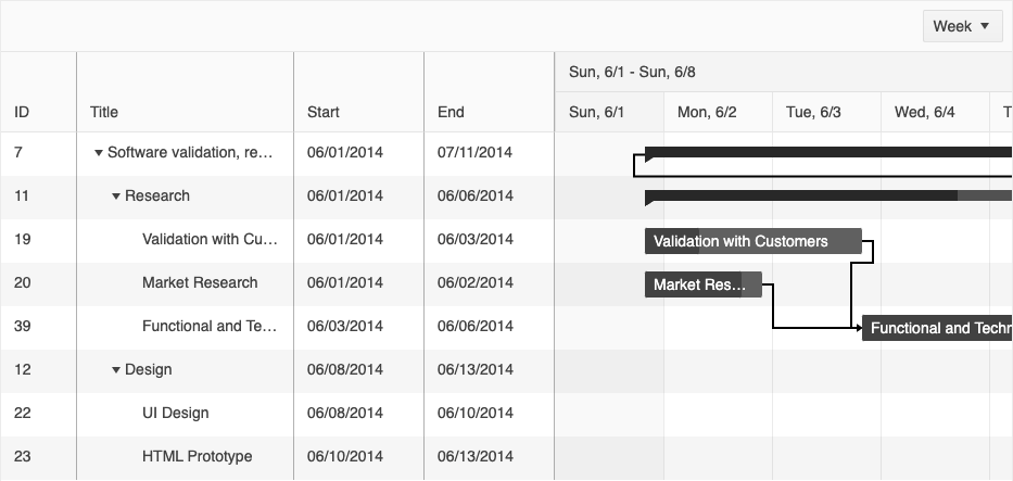
Ever tried to coordinate a big project? And I mean a HUGE project, one where you have to sync up plans between multiple people or teams, all doing different stuff. But some tasks can't begin until others have completed, and other tasks have to be happening simultaneously.

Meeting the deadline for something like that hinges on getting everything choreographed just so; ensuring that everyone understands what's expected of them by when, who they can ask when they have questions, and how they fit into the larger scope of the project.

When you're preparing to tackle something that large, the organization of your approach is actually its own task that needs to be completed before you can really begin anything else. And trying to capture all the intricacies of something like that in a standard calendar is an exercise in frustration. So, how do project managers and team leads handle it? Enter: the React Gantt Chart. In this blog, we'll be looking at how to use Gantt charts in general, but for illustration purposes, let's take a look at the KendoReact Gantt Chart.

What Is a Gantt Chart?

Example of the KendoReact Gantt Chart

A Gantt chart is a kind of hybrid between a data grid and a calendar, created specifically for project management. Like a calendar, it not only allows you to input all the tasks (of course), but also their timelines, dependencies, categories and more. It creates a visual view of all these timelines and dependencies that makes it easy for the user to understand the scope of a project at a glance. Then, like a data grid, it allows you to filter, sort, reorder and otherwise organize the information however the user needs in order to assess the current state of the project.

The KendoReact Gantt Chart also comes with a few extra features—like time zone and globalization support for remote teams, the ability to convert flat data into the Gantt-style tree view, and keyboard navigation for full accessibility—that can help take your project management software to the next level.

How Do I Know if My Users Need a Gantt Chart?

There are tons of different ways to track a project, all with varying complexity: from Kanban boards to calendars, or even just basic to-do lists. A Gantt chart is powerful and takes a little bit of configuration, so it might be overkill for simple projects. In general, the best user experience for your application is the simplest, but you also don't want to be passing over features that would make your users' lives easier, if they had access to them.

So, how do you know when your users would benefit from a Gantt? Here are a few rules of thumb that that you can use to help determine when it's time to step up from the more basic tools:

  • Who are your users? The people working on the project will always help determine the usage of a Gantt chart more than the project itself will. There are three main ways in which your userbase can help you determine the types of tools best suited to them:

    • The number of people per project: The fewer people involved, the less you need to prioritize synchronization, as it will happen more naturally with a group of three, for example, than a group of 20. When your users are coordinating a large group of folks, the Gantt becomes a clear choice to organize the sheer amount of information.
    • Where the users are located: Are the people on a project typically all in the same office, or all over the world? If your users tend to be geographically scattered, you're probably dealing with a group that would benefit from a Gantt chart in order to function as a "source of truth" for all their asynchronous communication. Having one place to see the timeline, assignments, categories and current status of the tasks is priceless for teams like this—especially when everyone can see that content in their own language and time zone.
    • How your users know each other: Consider whether your application is intended for use within a single team, or for more varied, cross-functional groups. When you're dealing with groups comprised of several different teams, then over-communication is of the essence, and the Gantt can ease that pain point even on a relatively simple project. Similarly, if your users are managing a project that involves several different groups of people, all working on very different jobs, the ability for those groups to filter down the tasks to see only the ones they're responsible for can be a huge benefit.
  • What kinds of projects are they using your application to manage? Even the smallest, tightest group of people can benefit from the use of a Gantt chart when tacking a particularly thorny project. Here are a couple ways to use project type to determine your decision to include a Gantt chart:

    • The number and type of tasks: If your average users are only inputting a few items that need to be coordinated, then you can skip the Gantt. But when they have a long list of tasks to keep track of, the Gantt chart becomes incredibly useful for visualizing the current status and timeline of each task. Once the project hits a level of complexity where it would be helpful to be able to sort and filter tasks, the Gantt is a win for everyone.
    • The order and complexity of the tasks: Sometimes, tasks can be checked off in any order, and you'll still make progress just the same. But for projects where there are dependencies between the tasks, the Gantt really shines by providing an easy way to track the connections between everything going on. This is especially useful when your users are managing overlapping tasks, or tasks with multiple pre-requisites.
    • The timeline: Very short timelines and very long timelines can (ironically) be equally difficult to manage. With a short timeline, it's crucial that everything is planned as accurately as possible, and that everyone knows exactly what is expected of them in order to finish on time. With a long timeline, it can be easy to lose track of what's supposed to be happening when, and the longer window can create the illusion of having all the time in the world with no urgency at all. Both situations benefit from the usage of a Gantt chart, which helps your users view the timeline in an intuitive and visual way, connecting tasks to each other directly and showing how much of the available time is allotted for each one.

Adding a Gantt Chart to Your React App

If you've just gone through that list and feel like your React app could benefit from the inclusion of a Gantt, then I'd strongly recommend taking a look at the KendoReact Gantt Chart. The Gantt Chart in general is a somewhat less common component, so you might not find it in just any component library—but KendoReact not only includes a beautifully designed React Gantt Chart, it also offers a handful of additional features that will make your users' project planning so much easier:

  • Sorting, filtering and reordering: The KendoReact Gantt Chart allows your users to sort and filter the Gantt, as well as reorder the columns, so they have full control over showing the information that's most relevant to them.
  • Setting task and dependency types: There are three different types of task types (regular, summary and milestone), as well as four different types of dependency types (finish to finish, start to finish, start to start, and finish to start) built into the React Gantt Chart, allowing for fuller configuration of the chart based on how it will be used.
  • Flat-data conversion: If you have flat data that needs to be converted into a tree in order to be visualized by the component, the KendoReact Gantt makes it easy! Converting flat data to a tree structure is as easy as utilizing the built-in createDataTree function!
  • Internationalization: The KendoReact Gantt Chart is made to support teams working in distributed workplaces all around the globe. Unless a time zone is specifically set, the Gantt Chart will automatically convert times to the local time zone of the user. You can also easily handle localization of messages and date/time formats using the KendoReact Internationalization Package.

Knowing the current status of every task, what you're waiting on, who's responsible, and how much time you have left are all crucial parts of managing a large project that are all made exponentially easier with a Gantt chart. If you're creating software where your users will be handling larger or more complex project management tasks, then providing them with this option can ease their jobs significantly.

Consider whether the Gantt is a good fit for your application, and then take a look at the KendoReact Gantt Chart docs for a deep dive on everything this powerful component is capable of!

ASP.NET Core for Beginners: Web APIs

$
0
0

If you work with the .NET platform or are new to this area, you need to know about Web APIs—robust and secure applications that use the HTTP protocol to communicate between servers and clients and are in high demand in the market.

What Is a Web API?

API Basic operation

Application Programming Interfaces (APIs) are basically HTTP services that are used to communicate between applications in a simple and centralized way.

Microsoft through the ASP.NET framework provides ways to build Web APIs that can be accessed from any client, such as browsers, desktop applications and mobile devices.

ASP.NET Web API can be used to build REST and SOAP services.

Following are some benefits of working with an ASP.NET Web API:

  • It works the way HTTP works, using standard HTTP verbs like GET, POST, PUT, DELETE for all CRUD operations.
  • Full support for routing.
  • Response is generated in JSON and XML format using MediaTypeFormatter.
  • It can be hosted on IIS as well as auto-hosted outside of IIS.
  • Supports template binding and validation.
  • Supports URL patterns and HTTP methods.
  • It has a simple form of dependency injection.
  • Can be versioned.

How Do ASP.NET Web APIs Work?

An ASP.NET Core Web API basically consists of one or more controller class that derives from ControllerBase. The ControllerBase class provides many methods and properties that are useful for working with HTTP requests.

ASP.NET Core Web API Flowchart

As you can see in the image above, a “client” makes an “HTTP request” to the API, which—through the “controller”—identifies the call and makes the Read or Write in the “data access layer.” The “Model” is returned, in this case, a JSON object “Contact: Name” in the “HTTP response.” In simple terms, the API is bridging the “client” and the “data” in a simple and safe way.

Example console API response

API Response

Now that we’ve seen the basics of Web APIs, let’s create an API and see in practice how it works.

Creating an ASP.NET Core 5 Web API

To create an ASP.NET Core 5 Web API application, we will use:

  • .NET SDK: The .NET SDK is a toolkit for developers that you’ll need to start developing in the .NET platform. You can download the version here (the .NET 5.0 is recommended because it already contains the anterior versions).

  • Visual Studio 2019: You can download the Community Version here—it’s free and contains all of the features you need to create, test and deploy a Web API application.

You can download the project’s source code here.

Below we will have some steps to build our application:

  1. Open the Visual Studio 2019 → Click on “Create a new project.”

  2. Choose option “ASP.NET Core Web API.” Click “Next.”

  3. Write the project name (my suggestion is “MyReadingList.WebAPI”) and the solution name folder (my suggestion is “MyReadingList”), then Click “Next.”

  4. In the “Target Framework” choose “.NET 5.0”, and Click “Create.”

By default, our newly created API comes with the basics to run it, with an example controller. If you click on “IIS Express” or press the “F5” key on your keyboard, the application will start and can be accessed through the URL:


https://localhost:44345/swagger/index.html

The GIF below shows the execution of the procedure.

Create First ASPNET Web API

When we created our API, it already had an example called “WeatherForecast” that you just ran, but let’s not waste time with that—we’ll make our own example API: a reading list and then we’ll add our favorite books.

First, let’s create our “Book” Model class, which is a class that represents a “Book” entity. To do this, right-click on the project and add a folder called “Models” and then within Models create a class called “Book”.

public class Book
{
  public Guid Id { get; set; }
  public string Name { get; set; }
  public string Author { get; set; }
  public string Genre { get; set; }
  public bool Read { get; set; }
}

Creating Database Context

The context class is responsible for interacting with data objects. It manages the entity objects during runtime, which includes filling object values with data coming from a database, tracking changes made and persisting the data to our database.

One way to work with the “context” paradigm is to define a class that derives from DbContext and exposes the model class as a property of DbSet.

The Entity Framework allows us to query, insert, update and delete data using objects known as entities. It maps the entities and relationships that are defined in your entity model and provides functions to perform the following tasks:

  1. Materialize data returned from the database as objects
  2. Control the changes made to objects
  3. Make changes to the database
  4. Work with the competition
  5. Link objects to controls

In this project, we will use a database called SQLite, which is a C-language library that implements a small, fast, self-contained, highly reliable and full-featured SQL database engine.

We need to install the following packages in the project:

  • “Microsoft.EntityFrameworkCore” Version=“5.0.9”
  • “Microsoft.EntityFrameworkCore.Design” Version=“5.0.9”
  • “Microsoft.EntityFrameworkCore.Sqlite” Version=“5.0.9”
  • “Microsoft.EntityFrameworkCore.Sqlite.Design” Version=“1.1.6”
  • “Microsoft.EntityFrameworkCore.Tools” Version=“5.0.9”

You can do this through the NuGet package manager.

Then still inside the Models folder, create a class called “BookContext” and put the following code in it:

public class BookContext : DbContext
{
  public BookContext(DbContextOptions<BookContext> options) : base(options) { }
  public DbSet<Book> Books { get; set; }
  protected override void OnModelCreating(ModelBuilder builder)
  {
    builder.Entity<Book>().HasKey(b => b.Id);
    base.OnModelCreating(builder);
  }
}

With this code, we define that “Book” is our context class, which will receive in the database an entity of the same name and will have its properties (name, author, etc.) as columns in the book table.

We also defined that the Id will be the primary key of the table through the OnModelCreating method.

Creating SQLite Connection String

Let’s create our connection string, which will open a connection to the database we’ll call “ReadingList.db”.

Open the archive “appsettings.json” and put this code before “Logging”:

"ConnectionSqlite": { "SqliteConnectionString": "Data Source=ReadingList.db" },

Registering Context With Dependency Injection

ASP.NET Core implements dependency injection by default. Now that we have created our Context class, we need to do the dependency injection of this class. ASP.NET Core allows us to do the injection when our application is started.

To do this, open the Startup.cs file and replace the ConfigureServices method with this:

public void ConfigureServices(IServiceCollection services)
{
  services.AddControllers();
  services.AddSwaggerGen(c =>
  {
    c.SwaggerDoc("v1", new OpenApiInfo { Title = "MyReadingList.WebAPI", Version = "v1" });
  });

  var connection = Configuration["ConnectionSqlite:SqliteConnectionString"];
  services.AddDbContext<BookContext>(options => options.UseSqlite(connection));
}

Creating the Database

Now that we have everything set up, we can create the database from the model using “Migrations.”

The migrations feature enables you to make changes to your model and then propagate those changes to your database schema. Migrations are enabled by default in EF Core.

The process is very simple. Go to the folder where the project was created, open a console and enter the commands below.

dotnet ef migrations add InitialModel

And then:

dotnet ef database update

Powershell commands

The first command is to support migration and create the initial set of tables for the model. The second is to apply the migration to the database.

Important! If while running the commands you get any errors related to the version of EntityFramework, run this command in the console:

dotnet tool update --global dotnet-ef --version 5.0.9

If everything worked out, you will see the database created at the root of the project—where you opened the console, in the file “ReadingList.db”, that’s where our database is. To open this file and see the tables created as in our model, you will need to download an SQLite-compatible app. If you use Windows, I recommend the “SQLite Viewer Editor”—it is free and can be downloaded directly from the Microsoft Store.

The database in "SQLite Viewer Editor"

Database in SQLite Viewer Editor

In addition to the “Books” table, we also have the “__EFMigrationsHistory” which is automatically created when we apply Migrations and is used to track change versions, like a history.

Creating the Controller

Now we are going to create a controller to be able to do CRUD operations in our database. To do this, perform the following steps:

  1. Right-click on the “Controllers” folder → Add → Controller → Select “MVC Controller - Empty” → Add
  2. Name it “BooksController”
  3. Open the generated file and replace your code with this:
using Microsoft.AspNetCore.Mvc;
using MyReadingList.WebAPI.Models;

namespace MyReadingList.WebAPI.Controllers
{
  [Route("api/[controller]")]
  [ApiController]
  public class BooksController : Controller
  {
    private readonly BookContext _context;
    public BooksController(BookContext context)
    {
      _context = context;
    }
  }
}

With this code we made the context dependency injection in the controller. Next we will implement the methods responsible for performing the operations (CRUD):

HTTP Method Route Description Request body Response body
GET /api/books Get all books None Array of books
GET /api/books/read=true Get all books read None Array of books
GET /api/books/{id} Get a book by Id None Book
POST /api/books Add a new book Book Book
PUT /api/books/{id} Update an existing book Book None
DELETE /api/books/{id} Delete a book None None

Implementing API Methods

Following the order in the table above, we will implement the API methods responsible for doing CRUD operations in the database. Still in “BooksController,” you can put this code right below the dependency injection:

//Get all books
[HttpGet]
public async Task<ActionResult<IEnumerable<Book>>> GetBooks()
{
  return await _context.Books.ToListAsync();
}

//Get all books read
[HttpGet("read")]
public async Task<ActionResult<IEnumerable<Book>>> GetBooksRead()
{
  bool read = true;
  var books = await _context.Books.ToListAsync();
  
  var booksRead = (from book in books where book.Read == read select book).ToList();
  
  return booksRead;
}

//Get a Book by id
[HttpGet("{id}")]
public async Task<ActionResult<Book>> GetBook(string id)
{
  Guid guidId = Guid.Parse(id);
  
  var book = await _context.Books.FindAsync(guidId);
  
  if (book == null)
    return NotFound();
  
  return book;
}

//Add a new book
[HttpPost]
[Route("create")]
public async Task<ActionResult<Book>> Create(Book book)
{
  _context.Books.Add(book);
  await _context.SaveChangesAsync();
  return CreatedAtAction("GetBook", new { id = book.Id }, book);
}

//Update an existing book
[HttpPut("{id}")]
public async Task<IActionResult> Update(string id, Book book)
{
  if (id != Convert.ToString(book.Id).ToUpper())
    return BadRequest();

  _context.Entry(book).State = EntityState.Modified;

  try
  {
    await _context.SaveChangesAsync();
  }
  catch (DbUpdateConcurrencyException)
  {
    if (!BookExists(id))
      return NotFound();
    }

  return NoContent();
}

//Delete an existing book
[HttpDelete("{id}")]
public async Task<IActionResult> Delete(string id)
{
  Guid guidId = Guid.Parse(id);

  var book = await _context.Books.FindAsync(guidId);

  if (book == null)
    return NotFound();

  _context.Books.Remove(book);

  await _context.SaveChangesAsync();

  return NoContent();
}

//Check if the book exists in the database
private bool BookExists(string id)
{
  return _context.Books.Any(e => Convert.ToString(e.Id) == id);
}

Performing Operations (CRUD) With Fiddler Everywhere

Now we have the basics we need to create, update, delete and fetch books from the database. To do this, first, run the project by clicking on the run icon in Visual Studio or pressing the “F5” key.

Create

To do the operations we will use Fiddler Everywhere, which can be used to make HTTP requests to Web APIs simply and quickly, and has many other features.

Follow the steps in the image below to add a book to the database via the Create method of the API. Afterward, you can open the ReadingList.db file with SQLite Viewer Editor and see the record in the table.

Create book

Important! The example images will have the localhost port set to 44345, but you must change it based on the port your application runs on.

Get All Books

Now that we have inserted our book (you can insert as many as you like, just edit the data sent in the “body”), we can search them through the “GET” route.

Get All Books

Update

For Update, in Fiddler Everywhere create the method “Update book,” in the contents of the “Body” change the data from “read” to “true” and click on “Send.”

The record has now been changed to “read” and can be fetched on the next route.

Update a book

Get All Books (Read)

We will only look for books that have already been read. For that we will use another route, and this route will only return records that have the property “read”=“true”, as you can see in the image below:

Get All Books Read

Get a Book by Id

To search for a single specific book, we will use the same “GET” route, but passing in the route the Id of the book we want to see details.

Get a Book by Id

Delete

To delete a record is very simple—just pass the id of the record you want to delete in the route, as in the example below:

Delete a book

Conclusion

Finally! Our API is 100 percent functional! ✨

In this article, we looked at the basics of ASP.NET Core Web APIs, created a project using Visual Studio, added a database, and performed the four basic operations (CRUD) with Fiddler Everywhere.

Now you can fill your list with your favorite books. Feel free to add new fields and features.

In the next post on APIs we will develop a frontend application and integrate it with our API to display the records. See you soon! ‍♂️

Filter Your Data With Style Using RadFilterView

$
0
0

Have you ever wanted your application to have the filtering options of the most popular shopping sites? Now it’s possible, with the brand-new RadFilterView control. It comes with the latest R3 2021 release of Telerik UI for WinForms.

RadFilterView is a control that allows your users to filter data with ease, using the intuitive UI. It is designed to work with our most popular controls like RadGridView, RadListView, RadTreeView and so on. You can simply set the AssociatedControl property of RadFilterView and, when the user changes some filters, the associated control will be instantly filtered.

this.radFilterView1.AssociatedControl = this.radGridView1;

filter-view - With filtering checkboxes for first name, user clicks Chris and then Janet. The results first filter for only Chris and then for both names.

If you do not want to trigger the filtering of the associated control each time the user makes a single change, you can change the FilteringMode property.

this.radFilterView1.FilteringMode = FilteringMode.Programmatically;

The control can also work standalone (without an associated control). In this mode, the DataSource property needs to be set, to feed the control with data.

When the user changes a value in any category the FilterChanged event of the control is fired. In the event handler, you can use the collection of FilterDescriptors, which is used to filter most of our data controls, or the RadFilterView.Expression property, which returns an SQL query–like string:

"[FirstName] IN ('Bruce','Chris') AND [SSN] >= 2882255 AND [Married] = True"

Categories

How does it work? When the DataSource is set, the filter view control creates a category for each column of the corresponding data. Then goes through each record and stores the values. Based on the data type of the column, the control creates distinct types of categories:

  • Text (string) data: The category creates a list of checkbox items with all the unique values. You can switch between single and multiple choice.

    text-category - Of six checkbox filters for last names, three are selected

  • Numeric data: This category shows numeric inputs (RadSpinEditorElements) and restricts the user to change the values between the minimum and maximum values found in the data source. There is also a RadTrackbarElement (slider) added below the spin editors for even better control of the values.

    numeric-category - slider shows from/to range with the numbers in boxes that allow incrementing/decrementing

  • Boolean data: It is an ancestor of the text category and shows two checkboxes with true and false values.

    boolean-category - Discontinued with true or false checkboxes

  • DateTime: This category uses two date inputs (RadDateTimePickerElements). And just like the numeric inputs, the users are restricted to changing the dates in the range between the minimum and maximum values in the DataSource.

    datetime-category - Date of birth with From/To range with dates

  • Indicators: The purpose of filter indicators is to allow users to easily identify the categories with changed values (for example, the text category with some checked checkboxes or the numeric category with changed min value). This is extremely useful when the user has collapsed some categories and sees only the header text. The indicator also allows the filter of the current category or all filters in the control to be cleared.

    indicator - clear filter, clear all filters

Working With Categories

The categories provide a variety of options where you can replace the whole category with a custom one, customize the category or just change the values.

Now let’s have a look at a filter view bound to text data. Here is how the default created text category looks:

category-demo-initial - category header reads 'product_name'

As you can see, the category header text is not user-friendly as it is the same as the source column name. The category display name can be changed in the CategoryCreating or CategoryCreated events.

private void RadFilterView1_CategoryCreated(object sender, FilterViewCategoryCreatedEventArgs e)
{
    if (e.Category.PropertyName == "product_name")
    {
        e.Category.DisplayName = "Product Name";
    }
}

category-demo-header-text - category header reads 'Product Name'

Another thing that can be seen is that the values are in the same order as they appear in the data source. When we have a large set of text values it would be much easier for the users to navigate through alphabetically sorted data. The correct place to reorder the values is the CategoryCreating event. Here you can even replace the whole category. Here is a code sample of how to sort the values.

private void RadFilterView1_CategoryCreating(object sender, FilterViewCategoryCreatingEventArgs e)
{
    List<object> values = e.Values.ToList();
    values.Sort();
    e.Values = values;
}

category-demo-ordered-values

Much better! To make it even more readable, we can capitalize the first letter of each product. This can be done in the ItemCreated event of the text category and change the text of the item (using the ToTitleCase method of the culture TextInfo). The right place to attach to this event is again in the CategoryCreating event.

private void RadFilterView1_CategoryCreating(object sender, FilterViewCategoryCreatingEventArgs e)
{
    List<object> values = e.Values.ToList();
    values.Sort();
    e.Values = values;
 
    FilterViewTextCategoryElement category = e.Category as FilterViewTextCategoryElement;
    category.ItemCreated += this.Category_ItemCreated;
}
 
private void Category_ItemCreated(object sender, FitlerViewTextCategoryItemCreatedEventArgs e)
{
    TextInfo info = CultureInfo.CurrentCulture.TextInfo;
    string newText = info.ToTitleCase(e.Item.Text);
    e.Item.Text = newText;
}

And the final result :

category-demo-capitalized-values

You can find more information about the RadFilterView control in our online documentation.

Share Your Feedback

Feel free to drop us a comment below sharing your thoughts. We would love to hear how all this works for you. You can visit our UI for Winforms Feedback Portal and let us know if you have any suggestions for particular features/controls.

If you haven't tried the Telerik UI for WinForms, you should check out our free trial or, better yet—go through all our UI suites in the DevCraft bundle!

Sands of MAUI: Issue #34

$
0
0

Welcome to the Sands of MAUI—newsletter-style issues dedicated to bringing together latest .NET MAUI content relevant to developers.

A particle of sand—tiny and innocuous. But put a lot of sand particles together and we have something big—a force to reckon with. It is the smallest grains of sand that often add up to form massive beaches, dunes and deserts.

Most .NET developers are looking forward to .NET Multi-platform App UI (MAUI)—the evolution of Xamarin.Forms with .NET 6. Going forward, developers should have much more confidence in the technology stack and tools as .NET MAUI empowers native cross-platform solutions on mobile and desktop.

While it is a long flight until we reach the sands of MAUI, developer excitement is palpable in all the news/content as we tinker and prepare for .NET MAUI. Like the grains of sand, every piece of news/article/video/tutorial/stream contributes towards developer knowledge and we grow a community/ecosystem willing to learn and help.

Sands of MAUI is a humble attempt to collect all the .NET MAUI awesomeness in one place. Here's what is noteworthy for the week of November 22, 2021:

Future of .NET

Hot off the heels of .NET 6 launch at .NET Conf, three developer advocate stooges invited an old friend to relive all the excitement: Ed Charbeneau, Alyssa Nicoll, Sam Basu and Jeff Fritz hosted the Future of .NET webinar.

This was a fun 2 hours breaking down all the big announcements from a developer's perspective and whipping up quick demos to showcase the hot bits. Discussions evolved around the significance of .NET 6, VS 2022 launch, C# 10 features, .NET MAUI updates and bringing Blazor goodness to desktop with hybrid apps. With .NET 6 carrying the LTS badge, migration and modernization would be top of mind for lot of existing apps—it was good to see an honest conversation about all the options on the table.

FutureOfDotNet

.NET MAUI Preview 10 Recap

How can a .NET MAUI release go by without some expected YouTube goodness? Gerald Versluis put out a video for all things .NET MAUI Preview 10 and recapped some tooling goodness with VS 2022. Gerald also went on to cover the sweet cross-platform real-time podcast app demo from .NET Conf keynote, showcasing the best of code sharing with .NET MAUI and Hybrid apps with Blazor.

One call to action is clear—if you haven't already, now is a great time to get started with .NET MAUI. The promise is coming together nicely.

Maui10Recap

.NET Updates

James Montemagno and Frank Krueger hosted the latest episode of the Merge Conflict podcast, diving into all the details of .NET 6 and Visual Studio 2022 releases.

While developer excitement is palpable, it was good to see the acknowledgement that there is a lot to take in—developers may need some time to settle in with the new .NET bits and Azure cloud services. James shared some good info on some of the behind-the-scenes work that went in towards making the cross-platform podcast demo app for .NET Conf—something soon to be open sourced for developers to tinker with.

MergeConflict280

Drawn Controls in .NET MAUI

There was a ton of content from passionate developers from around the world at .NET Conf—and some real gems for those interested in .NET MAUI. Javier Suarez did a session on Drawn Controls in .NET MAUI, diving into much of the awesome work that him and the team has been putting together.

Javier started with the basics of .NET MAUI and Microsoft.Maui.Graphics library, giving developers the freedom to render native UI per their needs. Javier then dived into the meat of things—the goodness evolving from the Microsoft.Maui.Graphics.Controls library.

While experimental, this new cross-platform graphics library allows developers to render fully drawn UI components with .NET MAUI, catering to popular design systems like Cupertino, Fluent and Material. Javier showed off some cool demos and talked through performance and extensibility of drawn controls—definitely a wonderful development within the .NET MAUI stack.

MauiDrawnUI

MAUIAppBuilder Code

Luis Matos continues his excellent series on the MauiAppBuilder—this time diving into much of the code that now powers the bootstrapping of .NET MAUI apps using the generic .NET Builder pattern.

Luis talks about how to initialize a MauiAppBuilder instance using a Static method with default configurations and dives into the MauiAppBuilder Public API. This API is where a lot of the plumbing happens—lot of properties/configurations and a single method called Build() which creates the MauiApp. Luis dives into some tricky internal code unapologetically and teaches us a lot—looking forward to the rest of the series.

AppBuilderCode

That's it for now.

We'll see you next week with more awesome content relevant to .NET MAUI.

Cheers, developers!

Deploying an Angular App on GitHub Pages

$
0
0

In this piece, we will be building an Angular application with Kendo UI for Angular and then deploying it online with GitHub Pages.

Kendo UI

Kendo UI is a JavaScript library by Progress Telerik that helps you build great user interfaces for your web applications with ease. It contains tons of components that are interactive and accessible and saves you time by already implementing key UI functionalities inside components. Kendo UI has support for all your favorite JS frameworks including Angular, so no extra integration needed to use it.

Kendo UI is also the only UI library that provides extensive support for data management on your user interface, so you have access to spreadsheets, data grids, various kinds of charts and a lot more.

Before We Start

This post is suited for all levels of frontend developers that use Angular, so being conversant with beginner concepts and installation processes is not assumed.

To be able to follow along through this article’s demonstration, you should have:

  • VS Code as your integrated development environment
  • Node version 11.0 installed on your machine
  • Node Package Manager version 6.7 (it usually ships with Node installation)
  • Angular CLI version 8.0 or above
  • Angular (This example uses version 12)

Other nice-to-haves include:

  • Working knowledge of the Angular framework at a beginner level

What Is GitHub Pages?

GitHub Pages is the official static-site hosting platform from GitHub. The whole idea is to make sure developers focus on building and let GitHub handle even deploy needs from the same place you do version control and host your files.

You can have GitHub pages set up for yourself as a user—this is mostly targeted at personal branding pages like portfolios. This lets you deploy to yourGitHubUsername.github.io.

To do this, you have to create a new repository on GitHub and call it:

<Your username>.github.io

After you save the repository, it automatically creates a GitHub page for you using the HTML at the root of the project. You can also set up GitHub pages for any new repository or another repository you already have on GitHub. Today, we will be using an npm package to set up GitHub pages for our Angular project.

Getting Started

The easiest way to set up an Angular project with Kendo UI for Angular is through the Kendo UI Template Wizard. This is the IDE extension built by the Kendo UI team to make it super easy for you to scaffold Angular apps in a few minutes with a click-through prompt.

Open your VS Code and navigate to the Extensions tab and search for Kendo UI Template Wizard, install it and reload your VS Code application. Now, you have the wizard. Let’s get to work!

To use the wizard inside the VS Code app, open the Command Palette. Either go to View -> Command Palette, or use shortcut Command + Shift + P for Mac or Ctrl + Shift + P on a PC. Select the Kendo UI Wizard and it will open up this prompt:

Kendo UI Template Wizard is on Step 1 of 4, New Project. It asks you to set a project name and location to create it.

I called my project Pages, but you can call it any name of your choosing. It will also ask you where in your machine you want to have this project generated for you.

After you specify that, click the “Next” button and you’ll be given a new prompt that asks you what framework you want to build with.

Select a front-end framework. We have selected Angular; other options are React and Vue. The right side says Kendo UI for Angular: ‘Engineered specifically for Angular, this suite enables you to take full advantage of the framework’s native performance capabilities such as AOT Compilation, Angular Universal Rendering and Tree Shaking.’

Choose Angular and click “Next.” The next prompt wants to know the structure you want your app to be in. I want a homepage and another blank page I can route to, so I choose 1 blank page:

Select pages for your application. We have chosen blank. Then Manage your app pages. We have 1 page.

You can play around with different structures to see how it is being generated. After you have chosen the structure you want, click the “Next” button.

Select theme for application. We have chosen Bootstrap; other options include Default or Material. Your project details: App name - Pages; Frontend framework - Kendo Angular; Theme - Bootstrap; Pages - 1.

This final prompt asks about styling, so Kendo UI by default can kickstart your project with a basic CSS style or Bootstrap or Material design. I picked Bootstrap, and on the right, you can see the project details summary.

Generation Status: Template Generation - creating ‘Blank1 (Blank)’ page … Give feedback or Report an issue. ‘Working’ status indicator.

Now your application has been generated, just like that. Open the project in VS Code and open up a new terminal. Run the command below to install all the packages with their latest versions.

npm install

After the installation is complete, let’s test out if we got everything right. Run the Angular development server with this command:

ng serve

Open your browser to http://localhost:4200/home and you should see this:

Welcome to Kendo UI for Angular. Focus on the core of your application and spend less time sweating over the UI. Get Started.

Navigate into the components folder and make sure your home component is exactly like this:

<div class="container mt-5">
    <div class='row'>
        <div class='col-12'>
            <h1 class='welcome mb-0'>Welcome to Kendo UI for Angular</h1>
            <h2 class='sub-header mt-0'>Focus on the core of your application and spend less time sweating over the
                UI</h2>
        </div>
    </div>
    <div class='row'>
        <div class='col-12'>
            <h1 class='get-started'>Get Started</h1>
        </div>
    </div>
    <div class='row justify-content-center'>
        <div class='col-4 text-right'>
        </div>
        <div class='col-4 components-list'>
            <p>
                <a href='https://www.telerik.com/kendo-angular-ui/components/'>Components</a>
            </p>
            <p>
                <a href='https://www.telerik.com/kendo-angular-ui/components/styling/theme-default/'>Default theme
                    overview</a>
            </p>
            <p>
                <a href='https://www.telerik.com/blogs/tag/kendo-ui-for-angular/'>Blog Posts</a>
            </p>
        </div>
    </div>
</div>

Now let us deploy the app using GitHub Pages.

Setting Up Deployment

The first thing we have to do is to create a repo on GitHub for this app so we can deploy it. Initialize a new repository, call it Pages and push it to GitHub. You can find an easy-to-use guide here to do so.

Now that we have created a pages repository, we will use an npm package to do the work of deployment. Take note of the repository name because it is very useful.

Angular CLI GHPages

This package helps us push our Angular apps to production and host them publicly on GitHub Pages, all through one command in the Angular CLI. Cool, right?

Let’s install this package in our project. Open the terminal in your VS Code and run this command:

ng add angular-cli-ghpages

Angular will install this package directly from npm and we are ready to go. Now we have only one thing to do: deploy our application! This is done using one command:

ng deploy --base-href=Pages

It will take a while for your app to be compiled and bundled and then you’ll see a success message.

 Building “kendo-angular-seed”
 Build target “kendo-angular-seed:build:production”
Generating ES5 bundles for differential loading…
ES5 bundle generation complete.
 Uploading via git, please wait…
 Successfully published via angular-cli-ghpages! Have a nice day!

Congratulations, your app has now been deployed on GitHub Pages. To find the link, go to your GitHub account, open the Pages repo, and go to the settings tab—and voila!

GitHub Pages - your site is published at, and the URL.

Conclusion

In this post, we have seen what Kendo UI is and how we can use it in our Angular applications to make our life even easier. We also saw how we use the Kendo UI Template Wizard and, finally, how we can deploy our applications from the same place we host projects: GitHub. Happy hacking! I cannot wait to see what you build with what you have learned.

Using Microsoft Hosted Agents in Azure Pipelines for Automated Test Execution

$
0
0

Running automated tests on Microsoft-hosted agents in Azure Pipelines helps you eliminate testing delays and speed up software delivery.

Speed is the biggest promise of test automation. For many teams, especially the ones that already practice continuous testing, the key to speeding up their testing cycles is reducing test execution time.

In this step-by-step guide, I will demonstrate how to set up Azure pipelines for running your automated tests on Microsoft-hosted agents.

What Are the Microsoft-Hosted Agents?

Microsoft-hosted agents (MHA) are virtual machines (VMs) created from Microsoft-supported images in Azure DevOps. There are several predefined images, equipped with latest versions of the Chrome and Edge browsers, Visual Studio and other tools, and with the actual agent that automatically connects to the agent pool in the Azure project. Each VM is created when a job is started and gets discarded after the pipeline run finishes.

The Microsoft-hosted agents’ VMs are set to run with an administrator user by default. A great advantage is that these templates get regular updates by the Azure DevOps team (once per week), so you don’t to worry about having the latest browser version for example.

A key aspect is that a Microsoft-hosted agents’ machine does not have a web or a desktop interface and does not allow for a remote connection using RDP (Remote Desktop Protocol). So, for automation testing purposes, which is the topic of this guide, Microsoft recommends Microsoft-hosted agents for headless testing and self-hosted agents for “headed” UI testing. Headless testing in Test Studio also enables you to speed up test execution up to three times, which is a key aspect of integrating testing into your delivery pipeline.

Benefits of Running Your Pipeline on Microsoft-Hosted Agents

One of the key benefits of using Microsoft-hosted agents is that this technology is being supported by Microsoft, so maintenance and tooling upgrades come out of the box. On top of this, you can deploy custom software during the pipeline run—such as the Test Studio Test Runner—install it on the VM and set it up to execute tests.

You can get some performance advantages related to running builds faster, as using VMs hosted by Microsoft allows you to use their resources so you won’t put any burden on yours, not to mention the capability you get to set up ready-to-use and faster-to-deploy virtual machines.

Relying on the same environment in the expected state without additional configuration is another reason to run your pipeline on Microsoft-hosted agents. Automated tests can benefit from all the above advantages as well—running your automated tests on MHA allows you to scale up your testing setup easier, faster and more reliably.

Running Headless Tests on Microsoft-Hosted Agents Step by Step

Running Test Studio headless tests on Microsoft-hosted agents is accomplished by following a process that involves configuring and installing the prerequisites needed for testing, executing the tests and gathering feedback through the test results.

Test Studio Runtime Setup

To be able to run your tests on a MHA virtual machine, you need to install the Test Studio Test Runner on the VM once the latter is deployed and running. The recommended way of doing that is by setting the Test Studio Run-Time .msi installer as an Artifact in the Azure DevOps project. That allows you to deploy and install the .msi in the MHA as soon as it gets created.

You can use the Azure feature of publishing and downloading universal packages to add the *.msi installer in the project feed as an Artifact and make it available for the pipeline download task. To connect to a project feed, you need the latest Azure CLI installed—after you log in you can use the publish commands to upload the Test Studio Test Runner.

Test Execution on Microsoft-hosted agents

Azure Pipeline Setup for Test Studio Tests

Now that the Test Studio Run-Time is available in the project, it is time to set up the Azure Pipeline, which will run the automated tests on the MHA. Since we will be doing headless testing here, we need to employ Headless Chrome as the execution browser.

Tests that are set to run on headed-UI browsers (browsers the UI of which is rendered onscreen) are not supported in Microsoft-hosted agents. Make sure that the test list you are going to use is set to execute tests only in Headless Chrome.

  1. Start by creating a free-form pipeline. Make sure that you have your Test Studio project with tests in source control and add a task to get the source on the virtual machine. I am using GitHub repository for this demo.

    Add a task to get the source on the virtual machine

  2. Add a task to download the Run-Time installer Artifact to the MHA. The task to use is “Download Universal Packages”. Note that it is important to set the Feed and Artifact names correctly as they were used during publishing the package.

    Running tests on Microsoft-hosted agents

  3. The next task in the pipeline is to initiate the installation of the Test Studio Run-Time. Based on the details in the previous “Download Package” task, the installer is downloaded on drive C: on the MHA machine. You can use a command line task and list an msiexec command for silent install of the *.msi file—this is the “passive install” in this case. An example command is listed in the screenshot.

    Running tests on Microsoft-hosted agents - msiexec.exe /i c:\TestStudio_Runtime_2021_3_1103_1.msi /passive /le c:\errorlog.txt

  4. Once the installation is completed, the next task can initiate the test execution. You can use the Test Studio CLI runner capabilities to trigger the test list run. For this you can create a new command line task and add the proper command. The options I went with set custom name for the Test Studio result file and generate an additional junit-formatted result file.

    Initiate test execution by triggering the test list run - where am i  / dir /

    There are two important aspects when setting this task. One is to avoid using hard-coded file paths, as there is no guarantee that in future versions of the MHA templates the paths will be the same. Instead, you can rely on the Azure predefined variables, such as the $(Build.Repository.LocalPath), which will always point to the folder with the pipeline sources.

    The second key setting of this task is to set the “Continue on error” flag for it—that way, even if the test list run is failing, the pipeline will continue executing its tasks and will proceed to the test result publishing regardless of the test execution results.

  5. When the test list run completes, you can send the Test Studio result files as an Artifact in the pipeline. Тhat way you can review these at any time after the pipeline runs. Create a task to “Publish Pipeline Artifact” and include the necessary information to get the generated *.aiiresult file.

    Send the Test Studio result files as an Artifact in the pipeline

  6. In addition, you can populate the junit-formatted results from the test list run to the pipeline build summary. Use the “Publish Test Results” task.

    Populate the junit results to the pipeline build summary

With this, the pipeline is set and you can run it to trigger the test list execution in Headless Chrome mode. After the build is completed, the pipeline overall result appears in the build summary. The junit test results appear under Tests Plans/Runs, and the Test Studio results are published as pipeline Artifacts.

Summary

Running automated tests on Microsoft-hosted agents is yet another efficient and reliable way to eliminate delays and speed up testing as part of your delivery process. Especially if you are already using Azure DevOps for running pipelines. Doing it once, based on the provided step-by-step guide, will enable you to successfully integrate test execution into your CI/CD setup. Don’t believe me? Try it out for yourself.

Try Now

How To Build a Recursive Side Menu in React

$
0
0

In this tutorial, you will learn how to create a nested side navigation menu using recursive components. We will also cover how to style active nav links and create a layout using CSS grid.

There are many application types that might require you to create recursive components. If you have seen at least a few admin UI themes, you might have spotted that a lot of them often have a sidebar containing a navigation menu with nested links. In this tutorial, I want to show you how you can create a recursive menu in React. Below you can see a GIF of the menu we are going to create.

A recursive side menu with navigation items Home, Profile, Settings. Settings expands to include Account; Security > Credentials, 2FA.

Let’s start with a project setup.

Project Setup

For this tutorial, I decided to use Vite. You can scaffold a new project either with npm or Yarn.

With npm

npm init @vitejs/app recursive-menu --template react

With Yarn

yarn create @vitejs/app recursive-menu --template react

After the project is created, move into the project directory:

cd ./recursive-menu

And install dependencies as well as the react-router-dom library

With npm

npm install react-router-dom

With Yarn

yarn add react-router-dom

Next, clean up App.jsx and App.css files. You can remove everything from the App.css file. Below you can see how your App.jsx file should look:

import React from 'react';
import './App.css';

function App() {
  return <div className="App"></div>;
}

export default App;

After that, you can start the development server by either running npm run dev or yarn dev.

Layout and Routes Setup

Before we focus on creating a recursive side menu, I want to show you how to create a layout using CSS grid. After we have the layout ready, we will start working on the sidebar menu.

Let’s start with creating a Layout component. It will render header, aside, main, and footer elements.

src/layout/Layout.jsx

import React from 'react';
import style from './layout.module.css';

const Layout = props => {
  const { children } = props;

  return (
  <div className={style.layout}>
      <header className={style.header}></header>
      <aside className={style.aside}></aside>
      <main className={style.main}>{children}</main>
      <footer className={style.footer}></footer>
    </div>
  );
};

export default Layout;

As you can see in the code, we are using CSS modules. CSS modules provide a lot of flexibility as they are great for scoping CSS and passing styles around.

If you don’t know what CSS modules are, you can check out this link.

Let’s create the layout.module.css file as well. The .layout class will be a grid with two columns and three rows. The first column with the value of 18rem is specifically for the sidebar. The 80px rows are for the header and footer respectively.

src/layout/layout.module.css

.layout {
  display: grid;
  grid-template-columns: 18rem 1fr;
  grid-template-rows: 80px 1fr 80px;
  min-height: 100vh;
}

.header {
  grid-area: 1 / 1 / 2 / 3;
}

.aside {
  grid-area: 2 / 1 / 4 / 2;
}

.main {
  grid-area: 2 / 2 / 3 / 3;
}

.footer {
  grid-area: 3 / 2 / 4 / 3;
}

If you would like to learn more about CSS grid, you should check out this complete guide and the CSS Grid Garden game.

Next, we need to update the App.jsx to utilize the Layout component we just created and add a few routes.

import React from 'react';
import { BrowserRouter as Router, Switch, Route } from 'react-router-dom';
import Layout from './layout/Layout.jsx';
import Home from './views/home/Home.jsx';
import Profile from './views/profile/Profile.jsx';
import Settings from './views/settings/Settings.jsx';

import './App.css';

function App() {
  return (
    <Router>
      <div className="App">
        <Layout>
          <Switch>
            <Route exact path="/">
              <Home />
            </Route>
            <Route path="/profile">
              <Profile />
            </Route>
            <Route path="/settings">
              <Settings />
            </Route>
          </Switch>
        </Layout>
      </div>
    </Router>
  );
}

export default App;

We have three routes for Home, Profile and Settings components. We need at least a few routes, as we want to be able to switch between different pages when we are done with the recursive sidebar menu. Next, create these three components.

src/views/home/Home.jsx

import React from 'react';

const Home = props => {
  return <div>Home page</div>;
};

export default Home;

src/views/profile/Profile.jsx

import React from 'react';

const Profile = props => {
  return <div>Profile page</div>;
};

export default Profile;

src/views/settings/Settings.jsx

import React from 'react';
import { Switch, Route, useRouteMatch } from 'react-router-dom';
import Security from './views/Security';
const Settings = props => {
  let { path } = useRouteMatch();
  return (
    <div>
      <Switch>
        <Route path={`${path}/account`}>Account</Route>
        <Route path={`${path}/security`}>
          <Security />
        </Route>
      </Switch>
    </div>
  );
};

export default Settings;

Home and Profile components do not have anything besides a bit of a text. However, in the Settings component, we have two nested routes—account and security. The former route renders just text, but the latter renders a Security component.

With this setup we have these 5 routes:

  • /
  • /profile
  • /settings/account
  • /settings/security/credentials
  • /settings/security/2fa

Now, let’s create the recursive menu.

Recursive Menu

Let’s start with installing heroicons by running npm install @heroicons/react, or yarn add @heroicons/react. Icons are a great way to improve the visual look of a sidebar navigation menu.

Next, we need to create menu config and sidebar files. We will export a sideMenu constant which will be an array of objects. Each object can contain these properties:

  • label – The text label displayed for the link
  • Icon – The Icon component displayed next to the label
  • to – The path for the router NavLink component
  • children – A nested array of links

If an object has the children property, then it is treated as a nav header. It will have a chevron icon to open and close nested links. If it doesn’t have any children specified, it will be a nav link.

src/layout/components/sidebar/menu.config.js

import {
  HomeIcon,
  UserIcon,
  CogIcon,
  UserCircleIcon,
  ShieldCheckIcon,
  LockOpenIcon,
  DeviceMobileIcon,
} from '@heroicons/react/outline';

export const sideMenu = [
  {
    label: 'Home',
    Icon: HomeIcon,
    to: '/',
  },
  {
    label: 'Profile',
    Icon: UserIcon,
    to: '/profile',
  },
  {
    label: 'Settings',
    Icon: CogIcon,
    to: '/settings',
    children: [
      {
        label: 'Account',
        Icon: UserCircleIcon,
        to: 'account',
      },
      {
        label: 'Security',
        Icon: ShieldCheckIcon,
        to: 'security',
        children: [
          {
            label: 'Credentials',
            Icon: LockOpenIcon,
            to: 'credentials',
          },
          {
            label: '2-FA',
            Icon: DeviceMobileIcon,
            to: '2fa',
          },
        ],
      },
    ],
  },
];

After we have the menu config ready, the next step is to create a sidebar component that will contain the recursive menu.

src/layout/components/sidebar/Sidebar.jsx

import React from 'react';
import style from './sidebar.module.css';
import NavItem from './navItem/NavItem.jsx';
import { sideMenu } from './menu.config.js';

const Sidebar = props => {
  return (
    <nav className={style.sidebar}>
      {sideMenu.map((item, index) => {
        return <NavItem key={`${item.label}-${index}`} item={item} />;
      })}
    </nav>
  );
};

export default Sidebar;

The sidebar component loops through the sideMenu config array we have specified before and renders NavItem component for each item. The NavItem component receives an item object as a prop. We will get to the NavItem component in a moment. We also need to create a CSS file for the sidebar.

src/layout/components/sidebar/sidebar.module.css

.sidebar {
  background-color: #1e40af;
  height: 100%;
}

We need to update the Layout component to include the Sidebar component we just created. Import it and render it in the aside element as shown below.

src/layout/Layout.jsx

import React from 'react';
import style from './layout.module.css';
import Sidebar from './components/sidebar/Sidebar.jsx';

const Layout = props => {
  const { children } = props;

  return (
    <div className={style.layout}>
      <header className={style.header}></header>
      <aside className={style.aside}>
        <Sidebar />
      </aside>
      <main className={style.main}>{children}</main>
      <footer className={style.footer}></footer>
    </div>
  );
};

export default Layout;

Great! We can focus on the NavItem component next. The NavItem component will check if the item object pass contains the children property. If it does, then it will return a NavItemHeader component. However, if there are no nested children links, then the NavItem will render the NavLink component from the react-router-dom library.

Note that we are using the NavLink component instead of the usual Link. The reason for this is because the NavLink component allows us to specify activeClassName, which is used to change the background color of the currently active link.

src/layout/components/sidebar/navItem/NavItem.jsx

import React from 'react';
import { NavLink } from 'react-router-dom';
import style from './navItem.module.css';
import NavItemHeader from './NavItemHeader.jsx';

console.log({ style });
const NavItem = props => {
  const { label, Icon, to, children } = props.item;

  if (children) {
    return <NavItemHeader item={props.item} />;
  }

  return (
    <NavLink
      exact
      to={to}
      className={style.navItem}
      activeClassName={style.activeNavItem}
    >
      <Icon className={style.navIcon} />
      <span className={style.navLabel}>{label}</span>
    </NavLink>
  );
};

export default NavItem;

The last component we need to create is the NavItemHeader component. This component is responsible for conditionally rendering nested links. It always renders a button with an icon and label specified in the config as well as the chevron icon. Besides that, it loops through the children array. If an item in the children array also has a children property, then another NavItemHeader component is rendered. Otherwise, the NavLink component is rendered.

src/layout/components/sidebar/navItem/NavItemHeader.jsx

import React, { useState } from 'react';
import { NavLink, useLocation } from 'react-router-dom';
import style from './navItem.module.css';
import { ChevronDownIcon } from '@heroicons/react/outline';

const resolveLinkPath = (childTo, parentTo) => `${parentTo}/${childTo}`;

const NavItemHeader = props => {
  const { item } = props;
  const { label, Icon, to: headerToPath, children } = item;
  const location = useLocation();

  const [expanded, setExpand] = useState(
    location.pathname.includes(headerToPath)
  );

  const onExpandChange = e => {
    e.preventDefault();
    setExpand(expanded => !expanded);
  };

  return (
    <>
      <button
        className={`${style.navItem} ${style.navItemHeaderButton}`}
        onClick={onExpandChange}
      >
        <Icon className={style.navIcon} />
        <span className={style.navLabel}>{label}</span>
        <ChevronDownIcon
          className={`${style.navItemHeaderChevron} ${
            expanded && style.chevronExpanded
          }`}
        />
      </button>

      {expanded && (
        <div className={style.navChildrenBlock}>
          {children.map((item, index) => {
            const key = `${item.label}-${index}`;

            const { label, Icon, children } = item;

            if (children) {
              return (
                <div key={key}>
                  <NavItemHeader
                    item={{
                      ...item,
                      to: resolveLinkPath(item.to, props.item.to),
                    }}
                  />
                </div>
              );
            }

            return (
              <NavLink
                key={key}
                to={resolveLinkPath(item.to, props.item.to)}
                className={style.navItem}
                activeClassName={style.activeNavItem}
              >
                <Icon className={style.navIcon} />
                <span className={style.navLabel}>{label}</span>
              </NavLink>
            );
          })}
        </div>
      )}
    </>
  );
};

export default NavItemHeader;

Finally, here are the classes that are shared between NavItem and NavItemHeader components.

src/layout/components/sidebar/navItem/navItem.module.css

.navItem {
  padding: 0.8rem 1.25rem;
  text-decoration: none;
  display: flex;
  align-items: center;
}

.navItem:hover {
  background-color: #1e3a8a;
}

.activeNavItem {
  color: #dbeafe;
  background-color: #1e3a8a;
}

.navIcon {
  color: #d1d5db;
  width: 1.5rem;
  height: 1.5rem;
  margin-right: 1rem;
}

.navLabel {
  color: #d1d5db;
  font-size: 1rem;
}

.navItemHeaderButton {
  width: 100%;
  outline: none;
  border: none;
  background: transparent;
  cursor: pointer;
}

.navItemHeaderChevron {
  color: #d1d5db;
  width: 1.5rem;
  height: 1.5rem;
  margin-left: auto;
  transition: all 0.25s;
}

.chevronExpanded {
  transform: rotate(180deg);
}

.navChildrenBlock {
  background-color: hsl(226, 71%, 36%);
}

After adding these styles, you should see the recursive side menu shown in the gif at the start of this tutorial.

That’s it. I hope you found this tutorial useful and have a better idea about how to implement a recursive menu in React. You can use this code in your own projects and expand on it. Recursively rendered components might be a bit intimidating at first glance, but it’s good to know how to implement them, as they can be very useful, especially in scenarios like the one we just covered. You can find the full code example for this tutorial in this GitHub repo.


What Was Added To C# 10

$
0
0

Here are some of my favorite new features in C# 10 and how I see myself using them.

In a previous post, I talked about all of the new features of C# 9. With the release of .NET 6 recently, I wanted to share some of the new language features of C# 10.

Let’s take a look at some of the new language features.

Saving Time

.NET added quite a few features to the language that can save you a lot of time.

File-Scoped Namespaces

In my opinion, file-scoped namespaces are a great way to organize your code. They allow you to organize your code into logical groups and keep your code from being too cluttered.

File-scoped namespaces allow you to save some keystrokes and indentation in your code. Now, you can declare your namespace at the top of your file, assuming you only have one namespace for your file. Which I believe you should always do.

Old code:

namespace MyNamespace
{
  class MyClass
  {
    public void MyMethod()
    {
        // ...
    }
  }
}

Now becomes:

namespace MyNamespace;

class MyClass
{
  public void MyMethod()
  {
      // ...
  }
}

Now we save two curly braces and one indentation level. I kind of wish this feature was in .NET 1, since you really should only have one namespace per file.

Global Using Directives

How often do you see or type the same namespaces over and over again? using System;, for me, is declared in almost every file in my project. With C# 10’s Global Using Directives, you can declare your using directives at the top of your file and then use them throughout your file. Now I can add global using System; to one file in my project, and the using statement will be referenced throughout all my files/classes.

I see myself using the following code in my project regularly now:

global using System;
global using System.Collections.Generic;
global using System.Linq;

While not required, I recommend that you place all of your global using directives in a standard filename across your projects. I plan on using GlobalUsings.cs, but feel free to use whatever you want.

If putting your global using directives in a file is not your preference, you can also add them to your .csproj file. If I wanted to include the three global using directives above in my .csproj file, I would add the following to my .csproj file:

<ItemGroup>
  <Using Include="System" />
  <Using Include="System.Collections.Generic" />
  <Using Include="System.Linq" />
</ItemGroup>

Either approach will work, but the .csproj approach seems to be easier to discover.

If global using is not your or your team’s thing, you can disable it by adding the following to your .csproj file:

<PropertyGroup>
  <ImplicitUsings>disable</ImplicitUsings> // Can also be set to `false`
</PropertyGroup>

Extended Property Patterns

Pattern Matching was introduced in C# 7. It allows you to match the properties of an object against a pattern. Pattern matching is a great way to write cleaner code. In C# 8, the Property Patterns feature was added, which enabled you to match against properties of an object like this:

Person person = new Person {
  FirstName = "Joe",
  LastName = "Guadagno",
  Address = new Address {
    City = "Chandler",
    State = "AZ"
  }
}

// Other code

if (person is Person {Address: {State: "AZ"}})
{
  // Do something
}

Now with C# 10, you can reference nested properties of objects with dot notation. For example, you can match against the City and State properties of a Person object like this:

if (person is Person {Address.State: "AZ"})
{
  // Do something
}

String Improvements

C# 10 made improvements to interpolated strings in C# 10. const variables can now be used with interpolated strings.

I have trouble finding a “real world” example of this, so here is an example of how it works:

const string greeting = "Hello";
const string name = "Joe";
const string message = $"{greeting}, {name}!";

The message variable will be the value of Hello, Joe!.

Interpolation has not just been improved for consts but for variables that can be determined at compile time. Let’s say you maintain a library, and you decide to obsolete a method named OldMethod. In the past, you would have to do something like this:

public class MyClass
{
    [Obsolete($"Use NewMethod instead", true)]
    public void OldMethod() { }

    public void NewMethod() { }
}

But now, you can do this:

public class MyClass
{
    [Obsolete($"Use {nameof(NewMethod)} instead", true)]
    public void OldMethod() { }

    public void NewMethod() { }
}

This makes it easier to update your code when you need to. Now you don’t have to remember everywhere you used hardcoded name of the method you want to obsolete.

CallerArgumentExpression

CallerArgumentExpression attribute is a new feature of C# 10 that enables you to capture the expression that is passed into a method which is useful for debugging purposes.

Let’s say we have a method called Validate that checks and validates assorted properties of a Person object.

public static class Validation {
  public static book IsValid(Person person)
  {
    Debug.Assert(person != null);
    Debug.Assert(!string.IsNullOrEmpty(person.FirstName));
    Debug.Assert(!string.IsNullOrEmpty(person.LastName));
    Debug.Assert(!string.IsNullOrEmpty(person.Address.City));
    Debug.Assert(person.Age > 18);
    return true;
  }
}

Now we have the following code that calls the Validate method:

Person person;
var result = Validation.IsValid(person); // Fails: person != null

Person person = new Person{
  FirstName = "Joe",
  LastName = "Guadagno",
  Address = new Address {
    City = "Chandler",
    State = "AZ"
  },  
  Age = 17
};
result = Validation.IsValid(person); // Fails: person.Age > 18

Each call will fail because at least one assertion fails. But which one failed? That is where CallerArgumentExpression comes into play. To fix this, we’ll create a custom Assert method and add the CallerArgumentExpression attribute to the method:

public static void Assert(bool condition, [CallerArgumentExpression("condition")] string expression = default)
{
  if (!condition)
  {
    Console.WriteLine($"Condition failed: {expression}");
  }
}

Now if we call the Validate method with the above sample, we’ll get the following output:

Condition failed: person != null

and

Condition failed: person.Age > 18)

Null Argument Checks

The introduction of CallerArgumentExpression attribute has enabled a few new extensions methods to the framework. For example, there is now a ThrowIfNull extension method that can be used to throw an ArgumentNullException if the argument is null.

We no longer have to write this:

if (argument is null)
{
    throw new ArgumentNullException(nameof(argument));
}

We can now write this:

ArgumentNullException.ThrowIfNull(argument);

The method, behind the scenes, looks like this:

public static void ThrowIfNull(
    [NotNull] object? argument,
    [CallerArgumentExpression("argument")] string? paramName = null)
    {
        if (argument is null)
        {
            throw new ArgumentNullException(paramName);
        }
    }

Wrap-up

This is not an exhaustive list of new language features introduced in C# 10. To see what else was added to C# 10, check out What’s new in C# 10.0.

7 Features That Will Build More Trust in Your Product Reviews

$
0
0

Consumers aren’t very trusting of brands these days. What they do trust, however, are recommendations from other consumers. A reviews section in your app or website alone isn’t good enough. Here are seven features to make your reviews more useful to shoppers.

When designing ecommerce websites or apps, the best thing to do to build trust and instill confidence in consumers is to include product ratings and reviews. But the mere presence of reviews isn’t enough.

Social proof can play a big role in the decision-making process. But only if the product’s reviews are trustworthy and easy to sift through.

Below, I’d like to discuss seven features that can improve the usability of a product reviews section. You won’t be able to use all of them since they could easily overwhelm the UI. However, you should be able to find a few gems in here that’ll make the reviews section a valuable part of the shopping experience.

7 Trust-Building Features for Your Product Reviews Section

This is what the local page for Chili’s Grill & Bar in the DoorDash app looks like:

Chili’s Grill & Bar in the DoorDash ordering app has a 4.2-star rating from over 6,800 ratings.

Two lines beneath the restaurant name is the average star rating and number of reviews left for it. However, there’s no way to actually explore what led Chili’s Grill & Bar to get 4.2 stars. It’s just a static datapoint. While it can be used to compare different restaurant options in DoorDash search results, it’s really nothing more than a superficial statistic.

When building out a reviews section for your clients’ apps or websites, you’re going to need to do better than this. Here are some features that will help:

1. Filters & Sorting

These are both pretty standard features in product searches, but we should be including them in review searches, too. Filters enable shoppers to reduce the number of reviews they see, while sorting puts the most relevant matches at the top.

For sites with hundreds or even thousands of reviews, these search customization features are a must. Otherwise, you’re going to leave shoppers with a ton of work trying to find reviews that are relevant and useful.

As for what kinds of options to include in your filters and sorting, it all depends on what your products are.

For example, Wayfair’s “Sort By” feature includes options for:

  • Most relevant
  • Most helpful
  • Most recent
  • Images included

The Wayfair mobile app allows customers to sort product reviews by Most relevant, Most helpful, most recent and images included. In this example, we see “Most helpful” highlighted in the scroller bar.

With the exception of the images option, this is a pretty common way of sorting reviews. But there are other ways you might want to handle this.

For instance, the Apartment Ratings website offers up the following sorting options:

  • Newest Activity
  • Recently Lived In
  • Review Rating
  • Original Date

The apartment ratings website enables visitors to sort renter reviews by Newest Activity, Recently Lived In, Review Rating and Original Date.

With this example, we see that timing is especially important to Apartment Ratings’ audience.

As someone who has done a lot of renting, I can tell you that the timing of customer reviews is absolutely crucial in the decision-making process. One of the reasons for this is because apartment management has a high turnover rate, so prospective renters want to know what it’s like to live there now under current management.

If we look at Hotels.com review filters, we see another unique set of filtering/sorting options:

Hotels.com allows users to filter customer reviews by traveler type: All, Business, Romance, Family, Friends, Other.

Hotels.com helps its users narrow down their options by looking for reviews based on traveler type. For example:

  • Business
  • Romance
  • Family
  • Friends
  • Other

Again, what you choose to include in your filters or sorting all depends on what your site or app is selling.

While you can build out filters and sorting options based on broader categories or actions, sometimes it’s just not enough.

You have to expect that some shoppers will be looking to fulfill an off-label purpose or need. Rather than try to anticipate what this might be and build it into your filters or sorting, just give them a search bar so they can narrow down the reviews on their own.

Wayfair is a good example to follow:

The Wayfair app includes a search bar in between its customer photos and customer reviews. In this example, the user wants to “Show reviews that mention” the word “summer”.

The search bar is located just above the customer reviews, so it’s easy to find. The bar itself stretches the full width of the screen which makes it easy to click on. And after a user inputs their query, the relevant reviews show up below with the key phrase highlighted.

3. Product Specs

Some products just aren’t meant to be used by everyone. While the product description may provide information on who it’s best for, that’s not always the case. As such, your product variations may receive different responses—and it’s important that your reviews section captures that difference in opinion.

I often run into this when shopping for clothes and undergarments.

Even if it looks great on the model in the product images, different body types can fit into clothing differently. So, allowing customers to provide this type of context in their reviews can be really helpful for other shoppers.

Wacoal, for instance, prompts customers to provide sizing info when leaving reviews:

Wacoal asks customers to include certain answers when leaving a review. Did you receive an incentive for this review?, Wardrobe Solutions, Size, Favorite Features are all fields they’re asked to fill in. They are also asked to rate the product based on fit, comfort and quality of product.

In addition, it asks them to rate the product based on fit, comfort and quality. By providing the size context, shoppers can more easily identify trends when looking over the product reviews.

4. Reviewer Specs

In addition to learning more about the products or variations bought, shoppers may find it worthwhile to know more about the person leaving the review.

Here’s an example from Vitamin Shoppe that demonstrates how some basic reviewer data can help reviews feel more honest:

The Vitamin Shoppe app asks reviewers to leave details about themselves. In this example, we see the date of the review (November 27, 2020), the person’s name (CASEY K), their location (Illinois), the date of the purchase (over 2 years ago), their gender (Male) and their age (35-44).

Casey K of Norridge, Illinois, is the person who left this review. We don’t need their full name, but having a real name instead of a random username like iLuvSchool450 definitely helps this feel more authentic.

In addition, the details about Casey’s gender and age can be useful. Because some vitamins and supplements are created for people based on gender or age, this is relevant data to include from reviewers.

Here’s another way you might go about collecting reviewer data. Sephora shares information on the reviewer’s complexion, hair and eye color, and skin type:

Sephora includes information about its reviewers’ eye color, skin tone and skin type alongside its reviews. In the review from whitney, we see that this reviewer has hazel eyes, fair skin tone and normal skin.

While augmented reality can certainly help online shoppers test out beauty products, what about apps that aren’t equipped with that technology? By asking reviewers to provide these details, online shoppers can get a better idea of which products will work best based on their personal appearance.

5. Reviewer Verification

Fake reviews are rampant online. There are a bunch of ways to spot them. Length of review. Keywords used. Similarity to other reviews. Customers who have never left reviews before. And so on.

But, really, it shouldn’t be up to your shoppers to try and suss out who is telling the truth. If you want your reviews section to be seen as credible, include reviewer verification.

Apartment Ratings does this:

The Apartment Ratings website includes a “Verified Resident” tag on reviews to keep visitors from wondering whether a review is legitimate or not.

Reviewers that have been confirmed as residents of the apartment community will have a “Verified Resident” note added above their comment. This gives your visitors a quick and easy way to identify which reviews to pay the most attention to.

Sephora also uses tags to verify reviewers’ identities:

For reviewers that received an incentive to leave a review, the Sephora app includes a “Received free product for review” tag under the review. It also includes a “Sephora Employee” tag when one of its employees reviews a product.

This is an interesting use case as we see two types of identifiers here:

  • Sephora Employee
  • Received free product for review

So long as they’re not all super-glowing or vague reviews, this level of transparency should help visitors better decide if they want to trust the reviews here.

6. User-Generated Content

Photos and videos submitted by reviewers of your products, services or facilities can help support the accuracy of their claims. Not only that, they can help shoppers visualize what it is they’re going to buy and whether it’s a good fit for them.

For example, I was looking for a car seat for my dogs. I went to the Chewy app and started poking around. While it’s great that reviewers tell you about how much they liked certain car seats, the accompanying pictures are much more helpful to me:

The Chewy app allows reviewers to upload pictures of the products they bought. The Item Details tab for this doggy car seat shows a small white dog lying down inside a hanging bucket seat.

Photos like these allow shoppers to see how the seat is placed in the car, how high up it is from the actual leather seats and how well a smaller dog would fit inside it. That visualization alone might be enough for a shopper to decide if it’s the right product for their needs.

While a search bar can help shoppers find key phrases if they’re looking for something specific or unique, user-generated photos and videos can do the same.

For example, I’ve been looking for a collapsible wagon for my dogs (and, yes, I realize I spend too much money on them). I hadn’t been able to find one on the usual pet sites I buy from, so I figured I’d try a larger ecommerce marketplace like Amazon.

Even then, I couldn’t find any dog-friendly wagons—not by the product names or descriptions anyway. Since Amazon doesn’t include a search bar in its reviews section, all I really had to rely on was the customer reviews and their photos:

Amazon reviewers can upload photos of their purchases. This gallery of photos for the Radio Flyer 3-In-1 EZ Folding, Outdoor Collapsible Wagon for Kids & Cargo, Red Shows both kids and dogs sitting in it.

I’m so glad I looked at the gallery as I found a bunch of photos with dogs in the wagon. If I hadn’t seen those, it would’ve taken me forever to read through as many reviews as possible to figure out if this purchase would be dog-friendly or not.

7. “People Found This Helpful”

Think of this as social proof for social proof. So, in addition to allowing reviewers to leave their feedback and rating on a product, you allow other customers to weigh in on how helpful the reviews are.

Here’s how Yankee Candle has implemented it:

After each review on the Yankee Candle site, shoppers can indicate if the review was helpful by clicking “Yes” (16 clicked it for this review) or “No” (0 chose this option). They can also use the “Report” or “Comment” button.

Shoppers are given the option to say “Yes” or “No” in terms of the review’s helpfulness. They can also report a review or leave a comment on it. Yankee Candle then shares that feedback directly on the review, which can increase the relevance of one review over others.

Wrap-up

Like I mentioned earlier, you might not want to or need to include all of these features in your reviews section. That said, even just adding a few of these features to your UI could increase trust in the reviewers and transparency about your products. In return, your conversion rates will go up and more customers will be encouraged to leave reviews of their own.

Angular Basics: Comparing Data Producers in JavaScript—Functions, Promises, Iterables and Observables

$
0
0

Functions, promises, iterables and observables are the producers in JavaScript. Each can produce a value/sequence of values and send it to consumers.

kittens in a basket

Photo credit: Jari Hytönen on Unsplash.

Producers and Consumers of Data

Our applications often contain code that produces data and code that uses that data. Code responsible for producing data is called the producer or the data source, while code that consumes the data is called the consumer.

A producer encapsulates the code for producing data and provides the means to communicate with the consumer. A producer may produce any kind of data. It may get the data by fetching it from an API, listening to DOM events, performing a calculation based on input values or even store hard-coded data.

The diagram below illustrates that producers vary in when and how they produce data as well as how they send data to the consumer.

Producer (produces data) with an arrow toward Consumer (consumes data). The arrow contains: push/pull, lazy/eager, single value/sequence of values, synchronous/asynchronous, unicast/multicast

Icons made by Freepik from www.flaticon.com.

A producer may:

  • have a pull or push system
  • have lazy or eager execution
  • return a single value or emit a sequence of values
  • carry out a synchronous or an asynchronous operation to produce data
  • unicast or multicast data to consumers

Any guesses to what producers are available in JavaScript?

Producers in JavaScript

Functions, promises, iterables and observables are the producers in JavaScript. Each can produce a value, or in some cases a sequence of values, and send it to the consumers.

Functions and promises both return a single value. However, functions are synchronous and lazy, whereas promises are asynchronous and eager.

Iterables and observables allow us to work with sequences of data (also known as streams of data). However, iterables are synchronous and lazy, while observables can produce data synchronously or asynchronously.

Functions, promises and iterables are built in to JavaScript. Whereas observables are not part of JavaScript yet and are implemented by libraries such as RxJS.

Let us have a closer look at each in turn.

Functions

Functions produce a single value. A function takes input, does some operation on the input and returns a single value as output. If the function body does not have a return statement to return a value, it implicitly returns undefined.

function sumNaturalNumbers(num) {
  if (num <= 1) {
    return num;
  }
  return sumNaturalNumbers(num - 1) + num;
}

Functions are executed lazily. We won’t get any data from our function declaration above because functions are inert. The function declaration only defines the parameters and says what to do in the body. The code within the function body isn’t executed until we call the function and pass in any arguments. The function will only return a value when we ask it to—that is why we call it lazy. Functions are executed lazily or on demand.

The caller (consumer) is in control of when it receives data from a function. They pull the data out of the function.

Our sumNaturalNumbers() function is not executed until we call it:

sumNaturalNumbers(10);

Functions are synchronous. When we call a function, the JavaScript engine creates a function execution context containing the function’s arguments and local variables and adds it to the JavaScript callstack.

The JavaScript engine executes each line of code in the function body until the function returns. Then the JavaScript engine removes the function’s execution context from the JavaScript callstack.

Function calls (except asynchronous callbacks) run directly on the main thread of the browser’s renderer process. The main thread of the renderer process is responsible for running our web application’s JavaScript. The synchronous code in our application runs directly on the main thread—it is added to the top of the callstack (without waiting for the callstack to be empty first).

Whereas asynchronous callbacks must first wait in a queue before they can run on the main thread. We use Web APIs to perform asynchronous tasks in our applications. For example, to fetch data from the network or run CPU-intensive operations on worker threads. We process the results of these tasks in our application through callback functions and event handlers.

Once the asynchronous task is complete, the thread performing the asynchronous task queues the callback to a task queue or microtask queue. The event loop executes the queued callbacks on the main thread when the JavaScript callstack is empty.

Great, let us look at iterables next.

Iterables

Iterables were introduced to JavaScript in ES2015. An object is iterable if it has a Symbol.iterator method that returns an iterator object.

The iterator object has a method called next() that lets us iterate over the values in the iterable.

Calling an iterator.next() returns an object with two properties:

  • value is the next value in the iteration sequence
  • done is true if there are no more values left in the sequence

Let us create an iterator to iterate over an iterable.

Generator functions make it easy to create an iterable and its iterator. The function keyword followed by an asterisk (function*) defines a generator function.

We can think of the yield keyword as intermediate returns. Using yield we can return multiple values before hitting the final return statement.

function* generateVowelsIterator() {  
    yield 'a';
    yield 'e';
    yield 'i';
    yield 'o';
    yield 'u';  
    return true;
}

To consume data from the generator function, we request an iterator—calling a generator function returns an iterator:

const vowelsIterator = generateVowelsIterator();  

We can now call next() on the iterator. This asks the generator function to evaluate the first yield expression and return the value. Each time we call iterator.next() the generator function evaluates the next yield statement and returns the value, till the function returns the final value and sets done to true.

vowelsIterator.next(); // {value: "a", done: false}  
vowelsIterator.next(); // {value: "e", done: false}  
vowelsIterator.next(); // {value: "i", done: false}  
vowelsIterator.next(); // {value: "o", done: false}  
vowelsIterator.next(); // {value: "u", done: false}  
vowelsIterator.next(); // {value: undefined, done: true}

Like functions, generator functions can accept parameters, so instead of hard-coding the yielded values, we can make a more generic iterator:

function* generateWordIterator(word) {  
  let count = 0;  
  for (let i = 0; i < word.length; i++) {  
    count++;  
    yield i;  
  }  
  return count;  
}

We don’t actually need to create custom iterators to iterate over values in a string. Very conveniently for us, in ES6 collections became iterable. Thus, the string, array, map and set types are built-in iterables in JavaScript. Each of these types have a Symbol.iterator method in their prototype chain that returns their iterator.

Let us redo our vowels example then. We can store the vowels in a string and iterate over it using the for...of statement:

const vowels = 'aeiou';

for (let vowel of vowels) {  
  console.log(vowel);  
}

We often use the for...of statement, the spread operator [...'abc'] and destructuring assignments [a,b,c]=['a', 'b', 'c'] to iterate over values. Behind the scenes, they ask the iterable for an iterator object to iterate over their values.

Now that we’ve looked at examples of iterators, how do they compare with functions?

Just like functions, iterators are lazy and synchronous. Unlike functions, an iterable can return multiple values over time through its iterator. We can keep calling iterator.next() to get the next value in the sequence until the sequence is consumed.

Let us look at promises next.

Promises

A Promise object represents the eventual completion (or failure) of an asynchronous operation and its resulting value (or error).

const myPromise = new Promise((resolve, reject) => {
    // setTimeout is an asynchronous operation
    setTimeout(() => {  
      resolve('some value');  
  }, 1000);  
})

We pass success handlers to a promise by calling its then() method. Similarly, we pass an error handler to a promise by calling its catch() method.

(We could pass in error handlers as the second parameter to the then() method as well—however, it is more common to leave error handling to the catch() method.)

myPromise  
  .then(successHandlerA)  
  .then(successHandlerB)  
  .catch(errorHandler);

A promise object has two properties:

  • status—as the name suggests, status stores the status of the promise (pending, fulfilled or rejected)
  • value—the value returned from the asynchronous operation

While the asynchronous operation is still in progress, the promise is pending and the value is undefined.

If the operation completes successfully then the promise object:

  • updates its state property to fulfilled
  • sets its value to the value returned by the asynchronous operation
  • adds the success callbacks together with the promised value to the microtask queue

On the other hand, if the asynchronous operation has an error the promise object:

  • updates its state to rejected
  • sets its value to the error information
  • adds the error callback to the microtask queue with the error information

In short, a promise either resolves to a value when the asynchronous operation is completed successfully, or it resolves with a reason for an error if the operation fails.

Promises are always asynchronous as they add the success or error callback to the microtask queue. The event loop executes the queued callbacks when the JavaScript callstack is empty.

Unlike functions and iterables, promises are not lazy, but eager. A promise in JavaScript represents an asynchronous action that has already been started. For example, calling fetch() starts the asynchronous operation of requesting for the specified resource from the network and returns the promise that represents that operation.

const pikachuPromise = 
fetch('https://pokeapi.co/api/v2/pokemon/pikachu');

pikachuPromise
  .then(response => response.json())
  .then(data => console.log(data))
  .catch(err => console.error(err));

Promises are multicast. The callbacks will be invoked even if they were added after the success or failure of the asynchronous operation that the promise represents.

Let us look at observables next and see how they compare with promises, iterables and functions.

Observables

An observable represents a sequence of values that can be observed. — TC39

Observables are lazy Push collections of multiple values. — RxJS

Observables fill the missing spot for a producer in JavaScript that can send a sequence of values asynchronously. This is illustrated in the following table:

  Single  Multiple
Pull Function Iterator
Push Promise Observable

Observables provide a unified way to work with different kinds of data. They can produce:

  • A single value (like functions and promises) or multiple values (like iterables)
  • Synchronously (like functions and iterables) or asynchronously (like promises)
  • Lazily (cold observable) or eagerly (hot observable)
  • Unicast to a single consumer (cold observable) or multicast to multiple consumers (hot observable)

Unlike promises and iteration protocols, observables are not part of JavaScript yet. However, there is a TC39 proposal to add an observable type to JavaScript. We can use libraries that implement the observable type, most popular of which is RxJS (with 24,895,323 npm weekly downloads at the time of writing).

The trick to understanding observables lies in seeing how an observable instance is created.

We pass a subscriber function to the observable constructor.

The subscriber function takes an observer as its input parameter. An observer is an object with properties that contain the next, error and complete callbacks.

We define the logic for producing data in the subscriber function, and send data to the observer by calling the next() callback. Likewise, we notify the observer of an error by calling the error() callback and of completion by calling the complete() callback.

import { Observable } from 'rxjs';

const myObservable$ = new Observable(subscriber);

function subscriber(observer) {  
  // 1. produce data

  // 2. emit data
  // 3. notify if error
  // 4. notify if/when complete
  
  // 5. return a function which will be executed when unsusbcribing from the observable
  return () => {
    // teardown logic
  };
}

To consume data from the observable, we need to first subscribe to the observable instance by calling the subscribe method and passing in an observer. Subscribing to the observable instance executes the subscriber function, which produces data and and calls the appropriate callbacks when it has data, an error occurs or it is complete.

myObservable$.subscribe({
  next: (data) => // do stuff with data, 
  error: (error) => // handle error, 
  complete: () => // handle completion
});

However, we don’t usually need to define the logic for creating an observable instance ourselves. The RxJS library provides observable creation functions for common used cases, such as of, fromEvent, interval, concat and many more.

Pull vs. Push Systems

Pull

In a pull system, the consumer pulls the data from the producer. The consumer is in control and it decides when to get the data—it pulls the data from the producer when it wants.

The pull system is suitable for data produced synchronously, allowing the consumer to get data whenever it asks for it without having to wait and without blocking.

The main thread of the renderer process is responsible for:

  • rendering the web page
  • responding to user inputs
  • as well as running the application’s JavaScript

The main thread can only do one task at a time. Therefore, if a function takes too long to return, while it is running, the function blocks the main thread and prevents it from rendering the page and responding to user inputs.

Examples

Two of the producers in JavaScript have a pull system:

  1. Functions

As shown in the code below, we pull the value out of a function by calling the function.

function sum(a, b) {  
  return a + b;  
}
const cost = sum(1, 2);
  1. Iterables

In the code below, we pull the values out of the array (which is an iterable) using a destructuring assignment. The destructuring assignment uses the array’s built-in iterator to traverse through the elements in the colorPalette array and assign the value to the corresponding variables royalblue, etc. specified in the array destructuring.

const colorPalette = ['hsl(216,87%,48%)', 'hsl(216,87%,48%)', 'hsl(42,99%,52%)', 'hsl(7,66%,49%)'];

const [royalblue, seagreen, orange, firebrick] = colorPalette;

Push

In a push system, the producer pushes data to the consumer when the data is available.

The consumer lets the producer know that they’re interested in receiving data. However, the consumer does not know when the data will arrive. For example, if the consumer asked the producer for data that needs to be fetched from the network, factors such as the network connectivity affect the time it takes for the producer to receive data.

The consumer doesn’t want to block the renderer thread while it waits for the data from the producer. Neither does it want to keep checking with the producer to see if the data is available yet. What can the consumer do instead? It can send the producer a callback!

Callback Functions

The consumer can define a function that accepts the data as input and implements the logic to process the data. It can send this function to the producer. Such a function is called a callback. When the producer has the data available, it can call the callback function, passing in the data as an argument.

Additionally, the consumer can send callback functions to handle errors and a callback to be notified that the producer has finished sending all the data (if the producer allows it).

Promises and observables are both examples of a push system. We have already met the callbacks they accept:

 Callback  Promise  Observable
To process data then() next()
To handle error catch() error()
To handle completion - complete()

The push system is really well suited for processing asynchronous data. The consumer does not have to wait for the data, it simply passes its callbacks to the producer who will execute the appropriate callback when it is ready.

Having said that, observables can produce and emit data synchronous as well as asynchronously.

Promises queue the callbacks in a microtask for the event loop to execute. Observable that carry out an asynchronous operation to get data queue the callbacks in a task queue for the event loop to execute.

Although promises and observables are both push systems, they have plenty of distinctions. Promises are always multicast, asynchronous, eager and resolve to a single value. Whereas observables can be unicast or multicast, synchronous or asynchronous, return a single value or multiple values, and are lazy if cold and eager if hot.

Now we’ve seen that observable and promises are both push systems, let us see what observables have in common with iterables next.

Data Streams—The Iterator and Observer Design Patterns

Iterables and observables both deal with streams of data. Instead of returning a single value to the consumer, iterables and observables can send a sequence of values. The sequence could contain zero or more values.

Iterables and observables are based on the iterator and observer behavioral patterns described by the Gang of Four in their popular book, “Design Patterns: Elements of Reusable Object-Oriented Software.”

Iterator Design Pattern

The iterator pattern describes the semantics for a client (consumer) to iterate over a sequence of values (the iterable). The iterator pattern includes semantics for error and completion. It describes a pull relationship between the producer and the consumer.

The iterable and iterator protocols were added to ECMAScript 2015.

The iterator pattern is a design pattern in which an iterator is used to traverse a container and access the container’s elements. The iterator pattern decouples algorithms from containers; in some cases, algorithms are necessarily container-specific and thus cannot be decoupled. — Wikipedia

Observer Design Pattern

The observer pattern does the same as the iterator but in the opposite direction. It describes a push relationship between the producer and the consumer.

Observables are not part of ECMAScript yet (however, there is a TC39 proposal to add observables to ECMAScript). We can use observables through the RxJS library.

Although the observer pattern described by the Gang of Four does not include the semantics for completion, clever folks in the JavaScript community realized the power of a push-based system that notifies the consumer of completion. I really like the talks by Jafar Husain who explains this beautifully. For example, in this talk Jafar demonstrates how easy it is to create a mouse drag collection using observables because observables can let their subscribers know when they have completed producing data.

The observer pattern is a software design pattern in which an object, named the subject, maintains a list of its dependents, called observers, and notifies them automatically of any state changes, usually by calling one of their methods. — Wikipedia

Summary

The table below presents a sweet and simple summary of what we’ve covered in this article:

 Producer  Characteristics
Function Single value, synchronous, lazy, pull
Promise Single value, asynchronous, eager, pull
Iterable Multiple values, synchronous, lazy, push
Observable Multiple values, synchronous or asynchronous, lazy or eager, push

Further Resources
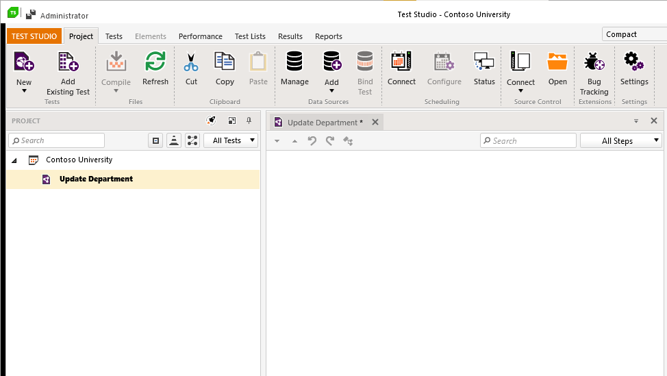
Sands of MAUI: Issue #35

$
0
0

Welcome to the Sands of MAUI—newsletter-style issues dedicated to bringing together latest .NET MAUI content relevant to developers.

A particle of sand—tiny and innocuous. But put a lot of sand particles together and we have something big—a force to reckon with. It is the smallest grains of sand that often add up to form massive beaches, dunes and deserts.

Most .NET developers are looking forward to .NET Multi-platform App UI (MAUI)—the evolution of Xamarin.Forms with .NET 6. Going forward, developers should have much more confidence in the technology stack and tools as .NET MAUI empowers native cross-platform solutions on mobile and desktop.

While it is a long flight until we reach the sands of MAUI, developer excitement is palpable in all the news/content as we tinker and prepare for .NET MAUI. Like the grains of sand, every piece of news/article/video/tutorial/stream contributes towards developer knowledge and we grow a community/ecosystem willing to learn and help.

Sands of MAUI is a humble attempt to collect all the .NET MAUI awesomeness in one place. Here's what is noteworthy for the week of November 29, 2021:

Blazor with .NET MAUI

.NET developers building web apps are understandably excited about Blazor—C# code front and back with familiar Razor syntax and productive tooling. With .NET MAUI, the story gets better with Blazor goodness now welcome on native cross-platform apps for mobile and desktop. Eilon Lipton did an awesome session at .NET Conf covering the promise of Blazor on native apps—powered by .NET MAUI.

Developers get to write true Blazor code and bring in Razor Class Libraries into native apps bootstrapped by .NET MAUI—all possible with the modern light weight BlazorWebView component, while maintaining full native device API access. This promise of Blazor on mobile/desktop with .NET MAUI should be the foundation of migrating/modernizing older apps while sharing code with web apps—the future looks good!

BlazorHybrid

Cross-Platform Apps with .NET MAUI

Nish Anil and Vivek Sridhar hosted the latest Microsoft Reactor show called SamosaChai.NET—what better way to learn .NET than over the classic Indian snack time. The guest was none other than James Montemagno who talked through building mobile/desktop apps with .NET MAUI and Blazor.

Over friendly banter, James walked through the .NET MAUI basics, from getting started with the templated solutions to building the complex .NET Conf podcast app. If you are still on the fence about .NET MAUI, this is a great starting point to see the future of cross-platform app development with .NET.

SamosaChai

.NET 6 Unleashed

Matt Soucoup hosted the latest .NET MAUI podcast and invited James Montemagno and David Ortinau for company. On the cards was celebrating all things .NET 6—the release, tooling, .NET Conf and of course, .NET MAUI. When friends hang out live on air, they share customer stories and quality ramblings about the state of modern .NET.

Key takeaways include developer flexibility with .NET—the right tools for the right job without being forced into it. Client developers with .NET have a native desktop and mobile technology stacks to reach just about any device. Web developers doing .NET could be doing some flavor of ASP.NET or Blazor, but many enterprises also have investments in JS stacks with Angular/React—all of which is now welcome in cross-platform native apps with .NET MAUI. Choice in technology stack is a good thing and .NET developers love the flexibility.

MauiPodcast101

.NET MAUI in .NET Curry

DotNetCurry, better known as 'DNC', produces a free digital magazine publication bringing the latest from the .NET/JavaScript worlds, presented by Microsoft MVP's and industry veterans. DNC Magazine recently hit the 50th edition—big congratulations are due for continued efforts to maintain quality and reaching the milestone. The 50th edition does not disappoint and is packed with loads of .NET/JS content, including big coverage of .NET MAUI.
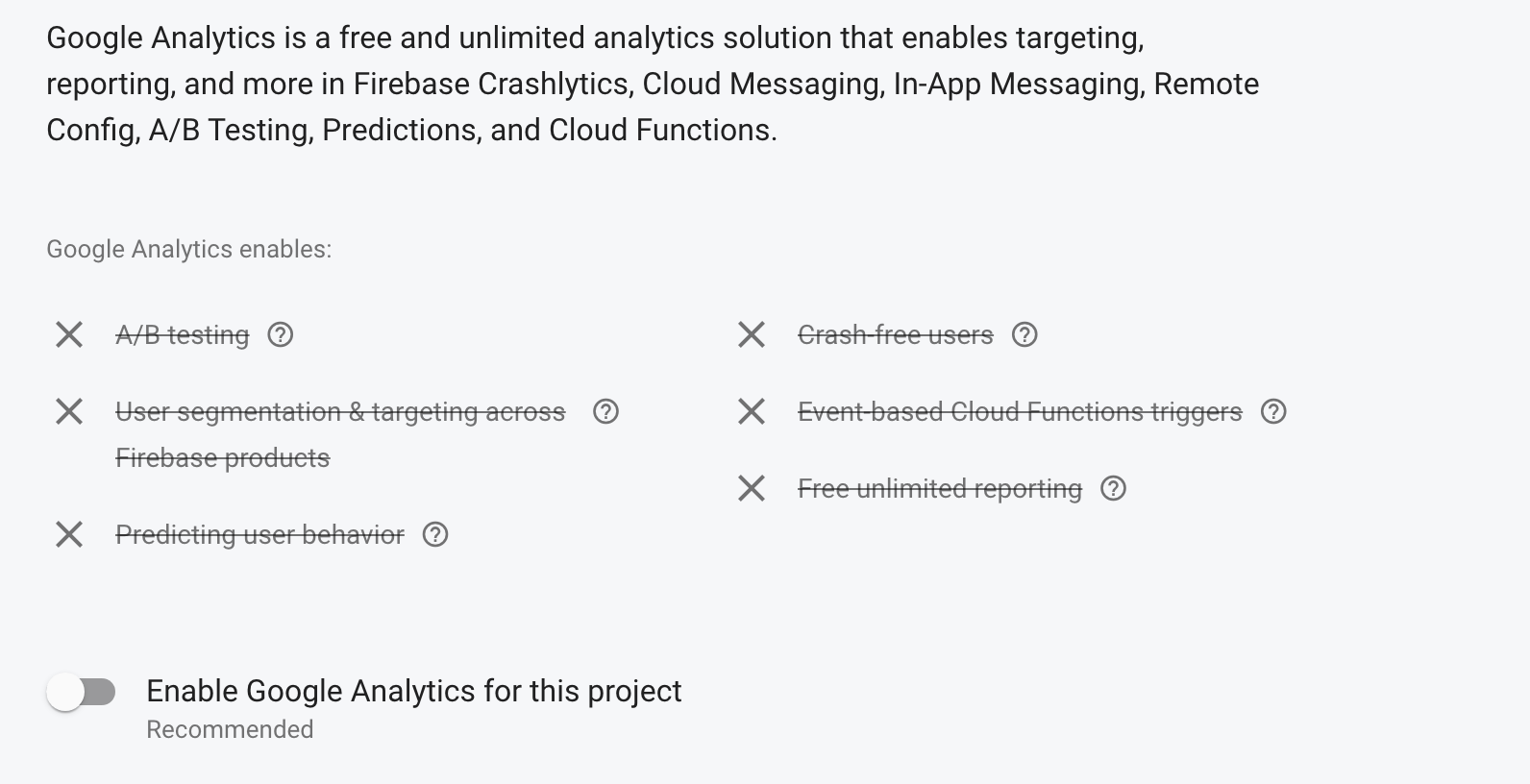
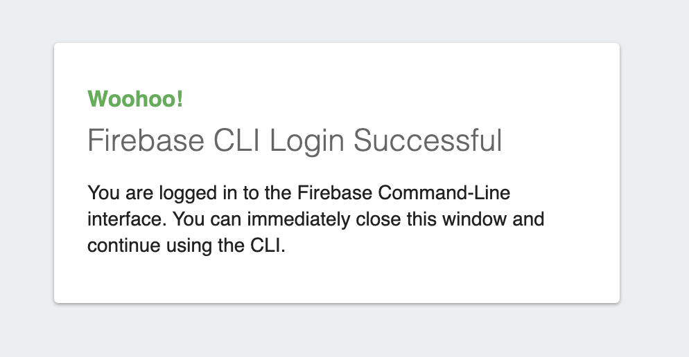
Gerald Versluis turned off his usual camera/microphone and took to the keyboard to write up a piece of what developers can expect with .NET MAUI. Gerald covers the .NET MAUI basics, the new Handler architecture, Host Builder model, bringing in Blazor goodness and several other benefits that .NET MAUI brings to the table. Going offline for a bit? This 50th edition DNC Magazine is a must to download and soak in all the latest developer content.

DNC

TinyMvvm for .NET MAUI

For good reason, the MVVM design pattern works well for XAML/C# codebases and much of the core features are supported out of the box in Xamarin.Forms/.NET MAUI. When you need just a little bit more help, but want to stay away from heavier MVVM frameworks, you may look at TinyMvvm, an open-source light-weight MVVM library custom built for Xamarin.Forms.

Wondering what the future holds with TinyMvvm with .NET MAUI? Developer Daniel Hindrikes has you covered. After the 3.0 release, the first preview of TinyMvvm for .NET MAUI is now out and ready for you to give things a spin. Not surprisingly, the MauiAppBuilder Host Builder pattern to bootstrap .NET MAUI apps works well with dependency injection—it would be really simple to use an extension method with a resolver and get rolling using TinyMvvm for .NET MAUI apps.

TinyMVVM

That's it for now.

We'll see you next week with more awesome content relevant to .NET MAUI.

Cheers, developers!

Checking the Health of Your ASP.NET Core APIs

$
0
0

With the advent and popularization of web APIs and microservices, monitoring their health is indispensable, and when dealing with multiple APIs at the same time, this task can become quite challenging. But there are some features that help us develop checks quickly and accurately—health checks.

What Are Health Checks in ASP.NET Core?

Health checks are part of the middleware and libraries provided by ASP.NET Core to help report the health of application infrastructure components.

Why Do We Need Health Checks?

Because through them we can monitor the functioning of an application in real time, in a simple and direct way. ‍⚕️

How Do Health Checks Work?

To know if an API is running in a healthy way or not, we use a health check to validate the status of a service and its dependencies through an endpoint in the API of the REST service.

This allows us to quickly and in a standardized manner decide if the service or our dependences is off.

This endpoint uses a separate service that assesses the availability of the functions of the rest of the system and also the state of its dependencies.

The information collected during the check can include performance calculations, runtime or connection to other downstream services. After completing the evaluation, an HTTP code and a JSON object are returned depending on the evaluation of the services in the health check.

Now that we know the basics about health checks, we can implement an example and see in practice how it works.

‍ You can access the full source code here.

Creating the Project

Open a PowerShell console in the folder where you want to create the project, then give the command below. This command will create an ASP.NET 5 Web API project with the name “HealthCheck.” Once it’s created, you can open the file “HealthCheck.csproj” with Visual Studio.

dotnet new webapi -n HealthCheck --framework net5.0

Then create a new controller named “HealthController” and add the following code:

using Microsoft.AspNetCore.Mvc;
using Microsoft.Extensions.Diagnostics.HealthChecks;
using Microsoft.Extensions.Logging;
using System.Net;
using System.Threading.Tasks;

namespace HealthCheck.Controllers
{
    [Controller]
    [Route("health")]
    public class HealthController : ControllerBase
    {
        private readonly ILogger<HealthController> _logger;
        private readonly HealthCheckService _service;

        public HealthController(ILogger<HealthController> logger, HealthCheckService service)
        {
            _logger = logger;
            _service = service;
        }

        [HttpGet]
        public async Task<IActionResult> Get()
        {
            var report = await _service.CheckHealthAsync();

            _logger.LogInformation($"Get Health Information: {report}");

            return report.Status == HealthStatus.Healthy ? Ok(report) : StatusCode((int)HttpStatusCode.ServiceUnavailable, report);
        }
    }
}

Our controller will contain the method responsible for checking the API health. When it receives a request, it will check it, and then it will return a JSON with the response content and, as a good practice, we added a method to log the execution.

Registering the HealthCheck Service

Open the file “Startup.cs” and inside it find the method “ConfigureServices”. Inside it, add this code snippet:

services.AddHealthChecks();

Now you can start the application, and you will see the /health route that we just created. You can use Fiddler to make the request like in the image below:

Get Health By Fiddler Everywhere

When we sent a request to the /health route, the application returned a JSON object with some information:

Entries: A dictionary-type object in this case is empty.

Status: 2 - Derives from the “HealthStatus” enum and as the summary means: “Indicates that the health check determined that the component was healthy.”

TotalDuration: Health Check runtime information.

In simple terms, our API is “healthy”—no problems were found and we now have a route just to check this.

Health Check in Database

In addition to the integrity of the application, we can also check other basic factors such as the connection to a database.

In this case, we will use Redis as a database. You need to have it running on your machine in a Docker image or directly. If you want you can use any other database just change the connection string.

For that, we need to install the package: “AspNetCore.HealthChecks.Redis” - Version=“5.0.2”.

You can install it in the project with NugetPackage or from the console with the command:

dotnet add package AspNetCore.HealthChecks.Redis

Now let’s create a “Helper” class where we’ll put the connection string with Redis. Then create a folder called “Helpers” in the project, and inside it create a static class called “UtilsHelpers” and inside it put the following code:

public static string GetConnectionString()
{
return "localhost:6379";
}

In the file “Startup.cs” add the method responsible for verifying the connection with Redis. It will use the connection string that we just created.

So the Startup’s “ConfigureServices” method should look like this:

 public void ConfigureServices(IServiceCollection services)
        {
            //Here is HealthCheck and the connection to Redis
            services.AddHealthChecks()
                .AddRedis(redisConnectionString: UtilsHelpers.GetConnectionString(), name: "Redis instance");

            services.AddControllers();
            services.AddSwaggerGen(c =>
            {
                c.SwaggerDoc("v1", new OpenApiInfo { Title = "HealthCheck", Version = "v1" });
            });
        }

If your connection to Redis or another database you have used is OK, when you make the request through Fiddler, we will get the following result, showing the information about the connection:

Health Redis By Fiddler Everywhere

HealthCheck Through a Graphical Interface

Another interesting function that the ASP.NET Core health checks provide is a graphical interface with a kind of fun dashboard so that we can view the events that took place during the checks and the history of the entire execution.

So, let’s implement it and see this working. For that, we need to install the following dependencies in the project:

  • AspNetCore.HealthChecks.UI
  • AspNetCore.HealthChecks.UI.Client
  • AspNetCore.HealthChecks.UI.InMemory.Storage

Now at the “Startup” of the project, we will add the configurations of the libraries that we just installed in the project, then replace the method “ConfigureServices” with this one below. You can see in the comments the responsibility of each configuration.

        public void ConfigureServices(IServiceCollection services)
        {
            //Here is HealthCheck and the connection to Redis
            services.AddHealthChecks()
                .AddRedis(redisConnectionString: UtilsHelpers.GetConnectionString(), name: "Redis instance");

            services.AddControllers();
            services.AddSwaggerGen(c =>
            {
                c.SwaggerDoc("v1", new OpenApiInfo { Title = "HealthCheck", Version = "v1" });
            });

            // Here is the GUI setup and history storage
            services.AddHealthChecksUI(options =>
            {
                options.SetEvaluationTimeInSeconds(5); //Sets the time interval in which HealthCheck will be triggered
                options.MaximumHistoryEntriesPerEndpoint(10); //Sets the maximum number of records displayed in history
                options.AddHealthCheckEndpoint("Health Checks API", "/health"); //Sets the Health Check endpoint
            }).AddInMemoryStorage(); //Here is the memory bank configuration
        }

And the “Configure” method replace it with this:

public void Configure(IApplicationBuilder app, IWebHostEnvironment env)
        {
            if (env.IsDevelopment())
            {
                app.UseDeveloperExceptionPage();
                app.UseSwagger();
                app.UseSwaggerUI(c => c.SwaggerEndpoint("/swagger/v1/swagger.json", "HealthCheck v1"));
            }

            app.UseHttpsRedirection();

            app.UseRouting();

            app.UseAuthorization();

            app.UseEndpoints(endpoints =>
            {
                endpoints.MapControllers();

                //Sets the health endpoint
                endpoints.MapHealthChecks("/health");
            });

            //Sets Health Check dashboard options
            app.UseHealthChecks("/health", new HealthCheckOptions
            {
                Predicate = p => true,
                ResponseWriter = UIResponseWriter.WriteHealthCheckUIResponse
            });

            //Sets the Health Check dashboard configuration
            app.UseHealthChecksUI(options => { options.UIPath = "/dashboard"; });
        }

Our dashboard is almost ready to work. Now, in the “UtilsHelpers” class, add the following method:

 public static string ToJSON(this object @object) => JsonConvert.SerializeObject(@object, Formatting.None);

Important! To use the “SerializeObject” method, you need to install “Newtonsoft.Json” - Version=“13.0.1” as dependency.

And now, in the “HealthController” replace the “Get” method with this:

        [HttpGet]
        public async Task<IActionResult> Get()
        {
            var report = await _service.CheckHealthAsync();
            var reportToJson = report.ToJSON();

            _logger.LogInformation($"Get Health Information: {reportToJson}");

            return report.Status == HealthStatus.Healthy ? Ok(reportToJson) : StatusCode((int)HttpStatusCode.ServiceUnavailable, reportToJson);
        }

Finally, we can see our dashboard. For that, start the application and go to “localhost:PORT/dashboard”. If you followed all the previous steps, you will see in your browser this beautiful dashboard with the verification data:

Health Check Dashboard

Customizing the Checks

An interesting feature is the possibility of customizing the checks, choosing how we want to return the results.

For this we need to create a class that will inherit the interface “IHealthCheck”. Then create a folder called “Custom” and inside it create a class named “CustomHealthChecks” and put the code below in it:

using Microsoft.Extensions.Diagnostics.HealthChecks;
using System;
using System.Net;
using System.Net.Http;
using System.Threading;
using System.Threading.Tasks;

namespace HealthCheck.Custom
{
    public class CustomHealthChecks : IHealthCheck
    {
        public async Task<HealthCheckResult> CheckHealthAsync(HealthCheckContext context, CancellationToken cancellationToken = default)
        {
            var catUrl = "https://http.cat/401";

            var client = new HttpClient();

            client.BaseAddress = new Uri(catUrl);

            HttpResponseMessage response = await client.GetAsync("");

            return response.StatusCode == HttpStatusCode.OK ? 
                await Task.FromResult(new HealthCheckResult(
                      status: HealthStatus.Healthy,
                      description: "The API is healthy (。^▽^)")) :
                await Task.FromResult(new HealthCheckResult(
                      status: HealthStatus.Unhealthy, 
                      description: "The API is sick (‘﹏*๑)"));
        }
    }
}

In this class, we are creating a method that makes a request to a “cat” API and returns the result with a funny Kaomoji.

But it’s not done yet—we need to do the class dependency injection.

So at startup, we’re going to add the check in the class right after the Redis check, so the “ConfigureServices” method should look like this:

       public void ConfigureServices(IServiceCollection services)
        {
            //Here is HealthCheck and the connection to Redis
            services.AddHealthChecks()
                .AddRedis(redisConnectionString: UtilsHelpers.GetConnectionString(), name: "Redis instance")
                .AddCheck<CustomHealthChecks>("Custom Health Checks"); //Here is the custom class dependency injection

            services.AddControllers();
            services.AddSwaggerGen(c =>
            {
                c.SwaggerDoc("v1", new OpenApiInfo { Title = "HealthCheck", Version = "v1" });
            });

            // Here is the GUI setup and history storage
            services.AddHealthChecksUI(options =>
            {
                options.SetEvaluationTimeInSeconds(5); //Sets the time interval in which HealthCheck will be triggered
                options.MaximumHistoryEntriesPerEndpoint(10); //Sets the maximum number of records displayed in history
                options.AddHealthCheckEndpoint("Health Checks API", "/health"); //Sets the Health Check endpoint
            }).AddInMemoryStorage(); //Here is the memory bank configuration
        }

Now we can start the application again and we will have the following result in the dashboard:

Health Check Dashboard Custom

Conclusion

In this article, we saw the importance of doing the health check in our APIs and how to implement it in a simple way with health check resources. We also learned how to use the dashboard’s graphical interface and customize the results.

I hope this article is helpful in creating your health checks! See you soon.

Viewing all 4338 articles
Browse latest View live


<script src="https://jsc.adskeeper.com/r/s/rssing.com.1596347.js" async> </script>