We're happy to say that in the latest release of Fiddler, we now offer official support for all Chocolatey users.
Seven months ago, the unofficial Fiddler package was removed from the Chocolatey package list. Since that time, official Chocolatey support has become the highest voted item in our Feedback Portal. We've heard you, and are happy to say that the wait is now over.
Fiddler Package for Chocolatey
We’re happy to inform you that Fiddler is back for all Chocolatey users. And this time it’s officially supported by Progress. You can now easily install Fiddler on your machines using the package manager.
How Can You Use It?
To install Fiddler using the Chocolatey package manager, just type the following command in the console.
choco install fiddler
Package parameters:
--install-arguments "/D=install path" - (optional) Sets the install directory.
NOTES:
Fiddler installs for the current user so you need to execute the `choco install fiddler` command with the user account you intend to use FIddler with. If this account does not have admin rights, you could use the [Non-Administrative install](https://chocolatey.org/install#non-administrative-install) flavor of Chocolatey.
The default install directory is *`%LOCALAPPDATA%`\Programs\Fiddler*. If you prefer to install Fiddler somewhere else, please use the `--install-arguments "/D=install path"` parameter.
We hope you enjoy this official support for Chocolatey, and all the other improvements we've made with the latest release. You can try it out by downloading the latest version of Fiddler for free right here.
Looking for an easy and automated way to test your Kendo UI controls? Learn how you can use our tools to make testing simple.
You are working with Kendo UI and you want to automate your day-to-day testing procedures. It is easier to test a custom control framework when you know it from the inside. Let us show you how to do that with Progress Testing Framework, Test Studio, and Test Studio Dev Edition.
Built-in Support for Kendo UI Controls
Testing Framework, Test Studio and Test Studio Dev Edition have out-of-the-box support for Kendo UI for Angular, Kendo UI for jQuery and the Telerik UI for AJAX and UI for Silverlight RadControls. Every type of control is isolated in a separate library which can be found in the \Bin\Translators folder located inside the Test Studio installation folder.
For example, if we want to test a web application which is using Kendo UI for Angular components, we should add references in our test project to the following libraries: Telerik.TestStudio.Translators.Common.dll and Telerik.TestingFramework.Controls.KendoUI.Angular.dll.
Finding and Using Kendo UI Elements
To test a component, we first need to find it. All Testing Framework and Test Studio find mechanisms are valid for this task, including the newly added CSS selector query. After finding the desired component it should be cast to the respective built-in control type. In the next example we will locate a <KendoAngularGrid> element and verify the number of currently displayed rows. Don't forget to include the required using statements!
using Telerik.TestStudio.Translators.Common;
using Telerik.TestingFramework.Controls.KendoUI.Angular;
using Telerik.TestingFramework.Controls.KendoUI.Angular.Grid;

// Navigate to Kendo UI for Angular grid demo page
ActiveBrowser.NavigateTo("https://www.telerik.com/kendo-angular-ui/components/grid/selection/", true);

// Find the first grid located in the first frame of the page
KendoAngularGrid grid = Manager.ActiveBrowser.Frames[0].Find.AllByTagName<KendoAngularGrid>("kendo-grid").FirstOrDefault();
Kendo UI Control-Specific Verifications
Additionally, to significantly facilitate the testing process, all Kendo UI controls have properties exposing the current state and providing easy access to their internal structure. Therefore, now we can use the DataItems property exposed by the KendoAngularGrid class to access its rows and verify their count:
// Verify the number of rows of the grid
var expectedGridDataItemsCount = 77;
var actualGridDataItemsCount = grid.DataItems.Count;
Assert.AreEqual<int>(expectedGridDataItemsCount, actualGridDataItemsCount);
Log.Writeline("Grid rows count is: " + grid.DataItems.Count.ToString());
Following the same logic, we can select the first row of the Kendo UI grid and verify its index in the currently displayed structure:
// Selext the first row of the grid
KendoAngularGridDataItem firstRow = grid.DataItems.FirstOrDefault();

// Verify first row index
var expectedRowIndex = 0;
var actualRowIndex = firstRow.ItemIndex;
Assert.AreEqual<int>(expectedRowIndex, actualRowIndex);
Log.WriteLine("First row index is: " + firstRow.ItemIndex.ToString());
Kendo UI Control-Specific Actions
Furthermore, the built-in control types in Testing Framework and Test Studio provide methods for invoking actions specific to the respective Kendo UI control, which otherwise could be hard to trigger due to the internal event flow.
In this example we will use a <KendoAngularSwitch> element, try to toggle its state and confirm that the change was successful. Once again, do not forget to include the necessary using statements!
using Telerik.TestStudio.Translators.Common;
using Telerik.TestingFramework.Controls.KendoUI.Angular;
using Telerik.TestingFramework.Controls.KendoUI.Angular.Switch;
Initially, we navigate to the respective Kendo UI for Angular demo page and locate the element:
// Navigate to Kendo UI for Angular switch demo page
ActiveBrowser.NavigateTo("https://www.telerik.com/kendo-angular-ui/components/inputs/switch/", true);

// Find the first switch located in the first frame of the page
KendoAngularSwitch kendoSwitch = Manager.ActiveBrowser.Frames[0].Find.AllByTagName<KendoAngularSwitch>("tagname=kendo-switch").FirstOrDefault();
Afterwards, we use the built-in control property IsSwitchOn to confirm that the initial state of the Kendo UI for Angular Switch is on:
var expectedToggleState = true;
var actualToggleState = kendoSwitch.IsSwitchOn;
Assert.AreEqual<bool>(expectedToggleState, actualToggleState);
Log.WriteLine("Switch is on: " + kendoSwitch.IsSwitchOn.ToString());
Consequently, we invoke the method Toggle exposed by the control to change the state of the Kendo UI for Angular Switch to off:
// Toggle switch off
kendoSwitch.Toggle();
Log.WriteLine("Switch toggled.");
Finally, we can verify that Kendo UI for Angular Switch state really changed to the desired state by once again using the IsSwitchOn property:
// Verify switch state is off
var expectedSwitchToggleState = false;
var actualSwitchToggleState = kendoSwitch.IsSwitchOn;
Assert.AreEqual<bool>(expectedSwitchToggleState, actualSwitchToggleState);
Log.WriteLine("Switch is on: " + kendoSwitch.IsSwitchOn.ToString());
Codeless, Easy Automation Testing of Kendo UI Controls with Test Studio
Now that we've played around with the API, let's see how we can do the same things the easy way. The Test Studio stand-alone application and Test Studio Dev Edition provide access to all of the above through a friendly and intuitive user interface.
Automatic Verifications in a Dedicated and Intuitive Recorder
Once you start up the built-in Recorder, you get visual access to the full tree of elements of your web application. Just hit the "Highlight Element" button and you're ready to go. Test Studio performs all the heavy lifting in terms of element finding in the background for you:
Here, when you hover the mouse over the element of your choice, you get a context-sensitive menu with translated controls, together with actions and verifications available for these controls.
Let's go back to our earlier example — verifying the count of rows of your grid. We saw how it's done in code, now let's see how you can do it hassle-free. Simply point your mouse over the grid and wait for the context menu to pop up. There, when you navigate through the menu, you'll find the needed verification. Click it, and it's already a step in your test flow:
Yes, it's that easy!
Say we want next to verify that a certain cell in our grid contains some specific text. Just find the cell of interest, hover over it, navigate through the context menu and select the verification you need:
Again, it really is that easy!
Automatic Actions Translation in Recorder
There's also an easy way to record the action, specific to a given Kendo UI component. Instead of finding the element and casting it to the required type, and looking for the appropriate method to invoke, simply visually locate the desired component in your application page, point it with the mouse and perform the action you need.
In the above case with the Kendo UI for Angular Switch control, just point at the element and toggle it. The action is readily recorded as a step in your test.
Easy, right?
You can then add verifications for the state of the Switch, the very same way we did with the Grid — hover over the Kendo UI for Angular Switch, wait for the pop-up menu, navigate to the needed verification and click:
Piece of cake!
Easily Turn Recorded Actions and Verifications into Code
Still, if you really, really love your code, don't worry. You can effortlessly convert what you've just clicked to code and it will still work, as if you just typed it in yourself.
Just select the step in question, right-click it, select "Edit in code" and you're ready to go back to coding the way you like:
Side note: the generated code looks like it's missing something just because Test Studio has already silently performed the element discovery magic previously, when we clicked on the Kendo UI for Angular Switch element.
Of course, you can do the same for all available verifications.
Conclusion
All-in-all, Testing Framework, Test Studio and Test Studio Dev Edition will indeed make your testing life much easier, and you should definitely keep it in mind when planning to automate your Kendo UI-based web application testing. Whether you like to write your own testing logic fully in code, or you would rather feel like spending more time on other automation tasks and wish to click your way through Kendo UI components testing automation, we provide you with the tooling to complete your day-to-day tasks. And, yes, it's lean and easy.
Learn how state machines can make development a little easier, including tips for better UI development.
UI development is more complex than it appears. In fact, behind all of your favorite UI elements and actions lie secret machines: state machines. Once you understand how to manage state and state machines, it'll make your life easier.
For example, state might be either
var IsLoggedIn = false
Or
var IsLoggedIn = true
But there's still more complexity there: is that login in progress? Is that login successful?
That's the challenge UI engineers and developers face; in fact, UI expert Krasimir Tsonev suggests managing state is what those UI developers spend most of their time doing. If it were easy, it wouldn't take that much time.
(Of course, nothing is as easy as it seems, but managing state doesn't even *seem* easy.)
Tsonev, in his presentation from DevReach (see the full video below), dives right into the thorniest issues of managing state, and teaches you how understanding and state machines can make your life easier.
All of those state variables in the example with which Tsonev starts are the "elephant in the room." State is a variable that changes over time: his explanation is very clear (watch it!), contrasting state management and data management.
Every app, he explains, has unique state management, making frameworks hard to apply.
Given the scope of the problem, he then explains how we got here over time, starting in 2006. In an epiphany recently, he explains that perhaps there's no state management, but, instead, data and flow management.
We are writing and implementing state machines every day: they store your states; accepting input to change the state. He explains a real-world example of a turnstile with either a locked or unlocked state, and which inputs result in which state.
You can visualize each state in a table form:
State > input > transition to what state
You can envision each state, each input, and what the resulting transition state is. He walks through a detailed example to make sure you're ready to try it in your own apps, understanding how the state machine operates.
Working through the state table helps you engineer your state machines so that they respond appropriately to each input — and respond only to the correct inputs you've designed. It helps you, similarly, to handle errors elegantly as well.
Once the general concepts are understood and the state planning is done, Tsonev gives clear and specific examples in code to help you best understand how to get started.
Give Tsonev's presentation a look and make your UI state management easier. Watch the whole presentation from DevReach:
About the Presenter
Thanks to Krasimir Tsonev for demystifying State Machines. He's an experienced developer and the author of Node.js Blueprints and Node.js by Example. Find him at: @KrasimirTsonev, krasimir (GitHub), and antidote.me.
A summary of Angular Schematics: the what, how and why. Here's the super simple version!
If you're an average Angular developer that hasn't quite reached power-user light level, then this article is for you! If you've heard of a three syllable word (schematics) but haven't figured out what it does or how it works, then this article is also for you! We are going to cover the basics of what schematics are and what you can do with them.
What Are Schematics Anyways?
If you've been around the Angular community for a hot minute, you've probably heard of Schematics. But what are they and, more importantly, what cool things can we use them for?
If you search for the term "Angular Schematics," you will inevitably find yourself at the Angular DevKit repo on GitHub:
Next step: understanding the relationship between the Angular CLI, Angular Schematics and this new player—the DevKit.
Well, the DevKit is simply a set of libraries to “manage, develop, deploy and analyze your code” and currently just contains the CLI and Schematics. That is all well and dandy, but how does the CLI fit into this story?
The CLI peeps created Schematics to be a more “powerful and generic” way to support the CLI scaffolding. You can read about the four reasons why in the article, Schematics — An Introduction by Hans Larsen.
Schematics
So, we know why Schematics were created and what the CLI team is using them for, but how about for us? I like how Tomas Trajan put it though, he said Schematics are a “recipe” for generating and modifying files in your project. You call this recipe with this command: ng generate <schematic-name>.
Schematics Collection
If you've heard about Schematics, you might have also heard about Collections. A Schematics Collection is simply a project that has at least one schematic in it.
Schematic Collections are usually just that, a collection of named Schematics that people publish and allow others to then install. The Angular team maintains the official @schematics/angular collection, which contains Schematics like component, module and application. But normal users like you and I can take advantage of Schematics and make them available for use to the WORLD!
What Are Some Useful Things You Can Do with Angular Schematics?
Understanding the definition of Schematics is only part of understanding what they really are. To fully understand, you also have to know what you can do with Schematics. This next section covers a small list of what you can do with Schematics, although it might be easier to ask “What can't you do?” than to answer “What can you do?”.
Nx by Nrwl
You can use Schematics to create a library of services. A perfect example of this is the company Nrwl. They created Nx, which is a collection of Schematics and helper services that structure an Angular CLI project to enable building at scale and with multiple teams and apps.
If you'd like to give Nx a try, use ng add @nrwl/schematics to add the Nx goodies to your project and configure the Angular CLI space to be in the Nx format. From there, you can use the Schematics that Nx provides to add apps, libraries and other common pattern stuff (like ngrx, etc.).
Nx also has several binaries (they are command line scripts, like what ng itself is) that can be run in the command line to do things like only test apps affected by code changed in a commit, generate a data visualization diagram of your app and libs, format and lint code across your workspace, etc. — Justin Schwartzenberger
With Schematics, a very common use is to enable build commands for your library or service (like ng add and ng update). You can also generate project skeletons with the environment configured to be already setup with the latest, no need to spend hours combing through outdated docs! Lastly, as Gianna Ciaramello put it, “Schematics can also be used to easily introduce and enforce project wide conventions.”
Create Your Own Schematic!
If you would like to give Schematics a shot, you just need to follow these three simple steps to get going! First, using node 6.9 or higher, install the Schematic command line tool:
npm install -g @angular-devkit/schematics-cli
Now that we have the command line tool installed, we have access to this nifty executable that will create a blank schematic project:
schematics blank --name=my-awesome-component
We can see the component created in our project:
Use Case: How We're Using Schematics for Kendo UI
To give another example of a cool company is using Schematics to benefit users, you have to look no further than this very website! Kendo UI uses Angular Schematics to ensure that ng add works properly for all of our packages. Like we mention here, this goes through all of the proper steps to ensure that you're off to the races with our components once you ng add any of them to your project.
We also have dependencies on other Kendo UI for Angular packages. Using Schematics, it simplifies adding in our references in to the app module, and it also simplifies using our themes with angular.json configuration. All of these are points where someone could come in and try Kendo UI for Angular, run into configuration issues and then give up. But with Schematics, we can ensure that people have a good getting-started experience. Schematics also help us ensure that projects are set up the right way.
All around, Schematics are a pretty powerful tool that this girl thinks are currently under-used in our Angular industry. I think as more and more people try them out, the more popular they will become. We here on the Kendo UI team sure love them!
Microsoft's Azure Functions is a modern serverless architecture, offering event-driven cloud computing that is easy for developers to use. This article provides an overview of what they are and how they work.
Serverless computing is all the hype these days—glad that you and I started talking all things serverless during our flight to a developer conference! We talked about different types of cloud computing, what exactly serverless is and some scenarios you could use it for. We took a break for the beverage service, but now with our coffees in hand, we can start the conversation again. This time however, I want to dive into the details and talk about Microsoft's serverless cloud computing offering, Azure Functions.
Since we're cruising at 35,000 feet, let me first give you the 35K foot overview of what exactly Azure Functions are, and what they can do for you. Then we'll quickly build an Azure Function to see it in action. Yeah, that's right—we'll be able to build, test and run an Azure Function all on terrible airplane Wi-Fi!
What Are Azure Functions?
Microsoft's Azure Functions is a modern serverless architecture, offering event-driven cloud computing that is easy for developers to use. It provides a way to run small pieces of code or Functions in the cloud without developers having to worry themselves about the infrastructure or platform the Function is running on.
That means we're only concerned about writing the logic of the Function. And we can write that logic in our choice of languages: JavaScript, C#, F# or Java. We are also able to add dependencies/packages from npm or NuGet to Azure Functions—this way, we don't have to reinvent the wheel and can use well-tested libraries.
And of course, I'm obligated to mention the pricing model of Azure Functions—you only pay for what you use. With Azure Functions being a serverless offering, you're only charged when your Function is actually running—not while it is sitting idle waiting for something to happen. This means no more hosting Virtual Machines or running apps in the cloud—Azure will figure out as much or as little infrastructure that is needed to run your Function on demand. You literally pay for only the compute time to execute your Function in the cloud—the cost savings can be substantial.
Now, let's talk about how an Azure Function gets invoked.
Triggers and Bindings
An Azure Function is a self-contained piece of code that waits to be executed. What starts that execution? Something called a trigger. A trigger simply listens to external services for certain events to occur, then fires up the hooked-up Functions in response. Azure Functions can be started by numerous triggers, such as an HTTP request, a BLOB being inserted into a container or a timer being lapsed.
That's not all though, Azure Functions can also be bound to external services as well. These bindings are effectively input parameters and return values from your Function. An example of an input parameter could be a specific record in an Azure Cosmos DB database. An output binding could be an Azure Storage Queue message. Azure Functions even support third-party bindings—your Function can have Twilio send a text message! After configuring Twilio, all you need to do is return the appropriate type of object from your Function.
Here's the kicker: the Function runtime handles the connection to the binding for you. That means you don't have to new up or worry about disposing objects that the Function is bound to. You set up some one-time configuration settings and then place attributes on parameters (as you'll see below), and the Functions runtime will take care of the rest!
Enough talk! Let's break out the laptop and code up a simple Function, shall we?
Let's Build an Azure Function!
Don't worry about having an Azure subscription or even being connected to the internet—we can develop and debug Azure Functions locally using either Visual Studio or Visual Studio Code! See, I told you we didn't need to worry about the Wi-Fi on this flight!
The incoming HTTP call is the trigger and the message queue the Function writes to is an output binding. Let's have at it!
You do need to have some tools downloaded and installed to get started. First and foremost, you'll need to install the Azure Function Core Tools, which is a local version of the actual Azure Functions runtime. Then you'll need Visual Studio Code with the Azure Functions extension installed to do the development with. Finally, you'll need the Azure Storage Emulator installed as well—this will allow us to write to a message queue locally.
Now with all of the tooling out of the way, let's write a Function!
First, fire up Visual Studio Code. Then, from the command palette, type: Azure Functions: Create New Project
Then follow the steps as to which directory you want to create the project in and which language you want to use.
After the templates have finished installing, you may get a prompt to download additional components—these are NuGet packages. Go ahead and do that.
Now we have a Function project, but no Functions! Let's fix that. From the command palette again, type: Azure Functions: Create Function
It will then prompt you to pick the folder in which your Function app resides and then select a template.
Pick the HTTPTrigger and name it PostToAQueue. After giving it a namespace, it prompts for an authorization level—pick Anonymous.
Now we have a Function! Let's go ahead and hit F5 and see it run!
After it starts, you'll see the Azure Functions logo appear in the Terminal window and then URL the Function is located at.
In a web browser, we'll type in: http://localhost:7071/api/PostToAQueue?name=Matt and the Function will respond. You can even set breakpoints in Visual Studio Code and step through the code!
Writing to a Queue
Next, we'll get this HTTP trigger Function to write to a local Azure Storage Queue.
First thing we want to do is set a configuration setting to tell the Function runtime where to find the Storage. Open up local.settings.json and set "AzureWebJobsStorage" to "UseDevelopmentStorage=true". The full file will look like:
Then create a new class within your project. This class will hold nothing but properties. Call it whatever you want and add whatever properties you want to it. I called mine TheMessage and added an Id and Name properties to it.
Finally, change your PostToAQueue Function, so it looks like the following:
[StorageAccount("AzureWebJobsStorage")]
public static class PostToAQueue
{
  [FunctionName("PostToAQueue")]
  [return: Queue("demo-queue")]
  public static TheMessage Run([HttpTrigger(AuthorizationLevel.Anonymous, "get", "post", Route = null)]HttpRequest req, TraceWriter log)
  {
    string name = req.Query["name"];

    var msg = new TheMessage { Id = Guid.NewGuid(), Name = name};

    return msg;
  }
}
Note the addition of the StorageAccount class-level attribute. This is telling the Function to use the storage connection we specified before. Then there's one more attribute at the Function level: [return: Queue("demo-queue")]. This is specifying which queue to use in that storage account.
Finally, we changed the return type to TheMessage (and it could be any class at all here).
Then, by returning the function, that class is written into the queue. And that's it. We don't have to handle new'ing up anything specific to the storage account or the queue—the Azure Functions runtime takes care of all of that for us!
Before running it again, start the Microsoft Storage Emulator (find it via the Windows start menu). Then hit F5, and issue the same HTTP GET as before.
If you have the Azure Storage Explorer installed, you can browse your local Queue and see the new message in there!
Summing Up
We had a quick look at what Microsoft's serverless offering, Azure Functions, is comprised of. It's a full-featured FaaS offering that enables you to write functions in your language of choice, including reusing packages such as those from NuGet or npm!
A highlight of Azure Functions is the way they are triggered and bound. The triggers define how a Function starts, and bindings are akin to input and output parameters on it that correspond to external services. The best part is that the Azure Function runtime takes care of maintaining the connection to the external services so you don't have to worry about new'ing up or disposing of the connections yourself. We then wrote a quick Function that gets triggered off an HTTP request and then writes a query string parameters from that request into a local Azure Storage Queue.
The flight is about to land now—but let's meet up at the conference and I'll show you a fully featured Azure Function that makes use of a couple different bindings to do some amazing things. Down from actual clouds, but off to the clouds with our code!
Telerik Reporting and Telerik Report Server provide several components out of the box to connect your reports to various data-providing sources. They can be set up in design time using dedicated DataSource Wizards that will guide you through the component setup. This makes the configuration process intuitive with little to no programming involved.
Some of our DataSource components are dedicated to specific platforms. They are described briefly at the end of the blog post.
The Most Popular SqlDataSource
Our SqlDataSource component enables connections with Microsoft SQL Server, MySQL, Oracle, OLE DB or ODBC databases. You only need to provide a connection string and define the SQL statement or the Stored Procedure to retrieve the data. The SqlDataSource Wizard features a built-in Query Designer that further improves the user experience.
The SqlDataSource also supports parameterized SQL queries. The parameters in its Parameters collection are associated with placeholders in the SelectCommand query and can be evaluated with any valid Expression.
To further facilitate the database connection, Telerik Reporting is coming with a bundle of Progress DataDirect ODBC drivers that can connect your reports to some of the major databases.
Flexibility with the ObjectDataSource
The ObjectDataSource component provides a way to bind the report Data Items to a business object or other class (middle tier in a multi-tier architecture) without extra code. With ObjectDataSource, the data is provided to the report by executing custom code, which gives the flexibility to use virtually any data source that is accessible in the .NET environment.
The security is assured by letting the ObjectDataSource resolve only types that are declared either in the current report's assembly or in the application configuration file.
Use CsvDataSource When Data Comes from a Text Source
CsvDataSource component links to data located in a Comma Separated Values (CSV) document, including files (*.csv, *.tsv, *.txt, etc.), inline string or stream. It is extremely useful for test purposes as the data can be embedded inside the report definition.
Platform/Framework-Specific DataSource Components
We provide you with the means to seamlessly integrate Telerik Reporting with applications or websites that utilize popular frameworks, platforms or services:
While many in the States might be spending the 4th of July watching a parade, that doesn't mean the rest of the world has to be left out.
Some of my favorite childhood memories include summer family road trips from California to Illinois in a red, two-door Ford Fairmont without any air conditioning, squished between my brothers in the backseat. Jeff, my younger brother, leaving his brand new Tauntaun from The Empire Strikes Back (the one with the open belly rescue feature) in the back windshield during one of our stops and it melting into a pile of goo.
My father was a history teacher and my mom a lifelong learner, so we would stop at every historical landmark along our route (and sometimes go out of our way to find them) and my brothers and I had to document our experiences in our journals.
As you might imagine, Independence Day in the United States of America (the 4th of July, if you weren't aware) was kind of a big deal for a family with parents who held a passion for history. We celebrated, as most modern Americans do, by spending time with friends and family, barbecuing or picnicking, watching parades and outdoor concerts, and always ending the night with fireworks. But my parents also always ensured we understood the what and why behind the holiday we were celebrating.
Maybe I’m feeling a bit nostalgic, but it seemed only fitting that I write a blog post (like a journal entry) this week with a nod to Independence Day, while being fully aware that to anyone outside of the United States, 4th of July is just another day.
To that end, I’ve compiled and present a parade of knowledge from 13 industry influencer friends, with advice from each of them about programming/being a programmer. Thirteen because that is the number of original colonies represented by the 56 delegates who signed the Declaration of Independence; a parade, because, well, that’s just one way we celebrate.
Hope you enjoy! And if you have a Tauntaun, please don’t leave him in the sun .
Tim Huckaby.“You are not the user. You do not build software for yourself. You build software for people like Grandma Huckaby. And if Grandma Huckaby gets frustrated trying to figure out your user interface then that's a bad user experience and you have failed.”
Jeff Fritz.“Leonard Nimoy said: ‘The miracle is this: the more we share, the more we have.’ It applies to our knowledge: write blog posts, give presentations, share what you have learned. It applies to open source: when you share your code, your team will grow beyond your local group and your project will become more than you ever imagined.”
Rachel Appel.“Sometimes the best solution isn’t the new, shiny technology. Sometimes it’s the mature, possibly boring, tried but tested technology.”
Brian Randell.“Go beyond the code and be human—develop relationships in person and online.”
Ted Neward.“ ’I only know that I know nothing.’ —Socrates.
‘Let the system tell you.’ —Agile proverb.
‘No, you DON’T know where the bug is, so fire up the damn debugger already.’ —Ted Neward”
Jeffrey Richter. “Don't perform premature optimizations. Get your code working first. And then, if there is a performance issue, profile the code to find the exact bottleneck. Then, optimize the bottleneck.”
Michele Leroux Bustamante.“It is impossible to be ‘bored’ when you work in technology. The work is always interesting, challenging and fun—and it's never done, so you'll never run out of things to do. Career opportunities are literally endless. Embrace that, but harness it and make it work for you while finding time for other important personal things.”
Deborah Kurata.“We each have a unique superpower: speaking, posting, open-source support, finding bugs, explaining complex concepts clearly. Find your superpower, and use it to help the community.”
Scott Hanselman. “Don’t give bile a permalink. Explained: don’t be unkind, rude, unsupportive or negative online. Later, you will feel different, but that URL you linked your bile to will always exist—and it will find you.”
Julie Lerman.“Stay curious. There’s always time to learn a little bit about something that has piqued your interest and no need to become and end-to-end expert on every single topic. You can learn a little thing and quite often still benefit from it. Sometimes the benefit is just sating your curiosity but a great side effect is that it keeps your learning skills sharp.”
Jeff Prosise.“ ‘Good’ code isn’t really good code unless it’s maintainable. I would rather see four lines of code that are easily understandable than one line of code that works magic but isn’t easily decipherable. Comments are a crucial element of good code. Make it easy for the person that succeeds you to understand what you did and why you did it. Doing so might prevent him or her from repeating your mistakes. And if, in an interview, a programmer tells you ‘good code is self-documenting,’ show them the door – quickly.”
Jeremy Likness. "Always write just the right code to get the job done and nothing more. Keep it simple—writing code for what might happen or you may need later can quickly complicate an otherwise elegant and straightforward solution. Simple code is easy to update when requirements change."
Burke Holland. "Learn to use your editor. Really learn it. Every time you reach for your mouse, think: 'Can I do this with keyboard shortcuts?' The answer is probably, 'yes.' Force yourself to use them. It will take longer at first, but you will be astonished at how much faster it makes you and it happens quicker than you think. For more editor tips, check out: http://vscodecandothat.com"
A developer perspective on mobile trends and why they matter.
Smartphone growth is flat. That's the bad news. But for developers, there's a lot of silver linings in that cloud.
The latest Internet Trends Report (from Mary Meeker at Kleiner Perkins) says there has been zero growth in the number of smartphone shipments from 2017 to 2018. That means the crazy high growth numbers seen in previous years are gone—and that the market in terms of units shipped is no longer growing.
In a related statistic, Meeker says the trend of smartphones getting better, faster and cheaper has also continued. While there was plenty of talk about last year's phones reaching prices points of over $1,000, the reality is that most people are getting more phone for less.
So What Do These Trends Mean for Developers?
First, as in so many cases, we can't look to ourselves as examples of what most of our users represent. If you're like most developers we know, you're probably using a fairly new and fairly expensive smartphone. But most people don't.
When we're building our mobile apps and sites, we need to remember to test for the average—or even the below average—device. Unless we're building games or other graphically intensive projects, it's important to build sites that will run reasonably well on less than the top-of-the-line smartphone. As a corollary to that, it's also important to choose UI components that are lightweight enough to perform well and look good regardless of device. (We're partial to Kendo UI for obvious reasons.)
Second, these trends mean that we can't expect our sites will be visited by people who are new to smartphones. While it's important to provide guidelines and clear instructions for those new to the device, we have to keep people coming back through value and the quality of what our code does, not relying on a steady stream of new device buyers.
Of course, most of us are building B2B sites, not consumer-facing. But a related Kleiner Perkins stat shines a different light on this flat smartphone growth: while the growth in smartphone shipments is flat, the amount of time people spend on their smartphones continues to increase. (All this despite recent high-profile discussions of helping people better budget their screen time.)
Developer Takeaways
As developers, this means two things. First, as we mentioned earlier, our sites need to be fast and easy to use on a mobile device. With more sites and apps demanding time, our sites need to deliver what they promise efficiently. Whether you're building a mobile app or a website, your UI choices can dramatically improve that.
Second, if our usage metrics support it, we as developers need to continue to ensure that our mobile UIs and Web UIs are strong and lightweight. Of course, we recommend Kendo UI and Telerik UI for Xamarin to achieve that goal. If you don't already have a license, download a free 30-day trial of our DevCraft bundle, which includes these tools (and much more) today.
Learn how to quickly build a chatbot with Bot Framework and connect it to RadChat control in Telerik UI for WinForms.
Every journey has a starting point and this one starts at azure.com. The first thing we need is a Microsoft account and an Azure subscription. If you already have one you can use it. If you don't, you can create a free one.
Deploying the Bot Application
Once we have our account and subscription, our journey goes to the Azure portal. Here we will create and manage the app for our bot. We can even edit the source code of our bot right in the browser, but let's not get ahead of ourselves. First, go to “Create a Resource” (1). If this is your first time in the portal, you will have the option right in your dashboard, in all cases you can use the button on the menu on left hand side. The type of resource we are interested in is called “Web App Bot” (4) which can be found under the “AI + Machine Learning” group (2). Note that clicking on (3) is optional but will help you understand the next window.
On the next step, fill in the required fields and leave the Bot Template to “Basic (C#),” then hit Create. This will create an echo bot that will repeat back any messages we send to it.
In a few moments, the bot app will be deployed and we will be ready for the channel setup.
Enabling the DirectLine Channel
When we open our newly created app, the only way to reach it is through Web chat. To enable DirectLine, which will be our channel of communication, click on the Channels option (1) and then on the DirectLine button (2).
After you enable the channel, the channel's settings dialog will open. Since we are there and we are close to being done with the part of the project on the Azure portal side, you can hit show (1) on either secret key and then copy the actual secret from the text box (2). In the end, hit Done (3) and we are done with the setup.
If you ever need to come back to this dialog, you can hit the Edit button in the channels list.
Hooking Up the Chat UI Control
Now, we will create a new WinForms project in Visual Studio and open the app.config file. Inside it, we will place the secret we just copied and the bot ID. The bot ID will usually be the same as your app name but to be on the safe side, you can go to Application Settings in your app options and scroll through the options--you should be able to find it. Here is how the app.config looks:
Now we need to add references to the necessary assemblies. Go to the Solution Explorer of your Visual Studio, right click on the new project and click “Manage NuGet Packages.” In the “browse” section, search for “Microsoft.Bot.Connector.DirectLine” and hit install. Then repeat for the “websocket-sharp” package. After installing the NuGet packages, you can update the ones that have newer versions if you want to.
Next, we place a RadChat control on the main form and we can begin writing code.
We start by defining some fields. I will place all the code and explain the purpose of it below:
The first two lines read the settings we placed in the app.config file and store them into variables. The web socket client is used for listening for messages from the server. The direct line client helps with starting the conversation and sending messages to the server. The conversation is used to hold information for the current conversation. The two authors are there so RadChat can display the messages from both parties appropriately.
Next, we have the initialization code in the form's constructor. Again, here is the code and the explanation follows:
public Form1()
{
  InitializeComponent();

  Conversation tokenResponse = new DirectLineClient(directLineSecret).Tokens.GenerateTokenForNewConversation();
  this.directLineClient = new DirectLineClient(tokenResponse.Token);
  this.conversation = directLineClient.Conversations.StartConversation();

  this.webSocketClient = new WebSocket(conversation.StreamUrl);
  this.webSocketClient.OnMessage += WebSocketClient_OnMessage;
  this.webSocketClient.Connect();

  this.radChat1.Author = this.client;
  this.radChat1.ChatElement.SendMessage += this.ChatElement_SendMessage;
}
Here we have the standard code for starting a conversation through the DirectLine API, then we have the code for receiving messages from the server and finally the code for getting the user messages from RadChat. Note that we set the client author to the chat control so that RadChat knows who is the author of the messages written in its input field.
Now let's consider the code for receiving messages from the server and displaying them in the chat control:
private void WebSocketClient_OnMessage(object sender, MessageEventArgs e)
{
  // Occasionally, the Direct Line service sends an empty message as a liveness ping. Ignore these messages.
  if (string.IsNullOrWhiteSpace(e.Data))
  {
    return;
  }

  if (this.radChat1.InvokeRequired)
  {
    this.Invoke(new MethodInvoker(delegate { this.AddMessageToChat(e.Data); }));
  }
  else
  {
    this.AddMessageToChat(e.Data);
  }
}

private void AddMessageToChat(string data)
{
  var activitySet = JsonConvert.DeserializeObject<ActivitySet>(data);
  var activities = from x in activitySet.Activities
                   where x.From.Id == botId
                   select x;

  foreach (Activity activity in activities)
  {
    if (activity.Type == ActivityTypes.Message && !string.IsNullOrEmpty(activity.Text))
    {
      this.radChat1.ChatElement.AddMessage(new ChatTextMessage(activity.Text, this.bot, DateTime.Now));
    }
  }
}
Here it is a matter of getting the right elements from the JSON that the web app sends and then adding the message to RadChat.
The final part of the code deals with sending messages from the user through RadChat to the server:
private void ChatElement_SendMessage(object sender, SendMessageEventArgs e)
{
  string message = ((ChatTextMessage)e.Message).Message;

  Activity userMessage = new Activity
  {
    From = new ChannelAccount(name: this.client.Name),
    Text = message,
    Type = ActivityTypes.Message
  };

  directLineClient.Conversations.PostActivityAsync(conversation.ConversationId, userMessage);
}
With this, our journey concludes. All the steps and code to have a working chatbot brought us here and now we can start the application and send a message to the bot which he should echo it back.
Closing Words and Next Steps
Hopefully, you found this article interesting and it helps you to set up your first chatbot. The RadChat control used in the last section is available through the Telerik UI for WinForms toolkit. You can find the related documentation and feel free to share your feedback through our feedback portal.
If you are new to Telerik UI for WinForms, you can check out the Demo application and Sample apps or try the controls out for free for 30 days.
The Barcode control (added to the Telerik UI for Xamarin toolkit with the R2 2018 release) enables you to quickly generate the most commonly used types of barcodes in your Android, iOS and UWP mobile applications. This blog post aims to familiarize you with the key features of the control and shows you how to easily include the element within your application in a matter of seconds.
Let me start off by showing you an example of a generated barcode used within a custom view that we created for our Xamarin Sample Application:
This image is a snapshot of the SpecialOffer example, which is available in the QSF Sample Application. You can check the QSF application (located in the QSF folder within your local Telerik UI for Xamarin installation) for more examples that include different Barcode scenarios.
The Key Features of the Xamarin BarCode Control
First, let"s have a look at the key features the control provides:
Support for one-dimensional barcodes:Codabar, Code 11, Code 25 Standard, Code 25 Interleaved, Code 39, Code 39 Extended, Code 93, Code 93 Extended, Code 128, Code 128 A, Code 128 B, Code 128 C, MSI, EAN 8, EAN 13, GS1-128, Postnet, UPC A, UPC E, UPC Supplement 2, UPC Supplement 5. Go to 1D barcodes section for more information about each barcode.
Support for different two-dimensional barcodes: Such as the popular QR code and PDF417. Check out the 2D barcodes documentation.
Three sizing modes:RadBarcode provides three sizing modes that will help you fine-tune the rendering of your codes.
Styling capabilities:RadBarcode exposes ForegroundColor and BackgroundColor properties that can be used to customize its visual appearance.
Adding the Control to Your Application
Visualizing a QR code requires only five XAML lines:
The result from adding the above code to your XAML is the following barcode:
To show your barcode with the perfect quality (no matter the screen density), you could use one of the three sizing modes:
Manual: You could define the size of the smallest line or dot of the code through the Module property and the other lines and dots multiply to that size. The Module property is measured in device pixels.
Snap: The barcode is stretched to the available size, while each line or dot is drawn with exact number of pixels so they look sharp.
Stretch: The barcode is stretched in such a way to fit exactly the available size; each line or dot size is calculated so they snap to the device pixels. In order for the lines to stay sharp and stretch the barcode to the available size, some of them are slightly thicker than others.
As you can see, the API of the control is quite simple and it is very easy to include it in your application. We encourage you to give it a try and boost the effectiveness of your application with minimum effort from your side.
As always, your feedback regarding the control would be greatly appreciated. Any suggestions are welcomed so we can make the process of integrating any type of barcodes within your Xamarin application as smooth and easy as possible.
Join the unofficial #MSInpire dev party from the comfort of your own home or office.
In the third week of July, Microsoft will be hosting its annual partner conference—Microsoft Inspire. Held this year in Las Vegas, Inspire will be co-located for the first time with Microsoft Ready, which is Microsoft’s internal sales and marketing kickoff. The idea, apparently, is that by bringing partners and employees together in one place, there will be more opportunity for collaboration.
So as a developer, why would you care? Sounds like a business/sales/marketing-type thing. Other than not wanting to miss the opportunity to be in Vegas in July, you’re probably right. However, with that many people in one place, waiting to hear what Microsoft thinks is important, there are bound to be some developer folks around to tell the story.
So on Tuesday, July 17, I’m heading to Vegas with Dee Dee Walsh from Mobilize.net and Richard Campbell from .NET Rocks! to bring the party and info to you. A summer staycation for developers, if you will. We’ll have a party on Twitter where you can win cool prizes from various Visual Studio partners (kind of like being on the show floor) and we’ll have some interviews with Microsoft folks (and some surprise guests) on Facebook Live (like some lightning round sessions).
Here’s the skinny about how to join in the fun on Tuesday, July 17.
Time
(all times PT)
What
Where to Tune In
9:00 a.m. – 10:00 a.m.
Facebook Live from Vegas
We’ll start the day with Facebook Live interviews with folks from Microsoft. Tune into facebook.com/MobilizeNet to watch throughout the hour.
Party on Twitter
Join us for a party on Twitter! Hosted live from .NET Rocks! Richard Campbell’s Twitter account, we will share technical demos/facts from Visual Studio partners, give away cool prizes for answering questions, and surprise you with a few live twitter broadcasts. To participate, simply tune into twitter.com/richcampbell between noon and 1 p.m. PT on July 17 and answer questions using the hashtag #MSInspireDev
We’ll finish the day the way we started—with Facebook Live interviews with folks from Microsoft. This time, tune into facebook.com/Telerik to watch throughout the hour.
Visual Studio’s John Montgomery recently began discussing Visual Studio 2019, so we took to Twitter to see when the dev community thought the new release would launch. Read on to see the results of our informal survey.
At the beginning of June, Visual Studio’s Director of Program Management John Montgomery teased the .NET community about the launch of Visual Studio 2019. If you are anything like us, this line piqued your interest:
“As for the timing of the next release, we’ll say more in the coming months, but be assured we want to deliver Visual Studio 2019 quickly and iteratively.”
Personally, I had my money on an early release—January. Not only is John hinting at a fast release, but I also think Microsoft has learned a lot from shipping VS Code fast, on a monthly basis with a transparent and predictable roadmap. Additionally, Microsoft has acquired a few companies known for lean and agile delivery—Xamarin and GitHub, to name a few. As the engineering and leadership teams merge more, there is a case to be made that we could be looking at an earlier launch.
For anyone anxious or looking forward to the new launch of Visual Studio 2017, I'd pay attention to the Visual Studio Preview program. Currently it still has 2017 messaging on the page, but the program promises to offer users “the latest features not yet in Visual Studio 2017.” Looks like a great place for early adopters to stay on top of new features coming out in the future.
That said, our community thought differently. We conducted a short and not-very-scientific survey just for the fun of it. With over 8,000 votes cast, the .NET community (30% of you) is expecting the release right around the Microsoft Build conference, which is traditionally around the May timeframe. This shouldn’t be a shocker given Build is a premier developer conference. But Microsoft has surprised us in the past. If anything, 48% of the survey takers would love to see Visual Studio ship AHEAD of the Build conference. Hey Visual Studio team, hope you are reading this blog—give the people what they want!
In the past, we sim-shipped Telerik controls at the same time as Visual Studio (i.e. Visual Studio 2017 support announcement, Visual Studio 2015 support announcement to name a few) and we made sure they were compatible on 'day 0' of the release. As a Visual Studio partner, we will be aiming to do the same for the next version too. The Microsoft team has been great in working closely with us and the rest of the partner ecosystem to ensure that we are well aware of the plans for the next release.
However, we also try to go beyond that traditional partner role and watch the wider Microsoft trends and act on them. Microsoft has been very active on the AI front, and in his blog post, John hints at more AI-related features for the next version of Visual Studio. We have kept pace with Microsoft on the AI front and have already developed Conversational UI components so you can add modern UI elements to your .NET and JavaScript apps. Give them a shot and let us know what you think.
Learn how to use a Toolip UI component to add text labels that appear when a user hovers over, focuses on, of clicks on an element. Use in forms too.
Welcome back to the Dojo! Although we are moving on from navigational components like the treeview, you will still need to keep your skills sharp because we will be using them in future lessons. Today's topic is tooltips.
A tooltip is a text label that appears when a user hovers over, focuses on, or clicks on an element. Tooltips are used when you want to show additional information about an element like its functionality. Tooltips can be paired with labels in a form to describe what kind of information goes into the field. And they can accompany icon buttons in a toolbar to explain the tool's behavior. Coming up, you will see how to implement a Kendo UI tooltip in a form and a button group!
Icon with Tooltip
The first part of creating a tooltip is identifying the target. The target is the element that will trigger the tooltip. This can be a span element wrapped in text, an icon, or any other element. The next part is specifying the content of the tooltip. You can do this by adding a title attribute to the element. By default, the tooltip will appear on the bottom of the element when you hover over it. This is the complete implementation for you to practice in the Telerik Dojo:
Suppose you did not want to specify the content for your tooltip inside its target. This would be the case if the content were lengthy or you wanted to load it from a URL. Let's look at the example of using tooltips on a label for a form field. Our example will contain a list of requirements for creating a password. Instead of putting this information in the title attribute of the label, it will be set in the content property of the tooltip's API. The width of the tooltip is also set to fit each item on one line. This is the result with the updated code:
Finally, we will combine the button group component with the tooltip component. The button group will contain the bold, italic, and underline icons. When we hover over each icon, it will display its name. To implement this, we will need to create an unordered list in our HTML. Each <li> element represents an item in the button group and is the target for a tooltip. Next, we will initialize the button group with kendoButtonGroup(). The tooltip content will be placed in the HTML. Therefore each <li> element needs a title attribute as well.
Now, instead of giving each button an id and calling kendoTooltip() on each item, we will use the filter option. Filter lets us use the container of our target to initialize the tooltip. Then we specify the name of the element we want to display the tooltips on in the filter. For our example, it will be the <li> element. This is the code:
A tooltip, as the name suggests, can explain the actions of tools and provide other contextual information about an element. You can use them alone or in conjunction with other Kendo UI components like buttons, button groups, and toolbars. Besides configuring a tooltip's title, you can also configure where it is positioned and what trigger will open it. The position of a tooltip can be top, bottom, left, right or center. Triggers include mouseenter, click, and focus.
Coming up in this series, the next component we will look at is the window. The window component is a kind of modal that can be moved, resized, and closed. The window is a tool every Kendo UI warrior needs if you want to create more complex UIs.
Try Out the Tooltip for Yourself
Want to start taking advantage of the Kendo UI Tooltip, or any of the other 70+ ready-made Kendo UI components, like Grid or Scheduler? You can begin a free trial of Kendo UI today and start developing your apps faster.
Angular Elements solves the problem of code reuse across multiple frameworks and provides a way to use Angular components in non-Angular environments. Learn how you can start using them in your apps today.
Angular is awesome. It's a full-featured, robust framework with a lot of power under the hood. Wouldn't it be nice, though, to be able to use Angular in different contexts without all of the overhead? Maybe you need to share a custom Angular datepicker with other teams using other frameworks. Maybe you need to embed a tiny Angular application into a CMS. Or, maybe you'd like to use Angular components inside of your legacy AngularJS application as an alternative to the ngUpgrade library.
These are the problems that the Angular Elements library solves. Angular Elements is a project under Angular Labs, the Angular team's umbrella for new, experimental ideas. Angular Labs allows the team to break new ground without breaking your application. The first experimental release of Elements became part of Angular 6. It's a minimum viable product that's not yet ready for full-fledged production, but we should see a more refined version of Elements in Angular 7.
So, what exactly is the Angular Elements project and how do we start using it?
Web Components and Custom Elements
Before we dig into Angular Elements, we need to learn a little bit about web components.
Angular Elements lets you package your Angular components as custom web elements, which are part of the web components set of web platform APIs. Web components are technologies to help create reusable, encapsulated elements. Right now, that includes the shadow DOM, HTML templates, HTML imports, and custom elements. The custom elements technology powers Angular Elements.
Custom elements are reusable, encapsulated HTML tags to use in web pages and web apps. They can be used in any framework or library that uses HTML. In short, you're able to create custom DOM elements that have their own functionality that the rest of the page doesn't need to know anything about. (You can also modify existing DOM elements, though we won't be doing that with Angular Elements.)
To create a custom element, you simply need to create an ES6 class that extends from an HTML element and register that class with the browser through an API called the CustomElementRegistry. Custom elements have lifecycle hooks, such as the connectedCallback and the disconnectedCallback. They also allow you to register interest in attributes, which can also have callbacks and properties associated with them. And finally, like other DOM elements, custom elements can have events associated with them using addEventListener.
What is Angular Elements?
The Angular Elements library is essentially a bridge between Angular components and the custom web elements API. With Angular Elements, Angular components act as hosts for custom elements. Angular inputs map to properties, host bindings map to attributes, outputs map to events, and lifecycle hooks map to the custom element lifecycle hooks. As you can see, Angular was purposefully designed to interface easily with the DOM API, and custom elements are no exception.
Angular Elements also let us take advantage of Angular's dependency injection. When we create a custom element using Angular Elements, we pass in a reference to the current module's injector. This injector lets us share context across multiple elements or use shared services.
We also get content projection (transclusion) with Angular Elements, with a couple of caveats. Content project works correctly when the page first renders, but not with dynamic content projection yet. As of now, we also don't yet have support for ContentChild or ContentChildren queries. Content projection should get more robust over time, though, and we'll also have the ability to use slots and the shadow DOM as browser support increases.
Use Cases
If you used AngularJS (1.x) a lot, you may have appreciated how flexible it was. You could use AngularJS in lots of places: inside of a CMS, inside of a Microsoft MVC application, or as a full-fledged SPA (single-page application). Angular (2+) is a much more robust framework and was designed as a tool to build complete, full-featured applications. Angular Elements will restore flexibility to Angular, but with many more features than AngularJS could provide.
Essentially, anywhere you think you may need Angular, you'll be able to use it with Angular Elements. The current release of Elements has been optimized for apps and containers, but there's still work to be done for reusable widgets. That brings us to our topic: the challenges facing Angular Elements today.
Hurdles to Production Use
While Angular Elements is looking extremely promising as of Angular 6, there are still a few challenges that must be overcome as the team gets it ready for production use:
Bundle size: Currently, whether you ship a tiny widget or a full application as a custom element, a lot of Angular comes along with it. This makes the resulting bundle size of your custom element pretty large. Luckily, Ivy, the next generation of Angular's compiler, will solve this problem. Ivy is optimized for removing unused pieces of Angular and creating smaller bundles, so it's a match made in heaven for Angular Elements. You can learn more about Ivy in my article First Look: Angular Ivy.
Steps to use: As you'll see in a moment when we build our first element, some of the setup and packaging of Angular Elements is a little clunky right now. This is to be expected from a first release, and I wouldn't sweat it. Based on how the Angular CLI has been developing over the last year, I'm sure this process will get ironed out. Ivy will also help with this, as support for and optimization of Angular Elements will be baked in from the start.
Browser support: Browser support for custom elements is improving, but it's still not all the way there. Most browsers have at least experimental support of custom elements, but, as of this writing, custom elements are not yet supported in Internet Explorer or Edge. Unfortunately, this is an area outside of the Angular team's control. In the meantime, we can use polyfills to add browser support, though that does add to the setup clunkiness and the overall bundle size. Hopefully we won't have to use these polyfills for too much longer, but you can see this handy table of custom elements browser support to keep up to date with the status.
Getting Started with Angular Elements
Now that we know all about Angular Elements, let's create our own reusable custom element! We're going to make a simplified clone of the Momentum dashboard Chrome extension as a reusable component. It's straightforward, but we'll use an @Input, the *ngIf directive, and a template variable just to see Angular magic used out of context.
Just a reminder, Angular Elements is still in early days, so new updates might break things, and your development environment may affect some of these steps.
Create and Set-Up the Project
To get going, we're going to create a new Angular CLI project and add Elements to it.
First, make sure you have the Angular CLI installed globally (and be certain it is the latest version, at least 6.0.8 as of the time of this writing):
npm install -g @angular/cli
Let's create our application with the CLI. Once the install is done, navigate into the folder with cd and open it with your favorite editor (I'm using Visual Studio Code).
ng new momentum-element
cd momentum-element
We can add Angular Elements to our project using the ng add command and pass in the name of our project.
ng add @angular/elements --project=momentum-element
Not only does this command add Angular Elements, it also adds a polyfill called document-register-element and adds it to the scripts section of our Angular CLI config file (angular.json). This polyfill adds support for the custom elements API.
Create the Component
Now that we're set up, let's make our component. We'll just reuse our AppComponent that's generated by the CLI (it's inside /src/app). Replace the code in app.component.ts with the following:
A couple of notes on this. First, the selector won't actually matter here, because we'll be registering this component as a custom element with its own tag. Second, notice that we're using ViewEncapulation.Native. Specifying an encapsulation strategy affects how our styles are applied to components. The default is called Emulated, which simulates the shadow DOM in order to have scoped styling, even in browsers that don't support the shadow DOM. We're flipping on the real shadow DOM here by using the Native strategy.
Other than that, we're just doing a couple simple things here. We're creating an @Input for the name attribute, which we'll default to "friend". We're also making a focus string property and a focusSet boolean property, as well as a function that sets that property and toggles the boolean to show and hide the input box.
Let's do the template next. Replace the contents of app.component.html with this:
We've got a simple input with a template variable here so the user can type a focus for the day, hit enter, and it will display. Nothing too crazy, but we're taking advantage of Angular to make this easy.
Finally, let's add some style. Replace the contents of app.component.css with this:
That's all we need to do to get our component up and running.
Creating a Custom Element
So far, we haven't done anything related to Angular Elements here. In fact, you could update index.html to use app-momentum-element instead of app-root, run ng serve, and see the working component in the browser, just like normal.
To use our component as a reusable widget, we just need to modify the way our AppModule bootstraps. We only need to do two things to do this. First, instead of having the AppComponent in a bootstrap array, rename that array to entryComponents to prevent the component from bootstrapping with the module:
Next, we need to create the custom element. This can be done in a few different places, but we'll do it in a constructor function. You'll need to add Import to the list of @angular/core imports, and you'll need to import createCustomElement from @angular/elements. Once that's done, add the constructor like this:
Here, we're calling the createCustomElement function, passing in our component and an instance of our module's injector (we're using ES6 destructuring here, but it's equivalent to {injector: injector}). This function returns a special class that we can use with the Custom Elements API, where we define our element by passing in a selector and the class.
Finally, we need to add ngDoBootstrap to override the bootstrap function. Our completed AppModule will look like this:
import { BrowserModule } from '@angular/platform-browser';
import { NgModule, Injector } from '@angular/core';
import { createCustomElement } from '@angular/elements';
import { AppComponent } from './app.component';
@NgModule({
  declarations: [AppComponent],
  imports: [BrowserModule],
  providers: [],
  entryComponents: [AppComponent]
})
export class AppModule {
constructor(private injector: Injector) {
  const el = createCustomElement(AppComponent, { injector });
  customElements.define('momentum-element', el);
}
ngDoBootstrap() {}
}
That's it!
Packaging Angular Elements
So far, we've created a component and turned it into a custom element. Now we need to package it up so that it can be used elsewhere with a script tag. This means we need to not only build the application as we normally would, but concatenate all of the script files that the CLI produces into a single file.
I'll go ahead and let you know, this is the roughest part of this process right now. There are several different ways you can accomplish this:
Use a bash script, like in this article by Tomek Sułkowski
Use Node with a script like in this article by Sebastian Eschweiler
I'm going to show you the Node approach today, because it seems to work on multiple platforms without any issues. In the future, though, I'm sure there will be a CLI schematic for Angular Elements that generates a flat file structure and bundles into one file. Don't forget, we're only getting started with the potential for Elements!
To create a Node build script, you'll need to install two more dependencies:
npm install --save-dev concat fs-extra
Next, at the root of our project, create a file called elements-build.js and paste this in:
This script will take all of the scripts that the CLI generates and combine them into a single file. It will also move the CSS file over, though since we're using native encapsulation, this file will be empty.
Next, create a folder at the root of the project called elements. This is where we'll keep the concatenated files, as well as the HTML file we'll use to test our custom element.
Feel free to replace my name with yours in the name attribute!
That's all we need to do to get a working build of a custom element.
Our Custom Element in Action
Let's see if all this actually works. First, run our new build script:
npm run build:elements
You should see momentum-element.js and momentum-element.css in the elements folder alongside our HTML file. You'll see that the script file is about 200 kb right now, which is a bit large for something so simple. Don't worry, though - Ivy will help cut that down by quite a bit in the future.
Now let's serve up that folder. You'll want to install a simple HTTP server. I like to use static-server:
npm install -g static-server
You can then cd into that folder and start up the server:
cd elements
static-server
When you navigate to localhost:9080 (in a browser that supports custom elements, like Chrome), you should see your custom element!
We've got ourselves a fully functional custom element! Feel free to experiment and build on this example. You can add multiple instances of this element to do the DOM with different name inputs. You could also add custom event listeners to interact with other elements. Try dropping this custom element into a React or Vue app! You can check out my finished code at this GitHub repo.
Note: if you're getting an error like Failed to construct 'HTMLElement', you may have a package version problem. I was getting this error when I created a project with an older version of the CLI, even when I tried to manually update. Once I updated my global version of the CLI and generated the project, it worked. Of course, you'll also be unable to run this custom element in IE or Edge.
Conclusion
Hopefully you've begun to understand some of the power of Angular Elements. The flexibility of custom elements means there is a dizzying array of possibilities to use your Angular code across teams, frameworks, and even technologies. There are still some things to hammer out with the usage and tooling around Angular Elements, but this first release looks like a solid foundation for the next release!
To dig deeper into Angular Elements and custom elements in general, check out these resources:
Learn everything you need to know about Microsoft's Azure IoT Edge in the latest Eat Sleep Code podcast.
On this episode of Eat Sleep Code, Carl Schweitzer (Software Engineer, Microsoft) discusses Azure IoT Edge. Carl shares information about what Azure IoT Edge is, and we learn what devices, operating systems, and environments are compatible with it. We also touch on where Machine Learning fits into it all.
Carl is a Software Engineer at Microsoft specializing in developing IoT solutions. Prior to Microsoft, Carl was a 4-time MVP and has been developing IoT projects for a decade.
Using the latest FontAwesome 5 fonts in your Xamarin.Forms 2.5 application just got a whole lot easier.
There are many examples of using custom fonts in your Xamarin.Forms apps floating around the Internet. But like time, technology marches on and some recent changes have made it a little more difficult, so I thought I'd take a few minutes to show you how to use the latest FontAwesome fonts into Xamarin.Forms 2.5.
FontAwesome is a custom font set that has symbols that replace normal text characters and provide (predominately) web developers with easy to use iconography for buttons. For web use, FontAwesome offers easy to use CSS/Less and JavaScript features that make showing a search icon as easy as adding a <i class="fa fa-search" /> element. But underneath all of the web tricks is a collection of TrueType and OpenType fonts that can be used in any application.
FontAwesome version 5 is divided into a Free tier that includes 946 icons and a Pro version that has another 1535 icons. This is a departure from the 4.7 version where all of the icons were contained in a single font file and they were all available for free. The version 5 free files are split between 3 font files:
fa-brands-400.ttf/otf
fa-regular-400.ttf/otf
fa-solid-900.ttf/otf
You can learn more about FontAwesome and download the font files along with the accompanying CSS/Less files at https://fontawesome.com/. The files we'll be using in this demo are located in the fontawesome-free-5.0.8\web-fonts-with-css\webfonts directory.
Adding FontAwesome Files to Your Platform Projects
I'm going to be using icons from the fa-regular-400.ttf type font, so the first thing you have to do is to add the TrueType file to each of your platform specific projects in Visual Studio. For Android and UWP, you add the file under your Assets directory. For iOS, add it to your Resources directory. Add the file by right-clicking on the folder and selecting "Add Existing Item," locate the file and it will be added to the project.
The next step is to make sure that the Build Action is set properly. For Android, the Build Action should be set to "AndroidAsset," for iOS set it to "BundledResource," and finally for UWP set it to "Content" and set the Copy to Output Directory "Copy always."
Using the Font in Your Xamarin.Forms User Interface
Now that that fonts are added to your respective platform projects, using it in Xamarin.Forms is easy, if not altogether straight forward. This is due to the differences in how assets/resources are referenced by platform and by the naming structure of the new FontAwesome files.
The XAML above shows a button and a label that display the FontAwesome "meh" icon. In order to use the custom font you have to specify the FontFamily attribute. The format for this attribute is different for each platform.
Android: <filename>#<font name with style (Regular in this case)>
iOS: <font name>
UWP: <filename>#<font name without style>
Each icon in the FontAwesome library has a Unicode value associated with it. The "meh" icon above uses Unicode character, f11a. This is represented in C# code via \fu11a; and in XAML via . Find the Unicode characters for each icon on the FontAwesome site.
That's all there is to it. Here's what it looks like in the apps.
Icon Sizing
Many of the features of the FontAwesome library are actually implemented by CSS, including the ability to specify a size multiplier such as fa-9x. While these features aren't supported in the app itself, you can simply increase the size of your text using the FontSize attribute.
Animations
There are some popular libraries that allow you to add animations to your application, such as Font Awesome Animation. These libraries also use CSS but the functionality can easily be duplicated using Xamarin Forms ViewExtensions class animations. For example the following code will rotate the object containing the FontAwesome object 180 degrees:
The DropDownTree UI component is a new addition to Kendo UI that allows you to easily display hierarchical data rendered as a tree structure within a dropdown element. Read on to learn how you can use it in your apps.
One of my favorite things coming out of the R2 2018 release of Kendo UI for jQuery is
the new DropDownTree component. This component was the top-voted feedback item in
the Kendo UI feedback portal and I was pumped to see this widget be a part of the release. A lot of you have already started using the component, but I wanted to take some time going through a little introduction of the component, as well as some of the top features, for folks that have not yet had a chance to add this widget to their apps!
This blog post specifically covers the jQuery edition of the DropDownTree. If you're looking to use this component with HTML or Tag Helpers in ASP.NET MVC or ASP.NET Core I recommend reading this blog post by Ed Charbeneau.
Getting Started with the DropDownTree
First off, what is the DropDownTree all about? Well, as someone that spends a lot of time plugging in data in to forms I feel that sometimes nothing beats a drop down component. This is a fairly clean user experience since it takes up so little space, but once we enter or click on the component the data found within the component can be a huge list of items. In some cases we want the list to represent our underlying data, which could be in hierarchical form. What's a good way to display hierarchical data? You guessed right: a
TreeView.
This is where the DropDownTree comes in to play.
Hierarchical data rendered as a tree structure found within a drop down.
With that out of the way, let's see how we can go about implementing this component.
To kick things off we are almost always working with an input element when we're looking to input data in our forms, even with dropdowns, so let's create one for our DropDownTree.
<input id= "dropdowntree" />
Now, since we're dealing with jQuery we can instantiate our Kendo UI component like we would do with any other Kendo UI widget.
$(document).ready(
  function () {
    $("#dropdowntree").kendoDropDownTree();
  }
);
We're not going to get anywhere without data and for this example we'll just hard code the items we want to be able to select.
Note the expanded: true property on the "DC" node. This allows a node to be automatically expanded whenever the dropdown opens. This is set to false by default.
There are a couple more configuration options that we can set to make this component a little easier to interact with and a bit more friendly, specifically the height (sets the height of the internal TreeView), autoClose (allows us to prevent closing the drop down when selected), and placeholder (text to be displayed when an item has not been selected) options. I'll just throw in the entire piece of code along with these properties right here:
The sample we just stepped through gives us a good idea of how to get started with the DropDownTree, but what about some more real-life scenarios? For example, what if we want to bind to a REST API somewhere rather than deal with local data? Well, if you noticed above we have the DataSource configuration option built-in to the component and this means we can easily work with a Kendo UI HierarchicalDataSource (this is hierarchical data after all).
In the Kendo UI documentation and demos we have a few sample endpoints that we can use, but in this particular case I'll use a URL that we almost always use for homogeneous data, namely this URL: https://demos.telerik.com/kendo-ui/service/Employees.
If we plug this in to our browser or Postman we see that the response we get at the initial level is the following:
This means we have a single item at the root level, and we probably should pay attention to the HasEmployees field to see if an item should be expandable or not.
So, to hook into this we first need to create our data source. As we do this we also need to do two things:
Define a client-side model of the data source that defines a unique identifying field
Define the field that indicates if the item has children or not (to help query deeper for more data)
With this in mind we come up with the following code:
Now, configuring the DropDownTree to use this HierarchicalDataSource instance is pretty easy. Taking from our previous example we just define the DataSource to use
sampleData and then we set the
dataTextField configuration option to indicate which field is responsible for displaying text.
That's all there is to it! Here's a quick view of what the end-result looks like.
Useful Features
Beyond just binding to data (local or remote) there are a ton of fun features available out of the box as well. Here's a couple of my favorites that are extremely useful and can be enabled with just a few configuration options.
Checkboxes
Everyone loves some checkboxes! Previously we've just dealt with single selection, but if we want to allow our users to select multiple elements with ease we can do so with simple checkboxes.
Taking our super heroes example we can just tweak the code and add in two configuration options: checkboxes and
checkAll. The first option is pretty self-explanatory, while the second option gives us a "Check All" item
This is how it ends up looking. Note the tokens that we create when we select items that can easily be removed from the input itself instead of deselecting an item after opening the component.
Client-Side Filtering
If we're dealing with a lot of data it's nice to work with some way of filtering down the total number of items that we're displaying. This is why we implemented the
filter configuration option. This is a single configuration option that can be set to "startswith", "endswith", or "contains" to tweak how the filtering is done. Here's our super hero DropDownTree with a "startswith" filter set.
Templates
The last neat filter that I want to highlight is the ability to define a template within the DropDownTree. This uses the Kendo UI template framework in order to define an external filter using HTML and then using this to define just how each item should look beyond just a simple node with text or a check box.
Here's a quick look at what can be accomplished with templates.
This image was taken from
our online template demo which showcases the full source code for how to implement something like this.
Go Forth and Dropdown
There you go folks - an introduction along with my favorite parts of the DropDownTree! I hope you enjoyed this look in to this great new component. Who knows, maybe you were inspired to add it in to your application? There's more to this component than what I've covered here, so I recommend that you look at
the Kendo UI online demos as well as
the DropDownTree API section of our documentation. As always, if you have any feedback around how we can improve the component with new features and functionality you can leave us a comment here or head over to the
Kendo UI feedback portal!
In this article, Ed Charbeneau walks you through one of the newest (and most-requested) controls we've introduced for ASP.NET MVC and ASP.NET Core developers: the DropDownTree!
With the R2 2018 release came the top-most voted feedback item to our list of UI components, the DropDownTree for ASP.NET MVC and the DropDownTree for ASP.NET Core. The DropDownTree is a TreeList component embedded inside a ComboBox. This bit of UI makes for easy selection of hierarchical values in a small footprint. Included in the update is the option for ASP.NET Core Tag Helpers, an HTML like syntax for declaring UI elements. In addition, the DropDownTree features easy to use enhancements, on demand loading, and client-side filtering. In this article we'll discuss how to use the DropDownTree in several scenarios and which features best fit your application.
Tag Helper or HTML Helper: The Choice is Yours
As of the R2 2018 release, Telerik UI for ASP.NET Core supports Tag Helpers for every UI component available including the new DropDownTree. Tag Helpers work similarly to Razor HTML Helpers with some added benefits. While both Tag Helpers and HTML Helpers produce the same output there are key differences in how the two are expressed. Tag Helpers utilize HTML like “tags” and “attributes” which provide a syntax that requires less context-switching (from HTML to C#).
The following example uses an HTML helper to initialize a DropDownTree component. The properties chain from the DropDownTree() method and set the data-source, describe the model, and enable features.
<!-- Html Helper -->
@(Html.Kendo().DropDownTree()
              .Name("dropdowntree")
              .DataTextField("Name")
              .HtmlAttributes(new { style = "width:300px" })
              .DataSource(dataSource => dataSource
                .Model(model => model
                  .Id("EmployeeID")
                  .HasChildren("HasChildren")
                )
                .Read(read => read
                  // The action method which will return JSON
                  .Action("Employees_Read", "Home")
                )
            )
)
Expressing the same component using a Tag Helper produces a syntax that closely resembles HTML. Instead of using methods to set properties, the Tag Helper uses attributes.
<!-- Tag Helpler -->
<kendo-dropdowntree name="dropdowntree1" datatextfield="Name" placeholder="Employee name" style="width:300px">
  <hierarchical-datasource>
    <transport>
      <!-- The action method which will return JSON -->
      <read url="@Url.Action("Employees_Read", "Home")" datatype="json" />
    </transport>
    <schema type="json">
      <hierarchical-model id="EmployeeID" has-children="HasChildren">
      </hierarchical-model>
    </schema>
  </hierarchical-datasource>
</kendo-dropdowntree>
Developers get great IntelliSense support with both HTML Helpers and Tag Helpers. However, when using Tag Helpers, developers benefit from IntelliSense for standard HTML and CSS as well. This was often lost with HTML helpers as standard HTML and CSS needed to be defined with C# anonymous types.
Load On Demand
When working with large hierarchical data sets, performance is often a concern. Fetching large hierarchical data sets from the server could be a potential performance bottleneck in terms of both database and network traffic. The DropDownTree has built-in feature to compensate for this scenario. By enabling the Load On Demand, the DropDownTree will only load data for visible nodes within the DropDownTree's view.
In the following example we'll see how the DropDownTree behaves with and without On Demand loading.
On the server-side, we'll use a controller action Employees_Read to return a list of Employees as JSON data. If the parameter employeeId is passed to the method, it will return a list of employees that are child records of the corresponding employeeId. If no employeeId is supplied, the root node is returned.
public JsonResult Employees_Read(int? employeeId)
{
  // Get employees who report to employeeId (null for root nodes)
  var employees = db.Employees.Where(employee => employeeId.HasValue ? employee.ReportsTo == employeeId : employee.ReportsTo == null);

  // Project the results
  var result = employees.Select(employee => new
  {
    EmployeeID = employee.EmployeeId,
    Name = employee.FullName,
    HasChildren = employee.Employees.Any()
  }).ToList();

  return Json(result);
}
On the client-side of the application we'll setup a DropDownTree with on demand loading disabled, this is the default behavior for the DropDownTree.
On the initial call, employeeId will be null, thus Employees_Read will get the root node for the tree. As each Tree node is bound to the data-source an additional call is made to the Employees_Read for each record that has child nodes. Even though the DropDownTree nodes have not been expanded, the data is fetched.
We can see the calls being made within the browser's console.
By adding the load-on-demand property to the DropDownTree and setting the value to true we can modify the behavior so it only fetches data as needed.
<kendo-dropdowntree ... load-on-demand="true">
As before, the initial call to employeeId will be null fetching the root node for the tree. However, the DropDownTree will not fetch child nodes until the user expands a tree node.
Inspecting the network traffic in the browser's console shows that each node is loaded only when the user needs the data.
Performance improvements when using “load on demand” will depend on the number of nodes within the data set and its size. With this approach unnecessary database calls and network requests are avoided.
Client-Side Filtering
Allowing users to quickly find data in a list is a common UI pattern in combo boxes. Enabling users to search within a given data set provides a fast and efficient means to selecting the desired item. With the DropDownTree, client-side filtering can be enabled with multiple search patterns: Contains, StartsWith, or EndsWith. Selecting any of these three search options prompts the user with filter input which is capable of traversing the entire tree and displaying only items that match the query.
To enable client-side filtering, the filter property is set to one of aforementioned FilterTypes.
When a user filters a DropDownTree matching items are shown while parent items remain visible in the view. By keeping parent items visible, the filtered items remain in context to their relationship. The simplicity of search and subtitle details like maintaining the parent-child relationship are what make an elegant user experience.
But Wait, There's More!
While Tag Helpers, Load On Demand, and Client-Side filtering are some of the top reasons to check out the new DropDownTree, there's still many more features worth checking out. Like many components in the UI for ASP.NET Core, the DropDownTree offers keyboard navigation for out-of-the-box accessibility, localization support, custom templates, themes and much more.
If you're not currently using Telerik UI for ASP.NET Core in your .NET apps, then start a 30 day free trial and see what they have to offer.
Be a CI testing superhero with Test Studio! In this post, you'll learn how to use Test Studio in a TFS build and get detailed results.
There is one immutable thing in the continuous integration/continuous delivery (CI/CD) process, no matter what build scripts are running and what tools are used, there is always a testing phase where you need to have some automation tests set.
In this article I’ll walk you through the process of using Test Studio tests in a TFS build and getting detailed test results for each run. I’ll focus directly on the testing phase assuming the build and deploy phases are already successfully set.
There are two basic requirements for any test tool to successfully run tests in a CI environment. The first thing is to have the CLI tools necessary for managing the test execution. The second is to have an easy way to report test results and show them in a meaningful report. From the test tool perspective, this means to be able to output test results in a commonly used format, like JUnit for example.
Fortunately, Test Studio has both capabilities. I’ll show, in a few easy steps, how you can use Test Studio for testing in the TFS build process. I’ll cover two approaches, one using the Test Studio CLI runner provided with each edition of Test Studio (ArtOfTest.Runner.exe), and the second with the VS test runner (vstest.console.exe).
Using the Test Studio (TS) CLI runner (called ArtOfTest.Runner.exe) is easy. I’ll now explain in a few steps how to include Test Studio tests in the build process using the TS Runner. As I mentioned above, we’ll concentrate on the test execution phase and the reporting phase.
Add a simple execute batch script step in the build process.
To run your tests, you simply need to provide some command options to the CLI tool. First you set the test project root. Next you choose whether to run a single test or a test list. Finally you decide on the result output format. For this example, I chose JUnit because this format is natively supported by TFS and the results will appear in the build summary (we’ll talk more about that in the next step).
Hint: It’s very useful to set your working directory (the working directory is the folder from where the agent executing your tasks is launched). In this case my test project is in TFS and the test files are downloaded in the working directory. This way you can use relative paths as in the example. Note that the TS Runner exe is also in the system path (this can also be done runtime if it’s required).
Now that we have a task that will execute your tests we need to set the Control Options to “Continue on error.” This is important because if the build stops on this task it will not perform the upload results task that we use later in the process. Don’t worry though, the build will still fail.
The second important step is to get the results outputted from the test run and upload them to the server. This way you can check the result history in the build summary and build a historic trend of your fail/pass rate between each build. For this reason, a publish TS Results task is needed.
Setting up the “Publish Test Results” task is simple. You just set the expected results format to JUnit and select the results output folder.
If everything is set correctly, after the build completion you can check the test results.
From the results view you can easily check the pass/failure trend, failure details (if any) and other data. You can also directly associate the results with work items in TFS or log bugs.
Hint: You can also use the publish artifact task if you need to upload any 3rd party files to the build summary. For example, your test runs may output additional data like screenshots.
If you decide to use the VS CLI test runner (vstest.console.exe) the only different step in the process is in the test execute task. What you need is to use the run VS tests task instead.
In the VS test task, you need to simply specify that you will execute tests from assemblies, then type the names of the tests you want to be executed or use a regular expression.
There are some important points to clarify here. Note the check on the “Test mix contains UI tests,” as it is mandatory to enable this option. You can also choose a settings file. Settings files are useful because there you can set some options specific to Test Studio tests. You can find more info in this article about VS test settings and Test Studio tests.
In conclusion, there is no single correct way to run your tests in a CI environment. In this article I showed you the essentials on how to integrate Test Studio tests in your environment but the possibilities are endless. You can use additional scripts (PowerShell for example) that can prepare the environment, or post build scripts for enhanced reporting, or find something else that works best for you.
Manojkumar Murugesan, Developer Expert for NativeScript, checks in from the Silicon Valley of India and talks about interesting projects he's recently worked on.
This post is part of our series featuring our Developer Experts, community members who represent the best of our products. Read about other featured experts here and meet more DEs here.
What's your background, professionally?
I'm a full-stack developer with over seven years of experience in building web and mobile applications.
Where are you based and why?
I'm based in Bengaluru now, because it's the Silicon Valley of India.
With whom are you working?
At present, I'm working with ALTEN Calsoft Labs. I'm also an active freelancer at Upwork.
What project are you working on now?
At present, I'm working on a mobile application that will act as a DMX lighting console.
What's the most interesting project you've done recently?
I wrote my first NativeScript plugin recently: nativescript-vector-icons. It basically creates a PNG version of your font icon so that it can be easily used with components like TabView, ActionItem, etc. It's a simple plugin, but I was badly missing that feature in my apps. Hope to find time soon to share a few more plugins in my list.
What are some challenges you are encountering now in your work?
I believe NativeScript already solved one of the biggest challenges I experienced in past years. I have been working with various SDKs for building mobile apps in the past years, started with Cordova, Sencha Touch, Ionic and later Titanium and React Native.
But everywhere, the ultimate problem was customization. No matter how many tools, libraries or plugins these SDKs had, at some point I needed to customize something in order to meet my customer's expectations. It was always a pain switching between JavaScript/Objective C/Java, compiling plugins, writing JS interfaces and spending hours to implement a simple feature. Sometimes we had to even compromise due to platform limitations.
Today, I'm happy that with NativeScript, everything is done in JavaScript and it's possible to do almost anything that a native app can do with Swift/Java.
Which of our products do you use and why?
I use NativeScript and Pro UI. In the past, I've also used Kendo UI and Fiddler.
In your experience, what's the biggest software pain point in the mind of your partners or clients?
The biggest pain point might be having to work on older applications to implement new features or to fix bugs. The software might have been built years ago, use an entirely different build flow, be slower and lack the latest features from your language or framework. Often it feels as if it could be easier to rewrite the entire application rather than fixing the old code.
For instance, recently I had to work with JavaScript, after TypeScript made me lazy for quite time now. It gets on my nerves when JavaScript throws a runtime exception and I have to go back into the code to trace down a simple mistake.

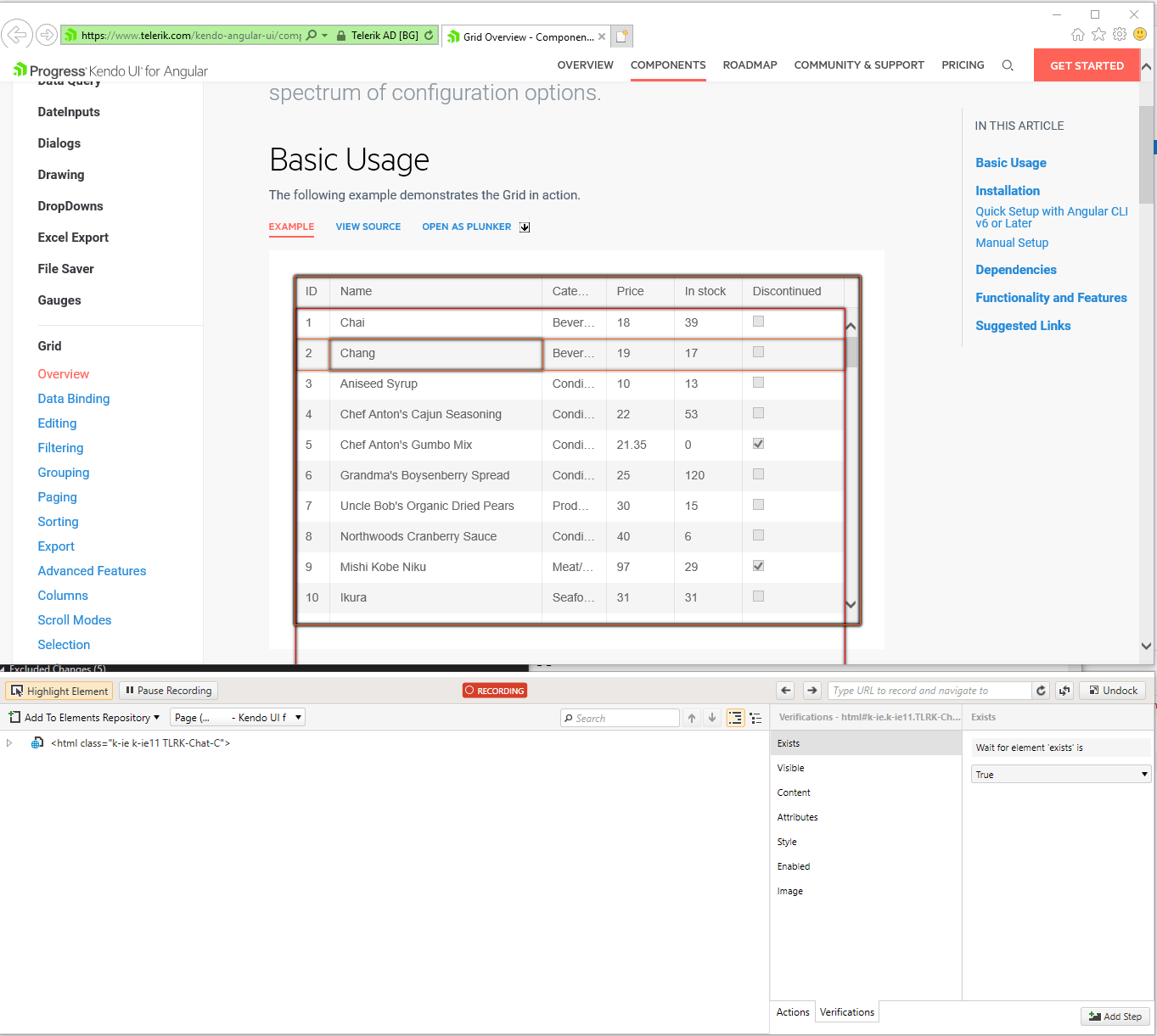
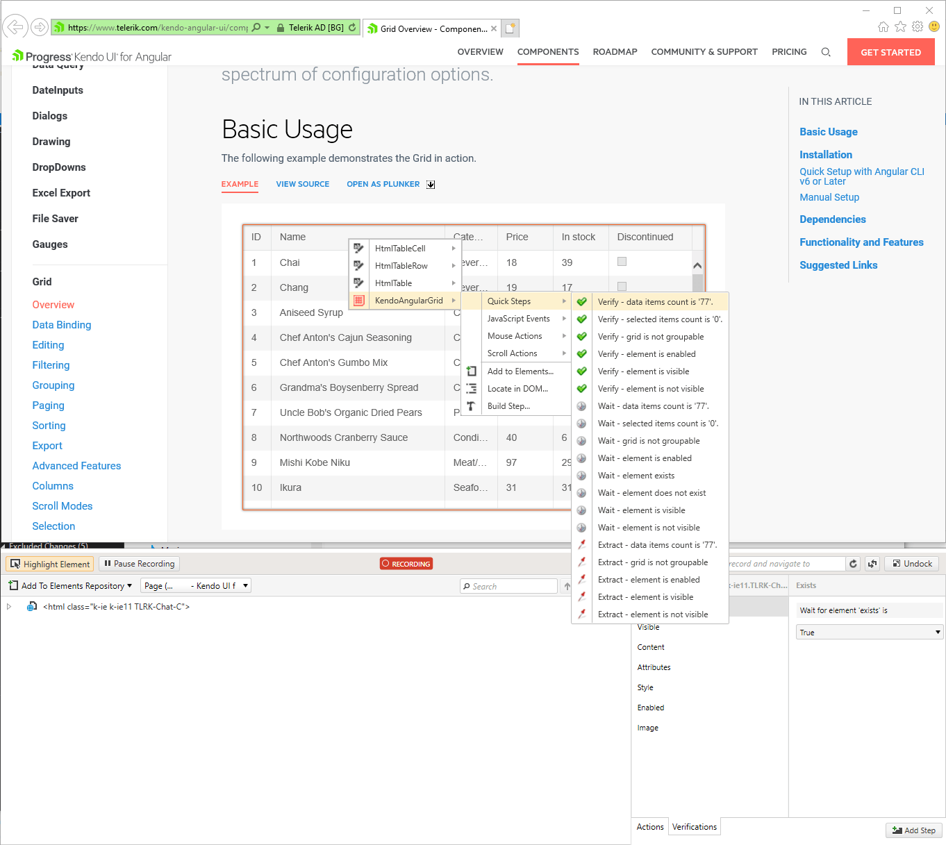
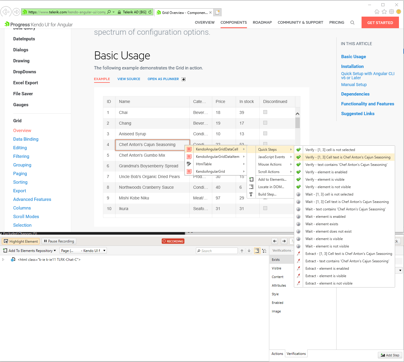
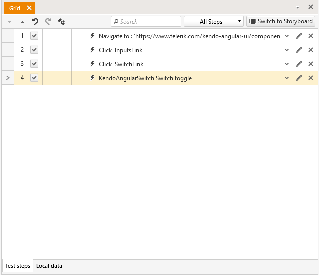
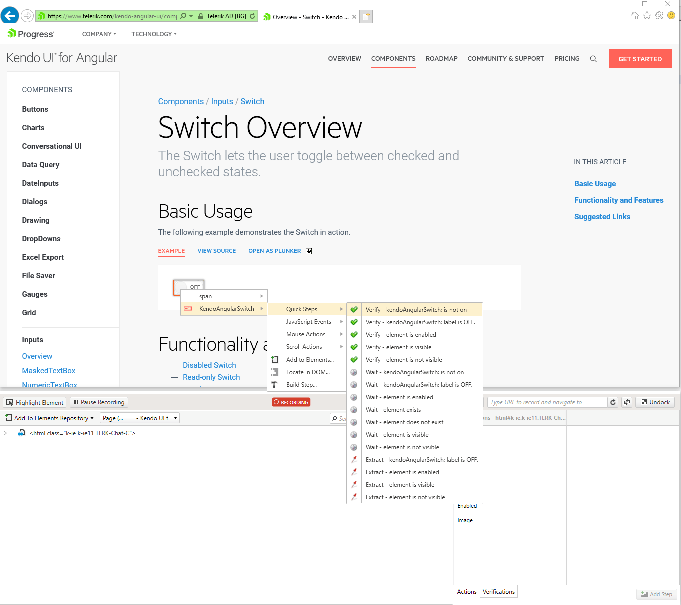
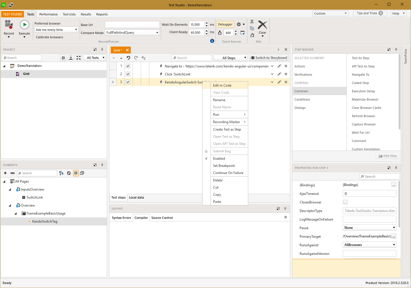
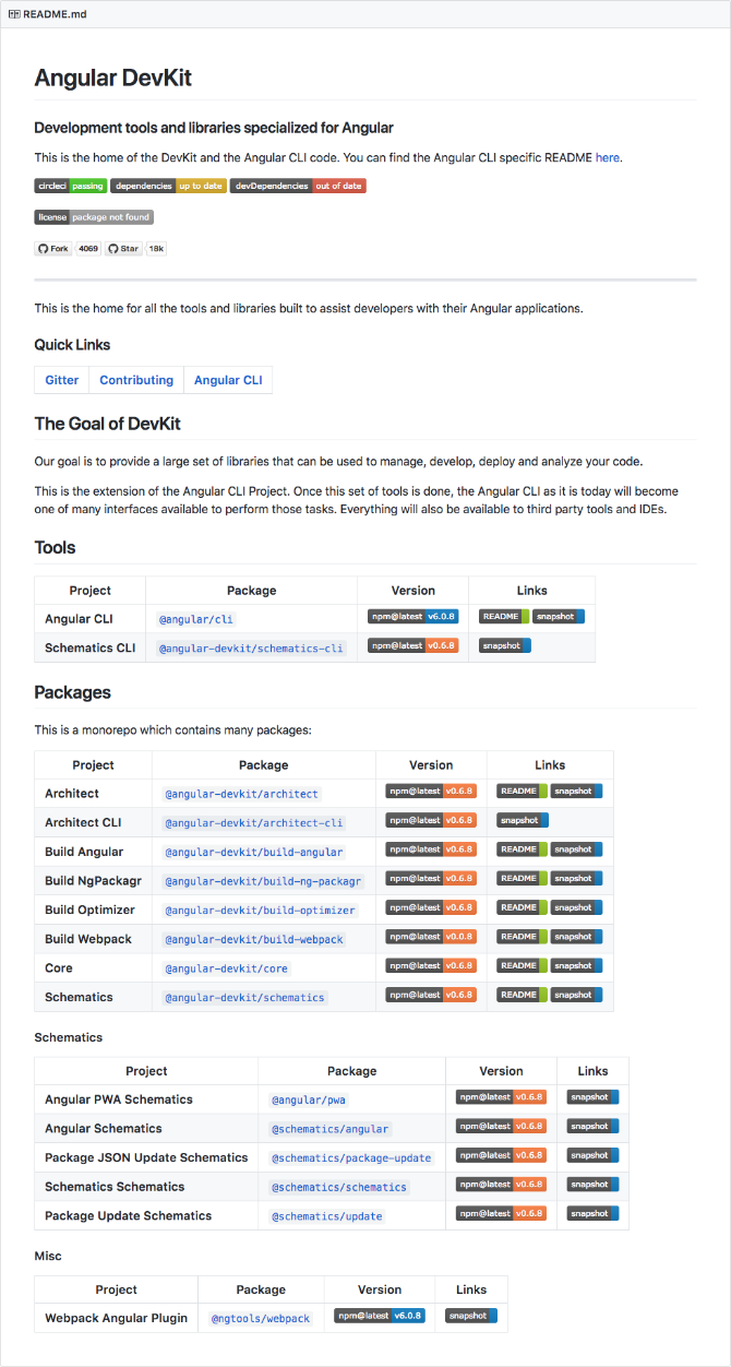
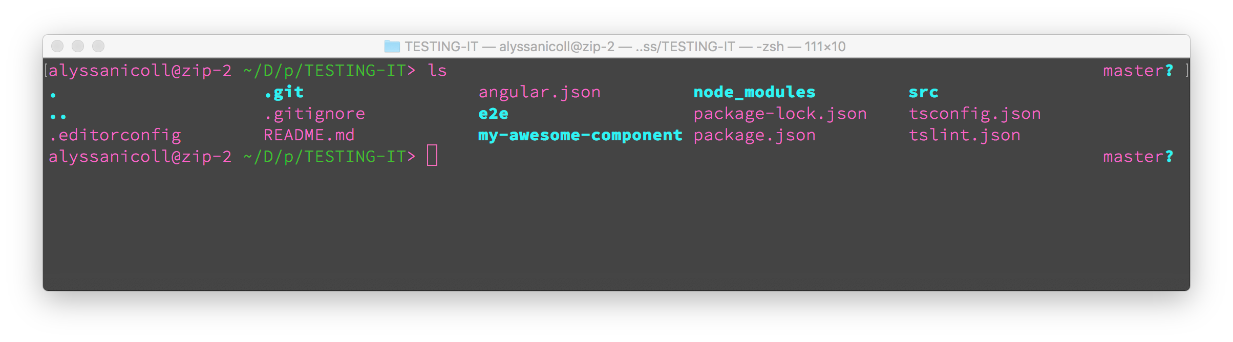

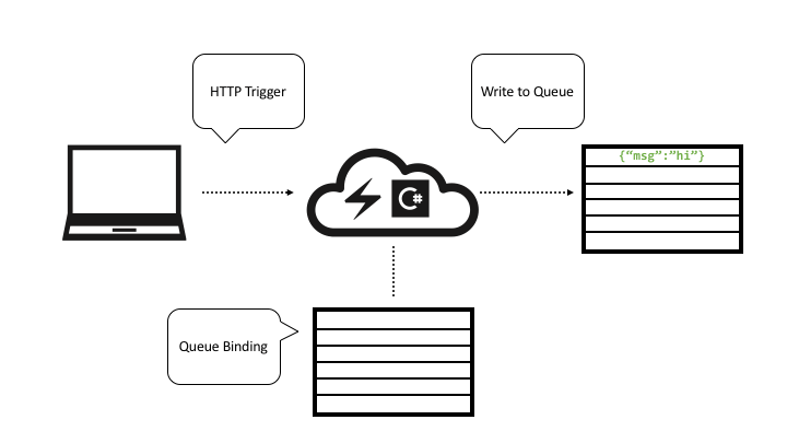
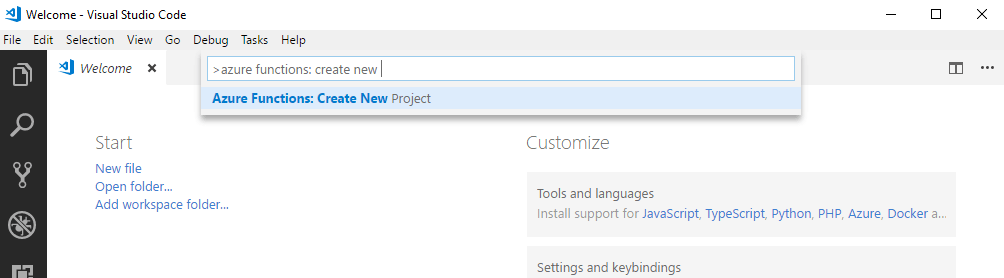
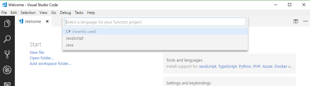
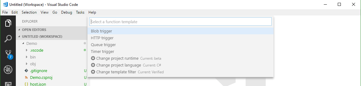
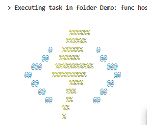
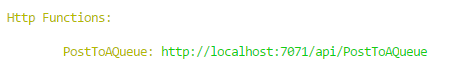
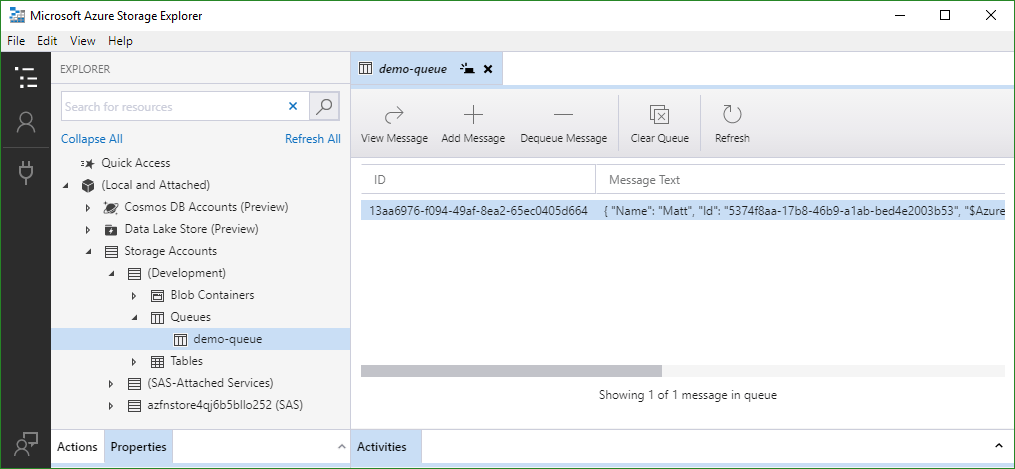


.tmb-small.jpg?sfvrsn=e854cb78_2 "Tauntaun_with_Open_Belly_Rescue_Feature")
 My father was a history teacher and my mom a lifelong learner, so we would stop at every historical landmark along our route (and sometimes go out of our way to find them) and my brothers and I had to document our experiences in our journals.