Quantcast
Channel: Telerik Blogs
Viewing all 4206 articles
Browse latest View live

Performance Profiling Your React App

$
0
0

React is an awesome framework for frontend development. It helps us painlessly create interactive UIs. Using the virtual DOM, React is able to reconcile changes to the DOM in a performant way.

But as we write code, we unknowingly introduce performance issues. Thus, we should be able to discover these performance issues, before we can fix them.

In this article, we’ll learn how to profile the performance of our React application using React Profiler.

In today’s web, amongst other things, an app is said to be performant if it handles rendering over 60 frames per second. Anything less than that would lead to “jank” and an overall slow user experience.

Prerequisites

To follow this article, basic React knowledge is required. You should also be familiar with the React DevTools.

React Profiler

React 16.5 added support for the DevTools profiler plugin. This plugin collects timing information about each rendered component in order to identify performance bottlenecks.

React applies changes to the DOM during its commit phase. React Profiler groups performance by commits, giving you the ability to see how costly each change is.

Accessing React Profiler

If you’re running a React application that supports React Profiler, simply open the React DevTools and you’ll see a “Profiler” tab. Clicking the tab will show you a record button, which records your app’s performance when clicked:

React Profiler tab

Profiling A React Application

To demonstrate how to profile a React application using React Profiler, I’ll use a simple to-do app built using the Create React App.

The to-do app has an input field and renders a hard-coded list of to-dos. The input from the input field is displayed on another section of the page:

Demo Todo App

To record the performance of your app, click the record button, then make use of your app as you normally would. Once you start recording, React Profiler collects information every time your application renders. When you are done profiling, click the stop button:

Recording profiling data using React Profiler

Reading Performance Data

When you click the stop button, the Profiler tab is filled with performance data in form of a flame graph. The data has a commit chart, chart view selector, and performance chart view section:

Profiling data

Commit Chart

The commit chart can be found in the top right part of the tab. It contains all the commits applied within the profiling period.

Each bar in the chart represents a single commit. The height and color of the bars represent how long a commit took to render; the tall and yellow bars are the commits that took longer, while the short and blue ones represent the commits that took a shorter time to render.

The bars can be selected (selected bars are colored black) and their corresponding commit information viewed:

Commit chart

In the image above, we see that there are 81 commits. The currently selected commit took 4.5ms to render and there was no interaction. In cases where you have so many commits, you can filter commits by clicking the gear icon shown in the image above. It allows you to hide commits that fall under specified thresholds.

Browsing Commits

Commits can be viewed as flame charts, ranked charts, component charts and interactions. These different views give you different perspectives with which to view the performance of your app. Clicking a commit bar shows you data for that commit in the chart view.

Flame Chart

The flame chart view represents the state of your application for a particular commit. Each bar represents a component and the width of a bar shows how long it took for a component and its children to be rendered.

The colors of the bars also indicate how long it took for each component to render. Yellow components took more time, blue components took less time, and gray components did not render at all during the commit.

Clicking a component shows you information about it during that commit on the right detail panel:

Flame chart

Ranked Chart

The ranked chart view displays each component in a single commit, ranked in order of how long they took to render. The components which took longer to render are at the top. To view this chart, click the ranked chart radio button in the top left corner of the Profiler tab. As with the flame chart, you can zoom in or out on a ranked chart by clicking on components:

Ranked chart

Component Chart

The component chart provides information on the render cycle of a component while you were profiling. It displays this in form of a bar chart. Each bar represents a time when the component rendered. If the selected component did not render at all during the profiling session, a message is shown to indicate this.

To view this chart, either double-click on a component or select a component and click on the blue bar chart icon in the right detail pane. You can return to the previous chart by clicking the “x” button in the right detail pane:

Component chart

Interaction Chart

The interaction chart is an experimental API that can trace the cause of an update and display it in the profiler tab.

Common Problems With React Profiler

  • Having multiple roots in your application can lead to an error after profiling: No profiling data has been recorded for the selected root. If you encounter this error, try selecting a different root in the elements panel to view profiling information for that root.
  • Sometimes a commit may be so fast that React Profiler does not get any meaningful information. In such cases you would get the following error: No timing data to display for the selected commit.

Conclusion

In this article, we’ve learned performance profiling for a React application using React Profiler. I hope you’ve learned something that will help you build more performant React apps.

For More on Building React Apps

Looking to learn more about React and get going with your React app development? Check out these resources to find out more:


Comparing Native Blazor Components to Wrapped JavaScript Components

$
0
0

Should we rewrite native UI components or reuse existing JavaScript UI components? We compare native Blazor components to wrapped JavaScript components by understanding how Blazor works, including what native vs. interop means and more.

Blazor is a new Single Page Application (SPA) framework that utilizes WebAssembly to run .NET application code in the browser. This future-forward framework allows developers to leverage their existing .NET code and skills to create web applications that can run completely client-side without the need for browser plug-ins. As with any new web framework, we're presented with a challenging decision of bringing along assets from previous works into the new system.

In the case of Blazor, the challenge presents itself in the User Interface (UI) components of the application model. Due to previous lack of choice, web UIs are written in JavaScript, whereas Blazor heavily utilizes the C# language and Razor markup syntax. This stark contrast of choices forces one's hand in one of two directions - rewrite native UI components or reuse your JavaScript UI components.

Let's explore the challenge by understanding how Blazor works, what native vs. interop means, all while discussing the tradeoffs of choosing between the two approaches.

Blazor Architecture Basics

Blazor is a new breed of web application framework, a first of its kind. Blazor is similar in many respects to React or Angular, but what sets it apart is the underlying architecture is crafted upon WebAssembly instead of JavaScript.

WebAssembly (WASM) is a web standard, developed by the World Wide Web Consortium (W3C), that defines an assembly-like binary code format for execution in web pages. WebAssembly is the cornerstone of Blazor in that it provides a platform for the Mono Runtime for WebAssembly, a .NET runtime compiled to WASM format.

A Blazor application is a true .NET application, running on a .NET runtime inside the browser. This is quite an important factor in the decision process when it comes to writing UI components for Blazor, as you should know the context in which the component is executed.

Blazor Architecture: DOM Abstraction

Much like its JavaScript siblings, Angular and React, Blazor employs a similar approach to handling changes to the Document Object Model (DOM). No matter what framework you choose, DOM manipulation is a taxing process which is often compounded by directly changing its structure more frequently than necessary. Without a proper execution plan, most approaches to DOM manipulation destroy and rebuild chunks of DOM, ripping out multiple nodes and repainting them. This is a solved problem in modern frameworks through the use of a DOM abstraction.

The DOM abstraction in Blazor is called the RenderTree, it's a lightweight representation of the DOM. Think of the RenderTree as copy where changes can be quickly made as nodes in this tree can be created, updated and deleted without consequence of re-rendering the page. Now multiple components in the system can make changes against the RenderTree at once with much less of a performance hit. When the dust has settled, the RenderTree and DOM are reconciled by looking for the differences between the two and re-rendering only what's absolutely necessary.

The RenderTree is vital to UI components behavior and render speed. It's also an important aspect to choosing between how to write UI components, especially when it comes to JavaScript.

Blazor Architecture: Native Components

In a Blazor application, components (.razor) are actually processed quite differently from traditional Razor (.cshtml) markup. Razor in the context of MVC or Razor Pages is processed directly to HTML, which is rendered server side and sent over an HTTP request. A component in Blazor takes a different approach - its markup is used to generate a .NET class that builds the RenderTree.

<h1>Counter</h1>

<p>Current count: @currentCount</p>

<button class="btn btn-primary" onclick="@IncrementCount">Click me</button>

Each HTML element in the component gets passed to the RenderTreeBuilder and given a sequence number used to quickly differentiate changes in the DOM.

    public class Counter : ComponentBase
    {
        protected override void BuildRenderTree(RenderTreeBuilder builder)
        {
            base.BuildRenderTree(builder);
            builder.AddMarkupContent(0, "<h1>Counter</h1>\r\n\r\n");
            builder.OpenElement(1, "p");
            builder.AddContent(2, "Current count: ");
            builder.AddContent(3, currentCount);
            builder.CloseElement();
            builder.AddContent(4, "\r\n\r\n");
            builder.OpenElement(5, "button");
            builder.AddAttribute(6, "class", "btn btn-primary");
            builder.AddAttribute(7, "onclick", M...<UIMouseEventArgs>(this, IncrementCount));
            builder.AddContent(8, "Click me");
            builder.CloseElement();
        }

This component architecture is fundamental to Blazor's operation and supports features built into the framework such as: component life cycle methods, templates and validation.

Blazor Architecture: JavaScript Wrappers

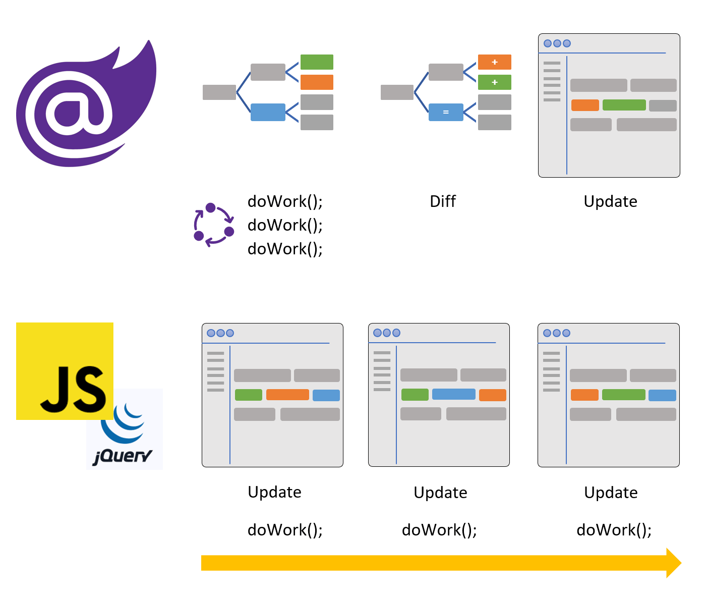
A "native" Blazor component is one that is written using the framework's component architecture, a component that has a RenderTree and hooks into life cycle methods. The alternative is to create a wrapper for preexisting JavaScript components. When using JavaScript a component is created that exposes a set of properties and methods that map to a JavaScript implementation. On the surface a JavaScript based component is used like native component, but under the surface it bypasses the RenderTree and the HTML is rendered by directly manipulating the DOM.

The Blazor RenderTree process vs. direct DOM manipulation. RenderTree consolidates updates, takes the delta, performs a single update. JavaScript updates even when it is not necessary.

The ability to perform calls to JavaScript from within a Blazor application is called the JavaScript interop. The interop is a necessary feature of Blazor as it bridges any gaps between WebAssembly and DOM APIs. This is especially useful for things not supported in Blazor like: GeoLocation, File Access, and Camera APIs to name a few. It's a very powerful tool, but it can easily become bad practice as it can circumvent the Blazor virtual DOM.

Leaky Abstractions

In software development, a leaky abstraction is an abstraction that leaks details that it is supposed to abstract away. Wrappers have a natural tendency to fall victim to this definition. Because wrappers need support from outside the Blazor framework, they require additional details like id and ref attributes. Legacy JavaScript code relies heavily on ids and elementRefs. Since they exist outside of the RenderTree, they need to be located in the DOM by traversing the DOM structure and then manipulated, a costly routine. If these are required attributes for a UI component library you can assume its heavily dependent on JavaScript.

<AcmeWidget ID="myThing" ref="myReference" ...>

Content & Template Support

Components are the building blocks of Blazor application and one of its strongest assets. Components can host other components in two ways - through Child Components and Templates - and as a result Blazor development is very nimble. Child Components and Templates are component properties with a special class called a RenderFragment, a delegate that writes the content to a RenderTreeBuilder. This is another oversight for components built from JavaScript wrappers and a prime reason to build native components.

Child components are extremely powerful as they can transform component behavior or composition of components. Such a feature can truly be appreciated by example. In the following code a TelerikTabStrip is given a list of Forecast objects, the list is iterated over using a simple foreach, building the tabs dynamically.

<TelerikTabStrip>
    @foreach (var f in Forecasts)
    {
        <TelerikTab Title=@f.City>
            <Weather City=@f.City
                     TempC=@f.Temp
                     Forecast=@f.Outlook>
            </Weather>
        </TelerikTab>
    }
</TelerikTabStrip>

The ability to declare components in this manner is due to the Blazor framework's component architecture and use of RenderFragments.

Dynamic components aren't limited to simple foreach loops either. Virtually any C# methodology can be applied to control rendering. In the next example, the same TelerikTabStrip component is used with an if statement which is bound to a check-box embedded within one of the child tabs. Changing the value of the check-box in this instance instantly effects the visibility of the first tab.

<TelerikTabStrip>
    @if (showFirstTab)
    {
        <TelerikTab Title="First Tab">
            This is the first tab.
        </TelerikTab>
    }
    <TelerikTab Title="Second Tab">
        <label>
            <input type="checkbox" bind=@showFirstTab />
            Toggle first tab
        </label>
    </TelerikTab>
</TelerikTabStrip>

This is possible because the scope of showFirstTab is outside of the component itself. Since the components are native they obey Blazor's rendering and data binding capabilities.

More advanced scenarios play out when Templates are used to allow for customization of how a component renders markup. Templates can be used for simple tasks like formatting values or displaying images, while more extensive Templates can transform the user interface completely, adding entirely new functionality to a component. For further reading on this subject, the article "Why Blazor Grid Templates Will Make You Question Everything" gives a comprehensive overview with code examples.

Pre-Rendering

Blazor isn't just capable of running client side, it can be hosted server-side as well. When Blazor runs server-side it has the ability to pre-render views to eliminate loading screens and enhance SEO. The way pre-rendering works in Blazor is similar to how ASP.NET Razor views and pages are rendered. In fact, because of this Blazor components are compatible with ASP.NET Razor views and pages. When using JavaScript based components, the server can not pre-render the component as JavaScript is not yet available. Instead, the page will need to be rendered by JavaScript when it is parsed by the client. It's important to be aware that this mode of operation is unavailable when wrapping existing JavaScript components.

Validation

Validation in Blazor is tightly coupled with the core component system. Since Blazor uses C# throughout the programming model, it supports the popular DataAnnotation method of defining validation.

using System.ComponentModel.DataAnnotations;

public class ExampleModel
{
    [Required]
    [StringLength(10, ErrorMessage = "Name is too long.")]
    public string Name { get; set; }
}

The DataAnnotations can be used to trigger validation within business logic on the server and also UI validation. The built-in EditForm component provides validation and event handlers that provide a seamless work-flow in the component model.

<EditForm Model="@exampleModel" OnValidSubmit="@HandleValidSubmit">
    <DataAnnotationsValidator />
    <ValidationSummary />

    <InputText id="name" bind-Value="@exampleModel.Name" />

    <button type="submit">Submit</button>
</EditForm>

@functions {
    private ExampleModel exampleModel = new ExampleModel();

    private void HandleValidSubmit()
    {
        Console.WriteLine("OnValidSubmit");
    }
}

Once again this is a scenario that plays out best when components are built using native components. Native components share a state called an EditContext that allows components within an EditForm to communicate. Native components that have integrated the EditContext automatically validate when placed within an EditForm without additional code. When trying to wrap existing JavaScript components validation requires leaky abstractions through the use of Id and ElementRef attributes.

Is JavaScript all Bad?

There is absolutely nothing wrong with using JavaScript libraries to support Blazor components. There are some use cases where JavaScript interop is a necessity to fill gaps as WebAssembly and Blazor are maturing products. One way that JavaScript interop can be beneficial is when it is used to augment native components by adding features that do not disturb the RenderTree, such as giving focus or providing keyboard navigation. In addition, JavaScript libraries can be used to add system level functionality when tapping into the DOM Web APIs like GeoLocation, File access, Canvas, and SVG.

Telerik is Native First

With Telerik UI for Blazor we have taken a native first development approach to building UI components. Our best practice is to take native implementation as far as the framework allows, leveraging the RenderTree, and allowing components to naturally hook into templates and validation. Our components make minimal use of JavaScript interop, ensuring that there are no leaky abstractions filtering up to the surface and getting in the customer's way. We have found extensive benefits with templates that offer an open-ended approach to web building applications.

Our Kendo UI brand of JavaScript components are a substantial asset to us and our customers, however we have determined that the best approach is to rebuild for Blazor with the knowledge we have gained from building UI components for Kendo UI. We can then apply it to Blazor using its fully native technologies, rather than wrapping the JavaScript work and passing it along to customers as something new.

Storage Options in the Browser (Part 1)

$
0
0

Should you use localStorage or cookies to store your authentication token? What are the tradeoffs to each approach and how can you tie them all together? Did you know that localStorage can even be used to synchronize logout across multiple tabs?

Browser Storage

In React applications, we typically store our data in state, either using component state or a state management tool such as Redux and MobX. This works great until the user refreshes the page. Then we have to start from scratch and re-fetch all the data from our server in order to populate the state again.

There are many situations where we might want to persist data in such a way that when the user refreshes the page, all is not lost. Imagine a world where the user had to re-authenticate every time they refreshed the page!

In this this two-part series, we will look at four different ways to store data in the browser: localStorage, sessionStorage, cookies, and IndexedDB. Why so many ways? They each are useful in different circumstances and have different capabilities. In this article we will explore how best to take advantage of them in a note-taking application which includes JWT authentication (with synchronized logout) along with “draft” notes that can be synchronized to the server at a later date.

The source code for this project can be found at https://github.com/leighhalliday/leigh-notes-web. The final version of this app is located at https://leigh-notes-web.herokuapp.com/.

Client-Side Storage Overview

  • localStorage: A key/value store that lives entirely in the client (browser). Useful for storing authentication tokens which do not need to be sent to the server - when no server-side rendering (SSR) is used.
  • sessionStorage: A key/value store which functions similarly to localStorage, but is expired/cleared when the user closes the page and is not shared across tabs even on the same domain. Most useful for storing temporary data.
  • cookies: Data which can be read from and written to within the browser, but also travels to the server with each request in the cookie header.
  • IndexDB: As the name suggests, a database that lives within the browser. Somewhat difficult to use on its own, but paired with a tool such as PouchDB, can be useful for storing more complex client-side data which needs to be queried and be performant.

localStorage and sessionStorage

Both localStorage and sessionStorage are key/value stores that use the Storage object. Both the key and the value must be strings.

// Set an item
localStorage.setItem("name","Leigh");// Get an item
localStorage.getItem("name");// "Leigh"// If we look at `localStorage` we see:// Storage {name: "Leigh", length: 1}// We can remove an individual item:
localStorage.removeItem("name");// Or we can clear all items:
localStorage.clear();

I mentioned that both the key and the value must be strings… so how do we store an array or an object? We can do this using JSON.stringify(object) to convert our JS object into a JSON string when setting the item, and use JSON.parse(string) to convert the JSON string back into a JS object when getting the item. Take a look at the example below:

let user ={ name:"Leigh", email:"leigh@email.com"};// Must stringify before putting object into storage
localStorage.setItem("user", JSON.stringify(user));// Must parse when reading string value from storage
user = JSON.parse(localStorage.getItem("user"));

If you ever read an item from localStorage and it looks like "[object Object]," it’s a sign that you forgot to stringify the value first!

Cookies

If your app is a fully client-side SPA (single-page application), you probably don’t need to mess with cookies, and localStorage will do the trick. That said, if you’re using something like Next.js to support server-side rendering (SSR), cookies become very important, giving you access to the authentication token on the server.

We typically think of cookies in the plural, but the truth is that they are stored in a single string value that must be parsed to break them into individual key/value pairs.

console.log(document.cookie);// "AMCV_A783776A5245B1E50A490D44%40AdobeOrg=2121618341%7CMCIDTS%7C17913%7CMCMID%7C60111815297468236860711566255111819255%7CMCAAMLH-1548272641%7C9%7CMCAAMB-1548272641%7CRKhpRz8krg2tLO6pguXWp5olkAcUniQYPHaMWWgdJ3xzPWQmdj0y%7CMCOPTOUT-1547675041s%7CNONE%7CMCAID%7CNONE; _gcl_au=1.1.664470253.1547667842; token=eyJhbGciOiJIUzI1NiJ9.eyJ0b2tlbiI6IjY3Njc2N2VkLTFkYTMtNGZjOS05OGYxLTc3YTJlYjUzZGFlOSJ9.0BwIIJdHXmP_MLh5qQjUpdWZ_IQ4bjb6aSsTetLA_N4"

That’s a mess! We can break them apart by splitting the string on "; ", and if we then map each value and split it on "=" we’ll finally end up with the key/value pairs we’re looking for:

const cookies = document.cookie.split("; ").map(value => value.split("="));// Gives us:[["AMCV_A783776A5245B1E50A490D44%40AdobeOrg","2121618341%7CMCIDTS%7C17913%7CMCMID%7C60111815297468236860711566255111819255%7CMCAAMLH-1548272641%7C9%7CMCAAMB-1548272641%7CRKhpRz8krg2tLO6pguXWp5olkAcUniQYPHaMWWgdJ3xzPWQmdj0y%7CMCOPTOUT-1547675041s%7CNONE%7CMCAID%7CNONE"],["_gcl_au","1.1.664470253.1547667842"],["token","eyJhbGciOiJIUzI1NiJ9.eyJ0b2tlbiI6IjY3Njc2N2VkLTFkYTMtNGZjOS05OGYxLTc3YTJlYjUzZGFlOSJ9.0BwIIJdHXmP_MLh5qQjUpdWZ_IQ4bjb6aSsTetLA_N4"]];

The last cookie we can see is the token cookie, which stores the JWT (JSON Web Token) required for authentication. The other two cookies… I’m not quite sure where they came from (my localhost:3000 has seen some crazy things)!

Reading and writing cookies in this format - we haven’t even covered expiry and encoding/decoding values - is a pretty big pain and why a small library such as js-cookie can make your life way easier.

With js-cookie we can get and set cookies in a similar way to how we did it with localStorage:

// set a value
jsCookie.set("name","Leigh");// get a value
jsCookie.get("name");// "Leigh"// remove cookie
jsCookie.remove("name");

It should be mentioned that certain cookies may be marked as “HTTP Only”, which means that they are not accessible from within the client-side JavaScript code. Cookies can also have an expiry date, be limited to a certain subdomain and/or path, and only be available on secure (HTTPS) connections.

Authentication Using a JWT

With our newfound knowledge of localStorage, sessionStorage, and cookies, let’s implement a login component which will make an HTTP request to the server with the user’s email and password, receiving a response with a JWT token if valid. When we have the JWT token, we’ll need to store it somewhere. Now is when you need to choose between localStorage or cookies, but because we are doing this from within a Next.js application which supports SSR, we’ll be required to opt for cookie storage so that it will be available to the server.

To better encapsulate our authentication logic, we’ll create a custom hook called useAuth, responsible for making the HTTP request and tracking what the user has entered into the form.

// In pages/login.jsconstuseAuth=()=>{// State required to track the form's dataconst[submitting, setSubmitting]=useState(false);const[email, setEmail]=useState("");const[password, setPassword]=useState("");const[error, setError]=useState("");// A function to call when the user is ready to authenticate// the values they have entered into the form.const authenticate =async event =>{
    event.preventDefault();setSubmitting(true);setError("");try{// Make an HTTP request to serverconst response =await Axios.post("https://leigh-notes-api.herokuapp.com/session",{
          email,
          password
        });// Pass the token to a `login` function which is responsible// for saving its value in a cookie and redirecting the user.const{ token }= response.data;login({ token });}catch(error){// A 400 means invalid email or password, update state so user// can see the error message.if(error.response && error.response.status ===400){setError(error.response.data.errors.join(", "));}else{throw error;}}setSubmitting(false);};return{
    submitting,
    email,
    setEmail,
    password,
    setPassword,
    error,
    authenticate
  };};

So what does the login function that is called look like? It’s very short, working with js-cookie and the Next.js routing system to redirect the user. In our app this function is exported from utils/withAuthSync.js.

// In utils/withAuthSunc.jsimport Router from"next/router";import cookie from"js-cookie";exportconst login =async({ token })=>{
  cookie.set("token", token,{ expires:1});// cookie expires in 1 day
  Router.push("/");};

Let’s finally take a look at the Form component which works hand-in-hand with the functions already shown above.

constForm=()=>{const{
    submitting,
    email,
    setEmail,
    password,
    setPassword,
    error,
    authenticate
  }=useAuth();return(<formonSubmit={authenticate}>{error &&<pclassName="error">{error}</p>}<inputtype="email"placeholder="email"onChange={e =>{setEmail(e.target.value);}}value={email}autoComplete="username"disabled={submitting}required/><inputtype="password"placeholder="password"onChange={e =>{setPassword(e.target.value);}}value={password}autoComplete="current-password"disabled={submitting}required/><buttontype="submit"disabled={submitting}>
        Login
      </button></form>);};

Logging User Out

We’ve logged the user in, but how do we log the user out? Deleting the cookie might be the obvious answer, but the truth is that in our case it is only 1/4 correct. We’re going to perform the following actions when the user asks to be logged out:

  1. Remove the token cookie.
  2. Tell the API to expire the token… this is important so that even if someone were to find the JWT token, the server wouldn’t acknowledge it.
  3. We’ll use localStorage to synchronize the user’s logged-out status across multiple tabs in the browser. They will all be redirected back to the login page and we won’t be left exposing the user’s sensitive data on the page in plain sight.
  4. Finally, redirect user to the /login page.
// utils/withAuthSync.jsimport Router from"next/router";import cookie from"js-cookie";import Axios from"axios";exportconst logout =async token =>{// 1. Remove the token cookie
  cookie.remove("token");// 2. Notify API to expire token// Notice we are sending the token in the Authorization header// so that the server knows which token to expiretry{await Axios.delete("https://leigh-notes-api.herokuapp.com/session",{
      headers:{ Authorization:`Bearer: ${token}`}});}catch(error){// assume already logged out if call fails}// 3. Write to localStorage... triggering an event which enables// listening tabs to redirect to the /login page
  window.localStorage.setItem("logout", Date.now().toString());// 4. Redirect user back to the /login page
  Router.push("/login");};

The Layout component, which is in charge of rendering the appropriate navigation based on whether the user has a token or not (logged in or logged out), calls the logout function when the user clicks the button.

exportdefaultfunctionLayout({ token, children }){return(<div><Head><title>Notes!</title></Head><nav>{token ?(<buttononClick={()=>logout(token))}>Logout</button>):(<><Linkhref="/login"><aclassName="btn">Login</a></Link><Linkhref="/register"><aclassName="btn">Register</a></Link></>)}</nav><divclassName="container">{children}</div></div>);}

Storage Events - Synchronize Across Browser Tabs

We saw above something pretty neat, that localStorage allows us to listen for events any time a value is set. In our app’s case, all tabs open for this app can listen for when localStorage is written to using the “logout” key. All pages in our app that require authentication are wrapped in a higher-order-component (HOC) which listens for this event.

exportconstwithAuthSync= WrappedComponent =>{returnclassextends Component {// I have removed some Next.js specific code to simplify things// for the purposes of this articlecomponentDidMount(){
      window.addEventListener("storage",this.syncLogout);}componentWillUnmount(){
      window.removeEventListener("storage",this.syncLogout);
      window.localStorage.removeItem("logout");}syncLogout= event =>{if(event.key ==="logout"){
        console.log("logged out from storage!");
        Router.push("/login");}};render(){return<WrappedComponent {...this.props}/>;}};};

The syncLogout function is called and we are able to check if event.key (referring to the localStorage key) is equal to "logout", and if so we can use the Next.js router to send the user to the /login page. It seems that this StorageEvent is not triggered from within the same browser tab that it was declared in, but that’s perfect for our use-case.

The HOC’s use looks like export default withAuthSync(Index);.

Conclusion

So far we’ve looked in-depth at localStorage (along with its closely related cousin sessionStorage) and cookies. The former works great when you need a key/value store entirely client-side, with cookies allowing storage to be accessible both client-side but also server-side.

There comes a time when you might feel the restrictions of these two approaches. They both are written to and read from synchronously, potentially causing browser slow-downs, and something just doesn’t feel right about using localStorage as a “database.” That’s where IndexDB comes into the picture, providing asynchronous client-side storage, albeit with a somewhat clumsy interface. Stay tuned for Part 2 of this article, which will show how you can easily use the PouchDB library to interact with IndexDB.


For More Info on Building Great Web Apps

Want to learn more about creating great web apps? It all starts out with Kendo UI - the complete UI component library that allows you to quickly build high-quality, responsive apps. It includes everything you need, from grids and charts to dropdowns and gauges.

Learn more about Kendo UI

Get a free trial of Kendo UI

Creating Single Page Applications in Blazor with the TelerikGrid and TelerikTabStrip

$
0
0

The TelerikGrid in Telerik UI for Blazor is a powerful tool for displaying multiple rows of objects. However, sometimes a grid can't provide a complete interface to the data. When that happens, for the most extensible solution, you can provide the user with the ability to switch from a row to the view they want. By integrating the TelerikGrid and the TelerikTabStrip, you can let the user select the item they want from a grid in one tab and then switch to another tab that shows additional information.

The source code for this article is available on GitHub: TelerikBlazorUIComponents

Configuring Events in the TelerikGrid

The first step in this process is to give the user the ability to select a row in the TelerikGrid. As of this writing, there isn't a native way to select an item in the grid (though there will be), but there are a couple of options you can use, including defining a template that includes a select button. For this post, however, I've chosen to exploit the event architecture of the TelerikGrid.

To access the TelerikGrid's events, first add the <TelerikGridEvents> element to the grid's markup, like this (for more about the TelerikGrid [Ed Note: formerly KendoGrid] see my earlier post):

<TelerikGrid Data="@customers">
  <TelerikGridEvents>
    <!-- ... -->
  </TelerikGridEvents>
  <!-- rest of grid markup... -->
</TelerikGrid>

As I said, while there is no OnSelect event in the grid's events, there are multiple other events (including OnDelete, OnUpdate, OnCreate, and OnCancel). For example, I can convert the existing OnEdit event into a “select row” UI event by tying it to a method in my page's functions block. I've called the method DisplayDetail:

<TelerikGridEvents>
  <EventsManager OnEdit="@((args) => DisplayDetail(args))"> />
</TelerikGridEvents>

By using a lambda expression, I've actually gone to more trouble here than I need to. I like the lambda-based syntax because it makes explicit that the grid will pass an argument to my DisplayDetail method. However, I could have achieved the same goal with just OnEdit="DisplayDetail".

To give the user a tool for selecting a row, I then add a TelerikGridCommandColumn as the first column in my <TelerikGridColumns> element. Within that element, I can add multiple buttons to the column using the <TelerikGridCommandButton> element – for this case, I only need one button. The Command attribute on the button lets me tie the button to one of the events specified in the <TelerikGridEvents> element (obviously, in this example, I'm going to use the “Edit” event). In addition, the TelerikGridCommandButton has an Icon attribute that lets me specify an icon to display in the button; I can also provide some text between the element's open and close tags to display as the button's caption. In this case, I stayed with the default edit icon and changed the caption text to “Select”:

<TelerikGridColumns>
  <TelerikGridCommandColumn>
    <TelerikGridCommandButton Command="Edit" Icon="edit">
      Select
    </TelerikGridCommandButton>
  </TelerikGridCommandColumn>
  <TelerikGridColumn Field="Id" Title="Customer Id" />
  <!-- more columns -->
</TelerikGridColumns>

Processing the Event

Now I need to write the method that will catch and process the event. I called my event DisplayDetail and I need to have it accept the GridCommandEventArgs object that the grid will pass to it. The skeleton for that method looks like this:

@functions
{  
  public void DisplayDetail(GridCommandEventArgs e)
  {
    // ...
  }

  // ...
}

The GridCommandEventArgs object has an Item property that points to the object displayed in the row that the user selected. Since my grid is displaying Customer objects, I can cast that Item property to a Customer object. I'll put that Customer object into a field to use in other parts of my UI:

private Customer currentCustomer;
public void DisplayDetail(GridCommandEventArgs e)
{
  currentCustomer = (Customer) e.Item;
}

By default, the grid is also going to put the row I selected into an edit mode. To prevent that from happening, I set GridCommandEventArgs.IsCancelled to true, which prevents the selected row's display from changing. At this point, then, my DisplayDetail method looks like this:

public void DisplayDetail(GridCommandEventArgs e)
{
  currentCustomer = (Customer) e.Item;
  e.IsCancelled = true;
}

My next step is to display the information from the row in a form rather than as a row in a grid. To handle that, I'm going to take advantage of the TelerikTabStrip.

Configuring Tabs

What I'm going to do is set up two tabs within the TelerikTabStrip: one tab to display the grid, and one to display the data from the selected row.

Moving my grid into a tab is easy: I just wrap my grid's markup inside a <TelerikTab> element inside a TelerikTabStrip. I'll use the TelerikTabStrip's TabPosition attribute to have the tabs display across the top of my page. I'll also add a second tab to display the individual customer. With both tabs, I'll use their Title attribute to set the text displayed in at the top of the tab:

<TelerikTabStrip ref="@tabstrip" TabPosition="TelerikTabPosition.Top">
  <TelerikTab ref="@currenttab" Title="Customer List">
    <TelerikGrid Data="@customers">
      <!-- grid markup -->
    </TelerikGrid>
  </TelerikTab>
  <TelerikTab Title="Current Customer">
    <!-- markup to display the selected customer -->
  </TelerikTab>
</TelerikTabStrip>

Initially, I want the “Current Customer” tab to be disabled and enabled only after a customer is selected. To handle enabling/disabling the tabs, I'll need to bind the tab's Disabled attribute to some field or property I can set from code. I'll call this field currentCustomerTabDisable:

private bool currentCustomerTabDisable = true;

Now, in my DisplayDetail method's code, after retrieving the selected Customer, I set the field to false:

public void DisplayDetail(GridCommandEventArgs e)
{
  Customer cust = (Customer) e.Item;
  e.IsCancelled = true;
  currentCustomerTabDisable = false;
  StateHasChanged();
}

Of course, this won't do any good unless I also tie the Disabled attribute on my tab to the field. That markup looks like this:

<TelerikTab Title="Full Customer"
          Disabled="@currentCustomerTabDisable">
  <!-- ... -->
</TelerikTab>

Displaying the Selected Customer

Having gone to all that trouble, the final step is to display the selected Customer's information in the second tab. That's “plain old Blazor code”: I add some textboxes to the second tab and use the bind attribute to associate the textbox with my currentCustomer field. That markup looks like this:

<TelerikTab Title="Full Customer"
          Disabled="@currentCustomerTabDisable">
  <input type="text" bind="@currentCustomer.FirstName" />
  <input type="text" bind="@currentCustomer.LastName" />
</TelerikTab>

Because the bind attribute implements two-way databinding, changes made on the “current customer tab” are automatically reflected in the grid.

Of course, if I was a decent human being, I wouldn't just enable the “current customer tab”, I would also switch the user to that tab. I can do that by calling the SetActiveTab method, passing a reference to the tab I want to display. However, to access the tabstrip (so that I can call its SetActiveTab method) and the tab (so I can pass it to the SetActiveTab method), I first need references to both. That's a three-step process.

First, I add the ref attribute to the <TelerikTabStrip>, tying it to a field in my function's block called I've called “tabStrip”:

<TelerikTabStrip ref="@tabStrip" TabPosition="TelerikTabPosition.Top">
  <!-- ... -->
</TelerikTabStrip>

In the same way, this markup ties the tab to a field called currentCustomerTab:

<TelerikTab ref="@currentCustomerTab"
          Title="Full Customer"
          Disabled="@currentCustomerTabDisable">
  <!-- ... -->
</TelerikTab>

The second step is to add those fields to my functions block. A TelerikTab implements the ITab interface, which suggests that there may be multiple kinds of tabs in the future. To support that possibility, I declare my currentCustomerTab as an ITab:

@functions {
  private TelerikTabStrip tabStrip;
  private ITab currentCustomerTab;
  // ...
}

With those references to the TelerikTabStrip and TelerikTab in place, I can update my DisplayDetail method to switch the user to the second tab:

public void DisplayDetail(GridCommandEventArgs e)
{
  currentCustomer = (Customer) e.Item;
  e.IsCancelled = true;
  currentCustomerTabDisable = false;
  tabStrip.SetActiveTab(currentCustomerTab);
  StateHasChanged();
}

One of the nice features of this design is that it's almost infinitely extensible: As you add more customer-related functionality to this page, you can just keep adding more tabs. And all it will cost you is some markup and about half a dozen lines of code.

Let's Talk JavaScript "Falsey"

$
0
0

In this article we will explore a basic but yet super important concept in JavaScript. The "falsey" value of your data.

Many times in articles and documentation, you may find yourself running into terms like “falsey” value, or “truthy” value, which are not 100% clear - especially in JavaScript. Let’s nose dive into this fundamental concept together.

The Core

The first thing to keep in mind and to learn is that “falsey” is not the same as FALSE. When a variable is set to false, that is a boolean type value.

let myBoolean =false;let anotherBoolean =true;

A boolean value is either true or false. But what then does it mean when something is “falsey”?

The Anything and the Everything

Take this next concept at face value. ANYTHING and EVERYTHING that has a value can be evaluated as truthy or falsy. Usually, to check the “falsey-ness” of something in code, you do this:

let value =null;if(!value)// do something

Here’s your a-ha moment. Value is definitely not a boolean, and is actually being set strictly to null. What then is happening in line two? How is JavaScript evaluating this null value in an if statement that clearly has to check for a true/false condition?

The answer is, as you guessed, the “falseyness” of the value.

Diving in

Technically speaking, there are only six values that would “trigger” a falsey check in an if statement like we had before. Let’s take a look.


1. undefined

You get this when a variable doesn’t have a value.

let noValue;// We don't assign a value here, so it defaults to undefinedif(noValue){// This won't be reached}if(!noValue){// This will be reached}

2. null

Whenever a variable is declared as null, this will be falsey.

let nullValue =null;let object ={ prop:null}if(!nullValue){// This will execute}if(!object.prop){// This will execute too}

3. NaN

You get NaN from performing invalid math operations, and it too will evaluate to falsey.

let result = Math.sqrt(-1)let invalid =parseInt('thisisnotanumberwhatareyoudoingwithyourlife')if(!result &&!invalid){// This would execute since both are falsey and NaN!}

4 and 5. 0 and "" (empty strings)

Another way to usually represent false Boolean values is, of course, the number 0, and its counterpart true is represented by the number 1.

This means that anything that is trying to be evaluated as falsey that has a number 0 will be interpreted as FALSE. Be careful with this common gotcha.

Empty strings are ALSO evaluated as false, as you will see in the example.

let emptyString ="";let numericZero =2-2;if(!emptyString){// Empty strings are falsey}if(!numericZero){// This would also execute, since 2 - 2 = 0 (MIND. BLOWN.)}

The final and 6th value is… drumrolls

6. Boolean false! :)
I will not insult your intelligence with an example, don’t worry.

Dem Arrays, tho

So, maybe you’re thinking about arrays now. And maybe you’re thinking, ok, so I would think if an array is empty, or its length === 0, then it should be falsey. Right?

WRONG!

const myCoolArray =[];if(!myCoolArray){// Get all the moneyz}else{// Lose all the moneyz}

Bad news. You lost the moneyz. This is a VERY common gotcha in JavaScript programming. Always remember that any array or object, even if empty, will evaluate to true when inspected inside a conditional.

Let’s get freaky with arrays though. What happens if we actually evaluate an array with an “equal to” == to a boolean false? (Note, we’re doing “equal to”, not “equal to and equal type” which would be === also called “identical.”)

const emptyArray =[]if(!emptyArray){// Ok, so this would not get reached, because it's "truthy"}if(emptyArray ==false){// This actually WOULD execute. Whoa, ok? What?}if(emptyArray ==true){// This does not get executed!}if(emptyArray ===false){// This would NOT run, because emptyArray is of type ARRAY and false is a BOOLEAN}

Beware of the Binaries

Ok well, maybe not the binaries, but do keep an eye out for number types when making your evaluations.

Consider the following example.

const gameData ={
  playerIndex:0,
  totalPlayers:1}if(gameData.playerIndex){awardPointsToPlayer(gameData.playerIndex)}if(!gameData.totalPlayers){weHaveNoPlayers()createSomePlayers()}

In this example, we have two major problems. The first one is that gameData.totalGames is a number type with value 0. In our conditional, we are trying to check if we have a player index, and then award her some points, but this code will in fact never be executed. JavaScript will evaluate the type of the 0 to numeric and will assert a falsey value.

In the second example, we are trying to check if we are lacking players. However, we are also not going to get our code executed, because the numeric type 1 will assert to a truthy value, and our ! looking for the falsey value will assert false - and will not execute.

How Do I Avoid These Problems?

Well, the first and best way to avoid falling into these caveats is knowing what’s causing them, and now you do! But I would encourage two tips.

  1. Avoid == like the plague. JavaScript is very squirmish with type evaluations. Get into the habit of using === and checking for type as well and you will avoid many headaches.

  2. If you are evaluating numeric values, be explicit about your comparisons. For example, in the above example, we could refactor our checks to the following.

const gameData ={
  playerIndex:0,
  totalPlayers:1}if(gameData.playerIndex >=0){awardPointsToPlayer(gameData.playerIndex)}if(gameData.totalPlayers ===0){weHaveNoPlayers()createSomePlayers()}

Just make sure you’re not passing strings instead of numbers, because those will fail with type comparisons :)


For More Info on Building Great Web Apps

Want to learn more about creating great web apps? It all starts out with Kendo UI - the complete UI component library that allows you to quickly build high-quality, responsive apps. It includes everything you need, from grids and charts to dropdowns and gauges.

Learn More about Kendo UI

Get a Free Trial of Kendo UI

Web Accessibility for Developers: What It Is and Why It’s Important (Part I)

$
0
0

Web accessibility is an increasingly important component of web development, for usability, compliance and many other reasons. In this series we'll explore the topic in depth.

Introduction

In the process of implementing accessibility compliance (Section 508, WCAG 2.0 and WAI-ARIA) for KendoReact, our suite of native UI components for React, we learned a lot on the topic. With this blog series, our goal is to introduce fellow engineers to web accessibility and share our practical knowledge and best practices.

This first article is an attempt to answer what accessibility is and why it matters.

The W3C definition is a great starting point: accessibility means that websites, tools, and technologies are designed and developed so that people with disabilities can use them. More specifically, people can: perceive, understand, navigate, and interact with the Web, and contribute to the Web.

The perfect example for accessibility is if you can use your site without looking at it. Instead, you would listen to a screen reader that describes the UI and navigate with keyboard only.

Why Accessibility is Generally Neglected

While there are many reasons why accessibility is not omnipresent, as it ideally should be, three of them seem to be key. First, it’s hard to accommodate for something that you don’t understand well. Second, making your application accessible requires a lot of work – from understanding the premises of the standards you need to follow to designing the needed features and functionalities into your app (or finding a good way to modify it if it’s a legacy project). Then of course, there’s testing whether your approach has yielded the desired result – and much of the testing can only be done manually. The practices described in this series will make this effort easier, but we are still talking about a serious undertaking.

Third is the economic argument which rightly or not dominates modern decision making: in most cases, a smaller percentage of your clients (or users) would be affected by a disability, which serves as justification to postpone implementing those accessibility improvements for the next release.

Why Accessibility is Important

Ethics

People with disabilities deal with a lot of challenges on a daily basis. If they are among your clients or users, enabling them to interact with your web app is plain human decency.

Market

There's data that one billion people worldwide, and 20% of all internet users, have some form of disability. This is still a minority, but it comprises of a lot more people than most of us would think.

Legal

As legislation in this domain develops, it becomes more and more likely for your business to be required by law to be accessible. The next section focuses on this topic.

User Experience

Accessibility guidelines are designed to help people access and use your website more easily. As a side effect, most of them improve usability and directly benefit all users, including those without disabilities. For example, readable text helps not only people with poor sight, but all users.

Engineering

Many of the good practices for accessibility are good engineering and design principles in general. Often it is the poorly written code that is not accessible. For those of us who strive for mastery of our craft, accessibility is just a matter of doing a good job.

Reputation

Having a more accessible site than your competition is a competitive advantage and can potentially create positive buzz around your brand.

SEO

There is some overlap between good practices for SEO and web accessibility. For example, writing semantic HTML with proper use of descriptive attributes such as labels, video transcription, image captioning and using title and header tags all improve both a website’s SEO and its accessibility. 

Legislation

Current legislation is moving in a direction where accessibility is becoming a mandatory feature of the web. In the USA, accessibility is covered by the Americans with Disabilities Act (ADA). Many of the developed countries have similar laws, for example, the UK has the Equality Act of 2010. In practical terms, these laws mean that public sector organizations and businesses are required by law to follow the Web Content Accessibility Guidelines (WCAG).

It’s not just your customers and users you should be thinking about. If your organization has 50 or more employees, you need to accommodate those that have disabilities. This means your internal web tools will have to be accessible as well.

If you are a contractor working for the government, you need to comply with Section 508 of the Rehabilitation Act in your work in addition to the above. By law, all US government services need to follow Section 508.

These laws are not just an indication of good intentions. More and more law firms take legal actions based on accessibility legislation.

Conclusion

We hope you are convinced that accessibility matters and is a worthwhile project to pursue. Now that we’ve laid the foundations, in the following parts, we will explore how to achieve good results meeting accessibility requirements with a reasonable investment of effort.

The Whole Series: What's to Come

  • Part 2: Types of Disabilities and Best Practices to Accommodate for Them. Here we further define the problem, break it down into sections on different disability types, suggesting individual solutions.
  • Part 3: Technical Best Practices. This part is technically oriented and focuses on working with screen readers.
  • Part 4: More Best Practices and Resources. Here we go over more practices about organizing our workflow and further explore how to make this daunting task manageable.

Implementing a List/Details Page in Blazor

$
0
0

A common UI pattern is the List+Details page: The top of the page has a grid (or, perhaps, just a drop-down list); the bottom of the page has the detail for the item selected at the top of the page. An example of this pattern is a page with a list of customers at the top and a list of the currently selected customer's salesorders at the bottom.

The TelerikWindow UI component in Telerik UI for Blazor makes this pattern easy to implement. Using the window effectively separates your page into two views (the top and the bottom), allowing you to develop the bottom portion displayed inside the window independently of the top portion. The window component allows you to hide or reveal the bottom of the page, depending on what's going on in the top part. Your biggest design decision is deciding how much UI you want to put inside the window.

Setting Up the Top of the Page

As an example, I'll start with a <TelerikGrid> element at the top of my page that displays a list of customers (that list is held in a field called customers in my functions block). Inside the grid, I use the <TelerikGridCommandButton> element to put a select button on each row and tie that button to method called DisplayDetail using the <TelerikGridEvents> and <EventsManager> elements. The markup to create my grid looks like this:

<TelerikGrid Data="@customers" Sortable="true">
  <TelerikGridEvents>
    <EventsManager OnEdit="@((args) => DisplayDetail(args))"></EventsManager>
  </TelerikGridEvents>
  <TelerikGridColumns>
    <TelerikGridCommandColumn>
      <TelerikGridCommandButton Command="Edit" Icon="edit">
        Select
      </TelerikGridCommandButton>
    </TelerikGridCommandColumn>
    <!-- ... -->
  </TelerikGridColumns>
</TelerikGrid>

Following the close tag for the <TelerikGridCommandColumn> element, I put the markup that defines the few columns of key information that allow the user to identify the customer they want to see details for:

<TelerikGridColumn Field="Id" Title="Customer Id" />
<TelerikGridColumn Field="LastName" Title="Last Name" />

The next step is to load the grid with customer data when the page first displays (I'm retrieving the data from a service endpoint in this code):

@functions {
  private IEnumerable<Customer> customers = null;

  protected override Task OnInitAsync()
  {
    HttpClient hc = new HttpClient();
    HttpResponseMessage rm = await hc.GetAsync("https://localhost:5001/customers");
    customers = await rm.Content.ReadAsAsync<IEnumerable<Customer>>();
    StateHasChanged();
    return base.OnInitAsync();
  }
}

With the top (List) part of the pattern in place, I can use the TelerikWindow to implement the bottom (detail) part.

Setting Up the Bottom of the Page

Initially (and until the user selects a customer in the grid), the window that displays the details is unavailable, so I've started by setting the TelerikWindow's Visible attribute to false:

<TelerikWindow Visible="false">
  <!-- ... -->
</TelerikWindow>

You can add additional attributes to the TelerikWindow element to control the window's location and size. The Size attribute, for example, will accept a value from the Size enumeration to use one of three standard sizes (Large, Medium, and Small). Alternatively, you can create a custom size by adding the Height and Width attributes to the element. In the absence of any of those attributes, the window is automatically sized to be just big enough to hold its content.

You can also set the TelerikWindow's Centered attribute to true to have the window centered in the browser window (not within the window's container). For custom positioning, the TelerikWindow's Top and Left attributes allow you to put the window wherever you want (within the browser's window, of course). Without the Centered, Top, and Left attributes, the window will display where it would appear in the “normal flow” of the page.

Wiring Up the Select Button

The next step is, in my DisplayDetail method, to activate the window and retrieve the data to be displayed in the window when the user selects a row. I first need to add two using statements at the top of the page to make the code work:

@using Telerik.Blazor
@using Telerik.Blazor.Components.Window

My DisplayDetail method, called from the grid, will automatically be passed a GridCommandEventArgs parameter that has two key properties: Item and IsCancelled. The Item property holds a reference to the Customer object displayed in the selected row; the IsCancelled property allows me to suppress the default behavior for the button (which is to switch the row out of display mode and into edit mode).

In the DisplayDetail method, I just want to move the selected Customer object into a field or property so that I can bind UI elements inside the window to properties on the Customer object. I also need to set the IsCancelled property to true to keep the row from being put into edit mode. That code looks like this:

@functions {
  private Customer currentCustomer;
    
  public void DisplayDetail(GridCommandEventArgs e)
  {
    currentCustomer = (Customer) e.Item;
    e.IsCancelled = true;

    // ...
  }
}

Of course, rather than display more information from the Customer object, I could retrieve other, related information – the sales orders for the customer or a list of shipments, for example.

Now that there's data to display, I need to make the window visible. The first step in that process is to tweak the TelerikWindow's Visible attribute so that it's bound to a field or property in my functions block. The enhanced markup looks like this:

<TelerikWindow Visible="@windowVisible">
  <!-- ... -->
</TelerikWindow>

Inside my page's functions block, I need to define the windowsVisible field:

@functions {
  private bool windowVisible;
  private Customer currentCustomer;

  // ...
}

Now, to make the window visible, I just need to set that windowVisable field to true and call Blazor's StateHasChanged method to let Blazor know that the page needs to be updated. I'll do that at the end of my DisplayDetail method:

public void DisplayDetail(GridCommandEventArgs e)
{
  currentCustomer = (Customer) e.Item;
  e.IsCancelled = true;
  windowVisible = true;
  StateHasChange();
}

Adding Content to the Window

With the top and bottom of my page defined (and their interaction), all that's left is to add content to the window. I add that content inside <TelerikWindowContent> elements inside the <TelerikWindow> element.

The following markup adds a textbox element that, using Blazor's bind attribute, implements two-way databinding between the textbox and the FirstName property on my currentCustomer object (i.e. changes to the property change the value in the textbox and changes to the value in the textbox automatically update the property). The content also includes a button that the user can click to save the changes made to that customer object through the textbox:

<TelerikWindow Visible="@windowVisible">
  <TelerikWindowContent>
    First Name: <input type="text" bind="@currentCustomer.FirstName" />
    <!-- more input elements to display/update Customer properties -->
    <input type="button" onclick="SaveCustomer" value="Save Changes" />
  </TelerikWindowContent>
</TelerikWindow>

I could also have added the <TelerikWindowTitle> element inside the <TelerikWindow> element to define a header for my window.

In the SaveChanges method called from my button, I need to do a few things. First, of course, I need to send the updated currentCustomer to the service endpoint I retrieved it from in order to update the data at the service. After that, I set the field that controls my window's visibility to false and set the currentCustomer field to null. The grid will take care of displaying the changed data so I don't need to call StateHasChanged to update the display with the changed data:

public async void SaveCustomer()
{
  HttpClient hc = new HttpClient();
  HttpResponseMessage rm = await hc.PutAsJsonAsync("https://localhost:5001/customers", 
                                                   currentCustomer);
  currentCustomer = null;
  windowVisible = false;
}

From this point on, it's just a matter of how complicated I want the bottom part of my page to be. If I want to have multiple, related views of detail data, I might add the TelerikTab control inside of my window to organize those views. If different kinds of data in my grid required different views, I might add multiple windows to my page and choose which one to make visible in my DisplayDetails method.

The key takeway is that, with this structure in place, extending this UI pattern just depends on what content you want to put in your windows and how many windows you want to include in your page.

The full download of this project is available here.

Advanced Patterns in React

$
0
0

Understand why patterns in React is such an important topic, and learn why they are used and what problems they came to solve.

In this article, we're going to learn more about advanced patterns in React: what exactly are these patterns, why we started to use them in the first place, and the problems that these patterns came to solve. We'll first learn briefly about Mixins, then about High Order Components, and then Render Props. Also we're going to learn how we can reuse our state logic throughout our components with these patterns, and have better components composition in our applications.

Code reuse was always one of the most important topics in React. The way we build our components to reuse them the most we can so we're not writing too much redundant code was always on the top of priorities in almost every application. The DRY (Don't Repeat Yourself) factor is still pretty relevant these days and it's really important when we're talking about scalability in our applications, so it should be considered every time we're building something new. It's such an important topic for applications. With code reuse, we get a better application, we write less code, and also our code gets more readable, which improves the scalability of our application.

As Mae Capozzi wrote here, there are three levels of code reusability in React (not at all, one-application components, and cross-application components). For me personally, it's like every piece of code should be reused everywhere within the application if it's needed. I agree that sometimes we might write code that we'll not be proud of or not use in another part of our application, but this should be just in special cases. When we're writing code, we should have in mind that we should reuse the most state logic that we can, which lets our code be more readable for other developers. Plus, it'll make our applications more concise and scalable.

React is a beautiful and powerful library, and also a total game-changer in the way we develop applications nowadays. It introduced us developers to a concept that we weren't considering well when we were previously building our applications: composition. The "composition" term can be defined as the way we can build complex functions with small and powerful functions. In our case, we can define it as components, so we can write better components by writing smaller components, reusing as much of our code as possible.

Sometimes we need to build our components in a way that we should reuse its logic in other parts of our application. How we can do it? How we can achieve a good level of composition and code reusability? Write better components, without repeating any data logic? For this, we can use some advanced patterns to achieve this level of composition in React, such as High Order Component or Render Props.

The Beginning

Composition became such an important topic to developers that the community started to look at and develop some solutions for the problem of code and logic repeated throughout our applications. Some patterns deal with code reuse, writing the most reusable code possible, not repeating our state logic, and then writing better components.

Mixins seemed like a good option for code reuse at the beginning of React, back in 2015. If you don't know about mixins, you can read about them in a blog post here, but React has changed so much throughout the intervening years that this pattern is almost unusable today and definitely not a good pattern to use in our applications. The post says "its goal was to give you a way to reuse code between components", but it didn't last too long.

To use the mixins patterns, we needed to use the createClass method provided to create React class components. A mixin looks like this. We have a function that we want to share:

const fetchJokeMixin = {
  getJoke: async () => {
    await fetch("https://api.chucknorris.io/jokes/random")
            .then(response => response.json())
            .then(joke => joke)
            .catch(err => err);
  }
};

And our React class component would look like this:

React.createClass({
  mixins: [fetchJokeMixin],
  componentDidMount() {
    const joke = this.getJoke();
  }

  render() {
    // ...
  }
})

Notice here that the createClass method provided to create React class component was used to create class components before the ES6 specification got released. Mixins had too many problems with name clashes, performance optimizations, snowballing complexity, and more. It got deprecated very fast because we adopted a new way to deal with code reuse and sharing state logic throughout our components - we started to use High Order Components.

High Order Components can be an answer to code reuse and better composition, and, in fact, it helped and is helping a lot of applications.

A Step Back

To understand High Order Components, we need first take a step back. We need to learn about something fundamental to understanding High Order Components and why they're so powerful and so widely used these days for better component composition and code reuse.

If you're familiar with JavaScript (and I really hope that you are), you may have heard about the High Order Functions. Basically, a high order function is a function that can take another function as an argument, or that returns a function as a result.

For example, the .map method that is built in to JavaScript is a High Order Function. With it, we can map a specific array and return something. For instance, we can map an array of numbers and return each item multiplied by 2, like this:

const arr1 = [1, 2, 3];
const arr2 = arr1.map(item => item * 2);

console.log(arr2);

In JavaScript, we also have other built-in methods that are High Order Functions, such as the .filter method. With this method, we create a new array with all elements that pass the condition. We have many more methods in JavaScript that are High Order Functions, and I really recommend you learn more about them.

You may also have heard about the Decorator pattern. Basically, with Decorators, we can wrap one of part of our code (a class or function) and add something to it, without affecting the behavior of other objects from the same code. With it, we can create new functionalities and we can also extend the behavior of our class or function without having to create a new function.

const addStringToName = fn => name => {
  const awesomeString = `${name} is awesome.`;
  fn(awesomeString);
};

const sayName = name => console.log(name);
const awesome = addStringToName(sayName);
awesome("Leonardo");

Decorators are in stage 2, so maybe in the near future we can start to use them and write more declarative code and with better support.

But why am I talking to you about High Order Functions and Decorators? Well, because they are pretty similar to High Order Components in React.

High Order Components

A High Order Component is basically a function that takes a component as an argument and returns a new component with some more functionality. It's much like a High Order Function, but instead of returning a function, we're returning a component. We can benefit from this pattern and use it with our components to build better components and more reusable code.

Let's imagine that we have a component called Jokes, and inside that, we have a button. Every time we click that button, we make a request to the Chuck Norris API, and we render some new random joke. Our React class component would be like this:

class Jokes extends Component {
  state = {
    joke:  ""
  };

  onRequest = () => {
    fetch("https://api.chucknorris.io/jokes/random")
      .then(response =>  response.json())
      .then(joke => {
        this.setState({ joke:  joke.value });
      })
      .catch(err => err);
  };

  render() {
    return (
      <div>
        <h4>{this.state.joke}</h4>
        <button onClick={this.onRequest}>Click to see a new joke</button>
      </div>
    );
  }
};

Now, if we need to use this logic in another component, for example, what we could do? We could use a High Order Component! We could wrap our logic, in that case only the request, and make a High Order Component just for it.

A High Order Component usually looks like this:

const withJoke = JokeComponent => props => {
  return class JokeWrapper extends Component {
    render() {
      return <JokeComponent {...this.props} />;
    }
  }
}

A High Order Component is basically a function, and inside that function, we're going to wrap a component and pass any additional props that we want to that component. In our case, we want to make a HOC to pass the request logic, so every time we wrap a Component with this HOC it'll include it at that specific component.

So, our High Order Component would look like this:

const withJoke = JokeComponent => {
  return class extends Component {
    state = {
      joke:  ""
    };

    onRequest = () => {
      fetch("https://api.chucknorris.io/jokes/random")
        .then(response =>  response.json())
        .then(joke => {
          this.setState({ joke: joke.value });
        })
        .catch(err => err);
    };

    render() {
      return (
        <JokeComponent {...this.props}
                       joke={this.state.joke}
                       onRequest={this.onRequest} />
      );
    }
  };
};

We are passing two props to our wrapped component - joke that's going to be our joke, and onRequest that's the function that we're going to make a new request and set a new joke. But now, how can I make use of this HOC in my Jokes component?

Well, inside my Jokes component now all I need to do is pass the onRequest prop wherever I want. In this case, I'm going to pass our joke prop inside a text every time we click on a button. And then I need to wrap the Jokes component with the withJokes component at the end of the file.

class Jokes extends Component {
  render() {
    return (
      <div>
        <h4>{this.props.joke}</h4>
        <button onClick={this.props.onRequest}>Click to see a new joke.</button>
      </div>
    );
  }
}

Now we're reusing the maximum of our logic and repeating less code. You can expand and start to use this pattern in other cases as well - it'll definitely help you to repeat less code and reuse more. As you can see, High Order Components are a powerful pattern, and can help us to both reuse the maximum of code we can and share logic between components easily.

But we also have another nice pattern to share logic across components and reuse code. It's called Render Props. Next, let's see how Render Props can be different from High Order Components.

Render Props

A render prop is a prop that you pass to a component that tells what this component should render. That's it. Instead of passing a component like in a High Order Component, we pass a function that renders a component. It sounds pretty awesome and easy as well, and, in fact, it is! This is what a render prop looks like:

<FetchJoke render={({ joke, onRequest }) => (
  <Jokes joke={joke} onRequest={onRequest} />
)} />

As you can see, it's pretty simple and yet powerful. To explain it further to you, this is what's working under the hood:

Inside the FetchJoke component, we pass a prop called render, which is going to be a function to render our Jokes component. That render function takes two arguments - joke which is going to be our joke that we fetch from the API, and onRequest which is our function that we're going to use to make a new request every time we click a button.

You can see, it's fairly simple and easy to understand, so let's write this code to see this working. We're going to create a new component called FetchJoke. We copy all the code that we used in our withJoke HOC previously, but this time we're going to have a class component, and inside the render method, we're going to return the following code:

render() {
  return (
    <div onClick={this.onRequest}>
      {this.props.render(this.state)}
    </div>
  )
}

As you can see, the render prop is just a function that renders all our state, in that case, our joke. And the onRequest function that we use to make a new request every time we click that button, we pass that inside the div, so every time we make a click we'll render some new joke.

So now, inside our Jokes component, we remove the withJoke component that we made earlier, and also unwrap it. Then, inside our main App component, we import the FetchJoke and the Jokes component, and write the following code:

<FetchJoke render={({ joke, onRequest }) => (
  <Jokes joke={joke} onRequest={onRequest} />
)} />

Now we're using the Render Props pattern to render the Jokes component, and passing some props to it. Awesome!

You might be wondering why the prop that renders our Jokes component is named render. That's totally up to you, you can name it the way you want, it's just a best practice to name it to render or something similar because you can easily understand what's going on under the hood.

Conclusion

In this article we learned about High Order Components and Render Props, how you can use them in your applications, and what problems exactly these patterns came to solve.

Both these patterns are pretty amazing to solve the code reuse problem that a lot of people might have, and to have better component composition throughout our applications. But now, we have a new API that can change everything about the way we were thinking about code reuse. I'm talking about React Hooks.

In the next article, I'm going to talk about React Hooks, how they work and how they can replace these patterns in some cases, and be even better for code reuse and component composition.

Hope you enjoyed this article. See you at the next!

Looking to get a head start on React Hooks?

Our KendoReact UI components work quite well with React Hooks - you can read all about it in our recent blog post, Discovering React Hooks with KendoReact.


So What Actually is Vue.set?

$
0
0

Reactivity in VueJS is one of THE core features that any developer needs to understand and completely harness to fully grasp the power of the framework. Vue.set is an API call that will fit nicely in your toolbelt for building more powerful applications. Let's go ahead and learn about it together.

Talking about Vue.set is talking about reactivity, so prepare yourself for some theory on this one. However, as always, it doesn’t need to be something hard or boring. Find your avocados and chips, make some guacamole, and let’s dip right in.

Data and Reactivity

Whenever you create a data() property function inside a Vue component and return the object back, Vue does a lot of things behind the scenes to hook everything up inside your component and to make it reactive.

exportdefault{data(){return{
     red:'hot',
     chili:'peppers'}}}

The first thing that Vue will do here with our awesome awesome awesome RHCP data, is walk through each of the properties of the return { } object, and create a unique getter and setter for each one. The nitty gritty of how this actually happens is beyond the scope of this article, but Vue Mastery has a very nice video explaining this in detail.

The purpose of creating these is so that when you access these properties inside your code, by doing this.red for example, or when setting them with this.red = "hotter", you are actually calling these getters and setters that Vue created for you.

Inside this magical land of SETGET, Vue hooks up your computer properties, watchers, props, data, etc. to become reactive. In super simple terms, a function is called that updates the whole shebang every time the setter is changed.

The Pitfall

Awesome! This is what we love about Vue, right? Its amazing reactivity and under-the-hood power. But there is a dark side here that needs to be explored.

Let’s change our data a little bit and see what happens when we start trying to work with dynamic data.

data(){return{
    members:{}}}

Alright, nothing fancy so far. We have a members property of our data into which we want to add band member information. Now for the sake of example, let’s add a method that will pretend to pull some information from a remote HTTP call, that will give us back a JSON object with the band info.

data(){return{
    members:{}}},
methods:{getMembers(){const newMember ={
     name:'Flea',
     instrument:'Bass',
     baeLevel:'A++'};// Some magical method that gives us data got us this sweet info// ...}}

Hm. Ok, so looking at this example, let’s stop and think. There are many ways to resolve this current dilemma - how do we add this newMember object into our current members property?

Maybe you’re thinking, let’s turn members into an array and push it. Sure, but that’s cheating because it breaks my CAREFULLY constructed example that I didn’t just make up as I was typing this.

In this scenario, we NEED to have members as an object. Ok, simple - you’d say, let’s just add a new property to the members property, it’s an object after all. In fact, let’s go ahead and make the member’s name the name of the property.

getMembers(){const newMember ={
     name:'Flea',
     instrument:'Bass',
     baeLevel:'A++'// Totally important property that we will never use};// Some magical method that gives us data got us this sweet infothis.members[newMember.name]= newMember;}

Lok’tar Ogar!

Except, no, because A. this is not Orgrimmar, and B. we now have a problem.

If you were to run this code on your browser and test it right now, you will see that you are actually pushing this new data into the members data, but this change to the component state will not actually make any of your application re-render.

In a scenario where you are just using this data for some computation, or for some type of internal storage, then doing things this way won’t impact your application. However, and this is a huge HOWEVER, if you are using this data reactively on your app to display some information on your page, or for conditional rendering with v-if or v-else, then things are going to get funky.

Actually Using Vue.set

So now that we understand where the problem is actually coming from, we can learn what is the proper solution. Allow me to introduce you to Vue.set.

Vue.set is a tool that allows us to add a new property to an already reactive object, and makes sure that this new property is ALSO reactive. This completely takes care of the problem that we were experiencing on the other example, because when our new property on members gets set, it will automatically be hooked into Vue’s reactivity system, with all the cool getters/setters and Vue-magic behind the scenes.

A small note is, however, required to understand how this affects arrays. So far, we have only really played around with objects, which are super easy to understand. New prop? Add it with Vue.set if you want it to be reactive. Simple.

Following up with our example, let’s switch things up to use Vue.set instead.

getMembers(){const newMember ={
     name:'Flea',
     instrument:'Bass',
     baeLevel:'A++'};// Some magical method that gives us data got us this sweet info//this.members[newMember.name] = newMember;this.$set(this.members, newMember.name, newMember);}

This bit is new - this.$set(this.members, newMember.name, newMember);.

There’s two things I want to mention for this piece of code. I’ve been telling you so far that Vue.set is how we are going to be doing things, but now I’m using this.$set. But fear not - this is only an alias, so it will behave in the exact same way. The cool thing is that you don’t have to import Vue inside your components to use it.

The second thing I want to make note of is the syntax of this function. It takes three parameters.

One is the object or array which we are going to modify (in this case this.members).

A second parameter that points to the property or key of the first object/array that we passed (so newMember.name because we want it to be dynamic).

And finally a third parameter which is the value we want to set into it. (In our case, newMember).

this.members [newMember.name]= newMember;//            V               V              Vthis.$set(this.members, newMember.name,   newMember);

(P.S. My ASCII skills are not for sale. ^)

But what’s up with array reactivity?

When we create an array inside the initial state, Vue sets it up to be reactive for us. However, Vue is unable to currently detect when you directly assign a value using an index. For example, if we were doing this:

this.membersArray[3]= myNewValue;

Then Vue won’t be able to detect this change, and thus it would not be reactive. Please keep in mind that if you modify arrays with operations like pop, splice, or push, then those operations WILL trigger reactivity on the arrays, so you can safely use those.

In the off case that you need to set an index value directly, we have Vue.set to help us out. Let’s see how that would look on our previous example.

this.$set(this.membersArray,3, myNewValue)

If you want to read more about all the reactivity caveats, check out this link to the official documentation.

Bonus

Vue’s core team is currently working on Vue 3.0, and recently announced a lot of upcoming changes to the reactivity system that will make our lives easier as developers.

This is all still subject to change at the time of this writing, but the word on the street is that these caveats will no longer be an issue. In other words, in Vue 3.0 you will be safe to forget about these edge cases completely, with the exception of those poor souls that still have to target some old browsers that will not fully support the new reactivity system.

For More Info on Building Great Web Apps

Want to learn more about creating great web apps? It all starts out with Kendo UI - the complete UI component library that allows you to quickly build high-quality, responsive apps. It includes everything you need, from grids and charts to dropdowns and gauges.

Learn More about Kendo UI

Get a Free Trial of Kendo UI

IndexedDB—A Database in the Browser (Part 2)

$
0
0

When localStorage and cookies reach their limits, when their thread blocking nature slow your app down, it's time to reach for IndexDB. But why live with the low-level API that can be clumsy to get the hang of? Reach for PouchDB and start taking advantage of this asynchronous, performant browser storage today.

There are many ways to store data client-side, and we covered localStorage, sessionStorage, and cookies in Part 1 of this article, but that’s not where it ends! Modern browsers come with another approach to client-side data storage, providing asynchronous reads and writes with an albeit slightly confusing interface. What am I talking about? No, not Web SQL, which has been deprecated and should not be used. I’m talking about IndexedDB!

In this article, we’ll investigate how to use IndexedDB (along with the PouchDB library) to store “draft” notes that can be later synced to our API to be stored permanently. Accidentally close your browser? Never fear! The draft has been safely tucked away in IndexedDB.

The source code for this project can be found at https://github.com/leighhalliday/leigh-notes-web. The final version of this app is located at https://leigh-notes-web.herokuapp.com/.

Difficult Interface

I mentioned above that IndexedDB is difficult to work with, and even this explanation uses a slightly modified API (that has been promisified) to interact with it. Because of this, many people have created libraries built on top of IndexedDB to simplify things. Popular libraries include localForage, Dexie.js, IDB-keyval, and the library we’ll be covering in this article, PouchDB.

Connecting to the DB

Similar to how backend/server-side code must connect to the database, we must connect to our PouchDB database as well. Because this is client-side specific code and Next.js also runs on the server, I have a check in place to only return a connection to the database if we are in the browser.

There can be multiple database connections, so here we are saying to connect to one called “notes,” which will be created if it doesn’t exist yet.

// pages/index.jsimport PouchDB from"pouchdb";constgetDb=()=>{if(process.browser){returnnewPouchDB("notes",{ auto_compaction:true});}};

So far the component we are building which renders the notes looks like this:

classIndexextendsReact.Component{// A special function in Next.js which provides initial props to// the "Page" Component before it renders.staticasyncgetInitialProps({ token }){return{ token };}// Our default state
  state ={
    draftNotes:{},
    savedNotes:{}};// Let's set up the DB connection
  db =getDb();// remaining functions including render}

Reading the Notes

When our component mounts, we want to load the draftNotes from PouchDB and populate the state with them.

componentDidMount(){this.loadDraftNotes();// data comes from PouchDBthis.loadSavedNotes();// data comes from API}

The loadDraftNotes function first reads allDocs from the DB which gives us back a result object. After extracting the doc (the actual note) from each row, and then reversing them to have the latest draft note at the top of the list, we can place them into the state.

loadDraftNotes =async()=>{const result =awaitthis.db.allDocs({ include_docs:true});const draftNotes = result.rows.map(row => row.doc).reverse();this.setState({ draftNotes });};

Adding and Updating Notes

When creating a new note, we must have a unique _id column that is required by PouchDB… we’re using an ISO string of the current date in this case. First, we’ll append the draftNotes state, adding our new note to the beginning of the array, and after that we can call the db.put(note) function which inserts the new note into the database.

createNote=()=>{const note ={
    _id:newDate().toISOString(),
    body:""};const draftNotes =[note,...this.state.draftNotes];this.setState({ draftNotes });this.db.put(note);};

Updating is slightly more complicated than inserting, but isn’t too bad! Given the index of the note in our draftNotes array, and the updated body, we can first update the state (with a little help from the immutable library Immer).

After updating the state, we’ll use the index to find the _id property, needed by PouchDB to read it from the database. After reading the note from the database, we can update its body property, and then call put to update the database with our changes.

Even though we used the put function for both inserting a new note and updating an existing note, PouchDB is smart enough to know which one you’re trying to do because of its unique _id attribute.

updateNote =async(index, body)=>{this.setState(produce(draft =>{
      draft.draftNotes[index].body = body;}));const noteId =this.state.draftNotes[index]._id;const note =awaitthis.db.get(noteId);
  note.body = body;this.db.put(note);};

Removing Notes

At some point you’ll want to save your draft notes to the server, something in this example I called sync. For each note we’ll want to:

  1. Post the note via AJAX to our API, saving it in our production database
  2. Remove the note from the local PouchDB

After we have gone through all the notes, we can call loadDraftNotes and loadSavedNotes again to refresh the state.

syncNotes =async()=>{const promises =this.state.draftNotes
    .filter(note => note.body).map(async note =>{awaitthis.postNoteToApi(note);awaitthis.deleteNote(note);});await Promise.all(promises);this.loadDraftNotes();this.loadSavedNotes();};

There’s a lot of promises going on here! What you end up with is an array of them, and using await Promise.all(promises) you can wait for all of them to resolve. Let’s take a look at what postNoteToApi(note) does. It’s a fairly straightforward POST AJAX request using Axios to the API, passing along the JWT token in the Authorization header so it knows who we are.

postNoteToApi= note =>{const{ token }=this.props;return Axios.post("https://leigh-notes-api.herokuapp.com/notes",{
      note:{ body: note.body }},{ headers:{ Authorization:`Bearer: ${token}`}});};

Once we’ve posted the note to the API, we can remove it from our local PouchDB, which is what deleteNote(note) does:

deleteNote =async note =>{const doc =awaitthis.db.get(note._id);awaitthis.db.remove(doc);};

The Notes UI

We’ve looked a lot at the individual functions so far, but haven’t yet taken a peek at what the UI looks like, what actually gets rendered.

render(){const{ token }=this.props;const{ draftNotes, savedNotes }=this.state;return(<Layouttoken={token}><h1>Notes!</h1><divclassName="actions"><buttononClick={this.createNote}>New</button>{draftNotes.length >0&&(<buttononClick={this.syncNotes}>Save Drafts</button>)}</div><ulclassName="notes">{draftNotes.map((note, index)=>(<liclassName="note"key={note._id}><DraftNotenote={note}index={index}updateNote={this.updateNote}/></li>))}{savedNotes.map(note =>(<liclassName="note"key={note.id}><spanclassName="note-status">{note.createdAt.substring(0,10)}</span><p>{note.body}</p></li>))}</ul></Layout>);};

The DraftNote component referenced above is a small component to help with rendering a form for each of the draft notes:

constDraftNote=({ note, index, updateNote })=>(<form><spanclassName="note-status">draft</span><textareavalue={note.body}onChange={event =>{const body = event.target.value;updateNote(index, body);}}/></form>);

Used by Twitter

The next time you’re on Twitter, go into the developer tools and into Application, where you’ll see IndexedDB as one of the Storage options on the left. Poke around a little bit and see how they use IndexedDB to cache some user information for direct messages. Looks like I found Wes Bos in mine!

twitter-indexeddb

{
conversations:["815246-119841821"]; id:"815246"; id_str:"815246"; name:"Wes Bos"; name_lowercase:"wes bos"; profile_image_url_https:"https://pbs.twimg.com/profile_images/877525007185858562/7G9vGTca_normal.jpg";protected:false; screen_name:"wesbos"; verified:true;}

Conclusion

We were able to use IndexedDB (with the help of PouchDB) to create functionality to add and edit draft notes and later synchronize them back to the API / server. We could have probably done something similar using localStorage, but IndexedDB has performance gains given that all of its functions happen asynchronously.

For More Info on Building Great Web Apps

Want to learn more about creating great web apps? It all starts out with Kendo UI - the complete UI component library that allows you to quickly build high-quality, responsive apps. It includes everything you need, from grids and charts to dropdowns and gauges.

Learn More about Kendo UI

Get a Free Trial of Kendo UI


.NET Developer Updates from Build 2019

$
0
0

Coming out of Microsoft Build, let us recap the most exciting platform updates and tooling enhancements for .NET developers.

Microsoft just wrapped up its annual Build developer conference in Seattle last week. Build has always been future-facing, showing developers a glimpse of what's possible with modern tooling. Microsoft also deeply cares about developer experiences through rich tooling and longevity of developer platforms. There was much to rejoice from Build 2019 - a cornucopia of announcements of interest to most .NET developers. Let's take a look at some exciting developments enabling .NET developers to build the next-generation of amazing apps.

Visual Studio

Visual Studio, in its various forms, provides one of the richest experiences for developers. VS really is a cutting-edge IDE enabling top-notch developer productivity for building any type of app - web, desktop, mobile, cloud or AR/VR, across a variety of programming languages. It is no surprise that Visual Studio continues to get love and investments to empower developers.

VS2019 

VS IntelliCode

Visual Studio's IntelliCode is essentially AI-assisted enhanced IntelliSense. IntelliCode recommends what developers may be intending to type at the top of your completion list - these recommendations are based on thousands of open-source projects on GitHub. When combined with local code context and customizations to promote common practices, IntelliCode promises a ton of developer productivity help. IntelliCode’s capabilities for assisted IntelliSense are now generally available for C#/XAML in Visual Studio and Java/JavaScript/TypeScript/Python in Visual Studio Code.

VS Code Remote Developer Extensions

Visual Studio Code now enables superior remote development scenarios, thanks to new Extensions. Developers can now write/edit/debug code on remote machines/servers, virtual machines and Docker containers. In the time of increasing implementations of Cloud Native architectures, Remote Developer Extensions for VS Code should provide more ammunition and flexibility for developers to be successful.

VS Online

Did you know VS Code is essentially a web app running inside an Electron shell? The same rich code authoring experience offered by VS Code will now be available to developers through the browser. While online code editing was already available for Azure hosted projects/solutions, VS Online will make the experience ubiquitous as a companion to Visual Studio and Visual Studio Code. Built for productivity on the go, VS Online will enable developers to pull up any modern browser and have access to their code. VS Online allows for quick code edits, Pull Requests and even joining Visual Studio Live Share sessions.

.NET

The beloved .NET continues to evolve, supporting ever increasing platforms and programming paradigms. .NET promises a more unified framework over fragmentation, while enabling app modernization and infusing intelligence into apps.

DotNet5 

.NET 5

The promise of One .NET is here - the next iteration will just be called .NET 5 arriving in 2020. This would be a unified .NET stack - combining the best .NET Core and Mono. Developers can think of .NET 5 as a unified single Base Class Library containing APIs for building any type of application - ASP.NET web apps, Xamarin apps for iOS/Android/other platforms, Windows Desktop and IoT. .NET 5 will provide both Just-in-Time (JIT) and Ahead-of-Time (AOT) compilation models to support multiple compute scenarios for both server-side and thin clients.

.NET Core 3

While .NET 5 is out on the horizon, the next iteration of .NET Core 3 is Preview 5 available now. .NET Core 3 brings modernization to Windows Desktop development, enabling access to new APIs and side-by-side .NET runtimes. Both WinForms and WPF apps can now be built on top of .NET Core 3, as well as enabling ASP.NET server-side Blazor apps with C#/Razor syntax.

.NET for Apache Spark

Apache Spark is a unified analytics engine for large-scale data processing. Spark runs on Hadoop, Apache Mesos, Kubernetes, standalone or in the cloud, and can access diverse data sources. A new OSS library adds .NET support to Apache Spark, enabling developers to build solutions with Spark without having to revert to other programming languages.

Xamarin.Forms 4.0

The next release of Xamarin.Forms promises a new era of productivity for developers building cross-platform mobile apps. Xamarin.Forms 4.0 introduces the Shell - a new way to structure apps. Xamarin.Forms Shell provides full-featured navigation out of the box with flyout menus, bottom/top tabs and URI-based routing. The new Xamarin.Forms Visual NuGet package offers developers an easy way to implement Material Design for app-wide consistency and also the option to customize the Material renderers.

ML.NET 1.0

If developers had any doubts about the importance of Machine Learning going forward, it is now built into .NET. ML.NET is an OSS cross-platform framework that runs on Windows, Linux and macOS, making machine learning accessible within .NET. Developers can now build and infuse custom AI into their applications by creating custom machine learning models. This should enable the next generation of intelligent .NET apps capable of ML tasks such as classification, regression, clustering, ranking, recommendations and anomaly detection. ML.NET is now generally available with the first production-ready 1.0 version.

Mixed Reality

One Build keynote demo failure aside, AR/VR pushes the boundary of human-computer interactions and enables new immersive experiences.

Holo2 

Hololens 2 Developer Edition

Hololens 2 is amazingly cool and addresses a lot of the shortcomings of the Generation 1 Hololens. While MR/VR/AR offer opportunities for developers, a stumbling block has been the high barrier to entry, arguably the cost factor of Hololens. Hololens 2 Developer Edition looks to offer a solution - thus making it easier for developers to jump into building Mixed Reality apps and experiences for Hololens 2. The development edition includes a HoloLens 2 device, Azure credits, Unity Pro trials and other tools - all for $99 per month.

Unreal Engine

Unreal Engine is the uber popular gaming engine allowing for ambitious artistic visions to be brought to life, thanks to a full product suite of creativity tools. Unreal Engine support for streaming and native platform integration will be available for HoloLens 2 - this is big news for developers aiming to bring amazing Mixed Reality experiences on the Hololens 2.

Windows for Developers

While the modern Microsoft is all about open source and cross-platform parity, the desire remains for Windows OS to be home for developers. As the push for unified Windows apps evolve, there is increasing parity between Win32 and UWP stacks, as well as modern tools providing developer flexibility.

WindowsTerm 

Windows Terminal

After what feels like eternity, the terminal in Windows is getting some love back. Windows Terminal promises a new terminal experience for CLI developers on Windows. As expected from a modern terminal application, Windows Terminal will sport support for GPU accelerated text rendering, multiple tabs and the all-important emoji support. Windows Terminal is slated to arrive sometime in June.

React Native for Windows

Using React to build web apps or React Native to target mobile form factors? There is good news if developers want to target the Windows App Store. The same component model architecture and coding experience/artifacts can now be reused to make native apps for Windows - thanks to React Native for Windows. No longer a PWA shell, React Native can be used to build performance-tuned native Windows apps.

Conclusion

Build 2019 was a milestone event allowing Microsoft to share its tech vision with developers. While Cloud and AI dominated the overall tech landscape, practical developer tooling enhancements and updates to existing frameworks keep inviting developers to the Microsoft technology stack.

As always, we at Progress are here to clear roadblocks for developers to be successful. With Telerik and Kendo UI, we’ll continue to provide rich UI controls and frameworks to light up your Web/Mobile/Desktop apps. Hot off the press is Telerik UI for Blazor - Blazor web components written from ground up for server-side or client-side use. And we support Telerik UI for WinForms/WPF on .NET Core 3 already. With an eye towards the future, close partnership with Microsoft and heavy investments to make top notch developer tooling, needless to say - we’re here for you, today and tomorrow.

Building an Online Store Using ngrx/store and Angular

$
0
0

In this tutorial, we'll build a simple store where items can be added and removed from cart, and we’ll manage the application’s state using ngrx/store. As we’ll see, it is easier to manage data flow in the application when side effects and data flow are abstracted from components.

Managing an application is tasking, as the application grows to a never ending maze that requires a makeshift map to navigate. When applications grow to be that complex, managing data throughout the application becomes a major headache. This is where the importance of state management libraries like Redux, MobX and ngrx/store arises.

An important advantage of state management libraries in large-scale applications, especially hierarchical ones, is the ability to abstract the state of the application from components into an application-wide state. This way, data can be passed around with ease and components can act independently of each other.

For Angular, a great state management library is ngrx/store. This is an RxJS-powered state management library. It uses a similar syntax to Redux: actions, reducers, stores, effects, and RxJS’s reactive API.

In this tutorial, we’ll be building a fruit store using Angular. In our small store, a user will be able to add and remove fruits from the cart. We’ll also look at how we can use Effects for handling network requests, reducers and actions for data management. We’ll be setting up a minimal server using Express that will serve products to the Angular application.

To follow this tutorial, a basic understanding of Angular and Node.js is required. Please ensure that you have Node and npm installed before you begin.

If you have no prior knowledge of Angular, kindly follow the tutorial here. Come back and finish this tutorial when you’re done.

We’ll be using these tools to build our application:

Here’s a screenshot of the final product:

finalproduct

Initializing Application and Installing Dependencies

To get started, we will use the CLI (Command Line Interface) provided by the Angular team to initialize our project.

First, install the CLI by running npm install -g @angular/cli. npm is a package manager used for installing packages. It will be available on your PC if you have Node installed; if not, download Node here.

To create a new Angular project using the CLI, open a terminal and run:
ng new fruit-store --style=scss

This command is used to initialize a new Angular project; the project will be using SCSS as the pre-processor.

Next, run the following command in the root folder of the project to install dependencies.

  // install depencies required to build the server
  npminstall express body-parser
    
  // front-end dependencies
  npminstall @ngrx/store @ngrx/effects

Start the Angular development server by running ng serve in a terminal in the root folder of your project.

Building Our Server

We’ll build our server using Express. Express is a fast, unopinionated, minimalist web framework for Node.js.

Create a file called server.js in the root of the project and update it with the code snippet below

// server.jsconst express =require('express');const bodyParser =require('body-parser');const app =express();const port = process.env.PORT ||4000;const fruits =require('./fruits');
    
    app.use(bodyParser.json());
    app.use(bodyParser.urlencoded({ extended:false}));
    app.use((req, res, next)=>{
      res.header('Access-Control-Allow-Origin','*');
      res.header('Access-Control-Allow-Headers','Origin, X-Requested-With, Content-Type, Accept');next();});
    
    app.get('/fruits',(req, res)=>{
      res.json(fruits);});
    
    app.listen(port,()=>{
      console.log(`Server started on port ${port}`);});

The calls to our endpoint will be coming in from a different origin. Therefore, we need to make sure we include the CORS headers (Access-Control-Allow-Origin). If you are unfamiliar with the concept of CORS headers, you can find more information here.

This is a standard Node application configuration, nothing specific to our app.

We’re creating a server to feed data to our application so we can see how Effects can be used to fetch external resources to populate the store.

Create a file named fruits.js that will hold the products for our store. Open the file and populate it with the code below:

//fruits.js
    
    module.exports =[{"name":"Berries","price":23.54,"image":"/assets/images/berries.jpeg","description":"The bestest fruit known to man. Sweet yet sour but beautiful"},{"name":"Orange","price":10.33,"image":"/assets/images/oranges.jpeg","description":"Succulent and watery, you'll never run out of water"},{"name":"Lemons","price":12.13,"image":"/assets/images/lemons.jpeg","description":"Sour but important for revitalization"},{"name":"Bananas","price":10.33,"image":"/assets/images/banana.jpeg","description":"An every day fruit, can be served with every dish"},{"name":"Apples","price":10.33,"image":"/assets/images/apple-item.png","description":"Sliced and served with your salad. Served as snacks midway through the day"},{"name":"Sharifa","price":10.33,"image":"/assets/images/unknown.jpeg","description":"A great fruit, also known as custard apple"}]

Note: All image assets can be found in the GitHub repository here. Images were gotten from https://pexels.com.

Start the server by running the following command in a terminal within the project folder:

node server.js

Home View

To get started, we’ll define the views for the application, starting from the home page. The home page will house the products grid and the header. Using the CLI, we’ll create a component named home within the src/app folder. Run the command below in the project folder to create the home component:

ng generate component home

Open the home.component.html file and replace it with the content below.

<!-- /src/app/home/home.component.html --><main><sectionclass="banners"><div><imgsrc="/assets/images/fruits.jpeg"alt="Apples in a bunch"/></div><div><imgsrc="/assets/images/berry.jpeg"alt="A bunch of berries"/></div><div><imgsrc="/assets/images/banner-1.jpeg"alt="Slushy oranges"/></div><div><imgsrc="/assets/images/banner-2.jpeg"alt="A diverse set of fruits"/></div></section><sectionclass="product-area"><!-- TODO: Create product list component --></section></main>

You can find image assets used here.

In the snippet above, we’ve defined an area for the banners and products list. The banner area will house four banner images. We’ll go about creating the product list component later in the tutorial.

Styling the Home Component

Next, we’ll go about styling the home page, the banner area to be exact. We’ll give the images a defined height and give the container a max width.

// src/app/home/home.component.scssmain{width:90%;margin: auto;padding:20px 15px;.banners{display: flex;align-items: center;justify-content: center;div{width:26%;margin-right:10px;img{height:200px;width:100%;max-width:100%;border-radius:10px;object-fit: cover;}}}}

Since we’ll be using external fonts, we’ll update the src/index.html file with a link tag alongside the src/styles.scss file.

<!-- index.html --><!doctype html><htmllang="en"><head><metacharset="utf-8"><title>MyStore</title><basehref="/"><metaname="viewport"content="width=device-width, initial-scale=1"><linkhref="https://fonts.googleapis.com/css?family=Dosis:400,500,700|Lobster"rel="stylesheet"><linkrel="icon"type="image/x-icon"href="favicon.ico"></head><body><app-root></app-root></body></html>

Then we’ll select Dosis as our default font family. We’ll also negate the default padding and margin on the body and html elements. Open the styles.scss file and update it with the following content:

// styles.scss/* You can add global styles to this file, and also import other style files */body, html{margin:0;padding:0;font-family:'Dosis', sans-serif;background-color: whitesmoke;}

Header Component

The header component will display the the application logo and the cart total. The component will be subscribed to the store listening for changes to the cart array. More light on this when the NgRx/store library is introduced later in the article.

Run the following command to create the header component:

ng generate component header

Next, open the src/app/header/header.component.html file and update it to look like the code below:

<!-- src/app/header/header.component.html --><header><divclass="brand"><imgsrc="/assets/images/logo.png"alt="avatar"/><h5>The Store</h5></div><divclass="nav"><ul><li><imgsrc="/assets/images/shopping-bag.png"alt="cart"/><spanclass="badge"*ngIf="cart.length > 0">{{ cart.length }}</span></li></ul></div></header>

Note: Any image asset used can be found here in the GitHub repository.

Next, we’ll style the header. Open the header.component.scss file and update it with the snippet below:

//header.component.scssheader {display: flex;background-color: white;margin:0;padding:5px 5%;color: whitesmoke;box-shadow:02px 4px 0rgba(0, 0, 0, 0.1);.brand {flex:1;display: flex;align-items: center;img {height:35px;border-radius:50%;margin-right:17px;}h5 {font-family:'Lobster', cursive;font-size:23px;margin:0;letter-spacing:1px;color:rgb(52, 186, 219);background:linear-gradient(90deg,
            rgba(52, 186, 219, 0.9878326330532213)44%,
            rgba(0, 255, 190, 1)100%);-webkit-background-clip: text;-webkit-text-fill-color: transparent;}}ul {list-style: none;padding-left:0;display: flex;li {display: flex;align-items: center;position: relative;img {width:40px;}.badge {height:20px;width:20px;font-size:11px;color: white;background-color:#35badb;display: flex;justify-content: center;align-items: center;position: absolute;top:0;right: -10px;border-radius:50%;}}}}

Open up the header.component.ts file and declare the cart variable used in the HTML file.


    import { Component, OnInit, Input } from '@angular/core';
    
    @Component({
      selector: 'app-header',
      templateUrl: './header.component.html',
      styleUrls: ['./header.component.scss']
    })
    export class HeaderComponent implements OnInit {
      constructor() {
      }
    
      cart = [];
      ngOnInit() {}
    }
    

App Component

After creating the home and header components, the next step is to render the components in the root App component. Open the app.component.html file within the src/app/ directory. Update it to render both Header and Home components.

<!-- app.component.html --><div><app-header></app-header><app-home></app-home></div>

Start the application server by running the following command: npm start or ng serve.

Then navigate to http://localhost:4200 on your browser. You should see the something similar to the screenshot below:

store-home

Make sure to get the image assets from GitHub or use your preferred images.

Introducing NgRx/store

NgRx/store is a library for managing state in your Angular applications, it is a reactive state management library powered by RxJS. Similar to Redux, this library can be used to manage the flow of data throughout your application, when actions are dispatched, reducers act on them and mutate the store. Another library we’ll be working with is NgRx/effects. Effects are commonly used to handle side effects in your application, like fetching data from an external resource.

The first step is to create and assign actions. The actions will be mapped to constants using an enum. Create a folder named store within the src/app directory, this folder will hold everything relating to our application’s state management.

Within the store folder, create a file called actions.ts. Open the file and update it with the code below:

// src/app/store/actions.tsimport{ Action }from'@ngrx/store';interfaceProduct{
      name:string;
      price:number;
      description:string;
      image:string;}exportenum ActionTypes {
      Add ='[Product] Add to cart',
      Remove ='[Product] Remove from cart',
      LoadItems ='[Products] Load items from server',
      LoadSuccess ='[Products] Load success'}exportclassAddToCartimplementsAction{
      readonly type= ActionTypes.Add;constructor(public payload: Product){}}exportclassGetItemsimplementsAction{
      readonly type= ActionTypes.LoadItems;}exportclassRemoveFromCartimplementsAction{
      readonly type= ActionTypes.Remove;constructor(public payload: Product){}}exportclassLoadItemsimplementsAction{
      readonly type= ActionTypes.LoadSuccess;constructor(public payload: Product[]){}}exporttype ActionsUnion = AddToCart | RemoveFromCart | LoadItems | GetItems;

First, we declare an interface that defines the properties of the Product object. Then we go on to declare unique actions to be used.

Actions are typically used to describe events in the application. When an event is triggered, a corresponding event is dispatched to handle the triggered events. An action is made up of a simple interface with a single property type, the type property is a unique identifier for the action.

An action type is commonly defined using the following pattern [Source] event— the source where the event originates and the event description.

You can create actions using as an interface or a class. Classes are easier to use if you need to extend the action with a payload property, so that’s what we did.

After creating actions, a type ActionsUnion is exported. This export helps define all Actions in this feature area; it exposes the type information of the actions exported. You can read more on creating actions union here.

After creating actions, the next step is to create a reducer that handles transitions of state from the initial to the next based on the action dispatched. Create a file named reducer.ts in the src/app/store directory. Open the file and update it with the code below:

    // src/app/store/reducer.ts
    
    import { ActionsUnion, ActionTypes } from './actions';
    
    export const initialState = {
      items: [],
      cart: []
    };
    
    export function ShopReducer(state = initialState, action: ActionsUnion) {
      switch (action.type) {
        case ActionTypes.LoadSuccess:
          return {
            ...state,
            items: [...action.payload]
          };
    
        case ActionTypes.Add:
          return {
            ...state,
            cart: [...state.cart, action.payload]
          };
    
        case ActionTypes.Remove:
          return {
            ...state,
            cart: [...state.cart.filter(item => item.name !== action.payload.name)]
          };
    
        default:
          return state;
      }
    }

A reducer is simple pure function that transitions your application’s state from one state to the next. A reducer doesn’t handle side effects — it is a pure function because it returns an expected output for a given input.

First, we have to define the initial state of the application. Our application will display a list of items and also allow user add and remove items from the cart. So the initialState of our application will feature an empty array of items and an empty cart array.

Next, we’ll define the reducer which is a function featuring a switch statement that acts on the type of action dispatched.

  • The first action type is the LoadSuccess action, which is called when products are successfully loaded from the server. When that happens, the items array is populated with that response.
  • The next action type is Add. This action is dispatched when a user wishes to add an item to cart. The action features a payload property containing details of the item. The reducer takes the item and appends it to the cart array and returns the state.
  • The final case is the Remove action. This is an event telling the reducer to remove an item from cart. The cart is filtered using the name of the item dispatched, and the item is left out of the next state.

You’re probably thinking that the numbers don’t add up. We created four actions but we’re only acting on three of them. Well, actions can also be used for effects network requests; in our case, fetching items from the server. We’ll look at creating a service to handle fetching the products from the server.

Registering the Reducer

After creating a reducer, it needs to registered in the StoreModule. Open the app.module.ts file and import the StoreModule from the ngrx/store library as well as the ShopReducer we just created.

    //app.module.ts
    
    import { BrowserModule } from '@angular/platform-browser';
    import { NgModule } from '@angular/core';
    import { StoreModule } from '@ngrx/store';
    import {HttpClientModule} from '@angular/common/http';
    
    import { AppComponent } from './app.component';
    import { HomeComponent } from './home/home.component';
    import { HeaderComponent } from './header/header.component';
    
    import { ShopReducer } from './store/reducer';
    
    @NgModule({
      declarations: [
        AppComponent,
        HomeComponent,
        HeaderComponent,
      ],
      imports: [
        BrowserModule,
        HttpClientModule,
        StoreModule.forRoot({ shop: ShopReducer }),
      ],
      providers: [],
      bootstrap: [AppComponent]
    })
    export class AppModule {}  

When registering the ShopReducer, we assign it a unique identifier (shop). This is useful in case you need to register multiple reducers. This need will arise in a larger application where several reducers are created to handle different areas of the application.

Fetching Products from the Server

To handle fetching products from the server, we’ll make use of the ngrx/effects library. The library can be used interact with services, abstracting them from components. Effects are used in collaboration with actions and reducers to transition state with the data returned after a network request.

First, we’ll create a service that will handle fetching items from the server. To create this service using the CLI, run the command below:

ng generate service fruits 

Then open the file and update the content to be similar to the snippet below:


    // src/app/fruits.service.ts
    
    import { Injectable } from '@angular/core';
    import { HttpClient } from '@angular/common/http';
    
    @Injectable({
      providedIn: 'root'
    })
    export class FruitsService {
      constructor(private http: HttpClient) {}
    
      getAll() {
        return this.http.get('http://localhost:4000/fruits');
      }
    }

Import the HttpClient, create a method called getAll and return a call to the server to get fruits using the HttpClient. Next, we’ll create an effects file that will make the network request using the FruitService when the appropriate action is triggered.

Create a file named effects.ts within the src/app/store directory. Open the file and copy the following code into the file:

    import { Injectable } from '@angular/core';
    import { Actions, Effect, ofType } from '@ngrx/effects';
    import { EMPTY } from 'rxjs';
    import { catchError, map, mergeMap } from 'rxjs/operators';
    import { ActionTypes } from './actions';
    import { FruitsService } from '../fruits.service';
    
    @Injectable()
    export class ShopEffects {
      constructor(
        private actions$: Actions,
        private fruitsService: FruitsService
      ) {}
      
      @Effect()
      loadFruits$ = this.actions$.pipe(
        ofType(ActionTypes.LoadItems),
        mergeMap(() =>
          this.fruitsService.getAll().pipe(
            map(fruits => {
              return { type: ActionTypes.LoadSuccess, payload: fruits };
            }),
            catchError(() => EMPTY)
          )
        )
      );
    }

An effect is simple a service with a @Effect decorator. There’s a bit going on here so we’ll explain each strange keyword used here.

  • Actions is an observable stream of all the actions dispatched after the application’s state has been reduced.
  • From the actions dispatched, we use the ofType operator provided by the library to filter the actions with the provided type (LoadItems in our case). One or more action types can be provided to the pipeable stream.
  • The mergeMap operator by RxJS is for flattening and merging the actions into an Observable.
  • The getAll method of the FruitService returns an observable that is mapped, and the response is then dispatched as an action, provided there was no error.
  • The catchError operator handles any errors encountered during the process.

After creating effects, we have to register it in the root module. Open the app.module.ts file and update it to fit the snippet below:

    import { BrowserModule } from '@angular/platform-browser';
    ...
    import { EffectsModule } from '@ngrx/effects';
    import { ShopEffects } from './store/effects';
    
    @NgModule({
      declarations: [
        ...
      ],
      imports: [
        ...
        EffectsModule.forRoot([ShopEffects])
      ],
      ...
    })
    export class AppModule {}

In the EffectsModule, we can register our effects ShopEffects. Multiple effects can be registered by adding the effects to the array.

Now that we’ve created actions to handle events in our application and reducers to transition state, let’s populate the store with items from the server using the effects. Before we do that, let’s define views for the product and products list.

Products List View

Run the following commands to generate components for the product item and product list:

ng generate component product        

And for the product list run:

ng generate component product-list

Open the product.component.html file in the src/app/product directory and update with the code below:

    // src/app/product/product.component.html
    
    <divclass="product"><divclass="product-image-holder"><img[src]="product.image"[alt]="product.name"class="product-image"/></div><divclass="product-details"><pclass="product-details__name">{{ product.name }}</p><pclass="product-details__price">${{ product.price }}</p></div><divclass="product-description"><p>{{ product.description }}</p></div><divclass="product-actions"><buttonclass="product-actions__add"(click)="addToCart(product)"*ngIf="!inCart"><imgsrc="/assets/images/add-to-cart.png"alt="add to cart"/></button><buttonclass="product-actions__remove"(click)="removeFromCart(product)"*ngIf="inCart"><imgsrc="/assets/images/remove-from-cart.png"alt="remove from cart"/></button></div></div>

Here we have two buttons for adding to and removing an item from the cart. A flag inCart is used to determine which of the button to display.

Note: All image assets can be found in the GitHub repository here.

Let’s style the component by updating the product.component.scss file with the styles below:

// product.component.scss%button{border-radius:50%;display: flex;justify-content: center;align-items: center;height:32px;width:32px;cursor: pointer;&:hover {transform:scale(1.1);}img {width:16px;height:16px;}}.product {box-shadow:01px 1px 0rgba(0, 0, 0, 0.2);border-radius:5px;margin:015px 30px 0;width:286px;max-height:400px;height:320px;&:hover {transform:scale(1.05);border:1px solid #35BADB;.product-actions {display: flex;}}&-image {max-width:100%;width:300px;border-top-right-radius:5px;border-top-left-radius:5px;height:180px;object-fit: cover;}&-details {display: flex;justify-content: space-between;padding:8px 15px;&__price {font-weight:500;opacity:0.7;letter-spacing:1px;margin:0;}&__name {opacity:0.8;font-weight:500;margin:0;}}&-description {padding:10px 15px;p {opacity:0.6;margin:0;}}&-actions {display: none;justify-content: flex-end;padding:015px;&__add {@extend%button;border:2px solid rgb(52, 186, 219);}&__remove {@extend%button;border:2px solid indianred;}}}

Open the product.component.ts file and update it with the variables and methods used in the HTML file.


    // src/app/product/product.component.ts
    
    import { Component, Input, OnInit } from '@angular/core';
    import { Store } from '@ngrx/store';
    import { AddToCart, RemoveFromCart } from '../store/actions';
    
    export interface Product {
      name: string;
      price: number;
      description: string;
      image: string;
    }
    
    @Component({
      selector: 'app-product',
      templateUrl: './product.component.html',
      styleUrls: ['./product.component.scss']
    })
    export class ProductComponent implements OnInit {
      constructor(private store: Store<{ items: []; cart: [] }>) {}
    
      inCart = false;
      @Input() product: Product;
    
      addToCart(item: Product) {
        this.store.dispatch(new AddToCart(item));
        this.inCart = true;
      }
    
      removeFromCart(item: Product) {
        this.store.dispatch(new RemoveFromCart(item));
        this.inCart = false;
      }
      ngOnInit() {}
    }

First we import the Store observable from the ngrx/store library. The store property will be used to dispatch actions.

The addToCart method takes one parameter (item); the method dispatches an action to add an item to cart. After dispatching the action, the inCart property is set to true. This flag is for identifying which items are in cart.

Meanwhile, the removeFromCart method dispatches an action to remove an item from cart and updates the inCart property to false.

Next we’ll render the Product component in the product-list component. Open the product-list.component.html file and render the Product similar to the snippet below:

<!-- product-list.component.html --><divclass="product-list"><app-product*ngFor="let fruit of fruits"[product]="fruit"></app-product></div>

We’ll add some styles to the component’s stylesheet. Open the product-list.component.scss file and add the styles below:

.product-list {padding:10px 0;margin-top:30px;display: flex;flex-wrap: wrap;}

The product list component will receive an Input from the Home component, so let’s update the component to take an Input an array of fruits. Update the product-list.component.ts file to be similar to the snippet below:

    import { Component, Input, OnInit } from '@angular/core';
    import { Product } from '../product/product.component';
    
    @Component({
      selector: 'app-product-list',
      templateUrl: './product-list.component.html',
      styleUrls: ['./product-list.component.scss']
    })
    export class ProductListComponent implements OnInit {
      constructor() {}
    
      @Input() fruits: Product[] = [];
    
      ngOnInit() {}
    }

After making this change, the final step is to render the product list component in the home.component.html file and dispatch an action to load the products from the server in the OnInit lifecycle of the component.

Open the home.component.html file and render the product list component within the element with the product-area class attribute:

<main><sectionclass="banners">
        ...
      </section><sectionclass="product-area"><app-product-list[fruits]="items"></app-product-list></section></main>

Then update the home component and make it similar to the snippet below:

    import { Component, OnInit } from '@angular/core';
    import { select, Store } from '@ngrx/store';
    import { GetItems } from '../store/actions';
    import { Product } from '../product/product.component';
    
    @Component({
      selector: 'app-home',
      templateUrl: './home.component.html',
      styleUrls: ['./home.component.scss']
    })
    export class HomeComponent implements OnInit {
      constructor(private store: Store<{ items: Product[]; cart: [] }>) {
        store.pipe(select('shop')).subscribe(data => (this.items = data.items));
      }
    
      items: Product[] = [];
    
      ngOnInit() {
        this.store.dispatch(new GetItems());
      }
    }

First we dispatch a new action GetItems. The action type was registered in the effect that handled fetching products from the server. After dispatching the action, we use the Store observable and the select operator to select and subscribe to the store we registered in the AppModule file.

When subscribed to the store, the data returned is the current state of our store. If you remember, the initial state of our store had two properties, both of which are arrays. In the home component, we need the array of items in the store, so using dot notation we’ll get the current items from the state.

After this change, if you visit http://localhost:4200, you should see all the latest changes we’ve made, including the ability to add and remove an item from cart.

store-able-to-add-or-remove

If you try adding an item to the cart, you’ll notice it is successful, but our cart doesn’t update with the number of items in the cart. Well, this is because we’re not subscribed to the store, so we won’t get the latest updates on the cart.

To fix this, open the header.component.html file and update the component to subscribe to the store in the component’s constructor.

    import { Component, OnInit, Input } from '@angular/core';
    import { select, Store } from '@ngrx/store';
    import { Product } from '../product/product.component';
    
    @Component({
      ..
    })
    export class HeaderComponent implements OnInit {
      constructor(private store: Store<{ items: []; cart: [] }>) {
        store.pipe(select('shop')).subscribe(data => (this.cart = data.cart));
      }
    
      cart: Product[] = [];
      ngOnInit() {}
    }

Similar to the Home component where we subscribed to the store and got the items array from the state, here we’ll be subscribing to the cart property of the state.

After this update, you should see the amount of items in cart when an item is added or removed from the cart.

cart-updating

Note: Ensure both that the Angular dev server is running on port 4200 and that the server is running on port 4000.

Conclusion

In this tutorial, we’ve built a simple store where items can be added and removed from cart. We’ve been able to manage the application’s state using NgRx/store. As we’ve seen, it is easier to manage data flow in the application when side effects and data flow are abstracted from components. The decision to pick a state management library is sometimes difficult. Some people introduce them too early, which adds another level of complexity to the application, and some people introduce them too late, but no matter what the case may be, state management libraries are helpful whenever they’re introduced.

I remember a popular quote about Flux:

You’ll know when you need Flux. If you aren’t sure if you need it, you don’t need it.

The same should be applied in this case. The choice rests on you. You can find the source code for this demo here.

We are our choices.” - Jean-Paul Sartre

This blog has been brought to you by Kendo UI

Want to learn more about creating great web apps? It all starts out with Kendo UI - the complete UI component library that allows you to quickly build high-quality, responsive apps. It includes everything you need, from grids and charts to dropdowns and gauges.

KendoJSft

WebAssembly-ifying .NET with Blazor

$
0
0

WebAssembly is one of the newest technologies to hit the web dev world with some promising new features around performance and expanding the boundaries of web languages. We’ll take a look at using it with Blazor to allow .NET developers to create a SPA.

WebAssembly allows you to execute code built in other languages within the browser. Traditionally, writing a web app with .NET would involve ASP.NET with an IIS server. With the introduction of WebAssembly, new frameworks are being developed to allow new languages to start being web languages by being compiled down into WebAssembly. In this article, we will explore one of those frameworks: Blazor. Blazor allows .NET developers to write .NET code to create a SPA (Single Page Application). Since every new language brings a new perspective, it'll be interesting to see how a new wave of .NET developers shape SPA designs and patterns going forward.

Microsoft is definitely starting on the right foot with Blazor by providing an easy way to get started along with some boilerplate code. We are going to explore a little of what makes Blazor unique. Then, we are going to create our site and get it ready to be hosted. The source code for this article is available on GitHub: BlazorEx.

Let's jump into it.

What is Blazor?

Like I mentioned earlier, Blazor is a SPA framework that can be compiled down to WebAssembly and run in a browser. At this time, Blazor comes in two flavors: server-side and client-side.

Server-side Blazor is very similar to traditional ASP.NET, but uses SignalR to communicate between client and server and needs to be hosted from an IIS server. This flavor of Blazor has all the ups and downs of ASP.NET — a server is managing multiple client connections, and the bundle cannot be hosted via CDN. Server-side Blazor is expected to shift with .NET Core 3.0 later this year.

Client-side Blazor, which I'm just going to refer to as Blazor from this point forward, allows the bundle to be hosted from a static location, which offloads work from the servers. This flavor of Blazor has recently moved from experimental to official preview status. Blazor accomplishes browser compatibility for C# by compiling down code into .NET assemblies, which are converted into WebAssembly.

While Server-side and Client-side Blazor share the same programming model, client-side Blazor will not ship with .NET Core 3.0 on initial release, but it has been committed to shipping out in a future release of .NET Core 3.0.

Setting Up an Environment for Blazor

We are going to need to download some new tooling. Due to Microsoft's push towards .NET Core, this post is not limited to those with Windows; all types of operating systems can participate. I'll include notes for each OS where it differs from the others.

  1. Download Visual Studio 2019 (macOS and Windows only)
  2. Download the latest .NET Core 3.0

    Follow the directions for your OS in the link. After this step, you should be able to run dotnet --list-sdks from your Terminal or Command Prompt to see .NET Core 2.1 (if you downloaded Visual Studio) and 3.0.

  3. Get the templates for Blazor by running the following command in your Terminal or Command Prompt to download the templates:
    dotnet new -i Microsoft.AspNetCore.Blazor.Templates::0.9.0-preview3-19154-02
  4. If you run into any problems, you can see all dotnet templates where you can download the latest Blazor templates.

At this point, we should have everything we need installed to create our app.

Creating Our App

First, we need to create our app. In your Command Prompt or Terminal, run:

dotnet new blazor --name BlazorEx --output BlazorEx

This command will create a new Blazor project named BlazorEx and place it in a new folder called BlazorEx.

macOS Note: After creating a Blazor app, you need to initialize an ASP.NET Core 3.0 app (ASP.NET Core Web App) using dotnet new webapp, then dotnet run. There is a bug where a Blazor app will not run due to missing dependencies, which are installed if you run any other project first.

While inside the BlazorEx folder, run:

dotnet run

To start the app. If you navigate to http://localhost:5000, the following page is displayed:

Homepage of Blazor Application

We have built our foundation from which to start exploring Blazor at this point. In the next section, we are going to start adding new content.

Modifying Our App

This foundation for our Blazor app is a good start, but we are going to keep the momentum going by adding a profile page. The .cshtml pages contain Razor components, so if you are looking for further guides into check out this resource.

First, we need to create a Profile.cshtml in the folder, BlazorEx/Pages:

@page "/profile"
@inject HttpClient Http

<h1>Profile</h1>
<p>Pulling data from another API.</p>

@if (currentProfile == null)
{
  <div>Loading...</div>
}
else
{
  <div>
    <span>First Name:</span>
    <span>@currentProfile.Name</span>
  </div>
  <div>
    <span>Last Name:</span>
    <span>@currentProfile.Surname</span>
  </div>
  <div>
    <span>Region:</span>
    <span>@currentProfile.Region</span>
  </div>
}

@functions {
  // data retrieved from HTTP GET request
  ProfileData currentProfile;

  protected override async Task OnInitAsync()
  {
    currentProfile = await Http.GetJsonAsync<ProfileData>("https://uinames.com/api/?&amount=1&ext");
  }

  // parsed response data
  class ProfileData
  {
    public string Name { get; set; }
    public string Surname { get; set; }
    public string Gender { get; set; }
    public string Region { get; set; }
  }
}

After adding the profile page, you'll need to restart the app for the profile page to be accessible. Afterward, you'll be able to navigate to it via http://localhost:5000/profile. Next, we'll modify our NavBar to add this link.

Open up the file, BlazorEx/Shared/NavMenu.cshtml. We are going to add another entry to point to our profile page in the Navigation Bar.

<li class="nav-item px-3">
  <NavLink class="nav-link" href="profile">
    <span class="oi oi-person" aria-hidden="true"></span> Profile
  </NavLink>
</li>

Restart the service, and you'll see a new link on the left side of the page:

Image of Working App on Profile Page

Hosting

One of the primary benefits of Blazor is being able to host our app as a static file, but up to this point, we have been using dotnet run to serve it up locally using .NET. Let's package up our project and get it ready to be hosted from as a static file.

First, we need to publish it in release mode.

dotnet publish -c Release

Next, you want to copy the build artifacts into a more manageable location.

cp -av ./bin/Release/netstandard2.0/publish/BlazorEx/dist/. ./build

Depending on where you want this hosted, you'll need to change the <base> tag in the index.html. If you want to host it from a custom domain, you can delete the tag. If you are going to host it from a specific path (i.e. https://reedyrm.github.io/BlazorEx/), you will need to specify that path in the href attribute of the base tag.

<base href="https://reedyrm.github.io/BlazorEx/" />

Finally, let's test this locally to verify that everything is being built correctly. We can install a static file hoster called serve.

yarn global add serve

Next up, you can run the following command and navigate to the URL to see the site hosted.

serve -s build

You should be able to view it locally.

Now you're all set to keep building your new site or to start migrating over some functionality from your existing ASP.NET app. Some of your components may be close to a simple copy & paste to get them working in Blazor.

Conclusion

We have walked through Blazor as a concept, jumped into getting our environment setup, made some changes, and finally got it ready to be hosted. While this framework is still in development, Blazor elevates .NET to the same tier of languages like Node which allow developers to have the same frontend and backend languages.

As a whole, WebAssembly has started opening the doors of web dev by allowing new languages (.NET and Rust) to be web languages. WebAssembly has even found its way into other non-web environments like IoT devices and server execution. It'll be exciting how you use it in your ecosystem.

Looking to Create Beautiful UI with Blazor?

Don't forget to check out the new Telerik UI for Blazor, our native UI component suite for the Blazor framework. Get up and running quickly with grids, charts, calendars and much more. You can start a free trial today.

Learn More about Telerik UI for Blazor

Start a Free Trial Today

Web Accessibility for Developers Part II: Disability Types and Tips to Make Your Website More Accessible

$
0
0

Web accessibility is an increasingly important component of web development. In the second part of this series, we talk about types of disabilities and how you can develop accessibility for each type of user.

In the process of implementing accessibility compliance (Section 508, WCAG 2.0 and WAI-ARIA) for KendoReact, our suite of native UI components for React, we learned a lot on the topic. With this blog series, our goal is to introduce fellow engineers to web accessibility and share our practical knowledge and best practices.

Part II of this series further defines the problem, breaking the conversation down to look at the different types of disabilities and offers ideas how to build your web apps to be more accessible for each type of user.

Types of Disabilities and Accessibility Best Practices

There are four major disability types - hearing, sight, motor and cognitive disabilities. Each type includes a multitude of conditions. They cause different challenges when interacting with the web and require different approaches to solve these challenges. Let’s explore some best practices addressing each separate type of disability. You will notice that most of these practices are not about the underlying technology we use but about how we design our software. This means that everyone involved in the development process can contribute to better accessibility.

Hearing (Auditory) Disabilities

Hearing disabilities range from mild hearing loss to deafness. The best way to help these users is to avoid relying only on sound to convey critical information. Instead, add another media in parallel for support. For example, if you use video, make sure it supports subtitles with full captions. If you use audio, provide a transcript. Subtitles and transcripts should be full and not miss critical lines. In a later paragraph, we will list guidelines for readability. They strongly apply to subtitles and transcripts. In addition to this, for both video and audio, make sure background noise is minimized, so that the conveyed information is as audible as possible.

Visual Disabilities - Low Vision

The primary way to accommodate for low vision is to have a readable interface. UI elements need to be big and clear. Text is more complex, though, and in a later paragraph, we will list guidelines for readability. They are designed to assist people with low vision.

Contrast is another important aspect. High contrast between elements and colors in the UI will help people with low vision. There are tools available that examine if contrast is insufficient for people with this condition. Here you can find the tools recommended by the Web Accessibility Initiative (WAI). In most page designs used nowadays, contrast is indeed problematic. Below is an example of a high contrast theme that complies with WCAG. Such high contrast will not work well with regular themes and you would probably prefer not to sacrifice the visual appeal of your site. A good compromise is to include a high-contrast theme as an option on your website, much like the option to change the language.

High Contrast Theme

Visual Disabilities - Blindness

Blind people use screen readers. These applications parse the HTML and describe it to the user using natural language. Developing for screen readers has its specifics, so the next part in the series will focus exclusively on them. Additionally, the input device a user with blindness will work with will be different. Using a mouse requires sight. A blind person will need full keyboard support instead.

Sight Disabilities - Colorblindness

Colorblindness, too, is not a single condition. There are different types of colorblindness. Deuteranomaly is difficulty to perceive green light and is the most common. Having difficulty perceiving red light is called protanomaly and is a bit less common. The visible specters of these two conditions are somewhat similar and the conditions are more commonly known as red-green colorblindness. Tritanomaly is a problem with perception of blue colors and is very rare.

The severity of each condition also varies - they can range from a slight perception problem to full inability to perceive that color. We use the prefix -nomaly when the color perception is partially affected and – nopia when a color cannot be perceived at all. Achromatopsia is the condition of seeing everything in greyscale and is very rare. Keep in mind that explanation given here is quite simplified. Changes in color perception do not affect a single color but the whole visible spectrum.

Your initial idea may be to pick colors that most people with colorblindness can see. This is not ideal because of the numerous variations of the disability, but orange and blue work ok in most cases. This is one of the reasons why the internet loves blue so much.

There are tools that simulate how your site looks when seen by colorblind people. You can use them to detect if there is a problem and then design and add optional themes for problematic types of the condition. This still requires your user to be able to find and switch to the respective theme.

Your most efficient solution is to not rely on color alone to convey critical information. You can design around the problem by using shapes, symbols, animation and other creative means.

Motor Disabilities

Fast and/or repetitive actions, actions that require holding a button, actions with time limits - all of these are hard for people with motor disabilities and can cause physical pain. You need to avoid them, but it is not so simple. The following example illustrates why: imagine you have a slider that requires you to hold a button to move. Your solution may be to allow the slider to move by tapping a key, but if the step is too small, the result will be a repetitive action that is not much of an improvement. The general rule is you need to design a website so a user would be able to conveniently use it both with a keyboard only and with a mouse only.

Cognitive Disabilities Related to Motion Sickness and Sensory Overload (eg: Epilepsy)

There are several patterns that can cause motion sickness or sensory overload. Usually these are rapid effects such as shaking, bright lights, quickly flashed (3 times/second or faster). Repeating movement patterns, rapid or not, can cause the same issues. A good example for a repetitive but slow movement on a page is an animation of falling snow we often see around the winter holidays. Sharp changes using flashy transitions in the contents on a page are also problematic; we need to use smooth transitions instead. A good practice is to avoid problematic effects, but if you want to use them, allow users to disable them as a compromise.

Cognitive Disabilities - Learning Difficulties

Simplicity is key. Make your scenarios simple, make your interface simple and free of clutter. Use simple language, avoid fancy words. Always provide clear instructions with concise information. The amount of information should be just right – too little will not be enough but add too much and some users will get distracted. Avoid time limits that can put unnecessary pressure on the user.

Cognitive Disabilities - Dyslexia

Dyslexia is a type of disability that makes it difficult for some people to read: dyslexic people may confuse letters or see them rotated or crowded together. In the next paragraphs, we will list guidelines for readability. They strongly apply to addressing the challenges of dyslexia.

Tips on Readability

Good readability ensures your website will be accessible for a number of people with disabilities: readable subtitles and transcripts will be of help to people with hearing problems and readable text in general will be of help to people with low vision or dyslexia. A rule of thumb is to use simple and clean sans-serif font in a large font size.

Space matters. For example, long lines are hard to read, so apply a limit of 70 characters per line. For subtitles, the recommended limit is 35 characters. Provide enough space for characters to breathe - 1.5x line spacing is ok. On the topic of space, text in all capital letters is hard to read, so use mixed case. Reading speed also matters, so do not advance text automatically or in the case of subtitles - keep them on the screen for at least 0.3 seconds per word.

A key part of the puzzle is contrast. Background images usually obscure text. Good fonts have a border around the letters to enhance contrast, but it is even better to avoid background images altogether and provide a solid background that contrasts well with the text.

The IT industry has created awesome and free specialized fonts that are optimized for readability. You may consider some of them. Opendyslexic and Inter are good examples.

Conclusion

Accessibility is such a difficult problem to solve primarily because it consists of so many scenarios with individual solutions. But even if you know about all of the different types of disabilities, it is still very hard to keep in mind so many independent variables and come up with a solution that works for all. The good news is that a lot of the time accessibility is not about complex technological implementations but can be addressed by relying on simple design principles. In KendoReact, we try to follow them as much as possible.

In the next part of this series, we will share with you our experience with screen readers and offer some more tips. 

The Whole Series

  • Part 1: An introductory article on web accessibility that attempts to answer what accessibility is and why it matters.
  • Part 3: Technical Best Practices. This part is technically oriented and focuses on working with screen readers. (coming up)
  • Part 4: More Best Practices and Resources. Here we go over more practices about organizing our workflow and further explore how to make this daunting task manageable. (coming up)

What’s New in R2 2019 for Kendo UI and jQuery

$
0
0

The R2 2019 release of the jQuery UI components from Kendo UI is here! This release brings highly anticipated components like the PDF Viewer and Drawer, along with frequently-requested features like Endless Scrolling in the ListView.

May is finally here and you know what that means: time for another Kendo UI release! The R2 2019 release is here and it is bringing a huge set of new features and components so let’s dive right in!

New Component: PDF Viewer

jQuery PDF Viewer component with lorem ipsum pdf content

The new PDF Viewer component is designed to let your users view and interact with PDF files right in the browser! This new component can be initially bound to a PDF file, or a user can even open a file from their machine to view within the component itself. They can also download the file they are currently viewing with a single button click. The interface is fully responsive and adaptive as well, which means you can add the PDF Viewer component to display PDF files on a mobile device just as easily as it can be viewed on a desktop machine.

With this initial version we have also built in virtualization to help with going through larger PDF files. Performance is always on our minds after all

We also wanted to let you have your choice in PDF framework to process the actual document, so you can either use PDF.js or work with the Telerik Document Processing Library in order to process the PDF files for viewing.

New Component: Drawer

Kendo UI jQuery drawer widget expanded in modal mode

Another new component is the Kendo UI Drawer. If you’re unfamiliar with a drawer widget, it’s that lovely thing that expands and collapses when you click on something like a hamburger button. Usually this is on the left or right side of the page and it provides a slick way to have navigation without being in the way.

Outside of the ability to just show and hide the menu, which can be done in a modal way or by pushing the existing content to the side a bit, you have the ability to fully customize what each menu item looks like. This can be as simple as providing a simple text and icon combination through our properties, or work with templates to define your own look.

The drawer also features a “mini” mode which lets you show the menu but only rendering the icons you have chosen, giving a compact way to provide navigation within your application.

The Spreadsheet Component Gets Even Better

With the R2 2019 release the Spreadsheet component has received some of its most requested features! Specifically we tackled the following items.

Image Support

You can now add images to any cell. This includes dragging them around cells as well to find the perfect place for your images. Of course, any image that has been added will be a part of the files that you export

Cell Comments

With the latest release you can now let your end-users add comments to cells across the Spreadsheet and of course other users can review said comments when they visit the same document.

Additional Events

In order to provide more ways to customize the Spreadsheet component and make it tailor-fit to your applications we have expanded the events that we expose from the component. These events include:

  • OnChanging
  • OnDataBinding
  • OnDataBound
  • OnPaste
  • OnCut
  • OnCopy

As you can see, there’s now plenty of opportunity to jump in and override many of the default behaviors of the Spreadsheet component thanks to these events!

Mobile Improvements & Adaptive Renderings

In order to ensure that our developers do not have to make a choice between desktop or mobile, and instead think about responsive design and Progressive Web Apps (PWAs), we’ve gone through and updated and improved the adaptive rendering and mobile support of three of our components.

The Grid

Kendo UI jQuery Grid showcasing adaptive rendering which adapts to provide a more applicable UX for mobile

Normally when we deal with responsive design in the Grid we need to start looking in to what columns to show or hide, and maybe condense the pager in to a drop down or something like that.

However, there’s more to the Grid. There’s filtering, sorting, showing and hiding columns - all which requires additional UI elements to handle. These may be tricky to get in to something like a popup menu, and let’s face it - popup menus on mobile can be pretty bad. So, with adaptive rendering we take that in to account and provide an alternate user experience for interactions with the Grid to help truly adapt to the view that the Grid is rendering in.

Here’s a quick example of what this looks like when you click or tap on the header of a Grid.

Kendo UI jQuery Grid showcasing adaptive rendering that provides a list view with switches for column settings

See how we have a ListView with options (sort ascending or descending) and you can dive deeper in to the Filter options for a column? Similarly, we have switches available for every column to toggle visibility not just for the current column, but all columns available in the Grid.

I should mention that this isn’t the default behavior of the Grid - regular responsiveness still accounts for most requirements. However, this adaptive view can be set up with a single configuration option for those of you that need it!

The Scheduler

Kendo UI jQuery Scheduler showcasing a day view with an adapted user experience for mobile

Similar to the Grid, the Scheduler is another component that can benefit from actually adapting to its viewport rather than just being responsive. So, with the R2 2019 release we decided to focus on the adaptive view of the Scheduler component as well.

Kendo UI jQuery Scheduler with an agenda view adapted for mobile view ports

Above we see a quick look at the agenda view (with some additional grouping) configured for the adaptive view, with tapping on these items bringing up an editable form that takes up the entire view port to help with easier editing on smaller viewports.

Again, similar to the Grid, the adaptive view of the Scheduler is triggered by a configuration option.

The DateRangePicker

The DateRangePicker dropped with R1 2019 and some of the initial feedback we had around improvement was around how it handled mobile users. Well, with R2 2019 we’ve gone through an ensured that this component handles responsive design well and works much better on mobile devices!

ListView Gets Endless Scrolling

Up until this release endless scrolling in the ListView was the highest-voted item in our feedback portal. Well, I’m happy to say that I can officially mark this item as “done” with the R2 2019 release!

This means the ListView no longer needs a pager at the bottom in order to cycle through a large list of items. Simply scroll to the end of your current list of items and you’ll have the next page of items automatically loaded. Your end users can now scroll to their hearts content!

Other Improvemens

jQuery 3.4.0 Support

This is easy to cover: with R2 2019 the Kendo UI components are officially compliant with jQuery 3.4.0, ensuring that we are keeping up to date with the latest and greatest within the jQuery world.

Data Binding the Menu

Another long-awaited item is the ability to be able to do local and remote data binding to the Kendo UI Menu. Well, with the R2 2019 release we can finally data bind to the Kendo UI Menu! Rather than manually build out your menu you can now use a DataSource to connect to remote data and populate the menu according to your own data items.

This and More in our Webinar

If you want to see what we brought up here in action then you should join myself and my Developer Advocate colleagues for our live Kendo UI Webinar on Thursday, June 6th at 11:00 AM ET! We have limited seats for this webinar so make sure you head over and register to reserve your seat today!


What’s New in the Kendo UI Vue.js Components with R2 2019

$
0
0

The R2 2019 of Kendo UI for Vue.js is here, bringing a column menu, and virtualization while grouping data as well as across columns for the data grid. The ListView also received endless scrolling to help improve the performance of this data-heavy component.

We’ve been busy over the last couple of months expanding the Vue.js offering in thee Kendo UI bundle. During the last couple of months we have been busy expanding the native Kendo UI Vue.js data grid, as well as continued to expand features and new components within the wrapped components. Let’s dive right in!

The Native Vue.js Grid Just Got Better

As a part of our development efforts over the last few months we have added the following features to our Vue data Grid.

Grouping & Virtualization

Scrolling through a Kendo UI for Vue.js Grid with Grouping and Virtualization

Virtualization is a big reason for why the Kendo UI Vue,js Grid is so powerful already. However, we had not fully implemented virtualization when data was grouped. Well, with the latest version of the Grid you can now work with both features enabled like we do in this data grid demo.

Column Virtualization

Previous virtualization support, including what we did for grouping along with virtualization, was only on the row level. However, with R2 2019 we now also officially support virtualization around columns. This means that even the largest of data sets can be scrolled through smoothly both horizontally and vertically.

Frozen / Locked Columns

Animated gif showcasing frozen or locked columns while scrolling through data grid

The ability to freeze, or lock columns depending on what term you’re used to, is a big feature folks are looking for when it comes to the Grid. So, of course we went ahead and added this functionality to our data table component! This can be set up to work with locking columns to the left or the right, and columns can be locked and unlocked as you scroll horizontally past them as well. Here’s a demo of frozen columns in action to showcase what the code looks like to implement this functionality.

Grid Column Menu

Providing additional options for a column beyond the default filter icons and sorting is another big request that comes through for all of our data Grids. This is where the column menu feature comes in to play, which offers the ability for you to provide additional options for ever column, including showing and hiding columns via the menu or creating your own custom commands.

ListView Adds Endless Scrolling

Endless Scrolling, the scrolling method that loads more data as the scrollbar reaches the bottom of the currently scrolled area, is a big feature request on the ListView side. So, we decided to add this feature to the Kendo UI Vue.js ListView component, letting your users scroll through tons of data without needing to actually implement the pager.

Sign up for the Kendo UI Webinar!

If you want to see what we brought up here in action then you should join myself and my Developer Advocate colleagues for our live Kendo UI Webinar on Thursday, June 6th at 11:00 AM ET! We have limited seats for this webinar so make sure you head over and register to reserve your seat today!

What’s New in the Kendo UI Angular Components with R2 2019

$
0
0

The R2 2019 release for Kendo UI for Angular is here! Read about the updates we've done to the Scheduler, Editor, and Grid components along with new components and other various updates!

May is here and while the dust from ng-conf may have just settled I want to stir up some more hype for Angular by talking about the R2 2019 release of the Angular components in the Kendo UI bundle!

There’s a lot to cover, so let’s just jump straight in to things.

The Angular Scheduler Gets Plenty of Improvements

The Scheduler is one of our bigger components that I know quite a few of you have already picked up and worked with. While the initial version of the Scheduler was a bit bare bones, we’ve been working hard on adding features that are requested by users as well as look at our other Scheduler components in other suites for inspiration and ideas.

From R1 to R2 we were able to add quite a few features!

Resize Events

This is pretty big feature for any scheduler or calendar implementation, and while we did release this feature earlier in the year it still falls under what we did between R1 and R2 2019. So, your end users can now easily update the duration of any event by simply resizing the event and dragging the top or bottom of the event to the desired time slots.

Check out a demo of the resizing of events in action right here.

Drag & Drop Events

In a similar vein to resizing events, it is also important for your users to be able to freely drag and drop events around the calendar surface. So, with the latest edition of the Angular Scheduler you can easily enable this in any editable Scheduler, which of course also includes the ability to prevent certain items from being dragged around, or limiting where they can be dropped. Here’s a demo that showcases how the drag and drop functionality works!

Multi-Day & Work Week Views

Kendo UI for Angular Scheduler with a custom multi day view
 

Just how your schedule is display is of course also important. Often times in calendar clients like Outlook or Google Calendar you have the ability to switch between a few different views (single day, multiple days, work week, agenda view etc.). While we’ve already had quite a few of these views created already, with the latest bits we have Multi Day & Work Week views that can be either the default view for all of our Scheduling needs, or just one of many views that you allow your users to select from. To see how you can add this in your Angular applications today, jump over to the Kendo UI Angular Scheduler demo section to see an interactive demo and source code for how to implement these!

Export to PDF 

Exported PDF document from a Kendo UI for Angular Scheduler instance

The section title kind of gives things away here, but the Kendo UI Angular Scheduler now supports exporting the current view to PDF with the click of a single button! Initial configuration is really just a single line of code as well, with more advanced configuration options available, so adding this to your existing Scheduler implementation is a breeze! Here’s a demo of the PDF export in action.

Current Time View

Sometimes we get stuck deep in our calendar where we may not necessarily know where we are compared to the current time, hence the new ability for the Kendo UI Scheduler to give a nice little line to indicate what the current time is. Jump over to the Scheduler demo and click on “Today” to see how this works in real time.

Tools, tools, and more tools for the Rich Text Editor

Kendo UI’s rich text editor for Angular is a very fresh component and we’ve worked hard on adding as much functionality as possible to this frequently-used and requested component. Specifically these are the new tool options that we were able to add for R2 2019.

  • Format drop down showcases different formats
  • Insert Image Dialog
  • Insert File Dialog
  • Subscript & Superscript
  • View HTML tab
  • Font Picker & Font Size Picker
  • Text Align and Justify content
  • Clear formatting button
  • Localization
  • Right-to-left (RTL) support

That’s a whole lot of features to add! This is of course only the beginning, but with these features we’re already bringing in the most critical features for rich text editing in to your Angular applications! This Editor demo highlights all of these tools out of the box so head over there and play around with these new features!

Additions to the Grid

Everyone loves the Grid, and with good reason! With this release we managed to add a couple of more features to this popular component.

Endless Scrolling

Kendo UI for Angular Grid with the endless scrolling feature enabled
Endless Scrolling provides a new way for users to scroll through large sets of data, with more data being loaded every time the scroll bar reaches the bottom of the scrollable area. All features of the Grid (filtering, sorting, grouping, etc.) can be used with this mode of scrolling, but it does remove the need for an actual pager at the bottom of the Grid. To see his in action, check out our Grid Endless Scrolling demo.

Cell Spanning

The name kind of gives it away, but the Kendo UI Angular Grid now support spanning of cells both in the same row (column spanning) as well as in the same column (row spanning).

Excel Export Supporting Expand/Collapse Functionality

An interesting feature that I personally didn’t even know Excel could do is expand and collapse certain sections with a traditional plus/minus toggle button. Well, turns out it can and also turns out we can support it! So, if you’re using grouping in the Kendo UI Grid and want to allow the exported document to provide expand and collapse icons for your groups that can easily be done. Head over to this Grid demo to see how!

Two Big Items for the DropDowns

The DropDownList group of components also received two big updates: grouping and virtualization

Grouped Lists

Kendo UI for Angular drop down component with data grouped on a particular field
With the latest bits you can now define a particular field to group the data items within a drop down, rather than just list out all items without a specific order. This has been requested for some time so I’m happy to say it is delivered for R2 2019!

Virtualization (Soon)

This is another huge feature for DropDown components - especially in scenarios with a large list of data. While this is not available as of today (May 15th 2019), it will be available over the next couple of weeks. So, if you're reading this in the future virtualization should already be a part of the package!

I still wanted to bring this up in today's announcement blog post as I know it is a very important feature for many of you using the drop downs. We have the implementation more or less up and running, but there are tweaks we want to do before actually releasing the feature to make sure it is up to our regular standards.

New Component: ColorPicker

The Kendo UI for Angular Color Picker UI component displaying a custom palette of colors to pick from
A brand new widget that we added with this release is the Angular ColorPicker component. This is a pretty useful component to use whenever a choice of color needs to be involved within your application.

Whether it is from a list of predefined colors that appear once you click on the drop down like in the image above, or if you want to provide a gradient selection to self-select the perfect color, or even forego the entire drop drop and just render color blocks or the gradient right on the page - it’s all possible with the Kendo UI ColorPicker!

Accessibility

Accessibility is always something that we take very seriously on the Kendo UI teams, and Angular is no exception. We try to make our components compatible with WCAG 2.1, Section 508, and WAI-ARIA standards out of the box. However, there are certain scenarios and features that may prohibit certain levels of compliance, so we have created this accessibility documentation article to help ensure WCAG 2.1 compliance when you implement our Angular UI components.

Join Us for the Webinar!

If you want to see what we brought up here in action then you should join myself and my Developer Advocate colleagues for our live Kendo UI Webinar on Thursday, June 6th at 11:00 AM ET! We have limited seats for this webinar so make sure you head over and register to reserve your seat today!

What’s New in KendoReact with R2 2019

$
0
0

The R2 2019 release of KendoReact is here, bringing with it a large set of new components like the Editor, DateTimePicker, Notification, and more! Additionally this release brings column virtualization to the KendoReact Grid and a drag & drop feature for the TreeView.

They say that time flies when you’re having fun, and the last four months since R1 2019 have certainly flown by! We’ve been super busy since January, but now that we’re firmly in May I wanted to step through what the KendoReact team has been working for R2 2019. All of this effort has been made to ensure that creating business applications with React is as easy as possible, and you'll see plenty of great components and features added to the UI suite for this exact purpose.

More New Components

Editor

KendoReact Editor with some basic paragraphs and lists included as content.

The new KendoReact Rich Text Editor is a full-featured, highly customizable WYSIWYG editor. It enables end-users to input free-form text, apply a large spectrum of formatting options, and insert HTML content. Custom rendering support ensures that you can integrate it to fit any scenario across any React app. The component allows for the creation of custom Editor tools (controls) and plug-ins, which makes it very easy to extend and customize even further. Like the rest of the KendoReact UI library, the Editor complies with accessibility standards and supports globalization.

Jump over to the Editor demos to see the new component in action.

DateTimePicker

Animated gif of picking a date and time in the KenodReact date time picker component

The DateTimePicker component is perfect for scenarios where both date and time needs to be selected by the user. Following best practices around user experience, the component works well both on desktop and responsive mobile applications alike. As the gif above showcases, picking the date and time are done on separate “views” within the DateTimePicker, separating the two parts of this input nicely while still maintaining a uniform user experience.

Here is a quick link to the DateTimePicker component demos that should give you a good idea of how to use this component in your React apps today.

Notification

Various notification types like error, success, and warning showed as a part of the KendoReact notification component

With the new Notification widget developers can easily showcase additional information on top of their existing user interface. As the above image showcases, this notification component has predefined designs and styles for success, warning, or error notifications. Of course, it has full capability to provide your own styling and options for your notification requirements!

I wish I could trigger this with a notification itself, but instead a plain link will have to do. Check out the KendoReact Notification samples right here!

Slider

Sliders provide a slick and easy way to select a particular value out of some range. Whether it is percentage, movie ratings, or just messing with some opacity levels - sliders are an incredibly useful way to make your applications pop a little bit more.

Sortable

Screenshot of someone rearranging a list via drag and drop through the sortable component
Originally only available internally within our components, the KendoReact sortable component is a helpful utility library to help around displaying a generic list of items and re-ordering the elements by dragging and dropping them. Any updates to the list are preserved to the underlying data set.

It might be easier to see this in action, so head on over to the KendoReact Sortable documentation to get a better picture of what I’m talking about.

Draggable (for drag & drop)

Previously also only an internal implementation, this release sees the drag & drop utility library released for any generic drag & drop scenario. Allow any UI element to be draggable and define exactly what can be dragged and where it can, or cannot, be dropped.

To get inspiration around introducing drag and drop in to your React applications check out the Draggable overview demos

The Grid Becomes Even More Powerful

Column Virtualization

Animated gif showcasing the KendoReact Data Grid with Column and Row Virtualization enabled

In order to provide the best possible performance we can, the KendoReact data Grid now provides column virtualization on top of the already available row virtualization. No matter how many columns or rows you throw at the Grid your end users will see a smooth scrolling experience.

The above gif may not do this justice. Check out the Grid virtualization demo to see just how fast and buttery smooth the KendoReact Grid is with scrolling both vertically and horizontally!

Context Menu

Oftentimes end-users want to have some additional interactions with a row or a particular cell when right-clicking on the data item. Enter the context menu. This feature allows for additional interactivity options to appear in a menu whenever a data item is clicked.

Quality of Life Updates to the TreeView

Drag & drop

Dragging and dropping nodes around in the KendoReact TreeView component

Easily re-arrange the order, or at which depth, data items in the TreeView are displayed with the new built-in drag and drop feature of the KendoReact TreeView. This works for leaf nodes as well as nodes with children.

This feature works extremely well, and I recommend hopping over to the KendoReact TreeView drag & drop demo to play around with this yourself.

Checkbox selection

The KendoReact TreeView component with checkbox selection enabled. A few of the nodes have been selected via checkboxes

Developers often need to extract the selected items from a TreeView widget. This is now even easier than before with the new checkbox selection functionality which renders a checkbox next to each TreeView node.

Adding checkbox selection is pretty easy - just head on over to the KendoReact TreeView Selection demo and see how you can go about enabling this in your KendoReact TreeView!

Other Things We’ve Been Working On

We also have some other things that we have been working on that I wanted to highlight.

Demos with Hooks & Lazy Loading

Hooks, hooks, and more hooks. Seems like we can’t escape this word in today’s React landscape. While we’re not rushing to recreate every single demo to use hooks, we do have a couple of examples showcasing both hooks and one of them covers lazy loading as well!

Server-Side Rendering Demos

Server-side rendering is something that our components have supported pretty much from day one, however we don’t have too many examples of this in action. Well, that’s changing! Here’s a quick look at working with SSR and KendoReact for those of you interested.

Sign Up for the KendoReact R2 2019 Webinar!

If you want to see what we brought up here (and more) in action then you should join myself and my Developer Advocate colleagues during the KendoReact R2 2019 Live Webinar on Tuesday, June 4th at 11:00 AM ET! Seats are limited so make sure you register today to save your seat!

Save My Seat

JustMock in the Cloud, New Features for Async Tasks and More with R2 2019

$
0
0

Following your requests for JustMock, with R2 2019 we provide support for Azure Pipeline with build agent hosted in the cloud, auto resolving of test context when using asynchronous tasks, verification of method call prerequisites, throw an exception from an asynchronous task and new .NET Core project templates for Visual Studio.

Support for Azure Pipeline with Build Agent Hosted in the Cloud

Until now JustMock supported Azure Pipeline with build agent hosted on premises server. This was a limitation due to the requirement JustMock to be installed on the server. With R2 2019 we are officially providing installation free option for the Azure Pipeline task.

The installation free option is available for build agents hosted on premises servers and in the cloud. To configure this new option go to the JustMock options section in the JustMock VSTest task, which you should add to your build pipeline after installing our Telerik JustMock Tests v.2 extension. Simply fill the 32 and 64 bit JustMock profiler path as it is done in the following screenshot:

Azure Pipeline


Of course, you should first make sure that the 32 and 64-bit JustMock profiler dlls are available on the build agent machine. I have personally done that by adding them to the source control in a separate folder named "Lib". This way I ensure that regardless if the build agent is on premisses or in the cloud the profilers dll will be available. Lastly, a verification of the correctness of the specified path is always a good practice.

Support for Verification of Method Call Prerequisites

There are those test cases where the developer should make sure that a certain number of methods were already executed before verifying that a particular method has returned a correct value. This is why we have implemented a new feature for verification of method call prerequisites.

To better illustrate the benefit of this feature I will give the following example. Imagine that you want a certain collection to be returned by a method only after an Init method is called for all elements in that collection. How would you verify that?

Here is a code example demonstrating exactly how this test case could be verified:

// Arrange
var barCollection = newList<IBar>()
{
    Mock.Create<IBar>(),
    Mock.Create<IBar>(),
    Mock.Create<IBar>()
};
var barContainer = Mock.Create<IBarContainer>();
Mock.Arrange(() => barContainer.Elements)
    .ReturnsCollection(barCollection)
    .AfterAll(barCollection.Select(bar => Mock.Arrange(() => bar.Init())).ToArray());
 
// Act
barCollection.ForEach(bar => bar.Init());
var actualCollection = barContainer.Elements;
 
// Assert - verify that all prerequisites are met
Mock.Assert(barContainer);

For more information please check our documentation article about this feature.

Auto Resolving of Test Context When Using Asynchronous Tasks

In many situations when creating a mock for a static member the developer writing the test should think if this static member can be called from an async task and search for the correct JustMock API to handle this scenario. Until now the arrangement of such static member had to be done with calling the OnAllThreads method after all other expectations. With R2 2019 we have simplified this process by implementing an automatic resolving of test context when using asynchronous tasks. This means that if the developer has made an arrangement for a static member or future creation of object instance those arrangements will be valid out of the box for all async tasks created by the test method. 

Throw an Exception from an Asynchronous Task

Have you ever wonder how to simulate the return of a failed asynchronously executed task with specific exception? Me too as so do our clients. This is why we have implemented support for throwing a specified exception for a target asynchronous call causing returned task to fail. Here is example of how such arrangement should be done:

Mock.Arrange(() => foo.AsyncExecute()).ThrowsAsync<ArgumentException>();

For more information please check our documentation article about this feature.

.NET Core Project Templates

As we promised we are adding .NET Core project templates for Visual Studio. With those project templates a developer could create a test project for .NET Core using JustMock with few clicks.

Net Core test project template

Sign Up for the Webinar

To see the new release in action, please join us on the Telerik R2 2019 webinar, on Wednesday, May 29th @ 11:00 am - 12 pm ET.

Save My Seat

Share Your Feedback

Feel free to drop us a comment below sharing your thoughts. Or visit our Feedback portal and let us know if you have any suggestions or if you need any particular features.

Try out the latest:

JustMock

In case you missed it, here are some of the updates from our previous release.

What's New in Telerik Reporting and Telerik Report Server R2 2019

$
0
0
Our second release is here, and we are excited to share all the latest updates across Telerik Reporting and Telerik Report Server. Check out how to generate PDF documents with all applicable accessibility standards, fetch JSON-formatted data or how to use desktop viewers in .NET Core applications. 

The next major versions of Telerik Reporting and Telerik Report Server products have been just published. Now, it's time to introduce the latest features and improvements packed into the R2 2019 release. 

Here’s a quick look at the things we are most excited about: 

PDF Documents Accessibility 

As we keep striving to provide the best user experience for all end-users, it is essential that we can reach out to a wider audience. PDF export format is the most used one in our product, so in this release we decided to continue to push forward our efforts to introduce accessibility support for the exported PDF documents. This improvement is especially important for organizations who broadly use this format like banks, government institutions and big enterprises, where the accessibility support is a must. This will ensure accessibility for people with disabilities who use assistive technology such as screen readers, screen magnifiers, joysticks and other technologies to navigate and read electronic content. 

PDF Accessibility

JSON DataSource Component 

As of R2 2019, we enable offline feeding of the reports with data in JSON format. The JsonDataSource component enables data items to display data stored in JSON document, including files or inline string, without writing a single line of code. Using JsonDataSource allows you to access and display data in a report without parsing the JSON document first. This adds another option of self-containing report definition that does not have external dependencies and can be easily shared for report preview and export. 

JSON Data Source

WPF & WinForms Report Viewers for .NET Core 3.0 

Following today's trends, we’ve enabled the WPF and WinForms report viewers to support the up-and-coming .NET Core 3.0. In this new Core version, Microsoft team will add support for the desktop technologies when officially released. With this and the .NET Core 3.0 support for Progress Telerik Windows Forms and WPF control suites, we enable our users to create fully featured .NET Core desktop applications. 

WPF Core Demo

Telerik Reporting REST Service Targeting .NET Core 3.0

We cannot miss to share that in this release, we’ve also improved our Reporting REST Service to support .NET Core 3.0.

Eliminated Bugs 

For the full list of all the bug fixes, check the release notes for Telerik Reporting and Telerik Report Server

Try it Out and Share Feedback 

We want to know what you think—you can download a free trial of Telerik Reporting or Telerik Report Server today and share your thoughts in our Feedback Portal, or right in the comments below.  

Tried DevCraft? 

You can get Reporting and Report Server with Telerik DevCraft. Make sure you’ve downloaded a trial or learn more about DevCraft bundles. DevCraft gives you access to all the toolsets, allowing you to say “no” to ugly apps for the desktop, web, or mobile. 

Watch the Webinars

And don't forget to look at our release webinars, where our technical experts provide a deep dive into all our new features and functionalities. 

Register for the Telerik Webinar

Register for the Kendo UI webinar 

Register for the KendoReact webinar

Viewing all 4206 articles
Browse latest View live


<script src="https://jsc.adskeeper.com/r/s/rssing.com.1596347.js" async> </script>