Quantcast
Channel: Telerik Blogs
Viewing all 4262 articles
Browse latest View live

Simplified RibbonView, New WebCam & TabbedWindow Controls, More in UI for WPF R2 2019

$
0
0
R2 2019 of Telerik UI for WPF and Telerik UI for Silverlight is already available to download and it is fully packed with cool stuff.  We are introducing two new controls – WebCam and TabbedWindow, new Simplified View for the Ribbon control as well many new features in the Spreadsheet, TabControl and other controls.

Let’s dive into all the new controls and features of this release.

WebCam (Beta)

You wanted it – we delivered it! One of the most voted requests in our Feedback portal is now available in Telerik UI for WPF. RadWebCam allows you to easily capture photo or video and use it within your WPF application.

Here are the features of the initial version of controls:

  • Video stream– the control streams video from the connected camera.
  • Snapshot– easily take a picture by pressing camera button.
  • Snapshot preview– save or discard the taken snapshot.
  • Video recording– record video with ease by pressing the video camera button (without audio for this version).
  • Separate setting control– control the camera settings either through the built-in dialog or through separate control.
  • Localization– all the strings seen in the control are localized in all of our supported languages.

For more info check the WebCam documentation here or give it a spin through our WPF Demos! We need all of your feedback about the control, so we can better shape it (per your needs). Make sure to drop me a line here or in our Feedback portal– I will appreciate it.

Happy selfying !

Tabbed Window Control

Introducing the brand new RadTabbedWindow control. It will allow you to easily create browser-like user interface within your WPF application. You would be able to benefit from all the features of RadTabControl and RadWindow when using RadTabbedWindow.

Here are the key features of the control:

  • Pin/Unpin/Close Tabs– Pin the important tabs on the left side of the control using the respective button. Close any using the built-in close (x) button.
  • Add New Tabs - Add as many new tabs as needed at run-time using the built-in “plus” (+) button.
  • Drag and Drop– User can reorder tabs in a single window, drag out tab to create new window, or drag drop a tab from one window to another.
  • Themes– Benefit from the beauty of all the Telerik UI for WPF themes
  • CodedUI and Automation support

For more details please check this section of our online help documentation.

Simplified Ribbon

SimplifiedRibbon 

RadRibbonView now supports the modern look of the latest MS office application. Using this smaller more compact layout you could show only the common/important commands and have more space for the actual content of the application. With this modern appearance you will impress your customers and at the same time provide better user experience.

So in order to get it working just take your already built Ribbon UI and define the desired simplified UI by setting the SimplifiedItems property of RibbonTab. For more details on how to setup the Ribbon please refer to this help article.

Spreadsheet and SpreadProcessing: Scatter and Bubble charts

As promised, we continue to develop the charting functionality and with this release you can use two more chart types: Bubble and Scatter. The Scatter charts allow you to easily compare the relationship between two variables visually using two value axes. The bubbles are a different way to represent the Scatter charts and enable you to add a third value to the plotted data: the size of the bubbles.


For more info how to display charts in Spreadsheet check this article and for SpreadProcessing this article.

RadWindow Dialogs – Default Button

Have you ever wanted to change the default focused button of RadConfirm? If so – I know your pain. This is now possible without extracting and modifying its ControlTemplate – just set the DefaultFocusedButton property of the DialogParameters as shown below:

1.var dialogParams = newDialogParameters
2.{
3.    Content = "Are you sure?",
4.    DefaultFocusedButton = ResponseButton.Cancel
5.};
6.
7.RadWindow.Confirm(dialogParams);

And here is the result:

Check out the Predefined Dialogs article for more info.

.Net Core 3 Visual Studio Templates

Happy to announce that all of our Visual Studio project templates are available now as .Net Core project templates! Now with just a few clicks you could implement a rich Windows inspired application using the .Net Core version of Telerik UI for WPF. You would be able to choose from the following templates, they are available for Xaml and No Xaml binaries:

Happy coding! ‍

Other Features

  • AutomationManager: Custom AutomationProperties.HelpText will be now supported by setting the UseDefaultHelpText property to false. (link)
  • Themes: Introduced DisabledOpacity as dynamic palette resource for Windows8, Windows8Touch, Office2013, VisualStudio2013 themes.
  • GridView: New SearchMode that indicates whether an item should match any or all of the search terms. (link)
  • Map: Added option to provide API key for the OpenStreetmapProvider. The API key is needed for the Cycle and Transport modes. (link)
  • PropertyGrid: Added ability to control the initial expanded stated of the groups. (link)
  • VirtualGrid: Now if QueryableCollectionView is passed to the DataProvider the control will automatically use it instead of creating new instance.
  • TabControl: Added predefined pin and close buttons of the TabItems. (link)

Sign Up for the Webinar

To see the new release in action, please join us on the Telerik UI R2 2019 webinar, on Wednesday, May 29th @ 11:00 am - 12 pm EST.

Save My Seat

Share Your Feedback

Feel free to drop us a comment below sharing your thoughts. Or visit our Feedback portals about UI for WPFSilverlight and Document Processing Libraries and let us know if you have any suggestions or if you need any particular features/controls.

Try out the latest:

UI for WPF  UI for Silverlight


In case you missed it, here are some of the updates from our last release.


Meet Telerik UI for WinForms FileDialogs, Simplified Ribbon and DomainUpDown in R2 2019

$
0
0

Check out everything that's new in Telerik UI for WinForms with the R2 2019 release.

During the middle of the spring the new R2 2019 release is flourishing. It brings a diverse set of components, new features and amelioration in UI experience.

Let me share the key additions we have in R2 2019:

FileDialogs 

FileDialogs_WinForms

Have you ever wanted to be able to style the file dialogs in your application to appear as awesome as the controls from the Telerik UI for WinForms suite? Voilà! We are very thrilled to announce that the most wanted components by our customers are now here. You can replace the native dialogs with RadOpenFileDialog, RadOpenFolderDialog and RadSaveFileDialog to achieve a comprehensive look and feel! 

Here are a few of the major features of the dialogs:

  • Easy Navigation: The dialogs allow you to easily browse through your file system either through the tree-view-like navigation pane or the breadcrumb/path pane. A history of the visited folders is kept so that you can seamlessly jump back and forth between folders.
  • Search: The out-of-the-box search functionality allows you to quickly find just the files and folders you're looking for by using the Windows Search index when available.
  • Filter: You can specify a filter for the RadOpenFileDialog and RadSaveFileDialog dialogs in order to indicate to the user which types of files should be opened or saved.
  • Layouts: The UI allows the users to change the layout of the main pane by switching between different view modes (Tiles, Small Icons, Large Icons, etc.).
  • Variety of Themes: You can persist the appearance throughout your application by applying any of the predefined themes provided by the UI for WinForms suite to your dialogs.

Simplified Ribbon

SimplifiedRibbon_WinForms

RadRibbonBar introduces a new Simplified LayoutMode, in which all elements in the RibbonBar are automatically arranged on a single row. The simplified ribbon aims to help the user focus more on their work by providing a compact layout which is taking half the height of the standard ribbon.

DomainUpDown

DomainUpDown_WinForms

RadDomainUpDown is a combination of a text-box and a pair of arrow buttons to navigate through a predefined list of items. The control displays a text from a list of string available options. By clicking the up or down arrow button, the user can navigate backward or forward in the items list. It supports:

  • Items navigation by either using the up/down arrow keys or double clicking in the editor.
  • Data-binding - automatically populate the Items collection considering the records in the applied collection.
  • Unbound mode - adding the items manually via code.
  • Auto-complete functionality - appends text to the user's input if there is a match inside the Items collection.

Form Converter

Back in R3 2018 we introduced a RadFormConverter which is a powerful tool for converting standard forms to RadForm, RadRibbonForm and RadTabbedForm. Now, in R2 2019, if you have at least one control from the Telerik UI for WinForms suite on a Windows Forms Form, you can use the Form's smart tag to convert it to a RadForm, RadRibbonForm or RadTabbedForm.

FormConverter_WinForms

.NET Core Visual Studio Templates

Visual Studio Templates for .NET Core are introduced in the latest release. Using them, you can quickly end up with a ready to use Telerik UI for WinForms enabled application, based on .NET Core, or to jump start your project with one of the predefined application templates.

  CoreVSTemplates_01

CoreVSTemplates_02

Latest Internal Builds

We have recently released a new page on our website which will give you access to our latest internal builds. These are the distributions built automatically from our source repository and include all latest fixes (new features are usually not included). Regular builds are an integral part of our development process and based on the continuous quality assurance and feedback, we strive to produce the most stable releases possible. If you have experienced any problem with the current official distributions, there is a possibility that the issue has already been addressed in the latest internal build.

LIBs_WinForms

In addition to all these great features and new controls, as usual R2 2019 brings in many more improvements based on your feedback.

Try It Out and Share Your Feedback

R2 2019 is already available for download in customers’ accounts. If you are new to Telerik UI for WinForms, you can learn more about it via the product page. It comes with a 30-day free trial, giving you some time to explore the toolkit and consider using it for your current or upcoming WinForms development.

We would love to hear what you think, so should you have any questions and/or comments, please share them to our Feedback Portal.

Sign Up for the Webinar

To see the new release in action, please join us on the Telerik UI R2 2019 webinar, on Wednesday, May 29th @ 11:00 am - 12 pm EST.

Save My Seat

Telerik UI for Xamarin R2 2019: Welcome Map and ImageEditor Controls

$
0
0

Telerik UI for Xamarin R2 2019 is here with brand new Image Editor and Map controls, PdfViewer and Calendar improvements, Pdf-processing capabilities, Visual Studio 2019 support and more.

Another spring is in its full swing and the time has come for the Telerik UI for Xamarin R2 2019 release which adds great features and components to the rapidly-growing UI for Xamarin offering. For the most impatient of you here is a list of the highlights that come with the latest version: brand new ImageEditor and Map controls, Pdf-processing library, major improvements in the PdfViewer control which is no longer in beta state, additional selection modes and improvements in the Calendar control. The suite is now build against Xamarin.Forms 3.6 and supports the latest version of Xamarin.Forms. Support for VisualStudio 2019 and VisualStudio 2019 for Mac is included as well.

You can directly check the new additions in the official Telerik UI for Xamarin documentation and demo applications or you can continue reading this blog post for a brief overview of the highlights.

Image Editor and Image Editor Toolbar controls

The first great addition to the suite are the RadImageEditor and RadImageEditorToolbar controls. For those of you who are not familiar with the ImageEditor control, it enables you to easily view and edit images in different file formats. The toolbar control is specifically designed to further enhance the editor as it exposes all its editing capabilities and is open to easy customization from your side. Below you can see a picture of some of the operations (resize and crop transformations, hue effect) applied to an image through the RadImageEditor control:

image_editor_operations

The key features of the element include: 

  • Import and export images in different formats such as JPEG, PNG. GIF and BMP can be imported only for viewing purposes for the time being.
  • Different image source options
  • Rich image editing features set – transformations and effects
  • Undo/Redo support
  • Pan and Zoom support
  • Custom Commands
  • Toolbar with customization capabilities 

Map Control

The next big addition is the Map control. Its main purpose is to visualize rich spatial data. The control provides visualization of ESRI shape files that consist of geometric objects, such as lines, polylines and polygons. Such objects are commonly used to display various schemes, for example floor plans and seats distribution, all the way to parts of maps for countries, roads, rivers, etc. The following picture shows the map control used to represent data related to all states in the USA:

us_map

Some of the key features of the Map control are:

  • Shape files visualization
  • Multi-layer support
  • Various approaches for loading shape files
  • Pan and zoom support
  • Shape labels
  • Shapes styling
  • Selection
  • Custom commands

New library for working with PDF documents: PdfProcessing

After releasing our PdfViewer component with R1 2019, we are now exposing the model behind it. You can use the PdfProcessing library to create PDF files from scratch and modify existing ones. The library is built for .NET Standard and comes with support for a large set of the features defined in the PDF format specification. With the API and its exposed editors, you can insert images, draw on the document, add text or modify interactive forms. Don’t hesitate and try it out using the FirstLook example in the PdfProcessing section within the Demo application. If you need more detailed information, check out the PdfProcessing documentation section.

PdfViewer controlis is now GA

The R2 2019 release comes packed up with lots of improvements for the PdfViewer control which is no longer in beta state. Some of the improvements and new functionalities are :

  • Command improvements, including a new double-tapped command
  • Mechanism to detect when a document is loaded/unloaded
  • Read-on-demand feature
  • Automatic Fit-to-width
  • Various performance improvements
  • New rendering mode that renders the content in a background thread 

Calendar Selection Modes and Scheduling UI Improvements

The calendar control now supports two additional selection modes – Range and Multiple. With these additions you can choose from a total of four selection modes - None, Single, Range and Multiple. Furthermore, various improvements have been made to the control and we also added a Details field to the appointment UI. Here are how the additional selection modes are visualized in Android:

selection_modes

Share your thoughts

As always, your feedback is extremely important for us so feel free to comment under the blog or visit our Telerik UI for Xamarin Feedback portal. Sharing your feedback on additional features you would like to see or improvements in the current functionalities is always appreciated and is taken into consideration when planing the future releases so if
you are in a need for a certain control or feature - do not hesitate to share it with us. The latest version is available for download in www.telerik.com

Sign Up for the Webinar

To see the new release in action, please join us on the Telerik UI R2 2019 webinar, on Wednesday, May 29th @ 11:00 am - 12 pm EST.

Save My Seat

What’s New in Telerik UI for ASP.NET AJAX in R2 2019

$
0
0

The R2 2019 release for Telerik UI for ASP.NET AJAX is here! Read all about what's new in this release, including various updates to the RadMultiColumnComboBox and continued stability improvements.

May is here and you know what this means: the R2 2019 release is here! In this blog post I want to dive in to what is new for Telerik UI for ASP.NET AJAX with this new release, so let’s jump right in!

Updates to the RadMultiColumnComboBox

Some of you may have noticed that when we shipped the RadMultiColumnComboBox it had a limited set of themes that could be used with it. In terms of feedback that we received from our developers this was a fairly popular control and rather than delay a release due to the lack of certain themes we wanted to get something out in your hands right away. Well, with the R1 2019 behind is we could focus on implementing additional themes for the RadMultiColumnComboBox, which we released with R2 2019! So, if overall styling was holding you back from using the component then you have no
excused with this release!

RadMultiColumnComboBox showcasing a different theme applied to the control. 

Beyond themes we also went ahead and added several server-side events that we found to be needed for the RadMultiColumnComboBox. While we have quite a few client-side events, we wanted to expand what can be done on the server-side as well, hence the addition of the new server-side events! For a full run-down I recommend checking out our RadMultiColumnComboBox documentation section on server-side programming.

Button Gets a Confirmation Dialog

Adding an ability to work with the default browser confirm dialog, or work with the RadConfirm dialog, when using the RadButton has been one of our most requested features in our feedback portal. This can be extremely useful in scenarios where you want the user to confirm the action they’re about to do. This has technically been possible with some custom code, but now we are providing a quick and easy way to offer this with the RadButton component out-of-the-box!

Continued Stability Improvements

I always like to highlight that the UI for ASP.NET AJAX team continues to ensure that every release is the most stable release of UI for ASP.NET AJAX to date. With R2 2019 we have focused on our issues backlog and worked hard on improving the overall stability of UI for ASP.NET AJAX. This includes things like updated browser support to the latest and greatest, as well as a ton of under-the-hood items.

Upcoming Webinar

Want to see what we brought up here, plus what’s new with all of our .NET-based products? Join me and my colleagues for the official R2 2019 Telerik webinar on Wednesday, May 29th, at 11:00 AM ET! Seats are limited so make sure that you click on that link I just posted and reserve your spot today!

What's New in R2 2019 for Telerik UI for ASP.NET MVC & Core

$
0
0

The R2 2019 release for Telerik UI for ASP.NET MVC and UI for ASP.NET Core has arrived. Check out the latest and greatest including new components like the PDF Viewer and Drawer, or new features like Endless Scrolling in the ListView and data binding for the menu.

May is here and with it I bring the good news about the R2 2019 release for UI for ASP.NET MVC and UI for ASP.NET Core! These products share a lot of commonality so I wanted to cover them both in a single blog post. There’s a lot to cover here so lets jump straight in to things:

Support for ASP.NET Core 3.0 Preview 5

The first big thing that I want to announce here is that the Telerik UI for ASP.NET Core components are now compatible with ASP.NET Core 3.0 Preview 5. This ensures that those of you already looking at ASP.NET Core 3.0 can test our components in this preview version and prime us for the official release of ASP.NET Core 3.0.

New Component: PDF Viewer

UI for MVC & Core PDF Viewer component with lorem ipsum pdf content

The PDF Viewer component brand new for this release and is designed to let your users view and interact with PDF files without the need to download the file and work with it locally. The UI for ASP.NET MVC and UI for ASP.NET Core PDF Viewer be bound to a PDF file on initial load, or a user can even open a local file to view within their apps. Users can of course download the file they are currently viewing to their own machine. The UI is fully responsive and adaptive, which means the PDF Viewer works well in desktop and mobile scenarios alike.

A big item to bring up here is that the PDF Viewer comes with virtualization already in its first version! In order to make sure we can fit any high-performance scenario we wanted to make sure this was a part of our first release.

Finally, when it comes to actually processing the PDF files you have your choice of working with PDF.js or with the Telerik Document Processing Library to help process your PDF files for viewing and saving.

New Component: Drawer

UI for MVC & Core drawer widget expanded in modal mode

Another new component for R2 2019 is the Drawer widget. While this component has become a go-to for navigation across applications everywhere, just as a quick recap the drawer component is a menu that expands and collapses upon clicking a button (like a hamburger button in many mobile scenarios). Usually this is on the left or right side of the page and it provides a slick way to have navigation with minimal impact on real estate.

Showing or hiding the menu, which can be done in a modal way (overlay on top of content) or by pushing content to the side, can easily be toggled through clicking the drawer button or even through usage of our API. Each menu item comes with a default combination of a text and an icon, but you can also customize how each menu item appears through templates.

The drawer also features a “mini” mode which lets you show the drawer while only rendering the icons that you have chosen - a very compact way to add navigation to your web applications.

Big Focus on the Spreadsheet Component

A component that deserved some attention in the last couple of months was the Spreadsheet component, and with R2 2019 we are bringing a ton of highly requested features to this component.

Image Support

A long awaited feature: adding images to your Spreadsheet is now possible with R2 2019! You can add images to any cell, drag & drop the images around, and of course delete them as well. Any image(s) you add to your document will of course be exported whenever your users save the spreadsheet locally as well.

Cell Comments

This is pretty self-explanatory, but now it is possible for users to add comments in to any cells - bridging the gap even more with existing features they may have with desktop-based spreadsheet solutions.

Additional Events

This has been a big one, especially since it allows for further customization of the Spreadsheet itself. With R2 2019 we introduced a whole slew of new events:

  • Changing
  • DataBinding
  • DataBound
  • Paste
  • Cut
  • Copy

These provide a pretty solid amount of choices to ensure that you can take full control over the Spreadsheet component for ASP.NET MVC or ASP.NET Core to fit any of your application’s requirements.

Mobile & Adaptive Renderings

In order to ensure that our developers do not have to make a choice between desktop or mobile, and instead think about responsive design and Progressive Web Apps (PWAs), we’ve gone through and updated/improved the way two of our bigger components handle mobile devices. Specifically we have started to think about the adaptive rendering which is a bit different than just responsive design.

Adaptive rendering allows you to take over more of the view port and truly adapt to being on a mobile device. Rather than changing what is show or hidden when on smaller screens the component will show alternate UX in order to better suit the functionality of the components.

This has been a part of our Grid and Scheduler components for a while, but it was specifically geared towards hybrid mobile UI rather than a more modern approach of mixing desktop and mobile. So, we’ve updated things to be built-in to the components themselves (rather than rely on our hybrid UI framework) and also updated things for more modern UX design guidelines.

The Grid

Telerik UI for ASP.NET MVC & Core Grid showcasing adaptive rendering which adapts to provide a more applicable UX for mobile

Normally responsive design is brought up with the Grid we need to think about what columns to show or hide, and what other elements we can either remove or compress (pager comes down to a drop down rather than full pager, for example).

However, the Grid has filtering, sorting, user control for showing and hiding columns. All of these feature require UI elements to handle, and more often than not the desktop variations of the UX for interacting with them may be a bit clunky on mobile. Popup menus are pretty bad to deal with on mobile quite honestly. With adaptive rendering we have that in mind and we have created an alternate user experience for interactions with the Grid.

Here’s a sample of adaptive rendering in action. This is the page that appears when you tap on the header icon:

Telerik UI for ASP.NET MVC & Core Grid showcasing adaptive rendering that provides a list view with switches for column settings

Rather than another popup we now have a ListView with various options we can toggle (sorting), as well as providing switches for showing and hiding columns. Beyond this we also see with the > symbol that there is another level for filtering, which will also display a ListView of options.

A note here is that this isn’t the default behavior of the Grid. By default we assume that you want to work with responsive design. However, this type of functionality is only a configuration option away.

The Scheduler

Telerik UI for ASP.NET MVC & Core Scheduler showcasing a day view with an adapted user experience for mobile

Similar to the Grid, the Scheduler is a bigger component that can benefit from the adaptive rendering style rather than trying to squish everything in to a smaller screen.

Telerik UI for ASP.NET MVC & Core Scheduler with an agenda view adapted for mobile view ports

The image here showcases the agenda view, just one of the many views that work on mobile, with some grouping around resources. Tapping on any one of these items brings up an editable form that has a more mobile-friendly UX to help with editing on mobile devices.

Just like the Grid, this isn’t the default option. Instead this is offered through a configuration option to turn on or off.

The DateRangePicker

The DateRangePicker was added in R1 2019 and we almost immediately received feedback around what we can do for mobile devices. While it worked OK-ish, we certainly could improve. So, with R2 2019 the DateRangePicker has an improved mobile experience that should let you showcase the component on any device without concerns!

ListView Gets Endless Scrolling

Endless Scrolling continues to be a popular way of scrolling in our larger list-based components. This type of scrolling functions by loading more data once a user scrolls to the bottom of the current page, then the next set of data gets loaded. So, under the hood it operates similar to paging but to the end-user it seems like they can just continue to scroll.

The ListView is no exception to having this be a popular request, in fact it was the top-rated feature within our feedback portal until just now. With R2 2019 we can now mark this feature request as done because the ListView officially supports endless scrolling!

Miscellaneous Enhancements

Bind Menu to DataSource

With R2 2019 the Menu component supports being data bound via a DataSource! This means you can connect your menu to any back end (WebAPI maybe?) and pull in the data items from your data store.

DataSourceResult & DataSourceRequest Get Their Own Package

Previously the DataSourceResult and DataSourceRequest functionality that UI for ASP.NET MVC and UI for ASP.NET Core relies on has been built-in to the libraries. However, with these two products and our newly launched UI for Blazor all taking advantage of this code we wanted to make things a bit more modular. So, with R2 2019 we have separated out this functionality to the Telerik.DataSource package. This means you can use this whenever you are using filtering, sorting, grouping and paging on the server - all without depending on MVC.dll or Kendo.MVC.dll!

A quick note to make here is that while we recommend thinking about migrating to using Telerik.DataSource where you can, we haven’t removed the code internally to our libraries yet to ensure that we don’t introduce breaking changes!

Improved UI for ASP.NET MVC and Core Docs

We have also gone through the existing MVC and Core documentation resources and tried to update the API sections for both products. While we always try to improve documentation between every release, I wanted to especially highlight this as we spent some time on making the API of these two libraries easier to navigate through.

Upcoming R2 2019 Webinar

Want to see everything I brought up here in action? Looking for more information on other .NET UI libraries from Telerik? Well you’re in luck because on Wednesday, May 29th, at 11:00 AM ET we have the official R2 2019 Telerik webinar! Seats are limited so make sure that you click on that link I just posted and reserve your spot today!

Telerik UI for Blazor 1.1.0 Arrives!

$
0
0

The 1.1.0 release of Telerik UI for Blazor is here, providing many quality of life features and bug fixes to existing components.

The development team behind Telerik UI for Blazor is not one to sit back and relax - which is why I can announce that today we have the 1.1.0 release not even two weeks after the initial launch of 1.0.0!

This release brings some new features to existing components, as well as some bug fixes that are worth highlighting, so let’s dive right in.

Blazor Button Component

The Button component now exposes a type attribute that allows you to define different types of buttons based on your desired behavior - just like the type attribute on a regular HTML button element.

By default the Telerik UI for Blazor Button renders a <button type="submit"> element, but if you want to mix things, up as of today, we have the following options available on the ButtonType property of the component:

  • Submit - Renders a type="submit" attribute. Can submit the form and trigger validation. This is the default value.
  • Button - Renders a type="button" attribute. Does not invoke form validation and submission.
  • Reset - Renders a type="reset" attribute. Can reset the current form.

Blazor DateInput Component

The valid and invalid states of the DateInput are now triggered correctly.

Blazor DropDownList Component

The ValueField property now has a Guid property, which means that the Value and ValueField properties can now be one of hte following types:

  • number (such as int, double and so on)
  • string
  • Guid
  • Enum

We also took care of some issues we had around validation with the DropDownList.

Blazor Grid Component

With this release we took care of a couple of quality of life items for the Telerik UI for Blazor data grid. Namely:

  • The Grid’s height can now be set to 100%
  • Grid Command buttons no longer trigger form submission and validation. This improves the in-line editing experience quite a lot!
  • Grid events are now asynchronous
  • We added built-in validation to Grid Popup editor

Some of the bigger bug fixes we took care of for this release are:

  • Resolved an issue where the Grid Popup editor could appear off-screen on a vertically scrolling page
  • Grid filtering will now reset to the first page to ensure all results are properly seen (if there are any results)
  • Fixed an item where a nullable boolean property could not be edited in the Grid
  • Resolved the issue where a non-editable cell (read only) could be edited with inline edit mode

Blazor TabStrip Component

You can now access the Title property of the current active tab. So, if you have a Tab Strip defined like: <TelerikTabStrip ref="@myTabStrip">...</TelerikTabStrip> you could access the Title of the current selected tab using Console.WriteLine(myTabStrip.ActiveTab.Title);.

Interested in Blazor?

Is this the first time you’ve heard of Blazor or Telerik UI for Blazor? Well, if that’s the case then I recommend heading over to the Telerik UI for Blazor overview page to find out more! You’ll find some more information about the Blazor framework itself, as well as sing up for a trial of our UI components - all from one convenient place!

Want to Influence What’s Next?

We continue to improve and add to our list of UI components for Blazor and it’s all based off of your feedback! If there are components you wish that we would work on, or features that you want to see in existing components, feel free to comment in the section below or head over to our public feedback portal for Telerik UI for Blazor to make your voice heard!

What’s New in R2 2019 for Kendo UI

$
0
0

The R2 2019 release of Kendo UI is here! This brings with it a huge list of new components and features spread across our native libraries for jQuery, Angular, React, and Vue.

The R2 2019 release of the Kendo UI bundle is here and it is absolutely jam-packed with new components and features. Whether you are looking to develop with jQuery, Angular, React, or Vue - there’s plenty of new things to take a look at that should get you excited!

As usual, this blog post will serve as an overall summary of each individual JavaScript flavor and their updates along with links to more detailed pages that cover the new features to your favorite JS library in depth.

jQuery

New Components

With R2 2019 we are introducing two brand new components to the Kendo UI jQuery UI component list: the PDF Viewer and the Drawer widgets.

PDF Viewer

The PDF Viewer is designed to allow you to host PDF files within your apps without forcing users to first download the PDF to their local machine. The component can work with both PDF.js and the Telerik Document Processing Library to both process the PDF files for viewing and exporting. Additionally we have started off the first release with a bang and added virtualization as a feature, making sure that even the largest PDF files can be displayed in the component.

Drawer

The drawer widget has more or less taken over as the de facto navigation element for web applications, which is why we wanted to introduce this widget fully in to Kendo UI. The drawer can be either overlaid on top of existing content, or can move the content over to the side.

Drawer items are also your standard icon and text combination, but can be completely customized to have their own templates for layouts. The Drawer component also features the ability to display a more compact layout, called “mini” mode, which displays only the icons for every menu item.

New Features in Existing Components

Beyond the new components we have a ton of features being added in to our existing components.

Spreadsheet Improvements

The Spreadsheet widget is a very important widget within the Kendo UI component set, and with R2 2019 it received the most highly-requested features, including:

  • Image Support - Images can now be added, as well as dragged between, any cell within the Spreadsheet. Any images added will also be a part of the exported documents.
  • Cell Comments - End-users can now add comments to any cell, and of course if you have bound the Spreadsheet to a data end point they can also see other comments added in.
  • Events - We have expanded the set of events available in the Spreadsheet to include Changing, DataBinding, DataBound, Paste, Cut, Copy events. This should give you plenty of hooks to customize the Spreadsheet widget to fit your specific requirements.

ListView Endless Scrolling

Letting users scroll through large sets of data without having a pager at the bottom is a highly requested feature throughout all of our data bound components. The ListView is no exception to this and with R2 2019 we have added endless scrolling as a feature to the ListView - tackling the feature request with the most votes in our feedback portal!

Mobile & Adaptive Rendering

We have improved the mobile experience across a few components, including expanding the adaptive behavior of the Grid and the Scheduler.

What is adaptive behavior? Well, it gives us an improved UX for more advanced components where simply making the components fit to screen may not be enough. This means creating a separate screen for column settings, filtering, and sorting with the Grid, or creating separate screens for editing in both the Grid and the Scheduler.

Beyond this we have also improved mobile support for the DateRangePicker, ensuring that this component will work well on both desktop and mobile devices alike.

Menu Data Binding

The Kendo UI Menu has somehow escaped being able to be data bound to populate its elements. Well, no more! With R2 2019 we added the ability to work with the DataSource along with the Menu component, opening up the possibility that a remote data end point can be responsible for populating the menu for us.

jQuery 3.4.0 Support

jQuery 3.4.0 recently released and we were able to ensure that R2 2019 is fully compatible right away. So, for those of you looking to work with the latest and greatest within the jQuery world I’m happy to say that we fully support jQuery 3.4.0 with the latest release of Kendo UI!

More In-Depth Look at R2 2019 for jQuery

For a deeper dive in to what other features we added to jQuery, including some better descriptions of said features along with links to documentation and examples, I recommend heading over to the What’s New in R2 2019 for the jQuery Kendo UI Components blog post.

Angular

New Components

Along with the usual suspects like the Grid and DropDowns, Kendo UI for Angular has some big heavy hitting components, like the Scheduler and Editor. These require a lot of our attention to bring these into prime-time usage, so most of what we’ve done for R2 2019 has focused on those components. Still, we were also able to add a new component with the R2 2019 release!

ColorPicker

The Angular ColorPicker lets you provide either a drop down or expanded widget to let your users select color within your Angular applications. This can be done by providing a predefined color palette for your users to chose from, or a gradient that gives some more flexibility for picking a specific color.

New Features in Existing Components

Scheduler Enhancements

The Scheduler has been a focus of ours for a couple of releases now, and with good reason. It is one of our most-used components and we are receiving a ton of feedback from developers working with the component. While still have a few features to get to before we have caught up to our other web-based schedulers, with R2 2019 we were able to add the following features:

  • Resize events - Events can now be modified by resizing them through grabbing the top of the bottom of the event and expanding or shrinking the events.
  • Drag and drop events - Similar to above, drag & drop of events allows us to modify events through mouse interactions. Users can now drag an event to a different day or time slot to update when it happens.
  • Multi-day and work week views - While we have had a few different views of the Angular Scheduler for some time, with the latest release you can customize how many days you’d like to see in a single view. Additionally we have a work week view that you can select from.
  • Export to PDF - The content of the Scheduler can now be exported to PDF with the click of a single button!
  • Current Time - When a user clicks on the “Today” button within the Scheduler they will automatically be placed on the current day, and a current time indicator will be displayed as a line across the scheduler.

Editor Enhancements

The Editor is one of the newest Angular UI components that we offer from Kendo UI. As it's new, and because a rich text editor needs to cover a lot of scenarios, there are plenty of features that we need to add to the component. With this release we have covered most of the basics, including the following tools that have been added to the available toolbar options:

  • Format drop down showcases different formats
  • Insert Image Dialog
  • Insert File Dialog
  • Subscript & Superscript
  • View HTML tab
  • Font Picker & Font Size Picker
  • Text Align and Justify content
  • Clear formatting button
  • Localization
  • Right-to-left (RTL) support

This is just the tip of the ice berg for what’s to come for the Kendo UI Angular Editor, so keep an eye out for road map updates to see what is coming down the line!

Drop Down Improvements

The Drop Downs as a whole (not just the DropDownList, for example) have received two major new features that are pretty big if you ask me.

  • Virtualization (soon) - Much like the Grid and other list-based components, the drop downs will often have tons of data thrown at them. Virtualization helps ensure that users can scroll through tons of data while retaining a buttery-smooth scrolling experience. As of today's announcement the feature isn't quite ready, but I want to bring it up here to let everyone know we are just a week or so away from this being added in to the drop down package.
  • Grouping - Organizing large lists is no easy feat, and one approach that we take with drop downs is offering the ability to group the data on a particular field to help make navigation a little bit easier.

WCAG 2.1 Support

Accessibility is always important and a pillar for any Kendo UI product, and Angular is no exception. With R2 2019 we are introducing documentation and guidelines for how to ensure compliance with WCAG 2.1 standards when using the Kendo UI Angular components. As our UI components are pretty advanced there are always considerations around what features make something more or less accessible, so this guidelines should help navigate those waters!

More In-Depth Look at R2 2019 for Angular

For a more detailed look into the updates we have done on the Angular side check out the What’s New in Angular for R2 2019 blog post right here.

React

New Components

React, being one of the youngest libraries that we offer, is racing forward with implementing a ton of new components and features in an attempt to catch up with our other UI component libraries. For R2 2019 we introduced a ton of new UI widgets and features to existing UI components!

Editor

With R2 2019 we added the first version of our rich text Editor, giving React developers the option to add in more free-form text in to their forms and overall applications.

DateTimePicker

The DateTimePicker provides a single input element to select both a date and a time slot. The overall UX is pretty slick in that you have a calendar to select the date from and a time picker that is akin to many mobile time pickers that you may already be using today. Of course, as a developer you can easily extract the JavaScript date object from this component to save somewhere safe.

Notification

The notification widget is nice to have when you want to add some additional UX flare throughout your application. Whether it is a popup that appears when the user has done something good (successfully signed up) or if something went wrong (error message) - the notification gives an easy way to make this the focus of the users attention. We have some predefined notification types, success, failure, warning, but you can also fully customize the look and feel of your notifications.

Slider

The slider widget gives is new for R2 2019 as well and provides an intuitive way to select a particular value in some predefined range. Users can drag a little indicator from left to right to select the perfect value - far better than a regular input or a drop down with all available values.

Sortable

The KendoReact team has a few internal framework items that we use for some of our components and we often times realize that we should offer these as standalone packages to let other developers take advantage of them. Sortable is one of those packages. This opens up the opportunity for your end-users to reorder lists of HTML elements by dragging components around, with the underlying data being updated as we go along.

Draggable

The Draggable component is in the same vein as the Sortable component above: something that we want all React developers to be able to use rather than something we hoard for ourselves and the KendoReact UI components. Draggable is a generic utility library to help with dragging generic HTML elements and controlling where items can be dragged and dropped to.

New Features in Existing Components

Grid Improvements

Pretty much any release comes with some sort of update to the Grid honestly, but between January and May we added a huge feature in the form of column virtualization, cementing the KendoReact Grid as one of the fastest and feature rich data grids for React.

  • Column Virtualization - The KendoReact Grid is already one of the fastest data grids available for React developers and by introducing column virtualization we continue this trend of being on the forefront of performance. With the latest edition the Grid now supports virtualization of both rows and columns.
  • Context Menu - Often times we want to provide additional options on each of the data items within the Grid, and this is where the context menu comes in to play. Now a user can right-click on any row within the KendoReact Grid and have additional options appear. Of course you as a developer has full control over what appears in said menu.

TreeView Improvements

The TreeView also received some of the most frequently requested features, specifically drag & drop as well as checkbox selection.

  • Drag & drop - End-users can now take any node within the TreeView and drag & drop it to reorganize the TreeView structure. This works for leaf nodes as well as any nodes with children.
  • Checkbox selection - With a single configuration option you can now provide checkbox selection across the entire TreeView, with the selected values easily being extracted or set by working with the TreeView’s API.

More In-Depth Look at R2 2019 for React

Can’t get enough of what we’re doing with React? Head on over to the What’s New in KendoReact for R2 2019 blog post where I go in to more detail about all new components and features that are a part of R2 2019!

Vue

Native Data Grid

The native Kendo UI Grid for Vue.js received a lot of attention in the last couple of months.

  • Grouping & Virtualization - Virtualization can now be used in conjunction with grouping, meaning that there are no longer limitations for using groups along with virtualization. Huge performance gain here!
  • Frozen / Locked Columns - Frozen, or locked, columns provide a slick way to ensure that a column is permanently displayed as you scroll through your columns. A column doesn’t always have to be frozen and you can set up columns to only lock once they haven scrolled past.
  • Grid Column Menu - Being able to provide more options for interacting with columns is often times a requirement for any Grid implementation. With the column menu feature developers can now set up a default menu, or a customized menu, for interacting with features like filtering, sorting, the showing and hiding of columns - all within a menu that appears when you click on the Grid’s headers.

New Features in Existing Components

ListView Endless Scrolling

Having a pager at the bottom of a data bound list is sometimes far from ideal based on user requirements - end-users would like to just see a scrollbar instead. This is where Endless Scrolling comes in to play as it gives your users a way to scroll through all of your data without seeing a pager, and you as the developer receives a ton of benefits from loading pages of data rather than all data at once.

More In-Depth Look at R2 2019 for Vue.js

Want to check out more about what we’ve done for Vue.js with R2 2019? Head over to the What’s New in R2 2019 for Vue.js blog post to see even more detail.

Sign Up for the Webinar(s)

Normally this is the section where I throw in some details about an upcoming webinar. However, in today’s post I have great news in that we have two webinars that you can sign up for.

The first webinar I want to highlight is the live Kendo UI Webinar, taking place on Thursday, June 6th at 11:00 AM ET! Join myself and my colleagues on the Developer Advocate team to cover what I’ve talked about in this blog post, and the more detailed post, in a live webinar format.

Sign Up for Kendo UI Webinar

The second webinar I want to cover is the KendoReact-specific webinar for the folks of you interested just in React. This is happening on Tuesday, June 4th at 11:00 AM ET, and you can reserve your seats for the R2 2019 KendoReact Live Webinar right here.

Sign Up for KendoReact Webinar

For both of these webinars seats are limited, so head on over to either (or both!) of the links I posted here to reserve your seat today.

Telerik and Kendo UI R2 2019 Release is Here!

$
0
0

The second Telerik and Kendo UI release of the year has arrived! Check out the all-new and first-to-market Telerik UI for Blazor, and learn everything that's new, including new components and hundreds of improvements!

Every day as we open the telerik.com home page, we are reminded of the goal we are pursuing—to make Modern UI easy for you. On the web, on desktop and on mobile, with your framework and programming language of choice. Enabling you to be the best developer you can possibly be.

Our second release for 2019 delivers precisely on this goal by providing support for the latest technologies for building applications. We are excited to introduce the GA release of the all-new Telerik UI for Blazor component suite, packed with more than 16 native components. In addition, we are also happy to announce support for Visual Studio 2019 and .NET Core 3.0, numerous new controls and improvements across all frameworks and platforms. Read on for more details, and for those of you who just want to get the bits right away, you can get them here.

First to Market with Telerik UI for Blazor

If you haven’t heard of Blazor, you should really check it out. Blazor started as an experimental .NET web framework embracing WebAssembly to target web applications using C# and HTML. Your C# compiles to WebAssembly, so no need for JavaScript!

As one of the first teams to throw our support behind this new Microsoft framework, we want to help Blazor mature faster and ensure the ecosystem around it is ready for all of you who are as passionate about Blazor as we are.

We are so proud thatTelerik UI for Blazor 1.0.0 is here! With the initial release we have the following UI components ready for you right out of the box.

  • Grid
  • Area, Column, Bar, Line, Pie, Donut Charts
  • Calendar
  • Date Input and Date Picker
  • DropDownList
  • Numeric Textbox
  • Button
  • TabStrip
  • TextBox
  • Window
  • Animation Container

That’s a huge number of components! And all of them are native to the Blazor framework, so no funky business with wrappers. After a lot of research we decided to build the components natively in order to take full advantage of the framework capabilities and not make any sacrifices in terms or performance or functionality. With this list you can already start developing pretty advanced applications using Blazor. Needless to say, more components will be coming as soon as they are ready.

All of the input components can take advantage of Blazor’s validation framework and there’s full support for templates across the board.

One of the heavier hitters here is obviously the native Grid component. Just as a quick highlight, here are the initial features we have managed to squeeze in to the Grid (with more to come of course).

  • Paging
  • Sorting
  • Filtering
  • Show/Hide Columns
  • Cell Templates
  • In-cell Editing
  • Inline editing
  • Popup Editing
  • Custom form for editing
  • Custom editor (editor templates)

There’s just so much to showcase in the new Telerik UI for Blazor, so if you want to deep dive into it you can easily do it now.

If you’ve already been using Telerik UI for Blazor in its earlier iterations, you can go over to our What’s New in Telerik UI for Blazor 1.0.0 page to see what’s changed.

Blazor at Build

What’s New in the Telerik Line of Products

The R2 2019 release formalizes our support for Visual Studio 2019 and .NET Core 3.0, and brings a bunch of new controls for your web, mobile and desktop applications. While not a comprehensive list, below are our Telerik release highlights. Make sure you check out the release notes and blogs (see the table below) for each product to learn about everything that is included.

Web

  • Telerik UI for ASP.NET Core—Now features official support for .NET Core 3.0 preview 4
  • Telerik UI for MVC and Telerik UI for ASP.NET Core - New PDFViewer component, ListView endless scrolling, Spreadsheet and DataRangePicker improvements, as well as adaptive rendering for Grid and Scheduler
  • Telerik UI for AJAX—Updates to the MultiColumnComboBox and Button controls as well as plenty of stability improvements 

Mobile—Telerik UI for Xamarin

  • Brand New Controls: Map and Image Editor
  • Introducing a new document processing library for creation and manipulation of PDF documents—PDF Processing
  • The PDF Viewer component is now official, polished and packed with features 
  • Visual Studio 2019 for Mac Support

Desktop—Telerik UI for WPF and WinForms

  • Telerik UI for WPF & WinForms Visual Studio templates for .NET Core apps
  • Simplified Ribbon for WPF and WinForms
  • New TabbedWindow & WebCam controls for WPF
  • New DomainUpDown control and Customizable File Dialogs for WinForms

Reporting, Testing & Productivity Tools

  • PDF documents accessibility and new JSON DataSource component for Telerik Reporting and Telerik Report Server
  • WPF & WinForms report viewers support for .NET Core 3.0 for Telerik Reporting
  • Implement support for Azure DevOps pipeline with build agent hosted in the cloud, verification of method call prerequisites, automatic resolving of test context when using asynchronous tasks for Telerik JustMock
  • Visual Studio 2019 support for Telerik Test Studio Dev Edition 

What’s New in the Kendo UI Line of Products

The R2 2019 release adds a slew of new Kendo UI controls, numerous grid improvements, and rounds out Kendo UI’s native support for three of the most popular JavaScript frameworks (React, Angular and Vue). Be sure to check out the release notes and blog posts (see the table below) for more info.

KendoReact

    • New native components available with this release: Sortable component, Drag & Drop component, Native DateTimePicker component, Native Notification components
    • New Native Editor component - KendoReact rich text Editor is a full-featured, highly customizable WYSIWYG editor
    • Enhancements to existing components, like: Column virtualization and context menu in the Grid, Drag & drop and selection support in the TreeView

Kendo UI for Angular

A large list of Scheduler enhancements and features, including drag & drop, resizing of events and export to PDF

  • The official v1 release of the rich text Editor, including a whole slew of new tools like inserting images and files, font pickers, formatting drop downs and localization just to name a few
  • Grid enhancements including infinite scrolling, cell spanning and more
  • The DropDown components have added virtualization for high-performance scenarios
  • New color palette and color picker component
  • Additional accessibility features to help ensure compliance with WCAG 2.1

Kendo UI for Vue

  • Native Vue Grid enhancements including grouping virtualization, locked columns and column menu
  • The ListView component added the top-voted feature: Endless scrolling
  • New border radius options for ThemeBuilder

Kendo UI for jQuery

  • New PDF Viewer component
  • Spreadsheet enhancements including paste-value, add images, comments and row height autofit
  • Grid enhancements including adaptive grid rendering
  • The ListView component added the top-voted feature: Endless scrolling
  • Enhancements for mobile support including adaptive rendering for the scheduler, and full mobile support for the DateRangePicker
  • Menu component integration with the DataSource
  • New border radius options for ThemeBuilder

You can find out more details on all this at the Kendo UI release blogpost.

R2 2019 Release Blog Posts

While this blog post provides a high-level overview, you will want to check out these in-depth blog posts which cover all new features in detail.

Kendo UITelerik Reporting & Mocking 
KendoReactTelerik UI for ASP.NET MVCTelerik Reporting and Report Server 
Kendo UI for AngularTelerik UI for ASP.NET Core Telerik JustMock 
Kendo UI for VueTelerik UI for ASP.NET AJAX 
Kendo UI for jQueryTelerik UI for Xamarin 
 Telerik UI for WinForms  
 Telerik UI for WPF 


Your Feedback Matters!

We’d appreciate you pulling our new release today and sharing your feedback at https://feedback.telerik.com to help us shape the future of our Telerik and Kendo UI line of products.

Sign Up for Release Webinars

Seeing is believing, so register to see all the new features—WEBINARS ARE COMING UP FAST! It will help you to follow along easily if you download the latest release here.

Telerik Webinar

Date/Time:  Wednesday, 29 May 2019, 11 a.m. – 12 a.m. ET

Register for the Telerik Webinar

KendoReact

Date/Time: Tuesday, 4 June 2019, 11 a.m. – 12 a.m. ET

Register for the KendoReact webinar

Kendo UI

Date/Time: Thursday, 6 June 2019, 11 a.m. – 12 a.m. ET

Register for the Kendo UI webinar 


My Favorite Tips and Tricks in Angular

$
0
0

Angular comes with so many features, both popular and unknown, the easiest way to discover tricks to achieve difficult tasks using Angular is to use Angular a lot more and learn in the process. Here are my favorite Angular tips and tricks.

Angular is a JavaScript framework for building web applications, especially single page applications. As a framework, it offers the best practices and tooling to easily develop these web applications. When building with Angular, you’ll be using declarative templates, dependency injection, etc. to power applications that can run on all platforms (web, mobile and desktop).

Angular already outlines its best practices for easy development using the framework, but there might be other tips that you’ve missed that will most likely make development easier or help your application run and load faster. So here are seven tips and tricks to making Angular applications better.

1. Use Services to Handle Side Effects

When building your application, it is always useful to reduce side effects like HTTP requests, time-based events, etc. Abstracting these from the component to services will help reduce the complexity of the component and also ensures the reusability of the service. An example would be fetching data from an external server. You could fetch data within your component like this:

import{ Component }from"@angular/core";
    
    @Component({
      selector:'app-component',
      template:'<ul> <li *ngFor="let item of items">{{item}}</li> </ul>',})exportclassAppComponentimplementsOnInit{constructor(private http: HttpClient){}
      items =[];getItems(){returnthis.http.get('http://server.com/items')}ngOnInit(){this.getItems.subscribe(items =>this.items = items);}}

This method used in fetching the items is local to the component and can’t be reused, and if items are being fetched in other components, this whole procedure will be repeated and that’s not very DRY. If multiple network requests are made, the component will be littered with these methods. Let’s refactor this component to use a service for external requests.

    @Injectable({
      providedIn:'root'})exportclassItemService{constructor(private http: HttpClient){}getItems(){returnthis.http.get('http://server.com/items');}}

Then we’ll make use of it in the component:

import{ Component }from"@angular/core";
    
    @Component({
      selector:'app-component',
      template:'<ul> <li *ngFor="let item of items">{{item}}</li> </ul>',})exportclassAppComponentimplementsOnInit{constructor(private itemsService: ItemsService){}
      items =[];ngOnInit(){this.itemsServices.getItems().subscribe(items =>this.items = items);}}

This service can be used to fetch items application-wide.

2. ng add

This utility, introduced in Angular version 6, can be used to add a published package to your work environment, and it’ll run schematics in the background to update the functionality of your application. When downloading a package using this command, it also installs extra dependencies it needs to run, like polyfills, etc. Your application can be converted to a progressive web application using service workers and providing offline functionality using the command.

You can implement progressive web application features in your application by running the following command:

    ng add @angular/pwa

Or if you wish to add a touch of Material Design in your application, you can add the Angular Material library

    ng add @angular/material

3. Web Components

From Angular version 6 onward, you can develop custom native elements that can be used outside Angular. This can be done using a package introduced by Angular called Angular Elements (@angular/elements). This package provides a way to createCustomElements and polyfills to support browsers that aren’t compatible with web components. With this package, you can package your favourite components and use them within other frameworks like React, Vue, etc.

To get started building custom native elements in Angular, install the Angular Elements package in your application using the following command:

    ng add @angular/elements --name=<your_project_name>

You can follow the quick tutorial in the official Angular documentation to get started.

4. Aliases for Import Statements

This very useful feature is supported out of the box in Angular. I’m sure you’ve encountered instances where imports in your applications are just messy and difficult to read. You have something like:

import{ ThatComponent }from'../../../components/this-component/child-component'import{ ThisService }from'../../../../services/this-service'

I’m sure it would be more helpful to have aliases for the components and services paths – this would make these imports relatively easy to read and import.

When working with React, I’ve researched how to achieve this, but most solutions involve ejecting your application, which doesn’t really sound pleasing. Well, to achieve this in your Angular application, all you need to do is to update the tsconfig.json file:

{"compileOnSave":false,"compilerOptions":{"baseUrl":"src","paths":{"@components":"app/components","@services":"app/services",},"..."}}

What happened here is that the default value of the baseUrl property ./ was updated to point to the src directory. Then we added a new property called paths, which is an object containing key values pairs representing aliases defined for paths in our application. Aliases were defined for the components folder and the services folder. Now if we want to attempt the imports in the previous example, we’ll do this:

import{ ThatComponent }from'@components/this-component/child-component';import{ ThisService }from'@services/this-service';

This is way cleaner and easier to read than the previous example. If you’ve not booted up your editor to do this for your application already, then you should get to it.

5. Safe Navigation Operator for String Interpolation

When working with objects in Angular templates, you encounter situations where variables are declared without default values – the variable is just presented as a type definition. When trying to access a property on the variable that isn’t readily available, Angular will throw an error saying the variable is undefined.

For example, your template looks like this, you’re reading the name property of a student object:

<p>{{ student.name }}</p>

And this was how the variable was declared in the component file:

interfaceStudent{
      name: String;
      age: Number:}
    
    @Component({
      selector:'app-component',})exportclassAppComponent{
      student: Student;}

Angular will throw an error here.

Using the safe navigation operator, we can safeguard the name property against any null and undefined values. The safe navigation operator in Angular is this syntax ?., and we can update the template to use this:

<p> {{ student?.name }} </p>

When you run this, Angular doesn’t throw any errors and your console is clear. Another useful technique of avoiding this error is using the and (&&) operator to check if the value exists before reading the property path. We can update the example to use this syntax:

<p> {{ student && student.name }} </p>

If the value doesn’t exist, Angular will avoid evaluating the expression and nothing is rendered between the tags.

6. Handle Errors Properly with an Error Handler

Angular comes packed with an exception handling service that can be used to manage errors application-wide. When the service detects errors, it catches the error and logs it to the console. This service can be extended to add additional features unique to our application like logging the error using an error monitoring platform or sending the errors to your server for analytics.

The Error Handler is pretty easy to extend: We need to create a class that extends the properties of the ErrorHandler and overrides the built in handleError method used for displaying errors.

Create a file called error-handler.class.ts:

import{ErrorHandler}from'@angular/core';// A fake error monitoring libraryimport ErrorClient from'@error-reporters/core';// Initialize the report libraryconst reporter =newErrorClient();exportclassAppErrorHandlerextendsErrorHandler{constructor(private errorService: ErrorService){super(false);}publichandleError(error:any):void{
            reporter.sendReport(error)super.handleError(error);}}

In the snippet above, we made use of a fictional error reporting and monitoring library called @error-reporters. After extending the ErrorHandler service, we will report errors emanating from the application in the handleError method before handling the error with the ErrorHandler’s handleError method.

After that, we should register our custom AppErrorHandler in app.module.ts:

    @NgModule({
        declarations:[ AppComponent ],
        imports:[ BrowserModule ],
        bootstrap:[ AppComponent ],
        providers:[{provide: ErrorHandler, useClass: AppErrorHandler}]})

You can read more on the default error handler by Angular here.

7. Lazy Load Non-Vital Components

When working on fairly large applications or starting up one, it will be helpful to ensure that components not needed for the initial render of your application are lazy loaded. Lazy loaded in the sense that they’re loaded on demand. For example, when a user navigates away from the initial view of the application, a network request is made to load the destination route. Lazy loading can effectively reduce the bundle size of your application, thus reducing the load time of the application on the browser.

Lazy loading components starts with creating a feature module in your application, the feature module will house the components, services, providers, etc. attached it. The feature module is then loaded in the root routing module of the application. Look at the example below:

import{ NgModule }from'@angular/core';import{ CommonModule }from'@angular/common';import{ FeatureRoutingModule }from'./feature-routing.module';import{ FeatureComponent }from'./feature/feature.component';
    
    @NgModule({
      imports:[
        CommonModule,
        FeatureRoutingModule
      ],
      declarations:[FeatureComponent]})exportclassFeatureModule{}

This feature module FeatureModule contains a single component FeatureComponent and a routing module FeatureRoutingModule attached to it.

To lazy load this component, we’ll register the feature module’s routing module in the application’s root module:

import{ NgModule }from'@angular/core';import{ FormsModule }from'@angular/forms';import{ BrowserModule }from'@angular/platform-browser';import{ RouterModule }from'@angular/router';import{ AppComponent }from'./app.component';
    
    @NgModule({
      declarations:[
        AppComponent
      ],
      imports:[
        BrowserModule,
        FormsModule,
        RouterModule.forRoot([{
            path:'feature',
            loadChildren:'./feature/feature.module#FeatureModule'}])],
      providers:[],
      bootstrap:[AppComponent]})exportclassAppModule{}

With this simple step, a separate bundle will be built apart from the main app bundle. This bundle will be loaded when the user navigates to the /feature route. The experience might be a bit unpleasant because the user will need to wait for the route’s bundle to be loaded, and this might take a while depending on the size of the bundle.

To fix this issue, we’ll prefetch the other bundles in the background once the initial page has been loaded fully. We can do this using a built-in flag provided by Angular called the preloadStrategy. This tells Angular which strategy to use when loading lazied bundles.

Let’s update the current implementation to use the PreloadAllModules strategy:

import{ NgModule }from'@angular/core';...import{ RouterModule, PreloadAllModules }from'@angular/router';import{ AppComponent }from'./app.component';
    
    @NgModule({
      declarations:[...],
      imports:[...
        RouterModule.forRoot([{
            path:'feature',
            loadChildren:'./feature/feature.module#FeatureModule'}],{preloadStrategy: PreloadAllModules})],
      providers:[],
      bootstrap:[AppComponent]})exportclassAppModule{}

With this update, Angular will handle prefetching of feature bundles in the background for easy navigation.

Conclusion

Angular is a framework which means it has its way of doing things and producing results. It comes with so many features both popular and unknown, the easiest way to discover tricks to achieve difficult tasks using Angular is to use Angular a lot more and research more in the process. The tips and tricks listed above don’t fully cover the extent of what can be done using Angular’s extensive features.


For More Info on Building Great Web Apps

Want to learn more about creating great web apps? It all starts out with Kendo UI for Angular  - the complete UI component library that allows you to quickly build high-quality, responsive apps. It includes everything you need, from grids and charts to dropdowns and gauges.

Learn More about Kendo UI

Get a Free Trial of Kendo UI

How to Use a Vue Bar Chart UI Component in Your Web App

$
0
0

Learn how to easily use bar charts in your apps to compare data with a range of values over time, like stock prices, as we'll see in this example.

In my last post on this topic, I covered using a Vue Line Chart with Kendo UI. Today, you will learn how to create a bar chart using Kendo UI and Vue.

In a bar chart, each data item is represented by a vertical or horizontal bar. We will use a bar chart to compare Amazon stock prices over the course of a month. As a stock trader, we are interested in seeing what the range in prices are so that we can devise a strategy to make profitable trades. If we see the current stock price is lower than past prices, we may want to buy stocks. On the other hand, if we see the stock price is higher than usual, we may want to sell our stock or hold on to it. We will first create a chart to graph the closing price. Then we will create a grouped bar chart to graph the high and low prices. Finally, we will create a range bar chart of the high and low price.

Getting Started

Creating a column chart is similar to creating a line chart. First, we initialize the project using the Vue webpack-simple template. We will use the DataSource and Chart component in our project so we will install their Vue wrapper along with the Kendo UI package and the default theme.

npminstall --save @progress/kendo-ui
npminstall --save @progress/kendo-theme-default
npminstall --save @progress/kendo-charts-vue-wrapper
npminstall --save @progress/kendo-datasource-vue-wrapper

Then we import these packages into our main.js file, register the components globally, and add them to the component list.

import Vue from'vue'import App from'./App.vue'import'@progress/kendo-ui'import'@progress/kendo-theme-default/dist/all.css'import{ Chart, ChartInstaller }from'@progress/kendo-charts-vue-wrapper'import{ DataSource, DataSourceInstaller }from'@progress/kendo-datasource-vue-wrapper'

Vue.use(ChartInstaller)
Vue.use(DataSourceInstaller)newVue({
  el:'#app',
  components:{
  Chart,
  DataSource
  },
  render: h =>h(App)})

Creating a Bar Chart

The data we are using is provided by IEX. IEX has a free public API where we can retrieve stock information. It was chosen because the API is easy to understand and the response is formatted nicely for us so we won’t have to do any preprocessing. This is the URL we will use to make our request:

https://api.iextrading.com/1.0/stock/googl/chart

This will give us the daily data for Amazon stock for a one month period. The API gives the option to choose a period of one day, three months, six months, one year, two year, or five years. We chose to stick with the default, one month because the plan is to trade the stocks quickly and not hold on to them in the long run. Therefore we are interested in seeing if there are patterns in the short run that can be used to our advantage. This is an example response from the API:

[{"date":"2018-11-26","open":1539,"high":1584.81,"low":1524.22,"close":1581.33,"volume":6257716,"unadjustedVolume":6257716,"change":79.27,"changePercent":5.277,"vwap":1558.62,"label":"Nov 26","changeOverTime":0},...]

Next, we declare the DataSource and Chart components in the template of our App.vue file. In the DataSource component we will set the ref attribute to dataSource, the transport-read-url to the URL of our API and the transport-read-data-type is json. In the Chart component, we will make a reference to our DataSource component, add a title, position the legend to the bottom of the chart, make the tooltips visible, and give the chart a theme. The series, category-axis and value-axis will be configured in the data of the component. The following is the updated App.vue file:

<template><divid="app"><kendo-datasourceref="dataSource":transport-read-url="'https://api.iextrading.com/1.0/stock/amzn/chart'":transport-read-data-type="'json'"></kendo-datasource><kendo-chart:data-source-ref="'dataSource'":title-text="'Amazon Stock Prices'":legend-position="'bottom'":tooltip-visible="true":tooltip-template="'#: series.name #: $#: value #'":theme="'material'":series="series":category-axis="categoryAxis":value-axis="valueAxis"></kendo-chart></div></template><script>exportdefault{
  name:'app',data(){return{
      series:[{
        type:'column',
        name:'Close',
        field:'close'}],
      categoryAxis:{
        field:'label'},
      valueAxis:{
        labels:{
          format:'${0}'}}}}}</script><style>#app{margin-top:60px;}</style>

Bar Chart

Creating a Grouped Bar Chart

Next, we want to compare the high and low price of the stock. We are interested in seeing how much they vary each day. A grouped bar chart lets us compare multiple fields for each category. We will be able to display the bar for the high and the low for each day right next to each other. The difference in the height of the bars will allow us to quickly see if there are any dramatic differences. It also allows us to get an idea what the range of the data is. To create a grouped column chart we will add two series to the data. The first series will use the low field and the second series will use the high field. The following code replaces the series data in the script:

series:[{
  type:'column',
  name:'Low',
  field:'low'},{
  type:'column',
  name:'High',
  field:'high'}]

Bar Chart

Creating a Range Bar Chart

Another way we could compare the high and low price is with a range bar chart. The bottom of a range bar chart is the minimum value and the top is the maximum value. In our example, the low price will be marked by the bottom of the bar and the high price is marked by the top of the bar. It is easier to see the difference in the high and low this way because we had many values to compare and they were nearly the same height. Being able to view only the price range helps us to see how much the prices vary. The depth of the bar gives us a clue as to how volatile the prices are. To create a range bar chart we will first change our tooltip template to the following value:

:tooltip-template="'$#: value.from # - $#: value.to #'"

In the component data, we only need to specify one series and set the fromField which is low and the toField which is high.

series:[{
  type:'rangeColumn',
  name:'High and Low',
  fromField:'low',
  toField:'high'}]

Bar Chart

Here is a link to the final project: https://github.com/albertaw/kendoui-barchart

Summary

Bar charts are best used to compare data that has discrete categories. First, we created a vertical bar chart to compare the closing prices of our stock. For our example, the categories were days. Then we created a grouped bar chart to compare the high and low price. Grouped bar charts allow us to compare different series side by side. Last, we created a range bar chart of the high and low prices. A range bar chart gives us a better view to compare the differences in two values. There are also stacked bar charts which we haven’t seen. A stacked bar chart is used to compare the size of a group to the whole.

In the next article, we will learn about scatter plots. Stay tuned.

Resources

Try Out Kendo UI for Yourself

Want to start taking advantage of the more than 70+ ready-made Kendo UI components, like the Grid or Scheduler? You can begin a free trial of Kendo UI for Vue today and start developing your apps faster.

Start My Kendo UI Trial

Angular, React, and jQuery Versions

Looking for UI component to support specific frameworks? Check out Kendo UI for Angular, Kendo UI for React, or Kendo UI for jQuery.

3 Ways to Select Dates in Vue.js Forms Using Kendo UI DateInput Component

$
0
0

In this post, we'll demonstrate three ways you can add date selection to your Vue.js application using Kendo UI. We explain the need for dates, its uses on modern web apps, and build a Vue.js application.

Dates are a major part of modern web development components. The uses are mostly demonstrated in schedulers, calendars, and forms where users are expected to select specific dates for a particular event to occur. In this post, we will demonstrate three ways you can render a date component in your Vuejs application using a Kendo UI Dateinput component.

Create a Vue Project

To get started building our project, we’ll need to first create a Vue project, install the Kendo UI packages we will need for the project, and finally create our activity form. Without further ado, open a terminal window on your preferred directory and run the command below:

$ vue create dateinput-demo

If you don’t have Vue CLI installed globally, please follow this guide to do so and come back to continue with this lesson afterward.

When you’re done bootstrapping your Vue application, change into the new Vue application directory and start the development server.

$ cd dateinput-demo
$ npm run serve

This will serve your Vue application on localhost:8080. Navigate to it on your browser and you will see your Vue application live.

Vue-app

Add Kendo UI to Project

Next, let’s add Kendo UI to our new Vue project. For the scope of this demonstration, we’ll need

  1. The Kendo UI package
  2. The Kendo UI default theme package
  3. The Kendo UI DateInout wrapper for Vue

To do that, open a terminal window in the project’s root directory and run the commands below:

// Install Kendo UI vue package
$ npm install --save @progress/kendo-ui
// Install Kendo UI dateinput wrapper for vue
$ npm install --save @progress/kendo-dateinputs-vue-wrapper
// Install Kendo UI default theme package
$ npm install --save @progress/kendo-theme-default

Finally, we add the necessary Kendo UI packages from the CDN service. Open the index.html file in the public directory and add this snippet within the <head> tag:

<!--Load Kendo styles from the Kendo CDN service--><linkrel="stylesheet"href="https://kendo.cdn.telerik.com/2017.3.913/styles/kendo.common.min.css"/><linkrel="stylesheet"href="https://kendo.cdn.telerik.com/2017.3.913/styles/kendo.default.min.css"/><!--Load the required libraries - jQuery, Kendo, and Vue--><scriptsrc="https://code.jquery.com/jquery-1.12.4.min.js"></script><scriptsrc="https://kendo.cdn.telerik.com/2017.3.913/js/kendo.all.min.js"></script><scriptsrc="https://unpkg.com/vue/dist/vue.min.js"></script>

Now that we have all the necessary Kendo UI packages in our project, let’s go ahead and build our Calendar.

1. Date Selection with Kendo UI DateInput Calendar Component

Generally, the DateInput components enable users to pick dates and times for different purposes, be it in filling forms, scheduling events, managing to-dos, etc. Here, we’ll demonstrate how to select dates in our Vue application using the Kendo UI DateInput Calendar component.

To do this, we’ll need to edit our just-created Vue app. Open the src/components/ folder, you should find an existing file HelloWorld.vue. Rename the file to DateInputs.vue and update it with the code below:

<!-- src/components/DateInputs.vue --><template><div class="hello"><h3>{{ msg }}</h3><div id="vueapp"class="vue-app"><div class="col-xs-12 col-sm-6 example-col"><div class="col-xs-12 col-sm-6 example-col"><p>Select dates from the calendar below</p><kendo-calendar v-on:navigate="onNavigate"></kendo-calendar></div></div></div></div></template><script>exportdefault{
  name:"DateInputs",
  props:{
    msg: String
  },
  methods:{
    onNavigate:function(e){var view = e.sender.view();
      console.log(view.name);//the name of the current viewvar current = e.sender.current();
      console.log(current);//currently the focused date}}};</script>

Here we have rendered the kendo-calendar widget on the template and implemented the onNavigate method to log our currently focused month and day when the function is executed. Next, let’s update our App.vue file with the code below:

<!-- src/App.vue --><template><div id="app"><img alt="Vue logo" src="./assets/logo.png"><DateInputs msg="Date selection with Kendo ui DateInput Calendar component"/></div></template><script>import DateInputs from'./components/DateInputs.vue'exportdefault{
  name:'app',
  components:{
    DateInputs
  }}</script><style>
#app {
  font-family:'Avenir', Helvetica, Arial, sans-serif;-webkit-font-smoothing: antialiased;-moz-osx-font-smoothing: grayscale;
  text-align: center;
  color: #2c3e50;
  margin-top: 60px;}</style>

Here we imported our DateInputs component and registered it to our Vue instance. Then we defined the msg prop to display our custom message. Finally, open the main.js file and update it with the code below:

<!-- src/main.js -->import Vue from'vue'import App from'./App.vue'import{ DateinputsInstaller }from'@progress/kendo-dateinputs-vue-wrapper'
Vue.use(DateinputsInstaller)
Vue.config.productionTip =falsenewVue({
  render: h =>h(App),}).$mount('#app')

Here we imported the DateInputInstaller from our DateInput Vue wrapper and registered it to our Vue instance. Now when you check back on the browser where our project is running, you should see our calendar output:

calendar-output

Great! our DateInput calendar component works. This way, you can easily render calendars at different parts of your Vue applications whenever you need to.

2. Date Selection with Kendo UI DateInput DateInput Component

Unlike the Calendar component, the DateInput component represents an input field that recognizes and formats scheduling values such as dates. The input in each section of the DateInput widget is always valid for the relevant section. For instance, you cannot enter 23 in the month section or 60 in the day section. As a result, the value in DateInput is always any valid date.

To do this, we need to modify our existing Vue application to capture the new changes. First, open the DateInputs component we created in the last example and update it with the code below:

<!-- src/components/DateInputs.vue --><template><div class="hello"><h3>{{ msg }}</h3><div id="vueapp"class="vue-app"><div class="col-xs-12 col-sm-6 example-col"><div class="col-xs-12 col-sm-6 example-col"><p>Select date from the input below</p><kendo-dateinput v-model="date"></kendo-dateinput></div></div></div></div></template><script>exportdefault{
  name:"DateInputs",
  props:{
    msg: String
  },data(){return{
        date:null}}};</script>

Here, we removed the <kendo-calendar> widget we used in the previous example and replaced it with the <kendo-dateinput> widget. We have also added a data() function to initialize our date variable in the widget. If you check back on the browser, our new <kendo-dateinput> widget will be live:

kendo-dateinput-widget

3. Date Selection with Kendo UI DateInput DatePicker Component

Last but not the least is the Kendo UI DatePicker component. It combines the Kendo UI DateInput and Calendar components, giving the user the ability to either enter or pick a date value.

To implement this, we’ll have to further modify our existing application and swap out the relevant parts for the new widget. Open the DateInputs.vue file and update it with the code below:

<!-- src/components/DateInputs.vue --><template><div class="hello"><h3>{{ msg }}</h3><div id="vueapp"class="vue-app"><div class="col-xs-12 col-sm-6 example-col"><div class="col-xs-12 col-sm-6 example-col"><p>Select date from the input below</p><kendo-datepicker
            :min="minDate":max="maxDate":value="currentDate":format="'dd/MMMM/yyyy'"></kendo-datepicker></div></div></div></div></template><script>exportdefault{
  name:"DateInputs",
  props:{
    msg: String
  },data(){return{
      minDate:newDate(1,9,2010),
      maxDate:newDate(30,10,2050),
      currentDate:newDate()};}};</script>

Like before, we rendered the <kendo-datepicker> widget with the minimum and maximum date ranges. We also set the initial value of the date to the current date. Now if you check back on the browser, we’ll have the new widget rendered and functional:

kendo-datepicker

Conclusion

In this post, we have demonstrated by examples three different way you can add date selection functionalities to your Vue.js application using Kendo UI. This is only the surface of what Kendo UI can do. With Kendo UI, you can add other UI components and handle complex user interface compositions. Feel free to look up the documentation for more.

For More Info on Building Great Web Apps

Want to learn more about creating great web apps using Vue? It all starts out with Kendo UI for Vue - the complete UI component library that allows you to quickly build high-quality, responsive apps. It includes everything you need, from grids and charts to dropdowns and gauges.

Learn More about Kendo UI

Get a Free Trial of Kendo UI

Nine Performance Tips for Azure App Services

$
0
0

We always want the best performance from the software we deploy to Azure App Services. Not only does better performance make our customers happy, but better performance can also save us money if we “do more with less” in Azure. In this article we'll look at settings and strategies for improving the performance of web applications and web APIs running in an Azure App Service. We'll start with some easy configuration changes you can make for an instant improvement.

Enable HTTP/2

Microsoft announced support for HTTP/2 in App Services early in 2018. However, when you create a new App Service today, Azure will start you with HTTP 1.1 configured as the default protocol. HTTP/2 brings major changes to our favorite web protocol, and many of the changes aim to improve performance and reduce latency on the web. For example, header compression and binary formatting in HTTP/2 will reduce payload sizes. An even better example is the use of request pipelineing and multiplexing. These features allow for more concurrent requests using fewer network sockets and help to avoid one slow request from blocking all subsequent requests, which is a frequent problem in HTTP 1.1 that we call the “head-of-line” blocking problem.

To configure your App Service to use HTTP/2 with the portal, go to Platform Settings in the Configuration blade. Here you will find a dropdown to specify the HTTP version. With 2.0 selected, any clients that support HTTP/2 will upgrade their connection automatically.

HTTP Version Selection in App Services

HTTP/2 might not benefit every application, so you will want to run performance tests and stress tests to document your improvements. Here's a simple test where I used the network tools in Firefox against a page hosted in an App Service. The page references a handful of script and CSS resources, and also includes 16 images. Each image is over 200 KB in size. First, I used the developer tools to record what happens on an App Service using HTTP 1.1. Notice how the later requests start in a blocked state (the red section of the bars). This is the dreaded “head-of-line blocking” problem, where limitations on the number of connections and concurrent requests throttle the throughput between the client and the server. The client doesn't receive the final bytes for the page until 800ms after the first request starts.

HTTP 1.1 Blocking

Next, I switched on HTTP/2 support in the App Service. I didn't need to make any other configuration changes on the client or the server. The last byte arrives in less than 500ms. We avoid blocking thanks to the improved network utilization of HTTP/2.

HTTP/2 Improvements

In front of every Azure App Service is a load balancer, even if you only run a single instance of your App Service Plan. The load balancer intercepts every request heading for your app service, so, when you do move to multiple instances of an app service plan, the load balancer can start to balance the request load against available instances. By default, Azure will make sure clients continue reaching the same app service instance during a session, because Azure can't guarantee your application isn't storing session state in server memory. To provide this behavior, the load balancer will inject a cookie into the first response to a client. This cookie is what Azure calls the Application Request Routing Cookie.

If you have a stateless application and can allow the load balancer to distribute requests across instances without regard to previous requests, then turn off the routing cookie in the Configuration blade to improve performance and resiliency. You won't have requests waiting for a server restart, and when failures do happen, the load balancer can shift clients to a working instance quickly.

The routing configuration is another item you'll find in the Platform Settings of the App Service Configuration blade.

Turning off Instance Affinity

Keep the App Service Always On

If you've deployed applications into IIS in the past, you'll know that IIS will unload idle websites after a period of inactivity. Azure App Services will also unload idle websites. Although the unloading can free up resources for other applications that might be running on the same App Service Plan, this strategy hurts the performance of the app because the next incoming request will wait as the web application starts from nothing. Web application startup time can be notoriously slow, regardless of the technologies involved. The caches are empty, the connection pools are empty, and all requests are slower than normal as the site needs to warms up.

To prevent the idle shutdown, you can set the Always On flag in the App Service Configuration blade.

The Always On App Service Flag

Use a Local Cache

By default, the file system for your App Service is mounted from Azure Storage. The good news is your file system is durable, highly available, and accessible from multiple App Service instances. The sad news is your application makes a network call every time the app touches the file system.

Some applications require the Azure Storage solution. These are the applications that write to the file system, perhaps when a user uploads a file, and they expect the file system changes to be durable, permanent, and immediately visible across all running instances of the application. Other applications might benefit from having a faster, local, read-only copy of the website content. If this sounds like your application, or you want to run a test, then create a new App Setting for the app with a key of WEBSITE_LOCAL_CACHE_OPTION and a value of Always. You'll then have a d:\home folder pointing to a local cache on the machine and populated with a copy of your site content.

Using a Local Cache

Although I say the cache is read-only, the truth is you can write into the local cache folder. However, you'll lose any changes you make after an app restart. For more information on the tradeoffs involved and how the local cache works with log files, see the Azure App Service Local Cache overview.

Keep Your Customers Close, and Your Resources Even Closer

All the performance improvements we've looked at so far only require configuration changes. The next set of improvements require some additional infrastructure planning or restructuring, and in some cases changes to the application itself. The common theme in the next set of tips is to reduce the distance bits need to travel over the network. The speed of light is finite, so the further a bit has to travel, the longer the bit needs to reach a destination.

Co-Locate Your App Service and Your Database

In Azure you assign most resources you create to a specific region. For example, when I create an App Service, I can place the service close to me in the East US region, or, if I'm on an extended visit to Europe, I can select the North Europe region. If you create multiple resources that work together closely, you'll want to place the resources together in the same region. In the past I've seen performance suffer when someone at the company accidentally places an App Service in one region and an associated Azure SQL instance in a different region. Every database query from the App Service becomes a trip across the continent, or around the world.

How do you check your existing subscriptions to make sure your resources are properly co-located? Assuming you don't want to click through the portal to check manually, you can write a custom script or program, or use Azure Policy. Azure Policy has a built-in rule to check every resource to ensure the resource location matches the location of the resource's parent resource group. All you need to do with this rule in place is make sure your associated resources are all in the same resource group. The policy definition for this audit rule looks like the following.

{
  "if": {
    "field": "location",
    "notIn": [
      "[resourcegroup().location]",
      "global"
    ]
  },
  "then": {
    "effect": "audit"
  }
}

Keep Your App Service Close to Your Customer

If most of your customer traffic originates from a specific area of the world, it makes sense to place your resources in the Azure region closest to your customers. Of course, many of us have customers fairly distributed around the world. In this case, you might consider geo-replicating your resources across multiple Azure regions to stay close to everyone. For App Services, this means creating multiple App Service plans inside of multiple Azure data centers around the world. Then, you'll typically use a technology like Azure Traffic Manager to direct customer traffic to the closest App Service instance.

Traffic Manager is a DNS-based load balancer. So, when a customer's web browser asks for the IP address associated with your application's domain, Traffic Manager can use rules you provide and other heuristics to select the IP address of a specific App Service. Traffic Manager can select the App Service with the lowest latency for a given customer request, or you can also configure Traffic Manager to enforce geo-fencing where the load balancer sends all customers living in a specific province or country to the App Service you select. You can see the routing methods built into Traffic Manager in the Create Traffic Manager profile blade below.

Setting up a Traffic Manager Profile

There are tradeoffs and complications introduced by Traffic Manager. It is easy to replicate stateless web applications and web services across data centers around the world, but you'll need to spend some time planning a data access strategy. Keeping one database as the only source of truth is the easiest data access approach. But, if your App Service in Australia is reading data from a database in the U.K., you might be losing the performance benefits of geo-replicating the App Service. Another option is to replicate your data, too, but much depends on your business requirements for consistency. Data replication is typically asynchronous and delayed, and your business might not be able to live with the implications of eventual consistency.

Keep Your Content Close to the Customer

Azure's content delivery network allows you to take static content from Azure Storage, or from inside your App Service, and distribute the content to edge servers around the world. Again, the idea is to reduce the distance information needs to travel, and therefore reduce the latency in network requests. Static files like script files, images, CSS files, and videos, and are all good candidates for caching on the CDN edge servers. A CDN can have other benefits, too. Since your App Service doesn't need to spend time or bandwidth serving files cached on a CDN, it has more resources available to produce your dynamic content.

When setting up a CDN profile in Azure, you can select a pricing plan with the features you need from a set of providers that includes Microsoft, Verizon, and Akamai.

Setting up a CDN Profile

Keep Your Apps Together

Today's architecture fashion is to decompose systems into a set of microservices. These microservices need to communicate with each other to process customer requests. Just like keeping your application and database close together can benefit performance, keeping your microservices close to each other can benefit performance, too.

With App Services, remember that multiple services can live on the same App Service Plan. Think of the plan like a virtual machine dedicated to the role of a web server. You can place as many applications on the web server as you like, and keeping services together can reduce network latency. However, keep in mind that having too many services on the same machine can stretch resources thin. It will take some experimentation and testing to figure out the best distribution of services, the ideal size of the App Service Plans, and the number of instances you need to handle all your customer requests.

Summary

We've looked at several strategies we can use to improve the performance of web applications and web APIs we've deployed to Azure App Services. Just remember that your first step before trying one of these strategies should be to measure your application performance and obtain a good baseline number. Not every strategy in this article will benefit every application. Starting with baseline performance numbers will allow you to compare strategies and see which ones are the most effective for your application.

10 Time-Saving CSS Tips I Learned the Hard Way When Using Sass

$
0
0

These top 10 CSS best practices will help you save time and collaborate better with your team.

We sometimes think that we know all we need to know about SCSS and that we can give that extra time to get ahead on JavaScript.

I’m sorry to be the one breaking this to you, but you should pay more attention to your stylesheets. I’ve worked in projects where the code turned into spaghetti just because a few simple best practices weren’t applied. I quickly learned how precious some good tips can be when working with other people on a code base that can become quite large in no time.

That’s why, today, I’m sharing with you 10 SCSS best practices that will help you and your team.

Start using them, your teammates and the people who’ll later take over your code will thank you. (By the way… that’s one of the few ways you get extra points in the good place. )

Tip #1: Adopt the BEM Convention

Have you ever gotten into a project and didn’t know how to start reading or making sense of the CSS classes naming?

Yeah ‍♀️we’ve all been there. That’s why whenever I start a new project or join one, one of my first code style optimizations is implementing BEM and making sure that everyone follows it.

BEM stands for Block, Element, Modifiers. The added value that this CSS classes naming convention brings to the table is simple: it allows you to visualize how your template is styled in a structured way.

How it works is even simpler:

  1. You name the main blocks of your page like this for instance: class="button".

  2. Then, name the elements inside each block using two underscores (to show that it’s part of the block): class="button__icon".

  3. And in case you have a variant of that block, use two dashes to name a modifier: class="button button--red".

So in your template, it will look like this:

<buttonclass="button button--blue"><imgclass="button__icon"src="http://www.bem-br.org/img/logo.png"alt="icon-blue"/><pclass="button__label">Use BEM</p></button><buttonclass="button button--red"><imgclass="button__icon"src="http://www.bem-br.org/img/logo.png"alt="icon-red"/><pclass="button__label">Please use BEM</p></button>

Editing your styles will become much easier, because you’ll be able to visualize the structure of your code:

.button {border: none;margin:20px;cursor: pointer;.button__icon {width:20px;height:20px;}.button__label {color: white;padding:20px 40px;text-align: center;text-transform: uppercase;font-size:16px;}// --> MODIFIERS: COLORS <--&--blue {background-color: blue;}&--red {background-color: red;}}

To learn more about BEM: MindBEMding – getting your head ’round BEM syntax.

Tip #2: Don’t Repeat Yourself, Use Variable Extrapolation for Your Block Class Names

If you follow the BEM convention (or are going to), here is another good practice you can follow to speed up your development time: using variable extrapolation. This way, you will not repeat yourself.

It’s pretty simple — you just define your block class in a variable (in the example above it was .button) and replace it using #{$c} in your CSS code.

Let’s use the example above, to see how it works:

$c: “.button” 

#{$c}{border: none;margin:20px;cursor: pointer;&--blue {background-color: blue;}&--red {background-color: red;}#{$c}__icon {width:20px;height:20px;}#{$c}__label {color: white;padding:20px 40px;text-align: center;text-transform: uppercase;font-size:16px;}}

It’s a small and simple improvement, but not having to rewrite your block class name every time (or just being able to update it in a single spot) speeds things up, improves code readability and makes the structure of your CSS code pop out.

Tip #3: Structure Your Project With InuitCSS

You can think of InuitCSS as a CSS framework. Even though it does not provide you with UI components or anything like that.

Instead, InuitCSS helps you normalize, configure, homogenize and structure your stylesheets.

Sounds abstract? Okay, let’s see how it does that.

First, go ahead and install InuitCSS using npm install inuitcss --save. Now all you have to do is get to know the InuitCSS-specific CSS directory structure that it provides and follow it to set structure you project’s assets:

  • /settings: This is where all your global variables, site-wide settings and configs go. For example, instead of declaring colors variables in every one of my stylesheets, I just put them and organize them in one single file under this folder.

  • /tools: The tools folder is where you define your project mixins and functions, most of the time, I use it to store the Sass mixin I use for responsive media queries.

  • /generic: Here, you can specify low-specificity CSS rules, like normalize.css and reset rulesets.

  • /elements: When you need to style unclassed HTML elements like links, pages, images, tables, and so on, you can simply create a stylesheet in this folder for that.

  • /objects: The objects folder is where you put your objects, abstractions, and design patterns like your layouts.

  • /components: This is where the style of specific UI components goes. Honestly, I never use it, simply because I code my projects with Vue.js and it uses single file components.

  • /utilities: The utilities folder is for all the high-specificity, very explicit selectors like the animations you need to use in your project.

It’s pretty neat, I know!

Tip #4: Use Datasets to Group Your Colors

If you’re using Sass loops, I definitely recommend using datasets, especially if it involves defining colors.

Let’s check this one in play by taking the example of social buttons. As you can probably guess, social buttons (Facebook, Twitter, etc.) have different colors.

So instead of having to write this:

// VARIABLES$c:".c-social-button";#{$c}{border: none;border-radius:4px;color:$white;user-select: none;cursor: pointer;// --> NETWORKS <--&--facebook {background:#3b5998;}&--google {background:#db4437;}&--messenger {background:#0084ff;}&--twitter {background:#1da1f2;}}

You can choose a more elegant way:

// VARIABLES$c:".c-social-button";$networks: facebook, google, messenger, twitter;// THE DATASET FOR SOCIAL COLORS$socialColors:(facebook:#3b5998,
google:#db4437,
messenger:#db4437,
twitter:#1da1f2);#{$c}{border: none;border-radius:4px;color:$white;user-select: none;cursor: pointer;// --> NETWORKS <--@each$network in $networks{&--#{network}{background:map-get($socialColors, $network);}}}

Tip #5: Adopt Veli’s Colorpedia Naming Convention

If your color naming convention is light-pink clap your hands. If your color naming convention is dark-blue clap your hands. If your color naming color convention is medium-grey, clap your hands.

Okay, you get it and you know it: using terms like light, dark, medium and so on as a naming convention for your project colors is very limiting, simply because there are some projects where you’ll have a lot of color and this is not going to take you very far.

Instead of scratching my head about this one every time, I simply use Veli’s colorpedia. This way you’ll get to give your colors names that a human can understand while not being limited by the light/medium/dark spectrum.

Additional perks come with using Veli’s colorpedia Veli’s colorpedia— it provides you with matching colors and even tells you how a colorblind person sees it.

Some designers are just angels sent from heaven.

Tip #6: Avoid Using Mixins Everywhere

When you don’t have to use mixins, just don’t do it! Why?

Because when you use mixins, they have to be well-structured and maintained in a rigorous way. Using mixins for no good reason is the best way to get lost when the project grows. They can cause side effects and become hard to update when they are used in many places. So use them carefully.

If you don’t know whether and when to use a mixin, remember this one rule: Mixins are here to avoid repeating yourself by keeping a Single Source of Truth.

Also, as of today for example, we don’t have to use mixins to prefix CSS properties because we have plugins like PostCSS Autoprefixer that exist and do the heavy lifting for you.

Tip #7: Supercharge Your Media Queries with SASS MQ

Sass MQ is an open-source mixin crafted by developers working at The Guardian (fancy!). It’s amazing for two reasons:

  • It compiles keywords and px/em values to em-based queries, so when users zoom on your page, the content doesn’t get all scrambled up.

  • It provides fallbacks for older browsers like IE8.

It simply works by compiling this code:

$mq-breakpoints:(mobile:320px,
tablet:740px,
desktop:980px,
wide:1300px
);@import'mq';.foo {@includemq($from: mobile, $until: tablet){background: red;}@includemq($from: tablet){background: green;}}

Into this:

@media(min-width:20em)and(max-width:46.24em){.foo {background: red;}}@media(min-width:46.25em){.foo {background: green;}}

Elegant, simple and useful. What’s not to like?

To start using it, just go ahead and follow the instructions on their GitHub page.

Tip #8: Use CSSComb

One more final thing to get you a clean CSS code. I know that each one of us has our own way of writing CSS code, but doing so will leave you steps behind when working with somebody else or a team on a project.

That’s why I use CSS Comb. I installed the extension on VSCode, and every time I start a new project I set a .csscomb.json file in its root.

This .csscomb.json file includes a configuration that transforms your CSS code and your teammate’s into one single format whenever you run the extension.

You can use my own CSS Comb configuration below, or configure your own just by choosing the way you want your CSS code to look.

Tip #9: Using Placeholders Can Often Be a Great Tool

In a project, I have a set of properties that define a dark background. I very often find myself having to type them over and over again. Here is how using a placeholder can come very handy:

// The placeholder selector%darkbg {border: 1px  solid  #000000;background: #101010;box-shadow: 0  1px  5px  0  rgba(#404040, 0.6);}.my-dark-block-for-errors {@extend %darkbg;// Some other properties for errors}.my-dark-block-for-success {@extend %darkbg;// Some other properties for success}

This will compile into the following css code:

.my-dark-block-for-errors, .my-dark-block-for-success {border: 1px  solid  #000000;background: #101010;box-shadow: 0  1px  5px  0  rgba(#404040, 0.6);}.my-dark-block-for-errors {// Some other properties for errors}.my-dark-block-for-success {// Some other properties for success}

Notice how it made our two blocks extend the placeholder? No need to repeat ourselves now and to remember these properties anymore.

Tip #10: Take a Few Minutes to Browse Awesome-Sass.

Awesome-Sass is a curated list of awesome Sass and SCSS frameworks, libraries, style guides and articles. It is a fantastic resource that keeps getting updates as of today. It includes so many interesting resources and it will deepen your Sass skills just by browsing it for a few hours.

For instance, this is where I discovered the Sass Guidelines or Sassline.

I hope this article was useful. Sass will definitely save you time, and I also believe it made me a better developer. You can follow me on Twitter at @RifkiNada if you want to share more tips with me.

For More Info on Building Great Web Apps

Want to learn more about creating great web apps? It all starts out with Kendo UI - the complete UI component library that allows you to quickly build high-quality, responsive apps. It includes everything you need, from grids and charts to dropdowns and gauges.

Learn More about Kendo UI

Get a Free Trial of Kendo UI

Build a Mini Vue Task Scheduler with the Kendo UI Scheduler Component

$
0
0

Learn how to build your own task scheduler in Vue.js using the Kendo UI Scheduler component. We create a Vue project and implement the Kendo UI scheduler to demonstrate the setup process and explain how to build the scheduler in Vue.js.

On average, we embark on two or three unplanned events daily. It could be in the office, at home, even at coffee shops. A friend could easily bump into you, and before you know it, you guys are heading to a place you didn’t know you’d go five minutes ago.

This is why task schedulers are important to keep us focused on what we must do, even in the face of increasing distraction. With a task scheduler, all you need to do is open your schedule and see what your next task is and what time you have scheduled to get it done.

They help us schedule specific tasks, and set them to be completed at specific times. This is a good way to check ourselves and organize our tasks in a rather simple manner to increase efficiency and improve productivity. In this post, we will demonstrate how you can build one for yourself using Vue.js and the Kendo UI Scheduler component.

Set Up a Vue Project

First, we have to create a Vue.js project with which we can demonstrate the implementation of our task scheduler. Without further ado, open a terminal window on your preferred directory and run the command below:

$ vue create scheduler-demo

If you don’t have Vue CLI installed globally, please follow this guide to do so and come back to continue with this lesson afterward.

When you’re done bootstrapping your Vue application, change into the new Vue application directory and start the development server.

$ cd scheduler-demo
$ npm run serve

This will serve your Vue application on localhost:8080. Navigate to it on your browser and you will see your Vue application live.

vue-app

Add Kendo UI to the Project

Next, let’s add Kendo UI to our new Vue project. For the scope of this demonstration, we’ll need:

  1. The Kendo UI package
  2. The Kendo UI default theme package
  3. The Kendo UI Dropdown wrapper for Vue

To do that, open a terminal window in the project’s root directory and run the commands below:

  // Install Kendo UI vue package
$ npminstall --save @progress/kendo-ui
  // Install Kendo UI dropdown wrapper for vue
$ npminstall --save @progress/kendo-scheduler-vue-wrapper
  // Install Kendo UI default theme package
$ npminstall --save @progress/kendo-theme-default
  1. Finally, we add the necessary Kendo UI packages from the CDN service. Open the index.html file in the public directory and add this snippet within the <head> tag:
<!-- public/index.html --><!--Load Kendo styles from the Kendo CDN service--><linkrel="stylesheet"href="https://kendo.cdn.telerik.com/2017.3.913/styles/kendo.common.min.css"/><linkrel="stylesheet"href="https://kendo.cdn.telerik.com/2017.3.913/styles/kendo.default.min.css"/><!--Load the required libraries - jQuery, Kendo, Babel and Vue--><scriptsrc="https://code.jquery.com/jquery-1.12.4.min.js"></script><scriptsrc="https://kendo.cdn.telerik.com/2017.3.913/js/kendo.all.min.js"></script><scriptsrc="https://cdnjs.cloudflare.com/ajax/libs/babel-core/5.6.15/browser-polyfill.min.js"></script><scriptsrc="https://unpkg.com/vue/dist/vue.min.js"></script><!--Load the required Kendo Vue package(s)--><scriptsrc="https://unpkg.com/@progress/kendo-scheduler-vue-wrapper/dist/cdn/kendo-scheduler-vue-wrapper.js"></script>

Create the Scheduler Component

Now that we have all the Kendo UI packages we need for our scheduler app, let’s go ahead and modify our Vue app to render the scheduler. To do this, open the src/components/ folder. You should find an existing file HelloWorld.vue. Rename the file to Scheduler.vue and update it with the code below:

<!-- src/components/Scheduler.vue --><template><div class="hello"><h1>{{ msg }}</h1><div id="vueapp"class="vue-app"><div><kendo-scheduler :data-source="localDataSource":date="date":height="600":timezone="'Etc/UTC'"
                     @add="onAdd"
                     @navigate="onNavigate"<kendo-scheduler-view :type="'day'"></kendo-scheduler-view><kendo-scheduler-view :type="'workWeek'":selected="true"></kendo-scheduler-view><kendo-scheduler-view :type="'week'"></kendo-scheduler-view><kendo-scheduler-view :type="'month'"></kendo-scheduler-view><kendo-scheduler-view :type="'agenda'"></kendo-scheduler-view></kendo-scheduler></div></div></div></template><script>exportdefault{
  name:'Scheduler',
    data:function(){return{
        date:newDate('2013/6/6'),
        localDataSource:[{
              id:1,
              start:newDate("2019/2/18 08:00 AM"),
              end:newDate("2019/2/19 09:00 AM"),
              title:"Interview"}]};},
    methods:{
        onAdd:function(ev){
            console.log("Event :: add");},
        onNavigate:function(ev){
            console.log("Event :: navigate");},},
  props:{
    msg: String
  }}</script>

Here, we have rendered the <kendo-scheduler> widget on the application’s template section. The scheduler comes with a lot of events like onChange, onNavigate, onAdd, etc. There are a lot more scheduler events you should totally check out here.

We also rendered the <kendo-scheduler-view> widgets with their respective types to provide the option to render scheduled events in different views – as a single day, a whole week, or month, or as a list of tasks which needs to be accomplished.

Next, we predefined a task in the localDataSource array to render it on the scheduler when we run our app. We have also set up two events on our Vue methods object to define the events on the scheduler widget.

Modify App Component

Next, let’s import this component in the App.vue file and render it to the screen. Open the App.vue file and update it with the code below:

<!-- src/App.vue --><template><div id="app"><img alt="Vue logo" src="./assets/logo.png"><Scheduler msg="Welcome to your task scheduler"/></div></template><script>import Scheduler from'./components/Scheduler.vue'exportdefault{
  name:'app',
  components:{
    Scheduler
  }}</script><style>
#app {
  font-family:'Avenir', Helvetica, Arial, sans-serif;-webkit-font-smoothing: antialiased;-moz-osx-font-smoothing: grayscale;
  text-align: center;
  color: #2c3e50;
  margin-top: 60px;}</style>

Finally, we import the SchedulerInstaller in our main.js file. Then add it to our Vue instance to make it available everywhere in our app. Open the main.js file and update it with the code below:

<!-- src/main.js -->import Vue from'vue'import App from'./App.vue'import{ SchedulerInstaller }from'@progress/kendo-scheduler-vue-wrapper'
Vue.use(SchedulerInstaller)
Vue.config.productionTip =falsenewVue({
  render: h =>h(App),}).$mount('#app')

At this point, if you save the changes and check back on the browser, you should see the scheduler rendered like so:

scheduler


Great, we have our task scheduler working exactly as expected! We can see how the predefined task has been rendered on our scheduler and we can view it in the details on the Agenda tab.

Add a New Task

What if we wanted to add a new custom task to our scheduler – how do we go about it? Well, it’s straightforward. We open the Scheduler component and update our localDataSource array like so:

...{
  id:2,
  start:newDate("2019/2/22 1:00 PM"),
  end:newDate("2019/2/22 2:00 PM"),
  title:"Conference"},

Here, we are creating another conference task on the 22nd of Feb, 2019. This conference will happen between 1 pm - 2 pm according to our schedule; however, it’ll be rendered 1hr early for us. If you save this change and reload the browser, you should see that our new task has been scheduled on our scheduler:

new-task-scheduled

Conclusion

In this post, we have demonstrated how to build your own task scheduler in Vue.js using Kendo UI Scheduler component. It is very simple and straightforward to implement. Feel free to learn more about this component on the official documentation page.

For More Info on Building Great Web Apps

Want to learn more about creating great web apps with Vue? It all starts out with Kendo UI - the complete UI component library that allows you to quickly build high-quality, responsive apps. It includes everything you need, from grids and charts to dropdowns and gauges.

Learn More about Kendo UI

Get a Free Trial of Kendo UI


Build a Countries List with Telerik UI for WinForms DomainUpDown

$
0
0

In this blog post, you will learn more about the DomainUpDown control in Telerik UI for WinForms and how to use it to build a selection list for countries.

RadDomainUpDown in Telerik UI for WinForms is a combination of a text-box and a pair of moving up and down buttons to navigate through a limited selection of options. This control may save you some screen space since it occupies the space needed for a standard text-box. However, in addition, it allows the end user to select one of a variety of several items.

A common use-case is to build an input form for filling personal information. One of the required fields is the nationality. RadDomainUpDown is suitable for introducing the countries options if you don’t want to allocate  a lot of space on the form.

DomainUpDown_Animated

Adding Countries to the DomainUpDown Control

You can add the country items either at design time or at run time.

Adding Items at Design Time

The RadListDataItem Collection Editor allows you to do that. You can access it through the Smart tag >> Edit Items option:

DUD_01

Adding Items at Run Time

For each country option, add a RadListDataItem to the Items collection that RadDomainUpDown offers:

RadListDataItem item1 = newRadListDataItem("Bulgaria");
RadListDataItem item2 = newRadListDataItem("France");
RadListDataItem item3 = newRadListDataItem("Italy");
this.radDomainUpDown1.Items.AddRange(newList<RadListDataItem>()
 
{
    item1,
    item2,
    item3
});

Adding Flags to the Countries

Open the project’s Resources and add the flags for the countries that you have added:

DUD_02

DUD_03

Adding Country Flags at Design Time

Open the RadListDataItem Collection Editor again and assign an image to each RadListDataItem:

DUD_04

Adding Country Flags at Run Time

Set the Image property for each RadListDataItem:

item1.Image = Properties.Resources.BUL;
item2.Image = Properties.Resources.FR;
item3.Image = Properties.Resources.ITA;

The last thing to do is to set the ReadOnly property to true. Thus, the item’s image will be shown next to the text after making a selection:

DUD_05

Wrapping Items

Set the Wrap property to true if you need the selected item to revert to the first item after reaching the last item and vice versa.

DomainUpDownWrap 

Data Validating

The SelectedIndexChanging event allows you to control whether the newly selected item is valid according to the other fields’ input, e.g. selected town. If the selection is not valid simply set the Cancel argument to true:

privatevoidradDomainUpDown1_SelectedIndexChanging(objectsender,
    Telerik.WinControls.UI.Data.PositionChangingCancelEventArgs e)
{
    if(e.Position>-1 && this.radDomainUpDown1.Items[e.Position].Text=="Italy")
    {
        e.Cancel = true;
    }
}

Try It Out and Share Your Feedback

You can learn more about the Telerik UI for WinForms suite via the product page. It comes with a 30-day free trial, giving you some time to explore the toolkit and consider using it for your current or upcoming WinForms development.

Start My Trial

We would love to hear what you think, so should you have any questions and/or comments, please share them to our Feedback Portal.


Using WebAssembly with React

$
0
0

WebAssembly is one of the newest technologies to hit the web dev world with some promising new features around performance. This is a look into how we could slowly integrate the new technology into an existing React app.

WebAssembly is one of the newest technologies in web development. It allows you to execute code built in other languages — a feature you can take advantage of without a major rewrite, since we can incorporate it with existing code bases. Since the easiest way to gain adoption of new technology is to slowly weave it into an existing code base, we are going to be taking a React app that is built with create-react-app and adding WebAssembly libraries that were built in Rust. It's pretty common to have more than one team working on a React app (frontend + backend), and I can't think of a cooler experience than sharing code without sharing a language.

The source code for this article can be found on GitHub: react-wasm-migration and react-wasm-rust-library.

Initial Working React App

I started with creating a React app using the boilerplate.

npx create-react-app react-wasm-migration

Out of the box, create-react-app will not support WebAssembly. We have to make some changes to the underlying webpack config that powers the app. Unfortunately, create-react-app doesn't expose the webpack config file. So, we'll need to pull in some dev dependencies to help out. react-app-rewired is going to allow us to modify the webpack without ejecting, and wasm-load will help webpack handle WebAssembly.

Yarn:

yarn add react-app-rewired wasm-loader --dev

npm:

npm install react-app-rewired wasm-loader -D

Once this is done, you should have a fully functioning app, and we can jump into making some tweaks to our webpack.

Modify Webpack to Support WebAssembly

We need to add a config-overrides.js file to the root of our app. This file will allow us to make changes to our webpack file without rewriting it.

const path = require('path');

module.exports = function override(config, env) {
  const wasmExtensionRegExp = /\.wasm$/;

  config.resolve.extensions.push('.wasm');

  config.module.rules.forEach(rule => {
    (rule.oneOf || []).forEach(oneOf => {
      if (oneOf.loader && oneOf.loader.indexOf('file-loader') >= 0) {
        // make file-loader ignore WASM files
        oneOf.exclude.push(wasmExtensionRegExp);
      }
    });
  });

  // add a dedicated loader for WASM
  config.module.rules.push({
    test: wasmExtensionRegExp,
    include: path.resolve(__dirname, 'src'),
    use: [{ loader: require.resolve('wasm-loader'), options: {} }]
  });

  return config;
};

Credit for the above file goes to the folks over in Wasm Loader GitHub Issues, who were working towards the same goal of getting WebAssembly into a create-react-app.

At this point, if you run yarn start, you will not be using the webpack config changes, since we need to modify the package scripts. We need to make some changes to package.json in order to take advantage of the changes we just made.

Old:

"scripts": {
  "start": "react-scripts start",
  "build": "react-scripts build",
  "test": "react-scripts test"
}

New:

"scripts": {
  "start": "react-app-rewired start",
  "build": "react-app-rewired build",
  "test": "react-app-rewired test"
}

If you run yarn start, you should see the same initial page for a create-react-app. After each step, you should have a working application.

Including WebAssembly

There are several guides on creating WebAssembly in your language of choice, so we are going to gloss over such creation in this post. I've attached a link to the repo that I used to create the .wasm file that we are going to be using for this application. You can check it out along with some details on how I created it at react-wasm-rust-library.

At this point, our React app can support WebAssembly — we just need to include it within the app. I've copied my WebAssembly package into a new folder called “external” at the root level.

For the WebAssembly, we have added hello, add, and sub functions. Hello takes a string and returns Hello, <string>. Add will take two numbers and return their sum. Sub will take two numbers and return their difference.

Next up, we need to add our Wasm to our package.json and install it using yarn install --force or npm install.

dependencies: {
  "external": "file:./external"
}

This is not standard — we are actually skipping the step where we publish the WebAssembly package to npm and install it like any other node dependency. For production, you would want to publish your WebAssembly package to a private or public npm and install it using Yarn or npm.

Connecting All the Dots

We have everything in place to support WebAssembly; Webpack has been modified to support WebAssembly and we have included our WebAssembly package into our app. The last step is to start using the code.

WebAssembly must be loaded asynchronous, so we must include it using the import statement in App.js:

componentDidMount() {
  this.loadWasm();
}

loadWasm = async () => {
  try {
    const wasm = await import('external');
    this.setState({wasm});
  } catch(err) {
    console.error(`Unexpected error in loadWasm. [Message: ${err.message}]`);
  }
};

This will give us access to the WebAssembly as this.state.wasm. Next, we need to utilize our library.

render() {
  const { wasm = {} } = this.state;
  return (
    <div className="App">
      <header className="App-header">
        <img src={logo} className="App-logo" alt="logo" />
        <p>Edit <code>src/App.js</code> and save to reload.</p>
        <a className="App-link" href="https://reactjs.org" target="_blank" rel="noopener noreferrer">Learn React</a>
      <div>
        <div>Name: <input type='text' onChange={(e) => this.setState({name: e.target.value})} /></div>
        <div>{ wasm.hello && wasm.hello(this.state.name) } </div>
      </div>
      <div>
        <div>
          Add:
          <input type='text' onChange={(e) => this.setState({addNum1: e.target.value})} />
          <input type='text' onChange={(e) => this.setState({addNum2: e.target.value})} />
        </div>
        <div>
          Result:
          { wasm.add && wasm.add(this.state.addNum1 || 0, this.state.addNum2 || 0) }
        </div>
      </div>
      <div>
        <div>
          Sub:
          <input type='text' onChange={(e) => this.setState({subNum1: e.target.value})} />
          <input type='text' onChange={(e) => this.setState({subNum2: e.target.value})} />
        </div>
        <div>
          Result:
          { wasm.sub && wasm.sub(this.state.subNum1 || 0, this.state.subNum2 || 0) }
        </div>
      </div>
    </header>
  </div>
);

At this point, you can yarn start and start interacting with your WebAssembly.

Image of Working App with WebAssembly

Things to Watch for Along the Way

You can see how this can be pretty game-changing in places where you have teams working in different languages but need to collaborate on common deliverables, since you can share code instead of contracts. There are definitely some anti-patterns to watch out for as you begin your WebAssembly journey, though.

You will want to keep your libraries small since they cannot be bundled with the rest of your code. If you find that you are creating a massive WebAssembly, it may be time to break it up into smaller pieces.

You shouldn't WebAssembly-ify everything. If you know that the code is frontend only and there is no reason to share it, it may be easier to write it in JavaScript and maintain until you can verify that WebAssembly will make it perform faster.

Hopefully you feel that adding WebAssembly into your React project is well within reach after reading over this article.

The Journey of JavaScript: from Downloading Scripts to Execution - Part II

$
0
0

In this article, you’ll learn how JavaScript engines have evolved from a mere interpreter to a performant and efficient engine that produces highly optimized machine code. You’ll also learn about the underlying components in the V8 JavaScript engine, including how the interpreter produces bytecode with abstract syntax tree as the input and how the compiler uses this bytecode to generate optimized machine code. This article will also help in understanding some of the performance optimization techniques for objects and arrays.

This article is a part of the series on The Journey of JavaScript - from Downloading Scripts to Execution

Highlights from Part I of the Series

  1. We learned about the different ways of downloading scripts based on the use case. Scripts are downloaded synchronously and are blocking in nature. When the main thread comes across a script tag, it blocks the parsing of HTML DOM until the entire script is downloaded, parsed and executed. However, scripts can also be downloaded asynchronously, without blocking the main thread, with the use of async keyword in the script tag. If any of these scripts are not required on load, we can defer their execution until the DOM is ready by using defer keyword.
  2. JavaScript engines are built of parser, interpreter and compiler. The JavaScript source code is broken into tokens, which are fed to the parser. The parser generates an abstract syntax tree (AST) and Scopes based on these tokens.
  3. The JavaScript engines do not parse all of the source code on load. We saw the heuristics employed by the V8 engine for parsing JavaScript code.

You can read more on the above points here.

Overview of JavaScript Engines

The semantics of JavaScript is defined by the ECMAScript specifications, and these specifications are written by the TC39 committee. The JavaScript engines are required to follow these specifications while implementing different functionalities in JavaScript. Most of the major browsers have their own implementation of these engines, but they have the same end goal of meeting the semantics laid down by the TC39 committee. So, most of the performance-related techniques are applicable in almost all browsers.

Let’s look at the list of JavaScript engines in some of the major browsers.

BrowserJavaScript Engine
Microsoft EdgeChakra
FirefoxSpiderMonkey
SafariJavaScriptCore
Google ChromeV8

In this article, we will dig deeper into the internals of the V8 JavaScript engine.

High-Level Architecture of V8

alt High-level Architecture of V8

As we can see from the above image, the JavaScript source code is fed to the parser. The parser generates an AST. Ignition generates bytecode, and TurboFan produces optimized machine code. Don’t worry about the red and green arrows as of now. They will make sense once we get to the working of Ignition and TurboFan.

How Are JavaScript Engines Different from the Engines of Other Programming Languages?

The high-level languages like C++ and Java take two steps to convert source code to machine code. The compiler first converts the source code to an intermediate code and then the interpreter takes this intermediate code and converts it to machine code. For example, a Java file is compiled as javac filename.java. This command generates a bytecode and stores it in filename.class file. This bytecode can run on any machine that has Java Virtual Machine/Java Interpreter. It can be executed using the command java filename.class. The initial compilation step does the heavy work, and, hence, the server can execute the Java bytecode at a faster speed.

Unfortunately, the above strategy is not implemented in JavaScript engines. The JavaScript engines do not follow a two-step procedure for executing the source code. We never do compile filename.js. We directly run the JavaScript file in the browsers or on run-time with Node.js. The engines do not compile the entire source code all at once. Instead, JavaScript engines interpret the source code line by line and execute that line simultaneously.

Don’t you think this would make the execution of JavaScript a lot slower as compared to other high-level languages? JavaScript runs source code, whereas other high-level languages that we saw earlier run the optimized bytecode, which was generated in the previous step of compilation.

Let’s Look at Some Statistics

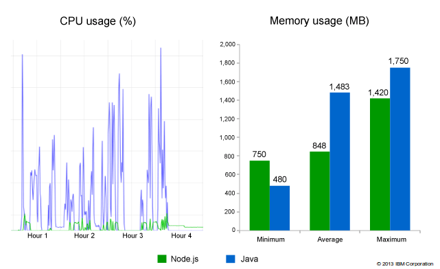
Here are the performance results with hardware usage benchmarks test. It is taken from this IBM article.

alt Comparison of nodejs with Java

Node.js uses the V8 JavaScript engine as the run-time. In the above image, we can see that Node.js performs better than Java with respect to the CPU usage, while its performance is on par with Java with respect to the usage in memory.

Here is the snapshot of most popular languages from the Stack Overflow survey of 2018.

alt Stack Overflow Survey 2018

As per the above image, JavaScript is the most popular language among professional developers.

Even though JavaScript engines skip the compilation step, its performance and popularity are better than other languages. Let’s see how JavaScript engines make this possible.

Evolution of JavaScript Engines

The first JavaScript engine was a mere interpreter. An interpreter is a software program that executes the source code line by line.

Let’s consider a JavaScript snippet below to understand how former engines used to operate.

functionarrSum(arr){var sum =0for(var i =0; i < arr.length; i++){
        sum += arr[i]}}

It has a simple arrSum function that adds the elements of an array arr. Inside for loop, there is only one statement that does the work of adding array elements to the variable sum.

Consider this from the point of the interpreter —

It is possible in JavaScript that an array can have numbers as well as strings at the same time. arr might have a mix of different data-types. On every iteration of the for loop, the interpreter checks the type of element in the array and accordingly performs the add/concatenation operation. + behaves as an addition operator for numbers and as concatenation operator for strings.

This type checking and computation on every iteration makes it slow. In earlier days, JavaScript was not considered as a language of choice because it was very slow compared to other high-level languages.

However, as we have seen from the statistics above, JavaScript performs better now and is a much-loved language among professional developers.

Chrome developed the first modern JavaScript engine, V8, in 2008. Its performance was much better than any prior engine. Chrome used just-in-time compilation in the V8 engine to boost its performance. Most of the browsers/JavaScript run-time systems now use the same technique to power up the execution speed of JavaScript code.

What is Just-in-Time Compilation (JIT)?

If the above code of adding elements of an array was compiled first, it would have taken some time to start up, but its execution would have been faster as compared to the earlier technique. JIT takes in the good parts of both the compiler and the interpreter. It interprets the source code line by line, produces bytecode for that line, and gives it to the compiler, which uses the profiling information to produce speculative optimizations. It compiles code during execution at run time.

Browsers started shipping in JavaScript engines with JIT and a profiler. A profiler, or a monitor, watches the code that runs and makes a note of the number of times a particular code snippet runs. If the same lines of code are run for more than some threshold value, that code is called as hot. The profiler then sends this hot code to the optimizing compiler.

The compilation details of the hot code are saved. If the profiler encounters this hot code again, it would convert it into its existing optimized version. This helps in improving the performance of the execution of JavaScript code. We’ll get to the assumptions that the compiler makes to generate optimized code later in the article.

How JIT Works in V8

alt Interpreter and Compiler in V8 JavaScript Engine

Ignition (interpreter) takes in AST and goes through its nodes one by one and accordingly produces the bytecodes. The profiler keeps an eye on the frequency at which a particular code snippet runs. If the frequency crosses some threshold value, it sends the hot code along with some profiling information to the TurboFan (compiler). TurboFan makes some assumptions to optimize this code further, and, if these assumptions hold true, it generates an optimized version for the hot code. The green arrow that signifies optimization success!

If the assumptions are not correct, it falls back to the bytecode that was generated by the Ignition. This is called a deoptimization or optimization bailout. The red arrow signifies de-optimization!

Let’s break JIT into parts and understand the working of each of the components in detail.

How Ignition Generates Bytecode

Bytecodes are considered small building blocks that can be composed together to build a JavaScript functionality. They abstract the low-level details of machine code. V8 has hundreds of bytecodes for different functionalities. For example, it uses the Add bytecode for addition operator and CreateObjectLiteral bytecode for creating an object.

Ignition uses a register machine to hold the local state of the registers. It has a special register called an accumulator that store the previously computed value.

Let’s consider a simple JavaScript snippet.

functionadd(x, y){return x + y;}add(1,2);

Here’s the bytecode generated for the above code:

alt ByteCode of the add function generated by Ignition

Focus only on the right-hand part. The registers a0 and a1 hold the value of the formal parameters. Add is a bytecode that is used for adding the values in registers a0 and a1.

Before jumping onto the working of TurboFan, we have to understand two important concepts in V8:

  1. Implementation of the object model
  2. Implementation of arrays

Implementation of the Object Model

The ECMAScript specification defines objects like dictionaries with string keys that map to values. In this section, we’ll learn how JavaScript engines store objects and how they implement property access on these objects.

let pokemonObj ={
    id:12,
    name:'Butterfree',
    height:11,
    weight:22}

Below is the AST for the object pokemonObj.

{"type":"Program","start":0,"end":87,"body":[{"type":"VariableDeclaration","start":0,"end":87,"declarations":[{"type":"VariableDeclarator","start":4,"end":87,"id":{"type":"Identifier","start":4,"end":14,"name":"pokemonObj"},"init":{"type":"ObjectExpression","start":17,"end":87,"properties":[{"type":"Property","start":23,"end":29,"method":false,"shorthand":false,"computed":false,"key":{"type":"Identifier","start":23,"end":25,"name":"id"},"value":{"type":"Literal","start":27,"end":29,"value":12,"raw":"12"},"kind":"init"},{"type":"Property","start":35,"end":53,"method":false,"shorthand":false,"computed":false,"key":{"type":"Identifier","start":35,"end":39,"name":"name"},"value":{"type":"Literal","start":41,"end":53,"value":"Butterfree","raw":"'Butterfree'"},"kind":"init"},{"type":"Property","start":59,"end":69,"method":false,"shorthand":false,"computed":false,"key":{"type":"Identifier","start":59,"end":65,"name":"height"},"value":{"type":"Literal","start":67,"end":69,"value":11,"raw":"11"},"kind":"init"},{"type":"Property","start":75,"end":85,"method":false,"shorthand":false,"computed":false,"key":{"type":"Identifier","start":75,"end":81,"name":"weight"},"value":{"type":"Literal","start":83,"end":85,"value":22,"raw":"22"},"kind":"init"}]}}],"kind":"let"}],"sourceType":"module"}

Notice the use of properties array that holds the key-value pairs of the object. As per the ECMAScript specification, the keys of an object are to be mapped to their respective property attributes. The property attributes tell more about the configuration of that key in the object.

Here is the list of the property attributes:

AttributeDescriptionDefault Value
valueThe value associated with the property. Can be any valid JavaScript value (number, object, function, etc.).undefined
enumerabletrue if and only if this property shows up during enumeration of the properties on the corresponding object.false
writabletrue if and only if the value associated with the property may be changed with an assignment operator.false
configurabletrue if and only if the type of this property descriptor may be changed and if the property may be deleted from the corresponding object.false

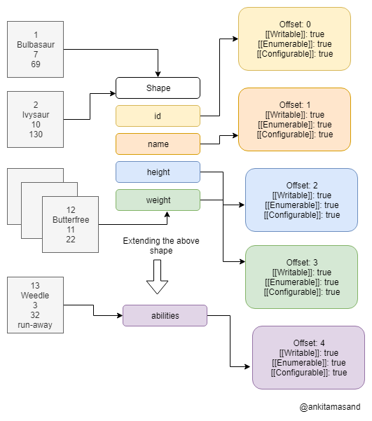
Let’s say a program has a hundred instances of the pokemonObj object, which is likely the case in common scenarios. That would mean the engine is supposed to create a hundred objects with all of the four keys of pokemonObjid, name, height and weight— along with their property attributes. That’s such a waste of memory to store repeated instances of the metadata of an object. The JavaScript engines tackle this problem by storing a shared copy of the metadata of an object. So, for hundreds of pokemonObj instances, it creates just one object to store the common metadata.

alt Multiple Objects sharing same metadata

We can optimize this more. Each of these objects holds the same four keys — id, name, height and weight. They all have the same shape of pokemonObj. We can create one shape with these four keys and let all the instances point to that shape. This will become clear from the diagram below.

alt JavaScript Objects share same shape

As it can be seen from the image above, all of the different Pokemon refer to the same shape (id, name, height, weight), and each of the keys in this shape structure refers to its respective property attribute’s structure. That’s a significant saving on the memory side!

There is an additional property offset that is included with the list of property attributes. Please note id has an offset of 0; name has an offset of 1; and so on. If we follow the pattern, it can be inferred that the keys in pokemonObj are assigned a sequential index as per their position in the properties array defined on the AST.

Let’s understand the need for the offset property.

For accessing any property on the pokemonObj, we use the . (dot) operator as pokemonObj.property. Let’s say we want the values of name, height and abilities of a Pokemon.

let name = pokemonObj.name // Butterfreelet height = pokemonObj.height // 11let abilities = pokemonObj.abilities // undefined

When the JavaScript engine encounters something like pokemonObj.name, it searches the name property defined on the shape of the pokemonObj. If it is found, it returns the value. Since abilities is not defined on the shape of pokemonObj, the engine searches for the abilities property on the prototype object of pokemonObj. It keeps traversing down the chain until it either finds abilities key or reaches to the end of the chain. In our case, it returned undefined, which means abilities was not defined on any of the ancestors of pokemonObj. Property accesses are hard in JavaScript. It is an expensive operation for an engine to traverse through the entire prototype chain for a single property.

Property access for keys name and height is very simple because of the offset property. The JavaScript engine simply returns the value from the object using the offset as defined on a particular property. For name, it would return the first value from pokemonObj, and for height it will return its second value.

Let’s say, we’ve got one more Pokemon called weedle joining in our gang. This one has some unique abilities and we really want to store all of its abilities in our pokemonObj object.

let weedle ={
    id:13,
    name:'weedle',
    height:3,
    weight:32,
    abilities:'run-away'}

We already have defined the shape for pokemonObj. JavaScript allows adding/deleting properties from an object at run-time. How do we handle the addition of abilities property to our pokemonObj shape? Should we make a new shape altogether for this object, or should we extend the previous shape? You might have guessed it right. We’ll extend our original pokemonObj shape to make room for an additional key called abilities.

alt JavaScript Objects extend Shapes

Extending shapes makes it easy to store objects that differ in some properties from their counterparts.

This can also be viewed as a hierarchical chain that starts from an empty object and eventually builds up the entire object.

let obj ={}
obj.a ='a'
obj.b ='b'
obj.c ='c'

It starts with an empty shape. obj.a = 'a' statement extends the empty shape and adds one property a to it. This goes on until we reach c. Please note, this is not an efficient way of creating objects. In order to create the above object, follow the below method of object declaration.

let obj ={
    a:'a',
    b:'b',
    c:'c'}

Takeaways from the Object Model Implementation

  1. Avoid adding/deleting properties from an object. Strive to maintain a constant structure for objects.
  2. Avoid reordering the keys of an object. The JavaScript engine takes into account the ordering of keys of an object using the offset property.
  3. Property accesses are expensive in JavaScript. The engine goes down to the root to find a particular property. Instead of directly accessing a property as pokemonObj.abilities, use hasOwnProperty method as below.
if(pokemonObj.hasOwnProperty('abilities')){// ... YOUR CODE}

hasOwnProperty method searches only on the object and not on its prototype chain.

Implementation of Arrays

Similar to objects, arrays are also considered dictionaries. But in the case of arrays, the keys are numeric, called as array indices. The JavaScript engines perform special optimizations for properties whose names are purely numeric. Objects have properties that map to values, while arrays have indices that map to elements.

In JavaScript, we don’t define the type of elements that an array will contain beforehand. While running JavaScript code, the engine determines the type of elements of an array and accordingly performs optimizations based on its type.

let arrIntegers =[1,2,3,4]let arrDoubles =[1,2.2,3.3]let arrMix =[1,2.2,'Hello World!']

The arrIntegers holds elements of type integers; arrDoubles contains integers as well as doubles; while arrMix contains integers, doubles, as well as strings.

The engines identify these three types of arrays a:
arrIntegers - SMI_ELEMENTS
arrDoubles - DOUBLE_ELEMENTS
arrMix - ELMENTS

SMI_ELEMENTS is a more specific type that contains only small integers. DOUBLE_ELEMENTS contains floating-point numbers and integer, while ELEMENTS is a general form that holds everything.

There are two more variants to these types defined above.

If an array is dense, it does not contain any undefined values — it is defined as a PACKED variant. However, if an array contains few spaces or holes or undefined values, it is defined as a HOLEY array.

let packedArr =[1,2,3,4]let holeyArr =newArray(4)
holeyArr[0]=1

packedArr has definite values on all its indices. In the second statement, the Array constructor creates an empty array of length 4. It has four undefined values. When we do holeyArr[0] = 1, it still contains three undefined values. Even if we populate all of the indices of holeyArr with definite values, it will still be called as HOLEY. Arrays cannot transition from a more generic type to its specific variant at any point in time. PACKED is a more specific variant as compared to HOLEY.

The JavaScript engine will categorize packedArr as PACKED_SMI_ELEMENTS because it contains all integers and it does not contain any undefined values. V8 can perform better optimizations for elements that are of more specific kinds. Operations on PACKED arrays are more efficient than those on HOLEY arrays.

V8 currently distinguishes 21 different elements kinds, each of which comes with its own set of possible optimizations.

alt Elements Kinds

It is only possible to transition down the lattice. An array cannot go back to its more specific version at any point.

Avoid Creating Holes in an Array

If you initialize an array using an array constructor as below —

let arr =newArray(3)

— it creates holes in the array. The engine identifies this array as of type HOLEY_ELEMENTS. Property accesses on HOLEY_ELEMENTS is expensive. If you want the value at arr[0], the engine first searches for the 0 property on array. Array arr does contain any of the properties yet. Since the engine cannot find the key 0 on arr, it descends to its prototype chain until it finds key 0 or has reached the end of the chain. This makes it similar to objects, and so even after using arrays, we’re not able to optimize it.

Instead, create arrays using an empty literal and then keep pushing values to it.

let arr =[]
arr.push(1)
arr.push(2)

With this approach, the number of elements present in the array is the same as that of its length.

For the same reason, access only those properties on the array that are defined within its length. If you access a property that is not defined on an array, it will enter into expensive lookups on the prototype chain.

V8 performs several optimizations for array built-in methods like map, reduce and filter.

Speculative Optimizations by the Compiler

If a certain code snippet has been executed some x number of times, the profiler passes it to the optimizing compiler. TurboFan uses the profiling information and makes some assumptions to produce optimized machine code.

Some of its assumptions are:

  1. The type of a variable is not changed.
  2. The structure of the object has not changed, and, hence, it can directly use the offset property defined on the object.

Inline Caches

Inline caches are the key ingredients in making JavaScript run fast. JavaScript engines use inline caches to memorize information on where to find a particular property of an object. The engines store the offset values and the bytecodes that are repeated too often in inline caches.

Deoptimization or Optimization Bailout

If the assumptions made by the compiler are not true, work done by the compiler is ignored and the engine falls back to the bytecode generated by the Ignition. This is called as deoptimization or optimization bailout. This happens because of one of the following reasons:

  1. The type of element has been changed at run time
let a =2
a ='Hello World!'
  1. The structure of an object has been changed.
  2. Element kinds of an array has been changed from PACKED to HOLEY version. Please note, the engines use a lot of optimization techniques for PACKED arrays. Avoid holes or undefined in your arrays.

Let’s Recap All That We Have Learned in this Tutorial

  1. JavaScript engines evolved from a mere interpreter to modern engines that use just-in-time-compilation. Just-in-time compilation combines the good parts of both the compiler and an interpreter. It compiles JavaScript code at run-time.
  2. V8 uses Ignition as the interpreter and TurboFan as the optimizing compiler. Ignition produces bytecode using AST as the input. The profiler watches code as it runs. It sends off the hot code to TurboFan. TurboFan uses profiling information to generate optimized machine code.
  3. We learned that interpreter has a stack of registers and it uses these registers to store parameters/variables. V8 has defined bytecodes for various operations like adding and creating objects or functions.
  4. We learned how JavaScript engines handle different Elements Kinds.
  5. Objects are stored in the form of shapes, which saves a lot of memory and also makes it easy to fetch any of the properties on an object.
  6. We saw some of the assumptions that a compiler makes to produce optimized code. If any of the assumptions fail, it deoptimizes its code and falls back to the bytecode that was generated by Ignition.

References

  1. https://www.youtube.com/watch?v=p-iiEDtpy6I
  2. https://www.youtube.com/watch?v=5nmpokoRaZI
  3. https://mathiasbynens.be/notes/shapes-ics
  4. https://v8.dev/blog/elements-kinds

This post has been brought to you by Kendo UI

Want to learn more about creating great web apps? It all starts out with Kendo UI - the complete UI component library that allows you to quickly build high-quality, responsive apps. It includes everything you need, from grids and charts to dropdowns and gauges.

KendoJSft

Header and Footer in Telerik UI for Xamarin ListView

$
0
0

The Telerik UI for Xamarin ListView control now features Header and Footer support, giving you new opportunities to customize the experience for your users.

With Telerik UI for Xamarin, you can now add custom content to the top and bottom of your list view using the HeaderTemplate and the FooterTemplate properties of the ListView. You can use them in your mobile app to display descriptive information about the content (list view items). In this blog post I will show you how both templates can be added to the RadListView control

ListView Header and Footer

HeaderTemplate

The HeaderTemplate can be used for adding custom content to the top of the items container. It could be used in different cases, for example to add text which gives an overview for the list view content. The snippet below shows how to add the HeaderTemplate:

<telerikDataControls:RadListView.HeaderTemplate>
    <DataTemplate>
        <LabelText="All mail"/>
    </DataTemplate>
</telerikDataControls:RadListView.HeaderTemplate>

FooterTemplate

The RadListView FooterTemplate is displayed at the bottom of the list view items. Here's a sample use-case scenario: say the items in the list view are messages and you want to execute some operation to all/some of them - in the footer template you can add a button that, when clicked, deletes all/the selected messages, or marks them "as read." Here is how a sample Footer Template could be defined:

<telerikDataControls:RadListView.FooterTemplate>
    <DataTemplate>
        <ButtonText="Delete all"Clicked="Button_Clicked"/>
    </DataTemplate>
</telerikDataControls:RadListView.FooterTemplate>

Please note that both templates are scrollable along the items in the ListView. For more details check our help article here.

Using Header and Footer in the Xamarin ListView

Let’s create a sample app using the HeaderTemplate and the FooterTemplate. For the demo we are going to use the RadDockLayout control. RadDockLayout provides a mechanism for child elements to be docked to the left, right, top or the bottom edge of the screen or to occupy the center area of the layout. You can easily arrange the views in order to achieve a fully featured layout of a page.

Let's create a view model and a business object that will be the source of the list view: 

publicclassViewModel
{
    publicViewModel()
    {
        this.Source = newObservableCollection<News>()
        {
            newNews("As a Front-End Developer, you will be responsible for the look, feel and navigation of complex enterprise ecommerce solutions."),
            newNews("We’re looking for a UX Architect for our UX/UI team who tells cohesive, well-thought and user tested stories through mind maps, user flows and ultimately, prototypes. "),
            newNews("Define consistent UI style guides and page layouts. "),
            newNews("You will be speaking to customers, using data to inform your designs, and, since we believe in design as a team effort, have an open work process with regular design critiques and peer feedback.")
        };
    }
    publicObservableCollection<News> Source { get; set; }
}
 
publicclassNews
{
    publicNews(stringdescription)
    {
        this.Description = description;
    }
 
    publicstringDescription { get; set; }
}

Finally, lets declare the RadDockLayout and dock the RadListView control to occupy the remaining space of the screen:

<ScrollViewBackgroundColor="White">
    <telerikCommon:RadDockLayout>
        <GridtelerikCommon:RadDockLayout.Dock="Top"
            BackgroundColor="#009688"
            HeightRequest="50">
            <LabelText="Job Descriptions"VerticalTextAlignment="Center"/>
        </Grid>
        <GridtelerikCommon:RadDockLayout.Dock="Bottom"
            HeightRequest="50"
            BackgroundColor="#659BFC">
            <LabelText="Navigation"VerticalTextAlignment="Center"/>
        </Grid>
        <Grid>
            <telerikDataControls:RadListViewItemsSource="{Binding Source}">
                <telerikDataControls:RadListView.BindingContext>
                    <local:ViewModel/>
                </telerikDataControls:RadListView.BindingContext>
                <telerikDataControls:RadListView.HeaderTemplate>
                    <DataTemplate>
                            <telerikPrimitives:RadBorderPadding="5">
                                <StackLayoutOrientation="Horizontal"BackgroundColor="#F7F7F7">
                                    <telerikPrimitives:RadBorderCornerRadius="30"
                                                        HorizontalOptions="Start"
                                                        WidthRequest="60"
                                                        HeightRequest="60"
                                                        Margin="10">
                                        <ImageSource="Avatar.png"Aspect="AspectFill"/>
                                    </telerikPrimitives:RadBorder>
                                    <StackLayoutOrientation="Vertical"Spacing="0"VerticalOptions="Center"HorizontalOptions="StartAndExpand">
                                        <LabelText="Jane"FontAttributes="Bold"TextColor="Black"Margin="0"/>
                                        <LabelText="@jane"TextColor="#919191"Margin="0"/>
                                    </StackLayout>
                                    <telerikInput:RadButtonText="Add news"
                                                    BackgroundColor="Transparent" 
                                                    BorderColor="#007AFF"
                                                    BorderRadius="30"
                                                    BorderWidth="2"
                                                    Margin="5"
                                                    WidthRequest="100"
                                                    HeightRequest="40"
                                                    Padding="12,3,12,3"
                                                    HorizontalOptions="End"
                                                    VerticalOptions="Center"
                                                    TextColor="#007AFF"/>
                                </StackLayout>
                        </telerikPrimitives:RadBorder>
                    </DataTemplate>
                </telerikDataControls:RadListView.HeaderTemplate>
                <telerikDataControls:RadListView.FooterTemplate>
                    <DataTemplate>
                        <telerikPrimitives:RadBorderPadding="5"BackgroundColor="#F7F7F7">
                            <telerikInput:RadButtonText="Share news"
                                            TextColor="White"
                                            WidthRequest="200"
                                            HeightRequest="40"
                                            VerticalOptions="Center"
                                            HorizontalOptions="Center"
                                            CornerRadius="25"
                                            Margin="0, 5, 0, 5"
                                            Padding="15,5,15,5"
                                            BackgroundColor="#007AFF"/>
                        </telerikPrimitives:RadBorder>
                    </DataTemplate>
                </telerikDataControls:RadListView.FooterTemplate>
                <telerikDataControls:RadListView.ItemTemplate>
                    <DataTemplate>
                        <telerikListView:ListViewTemplateCell>
                            <telerikListView:ListViewTemplateCell.View>
                                <StackLayoutOrientation="Vertical"Margin="10, 10, 10, 10"BackgroundColor="White">
                                    <LabelText="{Binding Description}"FontSize="15"Margin="3"TextColor="Black"/>
                                </StackLayout>
                            </telerikListView:ListViewTemplateCell.View>
                        </telerikListView:ListViewTemplateCell>
                    </DataTemplate>
                </telerikDataControls:RadListView.ItemTemplate>
            </telerikDataControls:RadListView>
        </Grid>
    </telerikCommon:RadDockLayout>
</ScrollView>

The image below shows the final result:

Demo App

That's all, now you have your list view with header and footer. 

Tell Us What You Think

Have we caught your interest with the RadListView new features and the RadDockLayout control? We would love to hear what you think about them. If you have any ideas for features to add, do not hesitate to share this information with us on our Telerik UI for Xamarin Feedback portal.

Don’t forget to check out the various demos of the controls in our SDK Sample Browser and the Telerik UI for Xamarin Demos application.

If you have not yet tried the Telerik UI for Xamarin suite, take it out for a spin with a 30-day free trial, offering all the functionalities and controls at your disposal at zero cost.

Start My Trial

Happy coding with our controls!

Creating a Serverless Application with KendoReact

$
0
0

In this article, we walk you through creating a serverless application with the Serverless Framework, deploying it to the cloud, and creating a user interface for it using KendoReact.

Serverless is an execution model that allows cloud providers to dynamically allocate resources at the function level in your code rather than the entire application. This provides for a more cost-effective and flexible way to run your application in the cloud.

Some of the most widely used serverless platforms are Amazon Lambda, Google Cloud Functions, Microsoft Azure Functions and IBM OpenWhisk.

The serverless model is gaining traction due to a few advantages over traditional cloud applications:

  • Low cost and high flexibility: serverless platforms automatically provision the optimal hardware to run your code when triggered
  • Low overhead: serverless providers charge for the amount of time your functions spend running; you pay less if there is less traffic to your application; you also pay less if your functions run fast
  • They shift the focus from cloud infrastructure to application: you are not required to manage or maintain your own servers, making it easier to focus on your application

The Serverless Framework is an open-source project that allows you to abstract the specific serverless provider and write your application the same way on all cloud platforms. The Serverless Framework adds cloud provider portability to the already impressive list of the benefits of the serverless model.

In this article, we walk you through creating a serverless application with the Serverless Framework. This is achievable with just about any serverless platform, including Progress Kinvey, but in this example we're going to deploy it to Amazon Lambda, and then create a user interface for it using KendoReact.

About KendoReact

Progress KendoReact is a library of native UI components created specifically for use in React development. KendoReact has no dependencies, and it provides a set of native UI components optimized for React. As such, we can use KendoReact to simplify and speed up UI development for Serverless applications.

Project Overview

In this article, we create a simple Pomodoro timer, using KendoReact and Serverless. If you're new to the Pomodoro technique, you can read about it here.

We create a simple interface for starting and stopping Pomodoro timers and listing the timers recently completed. The events are tracked in an AWS DynamoDB database. We use KendoReact components in the user interface.

We walk you through the dependency installation, the creation of the backend and the frontend, and the deployment of the project to AWS Lambda.

Dependencies

Backend

First, set up the credentials for your Amazon Web Services (AWS) account. If you don't have one, sign up for one on the AWS website here. Once you have the credentials, set them up with the AWS Command Line Interface (AWS CLI). Instructions on how to do this are here. For setup to be as easy as possible, your AWS account should have Admin credentials. If this is the first time you've used the AWS CLI, configure it according to these instructions.

Next, make sure that you have Node.js installed. As of writing, the latest stable version of Node.js is 10.15.0. Installing Node.js also installs the latest version of npm.

Finally, install the Serverless Framework by following the instructions listed in the article, Getting Started with Serverless.

Frontend

The requirements for the frontend of the project are similar to the backend:

  • Node.js (as of this writing, the latest version is 10.15.0)
  • npm (included with Node.js)
  • create-react-app, which is included with modern versions of Node.js
  • KendoReact, which we'll add later

Creating the Backend for the Serverless Application

Make sure that you saved your AWS credentials correctly. Serverless uses them to access the cloud provider, as detailed in the Dependencies section.

Create your backend structure by using this command:

$ serverless create -t aws-nodejs -p backend

This command produces a backend directory with two files in it, handler.js and serverless.yml:

$ tree
. 
├── backend
│  ├── handler.js
│  └── serverless.yml

handler.js contains the code of our backend. serverless.yml declares all the infrastructure necessary for our backend.

We start by defining two functions — one to fetch the saved Pomodoro entries, and one to create a new Pomodoro timer. Replace the current content in handler.js with the following code:

module.exports.getPomodoros = async (event, context) => {
  // fetch all pomodoros from DynamoDB table
  const pomodoros = await documentClient
    .scan({ TableName: "pomodoros" })
    .promise();  

  return response(JSON.stringify({ pomodoros }));
};

module.exports.postPomodoro = async (event, context) => {
  const Item = JSON.parse(event.body);
  await documentClient.put({
    TableName: "pomodoros",
    Item
  })
  .promise();

  return response(JSON.stringify({ Item }));
};

Both functions access the pomodoros table via the documentClient object. This is a mapping that the AWS DynamoDB JavaScript library conveniently provides. We declare the mapping it in the same file above the functions:

const AWS = require("aws-sdk");
const documentClient = new AWS.DynamoDB.DocumentClient();

With that, we are able to access the DynamoDB tables. We also define the response function with the CORS headers needed for the backend and the frontend to work together:

const response = body => ({  
  // return the CORS headers in the response, without that it
  // wouldn't work from the browser
  headers: {  
    "Access-Control-Allow-Origin": "*",
    "Access-Control-Allow-Credentials": true
  },
  statusCode: 200,  
  body
});

This completes the handler.js file. Next, we expose both of our handler functions to the outside world via the serverless.yml file. We add the function definitions first, overwriting anything you have in the functions section:

functions:  
  getPomodoros:  
    handler: handler.getPomodoros  
    events:  
      - http:
        path: /
        method: GET
        cors: true
  postPomodoro:
    handler: handler.postPomodoro
    events:
      - http:
        path: /add
        method: POST
        cors: true

Second, we define the DynamoDB database:

resources:
  Resources:
    # DynamoDB Table for pomodoro entries
    PomodorosTable:
      Type: AWS::DynamoDB::Table
      Properties:
        TableName: pomodoros
        AttributeDefinitions:
          - AttributeName: name
            AttributeType: S
        KeySchema:
          - AttributeName: name
            KeyType: HASH
        ProvisionedThroughput:
          ReadCapacityUnits: 2
          WriteCapacityUnits: 2

Finally, we define a location where to persist stack.json— this is how the frontend later knows where to look for our backend application:

plugins:
  - serverless-stack-output

custom:
  output:
    # Save endpoint URLs to stack.json inside frontend source
    # directory
    file: ../frontend/src/stack.json

That's it! Now we can install all the dependencies and deploy our Serverless backend to Amazon Lambda. First, install the plugin we declared above:

$ serverless plugin install --name serverless-stack-output

then

$ npm install

And deploy:

$ npm run deploy # or serverless deploy

And after a few minutes:

$ npm run deploy

> serverless deploy

Serverless: Packaging service...
Serverless: Excluding development dependencies...
Serverless: Creating Stack...
Serverless: Checking Stack create progress...
.....
Serverless: Stack create finished...
Serverless: Uploading CloudFormation file to S3...
Serverless: Uploading artifacts...
Serverless: Uploading service .zip file to S3 (3.53 KB)...
Serverless: Validating template...
Serverless: Updating Stack...
Serverless: Checking Stack update progress...
......................................................
Serverless: Stack update finished...
Service Information
service: serverless-kendo-pomodoro
stage: dev
region: us-east-1
stack: serverless-kendo-pomodoro-dev
api keys:
  None
endpoints:  
  GET - https://pyjsahfuk7.execute-api.us-east-1.amazonaws.com/dev/
  POST - https://pyjsahfuk7.execute-api.us-east-1.amazonaws.com/dev/add
functions:
  getPomodoros: serverless-kendo-pomodoro-dev-getPomodoros
  postPomodoro: serverless-kendo-pomodoro-dev-postPomodoro
Serverless: Stack Output saved to file: ../frontend/src/stack.json

Our backend is deployed to AWS! We're ready for the next step.

Cleaning Up

The Serverless Framework creates AWS resources for you. Once you've finished setting up the Serverless application and working with its frontend, remember to remove all the resources created by running $ serverless remove in the backend directory to avoid unexpected AWS charges for your account.

Creating the Frontend for the Serverless Application

The easiest way to create a structure for the frontend is to use the create-react-app utility. Run this command:

$ npx create-react-app frontend

The frontend consists of two components:

  • The main one is <App />. This is all the logic for communicating with the backend via HTTP requests and rendering the data fetched from the backend.
  • <Timer /> is used to measure the time.

For the App component, we use the Grid and GridColumn components from KendoReact. First install and save the packages:

$ npm install --save @progress/kendo-react-grid \
                     @progress/kendo-data-query \
                     @progress/kendo-react-inputs \
                     @progress/kendo-react-intl \
                     @progress/kendo-react-dropdowns \
                     @progress/kendo-react-dateinputs

Add it to the import section of App.js:

import { Grid, GridColumn } from "@progress/kendo-react-grid";

And replace the current <div className="App"> with the following:

<div className="App">
  <h1 className="App-title">Serverless KendoReact Pomodoros</h1>
  <Timer onFinish={this.onFinish} />
  <Grid data={**this**.state.data} classNames="grid">
    <GridColumn field="PomodoroName" title="Pomodoros Done" />
    <GridColumn field="Date" />
    <GridColumn field="Elapsed" />
  </Grid>
</div>

Here, we use a simple table to show the Pomodoro timers that we have already completed, plus reference a Timer component that has all the logic for measuring the time spent in the Pomodoros and between them.

The Timer component uses the RadialGauge, Input, and Button KendoReact components, and you can see its entire logic here.

The frontend uses stack.json to determine the details of the endpoint it is connecting to. This file is generated during the deploy of the backend. It is important to deploy the backend before running the frontend.

Once the backend is deployed, we parse the backend endpoint in App.js:

import { ServiceEndpoint } from "./stack.json";

The codebase for our frontend is small now that KendoReact implements all the components. We can focus on defining the business logic and presenting the data clearly.

We won't cover all the frontend code in this article, as there's a lot of boilerplate provided from Create React App. You can find the complete frontend codebase here. Clone that repo before continuing.

Running the Frontend

Once the frontend is ready, and after the backend is deployed, we can run the frontend locally by running the following commands in the frontend directory:

$ npm install

Then:

$ npm start

After that, the frontend is accessible at localhost:3000 in your browser. Try adding a few pomodoros:

Pomodoros example

Notice the smooth transitions in the fields provided by KendoReact with no extra code on our side:

Seamless transitions

That's it! We're ready for some productive time with our Pomodoro timer.

Conclusion

As we've seen, it's easy to get KendoReact and Serverless to work together. Configuring a React application to use a Serverless backend only requires a serverless.yml and a stack.json file. There is a lot you can do with a Serverless backend.

KendoReact provides convenient components to use in many situations. We've used grids, the buttons and the text fields in this article, but there are many more — including tools for animation, conversational UIs, PDF processing, and so on.

Serverless is a great way to create simple and scalable APIs and automate the deployment of the infrastructure required for those APIs. Learn more about the Serverless Framework here. If you want to learn about how the Serverless deployment process works on AWS, go here. As I mentioned earlier, while we happened to use AWS in this example, you could also have used a platform like Kinvey, which you can learn more about here.

Learn more about the KendoReact components here. Documentation on specific components included in KendoReact is here. And here is how to install KendoReact.

How did your setup go with Serverless and KendoReact? Let us know in the comments!

The Uno Platform And WebAssembly

$
0
0

On this episode of Eat Sleep Code, we talk about using Uno to create cross platform .NET apps, and what WebAssembly means for deploying .NET to the web.

Join us as we talk with Jérôme Laban, Uno Platform CTO, about the prospects of using Uno to create cross platform .NET applications. Jérôme also discusses the use of WebAssembly by Uno and what WebAssembly means for deploying .NET to the web.

You can listen to the entire show and catch past episodes on SoundCloud. Or just click below.

Jérôme Laban

jerome.laban

Jerome Laban has been programming since 1998, mainly involved in .NET and C# development as teacher, trainer, consultant in France. He is the CTO of Uno Platform in Montreal, a framework aiming at improving the development cycle of cross-platform apps using Windows, iOS, Android and WebAssembly using Mono and Xamarin. Uno Platform

Show Notes

Viewing all 4262 articles
Browse latest View live


<script src="https://jsc.adskeeper.com/r/s/rssing.com.1596347.js" async> </script>