Quantcast
Channel: Telerik Blogs
Viewing all 4272 articles
Browse latest View live

Building Fiddler Importers

$
0
0

Learn how to build your own Fiddler importers with this simple guide.

This is a guest post from Eric Lawrence, written in collaboration with the Fiddler team. Would you like to write about Fiddler for our blog? Let us know in the comments below.

When reproducing a bug on a website or web service, traffic captures are invaluable because they allow developers and testers to easily see exactly what’s going on at the network level, even without having access to the reproduction environment. Over the years, Fiddler’s Session Archive Zip (SAZ) file format has become the gold standard for such captures because SAZ files are easily captured (with Fiddler, Fiddler Everywhere, FiddlerCap, or a Fiddlercore-based tool) and are easily reviewed with the powerful Fiddler desktop client.

However, in some cases, you may wish to debug network traffic that was originally captured using another tool and exported in a format like a Wireshark PCAP or the browser-standard HTTP Archive Format (HAR). Fiddler already includes importers for those formats, but what if you want to support a different format that Fiddler doesn’t yet support?

Fortunately, Fiddler is extremely extensible, and this extends to the import/export system. We’ve previously published an example exporter, and today I’d like to talk about how you can build an importer.

I’m now an engineer on the Microsoft Edge browser team, and our preview builds are now being tested by users around the world. When those users encounter problems, sometimes the best path for debugging starts with capturing a network traffic log. For some of our more technical users, that might involve collecting a SAZ file using one of the existing Fiddler-* products. But for other users (especially our upcoming MacOS users), collecting a SAZ file involves more overhead. In obscure cases, collecting a SAZ file might cause a repro to disappear.

Fortunately, the new Microsoft Edge browser is built atop the Chromium open-source browser engine, and Chromium includes a built-in network logging feature. To collect a network log in Edge, simply navigate a tab to edge://net-export (in Google Chrome, you’d visit chrome://net-export instead).

Configure the options using the radio buttons and click Start Logging to Disk. Open a new tab and reproduce the problem. After you’ve completed the repro, click Stop Logging. At the end, you’ll have a NetLog .json file containing all of the network events. The output JSON file can be viewed using a web-based viewer:

However, in many cases, it would be more desirable to view the file using Fiddler. Unlike the web based viewer (which tends to show content as a base64-encoded string of goo), Fiddler includes built-in formatters for common web formats (e.g. images, JSON, etc), and it makes it easier to export response bodies as files, resend captured requests using the Composer, and replay captured responses using the AutoResponder.

Fiddler does not include a NetLog importer by default, so let’s build one.

First, we start by looking at the Chromium documentation for the relatively straightforward file format. NetLog files are JSON-serialized streams of network events. The low-level events (tracking DNS lookups, TCP/IP connections, HTTPS certificate verifications, etc) are associated to a request identifier, which represents one or more network requests (what Fiddler calls a “Web Session”). So, the task of our importer is to:

  1. Parse the JSON file into a list of events
  2. Bucket the events by the request identifiers
  3. Generate one or more Fiddler Web Sessions from each bucket

The C# sourcecode for the FiddlerImportNetlog extension is available on Github. Beyond all of the typical project files, the extension itself consists of just two files, Importer.cs, FiddlerInterface.cs, and Properties\AssemblyInfo.cs.

The AssemblyInfo.cs contains just one line of interest:

[assembly: Fiddler.RequiredVersion("4.6.0.0")]

Fiddler requires this attribute to load the assembly as an extension; it specifies the minimal version of Fiddler you’ve tested the extension to run in.

The FiddlerInterface.cs file contains a simple class which implements the ISessionImporter interface. The ProfferFormat attribute on the class specifies the format type and a descriptive string to show in the import dialog:

The importer interface exposes a single method, ImportSessions, which accepts a string specifying the selected format, a dictionary of options, and an optional event handler to call back with import progress events. The function returns an array of Sessions created from the imported data.

The bulk of the extension’s logic is found in Importer.cs. The caller provides a StreamReader from which the imported file’s text is read and then parsed using the JSON.JsonDecode method made available by the using Fiddler.WebFormats statement at the top of the file. WebFormats.JSON is a fast, simple parser that reads the JSON into Hashtables (for JS objects), ArrayLists (for JS arrays), and primitive types (booleans, doubles, strings, etc).

After parsing, the importer looks up the mappings from named event types (e.g. URL_REQUEST_START_JOB) to the integer identifiers recorded inside the event entries, then parses the list of event entries, bucketizing those with a source of URL_REQUEST by the request id. Then, the ParseSessionsFromBucket method loops over each URL_REQUEST’s events to collect the data (e.g. request headers, response headers, response bodies) needed to generate a Fiddler Web Session. Two notable details:

  1. The NetLog format may have multiple request/response pairs in a single URL_REQUEST (e.g. if the request resulted in a redirect or an automatic authentication challenge/response)
  2. The NetLog format does not presently store (anywhere) the request body content for POST requests. In contrast, response body bytes may or may not be present based on the options chosen by the user when starting the logging process

After generating the list of extracted Web Sessions, the importer generates a few “mock” Sessions that allow the user to peruse the raw data captured in the file (e.g. the browser configuration, list of enabled extensions, etc).

After an hour of quick-and-dirty coding, Fiddler can now import NetLog json files:

If you’re just interested in using this importer without building it yourself, you can install it from my website. If you find any bugs, please file them!

Hopefully, you’ve found this to be a useful introduction to how easy it is to build importers to get your data into Fiddler!
Understand Basic Typescript Types

$
0
0

TypeScript is the cool (new? sort-of) kid on the block. In this article, we will explore the basics of "types," the core feature this superset gives us - and why you may care about joining in on all the funz.

So maybe you’ve heard about this thing called TypeScript. Maybe you haven’t – maybe you live in a pineapple under the sea or are still hacking away at ActionScript 2. Regardless, TypeScript is a thing, it’s happening, it’s here to stay, and it’s gaining strength by the minute.

Let’s dive in on the very basics.

Type-Script?

So what exactly -is-TypeScript (TS for short)?

TypeScript is a typed superset of JavaScript that compiles to JavaSscript.
-Microsoft

Ok so, that’s a bunch of fancy terms to say, that it’s an evolved form of JS. A superset language is a language that is built on TOP of the other one, so sort of like a Pokemon evolution without all the pretty graphics and cuteness.

You get all that is JavaScript, plus a little extra.

What about the typed part? It means that TypeScript allows you to basically tell your computer, when you’re coding, what each part of your code will hold. Think of it as putting labels on your variables and functions to make them strict on what they should be doing or containing.

Ok so, what about the compiles to JavaScript? Well, currently TypeScript is not something that browsers can understand. Browsers speak JavaScript. So when you work with this superset, you are going to have to use some sort of tool to change it back to JavaScript before you deploy.

This all sounds super scary? Maybe. Ever worked with SCSS? Aha! Well, that’s another superset but for CSS.

Let’s talk Moneyz

Variables in JavaScript don’t have types. This means you can basically put anything and everything you want into a variable and it’s completely valid code. For example:

let myBox ='This would be a string';
myBox =23;// But now it's a number
myBox ={ box:true};// I can also put objects
myBox =['there is no other like it','and this one is mine'];// and arrays :)

This code above is completely valid JavaScript code, a variable can change its contents as needed because the box (variable) that contains this content is flexible and will adjust to whatever you pass to it.

Sweet, ok, but why would I want to lose this flexibility?

We’ve all run into a scenario where something like this happens. You have a variable, which is a number, let’s say it’s the user’s bank account moneyz.

let moneyz =20;// Yes, this is how I spell it, let me be

So far so good, but maybe you make a call somewhere that is going to tell you how much money was just deposited into the account. But something somewhere in the land of “omg how am i going to debug this” made the second value a STRING.

So you merrily code a function:

functionincrementMoneyz(oldMoneyz, newMoneyz){return oldMoneyz + newMoneyz;}

However in reality now you have a case where, say, you’re adding up a number and a string. So the 20 she had before, added to the “20” she just deposited into her account…

let moneyz =20;let deposit ="20";let moarMoneyz =incrementMoneyz(moneyz, deposit);// Result => "2020"

Now, TypeScript is not going to protect you from runtime bugs and wild APIs, because in the end when you deploy your code it’s going to be good old JavaScript. But if this error is happening because of some oversight in your code, TypeScript is going to yell at you and hopefully prevent this mistake from happening.

So how then, do we set types on our variables?

Type-Proofing

Super simple, let’s learn by example. Switch gears to TypeScript (TS from now on, fingers hurt).

// This is TYPESCRIPTlet number =20;
number ='20';// ERROR

In TS, the compiler checks your code like big brother. So, in the above example, you are declaring a number variable old-school, no type. However, TS will know and label this variable as a Number. Why? Because you’re putting a number in it initially!

So what’s going to happen is that when you compile this code, TS will throw an error because '20' is not a number, it’s a string.

Simple, right? This type of, well… type… is called an inferred type. That mean’s you’re leaving TS all the heavy lifting.

What if, however, we want to keep all the control of types for ourselves? Then we have to explicitly tell TS what we want.

let typedNumber: number =20;
typedNumber ='20';

Same example, but I switched the variable name to typeNumber for clarity.

See the : number part after the variable declaration? That’s the actual type! It reads:

I want a new variable, called typedNumber, with a type of a number value, and the initial value is 20.

When the compiler hits the second line, and sees the string, it will also complain and throw and error - as expected.

Numbers, check. What other types are there though?

Booleans

let myBool: boolean =false;let emptyBool: boolean;// Yup, you can declare it without initial value!
emptyBool ='false';// Error, emptyBool has a type of boolean!

Strings

let myString: string ='TS is bae';
myString =['EVIL'];// Error! myString is typed as stringlet quotes: string ="You can also use double quotes :)";let awe: string =":o"let backtick: string =`And backticks! ${awe}`;

Arrays

let anArrayOfNumbers: number[]=[1,2,3];let alsoAnArrayOfNumbers: Array<number>=[1,2,3];let anArrayOfStrings: string[]=['a','b','c'];let alsoAnArrayOfStrings: Array<string>=['a','b','c'];

Arrays have a little gotcha to how they’re typed, because as you can see from the above example, we have two different syntaxes. In the first one, we tell the compiler the contents of the array plus []. On the second syntax, we first say it's an Array and then what’s going to be in it.

Feel free to use whichever works better for you.

Tuple

So what is a Tuple?

Simply put, a Tuple is an array of a defined/fixed number of elements which you know what they are beforehand, and that have different types.

This is best explained with an example. Imagine you have an API for users, which you know returns an array with the name at index 0, the last name at index 1, and the age at index 2.

// ['Marina', 'Mosti', 32];let userTuple:[string, string, number];
userTuple =['Daenerys','Targaryen',17];//This is valid. Also. How you doin'?
userTuple =['Sansa','Stark','IDK kill her already'];// This would be an error

Keep in mind that although Tuples are super useful, they are only to be used in the particular cases where you know that your data is going to have this format, because even a simple thing like a change in array index will break the type.

Enum

Enum is another new datatype in TypeScript that we get to play with.

Ever been in a scenario where you want to define a list to just make some reference later on, and you end up doing a bunch of constant literal strings to keep track of it?

Take for example a user’s membership to a site, which has a few defined options.

enum Membership { Free, Member, Gold   }

The enum here is just defining a list. This is not a variable - imagine that you’re only making the blueprint for this type.

Now to actually use it, we could do the following:

enum Membership { Free, Member, Gold   }const userMembership: Membership = Membership.Free;

Take a look at the const variable that we’re setting up. The type is actually Membership, which is referencing the enum that we created before. This way, we can actually access Membership.Free and set it to this variable.

Keep in mind something important: The actual value of the variable is a number! The enum actually behaves like an array, where each item gets a 0 index incremental value. You can also override these internal values by setting them with an equal sign.

enum Membership { Free =3, Member, Gold   }

In this case, Member would be 4, and Gold would be 5 - they increment starting from the last known value, in this case 3, defined by Free.

But, I’m a Free Spirit!

So you may argue at some point that not having types is actually a benefit. That you prefer your functions be be able to return 3 different types of data depending on output. That you will not succumb to these chains!

Good news! There's one more datatype for specially this type of situation: Any

As the name already tells you, this type makes the variable behave in the same way that plain JavaScript does.

const anarchy: Any ='YAAAAS';
anarchy =9000;// works! :)

Wrapping Up

TypeScript is coming with force into the FE dev world, if you have been putting it on hold to start playing with it and learning, now is the time to pick it up and start polishing your typed-skills.

If you want to read/learn more about I recommend diving into the handbook and tutorials they have up in their official website.

Thanks for reading!

For More Info on Building Great Web Apps

Want to learn more about creating great web apps? It all starts out with Kendo UI - the complete UI component library that allows you to quickly build high-quality, responsive apps. It includes everything you need, from grids and charts to dropdowns and gauges.

Learn More about Kendo UI

Get a Free Trial of Kendo UI

How to Achieve Chrome-like Tabs with Tabbed Form in WinForms applications

$
0
0

This post will introduce you to the Tabbed Form control and its features, and we'll see how to achieve tabbed navigation in your WinForms application.

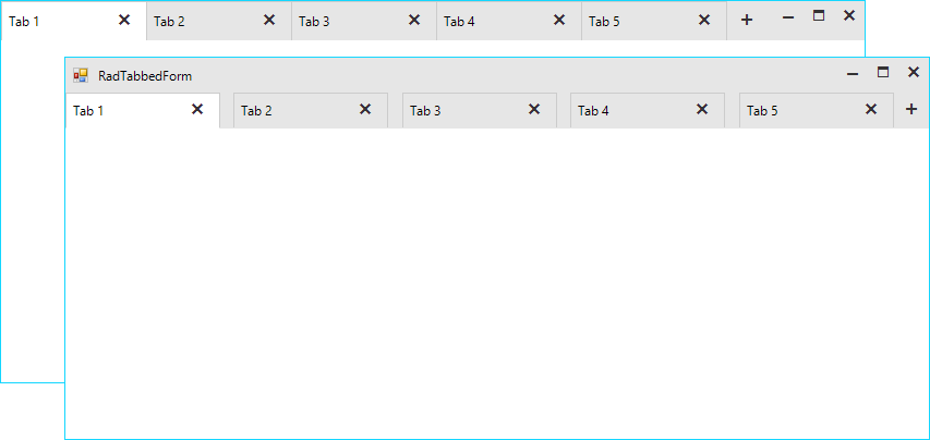
We introduced the Telerik UI for WinForms RadTabbedForm in the R1 2019 version of the controls. I hope that by now you have played with it and seen how handy it can be in so many scenarios. In this blog post I will try to explain some of the scenarios the control handles and later go over the features in more depth.

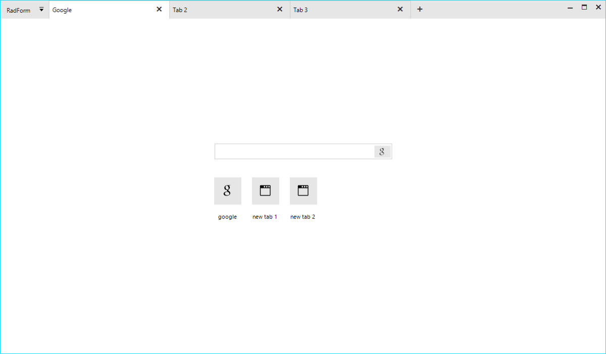
tabbed-form-01

Where to Use Tabbed Form?

The idea to organize the different views of an application in separate tabs is not new. The Microsoft TabControl and our own RadPageView have been around for quite some time. Although powerful, these controls serve a more limited purpose. Imagine, that you want to implement a tabbed UI which will serve as a top-level container of the entire application. The page view and MS tab control are not suitable for this as they are bound to the form they were added to and the pages or tabs cannot be dragged and dropped. Actually, a dock control can better serve you, yet if you want to achieve an end-user experience like what people are seeing in the modern browsers, it is still not good enough.

The RadTabbedForm is specifically built to handle this scenario. The application content can be organized and separated in different tabs where each tab is responsible for a different part of the application. The tabs are located inside the form's title bar just like in browsers (Chrome, Edge etc.) and they can be reordered or moved away to a separate window. This is extremely useful in big applications visualizing data. Instead of switching from one tab to another, the end user could simply drag the tab out thus creating a new form. The tabs would then be in two separate windows and the user could easily view both contents simultaneously. RadTabbedForm offers great flexibility and freedom which will be appreciated by the people using your application.

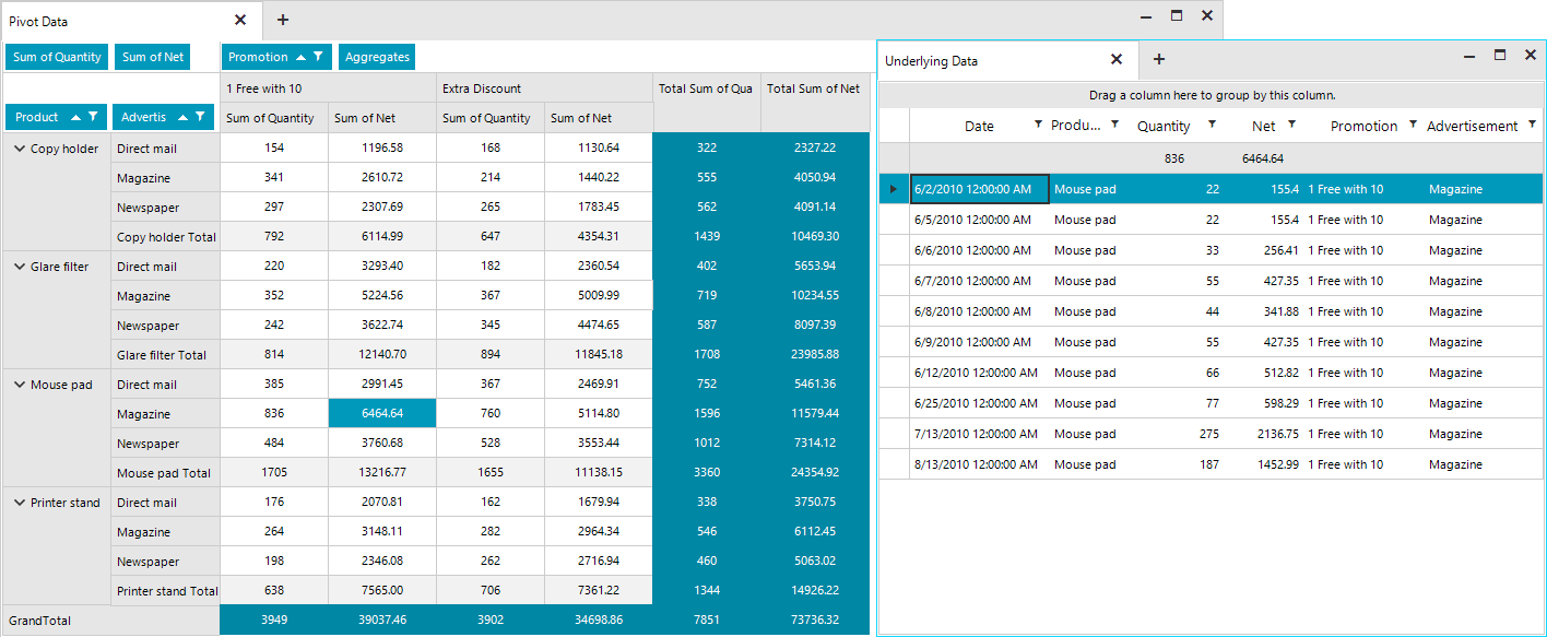
The screenshot below shows two tabs with the second tab being detached in a separate form. The first tab displays a RadPivotGrid and the second one shows a breakdown of the grouped and aggregated data behind the selected cell in the pivot from the first tab.

tabbed-form-011

Architecture and Features

The RadTabbedForm represents a form host of the RadTabbedFormControl. The form control is responsible for creating and manipulating the tabs in the title bar, the panels associated with each tab holding their content and the drag-drop service. Basically, most of the functionality and API is defined inside the RadTabbedFormControl, which is exposed by the form's TabbedFormControl property. The control is packed with many features and its look can be completely customized by simply setting a couple of properties. The form is built on top of TPF consisting of many light-weight visual elements. The Structure article in the documentation provides information on the more important building blocks of the control.

Full Design Time support

Tabs can be added in the designer of Visual Studio. Each tab will create a panel where all the other controls can be added.

RadTabbedForm with the Fluent Theme in the Visual Studio Designer

tabbed-form-02

Title Bar Support

It was really challenging to implement all the features inside the form's non-client area. I am happy to say that we managed to achieve everything which was planned.

  • Settings: The title bar’s height is not fixed, and it can be adjusted via the CaptionHeight property. The tabs height and the space between them is also adjustable. We have decided to leave no space between the tabs, however, if your end users would need such you can increase the tab spacing. For example, with the following settings you can increase the height of the entire title bar and have the tabs displayed under the top-part where the form`s icon and system buttons are located. This way you will have a bigger part of the non-client area empty which will allow the users to move the form easily.

    this.ShowIcon = true;
    this.TabbedFormControl.ShowText = true;
    this.TabbedFormControl.CaptionHeight = 65;
    this.TabbedFormControl.TabHeight = 32;
    this.TabbedFormControl.TabWidth = 180;
    this.TabbedFormControl.TabSpacing = 12;
Default and Customized Tabbed Forms

tabbed-form-03

  • Standard Windows Title Bar Style: What does it mean? Basically, it means that we can paint the tabs inside the default Windows title bar as it is painted by the operating system. This will vary from one Windows version to another and it will also depend on the chosen Windows theme. This behavior is controlled by the AllowAero property of the form. Setting the property to false would force our themes and the control will adjust the title bar to match the theme of the tabbed control. In some situations, it might be necessary to match the standard Windows look so the AllowAero property has you covered:

    this.AllowAero = true;

Standard Windows 10 Title Bar Style

tabbed-form-04

Drag and Drop

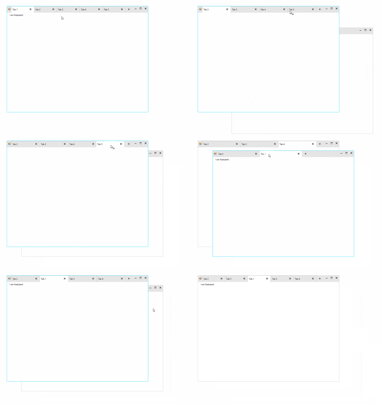
The tabs can be reordered inside the title bar. It is also possible to drag them out to create a separate form. The tab content including all the added controls will be moved to the new form. This operation can be repeated numerous times over and the tab be moved from one form to another.

tabbed-form-drag-drop

Quick Actions

Various elements like buttons, check boxes, drop-down buttons etc. can be added before and/or after the tabs.

this.TabbedFormControl.LeftItems.Add(newRadButtonElement { Text = "button1"}); //adds items before the tabs
this.TabbedFormControl.RightItems.Add(newRadButtonElement { Text = "button2"}); //adds items after the tabs

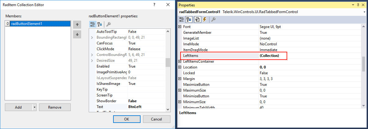
These elements can be also added in the Visual Studio designer.

tabbed-form-05

The LeftItems and RightItems collections are also exposed in the property grid of the designer and the elements can be edited in the collection editor.

tabbed-form-06

Navigation

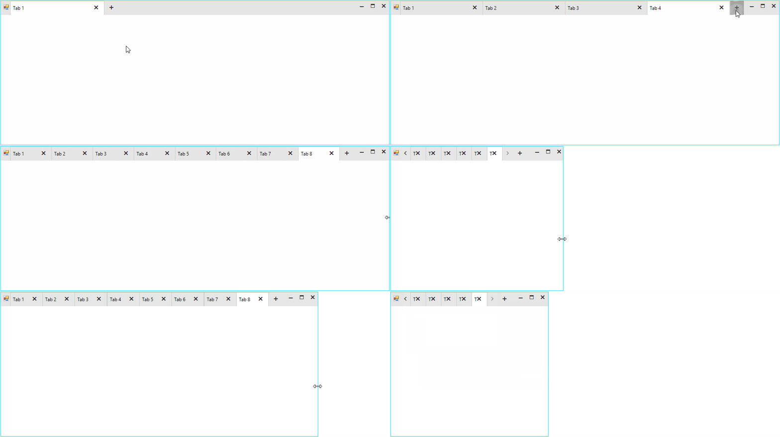
The tabbed control also has a built-in navigation. The navigation buttons will appear automatically, whenever the tabs cannot fit entirely in the available width. The tabs always have an equal width and it can be controlled with the TabWidth and MinimumTabWidth properties. The layout is smart enough and if the tabs count is increased to a point that they cannot fit in the title bar with their specified width, the widths of all tabs will be decreased equally. The layout will decrease the widths of the tabs until it reaches the specified MinimumTabWidth value. At that moment the navigation buttons will become visible.

tabbed-form-navigation

Pinned Items

Tabs can be pinned to the left or right side of the title bar. When unpinned, the tab will return to its last position.

this.TabbedFormControl.Tabs[0].Item.IsPinned = true;

tabbed-form-07

Context Menu

The tabbed control also has a built-in context menu which is fully localizable.  

tabbed-form-08

The items displayed in the menu can be customized in the RadTabbeFormControl.ContextMenuOpening event.

privatevoidTabbedFormControl_ContextMenuOpening(objectsender, RadTabbedFormControlItemConextMenuOpeningEventArgs e)
{
    if(e.TabItem.Text == "Tab 1")
    {
        //remove first item
        e.ContextMenu.Items[0].Visibility = ElementVisibility.Collapsed;
    }
    elseif(e.TabItem.Text == "Tab 2")
    {
        //disable the context menu
        e.Cancel = true;
    }
}

Getting Started

There are two ways to add a RadTabbedForm to your Visual Studio project:

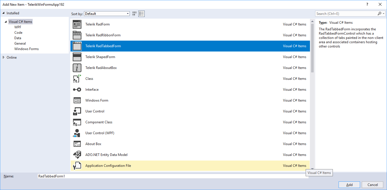
  • VSX extensions: Assuming that you have our Visual Studio extensions installed, you can create a new tabbed form by simply adding a new item to the project.

tabbed-form-09

  • RadFormConverter: Simply drag and drop the component from the Visual Studio tool box and convert the current form to a RadTabbedForm.

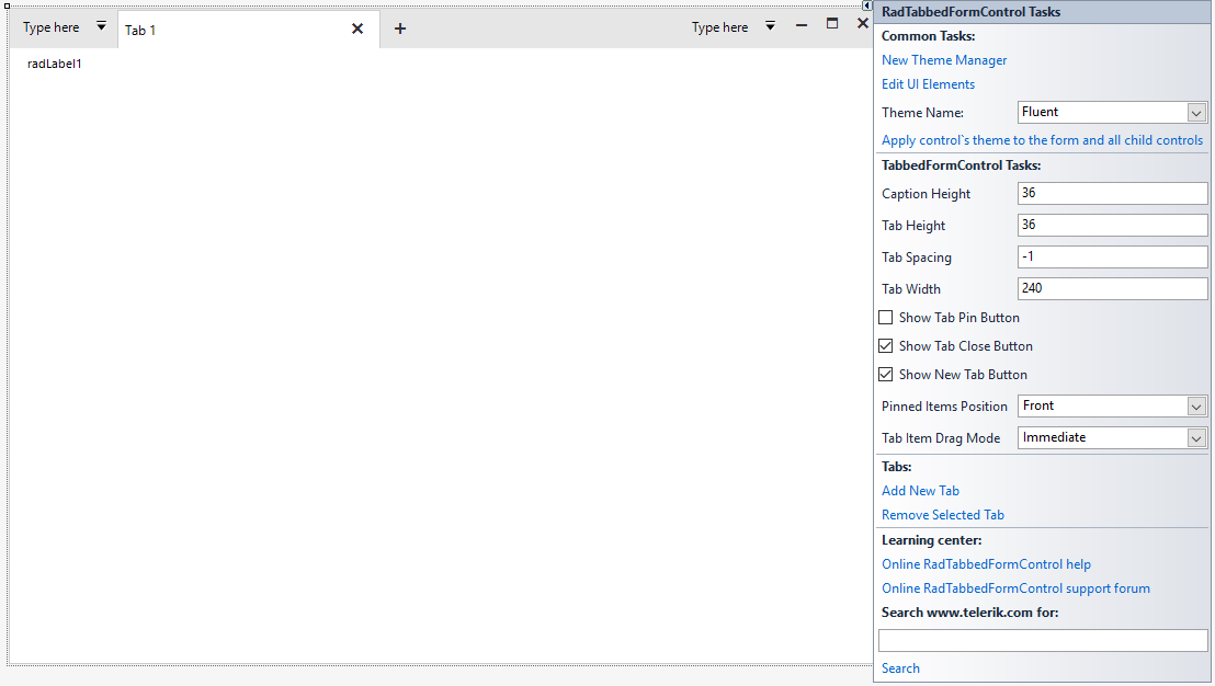
Once you have the form added to the project you can start building the UI. Tabs can be added via the RadTabbedFormControl's smart tag. The smart tag also exposes the most important properties of the control. You can also check our Demo application and the two RadTabbedForm examples. Please also don't miss the documentation as it provides detailed information on the features and API of the control.

Try It Out and Share Your Feedback

We'd love to hear what your thoughts are on the new control. Please leave a comment below or write in the forums. If you have an idea for the next great feature you can also submit it on our feedback portal.

You can learn more about the Telerik UI for WinForms suite via the product page. It comes with a 30-day free trial, giving you some time to explore the toolkit and consider how it can help you with your current or upcoming WinForms development.

A Look Back at React Europe 2019 in Paris

$
0
0

React Europe 2019 concluded last week. I want to share my experience from the perspective of a first time visitor to Paris, and highlight some of the amazing talks, speakers and attendees that made this event so incredible for myself and my teammates from KendoReact.

For the 5th year in a row, React Europe has held a fantastic conference in Paris, France. My company (Progress Software) had an amazing time not only as a sponsor of the main conference event, but we also participated in the hackathon on Saturday.

React Europe Crowd

The event was held at the Espace Charenton event center in the Porte de Charenton area of Paris and drew around one thousand React developers from all over the world.

Keynote by Jared palmer

Host and emcee Jared Palmer led the conference with a really good message about embracing React, building new things, contributing to open source including ReactJS, writing understandable docs, welcoming newcomers to JavaScript and the community as a whole. If we don't give these people the room to grow and improve, they will find another community that does welcome them.

React has always been a growing and welcoming community, and we have to work extra hard to make sure that doesn't change. I felt Jared's keynote to be an inspiring way to open the conference, which ended up being one of the more intimate of the conferences I had been to as all of the speakers were super approachable. It was a very friendly vibe amongst the attendees and I never once encountered anything to the contrary. The coordinators were not only welcoming to me and my team as a new sponsor, but they went out of their way to show us a good time. I recommend this as one of the few must-attend and must-sponsor events if your team is thinking about going next year.

The food and catering throughout the event was top notch, french breakfasts and baguette sandwiches for lunch, and of course there is no shortage of amazing restaurants in Paris.

Amazing Food and French Catering

It doesn't hurt that React Europe is held in one of the most romantic and beautiful cities in the world. As a first time traveler (as was most of my group), we made some time to get around the city and take in the great landmarks and attractions. But the conference really was the shining light in this trip and I would like to quickly highlight some of my favorite talks and give you my experience as a first time attendee. 

We heard from many amazing speakers at this event. Some of them were veterans of react Europe, like Lee Byron, who is the only speaker to have graced the React Europe stage every year since it began in 2015. Others included Michael Westrate, Ives van Hoorne, Brent Vatne, Josh Comeau.

As an avid viewer of the previous years talks, I noticed a lot of new faces that may not have been on the main stage before or had only been involved with lightning talks in the past years. I thought many had extremely amazing talks, including: Ankita Kulkarni, Charly POLY, Olga PetrovaElla van Durpe, and Alec Larson, Charles Mangwa, Lisa Gagarina and Tim Neutkens just to name a few.

Hooks in Motion by Alec larson

One of my favorite talks as a UI developer who loves animations and React Hooks was from Alec Larson (@alecdotbiz), you can check out his full talk "Hooks in Motion" about natural animations!

Move Fast With Confidence by Paul Armstrong

Another great talk that really resonated with me, and which is valuable for everyone no matter their skill level, was Paul Armstrong's "Move Fast With Confidence" talk. You can preview this already on the React Europe YouTube channel, and they are adding more and more talks every day from the conference, so you should go check them out now to see all of the amazing sessions that you might have missed or just want to watch again. I know I have been spending a lot of time in the past few days checking out the talks that I liked or maybe missed out on while I was there.

It's important as a conference to not simply progress with more advanced talks each year, but to always have something for those who are new to React or even the industry for that matter. This keeps the roster of speakers each year fresh and keeps form alienating newcomers to the React space by making sure there is something for everyone.

A few talks were what I feel to be a little on the advanced side (and this is OK), one example of which is Julien Verlaguet's talk on SKIP, the language recently open-sourced by Facebook. SKIP was a research project to explore language and runtime support for correct, efficient memoization-based caching and cache invalidation. Or I think he described it better when he said that it's a programming language built from the ground up with the ideas of React at its core, meaning that it deals with state in a similar way to React.  You will need to watch the talk as it is a very interesting presentation.

I can't talk about everything that was presented on at the main stage, we would be here for hours, but it's all a great reason to go and check out day one and day two of the conference on YouTube, I'll put a list of all of the talks below so you can pick and choose and jump straight to the individual talks.

Talks on YouTube

Currently there are only a few talks posted to the React Europe YouTube page. The full day's video was posted after the conference but was removed yesterday as each individual talk began to be posted. Below are the talks that have been uploaded. I will try to keep the article updated as new ones are posted each day, but it's a time intensive process and it may take a while for all of them to get posted.

React Europe Conference Day One (May 23rd)

React Europe Conference Day Two (May 24th)

Links still being processed, update coming soon!

Hackathon

This was held on the Saturday after the conference. We posed a KendoReact challenge, offering attendees the opportunity to win an Apple Watch by hacking a demo we put together where attendees built a travel booking site using our React components.

Hackathon Prizes

This event was attended by about 20 developers that stuck around an extra day to try their hand at our coding challenges.

Hackathon Attendees

Everyone did such an amazing job that we decided to give three runners up KendoReact licenses as well!

Hackathon Winner

One winner (shown above), who combined both our KendoReact challenge and the AWS Amplify challenge, took home the well-deserved Apple Watch and a KendoReact license. As I said above three runners up also walked out with a KendoReact license. Thanks to everyone who participated!

Create Accessible PDF Documents with Telerik Reporting

$
0
0

Our latest addition to the accessibility story is enabling the PDF rendering extension to produce PDF files that comply with the PDF/UA standard. 

Whether we are writing code, authoring an article or composing a poem, we usually want to get our message delivered to as many people as possible. Sharing our work with others is getting much easier with the advantages that modern technology gives us. This task gets even more important when the shared information represents business data that needs to be accessed by a broader audience.  

A key factor here is to choose a suitable medium, and Adobe’s PDF file is arguably the best way to spread the message. PDF stands for Portable Document Format and indeed it is a well-established standard for creating and distributing documents, which can be read on virtually any current platform and device. But the PDF standard has one more very important feature – it can produce documents in a way that allows users with disabilities to be able to perceive the shared information. This feature is called accessibility and is defined by the PDF/UA standard which is aimed at production companies of software and assistive technologies. 

Accessible PDF Documents

We on the Telerik Reporting team introduced accessibility support in R3 2017 and have since continued evolving further in this direction. Our latest addition to the accessibility story is enabling the PDF rendering extension to produce PDF files that comply with the PDF/UA standard. The most important characteristics of these files are listed below:
  • Tagged contents - all textual items in the report will have a corresponding accessibility entry in the PDF structure. This entry contains the text recognized by the screen readers and other assistive technologies. The rules to generate the text in tagged contents are the same used to generate the metadata in rendered report contents and can be checked here
  • Description for non-textual items - the PictureBox, Graph and Map items should provide meaningful accessible descriptions as well. This description is persisted in a tagged element with configured actual and alternate text. Other graphical primitives like borders will be treated as non-informational elements and will be added in the PDF document structure as artifacts. 
  • Annotations - all the links in the document have a respective link annotation object in the PDF structure. The purpose of the link annotation objects is to provide additional information about the currently selected navigational link. 
  • Document Title - the title is obtained from the PDF device information settings that can be set via code or through the configuration file. When unavailable, the DocumentName property of the report will be used instead. 
  • Document Natural Language– like the document’s title, the document language should be set in the PDF device information settings. If unavailable, the value of the Culture.Name property of the report will be used instead. 

Configuration 

The setting that determines whether the reporting engine would add the accessibility information to the PDF document is named enableAccessiblity and is passed through the PDF device information settings. The settings can be also controlled from the report viewer’s EnableAccessibility property, providing a consistent behavior between viewed content and exported documents. Since the report viewer setting has a broader scope, it has lower priority than the settings explicitly set in device information object. The accessibility feature can also be enabled in code, for example, when the PDF file is produced from the ReportProcessor class:

var rs = newTypeReportSource() { TypeName = typeof(Dashboard).AssemblyQualifiedName };
var deviceInfo = newHashtable()
{
    { "EnableAccessibility", true}
};
var result = newReportProcessor().RenderReport("PDF", rs, deviceInfo);
File.WriteAllBytes("AccessibleDashboard.pdf", result.DocumentBytes);

Results Assessment

The most complete document that describes the checks that a PDF file needs to pass to satisfy PDF/UA standard, is the Matterhorn Protocol. It specifies which of the failure conditions can be tested with dedicated software and which need to be examined manually. Based on this protocol, many tools can evaluate the produced PDF document and determine if it complies to the accessibility standards established with PDF/UA.

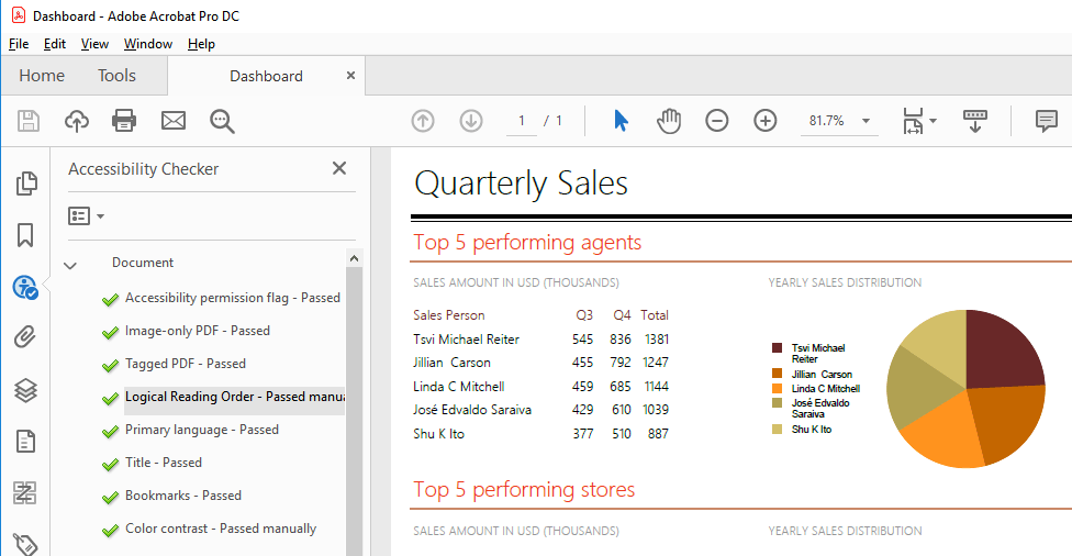
For example, Adobe Acrobat provides a thorough test that traverses the PDF structure and its metadata and outputs a detailed report as shown below:

PDF accessibility check on Adobe Acrobat

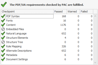
Another comprehensive and free testing tool is PAC - PDF Accessibility Checker. PAC is built in accordance with the Matterhorn protocol and evaluates all the failure conditions that can be tested with a software product. It also includes a screen reader preview that helps to determine how the document will be interpreted by screen-reading applications like NVDA and JAWS, utilized by the visually impaired users. The report that PAC tool displays when checking a PDF/UA compliant file looks like this:

PDF Accessibility Check by PAC

Want to Learn More?

If you are new to our tools or have only tried some, make sure you download the trial and take them for a spin. You can either download just the Reporting and Report Server tools, or download a trial of our entire set of .NET and JavaScript tools with the DevCraft bundle.

We're eager to hear what you think, so please don't forget to share your feedback and help us make Telerik Reporting even better.

WPF/ Silverlight: RadGauge Layout Composition

$
0
0

Today I would like to highlight one of the newest controls added to the WPF / Silverlight control suites in November – the RadGauge control.

RadGauge combines its rich assortment of radial, linear and numeric gauge types with very flexible layout composition abilities thus allowing you to attain a new level of data visualization quickly and easily.

Let us discuss the basics of the layout composition and how it is implemented in the gauge control.

There are three levels of controls that participate in the layout:

  • RadGauge
  • LinearGauge / RadialGauge
  • LinearScale / RadialScale / NumericScale


RadGauge is the top level class but as far as the control is concerned this is simply a container that holds the rest of the building blocks together. RadGauge can contain any mixture of layout controls (grids, panels), LinearGauge (RadialGauge) containers, and even LinearScale / RadialScale / NumericScale instances.

LinearGauge (RadialGauge) is a container that normally stores the set of linear (respectively radial) and numeric scales. One of the major goals of this container control is the ability to create common appearance for your linear (radial) gauges. The default template looks like this:

<ControlTemplate>
   
<Border Background="{TemplateBinding Background}"                            
            BorderBrush
="{TemplateBinding BorderBrush}"
            BorderThickness
="{TemplateBinding BorderThickness}">
       
<Grid>
           
<ContentControl Template="{StaticResource RadialGaugeBackground}"/>
            <
ItemsPresenter />
            <
ContentControl Template="{StaticResource RadialGaugeForeground}"/>
        </
Grid>
   
</Border>
</ControlTemplate>

In this way you can define the background and the foreground content for all scales shown in one gauge and achieve artistic look for your gauges with different effects (e.g. place the radial image as background and add some “glassy” gradient as foreground). Note that it is not compulsory to use the LinearGauge / RadialGauge container e.g. if you prefer plain range display, you can place LinearScale / RadialScale / NumericScale instances directly in the RadGauge control content.

LinearScale / RadialScale / NumericScale instances provide all of the essential gauge logic. These controls host other elements (tick marks, labels and indicators) and provide functionality to manage appearance and positioning of these elements.


OK, let us see some examples that visualize the concepts described so far:

The most common approach to display radial gauge would be to use the RadGauge –> RadialGauge –> RadialScale hierarchy like this:

<telerik:RadGauge Grid.Row="1" Name="RadGauge1">
   
<telerik:RadialGauge Name="RadialGauge1" Width="300" Height="300">
       
<telerik:RadialScale Name="radialScale" Min="0" Max="8000" Center="0.5,0.5" 
            Radius
="0.75" StartWidth="0.15" StartAngle="120" SweepAngle="300" BorderBrush="Transparent" 
            IsLabelRotated
="True" MajorTicks="8" MiddleTicks="1" MinorTicks="6">
           
<telerik:RadialScale.MajorTick>
               
<telerik:TickProperties Length="0.15" />
            </
telerik:RadialScale.MajorTick>
           
<telerik:RadialScale.MinorTick>
               
<telerik:TickProperties Length="0.1" TickWidth="0.1" Location="OverInside" />
            </
telerik:RadialScale.MinorTick>
           
<telerik:RadialScale.Label>
               
<telerik:LabelProperties />
            </
telerik:RadialScale.Label>
           
<telerik:RadialScale.Indicators>
               
<telerik:Needle Name="marker" IsAnimated="True" SnapType="ToGrid">
               
</telerik:Needle>
           
</telerik:RadialScale.Indicators>
       
</telerik:RadialScale>
   
</telerik:RadialGauge>
</telerik:RadGauge>
 
 radial1
 
If you would like to achieve more plain display (no orange background ellipse and “glassy” foreground look), you can show only the range scale by omitting the RadialGauge container like this:
 
<telerik:RadGauge Grid.Row="1" Name="RadGauge1">
   
<telerik:RadialScale Width="300" Height="300" Name="radialScale" Min="0" Max="8000" Center="0.5,0.5" 
        Radius
="0.75" StartWidth="0.15" StartAngle="120" SweepAngle="300" BorderBrush="Transparent" 
        IsLabelRotated
="True" MajorTicks="8" MiddleTicks="1" MinorTicks="6">
       
<telerik:RadialScale.MajorTick>
           
<telerik:TickProperties Length="0.15" />
        </
telerik:RadialScale.MajorTick>
       
<telerik:RadialScale.MinorTick>
           
<telerik:TickProperties Length="0.1" TickWidth="0.1" Location="OverInside" />
        </
telerik:RadialScale.MinorTick>
       
<telerik:RadialScale.Label>
           
<telerik:LabelProperties />
        </
telerik:RadialScale.Label>
       
<telerik:RadialScale.Indicators>
           
<telerik:Needle Name="marker" IsAnimated="True" SnapType="ToGrid">
           
</telerik:Needle>
       
</telerik:RadialScale.Indicators>
   
</telerik:RadialScale>
</telerik:RadGauge>

radial2


Moreover, you can mix various gauge visuals and layout controls like this:

 - Grid

       - LinearGauge

              - LinearScale

       - StackPanel

              - RadialGauge

                     - RadialScale

              - RadialScale

    <telerik:RadGauge Grid.Row="1" Name="RadGauge1">
       
    <Grid Width="520" Height="400">
           
    <Grid.ColumnDefinitions>
               
    <ColumnDefinition Width="Auto" />
                <
    ColumnDefinition Width="Auto" />
            </
    Grid.ColumnDefinitions>
           
    <telerik:LinearGauge Width="120" Height="370" Margin="15">
               
    <telerik:LinearScale Min="0" Max="100" MajorTicks="10" MiddleTicks="1" MinorTicks="5">
                   
    <telerik:LinearScale.MajorTick>
                       
    <telerik:TickProperties Length="0.1" TickWidth="0.1" Location="OverCenter">
                       
    </telerik:TickProperties>
                   
    </telerik:LinearScale.MajorTick>
                   
    <telerik:LinearScale.MiddleTick>
                       
    <telerik:TickProperties Length="0.025" TickWidth="0.5" Location="OverCenter"/>
                    </
    telerik:LinearScale.MiddleTick>
                   
    <telerik:LinearScale.MinorTick>
                       
    <telerik:TickProperties Length="0.02" TickWidth="0.3" Location="OverCenter"/>
                    </
    telerik:LinearScale.MinorTick>
                   
    <telerik:LinearScale.Label>
                       
    <telerik:LabelProperties />
                    </
    telerik:LinearScale.Label>
               
    </telerik:LinearScale>
           
    </telerik:LinearGauge>
           
    <StackPanel Orientation="Vertical" Grid.Column="1">
               
    <telerik:RadialGauge Name="RadialGauge1" Width="200" Height="200">
                   
    <telerik:RadialScale Name="radialScale" Min="0" Max="8000" Center="0.5,0.5" 
                        Radius
    ="0.75" StartWidth="0.15" StartAngle="120" SweepAngle="300" BorderBrush="Transparent" 
                        IsLabelRotated
    ="True" MajorTicks="8" MiddleTicks="1" MinorTicks="6">
                       
    <telerik:RadialScale.MajorTick>
                           
    <telerik:TickProperties Length="0.15" />
                        </
    telerik:RadialScale.MajorTick>
                       
    <telerik:RadialScale.MinorTick>
                           
    <telerik:TickProperties Length="0.1" TickWidth="0.1" Location="OverInside" />
                        </
    telerik:RadialScale.MinorTick>
                       
    <telerik:RadialScale.Label>
                           
    <telerik:LabelProperties />
                        </
    telerik:RadialScale.Label>
                       
    <telerik:RadialScale.Indicators>
                           
    <telerik:Needle Name="marker" IsAnimated="True" SnapType="ToGrid">
                           
    </telerik:Needle>
                       
    </telerik:RadialScale.Indicators>
                   
    </telerik:RadialScale>
               
    </telerik:RadialGauge>
               
    <telerik:RadialScale Width="200" Height="200" Min="0" Max="8000" Center="0.5,0.5" 
                    Radius
    ="0.75" StartWidth="0.15" StartAngle="120" SweepAngle="300" BorderBrush="Transparent" 
                    IsLabelRotated
    ="True" MajorTicks="8" MiddleTicks="1" MinorTicks="6">
                   
    <telerik:RadialScale.MajorTick>
                       
    <telerik:TickProperties Length="0.15" />
                    </
    telerik:RadialScale.MajorTick>
                   
    <telerik:RadialScale.MinorTick>
                       
    <telerik:TickProperties Length="0.1" TickWidth="0.1" Location="OverInside" />
                    </
    telerik:RadialScale.MinorTick>
                   
    <telerik:RadialScale.Label>
                       
    <telerik:LabelProperties />
                    </
    telerik:RadialScale.Label>
                   
    <telerik:RadialScale.Indicators>
                       
    <telerik:Needle Name="marker2" IsAnimated="True" SnapType="ToGrid">
                       
    </telerik:Needle>
                   
    </telerik:RadialScale.Indicators>
               
    </telerik:RadialScale>
           
    </StackPanel>
       
    </Grid>
    </telerik:RadGauge>

    radial3


    Hope this overview helps.

    RadGrid for ASP.NET AJAX Performance Optimization

    12 days, 6 countries…

    $
    0
    0

    I’m about to leave for a 12 day road trip that will take me to six different countries on three continents.

    My first stop, arranged by Adam Cogan and Telerik, is an Agile Seminar in Sydney, Australia. Should be fun, at least they already know what Rugby is and will get my sports references.  I will also be speaking on Silverlight at the Sydney .NET User Group. I’ll be doing my WCF walk through and then a RIA Services demo, about 2 hours, no slides, only Visual Studio. In addition to my presentation, I will also be demoing the new Telerik Data Services Wizard at the user group and show how to build a data driven Silverlight application in 30 seconds. I will also unveil to the world a brand new feature of Telerik OpenAccess/Data Services Wizard at the user group.

    I’ll come back to Hong Kong for a day or so and then for the three day weekend (Buddha’s birthday!) will head up to Shanghai for the World Expo.  I’ll but a Telerik sticker on the door of the Bulgarian pavilion. Just hope that act of guerilla marketing doesn’t lead me to a communist Chinese prison…

    The week after, I will head to Sofia and visit the Telerik mother ship for a few days. Then off to Romania to speak at a PMI conference, on yes, Scrum. A quick one day layover in Istanbul to visit the infamous anti-suckieness club President and Vice-President: Malek and Goksin. Not sure if they, now both being Microsoft employees, will make me go see customers or not.

    Should be fun, I hope to see you at some of the events!


    Silverlight Recruiting Application #9 - Adding RadUpload (Part 2)

    $
    0
    0

    Yesterday we saw all the plumbing involved to lay a groundwork for RadUpload being used to add files to applicants. Today we actually dive into the code for getting RadUpload working in the MVVM application.

    The first step in this is deciding where to add the ability to upload files. Doing this within the main Applicants grid is nice (since we're already using the RowDetails presenter), but that'll clutter up the UI there as I want to switch that into a quick and easy overview of each applicant. So instead we're modifying the AddEditApplicantView to make it tab-based, providing one tab for the regular information and the other for handling the file uploads (and project rating, since we do have a RadRating control now!). I'll spare you the markup, but here is the new UI:

    New UI for Add/Edit Applicant View

    Do you see the RadUpload instances? Neither do I, that's because they have Visibility set to Collapsed and we're handling all actions through the RadUploadDropPanel and attached behaviors on RadUpload. Since we now utilize DropTarget support with RadUpload, we don't even need to see the control anymore to take advantage of the fast upload capabilities it gives us. To get into the code a little, here is the XAML markup for the first instance of RadUploadDropPanel, RadUpload, and the corresponding HyperlinkButton:


    <telerik:RadUploadDropPanelx:Name="xResumeDropPanel"
                                Grid.Row="1"
                                Grid.Column="1"
                                AllowDrop="True"
                                DragOver="xResumeDropPanel_DragOver"
                                DragLeave="xResumeDropPanel_DragLeave"
                                Drop="xResumeDropPanel_Drop"
                                RadUpload="{Binding ElementName=xResumeRadUpload}">
        <Borderx:Name="xResumeUploadBorder"
                Margin="5"
                Background="LightBlue"
                Height="30">
            <TextBlockHorizontalAlignment="Center"
                        VerticalAlignment="Center"
                        Text="Resume"/>
        </Border>
    </telerik:RadUploadDropPanel>
    <telerik:RadUploadx:Name="xResumeRadUpload"
                        AllowDrop="True"
                        IsAutomaticUpload="True"
                        UploadServiceUrl="/HRUpload.ashx"
                        OverwriteExistingFiles="True"
                        TargetPhysicalFolder="{Binding UploadTargetFolder}"
                        command:UploadStartedEventClass.Command="{Binding UploadStartedCommand}"
                        command:UploadFinishedEventClass.Command="{Binding UploadFinishedCommand}"
                        command:FileUploadedEventClass.Command="{Binding FileUploadFinishedCommand}"
                        Grid.Row="1"
                        Grid.Column="3"
                        Visibility="Collapsed"
                        d:DesignHeight="10"
                        d:DesignWidth="10"/>
    <HyperlinkButtonx:Name="xResumeUploadTextBlock"
                        HorizontalAlignment="Center"
                        VerticalAlignment="Center"
                        Content="{Binding ResumeUploadStatus}"
                        Foreground="{Binding ResumeUploadStatus, Converter={StaticResource StatusToColorConverter}}"
                        NavigateUri="{Binding ActiveApplicant.Resume}"
                        TargetName="_blank"
                        Grid.Row="1"
                        Grid.Column="2"/>


    And we also get a little bit of code-behind:

    // I'm not a bad MVVM programmer, but creating behaviors in order to 
    //   modify the drag-over color for the RadUploadPanel content is 
    //   overkill - this is strictly a view-related issue and therefore
    //   it is okay to have strictly view-related code in the code-behind. :)
    privatevoidxResumeDropPanel_DragOver(objectsender, DragEventArgs e)
    {
        ((sender asRadUploadDropPanel).Content asBorder).Background = newSolidColorBrush(Colors.Orange);
    }
    privatevoidxResumeDropPanel_DragLeave(objectsender, DragEventArgs e)
    {
        ((sender asRadUploadDropPanel).Content asBorder).Background = newSolidColorBrush(Color.FromArgb(255, 96, 194, 255));
    }
    privatevoidxResumeDropPanel_Drop(objectsender, DragEventArgs e)
    {
        ((sender asRadUploadDropPanel).Content asBorder).Background = newSolidColorBrush(Color.FromArgb(255, 96, 194, 255));
    }


    For those MVVM purists, yes, there is code in my code-behind, but I've got a very specific reason for that (explained in the comments, but I'll touch on it again). The DragOver, DragLeave, and Drop events are only effecting something in the view and have nothing to do with the overall data model for the application. So for each I could have gone the route of creating an attached behavior, setting the colors in the viewmodel to bind to the drop panels, and adding more code to my viewmodel to ensure this all works without a hitch, but why? This works, it only impacts the view, and is a more streamlined and less time-consuming approach than all that. 

    Back on track, in order of appearance we see our RadUploadDropPanel that is bound to the xResumeRadUpload (therefore any files dropped on the drop panel get added to RadUpload), with a simple border and textblock being used to provide a UI that updates based on whether the user is dragging a file over it or not.

    Next is RadUpload, where all the magic is going to happen:

    • IsAutomaticUpload is true so that once a file is dropped on the respective upload panel, RadUpload runs with it and attached behaviors cover the rest of our interaction
    • UploadServiceUrl points to a standard RadUpload upload handler in the .Web project (instructions here on the basic setup I used)
    • OverwriteExistingFiles is true because I trust my HR people to handle their uploads properly
    • TargetPhysicalFolder is bound to UploadTargetFolder, which gets updated whenever we switch into this view to ensure that the correct ApplicantGUID is being used for our target

    The commands cover the three things that we need to ensure uploads are going as planned and reporting status back to the UI. UploadStarted will let us know, if you haven't guessed, when the upload is starting. UploadFinished is doing the same when the upload finishes, except this lets us grab the instance of RadUpload so that when FileUploadFinished runs, we know which property of the entity to 'attach' the file to. I won't go into the EventClass code (it's the same for every command I add like this, albeit with names and control references switched up), but here are the three EventBehaviors:

        publicclassUploadStartedEventBehavior : CommandBehaviorBase<RadUpload>
        {
            publicUploadStartedEventBehavior(RadUpload element)
                : base(element)
            {
                element.UploadStarted += newEventHandler<UploadStartedEventArgs>(element_UploadStarted);
            }
      
            voidelement_UploadStarted(objectsender, UploadStartedEventArgs e)
            {
                RadUpload ru = sender asRadUpload;
                base.CommandParameter = ru.Name;
      
                base.ExecuteCommand();
            }
        }
    ...
        publicclassUploadFinishedEventBehavior : CommandBehaviorBase<RadUpload>
        {
            publicUploadFinishedEventBehavior(RadUpload element)
                : base(element)
            {
                element.UploadFinished += newEventHandler<EventArgs>(element_UploadFinished);
            }
      
            voidelement_UploadFinished(objectsender, EventArgs e)
            {
                RadUpload ru = sender asRadUpload;
                base.CommandParameter = ru.Name;
      
                base.ExecuteCommand();
            }
        }
    ...
        publicclassFileUploadedEventBehavior : CommandBehaviorBase<RadUpload>
        {
            publicFileUploadedEventBehavior(RadUpload element) 
                : base(element)
            {
                element.FileUploaded += newEventHandler<FileUploadedEventArgs>(element_FileUploaded);
            }
      
            voidelement_FileUploaded(objectsender, FileUploadedEventArgs e)
            {
                base.CommandParameter = e;
                  
                base.ExecuteCommand();
            }
        }


    and their respective DelegateCommands on the viewmodel:

    // When upload starts we update the UI
    publicvoidUploadStartCommand(objectobj)
    {
        stringcontrolName = (string)obj;
        if(controlName.Contains("Resume"))
        {
            ResumeUploadStatus = "Started";
        }
        elseif(controlName.Contains("CoverLetter"))
        {
            CoverLetterUploadStatus = "Started";
        }
        else// only one left is Project
        {
            ProjectUploadStatus = "Started";
        }
    }
    // Same when upload finishes
    publicvoidUploadFinishCommand(objectobj)
    {
        stringcontrolName = (string)obj;
        // save this to use in FileUploadFinishCommand
        _uploadName = controlName;
        if(controlName.Contains("Resume"))
        {
            ResumeUploadStatus = "Complete";
        }
        elseif(controlName.Contains("CoverLetter"))
        {
            CoverLetterUploadStatus = "Complete";
        }
        else// only one left is Project
        {
            ProjectUploadStatus = "Complete";
        }
    }
    // Use this to capture the file name on upload finishing :)
    publicvoidFileUploadFinishCommand(objectobj)
    {
        FileUploadedEventArgs uploadEvents = obj asFileUploadedEventArgs;
        stringuploadFileNameResult = uploadEvents.SelectedFile.Name;
        if(string.IsNullOrEmpty(uploadFileNameResult))
        {
            eventAggregator.GetEvent<NotifyUserEvent>().Publish("Problem uploading file!");
        }
        else
        {
            if(_uploadName.Contains("Resume"))
            {
                ActiveApplicant.Resume = "/HR/applicants/"+ ActiveApplicant.ApplicantGUID.ToString() + "/"+ uploadFileNameResult;
            }
            elseif(_uploadName.Contains("CoverLetter"))
            {
                ActiveApplicant.CoverLetter = "/HR/applicants/"+ ActiveApplicant.ApplicantGUID.ToString() + "/"+ uploadFileNameResult;
            }
            else// only one left is Project
            {
                ActiveApplicant.OverviewProject = "/HR/applicants/"+ ActiveApplicant.ApplicantGUID.ToString() + "/"+ uploadFileNameResult;
            }
            _uploadName = "";
        }
    }


    So the order of events is:

    • Upload Starts - Update UI
    • Upload Finishes - Update the UI and save RadUpload instance name
    • File Upload Finishes - Save the file name and location to our entity

    Lastly we have the HyperlinkButton, which utilizes *UploadStatus as a tracking variable on the viewmodel to determine where we are at with our upload (and if we have one when loading an Applicant in), the foreground gets converted to show successful (green), standard (black), or error (red) states, and the NavigateUri points to the file that is accessible on the server.

    So what happens here? Let me give you a short pictorial to show you how this all goes down...

    RadUploadProcess

    And we're good to go. :)

    Next week we cover the (I hope) significantly easier approach of doing this all in the code-behind version.

    Cheers!

    Building a Data Warehouse Part III: Location of your data warehouse

    $
    0
    0

    [repost from Stephen Forte's Blog]  

    See also:

    In Part I we looked at the advantages of building a data warehouse independent of cubes/a BI system and in Part II we looked at how to architect a data warehouse’s table schema. Today we are going to look at where to put your data warehouse tables.

    Let’s look at the location of your data warehouse. Usually as your system matures, it follows this pattern:

    • Segmenting your data warehouse tables into their own isolated schema inside of the OLTP database
    • Moving the data warehouse tables to their own physical database
    • Moving the data warehouse database to its own hardware

    When you bring a new system online, or start a new BI effort, to keep things simple you can put your data warehouse tables inside of your OLTP database, just segregated from the other tables. You can do this a variety of ways, most easily is using a database schema (ie dbo), I usually use dwh as the schema. This way it is easy for your application to access these tables as well as fill them and keep them in sync. The advantage of this is that your data warehouse and OLTP system is self-contained and it is easy to keep the systems in sync.

    As your data warehouse grows, you may want to isolate your data warehouse further and move it to its own database. This will add a small amount of complexity to the load and synchronization, however, moving the data warehouse tables to their own table brings some benefits that make the move worth it. The benefits include implementing a separate security scheme. This is also very helpful if your OLTP database scheme locks down all of the tables and will not allow SELECT access and you don’t want to create new users and roles just for the data warehouse. In addition, you can implement a separate backup and maintenance plan, not having your date warehouse tables, which tend to be larger, slow down your OLTP backup (and potential restore!). If you only load data at night, you can even make the data warehouse database read only. Lastly, while minor, you will have less table clutter, making it easier to work with.

    Once your system grows even further, you can isolate the data warehouse onto its own hardware. The benefits of this are huge, you can have less I/O contention on the database server with the OLTP system. Depending on your network topology, you can reduce network traffic. You can also load up on more RAM and CPUs. In addition you can consider different RAID array techniques for the OLTP and data warehouse servers (OLTP would be better with RAID 5, data warehouse RAID 1.)

    Once you move your data warehouse to its own database or its own database server, you can also start to replicate the data warehouse. For example, let’s say that you have an OLTP that works worldwide but you have management in offices in different parts of the world. You can reduce network traffic by having all reporting (and what else do managers do??) run on a local network against a local data warehouse. This only works if you don’t have to update the date warehouse more than a few times a day.

    Where you put your data warehouse is important, I suggest that you start small and work your way up as the needs dictate.

    Telerik AJAX Q1 2011 Service Pack 2

    $
    0
    0

    The next stabilization release of the Telerik AJAX controls has just been shipped. To see what is included in this wrap up, visit the quick links below:

    RELEASE NOTES / LIVE DEMOS / ONLINE DOCUMENTATION

    TRIAL DOWNLOAD / PAID DOWNLOAD

    Although there is nothing flashy in this service pack, there a few noticeable additions/improvements that are worth to be mentioned explicitly, hence I am giving them in a "digested" form:

    ServicePack_image3
    • AsyncUpload - added functionality to set TemporaryFolder globally using the appSettings section in web.config
    • Calendar - added a quick option to enable Today's day highlighting via RadCalendar's SmartTag
    • Grid - introduced a new property (RadGrid.ClientSettings.DataBinding.ShowEmptyRowsOnLoad) to provide the option to hide empty data rows on initial load with client-side data-binding
    • Input - added Display property for all RadInputs
    • RibbonBar - a bunch of new properties and methods have been included (see release notes)
    • Rotator - added a Target attribute to the RadTickerItem in order to specify the target attribute when NavigateUrl is defined
    • Scheduler - improved RadScheduler's RecurrenceEditor to support clean initialization with no/empty RecurrenceRule
    • TreeList - handlers on server for some client fired commands are implemented

    Next objective > Q2 2011 AJAX Beta release in the end of June, stay tuned.

    Using the Multiple Selection of the RadCalendar control for Silverlight and WPF with MVVM

    $
    0
    0

    Developing and supporting MVVM applications is easy and effective. That's why we want to create MVVM applications that follow this pattern. Sometimes the controls we use have some limitations. For example, list properties, which are read-only and do not allow us to create an appropriate binding to our view-models. It is normal for properties of list type to be read-only, because this is considered a good practice, but it becomes a problem for the MVVM pattern. In the ItemsControl this problem is solved with two properties - Items and ItemsSource. This blog post is about an example that demonstrates how to create an additional property for the SelectedDates property of the RadCalendar control.

    Here is the demo application:


    Get Microsoft Silverlight


    And the code of the main page is as follows:

    <UserControlx:Class="CalendarAndViewModel.MainPage"
        xmlns:local="clr-namespace:CalendarAndViewModel"
        mc:Ignorable="d"
        d:DesignHeight="300"d:DesignWidth="400">
        <UserControl.DataContext>
            <local:SampleViewModel/>
        </UserControl.DataContext>
     
        <Gridx:Name="LayoutRoot"Background="White">
            <Grid.RowDefinitions>
                <RowDefinitionHeight="25"/>
                <RowDefinition/>
                <RowDefinition/>
            </Grid.RowDefinitions>
             
            <StackPanelOrientation="Horizontal"Grid.Row="0">
                <ButtonContent="Select many"Click="OnSelectManyClick"/>
                <ButtonContent="Deselect all"Click="OnDeselectAllClick"/>
            </StackPanel>
             
            <telerik:RadCalendarGrid.Row="1"
                                 SelectionMode="Extended"
                                 local:CalendarExtensions.TrackCalendarSelectedDates="True"
                                 local:CalendarExtensions.SelectedDates="{Binding SelectedDates, Mode=TwoWay}"/>
     
            <ListBoxGrid.Row="2"ItemsSource="{Binding SelectedDates}">
     
            </ListBox>
        </Grid>
    </UserControl>


    The details of the implementation process are not a subject of this article, so I will just share the project here. If interested, you can download it from here.

    Using the TeamPulse Ideas & Feedback Portal on Your Smartphone or Tablet

    $
    0
    0

    I love mobile computing. A lot of innovation has emerged in this area lately with Microsoft's WP7 Mango, Apple's iOS 5 and Google's Ice Cream Sandwich all making waves in the last few months. The devices that these operating systems power have become an important part of many people's daily routine. I myself just recently spent close to 1,000 dollars on a new smartphone, justifying it to my spouse by arguing that I spend more time on my phone then I do on my computer (Not quite true, but let's keep that our little secret, shall we?).

    The great thing about these devices is that they keep us connected to our tools even when we're not in the office. This is critical because work often doesn't fit neatly into a 9-to-5-sitting-at-my-desk box. That's one of the reasons I'm very excited about our new TeamPulse Ideas & Feedback Portal. With this new tool, people can register their ideas and feedback no matter where they are. Your customer could be viewing your application on her tablet (regardless of the operating system), then without having to wait, jump over to our portal and provide her feedback while it's fresh in her mind. Does your head of sales want to capture the two or three great feature requests he just heard about during a sales visit while he's thinking of it? No problem. Instead of sending an email that someone will have to copy into TeamPulse, he can simply open up the portal on his phone and place the item there himself. Zero friction access.

    Our new Ideas & Feedback Portal is completely mobile compatible. As you can see in the video, the portal lives happily inside my iPad (or any other tablet or smartphone). As the TeamPulse product owner, I can now perform the important activity of managing feedback from our customers, all from the comfort of my favourite mobile device.

    Try as part of TeamPulse


    Learn more >>

    What to do when team members go dark, aka the problem with “Fine”

    $
    0
    0

    We’ve all heard it in our personal relationships, whether it’s a partner, parent, or child.  You ask a question, and the dreaded answer comes – “Fine”.  What’s wrong with that answer, you ask?  It’s not the word.  It’s the deep ambiguity behind it.  What I have learned in 15 years of marriage is that there is always a story behind that simple word, and have learned how to probe to find it.

    Think about this in your work environment.  One of the problems with the traditional (or waterfall) development methodology is a lack of continuous, structured communication.  Oh sure, there might be status reports (written or verbal), or periodic meetings, but what do you usually hear from the team members? “It’s fine.” This can continue on until the team gets closer to the release, then all of a sudden, problems start “appearing” where before everything was just “fine”.

    How can this happen?  Why didn’t the team just bring up their impediments or issues when they appeared, instead of waiting until the last minute?  Were they hiding them?  Not likely.  People aren’t generally deceitful.  More likely, they were overly optimistic.  Sure, they had issues. But there was plenty of time in the schedule to make up for them, right?  It’s easier to just report “Fine” than to raise the alarm and draw attention to your self.

    Typically, if a coworker tells you everything is fine, you just accept it and move on.  It’s in our personal relationships that we’ve learned the subtleties of that word.  We don’t typically have the type of relationship with our coworkers that would cause us to question someone who declares that everything is “fine”.  But what if things aren’t really fine, but your coworker still reports their status as fine?

    It’s happens all too often – team members are going through a drop in productivity (for a variety of reasons), yet they don’t report it.  Those issues might be blocking bugs, overly optimistic estimates, or simply a lack of experience.  They might not think the issues are a big deal, or they maybe afraid to bring them up to the team for fear of repercussions or embarrassment.  Maybe they have some personal items that are interfering with their productivity that they want to keep personal.

    In development, we call this “Going Dark”.

    How does a team expose when one or more developers go dark? You might say that communication is the key. Only by increasing communication amongst the team can we get a better understanding of the pulse of the project. However, if a developer doesn’t want to come forward with their issues, having a standup isn’t going to fix that problem.

    Then burn down charts are surely the answer!  As I’ve always said, before you can fix anything, you have to expose it and measure it.  That is true, but just injecting standups and burn down charts into your development process alone doesn’t necessarily surface when developers go dark.  Take the burn down chart shown in Figure 1.  There is definitely a problem with the project, and it’s been going on for several days.  But what is the problem?  It’s impossible to tell.  Maybe in the standup, the team has been stating what is holding them back. Then again, maybe not.  If they are still reporting that nothing is holding them back (“Everything is fine”), then it’s a classic case of developers (maybe the whole team) going dark.

    image

    Figure 1 (Image from Telerik’s TeamPulse Agile Project Management Software)

    If the problems aren’t being raised in the standups (or maybe your team isn’t holding daily standups), the only indicator of developers going dark is a drop in velocity.  Even worse, if the problems aren’t caught early enough, they can lead to missed deadlines and cost overruns. If your team is working in sprints and using burn down charts (and more importantly, keeping them up to date and accurate), the problem becomes apparent before the deadline is missed.  The scrum master/project manager knows to dig into the project to see what’s going on.  But where to start?  Do you spend the time and energy probing every team member? Do you have the resources for that?

    What we need are personal burn down charts so the scrum master/project management can quickly see who’s gone dark, and not have to spend the time trying to interpret whether “Fine” means “Fine” or “I’m totally in the weeds here!” Something like the People Status screen shown in Figure 2 would help to take all of the guesswork out the equation and simple show that three of the team members have “gone dark”. Red lines indicate nothing being produced. Not completing any tasks on a single day might not be that bad (it all depends on how your team sizes tasks), but several days in a row certainly indicates a problem.

    image

    Figure 2 (Image from Telerik’s TeamPulse xView™ )

    We need to keep advancing our transparency if we want to keep advancing our teams.  The more low-friction tools we have at our disposal the better we can manage all aspects of our projects.  Communication is hard.  If it was easy, we would all be doing it so much better, and we would need to incorporate processes into our lives to facilitate it.

    Remember – Fine isn’t always fine.  If you ask someone how their day is, and they answer “Fine”, and you truly care how their day is, you need to dig deeper.  But when their day really is “fine”, than digging deeper is a waste of precious time, and moreover, can lead to problems (like feelings of mistrust) between team members.

    If someone asks you how things are going, don’t answer with “Fine”.  Tell them specifically.  “It’s going pretty well, we are still on track” or “We’ve hit some snags, but we will be able to make our deadlines” can both be distilled down to “Fine”.  After all, both groups will probably hit their mark and make their commitment, but the latter case would warrant some extra love from the project manager…

    Happy Coding!

    Localization of the TeamPulse Ideas & Feedback Portal

    $
    0
    0

    With the 2012 R2 Release, localization of the Ideas and Feedback Portal is as easy as editing a text file! 

    Background

    Localization is the process of changing the text in an application to another language, or locale.  Well designed applications allow for changing the text that is displayed without having to branch the source code and recompile, and TeamPulse certainly falls into this category.  Built on Microsoft’s .NET Platform, TeamPulse takes full advantage of the localization features provided by the .NET Framework, allowing you to customize the Ideas and Feedback portal to the language that best meets your needs.

    Based on our customers’ feedback that we gather through many channels, including our instance of the Ideas and Feedback Portal that we use to gather feedback from you, our customer, the ability to localize the Feedback Portal was a highly rated need. 

    Getting Started

    Finding the Installation Folder using Environment Variables

    Before we can customize the Portal, we need to know where on our server the application resides.  If you followed the defaults during installation, the location is %ProgramFiles%\Telerik\TeamPulse\FeedbackPortal, where %ProgramFiles% is the default drive and path for installation of software.  To quickly determine where your default directory is, open a command window by clicking Start->Run, then type “cmd” without the quotes (see Figure 1).

    SNAGHTML101b1f95

    Figure 1

    Once you have a command window open, type “echo %ProgramFiles%” (without the quotes), and you will see the definition of the environment variable (see Figure 2).

    image

    Figure 2

    Finding the Installation Folder using Internet Information Services (IIS) Manager

    The Ideas and Feedback Portal is an ASP.NET application that runs in IIS.  To determine where it is running, open up Internet Information Services Manager by clicking on Start –> Administrative Tools –> Internet Information Services (IIS) Manager.  Or, from the Run prompt (Start –> Run), type “INETMGR.EXE” without the quotes.

    This will bring up a window similar to the one in Figure 3.  Expand the Server in the left rail, and click on the “Sites” icon.  This will list all of the sites installed on that server.  In the center content area of the screen, make sure that the “Features View” tab is selected.  This will then list all of the sites and the path to their installation.  You can see in this example that the Portal as well as TeamPulse are both installed under the C:\Program Files\Telerik\TeamPulse directory.  If your path has an environment variable (such as %SystemDrive%), you can use the technique from the previous section to discover the actual installation path.

    image

    Figure 3

    Working With Localization Files

    To put it bluntly, localization files are big XML files.  All of the strings that can be modified are their own <data> element like in Listing 1.  These are the data elements for the “Like” and “Dislike” labels in the Feedback Portal.  The strings in the <value> tags are the values that get displayed in the application. 

    <dataname="Dislike"xml:space="preserve">
    <value>Dislike</value>
    </data>
    <dataname="Like"xml:space="preserve">
    <value>Like</value>
    </data>

    Listing 1

    If we want to change the display to Yes for Like and No for Dislike as we change the language to Dutch, we change the XML to what we see in Listing 2.

    <dataname="Dislike"xml:space="preserve">
    <value>Nee</value>
    </data>
    <dataname="Like"xml:space="preserve">
    <value>Ja</value>
    </data>

    Listing 2

    Ideas and Feedback Portal Localization File

    With the 2012 R2 Release, the localization file for the Feedback Portal is located in %installation_directory%\App_GlobalResources directory, where %installation_directory% is the directory where the feedback portal is installed (this can be located as described in the beginning of this article).  In that directory is a file named “String.resx”, which is the localization file for the Portal.

    In this example, we want to change the Search Topics/Suggest New text as well as the Like/Dislike text. Figure 4 shows the changes that we want to make.

    image

    Figure 4

    In this example, we are going to change the language to "Dutch”, but before we do that, we need to determine how we are going to activate the localization.

    Updating the Main Resource File

    One way is to replace the text in the string.resx file with the changes that we want.  Any changes that are made in the strings.resx file that is in the %installation_directory%\App_GlobalResources directory will automatically take effect on the next browser refresh.  If you do change the existing file, make sure to make a backup before you start!

    Changing the Culture Using the Web.Config

    Since there is only currently one resource file, ASP.NET will automatically use that file.  If there is more than one, it looks to match the file names with the current “UICulture”.  The Culture setting is used for date and numerical formatting, whereas the UI Culture is used for localizing the strings in an application.   The naming convention for localization files is “Strings.yy.resx”, where “yy” indicates the culture.  “en” for English, “bg” for Bulgarian, “nl” for Dutch, etc.

    To change the UICulture for an ASP.NET application, open up the web.config file (found in the %installation_directory% for the Ideas and Feedback Portal), and find the line that reads <system.web>.  Add a new line after system.web line as shown in Listing 3 so you can specify the UICulture. In this example, the culture is set to English.  NOTE: Please make sure that you enter it exactly like it is written, as it’s case sensitive.

    <system.web>
    <globalizationuiCulture="en"/>
    <!-- rest of config file cut for brevity ->
    </system.web>

    Listing 3

    Changing the Text to Dutch

    First we copy the existing “Strings.resx” file to “Strings.nl.resx”. In the new file, find the four entries that we want to change.  These changes that are shown in Listing 4.  We also change the web.config file to change the UICulture to “NL”, as shown in Listing 5. 

    <dataname="SearchTopics"xml:space="preserve">
    <value>Zoeken Onderwerpen</value>
    </data>
    <dataname="Suggest"xml:space="preserve">
    <value>Suggesties doen voor nieuwe onderwerpen</value>
    </data>
    <dataname="Dislike"xml:space="preserve">
    <value>Nee</value>
    </data>
    <dataname="Like"xml:space="preserve">
    <value>Ja</value>
    </data>

    Listing 4


    <system.web>
    <globalizationuiCulture="nl"/>
    <!-- rest of config file cut for brevity -->
    </system.web>
    Listing 5

    Once those changes are in place, we can refresh our browser and see the (partly) localized Ideas and Feedback Portal (as shown in Figure 5).

    image

    Figure 5

    Summary

    With just a few steps (once you know where to look), you can easily localize the TeamPulse Ideas and Feedback Portal to match your language and customer needs.  Special thanks to the development team for making this such a simple process with the 2012 R2 release.  You spoke, we listened, and we have simplified the process for localization into merely editing text files!


    XAMLflix Video–RadTimeBar for Silverlight and WPF

    $
    0
    0

    This week on XAMLFlix we’re looking at RadTimeBar for Silverlight and WPF.

    XAMLflix is a Telerik production, designed to teach you how to use and get the most out of new new and existing controls in Telerik’s XAML suite.  Every Tuesday and Thursday we have new videos; every Wednesday we have a new written tutorial. 

    Since the Telerik Silverlight and WPF controls share a common codebase and API, you only have to learn how to use them once! In this video we show how to work with RadTimeBar in Silverlight, but the downloadable code demonstrates clearly that the same code works perfectly in WPF.

    RadTimeBar is a lightweight time-bound Data Visualization control. It acts as a container for displaying data, and is ideally suited to work with RadSparkline, containing the Sparkline and giving it context within a time period. You can also combine RadTimeBar with RadChart, RadGridView, RadBulletGraph etc.

    RadTimeBar provides a powerful context for RadSparkline. The sparkline is terrific at providing an overview of the trends of your data; anchoring it in RadTimeLine gives that overview a context of when the various changes occurred.

    • RadTimeBar Getting Started introduces the RadTimeBar and shows you how to create one declaratively – that is, within XAML.  It also introduces the concepts of intervals, such as month, week and day to enhance your display. Finally the video shows you how to control how much of the time line is initially displayed. (Download the project!)
    • RadTimeBar Code shows how to create a RadSparkline and a RadTimeBar in C#. By taking programmatic control over the creation and display of the control you gain the ability to modify the appearance of the control dynamically. The properties set programmatically are of course the same as those set declaratively in XAML.  (Download the project!)
    • RadTimeBar Advanced Features dives more deeply into managing the amount of data that is initially displayed. Three time spans are considered: the time for the entire display, the time span initially shown in the control and the time span for the selection.  Additionally, a new attribute is introduced that allows you to have the highlighted span snap to time intervals. (Download the project!)

    Wrap-Up

    Telerik XAMLflix for WPF controls In these videos you’ll see how easily you can add and modify RadTimeBar and how you can use RadTimeBar as a container for other data visualization controls such as RadSparkline.

    Remember, RadTimeBar is only one of the controls offered in the Silverlight/WPF suite. Download your own copy of the Silverlight and WPF control suite right now.  

    What would you like to see us cover in this series? Are there particular controls or details of controls you’d like to see XAMLflix videos on? Just add a comment.

    The next trick in Add OpenAccess Service Wizard sleeve - Web API

    $
    0
    0

    Telerik OpenAccess ORM Q2 2012 is already live so hurry up and check all the benefits of upgrading to it on our What’s New page

    One of the most interesting additions to this release is the Add OpenAccess Service wizard (in short AOS wizard), a great time-saver when you want to expose your data to other tiers using various kinds of services. After implementing the generation of WCF Data Services 5 there, we would like to share with you our future plans for this wizard – Web API support!

    Goals

    As many of you know Microsoft recently published a release candidate version of the new WebAPI with the MVC 4 RC. We think it is the perfect moment to add one more service layer technology to the broad array of service types generated by AOS wizard.
    As with the other service scaffolds, the main goal is to let developers hit the ground running with a new service implementation. That means we need to expose endpoints for each entity, and related methods for creating, updating and deleting them. In the case of WebAPI, we will also need to configure service routes in the global.asax.

    Challenges

    The WebAPI framework makes it easier for developers to create and configure a service layer for any application, but some of the same challenges must still be faced. In particular, how do you best expose your data at the service boundary?

    In a well-designed data model, entities have many relationships which can wreak havoc on a JSON or XML serializer. To get around these issues the Add OpenAccess Service Wizard creates repositories and DTOs for each entity. While we believe separating the data layer and the transport layer is a good thing, we consider allowing the developers to make that decision based on their specific needs. We will provide an option for that.

    As always, the AOS wizard will generate the service end points using T4 templates, which can easily be customized. That said, we hope that by starting the conversation early we can make the default functionality robust enough that most developers will not have to customize anything :)

    Conclusions

    In the end it is YOUR feedback that matters most!

    What would you like to see the Data Service Wizard scaffold for WebAPI out of the box?

    Are you going to replace any of your existing WCF services with WebAPI?

    Would you like to see navigation properties support in our DTO types in the WebAPI service layer?


    Happy Coding!

    Getting Started with JustCode Webinar

    $
    0
    0

    Telerik JustCode includes many features beyond what is offered in a vanilla installation of Visual Studio. More importantly, it gives you these features without interfering with the way you code. The latest edition includes a Getting Started Wizard to help you learn the basic features of JustCode. Even so, any extremely powerful tool deserves a good walk-through.

    On Tuesday, July 3rd, join the Getting Started with JustCode Webinar, where I will do just that.

    Attend this webinar to discover awesome features you can use immediately and how JustCode makes your work day easier. Along the way, I will show you a few neat tricks so you’re never stuck. 

    This webinar is for everyone, and I will be taking audio questions at the end. If you’re available this Tuesday at 9am EDT, please register here

    Due to the lack of progress in molecular assembler technology, refreshments will not be provided. 

    Hope to see you there, and happy coding! 

    A Brief Guide To Data Manipulation with Telerik’s mighty PivotGrid for ASP.NET AJAX

    $
    0
    0
    Since we introduced the RadPivotGrid for ASP.NET AJAX in Q2 2012 we have been working hard to bring new functionalities and make our next grid control the best on the market. Now with the release of Q3 2012 we are happy to tell you that we are even closer to achieve desktop-like experience in the browser. The new Telerik’s PivotGrid ConfigurationPanel is a perfect showcase of what RadControls could do and how the web could encapsulate rich client-side interactions with heavy CPU intensive backend calculations. Let’s go through the details.

    Telerik’s PivotGrid ConfigurationPanel

    ConfigurationPanel basics - separation between data and field manipulations

    The panel is perfect when you need to make a clear distinction between data and logic. In scenarios where lots of field manipulations are required - reordering, showing, hiding, sorting and filtering data, the configuration panel conveniently separates these operations from the table which display the data which improves user experience and provides easier learning curve for the end user.
    But everything you read so far comes at a price – a RadPivotGrid EnableConfigurationPanel property should be set to true ;). The panel demo perfectly showcases the idea and everyone interested could try it out here

    Moving things around

    The fun part is when you start dragging and dropping items around. Of course, that is not the only way to move fields. You could also use the convenient Telerik’s ASP.NET ContextMenu. All functionalities could be toggled by Boolean properties under the RadPivotGrid.ConfigurationPanelSettings. Try it out! I bet you will like it and feel the intuitive interface.

    Layouts and positioning

    You have the freedom to position the panel at five places in four different layouts. This makes whole twenty variants if my school teacher has taught me right :). I recommend you to place the panel in the Fields RadWindow so you could use the whole page for displaying the important data and leave the floating window to do the rest.

    Defer Layout Update

    “Defer Layout Update” is a mode, part of the many features the ConfigurationPanel introduces. It will give you the opportunity to boost performance by queuing operations. Page postback occurs only when the Update button is clicked. The functionality is very useful when a lot of field manipulations are required.

    What’s next

    Try the feature yourself to get your own impressions of it. The documentation here will surely help you throughout the process. We are waiting for you feedback.

    Keep an eye on our releases because we are not done yet. We will bring lots of new functionalities and improvements for the next release to all our controls. So be in touch!

    Cloudy with a Chance of Testing

    $
    0
    0

    Greetings, Testers. Over the past several weeks, we've been talking about four technology trends that have been identified as disruptive, and Peter & I discussed them in our recent webinar.

    For example, there's the cloud, "a colloquial expression used to describe a variety of different types of computing concepts that involve a large number of computers connected through a real-time communication network such as the Internet." [wikipedia's description] In real terms, for us that means one or more virtual systems that we can use to host our data or applications without adding IT staff or hardware in our own racks. What we give up in direct control, we often gain in reduced cost and increased flexibility.


    Telerik's tools give developers and testers several ways to take advantage of cloud computing.

    For mobile developers, Icenium Everlive gives you several options for data storage, code execution & more, and Icenium Mist is a cloud based IDE for developing hybrid mobile applications. You can code, test (through a device simulator) and build your entire hybrid mobile app through your browser. Icenium also supplies cloud based build services for iOS and Android, along with deployment to the app stores for each, regardless of which Icenium IDE you're using.

    You can easily add EQATEC Analytics to your applications, and get application analytics, error reporting, and more, all through cloud based services.

    Test Studio for iOS users can take advantage of our web portal for collaboration and storage of tests & result data.

    Testers who are using Test Studio for functional or load testing can set up execution servers on remote servers on a cloud-based application environment. Those can be used to spread the testing across lower-cost virtual systems, as long as they can access the systems you're testing of course, and the tests can be scheduled to run whenever convenient.

    How are you leveraging cloud computing as part of your development and testing processes? Comment here or join in the conversation on Twitter. And as always, if you're not already using Test Studio, there's a 30-day free trial waiting for you.

    Peace,
    Steven

    About the Author

    picture of Steven Vore

    Steven Vore

    Steven Vore is an Evangelist for Telerik's Test Studio. He has worked in software support and testing for the better part of two decades, and enjoys exploring ways to make software easier to use. He is a fan of movies and music, and can often be found on Twitter as @StevenJV.

    Viewing all 4272 articles
    Browse latest View live


    <script src="https://jsc.adskeeper.com/r/s/rssing.com.1596347.js" async> </script>