Quantcast
Channel: Telerik Blogs
Viewing all 4108 articles
Browse latest View live

How to Achieve Chrome-like Tabs with Tabbed Form in WinForms applications

$
0
0

This post will introduce you to the Tabbed Form control and its features, and we'll see how to achieve tabbed navigation in your WinForms application.

We introduced the Telerik UI for WinForms RadTabbedForm in the R1 2019 version of the controls. I hope that by now you have played with it and seen how handy it can be in so many scenarios. In this blog post I will try to explain some of the scenarios the control handles and later go over the features in more depth.

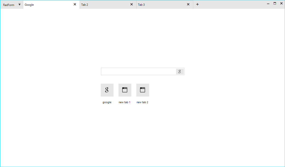
tabbed-form-01

Where to Use Tabbed Form?

The idea to organize the different views of an application in separate tabs is not new. The Microsoft TabControl and our own RadPageView have been around for quite some time. Although powerful, these controls serve a more limited purpose. Imagine, that you want to implement a tabbed UI which will serve as a top-level container of the entire application. The page view and MS tab control are not suitable for this as they are bound to the form they were added to and the pages or tabs cannot be dragged and dropped. Actually, a dock control can better serve you, yet if you want to achieve an end-user experience like what people are seeing in the modern browsers, it is still not good enough.

The RadTabbedForm is specifically built to handle this scenario. The application content can be organized and separated in different tabs where each tab is responsible for a different part of the application. The tabs are located inside the form's title bar just like in browsers (Chrome, Edge etc.) and they can be reordered or moved away to a separate window. This is extremely useful in big applications visualizing data. Instead of switching from one tab to another, the end user could simply drag the tab out thus creating a new form. The tabs would then be in two separate windows and the user could easily view both contents simultaneously. RadTabbedForm offers great flexibility and freedom which will be appreciated by the people using your application.

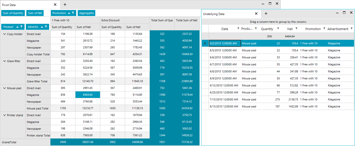
The screenshot below shows two tabs with the second tab being detached in a separate form. The first tab displays a RadPivotGrid and the second one shows a breakdown of the grouped and aggregated data behind the selected cell in the pivot from the first tab.

tabbed-form-011

Architecture and Features

The RadTabbedForm represents a form host of the RadTabbedFormControl. The form control is responsible for creating and manipulating the tabs in the title bar, the panels associated with each tab holding their content and the drag-drop service. Basically, most of the functionality and API is defined inside the RadTabbedFormControl, which is exposed by the form's TabbedFormControl property. The control is packed with many features and its look can be completely customized by simply setting a couple of properties. The form is built on top of TPF consisting of many light-weight visual elements. The Structure article in the documentation provides information on the more important building blocks of the control.

Full Design Time support

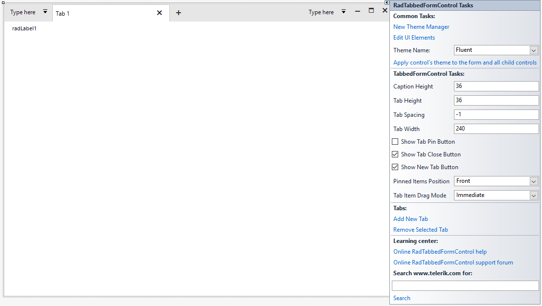
Tabs can be added in the designer of Visual Studio. Each tab will create a panel where all the other controls can be added.

RadTabbedForm with the Fluent Theme in the Visual Studio Designer

tabbed-form-02

Title Bar Support

It was really challenging to implement all the features inside the form's non-client area. I am happy to say that we managed to achieve everything which was planned.

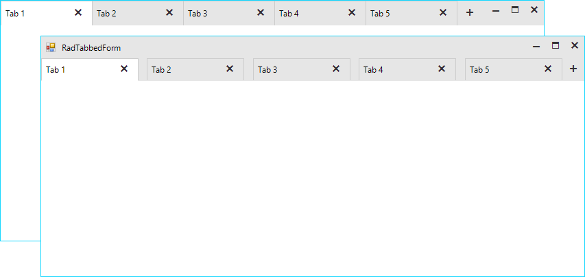
  • Settings: The title bar’s height is not fixed, and it can be adjusted via the CaptionHeight property. The tabs height and the space between them is also adjustable. We have decided to leave no space between the tabs, however, if your end users would need such you can increase the tab spacing. For example, with the following settings you can increase the height of the entire title bar and have the tabs displayed under the top-part where the form`s icon and system buttons are located. This way you will have a bigger part of the non-client area empty which will allow the users to move the form easily.

    this.ShowIcon = true;
    this.TabbedFormControl.ShowText = true;
    this.TabbedFormControl.CaptionHeight = 65;
    this.TabbedFormControl.TabHeight = 32;
    this.TabbedFormControl.TabWidth = 180;
    this.TabbedFormControl.TabSpacing = 12;
Default and Customized Tabbed Forms

tabbed-form-03

  • Standard Windows Title Bar Style: What does it mean? Basically, it means that we can paint the tabs inside the default Windows title bar as it is painted by the operating system. This will vary from one Windows version to another and it will also depend on the chosen Windows theme. This behavior is controlled by the AllowAero property of the form. Setting the property to false would force our themes and the control will adjust the title bar to match the theme of the tabbed control. In some situations, it might be necessary to match the standard Windows look so the AllowAero property has you covered:

    this.AllowAero = true;

Standard Windows 10 Title Bar Style

tabbed-form-04

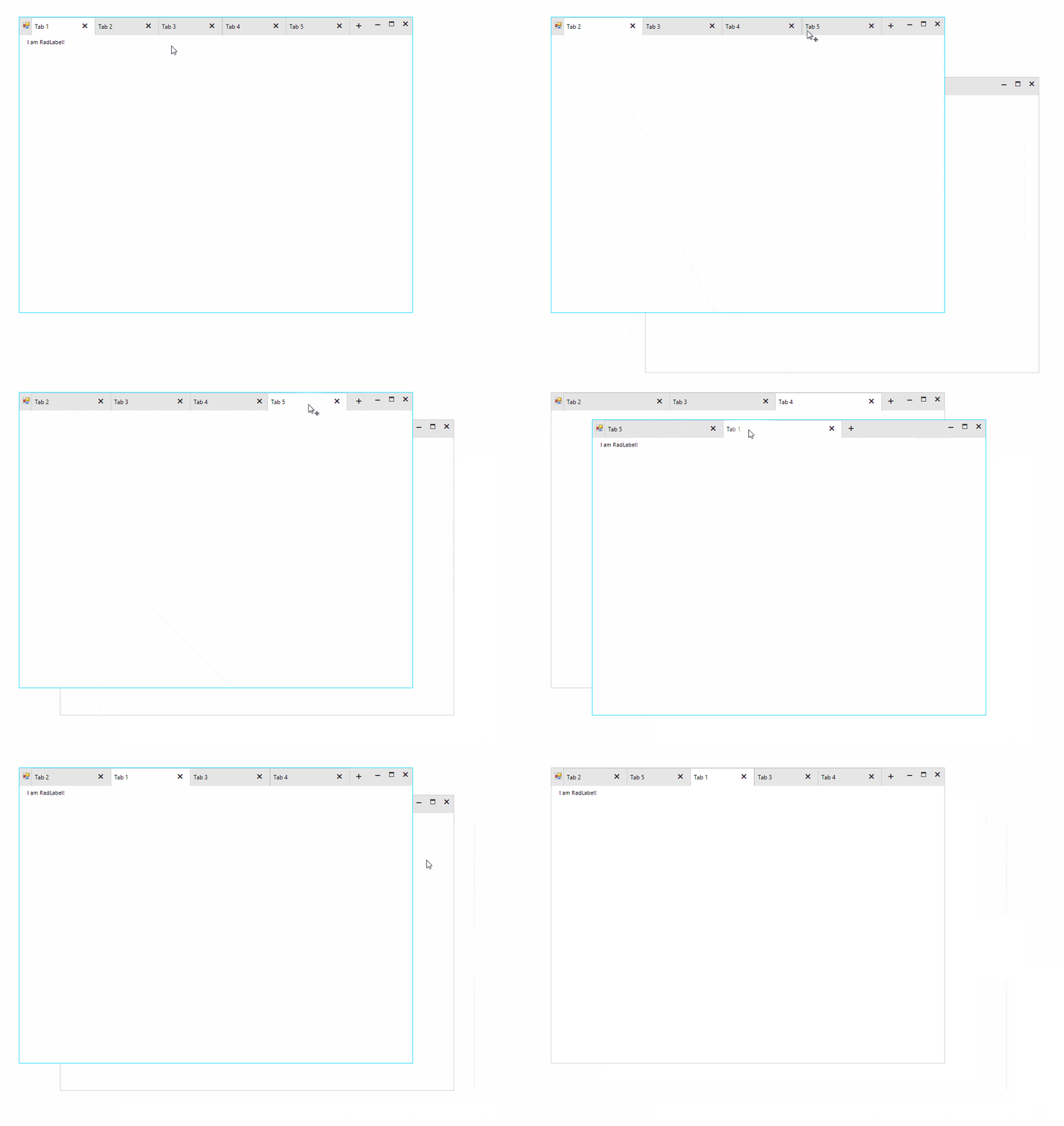
Drag and Drop

The tabs can be reordered inside the title bar. It is also possible to drag them out to create a separate form. The tab content including all the added controls will be moved to the new form. This operation can be repeated numerous times over and the tab be moved from one form to another.

tabbed-form-drag-drop

Quick Actions

Various elements like buttons, check boxes, drop-down buttons etc. can be added before and/or after the tabs.

this.TabbedFormControl.LeftItems.Add(newRadButtonElement { Text = "button1"}); //adds items before the tabs
this.TabbedFormControl.RightItems.Add(newRadButtonElement { Text = "button2"}); //adds items after the tabs

These elements can be also added in the Visual Studio designer.

tabbed-form-05

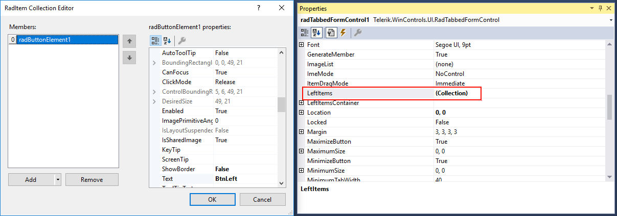
The LeftItems and RightItems collections are also exposed in the property grid of the designer and the elements can be edited in the collection editor.

tabbed-form-06

Navigation

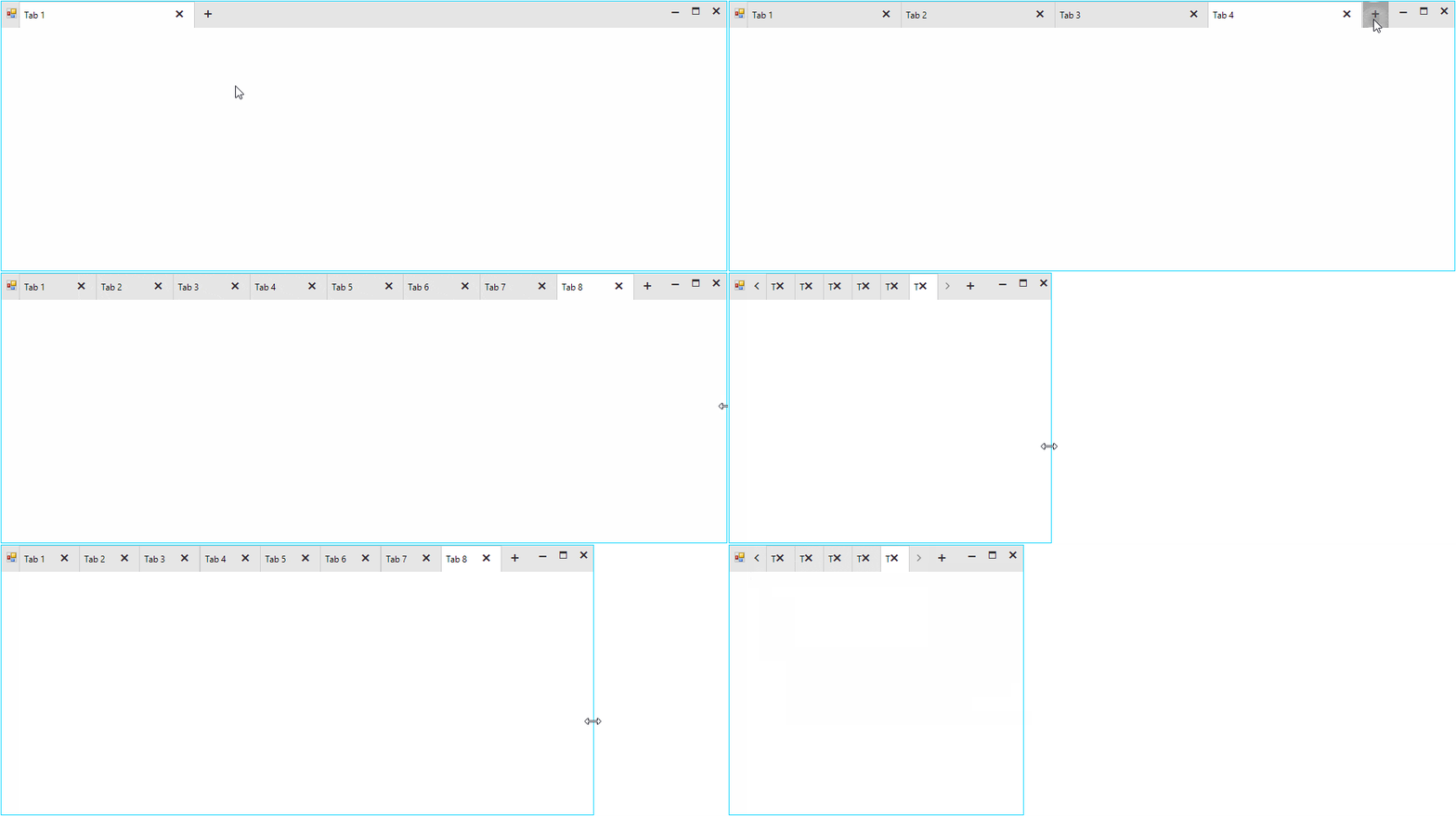
The tabbed control also has a built-in navigation. The navigation buttons will appear automatically, whenever the tabs cannot fit entirely in the available width. The tabs always have an equal width and it can be controlled with the TabWidth and MinimumTabWidth properties. The layout is smart enough and if the tabs count is increased to a point that they cannot fit in the title bar with their specified width, the widths of all tabs will be decreased equally. The layout will decrease the widths of the tabs until it reaches the specified MinimumTabWidth value. At that moment the navigation buttons will become visible.

tabbed-form-navigation

Pinned Items

Tabs can be pinned to the left or right side of the title bar. When unpinned, the tab will return to its last position.

this.TabbedFormControl.Tabs[0].Item.IsPinned = true;

tabbed-form-07

Context Menu

The tabbed control also has a built-in context menu which is fully localizable.  

tabbed-form-08

The items displayed in the menu can be customized in the RadTabbeFormControl.ContextMenuOpening event.

privatevoidTabbedFormControl_ContextMenuOpening(objectsender, RadTabbedFormControlItemConextMenuOpeningEventArgs e)
{
    if(e.TabItem.Text == "Tab 1")
    {
        //remove first item
        e.ContextMenu.Items[0].Visibility = ElementVisibility.Collapsed;
    }
    elseif(e.TabItem.Text == "Tab 2")
    {
        //disable the context menu
        e.Cancel = true;
    }
}

Getting Started

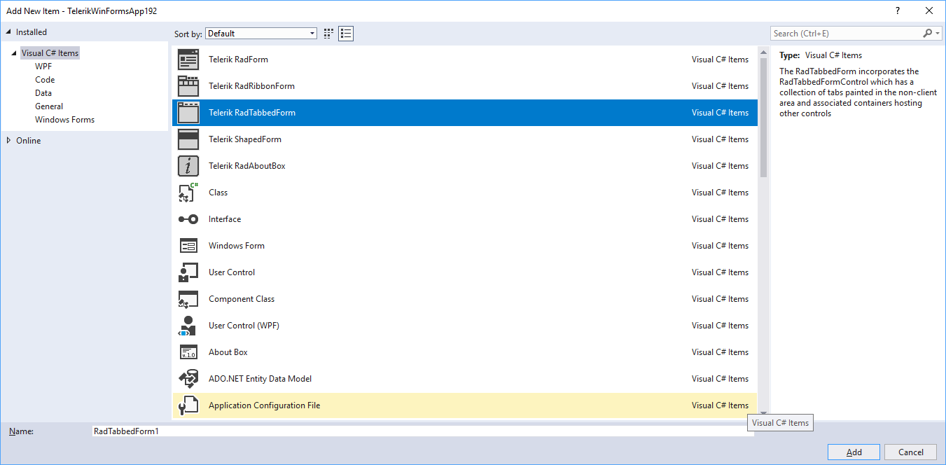
There are two ways to add a RadTabbedForm to your Visual Studio project:

  • VSX extensions: Assuming that you have our Visual Studio extensions installed, you can create a new tabbed form by simply adding a new item to the project.

tabbed-form-09

  • RadFormConverter: Simply drag and drop the component from the Visual Studio tool box and convert the current form to a RadTabbedForm.

Once you have the form added to the project you can start building the UI. Tabs can be added via the RadTabbedFormControl's smart tag. The smart tag also exposes the most important properties of the control. You can also check our Demo application and the two RadTabbedForm examples. Please also don't miss the documentation as it provides detailed information on the features and API of the control.

Try It Out and Share Your Feedback

We'd love to hear what your thoughts are on the new control. Please leave a comment below or write in the forums. If you have an idea for the next great feature you can also submit it on our feedback portal.

You can learn more about the Telerik UI for WinForms suite via the product page. It comes with a 30-day free trial, giving you some time to explore the toolkit and consider how it can help you with your current or upcoming WinForms development.


A Look Back at React Europe 2019 in Paris

$
0
0

React Europe 2019 concluded last week. I want to share my experience from the perspective of a first time visitor to Paris, and highlight some of the amazing talks, speakers and attendees that made this event so incredible for myself and my teammates from KendoReact.

For the 5th year in a row, React Europe has held a fantastic conference in Paris, France. My company (Progress Software) had a superb time not only as a sponsor of the main conference event, but we also participated in the hackathon on Saturday.

React Europe Crowd

The event was held at the Espace Charenton event center in the Porte de Charenton area of Paris and drew around one thousand React developers from all over the world.

Keynote by Jared palmer

Host and emcee Jared Palmer led the conference with a really good message about embracing React, building new things, contributing to open source including ReactJS, writing understandable docs, welcoming newcomers to JavaScript and the community as a whole. If we don't give these people the room to grow and improve, they will find another community that does welcome them.

React has always been a growing and welcoming community, and we have to work extra hard to make sure that doesn't change. I felt Jared's keynote to be an inspiring way to open the conference, which ended up being one of the more intimate of the conferences I had been to as all of the speakers were super approachable. It was a very friendly vibe amongst the attendees and I never once encountered anything to the contrary. The coordinators were not only welcoming to me and my team as a new sponsor, but they went out of their way to show us a good time. I recommend this as one of the few must-attend and must-sponsor events if your team is thinking about going next year.

The food and catering throughout the event was top notch, french breakfasts and baguette sandwiches for lunch, and of course there is no shortage of great restaurants in Paris.

Amazing Food and French Catering

It doesn't hurt that React Europe is held in one of the most romantic and beautiful cities in the world. As a first time traveler (as was most of my group), we made some time to get around the city and take in the great landmarks and attractions. But the conference really was the shining light in this trip and I would like to quickly highlight some of my favorite talks and give you my experience as a first time attendee. 

We heard from many brilliant speakers at this event. Some of them were veterans of react Europe, like Lee Byron, who is the only speaker to have graced the React Europe stage every year since it began in 2015. Others included Michael Westrate, Ives van Hoorne, Brent Vatne, Josh Comeau.

As an avid viewer of the previous years talks, I noticed a lot of new faces that may not have been on the main stage before or had only been involved with lightning talks in the past years. I thought many had extremely super interesting talks, including: Ankita Kulkarni, Charly POLY, Olga PetrovaElla van Durpe, and Alec Larson, Charles Mangwa, Lisa Gagarina and Tim Neutkens just to name a few.

Hooks in Motion by Alec larson

One of my favorite talks as a UI developer who loves animations and React Hooks was from Alec Larson (@alecdotbiz), you can check out his full talk "Hooks in Motion" about natural animations!

Move Fast With Confidence by Paul Armstrong

Another great talk that really resonated with me, and which is valuable for everyone no matter their skill level, was Paul Armstrong's "Move Fast With Confidence" talk. You can preview this already on the React Europe YouTube channel, and they are adding more and more talks every day from the conference, so you should go check them out now to see all of the sessions that you might have missed or just want to watch again. I know I have been spending a lot of time in the past few days checking out the talks that I liked or maybe missed out on while I was there.

It's important as a conference to not simply progress with more advanced talks each year, but to always have something for those who are new to React or even the industry for that matter. This keeps the roster of speakers each year fresh and keeps form alienating newcomers to the React space by making sure there is something for everyone.

A few talks were what I feel to be a little on the advanced side (and this is OK), one example of which is Julien Verlaguet's talk on SKIP, the language recently open-sourced by Facebook. SKIP was a research project to explore language and runtime support for correct, efficient memoization-based caching and cache invalidation. Or I think he described it better when he said that it's a programming language built from the ground up with the ideas of React at its core, meaning that it deals with state in a similar way to React.  You will need to watch the talk as it is a very interesting presentation.

I can't talk about everything that was presented on at the main stage, we would be here for hours, but it's all a great reason to go and check out day one and day two of the conference on YouTube, I'll put a list of all of the talks below so you can pick and choose and jump straight to the individual talks.

Talks on YouTube

Currently there are only a few talks posted to the React Europe YouTube page. The full day's video was posted after the conference but was removed yesterday as each individual talk began to be posted. Below are the talks that have been uploaded. I will try to keep the article updated as new ones are posted each day, but it's a time intensive process and it may take a while for all of them to get posted.

React Europe Conference Day One (May 23rd)

React Europe Conference Day Two (May 24th)

Links still being processed, update coming soon!

Hackathon

This was held on the Saturday after the conference. We posed a KendoReact challenge, offering attendees the opportunity to win an Apple Watch by hacking a demo we put together where attendees built a travel booking site using our React components.

Hackathon Prizes

This event was attended by about 20 developers that stuck around an extra day to try their hand at our coding challenges.

Hackathon Attendees

Everyone did such an amazing job that we decided to give three runners up KendoReact licenses as well!

Hackathon Winner

One winner (shown above), who combined both our KendoReact challenge and the AWS Amplify challenge, took home the well-deserved Apple Watch and a KendoReact license. As I said above three runners up also walked out with a KendoReact license. Thanks to everyone who participated!

Create Accessible PDF Documents with Telerik Reporting

$
0
0

Our latest addition to the accessibility story is enabling the PDF rendering extension to produce PDF files that comply with the PDF/UA standard. 

Whether we are writing code, authoring an article or composing a poem, we usually want to get our message delivered to as many people as possible. Sharing our work with others is getting much easier with the advantages that modern technology gives us. This task gets even more important when the shared information represents business data that needs to be accessed by a broader audience.  

A key factor here is to choose a suitable medium, and Adobe’s PDF file is arguably the best way to spread the message. PDF stands for Portable Document Format and indeed it is a well-established standard for creating and distributing documents, which can be read on virtually any current platform and device. But the PDF standard has one more very important feature – it can produce documents in a way that allows users with disabilities to be able to perceive the shared information. This feature is called accessibility and is defined by the PDF/UA standard which is aimed at production companies of software and assistive technologies. 

Accessible PDF Documents

We on the Telerik Reporting team introduced accessibility support in R3 2017 and have since continued evolving further in this direction. Our latest addition to the accessibility story is enabling the PDF rendering extension to produce PDF files that comply with the PDF/UA standard. The most important characteristics of these files are listed below:
  • Tagged contents - all textual items in the report will have a corresponding accessibility entry in the PDF structure. This entry contains the text recognized by the screen readers and other assistive technologies. The rules to generate the text in tagged contents are the same used to generate the metadata in rendered report contents and can be checked here
  • Description for non-textual items - the PictureBox, Graph and Map items should provide meaningful accessible descriptions as well. This description is persisted in a tagged element with configured actual and alternate text. Other graphical primitives like borders will be treated as non-informational elements and will be added in the PDF document structure as artifacts. 
  • Annotations - all the links in the document have a respective link annotation object in the PDF structure. The purpose of the link annotation objects is to provide additional information about the currently selected navigational link. 
  • Document Title - the title is obtained from the PDF device information settings that can be set via code or through the configuration file. When unavailable, the DocumentName property of the report will be used instead. 
  • Document Natural Language– like the document’s title, the document language should be set in the PDF device information settings. If unavailable, the value of the Culture.Name property of the report will be used instead. 

Configuration 

The setting that determines whether the reporting engine would add the accessibility information to the PDF document is named enableAccessiblity and is passed through the PDF device information settings. The settings can be also controlled from the report viewer’s EnableAccessibility property, providing a consistent behavior between viewed content and exported documents. Since the report viewer setting has a broader scope, it has lower priority than the settings explicitly set in device information object. The accessibility feature can also be enabled in code, for example, when the PDF file is produced from the ReportProcessor class:

var rs = newTypeReportSource() { TypeName = typeof(Dashboard).AssemblyQualifiedName };
var deviceInfo = newHashtable()
{
    { "EnableAccessibility", true}
};
var result = newReportProcessor().RenderReport("PDF", rs, deviceInfo);
File.WriteAllBytes("AccessibleDashboard.pdf", result.DocumentBytes);

Results Assessment

The most complete document that describes the checks that a PDF file needs to pass to satisfy PDF/UA standard, is the Matterhorn Protocol. It specifies which of the failure conditions can be tested with dedicated software and which need to be examined manually. Based on this protocol, many tools can evaluate the produced PDF document and determine if it complies to the accessibility standards established with PDF/UA.

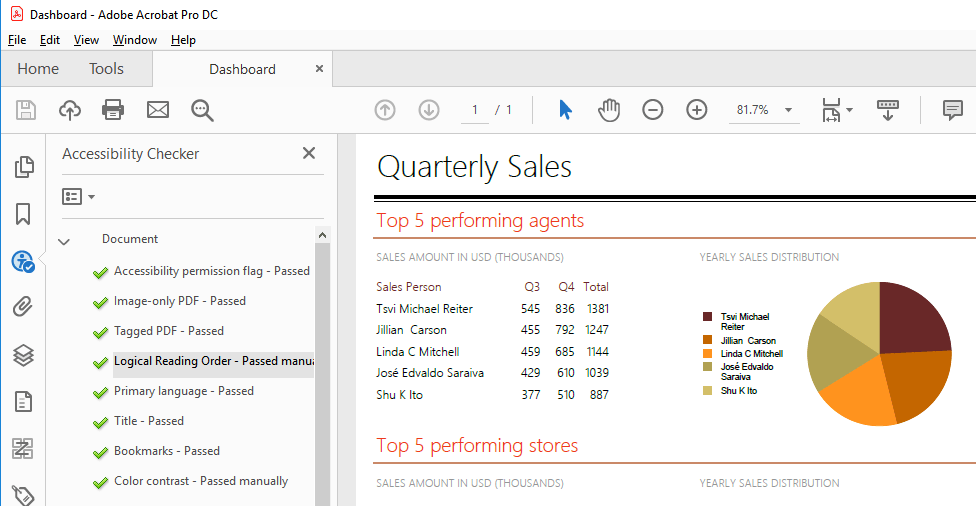
For example, Adobe Acrobat provides a thorough test that traverses the PDF structure and its metadata and outputs a detailed report as shown below:

PDF accessibility check on Adobe Acrobat

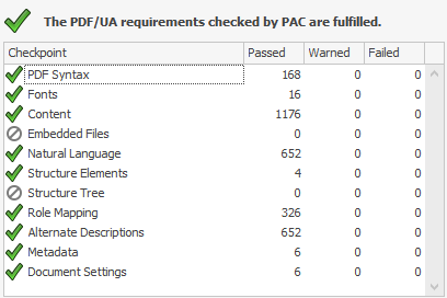
Another comprehensive and free testing tool is PAC - PDF Accessibility Checker. PAC is built in accordance with the Matterhorn protocol and evaluates all the failure conditions that can be tested with a software product. It also includes a screen reader preview that helps to determine how the document will be interpreted by screen-reading applications like NVDA and JAWS, utilized by the visually impaired users. The report that PAC tool displays when checking a PDF/UA compliant file looks like this:

PDF Accessibility Check by PAC

Want to Learn More?

If you are new to our tools or have only tried some, make sure you download the trial and take them for a spin. You can either download just the Reporting and Report Server tools, or download a trial of our entire set of .NET and JavaScript tools with the DevCraft bundle.

We're eager to hear what you think, so please don't forget to share your feedback and help us make Telerik Reporting even better.

Throwing .NET Exceptions: ArgumentException and InvalidOperationException

$
0
0

Exceptions can be thrown either by the runtime or the application code. This can be caused by bad code, while, other times, the problem is caused by bad user input that has not been accounted for in the application's code. When any of these errors occur, the system catches the error and raises an exception.

The process of generating and signaling the error is referred to as throwing an exception. This is done using the throw keyword followed by a new instance of a class derived from System.Exception. There are standard exception types provided by the .NET framework that you can use rather than creating a custom exception.

In this post, I'll show you why and how to use the ArgumentException and InvalidOperationException types which, are part of the standard exceptions in .NET.

Note: Interested in learning about the ArgumentNullException and ArgumentOutOfRangeException? Check out my post on those exceptions here.

Working with InvalidOperationException Exception

The InvalidOperationException exception type is thrown when a method call is invalid for the object's current state. This can be caused by changing a collection while iterating it, or casting a Nullable<T> that is null to its underlying type. We can also throw this exception type in cases where we want to signal to our application that the requested operation through a method call can't be performed because the object is in an invalid state. Let's look at an example:

class Account
{
  public Account(string firstName, string lastName, int balance)
  {
    FirstName = firstName;
    LastName = lastName;
    Balance = balance;
  }

  public string FirstName { get; private set; }
  public string LastName { get; private set; }
  public int Balance { get; private set; }

  public void Withdraw(int amount)
  {
    if (amount > Balance)
      throw new InvalidOperationException("Insufficient fund");

    Balance = Balance - amount;
  }
}

The code above shows an Account class with properties to hold the account owner's names and account balance. The Withdraw method deducts the withdrawal amount from the balance, and if the withdrawal amount is higher than the balance, it throws an exception — the InvalidOperationException. When the exception is raised, it cancels the withdraw transaction and signals to the application that the account can't be debited of that amount because of insufficient funds.

Working with ArgumentException Exception

The ArgumentException type inherits from the System.SystemException class and should be thrown when a method argument receives an invalid argument value. Carrying on from the Account class example from the previous section, let's guard the Withdraw method not to allow a number less than one, or an empty string as values for the names.

class Account
{
  public Account(string firstName, string lastName, int balance)
  {
    if (string.IsNullOrEmpty(firstName))
      throw new ArgumentException("FirstName is invalid");
    if (string.IsNullOrEmpty(lastName))
      throw new ArgumentException("LastName is invalid");

    FirstName = firstName;
    LastName = lastName;
    Balance = balance;
  }

  public string FirstName { get; private set; }
  public string LastName { get; private set; }
  public int Balance { get; private set; }

  public void Withdraw(int amount)
  {
    if (amount < 1)
      throw new ArgumentException("Amount can't be less than 1",
                                  nameof(amount));
    if (amount > Balance)
      throw new InvalidOperationException("Insufficient fund");

    Balance = Balance - amount;
  }
}

In the code above, we used the ArgumentException exception in the constructor to prevent initializing an account object with invalid values. We also throw the ArgumentException exception if the Withdraw method is called with an amount less than one. We used the constructor that accepts an exception message and a second parameter to indicate the parameter that caused the exception.

That's A Wrap

We looked at throwing exceptions in C#, specifically, throwing the ArgumentException and InvalidOperationException that are part of the standard exceptions in .NET.

The ArgumentException is thrown when a method argument receives an invalid argument value. The InvalidOperationException exception is thrown in cases where the failure to invoke a method is caused by reasons other than invalid arguments. Because the InvalidOperationException exception can be thrown in a wide variety of circumstances, it is important to read the exception message returned by the Message property. How you handle the exception depends on the specific situation. Most commonly, however, the exception results from developer error and it can be anticipated and avoided.

How to Use a Vue Scatter or Bubble Chart UI Component in Your Web App

$
0
0

Scatter charts and bubble charts can help you visualize whether a relationship exists between several variables. See how you can easily incorporate them into your Vue apps.

In my last post on this topic, we talked about using a Vue Bar Chart with Kendo UI. In this post, we will learn how to use the scatter and the bubble chart.

Scatter charts are used to determine whether a relationship exists between two variables. The strength of the relationship is determined by how closely the data points fit a line. The direction of the line determines if there is a positive relationship, negative relationship or no relationship between the variables. Bubble charts are similar to scatter charts except you can compare up to four variables. The size and the color of the bubble represent two additional variables.

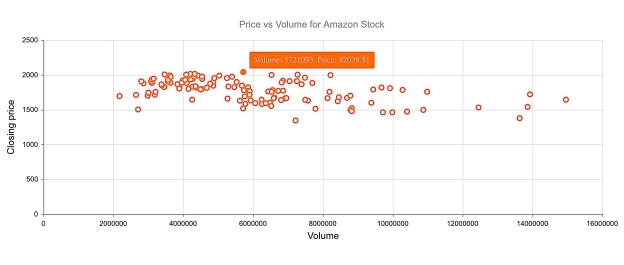
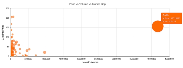
Coming up, we will create a scatter chart to plot the price and volume for Amazon stock. Then, we will create a bubble chart to plot the price, volume, and market cap for a group of stocks.

Getting Started

We will first initialize a Vue project using the webpack-simple template. Next, we will install our dependencies. We will need to install Kendo UI, a theme, the Charts package, and the DataSource package. The following commands install all of our packages.

npminstall --save @progress/kendo-ui
npminstall --save @progress/kendo-theme-default
npminstall --save @progress/kendo-charts-vue-wrapper
npminstall --save @progress/kendo-datasource-vue-wrapper

Inside the main.js file, we import the packages. We register the Chart and DataSource globally using the ChartInstaller and DataSourceInstaller then add them to the component list.

import Vue from'vue'import App from'./App.vue'import'@progress/kendo-ui'import'@progress/kendo-theme-default/dist/all.css'import{ Chart, ChartInstaller }from'@progress/kendo-charts-vue-wrapper'import{ DataSource, DataSourceInstaller }from'@progress/kendo-datasource-vue-wrapper'

Vue.use(ChartInstaller)
Vue.use(DataSourceInstaller)newVue({
  el:'#app',
  components:{
  Chart,
  DataSource
  },
  render: h =>h(App)})

Creating a Scatter Chart

We want to see if there is a relationship between price and volume for our stock. If prices rise as the volume rises, the data should form an upward sloping band. This could be a good sign the prices are on an upward trend. Inside the template in our App.vue file we will remove the markup between the #app element and add a DataSource and Chart component. The DataSource component requires a name so we can reference it in our chart component, the URL of our web service, and the response data type. The following is the URL for our request:

https://api.iextrading.com/1.0/stock/amzn/chart/6m

The API we are using is provided by IEX. This endpoint will return the last six months of stock data for Amazon. Here is what an example response looks like:

[
    {
        "date": "2018-07-02",
        "open": 1682.7,
        "high": 1713.89,
        "low": 1678.06,
        "close": 1713.78,
        "volume": 3185696,
        "unadjustedVolume": 3185696,
        "change": 13.98,
        "changePercent": 0.822,
        "vwap": 1699.05,
        "label": "Jul 2, 18",
        "changeOverTime": 0
    },
    …
]

The Chart component will include a reference to the data source, a title, a tooltip, a series, an x-axis, and a y-axis. The value of these attributes will be set in the component’s data. This is the updated template with the DataSource and Chart components added:

<template><divid="app"><kendo-datasourceref="dataSource":transport-read-url="'https://api.iextrading.com/1.0/stock/amzn/chart/6m'":transport-read-data-type="'json'"></kendo-datasource><kendo-chart:data-source-ref="'dataSource'":title="title":tooltip="tooltip":series="series":x-axis="xAxis":y-axis="yAxis"></kendo-chart></div></template>

In the script portion of the component, we will add the text for the title. We will make the tooltip visible and give it a template. For the series, we will specify the type and set the x field and y field. Then for the x-axis and y-axis, we will set the text for the title. Here is the updated script:

<script>exportdefault{
  name:'app',data(){return{
      title:{
        text:'Price vs Volume for Amazon Stock'},
      tooltip:{
        visible:true,
        template:'Volume: #: value.x #, Price: $#: value.y #'},
      series:[{
        type:'scatter',
        xField:'volume',
        yField:'close'}],
      xAxis:{
        title:{
          text:'Volume'}},
      yAxis:{
        title:{
          text:'Closing price'}}}}}</script>

Vue

This is a link to the project’s repo: https://github.com/albertaw/kendoui-scatterchart

Creating a Bubble Chart

We want to show the relationship between volume, price, and market cap on our bubble chart. We will be looking at a group of stocks in the computer hardware sector. Volume will be our x variable. Price will be the y variable. And the market cap will be the size of the bubble. We might predict that stocks with the highest volume will also have the highest price. If this is the case we expect to see the points form a line that has an upward slope. Or, we could find that stocks with a larger market cap have a higher price. In this case, larger bubbles will be higher up on the graph. This may not be the case however and there is also the possibility that no relationship exists between the variables.

The components for the bubble chart will remain the same nearly the same. This is the URL that the data source will use:

https://api.iextrading.com/1.0/stock/market/collection/tag?collectionName=Computer+Hardware   

The title and tooltip will also change. The series type is changed to bubble. In addition to an x and y field, a size and category field are added to the series. The category field represents the individual stocks, therefore, we will use the stock symbol for this entry. This is the updated script:

<script>exportdefault{
  name:'app',data(){return{
      title:{
        text:'Price vs Volume vs Market Cap'},
      tooltip:{
        visible:true,
        template:'<strong>#: category #</strong> Volume: #: value.x # <br> Price: $#: value.y #'},
     series:[{
      type:'bubble',
      xField:'latestVolume',
      yField:'close',
      sizeField:'marketCap',
      categoryField:'symbol'}],
     xAxis:{
      title:{
        text:'Latest Volume'}},
     yAxis:{
      title:{
        text:'Closing Price'}}}}}</script>

Vue

This is the link to the repo for this example: https://github.com/albertaw/kendoui-bubblechart

Summary

Scatter charts and bubble charts are used to see how data is related. A trend line shows if there is a relationship between the variables, how strong the relationship is, and the direction of the relationship. We created a scatter chart for Amazon stock to see the relationship between price and volume. Then we created a bubble chart to see if there was a relationship between volume, price and market cap for stocks in the computer hardware sector. We only saw the basics of what can be configured with the charts. There is another variation of the scatter chart, the scatter line chart which connects all of the points. The scatter and bubble charts can also be bound to grouped data.

In the next post, you will see how to create a pie and donut chart. Both of these charts visualize data that has a part-whole relationship.

Resources

Try Out Kendo UI for Yourself

Want to start taking advantage of the more than 70+ ready-made Kendo UI components, like the Grid or Scheduler? You can begin a free trial of Kendo UI for Vue today and start developing your apps faster.

Start My Kendo UI Trial

Angular, React, and jQuery Versions

Looking for UI component to support specific frameworks? Check out Kendo UI for Angular, Kendo UI for React, or Kendo UI for jQuery.

Angular 8 is Here: What’s in it and Why Should You Care?

$
0
0

Angular 8 is now available. Learn about some of our favorite new features, why we think they are important and how they make your life as an Angular developer easier.

As you no doubt saw, version 8 of Angular was released this week. The update spans across the framework, Angular Material and the CLI. We’re always eager to dig in when a new version ships and wanted to share a few of the new features we find interesting and why.

After reading, let us know what you think? What else about this major release are you looking to take advantage of?

Differential Loading by Default

Prior to version 8 of Angular, in order to make sure your application was compatible with the majority of browsers, compilation (ES5 - Typescript that is compiled and bundled) and polyfills (which provide functionality not available in legacy browsers) were used.

In Angular 8, differential loading - which means the CLI actually builds a modern bundle and a legacy bundle – is handled by the Angular CLI as part of the build process for deployment by default.

According to the documentation, the Angular CLI uses two configurations for differential loading:

  • Browserslist - The browserslist configuration file is included in your application project structure and provides the minimum browsers your application supports. See the Browserslist spec for complete configuration options.
  • tsconfig.json - The target in the TypeScript compilerOptions determines the ECMAScript target version that the code is compiled to. Modern browsers support ES2015 natively, while ES5 is more commonly used to support legacy browsers.
Note: Differential loading is currently only supported when using es2015 as a compilation target. When used with targets higher than es2015, a warning is emitted during build time.

One of the biggest benefits to differential loading that applications will save 7-20% of their bundle size.


Stephen Fluin
  Stephen Fluin describes the process in more detail in his blog post about the release.


Lazy Loading

Lazy Loading

Angular has long supported lazy loading by using the loadChildren key in the route configuration. With version 8, the Angular team has migrated from a custom syntax that was built into the Angular toolchain to the industry standard dynamic import. For developers who are using VSCode or WebStorm, this provides a significantly better experience, as those editors will now be able to understand and validate the imports.

Preview Version of Ivy

ivy-650

With Angular 8, a preview version of Ivy (the next-generation rendering pipeline for Angular) is available. The Angular team still recommends it should be used for testing only and not yet for production. That said, the promise of Ivy is that it will make Angular applications smaller and faster.

Web Worker Support

Web Workers

In Angular 8 you can generate new web workers from the CLI. This allows you to speed up your application if you are doing any sort of CPU-intensive processing because it offloads work to a background thread.

New Builders API

Builders API

With this new version, Angular now provides a new Builders API that allows you to perform building, testing, and deployment processes that were traditionally done with Schematics.

And Much More

As mentioned before, this is just a sampling of what is included in the Angular 8 release. Our engineers and advocates are excited to continue to dive deeper into all of the new features and functionality that has been delivered and you can expect to see more in-depth blogs in the coming weeks.

The Angular team has been very transparent about the fact that this release is an "evolution, not a revolution." We believe they delivered on that promise in a big way and are making Angular developers lives easier with the new functionality. Making your like easier is one of our goals as well. To that end, we are proud to say that Kendo UI for Angular team has been working hard to ensure it is Angular 8 compatible. They are still working on Ivy compatibility and will push out updates as they become available. If you don't have a current Kendo UI license, make sure you download your free 30-day trial.

And don't forget to share your thoughts with us about this release.

Localization and Globalization for Xamarin.Forms Applications Using Telerik UI for Xamarin

$
0
0

This blog will introduce you to the built-in mechanism for globalization and localization of the Telerik UI for Xamarin suite, and help you understand the difference between the two terms.

I have the feeling that these two terms - globalization and localization - are often misunderstood. Therefore I would like to start with more general questions and then will dive into some specifics. 

What is Globalization? 

According to W3, “Globalization is the process of design and development of a product, application or document content that enables easy localization for target audiences that vary in culture, region, or language. Some people use other terms, such as "internationalization” to refer to the same concept.” 

What about Localization? 

The process of adaptation of a product, application or document content to meet the language, cultural and other requirements of a specific target market (a locale). Often thought of only as a synonym for “translation of the user interface and documentation,” localization is a substantially more complex issue. It can include customization related to:

  1. Numeric, date and time formats
  2. Use of currency
  3. Keyboard usage
  4. Collation and sorting
  5. Symbols, icons and colors
  6. Text and graphics containing references to objects, actions or ideas which, in a given culture, may be subject to misinterpretation or viewed as insensitive
  7. Varying legal requirements

This list is just a start - localization can apply to many more things as well.

How Do These Relate to Application Development?

When it comes to the user interface of an application, these terms boil down to applying correct strings and various formats depending on the language settings of the respective device. This task sounds simple and straightforward, but it can become hard for execution, especially in cases where third party UI components are used.

We understand this, and therefore Telerik UI for Xamarin provides an easy to use mechanism which can change the predefined strings in our components. Examples of such strings can be found in several of our controls including RadDataGrid, RadCalendar & Scheduling UI, RadAutoCompleteView, RadNumerInput and more.

It is worth mentioning that not all the components take advantage of this mechanism simply because there are no predefined strings in every single one. For those which need any predefined string(s) the TelerikLocalizationManager is used to resolve the exact characters to display. Internally those components work with keys instead of specific string values. At runtime, the localization manager is expected to resolve those keys to concrete strings.

What is TelerikLocalizationManager? 

This is a class which uses one of two available approaches to map the predefined keys of all components of the Telerik UI for Xamarin suite with exact strings which will be visualized. 

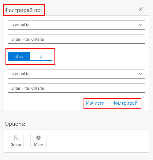
The first method requires extending the default manager by overriding a single function which does the actual mapping. It returns a string for a given key (a.k.a. key-value pair). Here is an example: 

publicclassCustomTelerikLocalizationManager : TelerikLocalizationManager
{
    publicoverridestringGetString(stringkey)
    {
        if(key == "And")
        {
            return"И";
        }
        if(key == "Or")
        {
            return"Или";
        }
        if(key == "ResetText")
        {
            return"Изчисти";
        }
        if(key == "FilterText")
        {
            return"Филтрирай";
        }
        if(key == "FilterUISectionText")
        {
            return"Филтрирай по:";
        }
        returnbase.GetString(key);
    }
}

Once the mapping is done, an instance of the customized localization manager should be assigned to the static TelerikLocalizationManager.Manager property before the UI is initialized and rendered. In a XamarinForms application a good place to do this is just before the InitializeComponent() function of a page. 

publicMainPage()
{
    TelerikLocalizationManager.Manager = newCustomTelerikLocalizationManager();
    this.InitializeComponent();
}

However, if your application initializes any resources at earlier stage, you should consider instantiating the extended manger on an earlier stage as well. 

Using TelerikLocalizationManager to Localize a Xamarin.Forms Application

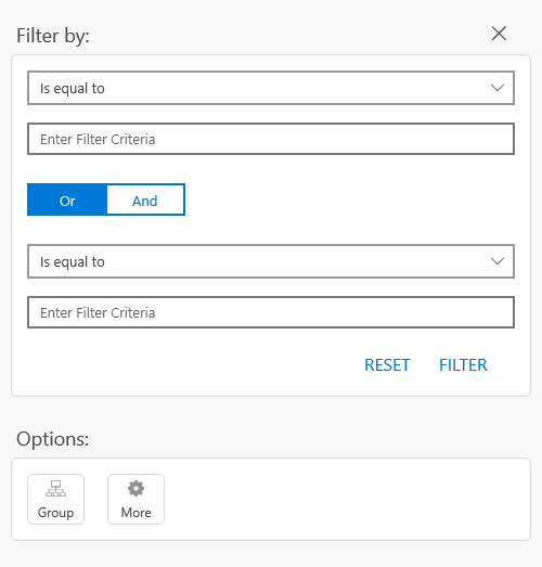
This example translates part of the filtering UI of the RadDataGrid component to Bulgarian. You can recreate the exact scenario by following the Getting Started article in our documentation. Here is how the filtering UI looks like by default.

RadDataGrid FilteringUI

After applying the customized localization manager, the visualized strings change like this: 

RadDataGrid Bulgarian FilteringUI

If you are going to translate an application, most likely you will have to translate it to many languages. This can be done by creating many customized localization managers – one for each supported language. In addition to this, the developer should decide which manager is to be used when instantiating one. Here is one way to do it:

publicpartialclassMainPage : ContentPage
{
    publicMainPage()
    {
        ILocalizationManager manager = null;
        if(CultureInfo.CurrentUICulture.Name == "bg-BG")
        {
            manager = newCustomTelerikLocalizationManager();
        }
        elseif(CultureInfo.CurrentUICulture.Name == "fr-FR")
        {
            // new up your French manager
        }
        elseif(CultureInfo.CurrentUICulture.Name == "de-DE")
        {
            // new up your German manager
        }
        ...
        TelerikLocalizationManager.Manager = manager;
        InitializeComponent();
        ...
    }
}


Localizing Xamarin Application with Resouces

On the other hand, the second available approach for providing key-value pairs eliminates the need of choosing between multiple managers. It makes use of the well-known .resx files. You just need to create one (or several), update them to match a convention and embed them into your application. Because of the convention the TelerikLocalizationManager will automatically pick and read the correct file depending on the language settings of the device. 

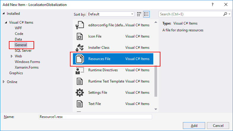
Speaking about creating such files, here are the steps that can be followed to do so. Usually Visual Studio provides a convenient item template for .resx files. It can be used by right-clicking on the portable project and navigating to Add > New Item… in the newly opened dialog navigate to Visual C# Items > General > Resources File.  

ResourcesFile item template

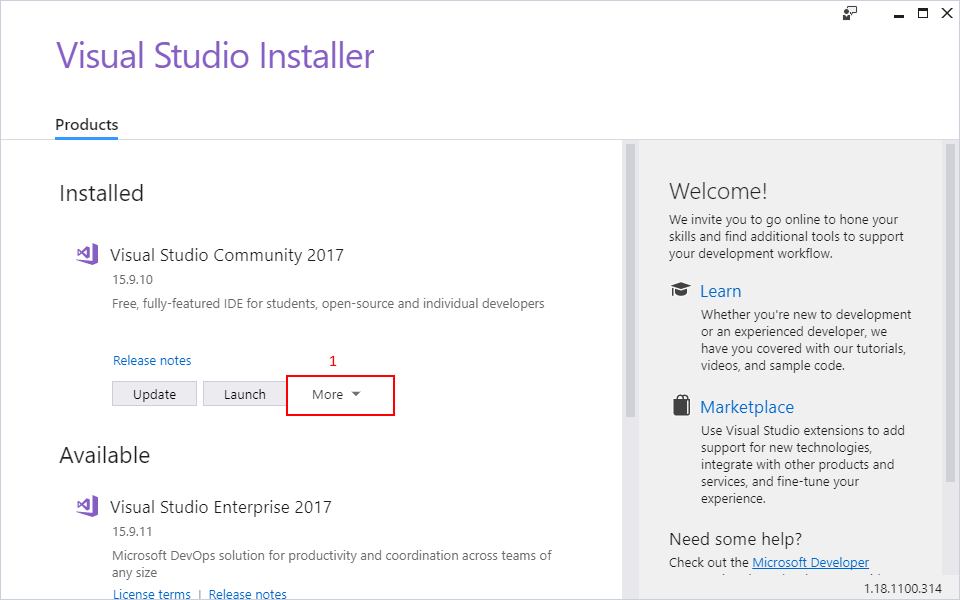
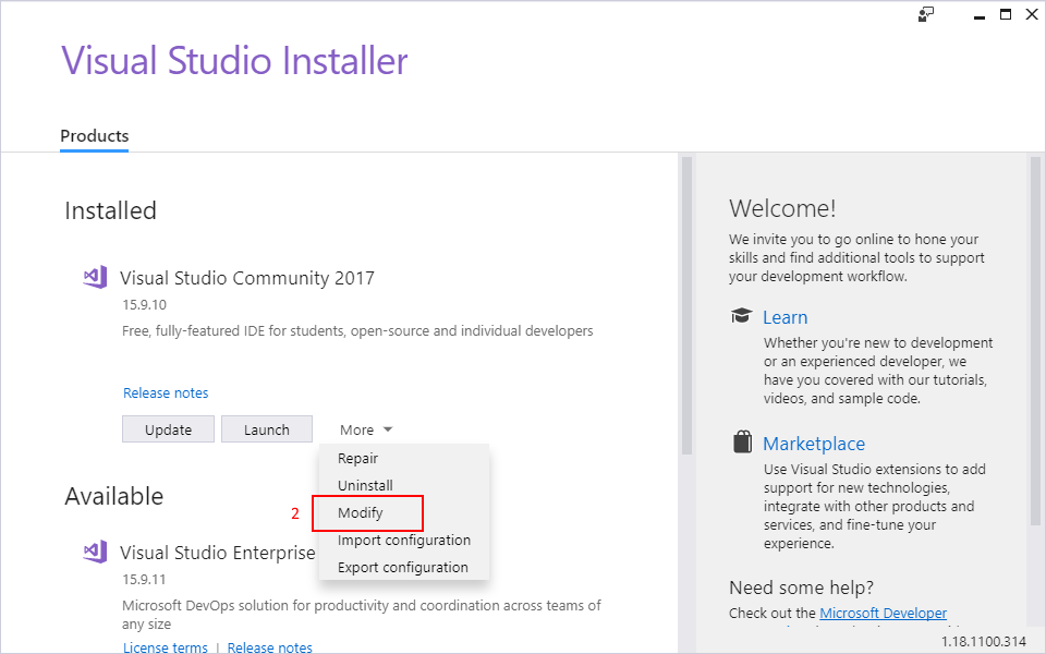
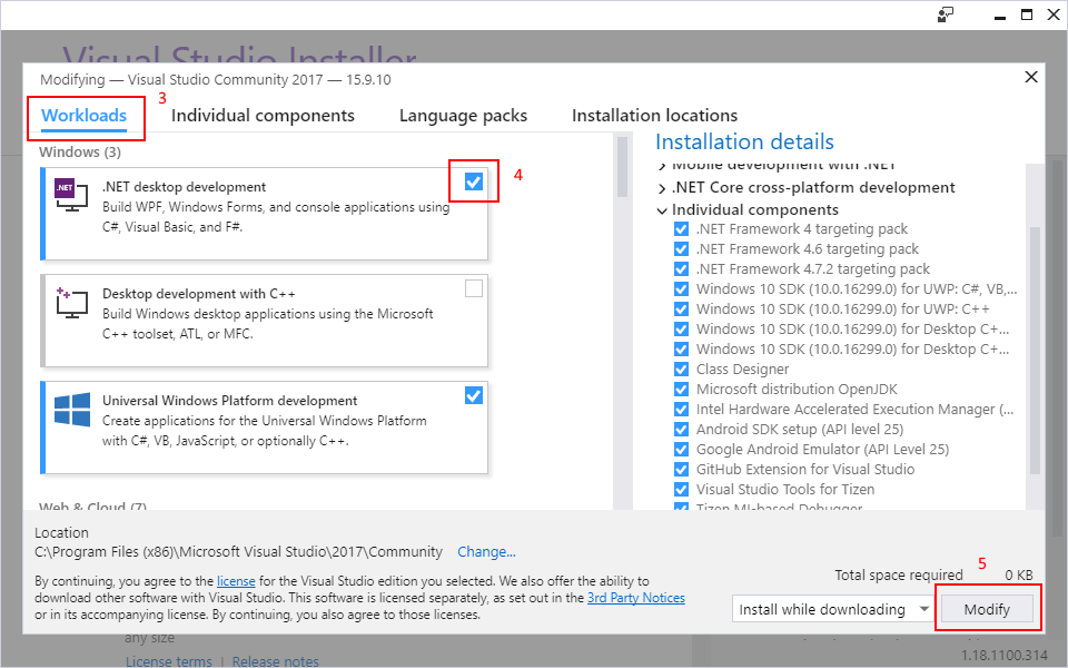
However, as a mobile developer it is a common pitfall to install only the “Mobile development with .NET” workload when installing Visual Studio. It gives you everything you need to get started with XamarinForms, but unfortunately, by default, this workload does not provide the resources file item template. You will have to install another workload to get it. This can be done by opening the Visual Studio Installer, going to More > Modify under Workloads, checking “.NET desktop development” and pressing Modify

Visual Studio Installer

Visual Studio Installer

Visual Studio Installer

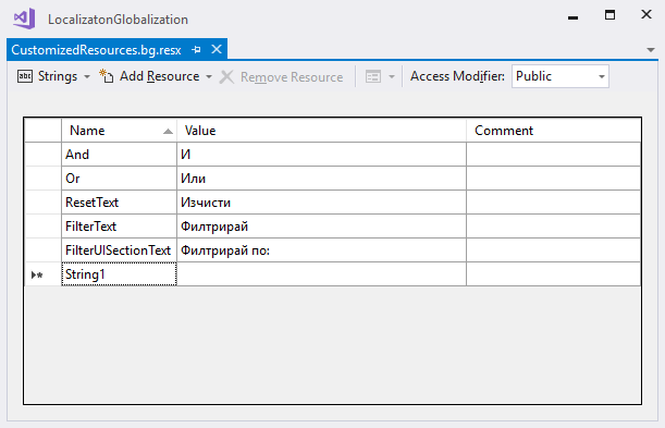
Let the installer do its job and then you will be able to create a .resx file from the Add New Item dialog. Visual Studio also provides a convenient editor for these files. In the editor, the key-value pairs can easily be provided in a tabular form. This makes reading, adding and editing entries much easier. 

ResourcesFile editor

Once the resource file is ready, it is time to comply to the earlier mentioned convention. There are two aspects that need to be covered.  

First is the name of the file. It should be structured like this [filename].[culture].resx. In this demonstration the file is named “CustomizedResources.bg.resx”. If I need to translate the app in German, the file containing the German key-value pairs would be named “CustomizedResources.de.resx”.  

The second aspect is to provide a resources file for the neutral culture as well. This is achieved by creating an empty .resx which does not specify any culture in its name. In this example it should be named “CustomizedResources.resx”. This file is not required to provide any key-value pairs since leaving it empty none of the default strings will be overridden and the controls will visualize their default strings representation. 

The final step is to provide a new resource manager to the default TelerikLocalizationManager. This once again should be done before the controls are visualized. 

namespaceLocalizatonGlobalization
{
    publicpartialclassMainPage : ContentPage
    {
        publicMainPage()
        {
            stringresourceId = "LocalizatonGlobalization.CustomizedResources";
            TelerikLocalizationManager.Manager.ResourceManager = newSystem.Resources.ResourceManager(resourceId, typeof(MainPage).GetTypeInfo().Assembly);
            InitializeComponent();
        }
    }
}

Please note how the resourceId variable is constructed. It includes the fully qualified namespace name and the filename without the culture specific extension of the resource file. This allows the ResourceManager to pick and use the correct resources file. 

Where Can I Find the Keys Used by the Components?

No matter which of the two approaches you choose to use, you will need to know the exact keys that the components internally use. In our xamarin-forms-sdk repository you can find the DefaultResources.resx file. It contains every key that is used by all components along with the default string values. 

Basically, this is the type and volume of the resources file that is required if you are to translate all the components part of the Telerik UI for Xamarin suite. 

Wrapping Up 

If you are in a hurry and are looking for a fast and easy way to translate your application, you may find it useful to create a custom ResourcesManager and some .resx files. However, if you need more control over the translation process, you may like extending the default TelerikLocalizationManager and taking control in code. 

Don't forget to install the newest version of Telerik UI for Xamarin from your Telerik account, check the available examples in the Demo Application as well as the SDK Samples Browser applications. As always, your feedback would be greatly appreciated. 

Thanks for reading and I hope you find the globalization and localization a bit clearer and valuable to your projects.

Understanding Angular Property Binding and Interpolation

$
0
0

Understanding Angular’s data binding types is important when building Angular applications. Learn about property binding and interpolation so you can understand which method best suits the task at hand.

When building applications using Angular, you come in contact with a couple of ways for displaying data on the view. Property binding and interpolation are the data binding types in Angular, used for moving data from the component to the template.

Data binding is a very important and powerful aspect of software development. It involves the concept of defining the communication between a component and its respective views. Data binding allows for dynamism and interactivity in applications.

There are about four types of data binding available in Angular:

  1. Event binding: This data binding type is when information flows from the view to the component when an event is triggered. The view sends the data from an event like the click of a button to be used to update the component. It is the exact opposite of property binding, where the data goes from the component to the view. An example of this type of data binding can be described using the example below:
        // component.html
    
        <p>My name is {{name}}</p><button(click)="updateName()">Update button</button>
    // component.ts
    
        @Component({
          templateUrl:'component.html',
          selector:'app-component',})exportclassComponent{
          name ='Peter';updateName(){this.name ='John';}}
  2. Two-way data binding: Two-way binding is a mechanism where data flows both ways from the component to the view and back. The component and view are always in sync, and changes made on either end are immediately updated both ways. Two-way binding is commonly used when dealing with forms where the user input is used to update the component’s state and vice versa.
  3. Interpolation: This data binding mechanism will be spoken about in detail in this article. In the technique, text representing variables in components are placed in between double curly braces in the template. Angular finds the variable matching the text in the component and replaces the text with the value assigned to the variable. Numbers, strings, etc. can be used directly between the curly braces.
        //component.html
        
        <p>{{ name }}</p>
    // component.ts
        
        @Component({
          templateUrl:'component.html',
          selector:'app-component',})exportclassComponent{
          name ='Peter';}
  4. Property binding: Property binding is a one-way mechanism that lets you set the property of a view element. It involves updating the value of a property in the component and binding it to an element in the view template. Property binding uses the [] syntax for data binding. An example is setting the disabled state of a button.
        // component.html
        
        <button[disabled]="buttonDisabled"></button>
    // component.ts
        @Component({
          templateUrl:'component.html',
          selector:'app-component',})exportclassComponent{
          buttonDisabled =true;}

String Interpolation

Interpolation, like we mentioned above, is a mechanism that allows the integration of defined string values into text within HTML tags and attribute assignments in the presentation layer (view). Interpolation makes use of the {{ }} double curly braces syntax to embed template expressions that will be converted by Angular into marked-up text in the view layer.

<p> Score count: {{5 + 5}} </p>

The snippet above shows an example of string interpolation. In the example above, Angular will run the expression between the curly braces and will render 10 as the element’s text rather than 5 + 5. Not all expressions run between the braces are allowed. You can’t declare a variable:

<p> {{ const score = 5 + 5 </p>

The above example is not allowed and will throw an error. Another example of expressions not allowed is initializing a class:

<p> {{ new Date() }} </p>

This will throw an error, as declaring objects when using string interpolation isn’t allowed. Functions with a return value on the other hand can be called, and Angular will evaluate the expression and convert it to a string.

<p> {{ convertToDate() }} </p>

The convertToDate function might be something similar to:

functionconvertToDate(){const date =newDate();return date.toLocaleDateString();}

Basically, you cannot use JavaScript expressions that have side effects like:

  • Assignments like (=, +=, -=, … )
  • Operators like new, instanceOf, typeOf, for, while, etc.
  • Chaining statements using ; or ,
  • Increment and decrement expressions like ++ and --;

Recent ES6 operators are also exempted from interpolation, same with bitwise operators like | and &.

Template expressions are most often used when using interpolation in Angular. Template expression typically produces a value within the double curly braces that Angular executes and binds to the property of a target being an HTML element, component or directive.

The context of an expression is typically that of a component instance, but an expression can also refer to the properties of view model, like a form element for instance.

<p> {{beverageInput.value}} </p><select#beverageInput><optionvalue="milo">Milo</option><optionvalue="coke">Coke</option><optionvalue="fanta">Fanta</option></select>

In the snippet above, we declared a template reference variable. A template reference variable is a value used to attach the reference of an element to a variable. In normal JavaScript, it is similar to doing this:

const beverageInput = document.querySelector('select');

But with a template variable, you can easily achieve this by attaching a value to the element starting with a pound/hash symbol #.

Going back to the example above of declaring a template variable, we declared a variable called beverageInput and tried to get the value of the variable. Angular sees this and immediately gets the value of the element attached to the variable and displays it. Even if the value of the element is updated, the text between the p element isn’t updated. This current implementation is static; to make it dynamic, we’ll update the element to use an event binding input:

<select#beverageInput(input)="0"><optionvalue="milo">Milo</option><optionvalue="coke">Coke</option><optionvalue="fanta">Fanta</option></select>

Now when the value of the element is updated, the interpolated value is also updated.

When working with string interpolation, it is important to know the guidelines and limitations of template expressions:

  1. No visible side effects: The expression shouldn’t attempt to modify the application’s state in any way; it is only allowed to update value of the target property.
  2. Quick execution: The expression should be able to execute in due time to avoid delays in rendering the template. Expressions that take too long to render should be moved to the component state.
  3. Keep it simple: Avoid running complicated expressions in the template view. Move complicated expressions from the view layer to the component to allow easier testing.

Understanding Property Binding

Property binding is the base method of binding in Angular, it involves binding values to DOM properties of HTML elements. It is a one-way binding method, as values go from the component to the template layer and changes made in the component updates the properties bound in the template.

Properties bound to an element are always presented using square brackets []. The values shouldn’t be confused with HTML attributes of the elements. Elements are typically represented as JavaScript DOM objects and their attributes are represented as a properties of the DOM.

In Angular applications, we can attach properties to DOM using values declared in the component. Using the square brackets syntax, we can bind properties to DOM elements; the property to be bound can also be prefixed with bind-. We can bind to the DOM using these two methods:

    //component.html

    <img[alt]="animal.name"[src]="animal.image"/><img bind-alt="animal.name" bind-src="animal.image"
    @Component({
      selector:'app-component',
      templateUrl:'component.html'})exportclassAppComponent{
      animal ={
        name:'Lion',
        image:'./assets/images/lion.jpg'}}

The above snippet binds data to the alt and src properties of the img element. Once the page rendering is complete, the browser will display the image and the resulting alt attribute.

After execution, both methods will be evaluated and the values of the animal object will be bound to the img tag. Both the approaches produce the same result. The first one uses the square brackets syntax, second a bind- prefix. There is no difference in the way they are executed on a page.

To render HTML using property binding, we can use the innerHTML property. This property takes the assigned value of the attribute and displays it as the text content of the tag. You can define a string variable containing HTML elements in the component end and display it using the method similar to the example below:

    // component.html
    
    <p[innerHTML]="nameDetails"></p>
// component.ts

    @Component({
      selector:'app-component',
      templateUrl:'component.html'})exportclassAppComponent{
      nameDetails ='The name is Bond <b>James Bond<b/>';}

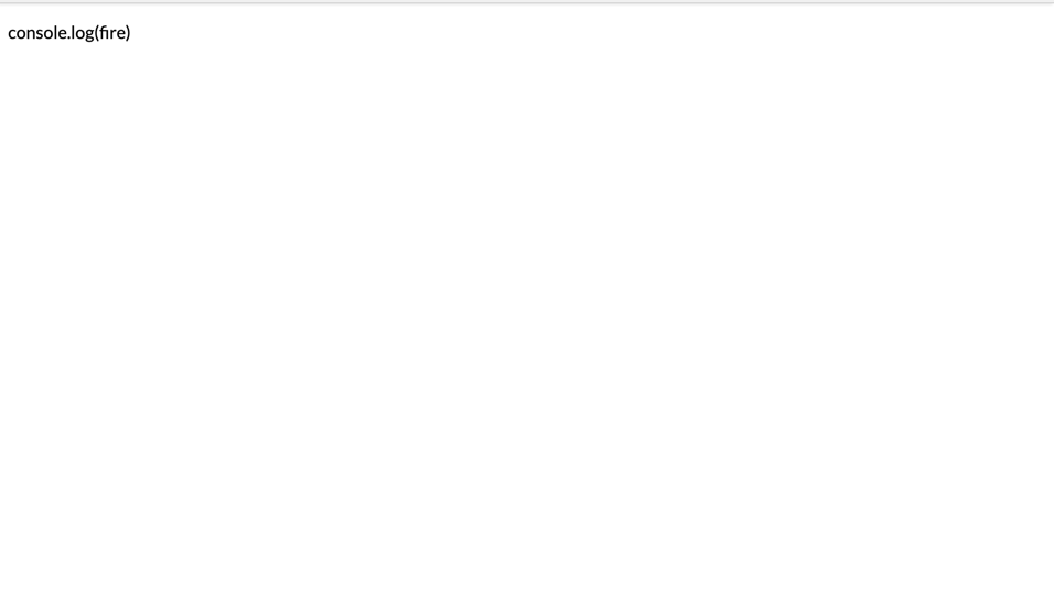
When rendered, Angular parses the b tag, and the text rendered within it is bold rather than rendering it as a normal string. When using the innerHTML attribute, all HTML tags are allowed with exception of the script tag. If the script tag was set to the nameDetails value, it would render the element’s text content as a string rather than parsing it as an element. If the example below is attempted, the expression within the <script> tag will not be processed but rendered as a string:

<p [innerHTML]="<script>console.log('fire')</script>"></p>


s_01C3B8965BDE0D4A75B8A1CAF8046DD76053F33DB94B3939D79388FF82CBC8B2_1549470530138_Screenshot+2019-02-06+at+4.37.39+PM

When working with the style attribute, the binding method switches up a bit, you bind directly to the style property involved. If you wanted to update the color of an element, the following syntax would be used:

    //component.html

    <h1[style.color]="color">It's valentines </h1>

In the component end, we’ll define a variable with the color we wish to use:

    @Component({
      selector:'app-component',
      templateUrl: 'component.html`
    })exportclassComponent{
      color ='indianred';}

And the element is rendered on the page like the screenshot below:

s_01C3B8965BDE0D4A75B8A1CAF8046DD76053F33DB94B3939D79388FF82CBC8B2_1549472597115_Screenshot+2019-02-06+at+6.03.07+PM

When the need arises to bind data to multiple style properties, we have to bind them multiple times to each targeted property. The above element’s font size and opacity can be updated using the method shown in the example below:

<h1[style.color]="color"[style.font-size]="fontSize"[style.opacity]="opacity">It's valentines </h1>

… and then declare the variables in the component:

// component.ts
    
    @Component({
      selector:'app-component',
      templateUrl: 'component.html`
    })exportclassComponent{
      color ='indianred';
      fontSize ='15px';
      opacity =0.7;}

When setting the style properties, we used a syntax similar to that of CSS, where properties are using the dash notation. The camel case notation can be used in the same situation in a similar way. Values like font-size will presented as fontSize:

<h1[style.font-size]="fontSize">It's valentines </h1>

Another method of dealing with the style attribute in Angular is Angular’s own directive ngStyle. This can be used to set multiple style properties using an object containing key value pairs, with the keys representing the style property and value representing the value to be set. We can rewrite the example above using the ngStyle directive:

<h1[ngStyle]="styles">It's valentines </h1>

And then we’ll create an object containing key value pairs.

    @Component({
      selector:'app-component',
      templateUrl: 'component.html`
    })exportclassComponent{
      styles ={
        color:'indianred',
        fontSize:'15px',
        opacity:0.7,}}

To bind the CSS classes on an element, we can define a variable with the the list of classes within a string field in the component, which is then assigned to the class property. The following snippet sets a class to the heading element:

<h1[class]="valentines">It's valentines </h1>

We can create this field property in the component :

    @Component({
      selector:'app-component',
      templateUrl: 'component.html`
    })exportclassComponent{
      valentines ='valentine-class text-bold';
      styles ={
        color:'indianred',
        fontSize:'15px',
        opacity:0.7,}}

The ngClass Angular directive also exists and can be used interchangeably with the class attribute binding. In the example above, if we replace [class] with [ngClass], it’ll bear the same results.

When using property binding, it is important to remember the following guidelines:

  1. Avoid side effects: Avoid expressions that tend to cause unknown side effects. Stick to using data properties and methods/functions that have return value. The increment and decrement operators can’t be used here and variables can’t be assigned.
  2. Bind the proper type: When using property binding, if the attribute being bound expects a string, ensure the type of the value being passed to it is a string to avoid unknown issues.
  3. Use brackets: When binding properties, the square bracket is always expected, and omitting it will lead to Angular treating it like a regular element property and the expression won’t be evaluated.

Conclusion

Understanding Angular’s data binding types is important when building Angular applications. With this knowledge, you can properly utilize the data binding method most suitable for the task at hand. The two data binding methods looked at in this article are both one-way data binding methods and are used to send data from the component layer to the view template. It doesn’t work the other way around. I hope this article broadens your knowledge of data binding in Angular, as data binding is very important and can’t be avoided when working with frontend frameworks.

For More Info on Building Great Web Apps

Want to learn more about creating great web apps? It all starts out with Kendo UI - the complete UI component library that allows you to quickly build high-quality, responsive apps. It includes everything you need, from grids and charts to dropdowns and gauges.

Learn More about Kendo UIGet a Free Trial of Kendo UI

Fasten Your Seatbelts! RadTabbedWindow Lands on XAML Islands

$
0
0

Telerik UI for WPF in R2 2019 is here and I am happy to announce that it can help you take the navigation in your WPF application to the next level. Say hi to the latest addition to our collection of WPF navigation controls – the brand new RadTabbedWindow.

Introducing RadTabbedWindow

It may sound like a hybrid WPF control, born from the equation RadTabControl + RadWindow = RadTabbedWindow. Don’t worry, RadTabbedWindow is not like hybrid cars – this control is the best of both worlds and there are no two ways about it.

Any application deserves an efficient navigation system. Luckily, tabbed navigation is one good such system. Tabbed navigation can absolutely be described as a “good conversation” with your clients. If implemented properly, it clearly and precisely tells the users exactly:

  • where they are
  • what's available to them
  • how can they access what's available

Therefore, a good navigation system needs to meaningfully separate content into different sections, clearly show what content is available and interactively present that content.

Want to bring the productivity of tabbed window management to your WPF application? Let me guide you through its key features.

Key Features & Events

The control has a rich API that greatly facilitates the customization of its functionality and appearance. Some of the tabbed window's key features include:

  • DragDrop support:
    • Reorder tabs in a single window
    • Drag out tabs to create new window
    • Drag drop tabs from one window to another
  • Pin/unpin/close functionality (through the UI or programmatically)
  • Adding tabs runtime (through the UI or programmatically)
  • Data Binding
  • Out-of-the-box touch support

Oh, let’s not forget to mention that the RadTabbedWindow control also exposes a number of events that greatly contribute to the easy customization of the control’s behavior:

  • TabbedWindowCreating (new one created via drag and drop)
  • AddingNewTab
  • PreviewTabPinned & TabPinned
  • PreviewTabUnpinned & TabUnpinned
  • PreviewTabClosed & TabClosed
  • PreviewSelectionChanged & SelectionChanged

More detailed information can be found in the great documentation article for the control.

P.S. The tabbed window comes with the built-in variety of our Telerik UI for WPF Themes Suite (this means even easier look and feel enhancements). Also, do not hesitate to benefit from the flawless color customization and rapid palette creation using the Color Theme Generator. Now let’s move on to the interesting part! The next sections will guide you through embedding UWP’s WebView control inside RadTabbedWindow.

Hosting WebView in RadTabbedWindow

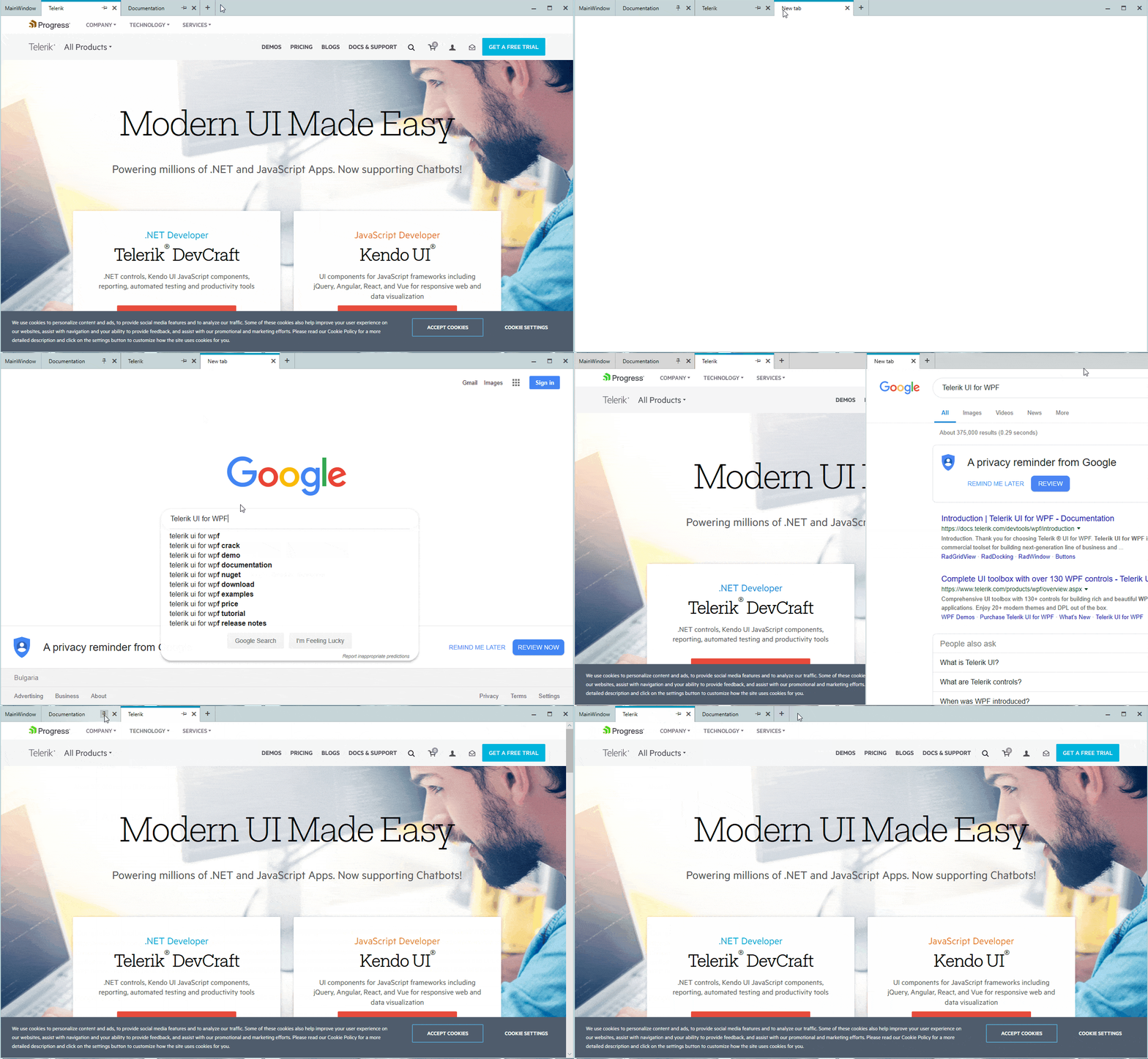
Do you remember XAML Islands? They are like little containers inside WPF apps - ones that can hold little pieces of XAML to render UWP controls. This way, we can now bring an even richer app experience with the modern UWP WebView control within our tabbed window.

With the newer Windows 10 versions, you can host UWP controls in non-UWP desktop applications using this feature. More information on this can be found here.

Have you already tried them? Shame on me, I haven’t.

What better time than now to test the waters of XAML Islands? :)

Requirements for Hosting WebView

There are some requirements that you need to be sure are met before we proceed:

Once we have check marks next to all the above bullets, we are ready to drag the WebView control from Visual Studio’s Toolbox!

Step-by-Step Guide

In this guide, I am using the tabbed window with NoXaml version and the Fluent theme.

  1. Create an empty WPF application, add references to the following assemblies and merge the corresponding ResourceDictionaries in App.xaml:
    • Telerik.Windows.Controls
    • Telerik.Windows.Controls.Navigation
    • Telerik.Windows.Controls.Data

    Add an empty Style targeting the main window which is based on RadTabbedWindowStyle. Your App.xaml should look like:

    <Application.Resources>
        <ResourceDictionary>
            <ResourceDictionary.MergedDictionaries>
                <ResourceDictionarySource="/Telerik.Windows.Themes.Fluent;component/Themes/System.Windows.xaml"/>
                <ResourceDictionarySource="/Telerik.Windows.Themes.Fluent;component/Themes/Telerik.Windows.Controls.xaml"/>
                <ResourceDictionarySource="/Telerik.Windows.Themes.Fluent;component/Themes/Telerik.Windows.Controls.Navigation.xaml"/>
            </ResourceDictionary.MergedDictionaries>
            <StyleTargetType="local:MainWindow"BasedOn="{StaticResource RadTabbedWindowStyle}"/>
        </ResourceDictionary>
    </Application.Resources>
  2. Add xmlns:telerik="http://schemas.telerik.com/2008/xaml/presentation," replace Window with telerik:RadTabbedWindow and remove the empty Grid. Your MainWindow.xaml should look like the following:
    <telerik:RadTabbedWindowx:Class="WpfApplication1.MainWindow"
            xmlns:local="clr-namespace:WpfApplication1"
            mc:Ignorable="d"
            Header="MainWindow"Height="800"Width="1300">
    </telerik:RadTabbedWindow>

    To be able to show WebView as RadTabbedWindow’s Content you need to add the following namespace and set AllowTransparency property to false. This property is true by default because of the underlying shadow, present in all themes. 

    xmlns:navigation="clr-namespace:Telerik.Windows.Controls.Navigation;assembly=Telerik.Windows.Controls.Navigation"
    navigation:RadWindowInteropHelper.AllowTransparency="False"

    In MainWindow.xaml.cs, you should inherit from RadTabbedWindow instead of Window:

    publicpartialclassMainWindow : RadTabbedWindow
    {
        publicMainWindow()
        {
            InitializeComponent();
        }
    }
  3. If you want the tabbed window to be the main window, you need to remove the StartupUri from the App.xaml file and modify App.xaml.cs to contain the following: 
    protectedoverridevoidOnStartup(StartupEventArgs e)
    {
        newMainWindow().Show();
        base.OnStartup(e);
    }

    Otherwise - you can create it as a separate window by adding a new Window to your project and changing the TargetType of the empty style from step 1 accordingly.

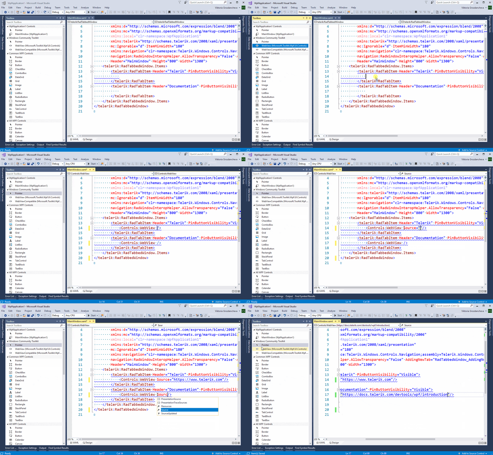
  4. Add new item to tabbed window, drag WebView from Visual Studio’s Toolbox as its content and make the desired configurations:

    Drag WebView as RadTabItem Content from Toolbox

  5. Run the application and enjoy!
The following GIF is a sample representation of the above guide with the only difference that it creates new WebView as the Content of the new tab form AddingNewTab event. Code snippet of AddingNewTab follows as well.

RadTabbedWindow in action
private void RadTabbedWindow_AddingNewTab(object sender, Telerik.Windows.Controls.TabbedWindow.AddingNewTabEventArgs e)
{
    var wv = new WebView();
    wv.Source = new Uri("https://google.com");
    RadTabItem newTab = e.Item as RadTabItem;
    if (newTab != null)
    {
        newTab.Header = "New tab";
        newTab.Content = wv;
    }

It didn’t hurt, and it actually looks pretty cool, doesn’t it? As the Telerik R2 2019 Release is already live, do not hesitate to give RadTabbedWindow a try right away and feel more than welcome to share your thoughts in the comments section below.

Try It Out

If by some chance this is the first time you've heard about Telerik UI for WPF, then you can explore the great variety of key features, controls and themes ready for the taking on our product page.

17 Angular Libraries You Should Know About

$
0
0

While it's fine to avoid using external libraries during development sometimes, they can help reduce development time significantly. Here, we list some useful Angular libraries that can help as you develop applications with Angular.

Angular is a web development framework for building robust single-page applications and systems. Developed and maintained by Google and community maintainers, Angular is a great library for building large scale web applications.

Angular has a huge and active community, thus, a lot of libraries have been introduced by the community to plug holes and extend the tooling provided by Angular. Today, we’ll look at some libraries that can be introduced into existing applications — libraries ranging from utility libraries to UI component libraries.

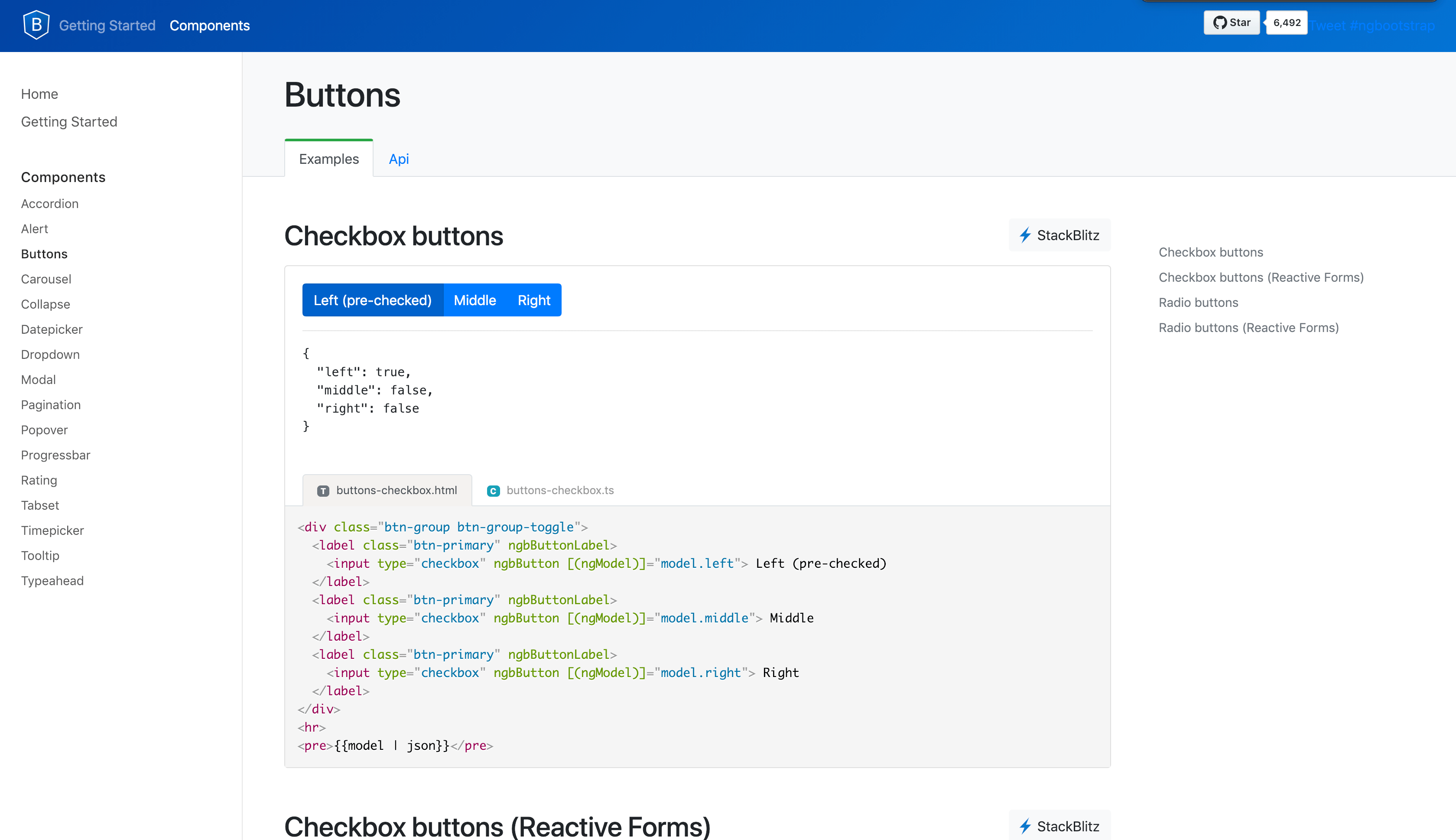
1. ng-bootstrap

It seems fair to start with the Angular implementation of the most popular UI library. The ng-bootstrap library was built from the top down using TypeScript. Unlike the previous version, it has dropped jQuery as a dependency, specifying Bootstrap’s CSS as its only other dependency. With most JavaScript components implemented, the library seems like a complete solution when using Bootstrap with Angular — as active development is ongoing, more components will be included. With almost 7k stars on GitHub, ng-bootstrap seems like a very popular choice for a lot of Angular developers.

The Angular.js version of this project is still available here, although it isn’t actively maintained.

ng-bootstrap

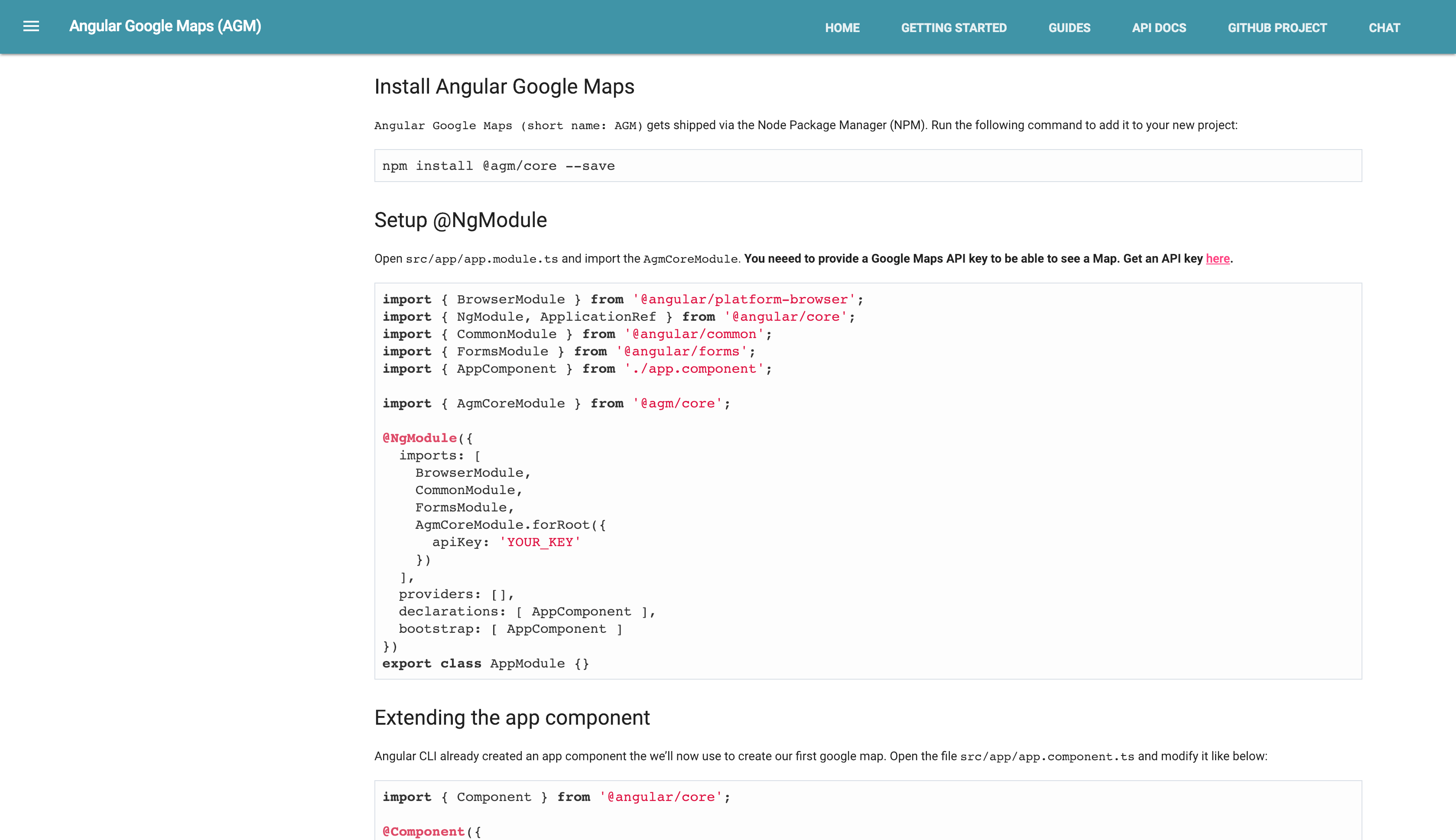
2. Angular Google Maps

Using the Google Maps library in Angular is always a serious hassle because the library is loaded using a script tag, so type definitions aren’t readily available. This causes some compile errors that need a lot of hacking to get rid of.

The Angular Google Maps library provides services and directives for implementing Google Maps services. There are directives available for creating maps, using markers, etc. The library also provides an async function that is useful for checking if the Google Maps library is loaded on the webpage.

The project has amassed almost 2k stars on GitHub. Visit their documentation to get started.

google-maps

3. ngx-translate

Building an application that supports multiple languages can be a serious struggle, especially for single-page applications. The ngx-translate is a great library for managing multiple languages in your Angular application. It provides services to load translations that can be used throughout the application. Translations can be defined and loaded using the TranslateService, and onChange listeners are also available for handling language changes within the application.

The setup is pretty straightforward, and the library is well documented with detailed examples. Visit their GitHub page to get started.

4. Angular2-jwt

Managing single-page applications that use web tokens for authentication usually requires using interceptors to append headers to network requests. While this is easy to implement, it is difficult to filter out requests that don’t require access tokens. This is where this impressive library comes in. Using the angular-jwt package by Auth0, you can load access tokens from the local storage or session storage. It provides an HttpInterceptor that appends authentication headers to the requests. The ability to blacklist or whitelist a domain is also available.

With almost 2k stars on GitHub, it is a well-documented library with adequate examples and only requires a few steps to get started.

5. AngularFire2

Looking to implement real-time functionality in your Angular application? Well look no further, this library uses the power of RxJS, Firebase and Angular to deliver data synchronization in real time. It also provides services and providers to query documents and collections on Cloud Firebase and the realtime database, handles authentication using Firebase, handles file upload to Cloud Storage, and sends Push Notifications. The package also supports server-side rendering and offline functionality. You can easily import each individual module to handle whichever functionality is required in your application. All documentation can be found in the library’s GitHub page.

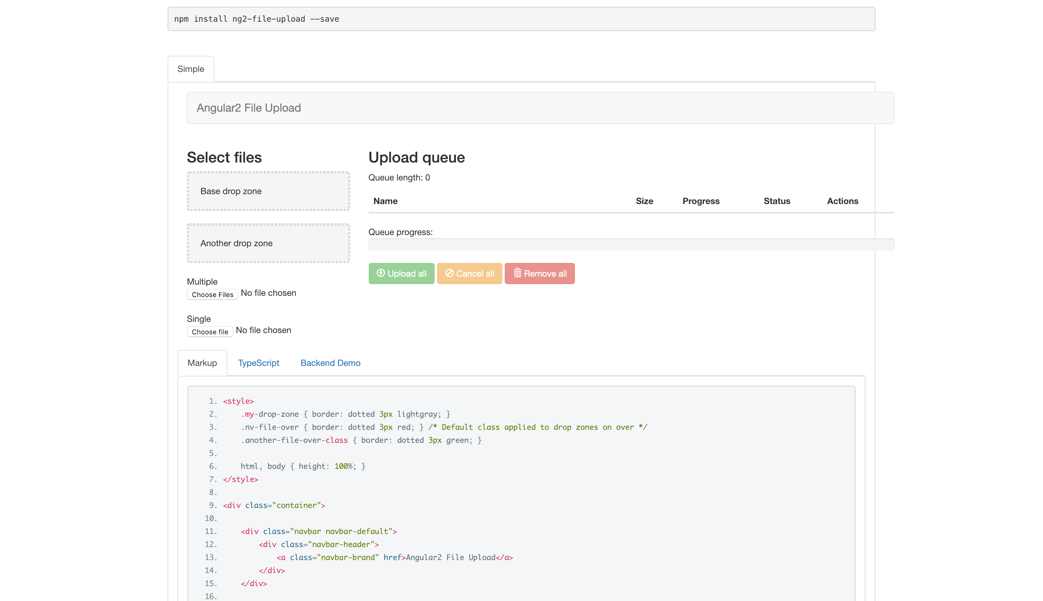
6. ng2-file-upload

Handling file uploads in any single-page application isn’t a task that’s fun to deal with. It would be great if an external library could handle file upload within your web application. Valon-software, the makers of ngx-bootstrap, has you covered with ng2-file-upload, a library that makes file upload a breeze.

The library supports drag-and-drop functionality alongside the good old file select implementation. It provides a utility class (FileUploader) that handles the different file upload methods. It also provides events to monitor the file upload progress, as well as errors and success during the upload.

The library is actively maintained and has almost 2k stars on Github.

ng2-file-upload

7. Angular Material 2

The list wouldn’t be complete without mentioning a library that implements Google’s Material Design specifications. Angular Material 2 is a components library created by the Angular team. It features a set of components implementing the Material Design specs, ranging from buttons to dialogs, bottom sheets, etc. It features fully customizable themes and a rich set of components that can be used to quickly build an application. Angular Material 2 comes with almost 40 components, with more components under development and four pre-built themes.

Get started with Angular Material 2 by visiting their documentation or GitHub page.

Angular-Material-2

8. ngrx/store

Managing state in small applications isn’t really complicated and state can be easily managed within individual components, but when there’s a need to share data between several components, the need for a proper state management system arises. NgRx offers reactive libraries optimized for Angular. It offers reactive statement for Angular in a package called ngrx/store. This package uses RxJS technologies to offer state management similar to Redux. The store allows developers write consistent and performant applications in a state-controlled environment. Very similar to Redux, the ngrx/store library uses Action, Reducers, Select and Store to manage the data flow within Angular applications. Get started with ngrx/store by following the steps listed in the library’s documentation.

9. Cloudinary Angular SDK

Cloudinary is SaaS web platform for managing media assets on mobile and web applications. It provides services for upload, storage, manipulation and delivery of media assets. Cloudinary offers an SDK for Angular that can be used in Angular applications for resizing and image conversion. The SDK can also be used for delivering different image sizes on different screens. It allows for easy delivery of video and image assets from Cloudinary’s storage.

Visit Cloudinary’s website to read more about about end-to-end management of media assets. The SDK can be found here on GitHub.

10. ng2-pdf-viewer

The ng2-pdf-viewer is a library for viewing and interacting with PDFs on a web application. The library providers a component for rendering PDF documents. The component can also be used for performing operations on the selected PDF like: resizing, rotating, searching through the document, etc. You can render files locally or provide a link to an external document. This library is great for managing PDF files on your web application, and there’s a lot it can handle using directives.

Visit their official documentation page or their page on GitHub.

11. ngx-charts

When working with data in a web application, the need for data visualization arises, thus the need for a data visualization library that can handle various forms of customizations while rendering. ngx-charts is quite interesting because their charts rely mostly on using Angular to animate SVGs, which offers more speed and flexibility as the library has been optimized for use in Angular.

It also uses d3 for math functions, scales and axis, etc. It comes with ten or more color schemes while making the charts fully customizable using CSS. Visit their demo page to view the different themes and color schemes available and their GitHub page to get started with the library. The library has garnered almost 3k stars on GitHub and is actively maintained.

ngrx-charts

12. ng-seed/universal

This great library has so many features packaged within it, it should be the Swiss army knife for every Angular developer. It consists of the following packages:

  • ngx-meta: for handling meta tags, title tags and SEO enhancement.
  • ngx-cache: for managing application wide data.
  • ngx-auth: for managing jwt-based authentication.

It comes with a couple of other packages for handling server-side rendering, lazy loading, state management and webpack configurations.

Clone the repository on GitHub and follow the instructions to get started.

13. Augury

When building web applications, browser DevTools play an important part in the development process. It provides features for debugging, diagnosing and editing web applications. When dealing with Angular applications, DevTools only lets you interact with the end product of your code, which means your Angular components, directives, etc. have been converted to JavaScript, HTML and CSS.

Augury as a browser extension allows you debug and visualize your Angular application in its pre-compiled state. With Augury, you can inspect your components and ensure they’re functioning as they should. Augury works better with source maps, so ensure that you generate source maps for a better experience while using Augury.

You can download the extension for Chrome or Firefox. Visit their GitHub page if you wish to contribute or raise issues.

14. ngx-moment

Moment.js is a utility library for manipulating time (not what you think). It provides a set of functions for parsing, formatting, validating, etc. dates and time using JavaScript. ngx-moment builds on the Moment.js library, providing Angular pipes for use within components. It comes packed with pipes for the functions provided by Moment.js, thus effectively eliminating the overhead of importing the functions into every component for use.

The library is actively maintained and is relatively easy to get started with. Visit the GitHub page and run through the documentation to get started.

15. ngx pipes

Fun times when Angular.js came packed with a set of pipes for transforming data before rendering. Filters is what they were called in Angular.js. Well, for some performance reasons, more recent Angular versions don't include pipes for filtering or ordering lists. Angular pipes is a library that contains a set of useful pipes for use in your Angular project. It contains pipes for performing actions like: trimming, reversing, matching and scanning strings, plucking, shuffling and ordering Arrays.

It is well documented and easy to integrate. Getting started should be a breeze and, soon enough, you’ll start getting more done with pipes. Visit the documentation or their GitHub page to get started.

16. Angular Epic Spinners

When dealing with interactivity on a webpage, you have to think about notifying users when processes not visible to them are ongoing. When the time comes, you are required to display a loading indicator. Some sites have custom loading indicators for their application, but if you’d rather have a set of easily available spinners, then this spinners library should be your go-to.

Angular Epic Spinners is built on the epic-spinners library, with Angular components for each component available in the library. Each component can be imported as an individual module and rendered anywhere within your application. You can select from any of 20 indicators available in the library. You can view the demo page or head straight to their GitHub page.

angular-epic-spinners

17. Apollo Angular

GraphQL is a query language for APIs and a runtime for fulfilling queries made with data. It allows developers to request for data they need in specific areas of their application. Apollo client is a library used to consume data from GraphQL endpoints. Apollo has different client libraries for consuming data on the frontend – libraries exist for React, Angular, Vue, etc.

Apollo Angular is a client library built for Angular applications to consume GraphQL endpoints. Apollo Angular is agnostic of any router used within the application. It also supports server-side rendering. The documentation page is well written with adequate examples to help you get started.

Summary

People sometimes avoid using external libraries in their applications during development. While that’s acceptable in some instances, external libraries can help reduce development time significantly. There are a lot of libraries that might have achieved whatever you’re struggling with during development. The task is finding the right library that fits into your applications and ensuring it fulfills its purpose. Happy coding.

For More Info on Building Great Web Apps

Want to learn more about creating great web apps? It all starts out with Kendo UI - the complete UI component library that allows you to quickly build high-quality, responsive apps. It includes everything you need, from grids and charts to dropdowns and gauges.

Learn More about Kendo UI

Get a Free Trial of Kendo UI

How to Use the KendoReact Editor

$
0
0

The editor is a powerful and versatile component of KendoReact, making it easy to add and format text and other HTML content. Learn how to use and customize it in your React apps.

The Editor component in KendoReact is a full-featured, highly customizable WYSIWYG rich text editor that can be integrated wherever you need to provide HTML editing (CMS, forums, ticketing systems, mail clients, chat clients, etc). It enables users to input free-form text, apply a large spectrum of formatting options, and insert HTML content such as images, tables, and hyperlinks.

The Editor offers a large set of built-in tools. You can also add custom tools, change the rendering of all the editor's elements (custom rendering) and extend the built-in functionality by adding plugins. The Editor, like all other components in the KendoReact UI library, is built in TypeScript.

In this blog post, I will show you how to use the Editor, and we will go through:

Getting Started with the KendoReact Editor

First, you need to import the Editor component and EditorTools module from the package, @progress/kendo-react-editor. Then, get the needed tools from EditorTools and pass them into the tools prop of the Editor. Setting initial content happens through the defaultContent prop. Getting content from the Editor or setting new content happens using the helper getHtml() and setHtml() functions exported by the EditorUtils module.

Up to this point, you don't need to know how the Editor manages its content or how the tools work. If your project requires customization or needs the Editor's functionality to be extended though, keep reading as we dive into the different ways you can customize or extend the functionality of the Editor.

How to Customize the React Text Editor's Built-In Tools

There are two ways for customizing this editor's built-in tools:

  1. Using the Editor's utility functions for generating tools
  2. Wrapping the tool into a higher-order component (HOC) function, through which to add the new props you need

Using the Editor's Utility Functions for Generating Tools

All the Editor's tools are React components and are generated by a corresponding HOC function. Each tool also has a settings object which is being passed to its generation function as a parameter. The Editor package exports both the functions and the settings needed for tool generation. For example, the Bold tool has been created in the following way:

import { EditorToolsSettings, EditorTools } from '@progress/kendo-react-editor';
const BoldTool = EditorTools.createInlineFormatTool(EditorToolsSettings.bold);

Passing a modified version of EditorToolsSettings.bold to EditorTools.createInlineFormatTool() will create a custom tool. Here's how the default settings of the Bold tool look:

const boldSettings = {
  mark: 'strong', // toggle the 'STRONG' tag
  altMarks: ['b'], // recognize the 'B' tag also as Bold

  // recognize an inline node with font-weight style and a
  // value matching the regular expression
  altStyle: { name: 'font-weight', value: /^(bold(er)?|[5-9]\d{2,})$/ },

  // props which will be passed to the Button component of the tool
  props: {
    icon: 'bold',
    type: 'button'
  }
};

// The messages keys used by the tool for localization. See
// also https://www.telerik.com/kendo-react-ui/components/editor/globalization/#toc-messages
{
  messages: {
    title: 'editor.bold'
  },

  // the name of the command that the tool executes
  commandName: 'Bold'
};

This approach allows you to easily modify the appearance and behavior of the tools without having to learn in-depth how the whole component is built. Follow this link for a full list of settings and functions for Editor tool generation.

Wrapping the Tool into a HOC

The HOC will extend the props of the desired tool and return the custom tool. Then add the HOC function into your tools collection. Simple as that:

const CustomBold = (props) => {
  return  (
    <Bold
      {...props}
      title="Custom Bold"
    />
  );
};

<Editor
  tools={[
    [CustomBold,  /* ... */ ]
  ]}
  <!-- ... -->
/>

Currently, the props of all tools extend the KendoReact Button and DropDownList props. In our case, the props that are available for our custom tool are listed in the ButtonProps interface. In other words, when it comes to customizing the tools, you can also configure everything that the KendoReact Button or DropDownList allows.

How to Implement Custom Tools into the KendoReact Editor

The above approach for customizing built-in tools can also be used for generating new tools. For example, if we take the Bold tool settings and change the mark to 'code', props.icon to 'code-snippet', and remove altMarks and altStyle fields, we can generate an entirely different tool that will toggle the <code> element.

const codeSnippetSettings = {
  mark: 'code', // toggle the 'code' tag
  props: {
    icon: 'code-snippet',
    type: 'button'
  },
  messages: {},
  commandName: 'Code'
};

const CodeTool = EditorTools.createInlineFormatTool(codeSnippetSettings);

The Editor's package also exports all the functionality that is used from the built-in tools, which includes functions for formatting, inserting content and others. This allows you to create your own tools for which the foundations have been already laid out (i.e. how to insert HTML content or apply formatting).

Here is an example of our custom code tool and a few more tools for formatting and inserting content:

Why Sanitize Pasted Content?

Pasted HTML content could look quite ugly, especially if copied from MS Word. Lists are presented as styled paragraphs, and content could contain invalid HTML styles, comments and XML strings.

In our experience, people are not always happy with the built-in paste functionality. They often have project-specific requirements, which need to be handled externally. For this reason, we have decided to move the format-stripping functionality outside of the Editor, so everyone can play with the code and edit it as needed.

Theming

As with all KendoReact UI components for React, the Editor can also be styled in all three out-of-the-box themes: Bootstrap theme, Material, and our own Default theme. If you are working within your own design system/theme, you can easily customize the Editor's styling using CSS or create your own theme using the KendoReact ThemeBuilder.

Under the Hood

For the Editor, we have decided to use an external engine instead of implementing our own from scratch. Since HTML editing has been here for a while, currently there are a lot of available engines to work with, and there is no value added in starting an Editor from scratch. After evaluating the available options, we decided that the ProseMirror toolkit is the right choice for our use case. It is very powerful and written in pure JavaScript.

The Editor in KendoReact is a versatile WYSIWYG rich text editor whose functionality can be customized or extended to meet any project requirements. Built specifically for React, it is as fast and lightweight as the framework itself and can save you a lot of development time.

Azure Cosmos DB and Grid in Web Forms

$
0
0

In this guide, learn how to use Azure Cosmos DB with Web Forms to create a powerful grid for your web apps.

Azure Cosmos DB and Grid in Web Forms - is this combination really possible?

Yes, absolutely. Azure Cosmos DB is the new kid in the block while Web Forms is the old veteran, but still the favorite web development technology of many people.

So, let’s start with building this grid.

This is a list of the content sections, so you can navigate easier:

  1. Create an Azure Cosmos DB Collection
  2. Partition Key
  3. Create a New Web Forms Project
  4. Add a Grid Control to the Page
  5. Read the Data from the Database
  6. Bind the Data to the Grid
  7. Inserting
  8. Deleting
  9. Updating
  10. Download and Run the Ready Project

Before we begin, here's a short summary defining Cosmos DB:

Today’s applications are required to be highly responsive and always online. To achieve low latency and high availability, instances of these applications need to be deployed in datacenters that are close to their users.

...

Azure Cosmos DB is a globally distributed database service that's designed to provide low latency, elastic scalability of throughput, well-defined semantics for data consistency, and high availability. In short, if your application needs guaranteed fast response time anywhere in the world, if it's required to be always online, and needs unlimited and elastic scalability of throughput and storage, consider building applications by using Azure Cosmos DB.

MSDN: Global data distribution with Azure Cosmos DB - overview

1. Create an Azure Cosmos DB Collection

In this sample I will use a nice option to configure an Azure Cosmos DB – its dedicated Emulator. You can use your existing collection from your Azure account or download the Emulator, which does not require an account.

Next step is to create the Container (Collection) and add some items. One of the fields you need to fill is called Partition Key and this setting is explained in more detail in the next section.

Once this is complete, your database emulator will now look like this:

Azure Cosmos DB Emulator

In the Explorer tab you can now see any records you might have:

Azure Cosmos DB Emulator - Explorer Tab

2. Partition Key

  1. What is this?

    Are you familiar with the concept of Grouping data? Partitioning is similar where it uses the same values of a field to distribute the data into divisions.

    It is useful for load balancing, performance, scalability, manageability, availability and similar abilities.

  2. Partitioning
  3. Some juicy details

    Let’s divide this in 2 sections (Reference):

  • Logical partitions:

    By using partitioning, the items in a container are divided into distinct subsets, called logical partitions.

    Example 1: If UserID serves as the partition key for the items in a container, and there are 1000 unique UserID values, 1000 logical partitions will be created for the container.

    Example 2: If all the items contain a City property, then you can use City as the partition key for the container and specific values for the City such as, "London", "Paris", "NYC" etc. will form a distinct logical partition.

  • Physical partitions:

    You don’t need to worry about these since Cosmos DB automatically manages the placement of logical partitions onto physical partitions (server infrastructure) depending on the load. Also, you can't control their size, placement, the count, or the mapping. What you can do, however, is to control the number of logical partitions and the distribution of data and throughput by choosing the right partition key using the suggestions from the next step.

  • How to choose it?

    Choosing a partition key is an important decision that will affect your application’s performance. You can consider the following best practices and details when choosing a partition key:

    • Have a wide range partition key with many distinct values such as hundreds or thousands.
    • Avoid “hot” partition key value (check the image below). If the requests for a specific value exceed the allocated throughput, the requests will be rate-limited.
    • By default, a single logical partition is allowed an upper limit of 10 GB of storage.
    • Candidates for partition keys may include the properties that appear frequently as a filter in your queries.
    • Think about not only having general even storage distribution, but also even distribution when your data is getting hit. Choose a partition key that spreads workload evenly across all partitions and evenly over time.
    • If such a property doesn’t exist in your data, a synthetic partition key can be constructed.

      Click the image below to expand and see a possible case with hot partition:

      Possible Hot Partition

      Pro Tip: You can choose this key only initially - changing some properties of a collection like the ID or the partition key are not supported. Reference

  • Videos

    I highly suggest that you check these videos before choosing the key:

  • 3. Create a New Web Forms Project

    I choose to use a Template Web Application provided by the Progress Telerik UI for ASP.NET AJAX Toolset. It is very similar to a standard ASP.NET Web Application Project so you are perfectly fine if you decide to use that instead. The next step would be to open the NuGet Manager and add the Microsoft Azure Cosmos DB Client Library.

    Pro Tip: Make sure that you are using a corresponding version of the Azure Cosmos DB Library and the Emulator. A long-time discrepancy between these can lead to issues. To avoid this, you can use their latest version.

    New Web Forms Project

    4. Add a Grid Control to the Page

    Now we will display our data in a grid control and make it visually appealing to the user’s eye. This can be achieved by using a standard asp:GridView or any other server-side grid control you prefer. I will be using the RadGrid– the most capable player in the Telerik AJAX league:

    <telerik:RadGrid ID="RadGrid1" runat="server" AllowPaging="True" Width="800px"

        OnNeedDataSource="RadGrid1_NeedDataSource" OnColumnCreated="RadGrid1_ColumnCreated"

        AutoGenerateEditColumn="true" OnUpdateCommand="RadGrid1_UpdateCommand"

        AutoGenerateDeleteColumn="true" OnDeleteCommand="RadGrid1_DeleteCommand"

        OnInsertCommand="RadGrid1_InsertCommand">

        <MasterTableView DataKeyNames="Id,Completed" CommandItemDisplay="Top">

        </MasterTableView>

    </telerik:RadGrid>

    And this is the entire definition. The columns are generated automatically based on the DataType of the field. Complex functionalities like paging, filtering, grouping, sorting, aggregates and many more are also provided with a single property and without any additional coding on the developer’s part.

    Yes, it is charming.

    On the outside, it will look like the image below. If Bootstrap is not your thing, you can also choose from around 20 other built-in skins or create your custom one:

    Grid

    You can find the required assemblies to run this grid in the Download section.

    5. Access the Database

    To set up a valid connection to your database, you will need to use some key identifiers. I prefer to have them directly in the web.config:

    <appSettings>

         ...

        <add key="endpoint" value="https://localhost:8081/" />

        <add key="authKey" value="C2y6yDjf5/R+ob0N8A7Cgv30VRDJIWEHLM+4QDU5DE2nQ9nDuVTqobD4b8mGGyPMbIZnqyMsEcaGQy67XIw/Jw==" />

        <add key="database" value="ToDoList" />

        <add key="collection" value="Items" />

    </appSettings>

    Now, we can get a reference to the database in the code-behind:

    private static readonly string DatabaseId = ConfigurationManager.AppSettings["database"];

    private static readonly string CollectionId = ConfigurationManager.AppSettings["collection"];


    private static DocumentClient client

    {

        get

        {

            return new DocumentClient(

                new Uri(ConfigurationManager.AppSettings["endpoint"]),

                ConfigurationManager.AppSettings["authKey"]);

        }

    }

    For implementing additional methods like CreateDatabaseIfNotExistsAsync and CreateCollectionIfNotExistsAsync, you can check the DocumentDBRepository.cs file and its GitHub code.

    6. Bind the Data to the Grid

    Once you have a valid connection and access to the database, you can now extract the records from the Collection and bind the grid. Usually, grids can be bound using their DataSource property and the DataBind() method. Since we are using RadGrid in this case, we can make avail of the ultimate NeedDataSource event handler of the grid:

        protected void RadGrid1_NeedDataSource(object sender, GridNeedDataSourceEventArgs e)

        {

            IQueryable<Item> source = client.CreateDocumentQuery<Item>(

                UriFactory.CreateDocumentCollectionUri(DatabaseId, CollectionId));


            RadGrid1.DataSource = source;

        }

    The amazing thing about it is that you don’t have to worry about actions like paging, filtering, sorting, grouping, their corresponding events, and when to rebind the grid. The NeedDataSource event does everything automatically under the hood and all that is left for you is to lean back and enjoy the functionality.

    7. Inserting

    Inserting is the most straightforward operation to modify the database. The process simply includes extracting the new values and adding a new record (Document) to the data source:

       protected void RadGrid1_InsertCommand(object sender, GridCommandEventArgs e)

        {

            GridEditableItem item = e.Item as GridEditableItem;

            Hashtable newValues = new Hashtable();

            item.ExtractValues(newValues);


            Item newItem = new Item()

            {

                Name = (string)newValues["Name"],

                Description = (string)newValues["Description"],

                Completed = (bool)newValues["Completed"]

            };


            client.CreateDocumentAsync(UriFactory.CreateDocumentCollectionUri(

                DatabaseId, CollectionId), newItem).Wait();

        }

    For create and update operations on documents, the partition key is optional. When absent, the client library will extract the partition key from the document before sending the request to the server. Reference

    8. Deleting

    Usually deleting a record (Document) requires only its unique data key value to remove it from the database. In this case the partition key part is also required so the Azure Cosmos DB knows in which bucket the item is located:

        protected void RadGrid1_DeleteCommand(object sender, GridCommandEventArgs e)

        {

            GridDataItem item = (GridDataItem)e.Item;

            string dataKeyID = item.GetDataKeyValue("Id").ToString();

            bool partitionKeyID = (bool)item.GetDataKeyValue("Completed");


            RequestOptions requestOptions = new RequestOptions()

            {

                PartitionKey = new PartitionKey(partitionKeyID)

            };


            client.DeleteDocumentAsync(UriFactory.CreateDocumentUri(

                DatabaseId, CollectionId, dataKeyID), requestOptions).Wait();

        }

    9. Updating

    Now for updating, I will separate the section into 2 parts:

    1. When there is no need to change the partition key of the record. In this case you can use the replace method and find and modify the record directly.
    2. When you want to change the partition key, too. Changing the partition key of an item (Document) is not supported and you need to first delete it and then re-create it in another partition/bucket.

        protected void RadGrid1_UpdateCommand(object sender, GridCommandEventArgs e)

        {

            GridEditableItem item = (GridEditableItem)e.Item;

            string dataKeyID = item.GetDataKeyValue("Id").ToString();

            bool partitionKeyID = (bool)item.GetDataKeyValue("Completed");

            bool newPartitionKeyID = ((CheckBox)item["Completed"].Controls[0]).Checked;


            Hashtable newValues = new Hashtable();

            item.ExtractValues(newValues);


            Item updatedItem = new Item()

            {

                Name = (string)newValues["Name"],

                Description = (string)newValues["Description"],

                Completed = (bool)newValues["Completed"]

            };


            if (partitionKeyID != newPartitionKeyID)

            {

                RequestOptions requestOptions = new RequestOptions()

                {

                    PartitionKey = new PartitionKey(partitionKeyID)

                };

                client.DeleteDocumentAsync(UriFactory.CreateDocumentUri(DatabaseId, CollectionId, dataKeyID), requestOptions).Wait();

                client.CreateDocumentAsync(UriFactory.CreateDocumentCollectionUri(DatabaseId, CollectionId), updatedItem).Wait();

            }

            else

            {

                updatedItem.Id = dataKeyID;

                client.ReplaceDocumentAsync(UriFactory.CreateDocumentUri(

               DatabaseId, CollectionId, dataKeyID), updatedItem).Wait();

            }

        }

    10. Download and Run the Ready Project

    Now comes the sweet part – you have the sample ready to download and run. All you need to change is the configuration of your own Azure keys as demonstrated in the Access the Database step. If you want to play some more with the Telerik tools, you can use the assemblies in the Bin folder of the project or get the installer from the Telerik Download page.

    Web Accessibility for Developers Part III: Coding Best Practices

    $
    0
    0

    Web accessibility is an increasingly important component of web development. In the third part of this series, we talk about screen readers and best practices for making your websites accessible on them.

    In the process of implementing accessibility compliance (Section 508, WCAG 2.0 and WAI-ARIA) for KendoReact, our suite of native UI components for React, we learned a lot on the topic. With this blog series, our goal is to introduce fellow engineers to web accessibility and share our practical knowledge and best practices.

    This blog, part III of a series on accessibility, focuses on the technology that helps us improve the accessibility of our websites, specifically how to work with and optimize our content for screen readers. We decided to dedicate a whole article on this topic, because screen readers are the primary tech that makes the web accessible to blind people. In addition, working with screen readers isn’t straightforward and presents a lot of technical challenges.

    Assistive Technology

    Assistive technology is the industry term that includes all software and hardware designed to help people with disabilities. Input devices include mouth sticks, head wands, big trackballs, specialized keyboards, voice recognition software. Output devices include screen magnifiers, screen readers, braille displays, hearing aids, software with natural language interfaces and more. Some of these enhance an existing technology, others provide an alternative way to interact with a computer.

    Screen Readers

    Most assistive technologies work on the level of the operating system and web developers do not need to do anything additional to enable them to function properly. However, with screen readers things tend to be a little more complicated. What screen readers do, in essence, is parse the HTML, then describe and explain it using natural language. The quality of that voice description depends directly on the quality of the code. So, naturally, screen readers are a primary concern for web developers working on making their websites more accessible. In the following paragraphs we will look at some of the best practices when optimizing our web assets for screen readers.

    Write Semantic HTML

    The best practice to help screen readers do their job properly is to write semantic HTML – that is, to write valid HTML, follow best practices and use elements according to their intended purpose. For example, if something looks and behaves like a button, make it a button, not a <div>. If it is a heading, use the <h> tags and not some inline CSS.

    The formal definition of the semantics of HTML elements can be found in the living standard of HTML

    In real life this is not so simple, of course. This brings us to the next sections.

    Follow the Spec

    As with any fundamental technology, the Internet has multiple standardizing bodies. The World Wide Web Consortium (W3C) is one of them and the Web Accessibility Initiative (WAI) is part of it. We as developers need to follow the Web Content Accessibility Guidelines (WCAG), developed by WAI, which is the general standard for web accessibility.

    The design practices I went over in Part II when discussing the different types of disabilities are described in greater detail in WCAG. It’s important to note that WCAG is a living standard that is actively being improved. The most recent version as of the time of writing is 2.1.

    WAI developed Web Accessibility Initiative - Accessible Rich Internet Applications Suite (WAI-ARIA) - the technical standard for how to write our code. We as developers need to follow this spec for screen readers to work properly.

    For brevity, in the next paragraphs I will refer to WCAG and WAI-ARIA as “the spec.”

    Automated Testing

    There are a variety of scanners that can automatically do checks covering many of the compliance rules that we are required to follow. For example, most automation software can easily scan for missing attributes and elements, check color contrasts or validate the HTML. A good practice is to do at least a quarterly scan of your site. And if you are really dedicated, you can include this step in your CI and CD process. Here is a list of good-quality scanners in no particular order:

    Manual Testing

    Unfortunately, automation can take just a small part of the big picture. If you want to achieve meaningful results, you have to manually test your site. The most practical way to perform such a test is to close your eyes and use only a keyboard and a screen reader to perform a variety of tasks on the website you’re reviewing.

    This is the point when I discovered how difficult accessibility testing really is.

    Navigation

    With your eyes closed, you cannot use a mouse. Keyboard navigation in the dark is much harder than with visual input. A lot of your solutions may not work as well as you had hoped once you stop seeing the screen. You will probably discover scenarios that you’ve failed to take into account. In short, offering good, working keyboard navigation is very hard.

    Auditory Complexity

    The market provides multiple screen readers and they are usually very hard to understand. You may struggle to make sense of what you hear. The reason is that screen readers do not just read the screen using text-to-speech. Their task is harder: they need to describe the UI in enough detail so you understand its structure. Screen readers can be understood well only when you provide them with simple constructs in simple scenarios. So you need to work very hard to simplify the information architecture of your site.

    Inconsistencies

    Each screen reader has its own subtle interpretation of the spec and behaves slightly differently on each browser. You will encounter a lot of grey areas where following the spec is just not enough to make all screen readers provide meaningful output. In those cases, your implementation needs to make a compromise that works ok in most combinations of readers and browsers.

    In our practice we’ve discovered a few combinations that work well for testing purposes:

    Jaws

    Jaws is one of the oldest screen readers on the market. This means that it is one of the most popular ones. It has numerous users, so you need to support it. But its age also means that Jaws needs to support a lot of legacy use cases. As a result, it is often not very compliant with the spec and difficult to work with. In our practice, we found that Jaws works best with IE.

    ChromeVox

    ChromeVox is the newest reader (as of the time of writing this article) and, consequently, most compliant with the spec. Its young age means it is still not very popular. It works best on Chrome.

    NVDA

    NVDA is another new reader with good compliance with the spec. It is very popular and works best on Firefox.

    Conclusion on Manual Testing

    When a reader works well on a particular browser, this gives you some confidence that its users will use it primarily on that browser, though there are no rules and the possible scenarios are many. However, given that we usually work with limited resources a good practice is to focus only on the popular combinations above and test often, instead of covering all possible combinations of readers and browsers, but doing it less often.

    To back up our statements with data, here is a link to a reputable screen reader user survey that sheds light on user adoption of screen readers.

    Third Party Testing is Last

    It is advisable that you test with people with disabilities or get accessibility feedback from clients. The best practice is to do this only after you have done your homework with in-house manual and automated testing. It is our responsibility to first make sure their user experience is not completely broken. Only then will you be able to get meaningful feedback from your users. 

    Conclusion

    Developing for accessibility is hard. Often it may feel like trial and error, with no clear, universally accepted solution. We in the KendoReact team understand the complexity of the situation, which is why we did this blog series. In a way, we are limited by the available technology – though as engineers we have always worked with limitations. Software has never been and will never be perfect. But making the most with the resources you have available is the mark of a master craftsman.

    The Whole Series

    • Part 1: Introduction - An introductory article on web accessibility that attempts to answer what accessibility is and why it matters.
    • Part 2: Types of Disabilities and Best Practices to Accommodate for Them. Here we further define the problem, break it down into sections on different disability types, suggesting individual solutions.
    • Part 4: More Best Practices and Resources. Here we go over more practices about organizing our workflow and further explore how to make this daunting task manageable. (coming up)

    Less Screen Space with the New Simplified Mode of RibbonView

    $
    0
    0

    Check out the latest feature of RadRibbonView - changing the default layout mode to a simplified one. Designed for all fans of keeping things neat and organized!

    There are some things that we use every (or almost every) single day of our lives. If there is something we can all agree on, it is that we all strive for all these things to be well-organized and balanced. This was one of the main goals for Telerik UI for WPF’s R2 2019 Release as well.

    That's why we make it easier to simplify the new Ribbon in our latest release. I believe that if you are fan of keeping things neat and organized, you’ll love it!

    This smaller, more compact ribbon is designed to show you the most commonly used ribbon elements in a streamlined single line interface. It replaces the bulkier design that has dominated Microsoft Office for years. According to Microsoft's announcement of this new ribbon UI, the change is "designed to help users focus on their work and collaborate naturally with others".

    How is this change achieved? By reducing vertical space and using a smaller number of highly used commands.

    What is the main advantage? Boosted end user productivity, while still providing the ability to go back to the traditional ribbon view in a single toggle.

    Let's dive into RadRibbonView’s new feature - changing the default layout mode to simplified. 

    Setting Up Simplified Content

    RadRibbonView’s new LayoutMode is designed to be fully customizable. What do I mean?

    YOU are the author of the whole simplified content that will be shown when switching to the new mode. So, make the most of your power and use it wisely.

    Some secret weapons to properly carry out this task include:

    • The SimplifiedItems property of the RadRibbonTab
    • The SimplifiedContentHeight property of the RadRibbonView
    • Last but not least - this awesome help article

    The SimplifiedItems property gives you full control over what is displayed, when the layout mode of the RadRibbonView is simplified. The idea of the simplified ribbon is to save vertical screen space; however, it comes at the cost of horizontal space. You may find the upcoming tips on how to adapt the default layout accordingly useful:

    • Remove elements (buttons, groups) that are not an integral part of your application. They can always be reached by switching to the default mode.
    • Combine multiple elements inside a dropdown. For example, if you have "Cut", "Copy" and "Paste" buttons in the default layout, you can combine them in a single RadRibbonSplitButton in the simplified layout.
    • If you do not want a particular RadRibbonGroup to be collapsed when the LayoutMode is Simplified, you can utilize the Variants property of the RadRibbonGroup.

    To see them in action, shall we begin our journey to perfection? In the following example, I use RadDiagram’s ribbon + the handy tips a bit higher up. Oh, and the popular Fluent theme (yes, the new LayoutMode undoubtedly comes with built-in support for all available themes!).

    DiagramRibbon Default Mode

    This is the default mode of the DiagramRibbon with Home tab currently selected. The first RadRibbonGroup – the General one – currently looks like:
    <telerikRibbon:RadRibbonGroupHeader="{telerik:LocalizableResource Key=DiagramRibbon_General}"x:Name="generalGroup"
        telerik:ScreenTip.Description="{telerik:LocalizableResource Key=DiagramRibbon_GeneralDescription}"
        telerik:ScreenTip.Title="{telerik:LocalizableResource Key=DiagramRibbon_General}"
        Icon="{telerik:IconResource IconRelativePath=16/CollapsedGroupIcons/home_general.png, IconSources={StaticResource IconPaths}}">
        <telerikRibbon:RadRibbonButtonx:Name="NewButton"Command="diagram:DiagramCommands.Clear"ribbonPrimitives:KeyTipService.AccessText="N"
            CommandTarget="{TemplateBinding Diagram}"
            LargeImage="{telerik:IconResource IconRelativePath=new.png, IconSources={StaticResource IconPaths}}"Size="Large"Text="{telerik:LocalizableResource Key=DiagramRibbon_New}"/>
        <telerikRibbon:RadRibbonButtonx:Name="OpenButton"Command="diagram:DiagramCommands.Open"ribbonPrimitives:KeyTipService.AccessText="O"
            CommandTarget="{Binding RelativeSource={RelativeSource TemplatedParent}}"
            LargeImage="{telerik:IconResource IconRelativePath=open.png, IconSources={StaticResource IconPaths}}"Size="Large"Text="{telerik:LocalizableResource Key=DiagramRibbon_Open}"/>
        <telerikRibbon:RadRibbonButtonx:Name="SaveButton"Command="diagram:DiagramCommands.Save"ribbonPrimitives:KeyTipService.AccessText="S"
            CommandTarget="{Binding RelativeSource={RelativeSource TemplatedParent}}"
            LargeImage="{telerik:IconResource IconRelativePath=save.png, IconSources={StaticResource IconPaths}}"Size="Large"Text="{telerik:LocalizableResource Key=DiagramRibbon_Save}"/>
        <telerik:RadCollapsiblePanelx:Name="undoRedoPanel">
            <telerikRibbon:RadRibbonSplitButton  telerik:StyleManager.Theme="{StaticResource Theme}"Command="diagram:DiagramCommands.Undo"x:Name="UndoButton"ribbonPrimitives:KeyTipService.AccessText="U"
                CommandTarget="{TemplateBinding Diagram}"CollapseToSmall="WhenGroupIsSmall"
                LargeImage="{telerik:IconResource IconRelativePath=Undo.png, IconSources={StaticResource IconPaths}}"Size="Medium"Text="{telerik:LocalizableResource Key=DiagramRibbon_Undo}">
                <telerikRibbon:RadRibbonSplitButton.DropDownContent>
                    <telerik:RadListBoxtelerik:StyleManager.Theme="{StaticResource Theme}"MaxHeight="500"BorderThickness="0"ItemsSource="{Binding Diagram.UndoRedoService.UndoStack, RelativeSource={RelativeSource TemplatedParent}}"ItemTemplate="{StaticResource UndoItemTemplate}"x:Name="UndoStackListBox"/>
                </telerikRibbon:RadRibbonSplitButton.DropDownContent>
            </telerikRibbon:RadRibbonSplitButton>
            <telerikRibbon:RadRibbonSplitButtontelerik:StyleManager.Theme="{StaticResource Theme}"Command="diagram:DiagramCommands.Redo"x:Name="RedoButton"ribbonPrimitives:KeyTipService.AccessText="R"
                CommandTarget="{TemplateBinding Diagram}"CollapseToSmall="WhenGroupIsSmall"
                LargeImage="{telerik:IconResource IconRelativePath=Redo.png, IconSources={StaticResource IconPaths}}"Size="Medium"Text="{telerik:LocalizableResource Key=DiagramRibbon_Redo}">
                <telerikRibbon:RadRibbonSplitButton.DropDownContent>
                    <telerik:RadListBoxtelerik:StyleManager.Theme="{StaticResource Theme}"MaxHeight="500"BorderThickness="0"ItemsSource="{Binding Diagram.UndoRedoService.RedoStack, RelativeSource={RelativeSource TemplatedParent}}"ItemTemplate="{StaticResource UndoItemTemplate}"x:Name="RedoStackListBox"/>
                </telerikRibbon:RadRibbonSplitButton.DropDownContent>
            </telerikRibbon:RadRibbonSplitButton>
        </telerik:RadCollapsiblePanel>
    </telerikRibbon:RadRibbonGroup>

    Now, let’s define its SimplifiedItems.

    <telerikRibbon:RadRibbonTab.SimplifiedItems>
        <telerikRibbon:RadRibbonGroupHeader="{telerik:LocalizableResource Key=DiagramRibbon_General}"
            telerik:ScreenTip.Description="{telerik:LocalizableResource Key=DiagramRibbon_GeneralDescription}"
            telerik:ScreenTip.Title="{telerik:LocalizableResource Key=DiagramRibbon_General}"
            Icon="{telerik:IconResource IconRelativePath=16/CollapsedGroupIcons/home_general.png, IconSources={StaticResource IconPaths}}">
            <telerikRibbon:RadRibbonDropDownButtonText="{telerik:LocalizableResource Key=DiagramRibbon_New}"VerticalAlignment="Center"SmallImage="{telerik:RadGlyph Glyph=}">
                <telerikRibbon:RadRibbonDropDownButton.DropDownContent>
                    <StackPanel>
                        <telerikRibbon:RadRibbonButtonCommand="diagram:DiagramCommands.Clear"ribbonPrimitives:KeyTipService.AccessText="N"
                            CommandTarget="{TemplateBinding Diagram}"Margin="0 5 0 0"
                            LargeImage="{telerik:IconResource IconRelativePath=new.png, IconSources={StaticResource IconPaths}}"Size="Medium"Text="{telerik:LocalizableResource Key=DiagramRibbon_New}"/>
                        <telerikRibbon:RadRibbonButtonCommand="diagram:DiagramCommands.Open"ribbonPrimitives:KeyTipService.AccessText="O"
                            CommandTarget="{Binding RelativeSource={RelativeSource TemplatedParent}}"
                            LargeImage="{telerik:IconResource IconRelativePath=open.png, IconSources={StaticResource IconPaths}}"Size="Medium"Text="{telerik:LocalizableResource Key=DiagramRibbon_Open}"/>
                        <telerikRibbon:RadRibbonButtonCommand="diagram:DiagramCommands.Save"ribbonPrimitives:KeyTipService.AccessText="S"
                            CommandTarget="{Binding RelativeSource={RelativeSource TemplatedParent}}"Margin="0 0 0 5"
                            LargeImage="{telerik:IconResource IconRelativePath=save.png, IconSources={StaticResource IconPaths}}"Size="Medium"Text="{telerik:LocalizableResource Key=DiagramRibbon_Save}"/>
                    </StackPanel>
                </telerikRibbon:RadRibbonDropDownButton.DropDownContent>
            </telerikRibbon:RadRibbonDropDownButton>
            <telerik:RadCollapsiblePanel>
                <telerikRibbon:RadRibbonSplitButtontelerik:StyleManager.Theme="{StaticResource Theme}"Command="diagram:DiagramCommands.Undo"ribbonPrimitives:KeyTipService.AccessText="U"LargeImage="{telerik:IconResource IconRelativePath=Undo.png, IconSources={StaticResource IconPaths}}"CommandTarget="{TemplateBinding Diagram}"Size="Medium"Text="{telerik:LocalizableResource Key=DiagramRibbon_Undo}">
                    <telerikRibbon:RadRibbonSplitButton.DropDownContent>
                        <telerik:RadListBoxtelerik:StyleManager.Theme="{StaticResource Theme}"MaxHeight="500"BorderThickness="0"ItemsSource="{Binding Diagram.UndoRedoService.UndoStack, RelativeSource={RelativeSource TemplatedParent}}"ItemTemplate="{StaticResource UndoItemTemplate}"/>
                    </telerikRibbon:RadRibbonSplitButton.DropDownContent>
                </telerikRibbon:RadRibbonSplitButton>
                <telerikRibbon:RadRibbonSplitButtontelerik:StyleManager.Theme="{StaticResource Theme}"Command="diagram:DiagramCommands.Redo"ribbonPrimitives:KeyTipService.AccessText="R"LargeImage="{telerik:IconResource IconRelativePath=Redo.png, IconSources={StaticResource IconPaths}}"CommandTarget="{TemplateBinding Diagram}"Size="Medium"Text="{telerik:LocalizableResource Key=DiagramRibbon_Redo}">
                    <telerikRibbon:RadRibbonSplitButton.DropDownContent>
                        <telerik:RadListBoxtelerik:StyleManager.Theme="{StaticResource Theme}"MaxHeight="500"BorderThickness="0"ItemsSource="{Binding Diagram.UndoRedoService.RedoStack, RelativeSource={RelativeSource TemplatedParent}}"ItemTemplate="{StaticResource UndoItemTemplate}"/>
                    </telerikRibbon:RadRibbonSplitButton.DropDownContent>
                </telerikRibbon:RadRibbonSplitButton>
            </telerik:RadCollapsiblePanel>
        </telerikRibbon:RadRibbonGroup>
    <!-- Other groups here -->
    </telerikRibbon:RadRibbonTab.SimplifiedItems>

    And this is what the simplified mode looks like:

    DiagramRibbon Simplified Mode

    Switching to the Simplified Ribbon

    Switching the layout of the ribbon can either be completed using the UI, or programmatically.

    To be able to switch to Simplified Mode, you just set the ShowLayoutModeButton property of the control to True. The content of this button is also fully customizable through the LayoutModeButtonContent property.

    And yes - using this button allows you to toggle back and forth between the simplified  and the traditional ribbon UI.

    <telerik:RadRibbonViewShowLayoutModeButton="True"LayoutModeButtonContent="Simplified Ribbon">
            <!--
                RadRibbonTabs
            -->
    </telerik:RadRibbonView>

    LayoutMode SwitchToggleButton

    Choosing to change the layout in code, you can:

    this.ribbonView.LayoutMode = RibbonLayout.Simplified;
     
    // or
      
    RibbonCommands.ToggleLayoutModeCommand.Execute(null, this.ribbonView);

    Just look what we did! Tiny, tidy, totally tubular! 

    LayoutMode - Simplified

    Try It Out and Share Your Feedback

    Didn’t that fire you with enthusiasm to immediately give the new RadRibbonView’s simplified layout mode a try? I know it did. Do not wait another minute and get the latest version of:

    Telerik UI for WPF

    If you have any difficulties, feel free to reach out to us – we are always there for you. And don’t forget to drop a line in the comments section or share your feedback to help us build the future of Telerik UI for WPF together.

    Happy coding all!

    KendoReact R2 2019 Webinar Recap

    $
    0
    0

    We recently hosted a webinar that highlighted the latest features in the R2 2019 release of KendoReact. Below is a summary of the webinar as well as answers to some of the questions that were asked.

    The KendoReact R2 2019 release is packed with new components and features. To get access to these features, one simply needs to install the latest version of the individual KendoReact packages. The latest bits can be seen here, but we also cover all updates that have been released since our last webinar (R1 2019)!

    KendoReact

    In case you missed it, here's a summary of the top highlights that we covered during the webinar:

    A more in depth review of the latest features can be read in our What's New in KendoReact R2 2019 article by Carl Bergenhem.

    KendoReact R2 2019 Webinar

    This R2 webinar was hosted by Eric Bishard, John Bristowe and Carl Bergenhem and it was streamed live on June 4th 2019. Don't worry if you didn't get a chance to watch it live. We've posted it to our YouTube channel. In fact, you can watch it now!

    Webinar Prize Winner

    During the webinar, we asked attendees for questions, we also offered a free KendoReact license as a prize for the best question asked. The team got together and had a hard time deciding because there were so many great questions asked, and we have printed them all below. But the winner of the KendoReact 1 year developer license goes to Doug Rivord. Congratulations and thanks for your participation in this R2 release webinar!

    Webinar Questions and Answers

    Is KendoReact a wrapper of Kendo UI jQuery components or React components created from scratch?

    The KendoReact components have all been written completely from scratch specifically for React - no dependencies!

    Is there a KendoReact scheduled component? If not, will there be?

    It's on our immediate KendoReact Roadmap.

    Is there a more detailed development Roadmap. I've found this (https://www.telerik.com/kendo-react-ui/roadmap/) but I'd really like to see something more detailed if possible?

    We will be updating this roadmap page to provide more details over the next couple of days.

    Is it possible to click a button that will add a new row to the grid and also removing a row from the grid when clicking on a remove button?

    Our Grids support all types of data binding. It's completely possible to update and remove rows/items from a collection that is tied to the output of the grid.

    Are there any plans to add an accessibility checker to the WYSIWYG editor, so that end users can make sure their edits are accessible?

    Currently, this is not on the KendoReact Roadmap. If you could elaborate we'd love to hear more on our public feedback portal.

    Any plans to bring react native into the mix?

    Currently, we do not have immediate plans for React Native UI components, but we certainly are chatting about React Native and what is possible from a UI standpoint. It's questions like this that keep these ideas fresh in our head. Thank you for participating today and asking great questions!

    Is there any nested grid available in Kendo react?

    Yes, you can check out the Master-Detail Grids demo

    Can you remove the obligatory placeholder (e.g. "day/month/year") from the date inputs?

    I think what you want to do is 'format' that date input placeholder differently. In order to do that, you can check out the Placeholders Documentation page.

    In the KendoReact Editor, Do we have any option to configure @mention user features?

    This feature is not in the Editor at this time, but you can certainly suggest this as a feature. Please visit our public feedback portal. I feel like this would be a specialized demo that we create to show how this can be done in the editor, rather than being a feature of the grid. But the idea should be explored.

    About how difficult is it to integrate KendoReact into an ASP .NET C# MVC project?

    Anywhere that you can run React, you can run KendoReact components. However, I have a few links you can check out on YouTube that are not ancient and show how to setup React in ASP.NET MVC (one, two, three).

    Is there a drop target to go along with the new draggable?

    No, it's fairly easy to track the last coordinates of the Draggable selected and when released by the user. The ability to set those coordinates I have exposed in a Draggable StackBlitz Demo altered version of our draggable demo. I do understand if this is not what you are looking for and can say that if you have ideas for the Draggable API, please visit our public feedback portal.

    Can we format the date in the textbox for DateTime control. Currently it's showing as dd/mm/yyyy but suppose if I want to show it as dd/MMM/yyyy after date selection?

    I have set up a StackBlitz DateTime Demo to show exactly how to do this. The DateTimePicker has a prop named format, which you can simply pass the string dd/MMM/yyyy and you get the three letter month instead of the two digit month.

    Is the Virtual scroll for the KendoReact Grid pagination server side or client side?

    It can be both. Depends on where you are loading your data from and how you want to handle it. The Grid itself does not necessarily bind directly to your server-side logic, so whatever you have in terms of a data fetching setup (full client-side, or server-side) will work for virtualization.

    Is there any option available to take a screenshot like capturing screen on button click and ask to attach and send an email?

    No, but if this is something you feel would make a great component as part of KendoRact, let us know on the public feedback portal.

    Does the pure Kendo React grid now implement all the functionality of the jQuery grid wrapper?

    At this point, it would be missing some smaller features here and there, but overall we cover the same features (if not more when thinking about column virtualization) and you should be safe to migrate over.

    Is that Kendo React component StoryBook available somewhere? (I missed the link if there was one)?

    John Bristowe has that on his private repo, so you should go fork it and open up the project locally, it's pretty cool and a great way to learn StoryBook!

    I use the Kendo UI for jQuery and Kendo UI for Angular, but I am not able to find the same component in react ?

    All of these libraries are evolving naturally based on feedback. If a component is missing definitely let us know by submitting feedback on our public feedback portal.

    Any way to subscribe to your releases so we know the latest and greatest first thing?

    I'd recommend the KendoReact changelog.

    We use Kendo jQuery right now will I be able to seamlessly transition to the react editor?

    There's a lot of feature parity between the Editor widget in Kendo UI for jQuery and the Editor component in KendoReact. Most of the features are available for both libraries.

    The Date Time Picker and Date Pickers and Time Pickers have that default value of month/day/year is there any way to make that empty, its kind of an eye sore in my app that it has a placeholder text and my others just have the label for the input?

    Currently we always show the placeholder. We'd love to implement it, so make sure to list this as a feature request in our public feedback portal.

    Where can I see more about columnVirtualization?

    You can check it out on our Grid Page.

    We have been developing a project since 2017 when only Kendo React Wrappers available. What do you suggest - whether we should re-write it with components or will keep it that way?

    You may not need to re-write those parts that work. You could keep your Kendo Wrapper Components (deprecated) the way they are and then use our native components for the new bits. It's fine to use them both in the same project, but we strongly advise using the new KendoReact components for all new development!

    Concerning the KendoReact Input component - If I set the value prop then it becomes read-only. I can't use defaultValue props as defaultValue can only be set once on load, on subsequent rendering through the state changes the default value is the same. Any fix over that in this release?

    Once setting the value prop, the component enters a controlled state. In order to keep the component in a controlled state, you must handle the onChange() event and pass the new value property.

    When we use wrappers and components together won't be there a CSS conflict?

    The components share CSS. One theme can work across multiple Kendo UI libraries :)

    What would you suggest as a UI testing framework which best fits my react app development along with Kendo UI?

    We believe one of the better testing libraries out there for React developers is Kent C Dodd's React Testing Library. There are videos on Egghead to help you get acquainted with it, as well there is a good blog post on the author's blog!

    What about a wizard or progress bar component? Do you have those in KendoReact?

    We do not have them added yet, but the progress bar is at least on our short list and should arrive later in 2019! As for the wizard component we recommend submitting this as a feedback item to our public feedback portal.

    I wrote a web app when KendoReact it first came out ( version 0.4.0 ), are there any instructions upgrading from 0.4.0 to 3.1.0? Or can I just update the library and it should work?

    We now require React 16.8 or the latest version of React. Let us know if you're having any problem and we'd be happy to help. Otherwise, the most notable changes in our components were updates to the API and properties of KendoReact Grid.

    Do you have any options for adding any type of animations to the components?

    We have a dedicated Animation package which is used internally across all KendoReact components. You can also use them as a standalone component.

    Are there any plans to add a Drawer Component to KendoReact?

    Yes! More news in the coming months on this and other components and feature news. Keep an eye on the KendoReact changelog.

    Have recent grid updates added features that make it easier to work with the Grid in Responsive designs, such as on the fly hiding of columns?

    Carl B: Certainly! It's very easy to work with a column collection to determine what to show or hide to control this. We're actively working in a sample to make this easier to follow with responsive scenarios but there's no issue with doing that already today. If you need some assistance in this definitely reach out to our support team for help!

    Eric B: Since props can be bound to state that is dynamic and representative of the current breakpoint, we can make decisions off these values and update the render. This gives me the opportunity to shut things off, change the way they are displayed, etc. But nothing added to the grid that has to do with rendering it responsively. We are always tweaking the performance of our components and we strive to make them work well at any resolution and/or device.

    Is there a place on the Kendo React website that lists the Kendo release and which minimum React release that is supported?

    Right now this is a bit hidden across various articles, but we will make this easier over the next couple of weeks by creating a "system requirements" page to help not only with the React version but any other items we can think of (browser support, etc.). We want to ensure that this info is easier to find :).

    What is the Kendo YouTube channel?

    Kendo UI TV.

    Thank You

    Thanks to everyone who joined us for the webinar, we received a lot of great feedback. We hope you love the new components, features and improvements we've made to KendoReact. Leave feedback through our Feedback Portal or in the comments below.


    How to Use a Vue Pie and Donut Chart UI Component in Your Web App

    $
    0
    0

    Pie and donut charts are circles with slices that represent categories (the donut has a hole in the middle). See how you can easily add these to your apps to visualize a variety of data. 

    In my last post on the topic, we covered scatter and bubble charts in Vue with Kendo UI. In this post, we will review the pie and donut chart.

    A pie chart is a circle with slices that represent each category. A donut chart is similar to a circle chart except there is a hole in the center. The purpose of these charts is to show how each category compares to the total value of all the categories. Pie and donut charts are best used when you have only a few categories and the total adds up to 100%. For example, you can build a chart showing spending by category. The categories could be bills, food, and entertainment. Combined, they make up your total spending. Up next, we will build a pie chart showing profit by stock. Then we will make a donut chart showing market cap by stock.

    Creating the Pie Chart

    First, we will create a pie chart using local data. We will need to initialize a Vue project using the webpack-simple template. Then install the Charts package, Kendo UI, and a theme. The following commands install these packages.

    npminstall --save @progress/kendo-ui
    npminstall --save @progress/kendo-theme-default
    npminstall --save @progress/kendo-charts-vue-wrapper
    

    Next, we import the packages in our main.js file then register the Chart component globally and add it to the component list.

    import Vue from'vue'import App from'./App.vue'import'@progress/kendo-ui'import'@progress/kendo-theme-default/dist/all.css'import{ Chart, ChartInstaller }from'@progress/kendo-charts-vue-wrapper'
    
    Vue.use(ChartInstaller)newVue({
      el:'#app',
      components:{
      Chart
      },
      render: h =>h(App)})

    In the App.vue file we add the chart component to the template. We will set the chart’s title, legend, tooltip, series, and theme. The following is the template.

    <template><divid="app"><kendo-chart:title="title":legend="legend":tooltip="tooltip":series="series":theme="'material'"></kendo-chart></div></template>

    The value of the chart’s attributes will be defined in the data of the script. The most important configuration is the series. The series type is set to pie. The series data contains an array with each element specifying the category and value. The categories are Apple, Amazon, IBM, and Microsoft. The values are the gross profit reported on each company’s 2017 income statement. The data was taken from the Nasdaq website. This is the updated script.

    <script>exportdefault{
      name:'app',data(){return{
         title:{
          text:'Gross Profit'},
         legend:{
          position:'top'},
         tooltip:{
          visible:true,
          format:'${0:N}',},
         series:[{
          type:'pie',
          data:[{
            category:'Apple',
            value:101839000000},{
            category:'Amazon',
            value:65932000000},{
            category:'IBM',
            value:36227000000},{
            category:'Microsoft',
            value:72007000000}],
          labels:{
            visible:true,
            template:'#: category #'}}]}}}</script>

    Pie

    This is the link to the repository for the code: https://github.com/albertaw/kendoui-piechart

    Donut Chart

    Next, we will create a donut chart. This time we will use data from an API. That means we will need the DataSource component. The following command will install the DataSource package.

    npminstall --save @progress/kendo-datasource-vue-wrapper
    

    Next, we will import the package in our main.js file, register the component globally, and add it to the component list. This is the updated file:

    import Vue from'vue'import App from'./App.vue'import'@progress/kendo-ui'import'@progress/kendo-theme-default/dist/all.css'import{ Chart, ChartInstaller }from'@progress/kendo-charts-vue-wrapper'import{ DataSource, DataSourceInstaller }from'@progress/kendo-datasource-vue-wrapper'
    
    Vue.use(ChartInstaller)
    Vue.use(DataSourceInstaller)newVue({
      el:'#app',
      components:{
      Chart,
      DataSource
      },
      render: h =>h(App)})

    Next, we declare the DataSource component inside the template of our App.vue file. The DataSource needs a name to reference it by, a data type and a URL. The data type is JSON. The URL is an API endpoint provided by IEX and is the following:

    https://api.iextrading.com/1.0/stock/market/list/gainers

    The API will return a list of stocks that are considered gainers. The chart component will remain nearly the same except we will add a reference to our DataSource component. This is the updated template:

    <template><divid="app"><kendo-datasourceref="dataSource":transport-read-url="'https://api.iextrading.com/1.0/stock/market/list/gainers'":transport-read-data-type="'json'"></kendo-datasource><kendo-chart:data-source-ref="'dataSource'":title="title":legend="legend":tooltip="tooltip":series="series":theme="'material'"></kendo-chart></div></template>

    In the script, we will change the title and the series data. The series type becomes donut. We will no longer list a category and value for each data item. Instead, we will specify a field and categoryField. We will use the marketCap field for our values and the stock symbol for the categories. This is the updated script.

    <script>exportdefault{
      name:'app',data(){return{
         title:{
          text:'Market cap'},
         legend:{
          position:'top'},
         tooltip:{
          visible:true,
          format:'${0:N}',},
         series:[{
          type:'donut',
          field:'marketCap',
          categoryField:'symbol',
          labels:{
            visible:true,
            template:'#: category #'}}]}}}</script>

    Donut Chart

    This is the link to the repository: https://github.com/albertaw/kendoui-donutchart

    Summary

    We built a pie chart using local data to compare profit by stock. Then we created a donut chart using remote data to compare market cap by stock. The segments of each chart represent a percentage of the total. Based on the data supplied the component will automatically calculate the percentages. When constructing a pie or donut chart it is important to identify what the categories are and that they add up to 100%. In our examples, the stocks were the categories. All of the values summed together made up our total. Then they were converted to percents so we could see what share of the total each category had.

    In the next article, we will learn how to build an area chart. An area chart is like a line chart but the space between the line and axis is filled in.

    Resources

    Try Out Kendo UI for Yourself

    Want to start taking advantage of the more than 70+ ready-made Kendo UI components, like the Grid or Scheduler? You can begin a free trial of Kendo UI for Vue today and start developing your apps faster.

    Start My Kendo UI Trial

    Angular, React, and jQuery Versions

    Looking for UI component to support specific frameworks? Check out Kendo UI for Angular, Kendo UI for React, or Kendo UI for jQuery.

    What's New in JavaScript?

    $
    0
    0

    A lot of cool and interesting features are added in the JavaScript specifications every year. We’ll take a comprehensive look at the new features in JavaScript and their respective browser support.

    The first popular graphical browser was released in 1993. Brenden Eich wrote the first version of JavaScript (then called LiveScript) in just 10 days in 1995 for Netscape Communications. Microsoft reverse-engineered the implementation of JavaScript and built JScript for Internet Explorer 3. The implementation of JavaScript and JScript was considerably different, so the developers faced a tough time building websites for the different browsers. This was an obstacle to the widespread take-up of JavaScript on the web.

    Netscape submitted JavaScript to the Ecma International committee to standardize the different features of the language for different browser vendors. The first official edition of the language specification was released in 1997 and came to be known as ECMAScript. Since then, a lot of features have been added in JavaScript to compete with other programming languages. The browser vendors have significantly improved the performance of the JavaScript engine to help power up modern web applications.

    The use of JavaScript is not just limited to web applications. It is being widely used in building command-line tools and server-side stuff using Node.js, desktop applications using Electron, cross-platform mobile applications using React Native and low-cost IOT devices. JavaScript is one of the most loved and popular languages in the developer community.

    A lot of cool and interesting features are added in the JavaScript specifications every year. In this article, we’ll look at the new features added in JavaScript and their respective browser support. This is a comprehensive list of the features and enhancements done to improve the performance of the real-world applications, as announced in Google I/O 2019.

    Real-World Performance Improvements

    Parsing & Compilation of JavaScript Code

    The JavaScript code is parsed and then compiled by the JavaScript engine to generate optimized machine code. The parsing speed has been doubled since Chrome version 61 to 75 as measured on the real-world applications.

    chart showing 2x parsing speed results

    When the browser encounters the JavaScript code, it blocks the main thread and gets busy in the process of parsing, compiling and interpreting this code. The V8 team has managed to pull off 40% of the parsing and compilation work from the main thread, and now this work is being done in another thread in parallel. This would significantly improve the start-up performance for web applications.

    Side-Note: If you’re interested in reading on the internal process of parsing and compilation, head over to theselinks.

    Promises

    Promises got 11 times faster between Node.js version 7 and version 12, while promise.all in particular got up to 13 times faster between Chrome 54 and Chrome 75.

    Memory Consumption

    The memory consumption is reduced by 20% as measured on Android Go devices running real-world web applications.

    Implementation of the JavaScript features announced in Google I/O 2018

    Some of the JavaScript features were announced in 2018, but they weren’t supported in all the modern browsers. These features are now implemented in all the modern browsers, and you can use them in your applications without using any polyfill. Let’s take a quick look at these features:

    Async Iterators and Generators

    An iterator is basically a pointer for traversing the elements of a data structure sequentially. As of now, the iterable data structures are Arrays, Strings, Maps, and Sets. We can implement iteration on these data structures using the key Symbol.iterator. The next method defined in the iterator protocol returns an object with two properties:

    value - Value of the next item in the sequence
    done - It indicates the end of the sequence and returns true for the last value

    We can asynchronously use Iterators and Generators for reading on-going streams of data. Let’s see this with the help of an example:

    asyncfunctiongetResponseSize(url){const response =awaitfetch(url)const reader = response.body.getReader()let total =0while(true){const{ done, value }=await reader.read()if(done)return total
            total += value.length
        }}

    This example is taken from Google I/O 2018. Here, we’re calculating the total number of chunks in a stream. If you’re already familiar with the async-await syntax, this code should look familiar to you. But let me still put this into words to make things more clear. The code after await waits until the response of the fetch URL is received. We then extract data into chunks and keep adding the length of the chunk in the variable total. The while loop runs until we reach the end of the stream. This is a lot of boilerplate to manually wait for each chunk and then evaluate the end of the stream. The new JavaScript is less verbose and looks a lot cleaner.

    asyncfunctiongetResponseSize(url){const response =awaitfetch(url)let total =0forawait(const chunk of response.body){
            total += chunk.length
        }return total
    }

    The for-await-of loop does the work of fetching the data from chunks and would terminate the process automatically once we reach the end of the stream. We can use the same syntax in Node.js as well instead of writing callbacks for data and end events.

    finally in Promises

    We can now use finally in promises. The code inside the finally block would be executed once the promise either gets resolved or rejected. Let’s look at its syntax:

    functiongetData(url){fetch(url).then(response =>{// ... doing some work on success callback}).catch(error=>{// ... busy catching errors}).finally(()=>{// ... doing the common stuff like hiding the spinner or a popup irrespective of the success or error})}

    The finally block can also be added with the async await functions like so:

    asyncfunctiongetData(url){try{const response =awaitfetch(url)// ... doing some work on success callback}catch(error){// ... busy catching errors}finally(){// ... doing the common stuff like hiding the spinner or a popup irrespective of the success or error}}

    Optional catch Binding

    You can now write catch blocks without passing it any argument as:

    try{doSomethingThatMightThrow()}catch{handleExecption()}

    Please note the difference between the catch syntax from above and the one that we’ve been using till now. The less-often used parenthesis are now optional!

    Trimming String From Only the Start or the End Side

    The commonly used function for trimming the white spaces in a string is trim. However, there may be cases where we’ve to remove the whitespaces from only one end start or the end. This is now possible using the trimStart and the trimEnd methods. Let’s see this in action with the help of an example:

    const str =`   Awesome JavaScript  `
    str.trimStart()// `Awesome JavaScript  `
    str.trimEnd()// `  Awesome JavaScript`

    Spread and Rest Operators in Objects

    We’ve been using the awesome spread and rest operators in Arrays, and the good news is that these operators are now supported in objects too.

    let obj1 ={
    name:"Ronald Weasley",
    role:"student",
    house:"Gryffindor",
    school:"Hogwarts School of Witchcraft and Wizardry",
    alias:"Ron",
    wand:"Willow, 14\", unicorn hair tail"}let obj2 ={
        boggart:"Aragog",
    patronus:"jack russell terrier",
    ministryOfMagic:false,
    orderOfThePhoenix:true,
    dumbledoresArmy:true,
    deathEater:false,
    bloodStatus:"pure-blood",
    species:"human"}let ronObj ={...obj1,...obj2 }// Creating deep copies of the objects `obj1` and `obj2` using the spread operator.let{ name, role, house,...rest }= ronObj
    

    Notice how the objects obj1 and obj2 are concatenated to form ronObj. The spread operator is used for deep cloning these objects. The rest object holds all the other keys except name, role and house.

    These are a bunch of pretty useful features in JavaScript and are supported in all the modern browsers. Let’s now look at the new features that are announced in Google I/O 2019.

    New JavaScript Features from Google I/O 2019

    list of new javascript features

    These are the new JavaScript features announced in Google I/O 2019. Let’s look at each of them.

    Class Fields

    There are two enhancements related to the class fields. The first one is getting rid of the unnecessary constructor boilerplate. Let’s look at a simple class that implements the functionality of a Sorting Hat and put students in one of the four houses: ‘Gryffindor’, ‘Ravenclaw’, ‘Slytherin’ and ‘Hufflepuff’:

    classSortingHat{constructor(){this._house =''}getvalue(){
            console.log("You belong to")returnthis._house
        }sortHouse(){const houses =['Gryffindor','Ravenclaw','Slytherin','Hufflepuff']const randomIndex = Math.floor(Math.random()*houses.length)return houses[randomIndex]}}const sortedHouse =newSortingHat()
    sortedHouse.sortHouse()
    sortedHouse.value
    
    /* Expected Output
    You belong to
    Gryffindor
    */

    The constructor in the above class is used to instantiate the objects and assign a default value to _house field. We’ve defined one getter function, and the sortHouse function uses an intensive algorithm (Random logic looks pretty tough to crack!) to come up with the appropriate house. The underscore at the start of the variable name is a convention to write private fields. However, it is just a convention and not something that is enforced strictly. This means, any student can access the property _house and might change his house!

    The first improvement in the above syntax is getting rid of the constructor and directly initializing the class field at the top-level, and the second biggest improvement is private members are actually private. This is not just a convention but enforcement, and the value of private fields outside of the class will be undefined. Let’s see the improvised SortingHat class:

    classSortingHat{
        #house ='';getvalue(){
            console.log("You belong to")returnthis.#house
        }sortHouse(){const houses =['Gryffindor','Ravenclaw','Slytherin','Hufflepuff']const randomIndex = Math.floor(Math.random()*houses.length)return houses[randomIndex]}}const sortedHouse =newSortingHat()
    sortedHouse.sortHouse()// Returned value is Slytherin
    sortedHouse.value // Syntax Error

    You’ll get an error on sortedHouse.value, when you try to access the private field of the class.

    The public and private fields are supported by Chrome and Node.js.

    BigInt and Numeric Separators

    You can now separate big numbers using underscore (_). This makes it easy to read them! It is difficult to find the order of the number 1000000000 at first sight. However, if we format it as 1_000_000_000, it is easy to find its order. And the good news is most of the popular browsers support this numeric separator.

    Another new thing with respect to numbers is related to BigInt. JavaScript allows type flexibility to developers: the data types - int, long, double, etc. - are managed by the underlying engine and all that developers care about is var.

    There is one serious problem in this implementation and that is:

    1234567890123456789*123// 151851850485185200000

    The output of the above code doesn’t look correct! The last digit should definitely be 7 (3*9). We have crossed the limit of the biggest number that an engine can hold and hence the error. We can solve this problem by using BigInt as:

    1234567890123456789n * 123n
    

    Try the above code in your browser console and check the validity of the result!

    Numeric separators are shipping in Chrome 75 and BigInts are available in Chrome, Firefox Nightly, Safari and Node.js.

    New Methods flat and flatMap in Arrays

    As the name suggests, the flat method is used to flatten the arrays.

    let arr =[1,2,3,[4,5]]
    arr.flat()// [1, 2, 3, 4, 5]

    The flat method does not modify the original array and can be used to flatten n-level nested arrays as well. Let’s flatten the 2-level nested array:

    let arr =[1,2,[3,[4,5]]]
    arr.flat()// [1, 2, 3, [4, 5]]
    arr.flat(2)// [1, 2, 3, 4, 5]

    When we pass depth as 2 to the flat method, the array gets flattened 2-level depth. The default value of the depth is 1. We can also pass Infinity to the flat method to recursively flatten until the original array contains no nested arrays.

    let arr =[1,[2,[3,[4,[5]]]]]
    arr.flat(Infinity)// [1, 2, 3, 4, 5]

    The flatMap method first applies the mapping function to each element of an array and then flattens the result into a new array. Let’s look at the use of the flatMap method:

    const arr =[1,2,3,4]constdoubleElement=(x)=>[x*2]
    arr.flatMap(doubleElement)// [2, 4, 6, 8]

    Each element of the array is doubled using the doubleElement method and then the result is flattened 1-level using flatMap.

    The flat and flatMap methods are available in Chrome, Firefox, Safari and Node.js.

    Object.fromEntries Method

    The Object.fromEntries() method transforms a list of key-value pairs into an object. It performs the reverse of the Object.entries method. Let’s first look at the Object.entries method that generates a list of key-value pairs from an object.

    const obj ={
        name:"Ronald Weasley",
    role:"student",
    house:"Gryffindor"}
    Object.entries(obj1)/* Expected Output
    [
        ["name", "Ronald Weasley"],
        ["role", "student"],
        ["house", "Gryffindor"]
    ]
    */

    As it can be seen from the above code, the Object.entries method converts an object into an array of key-value pairs. The Object.fromEntries does the exact opposite!

    const objMap =newMap([["name","Ronald Weasley"],["role","student"],["house","Gryffindor"]])
    Object.fromEntries(objMap)/* Expected Output
    {
        name: "Ronald Weasley",
        role: "student",
        house: "Gryffindor"
    }
    */

    Object.fromEntries is available in Chrome, Firefox, Safari and Node.js.

    globalThis

    The context of this changes as per the execution context, so it is not reliable to use this for accessing the global object.

    On the web, we can access the global object using window, self or frames, and, in the web workers, we can access the global object using the self keyword. In Node.js, the global object can be accessed by using the global keyword. The only reliable way to access the global this is:

    vargetGlobal=function(){if(typeof self !=='undefined'){return self }if(typeof window !=='undefined'){return window }if(typeof global !=='undefined'){return global }thrownewError('unable to locate global object')};var globals =getGlobal()if(typeof globals.setTimeout !=='function'){// no setTimeout in this environment!}

    That’s a lot of boilerplate code to find the correct value of the global object. The globalThis is here to clear all the confusion! It will always refer to the global object, irrespective of the environment.

    globalThis is now available in Chrome, Firefox, Safari, and Node.js.

    V8 Now Implements Stable Sort

    There was an open bug related to the stable sort in V8. Let’s consider an example to understand the problem first:

    let obj =[{
            name:'Rey',
            age:23},{
            name:'Rohan',
            age:34},{
            name:'Robert',
            age:23}]

    If we were to sort the above object with respect to the age property in ascending order, the sequence of elements with the same age value was not fixed in the previous version of sorting algorithm. Sometimes, Rey would come before Robert and sometimes it could be the opposite. The sequence was not fixed! But this is corrected now, and you can use sort without worrying about the sequence of the elements.

    Internationalization APIs

    V8 has added support for some of the cool Intl APIs that provide locale-specific functionalities like date formatting, number formatting, plural forms, and collation. These APIs can be used to get/format information of many languages. The language-specific key is provided as the first argument in the constructor.

    Let’s look at all these APIs in detail:

    Intl.RelativeTimeFormat

    The Intl.RelativeTimeFormat can generate human-friendly phrases for relative timestamps such as:

    const relativeTF =newIntl.RelativeTimeFormat('en',{ numeric:'auto'})
    relativeTF.format(-1,'day')// yesterday
    relativeTF.format(0,'day')// today
    relativeTF.format(1,'day')// tomorrow
    relativeTF.format(-1,'week')// last week
    relativeTF.format(0,'week')// this week
    relativeTF.format(1,'week')// next week

    The Intl.RelativeTimeFormat constructor takes in two optional parameters. The first one is used for specifying the locale information, and the second one takes in an options object. In our case, the numeric property is set as auto, which tells the formatter to use phrases like yesterday instead of 1 day ago. You can use this for other time units as well, like quarters, months, weeks, days, hours, minutes and seconds.

    Now with the native locale-specific APIs in JavaScript, we can ship web applications without adding hundreds of kilobytes of locale-specific libraries.

    Intl.ListFormat

    This API is used for joining the elements of a list using either a disjunction or a conjunction.

    const listFormatter =newIntl.ListFormat('en')
    listFormatter.format(['John','Sushi','Mary','Elizabeth'])// John, Sushi, Mary and Elizabeth

    Notice how it generates a nice string using all the elements of an array. The default type is a conjunction and hence the use of and. Below is an example of using it as a disjunction:

    const listFormatter =newIntl.ListFormat('en',{ type:'disjunction'})
    listFormatter.format(['Pizza','Pasta','Burger'])// Pizza, Pasta and Burger

    Intl.DateTimeFormat

    This API is used for formatting date ranges as below:

    const dateFormatter =newIntl.DateTimeFormat('en',{
        year:'numeric',
        month:'short',
        day:'numeric'})const startDate =newDate(start)// Mar 9 2019const endDate =newDate(end)// Mar 12 2019
    
    dateFormatter.formatRange(startDate, endDate)// Mar 9 - 12 2019

    Intl.NumberFormat

    const numberFormatter =newIntl.NumberFormat('en')
    numberFormatter.format(1000000000)// 1, 000, 000, 000

    This API formats the number as per the locale. For example, for en, the separator is , and for fr, it is blank space. It can also format BigInts.

    allSettled and any Methods on a Promise

    Currently, there are two combinators in JavaScript: promise.all and promise.race. Let’s take a look at these two methods:

    promise.all: It is useful for aggregating the results of multiple promises. It takes an iterable as an argument. It returns a single promise that resolves when all of the promises passed in an iterable are resolved. If any of the promise is rejected, it returns with the value of the promise that is rejected. promise.all is useful when you want to send information to multiple services asynchronously on the invocation of an event. To maintain consistency between these services, you’d reject the promise even if any one of the promises in an iterable (promises to send information) is rejected.

    promise.race: It takes in an iterable as an argument and returns a promise as soon as one of the promises in an iterable fulfills or rejects. This is specifically used when you’re interested in knowing which promise fails or succeeds at the earliest.

    The two new promise combinators were announced in I/O 2019: promise.allSettled and promise.any. Let’s understand what these methods are for:

    promise.allSettled: This returns a promise only when all of the promises in an iterable are settled; they’re either resolved or rejected. In this case, you don’t really care about the outcome of a promise. It is supported in Chrome 76 and Firefox Nightly.

    promise.any: This returns a promise when one of the promises is resolved. This is different than promise.race, which returns when a promise is resolved or rejected. It is still going through the standardization process and is not supported in any browser yet.

    WeakRef

    The WeakRef is still going through the standardization process and is available behind a flag in V8. This is an interesting feature so I would like to cover it in this article.

    In objects, keys are usually strings. Map and Set in JavaScript are used for storing key-value pairs, and here the key can be of any data type, including the object.

    There is one problem when we store objects as keys in Map and Set data structures. If any of the objects is set to null, its reference is not garbage collected from these data structures, and this causes memory leaks. Objects are strongly held in these data structures.

    The only way to weakly reference an object is by using WeakMap and WeakSet. This solves our above problem! But WeakMap and WeakSet are designed in a way that they can only accept objects as keys. Let’s consider one example from the I/O presentation where the use-case is to store images in a cache and clear them once they are not referenced anywhere:

    const cache =newMap()functiongetImageCached(name){if(cache.has(name))return cache.get(name)const image =performSomeExpensiveOperation(name)
        cache.set(name, image)return image
    }

    Please note: We’re using Maps here to store image names and data because WeakMap is not used for storing strings as keys.

    The above function getImageCached fetches the image using the function performSomeExpensiveOperation and then stores it in a cache. We’ll fetch this image from the cache on subsequent requests. As we have seen earlier, Maps hold on to their keys and values strongly, so these images can be never be garbage collected and this would lead to increased memory consumption.

    Here’s the solution - WeakRef. The new proposal solves the problem of memory leaks by creating a weak reference to an image and storing that in the cache instead of storing the image itself. The garbage collector can clear these image references when the memory consumption has reached a certain limit.

    Here’s the solution code, again from the example mentioned in I/O:

    const cache =newMap()functiongetImageCached(name){let ref = cache.get(name)if(ref !== undefined){const deref = ref.deref()if(deref !== undefined)return deref
        }const image =performSomeExpensiveOperation(name)
        ref =newWeakRef(image)
        cache.set(name, ref)return image
    }

    Notice how a weak reference to an image is created using the WeakRef. Another problem with the name code is keys of the cache will not be garbage collected. The good news is we have a solution to this problem as well!

    const finalizationGroup =newFinalizationGroup( iterator =>{for(const name of iterator){const ref = cache.get(name)if(ref !== undefined and ref.deref()=== undefined){
                cache.delete(name)}}})

    The FinalizationGroup group is used for registering a callback to remove the image names as well. Once the images are removed from the cache, this function will be invoked and it will do the work of removing the image names from the cache. You’ll have to add the below code in the getImageCached method after the line where the image is getting added to the cache. This is for registering the FinalizationGroup API:

    finalizationGroup.register(image, name)

    Conclusion

    I hope you got an overview of all the new things happening in JavaScript. Some of the things mentioned above are not supported in all the browsers, but you can always use a polyfill. Have fun learning JavaScript!


    This blog has been brought to you by Kendo UI

    Want to learn more about creating great web apps? It all starts out with Kendo UI - the complete UI component library that allows you to quickly build high-quality, responsive apps. It includes everything you need, from grids and charts to dropdowns and gauges.

    KendoJSft

    Writing Azure Functions with Telerik Document Processing

    $
    0
    0

    Over the past year, we've been bringing .NET Core support to the Telerik Document Processing Libraries. We’ve recently added PdfProcessing to that list. Let's try it in an Azure Function with a quick and powerful demo walkthrough.

    The Telerik Document Processing Libraries are a set of components that allow you to create, import, modify and export Excel, Word and PDF documents without external dependencies. Until recently, these libraries only worked in a .NET Framework environment.

    Over the past year, we’ve been putting in a lot of work into making the libraries cross-platform by porting the APIs to work in .NET Core and Mono environments via .NET Standard 2.0 support. We started with the release of the RadSpreadStreamProcessing and RadZipLibrary. In the last release, 2019 R2, we’ve added RadPdfProcessing to that list.

    In this article, I will demonstrate the ability to run RadPdfProcessing in an Azure Function that can create a 10,000-page PDF document in 8 seconds! Let’s get started.

    Setup

    Before moving forward, double check that you have the prerequisites installed. You’ll need: 

    • Visual Studio 2019 installed with the Azure development workload
    • Have the Azure Functions tools installed.
    • An Azure account is optional, but recommended (you can test functions locally without it)

    To get started, open Visual Studio 2019 and create a new C# Azure Functions project (Fig.1).

    Fig.1 (click to enlarge any figure)

    Create a new Azure Functions project

    Next, name it "DocumentProcessingFunctions" and click the Create button (Fig.2).

    Fig.2

    Set Project Name

    The last part of project wizard is to configure the function settings. To keep this demo simple, let's choose HttpTrigger and set access rights to Anonymous (Fig.3).

    Fig.3

    Functions settings

    When Visual Studio finishes generating the project, do a project Rebuild to restore the NuGet packages and compile.

    There's one last thing to do before we start writing code. At the time of writing this article, the project's Microsoft.NET.Sdk.Functions package is a version behind. Let's update that now (Fig.4).

    Fig.4

    Update NuGet Packages

    Adding PdfProcessing References

    Now that the project is primed, it's time to add the Telerik Document Processing assembly references. There are two ways to do this; via NuGet package or assembly reference.

    Although the .NET Framework versions have NuGet packages, at this time the .NET Standard versions are only shipped via NuGet inside the Telerik.UI.for.Xamarin package. However, installing the Telerik UI for Xamarin NuGet package pulls in a bunch of unnecessary dependencies (e.g. Xamarin.Forms). Therefore, the best option is to reference the assemblies directly.

    You can find the Document Processing assemblies in the Telerik UI for Xamarin installation folder. This folder location depends on which operating system you're using.

    - MacUser\Documents\Progress\Telerik UI for Xamarin [2019 R2 or later]\Binaries\Portable
    - PCC:\Program Files (x86)\Progress\Telerik UI for Xamarin [2019 R2 or later]\Binaries\Portable (Fig.5). 

    Fig.5

    Assemblies Folder

    Note: If you do not already have UI for Xamarin installed, you have two options for a quick fix. Option 1: If you have a license, download it from the Telerik UI for Xamarin downloads page. Option 2: If you don't have a license, starting a trial on the Telerik UI for Xamarin page will download the installer.

    Let's now add the three required Telerik references for RadPdfProcessing to the project (Fig.6).

    Fig.6

    Telerik Project References

    Now that the references are added, we're ready to start writing the function.

    Writing the Function

    The project gets generated with a generic Function1 class. We don't want to use this because the function's class name is typically used for the FunctionName, which becomes part of URL for the HttpTrigger. Yes, you can rename the Function to be different than the class, but we'll stick to the defaults for this tutorial.

    Let's delete Function1.cs and add a new function to the project. You can do this with the same way you add a class, except you want to choose the "Azure function" template (Fig.7).

    Fig.7

    Add a new Function class

    This will open a new window in which you select the function's settings. As we did earlier, choose HttpTrigger and set the access rights to Anonymous (Fig.8).

    Fig.8

    Function Settings

    Your project should now look like this (Fig.9):

    Fig.9

    GeneratePdf Function Start

    Walking through how Azure functions work, or instructions on how to use RadPdfProcessing itself, is outside the scope of this tutorial. However, I still didn't want to drop a big code block on you without explanation, so I've left code comments to explain what each section does.

    At a high level, here are the stages:

    1. The function is triggered when a GET/POST is requested at the function's URL. There may or may not be a pageCount parameter passed in the query string (default is 10,000 pages).
    2. A sample BarChart.pdf file is downloaded from a blob using HttpClient to be used as the original source.
    3. RadPdfProcessing comes in and creates a working document. A for-loop, using the pageCount, is used to insert a page into that document (that page is a full copy of the sample PDF).
    4. The final PDF file created by RadPdfProcessing is returned to the client using FileResult.

    Here's the code, you can replace the entire contents of your GeneratePdf class with it:

    usingSystem;
    usingSystem.IO;
    usingSystem.Linq;
    usingSystem.Net.Http;
    usingSystem.Threading.Tasks;
    usingSystem.Web.Http;
    usingMicrosoft.AspNetCore.Mvc;
    usingMicrosoft.Azure.WebJobs;
    usingMicrosoft.Azure.WebJobs.Extensions.Http;
    usingMicrosoft.AspNetCore.Http;
    usingMicrosoft.Extensions.Logging;
    usingTelerik.Windows.Documents.Fixed.FormatProviders.Pdf.Export;
    usingTelerik.Windows.Documents.Fixed.FormatProviders.Pdf.Streaming;
     
    namespaceDocumentProcessingFunctions
    {
        publicstaticclassGeneratePdf
        {
            [FunctionName("GeneratePdf")]
            publicstaticasync Task<IActionResult> Run(
                [HttpTrigger(AuthorizationLevel.Anonymous, "get", "post", Route = null)]
                HttpRequest req,
                ILogger log,
                ExecutionContext executionContext)
            {
                log.LogInformation("START PROCESSING");
     
                // Check to see if there was a preferred page count, passed as a querystring parameter.
                stringpageCountParam = req.Query["pageCount"];
     
                // Parse the page count, or use a default count of 10,000 pages.
                var pageCount = int.TryParse(pageCountParam, outintcount) ? count : 10000;
     
                log.LogInformation($"PageCount Defined: {pageCount}, starting document processing...");
     
                // Create the temporary file path the final file will be saved to.
                var finalFilePath = executionContext.FunctionAppDirectory + "\\FileResultFile.pdf";
     
                // Remove any previous temporary file.
                if(File.Exists(finalFilePath))
                {
                    File.Delete(finalFilePath);
                }
     
                // Create a PdfStreamWriter.
                using(var fileWriter = newPdfStreamWriter(File.Create(finalFilePath)))
                {
                    fileWriter.Settings.ImageQuality = ImageQuality.High;
                    fileWriter.Settings.DocumentInfo.Author = "Progress Software";
                    fileWriter.Settings.DocumentInfo.Title = "Azure Function Test";
                    fileWriter.Settings.DocumentInfo.Description =
                        "Generated in a C# Azure Function, this large document was generated with PdfStreamWriter class with minimal memory footprint and optimized result file size.";
     
                    // Load the original file
                    // NOTE: In this test, we're only using a single test PDF download from public azure blob.
                    byte[] sourcePdfBytes = null;
     
                    using(var client = newHttpClient())
                    {
                        sourcePdfBytes = await client.GetByteArrayAsync("https://progressdevsupport.blob.core.windows.net/sampledocs/BarChart.pdf");
                        log.LogInformation($"Source File Downloaded...");
                    }
     
                    if(sourcePdfBytes == null)
                    {
                        returnnewExceptionResult(newException("Original file source could not be downloaded"), true);
                    }
     
                    // Because HttpClient result stream is not seekable, I switch to using the byte[] and a new MemoryStream for the Telerik PdfFileSource
                    using(var sourcePdfStream = newMemoryStream(sourcePdfBytes))
                    using(var fileSource = newPdfFileSource(sourcePdfStream))
                    {
                        log.LogInformation($"PdfFileSource loaded, beginning merge loop...");
     
                        // IMPORTANT NOTE:
                        // This is iterating over the test "page count" number and merging the same source page (fileSource.Pages[0]) for each loop
                        // For more information on how to use PdfProcessing, see https://docs.telerik.com/devtools/document-processing/libraries/radpdfprocessing/getting-started
                        for(var i = 0; i < pageCount; i++)
                        {
                            fileWriter.WritePage(fileSource.Pages.FirstOrDefault());
                        }
     
                        // Now that we're done merging everything, prepare to return the file as a result of the completed function
                        log.LogInformation($"END PROCESSING");
     
                        returnnewPhysicalFileResult(finalFilePath, "application/pdf") {FileDownloadName = $"Merged_{pageCount}_Pages.pdf"};
     
                    }
                }
            }
        }
    }

    Build the project, it's time to run it!

    Function Time

    Microsoft has a great tutorials on both how to test the function locally (via localhost) or publish it to Azure. I recommend stopping here to visit one of the options:

    I personally love the built-in support Visual Studio has for publishing projects. In just a few clicks, the App Service was spun up and my Functions project was published (Fig10).

    Fig.10

    Publish To Azure Dialog

    Now it's time to test the function! For the default 10,000 page PDF, use the URL without any parameters:

    - https://yourseviceurl.azurewebsites.net/api/GeneratePdf/

    Less than 10 seconds later, you'll get the file result (Fig.11).

    Fig.11

    10k Page File Result

    If you want to change the number of pages, say to test one hundred thousand pages, you can pass a pageCount parameter.

    https://yourseviceurl.azurewebsites.net/api/GeneratePdf/?pageCount=100000

    About 40 seconds later, yes 40 seconds for 100,000 pages, you'll get the file result (Fig.12)

    Fig.12

    100k Page Result

    Of course the time it takes will depend on the processing work you're doing in the document. In this demonstration, I illustrate the power and optimization that PdfProcessing has. The original BarChart.pdf document contains both text and images, it's no slouch.

    Wrapping Up

    I hope this was a fun and enlightening tutorial, and you can find the demo's full source code in this GitHub repo. The main takeaway today is that RadPdfProcessing now works anywhere .NET Standard 2.0 will. .NET Core on Linux? Check. Xamarin.Forms? Check. Azure Functions? Check.

    If you have any questions for the Document Processing Team, feel free to open a Support Ticket or post in the Forums. The same folks who build the components also answer support tickets and forum posts.

    Happy Coding! 

    How to Use the DevTools Network Filter Effectively

    $
    0
    0

    In this post we’ll go over the Network filter feature of Chrome DevTools to show you how to use it effectively in various use cases.

    Before we get into all the details, let’s take a moment to understand what Chrome DevTools is all about. Chrome DevTools is a set of web developer tools built directly into Google Chrome, to help developers diagnose problems on the go and build satisfactory websites, faster. Using DevTools makes it easy to view and manipulate pages on the browser by inspecting their elements and changing the CSS and HTML values.

    Opening DevTools

    There are a few steps to take when opening DevTools on Google Chrome, as we would see below, and you are welcome to use any of them:

    1. Keyboard Shortcuts:
      • Command + Control + C on Mac.
      • Control + Shift + C on Windows and Linux.
    2. Chrome Main Menu

      1. Click on the Chrome main menu.
      2. Select on More Tools.
      3. Select Developer Tools.
    3. Inspect the page.

      • Right-click anywhere on the browser and select Inspect.

    DevTools is comprised of so many panels, tabs and features. However, in this post, we’ll focus more attention on the DevTools Network panel, and specifically on the Filter tool. Since we now have a fair understanding of DevTools and how to open it in Chrome, let’s get into the Network filter tool.

    The Filter Tool

    The filter tool is used to narrow down the resources in the browser to what the developer needs at that moment. It is responsible for filtering HTTP requests that are being inspected on the browser. It can also be used to check parameters sent through an Ajax request. Ajax requests are asynchronous requests initiated by the browser that do not result directly in a page transition.

    • Note: The Console panel also has a filter tool. Do not mistake one for the other, since they serve different purposes.*

    Open Filter Tool

    The filter tool is located inside the Network panel in DevTools. With our keyboard shortcuts, DevTools will open directly into the Elements tab. In that case, we’ll switch to the Network tab, where we’ll have access to the filter tool like so:

    Filtering HTTP Requests with the Filter Tool

    HTTP requests are generated by the activities that happen on the browser. These requests are sent to a web server which returns a resource. When these requests are received, the Filter tool helps developers to search for specific parameters. It also helps to restrict which requests you are inspecting so you do not get overburdened.

    For instance, with the filter tool, you could search for XHR, or Media, or WS, or specify the exact parameter you want by typing it out. That way, it restricts other parameters and only shows you what you need at that moment. It makes working on the project less stressful, and you get to work faster too. Also, when you’re filtering and not getting the expected result, make sure that the request type quick selector is on All. As the name implies, it shows all the types.

    1. Filtering Requests by Types

    To check for an Ajax call to verify the variables being sent, you would have to find the call in the Network tab, and check the query string parameters in the Header. But then tracking the Ajax call in the Network tab is stressful. That is where the Filter tool comes in. With the filter tool, you can simply filter by type. For instance, you can filter for XHR, JS, IMG like so:

    In addition, you can also filter the network activity with the contents of server’s URL by typing it in the Filter tool, and having it search automatically.

    2. Filtering by Domains and Status Codes

    You can filter on things like domain, status code, response header, etc. Inside the filter tool search pane, type in the domain or status code to see their values as applied on the web page you’re currently on.

    3. Filtering by File Size

    In addition to status codes and domains, the network filter tool gives us the ability to filter requests by file sizes using the larger-than keyword. Setting the value of the larger-than keyword to a certain number will list all the request files that are lower than the specified file size like so:

    4. Filtering by Mime Type

    The filter tool also lets us filter requests by mime type. This helps developers filter through the HTTP request and display tables containing data of the selected mime types. Depending on the web page you’re on, the available mime-types can range from png, jpeg, x-icon, etc.:

    5. Filtering by Request Methods

    We can use the available request methods to filter through our request table. Usually we have the GET and POST request methods available on our pages. However, in more advanced web pages, we can have as many as five request methods. We can leverage the filter tool feature to determine and explore these methods like so:

    Conclusion

    In this post, we have defined the Filter tool in the Network panel of the Chrome DevTools. We have also reviewed the uses cases with demonstrative examples to help you understand how to use the tool effectively. There’s so much we can do with DevTools and the Network panel. You can read more about the Network panel on the Chrome DevTools official documentation.

    For More Info on Building Great Web Apps

    Want to learn more about creating great user interfaces? Check out Kendo UI - our complete UI component library that allows you to quickly build high-quality, responsive apps. It includes all the components you’ll need, from grids and charts to schedulers and dials.

    Top 5 VS Code Extensions for Efficient JavaScript Development

    $
    0
    0

    Extensions are external resources that help you improve the built-in abilities of VS Code. In this post, we take a look at the top 5 extensions to improve our JavaScript development skills.

    One of the most remarkable things about Visual Studio Code is the ability to improve its abilities by the addition of external extensions. There are loads of extensions in the marketplace, however. In this post, we’ll be discussing the top 5 extensions that will drastically enhance your JavaScript development in VS Code.

    ESLint

    ESLint is a pluggable and configurable linter tool for identifying and reporting on development patterns in JavaScript. It helps you maintain your code quality and structure with ease. Adding this extension to VS Code will help you auto-format your code, enforcing cleaner, well-structured, consistent code.

    ESLint

    Getting ESLint

    ESLint, along with every other VS Code extension, is available on the VS Code Marketplace. Simply open the link and click install.

    Another way to do this would be through VS Code itself. If you’re a fan of installing your extensions within VS Code, here’s how:

    install-eslint

    Note: In the latest version of VS Code, you won’t need to reload VS Code when you install an extension.

    After installation, you can configure ESLint to operate as you choose. For instance, you can set it to only format your code when you save. Even more, the linting features of ESLint will enforce certain development guidelines to help you stay consistent.

    Debugger for Chrome

    Debugger for Chrome is a VS Code extension used to debug JavaScript code running in the Google Chrome browser from within VS Code. It saves you the stress of constantly switching context to view changes in the logcat or generally to perform debugging operations.

    debugger-for-chrome

    Getting Debugger for Chrome

    The Debugger for Chrome extension is available for installation on the VS Code Marketplace alongside any other VS Code extension you might want. Simply open the link and click Install to install it to your VS Code.

    You can also install it directly from VS Code by clicking the extensions icon, searching for the Debugger for Chrome extension and installing it:

    install-debugger-for-chrome

    Note: In the latest version of VS Code, you won’t need to reload VS Code when you install an extension.

    More Features

    After installation, you will have access to all the extension features like setting breakpoints, stepping through lines of code, viewing your console output, debugging eval scripts, script tags, and dynamically added scripts.

    Limitations

    It is worth noting that there are some limitations to what the extension can do. For instance, it cannot debug web workers or any features that aren’t script debugging.

    JavaScript (ES6) Code Snippets

    JavaScript (ES6) code snippets is a VS Code extension that contains code snippets for JavaScript in ES6 syntax for VS Code. What’s more? It has support for both JavaScript and TypeScript.

    JavaScript-ES6-code-snippets

    Snippet extensions are very popular in the VS Code community. This one is even better as it helps you quickly add ES6 codes to your project with a few keystrokes.

    Supported Languages

    Apart from JavaScript, it has support for other languages like:

    • HTML
    • Vue
    • TypeScript React
    • JavaScript React
    • etc.

    Snippets

    Here are a few snippets and their triggers you should know.

    rqr→require package require('');
    met→creates a method inside a class add() {}
    fre→forEach loop in ES6 syntax array.forEach(currentItem => {})
    clg→console log console.log(object)
    pge→creates a getter property get propertyName() {return value;}

    There’s a long list of these snippets and their respective triggers on the Marketplace for your consumption.

    Getting JavaScript (ES6) Code Snippets

    Like the previous extensions, you can get JavaScript (ES6) code snippets from the VS Code Marketplace or directly from VS Code.

    Bracket Pair Colorizer

    This is my personal favorite. Apart from the aesthetic feel it gives your code in VS Code, it helps you automatically match all your braces. Oftentimes as our lines of code grows, it becomes increasingly tasking to keep track of all the braces, square brackets, and parentheses in our code.

    Bracket-Pair-Colorizer

    Bracket Pair Colorizer is fully customizable in that you can define what types of symbols you want to match and equally associate it with defined colors of your choice.

    Getting Bracket Pair Colorizer

    To install this extension, head over to the Marketplace and click the Install button to trigger the installation in VS Code. You can as well install it directly from VS Code by searching through the extensions icon like this.

    install-Bracket-Pair-Colorizer

    Apparently I already have it installed, which is why you’re not seeing the Install button as you otherwise would.

    Path Intellisense

    This is another of my favorite VS Code extensions. Having to remember exact file paths is really tasking for me, and it gets even more tasking with really large projects with numerous files. Luckily, the Path Intellisense extensions comes to the rescue. It automatically completes filenames for you so that you don’t have to worry about remembering all your filenames and their storage locations.

    Path-Intellisense

    It is worth mentioning that this particular feature comes preloaded in some projects. Hence, you might not need to install extensions for it.

    Getting Path Intellisense

    The Path Intellisense extension is available on the VS Code Marketplace. Simply open the link and install the extension. Better still, you could install it via npm or directly from the VS Code extensions section.

    Usage

    Path-Intellisense-at-work

    Image credit : Path Intellisense

    Conclusion

    There we have it. In this post we have highlighted 5 Visual Studio Code extensions that will definitely enhance your JavaScript development. ESLint will help you write cleaner, more consistent code; Debugger for Chrome will help debug better; JavaScript(ES6) Code Snippets will increase your productivity by generating snippets for you; Bracket Pair Colorizer will be there to help you trace and match trailing braces to their respective pairs; and finally, the Path Intellisense extension will help you autocomplete filenames.

    If you have other amazing extensions you feel will improve our JavaScript development in VS Code, please go ahead and mention them in the comment section.


    For More Info on Building Great Web Apps

    Want to learn more about creating great web apps? It all starts out with Kendo UI - the complete UI component library that allows you to quickly build high-quality, responsive apps. It includes everything you need, from grids and charts to dropdowns and gauges.

    Learn More about Kendo UI

    Get a Free Trial of Kendo UI

    Viewing all 4108 articles
    Browse latest View live


    <script src="https://jsc.adskeeper.com/r/s/rssing.com.1596347.js" async> </script>