Quantcast
Channel: Telerik Blogs
Viewing all 4112 articles
Browse latest View live

What to Look for When Choosing a React Data Grid Component

$
0
0

Selecting a React grid is something a lot of us will eventually be required to do as an enterprise level developer. In this article I try to give some insight into what features I look for in a data grid.

Finding a workhorse grid for tabular data in your applications is something you regularly need to do as a frontend developer building line-of-business applications in the enterprise or at a large company. Understanding what to look for and what features you will need is a good prerequisite to choosing a React data grid.

When thinking about the must-have features of a solid data grid component, it's a matter of selecting one that fits all the criteria you have at the moment and anticipating where your project might go in the future. With this article, I've attempted to compile a list of key criteria most developers will need to consider when looking for a grid solution. I hope that you can take this guide and expand on it with your own research and find the ideal grid for your project.

Performance

Most major component libraries are going to appear to work fine in application demos and during your development phase. But you may run into performance issues once you start using real data and users start interacting with it in a test or production environment. For this reason, before making any final decisions on a particular library, you should use the React Performance Tools to analyze its performance and try to replicate a real use case or scenario similar to how you will use it in production.

We have info on the Telerik Blogs about measuring performance, including one article in particular about Profiling React Components, which shows how to use the User Timing API. In combination with the React Blog's Introducing the React Profiler, these are great resources for measuring the performance of a React component. Just as you would profile components you build and release yourself to production, when looking for a component library to bring into your project you should be testing them with your own application-specific data. How do they perform under the situations you envision them working?

Package Support

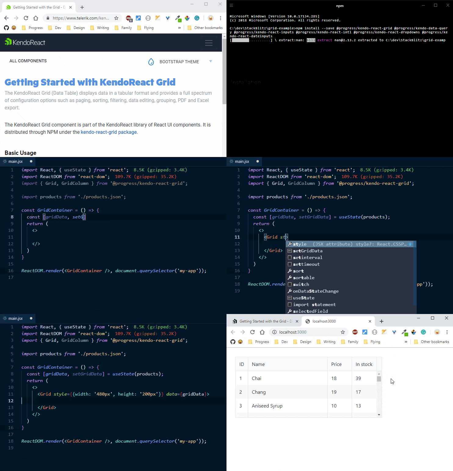
All React component libraries should give you the ability to install through npm or GitHub. Below is an example of importing and using a Grid component into your project. Most libraries will have a similar experience for incorporating their library easily into your project.

React Import Grid

We make our packages easily consumable through npm to ensure that if you need to test an idea and build a demo, you're just an npm install away!

Must-Have Features in a React Grid

The following list of features is largely based on my experience building line of business applications for a large auto manufacturer.

Sorting, Filtering, and Paging

We need to ensure that any grid that we decide to use has options for basic Sorting, Filtering and Paging. This is the absolute minimum requirement I would have needed for any grid we would have used for our inventory system. If the devleoper has to worry too much about the implementation details of how to do these tasks, they are not getting their money's worth in a grid.

Sorting Examples

In React we typically will have a wrapper around our component that will allow us to keep track of our component's state. We can utilize this local state to store information about our sorting, what field we want to sort on and the direction (ascending or descending), as well as default settings. We can pass these into our component using props. A StackBlitz demo I created shows a very basic setup where we want to sort our data based on a productName. The default is true, and as you would guess, if you pass a false value to this prop you turn off the sorting feature.

A great bonus in any library is to help us query data. If the library you are looking at has something remotely similar to our Data Query package, it should help tremendously when applying the sorting, filtering, grouping, and other aggregate data operations. It makes methods like process(), orderBy(), and filterBy() available. These methods are helpful in areas outside your grid component as well. It's just a utility library, but another huge bonus.

In React, we also have the concept of a container component. These container components can be utilized to wrap and store our state for the grid component. We can import orderBy() and use it to sort our data which we have imported from a json file, which in turn has a column called productName. This makes it easy to load our data with default sort already in place. Maybe we want to always start off in a state where the data is in reverse alphabetical order? We would have the following setup in our state object:

state = {
  sort: [
    { field: 'ProductName', dir: 'desc' }
  ]
}

And now when we create our Grid component in React, we just need to pass the data into the grid using the data prop. The product of this value is an orderBy applied to the json data and as the second argument we can pass in our settings from our state object:

render() {
  return (
    <Grid data={orderBy(products, this.state.sort)}>
      <Column field="ProductID" />
      <Column field="ProductName" title="Product Name" />
      <Column field="UnitPrice" title="Unit Price" />
    </Grid>
  );
}

Already, and with very minimal effort, we have sorted our products by productName in a descending fashion. In order to make the individual column sortable we can use onSortChange(), an event that fires when the sorting of the Grid is changed. We handle this event ourselves and sort the data using a simple arrow function that updates our state using the setState() method in React.

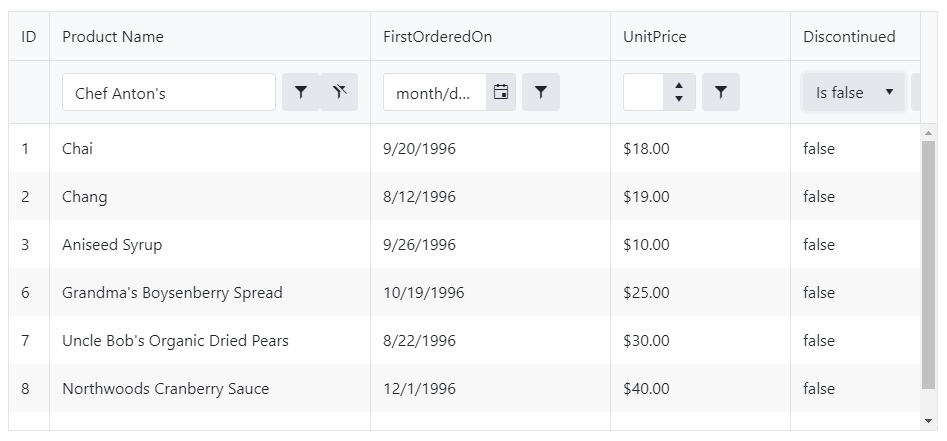
By default, when filtering is enabled, the Grid renders a filter row in its header. Based on the type of data the columns contain, the filter row displays text boxes in each column header where the user can filter string, numeric, or date inputs.

Filtering and Paging Examples

Most of the filtering that I want to do can be achieved with a Custom Filter Cell. This technique is easy to understand and it's powerful. Filtering can be accomplished similarly to our previous sorting example. Using a higher order component in conjunction with the process() Data Query method, we can manage local data. It has its own state and adds the filter, sort, total, and skip props to the Grid to handle an onDataStateChange() event. We can bind to more than one grid if needed using different sets of data, without the need for you to write any logic for the filtering, sorting or paging. Below is what this feature looks like in a grid:

React Grid Filtering

I prepared a StackBlitz Demo to show some basic filtering and paging as well.

Virtual Scrolling

Sometimes we have a large amount of data in our grids. When we're working with large numbers of columns or rows, we want to implement virtual scrolling. While the user is scrolling the table, the Grid needs to display only the visible data. Column Virtualization ensures that columns outside of the currently visible area of the grid will not be rendered.

The grid also has a special scrolling mode called Virtual Scrolling. It's this scrolling mode that is most useful with large data sets. You can set a prop on the grid called pageSize.

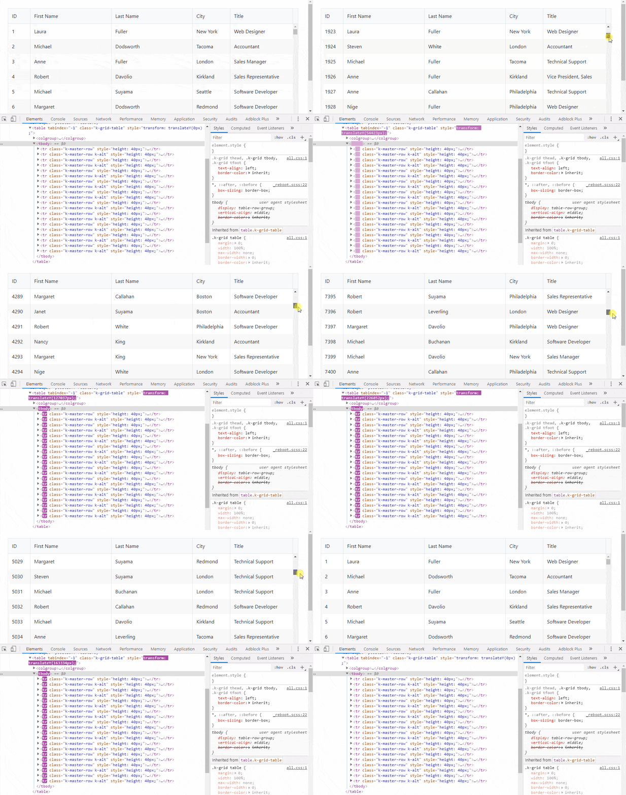
In this demo, if you open the grid in a new browser window and inspect the grid (as seen in the animated gif below) as you scroll, you will notice that the only rows getting rendered to the view at any one time are those that you see. Once you scroll past older records, they are removed and new records are rendered. Having this type of functionality can mean better grid performance.

React Grid Virtualization

Playing The Long Game

When looking for a good grid, or a general component library for that matter, you want to know that if you invest in using the library, that it's going to continue growing and being supported. Some libraries have been short-lived, either because the main contributor spends less time on the project or because the company building it was not able to continue. In most cases, active development on the project ensures future bug fixes and maintenance at the very least.

Knowing that a library has been around for a while and that new flavors and products are being built to this day in React, your favorite frontend framework, should give you confidence that it will be here for ten more years, that it will grow and that bugs will get fixed quickly. These are things that you want in a library. Having these traits will ensure you can have longevity with the tools and that your skills can be transferable or exploited as a developer in another job. You only get this from the larger libraries that have longevity.

Enterprise Level Support

Plain and simple, libraries that are not licensed rarely have any type of support outside of at-will community help. Most big web development shops and enterprise level businesses have tight deadlines and their developers push the technology to the edges. Sometimes it's helpful to have someone to reach out to that is an expert on working with the library. With KendoReact we can make those people accessible to you - they run our customer support channels, in fact.

Although we have seen some examples in our grid demo, we suggest looking around to see what else is out there that competes at this high level. If there are any features that you think you can't live without, put them in the comments and let us know what your favorite grid features are.


3 Questions to Ask When Migrating from Desktop to Web

$
0
0

With web applications undergoing a renaissance over the past decade, many individuals and companies are wondering what the proper course of action is, and are hesitant to jump in, lest they repeat the mistakes of past rewrites. In this post, we'll be discussing the questions to ask, the checkmarks to check, and the path to follow in order to make an involved effort simpler to understand.

Why are We Doing This (again)?

For many companies, moving to the web seems like something they should do, rather than something they need to do. That is, they see the modern web movement in the world of development and don't want to be left behind, but haven't fully analyzed the need within their particular sphere. Understanding the reasons for moving, and then assessing your situation, will help determine if a need actually exists.

Competition

One of the biggest drivers of improving software is market influence - complacence in innovating is a quick way to lose market share. If your competition has a more modern, more available, and more user-friendly application supporting their business, your revenue will feel the impact. This is readily apparent with external applications that have a direct effect on revenue - a web application has a lower barrier of entry than a desktop application, and if your users can open up a browser and begin using a competitor's product in seconds, you will lose customers who value ease of use above other metrics. For internal applications, the impacts aren't quite as noticeable - aging internal applications will eventually affect productivity and efficiency, which will impact revenue through higher costs. The excuse of "it still works and we can't afford to replace it" will eventually catch up to your organization as your competition implements more streamlined tools and processes.

Hardware

Aging hardware can slow down both web and desktop applications alike, but significant changes to web applications get filtered through a relatively consistent tier of systems that spread out the processing needed to get work done. Desktop software, due to the processing that inherently occurs right on a user's machine, represents a higher load and becomes more susceptible to the limits of the CPU, RAM, and data drive speeds. Because of this, upgrades to desktop software can force that hardware into obsolescence, whereas new versions of web applications can focus their increased computational needs on the server, keeping the processing on the browser end to a minimum. This results in applications that can run even on fairly low-spec machines, thereby increasing the potential customer pool.

User Base

Remote workers, either permanent ones or just ones who venture out into the field often enough, can have their efficiency driven down by desktop software either by updates that are mandatory or cause workflow disrupting issues, or simply because they aren't local to a machine that can run what they need. This point lends itself to the prior two motivations, as all three reasons can culminate in lost productivity. When thinking about external customers, however, a migration to the web opens up an easier path to transitioning to a Software as a Service (SaaS) model.

Current Technology

Desktop software, both internal and external, can suffer from obsolescence of the underlying frameworks in which they were written. Finding developers who still remember the language or platform – or worse yet, trying to find someone willing to learn it in order to support it -- becomes more and more difficult as time ticks on. Even if you have the staff on hand to support older applications, when newer applications (written in modern frameworks) are added to their workload, bug fixing and general support increases in difficulty as team members start having to split their time across platforms, wasting precious time due to ramp-up. Older software for the most part also tends to be inefficiently written, becoming a patchwork effort from teams of developers that have come and gone. Performance can suffer in ways that can't be rectified without a complete rewrite due to the architecture (or lack thereof).

What is This Going to Do for Us?

We've talked about the reasons for moving to a web application, so now let's think about those reasons in terms of benefits to the organization.

Devices & Performance

Web applications allow for access from basically any device, without a need for a VPN, which opens up support for most operating systems, whether desktop or mobile. Our hardware motivation above turns into an opportunity to greatly expand the number of devices you can support, with tablets and phones entering into the equation for specific workflows. This can increase the audience for external applications, as users are more likely to use your software if they can access it from more locations and with whatever hardware they happen to have on hand when they hear about it. For internal users, web applications allow them to be more responsive when emergencies crop up, or when you want to provide greater flexibility on where they work and what they use. Migrating an internal application to the web necessitates moving your data into a more accessible form, which provides the opportunity to put your data into a distributed setup. This will lower latency for offices that aren't collocated with the information they need access to.

Deployment & Flexibility

With web applications, the hassle of scheduled, voluntary, or mass forced rollouts are a thing of the past. Once the application has been certified for release through internal testing, it can instantaneously be pushed live. This benefits both bug fixes and new feature implementations, allowing urgent issues to get addressed in smaller amounts of time, and providing more flexibility and immediacy for new functionality. If smaller rollouts are desired, it becomes easier to determine which pool of users get access, granting another level of testing for new features. And to the inherent structure of modern web applications, better adherence to best practices is enforced, making it easier to switch out frontend technology in the future if the need arises.

How Do We Do This?

Once you've asked the above questions and the answers look like they'll address issues currently plaguing your organization, determining a proper plan of attack is key in making sure this rewrite is done once and done well.

Define an Approach

The two options available to anyone migrating an application are to convert it as a whole or move it over piece by piece. Both approaches have their pros and cons, so let's dive into them.

The preferred approach is to do this as a whole. With the importance and value of a proper UX process gaining visibility and recognition within the development community over the past decade, chances are the current desktop application was not designed with usability in mind. Moreover, simply migrating the desktop UI as it stands will lead to a poor experience in most cases (depending on the complexity and current design of the existing application). Designing an application workflow by workflow prevents both designers and developers from planning ahead and architecting for cohesion. Prefacing your development with a full UX process of user research, interaction design, visual design, and user acceptance testing will allow you to create an application with high usability and high usefulness, with a modern look and feel.

The cons of this are fairly obvious -- a design process will take a lengthy amount of time (again, depending on the size and complexity of the application), with zero developed code being produced until it completes. If your organization is pressed for time, then this method will likely not be a good fit, unfortunately.

The other option is migrating the application piece-by-piece. The advantages of this method include that it allows for faster deliverables, granting increased visibility to stakeholders. With faster releases, users can provide feedback early and often, which can be fed back into the design team's processes. Handling unforeseen technical challenges is easier with this approach as well, as these hurdles can be solved with a redesign without having committed to a longer path. And finally, the biggest reason and advantage for this option is: budget. Between planning, estimating, and generating revenue, an agile design and development plan will boost all three of those categories. Requesting budget for smaller, discrete sections of an application becomes easier as estimates become more accurate, and quicker releases allow internal applications to make users more efficient, while external applications can begin pulling in sales.

The negatives for this approach are basically all of the pros listed for the other option: the UX team will not have incorporated the entirety of the application during the design process, and the development team will not have had a chance to architect based on a complete understanding of the workflows needed. Both applications (the soon-to-be replaced desktop and the web application) will need to be supported and maintained, with likely highly different codebases, languages, platforms, frameworks, requiring ramp-up time as they switch between the two.

Architecture Analysis

Regardless of the approach, one of your first steps will be to analyze your current application. Gauging how difficult this migration will be is dependent on how closely your developers, throughout the history of your application, stuck to software engineering best practices. If your presentation layer is purely the UI – just the elements your users directly interact with, with behaviors, business logic, data access, etc. split out cleanly into separate layers – then your path will be straightforward and iterative, with relatively low effort, and with an architecture that will not change.

However, most everyone knows this is not the case. Separating logic into the tiers it originally belonged to (or creating that tier in the first place), is what will dominate your effort. Database connections, business logic to determine values in a dropdown in the code-behind, dependencies on computation libraries and utility functions in the presentation layer – all of these are signs of highly coupled software, and will represent the bulk of your time spent during the migration.

A web client can't (and shouldn't) open a database connection to your data store. Business logic should be in its own layer, and if the rules change, you shouldn't have to sift through code that specifies button size and color to do so. This is the common state of desktop software and the biggest hurdle to overcome when migrating to any new technology. To create a plan for re-architecture, the basic premise is that all non-visual element code needs to move, either behind a service, into a utility, or available through a controller.

Hybridization

Our goal is not to rewrite the entire application, but just the parts that disobey the rules established by best practices. The end result should be a web page that displays (and possibly generates) visual elements, relying on a back-end server for the data to bind to its controls. Moving your middle-tier, or creating a proper one from scratch, and making it accessible via web services is one of the first steps in migrating your application, and will allow you to create a hybrid application with both desktop and web frontends.

If cloud distribution is something that was on your roadmap or list of things to investigate, this is the perfect opportunity. The choice of utilizing the cloud vs. an on-premises deployment boils down to how much control you want over the security of your application and data. Cloud servers can be used for the app, the data, or both, and can scale as needed. If security issues require that all data be hosted and controlled by your company, shifting just the application itself to a distributed model will still reap benefits for performance, depending on how data-driven your needs are.

Validation happens on both the client and server, depending on your domain. Simple validation (required fields, numerics, length, etc.) can occur on the client side, while validation against business rules should be handled via an asynchronous request to the server. If you didn't handle this in a separate collection of validators, then they will need to be moved out of your presentation layer.

Once the core application is properly separated behind controllers that respond to browser requests, you can modify the existing code within your desktop application to make use of them. This will allow you to make progress adding functionality to your web application without having to completely abandon your existing solution.

Frontend Form Factor & Design

With the backend and middle-tier properly architected, you'll need to make a decision on what form factors (desktop vs. tablet vs. phone) you want to address. Is this application meant only for desktop users? Are there workflows that could be made usable on a smaller device? Are there use cases that lend themselves to being more useful on a mobile platform?

Once you've made the choice, the design team can begin the work of creating wireframes for however many form factors you've selected, noting that tablet and phone should not always follow the same design or adhere to the same set of limitations. There's a reason I listed it as "desktop vs. tablet vs. phone" and not "desktop vs. mobile" – the distinctions can make a big difference, both in design and development effort.

Speaking of development effort, utilizing any one of the number of responsive frameworks out there is not (always) the solution to reducing it. Responsive design and the frameworks available are more geared to web SITE development, not web APPLICATION development. You may trim some of the time needed to create specific elements, but that time can then be spent to make sure the designs reflow properly across different resolutions, screen sizes, and density settings, resulting in a lot higher of a testing overhead than necessary.

Conclusion

We've walked through a general guideline on moving from desktop technology to the modern web, asking key questions along the way about why we should entertain this idea, what the possible benefits are, and what the most logical path forward might be. Development environments are extremely varied and present unique challenges, so the advice here is not presented as the only solution, but rather a guide that anyone can use to perform a sanity check before undergoing an expensive and lengthy conversion.

How to Use a Vue Area Chart UI Component in Your Web App

$
0
0

Area charts make it easy to visualize a trend over time. Learn how to easily add an area chart to your web app.

In the last article, we learned about the pie and the donut chart in Kendo UI for Vue. In this article, we will learn how to create an area chart.

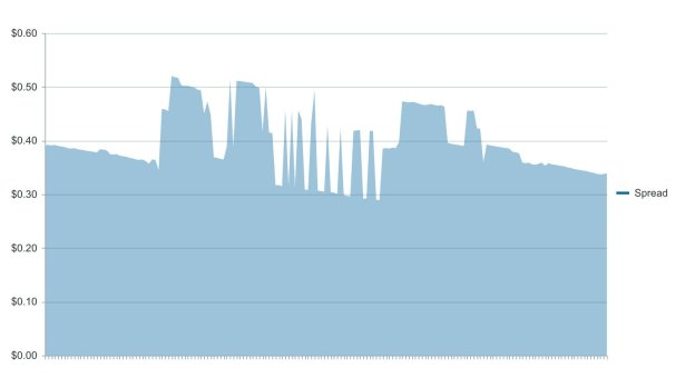
In an area chart, each data point is connected with a line and the space beneath the line is filled in with color. Area charts are useful for visualizing an overall trend as opposed to individual values. For example, a line chart can show a stock’s price over time. Such a chart would make it clear if the price is trending higher or lower. An area chart of the same data would emphasize how much the price has increased or decreased.

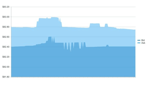
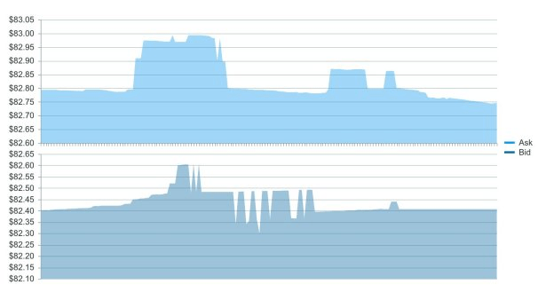
Coming up, we will create an area chart to show the bid-ask spread for a cryptocurrency. Then we will create another chart plotting the bid and the ask together and in different panes so you can see the spread in a different view.

Getting Started

We will first initialize a Vue project using the webpack-simple template. Building our chart requires Kendo UI, a theme, the Charts package, and the DataSourcepackage. We will install these dependencies with the following commands.

npminstall --save @progress/kendo-ui
npminstall --save @progress/kendo-theme-default
npminstall --save @progress/kendo-charts-vue-wrapper
npminstall --save @progress/kendo-datasource-vue-wrapper

Inside the main.js file, we import our packages, register the Chart and DataSource globally, then add them to the component list.

import Vue from'vue'import App from'./App.vue'import'@progress/kendo-ui'import'@progress/kendo-theme-default/dist/all.css'import{ Chart, ChartInstaller }from'@progress/kendo-charts-vue-wrapper'import{ DataSource, DataSourceInstaller }from'@progress/kendo-datasource-vue-wrapper'

Vue.use(ChartInstaller)
Vue.use(DataSourceInstaller)newVue({
  el:'#app',
  components:{
  Chart,
  DataSource
  },
  render: h =>h(App)})

We want to graph the bid-ask spread for the cryptocurrency Dash. The spread is the difference between the highest price a buyer is willing to pay and the lowest price a seller is willing to accept. The price a buyer is willing to pay is called the bid. The price a seller is willing to accept is the ask. If the highest bid is 8andthelowestaskis108 and the lowest ask is 10, the spread is $2. An area chart is helpful for visualizing this kind of data because we will be able to see the magnitude of the spread over time. The area under the curve will be larger when the spread is higher and smaller when the spread is lower.

Creating the Area Chart

First, we will configure the DataSource component. This requires a reference name, a URL and a data type. Because the data is not in a format we can use, we will also need to parse it.

The data will be retrieved from an API endpoint then saved locally to a JSON file. The source of the data is Kraken. The API returns the bid, ask and timestamp. We will calculate the spread by taking the difference of the bid and ask. The endpoint for the data is the following:

https://api.kraken.com/0/public/Spread?pair=dashusd

In the App.vue file, we add the DataSource component to the template and a method to the script to parse the data. This is the updated file.

<template><divid="app"><kendo-datasourceref="dataSource":transport-read-url="'Spread.json'":transport-read-data-type="'json'":schema-parse="schemaParse"></kendo-datasource></div></template><script>exportdefault{
  name:'app',
  methods:{
    schemaParse:function(response){return response.result.DASHUSD.map(function(arr){return{
          timestamp: arr[0],
          bid: arr[1],
          ask: arr[2],
          spread: arr[2]- arr[1]}});}}}</script>

Next, we will create the chart component. It will have a reference to the DataSource component, a tooltip, a series, a category axis, a value axis, and a theme. The series type will be set to area. The series field property will use the custom field we created called spread. The categoryField will be the timestamp. The following code adds the Chart component to the template and adds the chart’s data to the script.

<template><divid="app">
    ...
    <kendo-chart:data-source-ref="'dataSource'":tooltip="tooltip":series="series":category-axis="categoryAxis":value-axis="valueAxis":theme="'blueopal'"></kendo-chart></div></template><script>exportdefault{
  name:'app',data(){return{
      tooltip:{
        visible:true,
        format:'c6'},
      series:[{
        type:'area',
        field:'spread',
        categoryField:'timestamp',
        name:'Spread'}],
      categoryAxis:{
        labels:{
          visible:false},
        majorGridLines:{
          visible:false}},
      valueAxis:{
        labels:{
          format:'c2'}}}},...}</script>

Kendo UI Chart

Creating an Area Chart With Two Series

First, we will create an overlapping area chart to show the bid and ask. Then we will use the chart to show each series in separate panes. The following code updates our series with the information for our bid and ask.

series: [{
  type: 'area',
  field: 'bid',
  categoryField: 'timestamp',
  name: 'Bid'
},
{
  type: 'area',
  field: 'ask',
  categoryField: 'timestamp',
  name: 'Ask'
}],

Kendo UI Vue

Next, we will add the panes. The panes attribute will be added to the chart component and the panes will be defined in the data. Each pane will be given a name so it can be associated with an axis. Then we will create two axis for the value axis. Each axis is associated with a pane by setting its pane option. Last, the series needs to be associated with the axis by setting its axis attribute. The following is the updated App.vue file.

<template><divid="app"><kendo-datasourceref="dataSource":transport-read-url="'Spread.json'":transport-read-data-type="'json'":schema-parse="schemaParse"></kendo-datasource><kendo-chart:data-source-ref="'dataSource'":tooltip="tooltip":series="series":category-axis="categoryAxis":value-axis="valueAxis":theme="'blueopal'":panes="panes"></kendo-chart></div></template><script>exportdefault{
  name:'app',data(){return{
      tooltip:{
        visible:true,
        format:'c6'},
      series:[{
        type:'area',
        field:'bid',
        categoryField:'timestamp',
        name:'Bid',
        axis:'Bid'},{
        type:'area',
        field:'ask',
        categoryField:'timestamp',
        name:'Ask',
        axis:'Ask'}],
      categoryAxis:{
        labels:{
          visible:false},
        majorGridLines:{
          visible:false}},
       valueAxis:[{
        name:'Ask',
        pane:'top-pane',
        labels:{
          format:'c2'}},{
        name:'Bid',
        pane:'bottom-pane',
        labels:{
          format:'c2'}}],
       panes:[{name:'top-pane'},{name:'bottom-pane'}]}},
  methods:{
    schemaParse:function(response){return response.result.DASHUSD.map(function(arr){return{
          timestamp: arr[0],
          bid: arr[1],
          ask: arr[2],
          spread: arr[2]- arr[1]}});}}}</script><style>#app{margin-top:60px;}</style>

Kendo UI Vue

For a closer look, here's a link to the project’s repo: https://github.com/albertaw/kendoui-areachart

Summary

We built an area chart to show the spread for the cryptocurrency Dash. Then we made an area chart to show the bid and ask prices with the data plots overlapping each other and with the data in separate panes. An area chart can also be visualized as a stacked chart or a 100% stacked chart. A stacked area chart lets you see how each series compares to the whole. A 100% stacked area chart shows the part-whole relationship as percentages.

In the next article, we will see how to build a candlestick chart. A candlestick chart is a stock chart that shows a stock’s open, high, low and close prices.

Resources

Try Out Kendo UI for Yourself

Want to start taking advantage of the more than 70+ ready-made Kendo UI components, like the Grid or Scheduler? You can begin a free trial of Kendo UI for Vue today and start developing your apps faster.

Start My Kendo UI Trial

Angular, React, and jQuery Versions

Looking for UI component to support specific frameworks? Check out Kendo UI for Angular, Kendo UI for React, or Kendo UI for jQuery.

React Hooks and Component Composition

$
0
0

This is the second article of a two-part series. In the first article, we learned about advanced patterns in React like High Order Components and Render Props. We examined what exactly these patterns are, how we can use them to achieve a nice level of code reuse and state logic share throughout our projects, and also how they can help us to build better applications. In this part, we'll learn more about React Hooks, what are they and how we can replace some of these patterns to increase state logic reuse with React Hooks.

We know that composition in React is an important topic, and lately a lot of people have started to talk about it. It can have a huge impact on our applications if implemented the wrong way and with the wrong patterns, so we must strive for better component composition in our code. With it we can automatically improve our code readability, and we get less code with more state logic share throughout our applications.

The problem with some advanced patterns in React such as High Order Components or Render Props is that sometimes it’s overkill. Also in some cases it can leave our code heavier and too hard to understand for other developers. The fact that these patterns are advanced is another problem for some developers - they don’t know exactly how a Render Prop works and might get confused and lost with it.

But how we can replace these patterns in such cases with a more modern approach, making our code more concise, more readable, and with a nice level of component composition and code reuse? We can use React Hooks!

In the latest version of React, the React team released React Hooks. It’s a whole new way to deal with the state in our components, especially now that we can use and manage state in our functional components. With Hooks we can manage state in our components pretty easily, and also share state logic, making our code more readable and our application more concise.

Hooks?

The way we deal with the state in React was always such a big topic and a point of a lot of discussion from developers. The fact that we should use ES6 classes to deal with the state was kind of annoying because we weren’t too acquainted with it, and we were always seeking some solution for it. Now with Hooks, we have a whole new way to deal with the state to React.

Hooks allow us to deal with our state with functional components, so now there’s no need to write more class components. To start to use Hooks, all we need to do is import the useState hook, which is the most important hook:

import React, { useState } from "react";

Now, inside our function component, all we need to do is create a const, which is going to be an array of two values: the first one is our state variable, and the second is our function that’ll do something to our state. Then we pass the useState method and then we pass the default value of our state, which can be an array, object, string, etc.

const [name, setName] = useState("");

I just defined a state called name, which is going to be a string. With setName, I can set my name every time I call it. Pretty simple and powerful, we can do everything that we were doing with ES6 classes now with functional components. But you might be wondering how we can deal with lifecycle methods inside a functional component.

For this, the React team released the useEffect hook, which can totally replace the lifecycle methods that we were using in ES6 class components, it allows us to create some side effects in our components. To use it we need first to import it:

import React, { useState, useEffect } from "react";

And inside our functional component, we pass a function called useEffect.

Similar to componentDidMount and componentDidUpdate, everytime we render this component it’s going to render our name state that we defined earlier:

useEffect(() => { console.log(name); });

The useEffect hook can be very tricky because there’s a lot of ways to use it. Using it the wrong way could create some problems in your application. I’d really recommend that you first read the documentation about the useEffect hook, and then, to see how it works under the hood, read this post written by Dan Abramov that explains everything about the useEffect hook.

This was a brief introduction to Hooks. Next we’re going to learn about Custom Hooks, what are they, why they’re so powerful to manage state logic in our applications, and how we can replace our High Order Components our Render Props with them.

Custom Hooks

Hooks really came to solve the problems that we have with High Order Components and Render Props, and also to allow us to deal with the state with a better way than with classes components. We can create Custom Hooks to use everywhere in our application, share our state logic when we want and have a better component composition. Custom Hooks are basically a function, so we can import it everywhere we want. In the last article, we created a render prop called FetchJoke, and we know that a render prop is basically a prop whose value is a function, so we pass a component to this prop and it renders to us.

Now, we’re going to replace this render prop with a Custom Hook, and you’re going to see how Hooks can be a better, more powerful and readable way to deal with code reuse and component composition cases in React than HOCs and Render Props.

Let’s create a file called useJokes, which is going to be a file where we’re going to create our custom hook. Now, let’s import the useState hook, create an arrow function called useJokes, and export it at the end of our file.

import { useState } from 'react';

const useJokes = () => {
  // ...
}

export default useJokes;

So now, inside our useJokes function, let’s create our state, which is going to be called joke. And we’ll also create a function to set our state every time we make a request, which is going to be called setJoke. We’re going to pass a default value to our joke state which is going to be ‘No joke.

const [joke, setJoke] = useState("No joke.");

Now that we implemented our state, we need to create our onRequest function, where we’ll make a request when we click the button. So below our state, let’s create an arrow function called onRequest and pass our request inside it:

const onRequest = () => {
  fetch("https://api.chucknorris.io/jokes/random")
    .then(response => response.json())
    .then(joke => setJoke(joke.value))
    .catch(err => err);
};

Notice that when we return the whole joke, which is going to be an object, we need to set a joke with the setJoke function and pass the joke.value for it. Otherwise, it’ll throw an error.

Well now our Custom Hook is almost done. All we need to do is return the joke and the onRequest at the end of our function like this:

return { joke, onRequest };

And our whole Custom Hook has only 16 lines and looks like this now:

import { useState } from "react";

const useJokes = () => {
  const [joke, setJoke] = useState("No joke.");
  const onRequest = () => {
    fetch("https://api.chucknorris.io/jokes/random")
      .then(response => response.json())
      .then(joke => setJoke(joke.value))
      .catch(err => err);
    };
    return { joke, onRequest };
};

export default useJokes;

Now with this Custom Hook, we can replace our High Order Component and our Render Prop pretty easily. All we need to do is import our useJokes inside our Jokes component, and inside our component put the following code:

const { joke, onRequest } = useJokes();

Next, inside our return method, we’re going to return this:

<div>
  <h4>{joke}</h4>
  <button onClick={onRequest}>Click to see a new joke.</button>
</div>

Every time we click the button, it’s going to return to us a new joke. You can notice that the code gets cleaner and more readable, which helps us to understand what’s going on under the hood.

Advanced Patterns

Now that we have Hooks and are able to create Custom Hooks, a lot of people might be wondering: ‘Are Render Props dead now?’ or, ‘Is it worth it to use Render Props?’ And my answer would be NO to both questions.

Render Props are not dead, but I don’t think that is it worth using Render Props now that we have Hooks. We know that a Render Prop is a prop whose value is a function, but using Render Props we might face some problems, and one of those is Wrapper Hell. Look at this example:

<Connect render={({ loading, user }) => (
  <User render={({ id, name, list}) => (
    <Details render={({ id, name, text}) => (
      <!-- ... -->
    )} />
  )} />
)}/>

In this case, I just passed an example in which we only have 3 Render Props, but it can get worse quickly and our code can get pretty messy and slow. And this problem is not exclusive to Render Props - we might face this problem using High Order Components:

connect(withLoading(withHandler(withProps(TodoComponent))));

In this case, we’re using only 4 HOCs to pass our logic to our component, but let’s imagine that we have a case that we should use 10 or more HOCs nested. It would be pretty painful and very slow to develop and maintain this code. By using Hooks, we do not have this problem because all of our logic is shared between our components and we’ll never have some problem like Wrapper Hell using Hooks.

This doesn’t mean that you should use Hooks in all cases and never go back to High Order Components or Render Props! It means that in some cases (and in the vast majority of them), it’s better to use Hooks because it can aggregate a lot of your application, helping your code become more readable, faster, and reused far more.

Conclusion

In this two-part series, we learned about Advanced Patterns to React and also learned how to replace them with Hooks. The future of React now will be more and more Hooks - with better component composition throughout our applications, state logic being really easy to share between components, better code readability, less messy and slow code, etc.

If you have any pros and cons against Advanced Patterns or Hooks, comment below and let’s discuss it and improve the future of React patterns and composition.

Thank you for reading!


Curious for More on Using React Hooks?

For further reading on React Hooks, check out some of these related posts:

Promisifying Legacy Web APIs Just for Fun

$
0
0

We'll go through the basics of Promises and callbacks, and demonstrate the simplicity of promisifying the old XMLHttpRequest API.

It is no longer news that new JavaScript development patterns since the evolution of ES6 have influenced how we approach certain things in the JavaScript ecosystem. For instance, the standard callback function syntax which has been a standard for years. However, a new alternative, Promises, is now a more preferred pattern of development.

Promises

Promises represent a common way to react to asynchronous operations in JavaScript. A good example of a Promise-based API is the new fetch API provided by browsers. Not that you don’t already know this, but fetch is a replacement for the older callback-based XMLHttpRequest API, and, in this post, we are going to look at a few ways we can promisify some of our older APIs just for fun.

Callbacks

Let’s start with simple callbacks. In my opinion, the most common browser API that we come across is the setTimeout() API. It waits for a specified period of time and then executes a callback. A typical demonstration is this:

window.setTimeout(()=>{// do something after 1sec},1000);

As expected, the function waits for a second and then executes. With that in mind, let’s go ahead and see how we can promisify it just to understand how Promises better clarifies asynchronous processes.

Promisify a Callback

To define an A+ compliant Promise using the Promise constructor, we will pass in a function to the constructor. The function requires two arguments, resolve and reject, which are themselves callback functions under the hood. This is what we mean:

constpromisifiedSetTimeout=(delay, value)=>newPromise((resolve)=> window.setTimeout(resolve, delay, value));

Notice that we did not use the reject callback here. Why? Because setTimeout() does not provide any hooks for an error state. So instead, we pass resolve as the callback to setTimeout().

This gives us a chainable setTimeout() function. As much fun as it is to do stuff like this (promisify callbacks), I will advise you don’t get carried away. Many JavaScript APIs and most standard browser APIs are still heavily callback driven. This includes popular libraries like jQuery.

As a developer, this brings us to a bit of a crossroads, where we are caught between mixing two different styles of asynchronous code.

XMLHttpRequest

But who says we can’t just convert all our callbacks to promises? Let’s look at a more complex example and promisify the popular XMLHttpRequest API. But before that, let’s demonstrate the functionality to understand it better.

The XMLHttpRequest API was designed to fetch XML data over HTTP, hence the name. But today it can be used with protocols other than HTTP and it can fetch data not only in the form of XML, but also JSON, HTML or plain text. Here’s a quick example using the XMLHTTPRequest to fetch a Github user:

functionsuccess(){var data = JSON.parse(this.response);
console.log(data);}functionerror(err){
console.log('You have an error', err)}var request =newXMLHttpRequest();
request.onload = success;
request.onerror = error;
request.open('GET','https://api.github.com/users/kennypee');
request.send();

Here we have defined our request that we’ll use to retrieve data from the server asynchronously. The request returns a response from the server and stores it in the response variable. We also converted the response into a JavaScript object using the JSON.parse() method. In addition, we have defined two listeners to handle the success and error cases.

The progression here is, first, we open the request by passing the request method GET and the request URL where we’ll fetch the data from, then we send the request with the call to send().

If our request is successful, we store the data from the server into our response variable and convert it into an object and then log it to the console. If there is an error in our request, we log the error to the console with the error() case handler.

This brings us back to our initial question, is there a cleaner and simpler way to do this? The answer is YES. We can use Fetch to simplify this process in modern JavaScript development. Fetch is an improvement on the XMLHttpRequest API. The major difference between Fetch and XMLHttpRequest is that the Fetch API uses Promises, hence avoiding callback hell.

Fetch

The fetch() function takes a compulsory argument, which is the path to the resource you want to fetch. The functions return a Promise in any case, whether success or error. It has dedicated handlers for either case. If the request is successful, the .then() function will receive the response object from the server; if the request fails, the .catch() function receives the error object.

If we wanted to achieve the same functionality we have on the previous example with Fetch, here’s what we’ll do:

fetch('https://api.github.com/users/kennypee').then(function(response)){return response.json()}).then(function(data)){
console.log(data)}).catch(function(err)){
console.log('You have an error', err)});

Here we have done the same thing we did with the XMLHttpRequest but in a much simpler way. We’ve made use of the Fetch API to call to GitHub endpoint and fetch data about a user. When the promise is resolved, we get a Response object in return.

But the response object here only has information about the response itself and not of the user we asked for. To get the data we desire, we had to pull it from the response body by calling the .json() method on the response object to return a Promise, hence the need to chain another .then() function for the data.

Promisify the XMLHttpRequest API

Now that we have seen an undiluted XMLHttpRequest API and demonstrated the Fetch version of the same API, let’s try to promisify the XMLHttpRequest API. This will be more of a mix of both the XMLHttpRequest API and Fetch. To promisify our previous example of the XMLHttpRequest API, here are the steps we’ll take:

  1. Remove the success and error arguments in the function signature.
  2. Modify the function body to return a Promise.
  3. Instead of calling success(), resolve the Promise.
  4. Instead of calling error(), reject the Promise.

With these modifications, we can promisify our XMLHTTPRequest API to get the result below:

const fetch =(url, options ={method:'get'})=>newPromise((resolve, reject)=>{let request =newXMLHttpRequest();  
    request.onload = resolve
    request.onerror = reject;
    request.open(options.method, url,true);  
    request.send();});

This is a concise way of promisifying the XMLHttpRequest API without having to rewrite the existing code. More so, we can always replace all the old callback functions with the new .then() and .catch() syntax wherever the need be.

Extras

It might also interest you to know that, since Node.js version 8, you can convert all your callbacks to Promises using a built-in module called the util. All you need to do is call util.promisify() to convert your callback to a Promise.

Conclusion

Not that you don’t know all these but I hope you had fun doing it all over again to reinforce the knowledge. We demonstrated the conversion of usual callbacks to Promises and more popular XMLHttpRequest to Fetch just for the fun of it. To learn more about Promises, feel free to check out this documentation.

For More Info on Building Great Web Apps

Want to learn more about creating great web apps? It all starts out with Kendo UI - the complete UI component library that allows you to quickly build high-quality, responsive apps. It includes everything you need, from grids and charts to dropdowns and gauges.

Learn More about Kendo UI

Get a Free Trial of Kendo UI


Passing Variables to CSS on a Vue Component

$
0
0

In this article, I will share with you the process of discovering one of the not-so-common features of Vue.js, the injection of CSS variables from the component's script. Let's get a headache together and learn some Vue!

So. A few days ago, I was faced with an interesting challenge at work. The need to pass down some CSS style attributes into my <style> tags for controlling a couple of different properties with the same value, as well as performing some calc results.

After digging around Google and Github issues, I found a couple solutions that gave me a deeper understanding of Vue, and was definitely a fun little challenge that I want to share with you.

Initial Reaction

For the sake of example, let’s pretend you have a button component that you want to pass some properties that will control its height and the background color.

In reality, what I was trying to do was a lot more complex since it involved a bunch of SCSS calculations and CSS animations, but I like keeping my articles clutter free - so bear with me.

<template><button :style="btnStyles">My button</button></template><script>exportdefault{
  name:'SimpleButton',
  props:{
    bgColor:{
      type: String,default:"#0099CC"},
    height:{
      type: Number,default:100}},
  computed:{btnStyles(){return{"background-color":this.bgColor,
        height:`${this.height}px`};}}};</script>

Alright, so this would be a SimpleButton class, super useless, and as UGLY as I managed to make it. Just kidding, I’m actually a UX designer undercover. ‍

Coming back to the simplicity of the example, however, what I’m trying to do here is make this button’s CSS controllable by properties. I’m fully aware that this example is flawed, and that I could just simply be binding attributes into classes - but as stated, I don’t want to overcomplicate things.

It does, on the other hand, illustrate my first approach to the problem - put everything in an inline style tag. SURE, ok this works just fine, but it starts to become really verbose and complicated to follow once you have N levels of nested divs each, with their own different tags inside that need to be dynamic. Even more so if you’re trying to get SCSS to work in your favor with some calculations, mixins, functions, etc.

So at this point, I got my stubborn hat on and decided I had to find a solution that would allow me to pass in these variables into the <style>.

Being Stubborn

Vue 1.0 had the ability to somewhat interpolate variables into the <style> tag, and would allow you to set up CSS variables like so: --bg-color: {{ bgColor }};

However this came with a huge cost, because on every re-render Vue was having to do crazy things like recompiling these styles. Needless to say, it doesn’t work like this today. <style> tags are static, and once the component is mounted, that’s that.

At this point, stubborn was the name of the game. So I got digging and found a couple posts that pointed me in a similar direction. Create CSS variables on the inline style and then use them in the SCSS. Yeah…

So how do we do this?

Let’s start by first switching some things around on our previous example.

Go to the computed props, and replace the btnStyles with this new cssVars property.

computed:{cssVars(){return{'--bg-color':this.bgColor,'--height':this.height +'px'}}}

Alright, so now that we are dynamically generating these variables - how do we use them? Simple, let’s pass them to the <button> through the :style binding like we were doing before.

<button :style="cssVars">My button</button>

Yaaay…? Don’t worry, SOMETHING happened. Go to your developer tools and inspect the button, you’ll see in the element.style tab:

element-style

Go ahead and add these prop-created CSS variables into your style block for the button component.

<style scoped>
button {color:var(--text-color);background-color:var(--bg-color);height:var(--height);}</style>

Go ahead and run this in your browser, tada ~!

Testing Reactivity

Alright so the theory is really nice, but how do we actually test the reactivity of the CSS variables?

There are two ways to do it with what we currently have: mount the button component into your app, and pass in different props.

Or, for the sake of simplicity, we’re going to add a local data state so we can modify it on Vue developer tools.

Add this to your button logic.

data(){return{
      textColor:"blue"};},

Finally, don’t forget to add the color property to your styles.

<style scoped>
button {color:var(--text-color);background-color:var(--bg-color);height:var(--height);}</style>

Alright, now that we’re all set up - go to your browser and open the app. You’ll see that your button’s text is blue, as expected, since that is what we first set up as textColor on our state.

Now go into your Vue dev tools, and click on the property and change it to red or your color of choice. You’ll immediately see that the color of the button’s text changes as well.

Wait, what?

At this point you’re either fascinated by the endless possibilities of this approach, (well maybe not endless - it’s quite a niche solution to a very small handful of problems), or you are completely and utterly confused.

If you’re one of those in the second group, and you’re thinking that this whole mess could have been solved by :style or :class bindings, you’re absolutely right. Congratulations! However, as I mentioned, there are very specific SCSS scenarios where this starts becoming handy.

Example? How about calculating a menu’s position based on a the size of the menu and the internal icon’s size?

'--menu-position':(((this.menuSize *2)-this.iconSize )/-2)+'px',

Another example could be using them to do some CSS math. ()

height:calc(var(--height) * 10);

Here’s the codesandbox for this article :)

{% codesandbox kxw2p2wjr %}

Conclusion

Frankly, this whole endeavor was fun to investigate and apply to an actual project, and I’m sure I’ll run into a moment in my life where I’ll be glad I have this handy tool under my belt. So on that note, I hope at the very least you were entertained .

For More Info on Building Great Web Apps

Want to learn more about creating great web apps? It all starts out with Kendo UI - the complete UI component library that allows you to quickly build high-quality, responsive apps. It includes everything you need, from grids and charts to dropdowns and gauges.

Learn More about Kendo UI

Get a Free Trial of Kendo UI


The Journey of JavaScript From Downloading Scripts to Execution – Part III

$
0
0

In this article, you’ll learn how JavaScript is executed in the browser. The browser uses JavaScript runtime (like V8 in case of Google Chrome), CallStack, Memory Heap, Callback Queue and Event Loop for executing JavaScript. JavaScript is designed to be operated as a single-threaded language, yet we can execute asynchronous JavaScript code in the browser without blocking the main thread. This article aims to provide a detailed explanation of the underlying tools used by the browser to execute JavaScript code. You will also learn how asynchronous code is executed with the help of the Event loop. If you follow along with this tutorial, some of the core concepts in JavaScript, including its asynchronous nature, closures, hoisting and scope chain, will make complete sense!

This article is part III of the series on The Journey of JavaScript: From Downloading Scripts to Execution. Before we dive into the execution part of JavaScript, let’s recap all that we have learned in the previoustwo articles of the series:

  1. The script tags are blocking in nature. When the main thread encounters a script tag, it blocks the rendering of the HTML DOM and gets busy in downloading, parsing and executing these scripts. In the first part of the series, we learned the various ways of downloading scripts without blocking the main thread. We also saw some of the heuristics employed by the V8 JavaScript engine to speed up the parsing phase.
  2. In part II of the series, we dove deep into understanding the internals of JavaScript engines. The engines make use of Just-In-Time Compilation to produce the intermediate bytecode. The bytecode is then further optimized by the optimizing compiler.

I highly recommend reading the previous two parts of the series before jumping into the execution section, as they build on the fundamentals of JavaScript engines.

Table of Contents

  1. Execution Context
  2. Terminologies Related to Execution Context
  3. Scopes and Scope Chain
  4. Creation Phase
  5. Activation Phase
  6. Inferences from our Understanding of the Two Phases
  7. callstack and memoryheap
  8. What Is an Asynchronous Code and How Is It Executed
  9. Event Loop

Let’s review some of the essential concepts that are required for understanding the execution of JavaScript:

Execution Context

Execution Context can be viewed as a container that holds variables and functions. Let’s consider a simple example to understand more:

var a ='Hello World!'functionhelloWorld(){var a ='Hello Function!'
    console.log('Value of a inside the function helloWorld', a)// Prints Hello Function!}helloWorld()
console.log('Value of a outside of the function helloWorld', a)// Prints Hello World!

This is simple and straightforward code in JavaScript, but it is very important to understand how the above code will be executed by the JavaScript engine. When the above code is getting ready for execution, the main thread first creates a big container for the entire program. This container is called the Global Execution Context. It stores all the variables and functions that are required during the lifetime of the entire program. The below diagram reflects the state of the global execution context:

In JavaScript, every function operates in its own execution context. Let’s try to fit this statement in the container analogy–every function in JavaScript along with its local variables fit in another small container inside the main container. The smaller container can access the variables of the big container; however, the bigger containers cannot access variables of the inner smaller containers.

Let’s visualize the execution context for helloWorld function:

Please note: the inner smaller containers give preference to their local content. They first check if the variable in question is present in their specified range, and if it is not present they ask for it from its parent container.

If you have understood the container analogy for the execution context, the output of the console statements in the above code should seem obvious to you! The value of a inside the helloWorld function is Hello Function!. Outside of it, the value is Hello World! because the helloWorld function has its own execution context that holds the variable a with value Hello Function!. The variable a inside the helloWorld function is not accessible outside of it, and hence its value is Hello World! in the global execution context.

The main block in which the entire program sits is called the Global Execution Context. Every function runs in its own context and it is called a Function Context or Local Execution Context. The recent advancement in JavaScript with ECMAScript version 6 (ES6) allows maintaining Lexical Execution Context or Block-level Execution Context with the use of let and const.

Let’s understand the lexical execution context with the help of an example:

for(let i =0; i <5; i++){
    console.log('value of i inside the for loop', i)}
console.log('value of i outside the for loop', i)

The variable i is not defined outside of the for loop because of the use of let creates a block-level execution context and its lifetime is the closing bracket }. The execution context created by i is called as the Lexical Execution Context.

Scopes and Scope Chain

We learned about parsing in the first part of the series. The job of the Parser is to create Scopes and the Abstract Syntax Tree (AST). We have already learned about AST in detail, and now let’s see what scopes are and how they’re created.

Scopes define the area of operation of a particular variable. A variable defined in the global executed context is scoped globally and can be accessed by any function in the program, and the variables defined in a local execution context are scoped to the local level. So, we have global, local and lexical scopes.

Let’s move forward to Scope Chains:

The local functions have access to their local scope as well as the global scope. If there is a nested function inside this local function, it will have access to its own scope, its parent’s scope, and the global scope. This forms a chain of scopes and hence it is called a Scope Chain. Let’s see this in action!

var a =1functionfoo(){var b = a +1functionbar(){var c = b + a
    }bar()}foo()

When we execute the above code, the interpreter creates a scope for function foo and its scope chain would look something like [foo scope, global scope]. The scope for function bar would be [bar scope, foo scope, global scope].

The function bar has access to the variables of its outer function bar because of the scope chain. Can we infer something interesting out of it? Let me quote the definition of Closures, which should now make complete sense:

A closure is the combination of a function and the lexical environment within which that function was declared. - MDN

The use of the word combination should be obvious, as it combines the scopes of inner and the outer functions to form its own scope chain. I hope you now know that a closure is not magic but a combination of scopes.

Look-ups on Scope Chain

When the interpreter encounters a variable while executing a piece of code, it first looks for its value in the current scope. It traverses up the scope chain until the variable is found or it has reached the end of the scope chain.

Look-ups on the Prototype Chain

Let’s see an example to understand how scopes work with prototype chains:

var obj ={}functionbaz(){
    obj.a ='Hello'returnfunctionbar(){
        console.log('Property a set on obj', obj.a)}}var bazReturnFn =baz()bazReturnFn()// Prints Property a set on obj, Hello

The above code is straightforward. The function baz returns an anonymous function. The variable bazReturnFn stores the return value of the function baz. The function bazReturnFn runs in the global context. It finds the variable obj in the global context and then searches for the property a on obj.

Let’s define the property a on the prototype of obj:

var obj ={}functionbaz(){
    obj.prototype.a ='Hello'returnfunctionbar(){
        console.log('Property a set on obj', obj.a)}}var bazReturnFn =baz()bazReturnFn()// Prints Property a set on obj, Hello

It still returns the same value! Please note the interpreter first traverses the whole scope chain and then goes to the prototype chain for finding the value of a variable.

Now that we’re clear with the terminologies, let’s get to the two important phases involved in the execution of JavaScript.

Creation Phase

When a function is called, the interpreter creates its execution context and then the function enters the creation phase. The interpreter traverses the function code line by and line and does the following:

  1. Creates the scope chain
  2. Creates the variables, functions, and arguments
  3. Determines the value of this for the current context

Please note: the function is not yet executed.

This is the representation of an execution context:

fnExecutionContext ={
    scopeChain:{// Current scope + scopes of all its parents},
    variableObject:{// All the variables including inner variables & functions, function arguments},this:{}}

Activation Phase

The function is executed in this phase and the variables defined in variableObject are initialized here.

Let’s understand this with the help of a simple example:

functionfoo(a, b){var c = a + b

    functionbar(){return c
    }returnbar()}foo(1,2)

When the function foo is invoked, the interpreter first creates its execution context as below:

fooExecutionContext ={
    scopeChain:{},
    variableObject:{},this:{}}

The function foo now enters the creation phase. In this phase, the interpreter creates the scope chain, scans the code without executing it and declares all its variables in the variableObject, and evaluates the value of this. Let’s see the state of execution context after this phase:

fooExecutionContext ={
    scopeChain:{/* scope of function foo + global scope */},
    variableObject:{
        arguments:{0:1,1:2,
            length:2},
        a:1,
        b:2,
        c: undefined,
        bar:'pointer to function bar()'},this:{}}

Please note: the arguments passed to the function foo are evaluated in the creation phase. The local variable c is declared on variableObject and is initialized with a value of undefined.

The evaluation of this is not in the scope of this article. I recommend reading Let’s get this this once and for all to have a clear understanding of this in JavaScript.

Let’s now see the state of the execution context when the function enters into the activation phase:

fooExecutionContext ={
    scopeChain:{/* scope of function foo + global scope */},
    variableObject:{
        arguments:{0:1,1:2,
            length:2},
        a:1,
        b:2,
        c:3,
        bar:'pointer to function bar()'},this:{}}

Notice the value of the variable c. The interpreter evaluates the value of c when it comes across this line var c = a + b. When it comes across the invocation for function bar, it first creates the execution context for bar and then the function bar gets into the creation phase where the interpreter creates its scope chain, variableObject and evaluates the value of this. In the case of function bar, its scope chain will have its own context as well the context of the function foo, and hence the value of c is not undefined inside the function bar.

Inferences from our Understanding of the Two Phases

Making Sense of the Arguments Array

When I first learned about the arguments array, I thought of it as some magical data structure that just pops up on its own.

functionadd(){var a = arguments[0]var b = arguments[1]return a + b
}add(1,2)

Where is the arguments array defined and how does the function add get the reference to it? I have not even declared the arguments array, but my code is running perfectly fine!

After learning about the execution of JavaScript, I understood that the arguments array is not magic but an array created by the interpreter during the creation phase. Sigh!

A Word on Hoisting

A strict definition of hoisting suggests that variable and function declarations are physically moved to the top of your code, but this is not in fact what happens. Instead, the variable and function declarations are put into memory during the compile phase, but stay exactly where you typed them in your code. - MDN

Hmm. Let’s try to understand the above statement:

The interpreter scans the entire function code and puts the variable and function declarations in the variableObject of the execution context during the creation phase. The declarations are not moved anywhere; they are just added in the variableObject and kept aside in the memory.

We’ve learned many things before now, like execution context, scopes and scope chains, closures, and hoisting.

Cool, but what about CallStack, MemoryHeap, Callback Queue and Event Loop?

It’s not just the JavaScript engine that is responsible for the execution of JavaScript in the browser. The CallStack, MemoryHeap, Callback Queue and Event Loop play a significant role here! Let’s get to them one by one:

CallStack and MemoryHeap

CallStack is a Stack data structure that stores the JavaScript statements sequentially for execution. It helps the interpreter in knowing what is to be executed next!

Let’s say we have a function foo as below:

functionadd(a, b){var c = a + b;return c;}functionfoo(){var a =1;var b =2;var c =add(a, b)
    console.log('value of a', a);
    console.log('value of b', b);
    console.log('value of c', c);}foo()

The callstack for the above code looks like this:

Notice how statements are pushed onto the stack and then executed one by one by the interpreter.

MemoryHeap is used for storing the variables and functions.

What Is an Asynchronous Code and How Is It Executed?

As we can see from the above diagram on callstack, the statements are executed instantly and they don’t block the stack. However, there are pieces of code that take some time to execute. For example, the network calls take a while to serve a response over the wires.

Does that mean the JavaScript code responsible for a network call would sit on the stack until it finishes execution and gets something back from the server? This would mean that the callstack cannot accept any event in this period of time. The entire screen will look unresponsive! Clearly, we have to think of some better alternatives to handling code that takes time to execute.

The network calls, timers, and other bits of code that take time to execute are put in a separate thread without blocking the main callstack. They execute asynchronously in another thread, and, once their execution is complete, someone gives a shout out to the CallStack to take it forward!

Here’s an illustration on how CallStack, MemoryHeap, Callback Queue and Event Loop work together to execute JavaScript code:

Let’s understand this with an example:

functionfoo(){var a ='Hello World'setTimeout(functionbar(){
        console.log('Inside function bar')},1000)}

The first statement in the above code takes almost no time to execute. The second setTimeout statement takes a function bar as the first argument, and this function bar should be executed after 1000ms as stated in its second argument.

setTimeout won’t sit in the CallStack for 1000ms and block everything. Instead, it would be pushed to another thread for 1000ms. After 1000ms, the function bar will be pushed to the Callback Queue (Another data structure that handles the callbacks for asynchronous pieces).

Event Loop

Someone gives a shout out to the CallStack that the asynchronous code is done executing: “You please handle the rest!” That someone is Event Loop.

The Event Loop sits between the CallStack and the Callback Queue. Whenever it sees that the CallStack is empty, it simply puts stuff from Callback Queue to the CallStack for execution. At this moment, the function bar would be executed by the CallStack.

Please note: the CallStack may become empty after 1000ms and not exactly at 1000ms. Hence the setTimeout and setInterval calls guarantee that the callbacks will be executed any time but no sooner than the interval.

And that’s how the asynchronous code is executed in the browser!

Conclusion

This is the final part of the three part series on The Journey of JavaScript: From Downloading Scripts to Execution. We started from how scripts are downloaded and then parsed by the JavaScript engine. We saw how parsers generate the scopes and abstract syntax tree. We learned all about the Ignition and Turbofan inside the V8 JavaScript engine and also how Arrays and Object models are handled by the engine.

In this part, we saw how JavaScript code is actually executed by the browser. We learned all about Execution Context and scopes and how closures and hoisting are supported by the JavaScript engine. We also learned about the CallStacks, MemoryHeap, Callback Queue and Event Loop.


This post has been brought to you by Kendo UI

Want to learn more about creating great web apps? It all starts out with Kendo UI - the complete UI component library that allows you to quickly build high-quality, responsive apps. It includes everything you need, from grids and charts to dropdowns and gauges.

KendoJSft

Your First Look at GraphQL Queries, Mutations, and Subscriptions

$
0
0

In this post, we give you insight into GraphQL features covering queries, mutations, and subscriptions.

GraphQL is an open-source data query and manipulation language for APIs, and a runtime for fulfilling queries with existing data. In this post, we’ll take an in-depth look at GraphQL core features like queries, mutations and subscriptions to better understand them and equally demonstrate how we can best leverage their functionality to build better APIs with GraphQL.

Queries

I consider queries to be the single most important part of the GraphQL architecture. They are the means by which the client can request the data it needs from the server.

GraphQL queries also provide the major difference between GraphQL and REST. As such, while REST has a clear structure of the data returned from a certain endpoint, GraphQL only exposes one endpoint for all requests, thus allowing the client to ask for what it specifically needs.

As is common in the GraphQL community, the structure of GraphQL queries makes it possible to uphold the common saying that, “With GraphQL, you can ask for what you want and get exactly that in return, no more, no less.” Consider the example below:

{
   Cars {
      model
   }}

This is the basic composition of a simple query, a root field (in this case, Cars) which is the object containing the payload, and the payload itself (in this case, model) which is the field(s) requested by the client. Obviously, this query is asking the server for the model of the Cars so the response will look exactly like this:

{"Cars":[{"model":"Mercedez Benz E-Class"},{"model":"Toyota Camry"},{"model":"Toyota Corolla"},{"model":"Honda Accord"},{"model":"BMW"},{"model":"Peugeot"},{"model":"Ferrari"}]}

As expected, the server will respond with exactly the data that was requested. Because we only request for the model field, the server only responded with that data. Now, for instance, we redefine our query to ask for another field, year, like so:

{
        Cars {
          model
          year
        }}

We’ll get the new requested field in the response like so :

{"Cars":[{"model":"Mercedez Benz E-class","year":"2012"},{"model":"Toyota Camry","year":"2010"},{"model":"Toyota Corolla","year":"2013"},{"model":"Honda Accord","year":"2009"},{"model":"BMW","year":"2010"},{"model":"Peugeot","year":"2014"},{"model":"Ferrari","year":"2015"},]}

There are other features that extend the abilities of GraphQL queries. For instance, we could use Arguments to return a specific car with its brand and even query for more data on the selected car. Consider this example:

{
        Car(brand:"Benz"){
          model
          year
          transmission
        }}

Here we have passed an Argument to narrow down our request to a specific car with the name of the car brand, which in this case is “Benz.” Now the server will respond with all the fields we have requested on this car (which are model, year and transmission) like so:

{"car":{"brand":"Benz","model":"Mercedez Benz E-class","year":"2012","transmission":"automatic"}}

You can also look up more features of GraphQL queries like Variables, Aliases, Operation Syntax, Fragments, Directives and so on to better understand the extent of queries.

Mutations

In GraphQL, mutations are mostly used to modify data on the server. They’re not very different from the queries we’ve written before. As a matter of fact, they share the same syntax with the inclusion of the mutation keyword. With GraphQL mutation, we can Create, Update and Delete data on the server.

Create new car

Considering our previous query examples, if we wanted to create or add a new car to our Cars, we can do so with mutation like this:

mutation{
        createCar(model:“Lamborgini”,year:2013){
          model
          id
          year
        }}

The mutation is defined just like a query. In our example above, the mutation has a root field and a payload just like our initial query definition. Notice that we have also passed three Arguments (model, id and year) with which we’ll create the new car.

When creating new data (car), it is important to assign a unique identifier to the new car to make it easy to identify and perform operations on it. GraphQL has a simple approach to doing this — you can attach the GraphQL type ID to a field to automatically generate a unique ID for each new car object created, which is what we have done with the mutation above.

For our mutation to work, of course a GraphQL type called Car has to exist with the arguments we have passed to our mutation and the uniquely generated ID like so:

      type Car {id: ID!model: String!year: String!}

In the same way we create new cars, we can equally use a mutation to update and delete cars from our Cars record.

Subscriptions

So far, we have seen how to fetch data from the server using queries and how to modify data on the server with mutations. Next, let’s look at how we can subscribe to events on the server with GraphQL subscriptions. According to the GraphQL documentation, subscriptions are a way to push data from the server to the clients that choose to listen to real-time messages from the server.

What this means is that with GraphQL subscriptions, we can create and maintain a real-time connection to the server. That way, we can subscribe to an event on the server, whenever that event is called, the server responds with corresponding data to the client in real time.

Just like queries, subscriptions specify a set of fields to be delivered to the client whenever an event happens on the server. The difference is, with queries, you get the requested data fields(s) you defined in the query in one answer when the request gets to the server, and that’s it. With subscriptions, however, the connection remains open and sends a result to the client every time a particular event happens on the server.

Consider a situation in which we want to notify all our connected clients whenever a new car is created. We’ll simply get updates from the server whenever the event happens and update the client automatically without having to make a separate request for it. Just like queries and mutations, GraphQL subscriptions also have to be defined in the schema:

      type Subscription {
        newCarAdded(model: String!,year: String!): Car
      }

Next we write the subscription query on the client:

      subscription carAdded {
        carAdded {
          model
          year
        }}

With this, we are now listening for the car addition event. Whenever a user adds a new car, a response will be sent to the client in this format:

{"data":{"carAdded":{"model":"the added car model","year":"the added car year"}}}

In the same vein, we can listen to a delete event, update event, etc. Kindly note that the code above only defines the GraphQL subscription in the schema. You can set up subscription on the client or on the server when adding it to your app.

Conclusion

In this post, we have tried to give you some insight into GraphQL features queries, mutations, and subscriptions. This is not nearly all you need to know about them — the scope is meant to give you a basic understanding of these features. Feel free to read more about them in the official documentation.


For More Info on Building Great Web Apps

Want to learn more about creating great web apps? It all starts out with Kendo UI - the complete UI component library that allows you to quickly build high-quality, responsive apps. It includes everything you need, from grids and charts to dropdowns and gauges.

Learn More about Kendo UI

Get a Free Trial of Kendo UI


What's New in the Telerik UI for WinForms R2 2019 Service Pack

$
0
0

Check out the latest features and fixes just released in the service pack for Telerik UI for WinForms, including improved dialogs and searching.

Along with several new features, we've introduced 40 important bug fixes to improve our customer’s experience when using Telerik UI for WinForms. This includes better memory consumption in RadGridView and an improved collapsing experience in RadRibbonBar.

Drag and Drop Functionality in File Dialogs

The drag and drop feature of the file dialogs allows you to grab items (file and folders) and move them to a different location. The feature supports copy and move operations and it is enabled by default. 

FileDialogsR22019SP

Deferred Search in RadGridView

Now, the filtering behavior through the search text box can be performed dynamically. The new DeferredSearch property of the GridViewSearchRowInfo indicates whether the grid control will wait until the Enter key is pressed before a new search operation is started. Its default value is false

Custom Fonts in RadFontDropDownList

Load your favorite custom fonts in RadFontDropDownList. You can already load custom fonts using the ThemeResolutionService class. Now, you can use the custom font loaded in memory by the ThemeResolutionService and add it to the font drop-down. RadFontDropDownList offers the AddFont and RemoveFonts methods accepting a FontFamily as an input parameter.

Try It Out and Share Your Feedback

R2 2019 SP is already available for download in customers’ accounts. If you are new to Telerik UI for WinForms, you can learn more about it via the product page. It comes with a 30-day free trial, giving you some time to explore the toolkit and consider using it for your current or upcoming WinForms development.

We would love to hear what you think, so should you have any questions and/or comments, please share them to our Feedback Portal.

You can also check our Release History page for a complete list of the included improvements.

Improved DesktopAlert, Map & More in Telerik UI for WPF R2 2019 SP

$
0
0

The R2 2019 Service Pack is live today and brings new features in the DesktopAlert, Map and DiagramRibbon controls, in the VisualStudio2013 theme, as well as many improvements in our major controls. Let's see what's new in Telerik UI for WPF and Telerik UI for Silverlight with the latest Service Pack.

DesktopAlert: Display Alerts with Auto Height and Hide Alerts from the Task Switcher

One of my favorite controls is RadDesktopAlert and I'm happy to share that the control gains two desired features this service pack:

  • Auto height– it is possible now to display alerts with auto height by simply setting the height of the control to double.NaN.
  • Hide from task switcher– by setting the ShowInTaskSwitcher property to false. The alert will not be visible in the Alt + Tab menu of Windows. (read more in the docs)

Make sure to check them out! 

Map: Add Request/Response Headers to the WebClient

If you are implementing a custom map provider you may find this useful. We have added a WebHeaders property of the MultiScaleTileSource, that will allow you to add request/response headers to the WebClient of the provider. For example now you can easily set a User-Agent/Referrer header. For more details please refer to this help article from our documentation.

DiagramRibbon: Simplified Ribbon Mode

In R2 we added new simplified layout mode to RadRibbonView (check this blog post out in case you have missed it), now with the service pack the feature is available for RadDiagramRibbon as well. You can now enjoy the new modern simplified ribbon layout available out of the box with RadDiagramRibbon – see it below in action:

Simplified DiagramRibbon

For more details check this article from our online help documentation.

TabControl: Close Tabs by Clicking the Middle Mouse Button

We added an ability to close the Tabs using the middle button. The option is disabled by default. In order to enable it, just set the CloseTabsOnMouseMiddleButtonDown property to true. You can see it in action in the WPF demos here– check the PinAndClose example from the TabControl demos.

TabbedWindow: Many Improvements

As you may know, in R2 we released brand new RadTabbedWindow control, that allows creating browser-like user interface within WPF application. For this Service Pack we polished it in order to make it better - so if haven't tried it, please do so!

One significant change that you should know about if you are using the control is that we changed the Items property type - from ObservableCollection<RadTabItem> to IList.

Please let us know if you have any feedback and make sure to check out this blog explaining how to use XAML islands in RadTabbedWindow (it is pretty )! 

VisualStudio2013 Theme: Customize the ReadOnly Appearance of the Controls

We added three new properties to the VisualStudio2013 palette that will allow you to easily modify the appearance of the controls that have a ReadOnly state. The new properties are:

  • ReadOnlyBackgroundBrush: Used as a background of elements that are in a read-only state.
  • ReadOnlyBorderBrush: Used in borders inside elements that are in a read-only state.
  • ReadOnlyOpacity: Used for text in inputs when they are in a read-only state.

For more info about the Theme please check the VisualStudio2013 Theme article. You can see them in action in the Color Theme Generator for WPF application.

Check Out the Detailed Release Notes

We have a lot more! To get an overview of all the latest features and improvements we’ve made, check out the release notes for the products below:

Share Your Feedback.

Feel free to drop us a comment below sharing your thoughts. Or visit our Feedback portals about Telerik UI for WPFSilverlight and Document Processing Libraries and let us know if you have any suggestions or if you need any particular features/controls.

And if you haven’t already had a chance to try our UI toolkits, simply download a trial from the links below:

UI for WPF  UI for Silverlight

In case you missed it, here are some of the updates from our last release.

Innovative Technology in the Latest Test Studio Release Revolutionizes UI Test Automation

$
0
0

An industry-first combination between attribute-based and image-based element identification drastically reduces test failures and lets you focus on the real bugs instead of tedious test maintenance. Learn how it works and what else is new in the R2 2019 release.

Quality assurance engineers report that one of their biggest pains is dynamically generated element attributes or application changes that lead to missing elements and, of course, failing tests. The elements are actually not missing, they are there, but their attributes have changed, and therefore the the correct find logic does as well, and our automation script just cannot find them anymore. This can mask a real bug and usually all the QA’s time for creative testing and bug investigation goes into test maintenance.

So, bugs slip into production, and meanwhile you are digging into the scripts, fixing elements instead of doing something more fun and creative and at the end of the day – so much work, not that much product quality. I know, you’ve felt that pain. But what we can do about it?

ConfusedNinja

We found the solution – it consists of well-known bits and pieces but combined in a new, innovative way. Currently, today’s tools and frameworks give you choice between attribute-based and image-based element find logic, and you need to choose one or another. Both approaches have their strong and weak spots and there is always some trade-off. We put some serious effort into tackling this and combined both into one, making test failure due to missing elements almost impossible.

So, what’s the idea? Test Studio uses a unique combination of element attributes to identify elements, which works very well in most cases. But sometimes an ID will turn out to be dynamically changing or a developer would change something and the test will fail. Here the new tech comes to the rescue. During test recording Test Studio will record also images for each element. When the traditional find logic fails it immediately tries to find the respective image, then we identify the element that stands behind it and execute the step, no matter if it is a simple click, type, button toggle or a more complex grid filtering change, for example. The test will pass with green status with just a warning letting you know that there was something odd along the way.

You can add a new element image or edit and update already recorded one either by directly uploading a new file or by using our brand-new in-house image recorder.

Recorder

If this is not exciting enough we also added several other very handy updates to the product:

  • New in-product help guides. Click on the rocket button inside Test Studio panels for some relevant help info. rocket
  • Visual Studio 2019 support.
  • Stability and performance improvements to the Results view when large number and large in size results are being loaded and reviewed.
  • Three brand new guided end-to-end scenario tutorials. Run them from the Get Started tab of the Welcome Screen
  • Ability to copy/paste and multiselect dynamic target items inside Load Testing.

With these exciting updates and the remaining fixes and improvements we, the Test Studio team, believe that we are making the lives of you, our customers, easier. We would love to hear your opinion, so don't hesitate to let us know what you think.

Happy testing!

Try Test Studio

Telerik UI for Xamarin R2 2019 SP Brings Hardware Acceleration for RadPdfViewer & More

$
0
0

The R2 2019 Service Pack is live today and brings new features in the PdfViewer, Calendar, TabView, and AutoCompleteView controls, and more improvements across the Telerik UI for Xamarin suite as well as some news in Telerik UI for UWP.

With last month's R2 release of Telerik UI for Xamarin, RadPdfViewer went from beta to official. Now, with the service pack release, we have added two new significant improvements - hardware acceleration and improved scrolling performance.

We have introduced a simple boolean property: EnableHardwareAcceleration. Just set it to true and RadPdfViewer will use the device's graphics adapters capabilities to render the document. In addition, we have invested a lot of effort in improving the scrolling performance - we have applied various optimizations, so now the scrolling is significantly smoother, with no stutter or delay.

In other news, in this release we have added a Completed event to RadAutoCompleteView - something you have been asking for. With it, you will be notified when the user is done entering the text query and have confirmed that with the return key. 

RadCalendar now features an API for serializing and deserializing recurrence patterns to/from iCalendar format:

var pattern = newRecurrencePattern()
{
    Frequency = RecurrenceFrequency.Daily,
    DaysOfWeekMask = RecurrenceDays.WeekDays,
    Interval = 3,
    MaxOccurrences = 10
};
stringserializedPattern = RecurrencePatternHelper.RecurrencePatternToString(pattern);

and

stringpattern = "FREQ = WEEKLY; UNTIL = 20191024T000000Z; INTERVAL = 3; BYDAY = MO,TU,TH,FR";
RecurrencePatternHelper.TryParseRecurrencePattern(pattern, outresult);

By popular demand, we have introduced a property in RadTabViewIsContentPreserved. Yes, you guessed it right, it lets you control if the tab content will be kept when switching between tabs, thus allowing for keeping the controls and their state intact when returning to certain tab.

The release also includes a number of fixes in RadCalendar, RadChat, RadDataGrid, RadListView, RadSideDrawer and RadTreeView.

What's New Telerik UI for UWP 2019 R2 SP

We have added a support for toolbox for Visual Studio 2019 so you can use the suite in the latest version of Visual Studion. In addition, we have added new property in RadAutoCompleteBox: SelectAllOnKeyboardFocus which allows suspending of the selection of the whole text when there is a keyboard focus. 

Check Out the Detailed Release Notes

We have a lot more! To get an overview of all the latest features and improvements we’ve made, check out the release notes for Telerik UI for Xamarin.

Share Your Feedback

Feel free to drop us a comment below sharing your thoughts. Or visit our Feedback portals about Telerik UI for Xamarin and UWP and let us know if you have any suggestions or if you need any particular features/controls.

And if you haven’t already had a chance to try our UI toolkits, simply download a trial from the links below:

UI for Xamarin  UI for UWP

In case you missed it, here are some of the updates from our last release.

Support for ASP.NET Preview 6 and More in UI for Blazor 1.2.0

$
0
0

Telerik UI for Blazor 1.2.0 is here, and it brings official support for ASP.NET Core 3.0 Preview 6!

Seems like nowadays we can confidently say “another day, another Blazor release!” While maybe not that bad, last week we did see updates come through with ASP.NET Core 3.0 Preview 6 dropping. If you’re interested in what’s new for ASP.NET Core Preview 6 head on over to Daniel Roth’s blog post covering the Preview 6 update.

As for this blog post, we will be focusing on the latest and greatest within Telerik UI for Blazor 1.2.0 which dropped today!

Preview 6 Support and Changes

While there are a lot of changes happening with Blazor itself, which the previously linked blog from Microsoft covers in detail, I wanted to highlight some of the items that have a direct impact on Telerik UI for Blazor. These are just copied straight from said blog post:

  • New Razor features: @attribute, @code, @key, @namespace, markup in @functions
  • Blazor directive attributes
  • Authentication & authorization support for Blazor apps
  • Static assets in Razor class libraries

There’s obviously more to this update, but the above has a direct impact around working with our UI components. For example, rather than using @function to define the code within our pages the new approach is to use @code within markup.

Another change is that Blazor-specific syntax uses more of the @directive attribute, which means that code that looked like:

<TelerikDateInput @ref="theDateInput" bind-Value="@dateInputValue"></TelerikDateInput>

is now:

<TelerikDateInput @ref="theDateInput" @bind-Value="dateInputValue"></TelerikDateInput>

In case you didn’t notice the small difference, the new approach uses @bind-Value versus the old way of bind-Value.

As mentioned, there are plenty of other updates but I just wanted to note some of the highlights here. Of course, with our support for Preview 6, UI for Blazor 1.2.0 officially supports working with these new features!

Telerik UI for Blazor Demos and Docs

While we’re on the topic, something to mention is that we have gone through all of our demos and documentation articles to cover these changes. This means that any code snippet or piece of information related to the previously mentioned changes will be reflected in our samples (@function is @code etc.).

This is a part of our ongoing commitment to stay on top of the latest and greatest within Blazor. The Telerik UI for Blazor team wants to ensure that any accompanying resource that we have, not just our actual UI components, continues to stay up-to-date and follow along with whatever changes happen within the Blazor framework. It’s a rapidly evolving world but we’re here to make sure you can follow along!

Some Updates to Our UI Components

An improvement with UI for Blazor 1.2.0 is that telerik-blazor.js, the one JavaScript file that we included with some interop items for Telerik UI for Blazor, is now included within the actual NuGet package of the product. This opens up the ability to rely on what is included with the NuGet package rather than rely on a CDN, which has been the approach so far. So, with Telerik UI for Blazor 1.2.0 you get a choice for how to include this JavaScript file: either through the CDN (which has been a frequently used method so far) or just pull in the file from the NuGet package you have referenced in your Blazor project already. Exactly what you need to keep in mind is covered in this documentation article.

Beyond this we have also introduced the ability to work with the EditorTemplate in popup editing for the data grid component, as well as binding DateInput and DatePicker to nullable values - two highly requested features from developers working with these two components. Both of these features are based on feedback that existing Telerik UI for Blazor users have sent over. We want to you, the developer, to know that your feedback is being addressed so continue to send over notes through our Telerik UI for Blazor Feedback Portal, or our support ticketing system, to ensure that we address items that you need!

More to Come!

The story of Telerik UI for Blazor certainly does not stop here, and we’ll be back in the near future with another update with new components and new features. Yes, 1.2.0 mainly focused on the changes coming from ASP.NET Preview 6, but that doesn’t mean we haven’t been busy expanding the features and capability of our UI components! Keep a look out for updates both here to keep up to date on the latest and greatest!

Kendo UI R2 2019 Release Webinar Recap

$
0
0

If you're new to our blogs, you might not be aware that we host a webinar after every release of our software. This is our way of showing you the latest and greatest features we've built in products like Kendo UI. It's also your opportunity to ask questions and have them answered by members of the product management and engineering teams.

Our webinar highlighted many of the great features we've added to the R2 2019 release of Kendo UI:

As you can see, the R2 release of Kendo UI brings with it a huge list of new components and features spread across our native libraries for jQuery, Angular, React, and Vue. Carl Bergenhem (Product Manager for Kendo UI) has provided an overview of the latest release in a series of blog posts:

The webinar was hosted by Eric Bishard, Carl Bergenhem, and myself (John Bristowe). Don't worry if you didn't get a chance to watch it live. We've posted it to the Kendo UI YouTube channel. In fact, you can watch it now!

Webinar Questions and Answers

We answered a number of questions during the webinar. Here's a sampling of the questions we received along with their answers:

Does Kendo UI share code across the libraries it supports (jQuery, Angular, React, Vue)? Are there any hooks to customize to the base behavior?
We share some common code. Changes to this common codebase are not possible for customers.

What scripts are required to enable mobile rendering? I tried to enable it before without changing any scripts/CSS. Enabling it broke the whole page. I've seen the documentation state different things.
If you're including kendo.all and the full CSS files this should all be included and you shouldn't need to change anything. However, if you're looking for individual scripts we are actively working on updating the page, Script Files for Data Management Widgets to showcase the newest list of files. Please submit a ticket on your specific case to make sure we can help you sooner rather than later! Alternatively, you can submit a suggestion to the Kendo UI Feedback Portal.

Will the features you've highlighted during this webinar be added to Telerik UI for .NET Core?
Totally! Anything mentioned during the section covering Kendo UI for jQuery was also added to Telerik UI for .NET Core!

What advantages do you have for creating PDF reports as compared to PDF.js?
Currently, we offer many similar features, but we are continuing to add features to this component as we speak to make our offering even more unique. We support both the usage of PDF.js and the Telerik Document Processing Libraries to process PDFs, but have our own unique toolbar and configuration options for the actual viewer. There's more to come for this component in fall 2019 and beyond!

Why are your Angular components better than competitor's components?
That's potentially a loaded question! Rather than do an explicit comparison, it might be useful to highlight a few reasons why people have switched to Kendo UI: overall, the approach we've taken with being truly native to Angular (never copying in code from our jQuery components), the overall performance of the components (especially looking at the Grid), and the overall breadth in offering of our components. There might be more granular and specific items depending on your scenario, but these are the general highlights that we see from chatting with customers.

Is endless scrolling available in a Grid widget available in Kendo UI for jQuery?
Yes!

Do you have solutions for Razor pages and ASP.NET MVC in .NET Core?
Yes, we do! Any of the features you see added to Kendo UI for jQuery is available for both ASP.NET MVC and ASP.NET Core. These are available through the Telerik UI for ASP.NET MVC and Telerik UI for ASP.NET Core. We offer both HtmlHelpers and TagHelpers for each of the components.

Do you have grids that speed up the loading of large amounts of data?
Yes, and you're likely referring to our ASP.NET Core offering. We have various ways of dealing with large data sets, including loading only what you need on the current page, virtualization, and a few other techniques to help. None of these are a silver bullet since many features depend on end-user requirements and what features align, but we have plenty of people loading very large amounts of data in our components.

Do you have any products for ASP.NET Core?
Yes, Telerik UI for ASP.NET Core.

For the Spreadsheet component, can we set the row height to auto so it auto-fits?
This feature was not added with the R2 release, but we are aware of this need for future features of the Spreadsheet! Also, feel free to vote and comment on this feature to raise the priority even further: Kendo UI spreadsheet autofit row height.

Does the Editor component allow custom tags? Or, will it remove them when the content is loaded? Also, I did not see a spell checker.
Custom tags could certainly be inserted if you want! We don't have to sanitize anything from the actual content of the editor, so you could insert whatever you want in there. Keep in mind that you should always do client-side and server-side validation of content to be safe. Spell checking is not included at this point, but please submit this feedback: Kendo UI for Angular Feedback Portal.

Are you planning to support vanilla JavaScript?
Currently, we are focused on creating native libraries for all of the JavaScript frameworks we support (Angular, Vue, and React) along with evolving our core jQuery offering. As for an implementation supporting vanilla JavaScript, we are actively looking at what can be offered here (web components, etc.) but do not have any immediate plans to share going down this route.

Does the R2 2019 release remove the requirement on rxjs-compat?
Not yet, but we'll be moving towards full RxJS 6 compatibility soon.

Are there any plans for a Radial Menu widget in KendoUI for jQuery?
Not at the moment. There is a feature request for a radial menu widget in the feedback portal: Create a Radial Menu Control and/or a Animated Arc Popup Menu.

Will we have a drawer component in Kendo UI for Angular?
We will work towards adding this component in Angular during the 2nd half of this year So, it's coming!

Thank You

Thank you to everyone who attended and asked such great questions. If you have any others, feel free to leave them in the comments below or in our Feedback Portal.

Unleash the Power of the KendoReact DatePicker Component

$
0
0

The KendoReact DatePicker is a flexible React UI component that lets you customize every aspect of it with a custom renderer. In this blog post we cover how to customize the Calendar component of the DatePicker to highlight the US federal holiday schedule.

Let’s chat about dates in our React applications. Specifically, let’s chat about letting users select dates through a date picker. While there are a few choices out there, today we will be focusing on what is available in KendoReact, a set of UI components designed and built from the ground up for React. In the demo we will use in this blog, we'll explore what a React DatePicker component can do using the KendoReact DatePicker as an example.

Normally this component displays some sort of an input element, and when a user interacts with it, a calendar appears through a popup in order to help the user select a particular date. As a quick side-note, if you need to include a time selection, there exists the DateTimePicker component and for working with a range of dates, you have the DateRangePicker.

Beyond just selecting dates, a DatePicker can also be a great way to showcase available and unavailable days. It also can highlight certain dates so your users are aware that something special might be going on that day. I don’t know about you, but I constantly have to look up if a particular day is a US holiday or not, so why not create a React DatePicker that showcases the 2019 US holiday schedule? Since everyone loves emoji, why not replace the rendered dates with an applicable one ( )?

#1 - Understand the Flexibility of the KendoReact DatePicker

The KendoReact DatePicker is a React UI component that is extremely customizable. It allows the React developer to take full control over the look and feel of the component. It’s important to understand how this may differ from traditional configuration option customization. What is unique about this component is that it is composed of three parts and each of these parts can be completely overridden and passed custom a custom renderer, meaning a developer has full control over the component while still maintaining underlying functionality.

These parts are:

  • DateInput - the actual text box and input responsible for showcasing the date that was picked, or for displaying a mask when no input has been provided.
  • Popup - the part of the UI component that allows for a calendar to appear when clicking in the DateInput or on the DatePicker icon.
  • Calendar - the actual calendar that is displayed within the above-mentioned popup.

This means that every single element of the KendoReact DatePicker can be tailor-made while still retaining the great underlying functionality of the component!

Today, we’ll be focusing on the Calendar portion of the DatePicker, but what we learn can also be used to work with, and customize, the DateInput and Popup pieces of the DatePicker.

#2 - Creating our Custom Calendar

Defining our Data

First, let’s think about the data that we want to use. A simple search around the web will give us a list of all federal holidays (in the US) and the days they fall upon during the 2019 calendar year. With that in mind, it makes sense to create an array of these days, with the name of the holiday, the actual date, as well as our emoji of course!

const usHolidays =  [
  { name: "New Year's Day", date: new Date("2019-01-01"), emoji: "" },
  { name: "Martin Luther King Day", date: new Date("2019-01-21"), emoji: "" },
  { name: "President's Day", date: new Date("2019-02-18"), emoji: "" },
  { name: "Memorial Day", date:  new  Date("2019-05-27"), emoji: "" },
  { name: "Independence Day", date:  new  Date("2019-07-04"), emoji: "" },
  { name: "Labor Day", date:  new  Date("2019-09-02"), emoji:  "️"  },
  { name: "Columbus Day", date:  new  Date("2019-10-14"), emoji: "" },
  { name: "Veterans Day", date:  new  Date("2019-11-11"), emoji: "️" },
  { name: "Thanksgiving Day", date:  new  Date("2019-11-28"), emoji: "" },
  { name: "Christmas Day", date: new Date("2019-12-25"), emoji: "" }
];

Working with the KendoReact Calendar

The KendoReact Calendar is a part of the KendoReact DateInputs npm package, which is the package that we will use to add the DatePicker to our app. For those of you worried about overall package size (since multiple components are in a single package sometimes): don’t worry, that’s where tree shaking comes in!

For these examples we are using the KendoReact Default theme, but the KendoReact Bootstrap theme and the KendoReact Material theme can also be used. In this scenario we are including a link to the compiled CSS file in the head tag of our index.html file, but following the documentation articles for any of the themes highlights how to include this as a part of our overall application bundle process if you prefer that instead.

The KendoReact Calendar documentation page provides the installation instructions for the Calendar component. Going through this we can then create our first React component that we will be building on top of for the this demo application.

import * as React from 'react';
import { Calendar } from '@progress/kendo-react-dateinputs';

export class CustomCalendar extends React.Component {
  render() {
    return (
      <Calendar />
    );
  }
}

Which will render the following on the page:

Default KendoReact Calendar showing June 2019

Creating Custom Cells in the KendoReact Calendar

It may be helpful to understand that the HTML for the KendoReact Calendar is a table element filled with td elements that represent each cell.

Screenshot from chrome developer tools showing the HTML structure of a KendoReact calendar
KendoReact Calendar cell highlighted in chrome for developer tools inspection
 

There are various ways to customize cells in the KendoReact Calendar, ranging from just adding additional information for each cell to completely taking over what is rendered in each cell. The latter is what we will be doing today. This means that in order to maintain the structure of the calendar whatever we return will need to be wrapped in a <td></td> element.

For this we should create a new React component, CustomCalendarCell and to make our life a little easier let’s start out with some boilerplate code:

export class CustomCalendarCell extends React.Component {
  handleClick = () => {
    this.props.onClick(this.props.value);
  }

  render() {
    // make weekends a bit opaque since a holiday calendar mostly focuses on what ADDITIONAL days we have off during the year (weekends are already off!)
    let style = {
        cursor: 'pointer',
        opacity: this.props.isWeekend ? .6 : 1
    };

    const className = classNames({
        'k-state-selected': this.props.isSelected,
        'k-state-focused': this.props.isFocused
    });

    return (
      <td
        onClick={this.handleClick}
        className={className}
        style={style}
      >
        <span className="k-link" title={this.props.isWeekend && this.title}>
          {this.props.children}
        </span>
      </td>
    );
  }
}

We can safely ignore style and className variables as they are only there to help with some styling options for our cells. style just makes weekend days a bit more faded (since we have those days off anyways) and className applies some KendoReact-specific CSS classes to the cells.

This piece of code may have stuck out:

handleClick = () => {
  this.props.onClick(this.props.value);
}

What we are doing here is working with the onClick() event that will be passed down from the Calendar component itself. This ensures that selecting our cell will properly highlight said cell in our Calendar and set the value of the Calendar to the selected day.

Everything else should be easy to follow. This will not change how the calendar renders normally (with the exceptions of the weekend days) so this is an excellent base to start from.

Let’s start making this calendar our own!

We already know the name and format of our data. So, let’s figure out how we can take this and check if the current date of the calendar cell is one of the holidays that we want to highlight. Something like this would work perfectly:

let emoji;

// find our holidays and assign the proper emoji - a simple for loop should do!
for (let i = 0; i < usHolidays.length; i++) {
  if (usHolidays[i].date.getUTCFullYear() == this.props.value.getUTCFullYear() && 
      usHolidays[i].date.getUTCMonth() == this.props.value.getUTCMonth() && 
      usHolidays[i].date.getUTCDate() == this.props.value.getUTCDate()) {
    emoji = usHolidays[i].emoji;
    style.backgroundColor = "rgba(255, 50, 85, 0.3)";
    this.title = usHolidays[i].name;
    break;
  };
}

What is happening here is that we create an emoji variable, which will be undefined if we are not on a holiday and will be assigned something if we have struck gold and have fallen on a holiday.

When it comes to comparing dates we’ll keep it simple and just compare the current year, month, and day for each date. The current day of our cell comes from this.props.value and is already in a date object, so we can just call getUTCFullYear(), getUTCMonth, and getUTCDate() to compare our two dates. We use the UTC variants here to avoid issues around time zones for our sample.

Once we have a match, we assign the holiday emoji to our emoji variable, update the style variable to have a background color (with 0.3 as opacity), and define the title of the day equal to the name of the holiday. On a regular day this would be written out like “Monday, June 10th, 2019” and will appear both when hovering over an item and be used for accessibility purposes.

We do have one last piece that we need to address, and that is how to use this match to update the cell content itself. This is done in the render() function when we call return. Right now we assume that we just have one type of cell, but what if we want to extend this to include a type for our emojis? Well, the easiest way would probably be to define a variable to represent our JSX outside of the return, which changes based on whether we have a normal day or one of our holidays.

let renderSpan;

if(emoji) {
  renderSpan = <span className="k-link" title={this.title}>{emoji}</span>;
}
else {
  renderSpan = <span className="k-link" title={this.props.title}>{this.props.children}</span>;
}
return (
  <td
    onClick={this.handleClick}
    className={className}
    style={style}
  >
    {renderSpan}
   </td>
);

As we see above, renderSpan becomes an important variable to ensure that we are rendering the correct content while still retaining many of the common props needed in the <td></td> element.

To take advantage of CustomCalendarCell we need to import it to our first component where we defined the calendar and define it as the cell renderer:

import * as React from 'react';
import { Calendar } from '@progress/kendo-react-dateinputs';
import { CustomCalendarCell } from './customCalendarCell.jsx';

export class CustomCalendar extends React.Component {
  render() {
    return (
      <Calendar
        cell={CustomCalendarCell}
        value={this.props.value}
        onChange={this.props.onChange}
      />
    );
  }
}

With all of this put together we can now navigate to any month with a holiday and see the fruits of our labor! Here’s January 2019 for example:

Custom KendoReact Calendar showcasing emojis for new year's day and martin luther king day

Note how hovering over the champagne bottle emoji gives us the “New Year’s Day” title!

Here is everything put together so far in a project on StackBlitz.

#3 - Adding our Custom Calendar to our React DatePicker

With the Calendar being customized the hard part is over. At this point we can take advantage of the KendoReact DatePicker customization options and simply pass in our CustomCalendar component.

Let’s update our main.jsx to import the DatePicker component and update the render() function to include the DatePicker.

import * as React from 'react';
import * as ReactDOM from 'react-dom';

import { DatePicker } from '@progress/kendo-react-dateinputs';
import { CustomCalendar } from './customCalendar.jsx';

class App extends React.Component {

  render() {
    return (
      <DatePicker
        onBlur={this.handleBlur}
        calendar={CustomCalendar}
      />
    );
  }
}
ReactDOM.render(
  <App />,
  document.querySelector('my-app')
);

It really is that simple: define the calendar prop of the DatePicker equal to our new CustomCalendar and we are already done!

A note here is that the usage of onBlur ensures that the proper propagation of the value changing will occur. So it’s just there to make the component works correctly even with our custom parts.

Gif showcasing a custom calendar displayed within the popup of a date picker

Like before, here’s the full project on StackBlitz.

#4 - Make Things Prettier with Tooltips

While the current titles that pop up is a nice feature, it doesn’t really fit with the rest of the look-and-feel of our application. This is where something like the KendoReact Tooltip comes to the rescue! We can use this to take the same titles but make them appear in a Tooltip that fits our overall theme instead.

As the KendoReact Tooltip demos showcases, normally this is done by just wrapping the element we want to tooltipify with the <Tooltip></Tooltip> tags, but because we’re dealing with a form of popup on top of a popup we need to do some slight tweaks to the way we add the component.

import * as React from 'react';
import * as ReactDOM from 'react-dom';

import { DatePicker } from '@progress/kendo-react-dateinputs';
import { Tooltip } from '@progress/kendo-react-tooltip';

import { CustomCalendar } from './customCalendar.jsx';

class App extends React.Component {
  tooltip = null;

  //we need to handle the blur event to ensure that mouseout causes tooltips to disappear
  handleBlur = (e) => {
    this.tooltip.handleMouseOut({clientX: 0, clientY: 0})
  }

  render() {
    return (
      <div
        onMouseOver={event => this.tooltip && this.tooltip.handleMouseOver(event)}
        onMouseOut={event => this.tooltip  && this.tooltip.handleMouseOut(event)}
      >
        <DatePicker
          onBlur={this.handleBlur}
          calendar={CustomCalendar}
        />
        <Tooltip ref={(tooltip) => this.tooltip = tooltip} anchorElement="target" position="top" openDelay={300} />
      </div>
    );
  }
}
ReactDOM.render(
  <App />,
  document.querySelector('my-app')
);

Without getting in to specific detail here, the extra code that we have around onMouseOver and onMouseOut is there to help in scenarios where a Tooltip may linger when interacting with the Calendar and covers scenarios where it may not disappear upon selecting the date.

With a simple inclusion of the Tooltip and a couple of lines of code we now get the following view when highlighting a date in our custom date picker component.

KendoReact DatePicker with Tooltips appearing when highlighting dates with the custom calendar

The full project in action can be found right here.

This is Just the Beginning

As we highlighted in the beginning of the article, this is just a single part of the KendoReact DatePicker component that can be customized. We also stuck to the KendoReact family of UI components instead of adding in any other custom components or other 3rd party libraries, which is certainly possible. If you found the above deep-dive useful, or if you have a customization to a DatePicker somewhere in your application, feel free to comment and share your experiences in the comment section below!

KendoReact UI Library for React


Supporting CORS by Proxying Requests with Express

$
0
0

When our frontend makes requests to a backend that lives in a different domain, we'll have to deal with Cross-Origin Resource Sharing (CORS). In this article we'll build an Express proxy that will request stock data from the IEX API on our behalf, and will emit the right CORS headers so that our frontend can access it without problems.

In our last article, we built a React app to render historical stock prices. Everything was working fine, until we encountered an issue when trying to hit the IEX API.

Our frontend (http://localhost:3000) and the IEX API (https://api.iextrading.com/) live under different domains, so the browser applies the same-origin policy and blocks any request going from the former to the latter.

In this article we'll learn how to overcome this issue by building a proxy with Express that will request stocks data from the IEX API on our behalf, and will emit the right CORS headers so that our frontend can access it without problems.

Stock chart app

You can see the code for the proxy we'll be building on this GitHub repo.

What is CORS?

Browser don't hurt me, don't hurt me... no more.

The MDN documentation on CORS defines it like this:

Cross-Origin Resource Sharing (CORS) is a mechanism that uses additional HTTP headers to tell a browser to let a web application running at one origin (domain) have permission to access selected resources from a server at a different origin. A web application makes a cross-origin HTTP request when it requests a resource that has a different origin (domain, protocol, and port) than its own origin.

Given that CORS headers need to be included in the response we get from the server, and given that we have no control over the IEX API, what we'll need to do is build our own proxy server that forwards requests to the IEX API, but emits the right CORS headers so that the browser doesn't block anything. Then we'll need to make changes to our client so that it hits our server instead of IEX's.

Building the Proxy Server

We'll build our proxy server using Express, a really popular Node web application framework. We'll make requests to the IEX API using request, a simple HTTP client. During development, we'll also use nodemon to monitor for any changes in our source and automatically restart the server, which will save us a ton of time.

Let's start our project and install all those dependencies:

$ mkdir stock-chart-proxy-express
$ cd stock-chart-proxy-express
$ npm init -y
$ npm install --save express request
$ npm install --save-dev nodemon

While we're at it, we can configure the start script in our package.json to run nodemon:

{
  "name": "stock-chart-proxy-express",
  "version": "1.0.0",
  "private": true,
  "scripts": {
    "start": "nodemon server.js"
  },
  "dependencies": {
    "express": "^4.16.4",
    "request": "^2.88.0"
  },
  "devDependencies": {
    "nodemon": "^1.18.9"
  }
}

We'll then write the simplest server possible in that server.js file:

const express = require('express');
const app = express();
const port = 3001;

app.get('/', (req, res) => res.send('Hello World!'));
app.listen(port, () => console.log(`http://localhost:${port}`));

If we npm start and access localhost on port 3001 with our browser, we'll see Hello World! on the screen. If you make any changes to the server.js file now, you'll see nodemon restarting the server automatically. Success!

Making Requests to the IEX API

Our proxy server will listen to our requests, and forward them to the IEX API. Even though the IEX API supports a ton of options, we only care about two pieces of information: the symbol the user entered, and the date range the user selected.

We'll read those two parameters symbol and range from the request query, and craft the appropriate URL for the IEX API. We'll then make a request to that URL using request, and forward the response:

app.get("/", (req, res) => {
  // read query parameters
  const symbol = req.query["symbol"];
  const range = req.query["range"];

  // craft IEX API URL
  const url = `https://api.iextrading.com/1.0/stock/market/batch?symbols=${symbol}&types=quote,chart&range=${range}`;

  // make request to IEX API and forward response
  request(url).pipe(res);
});

Dealing with CORS

If we start our server now and point our React client to it, we'll still see CORS errors. That's because our server isn't emitting CORS headers yet. Even though there are packages to help us deal with CORS, our needs are so basic that we can emit the necessary header ourselves with this simple middleware:

app.use((req, res, next) => {
  res.header("Access-Control-Allow-Origin", "*");
  next();
});

Now all responses will have an Access-Control-Allow-Origin header set to *, so we'll allow requests from all origins.

Deploying to Heroku

In order to deploy this app to Heroku, we'll want to make two small changes:

The first one is regarding the port our server listens to. We had hardcoded it to be 3001, but if you read the docs for Deploying Node.js Apps on Heroku you'll see this bit:

The command in a web process type must bind to the port number specified in the PORT environment variable. If it does not, the dyno will not start.

Our port declaration should be changed to this:

const port = process.env.PORT || 3001;

When we're running inside Heroku, we'll use whatever value the environment variable is set to. When we're running the app locally, that environment variable won't be set, so we'll fall back to port 3001.

The other small change we'll want to make is to limit which origins can make requests to our server. We've been allowing * until now, but in production we may want to do this:

res.header("Access-Control-Allow-Origin", process.env.ORIGIN || "*");

When running inside Heroku, we can set the ORIGIN environment variable to something like https://groundberry.github.io so that only our GitHub projects can access it. When we're running the app locally, the environment variable won't be set, so we'll fall back to * to allow all origins.

That's it, we're ready to deploy the app to Heroku:

$ heroku login
$ heroku create stock-chart-proxy
$ git push heroku master
...
-----> Node.js app detected
...
-----> Launching...
Released v9
https://stock-chart-proxy.herokuapp.com/ deployed to Heroku

If we now point our React app to https://stock-chart-proxy.herokuapp.com/, we'll see requests like https://stock-chart-proxy.herokuapp.com/?symbol=PRGS&range=5y going through without any CORS issues, and everything will work as expected. Hooray!

How to Use a Vue Stock Chart UI Component in Your Web App

$
0
0

A candlestick chart is a stock chart that helps visualize the performance of a stock, including the high, low and close. See how you can easily add it to your web apps.

In the previous article, we learned how to create an area chart with Kendo UI for Vue. In this article, we will create a candlestick chart.

A candlestick chart shows the open, high, low, and close values for a stock. It has a solid portion that is the body and two wicks extending above and below the body. The body shows the range between the open and close price. The top of the upper wick represents the highest trading price. The bottom of the lower wick is the lowest trading price. Candlestick charts are used to analyze patterns in price movements such as if the price is moving in an upward trend or a downward trend. Up next, we will create our chart using stock data we fetch from an API.

Getting Started

First, we will initialize our project using the Vue webpack-simple template. Then, we will install Kendo UI, a theme, and the Chart and DataSource components.

npminstall --save @progress/kendo-ui
npminstall --save @progress/kendo-theme-default
npminstall --save @progress/kendo-charts-vue-wrapper
npminstall --save @progress/kendo-datasource-vue-wrapper

In the main.js file, the packages are imported. The Chart and DataSource are registered globally and added to the component list.

import Vue from'vue'import App from'./App.vue'import'@progress/kendo-ui'import'@progress/kendo-theme-default/dist/all.css'import{ Chart, ChartInstaller }from'@progress/kendo-charts-vue-wrapper'import{ DataSource, DataSourceInstaller }from'@progress/kendo-datasource-vue-wrapper'

Vue.use(ChartInstaller)
Vue.use(DataSourceInstaller)newVue({
  el:'#app',
  components:{
  Chart,
  DataSource
  },
  render: h =>h(App)})

Creating the Chart

Our Chart component includes a reference to the data source component, a title, a date field, a series, and a theme. The data source component needs a URL and data type. The data is provided by IEX. We will use the API endpoint to retrieve Amazon’s stock data for one year. The following is the URL:

https://api.iextrading.com/1.0/stock/amzn/chart/1y

The dateField property of the chart is used as the categories. In the series we will specify the type, openField, highField, lowField, closeField, color, and downColor. The color and downColor are used to fill in the body of the candlestick. If the close is higher than the open, the price went up. The value of the color option is used to fill in the body in this case. If the open is higher than the close that means the price went down. The body will be the value of the downColor. In the App.vue file we add the DataSource and Chart component to the template and the chart’s data to the script.

<template><divid="app"><kendo-datasourceref="dataSource":transport-read-url="'https://api.iextrading.com/1.0/stock/amzn/chart/1y'":transport-read-data-type="'json'"></kendo-datasource><kendo-stockchart:data-source-ref="'dataSource'":title="title":dateField="dateField":series="series":theme="'material'"></kendo-stockchart></div></template><script>exportdefault{
  name:'app',data(){return{
      title:{
        text:'Amazon Stock Price'},
      dateField:'date',
      series:[{
        type:'candlestick',
        openField:'open',
        highField:'high',
        lowField:'low',
        closeField:'close',
        color:'#00c853',
        downColor:'#d50000'}]}}}</script><style>#app{margin-top:60px;}</style>

Vue Chart

We can also add a navigator to the chart. A navigator lets you select which time periods to show on the chart. It also has its own chart. You can add a series to the navigator and specify the chart type and which field to use from the data source. In this example, we create a line chart using the close field. We also pre-select a date range to display. First, we add the navigator attribute to the Chart component.

<kendo-stockchart:data-source-ref="'dataSource'":title="title":dateField="dateField":series="series":theme="'material'">
  :navigator="navigator"
</kendo-stockchart>
``
Then we configure the navigator property in the data.

 ```js
export default {
  name: 'app',
  data () {
    return {
      ...
      navigator: {
        series: {
          type: 'line',
          field: 'close'
        },
        select: {
          from: '2018/01/03',
          to: '2018/01/31',
        }
      }
    }
  }
}

Vue Chart

This is the link to the project’s repo: https://github.com/albertaw/kendoui-stockchart

Summary

A candlestick chart shows the open and close on the body of the candlestick and the high and low on the wicks. The minimum needed to create a chart is a date field and a series. A candlestick chart can also include a navigator to select certain date ranges.

In the next article, we will learn how to create a sparkline. A sparkline is a very small chart drawn without an axis or other chart-specific elements.

Resources

Try Out Kendo UI for Yourself

Want to start taking advantage of the more than 70+ ready-made Kendo UI components, like the Grid or Scheduler? You can begin a free trial of Kendo UI for Vue today and start developing your apps faster.

Start My Kendo UI Trial

Angular, React, and jQuery Versions

Looking for UI component to support specific frameworks? Check out Kendo UI for Angular, Kendo UI for React, or Kendo UI for jQuery.

Save for Later Feature in Forms Using LocalStorage

$
0
0

Forms are an integral part of the web, but filling them can be strenuous - especially with long forms. Let's learn how to build a "save for later" feature for forms using HTML5 LocalStorage. Users will be able to continue filling a form from where they left off even after closing it, and when returning to the page, the form is pre-filled with their previously entered information.

Forms are a very integral part of the web. They are one of the major ways in which data of every kind is acquired.

While forms are great, several reasons exist for why users shy away from filling out forms, especially with long registration forms and surveys.

To encourage users to fill out forms so we can get the necessary data from them, we need to make filling forms more convenient for users. One way to achieve this is by implementing a “save for later” feature in forms.

This is a technique that ensures users don’t mistakenly lose already filled form data and can also conveniently fill long forms.

In this article, we’ll be implementing a “save for later” feature using LocalStorage. Below is a sneak peek of what we’ll be building:

Our demo app

Prerequisites

To follow this tutorial, basic HTML, CSS and JavaScript knowledge is required.

Application Setup

To set up our application, create a directory and, in it, create three files:

  • index.html
  • form.css
  • form.js

Fire up your favorite editor and add the following markup to your index.html file:

<!-- index.html --><!DOCTYPE html><htmllang="en"><head><metacharset="UTF-8"/><metaname="viewport"content="width=device-width, initial-scale=1.0"/><metahttp-equiv="X-UA-Compatible"content="ie=edge"/><linkrel="stylesheet"href="form.css"/><title>Save Later</title></head><body><divclass="alert"></div><formid="save-later-form"><h3>Simple Save Later Form</h3><labelfor="full-name">Full Name</label><inputtype="text"name="full-name"id="full-name"/><labelfor="email">Email</label><inputtype="email"name="email"id="email"/><labelfor="phone">Phone Number</label><inputtype="tel"name="phone"id="phone"maxlength="11"/><labelfor="dob">Date Of Birth</label><inputtype="date"name="dob"id="dob"/><labelfor="security">Security Question</label><selectname="security"id="security"tabindex="0"><optionvalue="">Select a question</option><optionvalue="best-friend">What's your best friend's name?</option><optionvalue="pet">What's the name of your first pet?</option><optionvalue="spouse">Where did you meet your spouse?</option></select><labelfor="security-answer">Answer</label><inputtype="text"name="security-answer"id="security-answer"/><labelfor="description">Description</label><textareaname="description"id="description"placeholder="Describe yourself in 100 words"></textarea><buttontype="submit"id="submit">SUBMIT</button><buttontype="submit"id="save">SAVE</button></form></body><scriptsrc="form.js"></script></html>

In the code above, we declare a HTML5 document, and in the body of the document, we have a level-3 heading and a form containing several input elements.

In your form.css, add the following styles to make our form look presentable:

/* form.css */@importurl("https://fonts.googleapis.com/css?family=Nunito");*,
*:before,
*:after{box-sizing: border-box;}body {background-color: whitesmoke;font-family:"Nunito", sans-serif;}h3,
label {text-transform: uppercase;}.alert{width:80vw;margin:2rem auto;background-color:#d4edda;color:#155724;padding:0.75rem 1.25rem;border-radius:0.25rem;display: none;}#save-later-form{position: relative;width:80vw;margin:3rem auto;background-color: white;padding:1rem 2rem;border-radius:3px;}label {margin:1rem 00;display: block;}input {font-size:0.875em;width:100%;height:40px;padding:0px 15px 0px 15px;background: whitesmoke;outline: none;color:#000;border: none;border-radius:3px;}input:hover{background: whitesmoke;color: black;}button[type="submit"]{background-color:#349bab;width:calc((100% / 2) - 3px);display: inline-block;color: white;font-weight:600;height:2.8rem;border: none;font-family: Nunito;font-size:1rem;cursor: pointer;outline: none;}#save{background-color:#30383f;}select {width:100%;height:40px;background: whitesmoke;border: none;padding:0000.5rem;outline: none;}select:focus,
input:focus,
textarea:focus{outline:#349bab solid 1px;}textarea {width:100%;max-width:100%;height:110px;max-height:110px;padding:15px;margin:001rem 0;background: whitesmoke;outline: none;color: black;font-size:0.875em;border: none;}/* ========MEDIA QUERIES======== */@media screen and (min-width: 768px){#save-later-form,
  .alert{width:60vw;}}@media screen and (min-width: 992px){#save-later-form,
  .alert{width:40vw;}}

In the code above, we declared some styles for our form, including some media queries to make it look good on large screen sizes. If you load your index.html file in any browser of your choice, you should have something like this:

Simple form

Implementing the “Save for Later” Feature

Implementing the “save for later” feature using LocalStorage involves storing the form’s values in LocalStorage and using them to pre-populate the form whenever needed.

Add the following code in your form.js file:

// form.jsconst formId ="save-later-form";// ID of the formconst url = location.href;//  href for the pageconst formIdentifier =`${url}${formId}`;// Identifier used to identify the formconst saveButton = document.querySelector("#save");// select save buttonconst alertBox = document.querySelector(".alert");// select alert display divlet form = document.querySelector(`#${formId}`);// select formlet formElements = form.elements;// get the elements in the form

In the code above, we select all the elements we need to interact with including our form, alert box and save button.

On line 3, we declared a formIdentifier constant, which is basically a combination of the page’s URL and the id of the form. This identifier serves as the key for storing our form data in LocalStorage. It helps us identify data that belongs to our form in case there are several form data saved in LocalStorage.

To get and save the values in our form, we’ll attach an event listener to the Save button. This can also be achieved by other means, like whenever a form input is blurred or by running the function every ‘x’ seconds.

In the event listener, we call a function that returns an object containing the form data. This object is then saved as a JSON object in LocalStorage.

Add the following to the end of your form.js file:

// form.js.../**
 * This function gets the values in the form
 * and returns them as an object with the
 * [formIdentifier] as the object key
 * @returns {Object}
 */constgetFormData=()=>{let data ={[formIdentifier]:{}};// create an empty object with the formIdentifier as the key and an empty object as its valuefor(const element of formElements){if(element.name.length >0){
      data[formIdentifier][element.name]= element.value;}}return data;};

saveButton.onclick= event =>{
  event.preventDefault();
  data =getFormData();
  localStorage.setItem(formIdentifier, JSON.stringify(data[formIdentifier]));const message ="Form draft has been saved!";displayAlert(message);};/**
 * This function displays a message
 * on the page for 1 second
 *
 * @param {String} message
 */constdisplayAlert= message =>{
  alertBox.innerText = message;// add the message into the alert box
  alertBox.style.display ="block";// make the alert box visiblesetTimeout(function(){
    alertBox.style.display ="none";// hide the alert box after 1 second},1000);};

In the code above, with the getFormData, we instantiate a new object with the formIdentifier as the key and an empty object as its value. Next, we loop through the elements in our form and save their name and value as a key/value pair in our object and return the object.

On line 20, we add a click event listener to our saveButton. Whenever it is clicked, it gets the form data from the getFormData function. And on line 23, we save a JSON string of that data to LocalStorage. Lastly, we display a message letting the user know their form data has been saved.

Knowing that data stored in LocalStorage is accessible to anyone, ensure you don’t save sensitive form data like passwords or credit card information. Your users are better off typing those again.

Pre-Populating the Form with Saved Data

Now that we have our users' form data stored in LocalStorage, we need to pre-fill their form with this data whenever they come back to the form.

Let’s add the code to achieve this to the end of our form.js file:

// form.js.../**
 * This function populates the form
 * with data from localStorage
 *
 */constpopulateForm=()=>{if(localStorage.key(formIdentifier)){const savedData = JSON.parse(localStorage.getItem(formIdentifier));// get and parse the saved data from localStoragefor(const element of formElements){if(element.name in savedData){
        element.value = savedData[element.name];}}const message ="Form has been refilled with saved data!";displayAlert(message);}};
document.onload =populateForm();// populate the form when the document is loaded

In the code above, we have a populateForm function which is called on line 21 whenever the document has been loaded.

The populateForm function checks if data for the form exists in LocalStorage using the formIdentifier. If it exists, the data is retrieved and parsed into a JavaScript Object.

Next, we loop through the elements in our form and update its value with the saved data where the element’s name matches the key in our saved data object. This fills all the form elements with the saved data, and the user can continue from where they left off.

Bringing It All Together

If you’ve followed so far, your form.js file should look like this:

// form.jsconst formId ="save-later-form";// ID of the formconst url = location.href;//  href for the pageconst formIdentifier =`${url}${formId}`;// Identifier used to identify the formconst saveButton = document.querySelector("#save");// select save buttonconst alertBox = document.querySelector(".alert");// select alert display divlet form = document.querySelector(`#${formId}`);// select formlet formElements = form.elements;// get the elements in the form/**
 * This function gets the values in the form
 * and returns them as an object with the
 * [formIdentifier] as the object key
 * @returns {Object}
 */constgetFormData=()=>{let data ={[formIdentifier]:{}};for(const element of formElements){if(element.name.length >0){
      data[formIdentifier][element.name]= element.value;}}return data;};

saveButton.onclick= event =>{
  event.preventDefault();
  data =getFormData();
  localStorage.setItem(formIdentifier, JSON.stringify(data[formIdentifier]));const message ="Form draft has been saved!";displayAlert(message);};/**
 * This function displays a message
 * on the page for 1 second
 *
 * @param {String} message
 */constdisplayAlert= message =>{
  alertBox.innerText = message;
  alertBox.style.display ="block";setTimeout(function(){
    alertBox.style.display ="none";},1000);};/**
 * This function populates the form
 * with data from localStorage
 *
 */constpopulateForm=()=>{if(localStorage.key(formIdentifier)){const savedData = JSON.parse(localStorage.getItem(formIdentifier));// get and parse the saved data from localStoragefor(const element of formElements){if(element.name in savedData){
        element.value = savedData[element.name];}}const message ="Form has been refilled with saved data!";displayAlert(message);}};

document.onload =populateForm();// populate the form when the document is loaded

Go ahead and load your index.html file in the browser and try it out. You should be able to save data and get them pre-filled in your form when you visit the page again.

Conclusion

In this post, we have implemented a “save for later” feature in a form using LocalStorage. I hope you’ve found this article useful and that you use what you’ve learned to build awesome forms for your users.


For More Info on Building Great Web Apps

Want to learn more about creating great web apps? It all starts out with Kendo UI - the complete UI component library that allows you to quickly build high-quality, responsive apps. It includes everything you need, from grids and charts to dropdowns and gauges.

Learn More about Kendo UI

Get a Free Trial of Kendo UI

Building a Blog with Vue and Markdown Using Gridsome

$
0
0

Enter the world of static site generation and the JAMstack using Gridsome. Learn to build a blog using Markdown and GraphQL, and then deploy it to Netlify.

The web is ever evolving and the need to stay updated as developers is really important. In this article, I’ll be introducing you to the world of static site generation and the JAMstack using Gridsome. At the end of the article we’ll build a blog using Markdown as the generated content and GraphQL to query posts that will be displayed on the pages, and then we’ll see how to deploy it to Netlify.

Static Site Generators are part of a new hybrid approach to web development that allows you to build a powerful website locally on your computer but pre-builds the site into static files for deployment. JAMstack is a new way of building websites and applications that delivers better performance, higher security, lower cost of scaling and better developer experience.

Table of Contents:

  1. Introduction to Gridsome
  2. Prerequisites
  3. Setting up Gridsome Project
  4. Building A Blog With Gridsome
  5. Creating the Page Layout
  6. Displaying the Post Layout
  7. Deploying Blog To Netlify
  8. Conclusion

Gridsome official website

Introducing Gridsome

Gridsome is a Vue.js-powered static site generator for creating fast and secure websites that can be deployed anywhere. It makes it easy for developers to build modern JAMstack websites.

Gridsome comes bundled with some features that are hard to miss, and this makes it one of the most sought-after static site generators out there. Some of these features include:

  • Local development with Hot Reloading - See changes in real-time while developing.
  • Write Vue.js Code - A lightweight and approachable frontend framework.
  • GraphQL data layer - Centralized data management for all your data.
  • Automatic page routing - Quickly create and manage pages with files.
  • Progressive image support - Auto resize, optimize & lazy load images.
  • Auto page prefetching - Pages are loaded in the background for fast browsing.
  • Auto-optimized code - Get code-splitting and asset optimization out-of-the-box.
  • Fast static page generating - Deploy securely and fast to any Static Web Host.
  • Data source plugins - Add data from popular Headless CMSs, APIs or Markdown files.

Prerequisites

In order to follow through with this tutorial, You should have a basic knowledge of the following:

Setting Up a Gridsome Project

We’ll need to set up a new Gridsome project, and to do so we’ll be required to run the following commands.

For the first step, install the Gridsome CLI on your computer using npm or yarn.

$ npm install --global @gridsome/cli or
$ yarn global add @gridsome/cli

The next step after installing the CLI is to go ahead and create a new project called Telerik-blog and run the project.

// create a new gridsome project
$ gridsome create telerik-blog
$ cd telerik-blog
$ gridsome develop

After running these commands, your local dev server should be running at http://localhost:8080 with the sample page displayed below.

The Page is shown after creating a project

If we try to change anything on this layout page then we’ll see that it automatically changes what we have on the screen. This is as a result of Gridsome Hot Reloading feature we talked about earlier.

Building Out a Blog with Gridsome

We’ll get started by describing what we are trying to achieve with the blog — we’ll have a single page with a list of posts and have each post with content in Markdown. In order to achieve this, we’ll need to install a Gridsome Plugin called gridsome/source-filesystem that helps transform files into content that can be fetched with GraphQL in your components. Go ahead and install the package using this command:

yarn add @gridsome/source-filesystem or 
npm install @gridsom/source-filesystem

and configure it within the gridsome.config.js file:

module.exports = {
  siteName: 'Gridsome Blog',
  siteDescription: 'A simple blog designed with Gridsome',
  plugins: [
    {
      use: '@gridsome/source-filesystem',
      options: {
        path: 'content/posts/**/*.md',
        typeName: 'Post',
        route: '/blog/:slug'
      }
    }
  ]
}

The configuration above is what we need to set up the source-filesystem plugin. The options set here:

  • Path: the location of the markdown content we’ll be consuming in the posts.
  • typeName: The GraphQL type and template name. A .vue file in src/templates must match the typeName to have a template for it.
  • route: This is the route every post will follow i.e localhost:8080/blog/new-post

Gridsome uses Layouts as a wrapper for pages and templates. Layouts contain components like header, footer or sidebars, etc. and a slot component where content coming from pages and templates is inserted.

<template>
  <div class="layout">
    <slot/> <!-- Page/Template will be inserted here -->
    <div class="footer">
      <p>
        Built with
        <a class="link" href="//gridsome.org">Gridsome</a>
        & Made with ❤️ by
        <a class="link" href="//twitter.com/lauragift21">Gift Egwuenu</a>
      </p>
    </div>
  </div>
</template>

The above code block is our Default.vue component. We can go ahead and check the styling used in the GitHub Repo.

Creating the Page Layout

The Page layout will be where all the blog posts are listed and also will serve as the homepage. In Gridsome, Pages are used for normal pages and for listing & paginate GraphQL collections. In this case our blog posts is the collection. The page URL is generated based on the location and name of the file. As an example, if we create a file within the pages directory and name it Index.vue, it will be treated as index.html, which is the home page. The same applies if we create a file and call it About.vue— it’ll be treated as about.html and will be linked as /about. That is how routing works in Pages. Because we only want to display all posts in a single page, we can go ahead and create Index.vue file, or if we have one generated for us already then we can use that.

Our Index.vue should look like this:

<template>
  <Layout>
    <header class="header">
      <h1>Gridsome Blog</h1>
      <p>A simple blog designed with Gridsome</p>
    </header>
  </Layout>
</template>

And with that, we should have this page when we navigate to the homepage.

Blog page

Now that we have the homepage, we can go ahead and create a list of blog posts and display that on the page. We can create a PostList.vue file within the components directory, in which we’ll create the layout for displaying a list of post for our blog.

<template>
  <div class="post-list">
    <hr class="line" />
    <p class="date" v-html="post.date" />
    <h1 class="title" v-html="post.title" />
    <p class="description" v-html="post.description" />
    <b> {{post.timeToRead}} min read </b>  &nbsp
    <g-link :to="post.path" class="read">Read More...</g-link>
  </div>
</template>

<script>
export default {
  props: ["post"],
};
</script>

Within this file, we have content for displaying a list of posts and we are also adding a post props that enable us to pass data from the parent component down to the PostList child component.

Head back to the Index.vue within the Pages directory. Remember I previously mentioned Gridsome has a centralized data management for all your data, which in our case is GraphQL. It uses <page-query> and <static-query> to fetch data into pages, template and components. Here we need to pull all posts we have in our content directory written in Markdown and display them within our Vue component.

<page-query>
query {
  allPost {
    totalCount
    edges {
      node {
        id
        title
        timeToRead
        description
        date (format: "D MMMM YYYY")
        path
      }
    }
  }
}
</page-query>

Now, we have the content in the Vue component we can pass them to the PostList.vue component like this:

<section class="posts">
  <PostList v-for="edge in $page.allPost.edges" :key="edge.node.id" :post="edge.node" />
</section>

Blog post list

Displaying the Post Layout

Now we have a list of posts from the content folder displayed. The next step is to display a single post when one of these posts is clicked. We’ll be using a template to handle this. In Gridsome, a Template is used for displaying a single post view to GraphQL collections. Add a Post.vue file within the templates directory with the following content.

<template>
  <Layout>
    <br>
    <g-link to="/" class="link">  &larr; Go Back</g-link>
    <div class="post-title">
      <h1>{{$page.post.title}}</h1>
        <p class="post-date"> {{ $page.post.date}} | {{$page.post.timeToRead}} min read 
      </p>
    </div>
    <div class="post-content">
      <p v-html="$page.post.content" />
    </div>
  </Layout>
</template>

And to query the content of a single post, we’ll be using a page-query with the following:

<page-query>
query Post ($path: String!) {
   post: post (path: $path) {
    id
    title
    content
    date (format: "D MMMM YYYY")
    timeToRead
  }
}
</page-query>

With that done, when you click on read more on the homepage, you should see the content of a single post displayed with a slug using the post title like we configured in gridsome.config.js.

single post

Deploying Blog with Netlify

Our blog is complete! The next step is to deploy, and for this we’ll be using Netlify. Head over to Netlify website and create a new site. Make sure you have your codebase on GitHub. You can find the Repo for this project on GitHub. The next step is to add the following configuration.

Netlify deploy: Set Publish directory to dist.

After creating a new site on Netlify we’ll be prompted with a modal to configure our site. Go ahead and setup the branch to deploy as master and the build configurations should be gridsome build as the command and dist as the publish directory. After we’ve done that we can then click on deploy site and we’ll have our site deployed with a URL to visit in no time. The URL for this project can be found here.

Conclusion

In this article, we have demonstrated how to build a blog in Vue.js using Gridsome and Markdown. You can see it can be pretty straightforward to implement and in no time you have a personal blog running. Feel free to check out the GitHub Repo and Gridsome Documentation to learn more.


This blog has been brought to you by Kendo UI

Want to learn more about creating great web apps? It all starts out with Kendo UI - the complete UI component library that allows you to quickly build high-quality, responsive apps. It includes everything you need, from grids and charts to dropdowns and gauges.

KendoJSft

Creating a Music Player Application Using Kendo UI and Angular

$
0
0

In this music player tutorial, we see how easy it is to get started using Kendo UI components for Angular, and how easy it is to define the structure of your application using the Splitter component. The components are easy to use and configure.

Kendo UI is a library used for building applications at a faster pace. Kendo UI provides UI components for libraries like jQuery, Angular, React and Vue, and it comes packed with an extensive set of components for creating charts, data tables and drag-and-drop pages.

Kendo UI is customizable. It provides a set of themes for Material UI, Bootstrap, etc., and it comes packed with an icon set and a color palette. Kendo UI components are distributed as multiple NPM packages, so there’s no fear of bloating your application with unnecessary components and increasing your build bundle.

Angular is a JavaScript framework for creating a web application. It offers the best practices and tools to ease the development of applications. Angular uses declarative templates, dependency injection and Observables to power applications that can be run on several platforms.

Kendo UI provides Angular-specific components for ease of development, and we’ll be using some of the components to build a simple music player application. The application will be using Spotify’s API to get tracks and albums, and Kendo UI for creating grids and defining icons.

To follow this tutorial, you need a basic understanding of Angular. Ensure that you have Node and NPM installed before you get started.

If you have no prior knowledge of Angular, kindly follow the official tutorial here. You can return to the article when you’re done.

We’ll be building the application using the following tools:

Here’s a screenshot of the application we’ll be building:

the application we’ll be building

Creating an Application and Obtaining Spotify Keys

To get access to the Spotify API, you’ll need to create an application in the developer dashboard. Head over to the developer dashboard, and log in using your Spotify credentials. After logging in, you should the screenshot below:

The developer dashboard. Existing applications will be listed.

You can see that I have existing applications. If you don’t, click the empty card to create a new application, and fill in the required details to get started.

Since we won’t be setting up OAuth for users of the application, we’ll have to get access tokens from the Spotify developer console. The tokens expire after a couple of requests, but you can always extend the application to get access tokens from logged-in users.

To get a token, head over to the console, select the endpoint you wish to explore, and at the bottom of the page you should see a button titled Get Token. Click the button to get a new token and test the endpoint to view sample responses.

getting a token

Copy the generated token, we’ll be using this later in the article.

Initializing Application and Installing Dependencies

To get started, we will use the CLI (command line interface) provided by the Angular team to initialize our project.

First, install the CLI by running npm install -g @angular/cli. NPM is a package manager used for installing packages. It will be available on your PC if you have Node installed; if not, download Node here.

To create a new Angular project using the CLI, open a terminal and run:

ng new kendo-music-player --style=scss

This command is used to initialize a new Angular project; the project will be using SCSS as the pre-processor.

Next, run the following command in the root folder of the project to install dependencies:

 ng add @progress/kendo-angular-buttons @progress/kendo-angular-layout

Start the Angular development server by running ng serve in a terminal in the root folder of your project.

Home View

To get started, we’ll define the views for the application, starting from the home page. The home page will house the grid displaying tracks and albums and the header. The default App component will house the home page of the application. Open the app.component.html file and update the file to get started:

<main><!-- header component will come here --><section><kendo-splitter style="width:100%;height:100%;padding:40px 0"><kendo-splitter-panesize="60%"min="40%"><!-- albums grid here --></kendo-splitter-pane><kendo-splitter-panemin="30%"><!albumtrackslisthere--></kendo-splitter-pane></kendo-splitter></section></main>

First, we define the structure of our application using Kendo UI’s layout component. The layout package provides a splitter component that can be used to split the webpage into different sections. The splitter component allows the user to control the size of each section by dragging and resizing.

The kendo-splitter can be displayed in two orientations — vertical and horizontal. Just provide an orientation directive on the component. Within the kendo-splitter component, there are two kendo-splitter-pane components. These are used for creating columns similar to the .col elements in Bootstrap.

These pane components are resizable columns, so first we provide the size directive, which defines the width of the column similar to col-8 in Bootstrap. The min directive is used on resizable columns to restrict the resizing to a minimum width. In the example above, the first column can’t be resized past 40% and the second 30%.

Next, we’ll include the external assets the application will be using. We’ll be using the Montserrat and Roboto fonts. Also, we’ll update style.scss file to include the Kendo UI component stylesheets and application-wide styles.

Open the index.html file and include the link to the external fonts:

<!doctype html><htmllang="en"><head><metacharset="utf-8"><title>KendoMusicPlayer</title><basehref="/"><metaname="viewport"content="width=device-width, initial-scale=1"><linkrel="icon"type="image/x-icon"href="favicon.ico"><linkhref="https://fonts.googleapis.com/css?family=Montserrat:400,700|Roboto:400,500,700,900"rel="stylesheet"></head><body><app-root></app-root></body></html>

Also, we’ll be overriding the default color scheme of Kendo UI’s theme. The first step is to create a file to hold the variables. Create a folder in the src/app directory called scss-partials and create a partials file called _variables.scss within the folder. Open the file and update it with the following variables:

// src/app/scss-partials/_variables.scss$accent:#7B84FF;$accent-light:#DBDDFF;$border-radius:5px;$base-text:#525F7F;

Then open the style.scss file next and import the variables file and component stylesheets next:

// styles.scss@import"app/scss-partials/variables";@import"~@progress/kendo-theme-default/scss/button";@import"~@progress/kendo-theme-default/scss/splitter";body, html {margin:0;padding:0;font-family:'Roboto', sans-serif;background:#F7F7F7;}body,html,main, section{height:100%;}

Header Component

The header component will display the application logo and very little information. This component is mostly a display component.

Run the following command to create the header component:

ng generate component header

Next, open the src/app/header/header.component.html file and update it to look like the code below:

<!-- src/app/header/header.component.html --><header><divclass="brand"><imgsrc="/assets/images/logo.png"><h5>Just Music</h5></div><divclass="nav-items"><ulclass="nav-items"><liclass="nav-item"><span>Music</span></li></ul></div></header>

Note: Image asset used can be found here in the GitHub repository. The logo was obtained from https://flaticon.com.

Next, we’ll style the header. Open the header.component.scss file and update it with the snippet below:

@import"../scss-partials/variables";header {display: flex;background-color:#F7F7F7;align-items: center;font-family:'Montserrat', sans-serif;margin:0;padding:20px 5%;color: whitesmoke;box-shadow:01px 2px 0rgba(0, 0, 0, 0.1);.brand {flex:1;display: flex;align-items: center;img {height:35px;border-radius:50%;margin-right:17px;}h5 {font-size:15px;margin:0;text-transform: uppercase;letter-spacing:0.5px;font-weight:600;color:$base-text;}}.nav-items {margin:0;.nav-item {span {text-transform: uppercase;font-size:13px;font-weight: bold;letter-spacing:0.7px;padding:10px 17px;border-radius:4px;background-color:$accent-light;color:$accent;border: none;margin:0;}}}}

Just a couple of styles to beautify the header.

If you visit http://localhost:4200, you should see the latest view of the application. The header and the splitter are visible, you can play around with the resizable columns but remember to come back and finish the article. Ensure the Angular dev server is running before testing.

latest view of the app with header and splitter visible

Next, we’ll create a service to fetch the latest releases and tracks from Spotify.

Fetching Tracks and Albums

To handle fetching of the latest releases and tracks, we’ll be using a service. Services are recommended to be used for side effects like HTTP requests in your application. Services are reusable and can easily abstract processes like these from components, thus making components less bloated and easier to manage.

To create a service using the CLI, run the following command:

    ng generate service album

This should generate file named album.service.ts in the src/app directory. Open the file and update it to include new methods for fetching data:

import{Injectable}from'@angular/core';import{HttpClient, HttpHeaders}from'@angular/common/http';import{environment}from'../environments/environment';
    @Injectable({
      providedIn:'root'})exportclassAlbumService{constructor(private http: HttpClient){}getheaders(){returnnewHttpHeaders({'Content-Type':'application/json','Authorization':`Bearer ${environment.spotifySecret}`});}getAlbums(){returnthis.http.get('https://api.spotify.com/v1/browse/new-releases?limit=10&country=GB',{
          headers:this.headers
        });}getAlbumTracks(id:string){returnthis.http.get(`https://api.spotify.com/v1/albums/${id}/tracks`,{
          headers:this.headers
        });}}

First, we’ll import the HttpClient, which will be used for making HTTP requests. The HttpHeaders is useful for creating headers that can be attached to requests since the Spotify endpoints require Authorization headers.

The headers getter method generates headers using the HttpHeaders class and provides a Bearer token stored in the environment file. We’ll get to creating this spotifySecret property in the environment.ts file.

The next method is the getAlbums method that returns an Http request observable made to the new-releases endpoint. This endpoint returns the latest albums and tracks released on Spotify. You can view the responses from this endpoint in the console here.

Finally, the getAlbumTracks method takes an id parameter and calls the album/${id}/tracks endpoint. This endpoint simply returns the tracks contained in an album.

Next, we’ll update the environment.ts file with the token we obtained from the console. If your token has expired, you can get a fresh one here.

Open the environment.ts file and add a new property called spotifySecret to the object:

exportconst environment ={
      production:false,
      spotifySecret:'<ACCESS_TOKEN>',};

Replace the placeholder string <ACCESS_TOKEN> with your actual access token obtained from the console.

To use the HttpClient class, you have to include the HttpClientModule import in the app.module.ts file. Open the file and add the import:

import{ BrowserModule }from'@angular/platform-browser';import{ NgModule }from'@angular/core';...import{HttpClientModule}from'@angular/common/http';
    @NgModule({
      declarations:[...],
      imports:[...,
      HttpClientModule
      ],
      providers:[],
      bootstrap:[AppComponent]})exportclassAppModule{}

Next, we’ll create the components to display the latest albums from the new releases endpoint.

Creating the Album List View

Run the following commands to generate components for the product item and product list:

    ng generate component album

And for the product list, run:

    ng generate component album-list

Open the album.component.html file in the src/app/album directory and update with the code below:

<divclass="album"(click)="onAlbumClick($event)"><div[ngStyle]="albumCover"><divclass="details"><h3>{{album.name}}</h3><h4>{{getArtiste(album).name}}</h4></div></div></div>

The album has a click event listener to load the tracks of the selected album. Next, let’s add some styles to the component to give it some life. Open the album.component.scss file and add the following styles to it:

.album div {width:100%;height:300px;border-radius:6px;margin:10px 0;background-blend-mode: multiply, normal;background-size: contain;display: flex;align-items: flex-start;overflow: hidden;cursor: pointer;&:hover {h3 {transition:0.3s ease-in;transform:translateY(0);}h4 {transition:0.3s ease-in;transform:translateY(0);}}.details{display: flex;flex-direction: column;}h3 {font-size:17px;font-family:'Montserrat', sans-serif;text-transform: uppercase;letter-spacing:0.7px;font-weight:600;text-align: left;color: white;opacity:0.9;margin-left:15px;margin-top:30px;transform:translateY(-50px);}h4 {font-size:14px;text-transform: uppercase;letter-spacing:0.7px;font-weight:500;text-align: left;color: whitesmoke;opacity:0.6;margin-left:15px;margin-top:6px;transform:translateY(-70px);}}

Next, we’ll update the album.component.ts file to create the handler for the click event. Open the file and update it with the variables and methods used in the HTML file:

import{Component, EventEmitter, Input, OnInit, Output}from'@angular/core';
    @Component({
      selector:'app-album',
      templateUrl:'./album.component.html',
      styleUrls:['./album.component.scss']})exportclassAlbumComponentimplementsOnInit{
      @Input() album:{ images:Array<any>};
      @Output() albumSelected =newEventEmitter<Object>();
      albumCover:{};getArtiste(album){const{artists}= album;const[artist]= artists;return artist;}onAlbumClick(e){this.albumSelected.emit(this.album);}ngOnInit(){const{images}=this.album;const[, image]= images;this.albumCover ={background:`linear-gradient(0deg, #989494, #aba6a6), url(${image.url}), no-repeat`};}}

In the component, we have Input and Output bindings for component interaction. The component will take an Input named album. This will be sent by the album list component. The component also emits events using the Output binding coupled with the EventEmitter observable.

The component has two methods. The getArtiste method gets the album’s artist off the album input object. The next method is the event handler onAlbumClick; the method emits the album clicked to the parent component.

Finally, there’s the ngOnInit lifecycle. In here, we obtain the album image from the album object, then, using the image, we generate a background image using the linear-gradient function.

After setting up the album component, we’ll head over to the album-list component, open the album-list.component.html file and update it with the code below:

<sectionclass="album-section"><div><h4>Latest Albums</h4></div><divclass="album-list"><app-album*ngFor="let album of albums"[album]="album"(albumSelected)="onAlbumSelected($event)"></app-album></div></section>

Here, we loop through the array of albums using the *ngFor directive and rendering them using the album component. You’ll also notice the (albumSelected) event emitter created in the album component.

Next, open the album-list.component.scss file and update it with the styles below:

@import"../scss-partials/variables";.album-section {padding:30px 45px;h4 {font-size:15px;color:$base-text;text-transform: uppercase;font-family:'Montserrat', sans-serif;font-weight:600;margin:0020px;}}.album-list {line-height:0;column-count:3;column-gap:10px;}@media(max-width:1200px){.album-list {column-count:4;}}@media(max-width:1000px){.album-list {column-count:3;}}@media(max-width:800px){.album-list {column-count:2;}}@media(max-width:400px){.album-list {column-count:1;}}

The following styles are used to define a simple grid that presents the images in a random order within the grid.

Next, open the album-list.component.ts file to create the event handler for the events emitted from the album component.

import{Component, EventEmitter, Input, OnInit, Output}from'@angular/core';
    @Component({
      selector:'app-album-list',
      templateUrl:'./album-list.component.html',
      styleUrls:['./album-list.component.scss']})exportclassAlbumListComponentimplementsOnInit{constructor(){}
      @Input() albums:[]=[];
      @Output() albumSelected =newEventEmitter<object>();onAlbumSelected(album){this.albumSelected.emit(album);}ngOnInit(){}}

In the component, we define Input and Output bindings to receive data from the home component and to emit the selected album. The onAlbumSelected is the event handler for receiving data from the album component.

Next, we’ll render the album list component in the app.component.html and also fetch the latest albums using the album service.

Open the app.component.html file and update it to be similar to the snippet below:

<main><app-header></app-header><section><kendo-splitter style="width:100%;height:100%;padding:40px 0"><kendo-splitter-panesize="60%"min="40%"><app-album-list[albums]="albums"(albumSelected)="onAlbumChange($event)"></app-album-list></kendo-splitter-pane><kendo-splitter-panemin="30%"><!--tracklisthere--></kendo-splitter-pane></kendo-splitter></section></main>

After rendering the album list, update the App component to fetch albums and assign them to a variable. Also, we’ll create an event handler to receive the clicked album.

Open the app.component.ts file and update it to declare the variables used and to fetch the albums:

import{Component, OnInit}from'@angular/core';import{AlbumService}from'./album.service';
    @Component({
      selector:'app-root',
      templateUrl:'./app.component.html',
      styleUrls:['./app.component.scss']})exportclassAppComponentimplementsOnInit{constructor(private albumService: AlbumService){}
      albums =[];
      currentAlbum:any={};
      tracks =[];currentAlbumTracks(id){this.albumService.getAlbumTracks(id).subscribe((response:any)=>{const{items}= response;this.tracks = items;});}onAlbumChange(album:any){const{id}= album;this.currentAlbum = album;this.currentAlbumTracks(id);}ngOnInit(){this.albumService.getAlbums().subscribe((response:any)=>{const{albums}= response;const{items}= albums;this.currentAlbum = items[0];this.albums = items;this.currentAlbumTracks(this.currentAlbum.id);});}}

First, we import the AlbumService, then in the OnInit lifecycle, we fetch the albums using the service. When the request is complete, we get the items from the response using object restructuring. Then we set the first album in the list as the currentAlbum.

The currentAlbumTracks method is for fetching the tracks within an album; the method takes a single parameter id and uses the AlbumService to fetch the data.

The onAlbumChange method is an event handler that is called when an album is clicked. The method gets the id of the selected album and calls the currentAlbumTracks method to fetch its tracks. The selected album is assigned to the currentAlbum property.

After these updates, if we visit the application on the browser on http://localhost:4200/, we should see the albums listed, and it should be similar to the screenshot below. Ensure that the token hasn’t expired. Get a new one if it has.

application on the browser showing us the albums listed

Next, we’ll create the tracklist and track components. Stay tuned.

Creating the Tracks List View

Run the following commands to generate components for the song item and songs list:

    ng generate component song-item

And for the product list run:

    ng generate component song-list

Open the song-item.component.html file in the src/app/song-item directory and update with the code below:

<divclass="track"><divclass="track-info"><divclass="track-info__name"><h4>{{track.name}}</h4></div><divclass="track-info__meta"><spanclass="track-info__meta-duration">
            {{songDuration}}
          </span><divclass="track-info__meta-tags"><span*ngIf="track.explicit"class="">
              Explicit
            </span></div></div></div><divclass="track-playing__indicator"><imgsrc="/assets/images/short-waves.png"class="bland"alt=""><imgsrc="/assets/images/player-waves-colored.png"class="colored"></div><divclass="track-actions"><buttonclass="track-actions__play"><spanclass="k-icon k-i-video-external"></span></button></div></div>

Note: All image assets used can be found in a GitHub repository here.

In this component, we’ll display the track name, and we’ll display a tag if the track is explicit. We also used Kendo UI’s icon set to define the play button. Kendo UI has a rich set of icons that can be found here. They are easy to configure and customize.

Let’s apply some styles to the component. Open the song-item.component.scss file and update it with the following:

@import"../scss-partials/variables";.track {padding:15px 20px;display: flex;justify-content: space-between;background:#F7F7F7;border:1px solid rgba(0, 0, 0, 0.08);border-radius:10px;margin:10px 0;&:hover {background: white;transform:scale(1.06);box-shadow:02px 4px 0rgba(0, 0, 0, 0.09);.track {&-playing__indicator {.colored {display: block;}.bland {display: none;}}&-actions {&__play {background:$accent;.k-icon {color: white;}}}}}&-info {flex-grow:1;flex-basis:0;&__name {margin-bottom:8px;h4 {font-family:'Montserrat', sans-serif;opacity:0.8;font-size:14px;font-weight:400;margin:5px 0;}}&__meta {display: flex;align-items: center;&-duration {font-size:13px;font-weight:600;opacity:0.7;}&-tags {margin-left:7px;span {background:#ffdde2;color: indianred;border-radius:4px;font-size:10px;text-transform: uppercase;font-weight:600;padding:5px 6px;letter-spacing:0.6px;}}}}&-playing__indicator {flex-grow:1;flex-basis:0;.colored {display: none;}}&-actions {&__play {height:50px;width:50px;border-radius:50%;border: none;background:#F0F0F0;display: flex;justify-content: center;align-items: center;box-shadow:1px 2px 4px 0rgba(0, 0, 0, 0.09);cursor: pointer;.k-icon {font-size:22px;color:#D4D4D4;}}}}

After applying the styles, the next step is to update the component file to declare the variables used in the view template. Open the song-item.component.ts file and update it like the snippet below:

import{Component, Input, OnInit}from'@angular/core';
    @Component({
      selector:'app-song-item',
      templateUrl:'./song-item.component.html',
      styleUrls:['./song-item.component.scss']})exportclassSongItemComponentimplementsOnInit{constructor(){}
      @Input() track ={duration_ms:0};getsongDuration(){const{duration_ms}=this.track;const songInSeconds = Math.ceil(duration_ms /1000);const getMinutes = Math.floor(songInSeconds /60);const getSecondsRemainder = songInSeconds %60;return`${getMinutes}:${getSecondsRemainder}`;}ngOnInit(){}}

First, we declare an Input binding to receive the track data from the parent component, then we declare a getter function songDuration. This method takes the duration_ms property, which contains the length of the track in milliseconds and converts it to a minutes:seconds format seen in most music player applications.

After setting up the song-item component, we’ll head over to the song-list component, open the song-list.component.html file, and update it with the code below:

<divclass="song-list"><div><h3>Current Album</h3><hr><divclass="album-info"><divclass="album-info__image"><img[src]="albumCover.url"[alt]="currentAlbum.name"></div><divclass="album-info__name"><h4>{{currentAlbum.name}}</h4><p>{{albumArtiste.name}}</p></div></div></div><app-song-item*ngFor="let track of tracks"[track]="track"></app-song-item></div>

Here we loop through the array of tracks using the *ngFor directive and rendering them using the song-item component. Also, we display the name of the album and the album cover above the track list. The track list is songs within the album.

Next, open the album-list.component.scss file and update it with the styles below:

.song-list {padding:30px 50px;h3 {font-size:14px;font-weight:600;opacity:0.7;text-transform: uppercase;font-family:'Montserrat', sans-serif;margin:0015px;}hr{border-color:rgba(0,0,0,0.07);margin-bottom:15px;}.album-info {display: flex;align-items: flex-end;&__image {img {width:50px;height:50px;border-radius:6px;}}&__name {h4 {font-family:'Montserrat', sans-serif;text-transform: uppercase;font-size:14px;color:#7B84FF;font-weight:600;opacity:0.8;margin:00010px;}p{text-transform: uppercase;font-size:12px;font-weight:500;opacity:0.6;margin:005px 10px;}}}}

The following styles are used to define the list of tracks to be displayed.

The song-list component receives Input bindings from the parent component, so open the song-list.component.ts file to declare the Input variables and other variables used in the view template:

import{Component, Input, OnInit}from'@angular/core';
    @Component({
      selector:'app-song-list',
      templateUrl:'./song-list.component.html',
      styleUrls:['./song-list.component.scss']})exportclassSongListComponentimplementsOnInit{constructor(){}
      @Input() tracks:[];
      @Input() currentAlbum:any;getalbumCover(){const{images}=this.currentAlbum;const[image]= images;return image;}getalbumArtiste(){const{artists}=this.currentAlbum;const[artist]= artists;return artist;}ngOnInit(){}}

In the component, we define the bindings to be received by the component; also, we declare two getter methods albumCover and albumArtiste. The method names are pretty self-explanatory, but we’ll still walk through it. The albumCover method retrieves the image from the currentAlbum object, and the albumArtiste method retrieves the album’s artist.

Like we did with the album-list component, we’ll render the component in the app.component.html.

Open the app.component.html file and update it to be similar to the snippet below:

<main><app-header></app-header><section><kendo-splitter style="width:100%;height:100%;padding:40px 0"><kendo-splitter-panesize="60%"min="40%"><app-album-list[albums]="albums"(albumSelected)="onAlbumChange($event)"></app-album-list></kendo-splitter-pane><kendo-splitter-panemin="30%"><app-song-list[tracks]="tracks"[currentAlbum]="currentAlbum"></app-song-list></kendo-splitter-pane></kendo-splitter></section></main>

After rendering the list of tracks, if we visit the application on the browser on http://localhost:4200/, we should see both the albums listed and the tracks. If an album is clicked, it will load the tracks within the track list section. Check it out below:

application on the browser shows both the albums listed and the tracks

Conclusion

In this tutorial, we’ve seen how easy it is to get started using Kendo UI components for Angular. We’ve seen how easy it is to define the structure of your application using the Splitter component from Kendo UI. The components were easy to use and configure. You can extend this demo application to play each track listed. The Spotify API provides a preview_url for their tracks and an audio element can be used to play these tracks.

You can find the source code for this demo application here. Happy coding.


This blog has been brought to you by Kendo UI

Want to learn more about creating great web apps? It all starts out with Kendo UI - the complete UI component library that allows you to quickly build high-quality, responsive apps. It includes everything you need, from grids and charts to dropdowns and gauges.

KendoJSft

Viewing all 4112 articles
Browse latest View live


<script src="https://jsc.adskeeper.com/r/s/rssing.com.1596347.js" async> </script>