Quantcast
Channel: Blogs
Viewing all 4193 articles
Browse latest View live

Introduction to Xamarin.Forms Shell

$
0
0

The new Xamarin.Forms Shell is meant to boost mobile developer productivity. App content organization and navigation is nicely abstracted away by the Shell, thus allowing developers more time to focus on app content. This article explores the basics of Xamarin.Forms Shell and how to get started.

Mobile app development should be fun. But the realities of enterprise app development often put mobile developers under tight timelines. Indie developers authoring mobile apps are often trying to squeeze the most out of nights and weekends. Any framework, tool or technique that gives mobile developers productivity boosts is thus very welcome.

Now, most foodies will agree - a good burrito is pure bliss. You get to pick a wrapper that suits your taste and what goes inside is whatever your heart desires. And yes, all burritos should be customizable. But, what does a food reference got anything to do with mobile development?

Mobile developers are often looking for shortcuts - a good starting point definitely is worth it. Wouldn't it be nice if we could get some boilerplate functionality out of the box and be able to focus on app functionality? Most apps follow some structure with content organization and navigation - wouldn't it be nice to get something beautiful out of the box that works cross-platform seamlessly? What app developers want is a burrito shell - and then be able to fill it up with app content.

Xamarin.Forms makes it incredibly easy for .NET developers to build apps for iOS, Android & much more. Xamarin.Forms allows for building truly native apps from a single shared code base - apps with beautiful native UI.

Xamarin.Forms 4.0 shipped earlier this year and it seriously upped the UI game with the introduction of the Shell. Much like how Xamarin.Forms abstracts away user interface elements into an easy to use API, Shell abstracts away app architecture and navigation complexity.

Shell provides a container for your app. That container includes a MasterDetailPage, a TabbedPage, and a NavigationPage or a combination thereof. Shell also provides a rudimentary search functionality. And, to top it off, it has URI based navigation baked right in. It's almost like the Shell is the tortilla of our app burrito and the pages are the delicious fillings! Now that we have driven the burrito metaphor to the ground, let's dive in and create a Shell-based Xamarin.Forms app!

Our Demo App

First off, here's the app we'll create today.

ShellDemo
 

It's like a tourist guide to Seattle - except just a demo app. It has a MasterDetailPage with 2 children - one of which is a TabbedPage, the other is a regular old ContentPage. That TabbedPage has 2 tabs. Each page in those tabs has a ListView and tapping on the ListView items will navigate around the app. You can grab all of the demo code for this app on GitHub, clone it and follow along! Cool? Cool.

Shell Basics

To make an app into a Shell app, you need a Shell page. And that looks like this:

<?xml version="1.0" encoding="UTF-8"?>  
    <Shell
        xmlns="http://xamarin.com/schemas/2014/forms"
        xmlns:x="http://schemas.microsoft.com/winfx/2009/xaml"
        xmlns:pages="clr-namespace:ShellDemo"  
        x:Class="ShellDemo.ShellPage">
    </Shell>

Then in your Application page's constructor:

public App()
{
    InitializeComponent();
    MainPage = new ShellPage();
}

Documentation for Xamarin.Forms Shell has a ton of in-depth info on bootstrapping a Shell application. Now let's make that shell contain something!

Shell Components

As mentioned, there are 3 main components of a Shell application - the MasterDetailPage (or flyout), the TabbedPage, and the NavigationPage. You can use these all together, or pick and choose as you see fit. Let's start with the MasterDetailPage.

The Flyout

Looking at the app above, there are two 'detail' pages for the MasterDetailPage. One is a TabbedPage and the other is a ContentPage. So let's look at how you would add that ContentPage:

<Shell>
    <FlyoutItem Title="Tourist Site of the Day">
        <pages:TouristSitePage Title="Tourist Site" />
    </FlyoutItem>
</Shell>

That's pretty straightforward. Within the <Shell> element, we put in a <FlyoutItem> element. And within that, a reference to your custom page.

Now let's take a minute to stop and look at some shortcuts when building up the Shell. There are other elements such as <ShellContent> that could go into this hierarchy. But the Xamarin.Forms team has made it so the XAML parser will put those in for you if you omit them. Xamarin.Forms already knows that <pages:TouristSitePage> should be within a <ShellContent>. So we can omit that and let Forms do the work. You can dive deep in the Flyout mechanics in the Docs or read up more on what else Forms does for you.

The Tabs

The next step is to add the TabbedPage. Or Tabs as Shell likes to call them. Since that's also a part of the MasterDetailPage, it will go into a FlyoutItem as well. And then to tell Xamarin.Forms to render that particular FlyoutItem as tabs, you put <Tab> elements in it.

The syntax looks like this:

<FlyoutItem Title="City Info">
    <Tab Title="City Info">
        <pages:CityInfoPage Title="City Info" />
    </Tab>
    <Tab>
        <pages:BusRoutePage Title="Bus Routes" />
    </Tab>
</FlyoutItem>

Now we're getting somewhere. A MasterDetailPage wrapping up a TabbedPage with two tabs and a regular ContentPage.

What if you don't want a MasterDetailPage at all? Leave out the FlyoutItem elements. Only put in <Tab> elements. And if you wanted, you could wrap all those <Tab> elements in a <TabBar> element too. And here's the best thing, by default, all the bottom-most pages are already inside a NavigationPage.

You know what that means, it's time to do some navigation!

Navigation

Shell gives us something called URI-based routing. That means you give a page a string identifier, then call Shell.Current.GoToAsync passing in that page's identifier. And .. you pass along arguments to the new page as query string parameters.

So in the case of the bus stop page: since it's not referenced anywhere in the <Shell> page's XAML, we need to define a route for it. We do that in the constructor of our Shell page:

public ShellPage()
{
    InitializeComponent();
    Routing.RegisterRoute("busstop", typeof(BusStopPage));
}

This is going to allow Shell to navigate to the BusStopPage. And we'll do that in the BusRoutePage's ListView.ItemSelected event:

async void Handle_ItemSelected(object sender, SelectedItemChangedEventArgs args)
{
    var selectedRoute = e.SelectedItem as BusRouteInfo;

    await Shell.Current.GoToAsync($"busstop=route{selectedRoute.RouteNumber}");
}

Shell then will new up the BusStopPage and navigate to it, passing in the bus route number of the selected item. How do you get at that passed in parameter? There's a class level attribute you can use. It specifies what the incoming parameter's name will be along with a property in the class it should populate.

So here's what that looks like:

[QueryProperty("RouteNumber", "route")]  
public partial class BusStopPage : ContentPage

The route parameter will populate the RouteNumber property. There's a lot more to navigation within the Shell. Docs are here to help.

Summing Up

There you have it - Xamarin.Forms Shell abstracting away some of the complexities of building apps into an intuitive API. The <Shell> element is the basis of it all. To that you add <FlyoutItem> to create a MasterDetailPage. Within those items, you add either <Tab> elements to create a TabbedPage or your custom pages. Within the <Tab> elements add your custom pages. And you can navigate all around using Shell's brand new URI-based navigation.

There's a whole lot more that Shell can do, including searching and a host of visual styling. As always, Docs are the best place to start - more Shell deep dive articles coming up here. And did you know that Telerik UI for Xamarin works seamlessly with the new Xamarin.Forms Shell? Good times indeed. Enjoy your burrito!


Telerik UI for Blazor Team at BASTA Conference!

$
0
0

This week the Telerik UI for Blazor Team is at BASTA conference in Germany - the leading independent conference for Microsoft, Cloud & Web Technologies. We are also super excited to meet and talk to so many of you - current and future fans of Blazor.

Thanks to everyone who joined the inspiring keynote speech and demo delivered by our Manager of Software Engineering Pavlina Hadzhieva  Goodbye, Client-side JavaScript – Hello, Blazor.

Pavlina Hadzhieva  Goodbye, Client-side JavaScript – Hello, Blazor. 

                         Pavlina Hadzhieva  Goodbye, Client-side JavaScript – Hello, Blazor.

During her session Pavlina gave an overview of the Blazor framework and the paradigm shift it brings with client-side development with C#. She did a demo on building a Blazor application and discussed the benefits that Blazor will bring to your next project. She also shared with the audience the approach and choices that had to be made when developing native components for Blazor. The keynote speech wrapped up with insights around the Telerik UI for Blazor roadmap, lots of applause and follow-up discussions with our team.

Pavlina Hadzhieva  Goodbye, Client-side JavaScript – Hello, Blazor.

                Pavlina Hadzhieva  Goodbye, Client-side JavaScript – Hello, Blazor.

Telerik UI for Blazor Booth at BASTA

                                          Telerik UI for Blazor Booth at BASTA

This week is major for the Telerik UI for Blazor Team for three more reasons:

Happy Blazor Power Week and Stay Tuned for More Exciting News!

Finite State Machines in React

$
0
0

What are Finite State Machines and how can you use them in React to make complicated logic and UIs easier to grasp? In this article we’ll set out to provide an answer to this question by building a video player in React.

When I started to build the video player, I first thought about wanting to know if it was playing or paused. OK, I can use a boolean for that, right? But, while the video is loading, it’s not really playing or paused yet… it’s loading. Now I had two boolean values. What if it couldn’t load the video? What happens when it reaches the end of the video? You can see how something seemingly straightforward becomes harder to model.

Read on to see how XState by David K. Piano can help us model this complicated state in React, clearly defining the flow from one state to another.

The final version of the code referenced in this article can be found here.

What Is a Finite State Machine?

In the introduction I mentioned different “states” that our video player could be in:

  • loading: The initial state which occurs while we’re waiting for the video to load.
  • ready: Loading was successful.
    paused: Video playback is currently paused.
    playing: Video is currently playing.
    ended: The video has reached the end of the track.
  • failure: For whatever reason, the loading of the video failed.

I have listed six different states our video player can be in. Notice how it is a finite number (six), and not an infinite number of potential values? Now you know where the Finite of Finite State Machine comes from.

A Finite State Machine defines the possible states that our app (or portion of our app) can be in, and how it transitions from one state to another.

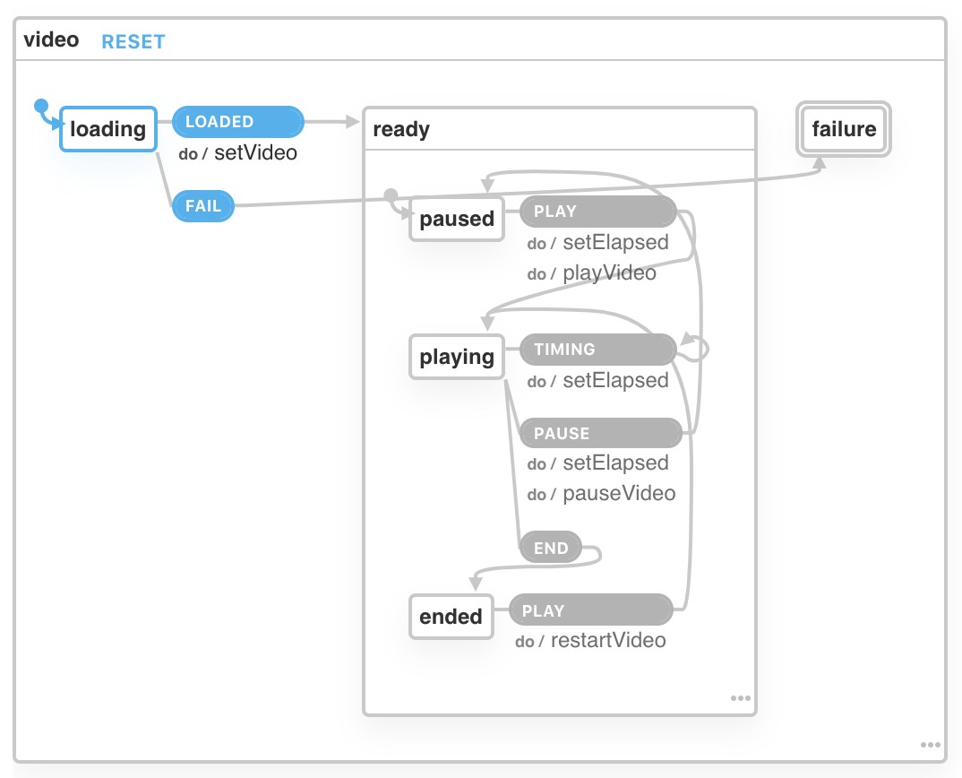
xstate-viz


What you’ve just seen above is the visual representation of the state machine for the video player we’ll be building.

Defining States and Transitioning Between Them

Let’s start to look at the code that defines the video state machine. It all starts with a large object that’s passed to Machine, where we define an id for the state machine, the initial state it should be in, followed by all the possible states.

const videoMachine =Machine({
  id:"video",
  initial:"loading",
  states:{
    loading:{
      on:{
        LOADED:{
          target:"ready",
          actions:["setVideo"]},
        FAIL:"failure"}}// additional states}});

You may have noticed that I only placed a single state here for now, called loading, and that’s so we can explain a few additional concepts before moving on. On the loading state we have an on attribute which is an object:

{"LOADED":{"target":"ready","actions":["setVideo"]},"FAIL":"failure"}

This object defines all the possible events that the loading state is prepared to receive. In this case we have LOADED and FAIL. The LOADED event defines a target, which is the new state to be transitioned to when this event occurs. We also define some actions. These are side effects, or in simple terms, functions to call when this event occurs. More on these later.

The FAIL event is simpler, in that it simply transitions the state to failure, with no actions.

Context

Real-world applications aren’t made up of only finite states. In our video state machine, we actually have some additional data to keep track of, such as the duration of the video, how much time has elapsed, and a reference to the actual video HTML element.ReactT Light_270x123

In XState, this additional data is stored in the context.

const videoMachine =Machine({// ...
  context:{
    video:null,
    duration:0,
    elapsed:0},// ...}

It starts out with some initial values, but we’ll see how to set and modify these values via actions below.

Events and Actions

Events are how to transition your state machine from one state to another. When using XState within a React app, you’ll most likely end up using the useMachine hook, which allows you to trigger events via the send function. In the below code we are triggering the LOADED event (which is available on the loading state), and we’ll pass some additional data to this event.

send("LOADED",{ video: ref.current });

The send function in this case is called within the onCanPlay event which comes with the video element.

exportdefaultfunctionApp(){// Setup of ref to video elementconst ref = React.useRef(null);// Using the video state machine within React with useMachine hookconst[current, send]=useMachine(videoMachine,{
    actions:{ setVideo, setElapsed, playVideo, pauseVideo, restartVideo }});// Extract some values from the state machine contextconst{ duration, elapsed }= current.context;return(<divclassName="container"><video
        ref={ref}
        onCanPlay={()=>{send("LOADED",{ video: ref.current });}}
        onTimeUpdate={()=>{send("TIMING");}}
        onEnded={()=>{send("END");}}
        onError={()=>{send("FAIL");}}><sourcesrc="/fox.mp4"type="video/mp4"/></video>{/* explanation of this code to come later */}{["paused","playing","ended"].some(subState =>
        current.matches({ ready: subState }))&&(<div><ElapsedBarelapsed={elapsed}duration={duration}/><Buttonscurrent={current}send={send}/><Timerelapsed={elapsed}duration={duration}/></div>)}</div>);}

The setVideo action uses a function called assign from XState which allows you to update individual properties of the context. We’ll use this event as an opportunity to copy the ref to the video element over to the context, along with the video duration.

const setVideo =assign({
  video:(_context, event)=> event.video,
  duration:(_context, event)=> event.video.duration
});

Conditional Rendering Based on State Value

We’ve seen bits and pieces of the video state machine, but let’s take a look at it in its entirety. In the list of possible states, the ready state has three sub-states (paused, playing, ended), which is why you find it nested. This is referred to as hierarchical state nodes. In the state machine, we have defined all of the states, their events, and which actions are called for each event. If you’d like to refer back to the diagram to make sense of this, it is available here.

const videoMachine =Machine({
  id:"video",
  initial:"loading",

  context:{
    video:null,
    duration:0,
    elapsed:0},

  states:{
    loading:{
      on:{
        LOADED:{
          target:"ready",
          actions:["setVideo"]},
        FAIL:"failure"}},
    ready:{
      initial:"paused",
      states:{
        paused:{
          on:{
            PLAY:{
              target:"playing",
              actions:["setElapsed","playVideo"]}}},
        playing:{
          on:{
            TIMING:{
              target:"playing",
              actions:"setElapsed"},
            PAUSE:{
              target:"paused",
              actions:["setElapsed","pauseVideo"]},
            END:"ended"}},
        ended:{
          on:{
            PLAY:{
              target:"playing",
              actions:"restartVideo"}}}}},
    failure:{
      type:"final"}}});

Our video player should show the “Pause” button when the state is {ready: 'playing'}, and otherwise should be the “Play” button. Within the Buttons controller, we can control this using if statements along with the current.matches function. which allows us to match the current value of the state machine.

constButtons=({ current, send })=>{if(current.matches({ ready:"playing"})){return(<buttononClick={()=>{send("PAUSE");}}>
        Pause
      </button>);}return(<buttononClick={()=>{send("PLAY");}}>
      Play
    </button>);};

Conclusion

By thinking in terms of states and how our code transitions from one state to another via the events it receives, we’ve been able to model the complex logic of a video player in a way that makes it easier to reason about. If you’d like to hear more from David, the creator of the XState library, it’s worth listening to a podcast with Kent C. Dodds that he did recently, where they talk in detail about state machines and their relationship to music.

Real-Time Data Visualization Using Vue and Socket.io

$
0
0

The need for real-time applications cannot be over-emphasized. Real-time features can be applied on social media applications that need to update all connected users with new data all at once, on data visualization applications, on communication channels and so on.

Going real-time is about sending and updating data as fast as possible in an automated, synchronous and bi-directional manner. It communicates between endpoints and updates data at a speed almost unnoticeable by the user.

Developers are always in search of ways to better automate this process; this search gave rise to technologies like Pusher, PubNub and the likes; however, we’ll use Socket.io for the scope of this topic.

Create a Vue Project

First we have to create a Vue.js project with which we can demonstrate the implementation of our task scheduler. Without further ado, open a terminal window on your preferred directory and run the command below:

 vue create realtime-chart

If you don’t have Vue CLI installed globally, please follow this guide to do so and come back to continue with this lesson afterwards.

When you’re done bootstrapping your Vue application, change into the new Vue application directory and start the development server.

cd realtime-chart
 npm run serve

This will serve your Vue application on localhost:8080. You can navigate to it on your browser and you should see your Vue application running.

Set up Node Server

Next, let’s set up our custom Node server. The logic behind our implementation is straightforward. We listen on an open connection on the server which sends us new values every 5 seconds. We then use these values to update the stock chart on the client.

Install dependencies
We need to install some dependencies for the packages we’ll need both for our server and the client. Open a terminal window in the projects root directory and run the commands below:

npminstall --save chart.js express socket.io socket.io-client vue-chartjs

At this point your dependencies block in your package.json file should look exactly like this:

"dependencies":{"chart.js":"^2.8.0","express":"^4.16.4","socket.io":"^2.2.0","socket.io-client":"^2.2.0","vue":"^2.6.6","vue-chartjs":"^3.4.0"}

Now, create a server.js file in the project’s root directory and update it with the code below:

//server.jsconst express =require("express");const app =express();const port =4000;const io =require("socket.io")(server);const server = app.listen(`${port}`,function(){
  console.log(`Server started on port ${port}`);});functiongetRandomValue(){return Math.floor(Math.random()*(50-5+1))+5;}
io.on("connection", socket =>{setInterval(()=>{
        socket.broadcast.emit("newdata",getRandomValue())},5000)});

Here, we define a getRandomValue() function that returns a random integer. Then we open a Socket.io connection and emit a newdata event with the random integer we generated from the getRandomValue() function every 5 seconds. On the client, all we have to do is listen for this event and update our chart with these values.

Set up Chart on the Client

For data visualization on the client, we’ll use the Chart.js library. It lets you use charts without much hassle inside Vue. It’s perfect for people who need to get simple charts up and running as fast as possible. It abstracts the basic logic but exposes the Chart.js object to give you maximal flexibility.

Open the App.vue file in your project’s src directory and update it with the code below:

<template>
  <div class="small">
    <line-chart :chart-data="datacollection" id="mychart"></line-chart>
  </div>
</template>
    
<script>
import LineChart from "../LineChart.js";
import io from "socket.io-client";
var socket = io.connect("http://localhost:4000");
    
export default {
  components: {
    LineChart
  },
  data() {
    return {
      datacollection: null
    };
  },
  created() {
    this.getRealtimeData()
  },
  methods: {
    fillData(fetchedData) {
      this.datacollection = {
        labels: [this.getRandomChartValues(fetchedData), this.getRandomChartValues(fetchedData)],
        datasets: [
          {
            label: "Google Stock",
            backgroundColor: "#1A73E8",
            data: [this.getRandomChartValues(fetchedData), this.getRandomChartValues(fetchedData)]
          },
          {
            label: "Microsoft Stock",
            backgroundColor: "#2b7518",
            data: [this.getRandomChartValues(fetchedData), this.getRandomChartValues(fetchedData)]          }
        ]
      };
    },
    getRealtimeData() {
      socket.on("newdata", fetchedData => {
        this.fillData(fetchedData) 
      })
    },
    getRandomChartValues(number){
      return Math.floor(Math.random() * number)
    }
  }
};
</script>
<style>
.small {
  max-width: 600px;
  margin: 150px auto;
}
</style>

Here, we imported the LineChart component from a LineChart.js file which we have yet to create. We’ll use this component to customize the behavior of our chart. We then imported the Socket.io client library to maintain communication with our server.

In the applications methods object, we defined a fillData() method that will help us populate our chart with the data fetched from the server. Since we need different sets of values for different parts of the chart, we defined a getRandomChartValues() function that takes in the value we fetched from the server and multiplies it with a random number. This way, we can have different values for all the different parts of our charts.

In the getRealtimeData() method, we listen for the newdata socket event from the server, once received, we call the fillData() method with the fetchedData to populate our chart’s datacollection object.

You may have noticed that we imported a LineChart component from a file we’ve not created yet - let’s create it now. In the project’s root directory, create a new file LineChart.js and update it with the code below:

import{ Line, mixins }from'vue-chartjs'const{ reactiveProp }= mixins
    
exportdefault{extends: Line,
  mixins:[reactiveProp],
  props:['options'],mounted(){this.renderChart(this.chartData,this.options)}}

Testing the Application

Now we are all set to try out our application. You can run the server in a separate terminal window in the projects root directory with:

node server
OR
nodemon server // if you have nodemon installed globally

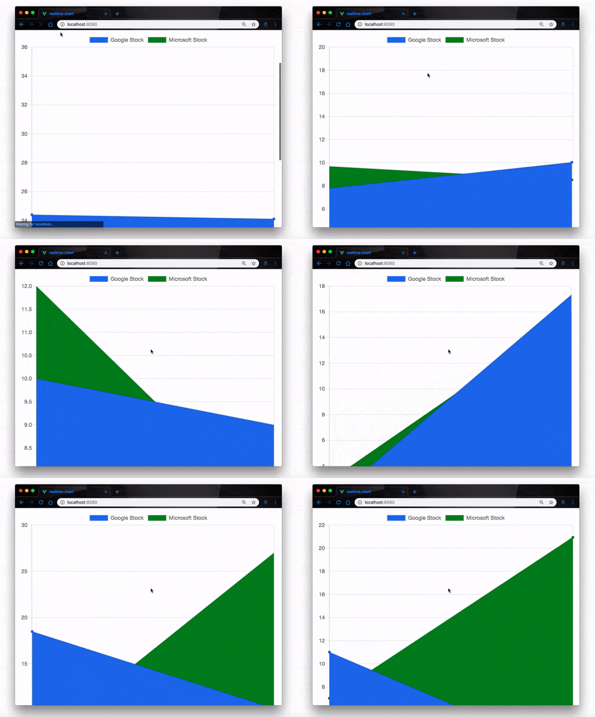
Your Vue app is already running on localhost:8080 on the browser. Navigate to it and watch how the stock data updates with different values in real-time.

Data visualization image 1

Conclusion

In this post, we have demonstrated how to implement real-time data visualization with Socket.io and Vue.js using the Chart.js library. There’s a lot more you can do with this application, you can extend this feature to work with real-time data APIs to monitor stock exchange rates and so on. Feel free to look up documentation on Socket.io, Vue.js and Chart.js to know more.

Understanding Server-Side Rendering

$
0
0

Understanding Server-Side Rendering

In this article, we’re going to learn about Server-Side Rendering, what this technique is and why we should consider it when we’re creating new apps. We’re going to learn how we can benefit from server-side rendered apps, including improving our SEO and making it easier for Google to index our pages.

Server-Side Rendering is not a new technique, but a lot of people don’t understand the concepts behind it, how it can benefit us, why we should use it, and where and when should we use this technique to get a better user experience.

So, first, let’s read a brief introduction about some concepts that we should understand: TTFB and SEO. Then, we’re going to have a brief introduction to Client-Side Rendering, the standard way that we’ve been building apps since the beginning of web development. And then finally we’re going to learn more about Server-Side Rendering and its benefits.

Introduction

Since the beginning of the web, we have always been creating new techniques and improving the old ones. With apps, we change our ways to improve our work and drive better results for our users. Back at the start, when we started to create applications using just raw HTML and CSS — and little bit of jQuery — we didn’t have a lot of the terms and techniques that we have nowadays. We didn’t know anything about Server-Side Rendering, and for a long time we didn’t even know that it was possible. We were more worried about delivering new features, without any concern about UX/UI or app performance. But at some point, it got inviable and we had to start to think about those concepts.

Since for so long performance on our apps wasn’t a concern, improving our techniques for building better apps was slow at first. But now it is one of our primary concerns — we’re always striving for better app performance — and that has pushed us to create a lot of techniques in the last couple of years, such as Server-Side Rendering.

If you’ve tried to create a JavaScript app recently, using any type of framework or library that’s been widely used — such as React, Vue, Angular — you know that two of the most painful points about it are Time to First Byte (TTFB) and also the famous SEO (Search Engine Optimization).

Someone searches your website on Google, and when the user clicks on the link to go to your website, the web browser requests information from the server to display it to the user. Time to First Byte (TTFB) is just the number of milliseconds it takes for the browser to receive the first byte of the response from your web server. This is one of the most important metrics that you can measure on your website, because if you have a higher TTFB on your website, that means it’ll take longer to render the website to your user, which could mean that they leave your website, leaving you with empty hands and without any users.

Another relevant point to having a good TTFB is that Google uses it as an indicator for ranking. By having a strong ranking on Google, everyone knows that you can get more traffic and also can generate more leads to your website.

After you create your app, when you’re deploying it to see the first users entering your website and finally testing the result of a lot of work and creativity, getting traffic is still one of the most difficult points. Some people like to pay for traffic. You can use Google Ads for that, to have a campaign run on a specific niche and gain traffic on your website.

When you’re creating a new web app, to start to get organic, unpaid traffic from the search engine — mostly Google — we need to have a good SEO (Search Engine Optimization). SEO is basically the process of optimizing your website to get a higher rank on the search engine, getting more organic and unpaid traffic, by making some changes to your website design and content to make a more attractive website. This process of optimizing your website for better SEO can get quite complex, and it can take a lot of time and effort to have the best SEO on your app to get a better ranking on the search engine.

But you might be wondering now what those two points — TTFB and SEO — have to do with Server-Side Rendering. Well, everything! Since we try to create powerful web apps and have a better user experience, we need to have a decent TTFB, to not take long to render the content to the user, and also have a strong SEO to be ranked well on Google, being highly ranked means more organic traffic, which can mean more leads.

Let’s learn a bit more about Client-Side Rendering and then learn more about Server-Side Rendering so we can understand the differences.

Client-Side Rendering

If you’ve been working in web development and have been creating web apps for the last few years, there’s a high chance that you’ve been creating client-side rendered apps without noticing it. It became the standard way to create apps, and we’ve been benefiting from it a lot. But there are some points that we must consider to understand if Client-Side Rendering is the best approach for our application, as we understand and weigh its core problems.

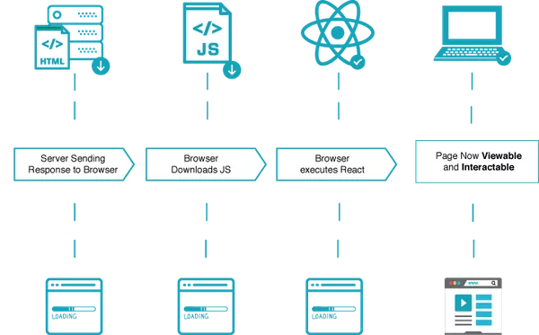
When you’re creating JavaScript web apps — any framework or library can be used here as an example — you’re rendering browser content using JavaScript. Basically what’s happening is: you receive your HTML document, and JavaScript will help you with the rendering of the app. That’s basically the concept of Client-Side Rendering — the data is retrieved from the server, and processed at the browser to display to the user.

Image by ReactPWA

That means that the render of your page is totally up to the user, depending on what kind of network connection they’re using at the moment, and also the device they’re using. Let’s imagine that they’re using a smartphone, and they’re using a slow 3G network connection. If the application is too heavy, it’s going to take a lot of time to render the page.

Some of the cons of using Client-Side Rendering are:

  • TTFB (Time to First Byte) and Performance— For most people, one of the most painful points of client-side rendered apps is the performance. While pages on server-side rendered apps are ready to be rendered, client-side rendered apps load a browser with an empty document while waiting for JavaScript to help you render the page. You still can have a really fast web app, but you’ll need to pay attention to some minor details in order to achieve that level of interaction and performance in your app.

  • **SEO (Search Engine Optimization) ** — SEO is still one of the cons of having a client-side rendered app. You can achieve a nice level of SEO in your app with a client-side rendered app, but the time and effort that you must put in to achieve it is significant.

  • Concerns— If you’re planning to create a client-side rendered web app, you need to attach some concerns and points that you must pay attention to in order to achieve a nice and well client-side rendered web app, such as bundling, transpiling, linting, code-splitting, lazy loading, etc.

That’s only a brief look at the cons that we have in Client-Side Rendering, but that doesn’t mean that you should never use it. You should consider what you can and want to achieve in your application, define a plan and the right technique for it, and go ahead.

Client-side rendered apps are widely used nowadays, and they won’t die any time soon. Now that we know a little bit about Client-Side Rendering, let’s finally learn about Server-Side Rendering.

Server-Side Rendering

When we have a client-side rendered app, we know that our application is rendered on the client. As you can suppose, the Server-Side Rendering concept is the opposite — your page is ready to be rendered by the server, without needing the client to wait for anything.

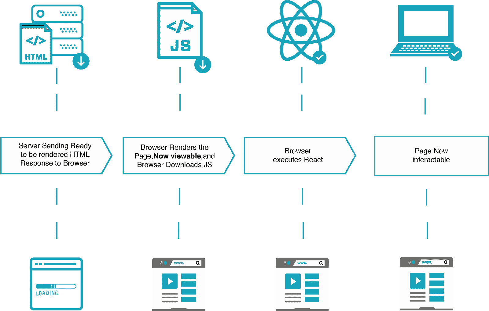
Every time the user enters a server-side rendered app, the client will request the information for the server, and the server will deliver the fully loaded page to the client. First, the application will be rendered as just raw HTML and CSS, to render the first view to the user. Then, while the DOM is being rendered, the app will be parsed and initialized. Only after that, will the application be fully loaded and the user be able to interact.

Image by ReactPWA

That’s one of the most beautiful things about Server-Side Rendering — you don’t need to wait for JavaScript to load the content for you, the server already does that. As you can imagine, Server-Side Rendering has a lot of benefits such as:

  • Performance— Your content is totally loaded on the server-side, which means you can gain some extra and precious milliseconds or even full seconds while rendering your app.

  • SEO— The content is totally crawlable by Google — or any other search engine — resulting in a better rank and more organic and unpaid traffic on your app.

  • Load the application without JavaScript— If a user tried to load the application without JavaScript enabled, it wouldn’t be a problem since all the content is loaded on the server-side.

Those are only some of the benefits that you can have with Server-Side Rendering, but it comes with some costs as well. When you’re starting to create a new application, it’s very important that you define what type of application you want it to be, and define the most important points that you need to achieve in order to deliver the most genuine and balanced experience to your client.

Conclusion

In this article, we learned how browsers work and about some important metrics for search engines such as Time to First Byte (TTFB) and SEO (Search Engine Optimization). Also, to understand about Server-Side Rendering, we learned about Client-Side Rendering. Server-Side Rendering is basically the technique to return the whole page rendered from the server, and we learned how it can benefit us with a better and performative application.

What Is Banner Blindness and What Should You Do About It?

$
0
0
Your visitors don’t just see ads, pop-ups, and other small interruptions as an annoyance. They know exactly what’s going to happen the second one of them intrudes on their experience: they’re going to have to re-engage with your website and try to make up for lost time (even if it is just a few seconds). You want to keep your visitors happy from start to finish, which means finding a better way to put your revenue and lead generation elements in front of visitors.

There was a time when the web was overrun with ads that opened in new windows — some of which weren’t discovered until you closed your browser for the day and discovered a barrage of them hiding beneath it. It was frustrating, to say the least.

While we’ve moved past the days of pop-out ad windows, are the ad and ad-like interruptions we put on websites nowadays really any better?

Considering the proliferation of banner blindness (and even more overt ad-blocking tactics), I think it’s safe to say that we’re continuing to annoy the heck out of our visitors.

Rather than continue to include these annoyances on our sites, let’s take a look at what the underlying issue is and how to design a better experience that doesn’t compromise your client’s ability to generate leads and revenue from their website.

The Problem with Ads, Pop-ups, and Other Small Interruptions

Think about the last time you were chugging along at work when your manager or an employee knocks on the door or pings you over Slack:

“Hey, can you look at this thing real quick?”

Even if you don’t have time to look at that small “thing,” the disruption alone costs you.

There’s an often-cited study from the University of California, Irvine on the cost of interruptions. The findings of this study found the following:

“When people are constantly interrupted, they develop a mode of working faster (and writing less) to compensate for the time they know they will lose by being interrupted. Yet working faster with interruptions has its cost: people in the interrupted conditions experienced a higher workload, more stress, higher frustration, more time pressure, and effort. So interrupted work may be done faster, but at a price.”

We’ve all experienced that pain as professionals. But what about as consumers?

Consider this from the perspective of a website visitor:

They go to your website with a specific goal in mind. Read an article. Buy a product. Subscribe to a service. Along the path to that objective, however, is a seemingly slight interruption in the form of an ad or pop-up.

Whether they decide to take action or disregard it, it’s disrupted their flow. This, in turn, increases the likelihood that, when they return their attention to what they came to do, they feel annoyed and pressured to just get it over with.

What Is Banner Blindness?

“Banner blindness” describes a sort of tunnel vision people get on websites. Rather than take time to soak in every detail and acknowledge every pop-up and alert and ad in front of them, they focus on one clear and narrow path.

Some users have even gone so far as literally blind themselves against ads with ad-blocking tools. According to Statista, this is the number of internet users in the U.S. who use or are expected to use ad-blocking tools:

Statista - Ad Blockers (002)

Statista data on the number of Internet users who have ad blocking technology on their computers. The data shows upward growth from 15.7% in 2014 to a projected 27% in 2021. 

Even without the use of ad blockers, internet users have had enough. As the Nielsen Norman Group explains in its findings:

“On the web, UI elements and different pieces of content all fight for users’ attention. To complete their tasks efficiently, people have learned to pay attention to elements that typically are helpful (e.g., navigation bars, search boxes, headlines) and ignore those which are usually void of information.”

Really, any sort of advertorial or promotional element used on a website may be excluded by your visitors’ banner blindness. For example:

  • Pop-ups promoting lead magnets
  • Browser push notification requests
  • Inline and sidebar ads on blogs
  • Video ads
  • Unrelated callout boxes
  • Cookie consent notices

Because design trends spread like wildfire once prolific marketers or digital influencers start touting them as the next “hot” thing, we’re only making it worse for our consumers.

For instance, the track your location message like this one used by Social Media Today:
Social Media Today Notice (002)

Social Media Today displays a small pop-up on top of browser, asking visitors if they will share their location with the website.

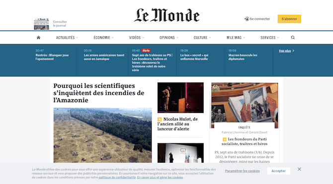
Or the cookie consent notice that seems to be on every website since the implementation of GDPR last year, like this one on the Le Monde website:

Le Monde Cookie Notice

Le Monde displays a cookie notice at the bottom of its website that must be dismissed or accepted.

Vitaly Friedman of Smashing Magazine says:

“In our research, the vast majority of users willingly provide consent without reading the cookie notice at all.”

A cookie consent notice is essential, especially in light of the major privacy violations that have taken place on the web in recent years. However, because it’s become such a predictable interruption, users don’t even bother to read the content or explore the options within the banner. They simply “Accept” so they can move on.

How to Design for Banner Blindness

Banner blindness is a problem. If your visitors are unable to see the pop-ups and ads you’ve carefully placed on the website, or willingly pass them by, how is your client going to maximize their lead generation efforts and conversions?

It gets even worse.

NNG’s research found that it’s not just ad-like elements that go ignored. The following are also affected by banner blindness:

  • Elements placed in locations where ads are usually found (like a sidebar)
  • Elements placed near an actual ad
  • Elements designed to resemble an ad

Even if your website isn’t populated by a bunch of intrusive ad-like elements, any resemblance or relation to them is enough for some visitors to skip over them.

As you go about building websites for your clients, consider the following tips for introducing ads, pop-ups, and other interruptions in a way that won’t harm the experience:

1. Prioritize the Content.

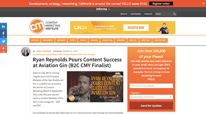
The Content Marketing Institute has a number of disruptions on this page:

CMI Banner

Content Marketing Institute has an ad for ON24 in the header, a newsletter subscription form on the sidebar, and $100 savings banner in a top sticky bar.

Overall, there are too many promotional elements on the page. There’s the newsletter signup on the sidebar, which might’ve been okay if it was the only promotional element on the page. Even then, the sidebar is a risky place to put it if users are wary about ads being there.

There’s also an ad to the right of the logo. This isn’t a very smart choice, as it distracts from the website’s branding and also pushes the navigation down another layer.

Finally, there’s a promotional offer to save $100 on the conference in the sticky bar up top. While it’s nice that visitors are spared an intrusive pop-up that has to be dismissed to see the content, it’s still one too many calls-to-action and not enough content.

If you want to prevent your visitors from getting banner blindness, don’t overload their visual field with ads and promotions. It’s no different than how you design a call-to-action for a page. The more choices you give them, the harder it’s going to be to persuade them to take action. So, keep it simple.

2. Put Some Thought into Designing Your Ads.

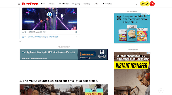
BuzzFeed is another one of those websites that’s guilty of going overboard with ad monetization.

BuzzFeed Ads

BuzzFeed has ads for Hyatt Place hotels, OLLY snacks, and something for an “instant transfer” but whose advertiser you can’t see.

Compare this page to the one on the CMI website though. Notice anything different?

No matter how overboard it’s gone with placing promotional elements on the page, CMI has done a beautiful job of designing them to blend with the website. BuzzFeed, on the other hand, has put any old ad on the page so long as it fits into the space. Even worse, the sidebar ads change as the user scrolls, creating an even greater distraction for them as they try to focus on the content.

If you’re going to use numerous ads or promotions on a page, don’t make it so glaringly obvious. By blending them with the site, you can make it feel more like your visitors have the option to engage with the interruptions if they want to.

3. Limit How Many Ads You Bring in from External Networks.

There’s something even more troubling happening with websites that import banner ads from third-party ad networks.

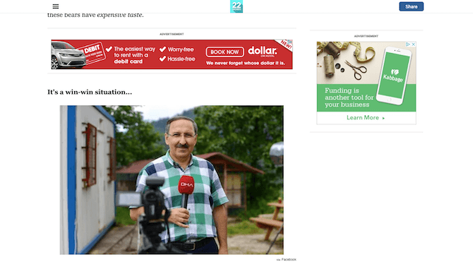
This is the website for 22 Words, a competitor of BuzzFeed:

22 Words Ads

This page on the 22 Words website includes an ad for Dollar And Kabbage.

Again, ads are imported from an external network, so there’s no control over the design.

What’s more, ads continue to intrude on the experience all the way down the page, which takes a very long time to get to, too. Part of this may be due to how many images are on the page, though with a good caching system, that shouldn’t be a problem. The overuse of ads is more likely to blame for the length of the page and the long loading times.

This is the pagespeed score Google gives this page on desktop:

22 Words Desktop Speed (002)

The 22 Words web page gets a score of 42 out of 100 on desktop.

And this is its mobile pagespeed score:

22 Words Mobile Speed (002)

The 22 Words web page gets a score of 25 out of 100 on mobile.

Neither of these scores is good, but the mobile score is especially troubling.

If you need a reason to stop using so many ads on your website, let this be it.

Your users visit your website to get some value out of it. If you bog it down with annoying ads at every scroll and, worse, slow down their reading experience in the process, don’t expect them to stick around long enough to see if there’s anything of value there.

4. Create More Passive Interruptions.

That might seem like an oxymoron — a “passive interruption” — but I assure you it’s not.

For example, remember the CMI newsletter signup form on the sidebar? According to NNG’s research, there’s a chance that signup form will be ignored by visitors because they expect ads and other promotional elements to reside there.

Here’s the thing though: you’re going to want people to subscribe to its newsletter. It’s the only way to ensure they know when new content or products hit the site. It’s also the best way to start growing your email list. So, what do you do?

Well, you can put it somewhere that’s out of the way, but still sure to get noticed. Like Uncommon Goods does with its footer form:

Uncommon Goods Lead Gen

Uncommon Goods moves its newsletter form to the footer of its website.

Another way to avoid placing unnecessary pop-ups on the site is by designing the element directly into the page.

This is the first thing visitors see when they enter the Debenhams website:

Debenhams Popup (002)

The Debenhams website greets visitors with a pop-up asking for their location and currency.

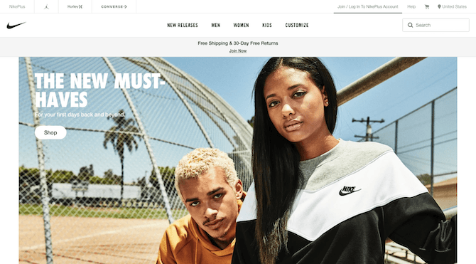
There’s no reason to introduce an interruption so early in the visit. There’s also no reason to put this information in a pop-up when visitors know they can find this kind of location switcher widget at the top or bottom of many websites. Like Nike does in the top-right corner of its header:

Nike International

Nike places a location switching widget in top-right corner of its website.

This is a much better and non-intrusive way to share this information with visitors.

Then, there’s the matter of banner ads.

Your visitors might have ad blockers installed that keep them from seeing your ads. For the rest, though, do you really want your banner ads to interrupt what they’re doing?

Your client might put up a fight when it comes to this. After all, how will they make money if the content is free and they don’t want to force memberships on visitors?

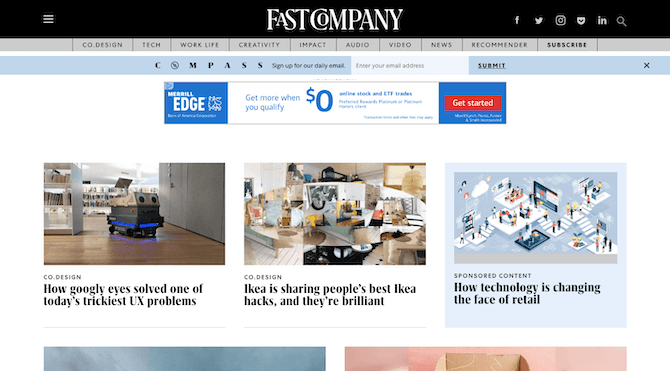
Fast Company has found a good middle ground:

Fast Company Sponsored Content

Fast Company has a banner ad for Merrill Edge and a highlighted block for a sponsored post mixed in with the rest of its content.

Fast Company uses a mix of banners ads and sponsored content to monetize its website.

This way, even if users miss out on the banner ads due to ad blockers or banner blindness, there’s still a chance to make money from them with sponsored posts.

Wrap-Up

One thing is for certain: Internet users are becoming more savvy to what websites are capable of. So, when choices are made to present interruptions into their reading, browsing, or shopping experiences, it can be understandably frustrating for them. Not only are you asking them to stop to look at an ad or pop-up they may not have any use for, but you’re unwittingly forcing them into a different mindset when they re-engage with the website.

To keep visitors happy and focused on what they came to your website to do, design these distractions so that they don’t get in the way. You still need them for the purposes of lead and sales generation, among other things, but you can give visitors more control over when and how they engage with them.

Build an Animated Login Form in Angular Using Kendo UI

$
0
0

In this post, we'll build an animated login page for an Angular application using Kendo UI components. We’ll learn how to use TextBox from the Input components, which provides a floating label, and also add a zoom effect from Kendo UI for jQuery.

Nowadays, creating an eye-catching product is one of the most common traits of web applications. This can either be geared toward creating better conversions or attracting users to buy, click and view things on a website. Animations help achieve all these goals and more.

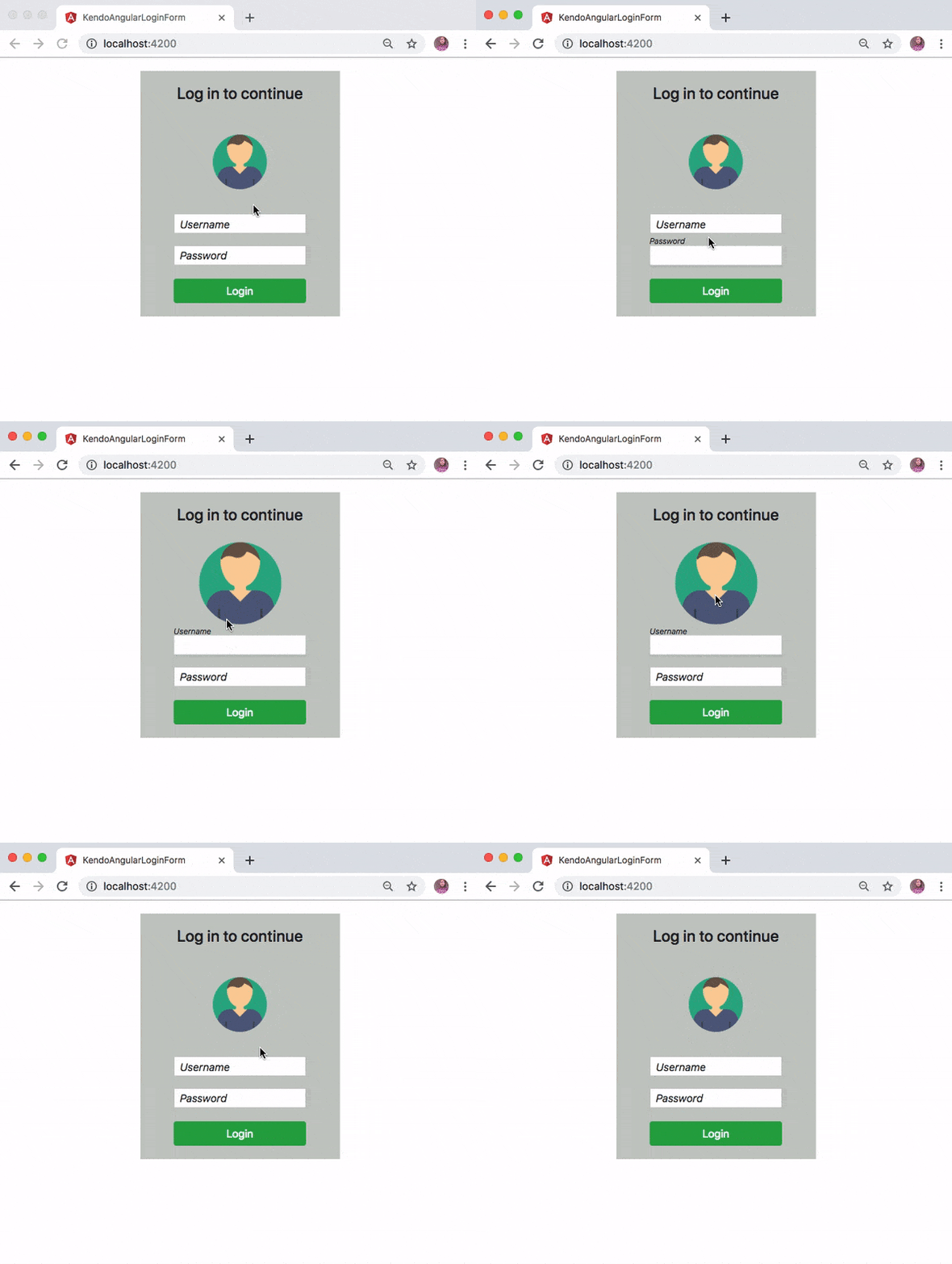
In this post we will further explore the Kendo UI components for Angular and build an animated login page. We’ll use the Input components from Kendo UI for Angular and combine them with a user interface interactivity component from Kendo UI for jQuery to achieve the page shown below:

gif sept 25

Getting Started

Before we start building the login page, you first need to download and install Angular CLI globally on your machine. This will help you craft a new Angular application without much hassle. Run the command below for that purpose:

npminstall -g @angular/cli

Create Angular Application

Now that you have Angular CLI installed, let’s proceed to create a new Angular application for this demo. Run the following command in the terminal from one of your projects folder:

ng new kendo-login-form

The preceding command will create a new Angular application in a folder named kendo-login-form. You can move into the newly created project with the command below and start the application:

// change directory
cd kendo-login-form
    
// Start the application
ng serve

You may experience an error with the message below in your console:

ERROR in node_modules/rxjs/internal/types.d.ts(81,44): error TS1005: ';' expected.
node_modules/rxjs/internal/types.d.ts(81,74): error TS1005: ';' expected.
node_modules/rxjs/internal/types.d.ts(81,77): error TS1109: Expression expected.

This is a known issue on GitHub and it’s due to lack of compatibility between the current version of TypeScript on your machine and rxjs. The quick way to fix this is to delete the node_modules folder. Now, open the package.json file and within the dependencies object, edit the rxjs by removing ^ :

"dependencies":{..."rxjs":"6.0.0",// remove the `^`"zone.js":"^0.8.26"},

Save the file and run npm install command again. Once the installation process is complete, you can proceed to start the application with ng serve.

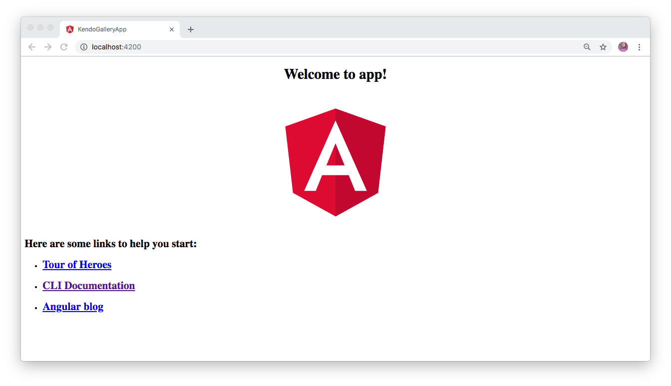
This will compile your application and start the development server. To view the default page of this Angular application, navigate to http://localhost:4200 from your favorite browser and you will see this:

angular sept 25


Install Angular Input Component

Angular CLI supports the addition of packages through the ng add command. So we’ll use it to add Kendo UI Angular Input components. Use this command for that:

ng add @progress/kendo-angular-inputs 

Kendo UI Input components can generally be used to render HTML input fields that allow users to input data easily for any Angular application. Some of these input fields include TextBox, TextArea, NumericTextBox, Slider and so on.

After installing the kendo-angular-inputs package, we can now make use of the InputsModule that has been automatically imported into our application as shown here in ./src/app.module.ts file:

// ./src/app/app.module.ts...import{ InputsModule }from'@progress/kendo-angular-inputs';import{ BrowserAnimationsModule }from'@angular/platform-browser/animations';
    
    
@NgModule({..
  imports:[
    BrowserModule,
    InputsModule,
    BrowserAnimationsModule
  ],...})exportclassAppModule{}

Kendo UI Angular Input Component in Action

To render the Input component within the view, all that is needed is to include the <input KendoTextBox /> on our page. Furthermore, we will wrap the <input /> elements with a TextBoxContainer component in order to give the input element a floating label. Replace the content of ./src/app/app.component.html file with the following:

// ./src/app/app.component.html
    
<divclass="container-fluid"id="authentication-wrapper"><divid="welcome-message"><h4>Log in to continue </h4></div><divid="wrap"><imgsrc="https://bit.ly/2udBml1"alt="profile picture"></div><divclass="row"><divclass="col-xs-12 col-sm-12 col-md-12"><kendo-textbox-containerfloatingLabel="Username"><inputkendoTextBoxtype="email"/></kendo-textbox-container></div><divclass="col-xs-12 col-sm-12 col-md-12"><kendo-textbox-containerfloatingLabel="Password"><inputkendoTextBoxtype="password"/></kendo-textbox-container></div><divclass="col-xs-12 col-sm-12 col-md-12"><buttonclass="submit-btn btn btn-success"> Login </button></div></div></div>

Here, we have added the Input components and wrapped them with a textbox component and also defined a floatingLabel for each.

Add the Zoom Effect

In order to complete the animated login page here, we’ll also include a zoom effect by adding the following CDN files for jQuery and Kendo UI within the ./src/index.html file. Replace the content of the index.html file with this:

<!-- ./src/index.html --><!doctype html><htmllang="en"><head><metacharset="utf-8"><title>KendoAngularLoginForm</title><basehref="/"><metaname="viewport"content="width=device-width, initial-scale=1"><linkrel="icon"type="image/x-icon"href="favicon.ico"><linkrel="stylesheet"href="https://kendo.cdn.telerik.com/2019.1.220/styles/kendo.common.min.css"/><linkrel="stylesheet"href="https://kendo.cdn.telerik.com/2019.1.220/styles/kendo.default.min.css"><linkrel="stylesheet"href="https://kendo.cdn.telerik.com/2019.1.220/styles/kendo.default.mobile.min.css"><linkrel="stylesheet"href="https://stackpath.bootstrapcdn.com/bootstrap/4.3.1/css/bootstrap.min.css"></head><body><app-root></app-root><scriptsrc="https://kendo.cdn.telerik.com/2019.1.220/js/jquery.min.js"></script><scriptsrc="https://kendo.cdn.telerik.com/2019.1.220/js/kendo.all.min.js"></script></body></html>

Update the App Component

Replace the content of the app component by adding the following code:

// ./src/app/app.component.tsimport{ Component, OnInit }from'@angular/core';declarevar $:any;declarevar kendo:any;
@Component({
  selector:'app-root',
  templateUrl:'./app.component.html',
  styleUrls:['./app.component.css']})exportclassAppComponentimplementsOnInit{constructor(){}ngOnInit(){$(document).ready(function(){$("#wrap img").hover(function(){
        kendo.fx(this).zoom("in").startValue(1).endValue(1.5).play();},function(){
        kendo.fx(this).zoom("out").endValue(1).startValue(1.5).play();});})}}

Once the application loads, we added a zoom effect to the user image on the login form on hover.

Lastly add the following styles to the application’s stylesheet as shown here:

// ./src/app/app.component.css#authentication-wrapper{width:300px;text-align: center;background:#c6cac6;}#wrap{margin-bottom:20px;}#wrap img {width:82px;bottom:65px;}#welcome-message{margin:20px;padding:20px;}.submit-btn{width:74%;margin:20px 0;}

Test the Application

Now proceed to start the application again by running ng serve from the terminal within the application’s directory. Once the application is built and served on http://localhost:4200 you will see this:

gif sept 25

Conclusion

In this post, we used Kendo UI components to include input fields for our Angular application. We also learned how to leverage Kendo UI to add some sort of animations to a login form.

Hopefully you have learned from this post and will give Kendo UI components a try for your Angular web applications. Don’t hesitate to read the official documentation to get a feel of other awesome features offered by Kendo UI.

Telerik UI for Blazor Team at BASTA Conference!

$
0
0

This week the Telerik UI for Blazor Team is at BASTA conference in Germany - the leading independent conference for Microsoft, Cloud & Web Technologies. We are also super excited to meet and talk to so many of you - current and future fans of Blazor.

Thanks to everyone who joined the inspiring keynote speech and demo delivered by our Manager of Software Engineering Pavlina Hadzhieva  Goodbye, Client-side JavaScript – Hello, Blazor.

Pavlina Hadzhieva  Goodbye, Client-side JavaScript – Hello, Blazor. 

                         Pavlina Hadzhieva  Goodbye, Client-side JavaScript – Hello, Blazor.

During her session Pavlina gave an overview of the Blazor framework and the paradigm shift it brings with client-side development with C#. She did a demo on building a Blazor application and discussed the benefits that Blazor will bring to your next project. She also shared with the audience the approach and choices that had to be made when developing native components for Blazor. The keynote speech wrapped up with insights around the Telerik UI for Blazor roadmap, lots of applause and follow-up discussions with our team.

Pavlina Hadzhieva  Goodbye, Client-side JavaScript – Hello, Blazor.

                Pavlina Hadzhieva  Goodbye, Client-side JavaScript – Hello, Blazor.

Telerik UI for Blazor Booth at BASTA

                                          Telerik UI for Blazor Booth at BASTA

This week is major for the Telerik UI for Blazor Team for three more reasons:

Happy Blazor Power Week and Stay Tuned for More Exciting News!


New features in React 16.9.0

$
0
0

In this post, you will be introduced to the newest version of React.js and all the deprecations that come with it, as well as general news about the future.

React is one of the most popular JavaScript libraries around, with over 110,000 stars and over 2 million people using it on GitHub. A host of dedicated community members makes life easier for developers, building an amazing user interface that has released the newest version: 16.9.0 (React now has over 100 releases).

Today we are releasing React 16.9. It contains several new features, bugfixes, and new deprecation warnings to help prepare for a future major release.  — React Blog

Now let us look into these new features:

Async Act()

In the last major release of React.js, a new testing utility was shipped. It is called act() and it helps developers write tests that match the various browser behaviors better.

A good example is how multiple state updates inside a single act get batched, matching normal React behavior for handling browser events. In React 16.8, the only act support was for synchronous functions and there were some warnings that still showed up while using it. But now in this new version 16.9 there is support for asynchronous functions, so you can await the act calls.

await act(async () => {  // ...});

Fixes for the previous warnings were also included in this version, so all your warnings will disappear as you update your React version.

Also the React team has invested some time into creating resources to help developers fully understand how to write tests with act() with the new testing recipes guide. It contains common use cases and how act() can be used in each to write tests. The examples make use of DOM APIs, but you can also use the React testing library.

Performance Measurements with Profiler API

The Profiler API for DevTools first got shipped in the 16.5 React version. It helps developers find difficulties in your web application. In this new 16.9 version, the React team has gone a step further to enhance the API.

With the new <react.profiler> you can measure a host of things programmatically yourself in the DevTools on DOM render from the phase to the times and even durations and interactions. It is ideally meant for larger applications to constantly check their performance and regressions over time. The Profiler is essentially a measuring tool for renders and it identifies the parts of your app that cause sluggishness and should benefit from memoization.</react.profiler>

A Profiler looks like this:

render(  <Profiler id="application" onRender={onRenderCallback}>    <App>      <Navigation {...props} />      <Main {...props} />    </App>  </Profiler>);

You can learn more about them and the parameters passed on render or call backs here in the official documentation.

It is important to note that they are disabled for production environments by default due to the additional overhead. If you want production profiling, then you can check out this resource where React provides a special production build with profiling enabled.

Renaming Unsafe Lifecycle Methods

Sometime last year in an update, the React team informed us of a decision to change the names of lifecycle methods that were deemed unsafe.

The lifecycle methods affected are listed below:

  • componentWillMountUNSAFE_componentWillMount
  • componentWillReceivePropsUNSAFE_componentWillReceiveProps
  • componentWillUpdateUNSAFE_componentWillUpdate

Do not panic: Your old application will not break with this particular update, as the old names still work. However, whenever they are in use, there will be a warning in your terminal:

warning

The warnings will send you links to resources for alternatives to these unsafe methods, but you can just run a simple codemod script that goes into your application and automatically renames all the unsafe lifecycle methods:

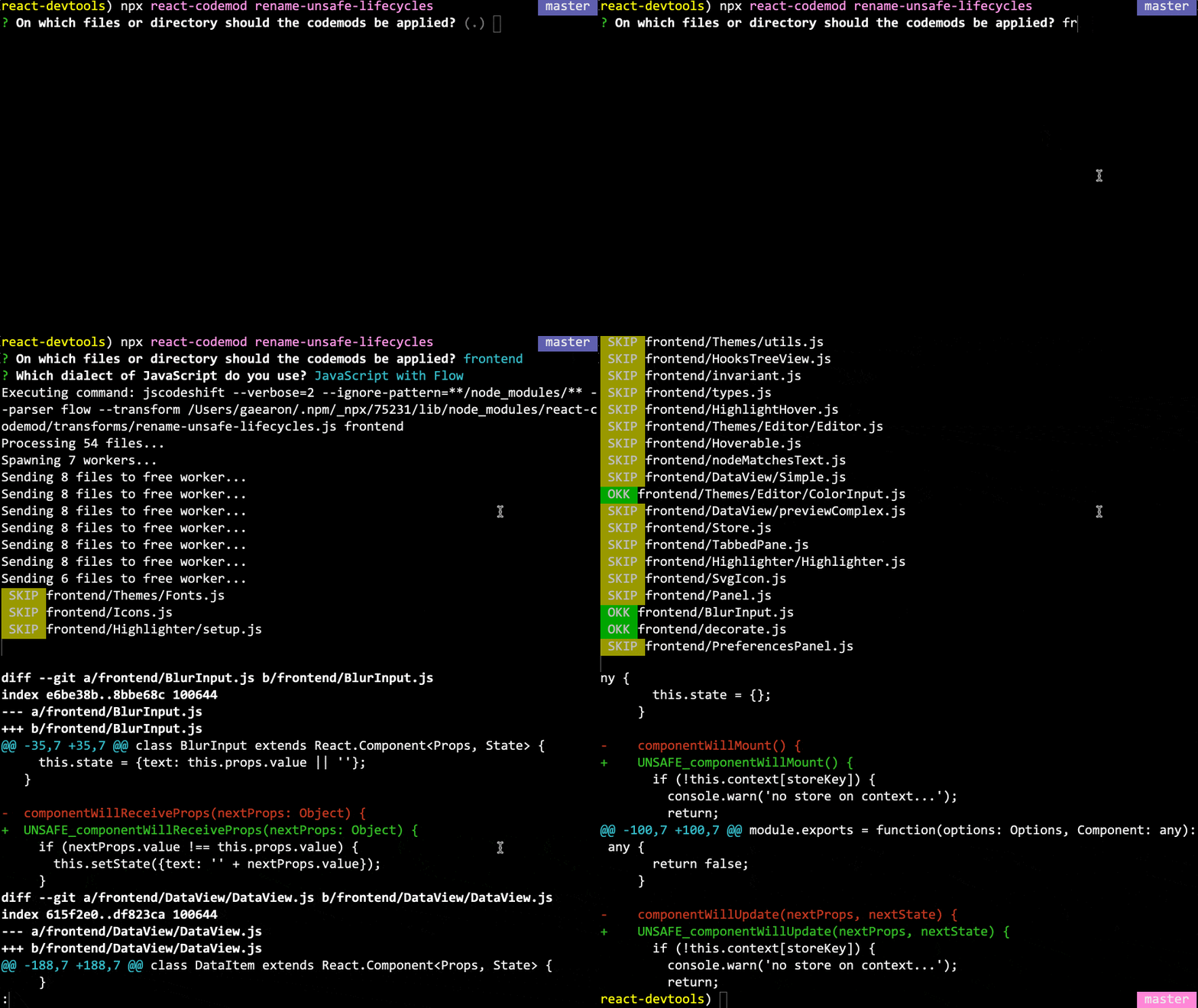
cd your_projectnpx react-codemod rename-unsafe-lifecycles

Running this codemod will replace the old names like componentWillMount with the new names like UNSAFE_componentWillMount:

warning 2

Moving forward, the React team promises that the unsafe methods will keep working on this update and even in version 17 soon to come. The prefix will enable developers to be constantly be reminded of their safety.

Removal of JavaScript URLs

It is a very old practice to use the javascript: inside the href attribute, but it is still done today. The React team has found it to be an unsafe practice, as it can open up security holes in your web applications.

const userProfile = {  website: "javascript: alert('you got hacked')",};// This will now warn:<a href={userProfile.website}>Profile</a>

In this new version of React, if you still use it, you will see warnings on your terminal to remind you that it is prone to vulnerability, and a solution like using event handlers is also suggested. In the future, however, this practice will be deprecated and so will throw an error.

Factory Components

This will not affect a whole lot of people, as it is not widely used, but during React compilation, factory components that return an object with a render method were supported; that was before Babel.

function FactoryComponent() {  return { render() { return <div />; } }}

However, it is a confusing pattern, as it can be used in place of function components that return a template value instead. This support is also responsible for a little bit of the slowness React experiences during compilation, so it is being deprecated. A warning will be logged when you use it, and a great alternative should be adding:

FactoryComponent.prototype = React.Component.prototype

In your file, you can also convert it to a class or a function component.

Future Plans

These are a few things to look forward to from the React team in the near future:

  1. There is a plan to release support for both Concurrent Mode and Suspense for Data Fetching in a single combined release instead of as single updates soon.
  2. The team has started working on a new Suspense-capable server renderer, but it will not be out with the release above. However, a temporary solution that lets the existing server renderer emit HTML for Suspense fallbacks will be out with it.

Upgrading Your Version

React v16.9.0 is available on the npm registry. To install React 16 with Yarn, run:

yarn add react@^16.9.0 react-dom@^16.9.0

To install React 16 with npm, run:

npm install --save react@^16.9.0 react-dom@^16.9.0

You can also use UMD builds of React through a CDN:

<script crossorigin src="https://unpkg.com/react@16/umd/react.production.min.js"></script><script crossorigin src="https://unpkg.com/react-dom@16/umd/react-dom.production.min.js"></script>

Conclusion

You have been introduced to the new React release and all the new features it ships with. As we wait for the next major version, 17, we also learn that a few important deprecations have been made in this minor version and you should take note of them. What is your favorite feature?

What's New in Fiddler for Windows v5.0.20194

$
0
0

Since we released Fiddler Everywhere back in November 2018 (for more info check this blog post), our primary focus was getting feature parity with Fiddler for Windows. However, this doesn’t mean that you won’t get new features. Here’s the proof – today’s release brings you some of the most wanted features from the feedback portal.

Preserve the Filters

Now with Fiddler filters are set automatically. Just add your filters, and they will be there every time you load the app so you don't need to add them manually.

Get Started Tab

Fiddler now introduces a new Get Started tab where you can find everything you need to get started with Fiddler in one place. Find the most used Fiddler commands, useful learning resources, recently opened archives and more. This is the place where you’ll find the latest news, articles or offers by Progress Telerik – the company that stands behind Fiddler.

Grouping AutoResponder Rules

Now you can group your AutoResponder rules. This will give you the ability to easily manage your rules within Fiddler.

Known Browsers

Now Fiddler recognizes MS Edge and Brave as web browsers. Moreover, you can customize Fiddler’s known browsers by using fiddler.knownbrowsers config.

Minor Fixes & Features

With this release, we managed to fix some of the most annoying issues, updated our TLS support to 1.3 and many more.

We’re looking forward to your comments about the release below or in our forums and feedback portal.

Happy Fiddling!

A WPF Journey to the Visual Studio 2019's Lavender Valley

$
0
0

Do you share the Microsoft team’s eagerness to deliver the best possible user experience that we encounter every day using Visual Studio? We do and with the latest official release of Visual Studio a new theme was born. Greet the latest addition to Telerik UI for WPF’s Theme Suite - the Visual Studio 2019 theme.


The R3 2019 release of Telerik UI for WPF components is live and comes with the new theme so you can bring the Visual Studio 2019 appearance to your desktop applications. Let’s dive into the theme’s features and specifications and explore the variety of advantages that come with it.

Steal a Glance at It

The feeling that I got when I heard about the new refreshed look of Visual Studio was excitement. I really loved the colors. All those blue and purple shades are somehow softer, calmer and relaxing. Oh, and the yellow shades – so cheerful and energetic.

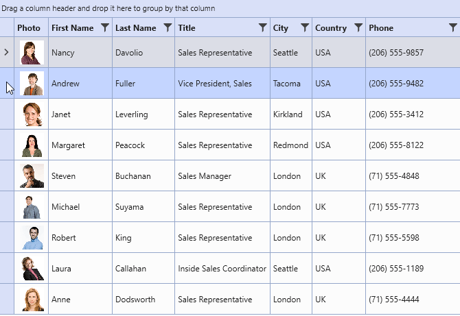
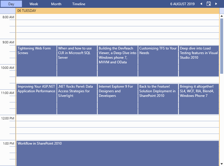
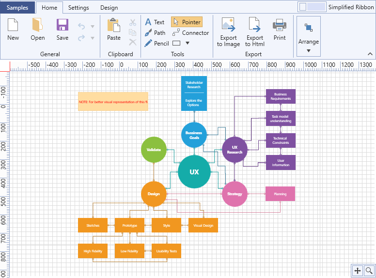
Just look at some of the most used controls from the Telerik UI for WPF’s controls:

GridView

ScheduleView

DiagramRibbon

You saw it. You liked it? You want it? Now let me show you how to get it.

Add the Visual Studio 2019 Theme to Your WPF App

One of my most favorite phrases is, “always leave room for dessert.” But I don’t want to offend those that are fans of starting with dessert either . So, let’s start with it this time.

Oh, yes. The dessert is this quick tutorial on getting started with the theme.

For implicit styles lovers:

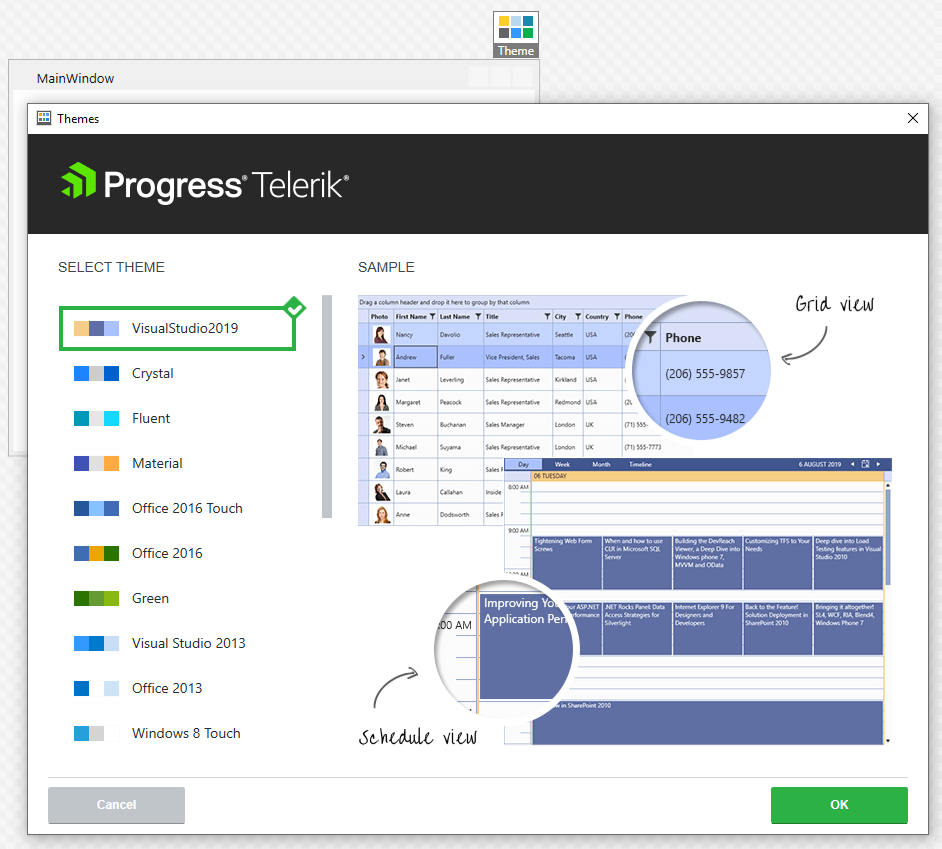
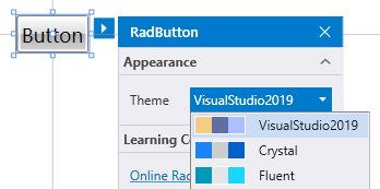
Drag a Telerik control from the toolbox, click on it in the Design View and choose Visual Studio 2019 from the available themes:

ThemeWizard

For StyleManager lovers:

You have two secret (or not) weapons - code-behind and StyleManager’s Theme attached property. The first one is easy:

publicMainWindow()
{
   StyleManager.ApplicationTheme = newVisualStudio2019Theme();
   InitializeComponent();
}

The second one is even easier:

StyleManager

P.S. You can achieve this in XAML as well:

<telerik:RadButtontelerik:StyleManager.Theme="VisualStudio2019"/>

Congrats, masters! See? It’s a piece of cake.

Cake

That's from me – you deserved it.

If you’re ready for your Visual Studio 2019 journey, don’t wait to step in the lavender valley to explore the theme’s documentation here.

Benefit from EEE Customization

I love customizations. Especially when they are Efficient, Effortless and Exquisite at the same time. Happily, these three can absolutely be put together in one sentence with the Visual Studio 2019 theme. The theme uses a ThemePalette like the previous members of the UI for WPF’s Themes Suite. All the colors that it provides are accessible to use in your applications – don’t be scared to dip your brush in these soothing palette colors and change them depending on your design needs!

PaletteColors

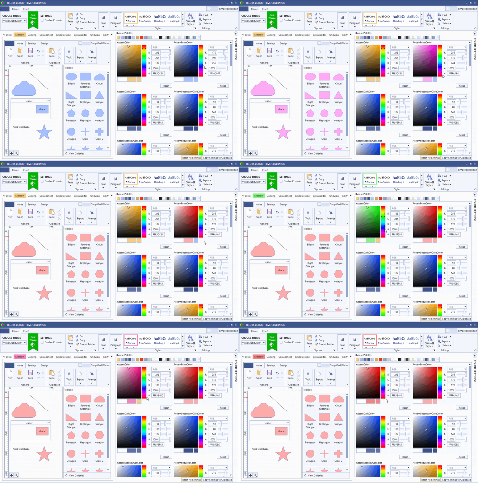
You do remember that the magic of color adjusting is already brought to the next level with our Color Theme Generator, don’t you? No need to setup separate theme projects, search for color tokens and group them by categories to find the one that you’re looking for, import and export several times to try out the results. Two directions only – color adjustments on the right and an instant real preview on the left:

ColorThemeGenerator_VS2019

Wait a minute! What if you need to change the ‘special states’ brushes for a particular control without predefining the whole theme palette or extracting the ControlTemplate? Well, I’ve got a little surprise for you.

With the R3 2019 release, we introduced the Theme Helper class. It exposes a powerful set of attached properties that you can benefit from. How to use it? Let’s take a RadToggleButton as an audience volunteer and see what will happen.

<telerik:RadToggleButton Content="RadButton"Margin="10"
    xmlns:helpers="clr-namespace:Telerik.Windows.Controls.Theming.Helpers;assembly=Telerik.Windows.Controls"
    helpers:ThemeHelper.MouseOverBrush="LightGoldenrodYellow"
    helpers:ThemeHelper.PressedBrush="{telerik:VisualStudio2019Resource ResourceKey=ValidationBrush}"
    helpers:ThemeHelper.CheckedBrush="{StaticResource MyCheckedBrush}"/>

VS2019ThemeHelper 


P.S. The magic does not end here. There are a lot more "R3" wonders to explore which you can find in this awesome blog post.

Try it Out and Share Your Feedback

Be the first to get the latest version and try out the new Visual Studio 2019 theme in Telerik UI for WPF. For existing users, you can get the latest bits in your account. And if you are new to Telerik UI for WPF, you can get a free 30 day trial here.
We’d love to hear your honest feedback! Send us your comments and feedback by using the comment section below or the Feedback Portal.

Download a trial today: 

UI for WPF

Democratize Data Through Simplicity with the New WinForms Sparkline

$
0
0

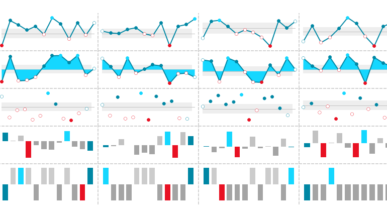
series_typesWe introduced the new WinForms Sparkline control in the Telerik UI for WinForms R3 2019 release. It is lightweight, compact and aims to present key information with excellent performance. Meet RadSparkline.

Sparkline Usage

The Sparkline control represents a highly compacted chart. It is super useful to highlight trends especially when screen space is limited. The control can easily display the variation of some measurement or stock price move.

Series Types

RadSparkline supports five different series types, each presenting the information in a meaningful yet compact manner. The series becomes really powerful when it is combined with the built-in indicators. Trends are highlighted in a user-friendly way and they can be perceived in a single glance.

Area

The data points are connected to form a line and an area enclosed by the points path and the zero line.area

Bar

This series is used to visualize data points as bar blocks where the height of each bar denotes the magnitude of its value.bar

Line

All of the data points are connected to form a line.line

Scatter

This series identifies the position of each data pointusing two numerical values along the horizontal and vertical axes.scatter

Win/Loss

All of the bars have an equal height and the view is divided into top and bottom halves.winloss

The Area, Bar and Win/Loss series define a BaselineValue property determining where exactly the viewport will be divided into top and bottom halves. By default, the view is split at the 0 value. The property is quite useful in the SparkWinLossSeries where one can define a value different than 0 to indicate wins and losses.

Consuming Data

It is super easy for the RadSparkline control to come to life. All you need to do is add data to it, whether you use data-binding or manually generated points, the API is straightforward both ways.

Data Binding

The control can be data-bound through the added series. Data-binding is implemented following the standard WinForms model with DataSource and ValueMember properties. The series can connect to any object which inherits from IList, IListSource (such as DataTable or DataSet), IBindingList (such as BindingList) or IBindingListView (such as BindingSource).

Unbound Mode

There is also an option to manually add data through the DataPoints property of the series.

SparkBarSeries barSeries = newSparkBarSeries();
barSeries.DataPoints.Add(newCategoricalSparkDataPoint(10));
// Or simply
barSeries.DataPoints.Add(10);

Indicators

RadSparkline exposes a convenient API to highlight significant data points. The indicators are a great way to bring user attention to a certain part of the trend such as highlighting high and low points, negative points or the first and the last points.indicators

Switching indicators on or off is really easy as there are specific properties for each indicator. It is also possible to change and customize the colors, border widths and even the shape.

SparkLineSeries series = newSparkLineSeries();
series.ShowHighPointIndicator = true;
series.ShowLowPointIndicator = true;
series.HighPointBackColor = Color.DarkRed;
series.HighPointBorderWidth = 3;
series.HighPointBorderColor = Color.Yellow;
series.HighPointSize = newSizeF(20, 20);
series.LowPointShape = newStarShape(5, 5);
series.LowPointBackColor = Color.DarkGreen;
// Add data points
this.radSparkline1.Series = series;

sparkline-indicators002

Annotations

Besides the indicators, user attention can be also drawn to a particular area of the chart with spark annotations, the available ones are GridLine and PlotBand. With the former you can display lines at a certain location based on the axis values, while with the latter you can indicate an entire area – from the beginning to the end of the vertical or horizontal axisannotations

Null Values

You can also define how null values added as data points will be handled by the control. In certain scenarios one may need to simply skip them and show an empty space on the view port while in other scenarios it would make sense to treat them as 0. This setting is controlled by the RadSparkLine.EmptyPointBehavior property.

Tooltips

Each of the data points can display a tooltip upon moving the mouse over. Tooltips are quite useful, and they will display the data point 's value. It is also possible to customize their text by handling the DataPointTooltipTextNeeded event on the tool tip controller.

Printing and Exporting

The control features convenient methods for exporting the sparkline control to an image or sending it to the printer.

this.radSparkline1.ExportToImage(@"..\..\spark.png", newSize(200, 200));
this.radSparkline1.PrintPreview();

Extensibility

As our controls are built on top of TPF it is really easy to use the main spark element in other controls. It is decoupled from the RadSparkline control which is basically a host of the RadSparklineElement. For example, you can add the element inside RadRibbonBar and have a cool chart which can be updated dynamically.

RadSparklineElement sparklineElement = newRadSparklineElement();
 
SparkBarSeries sparkBarSeries = newSparkBarSeries();
sparkBarSeries.ShowHighPointIndicator = true;
sparkBarSeries.ShowLowPointIndicator = true;
sparkBarSeries.ShowNegativePointIndicators = true;
sparkBarSeries.ShowFirstPointIndicator = true;
sparkBarSeries.ShowLastPointIndicator = true;
Random rand = newRandom();
for(inti = 0; i < 10; i++)
{
     sparkBarSeries.DataPoints.Add(this.rand.Next(-100, 100));
}
 
sparklineElement.Series = sparkBarSeries;
this.radRibbonBarGroup1.Items.Add(sparklineElement);

 spark_ribbon

Sparkline Grid Column

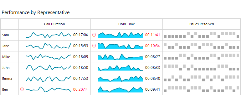
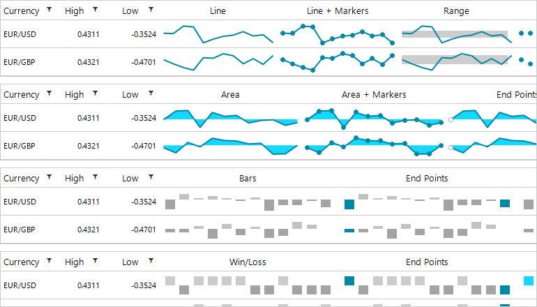
The RadSparklineElement is well integrated into RadGridView as part of the GridViewSparklineCellElement used by the GridViewSparklineColumn. In other words, RadGridView can now show chart data in a dedicated column. As the grid uses UI virtualization, having large amounts of data in the spark cells should not impact performance. The useful indicator related properties are exposed on the grid column and later propagated to the dynamically generated RadSparklineElement.

GridViewSparklineColumn sparkLineColumn = newGridViewSparklineColumn();
 
sparkLineColumn.SeriesType = SparkSeriesType.Line;
sparkLineColumn.Name = "Line";
sparkLineColumn.FieldName = "Line";
sparkLineColumn.HeaderText = "SparkLineColumn";
sparkLineColumn.ShowHighPointIndicator = true;
sparkLineColumn.ShowFirstPointIndicator = true;
sparkLineColumn.ShowLastPointIndicator = true;
sparkLineColumn.ShowNegativePointIndicators = true;
 
this.radGridView1.Columns.Add(sparkLineColumn);

grid_column

Data can be populated in the column as long as the grid is data bound to an object which has a property exposing an array of numbers pointing to the sparkline column. Another way is to handle the SparkDataNeeded event which gets raised whenever data needs to be synced to the cell. Of course, it is also possible to setup the grid in unbound mode and manually add the sparkline cell`s values.

Printing and Exporting in RadGridView

The sparkline column is also aware of the Document Processing Libraries, utilized by the grid exporting engine. The column is natively exported to Excel, PDF and HTML. The sparkline cells can be also printed. This is achieved using the element`s built-in export to image API.

sparkline_printing_exporting

Try it Out

To try out the new Telerik UI for WinForms Sparkline control, all you need to do is to download and install the latest bits. Existing users can get them in your accounts, and if you are new you can get a free 30 day trial here to check it out.

We'd love to hear how this all works for you, so please let us know your thoughts by visiting our Feedback portal or by leaving a comment below.

Why Scope Creep Happens and What to Do About It

$
0
0

Scope creep is what happens when an unplanned for change or new request interferes with the progress of a project. In this post, you’ll explore seven reasons why scope creep happens and learn how to repair these gaps in your process before it’s too late.

For instance, you’re halfway through developing an app when the client emails your project manager about getting a new feature added. The PM eagerly agrees to add the request since it “shouldn’t take too long.” Whether or not that’s the case, the deviation from the original scope of work throws everything out of whack.

The developer continues working on the app, though often stops to check in on the rest of the team to try and anticipate what this new feature will do to the app. The designer steps away from their other projects in order to quickly mock up the new feature. And the project manager tries to figure out how to shorten the remaining deadlines in order to hit the promised delivery date.

Bottom line: scope creep affects everyone involved in a project. Not only that, it adversely affects project timelines and profit margins. And, if the changes are big enough, scope creep can even affect the work you’re doing for other clients.

Scope creep is, unfortunately, a common occupational hazard for designers and developers. But it doesn’t need to be. Here’s what you can do about it.

How to Prevent Scope Creep

It’s easy to blame clients for throwing your workflow into disarray or trying to add more to their app than the original scope called for. In reality, though, scope creep stems from a lack of control you have over your process.

Here are some of the ways that scope creep can affect your app development process and what you can do to prevent it:

Scenario #1: No Contract

You have no contract or scope of work to clearly define the project, deliverables, costs, etc.

In some cases, it might seem okay to take on a new client without a contract. Perhaps you worked with them before or they’re a friend of a friend. Regardless of your relationship with them, or what how easygoing they seem at first, you need a contract to protect both them and yourself.

You can easily create a contract with a tool like AND.CO:

AND CO’s software allows app design teams to create contracts from its premade templates. All you need to do is fill in the pertinent details about the project. 

AND CO Contract

By using AND.CO’s template (or creating your own), you’ll never have to worry about leaving out important details again.

You can also use AND.CO to attach an SOW to the contract:

AND CO Scope

An example of a scope of work created inside AND CO contract software. This can be attached to any contract to provide clearer details on what a project entails.


You can get even more granular by including a list that contains:

●An explanation of the project
●Things the client is accountable for (like providing logins, files, etc.)
●Project stages/phases
●App deliverables
●Deadline

Once you have your SOW nailed down, carefully walk the client through it before they sign the contract. This ensures that you accurately captured the goal of the project and that they agree with what you have planned for it.

With a contract and a scope of work (SOW), you get a chance to set the stage for what’s about to happen. This lets the client know what to expect in terms of costs, deliverables and timeline. This also provides a clear framework for your team to work with in terms of the app’s goals, features to be included and so on.

Scenario #2: Deadline or Budget Is Too Tight

The original project was scoped out, but with too tight of a deadline or too small of a budget, leaving no room for error.

When a client comes to you (or your account manager) and says they desperately need their app to be done in four weeks, of course you want to be able to say “yes.” But it’s a bad idea to commit to something that you and your team can’t reasonably deliver on. Or to commit to something where the margin for error is so low that you’re bound to lose money on the job.

Before sending a contract to your client, make sure someone has done a careful cost/profit analysis to determine how much time your team needs in order to create the app they desire and how much money the client should pay in order for the job to be profitable.

Then, be honest with the client if they try to push back on pricing or timeline. For instance: “We could do this in four weeks, but we’d have to remove Features A and B, and we wouldn’t have time for testing.”

If you show clients what their compromises will cost them, they won’t ask you to shrink the budget or deadline again.

Scenario #3: No Change Control

Your process lacks a proper change request workflow.
First and foremost, your contract needs to include a clause that anticipates feedback. Here’s an example of the terms your contract might lay out:

AND CO Feedback Statements (002)

An example of the terms AND CO enables designers and developers to define in their contracts. This contract snippet explains the feedback limitations and info on how change requests will be handled.

“Feedback” limits how many times your client can provide feedback on what you’ve asked them to review. This forces them to really think about what kind of input they’re providing. This, in turn, will result in more useful and consolidated feedback instead of a never-ending barrage of vague or unhelpful feedback like, “Maybe the Analytics tab was better the way we had it before.”

“Changes” is a very basic statement regarding your change request process. I’d recommend bulking this section up, so you can make it perfectly clear when a change request is required and what it will do to the project. (This is why a scope of work should always be delivered alongside a contract.)

In other words, address things like:

●Will new feature requests or a design overhaul pause the project?
●Does the client owe any penalties for requesting a change?
●How will the timeline be affected?

Use your contract to provide details on your change request process. Then, be sure to remind your client throughout the project of how their requests will impact their ability to start making money from their app.

It’s not just your client’s understanding of how change requests work that can lead to scope creep. Change control can go off the rails by not having your own stringent process to manage it. An intuitive project management tool like Wrike would be useful, in this case.

What’s especially nice about Wrike is that it comes with a form builder tool (which you can learn about here). Use this to create a change management form that clients use to submit all change requests.

Scenario #4: The PM Always Says “Yes”

The project manager is unwilling to set or reinforce expectations with clients and instead says “yes” to everything without adjusting costs or timelines.
An iron-clad contract that your client has signed is a good place to start. But that doesn’t necessarily keep your project manager from being a pushover.

To prevent your PM's from allowing scope creep to happen, you’ll need to provide them with training on client management. Being able to say “no” or to explain how flip-flopping affects the project outcomes is an important skill for project managers. If they’re unable to control the client, no one else will either.

If that doesn’t work, you’ll need to find someone who understands the importance of setting boundaries with clients and following your processes.

Scenario #5: Too Many Cooks in the Kitchen

The client brings other decision-makers into the project, which holds things up and forces the project to go off the rails.
Clients pay you to build their apps because they don’t know the first thing about app development. That said, it’s that lack of knowledge that can cause problems with them down the line.

Unless you have their total trust, a nervous or insecure client may turn to others for input about the work you do. They don’t know anything about app development, so maybe their spouse who works in marketing does. Or their business partner who had an app developed last year wants to weigh in. It’s when they start turning away from you and bringing others into the feedback loop that things can get messy.

To get a handle on this, you need to take control of the project from the very get-go and demonstrate your authority. You are the app developer and know exactly what you’re doing. Put them at ease by showing them other apps you’ve created and be transparent about what it is you’re going to do for them. Basically, don’t give them any excuse to seek someone else’s input.

Scenario #6: Client Isn’t in the Loop

The client isn’t looped in for feedback until the very end of the project.
Clients can be difficult to work with, that’s for sure. However, it’s a bad idea to develop an app without their ongoing review and feedback.

For starters, when the client fails to hear anything on your progress, this is just cause for concern. And with concern comes distrust, which is going to make getting their buy-in very difficult.

Secondly, if you hold off on showing them anything until the end, you run the risk of having to deal with costly reworks when they decide they don’t like the direction you took the app in.

I know it can be annoying and stressful having clients weigh in on things like copy, design and functionality, but you’re more likely to get their approval if you keep them involved in the project.

Scenario #7: Inefficient (or No) Collaboration Between Team Members

Your app development workflow looks more like a rush to complete individual tasks than a collaborative effort to create an amazing product.
Speaking of communication, it’s not just isolating yourself from the client that can lead to scope creep. So, too, can team members isolating themselves from one another.

Great apps are not built by teams who deliver design, copy and code. They’re built by teams that work together to create a product.

So, the first thing to do is give your team a dedicated channel to talk to one another through. Slack is a good option, as it’s easy to organize based on projects, team members can chat in real time, and it integrates with your other business tools like Wrike.

Set up a dedicated channel in Slack so that your team can more effectively communicate and collaborate.

Slack Channel

Another thing that improves team collaboration is hosting a kickoff call at the beginning of a job.

Zoom is a great tool to do this with as it allows you to share your screen during team calls:

Zoom gives users the ability to share their desktop, their browser, their mobile device screen, or draw on a whiteboard.
Zoom Share (002)

This way, everyone can review the information and materials in real time together and clear up any confusion there might be before starting. It also starts each project with the mindset that “we’re all in this together” instead of every man or woman for themselves.

One other thing you can use to prevent scope creep is to adopt handoff tools that make it easier for your team to collaborate.

Unite UX, for instance, is a tool your designers and developers can use to seamlessly translate an app from design into code. Not only does this simplify the handoff, but it shortens the time your team has to spend on building a product. That way, if change requests or issues do arise, they won’t have as much of an impact on the deadline.

Wrap-Up

As you can see, a lack of process and control over projects is ultimately what leads to scope creep. So, if you want to stop losing money on jobs, disappointing clients and frustrating your team, use the above tips to clean up your workflow.

Adopting Blazor Webinar Recap: All Your Questions Answered

$
0
0

We had a great time during our long-awaited Adopting Blazor webinar last week. We had a great crowd, a lively discussion and tons of great questions. For those of you who could not attend, you can watch the webinar recording HERE for free. There is a lot of excitement in the air about Telerik UI for Blazor 2.1.1 with full support for the latest Blazor and .NET Core 3.0, along with new components and a number of significant improvements. Without further ado, let’s get to the heart of the matter and recap these great questions. 

Will I be able to use this with SQL Server and calling stored procedures?
The business layer is independent from Blazor, so you can use whatever you need. 

Where can Visual Basic .NET be used within Blazor?
There have been some questions around VB and Microsoft have shared their view on the topic in the following issue https://github.com/aspnet/Blazor/issues/171

What pre-requisite knowledge is required to successfully program in Blazor for an experienced Windows / middle-tier/ database back-end programmer that has no prior web programming experience?
Prior knowledge in C# and MVC/Razor. Here are additional getting started resources on Blazor and Telerik UI for Blazor. Depending on your background, you can also refer to this Blazor guide by Microsoft. 

In Blazor server-side, is it possible to make changes in Visual Studio, then reload the page to the website and take changes into account without stop and restart debugging?
It's still not in its final state, but in general yes. 

What about file upload? :)
We have File Upload on our radar for implementation and will try to address it in 2020 releases. We will aim to publish regularly our updated plans on the Telerik UI for Blazor roadmap page.  

In the GridView example, can the title be localized?
Localization is on our R1 2020 roadmap. 

Is there any kind of designer available that would help add Telerik controls to a UI?
Based on user feedback we will consider the option for design tools available for Telerik Blazor controls. 

Is support for OData/IQueryable in grid forthcoming?
The Telerik UI for Blazor Grid Supports IQueryable, and it's up to the developer what service the data comes from. 

What about multiple components in detail?
Yes, you can put whatever you need inside the template. 

Any information about when you'll release more components? Autocomplete is the one I need the most right now...
Our goal with Telerik UI for Blazor is to continuously deliver native UI components and ensure compatibility with preview versions beyond the official release of ASP.NET Core 3.0. We do have AutoComplete on our R1 2020 plan. 

Are Telerik Blazor components available in Kendo UI and ASP.NET MVC licenses?
Telerik UI for Blazor is available as a single product or as part of our DevCraft bundles containing multiple JS and .NET frameworks. More information on the offering can be found here: https://www.telerik.com/purchase/blazor-ui 

Is it possible to gradually integrate Blazor into a large ASP.NET web forms application?
No. But you should be able to do so with an ASP.NET Core application. 

With a client-side Blazor app, what happens if the client isn't able to install the necessary runtime?
With client-side Blazor, you only need support on your browser. 

Is it possible to port a SilverLight application to Blazor?
There isn't a direct way to do so, but depending on the app, you can create an equivalent Blazor app. 

The server-side app is not a Single Page application, correct? It won't be SPA until client-side Blazor ships -- right?
It is a single page application, since only one-page request is sent. After the initial load, all other navigation and interaction with the site is done through a SignalR connection. 

When did you add the Telerik dependency to the project? NuGet?
Yes, it's a single NuGet package, from our private NuGet feed. More details can be found in the Add the Telerik NuGet Feed to Visual Studio article. 

It would be great if you could also show how remote data binding would work (say for binding data to Grid).
We will work on adding additional resources to cover that in our upcoming releases. 

Is there/will there be a ComboBox control?
Yes, we do have ComboBox on our R1 2020 plan. To see the full list of available components you can visit the Telerik UI for Blazor page. 

SilverLight promised the same thing. Write client code in compiled C#. MS was going to create plugins for common browsers, but they abandoned that idea. How do we know that won’t happen here?
Client-side Blazor uses wasm to run .net code on the client. It doesn't rely on any other plugins. 

Have there been any known issues with different browsers and Blazor since no web browser implements the html standards exactly/properly?
With the supported browsers I believe not, at least not major ones. You can see the list supported browsers here

Any timeline on other components like ComboBox, Scheduler, Gantt?
Yes, we do have the Scheduler and ComboBox on our R1 2020 plan. You can check out what else we have planned for R1 in our Roadmap. For the Gantt chart we do have it on our backlog and hopefully it will be addressed in some of the upcoming releases sooner rather than later. 

How do you incorporate Blazor into an MVC Core web application? Is it automatically supported, or do you need to import dependencies?
There are several resources available on this topic. Checkout the article here.  

Will Telerik UI work for Blazor when building an application in dual-mode (client/server)? 
Telerik UI for Blazor components work in all hosting models. The differences are handled by the framework. 

Is there a tutorial which we can refer to in the future to learn Blazor?
We have plans to publish more videos as well as enrich our Getting Started resources that can be found here: https://docs.telerik.com/blazor-ui/introduction. You can also check the official guide provided by Microsoft. 

How do we get the Blazor Webassembly App template?
A detailed description can be found this article.  

Are client-side Blazor apps sandboxed? i.e. can they access local resources like printers directly and not using the browser?
Yes, they are contained in the browser and don't have access to the server resources directly. 

Is Blazor native friendly so we can use same code for desktop and native apps?
We recommend watching this demo by Steve Sanderson to see how far you can go with Blazor. 

Is PWA possible also in server-side? With specific handle?
A key concept in PWA is offline support, which is not possible with server-side Blazor. 

What is the scalability of your data grids?
They can be bound to IQueryable, so all paging, sorting and filtering is implemented through the database automatically. You also have the option to use your own service methods to get the best performance available. Check the following article: https://demos.telerik.com/blazor-ui/grid/manual-operations

Why are there two Blazor hosting scenarios? What should your decision of server vs client be based on?
You can look at many articles on this question, as both models have their advantages. Check out this video for comparison on the different hosting scenarios. 

Does the client need to install anything (like the way SilverLight was)?
No, you just need a browser support for wasm, if you are using client-side Blazor. For server-side you need Websockets support. 

Do I remember you saying Blazor requires VS 2019 as a minimum?
Yes, you need the latest version of VS 2019. For full list of prerequisites to run a Blazor project, you can visit the Getting Started page on https://docs.telerik.com/blazor-ui/introduction

How do Blazor and your components handle accessibility and screen reader usability?
Accessibility is going to be addressed in our upcoming 2020 releases. 

Are there controls for displaying images and performing basic manipulations like zoom and rotate?
Currently we don’t have such a components, however we will consider it for our 2020 release plan. 

Can we do some sort of foreign key-based OData api rendering? Meaning, if my grid is tied to OData to Products table and one of the fields is CategoryID which is a FK to Category table - are we able to tell Kendo UI that it’s a foreign key and use another OData url to get the name of this Category?
This would have to be resolved in the service layer. The grid itself is not able to resolve that at this moment. 

Is there enough out-of-the box support for managing state across multiple routes & components?
No, but there are already some community packages that offer, for instance, LocalStorage. You can also use DI to inject any state service you need. 

So, client-side Blazor only releases 1.0 version in .NET Core 5 release?
Client-side Blazor is expected to be released in May 2020. For details on .NET Core X evolution you can check the official plans of Microsoft in the their article

If I added a /// <summary> to the CountBy parameter in my component, does that info appear in the intellisense info at the point of use?
Yes. That's how we annotate our Telerik component parameters. 

What’s the likelihood that Microsoft will continue to grow and support Blazor? We got burnt with SilverLight so I’m keen not to repeat the same issue.
You may find some similarities. Blazor technology looks promising, Microsoft is heavily investing in it and what is different from SilverLight is that you don't need plugins. Blazor is natively supported by the browsers. 

Is unit testing via mstest or selenium supported?
A great post on the topic by Steve Sanderson can be found here. In addition to that, we are happy to announce the Telerik Test Studio has support for Blazor and Telerik UI for Blazor components. 

Are the attributes required to be strings e.g. "15" and not 15?
They are not. 

Is client-side debugging available?
A great article on Debugger capabilities can be found here.   

How do I install Telerik support for Blazor Project?
You can follow the instructions on our Getting Started documentation article

One question I had is around StockMarket charts built on Blazor. We use AmCharts today as they are the best stock chart solution for us at the moment, but I would like the equivalent in a Blazor control. We are using older Telerik grids, and a Blazor solution would help there also.
The Telerik Blazor grid was the first component added to the suite and we are planning to continue its development and growth in the R1 2020 release. The StockMarket chart is in our backlog and hopefully will be addressed in an upcoming release sooner rather than later. You can check the demos and our Blazor sample application including grid and charts here

When will you deliver the following controls for Blazor? ComboBox, ListBox, RadioButton, Check Box, Toggle Button, DropDown Button?
We have on our radar implementation for all of these components, some of them we are targeting with upcoming releases in 2020. We encourage you to submit any ideas and interests in our dedicated Blazor feedback portal. 

Following the webinar, we have updated our official roadmap page where you can find What’s Coming Next in 2020. Keep this link bookmarked so you can always be informed what's in our plans: https://www.telerik.com/support/whats-new/blazor-ui/roadmap

Can a client side Blazor app be hosted as a static web site?
Yes. 

Do your Blazor components adapt to various screen sizes, i.e. PC and phones?
In general, yes, however mobile is more of a focus in our future plans.  

Is there a path to migrate from SilverLight using Telerik components to Blazor?
It depends on your application, and its requirements. There isn't a 1 to 1 migration path between the two technologies. 

I notice that <TelerikGrid attributes don't use quotes, but <GridColumn attributes DO include quotes. Different fundamental Razor object types or something like that?
They are not required in most places, but you can add them everywhere. 

How easy is it to mix Blazor pages with existing Webforms/MVC apps?
You can only do so with Core 3.0 apps.  

How well does Blazor and Telerik's Blazor Components work with real data and by that, I mean millions of records coming across. Since it auto handles the serialization does it know it needs to do virtualization or do you still have to code for those efficiencies?
They can be bound to IQueryable, so all paging, sorting and filtering is implemented through the database automatically. You also have the option to use your own service methods, to get the best performance available: https://demos.telerik.com/blazor-ui/grid/manual-operations

That’s a Wrap! 

What a great bunch of questions. We can’t thank you enough for your interest in Telerik UI for Blazor. We are super excited about this technology and the impact it will have on your productivity. Reach out to us through our feedback or support & sales team for any additional questions or thoughts.

Building a Real-Time Data Visualization Dashboard with, jQuery, Socket.io and Kendo UI

$
0
0

In this tutorial, we’ll be building a real-time chart application. Using our application, users can visualize data on their dashboard in real time without having to refresh their browser. We’ll be using Socket.io and nodeJS as our server to get real-time updates and HTML, CSS, jQuery and Kendo UI for creating the user interface.

Real-time applications are programs that function within a time frame that the user senses as immediate, current or instant. On Facebook when you send a message, the recipient receives it without having to refresh his browser. On Instagram when someone likes your photo, you immediately receive a prompt without any action on your part. Some other examples of real-time applications are live charts, multiplayer games, project management and collaboration tools, and monitoring services.

In this tutorial, we’ll be building a real-time chart application. Using our application, users can visualize data on their dashboard in real time without having to refresh their browser. We’ll be using Socket.io and nodeJS as our server to get real-time updates and HTML, CSS, jQuery and Kendo UI for creating the user interface.

Prerequisites

To follow this tutorial, a basic understanding of jQuery and Node.js is required. Also ensure that you have at least Node version 8+ installed on your development machine before you begin. HTML/CSS knowledge is also recommended but not mandatory.

To build the required application, here are a few tools we’ll use:

real time data visualization 1

Initializing the Application

When dealing with static data or data that doesn’t get updated frequently, building the dashboard with HTML, CSS and jQuery might be the best solution. However, when dealing with data that gets updated frequently, the need for real-time systems arises. We will use Socket.io to keep the communication line between our server and the client open. We will use Node because we can easily create a minimal server with Express. We will be using a very minimal setup for this project. Lastly we will use Kendo UI’s Chart Component to reduce the amount of code we will write to build a custom one.

Create a folder called kendoUIChart and create a package.json file inside it. Now, add the following code:

// ./package.json{"name":"Kendouichart","version":"1.0.0","description":"Simple app built with node.js and socket.io","main":"app.js","scripts":{"test":"echo \"Error: no test specified\" && exit 1","start":"node app"},"author":"Your Name","license":"ISC","dependencies":{"express":"^4.16.2","socket.io":"^2.2.0"}}

Now when you run npm Install, it runs the script and installs all our dependencies. If it ran properly, you should now see a node_modules folder and a package-lock.json file. Now that this is out of the way, let’s go ahead and start writing some code.

In the root directory, create an app.js file. This file will be the entry point of our application. Then create a public folder where we will store our html file and static assets. Inside it, create an index.html file and a js directory and initialize a chart.js file in the directory.

Right now our folder structure should look like this:

    kendouichart/
        node_modules/public/
            js/
             charts.js
            index.html
        app.js
        package.json
        package-lock.json

Open the app.js file and add the following code to it:

// ./app.js const express =require('express')const app =express()//middlewares
    app.use(express.static('public'))//Listen on port 3000
    server = app.listen(3000);

Here, we require Express and initialize it. We then go ahead and use it to serve the files in our public folder. Now whenever you type npm start in the terminal, the files in the public folder get served as your homepage. That’s it for our basic server with Express, now let’s go ahead and create our real-time application. We will revisit this file when we are ready to add real-time features.

Creating the Dashboard with the Kendo UI Chart Component

Open your index.html file in the public folder and add the following lines of code:

<!-- public/index.html --><html><head><linkrel="stylesheet"href="https://kendo.cdn.telerik.com/2019.1.220/styles/kendo.common.min.css"><linkrel="stylesheet"href="https://kendo.cdn.telerik.com/2019.1.220/styles/kendo.rtl.min.css"><linkrel="stylesheet"href="https://kendo.cdn.telerik.com/2019.1.220/styles/kendo.default.min.css"><linkrel="stylesheet"href="https://kendo.cdn.telerik.com/2019.1.220/styles/kendo.mobile.all.min.css"><script src="https://code.jquery.com/jquery-3.3.1.js" integrity="sha256-2Kok7MbOyxpgUVvAk/HJ2jigOSYS2auK4Pfzbm7uH60="crossorigin="anonymous"></script><scriptsrc="https://kendo.cdn.telerik.com/2019.1.220/js/kendo.all.min.js"></script><title>Real Time Chart</title></head><body></body></html>

In our index file we have imported 3 things:

  • The Kendo UI default stylesheet.
  • The latest version of jQuery.
  • A minified version of all Kendo UI’s core components.

The main advantage of the CDN approach is that your users may be able to leverage a primed cache version of Kendo UI Core or jQuery if they’ve visited other sites using the framework.

An upside to using the other installation approach is that you can import just the components you need for your application, which can optimize page speed. However, for this demonstration purpose, we will stick to our CDN approach.

Next we need to create a div where Kendo UI will place the chart and then initialize Kendo UI Chart in our js file.

Add the following lines of code to the body of your index.html:

<!-- public/index.html --><divid="example"><divclass="demo-section k-content wide"><divid="chart"></div></div></div><scriptsrc="/js/charts.js"></script>

Now open your chart.js file and add the following lines of code:

// public/jsfunctioninit(){const blogComments =[{"blog":"My blog","day":"Day 1","value":3,"userColor":"#ffd600"},{"blog":"My blog","day":"Day 2","value":7,"userColor":"#ffd600"},{"blog":"My blog","day":"Day 3","value":12,"userColor":"#ffd600"},{"blog":"My blog","day":"Day 4","value":15,"userColor":"#ffd600"},{"blog":"My blog","day":"Day 5","value":6,"userColor":"#ffd600"}];functioncreateChart(){$("#chart").kendoChart({
                    dataSource:{
                        data: blogComments
                    },
                    title:{
                        align:"left",
                        text:"Comments per day"},
                    legend:{
                        visible:false},
                    seriesDefaults:{
                        type:"column",
                        labels:{
                            visible:true,
                            background:"transparent"}},
                    series:[{
                        field:"value",
                        categoryField:"day",
                        colorField:"userColor"}],
                    valueAxis:{
                        max:28,
                        majorGridLines:{
                            visible:false},
                        visible:false},
                    categoryAxis:{
                        majorGridLines:{
                            visible:false},
                        line:{
                            visible:false}}});}$(document).ready(createChart);$(document).bind("kendo:skinChange", createChart);}$(init);

In this file we create a function called init then we define an array to hold the data we want to display in the chart. Finally we call the kendoChart function and pass it to our datasource after which we initialize it.

Now start your app by typing npm start in your terminal. Visit http://localhost:3000 in your browser and you should see this:

real time data visualization 2


Going Real-Time with Socket.io

Right now, we have a working application. Next, we need to make it real-time using Socket.io. We already installed Socket.io as one of our node dependencies, so all we need to do is initialize it in our app.js and write some functions. Open up your app.js file and add the following code to it:

// ./app.js//other code//newly added codeconst blogComments =[{"blog":"My blog","day":"Day 1","value":3,"userColor":"#ffd600"},{"blog":"My blog","day":"Day 2","value":7,"userColor":"#ffd600"},{"blog":"My blog","day":"Day 3","value":12,"userColor":"#ffd600"},{"blog":"My blog","day":"Day 4","value":15,"userColor":"#ffd600"},{"blog":"My blog","day":"Day 5","value":6,"userColor":"#ffd600"}];functionswap(arr){return[arr[0], arr[1], arr[2], arr[3], arr[4]]=[arr[4], arr[3], arr[2], arr[1], arr[0]];}const io =require("socket.io")(server)
    
    io.on('connection',function(socket){setInterval(function(){var data =swap(blogComments)//send data to the client
                   socket.broadcast.emit('updateChart', data);},4000);});

In our app.js we declare our blog comments array. We then create a simple function swap to swap the contents of the array. We do this to simulate a data change. After that, we import the server.io library. We listen in on every connection and call the setInterval method every four seconds to swap the blog comments and emit the data to our clients (browsers).

To visualize this change we need to update our index.html and charts.js files.

Open your index.html file and add this code before the close of the body tag:

<!-- public/index.html --><scriptsrc="/socket.io/socket.io.js"></script><script>let socket =io('http://localhost');
      socket.on('connect',function(){});
      socket.on('event',function(data){});
      socket.on('disconnect',function(){});</script>

Open your charts.js file and update it to:

// public/js/charts.jslet socket;functioninit(){
     socket = io.connect("http://localhost:3000");
     socket.on('updateChart',(data)=>{functioncreateChart(){$("#chart").kendoChart({
                            dataSource:{
                                data: data
                            },
                            title:{
                                align:"left",
                                text:"Comments per day"},
                            legend:{
                                visible:false},
                            seriesDefaults:{
                                type:"column",
                                labels:{
                                    visible:true,
                                    background:"transparent"}},
                            series:[{
                                field:"value",
                                categoryField:"day",
                                colorField:"userColor"}],
                            valueAxis:{
                                max:28,
                                majorGridLines:{
                                    visible:false},
                                visible:false},
                            categoryAxis:{
                                majorGridLines:{
                                    visible:false},
                                line:{
                                    visible:false}}});}$(document).ready(createChart);$(document).bind("kendo:skinChange", createChart);});}$(init);

All we do in our chart.js file is swap out the datasource to data coming from the server.

Now start your application by typing npm start under the project directory in your terminal. Open up http://localhost:3000 and you will see the chart update in real time.

real time data visualization 3


N/B: All files used in this tutorial can be found here.

Conclusion

In this tutorial we learned how to use jQuery, Node.js, HTML and Kendo UI’s Chart Component to build a real-time chart application. This knowledge can help you create more complex real-time apps. Be sure to check out the Socket.io docs and post comments for clarity on parts you don’t understand. Happy coding.


Web-Based Results and Much More in the Latest Test Studio Release

$
0
0

Test Studio has been providing outstanding test automation capabilities to QA engineers for more than 10 years now. In the latest release, we provide even more value not only to the QA but to all other stakeholders in a project – PM, Developer, Management, etc. Let me present to you the Executive Dashboard.
Learn more about it and what else is new.

Executive Dashboard

The Executive Dashboard is a brand-new web-based Results Server. It displays all results from any Test Studio project and test list that is configured. Anyone on the team can access it without the need for a Test Studio license. This means that if a stakeholder wants to monitor the product health through the scheduled automated test lists results, he/she can do it anytime in the browser, on the desktop or mobile. Having such visibility and a live results feed can greatly improve the team's efficiency.

The Executive Dashboard is also super helpful for the QA engineer who can drill down into runs, tests and steps, investigating any failures or script issues.

If you run some tests lists locally, don't worry, you can upload them anytime and they will immediately appear in the dashboard.

In terms of features, you can mark favorite test lists which will always appear on top, there is a configurable auto-refresh interval, sortable Test List and Run columns and much more.

Next up is to add Reports into the Executive Dashboard in 2020.

Dashboard

Blazor Applications and Telerik UI for Blazor Support

Blazor is the latest Web UI framework developed by Microsoft and based on C#, HTML, Razor. It runs in the browser via WebAssembly. It will provide an alternative to JavaScript for building rich web apps. This is why Blazor is gaining a lot of traction, promising to be the next big thing in web development.

Progress has always been on top of new technologies and this time we are not falling behind. We have released a rich and powerful set of Blazor components, helping developers build beautiful applications with shorter development cycles, quick iterations and faster time to market.

Test Studio marks the beginning of the Blazor test automation race by joining first and and leading it. If you wonder, “Now how I am going to test these new Blazor apps?” don’t worry, we've got you covered. Test Studio supports any Blazor web application and on top of that has exclusive support for Telerik Blazor components. The party that best understands the internals of a component is the party that built it. Our translators open the element and expose the specific and custom properties for actions automation and verifications. With this, test creation is easier, faster and no additional coding is needed.

The supported Telerik UI for Blazor components are TreeView, TimePicker, Pager, NumericTextBox, List, Grid, DropdownList, DatePicker, DateInput, Button.

Stay tuned for more in 2020!

blazort_870x220

Test Lists in Test Studio Dev Edition (Visual Studio Plugin)

One of the main Test Studio goals is to boost tester-developer collaboration. Along with the standalone product, we provide a Visual Studio plugin also called Test Studio Dev Edition. Dev Edition is perfect for the developer or the Automation QA who wants to make use of Test Studio’s great productivity features in combination with Visual Studio's IDE. According to our developer customers, there was one major functionality that was missing in Test Studio Dev Edition – Test Lists. Now they are a fact inside the product. You can create test lists (collections/suites of tests) in the Visual Studio plugin to run a certain group of tests or include them in your CI/CD pipeline.

VSTestLists_Large

Images as a Primary Element Identification

Test Studio has a unique and bulletproof way of identifying web elements – a combination of DOM-based find logic and images. This is a stable solution to some of the toughest test automation challenges. We are introducing a new option here – the ability to use Images as primary element identification. So, if you know that in a certain scenario the DOM-based logic will not work because of dynamically generated elements or anything else, and you need to fallback to Image, you can choose the image to be the primary identification. Test Studio will first look for the image, so it will save time by not first waiting for the DOM find logic to fail.

All this sounds awesome, right! But wait, there is more. On top of the standard product bug fixes, we improved our code editor inside Test Studio adding search, replace, comment, uncomment options. Load Testing custom dynamic targets now is enhanced with the ability to define shared variables for headers. See the full release notes here.

Happy testing!

Try Test Studio

How to Design a Better Progressive Web App

$
0
0

Sometimes it’s hard to tell when the newest web design trend will be worth adopting or when it’s just a passing fad we shouldn’t invest too much time or energy in. Progressive web apps (PWAs), for instance, had that problem in the beginning, which is why most content written about them focused on explaining what they were.

Today, though, we don’t need to be educated on what a PWA is or why it’s a more valuable mobile asset than a mobile responsive website.

PWAs are inherently fast and secure. Plus, they’re a great option for anyone who wants to leverage the good stuff from native mobile apps (like offline caching and telephony integrations) while improving upon their weaknesses (like battery and storage consumption and sharing capabilities).

Needless to say:

PWAs have proven to not only be a viable design trend, but one with loads of staying power.

Now that we can move the conversation away from the what and why of PWAs, it’s time to look at the how.

How to Design a Better Progressive Web App

Although a mobile website and a progressive web app both live in the browser, the way you design them should be approached differently.

Whether you’re tasked with building a PWA from scratch, or turning a mobile website into a PWA, there are certain things you’re going to have to do differently.

Here are some things to think about when you design progressive web apps:

1. Design It; Then Cut 10%

There’s a trick writers use in editing, whether they’ve written something for the web or they’ve written a story. They sit down and write. Then, they return to the piece later and cut at least 10% of it out.

The same basic principle should apply when you’re designing a PWA. Sit down and create the design you would for a website. Then, when you return to review and refine it, cut out the components, sections and details that are nice-to-have, but not necessary.

This is the CVS website:

CVS Desktop

This is a well-designed block of categories with sample products to help consumers decide where they need to go on the site.

This is the same section on its PWA:

CVS PWA - home page

CVS has scaled back the design here. With the exception of Beauty, each category is now represented by a single product image.

While the designer could’ve retained the original design of each block, it wouldn’t have worked on the PWA. Either the side-by-side blocks would’ve been too small for users to see the three product images or the full-width blocks would’ve forced users to do extra scrolling to see each of the categories.

Instead, the PWA does away with that by trimming each category’s image down.

I would suggest taking it one step further by removing the background color, too. You can see how this looks on the “Shop Online” page of the CVS website:

CVS PWA - internal page

I’d argue that the products look more attractive when framed against a solid white background in this tiny bit of space. So, if you’re looking for somewhere to trim the fat, don’t be afraid to start with something as simple as color.

2. Don’t Be Afraid To Go “Lite”

Twitter has one of the most commonly referenced PWAs and for good reason.

This is what the Twitter website looks like with its latest redesign:

Twitter Desktop Nav

There’s a lot going on here. The menu has over a dozen options to choose from (if you reveal “More” options). The list of topics and people to follow on the right side also pulls users’ attention away from the main attraction: the news feed.

If your website suffers from information overload like this, think about how that could be improved by creating a “lite” experience for the PWA. Twitter did just that:

Twitter Lite Nav

The menu on its PWA has been reduced to four tabs:

  • Home feed
  • Search
  • Notifications
  • DMs

There’s also a blue button in the bottom-right corner where users compose new messages.

I’d guess that Twitter users aren’t clamoring for features like hashtag search, follow suggestions, list creation and profile management on mobile. So, look at your own analytics and see if you can make a similar judgment call to help you create a more streamlined experience for your PWA.

If you were to install heatmaps on your website, I bet you’d be surprised to see how few people make it to the footer. Unless they’re specifically looking for something they can’t find in the navigation, there probably aren’t too many mobile users, specifically, who are willing to scroll to it.

So, when you design your PWA, just get rid of it.

Again, this is about removing pieces of your design that aren’t 100% necessary. It’s also about leveraging the app shell to be more efficient with your mobile design.

A great example of this is Wyndham Hotels:

Wyndham Grand Bottom Nav

Wyndham makes good use of the bottom bar. The buttons sit at the bottom of the app shell, are all well-sized, and in good range of the thumb zone.

This way, users don’t have to do any clicking or scrolling to get to the pages or actions that matter most to their experience.

Another PWA that does this well is the Weather Channel:

Weather Channel Top Nav (002)

It makes sense that the bottom bar would contain forecast options as well as live radar and video feeds. Why come to the Weather Channel PWA if you’re not going to get instant details about the weather?

If you’re wondering where you’re going to put all that stuff that would otherwise live in the footer, the Weather Channel has a good solution for it:

Weather Channel Menu Footer (002)

When you open the Weather Channel menu, it contains a list of all the pages in the PWA (as it should). However, at the very bottom of its menu is its footer elements! This way, visitors can connect on social, inquire about advertising, and subscribe for the newsletter without having to scroll endlessly to the bottom of the site. It takes just one swipe of the menu to get there.

4. Find Another Way to Advertise

Just because you’re building a lighter and more streamlined experience for users doesn’t mean you can afford to cut back on marketing and advertising. It’s how your clients pay their bills, after all. However…

Because your PWA will likely have an ever-present app shell — at the top, bottom, or both — you really don’t have a lot of room to play with. Case in point:

Cracked Ads

This is from the Cracked PWA. As you can see, ads take up about two-thirds of the available real estate of this article. All you can see in this screenshot is one of the headers and a few words peeking out from behind the bottom pop-up.

This makes for a painful reading experience.

I know your clients need to monetize, but you’re going to have to find a better way to do it, whether it be with fewer ads, smaller ads, or switching to a subscription model.

Another way to handle this would be to minimize your ads or lead gen pop-ups and give your visitors the choice to click as Ulta does:

Ulta Popup

This a better way to advertise or market your business anyway. Pop-up and ad blindness is very real, and designing your PWA in a way that invites users to engage will lead to more clicks and sales.

Ulta Email (002)

5. Design an Eye-catching Home Screen Logo

Even though PWAs don’t live in the app store (or, rather, they don’t need to), users can still save them to the home screen to live alongside their downloaded apps.

The first thing you should do is make sure you create an “Add to home screen” message for your PWA users. This isn’t something I’ve seen a lot of, though I think your clients would greatly benefit from it as consumers grow more accustomed to interacting with PWAs and realize they can save them.

Next, you should create a unique icon for it. Here’s why:

PWA Icons

These are the icons for three news PWAs:

Le Monde and The New Yorker both use eye-catching home screen icons, whereas the Washington Post just has a black box.

If you’re going to go to the trouble of creating a PWA that can be saved to the home screen for quick-click access, take the time to create a unique and eye-catching icon for it.

PWAs Are the Future. Design Them That Way.

There’s no doubt that an app interface provides a better experience on mobile than a website can. That said, there are a number of obstacles and objections that are going to make your clients wary of investing in them and users reluctant to download them.

Which is why PWAs are the best solution for everyone.

As you try out the design tips above, don’t be afraid to play around with them. There are other ways to trim back your design without compromising on messaging or engagement. It’s all about finding the right balance.

Oh, and if you’re new to designing or building PWAs, it’s going to be extra important to have a way to translate your designs into code while the team adjusts. With Unite UX, you’ll be able to bridge that gap while further streamlining your app development process.

Build an Angular Mediaplayer with Kendo UI

$
0
0

In this tutorial, we'll see how to combine Kendo UI components and Angular to create a media player application.

Kendo UI is a customizable set of Javascript UI components; it also provides a set of themes for Material UI and Bootstrap, and it comes packed with a unique icon set and a range of colors in its palette. It has libraries for Angular, Vue, React and jQuery, and components available as multiple npm packages, eliminating the fear of bloating your application with unnecessary parts and increasing your build bundle.

Angular is a JavaScript framework for creating a web application; it offers the best practices and tools to ease the development of applications. Angular uses declarative templates, dependency injection and Observables to power applications on several platforms.

Kendo UI provides Angular-specific components for ease of development, and we’ll be using some of them to build a simple media player. The application will make use of the HTML5 video player coupled, and it’ll feature custom controls built using icons from Kendo UI’s icon set.

To follow this tutorial, you need a basic understanding of Angular. Ensure that you have Node and npm installed before you get started.

If you have no prior knowledge of Angular, kindly follow the official tutorial here. You can return to this article when you’re done.

We’ll be building the application using the following tools:

Here’s a screenshot of the application we’ll be building:

Initializing the Application and Installing Dependencies

To get started, we will use the CLI (command line interface) provided by the Angular team to initialize our project.

First, install the CLI by running npm install -g @angular/cli. npm is a package manager used for installing packages. It will be available on your PC if you have Node installed; if not, download Node here.

To create a new Angular project using the CLI, open a terminal and run:

ng new angular-mediaplayer --style=scss

This command is used to initialize a new Angular project; the project will be using SCSS as the pre-processor.

Next, run the following command in the root folder of the project to install dependencies:

npminstall @progress/kendo-theme-default

Start the Angular development server by running ng serve in a terminal in the root folder of your project.

Header Component

The header component will display the application logo and very little information. This component is mostly a display component.

Run the following command to create the header component:

    ng generate component header

Next, open the src/app/header/header.component.html file and update it to look like the code below:

<!-- src/app/header/header.component.html --><header><divclass="brand"><imgsrc="/assets/logo.svg"><h5>Just Play</h5></div></header>

Note: Image asset used can be found here in the GitHub repository. Assets are from https://flaticon.com.

Next, we’ll style the header. Open the header.component.scss file and update it with the snippet below:

header {display: flex;background-color:#f7f7f7;align-items: center;margin:0;padding:20px 5%;box-shadow:01px 2px 0rgba(0, 0, 0, 0.1);.brand {flex:1;display: flex;align-items: center;img {height:35px;border-radius:50%;margin-right:17px;}h5 {font-size:18px;margin:0;text-transform: capitalize;letter-spacing:0.5px;font-weight:600;color:#ff1d5e;opacity:0.7;}}}

Just a couple of styles to beautify the header.

Next, we’ll update the app.component.html file to render the header.

    // src/app/app.component.html
    
    <main><app-header></app-header><section><div><!-- media player comes here --></div><div><!-- video playlist comes here --></div></section></main>

If you visit http://localhost:4200, you should see the latest view of the application. The header is the only visible thing on the page but not for too long. Stay tuned!

Ensure the Angular dev server is running before testing

Home View

The home page will house the media player, the playlist and the header. The default App component will house the home page of the application. The app.component.html file requires no changes; it should stay the same as the previous section.

<main><app-header></app-header><section><div><!-- media player comes here --></div><div><!-- video playlist comes here --></div></section></main>

Next, we’ll add some styles to the app.component.scss file to give the page a bit more life. Open the app.component.scss file and copy the styles below into it:

// src/app/app.component.scsssection{display: flex;justify-content: center;margin-top:100px;}

That isn’t much, probably a lot less than you expected, but we’re moving. Next, we’ll define the playlist we’ll display and other variables useful for our application. Open the app.component.ts file and update it:

// src/app/app.component.tsimport{ Component }from'@angular/core';
    @Component({
      selector:'app-root',
      templateUrl:'./app.component.html',
      styleUrls:['./app.component.scss'],})exportclassAppComponent{
      playlist =[{
          name:'Arial view of roads',
          source:'https://player.vimeo.com/external/293373387.sd.mp4?s=546b9073d6ed62a05e064043589e30a8bb3ce6fa&profile_id=164&oauth2_token_id=57447761',
          thumbnail:'https://res.cloudinary.com/hackafro/image/upload/c_scale,h_100,w_150/v1554641467/Screenshot_2019-04-07_at_1.39.17_PM_purcgf.png',},{
          name:'Blur colorful lights',
          source:'https://player.vimeo.com/external/305211631.sd.mp4?s=3d46306a3d07d1c56eb64f1fcb1ba96232e34d90&profile_id=164&oauth2_token_id=57447761',
          thumbnail:'https://res.cloudinary.com/hackafro/image/upload/c_scale,h_100,w_150/v1554641309/Screenshot_2019-04-07_at_1.46.12_PM_ztnroy.png',},{
          name:'Amazing view of the sunset',
          source:'https://player.vimeo.com/external/306619138.sd.mp4?s=a7cb8a56ee700da618a4bc6bdd474eca0cf75d92&profile_id=164&oauth2_token_id=57447761',
          thumbnail:'https://res.cloudinary.com/hackafro/image/upload/c_scale,h_100,w_150/v1554641380/Screenshot_2019-04-07_at_1.46.38_PM_f6nyr4.png',},{
          name:'Lighthouse by the sea',
          source:'https://player.vimeo.com/external/312662160.sd.mp4?s=22154e69be5722a528e3c1cc374250af726a2b44&profile_id=164&oauth2_token_id=57447761',
          thumbnail:'https://res.cloudinary.com/hackafro/image/upload/c_scale,h_100,w_150/v1554641395/Screenshot_2019-04-07_at_1.46.26_PM_xgbfdq.png',},];
      currentVideo =this.playlist[0];onVideoChange(video){this.currentVideo = video;}}

NB: Video assets are from https://pexels.com and video thumbnails are stored in Cloudinary.

In the snippet above, we declared a playlist array that contains videos we’ll be displaying. Each item in the array contains the source, thumbnail and name details for the video.

There’s the onVideoChange method acting as an event handler; this method runs when an item in the playlist is selected; we set the clicked video as the currentVideo.

Next, we’ll include the external assets the application will be using. We’ll be using the Roboto font. Also, we’ll update style.scss and the angular.json file to include the Kendo UI component stylesheets and application-wide styles.

Open the index.html file and include the link to the external fonts:

<!doctype html><htmllang="en"><head><metacharset="utf-8"><title>Angular MediaPlayer</title><basehref="/"><metaname="viewport"content="width=device-width, initial-scale=1"><linkrel="icon"type="image/x-icon"href="favicon.ico"><linkhref="https://fonts.googleapis.com/css?family=Roboto:400,500,700,900"rel="stylesheet"></head><body><app-root></app-root></body></html>

Then open the style.scss file copy the styles below into it:

// styles.scsshtml {box-sizing: border-box;}*, *:before, *:after {box-sizing: inherit;}body {margin:0;padding:0;min-height:100vh;}

To include Kendo UI’s base stylesheet in our project, we’ll add it to the styles array in the angular.json file. Open the file and update the styles array with the base CSS file from Kendo UI.

{"$schema":"./node_modules/@angular/cli/lib/config/schema.json","version":1,"newProjectRoot":"projects","projects":{"angular-mediaplayer":{...},"architect":{"build":{"builder":"@angular-devkit/build-angular:browser","options":{..."styles":["src/styles.scss","node_modules/@progress/kendo-theme-default/dist/all.css"],"scripts":[]},// ... rest of the configuration}

Next, we’ll begin working on the media player component. The component will feature the HTML5 video player with custom controls.

Media Player Component

Using the media player component, we’ll play the active video in the playlist. To create the media player component, run the following command:

    ng generate component mediaplayer

After running the command, open the mediaplayer.component.html file and copy the content below into it:

<divclass="player"><videoclass="player__video viewer"[src]="currentVideo?.source"(timeupdate)="handleProgress()"(ended)="updateButton()"#videoplayer></video><divclass="player__controls"><divclass="progress"(mousedown)="mouseDown = true"(mouseup)="mouseDown = false"(mouseout)="mouseDown = false"(mousemove)="mouseDown && scrub($event)"(click)="scrub($event)"><divclass="progress__filled"[ngStyle]="progressBarStyle"></div></div><divclass="controls__secondary"><div><iclass="player__button toggle k-icon"[ngClass]="iconClass"title="Toggle Play"(click)="togglePlay()"></i><iclass="player__button next k-icon k-i-arrow-end-right"></i></div><div><inputtype="range"name="volume"class="player__slider"min="0"max="1"step="0.05"value="1"(change)="handleVolumeChange($event)"/></div></div></div></div>

In the snippet above, you’ll probably notice the high amount of event handler attached to elements in the file; we’ll go through them and explain what each event does.

On the video element, we receive the video’s source from the App component; also, we listen for two events: timeupdate and ended. The timeupdate event is triggered for the duration of the video’s play time, as each second of the video goes by the event is triggered. The ended event is triggered when the video has finished playing; I’m sure you guessed that.

Next, there’s the progress element; this element will act as the progress bar for the video, it’ll display the current play time of the video, we’ll also use this element to scrub the video, jumping between times in the video. Attached to the element are four events:

  • mousedown: When this event is triggered, we set the mousedown event to true; this is set to true because we only want to scrub the video when the user’s mouse is down.

  • mouseup: Here, we set the mousedown variable to false. Same goes for the mouseout event.

  • mousemove: In the event callback, we check if the mouse is down before scrubbing the video. If mousedown is set to true, we call the seek method.

  • click: On click, we take the user to the selected time in the video using the seek method.

From here, we have the play button; this is used to toggle the video’s playing state as signified in the element’s click listener.

Next, we’ll update the mediaplayer.component.ts file to declare the variables and methods used in the view template:

import{ Component, OnInit, ViewChild, Input }from'@angular/core';
    @Component({
      selector:'app-mediaplayer',
      templateUrl:'./mediaplayer.component.html',
      styleUrls:['./mediaplayer.component.scss'],})exportclassMediaplayerComponentimplementsOnInit{constructor(){}
      @ViewChild('videoplayer') videoElement;
      @Input() currentVideo;
      
      video: HTMLVideoElement; 
      progressBarStyle ={
        flexBasis:'0%',};
      iconClass ='k-i-play';
      mouseDown =false;togglePlay(){const method =this.video.paused ?'play':'pause';this.video[method]();setTimeout(()=>this.updateButton(),10);}updateButton(){const icon =this.video.paused ?'k-i-play':'k-i-pause';this.iconClass = icon;}handleVolumeChange(e){const{ target }= e;const{ value }= target;this.video.volume = value;}handleProgress(){const percent =(this.video.currentTime /this.video.duration)*100;this.progressBarStyle.flexBasis =`${percent}%`;}seek(e: MouseEvent){const{ srcElement: progress, offsetX }= e;const{ offsetWidth }= progress;const seekTime =(offsetX / offsetWidth)*this.video.duration;this.video.currentTime = seekTime;}ngOnInit(){const{ nativeElement }=this.videoElement;this.video = nativeElement;}ngOnChanges(changes){if(this.video){this.progressBarStyle.flexBasis ='0%';this.togglePlay();}}}

The component file is littered with event handlers and component lifecycle methods and we’ll go through each method, starting easy before moving to the complex methods.

The togglePlay method seems like an easy enough start. In the method, we check if the paused property is true, then we call the exact opposite method of the element. If paused, we call video.play(), and vice versa.

Also within the togglePlay method is the updateButton method that updates the icon displayed on the play button. We also used Kendo UI’s icon set to define the play button. Kendo UI has a rich set of icons that are available here. They are easy to configure and customize.

The handleVolumeChange method is an event handler for a change event on the input element we set up for handling the volume of the video. After every update, we set the value to the video’s volume property.

The handleProgress method is a handler for the timeupdate event. Within the method, we divide the video’s duration by the currentTime and multiply by one hundred to get the percentage of time played, and we set that to the progress element’s flexBasis style property.

In the seek method, we get the position the user clicked by dividing the offsetWidth (width of an element, including paddings and borders) of the progress bar by the offsetX (where the user clicked) event value. We multiply the result of the division by the video duration, resulting in the exact time in the video the user intends to skip to; we set that value as the currentTime of the video.

In the ngOnInit lifecycle, we get the nativeElement (video reference) object and assign it to the video property, and then we listen for changes to the MediaPlayer component’s Input properties in the ngOnChanges lifecycle method.

You might need to go through those method descriptions over again, but don’t worry, the rest of the article awaits you.

Next, we’ll add some styles to give life to the video element and the custom controls we created. Open the mediaplayer.component.scss file and copy the following styles into it:

// src/app/mediaplayer/mediaplayer.component.scss.player {max-width:750px;border:5px solid rgba(0,0,0,0.2);box-shadow:0020px rgba(0,0,0,0.2);position: relative;font-size:0;overflow: hidden;}.player__video {width:800px;}.player__button {background: none;border:0;line-height:1;color: white;text-align: center;outline:0;padding:0;cursor: pointer;max-width:50px;}.player__button:focus {border-color:#ff1d5e;}.player__slider {width:10px;height:30px;}.player__controls {display: flex;flex-direction: column;position: absolute;bottom:0;width:100%;transform:translateY(100%)translateY(-5px);transition: all .3s;flex-wrap: wrap;align-items: center;background:rgba(0,0,0,0.1);}.controls__secondary{display: flex;justify-content: space-between;width:98%;align-items: center;.toggle{font-size:16px;margin-right:7px;}.next{font-size:25px;}}.player:hover .player__controls {transform:translateY(0);}.player:hover .progress {height:8px;}.progress {flex:4!important;width:98%;margin:0 auto;position: relative;display: flex;flex-basis:100%;height:5px;transition: height 0.3s;background:rgba(167, 165, 165, 0.1);cursor: ew-resize;}.progress__filled {width:50%;background:#ff1d5e;flex:0;flex-basis:50%;}/* unholy css to style input type="range" */input[type=range] {-webkit-appearance: none;background: transparent;width:100%;}input[type=range]:focus {outline: none;}input[type=range]::-webkit-slider-runnable-track {width:100%;height:8.4px;cursor: pointer;box-shadow:1px 1px 1px rgba(0, 0, 0, 0), 001px rgba(13, 13, 13, 0);background:rgba(255,255,255,0.8);border-radius:1.3px;border:0.2px solid rgba(1, 1, 1, 0);}input[type=range]::-webkit-slider-thumb {height:15px;width:15px;border-radius:50px;background:#ff1d5e;cursor: pointer;-webkit-appearance: none;margin-top: -3.5px;box-shadow:002px rgba(0,0,0,0.2);}input[type=range]:focus::-webkit-slider-runnable-track {background:#ec83a1;}input[type=range]::-moz-range-track {width:100%;height:8.4px;cursor: pointer;box-shadow:1px 1px 1px rgba(0, 0, 0, 0), 001px rgba(13, 13, 13, 0);background:#ffffff;border-radius:1.3px;border:0.2px solid rgba(1, 1, 1, 0);}input[type=range]::-moz-range-thumb {box-shadow:000rgba(0, 0, 0, 0), 000rgba(13, 13, 13, 0);height:15px;width:15px;border-radius:50px;background:#ff1d5e;cursor: pointer;}

After this, we’ll render the component in the app.component.html file and run to the browser to see the latest changes. Open the app.component.html file and update it to render the mediaplayer component:

<!-- src/app/app.component.scss -->
    
    <main>
      <app-header></app-header>
      <section>
        <div>
          <app-mediaplayer [currentVideo]="currentVideo"></app-mediaplayer>
        </div>
        <div>
          <! -- playlist component here -->
        </div>
      </section>
    </main>

We render the media player component and then pass the currentVideo property to it. Navigate to http://localhost:4200 to see the component in full force:

Next, we’ll create the playlist area to allow users to go through a selection of videos.

Playlist Component

To create the playlist component, run the following command:

    ng generate component playlist

Open the playlist.component.html file and copy the content below into it:

<ul><li*ngFor="let video of videos"><img[src]="video.thumbnail"[alt]="video.name"[ngClass]="{ active: currentVideo.name === video.name }"(click)="onVideoClick(video)"/><h5>{{ video.name }}</h5></li></ul>

The component will display a list of video selections for the user to browse through. On the click of a video, we update the source of the video player to that of the clicked video. To implement this functionality, we’ll update the playlist.component.ts file:

// src/app/playlist/playlist.component.tsimport{ Component, OnInit, Input, EventEmitter, Output }from'@angular/core';
    @Component({
      selector:'app-playlist',
      templateUrl:'./playlist.component.html',
      styleUrls:['./playlist.component.scss'],})exportclassPlaylistComponentimplementsOnInit{constructor(){}
      @Input() videos:Array<{}>;
      @Output() videoClicked =newEventEmitter<Object>();
      currentVideo ={};onVideoClick(video){this.videoClicked.emit(video);this.currentVideo = video;}ngOnInit(){this.currentVideo =this.videos[0];}}

The playlist component will receive an array of videos from the App component; it’ll also emit a videoClicked event on click of a video. In the onInit component, we set the currentVideo to the first item in the array.

Next, we’ll add some styles to the component to remove the default ul list style. Open the playlist.component.scss file and copy the following styles into it:

// src/app/playlist/playlist.component.scssul {list-style: none;padding-left:0;margin:00050px;li {display: flex;margin-bottom:15px;img {width:150px;height:100px;margin-right:10px;cursor: pointer;}h5 {font-weight:500;font-size:15px;text-transform: capitalize;}}li > img.active {border:3px solid #ff1d5e;}}

The next step is to render the component in the app.component.html file. Open the file and add the playlist component:

<main><app-header></app-header><section><div><app-mediaplayer[currentVideo]="currentVideo"></app-mediaplayer></div><div><app-playlist[videos]="playlist"(videoClicked)="onVideoChange($event)"></app-playlist></div></section></main>

After the changes above, navigate to http://localhost:4200 to view the changes made. The playlist component should be visible on the page and clicking on any video will update the video player source to that of the selected video.

Conclusion

In this tutorial, we’ve seen how easy it is to get started using Kendo UI components for Angular. We’ve also seen how we can utilize the HTML5 API to create a video player with custom controls. You can take this demo one step further by adding previous and next buttons. With this, the user can move to the following video on the playlist. You can find the source code for this demo application here. Happy coding.

Using the Microsoft AppCenter to Instrument WinForms and WPF Desktop Apps with Analytics

$
0
0

At .NET conf 2019, Microsoft announced that the Visual Studio App Center now provides support for WinForms and WPF applications. What the App Center provides is an environment to build your app, test it on real devices, distribute to users and instrument it with analytics.

After .Net conf, I tested this new feature in a Telerik UI for WinForms application that I am developing. At this point, I am amazed how easy it is to plug your application to the AppCenter and collect data.

Let me take you through the process of how to instrument your WinForms and WPF application with the AppCenter. The first step is to go to https://appcenter.ms/apps, log-in, and create a new app. Give it a name and select the appropriate type.

app_center_blog001

Once you have added the app, you will see the brief steps on your screen.


app_center_blog002

The steps are easy to follow. First install the Microsoft.AppCenter.Analytics and Microsoft.AppCenter.Crashes Nuget packages. It can take some time since the packages depend on other stuff as well.

Then you need to add the code to your application. Please note that the getting started page contains the actual key that you need to add in your app. There is just one line that you should add to the Program.cs file.

staticvoidMain()
{
    AppCenter.Start("your code", typeof(Analytics), typeof(Crashes));
  
 
    Application.EnableVisualStyles();
    Application.SetCompatibleTextRenderingDefault(false);
    Application.Run(newMainForm());
}

Once this is done, you can start tracking general information like sessions, user counts, user-related information like country and see some info about the used devices. At this point you can add some events to your application so you can track specific actions. You can add some data as parameter by using as Dictionary.

var data = newDictionary<string, string>();
data.Add("Rows", rows.Count.ToString());
data.Add("Columns", columns.Count.ToString());
 
Analytics.TrackEvent("Data Loaded", data);

After using your application for some time, you can see the data that is collected.

Here is the data shown on the main page.

app_center_blog003

And the custom event used in the application.

app_center_blog004

That is all you need to do to collect user data. I encourage you to try it since it's easy and can provide valuable info for your WinForms and WPF applications.

Check out the Telerik UI for WinForms and Telerik UI for WPF components suites to learn more on how to deliver high quality, feature rich, modern and engaging desktop applications with WinForms and WPF.

Build a Real-Time Polling Application Using Vue and Socket.io

$
0
0

In this article, we'll utilize Vue and Socket.io to build a real-time polling application.

An opinion poll, often simply referred to as a poll or a survey, is a human research survey of public opinion from a particular sample. This makes it easily accessible, as it can be used by users anywhere in the world. Adding real-time functionality to the application improves the user experience, as votes are seen in real-time.

Kendo UI is a library used for developing applications at a relatively quick pace. It provides UI components for libraries like jQuery, Angular, React and Vue, and it comes packed with over 20 components for creating charts, data tables and drag-and-drop pages.

Kendo UI is customizable, and it also provides a set of themes for Material UI, Bootstrap, etc. Kendo UI components are distributed as multiple npm packages, so there’s no fear of bloating your application with unnecessary components and increasing your build bundle. It offers components for managing large data sets and for easy data visualization. Coupled with Vue, Kendo UI is an unstoppable tool useful for developing fantastic web applications.

Using Vue, you can extend the template language with your own components and use a wide array of existing components.

To follow this tutorial, a basic understanding of Vue and Node.js is required. Please ensure that you have Node and npm installed before you begin.

If you have no prior knowledge of Vue, kindly follow the official documentation here. Come back and finish the tutorial when you’re done.

We’ll be using these tools to build out our application:

We’ll build a real-time polling application using Socket.io, Vue and Kendo UI Charts component for data visualization.

Using our application, users will provide their opinion on when they head to bed at night.

Here’s a demo of the final product:

polling image 1

We’ll send our votes to the server and with the help of Socket.io, we’ll update the polls in real time.

Let’s build!

Initializing the Application and Installing Project Dependencies

To get started, we will use the vue-cli to bootstrap our application. First, we’ll install the CLI by running npm install -g @vue/cli in a terminal.

To create a Vue project using the CLI, we’ll run the following command:


vue create vue-polling

After running this command, you will be asked by the CLI to pick a preset. Please select the default preset.

Next, run the following commands in the root folder of the project to install dependencies.


// install dependencies required to build the server

npminstall express socket.io

// front-end dependencies

npminstall @progress/kendo-charts-vue-wrapper @progress/kendo-theme-default @progress/kendo-ui vue-socket.io

Start the app dev server by running npm run serve in a terminal in the root folder of your project.

A browser tab should open on http://localhost:8080. The screenshot below should be similar to what you see in your browser:

polling image 2

Building the Server

We’ll build our server using Express. Express is a fast, unopinionated, minimalist web framework for Node.js.

Create a file called server.js in the root of the project and update it with the code snippet below

// server.jsconst express =require('express');const app =express();const http =require('http').createServer(app);const io =require('socket.io')(http);const port = process.env.PORT ||4000;

io.on('connection',async(socket)=>{

socket.on('vote',(data)=>{

socket.emit('voted', data);});});

http.listen(port,()=>{

console.log(`Server started on port ${port}`);});

The setup here is pretty standard for Express applications using Socket.io. There’s no problem if you have no prior knowledge of Socket.io, as we’ll only be making use of two methods: emit for dispatching events and io.on for listening for events. You can always go through the official tutorial here.

We’ll listen for a vote event after the socket has been connected successfully, this event will be triggered by the client application. On receipt of the event, we dispatch an event voted to the client.

Run the following command in a terminal within the root folder of your project to start the server:


node server

The Home Page

The home page will display the polling options and the chart to visualize the computed data from the polls. The home page will also feature a header for the sake of presentation. The first step is to create a component to display the header. Open the src/components folder and create a file called Header.vue, open the file and update it with the snippet below:

<!-- /src/components/Header.vue --><template><header><divclass="brand"><h5>Just Polls</h5><imgsrc="../assets/001-yes.svg"alt="Logo"></div></header></template><script>exportdefault{

name:'Header',}</script><stylescoped>header {padding:8px 10px;border-bottom:1px solid rgba(0, 0, 0, 0.2);font-family: poiret-one, sans-serif;font-weight:400;font-style: normal;margin-bottom:60px;}header .brand{display: flex;justify-content: space-between;align-items: center;}header .brand h5{text-transform: uppercase;font-size:18px;line-height:2px;}header img{width:40px;height:40px;}</style>

NB: Image assets were gotten from https://flaticon.com.

Just a couple of styles to beautify the header. Finally, we’ll render the component in the App.vue file. Open the file, replace the contents by rendering the header component.

<!-- /src/App.vue --><template><divid="app"><Header/><divclass="body"><!-- app body here --></div></div></template><script>import Header from"./components/Header";exportdefault{

name:"app",

components:{

Header,},data(){return{

options:[{

value:0,

id:1,

category:"Before 9:00pm"},{

value:0,

id:2,

category:"After 9:00pm before 10:00pm"},{

value:0,

id:3,

category:"Before 11:00pm"},{

value:0,

id:4,

category:"Early hours - 12:00am"}],

voted:false};}</script><style>#app{width:70%;margin: auto;color:#2c3e50;font-family: muli, sans-serif;font-weight:400;}.body{display: flex;}</style>

In the snippet above, we update the App component to import the Header component to be rendered. We also created data values like the options and the voted property. The options array is a list of choices to be selected by the user, and the voted value is used to signify when a user has placed a vote.

Next, we’ll include the link to the external fonts we’ll be using in the project.

Open the public/index.html file and update it to include the link to the external fonts:

<!-- /public/index.html --><!DOCTYPE html><htmllang="en"><head><metacharset="utf-8"><metahttp-equiv="X-UA-Compatible"content="IE=edge"><metaname="viewport"content="width=device-width,initial-scale=1.0"><linkrel="icon"href="<%= BASE_URL %>favicon.ico"><linkrel="stylesheet"href="https://use.typekit.net/dnq8ozh.css"><title>Vue polling</title></head><body><noscript><strong>We're sorry but vue-polling doesn't work properly without JavaScript enabled. Please enable it to continue.</strong></noscript><divid="app"></div><!-- built files will be auto injected --></body></html>

If you visit http://localhost:8080 after this update, you should see the header we just created:

polling image 3

Next, we’ll create the polling component that will render the options for users to make a selection.

Polling View

Create a component file in src/components folder, and name it Poll.vue. Open the file and copy the following content into it:

<!-- /src/components/Poll.vue --><template><section><h4>What time do you head to bed?</h4><ul><liv-for="option in options":key="option.id":class="{ selected: selectedOption.id === option.id }"@click="vote(option)">{{option.category}}</li></ul></section></template><script>exportdefault{

name:"Poll",

props:["options"],data(){return{

selectedOption:""};}

methods:{vote(option){this.selectedOption = option;}}};</script><stylescoped>section {padding:10px 25px;border-radius:6px;box-shadow:010px 24px rgba(0, 0, 0, 0.2);width:40%;display: flex;flex-direction: column;justify-content: center;border-top:5px solid purple;}h4 {font-family: poiret-one, sans-serif;text-transform: uppercase;font-size:16px;letter-spacing:0.7px;margin-bottom:30px;}ul {list-style: none;padding-left:0;}li {padding:22px 17px;border:1px solid rgba(0, 0, 0, 0.1);margin-bottom:15px;border-radius:6px;cursor: pointer;}li.selected{border-left:5px solid purple;}</style>

In the code snippet above, we created the Poll component. The component will take an options property and we’ll loop through the options to create a view to collect a user’s opinion.

Next, we created a selectedOption data property that holds the user’s choice. Using this selection, we’ll flag the matching option and activate the selected class. All this is done in the vote method.

The next step is to render the Poll component in the App.vue file, open the file and update it to render the Poll component:

<!-- /src/App.vue --><template><divid="app"><Header/><divclass="body"><Poll:options="options"/></div></div></template><script>import Header from"./components/Header";import Poll from"./components/Poll";exportdefault{

name:"app",

components:{

Header,

Poll,},data(){return{// ... data properties};},};</script><style>

// ... styles

</style>

After this update, if you navigate to http://localhost:8080, you should see the poll area in all its glory. Your view should be similar to the screenshot below:

polling image 4

Next, we’ll create the chart component using Kendo UI’s components and also start communicating with the server using Socket.io

Chart Component

The chart component library we’ll be using is Kendo UI. Kendo UI provides UI components for developing applications using frameworks like Vue, Angular and React. To get started, we’ll use the Chart plugin in the main.js file.

Open the src/main.js and update it to be similar to the snippet below:

// src/main.jsimport Vue from'vue';import'@progress/kendo-ui';import'@progress/kendo-theme-default/dist/all.css';import{

ChartInstaller,}from'@progress/kendo-charts-vue-wrapper';import App from'./App.vue';

Vue.use(ChartInstaller);

Vue.config.productionTip =false;newVue({

render:(h)=>h(App),}).$mount('#app');

We import the base Kendo UI package, then we include the stylesheet to include the default styling for Kendo UI in our project. Also, we imported the charts plugin from Kendo UI and call the Vue use method.

Create a file called PollChart.vue in the src/components folder, open the file and copy the snippet below into it:

<!-- /src/components/PollChart.vue --><template><section><kendo-chartref="chart":title-text="'What time do you go to bed?'":legend-position="'top'":tooltip-visible="true":tooltip-template="template":theme="'sass'":style="style"><kendo-chart-series-item:type="'donut'":data="options":labels-visible="true":labels-template="template":labels-position="'outsideEnd'":labels-background="'transparent'":labels-align="'circle'":style="style"></kendo-chart-series-item></kendo-chart></section></template><script>import{ Chart, ChartSeriesItem }from"@progress/kendo-charts-vue-wrapper";exportdefault{

name:"PollsChart",

props:["options"],data(){return{

template:"#= category # - #= kendo.format('{0:P}', percentage) #",

style:{

fontFamily:"muli, sans-serif;",

height:"500px"}};}};</script><stylescoped>section {width:50%;margin-left:5%;font-family: muli, sans-serif !important;}</style>

We’ll be making use of the Chart Series component from Kendo UI. The chart displayed will be a doughnut chart, showing the number of votes for each option. The chart component will receive props like title-text, legend-position etc.

The component itself will receive an options prop from the parent component, this will be passed to the data property of the ChartSeries item.

The template data property is used for the tooltip display. Next, we’ll render the PollChart within the App component. Open the App.vue file and update it to render the PollChart component:

<!-- /src/App.vue --><template><divid="app"><Header/><divclass="body"><Poll:options="options"/><PollsChart:options="options"v-if="voted"/></div></div></template><script>import Header from"./components/Header";import Poll from"./components/Poll";import PollsChart from"./components/Chart";exportdefault{

name:"app",

components:{

Header,

Poll,

PollsChart

},data(){...},};</script><style>...</style>

Next, we’ll set up Socket.io on the client to receive events from the server. We’ll be making use of the vue-socket.io library.

Introducing Socket.io

So far we have an application that allows users to cast votes but we have no way of keeping track of how others voted in real-time. We have also set up a way of visualizing the polling data using Kendo UI chart components. To solve the real-time problem, we’ll include the vue-socket.io library that allows us to communicate with the server in real time.

Open the src/main.js file and register the socket.io plugin:

// src/main.jsimport Vue from'vue';...import VSocket from'vue-socket.io';

Vue.use(newVSocket({

debug:true,

connection:'http://localhost:4000',}));// ... rest of the configuration

This makes the library available to the whole application, which means we can listen for events and emit them. The connection property within the object is the URI of our server and we enabled debug mode for development.

Let’s update the Poll component to emit an event whenever a vote is cast and also the App component to listen for events from the server.

Open the Poll.vue file and update it like the snippet below:

<!-- /src/components/Poll.vue --><template>

...

</template><script>exportdefault{

name:"Poll",

props:["options"],data(){...},

methods:{vote(option){this.$socket.emit("vote", option);this.selectedOption = option;}}};</script>

Installing the library in our application provides a sockets object within the component. It also adds a $socket object for emitting events. Within the vote method, we emit an event containing the selected option as the payload.

Next, update the App component to listen for votes, we’ll add a sockets object to the component, this object lets us set up listeners for events using the object keys. Open the App.vue file and add the sockets object to the component:

<!-- /src/App.vue --><template>

...

</template><script>import Header from"./components/Header";import Poll from"./components/Poll";import PollsChart from"./components/Chart";exportdefault{

name:"app",

components:{

Header,

Poll,

PollsChart

},data(){...},

sockets:{connect(){

console.log("connected");},voted(data){this.options =this.options.map(option =>{if(data.id === option.id){

option.value +=1;return option;}return option;});this.voted =true;}}};</script><style>...</style>

First, we added the sockets object to the component. Within the object we added two methods — event listeners for dispatched events:

<![if !supportLists]>- <![endif]>connect: This method listens for a successful connection to the server.

<![if !supportLists]>- <![endif]>voted: This method is called when a voted event is triggered from the server. Within this method, we get event payload data that contains the selected option. Using the payload, we go through the options and get the option matching the payload. The value property of the matching option is then incremented.

Now when a user selects an option, an event is emitted with the user’s selection as the payload. We can check this new update by visiting http://localhost:8080.

polling image 5

Conclusion

Using Kendo UI, Socket.io and Vue, we’ve built out an application that receives opinions of users and renders the data using charts provided by Kendo UI. Socket.io was introduced into the application to provide real-time functionality when casting votes. You can find the demo for this article on Github.

Viewing all 4193 articles
Browse latest View live


<script src="https://jsc.adskeeper.com/r/s/rssing.com.1596347.js" async> </script>