Quantcast
Channel: Telerik Blogs
Viewing all 4117 articles
Browse latest View live

Batch Editing with Kendo UI Grid for Angular

$
0
0

In this tutorial we’ll go through an example of how you can batch edit all rows of a Kendo UI Grid at the same time, effectively binding the whole grid to an Angular Reactive Forms FormGroup and FormArray to enable the validation and saving of all form data together instead of line by line, so it behaves a little more like a “normal” Reactive Form. This example is built with Angular 8.2.6.

The below example contains a Kendo UI Grid with a list of products that displays in “view” mode by default. When the edit button is clicked, the grid is switched to “edit” mode, which makes all product fields editable and allows products to be added or removed from the grid. After editing, you can either save or cancel the changes.

Styling of the example is done with Bootstrap 4.3, the Kendo UI for Angular Default Theme, and a couple of custom CSS styles in the main index.html file. For more info on styling Kendo UI components for Angular, see this styling overview.

Here it is in action:
(Edit on StackBlitz at https://stackblitz.com/edit/batch-editing-with-kendo-ui-grid-for-angular)

Angular App Component Template with Kendo UI Grid

The app component template contains the HTML and Angular template syntax for displaying the example Kendo UI Grid; it contains a single <kendo-grid> component wrapped in a bootstrap card for layout.

The grid defines the template reference variable #grid so it can be accessed from the app component below with the ViewChild('grid') decorator, and the data property of the grid is bound to an array of products defined in the app component using the Angular property binding [data]="products".

A different toolbar is displayed when the grid is in “view” or “edit” mode with the help of the isEditMode property, the “view” mode toolbar only contains an Edit button, and the “edit” mode toolbar contains buttons for Add, Save and Cancel. Each toolbar is defined using an <ng-template> tag with the kendoGridToolbarTemplate directive, and each button is bound to an event handler method in the app component using an Angular event binding attribute e.g. (click)="onAdd()".

There are four columns defined with the <kendo-grid-column> tag— one for each product field and one with a Remove button that is only displayed when the grid is in “edit” mode.

<divclass="card m-3"><h5class="card-header">Batch Editing with Kendo UI Grid for Angular</h5><divclass="card-body"><kendo-grid#grid[data]="products"><ng-template*ngIf="!isEditMode"kendoGridToolbarTemplate><button(click)="onEdit()"class="k-button k-primary">Edit</button></ng-template><ng-template*ngIf="isEditMode"kendoGridToolbarTemplate><button(click)="onAdd()"class="k-button">Add</button><button(click)="onSave()"class="k-button">Save</button><button(click)="onCancel()"class="k-button">Cancel</button></ng-template><kendo-grid-columnfield="Name"></kendo-grid-column><kendo-grid-columnfield="Price"editor="numeric"format="{0:c}"></kendo-grid-column><kendo-grid-columnfield="InStock"title="In Stock"editor="boolean"></kendo-grid-column><kendo-grid-column*ngIf="isEditMode"><ng-templatekendoGridCellTemplatelet-rowIndex="rowIndex"><button(click)="onRemove(rowIndex)"class="k-button">Remove</button></ng-template></kendo-grid-column></kendo-grid></div></div>

Angular App Component with Kendo UI Grid

The app component contains all of the properties and methods for interacting with our grid.

Component Properties

products contains the array of product objects bound to the grid in the template with the [data]="products" property binding attribute.

originalProducts is used to hold a copy of the original products array just before switching to “edit” mode, so the changes to the products array can be reset if the Cancel button is clicked.

productsForm is an Angular Reactive FormGroup that holds the FormArray and all FormControl components for the whole form, so all fields can be validated and saved together.

isEditMode is a boolean flag used to toggle the app component template between “view” and “edit” modes.

@ViewChild('grid') grid holds a reference to the Kendo UI Grid component defined in the app component template. The ViewChild decorator enables access to the grid component using the 'grid' parameter because it matches the #grid template reference variable defined on the kendo-grid tag in the template.

Component Methods

ngOnInit() initializes the the products array with a sample set of products, and sets the productsForm to a new FormGroup containing a FormArray for holding all of the product form groups and controls. The form group is created with the FormBuilder instance that is injected in the component constructor.

onEdit() handles when the Edit button is clicked and converts the grid into an editable form. It makes a copy of the products array in case the edit action is cancelled, then calls a couple of helper functions to initialize the form controls and switch all grid rows into “edit” mode, and lastly sets isEditMode to true to display the correct toolbars in the template.

onAdd() handles when the Add button is clicked to add a new product row to the bottom of the grid. It pushes a new object to the products array and a new form group to the FormArray of the productsForm, then sets the new row of the grid to “edit” mode.

onRemove(index) handles when the Remove button is clicked to remove the selected row from the grid. First it closes all rows of the grid (sets them to “view” mode), then removes the product object from the products array and the product form group from the FormArray before setting all rows back to “edit” mode. I found it necessary to close all rows before removing to avoid unexpected side effects from the grid.

onSave() handles when the Save button is clicked to validate and save the form data. If the form is invalid, an alert is displayed and the data is not saved. If the form is valid, the data is “saved” by copying the updated form data into the products array and setting the grid back to “view” mode. In a real world application, this is where you would typically put an API or service call to persist the data.

onCancel() handles when the Cancel button is clicked to discard any changes and switch the grid back to “view” mode. It closes all the grid rows to set them back to “view” mode, then reverts any changes by copying the original product data back into the products array, and sets isEditMode to false to display the correct toolbars in the template.

import{ Component, OnInit, ViewChild }from'@angular/core';import{ FormBuilder, FormGroup, FormArray, Validators }from'@angular/forms';import{ GridComponent }from'@progress/kendo-angular-grid';

@Component({ selector:'app', templateUrl:'app.component.html'})exportclassAppComponentimplementsOnInit{
    products =[];
    originalProducts =[];
    productsForm: FormGroup;
    isEditMode =false;
    @ViewChild('grid') grid: GridComponent;constructor(private formBuilder: FormBuilder){}ngOnInit(){this.products =[{ Name:'Vegemite', Price:2.50, InStock:true},{ Name:'Tim Tams', Price:3.99, InStock:true},{ Name:'Meat Pies', Price:6.00, InStock:false},{ Name:'Pavlova', Price:4.39, InStock:true}];// initialise products form with empty form arraythis.productsForm =this.formBuilder.group({
            formArray:newFormArray([])});}// convenience getters for easy access to form fieldsgetf(){returnthis.productsForm.controls;}getfa(){returnthis.f.formArray as FormArray;}onEdit(){// store copy of original products in case cancelledthis.originalProducts =[...this.products];// reset / initialise form fieldsthis.resetForm();// set all rows to edit mode to display form fieldsthis.editAllRows();this.isEditMode =true;}onAdd(){// add item to products arraythis.products.push({});// add new form group to form arrayconst formGroup =this.createFormGroup();this.fa.push(formGroup);// set new row to edit mode in kendo gridthis.grid.editRow(this.products.length -1, formGroup);}onRemove(index){// rows must all be closed while removing productsthis.closeAllRows();// remove product and product form groupthis.products.splice(index,1);this.fa.removeAt(index);// reset all rows back to edit modethis.editAllRows();}onSave(){// mark all fields as touched to highlight any invalid fieldsthis.productsForm.markAllAsTouched();// stop here if form is invalidif(this.productsForm.invalid){alert('FORM INVALID :(');return;}// copy form data to products array on successthis.products =this.fa.value;this.closeAllRows();this.isEditMode =false;}onCancel(){this.closeAllRows();// reset products back to original data (before edit was clicked)this.products =this.originalProducts;this.isEditMode =false;}// helper methodsprivateeditAllRows(){// set all rows to edit mode to display form fieldsthis.products.forEach((x, i)=>{this.grid.editRow(i,this.fa.controls[i]);});}privatecloseAllRows(){// close all rows to display readonly view of datathis.products.forEach((x, i)=>{this.grid.closeRow(i);});}privateresetForm(){// clear form array and create a new form group for each productthis.fa.clear();this.products.forEach((x, i)=>{this.fa.push(this.createFormGroup(x));});}privatecreateFormGroup(product: any ={}){// create a new form group containing controls and validators for a productreturnthis.formBuilder.group({
            Name:[product.Name, Validators.required],
            Price:[product.Price, Validators.required],
            InStock:[product.InStock ||false, Validators.required]})}}

Angular App Module

This is a fairly simple Angular app module with just what’s required for the example. To use the Kendo UI Grid for Angular, it imports the { GridModule } from '@progress/kendo-angular-grid' and includes it in the imports array of the @NgModule decorator; and to use Angular reactive forms, it imports the { ReactiveFormsModule } from '@angular/forms' and includes it in the imports array of the @NgModule decorator.

import{ NgModule }from'@angular/core';import{ BrowserModule }from'@angular/platform-browser';import{ ReactiveFormsModule }from'@angular/forms';import{ BrowserAnimationsModule }from'@angular/platform-browser/animations';import{ GridModule }from'@progress/kendo-angular-grid';import{ AppComponent }from'./app.component';

@NgModule({
    imports:[
        BrowserModule,
        ReactiveFormsModule,
        BrowserAnimationsModule,
        GridModule
    ],
    declarations:[
        AppComponent
    ],
    bootstrap:[AppComponent]})exportclassAppModule{}

Conclusion

So that’s everything you need to do to effectively bind a Kendo UI Grid component to an Angular Reactive Forms FormArray in order to batch edit, validate and save all form fields together as a whole.

For further information about the Kendo UI Grid for Angular check out the official documentation at https://www.telerik.com/kendo-angular-ui/components/grid/.

Thanks for reading!


Your Monthly October Fill of Telerik UI for ASP.NET Core

$
0
0

Last month we introduced the third major version of Telerik UI for ASP.NET Core for 2019. Compatible with the official ASP.NET Core 3.0 release and packed with plenty of the new components and features: Timeline,Filter,Rating, Card , Diagram, Search Panel in the Grid, DPL and many more. You can learn all about the R3 2019 updates in the dedicated blog post.

In this blog post we wanted to reveal more about what we are currently cooking up for you and what next to expect in the R3 Service Pack on October 23,.2019 and R1 2020 coming in January.

What to Expect in R3 2019 Service Pack  Due Oct 23rd ?

Editor Enhancements

We are adding a cool new tool to one of your favorite components the Editor. The Editor Merge Table tool will enable you to effortlessly merge and split table cells both vertically and horizontally.

Telerik UI for ASP.NET CoreEditor Merge Table Cells 

Table Cell Merge Editor – Vertical and Horizontal

Visual Studio Extensions Update

Following the official release of .NET Core 3.0 last month, we ensured that Telerik Visual Studio Extensions include updated project templates compatible with the latest new features in .NET Core 3.0.

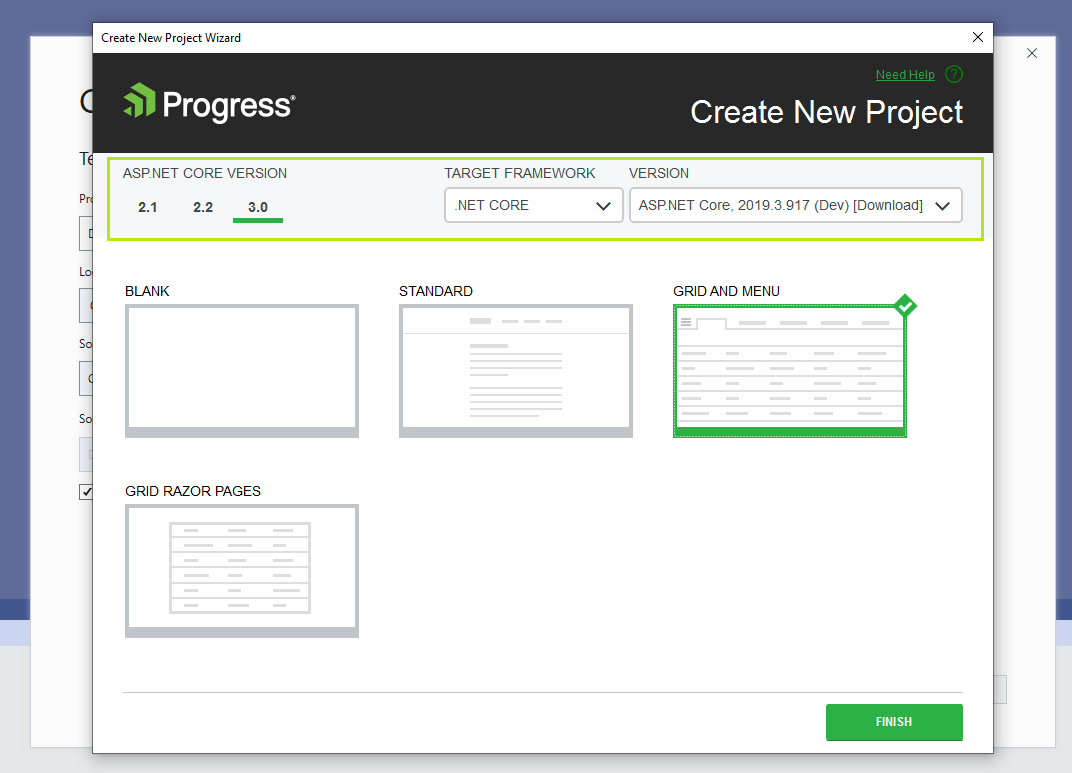
To make use of the new extensions in your projects, download the latest published version of Telerik ASP.NET Core VSExtentions, select 3.0 as ASP.NET Core version and the latest version of the build as shown in the example below.

Telerik UI for ASP.NET Core VS Extentions 

Telerik UI for ASP.NET Core VS Extentions

What to Expect in R1 2020 Due in January 2020?

New ASP.NET Core Component File Manager

Based on your feedback many of today’s web applications you develop need to perform file management operations. That’s why we put on the R1 2020 plan the File Manager component with the aim to enable viewing folders and files and navigating through them in a handy way.

The File Manager control will let you perform common operations with files and folders such as browsing, copy/paste, rename and more. In addition to that it will provide functionality for upload and download files and search for necessary files and folders.

New Badge for Button Component

For all of you looking for user-friendly ways to notify users in your applications for activity, change of status, received message or action required, we are building a brand new Button Badge Component.

Component Enhancements

Along with the addition of new components, the Telerik UI for ASP.NET Core team also aims to introduce multiple enhancements to existing and develop new sample solutions with Razor pages and other new capabilities introduced by the framework. Stay tuned for more exciting news!

The Future of .NET Core or Better Said .NET 5

Earlier this year Microsoft announced that .NET Core 3.1 will be the last .NET Core mention. As of 2020 their plans are to introduce .NET 5. Version 4 will be skipped because it would confuse users that are familiar with the .NET Framework, which has been using the 4.x series for a long time. In addition to that, Microsoft has firmly stated that .NET 5 is the future for the .NET platform.

And while the .NET Core framework is on the road to .NET 5, we will continue to ensure that Telerik UI for ASP.NET Core is compatible with the latest .NET Core 3.1 preview releases by Microsoft.

Download and Install the Latest Telerik UI for ASP.NET Core Version

To make sure you have access to the latest R3 2019 from our components and feature set, download the latest version from Your Progress Account or via the Progress Control Panel. If you are planning your next great application and wonder what cool stuff is coming out soon, check our What’s New Page or Telerik UI for ASP.NET Core Roadmap page.

Help Us Shape the Future of Telerik UI for ASP.NET Core!

Please vote and submit ideas for new components and features on the official Telerik UI for ASP.NET Core feedback portal  and have direct influence on the 2020 roadmap and beyond.

How Many CTAs Are Too Many?

$
0
0

It’s so hard these days to get your app to stand out from the sea of other apps scrambling to do the same thing. They make the same promises, tout the same features, and might even design their website to look similar to your own.

Having tested many SaaS and mobile apps over the years, I can tell you that there’s one thing many designers get wrong when it comes to the website:

The quantity of calls to action.

The CTA is a critical component of anything you build, be it the app itself or the website that sells it. And while a lot of focus tends to be placed on the quality of CTA design (e.g. colors that convert, sizing for visibility, placement for clickability), what about quantity?

If you want people to download or buy your app, you have to remove all barriers to entry. And one of the first barriers you should look at is the call-to-action.

The Problem with Too Many Calls to Action

The primary goal of your website is to get users to convert into app users. That doesn’t mean you can’t have secondary goals, like subscribing people to the newsletter, educating them about your product, and so on.

But if you can convince them to take action and convert right away, why bother presenting them with other CTAs that only slow down or confuse the process?

That said, I get that it’s not always easy to design your website with a single call-to-action button as Spotify has done:

Spotify CTA

Spotify only has one panel and one call-to-action button “Get Spotify Free” on its website.

You have to be in a very comfortable spot in your market to put out a website like this and know that users are going to click on “Get Spotify Free” without needing anything else from you. However, that doesn’t excuse making poor choices about how you present other CTAs on the home page.

Let’s look at some of the common CTA offenses and what you can do to fix them:

A CTA Free-for-All

As I mentioned before, it can be tough entering an app on the market that’s already overcrowded or dominated by a clear frontrunner. Which is why you might be tempted to throw everything you have at visitors to try and convince them to convert.

Let me show you an example.

This is the top of the home page for Bitly:

Bitly Home Page (002)

The top of the Bitly home page has three similar-looking call-to-action buttons: “Get a Quote”, “Get Started for Free”, and “Shorten”.

While there are too many CTAs competing for attention above the fold, the rest of the home page does a good job of tightening up the focus.

This is what visitors see if they scroll one time:

Bitly Scroll 1 (002)

A scroll down the Bitly page reveals some information about the product along with a “Get Started” button.

The third and final scroll reveals this:

Bitly Scroll 2 (002)

The third and final scroll on the Bitly page again shows a “Get Started for Free” CTA button.

So, although there’s a bit of conflict at the top of the page, the rest of it seems to be telling visitors: “Go ahead and try us out for free.”

Overall, it’s not a terrible way to handle the home page, though it could stand some tightening up above the fold. That said, it appears that competitor Rebrandly decided to copy their website after Bitly’s… sort of.

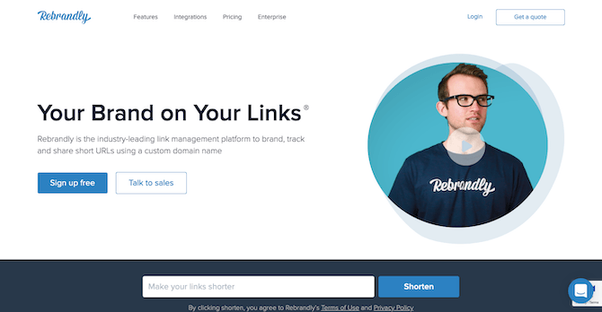
This is the top of the Rebrandly home page:

Rebrandly Home Page

Rebrandly includes four competing calls-to-action on its home page: “Get a quote”, “Sign up free”, “Talk to sales”, and “Shorten”.

If you disregard the style of designs used (illustrative versus video), this home page is eerily similar. The only problem is, it went a little overboard with its calls to action. There are now two blue CTAs for “Sign up free” and “Shorten” and two white CTAs for “Get a quote” and “Talk to sales”.

You could argue that the blue CTAs are the ones calling primarily for attention. However, let’s look at how the rest of the page handles it.

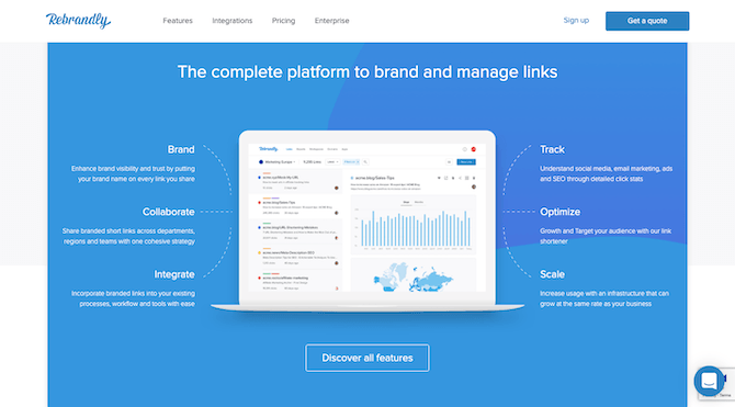
Rebrandly Features

Rebrandly invites visitors to “Discover all features” just below the fold of the home page.

The first section visitors see below-the-fold is a highlight of the features. This is in the same spot as the benefits section on Bitly’s website. But notice how the calls to action differ. With Bitly, the primary call was to “Get Started”, whereas here they’re being asked to learn more about the features.

The remainder of the home page continues to add new distractions in the path of visitors:

Rebrandly Case Studies

Rebrandly shows off client logos, online reviews, and user stats on its home page with a CTA to “View case studies”.

Rather than just leave it as, “Look at how happy our clients — many of whom you know — are with us!”, this section asks visitors to view their case studies.

On and on this goes, until the very bottom of the page where visitors are once again introduced to the primary call to action:

Rebrandly Primary Call-to-action (002)

Rebrandly gets creative with its primary CTA, this time labeling it “Start Rebranding Now” and pointing to a different link.

There are a couple problems with this. For one, “Start Rebranding Now” has never been used before. That’s because the top of the page was all about giving visitors a way to try the tool for free. This actually drives them to the Pricing page to buy the app.

So what visitors end up with is four different options in terms of how to get started:

  • Request a quote.
  • Talk to a sales rep.
  • Try the tool for free.
  • Buy it.

It’s okay to provide other options, like on a quote request form or on the contact page. What’s not okay is to throw so many choices at visitors within seconds of landing on the site and expect them to decide how to get in touch or take first steps.

To fix this CTA overload, Brandly would need to decide where they want to funnel traffic through and commit to it on the home page.

Inconsistency in Presentation

It’s not only risky to use too many CTAs because of the confusion it causes, it’s also risky because it gives you more opportunities to add inconsistency to the design.

Visitors might not realize they’re doing it, but they’re looking for consistently designed components to quickly steer them in the direction they want to go in. So, when your buttons are calling them to do different things, but designed the same way, this can be a big problem.

Let’s look at an example that works from monday.com:

Monday Home Page CTA (002)

monday.com uses the same “Get Started” CTA in red throughout its home page.

The “Get Started” button you see above is the same one — size, color, and wording — that appears as visitors make their way down the home page. The only other time they encounter a clickable element, it’s in the form of a hyperlink. In this example, the link is “See all features”:

Monday Clickable Link (002)

monday.com also includes clickable links that invite visitors to learn more about their product, but the primary goal is always to “Get Started”.

This design choice makes it much easier for visitors to stay focused on their primary goal and not get distracted by other CTAs. The links are there, but they’re not as prominent.

Now, there are two ways that inconsistency can rear its head and cause havoc with CTAs. The first is if you design all buttons to be the same color. The second is if you change the color of an already established button. MoEngage makes both of these mistakes:

MoEngage Home Page

MoEngage uses its brand green to color all of its CTA buttons, including “Request Demo” and “Get Started”.

MoEngage’s brand green is what they use to color each CTA button, which includes the “Request Demo” and “Get Started” buttons seen here and 12 “Learn More” buttons down below.

MoEngage Learn More (002)

MoEngage includes 12 different “Learn More” buttons on its home page to educate visitors on its product and features.

The only time the color changes is when the primary “Get Started” CTA reappears and is turned into a ghost button (white with color text):

MoEngage Ghost Button

MoEngage displays its primary CTA a second time on the home page. This time, “Get Started” is unrecognizable in white.

There are a couple reasons why it’s a problem to design CTAs this way:

First, visitors don’t get a break. These kinds of visual cues let them know when they can stop and take action. But when all of the visual cues are begging them to stop, you’re just adding more time and frustration to the process.

Secondly, the reintroduction of the primary CTA is expected once a visitor scrolls past the fold. But when the reality of its reintroduction deviates from that expectation (it’s now a white button with green text, for instance), there’s a chance they could miss it.

Redundant Requests

There’s typically a rhythm to a home page, regardless of how long or short it is. The hero banner calls visitors to take the primary action (usually sign up, demo, or try for free). Then, there’s some talk about benefits or features, with maybe some social proof thrown in. Finally, the primary call to action is introduced once more.

While those sections between the primary CTAs might be useful in selling visitors on your app, that doesn’t mean you need to distract them from conversion by continually asking them to learn more.

Let’s use the Toggl home page, for example:

Toggl Home Page (002)

The Toggl design above-the-fold looks great, complete with a red “Signup” button.

This is a beautifully designed hero banner. Scroll down, though, and you’ll find section after section where visitors are repeatedly asked to explore “All Features”.

Toggl Features (002)

Toggl’s home page repeatedly uses the “All Features” CTA to invite users to learn more about the product.

It’s okay to split your benefits or features this way on the home page. That’s not what the issue is. The issue is that there are too many buttons asking visitors to stop, consider whether they want to click, and then move on. And even if they decide they don’t want to explore “All Features”, the next three sections ask if they’re sure they don’t want to learn more.

Let’s turn our attention to Yummly now:

Yummly Features (002)

Yummly consolidates all of its app’s features into a single panel on the home page. There is no CTA present in this section.

This is the part of the home page that shows off Yummly’s features. It’s simply done and all of the information is neatly consolidated. Notice how there’s no CTA either. This allows the website to educate visitors about the product without sending them down a rabbit hole.

Again, the more CTAs you add to the page, the longer it’s going to take visitors to convert. So, in addition to looking for extraneous CTAs to remove, you might want to consider tightening up the design too.

Wrap-Up

Whether your CTAs are distracting, confusing, or just eating up too much of their time, visitors aren’t going to be happy that something as simple as a button made it so hard for them to get a solution they need.

There are so many things that could stand in the way of visitors deciding to become your app users. So, why give them another reason with too many CTAs?

Observing Visibility in React

$
0
0

The IntersectionObserver API allows us to track the visibility of HTML elements, but how do you use it within React?

The IntersectionObserver API allows us to detect when an element we are watching is visible on the screen to the user. This may be an oversimplified (even incorrect) definition of how it works, which is technically done by watching when the target element intersects with an ancestor (or the viewport itself), but the reality is that it is easiest understood by thinking in terms of whether or not a specific HTML element is visible to the user.

IntersectionObserver has many uses, and you may want to use this API to:

  • Load additional data when the user scrolls to the end of the screen
  • Track which paragraphs of an article have been read
  • Animate an element the first time it is visible on the screen
  • Track ad or product impressions
  • Play or pause a video when it is visible
  • Lazy-load images as they scroll into view

In this article we will not only see how you could use the IntersectionObserver API to create an infinite scroll page, but also how to track the amount of time each paragraph in an article has been visible to the user. There are other great articles which explain IntersectionObserver well, but this one will specifically focus on how to use it in React.

The final solution and a live demo are available at the previous links.

The Basics of IntersectionObserver

Before we dive into the specifics of how it works in React, let’s see the most basic use of IntersectionObserver. The first step is to create an observer:

constcallback= entries =>{
  entries.forEach(entry =>{if(entry.isIntersecting){
      console.log(`We are displaying ${entry.target}`);}});};const options ={ threshold:0.5};const observer =newIntersectionObserver(callback, options);

Once we have our observer, set it up to be triggered when at least half of the element is visible (threshold: 0.5), we need to tell it which HTML elements to observe:

const target = document.querySelector("#item");
observer.observe(target);

Because the observer can observe multiple elements at a time, the callback always receives multiple entries. This callback is triggered both on entryAND on exit of the element. You can detect this by using the entry.isIntersecting property.

This example found the target element to observe using document.querySelector, but let’s see how to do this more effectively in React using refs.

React and its Many Refs

Refs is a loaded word in React. There is the useRef hook, creating a mutable object with a current property, but this ref doesn’t notify us when changes to it occur. We need to know when an element is rendered for the first time (in order to observe it) or is no longer being rendered (in order to tell our observer to unobserve it).

The second type of ref in React is a reference to an individual HTML element. We can capture this ref using a technique called callback refs. Using this approach, and storing the element’s ref in state, we can use the useEffect hook to react to changes to its value.

functionParagraph({ text }){const[ref, setRef]= React.useState(null);

  React.useEffect(()=>{if(ref){// Our ref has a value, pointing to an HTML element// The perfect time to observe it.}return()=>{if(ref){// We need to clean up after this ref// The perfect time to unobserve it.}};},[ref]);return<pref={setRef}>{text}</p>;}

Infinite Scrolling

We can use an IntersectionObserver to detect when the user has reached the end of the page, triggering another article to be loaded and rendered. Even though it is a little backward (given that this happens at the end of the component), let’s first look at what our component is rendering:

<main><ul>{articles.map(article =>(<likey={article.id}>{/* render article */}</li>))}</ul><divref={setBottom}>loading...</div></main>

Now that we know what is being rendered, at the beginning of our component we will set up the state and refs needed for the observer:

const[articles, setArticles]= React.useState([]);// Will hold a ref to a "bottom" element we will observeconst[bottom, setBottom]= React.useState(null);// Will hold the IntersectionOberverconst bottomObserver = React.useRef(null);

Next, we can use the useEffect hook to set the bottomObserver, something we only need to happen once, which is why the dependencies of the useEffect hook are empty. The callback function will update the articles state, loading another article using the createArticle function. This only needs to be done if the entry.isIntersecting property is true.

React.useEffect(()=>{const observer =newIntersectionObserver(
    entries =>{const entry = entries[0];setArticles(articles =>{if(entry.isIntersecting){return[...articles,createArticle()];}else{return articles;}});},{ threshold:0.25, rootMargin:"50px"});
  bottomObserver.current = observer;},[]);

Lastly, we can detect when the bottom ref changes, telling our observer to observe or unobserve the element:

React.useEffect(()=>{const observer = bottomObserver.current;if(bottom){
    observer.observe(bottom);}return()=>{if(bottom){
      observer.unobserve(bottom);}};},[bottom]);

Tracking Impressions

Another valuable use of an IntersectionObserver is to detect when an ad has an “impression”. This is an impression in the truest sense of the word, not that it’s just been rendered, but when it has been visible on the user’s screen. Similar to this, we could track when a product has been displayed, or how long a paragraph has been read (displayed) for.

Starting with the state we need to keep track of the paragraph observer, and the time each paragraph has been displayed, we have:

const[timers, setTimers]= React.useState({});const paragraphObserver = React.useRef(null);

Let’s see the code to set up the paragraphObserver. Its callback has the job of iterating over the observed entries (paragraphs), and determining if each one should start the timer, meaning it is being displayed, or whether to stop the timer, meaning it is no longer being displayed.

React.useEffect(()=>{const observer =newIntersectionObserver(
    entries =>{
      entries.forEach(entry =>{setTimers(timers =>{const id = entry.target.dataset.id;const timer = timers[id]||{ total:0, start:null};if(entry.isIntersecting){// Start the timer
            timer.start =newDate();}elseif(timer.start){// Stop the timer and add to the total
            timer.total +=newDate().getTime()- timer.start.getTime();
            timer.start =null;}return{...timers,[id]: timer };});});},{ threshold:0.75});
  paragraphObserver.current = observer;},[]);

For a better picture of what is happening, the timer data looks something like:

{"para1":{"total":0,"start":"2019-12-12 10:10:10"},"para2":{"total":25,"start":null},"para3":{"total":0,"start":null}}

The paragraphs are rendered with the help of a Paragraph component that we’ll see below, passing down the IntersectionObserver instance, allowing it to observe and unobserve the paragraph as it is either rendered for the first time or when it is no longer being rendered.

<main><ul>{articles.map(article =>(<likey={article.id}><h2>{article.title}</h2>{article.paragraphs.map((paragraph, i)=>{const key =`${article.id}|${i}`;return(<Paragraphkey={key}text={paragraph}paragraphId={key}observer={paragraphObserver.current}timer={timers[key]||{ total:0, start:null}}/>);})}</li>))}</ul><divref={setBottom}>loading...</div></main>

The Paragraph component receives a few props:

  • The text to display
  • A unique paragraphId which will be added to a data attribute
  • An IntersectionObserver instance as observer
  • The timing information for this specific paragraph as timer

Comments have been added in the code to explain the different parts of this component:

functionParagraph({ text, paragraphId, observer, timer }){// Track the ref to the paragraph being renderedconst[ref, setRef]= React.useState(null);// Observe and unobserve this paragraph
  React.useEffect(()=>{if(ref){
      observer.observe(ref);}return()=>{if(ref){
        observer.unobserve(ref);}};},[observer, ref]);// Calculate total time displayed for this paragraphlet total = timer.total;// The paragraph is active when it has a start timeconst active = timer.start ?true:false;if(active){// If it is still active, add the current time to the previous total
    total +=newDate().getTime()- timer.start.getTime();}// Converting milliseconds to secondsconst seconds =(total /1000).toFixed(1);// Finally time to render the actual paragraph elementreturn(<pref={setRef}data-id={paragraphId}className={active ?"active":"inactive"}><spanclassName="timer">{seconds}s</span>{text}</p>);}

Conclusion

Using the IntersectionObserver API, we have been able to automatically load the next article and track read-time for each of the paragraphs. We didn’t report it back to the server, but that could be added in order to know on a per-paragraph basis how long they are being read for. We used refs, state and the useEffect hook in order to tie these concepts together in React.

New in Telerik UI for Blazor 2.2.0: Virtual Scroll, Column Reordering & 3.1 Preview Compatibility

$
0
0

The latest release of Telerik UI for Blazor is here, with new capabilities for the grid, compatibility with the newest .NET Core Preview and more. Check out what's new.

Telerik UI for Blazor 2.2.0 has been just released and is ready for download, and we can't wait to share with you what’s new in the world of Blazor and our UI for Blazor. With the 2.0.0 release we announced the Grid Hierarchy, and this week we are extending the capabilities of the most used and desired component - the Grid. We are adding Virtual Scrolling and Column Reordering, along with updated demos and practical examples. In addition to the new features, we are happy to announce Telerik UI for Blazor suite compatibility with Preview 1 of .NET Core 3.1.

Telerik UI for Blazor is Compatible with ASP.NET Core 3.1 Preview 1

The Blazor framework is evolving rapidly, and we are happy to announce that Telerik UI for Blazor is compatible with Preview 1 of .NET Core 3.1 just days after Microsoft announced the update. The main goal of .NET Core 3.1 is polishing the features and scenarios delivered in .NET Core 3.0. It will be Microsoft’s long term support (LTS) release, supported for at least three years.

Spice Up Your Data with Blazor Grid

Data browsing and visualization with our Blazor Grid is now more dynamic and flexible, as we have added virtual scrolling and flexible column orders.

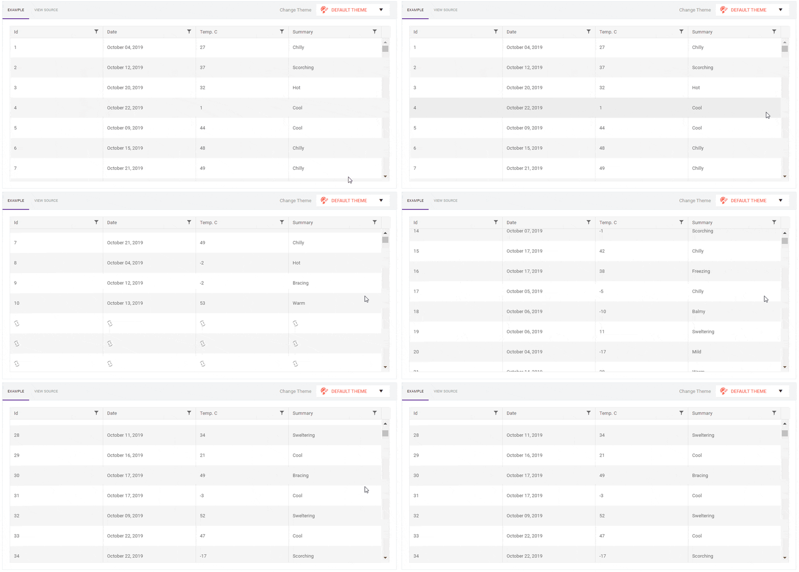
Virtual Scrolling

Large volumes of data are not an exception but a typical scenario in modern apps. A common approach is having the user page through, but if you want to deliver a more user-friendly way to explore the data you can now enable row virtualization.

Enabling virtualization can be done easily with two steps:

   1. Set ScrollMode property to "@GridScrollMode.Virtual"

   2. Assign values to the Height, RowHeight and PageSize properties

By adding these properties, the grid will be able calculate the position of the user in order to fetch the correct set of records from the data source.

<TelerikGrid Data=@GridData ScrollMode="@GridScrollMode.Virtual"
             Height="400px"RowHeight="40"PageSize="20"Sortable="true"FilterMode="@GridFilterMode.FilterMenu">

To further fine-tune the rendering performance and control the number of rendered rows, you can set the values in the PageSize property to a more suitable number so that it matches your application needs.

Telerik UI for Blazor Grid Virtual Scroll Telerik UI for Blazor Grid Virtual Scroll
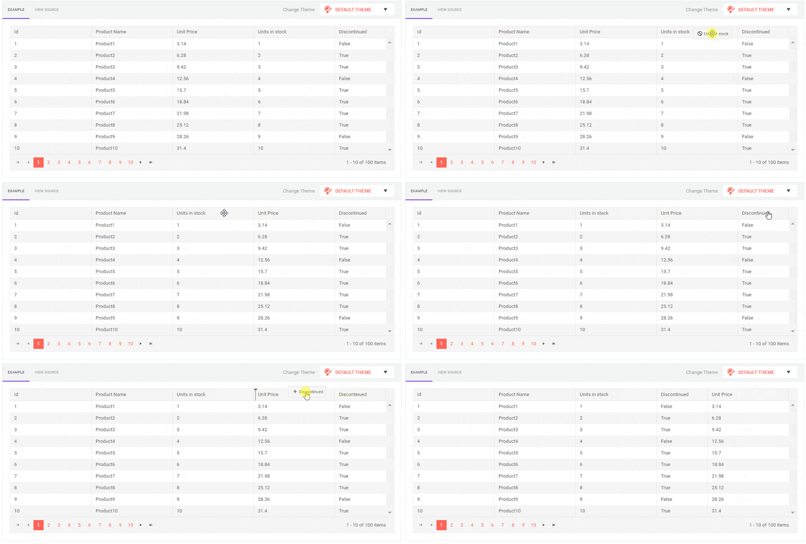
Virtual scrolling has its advantages, however if you wish to combine it with Hierarchy or Grouping, you should be aware of certain limitations, and in these cases you will have to implement regular grid paging.

The complete reference can be found in the Telerik UI for Blazor Grid Virtual Scrolling documentation.

Column Reordering

Users often want their data to be visualized in different ways, depending on their preference and what's convenient for them to consume the data. As a developer you don’t have to deal with conflicting requirements on column order – the Blazor Grid now let’s you configure it as Reorderable and your app users can reorder the grid columns simply by dragging their headers to the desired position.

Telerik UI for Blazor Grid Column Reordering Telerik UI for Blazor Grid Column Reordering
To enable the column reordering, set the Reorderable parameter of the grid to true. To prevent the user from moving a certain column, set its own parameter Reorderable="false". Note that the user can still re-arrange other columns around it.

<TelerikGrid Data="@GridData"Reorderable="true"Pageable="true"PageSize="10"Sortable="true"Height="300px">

Telerik UI for Blazor Team at  DevReach 2019

Our Telerik UI for Blazor Team will be part of DevReach 2019– Central and Eastern Europe's premier developer conference. Stop by for a Blazor chat at our booth, take part in our activities and enjoy this great event.

For everyone that would like get hands-on experience with Blazor we have a whole day event dedicated to“Build your First Full-stack Blazor App”with our Blazor gurusBozhidar Ivanchev and Ed Charbeneau.

Download Telerik UI for Blazor 2.2.0

We encourage you to visit the Telerik UI for Blazor overview page and download the latest version of Telerik suite of native Blazor components!

Help Us Shape The Future of Telerik UI for Blazor!

Don’t hesitate to share you feedback and let us know which components you would like to see next at the official Telerik UI for Blazor feedback portal. We value your ideas and will consider them when creating the 2020 product roadmap and beyond!

Happy Blazor Coding!

Building a Mini Angular Task Scheduler with Kendo UI

$
0
0

In this tutorial, we’ll see how we can utilize Kendo UI components when building an event scheduler.

Kendo UI is a library used for building applications at a faster pace. Kendo UI provides UI components for libraries like jQuery, Angular, React and Vue, and it comes packed with over 20 components for creating charts, data tables and drag-and-drop pages.

Kendo UI is customizable; it also provides a set of themes for Material UI, Bootstrap, etc.; and it comes packed with an icon set and a color palette. Kendo UI components are distributed as multiple npm packages, so there’s no fear of bloating your application with unnecessary components and increasing your build bundle.

Angular is a JavaScript framework for creating a web application. It offers the best practices and tools to ease the development of applications. Angular uses declarative templates, dependency injection and Observables to power applications that can be run on several platforms.

We’ll be using some of the components provided by Kendo UI to build a simple task scheduling application. The application will let users create tasks by specifying start and end dates alongside appropriate descriptions. The event will be displayed on a scheduler (calendar) component.

To get started with the tutorial, you’ll require a basic understanding of Angular. Also, ensure you have Node installed on your personal computer. If you have no prior knowledge of Angular, kindly follow the official tutorial here and download Node for your PC here if you haven’t already.

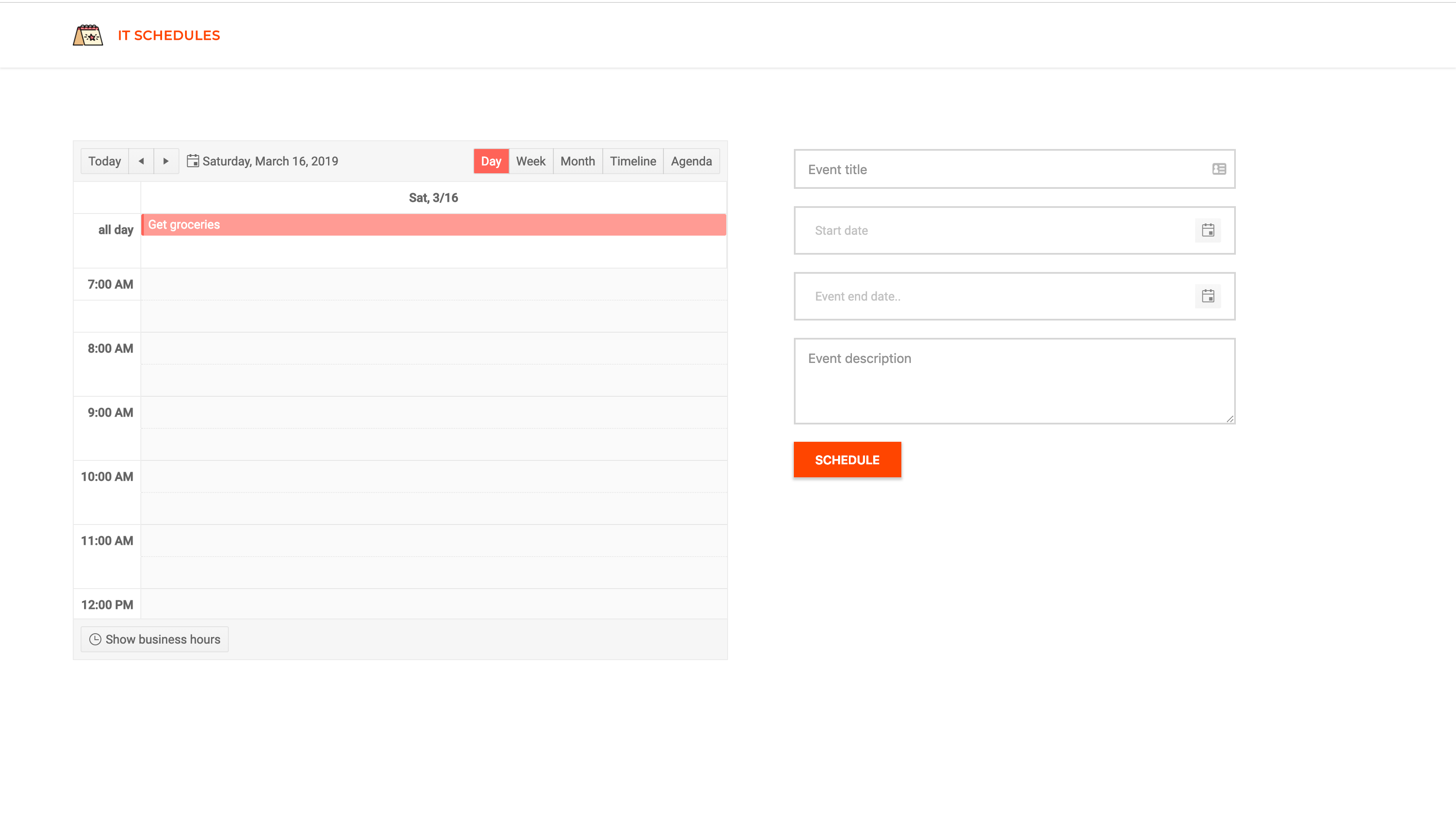
Here’s a screenshot of what we’ll be building:

angular task scheduler image 1

Initializing the Application and Installing Dependencies

To get started, we will use the CLI (command line interface) provided by the Angular team to initialize our project.

First, install the CLI by running npm install -g @angular/cli. npm is a package manager used for installing packages. It will be available on your PC if you have Node installed; if not, download Node here.

To create a new Angular project using the CLI, open a terminal and run:

ng new kendo-scheduler --style=scss

This command is used to initialize a new Angular project; the project will be using SCSS as the pre-processor.

Next, run the following command in the root folder of the project to install dependencies:

    ng add @progress/kendo-angular-scheduler
    ng add @progress/kendo-angular-dateinputs

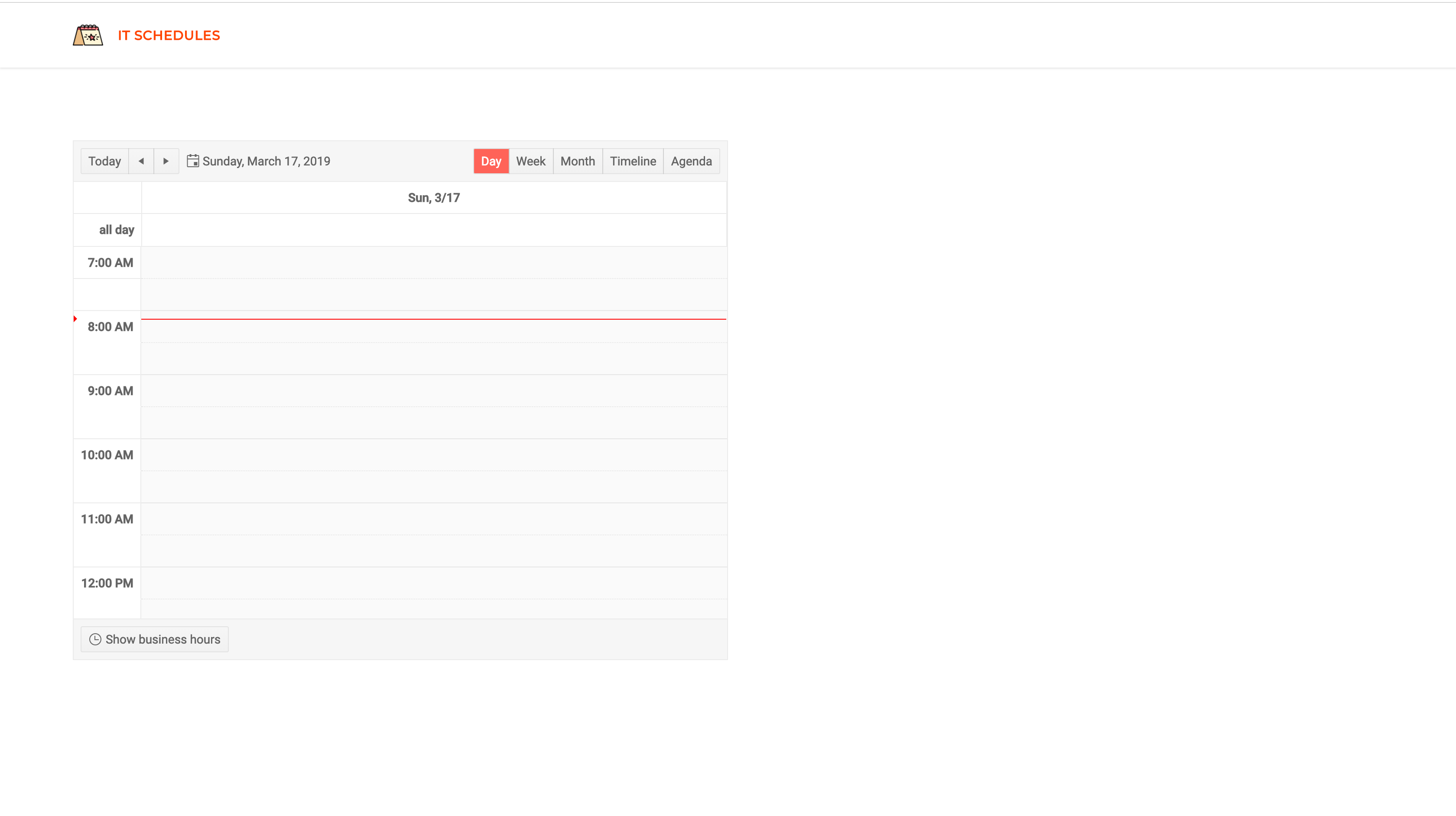
Open a terminal inside the project folder and start the application by running ng serve. If you open your browser and visit the link http://localhost:4200 you should see the screenshot below if everything went well.

angular task scheduler image 2

Calendar Component

We’ll be creating a component to hold the event scheduler. This component will render Kendo UI’s event scheduler component. The component will display the events entered by the user. To generate the component, run the following command:

    ng generate component scheduler

Open the newly created scheduler.component.html file and update the contents with the snippet below:

<div><kendo-scheduler[kendoSchedulerBinding]="events"[selectedDate]="selectedDate"
        style="height:600px;"><kendo-scheduler-day-view[startTime]="startTime"></kendo-scheduler-day-view><kendo-scheduler-week-view[startTime]="startTime"></kendo-scheduler-week-view><kendo-scheduler-month-view></kendo-scheduler-month-view><kendo-scheduler-timeline-view></kendo-scheduler-timeline-view><kendo-scheduler-agenda-view></kendo-scheduler-agenda-view></kendo-scheduler></div>

In the snippet above, we’re rendering the scheduler component provided by Kendo UI. This component will receive an array of events as an input. Also, it will take some control components like the day-view, week-view, etc. components. These components act as controls for the scheduler and can be used to update the current display of the scheduler.

Next, we’ll update the scheduler component file to declare the variables we used in the template file:

import{ Component, OnInit, Input }from'@angular/core';exportinterfaceEvent{
      Title: String;
      Description: String;
      Start: Date;
      End: Date;}
    
    @Component({
      selector:'app-scheduler',
      templateUrl:'./scheduler.component.html',
      styleUrls:['./scheduler.component.scss']})exportclassSchedulerComponentimplementsOnInit{constructor(){}
      @Input() events: Event[];
      startTime ='7:00';
      selectedDate =newDate();ngOnInit(){}}

The component will receive events from a parent component using Input bindings. Also, we’ll set the current date on the scheduler using the selectedDate variable, the same goes for the startTime.

Next, we’ll render the component within the app.component.html file. Open the file and update it to be similar to the snippet below:

<!-- app.component.html --><header><!-- header comes here --></header><main><divclass="scheduler"><app-scheduler[events]="events"></app-scheduler></div><divclass="event-form"><!-- Event form component comes here --></div></main>

In the snippet, we’re passing an array of events to the scheduler component. The events will be managed by the app component.

Next, we’ll throw in some styles for the component. Copy the snippet below into the app.component.scss file:

main{display: flex;width:90%;margin:5% auto;.scheduler{flex:11;}.event-form{flex:11;}}

Next, we’ll update the component file to declare the variables we used in the template file:

// app.component.tsimport{ Component }from'@angular/core';
    @Component({
      selector:'app-root',
      templateUrl:'./app.component.html',
      styleUrls:['./app.component.scss'],})exportclassAppComponent{
      events: Event[]=[];onNewEvent(event: Event){this.events =this.events.concat(event);}}

First, we declare the events variable which is an array, the events array will be populated by the onNewEvent method. This method will be called whenever a new event is created.

Next, we’ll include the external assets the application will be using. We’ll be using the Montserrat and Roboto fonts. Also, we’ll update style.scss file to include the Kendo UI component stylesheets and application-wide styles.

Open the index.html file and include the link to the external fonts:

<!doctype html><htmllang="en"><head><metacharset="utf-8"><title>EventScheduler</title><basehref="/"><metaname="viewport"content="width=device-width, initial-scale=1"><linkrel="icon"type="image/x-icon"href="favicon.ico"><linkhref="https://fonts.googleapis.com/css?family=Roboto:400,500|Montserrat:400,500"rel="stylesheet"></head><body><app-root></app-root></body></html>

Then open the style.scss file, we’ll be overriding the default style of some Kendo UI components and the default CSS properties of the body and html elements:

// styles.scss/* You can add global styles to this file, and also import other style files */.k-autocomplete,
    .k-dateinput-wrap,
    .k-dropdown-wrap,
    .k-picker-wrap,
    .k-multiselect-wrap,
    .k-numeric-wrap {border: none !important;}body {padding:0;margin:0;font-family:'Roboto', sans-serif;}

Header Component

The header component will display the application logo and very little information. This component is mostly a display component.
Run the following command to create the header component:

    ng generate component header

Next, open the src/app/header/header.component.html file and update it to look like the code below:

<!-- src/app/header/header.component.html --><header><divclass="brand"><imgsrc="/assets/images/logo-2.png"><h5>It Schedules</h5></div></header>

Note: Image asset used can be found here in the GitHub repository. The logo asset is from https://flaticon.com.

Next, we’ll style the header. Open the header.component.scss file and update it with the snippet below:

header {display: flex;align-items: center;font-family:'Montserrat', sans-serif;margin:0;padding:20px 5%;color: whitesmoke;box-shadow:01px 2px 0rgba(0, 0, 0, 0.1);.brand {flex:1;display: flex;align-items: center;img {height:35px;margin-right:17px;}h5 {font-size:15px;margin:0;text-transform: uppercase;letter-spacing:0.5px;font-weight:600;color: orangered;}}}

Just a couple of styles to beautify the header.

Then we’ll update the app.component.html file to render the header component:

<header><app-header></app-header></header><main>
      ...
    </main>

If you visit http://localhost:4200, you should see the latest view of the application. The header and the scheduler are visible. Next, we’ll create the event form component that will be used for creating new events. Ensure the Angular dev server is running before testing.

angular task scheduler image 3

Event Form Component

Now that we’ve successfully set up the scheduler component, let’s create an EventForm component that will be used for scheduling new events. The component will render a form and some input fields for inputting information relevant to the event.

Run the command below to generate the component:

    ng generate component event-form

Open the event-form.component.html file and copy the content below into it:

<form(submit)="handleSubmit()"[formGroup]="eventForm"><divclass="input-holder"><inputtype="text"placeholder="Event title"formControlName="title"/></div><divclass="input-holder"><kendo-datepickerformControlName="start"placeholder="Start date"></kendo-datepicker></div><divclass="input-holder"><kendo-datepickerformControlName="end"placeholder="Event end date.."></kendo-datepicker></div><divclass="input-holder"><textareaplaceholder="Event description"rows="4"formControlName="description"></textarea></div><divclass="input-holder"><buttontype="submit">Schedule</button></div></form>

For the form, we’ll be using the Reactive
Forms
approach to managing the input elements. Since we’ll be selecting dates, we’ll make use of the DatePicker component by Kendo UI. The component is easy to use and all we have to do is pass the formControlName directive to the component and we can receive the values from the component.

Let’s style the component a bit. Open the event-form.component.scss file and update the file with the styles below:

// src/app/event-form/event-form.component.scssform {display: flex;flex-direction: column;margin-left:10%;font-family:"Roboto" sans-serif;}.input-holder {margin:10px 0;display: flex;justify-content: flex-start;}.input-holder > button {justify-self: center;padding:12px 25px;border-radius:0;text-transform: uppercase;font-weight:600;background: orangered;color: white;border: none;font-size:14px;letter-spacing: -0.1px;cursor: pointer;}input,
    textarea,
    kendo-datepicker {padding:12px 15px;border:2px solid rgba(0, 0, 0, 0.2);border-radius:0;width:70%;opacity:0.8;font-size:15px;font-weight: normal;}kendo-datepicker{width:75%;}input:focus,
    textarea:focus,
    button:focus,
    kendo-datepicker:focus {border:2px solid orangered;outline: none;box-shadow:02px 3px 1px rgba(0, 0, 0, 0.2);}

Finally, we’ll update the component to create the variables and event handlers used in the template file. Update the event-form.component.ts file to be similar to the snippet below:

// src/app/event-form/event-form.component.tsimport{ Component, OnInit, EventEmitter, Output }from'@angular/core';import{ FormControl, FormGroup }from'@angular/forms';
    
    @Component({
      selector:'app-event-form',
      templateUrl:'./event-form.component.html',
      styleUrls:['./event-form.component.scss'],})exportclassEventFormComponentimplementsOnInit{constructor(){}
    
      eventForm: FormGroup =newFormGroup({
        title:newFormControl(''),
        description:newFormControl(''),
        start:newFormControl(),
        end:newFormControl(),});
    
      @Output()
      newEvent: EventEmitter<Event>=newEventEmitter();handleSubmit(){const event =this.eventForm.value;this.newEvent.emit({...event,});this.eventForm.reset();}ngOnInit(){}}```

In the snippet above, we created a form group object called `eventForm`. This will manage the multiple form controls being used. Next, we’ll create an [EventEmitter](https://angular.io/api/core/EventEmitter) property (`newEvent`), and this variable will be used to notify the parent component of new events. 

The `handleSubmit` method is an event handler called when the form is submitted. After submission, the method will get the value of the `eventForm` and emit it to the parent component using the `newEvent` property.

The `[FormGroup](https://angular.io/api/forms/FormGroup)` and `[FormControl](https://angular.io/api/forms/FormControl)` classes depend on the [ReactiveFormsModule](https://angular.io/api/forms/ReactiveFormsModule) to function, so we’ll update the `app.module.ts` file to include this module. Open the file and update the `imports` array with the [ReactiveFormsModule](https://angular.io/api/forms/ReactiveFormsModule):

```typescript
    //src/app/app.module.tsimport{ BrowserModule }from'@angular/platform-browser';// ... other importsimport{ ReactiveFormsModule }from'@angular/forms';
    
    @NgModule({
      declarations:[// ...],
      imports:[// ...
        ReactiveFormsModule,],
      providers:[],
      bootstrap:[AppComponent],})exportclassAppModule{}```

Next, we’ll update the `app.component.html` file to render the event form.

```html
    <header><app-header></app-header></header><main><div class="scheduler"><app-scheduler [events]="events"></app-scheduler></div><div class="event-form"><app-event-form(newEvent)="onNewEvent($event)"></app-event-form></div></main>

After this update, you can navigate to http://localhost:4200 to view the current state of the application:

angular task scheduler image 4

Note: Ensure the Angular dev server is running before visiting the link above. Run ng serve or npm start if you haven’t already.

Conclusion

In this tutorial, we’ve seen how easy it is to get started using Kendo UI components for Angular. A scheduler can be easily created using the component from Kendo UI. The components were easy to use and configure. Kendo UI also has a range of components to select from when building applications using Angular, React, Vue and jQuery. You can find the source code for this demo application here. Happy coding.

Smile for the Camera! WebCam Control for WPF and WinForms

$
0
0

The WebCam component is here for WPF and WinForms and there's a lot it can do. In this post, we'll take a closer look at it.

Our R3 2019 release is out, and with it RadWebCam is out of beta for WPF and makes its debut in the WinForms suite. Now you can give your users the ability to view a video feed, take and save pictures and video directly from your WPF or WinForms application. You can ready more about everything that's new in the respective release blogs for Telerik UI for WPF and Telerik UI for WinForms.

For the moment lets focus on the new WebCam control. To get started all you need is a webcam plugged into your computer or an integrated one. Drop the RadWebCam component on your Window or Form and start the project. It’s that simple! RadWebCam will find the webcam and use the video stream with the highest quality to start streaming.

webcam

Whether you are building gym subscription software, or for surveillance, access control, photo booth, machine learning or anything else, you can rely on RadWebCam. We did our best to try and abstract away all the complex internals involved in displaying a video stream from a camera inside a WPF/WinForms component. Nevertheless, flexibility and customization are in our DNA and we stayed true to that. There are a number of customizations you can perform to ensure RadWebCam fits your case as precisely as you need it to. The rich API is designed around ease of use and maximum control for the developer.

WebCam Extensive API

Say Cheese! Taking Snapshots

Taking snapshots of what is currently displayed by the camera is as simple as pressing a button, calling a method or executing a command in the case of WPF applications. You also have the choice of showing a preview of the snapshot taken or directly processing it further. To choose whether to show a preview or not, you can use the PreviewSnapshots property. Once you’ve decided, you have to handle the SnapshotTaken event where you get access to the actual image. What you do with it is entirely up to you: save it, send it, edit it, run it through your neural network, anything you fancy.

webcam taking snapshots

And… Action! Recording Video

If a picture can say a thousand words, imagine what 30 of them per second in HD resolution can do. You can use RadWebCam to record video from your camera just as easily as taking snapshots. You have a readily available button inside the camera UI, a command in the WPF case and a method you can call. To set up things you should set the RecordingFilePath property and you are ready to roll. You also have the RecordingStarted and RecordingEnded events to let you act immediately before or after a video recording. Sound is ON as long as you need it. You can choose whether to add audio to your video recordings by initializing RadWebCam with or without an audio recording device.

WebCam Video Recording

You are the Director: Choosing Devices and Formats

Sometimes you have several cameras and microphones available and you need a means to choose between them. Even when you have a single camera you might want to use different frame sizes or frame rates. We've got you covered here as well. You can use the available API to iterate over the devices and their formats available on the given machine.

var mics = RadWebCam.GetAudioCaptureDevices();
var cameras = RadWebCam.GetVideoCaptureDevices();
var videoFormats = RadWebCam.GetVideoFormats(cameras[0]);

WebCam Devices

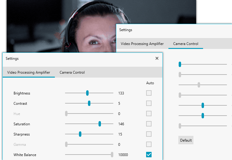
On top of the devices and formats you can allow your users to further fine tune their camera with the built-in settings control. With it they can adjust all the settings their webcam supports like Brightness, White Balance, Saturation etc.

WebCam Settings Dialog

Swapping Lenses: Localization, Styling and Touch

RadWebCam has you covered no matter what the language of choice is for your customers and how they prefer to interact with your application. Mouse, keyboard or touch, RadWebCam supports it all. You can tailor fit the UI through the visibility properties available for the individual buttons in the toolbar as well as the whole toolbar itself. You can also choose from a plethora of readily available themes we provide with our UI suites.

webcam localizationWebCam Styling and AppearanceWebCam Touch Support

Take #1859: Error Handling

Sometimes things do not work out as initially planned or fall midway. There are a number of ways your webcam can stop working or not work at all. These include when another application is using the camera and it is busy. Access to cameras can be forbidden in the Windows settings or the camera can be unplugged for whatever reason, even mid-session. In any of these cases RadWebCam will handle the case and display a message. You can also handle the CameraError event and add your input into the error handling process.

Get Started Today

RadWebCam for WinForms and WPF is out now, grab your webcam and get creative or unleash your customers’ potential and see what they can create with this powerful tool. Download the latest version of your favorite Telerik UI suite from the Your Account area of our website. If you are a new to the Telerik UI suites, download a free trial.

.NET is Dead, Long Live .NET

$
0
0

Microsoft has already said that .NET Core is the future of .NET, which means if you haven’t started, you’ll need to start migrating your existing .NET Framework applications to .NET Core. We’ll go over a few reasons to be excited about this change as well as how to get a head start on the move. 

In a world of evolving developer tooling, frameworks, and trends, Microsoft has an amazing track record of supporting the .NET ecosystem and the entire suite of products accompanying it. This is why the path that they have decided to take with .NET is surprising and a little welcomed. If you haven’t heard, .NET 4.8 is going to be the last release of the .NET Framework. The next release after .NET Core 3.0 will be .NET 5.0, which means that .NET Core will take on the mantle of .NET. One of the major goals of .NET Core has always been to unify the framework into having a single runtime that behaves similarly on all platforms.

With this announcement, Microsoft will be making two big steps, one of them planned and the other not so planned. The planned step is having .NET Core become the successor to the .NET legacy. The other step, which will be a little shakier, is the lack of 100% backward compatibility between .NET 5 and .NET 4.8. (At the time of this writing, Microsoft has committed to getting as close as possible to API parity in .NET 5.0).

We will go over some of the benefits to this announcement and how to get ready for this change if your codebase is still working with .NET Framework 4.8.

Benefits

The biggest upsides to this announcement are that .NET Core is the future and here to stay, as well as some performance improvements.

The future of .NET is open source and boundless. While .NET has been spreading to other platforms via Xamarin and Mono, .NET Core represents a unified approach to their cross-platform push. Along with the cross-platform unity, Microsoft is pushing heavily toward open-sourcing much of their code as well. By open-sourcing .NET, it has changed the licensing and hosting costs associated with choosing .NET and opens up the playing field for startups and developers who aren’t thrilled about “startup” languages. Another notable mention is that Microsoft has had the rare opportunity to rewrite their language with all the benefits of hindsight and practical real-world usage. They have definitely not wasted this opportunity either; they have made some noticeable improvements to .NET Core which you’ll be able to take advantage of as you migrate.

Most notable, they have introduced Span and Memory, which are contiguous allocations of memory that live in the stack and allow for faster operations than existing arrays. The concept is pretty simple, but the devil is in the details. They are available for everyone to play with, but just know that Microsoft has rewritten some of its internal APIs to take advantage of the performance enhancements, so you won’t have to learn all the nitty-gritty to get advantages from them.

Beware the Non-Starters

Before we jump into preparing for migration, there are some non-starters that, if you fall into these categories, you may need to rethink your current solutions or potentially dig into the .NET Framework for the life of your project.

At this time, there are no plans to implement these in .NET Core.

Non-Starters

  • AppDomains
  • Remoting
  • Code Access Security (CAS)
  • Security Transparency (Silverlight)
  • System.EnterpriseServices

Steps to Get Ready for Migration

I’ve given a few reasons to get excited about the future of .NET, some caveats for whether this migration appropriately applies to your needs, and now we need to make some changes to our existing codebases to get ready for the next release.

Microsoft has done a good job of building out a set of tools to help with the migration.

Step 1. Set your project to target .NET Framework 4.7.2

The first step may seem like a step backward, but you’ll want to set your project to target .NET Framework 4.7.2. Microsoft recommends using 4.7.2 since this gives you the availability of the latest API alternatives for cases where the .NET Standard doesn't support existing APIs.

You’ll notice that I casually tossed out .NET Standard without going into much detail. .NET Standard is a formal set of APIs that are intended to be available on every .NET implementation which will allow you to seamless migrate to .NET Core from .NET Standard.

Step 2. Run Your Code through .NET Portability Analyzer

After ensuring that your code is targeting .NET Framework 4.7.2, it is time to run your code through the .NET Portability Analyzer (ApiPort) to determine how much work would be required to port your .NET Framework codebase to .NET Core, .NET Standard, ASP.NET Core, NET Core + Platform Extensions, or .NET Standard + Platform Extensions. This tool is versatile since you can use it to analyze your codebase with several different options. It allows you to specify the versions and get very granular with the recommendations.

If you happen to be using C#, you can use the API Analyzer to help analyze your code. While this tool is useful, it is not specific to porting your codebase to .NET Core — it definitely falls into the more general category of tooling that happens to track down obsolete code, but it can track down some portability issues.

Step 3. Implement Your Plan for Porting

At this point, you have a good idea of the scope of work required for moving your codebase to .NET Core or at least a potential path forward once until your compatibility issues are resolved. As you start porting, there are two techniques that you can use to make progress. The first would be to copy your code into a .NET Core project and pick a version of .NET Standard that you want to target and reference your ApiPort references on what changes need to take place, along with pulling down the necessary NuGet packages. The second option would be to modify it in place. The best approach is really based on your code and what works for you.

Step 4. Test

If you were able to port over your code, the next steps would be to run your unit tests against the migrated codebase to ensure that they are working. There are only three unit test libraries that run on .NET Core: MSTest, xUnit, and NUnit.

Wrapping Up

Hopefully, you are as excited about the future of .NET as me and feel like there is a path forward for your codebase to .NET 5.0. Happy Coding!


Customizing Creating Your TreeView’s Nodes

$
0
0

The TreeView in Telerik UI for Blazor lets you control when and how each set of nodes gets loaded. That not only lets you control how the nodes are loaded but can also improve your page’s performance.

The TreeView in Telerik UI for Blazor allows you to decide what happens when a node is expanded — including how the nodes that are added to your tree are retrieved.

The Telerik TreeView component makes it easy for you to pull data out of a database and load it into the TreeView. But what if your data isn’t in a database or you want to “massage” it before displaying it or the process of retrieving your nodes is, in some way, “complicated”? The TreeView lets you retrieve the data for your nodes by providing a code-based way to load related data.

This strategy of retrieving nodes when needed can also help you improve performance. If, for example, you know that most of the time, most of the nodes on your treeview won’t be expanded, using this technique allows you to reduce the data required for the initial display of the treeview to just the top-level objects. Alternatively, if you were considering a treeview that’s more than two levels deep — well, the more levels you add to a treeview, the more data you have to retrieve, and the longer it takes to get to that initial display of your treeview. Retrieving only the nodes you need when you need them helps in both of these scenarios.

Version caveats: I tested this code in Visual Studio 2019 (16.3.1) which comes with ASP.NET Core 3.0 (which, in turn, includes the first production release of Blazor). I also used Telerik.UI.for.Blazor NuGet package, version 2.1.0.

Setting Up Your Objects

The first step in the process is to define the object that you’re going to use for the top-level nodes of your treeview. You can retrieve those objects from your database but, to support the Telerik TreeView, each object needs some additional properties that won’t exist in your tables:

  • HasChildren: A boolean property that’s set to true to indicate that a node can be expanded (i.e. has “child” nodes)
  • Expanded: A boolean property that indicates whether the node is being expanded by the user or contracted

In addition, your top-level objects will also need some collection property that holds the objects to be display as your second-level nodes in the treeview (this property may already exist in your data’s object model). Effectively then, you need a Data Transfer Object (a DTO) that combines UI-related data with data from your database.

As an example, this CustomerDto object has customer-related data from the database (CustId and FullName), a collection property holding all the Address objects associated with the Customer, plus the two UI-required properties (HasChildren and Expanded):

public class CustomerDto
{
   public int CustId { get; set; }
   public string FullName { get; set; }
   public IEnumerable<Address> Addresses { get; set; }
   public bool HasChildren { get; set; }
   public bool Expanded { get; set; }
}

I covered a LINQ-and-Entity-Framework approach to creating an object like this in an earlier post.

Defining the TreeView

With this in place, you’re ready to add a Telerik TreeView to your component. Markup like the following would do the trick:

<TelerikTreeView Data="@custs" OnExpand="@GetAddresses">
    <TreeViewBindings>
    </TreeViewBindings>
</TelerikTreeView>

In the TreeView, you must set the Data attribute to a field or property in your component’s code section that holds the collection of top-level objects you want to display (in my case, that’s a field called custs that holds my CustomerDto objects). To use code to retrieve and display the child/second-level objects, you must set the TreeView’s OnExpand attribute to the name of some method in your component’s code section (I’ve called my method GetAddresses).

In the TreeViewBindings, you’ll need at least two TreeViewBinding elements. The first TreeViewBinding references the top-level nodes (CustomerDto, in my case). The TextField must be set to some property on that object (I’ve used FullName) and the ItemsField attribute must be set to the property that holds the second-level/child objects (in this case, my CustomerDto object’s Addresses collection). If you’d like to do more than display a single property in a TreeView node, see my post on creating TreeView templates. Here’s that first TreeViewBinding:

<TelerikTreeView Data="@custs" OnExpand="@GetAddresses">
    <TreeViewBindings>
        <TreeViewBinding TextField="FullName" ItemsField="Addresses" />
    </TreeViewBindings>
</TelerikTreeView>

The second TreeViewBinding describes those second-level/child set of nodes. That will be, in my case, the individual Address objects for the CustomerDto’s Addresses property. For this example, I’m going to display the Address object’s City property in each of those second-level/child nodes. Here’s the complete markup for the TreeView:

<TelerikTreeView Data="@custs" OnExpand="@GetAddresses">
    <TreeViewBindings>
        <TreeViewBinding TextField="FullName" ItemsField="Addresses" />
        <TreeViewBinding Level="1" TextField="City" />
    </TreeViewBindings>
</TelerikTreeView>

If I was going to add a third level (i.e. children of the Address object), I could add an ItemsField attribute to the second TreeViewBinding, along with a third TreeViewBinding element to describe that third level.

Initializing the TreeView

In my component’s code section I have two things to do. The first is to load the field that I referred to in my TreeView’s ItemsField attribute that holds the top-level nodes. First, I need to define the field that holds my collection of CustomerDto objects:

@code {
    private IEnumerable<CustomerDto> custs;

Then I need to load that field with the objects that make up my top-level nodes. I want to do that early in my component’s life cycle so I put that code in the component’s OnInitializedAsync method. Here’s what that looked like:

    protected async override Task OnInitializedAsync()
    {
        custs = await CustomerRepository.GetAllAsync();
        await base.OnInitializedAsync();
    }

Loading the Children

Now I need to write the code that loads the second-level/child nodes (the Address objects associated with each customer). I have to put that code in the method I referred to in the TreeView’s onExpand attribute (I called that method GetAddresses). That method will automatically be passed a TreeViewExpandEventArgs object, which I need to catch to use in my method. Here’s what that method’s declaration looks like:

private async Task GetAddresses(TreeViewExpandEventArgs args)
{

Fundamentally, what I’m going to do in this method is use the TreeViewExpandEventArgs’ properties to determine if the node is being expanded (if the node is being collapsed, I don’t have to do anything). Then, if the node is being expanded, I’ll retrieve the child objects (the addresses for the customer, in this case) and stuff them into the property I referenced in the TreeViewBinding element’s ItemsField property (in this case, that would be the CustomerDto object’s Addresses property). The TreeView will take care of displaying them correctly.

There are two wrinkles I need to address in this code, though. First, if that property is already loaded, I don’t need to retrieve those object again (unless, of course, I figure that the underlying data is so volatile that I always need to retrieve the most up-to-date data). And, as I said earlier, if I have multiple levels that can be expanded, I also need to check what type of node I’m dealing with. If, for example, a user could also expand the Address node, I’ll need to include code to load its children.

Taking all of that into account, my GetAddresses method first uses the Expanded property on the TreeViewExpandEventArgs element to see if the node is being expanded or collapsed (if Expanded is true then the node is being expanded). I then use the TreeViewExpandEventArgs’ Item property (which holds the node that’s being expanded) to determine if I’m working with a CustomerDto object. To support using this method for other types of objects, I’ll set this up as a switch block inside an if block:

if (args.Expanded)
{
   switch (args.Item.GetType().Name)
  {
     case "CustomerDto":

Now that I know both that the node is expanded and that I am dealing with a CustomerDto object, I’ll cast that node into a CustomerDto variable so that I can get at the CustomerDto class’s properties:

CustomerDto cust = args.Item as CustomerDto;

The next step is to determine if I’ve already loaded the Addresses property (that could happen if the user is expanding a node that was expanded earlier). If so, I don’t have to do anything and I can just exit my method:

if (cust.Addresses != null)
{
   return;
}

Now that I’ve handled that “special” case, I can retrieve the Address objects for the Customer and stuff them into the Addresses property for the CustomerDto that’s being expanded. I also need to call Blazor’s StateHasChanged method to cause Blazor to display the change in the TreeView’s UI. If I’ve got the right classes in place, that code can be as simple as this (I’ve also included the break statement that the switch structure requires):

cust.Addresses = await AddressRepository.GetAddressesForCustomer(cust.CustId);
StateHasChanged();
break;

I’ve probably made this sound more complicated than it is — altogether, my GetAddresses method just has nine lines of actual code. Here it is in full:

private async Task GetAddresses(TreeViewExpandEventArgs args)
{
   if (args.Expanded)
   {
      switch (args.Item.GetType().Name)
      {
         case "CustomerDto":
                    CustomerDto cust = args.Item as CustomerDto;
                    if (cust.Addresses != null)
                    {
                        return;
                    }
                    cust.Addresses = await AddressRepositoryAsync.GetAddressesForCustomer(cust.CustId);
                    break;
      }         
      StateHasChanged();   
   }
}

I can, in fact, continue to customize what the Address objects attached to my TreeView nodes look like. There’s nothing stopping me from creating an Address DTO object with a Customer property that I could load with the related Customer object — that might come in handy as the user interacts with the Address nodes. The additional line of code before the break statement in my case statement would look like this:

cust.Addresses.ToList().ForEach(c => c.Customer = cust);

And I can continue to extend this model. To support, for example, another level of nodes underneath the Address nodes, I would only have to extend the switch block with another case block (another six lines of code). That’s not bad for complete control over how your treeview adds nodes.

Try it Today

To learn more about Telerik UI for Blazor components and what they can do, check out the Blazor demo page or download a trial to start developing right away.

Start Trial

10 Good Practices for Building and Maintaining Large Vue.js Projects

$
0
0

Here are the top best practices I've developed while working on Vue projects with a large code base. These tips will help you develop more efficient code that is easier to maintain and share.

When freelancing this year, I had the opportunity to work on some large Vue applications. I am talking about projects with more than a dozen Vuex stores, a high number of components (sometimes hundreds) and many views (pages). It was actually quite a rewarding experience for me as I discovered many interesting patterns to make the code scalable. I also had to fix some bad practices that resulted in the famous spaghetti code dilemma.

Thus, today I’m sharing 10 best practices with you that I would recommend to follow if you are dealing with a large code base. ‍♀️

1. Use Slots to Make Your Components Easier to Understand and More Powerful

I recently wrote an article about some important things you need to know regarding slots in Vue.js. It highlights how slots can make your components more reusable and easier to maintain and why you should use them.

But what does this have to do with large Vue.js projects? A picture is usually worth a thousand words, so I will paint you a picture about the first time I deeply regretted not using them.

One day, I simply had to create a popup. Nothing really complex at first sight as it was just including a title, a description and some buttons. So what I did was to pass everything as props. I ended up with three props that you would use to customize the components and an event was emitted when people clicked on the buttons. Easy peasy!

But, as the project grew over time, the team requested that we display a lot of other new things in it: form fields, different buttons depending on which page it was displayed on, cards, a footer, and the list goes on. I figured out that if I kept using props to make this component evolve, it would be ok. But god, how wrong I was! The component quickly became too complex to understand as it was including countless child components, using way too many props and emitting a large number of events. I came to experience that terrible situation in which when you make a change somewhere and somehow it ends up breaking something else on another page. I had built a Frankenstein monster instead of a maintainable component!

However, things could have been better if I had relied on slots from the start. I ended up refactoring everything to come up with this tiny component. Easier to maintain, faster to understand and way more extendable!

<template>
  <div class="c-base-popup">
    <div v-if="$slot.header" class="c-base-popup__header">
      <slot name="header">
    </div>
    <div v-if="$slot.subheader" class="c-base-popup__subheader">
      <slot name="subheader">
    </div>
    <div class="c-base-popup__body">
      <h1>{{ title }}</h1>
      <p v-if="description">{{ description }}</p>
    </div>
    <div v-if="$slot.actions" class="c-base-popup__actions">
      <slot name="actions">
    </div>
    <div v-if="$slot.footer" class="c-base-popup__footer">
      <slot name="footer">
    </div>
  </div>
</template>

<script>
export default {
  props: {
    description: {
      type: String,
      default: null
    },
    title: {
      type: String,
      required: true
    }
  }
}
</script>

My point is that, from experience, projects built by developers who know when to use slots does make a big difference on its future maintainability. Way fewer events are being emitted, the code is easier to understand, and it offers way more flexibility as you can display whatever components you wish inside.

⚠️ As a rule of thumb, keep in mind that when you end up duplicating your child components' props inside their parent component, you should start using slots at that point.

2. Organize Your Vuex Store Properly

Usually, new Vue.js developers start to learn about Vuex because they stumbled upon on of these two issues:

  • Either they need to access the data of a given component from another one that’s actually too far apart in the tree structure, or
  • They need the data to persist after the component is destroyed.

That's when they create their first Vuex store, learn about modules and start organizing them in their application.

The thing is that there is no single pattern to follow when creating modules. However, I highly recommend you think about how you want to organize them. From what I've seen, most developers prefer to organize them per feature. For instance:

  • Auth.
  • Blog.
  • Inbox.
  • Settings.

On my side, I find it easier to understand when they are organized according to the data models they fetch from the API. For example:

  • Users
  • Teams
  • Messages
  • Widgets
  • Articles

Which one you choose is up to you. The only thing to keep in mind is that a well-organized Vuex store will result in a more productive team in the long run. It will also make newcomers better predisposed to wrap their minds around your code base when they join your team.

3. Use Actions to Make API Calls and Commit the Data

Most of my API calls (if not all) are made inside my Vuex actions. You may wonder: why is that a good place to do so?

‍♀️ Simply because most of them fetch the data I need to commit in my store. Besides, they provide a level of encapsulation and reusability I really enjoy working with. Here are some other reasons I do so:

  • If I need to fetch the first page of articles in two different places (let's say the blog and the homepage), I can just call the appropriate dispatcher with the right parameters. The data will be fetched, committed and returned with no duplicated code other than the dispatcher call.

  • If I need to create some logic to avoid fetching this first page when it has already been fetched, I can do so in one place. In addition to decreasing the load on my server, I am also confident that it will work everywhere.

  • I can track most of my Mixpanel events inside these actions, making the analytics code base really easy to maintain. I do have some applications where all the Mixpanel calls are solely made in the actions. I can't tell you how much of a joy it is to work this way when I don't have to understand what is tracked from what is not and when they are being sent.

4. Simplify Your Code Base with mapState, mapGetters, mapMutations and mapActions

There usually is no need to create multiple computed properties or methods when you just need to access your state/getters or call your actions/mutations inside your components. Using mapState, mapGetters, mapMutations and mapActions can help you shorten your code and make things easier to understand by grouping what is coming from your store modules in one place.

// NPM
import { mapState, mapGetters, mapActions, mapMutations } from "vuex";

export default {
  computed: {
    // Accessing root properties
    ...mapState("my_module", ["property"]),
    // Accessing getters
    ...mapGetters("my_module", ["property"]),
    // Accessing non-root properties
    ...mapState("my_module", {
      property: state => state.object.nested.property
    })
  },

  methods: {
    // Accessing actions
    ...mapActions("my_module", ["myAction"]),
    // Accessing mutations
    ...mapMutations("my_module", ["myMutation"])
  }
};

All the information you'll need on these handy helpers is available here in the official Vuex documentation.

5. Use API Factories

I usually like to create a this.$api helper that I can call anywhere to fetch my API endpoints. At the root of my project, I have an api folder that includes all my classes (see one of them below).

api
├── auth.js
├── notifications.js
└── teams.js

Each one is grouping all the endpoints for its category. Here is how I initialize this pattern with a plugin in my Nuxt applications (it is quite a similar process in a standard Vue app).

// PROJECT: API
import Auth from "@/api/auth";
import Teams from "@/api/teams";
import Notifications from "@/api/notifications";

export default (context, inject) => {
  if (process.client) {
    const token = localStorage.getItem("token");
    // Set token when defined
    if (token) {
      context.$axios.setToken(token, "Bearer");
    }
  }
  // Initialize API repositories
  const repositories = {
    auth: Auth(context.$axios),
    teams: Teams(context.$axios),
    notifications: Notifications(context.$axios)
  };
  inject("api", repositories);
};
export default $axios => ({
  forgotPassword(email) {
    return $axios.$post("/auth/password/forgot", { email });
  },

  login(email, password) {
    return $axios.$post("/auth/login", { email, password });
  },

  logout() {
    return $axios.$get("/auth/logout");
  },

  register(payload) {
    return $axios.$post("/auth/register", payload);
  }
});

Now, I can simply call them in my components or Vuex actions like this:

export default {
  methods: {
    onSubmit() {
      try {
        this.$api.auth.login(this.email, this.password);
      } catch (error) {
        console.error(error);
      }
    }
  }
};

6. Use \$config to access your environment variables (especially useful in templates)

Your project probably have some global configuration variables defined in some files:

config
├── development.json
└── production.json

I like to quickly access them through a this.$config helper, especially when I am inside a template. As always, it's quite easy to extend the Vue object:

// NPM
import Vue from "vue";

// PROJECT: COMMONS
import development from "@/config/development.json";
import production from "@/config/production.json";

if (process.env.NODE_ENV === "production") {
  Vue.prototype.$config = Object.freeze(production);
} else {
  Vue.prototype.$config = Object.freeze(development);
}

7. Follow a Single Convention to Name Your Commits

As the project grows, you will need to browse the history for your components on a regular basis. If your team does not follow the same convention to name their commits, it will make it harder to understand what each one does.

I always use and recommend the Angular commit message guidelines. I follow it in every project I work on, and in many cases other team members are quick to figure out that it's better to follow too.

Following these guidelines leads to more readable messages that make commits easier to track when looking through the project history. In a nutshell, here is how it works:

git commit -am "<type>(<scope>): <subject>"

# Here are some samples
git commit -am "docs(changelog): update changelog to beta.5"
git commit -am "fix(release): need to depend on latest rxjs and zone.js"

Have a look at their README file to learn more about it and its conventions.

8. Always Freeze Your Package Versions When Your Project is in Production

I know... All packages should follow the semantic versioning rules. But the reality is, some of them don't.

To avoid having to wake up in the middle of the night because one of your dependencies broke your entire project, locking all your package versions should make your mornings at work less stressful.

What it means is simply this: avoid versions prefixed with ^:

{
  "name": "my project",

  "version": "1.0.0",

  "private": true,

  "dependencies": {
    "axios": "0.19.0",
    "imagemin-mozjpeg": "8.0.0",
    "imagemin-pngquant": "8.0.0",
    "imagemin-svgo": "7.0.0",
    "nuxt": "2.8.1",
  },

  "devDependencies": {
    "autoprefixer": "9.6.1",
    "babel-eslint": "10.0.2",
    "eslint": "6.1.0",
    "eslint-friendly-formatter": "4.0.1",
    "eslint-loader": "2.2.1",
    "eslint-plugin-vue": "5.2.3"
  }
}

9. Use Vue Virtual Scroller When Displaying a Large Amount of Data

When you need to display a lot of rows in a given page or when you need to loop over a large amount of data, you might have noticed that the page can quickly become quite slow to render. To fix this, you can use vue-virtual-scoller.

npm install vue-virtual-scroller

It will render only the visible items in your list and re-use components and dom elements to be as efficient and performant as possible. It really is easy to use and works like a charm! ✨

<template>
  <RecycleScroller
    class="scroller"
    :items="list"
    :item-size="32"
    key-field="id"
    v-slot="{ item }"
  >
    <div class="user">
      {{ item.name }}
    </div>
  </RecycleScroller>
</template>

10. Track the Size of Your Third-Party Packages

When a lot of people work in the same project, the number of installed packages can quickly become incredibly high if no one is paying attention to them. To avoid your application becoming slow (especially on slow mobile networks), I use the import cost package in Visual Studio Code. This way, I can see right from my editor how large an imported module library is, and can check out what's wrong when it's getting too large.

For instance, in a recent project, the entire lodash library was imported (which is approximately 24kB gzipped). The issue? Only the cloneDeep method was used. By identifying this issue with the import cost package, we fixed it with:

npm remove lodash
npm install lodash.clonedeep

The clonedeep function could then be imported where needed:

import cloneDeep from "lodash.clonedeep";

⚠️ To optimize things even further, you can also use the Webpack Bundle Analyzer package to visualize the size of your webpack output files with an interactive zoomable treemap.


Do you have other best practices when dealing with a large Vue code base? Feel free to tell me in the comments below or to reach out to me on Twitter @RifkiNada.

10 Tips for Designing Better User Experiences

$
0
0

Photo by Daria Nepriakhina on Unsplash

An introduction to building a better user interface design that is totally user-centered.

User Experience

The International Organization for Standardization defines user experience as:

[a] person’s perceptions and responses resulting from the use and or anticipated use of a product, system or service.

We can say that user experience comprises the feelings and behaviors a user has before interacting with your product, while interacting and after the interaction session is over. This is a holistic definition which also points to the fact that usability, which means being able to use a solution, is not only what user experience entails.

User Interface Design and its Impact on UX

User interface design is a term used to refer to the putting together of all the elements you can see while experiencing a service or using a product. This can mean screen designs, design of components like icons and buttons or even text and images, and everything else in between that the user interacts with.

These elements have to be designed with both the end user and the product or company’s brand in mind so that it provides a great experience for the user and also represents the product just as the manufacturers or builders want it to. This means that a designer is not just a user interface designer because they have to understand the brand, anticipate what the users will need to facilitate ease of use of said product, and design according to those.

While UI and UX are not the same thing, UI design often directly impacts a user’s experience. If the interface is bad, the experience will likely be bad.

Let’s take a look at some tips to improve user experience through careful UX design (which sometimes involve UI design).

Some User Experience Design Tips

Be Guided by Defaults

There are certain underlying ways of doing things that already exist and there is almost always no need to reinvent the wheel by changing them. A great example is how the back/cancel button on most iOS devices is at the top left. As you build your interface, you cannot change that already known concept to something like submit/send. This is way off the default behaviors people are used to.

Reversible Actions

When designing a user experience through an interface, remember to always create easy ways to reverse or undo actions. If a user knows that they are not being penalized, chances are they will be more creative and more open to try out novel features, knowing full well that they can always go back or hit the undo button. Most of the applications we use on a day-to-day basis have all included this ease-of-use concept in their applications.

Embrace Simplicity

As much as you can, keep your designs simple — simple to read and understand. The best designs are the ones that seem invisible but which the user totally resonates with and uses. After designing an interface for instance, take some time to ask yourself or your sponsored user about the unnecessary features or elements you might have added. Most of the time, the user just wants something they can easily understand and intuitively use.

Integrate Feedback Systems

In physics, Newton’s third law states simply that for every action, there is an equal and opposite reaction. Relating this concept to user experience design, it is expected that for any action or element that indicates a change in behavior (like a click or a hover), a visible or noticeable reaction should follow. For instance, in HTML links are underlined blue by default and they change color if clicked. A submit button should have a reaction that might range from an alert pop-up modal to a change of route to indicate that there has been a change in behavior.

Provision of Guides

Guides are indicators you can call visual cues that are placed strategically in an interface to ensure the users never feel lost. User interface elements like animations or even stationary ones, such as component titles and current page/option highlights, help to show the user where they are and where they can go back/next in the application.

Color and Contrasts

It is said that, in design, colors can serve as a source of direction and diversion of attention. It is important that designers harness the power of colors to ensure that the users are interacting with their user interface as closely as possible to how it was designed to be used. On the other hand, users usually end up surprising the experience builders, so do not be surprised if your interface is used in ways you did not earlier anticipate. But try to control the experience by using colors as simply and straightforwardly as you can. Color can reinforce understanding — like when an action button is the boldest, most noticeable color on the screen. Use that color consistently.

Graceful Exception Handling

A first look at exception handling might remind you of error reporting in the development side of things. But in user experience design it is very key to build a system that can give the user a sort of alert when things that are considered exceptions happen. A good example can be when someone is using your application and the WiFi goes off. Instead of keeping the user hanging, a simple ‘your internet connection is down’ prompt will be so helpful in guiding the user to check on the WiFi they are connected to.

Consistency

This has a lot to do with defaults but in a deeper way. Being consistent involves implementing user interface elements that are common to the users in regards to defaults, but also maintaining the use of those elements as your brand evolves and the product iterates. Remember how Snapchat pulled out a total redesign of their interface and how you felt about it? Don’t be like Snapchat.

Ease of Navigation

This seems pretty obvious, but it is very important that the user of your interface knows where they are at any given time, where they have been and how to get to where they want to be intuitively. So navigation should be very clear to encourage freedom of exploration. This will reduce the chances of any form of intimidation while using your solution.

Be Accommodating

If you use an application for the very first time, often you will see that, as you interact with the interface, some first-time-user cues pop up in the display without disturbing the user flow. This is a great example of being accommodating of all levels of users on your product. So the app should be fast enough for a returning or “power user” and slow enough for a first timer to understand easily how things work without stress.

To Wrap it All up

This post has introduced user interface design and tried to show user experience designers a few ways to ensure that they are totally user-centered in the solutions or interfaces they build. Building from a place of empathy and totally understanding the user, what they do, how they feel and everything you can about them can help in designing really great experiences for them.

Managing Your Page with TreeViews and Windows

$
0
0

So what can you do with a TreeView? Well, by combining the TreeView and Window components in Telerik UI for Blazor, you can let the user find the data they want and control how much data you inflict on them.

The TreeView in Telerik UI for Blazor allows you to decide what happens when a user interacts with the nodes in the TreeView. That lets you deliver a UI that gives the user what they want, when they want it.

While the Telerik TreeView for Blazor makes it easy to load the data you want, that still leaves the question of, “What would I do with a treeview once I load it?” One option is to use the treeview’s hierarchical display to allow the user to control what makes up a page’s UI.

Managing the Display

For example, let’s say that you want to present a list of customer types (or product categories) where each type has multiple customers (for product categories, each category would have multiple individual products). Where the number of top-level items (types of categories) and the number of items for each node level isn’t overwhelming, a treeview display lets the user drill down to the data they want, guided by the information displayed in the treeview’s nodes. That information is typically terse: the customer type name or the product category name at the top level, the customer or product name at the next level.

A treeview doesn’t have to be limited to just two levels. You can add additional levels as necessary so that, for example, a user could expand a particular customer to display that customer’s addresses or sales orders (or expand a product to display its purchase history or the various warehouses it’s held in).

Again, however, the information in the treeview is typically terse — just enough information to let the user navigate to what they want. But once the user finds the node they want, the user will typically want more detailed information about the selected item (more information about the selected customer/address or product/warehouse, for example). Because each node is associated with a Customer or Product object, you have that information available to display. All you have to do is give the user a way to select the detailed display (though, having said that, the Telerik TreeView does let you put as much information as you want in each node if you’re comfortable with more wordy nodes).

In general, treeviews support this kind of interaction by separating the ability to expand a node in the treeview (click on the arrow to the node’s left) from the ability to display the node’s data (click on the node itself). By providing templates for each node, the Telerik TreeView allows you to go beyond that to decide what interaction the nodes at each level will support.

Defining the TreeView

For example, let’s start with a TreeView that displays a collection of customers with their related addresses. The markup for that TreeView might look like this:

<TelerikTreeView Data="@custs">
    <TreeViewBindings>
        <TreeViewBinding TextField="FullName" ItemsField="Addresses">
            </ItemTemplate>
        </TreeViewBinding>
        <TreeViewBinding Level="1" TextField="Type">
        </TreeViewBinding>
    </TreeViewBindings>
</TelerikTreeView>

This markup ties the TreeView to a list of customer objects (held in a field I’ve called custs), each of which has an Addresses collection holding the customer’s Address objects. The markup displays each customer’s FullName property and each address’s Type property (the Type property flags what kind of address is being displayed: shipping, billing, etc.).

To customize the node’s appearance and behavior, I can add an ItemTemplate inside the TreeViewBinding element. Here’s the customer node with an ItemTemplate (because I’m using a template to control the node’s display, I no longer need the TreeViewBinding’s FullName attribute):

<TreeViewBinding ItemsField="Addresses">
   <ItemTemplate>
    …content…
   </ItemTemplate>
</TreeViewBinding>

I could use any number of UI items inside the template to give the user something to interact with. What I decided on was an anchor element with its onclick method set to call a method in the code section of my component (I called the method SetCurrentCustomer). Inside an ItemTemplate I have access to the node’s context field which holds the object attached to the current node (in this case, that’s a Customer object). I’ll need that Customer object to display the customer’s detailed information when the user clicks on my anchor element. In my onclick event, I pass the context object to my SetCurrentCustomer method.

After making all of those changes, my customer node looks like this:

<TreeViewBinding ItemsField="Addresses">
   <ItemTemplate>
      <a @onclick="() => SetCurrentCustomer((context as Customer))">@((context as Customer).FullName)</a>
      </ItemTemplate>
</TreeViewBinding>

Effectively, by selecting a node, the user has identified the “current customer” whose detailed data the user wants to see. I’ll provide that display later — for now, in my SetCurrentCustomer method, I’ll just catch the node’s Customer object and stuff it into a property:

Customer CurrentCustomer {get; set;}
private void SetCurrentCustomer(Customer cust)
{
   CurrentCustomer = cust;
}

I’ll do a similar thing with the second level of my treeview (the address nodes for each customer). The markup for that second level would look like this:

<TreeViewBinding Level="1">
   <ItemTemplate>
      <a @onclick="() => SetCurrentAddress((context as Address))">@((context as Address).Type)</a>
   </ItemTemplate>
</TreeViewBinding>

And here’s the related code:

Address CurrentAddress {get; set;}
private void SetCurrentAddress(Address addr)
{
        CurrentAddress = addr;
}

Managing the Page Display

Of course, I now need to display the detailed data for my Customer and Address objects. The easiest way to do that is to use Telerik’s Window component to hold the markup for each set of data. I’ll use two Boolean fields to control when each window is visible (visibleCustomer for the window with customer information; visibleAddress for the window with address information). The windows simply display the data of whatever object is in my CurrentCustomer and CurrentAddress properties.

Here’s the markup for those two windows with the fields that manage their visibility:

<TelerikWindow Visible="@visibleCustomer" Centered="false" Top="100px" Left="500px">
    <WindowTitle>
        Customer: @currentCustomer.CustId
    </WindowTitle>
    <WindowContent>
        Name: @currentCustomer.FullName
        …more data…
    </WindowContent>
</TelerikWindow>
<TelerikWindow Visible="@visibleAddress" Centered="false" Top="200px" Left="500px">
    <WindowTitle>
        Address: @currentAddress.Type
    </WindowTitle>
    <WindowContent>
        Name: @currentAddress.City
        …more data….
    </WindowContent>
</TelerikWindow>
@code {
    private bool visibleAddress;
    private bool visibleCustomer;

Now it’s just a matter of managing the display of the two windows. When a user clicks on a customer node, I want to store the Customer object to support the data displayed in the customer window data. I also want to hide any existing windows with address information so that I’m not displaying address information for one customer along with customer information for a different customer. And, of course, I want to display the customer window.

I can just put the code to handle that in the CurrentCustomer property that I update when the user clicks on a Customer node:

private CustomerDto currentCustomer;
private CustomerDto CurrentCustomer
{
   get
   {
      return currentCustomer;
   }
   set
   {
      if (currentCustomer != value)
      {
         currentCustomer = value;
         visibleAddress = false;
         visibleCustomer = true;
      }
   }
}

When the user clicks on an address node, the code is roughly similar. For example, I still want to store the Address object to support the display in the address window. With the Address object, however, I also want to update the current customer property to show the customer for that address (each Address object has a Customer property that points back to the address’s “owner”). To do that, all I have to do is set my CurrentCustomer property, which takes care of handling the display of the customer window. Finally, I need to display the address window. That code looks like this:

private Address currentAddress;
private Address CurrentAddress
{
   get
   {
      return currentAddress;
   }
   set
   {
      if (currentAddress != value)
      {
         currentAddress = value;
         currentCustomer = currentAddress.Customer;
         visibleAddress = true;
      }
   }
}

So, by leveraging the Telerik controls, I’ve got an interactive display that allows the user to drill down to the data they want while choosing between the summary data in the node’s template and the more extensive information in the related window. Not bad for a morning’s work.

Try it Today

To learn more about Telerik UI for Blazor components and what they can do, check out the Blazor demo page or download a trial to start developing right away.

Start Trial

Telerik UI for WPF R3 2019: New Features in SyntaxEditor, GridView, VirtualGrid and More

$
0
0

The service pack for our third release this year (R3 2019) is now live! It comes packed with 60+ improvements and new features for SyntaxEditor, VirtualGrid, GridView, ChartView and other controls. Let me guide you through what is new in Telerik UI for WPF and Telerik UI for Silverlight.

SyntaxEditor: Folding Improvements

With the R3 2019 release we debuted the beta version of the great new SyntaxEditor control (in case you missed it – make sure to check out the release blog). With the initial release its folding functionality was pretty much limited to C# and JS code files - collapsible regions were created only for methods/classes that use curly brackets ('{', '}').

In this Service Pack we added separate classes which can be used for particular language files - CSharpFoldingTagger, VisualBasicFoldingTagger, BracketFoldingTagger (suitable for JavaScript). In addition, the FoldingTaggerBase class can be now extended for you own custom languages. Now C# and VB folding taggers prepare collapsible regions for methods, classes, namespaces, properties, usings/imports, blocks, summaries, multiline comments and regions. See below how cool the C# and VB files look now:

C#:
csharp-folded
VB:
vb-folded

Custom folding region definitions can be added easily if you need additional auto-created folding regions in your app – for example:

this.foldingTagger.FoldingRegionDefinitions.Add(newFoldingRegionDefinition("#if", "#endif"));

We have also added lots of virtual methods in all folding tagger classes. For example, you can override GetFoldingRegionTitle and GetFoldingRegionToolTipContent to customize the folding title or the tooltip content of the folding area.

Check out the full documentation of the control here and the Taggers section for more details about the new features. And if you have any feedback about the control please let me know in the comments section or in our Feedback portal.

GridView: Improvements

  • Default Styles Can Now Be Combined with Custom Styles when Exporting - The arguments of the ElementExporting and ElementExportingToDocument events now have the default style for the exported element if the ExportDefaultStyles property of the export options is set to True. This means that you can now customize the default styles if you desire, by now any custom styles were overridden by the default styles. (link)
  • Search in Enum Values - It is now possible to highlight the values of an Enum column through the control's search panel. (link)

GridView Enum Search

  • Keep the Filtering Popups Open - The new FilteringDropDownStaysOpen property controls whether the filtering dropdowns should stay open when a click outside of the popups occurs. When set to True, the popups will only close on a click on either the close button or the respective filtering funnel icon. (link)

VirtualGrid: Tooltip Support

We added ToolTip support to the list of RadVirtualGrid's features. Now you can visualize information in a ToolTip while hovering over a cell. The ToolTip functionality is disabled by default. To enable it, you need to set the ShowCellToolTip boolean property of the RadVirtualGrid.

VirtualGrid Cell Tooltip

Check our help documentation for more info.

Calendar: Options to Hide Previous and Next Buttons

We added an ability to control navigation arrow visibility through the PreviousButtonVisibility and NextButtonVisibility properties. They are Visible by default. In order to hide them, just set the corresponding property either to Hidden, or Collapsed. You can see it in action in the following GIF:

Calendar Buttons Visibility

ChartView: New Way to Stack the Values

If it happens that you are displaying negative and positive values in the same category within the Area series for example, you might have noticed that those values are stacked separately. With this release it is now possible to stack them together (as seen in the charts in MS Excel for example). You simply need to set the RadChartView ChartViewExtensions.StackNegativeValuesSeparately attached property to False. See the difference below:

ChartView Stacking Negative Values Separately

For more details check out this help article from our online help documentation.

RibbonView: Disable the Keyboard Navigation for Specific Controls

We added option to stop the RibbonView keyboard navigation for particular controls and let their own keyboard navigation work. This can be achieved by setting the attached telerik:KeyTipService.IsKeyboardNavigationEnabled property to the control. See the following code snippet:

<telerik:RadRibbonViewtelerik:KeyTipService.IsKeyTipsEnabled="True">
<telerik:RadRibbonTabHeader="Home"telerik:KeyTipService.AccessText="H">
<telerik:RadRibbonGroupHeader="My Group">
<telerik:RadRibbonComboBoxtelerik:KeyTipService.AccessText="T"telerik:KeyTipService.IsKeyboardNavigationEnabled="False">
<telerik:RadRibbonComboBoxItemContent="Test 1"/>
<telerik:RadRibbonComboBoxItemContent="Test 2"/>
<telerik:RadRibbonComboBoxItemContent="Test 3"/>
<telerik:RadRibbonComboBoxItemContent="Test 4"/>
</telerik:RadRibbonComboBox>
</telerik:RadRibbonGroup>
</telerik:RadRibbonTab>
</telerik:RadRibbonView>

For more info check out this section of the Keyboard Support article of RadRibbonView.

Check Out the Detailed Release Notes

We have a lot more! To get an overview of all the latest features and improvements we’ve made, check out the release notes for the products below:

Share Your Feedback

Feel free to drop us a comment below sharing your thoughts. Or visit our Feedback portals about Telerik UI for WPF, Silverlight and Document Processing Libraries and let us know if you have any suggestions or if you need any particular features/controls.

And if you haven’t already had a chance to try our UI toolkits, simply download a trial from the links below:

UI for WPFUI for Silverlight

In case you missed it, here are some of the updates from our last release.

What's New in Telerik UI For Xamarin R3 2019 SP

$
0
0
The Telerik UI for Xamarin R3 2019 SP is here, focusing on styling with a new feature in RadListView and addressing a number of issues.

A month after the 2019 R3 release of Telerik UI for Xamarin, we have now released our Service Pack focusing on stability and some nice additions to the suite. Along with the improvements listed below, it adds some styling sugar to RadListView. It is now enhanced with GroupHeaderStyle property for easy styling of the group headers. Using it is nice and easy:

<telerikDataControls:RadListView.GroupHeaderStyle>
    <telerikListView:ListViewGroupStyle
        BorderColor="Red"
        BorderLocation="Bottom"
        BorderWidth="2"
        TextColor="DarkBlue"/>
</telerikDataControls:RadListView.GroupHeaderStyle>

Another convenience we have provided is the option to choose the keyboard to use with RadAutoCompleteView. The Keyboard property allows you to choose the desired keyboard layout to display any of the layouts supported by the framework.

AutoCompleteView Keyboard Property Setting

As it should be with a service pack, we have worked on a number of improvements in the controls across the suite. Here is a list with some of the issues we have addressed with it:

Calendar

  • Appointment styles in MultiDayViewStyle / DayViewStyle are not respected on Android
  • When TimelineInterval is set to "0:30" in DayView, it still shows as 1 hour on Android

Chart

  • Missing labels during pan on iOS
  • InvalidCastException is thrown when the Chart is loaded on iOS
  • ToolTip Behavior is not working properly for PieChart
  • ToolTip behavior displays incorrect values for PieChart on Android

DataForm

  • Exception is thrown when pressing next button on the keyboard on Android
  • SegmentedEditor does not immediately update the property when the CommitMode is Immediate on Android

ListView

  • BackgroundColor of group headers cannot be set to Transparent on iOS
    Margin inside GroupHeaderTemplate is not respected on iOS
    LayoutCycleException in Grid layout with many columns and rows on UWP
    GroupItemTemplate does not respect its template contents automatically on iOS

MaskedInput 

  • DisplayedTextFont is not properly applied on Android
  • DisplayedTextFontSize is not properly applied

NumericInput 

  • Focused and Unfocused events are not raised

PDF Viewer 

  • Link annotations do not work after reloading a document

SegmentedControl 

  • SelectedSegmentBackgroundColor is not applied on iOS 13

SideDrawer 

  • IsOpen binding does not work properly

TreeView  

  • Custom renderer is overridden by the default one

Share Your Feedback

For many of these we received feedback from you — extremely valuable and appreciated. Please, keep it coming, either by commenting below or by visiting our Feedback portal about Telerik UI for Xamarin. Let us know if you have any suggestions or if you need any particular features/controls.

And if you haven’t already had a chance to try our UI toolkits, simply download a trial from the link below:

Try Telerik UI for Xamarin

Telerik UI for WinForms R3 2019 Service Pack is Live

$
0
0

Your feedback has always been our main priority. We focused on addressing the issues you reported in our R3 2019 Service Pack, delivering 30 fixes in total.

I am happy to share that the R3 2019 Service Pack release of Telerik UI for WinForms is now live. As usual, we are thankful for all the feedback we have gathered, and we invested our efforts to make the suite even better, by introducing over 30 improvements in total.

Here are also some goodies that made it in the release.

GridViewSparklineColumn Supports Binding to IEnumerable<T> Where T is IConvertible

In R3 2019 we released a new GridViewSparklineColumn aiming to display sparkline charts. Initially, it worked with arrays of double values. Now, the supported types are extended to any IEnumerable<T> where T is IConvertible. It gives the developer the opportunity to use any numeric collection for building the sparkline:

sparkline

RadGridView Now Searches in Hierarchical Data when Paging is Enabled

Searching behavior is a very power mechanism for finding matches according to certain patterns. With the new improvement in RadGridView, you can easily highlight the results in all hierarchical levels in combination with enabled paging:

searchrow

RadTrackBar’s Snap-to-Ticks Behavior Considers the SmallTickFrequency

RadTrackBar now offers a SnapFrequency property. If you change it to Ticks and set the SnapMode to SnapToTicks, you can slide the thumb smoothly snapping to the small/large ticks.

snaptoTicks

What Comes Next?

Since a virtual keyboard is one of the most voted feature requests in our Feedback Portal, I am very thrilled to announce that it is planned for our next official release. It would fit any touch-screen and kiosk scenarios that require user’s input. The below screenshot illustrates the initial design that we are focused on:

keyboard

Syntax (Code) Editor is also a very demanded control considering the received feedback. As we completely understand the importance of such a UI component, we will put our efforts in researching the possibilities for implementing such functionality in the Telerik UI for WinForms suite. Stay tuned with the latest news on this topic by following the official feedback item.

editor

Try It Out and Share Your Feedback

The R3 2019 SP is already available for download in customers’ accounts. If you are new to Telerik UI for WinForms, you can learn more about it via the product page. It comes with a 30-day free trial, giving you some time to explore the toolkit and consider using it for your current or upcoming WinForms development.

We would love to hear what you think, so should you have any questions and/or comments, please share them to our Feedback Portal.

You can also check our Release History page for a complete list of the included improvements.


Integrating Actions into the Window in Telerik UI for Blazor

$
0
0

You can do a lot with the Telerik UI for Blazor Window. It not only allows you to dynamically add and remove sections of your UI, it also lets you build functionality into the window itself.

UI conventions let you add icons to the title bar of your windows. The Window in Telerik UI for Blazor will let you add any combination of the default icons (minimize, restore, and close) and also let you add your own icons. You can even bend the default icons to your own ends.

In an earlier post, I showed how a TreeView can provide a UI that allows the user to find their way to the information they want. Once the user found their info, I used a set of Telerik Windows to display the requested information. The content of a Telerik Window can, of course, consist of any combination of buttons and form controls that trigger events. However, as I’ll show in this post, you can use the window itself to deliver functionality to the user. The only limitations here are the ones you apply to yourself: the UI conventions you want to support.

Built-in Actions

By default, a Telerik Window doesn’t display any of the three default icons. It’s easy to add them, though: All you need is the WindowActions element enclosing three WindowAction elements, each with their Name attribute set to one of the default icons:

<TelerikWindow>
    <WindowActions>               
        <WindowAction Name="minimize" />
        <WindowAction Name="restore" />
        <WindowAction Name="close" />
    </WindowActions>

These icons will, without any additional work, do the right thing when the user clicks on them. But, for example, if you’re going to allow the user to make changes to the data and save it then, when the user closes the window, you should ask the user if they want to save their changes. In a perfect world, you’d need to know two things: Has the user made a change to the form, and is the data free from errors. You can handle both of those things by using Blazor’s EditForm component. I’m going to assume that you’ve done all that and are down to give the user a chance to save their information when they click the window’s close button.

The first step in adding a “check for save” functionality is to add icons you want to the window. This example adds just the single close icon:

<TelerikWindow Visible="@visibleCustomer">
    <WindowActions>               
        <WindowAction Name="Close" />
    </WindowActions>

If I want to make the icon appear and disappear, I can use a Boolean field in conjunction with the element’s Hidden attribute. This code would let me, by setting the value of visibleClose, cause my Close icon to appear when the user starts making changes:

<WindowActions>               
   <WindowAction Name="close" Hidden="@hiddenClose" />
</WindowActions>
@code {
       private bool hiddenClose = true;

To give the user the ability to decide whether to save their changes when they close that icon, I need to assign a method to the WindowAction’s OnClick event. This example assigns the method StartCheckSave to the close icon’s click event:

<WindowAction Name="close" Hidden="@hiddenClose" OnClick="StartCheckSave"/>

Be warned: As soon as you add a custom click event, it becomes your responsibility to close the window. To handle that, I’ll (eventually) need to set to false the visibleCustomer field that’s tied to the window’s Visible attribute.

Querying the User

Of course, now I want to ask the user if they want to save their changes. I’ll ask that question by displaying another window. However, I’ll center this window on the page and make it modal. Telerik Windows center themselves by default, so all I need is this markup, along with the Visible attribute set to yet another a Boolean field:

<TelerikWindow Modal="true" Visible="@visibleQuerySave">
    <WindowContent>
        <input type="button" @onclick="() => EndCheckSave(false)" value="Exit Without Saving" />
        <input type="button" @onclick="() => EndCheckSave(true)" value="Save Your Changes" />
    </WindowContent>
</TelerikWindow>

I’ll then set up the visibleQuerySave field to make this window appear when the user clicks the close button (after checking two other fields that tell me whether the user has made changes and that there are no errors):

@code {
    private bool visibleQuerySave;

    private void StartCheckSave()
    {
        if (!dirty || inError)
        {
             return;
        }
        visibleQuerySave = true;
    }

Both of the buttons in my modal window call a method I’ve named EndCheckSave: One button calls the method passing false and the other calls the method passing true. In my EndCheckSave method, I’ll first remove my modal window from the screen by setting to false the field tied to its Visible attribute. I’ll then check the true/false parameter passed to the method and, based on its value, decide whether to save the user’s data. And (finally) I’ll make the original window disappear by setting the field attached to that window’s Visible property.

Here’s that EndCheckSave method:

private void EndCheckSave(bool saveOption)
{
   visibleQuerySave = false;
   if (saveOption)
   {
       //…save user’s data
   }
   visibleCustomer = false;
}

Custom Actions and Icons

You’re not, however, restricted to using the three default icons for minimized, restore, and close. You can add your own icons to the window’s title bar.

For example, if you want to give the user the ability to save their work to local storage, you might want to add a download icon to the title bar. The only “new thing” required on the WebAction element is the Icon attribute which you use to set the appearance of the icon. For the Icon attribute, you can use the Kendo UI Web Font Icons Library, the CSS class name, or a custom icon font of your own.

When you have multiple icons, they’re rendered from left to right as they appear in the WindowActions element. Since I want to follow the standard Windows conventions, I want my close icon to be on the far-right end. That means I want to set up my WindowActions like this:

<WindowActions>
  <WindowAction Name="Download" Icon="@IconName.Download" OnClick="@SaveToLocalStorage" />
  <WindowAction Name="Upload" Hidden="@hiddenUpload" Icon="@IconName.Upload"
    OnClick="@GetFromLocalStorage" />  
  <WindowAction Name="Close" OnClick="StartCheckSave" />
</WindowActions>

I don’t want to have the upload icon display until I know that there is something in local storage to retrieve, so I’ve tied its Hidden attribute to yet another Boolean field.

All that’s left is to write the two methods, remembering in the download method to set the hiddenUpload field to true so that the upload icon appears. Here’s a sketch of the code for those two methods:

private bool hiddenUpload = true;
private async void SaveToLocalStorage()
{
    //…save to local storage
   hiddenUpload = false;
}
private async void GetFromLocalStorage()
{
   //…read from local storage
}

Really, the limitations in what you can do here come down to what commands will make sense to the user in the window’s title bar. But, as you can see, you can stack as many commands as you want into your window.

Try it Today

To learn more about Telerik UI for Blazor components and what they can do, check out the Blazor demo page or download a trial to start developing right away.

Start Your Trial

Getting Started with Rating Control in Xamarin Forms

$
0
0

Ratings are a critical part of how we make our decisions online, and being able to incorporate a high quality rating system into your app is essential to get your own reviews. Read on to learn how you can do this easily for your Xamarin apps.

These days, most of our decisions regarding online products or services are made based on the rating obtained thanks to previous consumers. For example, if we want to watch a movie or buy a product, we will always look for the best rated.

And it’s because these interfaces have certain features that we are able to add a score to the service or product.

To keep our application top-notch, in this post we will be learning how to use the Telerik UI for Xamarin Rating Control! The explanation will be divided into the following topics:

Starting with the implementation
Playing with rating shape
Adding templates

Rating Control in Xamarin Forms

But... What Exactly is the Rating Control ?

Rating is a Telerik control that allow us to add a rating. We can add it to any functionality we want in our Xamarin Forms application.

First of All, What Do I Need?

  1. Install Telerik in your Visual Studio
    1. AppleFor Mac
    2. WindowsFor Windows
  2. Add Telerik NugetPackage (See the instructions here)

Important: Telerik has a free trial that allows us to explore all the great components they offer for us to use in our Apps.

Let’s Start!

Starting with the Implementation

The implementation is so simple, you just need to add the following points! Add the namespace

xmlns:rating="clr-namespace:Telerik.XamarinForms.Input;assembly=Telerik.XamarinForms.Input"

Add the control in the following simple way!

<rating:RadShapeRating x:Name="StartRating"/>

Take into account the following information!

  • ⭐ - The default shape is the star
  • 5 - The qualification is based on five

Playing with Rating Shape

Once implemented, the Rating Control also lets you play with the shape! Here are some options!

Circle

<rating:RadShapeRating ItemShape="{x:Static rating:Geometries.Circle}" x:Name="CircleRating”/>

Heart

<rating:RadShapeRating ItemShape="{x:Static rating:Geometries.Heart}" x:Name="HeartRating"/>

Diamond

<rating:RadShapeRating ItemShape="{x:Static rating:Geometries.Diamond}" x:Name="DiamondRating"/>

It’s important to note that the property that makes this change possible is ItemShape.

Adding Templates

Good news! You also can add a rating template! To use it, you just have to know the following structure. Inside the <rating:RadTemplatedRating> tags, you must add the images that will be getting the control, both selected and unselected. Let’s start with the Unselected image:

<rating:RadTemplatedRating HeightRequest="55">
        <rating:RadTemplatedRating.ItemTemplate>
            <DataTemplate>
                <Image Source="Sad.png" />
            </DataTemplate>
        </rating:RadTemplatedRating.ItemTemplate>

Then, add the image that will be taken when the rating is Selected:

<rating:RadTemplatedRating.SelectedItemTemplate>
            <DataTemplate>
                <Image Source="Happy.png" />
            </DataTemplate>
        </rating:RadTemplatedRating.SelectedItemTemplate>

Finally, you can have a control with happy faces as qualifications and sad faces as unselected points. And the result will be just like this!

Rating Template

<rating:RadTemplatedRating HeightRequest="55">
        <rating:RadTemplatedRating.ItemTemplate>
            <DataTemplate>
                <Image Source="Sad.png" />
            </DataTemplate>
        </rating:RadTemplatedRating.ItemTemplate>
        <rating:RadTemplatedRating.SelectedItemTemplate>
            <DataTemplate>
                <Image Source="Happy.png" />
            </DataTemplate>
        </rating:RadTemplatedRating.SelectedItemTemplate>
    </rating:RadTemplatedRating>

Done! The Rating Control is implemented. Thanks for reading!!

References:

How to Use Context API with Hooks Efficiently While Avoiding Performance Bottlenecks

$
0
0

Context API is a great feature offered by React, but it can be tricky to get it right. Learn how to efficiently create and consume Context API with the use of React Hooks without performance issues. Starting with a naive implementation, we will iterate over what can be improved and how to avoid unnecessary component re-renders.

Since version 16.3, React has had a stable version of Context API that can be used to easily share data between many components. It can be passed down directly to components that need it while avoiding prop drilling. In this article you will learn how to use Context efficiently without introducing performance bottlenecks.

Imagine you have an application that has a global spinner which shows an overlay that covers the whole page while an app is communicating with a server. A function to show and hide a spinner should be accessible from any component in the application.

Let’s start with a simple implementation and then we will iterate through how it can be improved. First, create a new project with create-react-app. If you don’t know, it is a CLI tool for scaffolding React projects. Make sure you have Node.js installed on your machine. If you have any issues with creating a project then check the official site - https://create-react-app.dev/.

npx create-react-app context-app

When the project is ready, we have to create a few files.

src/context/GlobalSpinnerContext.js
src/components/GlobalSpinner/GlobalSpinner.js
src/components/GlobalSpinner/globalSpinner.css
src/components/RandomComments.js

Naive Implementation

In the GlobalSpinnerContext.js file we will create our Context logic and GlobalSpinnerContext provider, while the GlobalSpinner folder will have the Spinner component and styles. RandomComments.js file will fetch comments from an API and will trigger GlobalSpinner when needed.

src/components/RandomComments.js

The RandomComments component will render a list of comments. When it is mounted, it will make an API call to get comments and then use setComments to update the state and display them.

import React, {useState, useEffect} from 'react'

const RandomComments = props => {
  const [comments, setComments] = useState([])
  useEffect(() => {
    (async () => {
      const result = await fetch('https://jsonplaceholder.typicode.com/comments')
      const data = await result.json()
      setComments(data)
    })()
  }, [])

  return (
    <div>
      {comments.map(comment => {
        const {name, body, id} = comment
        return (
          <div key={id}>
            <p style={{fontWeight: 'bold'}}>{name}</p>
            <p> {body}</p>
          </div>
        )
      })}
    </div>
  )
}

export default RandomComments

src/components/GlobalSpinner/GlobalSpinner.js

Simple component which has an overlay and Loading text. You can be fancier if you like.

import React from 'react'
import './globalSpinner.css'

const GlobalSpinner = props => {
  return (
    <div className="global-spinner-overlay">
      <p>Loading...</p>
    </div>
  )
}

export default GlobalSpinner

src/components/GlobalSpinner/globalSpinner.css

Styling for the overlay and loading text.

.global-spinner-overlay {
  position: fixed;
  top: 0;
  left: 0;
  right: 0;
  bottom: 0;
  background-color: rgba(0, 0, 0, 0.3);
  font-size: 30px;
  color: white;
  font-weight: bold;
  display: flex;
  justify-content: center;
  align-items: center;
}

src/App.js

Imports and renders GlobalSpinner and RandomComments.

import React from 'react';
import './App.css';
import GlobalSpinner from './components/GlobalSpinner/GlobalSpinner'
import RandomComments from './components/RandomComments'
function App() {
  return (
      <div className="App">
        <GlobalSpinner />
        <RandomComments />
      </div>
  );
}

export default App;

If you run your project with the npm run start command, you should see a gray background with Loading text in the middle. We will not be getting fancy with beautiful-looking spinners, as what we currently have should be enough to go through the Context implementation.

After creating necessary files and updating App.js file, head to the GlobalSpinnerContext.js file.

import React, {createContext} from ‘react’

const GlobalSpinnerContext = createContext()

export default GlobalSpinnerContext

This is the simplest implementation where we create a context and then export it. This context could be imported and used in App.js as shown in the picture below:

App.js

import React from 'react';
import './App.css';
import GlobalSpinner from './components/GlobalSpinner/GlobalSpinner'
import GlobalSpinnerContext from './context/GlobalSpinnerContext';
import RandomComments from './components/RandomComments'

function App() {
  return (
    <GlobalSpinnerContext.Provider>
      <div className="App">
        <GlobalSpinner />
        <RandomComments />
      </div>
    </GlobalSpinnerContext.Provider>
  );
}

export default App;

However, we would have to write stateful logic for the spinner in App.js as well. Instead, let’s create a ContextProvider component which will encapsulate this logic and keep the App.js file clean.

In GlobalSpinnerContext.js we are going to create a GlobalSpinnerContextProvider component. Note that the GlobalSpinnerContext constant is not a default export anymore. The ContextProvider will use useState hook to store and update visibility state for the spinner. The first attempt for a working solution could look like this:

import React, { useState, createContext } from 'react'

export const GlobalSpinnerContext = createContext()

const GlobalSpinnerContextProvider = (props) => {
  const [isGlobalSpinnerOn, setGlobalSpinner] = useState(false)

  return (
    <GlobalSpinnerContext.Provider value={{isGlobalSpinnerOn, setGlobalSpinner}}>
        {props.children}
    </GlobalSpinnerContext.Provider>
  )
}

export default GlobalSpinnerContextProvider

Don’t forget to update App.js file as we use Context.Provider inside of the GlobalSpinnerContext.js file.

App.js

import React from 'react';
import './App.css';
import GlobalSpinner from './components/GlobalSpinner/GlobalSpinner'
import GlobalSpinnerContextProvider from './context/GlobalSpinnerContext';
import RandomComments from './components/RandomComments'
function App() {
  return (
    <GlobalSpinnerContextProvider>
      <div className="App">
        <GlobalSpinner />
        <RandomComments />
      </div>
    </GlobalSpinnerContextProvider>
  );
}

export default App;

Then in the GlobalSpinner component we can import the GlobalSpinnerContext and use it with useContext hook.

GlobalSpinner.js

import React, {useContext} from 'react'
import './globalSpinner.css'
import {GlobalSpinnerContext} from '../../context/GlobalSpinnerContext'

const GlobalSpinner = props => {
  const {isGlobalSpinnerOn} = useContext(GlobalSpinnerContext)
  return isGlobalSpinnerOn ? (
    <div className="global-spinner-overlay">
      <p>Loading...</p>
    </div>
  ) : null
}

export default GlobalSpinner

If you check the website, you will see that the overlay with the spinner has disappeared. This is because we set the spinner value to be false by default. In the same manner, we can import and use the GlobalSpinnerContext in the RandomComments component. However, this time we don’t need the isGlobalSpinnerOn value, but instead we need access to the setGlobalSpinner function.

RandomComments.js

import React, {useState, useEffect, useContext} from 'react'
import {GlobalSpinnerContext} from '../context/GlobalSpinnerContext'

const RandomComments = props => {
  const [comments, setComments] = useState([])
  const {setGlobalSpinner} = useContext(GlobalSpinnerContext)
  useEffect(() => {
    (async () => {
      setGlobalSpinner(true)
      const result = await fetch('https://jsonplaceholder.typicode.com/comments')
      const data = await result.json()
      setComments(data)
      setGlobalSpinner(false)
    })()
  }, [setGlobalSpinner])

  return (
    <div>
      {comments.map(comment => {
        const {name, body, id} = comment
        return (
          <div key={id}>
            <p style={{fontWeight: 'bold'}}>{name}</p>
            <p> {body}</p>
          </div>
        )
      })}
    </div>
  )
}

export default RandomComments

This is a very simple implementation which works for this scenario, but there are problems with it.

GlobalSpinnerContext Improvements

First issue is about how we are passing isGlobalSpinnerOn and setGlobalSpinner to the Provider.

<GlobalSpinnerContext.Provider value={{isGlobalSpinnerOn, setGlobalSpinner}}>
    {props.children}
</GlobalSpinnerContext.Provider>

All context consumers are re-rendered whenever a value passed to the Provider changes. This means that if we change visibility of the spinner or a parent component re-renders, both GlobalSpinner and RandomComments components will re-render. This is because we are creating a new inline object for the Provider value. One way to fix this is to use useMemo hook which would memoize the value object. It would only be re-created when isGlobalSpinnerOn value changes.

import React, { useState, createContext, useMemo } from 'react'

export const GlobalSpinnerContext = createContext()

const GlobalSpinnerContextProvider = (props) => {
  const [isGlobalSpinnerOn, setGlobalSpinner] = useState(false)

  const value = useMemo(() => ({
    isGlobalSpinnerOn,
    setGlobalSpinner
  }), [isGlobalSpinnerOn])

  return (
    <GlobalSpinnerContext.Provider value={value}>
        {props.children}
    </GlobalSpinnerContext.Provider>
  )
}

export default GlobalSpinnerContextProvider

This fixes the issue of re-creating a new object on every render and thus re-rendering all consumers. Unfortunately, we still have a problem.

Avoiding Re-rendering of All Context Consumers

As we have it now, a new value object will be created whenever spinner visibility changes. However, while the GlobalSpinner component relies on the isGlobalSpinnerOn, it does not rely on the setGlobalSpinner function. Likewise, RandomComments requires access to the setGlobalSpinner function only. Therefore, it does not make sense to have RandomComments re-render every time the spinner visibility changes, as the component does not directly depend on it. Therefore, to avoid this issue we can create another context to separate isGlobalSpinnerOn and setGlobalSpinner.

import React, { useState, createContext } from 'react'

export const GlobalSpinnerContext = createContext()
export const GlobalSpinnerActionsContext = createContext()

const GlobalSpinnerContextProvider = (props) => {
  const [isGlobalSpinnerOn, setGlobalSpinner] = useState(false)

  return (
    <GlobalSpinnerContext.Provider value={isGlobalSpinnerOn}>
      <GlobalSpinnerActionsContext.Provider value={setGlobalSpinner}>
        {props.children}
      </GlobalSpinnerActionsContext.Provider>
    </GlobalSpinnerContext.Provider>
  )
}

export default GlobalSpinnerContextProvider

Thanks to having two context providers components can consume exactly what they need. Now, we need to update GlobalSpinner and RandomComments components to consume correct values.

GlobalSpinner.js

The only change is that we don’t destructure isGlobalSpinnerOn anymore.

import React, {useContext} from 'react'
import './globalSpinner.css'
import {GlobalSpinnerContext} from '../../context/GlobalSpinnerContext'

const GlobalSpinner = props => {
  const isGlobalSpinnerOn = useContext(GlobalSpinnerContext)
  return isGlobalSpinnerOn ? (
    <div className="global-spinner-overlay">
      <p>Loading...</p>
    </div>
  ) : null
}

export default GlobalSpinner

RandomComments.js

We import ‘GlobalSpinnerActionsContext’ instead of ‘GlobalSpinnerContext’. Also, we don’t destructure ‘setGlobalSpinner’ function anymore.

import React, {useState, useEffect, useContext} from 'react'
import {GlobalSpinnerActionsContext} from '../context/GlobalSpinnerContext'

const RandomComments = props => {
  const [comments, setComments] = useState([])
  const setGlobalSpinner = useContext(GlobalSpinnerActionsContext)
  useEffect(() => {
    (async () => {
      setGlobalSpinner(true)
      const result = await fetch('https://jsonplaceholder.typicode.com/comments')
      const data = await result.json()
      setComments(data)
      setGlobalSpinner(false)
    })()
  }, [setGlobalSpinner])

We have successfully fixed our performance issue. However, there are still improvements that can be made. However, these are not about the performance, but the way we consume Context values.

Consuming Context in a Nice Way

To consume spinner context values in any component, we have to import the context directly as well as the useContext hook. We can make it a bit less tedious by using a wrapper for the useContext hook call. Head to the GlobalSpinnerContext.js file. We will not be exporting Context values directly anymore, but instead custom functions to consume contexts.

GlobalSpinnerContext.js

import React, { useState, createContext, useContext } from 'react'

const GlobalSpinnerContext = createContext()
const GlobalSpinnerActionsContext = createContext()

export const useGlobalSpinnerContext = () => useContext(GlobalSpinnerContext)
export const useGlobalSpinnerActionsContext = () => useContext(GlobalSpinnerActionsContext)

const GlobalSpinnerContextProvider = (props) => {
  const [isGlobalSpinnerOn, setGlobalSpinner] = useState(false)

  return (
    <GlobalSpinnerContext.Provider value={isGlobalSpinnerOn}>
      <GlobalSpinnerActionsContext.Provider value={setGlobalSpinner}>
        {props.children}
      </GlobalSpinnerActionsContext.Provider>
    </GlobalSpinnerContext.Provider>
  )
}

export default GlobalSpinnerContextProvider

Next, we have to update GlobalSpinner and RandomComments and replace direct use of useContext hook in favor of wrapper functions.

GlobalSpinner.js

import React from 'react'
import './globalSpinner.css'
import {useGlobalSpinnerContext} from '../../context/GlobalSpinnerContext'

const GlobalSpinner = props => {
  const isGlobalSpinnerOn = useGlobalSpinnerContext()
  return isGlobalSpinnerOn ? (
    <div className="global-spinner-overlay">
      <p>Loading...</p>
    </div>
  ) : null
}

export default GlobalSpinner

RandomComments.js

import React, {useState, useEffect} from 'react'
import {useGlobalSpinnerActionsContext} from '../context/GlobalSpinnerContext'

const RandomComments = props => {
  const [comments, setComments] = useState([])
  const setGlobalSpinner = useGlobalSpinnerActionsContext()
  useEffect(() => {
    (async () => {
      setGlobalSpinner(true)
      const result = await fetch('https://jsonplaceholder.typicode.com/comments')
      const data = await result.json()
      setComments(data)
      setGlobalSpinner(false)
    })()
  }, [setGlobalSpinner])

We don’t have to import useContext and spinner Contexts directly anymore. Instead, we have an interface to consume these values. There is another useful improvement we can make. useContext should only be called inside a Context.Provider. To ensure we don’t make the mistake of using a context outside of a Provider, we can check if there is any context value.

import React, { useState, createContext, useContext } from 'react'

const GlobalSpinnerContext = createContext()
const GlobalSpinnerActionsContext = createContext()

export const useGlobalSpinnerContext = () => {
  const context = useContext(GlobalSpinnerContext)
  if (context === undefined) {
    throw new Error(`useGlobalSpinnerContext must be called within GlobalSpinnerContextProvider`)
  }
  return context
}

export const useGlobalSpinnerActionsContext = () => {
  const context = useContext(GlobalSpinnerActionsContext)
  if (context === undefined) {
    throw new Error(`useGlobalSpinnerActionsContext must be called within GlobalSpinnerContextProvider`)
  }
  return context
}

As you can see on the picture above, instead of returning a result of useContext immediately, we first check the context value. If it is undefined, an error is thrown. Nevertheless, it would be a bit repetitive to do it for every useContext consumer function, so let’s abstract it into reusable factory function.

import React, {useState, createContext, useContext} from 'react'

const GlobalSpinnerContext = createContext()
const GlobalSpinnerActionsContext = createContext()

/* eslint-disable */
const useContextFactory = (name, context) => {
  return () => {
  const ctx = useContext(context)
    if (ctx === undefined) {
      throw new Error(`use${name}Context must be used withing a ${name}ContextProvider.`)
    }
    return ctx
  }
}
/* eslint-enable */

export const useGlobalSpinnerContext = useContextFactory('GlobalSpinnerContext', GlobalSpinnerContext)
export const useGlobalSpinnerActionsContext = useContextFactory('GlobalSpinnerActionsContext', GlobalSpinnerActionsContext)

The useContextFactory function accepts name parameter which will be used in an error message and context parameter that will be consumed. You might need to disable eslint for the useContextFactory as it might throw an error that useContext cannot be called inside a callback. This eslint error is thrown because the function useContextFactory starts with the word use, which is reserved for hooks. You can rename the function to something else like factoryUseContext.

In this article we covered how to use and consume Context the right way while avoiding performance bottlenecks. You can find a GitHub repo for this project at https://github.com/ThomasFindlay/react-using-context-api-right-way.

Enrich Your WPF Apps with the New SyntaxEditor Control

$
0
0

Show a block of highlighted code, display a custom language or add a complete code editor in your app – our syntax editor gives you plenty of opportunities for your applications.  

You know our shiny Telerik UI for WPF Demos Application, right? If you don’t, this is a robust WPF app, showcasing all of the over 140 UI controls of the Telerik UI for WPF component suite. Each of the components is presented by a handful of demos, all of them accompanied by their source code, so it is super easy to see how to use the different control features. 

How do we visualize the source code files? It’s via the RadSyntaxEditor control. You wanted it included in our WPF suite and we delivered it. Now you can implement source code editors and viewers in your desktop applications, in any language! ( ) 

Telerik UI for WPF Syntax Editor

Before going into the features let's make an important note that the RadSyntaxEditor is Beta in the R3 2019 release, and we really want to hear the scenarios you want it to cover for your applications in the future. This way we will surely deliver an outstanding official version in January 2020. 

Quick Start

To get started with the syntax editor, add it in XAML and then in code set its Document property to refer a file. The last step is to register a suitable tagger class to color the code properly.

<Grid>
   <telerik:RadSyntaxEditor x:Name="syntaxEditor"  />
</Grid>
public MainWindow()
{
    StyleManager.ApplicationTheme = new FluentTheme();
    InitializeComponent();
    Uri filePathUri = new Uri("/SyntaxEditor_Design;component/Test/CSharp.cs", UriKind.RelativeOrAbsolute);
    using (Stream stream = Application.GetResourceStream(filePathUri).Stream)
    {
        StreamReader reader = new StreamReader(stream, Encoding.UTF8);
        this.syntaxEditor.Document = new TextDocument(reader);
    }
    CSharpTagger cSharpTagger = new CSharpTagger(this.syntaxEditor);
    this.syntaxEditor.TaggersRegistry.RegisterTagger(cSharpTagger);

So in 10 lines of code, you get a code editor of your C# file in a modern looking Fluent theme:

Telerik UI for WPF Fluent Theme

Now lets look inside the fridge.

What's in the Toolbox? 

Syntax Highlighting

The syntax editor knows how to detect and color keywords, comments and regions in the following well-known languages in the .NET world: C#, VB, JS, SQL. Also, it recognizes the different parts in an XML-based source code text, so it is perfectly designed for highlighting XML-based language files - XML, XAML, HTML. 

Telerik UI for WPF Syntax Highlighting

With these two base types of syntax recognition, you can define your own custom language and process its syntax words or structures. 

Editing Experience Like in Popular IDEs 

RadSyntaxEditor stores the whole text of the document in a “rope” data structure which enables insertion and deletion of text at a logarithmic speed. Some features are inspired by the popular IDEs – line numbering, folding (expand / collapse sections in code), rectangle selection, simultaneous editing on consecutive lines, Undo-Redo, zooming (plus predefined zooming levels in combo). 

The Find-Replace dialog lets you navigate (find) a specific part of your code or replace some occurrences of matched strings. It is fully localized which means you can easily switch between our supported languages (EN, DE, FR, IT, TR, DU, ES) in your application and it will be translated. Or you can add translations for the provided localization keys. 

Telerik UI for WPF Find-Replace Dialog

Intelliprompt features like code completion and overload list let you add context-like menus for inserting code / text or navigating between possible method overloads. 

Themes, Palettes, Custom Colors, Formatting

You have plenty of ways to color/format your code/text in RadSyntaxEditor. With palettes, you can switch Light, Dark, Neutral and Neutral Dark variations of the syntax-related words in your code document. Of course, this can be easily combined with our built-in themes which are applied to scrollbars, zoom combo, find replace dialog, intelliprompt controls, background of the editor. 

Did I just forget to say that you can add a custom palette or even customize some of our built-in themes

Telerik UI for WPF Custom Theme

Rich API – Methods, Commands, Events

We have made sure most of the UI operations are executed through commands so that you can wire them easily to buttons/menus in your application. Of course, you can expect public methods for most of the features like Find-Replace / Cut-Copy-Paste / Insert-Delete / Navigation / Selection / Finding Lines / Indentation / Zooming / etc. You can track any change in the document, just subscribe to some helpful event and implement your application logic. 

Taggers and Layers 

Now let’s dive into the deep waters of processing text and then rendering some augmentations over it. Tagger in the syntax editor's world means a class which collects some occurrences of text portions and wraps them into tags. Tags keep reference to the found text, store information on how this text should be formatted and which layer should handle it. 

For example, the CSharpTagger collects keywords, comments, regions in a C# file and prepares collection of ClassificationTags. When the syntax editor updates its UI, there is a dedicated layer which colors the text from the ClassificationTags – the TextUILayer.  Another example – the TextSearchUnderlineTagger collects matches of single word and TextUnderlineUILayer renders colored rectangles below the occurrences of the given word in the document. 

Using Taggers in Code Editor

Theory is hard without practice, right? So, let’s code some useful stuff with Taggers. 

ToolTip Tagger

ToolTip tagger which shows the color of a “Color” property in XAML file in Tooltip: 

Telerik UI for WPF ToolTip Tagger

This is done by inheriting from TaggerBase<ToolTipTag>. In the GetTags method you receive all lines in the document in the format of spans. With regex matching we collect all occurrences of words which end at *Color=”#hexcolor”, then prepare content of a tooltip and return TagSpan<ToolTipTag> -  object which references the span containing the text and the tooltiptag object which will be processed by the TextToolTipLayer. 

public class ColorStringTooltipTagger : TaggerBase<ToolTipTag>
{
    private const string colorRegex = @"\w*Color=""(#{0,1})([0-9A-Fa-f]{8}|[0-9A-Fa-f]{6})""$";
    /// <summary>
    /// Initializes a new instance of the <see cref="ColorStringTooltipTagger"/> class.
    /// </summary>
    /// <param name="editor">The editor.</param>
    public ColorStringTooltipTagger(ITextDocumentEditor editor)
        : base(editor)
    {
    }
    /// <summary>
    /// Gets the tags.
    /// </summary>
    public override IEnumerable<TagSpan<ToolTipTag>> GetTags(NormalizedSnapshotSpanCollection spans)
    {
        TextSnapshot snapshot = this.Document.CurrentSnapshot;
        foreach (TextSnapshotSpan snapshotSpan in spans)
        {
            string lineString = snapshotSpan.GetText();
            Regex regularExpression = new Regex(colorRegex, RegexOptions.IgnoreCase | RegexOptions.ExplicitCapture);
            MatchCollection matches = regularExpression.Matches(lineString);
            foreach (Match match in matches)
            {
                if (match.Success)
                {
                    int index = lineString.IndexOf(match.ToString());
                    TextSnapshotSpan tempSnapshotSpan = new TextSnapshotSpan(snapshot, new Span(snapshotSpan.Start + index, match.Length));
                    string colorString = match.ToString();
                    Debug.WriteLine(colorString);
                    Rectangle rect = new Rectangle()
                    {
                        Width = 30,
                        Height = 30,
                        Fill = new SolidColorBrush(this.GetColor(colorString)),
                        Margin = new System.Windows.Thickness(5),
                    };
                    yield return new TagSpan<ToolTipTag>(tempSnapshotSpan, new ToolTipTag(rect));
                }
            }
        }
        yield break;
    }
    private Color GetColor(string colortext)
    {
        string colorPart = colortext.Substring(colortext.IndexOf("#"), 7);
        Color color = (Color)ColorConverter.ConvertFromString(colorPart);
        return color;
    }
}

The rest of the work is to register this tagger: 

ColorStringTooltipTagger tooltipTagger = new ColorStringTooltipTagger(this.syntaxEditor);
this.syntaxEditor.TaggersRegistry.RegisterTagger(tooltipTagger);

Underline Tagger

The UnderlineTagger is for drawing colored rectangles under hex color strings in a XAML file. 

Telerik UI for WPF Underline Tagger

Step 1. Create a custom IUnderlineDecoration object which draws a colored underline under a given Rect which is a bounding rectangle around a text portion:

public class CustomLineDecoration : IUnderlineDecoration
{
    private double thickness;
    internal CustomLineDecoration(double thickness)
    {
        this.thickness = thickness;
    }
    /// <summary>
    /// Creates the underline.
    /// </summary>
    /// <param name="rect">The rectangle.</param>
    /// <param name="brush">The brush.</param>
    /// <returns>FrameworkElement.</returns>
    public FrameworkElement CreateUnderline(Rect rect, Brush brush)
    {
        Line line = new Line();
        line.Stroke = brush;
        line.StrokeThickness = this.thickness;
        double lineY = rect.Top + rect.Height + 2;
        line.X1 = rect.Left;
        line.Y1 = lineY;
        line.X2 = rect.Right;
        line.Y2 = lineY;
        line.IsHitTestVisible = false;
        return line;
    }
}

Step 2. Create instances of the decoration, the TextFormatDefinitionKey and the underline tagger: 

public partial class MainWindow : Window
{
    private  static readonly ITextFormatDefinitionKey colorUdnerlineDefinition = new TextFormatDefinitionKey("ColorUnderlineDefinition");
    private TextSearchUnderlineTagger underlineTagger;
    private CustomLineDecoration lineDecoration = new CustomLineDecoration(4);

Step 3. Register the tagger and handle the SelectionChanged event:

public MainWindow()
{
    InitializeComponent();
    this.LoadFile("Test/UserControl.xaml");
    this.underlineTagger = new TextSearchUnderlineTagger(this.syntaxEditor, colorUdnerlineDefinition);
    this.syntaxEditor.TaggersRegistry.RegisterTagger(this.underlineTagger);
    this.syntaxEditor.Selection.SelectionChanged += Selection_SelectionChanged;

Step 4. On selection, check if the selected word is a hex color string, and if yes – set the custom formatting for this hex word and force the underline tagger to update the UI:  

private void Selection_SelectionChanged(object sender, EventArgs e)
{
    string selectedWord = this.syntaxEditor.Selection.GetSelectedText();
    foreach (char ch in selectedWord)
    {
        if (!char.IsDigit(ch) && !char.IsLetter(ch))
        {
            return;
        }
    }
    if (syntaxEditor.Selection.StartPosition.Index == 0)
        return;
    Span previousCharSpan = new Span(syntaxEditor.Selection.StartPosition.Index - 1, 1);
    if (this.syntaxEditor.Document.CurrentSnapshot.GetText(previousCharSpan) == "#")
    {
        string colorSection = string.Format("#{0}", selectedWord);
        Color color = this.GetColor(colorSection);
        this.syntaxEditor.TextFormatDefinitions.AddLast(colorUdnerlineDefinition,
           new TextFormatDefinition(new UnderlineInfo(new SolidColorBrush(color), lineDecoration)));
        this.underlineTagger.UpdateSearchWord(colorSection);
        this.syntaxEditor.Selection.Clear();
    }
}

Voila! Now you have a useful feature, implemented just in minutes, which is usually an extension for Visual Studio by the way .


UnderlineTagger

Stay Tuned

This blog post is about to end but this is just the beginning of this powerful component’s endless lifecycle. We will appreciate any feedback you may have, and we will take into consideration every feature suggestion from you. This way we will deliver an awesome, feature-rich, official Syntax Editor in R1 2020. Please send your suggestions in our feedback portal.

To try out the new WPF SyntaxEditor control, head out to your Telerik account, or download a trial of Telerik UI for WPF.  

Happy syntaxing! 

Concatenate Conf 2019 — Through My Eyes

$
0
0

A common problem facing Nigerians and Africans is the inability to get a visa to attend international conferences.  A group of awesome Nigerians stepped forward to solve this problem by bringing these speakers to Africa to speak in person. Hence, Concatenate 2019. Here is my report. 

Many communities are built on different principles, most of which are based on a collective or common problem. The joy of community is that it creates a safe space for people with common interests to nerd out about things they are passionate about or just work in general.

This particular community, “Concatenate,” was founded on the common problem facing Nigerians and Africans with the inability to get a visa to attend international conferences. No doubt Africa has been on the rise in terms of technology, more specifically Nigeria.

https://twitter.com/ShillaSaebi/status/1052305069213794307

I digress. A group of awesome Nigerians stepped forward to solve this problem by figuring out a way to connect Africans with these international conferences by bringing these speakers to Africa to speak in person. And, it’s free to attend!

dream team

Workshops

The conference kicked off on the 9th of October with workshops. They had a lot of exciting workshops lined up for developers to learn new things or learn more about what they already knew. We had the “serverless queen” herself, Simona Cotin, kick off with a workshop on “Introduction to GraphQL and Serverless.” That was really awesome because Simona works with “JavaScript in the cloud“ a lot.

In the other room, they had the awesome Anjana Vakil taking a workshop on using the Mapbox API to create custom maps.

Sadly, I didn’t attend the first two workshops. I did, however, get to attend the workshop with Sarah Drasner on “Let’s Build and Deploy JAMstack sites with Netlify,” which was really amazing because I have been writing a lot of articles and giving talks on JAMstack.

sarah

It was so nice to get first-hand information from Sarah on how Netlify supports the idea of the JAMstack with instant deployment. Just because Sarah is such an amazing teacher, we had a mini VueJS workshop within the JAMstack Workshop.

There were other workshops handled by Gift Egwuenu and Sharon Steed. Gift hosted the Vue Vixens workshop, which was super awesome. The Vue Vixens community has had a massive turn-out and impact on the number of women in tech.

vue vixins

Sharon did a workshop on “Communicating with Empathy,” which focused on teaching developers and designers the behaviors needed to be effective communicators in order to build inclusive tech teams.

Conference Day 1

set up

I particularly love the look of this stage.

The conference portion of the event kicked off with a talk about “Engaging Empathy: Using Empathy to Transform Your Culture,” by Sharon Steed. This talk focused on communication in the work space in an empathetic manner while sharing her story of having a stutter and not seeing it as a bad thing. She emphasized that collaborating with empathy is about putting people first.

Next we had Ives van Hoorne taking us through his experience building CodeSandbox. My takeaway from this talk was focusing on the important stuff when building, and building tools that solve a problem.

If you’re a developer, then you’ve always had to deal with debugging. We had the amazing Adora Nwodo, who is a software engineer at Microsoft, talk to us about “Productive Debugging: Because time is money.“

Understanding performance while debugging is also important, so we had Yoav Weiss, who is “on a mission to make the web faster, one perf feature at a time,” while working on Google’s Chrome developer relations team, speak on “Performance Debugging.”

Lightning Talks

They had a couple of lightning talks planned out before the break, and I gave one of them (Yay!!). Mine was on “Building an Empathetic Web for the Next Billion Users,” which was centered on web accessibility. I also put out an accessibility challenge, which you should check out, as there are a lot of cash prizes to be won.

Also, we had an awesome lightning talk on “The asSASSination of CSS” by Ursula Okolie, which was super awesome as she pointed out key features on SASS as a CSS preprocessor that would make it super useful for web developers to learn now.

After the lightning talks, we had talks from Burke Holland on “JAMstack Application with Azure Functions, Azure Storage and Cosmos DB”; Leslie Cohn-Wein, who gave a talk on “Spreading the JAM: Getting Started with the JAMstack Using Gatsby and Netlify Forms”; Ada Oyom on “Deep Dive into Modern Developer Experience”; Mina Markham on “Art Direction + Design Systems”; and Addy Osmani, who gave a brilliant talk on “The Cost Of JavaScript in 2019,” which was really exciting.

To end the day, we had an amazing talk by one of the organizers, Sarah Drasner. She gave an awesome talk on “The Future of Web Animation,” which changed the way I think about web pages and building web pages. She also shared the story of how the conference came about, which was really emotional.

Conference Day 2

Day 2 started off with a very heavy rain. However, that didn’t stop attendees from coming back for another awesome day with lots of incredible things to learn. The day kicked off with a talk by my favorite person, Tatiana Mac, who gave a talk on “Systems of Systems.”

The serverless queen herself, Simona Cotin, returned to walk us through the benefits of migrating to serverless architecture in her talk, “Building Scalable APIs using GraphQL and Serverless.”

Should product managers and developers learn to design? Silm Momoh answered this question with an amazing talk on design called, “Building Usable Products,” using a very practical approach.

Lightning Talks

We had awesome talks by Hack Sultan on the challenges of moving from a beginner level to an intermediate developer level. He also spoke about the work devcareer.io is doing to help increase the number of developers in Nigeria.

Networking is very important in the ecosystem, and Amarachi Amaechi helped us understand this importance in her lightning talk on “Sharing Valuable Knowledge.”

After the lightning talks, we had a talk from Julie Lerman on “Docker for Dev and Test,” which was really exciting as it brought a new light to using Docker. Kent C. Dodds gave a talk on “AHA Programming,” which focused on abstraction and how you can improve a codebase by applying and creating abstractions more thoughtfully.

Jason Lengstorf taught us about Gatsby and JAMstack. Chris Sevilleja gave an awesome talk on coding a business, as he shared a lot of insight from his experience building Scotch.io. And Anjana Vakil gave an electrifying talk on “Functional Programming” — she did this using pizza.

We finally got to find out the mystery speaker was Scott Hanselman, who shared his story about living with Type 1 Diabetes and how he uses technology to solve the problem of checking his blood sugar level, which was fascinating.

Until Next Time

Like all great conferences, the stage, the diversity of the speakers, the blend of light and color, the sound check to ensure everything was perfect — Concatenate Conf had it all, from an awesome diverse speaker lineup, to a wonderful set of organizers that are passionate about bridging the gap between tech communities across the world. Until Concatenate Conf 2020 (I have a feeling the conference will include a new country), stay awesome and keep winning.

Viewing all 4117 articles
Browse latest View live


<script src="https://jsc.adskeeper.com/r/s/rssing.com.1596347.js" async> </script>