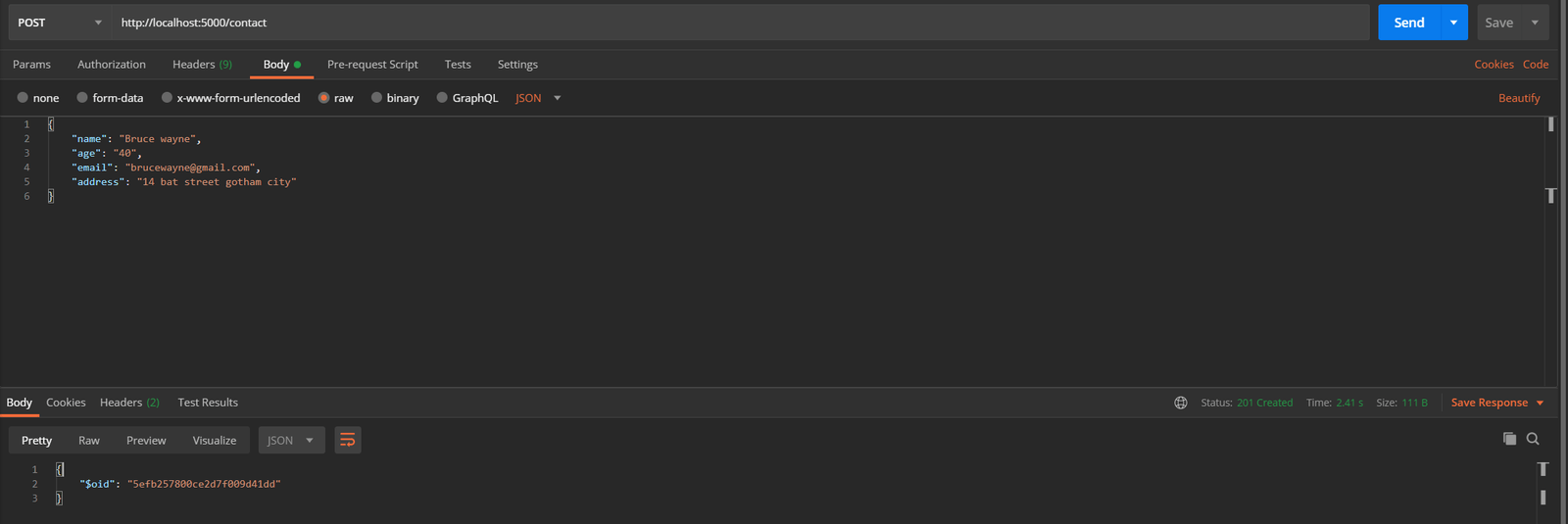
Quantcast
Channel: Telerik Blogs
Viewing all 4175 articles
Browse latest View live

Controlling the Whole DataGrid with State Events

$
0
0

The DataGrid in Telerik UI for Blazor’s OnStateInit and OnStateChanged lifecycle events give you almost complete control over every part of the grid. Learn how to use them in this tutorial.

The DataGrid in Telerik UI for Blazor’s lifecycle events makes it easy to both simplify and centralize functionality that it would otherwise require more complex code spread across multiple events to implement. Before implementing any row or button-specific functionality, you should always check to see if it would be easier to put that code in one of the grid’s lifecycle events (e.g. OnStateChanged, OnCreate, OnDelete, etc.).

The two most powerful of these lifecycle methods are the ones that let you manage your grid’s state: OnStateInit and OnStateChanged. These two methods give you the ability to both react to and change the grid’s state… which is, basically, everything about the grid: what filters are applied, what page is being displayed, which rows are selected, what groupings are in place, and more. There are two events so that you can manage the grid’s state as the grid is first loaded (OnStateInit) and as the user interacts with the grid (OnStateChanged).

Some technical background (feel free to skip this paragraph): I created the project in this post using version 2.12.0 of the Telerik controls, Visual Studio 2019 preview (version 16.6.0 Preview 6.0), and ASP.NET Core 16.6.934/Razor Language Tools 16.1.0/WebAssembly 3.2.0. The base for my project is the Telerik C# Blazor Application template, using the Blank Client App template. I added a DataGrid to the Index.razor page included in the template. I prefer to keep my code and markup in separate files, so I added an Index.razor.cs class file to my Pages folder and marked it as a partial class. All the code you see in this post is from that C# file.

Controlling the Grid’s Initial Load: Markup

To demonstrate the power of manipulating the DataGrid’s state as it loads in the OnStateInit event, consider a scenario where this component that displays a list of employees is passed a specific employee. In this scenario, as the grid initializes, I’ll have the grid display the page that includes the requested employee and make that employee the currently selected row. When the component is displayed, the requested employee will both be on the screen and ready to be modified.

My initial markup for the DataGrid ties it to a field called MyData that holds the collection of Employee objects, turns on several features (paging, selection, and filtering), sets the page size to another field (cleverly called pageSize), and sets up a field called theGrid to let me refer to the grid from my code:

<TelerikGrid Data="@MyData" Height="400px"
              Pageable="true" PageSize="@pageSize"
              SelectionMode="@GridSelectionMode.Single"
              FilterMode="Telerik.Blazor.GridFilterMode.FilterRow"
              @ref="theGrid">

The next step is to tie a method I’ve called GridInitializing to the grid’s OnStateInit event. To do that, and capture the GridStateEventArgs object generated by the event, I need to set the grid’s OnStateInit attribute to a lambda expression. That additional markup looks like this:

    @ref="theGrid"
    OnStateInit="(GridStateEventArgs<Employee> args) => GridInitializing(args)">

Controlling the Grid’s Initial Load: Code

With my markup taken care of, I can switch to my class file and write some code. First, I set up the fields that hold the data displayed by the grid (MyData), the page size (pageSize), and the field tied to my grid’s ref attribute (theGrid). I loaded some dummy data into MyData in my class’s constructor and I’ve omitted that here:

partial class Index
{
   IEnumerable<Employee> MyData;
   int pageSize = 10;
   TelerikGrid<Employee> theGrid;

With all that in place, I can start managing the grid’s initial state in my GridInitializing method. I don’t want my method to slow down the grid’s initialization process any more than necessary so I’ve declared the method as async void. The skeleton of my GridIntializing method looks like this:

void GridInitializing(GridStateEventArgs<Employee> e)
{

}

There’s a lot that you can do in the OnStateInit event (for example, the documentation for this event shows how to load your grid’s state from local storage to support offline processing). However, as the documentation points out, this method is called as the grid is initializing so there also are some things that you can’t do in the event (at least, not right now).

For example, the grid has a GetState method that returns the grid’s complete state… but calling that method in the OnStateInit method will stop your grid from displaying its data. Fortunately, though, there’s an easier way to access the grid’s state than calling the GetState method: The parameter passed to your OnStateInit method includes a GridState property that gives you access to the grid’s state (though, even reading some properties on the GridState property in OnStateInit—the Width property on a ColumnState, for example—will also stop the grid from displaying its data).

In order to have the grid display and select a specific employee, I need to do three things:

  • Find the matching employee in the collection displayed in the grid (I wrote a little helper method that returns both the matching object and its position in the collection)
  • Set the grid to display the page that the employee appears on
  • Make that row in the grid the currently selected row

And that takes just four lines of code in the OnStateInit event. First, I need to call my helper method to get the object and its position:

Employee sd;
int index = FindIndex(selectedName, out sd);

Next, I calculate the page number from the item’s position and use that to set the page to be displayed when the grid finishes initializing:

e.GridState.Page = (int) Math.Ceiling(((decimal)index / pageSize));

Finally, to make that object the currently selected employee, I add the object found by my helper method to a collection that I shove into the GridState’s SelectedItems collection:

e.GridState.SelectedItems = new List<Employee> { sd };

And I’m done: When the grid finishes initializing, the employee the user requested will be on the grid page, displayed to the user and already selected.

Responding to State Changes: Markup

While OnStateInit lets you control the grid’s initial state, OnStateChange lets you manage what happens as the user interacts with the grid. The grid takes a very broad view of what counts as a state change—it not only includes changing/adding/deleting objects in the grid but also changes to the shape of the grid (grouping) or the way the objects are displayed (sorting/filtering) and more.

While you can respond to all those changes in the OnStateChange event, in any particular application you’ll probably only care about a few of them. The issue here is that the OnStateChanged event method is called a lot so if you have too much going on in the event, it’s possible to impact the grid’s performance. You can address that issue by, first, making your event method run asynchronously and, second, by only executing any code when you need to.

As an example of what you can do in OnStateChange, when the user selects an employee in the grid (a state change), I’ll automatically filter the grid to show only the employees in the same department as the selected employee. To support that, I need to add a GridCheckboxColumn to the grid to let the user select an employee and trigger the state change (selecting an employee also adds that selected employee to the grid’s SelectedItems collection).

Here’s the markup that adds that column along with some of the other columns in the grid:

<GridColumns>
<GridCheckboxColumn SelectAll="false" Title="Select" Width="70px" />
<GridColumn Field="@(nameof(Employee.Id))" Width="120px" />
<GridColumn Field="@(nameof(Employee.Department))" Title="Team" />
…rest of the columns…

My first step is to wire up a method to the grid’s OnStateChanged event. The syntax for this is very similar to what’s required in the OnStateInit event:

@ref="theGrid"
OnStateChanged="(GridStateEventArgs<Employee> args) => GridChanging(args)" />

Controlling the Grid’s Initial Load: Code

Those similarities extend to the skeleton for the method, which accepts the same GridStateEventArgs parameter as the OnStateInit event handler. I’ve marked the method as asynchronous:

async void GridChanging(GridStateEventArgs<Employee> e)
{        

}

Next, I’ll check whether I need to do anything at all. The OnStateChanged event is raised a couple of times before the grid is fully initialized so I first see if the grid is ready to be used by checking the field referencing the grid: If the field’s not null, the grid is ready.

My second step is to check whether the state change is one that I’m interested in. The PropertyName property on the parameter passed to the method will tell you what part of the grid’s state has triggered OnStateChanged. In my case, I want to take action when PropertyName is set to “SelectedItems.”

Finally, I check for any conditions relevant to your action. In my case, the SelectedItems state will change both if an Employee object is added to the SelectedItems collection and if an Employee object is removed. I only want to do something if an Employee is present in the collection, so I check the SelectedItems count.

As a result, the first thing I do inside of my method is make sure all of those condition are met before I do anything. That code looks like this:

if (theGrid != null &&
    e.PropertyName == "SelectedItems" &&
    e.GridState.SelectedItems.Count > 0)
   {

   }

My next step is to grab the selected Employee object in the GridState’s SelectedItems collection:

{
   Employee sd = e.GridState.SelectedItems.First();

Modifying the grid’s state is pretty straightforward: I create a new GridState object, modify the parts of the state that I’m interested in, and then merge my modified GridState into the grid’s existing state using the DataGrid’s SetState method.

Here’s the code that creates a GridState object (called filteredState) and then adds a FilterDescriptor that limits the displayed rows to ones in the same department as the currently selected Employee object:

GridState<Employee> filteredState = new GridState<Employee>();
filteredState.FilterDescriptors = new List<FilterDescriptorBase>()
                        {
                            new FilterDescriptor() { Member = "Department",
                                                     Operator = FilterOperator.IsEqualTo,
                                                     Value = sd.Department,
                                                     MemberType = typeof(string)
                                                   }
                        };

To trigger filtering, I just need to merge this modified state into the grid’s state, using SetState. The SetState method is awaitable so, to make sure my grid remains responsive, I use SetState with the await keyword to have it run asynchronously, like this:

await theGrid.SetState(filteredState);

While there are additional lifecycle methods associated with the DataGrid (OnUpdate, OnCreate, etc.) with in the OnStateInit and OnStateChanged events you have the ability to go beyond the handling the data in the grid to manage virtually every other part of it.


What React 17 Means for Developers

$
0
0

See three of the more important changes—gradual updates, changes to event delegation, and stack trace updates—and see what these changes mean for the future of React as a whole.

Last week, the React team announced a release candidate of React 17 with the meme-friendly headline, “No New Features.”

But despite the “No New Features” headlines, React 17 does include a few changes that all React developers should be aware of.

In this article I’ll help you get up to speed.

Gradual Updates

The major focus of React 17 is to make it easier to upgrade React itself. From the release blog:

“React 17 enables gradual React upgrades. When you upgrade from React 15 to 16 (or, soon, from React 16 to 17), you would usually upgrade your whole app at once. This works well for many apps. But it can get increasingly challenging if the codebase was written more than a few years ago and isn’t actively maintained. And while it’s possible to use two versions of React on the page, until React 17 this has been fragile and caused problems with events.”

In the enterprise world it’s common for developers to want to use new framework features, but to have no ability to do so, as it’s hard to justify the time it takes to upgrade software without shipping any new features. This change in React 17 presents an interesting new upgrade workflow, where React developers can leave their existing code on a legacy version of React, while writing new code with the latest and greatest.

And there is precedence for this two-versions-of-a-framework-on-one-page workflow. For example, the Angular team has long allowed you to run Angular 1 and Angular 2+ simultaneously, and running a Google search of “running Angular one and two together” returns more than 38 million results—so there’s clearly demand.

That being said, the React team wants to make it very clear that this workflow should only be used when it’s absolutely necessary.

“For most apps, upgrading all at once is still the best solution. Loading two versions of React—even if one of them is loaded lazily on demand—is still not ideal.”

If you’re interested in trying out this new workflow, check out the sample app the React team shipped with the release. It’s well organized, and the folder structure makes it very clear which code is legacy, which is modern, and which is shared between the approaches.

folder-structure

Changes to Event Delegation

The second big change in React 17 affects how event delegation works within React. From the blog:

“In React 17, React will no longer attach event handlers at the document level. Instead, it will attach them to the root DOM container into which your React tree is rendered.”

This change is unlikely to affect you, as this is is an implementation detail that React didn’t expose through any APIs. But because React is now better isolated—aka the framework no longer depends on event handlers outside of its root element—that does open up some interesting possibilities.

For example, multiple React applications can now exist on the same page with little risk of conflict. For example, you could take the default Create React App application, and do something silly like this:

<div id="root"></div>
<div id="root2"></div>
<div id="root3"></div>
<div id="root4"></div>
ReactDOM.render(
  <React.StrictMode>
    <App />
  </React.StrictMode>,
  document.getElementById('root')
);

ReactDOM.render(
  <React.StrictMode>
    <App />
  </React.StrictMode>,
  document.getElementById('root2')
);

ReactDOM.render(
  <React.StrictMode>
    <App />
  </React.StrictMode>,
  document.getElementById('root3')
);

ReactDOM.render(
  <React.StrictMode>
    <App />
  </React.StrictMode>,
  document.getElementById('root4')
);

And with a bit CSS you could have a page with four identical React apps, which looks like this.

Multiple versions of React one page

Although your average app shouldn’t be rendering multiple React instances, this does open up some interesting possibilities for dashboard-like apps. For example, imagine a dashboard application with a number of widgets, and all of the widgets are mini React apps.

In a more practical sense, this change to event delegation will help React play better with other frameworks. From the blog:

“This change also makes it easier to embed React into apps built with other technologies. For example, if the outer “shell” of your app is written in jQuery, but the newer code inside of it is written with React, e.stopPropagation() inside the React code would now prevent it from reaching the jQuery code — as you would expect.”

It’s pretty common for other frameworks, especially DOM-based frameworks like jQuery, to mess with events at the document level. Now that React doesn’t use events outside of its rendering context, it’s a lot safer to introduce React into legacy apps, where you might have a bunch of older JavaScript tools you can’t easily remove.

Better Stack Traces

The final change that caught my eye affects how React renders stack traces. From the blog:

“In React 17, the component stacks are generated using a different mechanism that stitches them together from the regular native JavaScript stacks. This lets you get the fully symbolicated React component stack traces in a production environment.”

The way they accomplish this is kind of nuts.

“The way React implements this is somewhat unorthodox. Currently, the browsers don’t provide a way to get a function’s stack frame (source file and location). So when React catches an error, it will now reconstruct its component stack by throwing (and catching) a temporary error from inside each of the components above, when it is possible.”

Whoa.

But it works, and I can see this being extremely useful for production debugging. For example, suppose you use the following code to catch errors in your application.

import React from 'react';
import { ErrorBoundary } from "react-error-boundary";

function ErrorFallback({ componentStack }) {
  console.log(componentStack);

  return (
    <p style={{ color: "red" }}>Something went wrong!</p>
  )
}

function App() {
  return (
    <ErrorBoundary FallbackComponent={ErrorFallback}>
      { /* Your app */ }
    </ErrorBoundary>
  );
}

The ErrorFallback here makes use of React’s error boundaries API, and logs each error’s componentStack each time something goes wrong. With React 16, the above code outputs less-than-helpful stack traces when something goes wrong in production.

For example. here’s a not-especially-useful trace I get when trying to call toUpperCase() on null.

    in s
    in i
    in u
    in StrictMode App.js:6:10

After upgrading the app to React 17, the stack trace now includes a link to each component’s location in the source code.

s@http://localhost:8000/static/js/main.15f3e38c.chunk.js:1:470
i@http://localhost:8000/static/js/2.477a9a31.chunk.js:2:1611
u

On its own this isn’t especially helpful—unless you’re awkwardly aware of what 2.477a9a31.chunk.js:2:1611 is—but if you combine these stack traces with source maps and an error symbolicator like Sentry, you’ll have the ability to get full component stack traces of production errors.

It’s definitely a feature that’s worth playing with if you struggle debugging your production React errors at all.

The Future of React

Overall, React 17 is aimed at making React more stable and easier to upgrade, but what does that mean for the future of React? From the blog:

“We’re actively working on the new React features, but they’re not a part of this release. The React 17 release is a key part of our strategy to roll them out without leaving anyone behind.”

When you operate at the scale of React, it’s almost impossible to introduce changes without segmenting your user base.

Consider React hooks. Although hooks weren’t a breaking change, they segmented all online documentation and tutorials into two groups—those that use hooks, and those that don’t. Here at Progress we’ve felt this struggle firsthand, as some of our KendoReact users prefer to see documentation with hooks, some prefer to see documentation with class components, and some want both to be available. Obviously we want to make all users happy, but there are only so many permutations of React versions and APIs we can feasibly support.

With this context in mind, I’m reassured that the React team spent a release focusing on the experience of your average React developer, and is putting forth an effort to improve the upgrade path. Hopefully this will make future React features easier for everyone to use

How to Work With Client-Side Blazor

$
0
0

You’ve probably heard talk of Blazor Wasm, but what is it and how can you use it to rapidly build your web applications?

In short, client-side Blazor (Blazor Wasm) brings C# to the browser.

We’re all familiar with the idea of writing JavaScript, which runs in the browser, but now we have another option: to write C# and run that in the browser too.

This works thanks to something called WebAssembly.

WebAssembly (Wasm) represents a significant change in web application development: opening the door to being able to compile binary bundles and ship them to the browser (as an alternative to shipping JavaScript code as text).

Now you might be thinking, Running binary code in the browser sounds complicated. But, thankfully, we don’t need to worry about the lower level implementation details because Microsoft has taken care of them, freeing us up to focus on the fun part: building web applications using Blazor’s component model.

Explore Blazor: Free quick start guide to productivity with Blazor. Get our Beginner's Guide ebook

Build Your Application, One Component at a Time

You can spin up a new Blazor Wasm project in your IDE (Visual Studio, Jetbrains Rider, etc.) or via the command line.

dotnet new blazorwasm

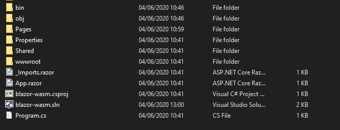
When you do, you’ll find yourself staring at the standard Blazor Wasm project.

Blazor WASM "blank" project

Everything in Blazor is a component and you’ll find a few examples in the Pages folder…

Blazor example components

These components (be they your own or components you’ve brought in via a component library such as Telerik’s UI for Blazor) form the building blocks of your Blazor applications.

Here’s an example:

Greeting.razor

<h1>Hello, @Name</h1>

@code {
    [Parameter]
    public string Name { get; set; }
}

We can now render this component wherever we want, passing in a value for the Name parameter…

<Greeting Name="Gurdeep" />

Blazor’s components are referenced by filename, so our Greeting component is defined in a file called Greeting.razor and we can include it elsewhere in our application using its name: <Greeting />.

Re-use Those Components

If you’re used to a more traditional “page-based” approach to building web applications, this component-based approach can seem a little odd at first, but its strengths soon become apparent.

For example, imagine you need to display a “Like” button in your app.

Naturally this kind of UI “widget” might appear in multiple places: posts, replies, comments, etc.

With Blazor you would define this as a component, consisting of UI markup written using Razor…

LikeButton.razor

@if (_liked)
{
<span>Liked!</span>
}
else
{
<button @onclick="HandleLikeClicked">
Like!
</button>
}

… and UI logic written using C#.

@code {

[Parameter]
public EventCallback OnLiked { get; set; }

bool _liked { get; set; }

protected void HandleLikeClicked() {
_liked = true;
OnLiked.InvokeAsync(EventArgs.Empty);
}
}

Admittedly this needs a bit of CSS and probably a graphic or two to make it look better. But, appearance aside, we have a simple “Like” button.

When you click the button, the private _liked boolean flag is set to true and Blazor will re-render the UI to show the text “Liked” instead of the button.

At the same time, the OnLiked Event Callback will be invoked.

This means, wherever you decide to use your shiny new Like component, you can pass in the behavior you want to be triggered when the user “likes” the thing (whatever that may be).

@foreach (var post in Posts)
{
    <h2>@post.Title</h2>
    <LikeButton OnLiked="()=>HandleLiked(post)"/>
}

This loops over a list of Post objects and renders a Like button for each.

When the user clicks the Like button (inside the LikeButton component), OnLiked is invoked, forwarding the specific post to the HandleLiked method.

@code {
    private List<Post> Posts { get; set; }
    
    protected void HandleLiked(Post post)
    {
        Console.WriteLine("Liked this post: " + post.Title);
    }
}

Now you have the means to keep your “Like” buttons consistent (in appearance and behavior) throughout your app, but still perform different actions depending on where the button is rendered, and what should happen when it’s clicked.

Differences Between Server-Side and Client-Side

You may have heard mention of Blazor Server and Blazor WebAssembly (or Blazor Wasm).

These are two different hosting models for your Blazor applications.

In practice, you’ll build your app using the same component model (see above), but when it comes to hosting you can either keep everything on the server (Blazor Server) or ship your application to the browser (Blazor WebAssembly).

With Blazor Wasm your code is compiled into a number of DLL files which are retrieved by the browser (when someone visits your site).

The browser downloads these DLL files plus the .NET runtime, and runs your app via WebAssembly.

With Blazor Server, the browser opens up a connection to the server which keeps hold of the DLL files and runs your application using the .NET runtime (on the server).

Crucially, how you build and debug your application remains largely consistent between the two hosting models.

In both cases you’ll build your applications using Blazor’s component model.

The primary differences relate to how your app will scale and handle failures (such as loss of network).

Blazor Server

  • No initial download of the framework
  • Relies on an open connection to the server
    • Performance is directly affected by latency (the connection between the browser and the server)
    • You’ll get an error if the connection to the server is lost

Blazor Wasm

  • Initial download of framework (the first time you access any Blazor Wasm site, but once you have it, you have it!)
  • Your app runs in the browser so is unaffected by network latency
  • No need to maintain a connection to the server (but can still make HTTP calls to a backend API)

Try Kendo UI for Vue—Complete UI component library for web apps. Free Trial

Debug Client-Side Blazor

Sooner or later you’re going to need to see what your components are doing: to check your logic or diagnose an issue.

If you’ve written JavaScript code recently, I’m guessing you’ve adopted one of the following options for diagnosing unexpected behavior in your code:

  • Frantically added as many console.log statements as you could until you figured out what on earth is going on!
  • Figured out how to debug your JavaScript code (either in the browser, or via an integration with your IDE/code editor)

I know which one I’ve used more often…

Thankfully, with the official release of Blazor Wasm, you can resist the temptation to litter your code with Console.WriteLine (the C# equivalent of console.log) and, instead, debug your application code in your favorite editor.

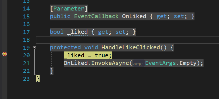
Debug in Visual Studio

So long as you have a recent version of Visual Studio 2019 installed you can simply set a breakpoint in your code and hit F5 to debug your Blazor Wasm application.

Debugging Blazor WASM Visual Studio

Debug in VS Code

Visual Studio Code requires a little more setup to make debugging work.

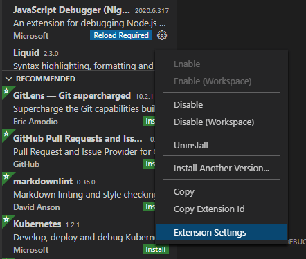
As per the official docs, you’ll need the C# extension and JavaScript Debugger (Nightly) extension.

With those installed, access the Javascript Debugger (Nightly) extensions’ settings (via the little cog in the list of extensions).

Javascript Debugger Extension Settings

Then tick the box next to Debug > Javascript: Use Preview.

Enable preview in javascript debugger extension

With all that done, when you subsequently open a Blazor Wasm project folder in VS Code, you’ll be prompted to “add required assets”.

Prompt to add required assets to debug the Blazor WASM project in VS Code

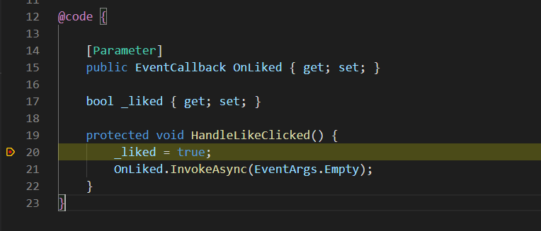
Click “Yes”, set a breakpoint, then hit F5 to start with debugging support enabled (or head over to the Run tab and run the Launch and Debug configuration).

A paused breakpoint in VS Code

Go Faster with a Component Library

One of the great advantages of building your application using components is you don’t have to build every single component yourself.

After all, the value of your application is generally in its unique, domain-specific logic and intelligence, not in the specific date picker, or modal popup you need to implement to make it all work.

If you’re looking to rapidly build your web applications using tried-and-tested UI components, you can save yourself a lot of time by adopting a Blazor component library.

Telerik UI for Blazor is one such library and works with both Blazor Server and Blazor Wasm, so you can use whichever Blazor Hosting model makes sense for your use case, and build your applications in the exact same way regardless.

Try Telerik UI for Blazor—Native components for building web apps with C#. Free Trial

In Summary

Blazor Wasm is finally here, and its component model enables you to build your application, one component at a time.

You can easily debug your code using Visual Studio, or VS Code, and you can take advantage of Telerik’s UI for Blazor to rapidly build up your application while retaining the ability to run it via either Blazor Server or Blazor Wasm.

Use Fiddler Everywhere to Inspect Your Web Traffic

$
0
0

Fiddler Everywhere is a popular tool among developers for inspecting and debugging network issues.

To enable developers to diagnose network traffic, Fiddler Everywhere provides the Traffic Inspector feature.

Fiddler Everywhere Banner


If you are new here, Fiddler Everywhere is a tool for network debugging and monitoring. It logs all the HTTP(S) traffic between the client and the internet. The tool is handy to inspect, debug, mock, and share network requests and responses. You can check out this starter guide to get you started with Fiddler Everywhere.

Web Sessions

Fiddler Everywhere web sessions

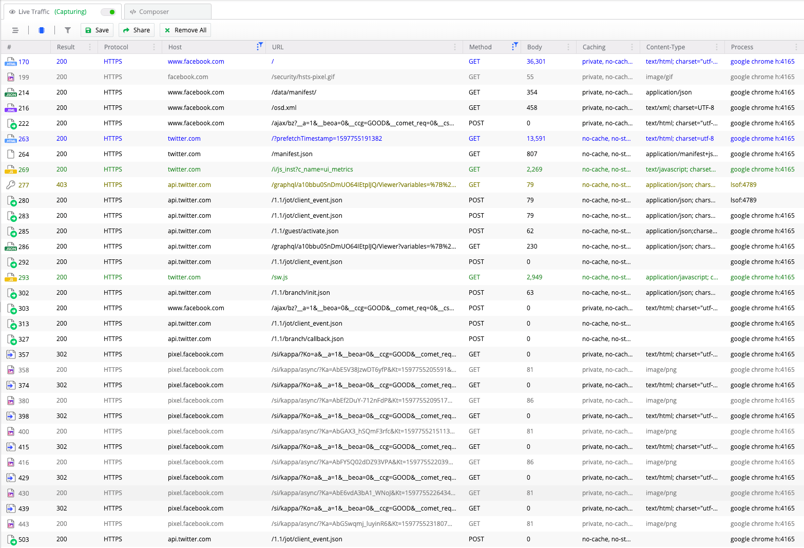
Fiddler Everywhere captures individual web sessions, which is a single transaction between a client and the server. Each web session contains a pair of Request headers and Response headers, along with a set of flags that contain the session metadata and a timer. The web sessions are all logged in the Live Traffic tab in Fiddler Everywhere.

Try Fiddler Everywhere

Traffic Inspector

Fiddler Everywhere traffic inspector

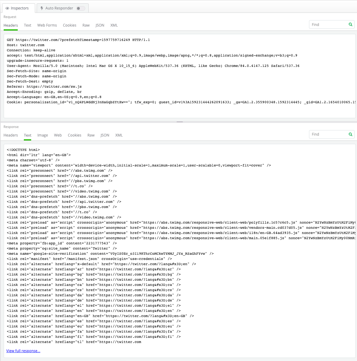
On selecting a web session by clicking on it, Fiddler Everywhere loads the data in the Traffic Inspector tab on the right. The Request headers are present at the top, and the Response headers below.

Fiddler Everywhere has different types of Traffic Inspectors available, which can be used based on the content's format. You can switch the Inspectors by merely clicking on the required tab. Some of the available Inspectors in Fiddler Everywhere include:

  • Headers
  • Text
  • Raw
  • JSON
  • XML
  • Cookies
  • Web Forms (Request only)
  • Image (Response only)
  • Web (Response only)

Headers Inspector

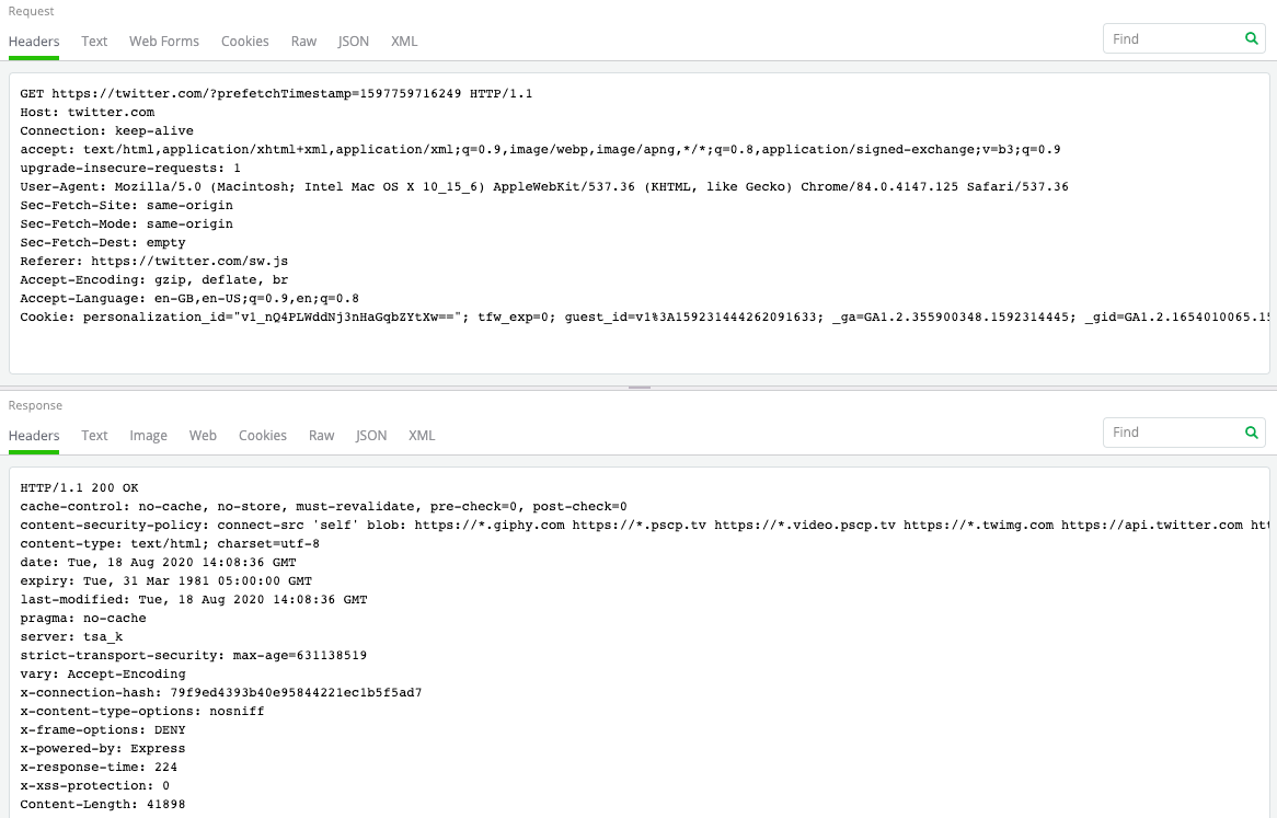
The Headers traffic inspector in Fiddler Everywhere helps you see all the HTTP headers sent and received by the Request and Response, respectively. The inspector indicates the HTTP method (GET) used, the URL requested (www.example.com/page.html), the HTTP version (HTTP/1.1), and the response status code (200 OK).

Fiddler Everywhere headers inspectors

Fiddler Everywhere captures four types of headers:

  • General headers: This usually has data not directly related content. Depending on the context, it is present in the Request or the Response. Example: Date, Connection.
  • Request headers: This contains specific information about the data requested, or the about the client requesting the data. Example: Accept, User-Agent.
  • Response headers: These carry information about the Response, or the server providing the Response. Example: Age, Server.
  • Entity headers: These contain information about the body of the data requested or fetched. These are present in both the Request and the Response. Example: Content-Length, Content-Encoding.

Text Inspector

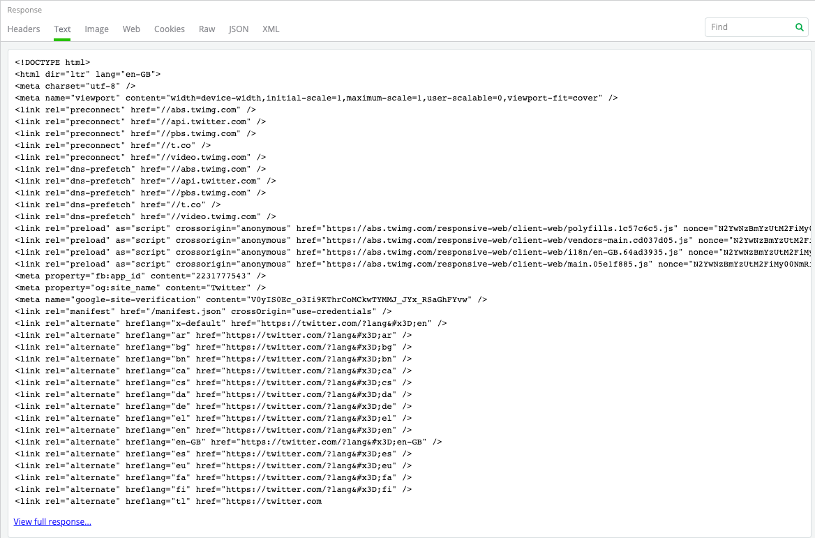
Fiddler Everywhere test inspector

The Text Inspector in Fiddler Everywhere allows you to view the body present in the Request and Response as text. Fiddler Everywhere automatically interprets the text using the character set identified in the headers, the byte-order-mark (BOM), or a META tag.

Raw Inspector

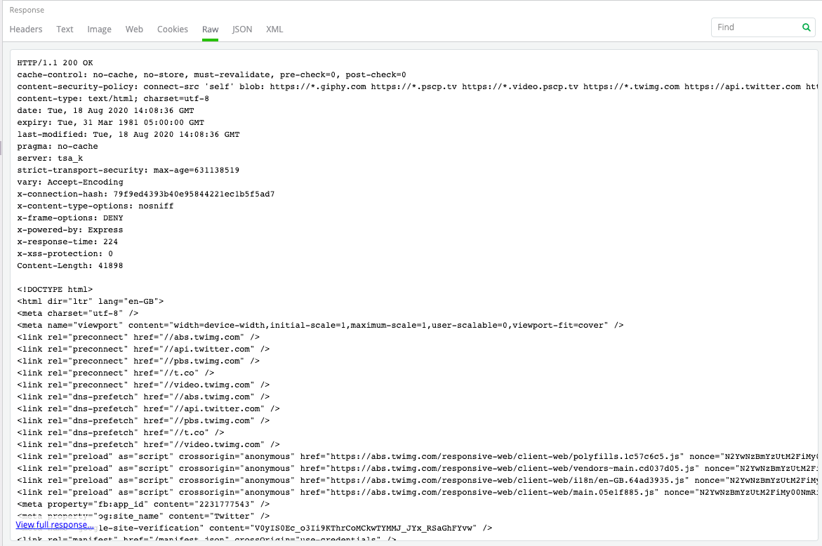
Fiddler Everywhere raw inspector

The Raw Inspector in Fiddler Everywhere provides the entire Request and Response as plain text. The text also includes the headers and body of the content.

JSON Inspector

Fiddler Everywhere JSON inspector

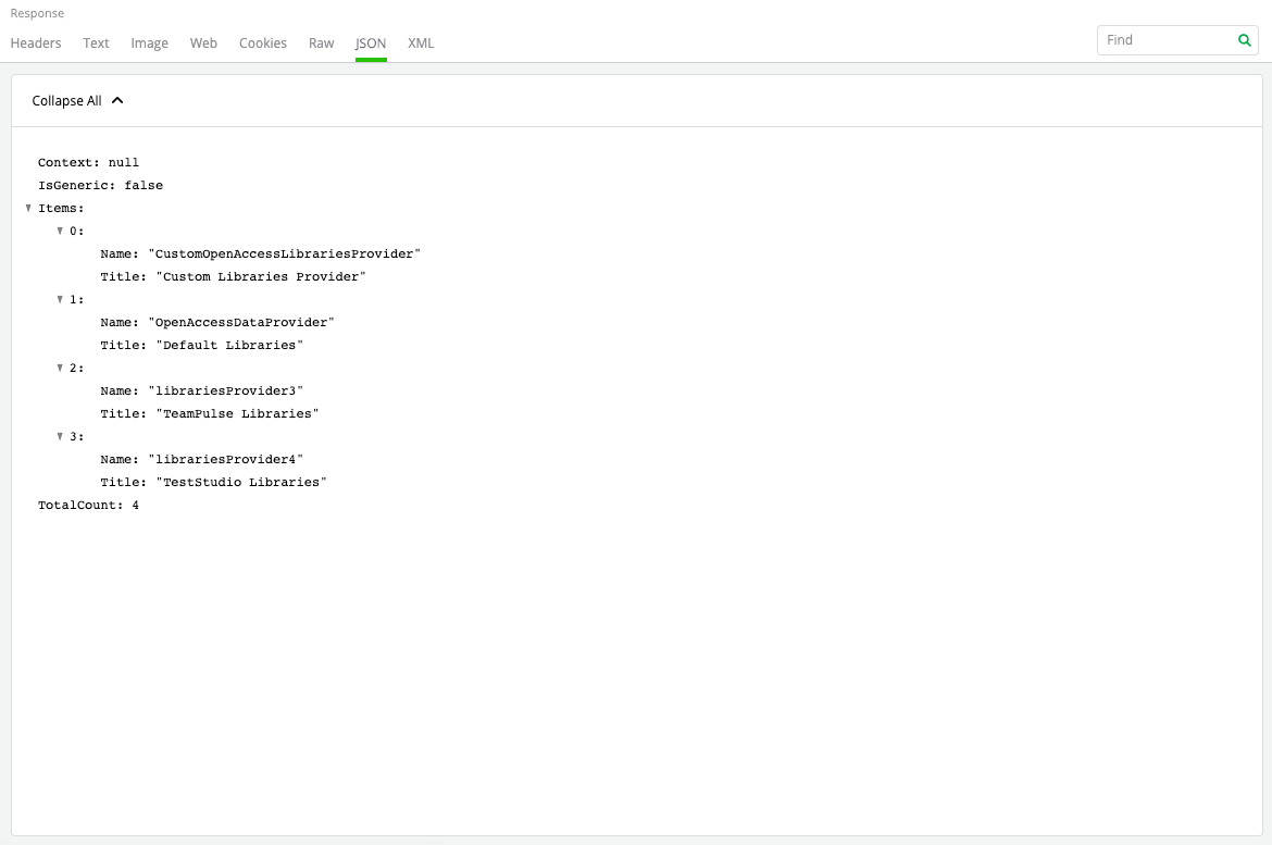
The JSON Inspector in Fiddler Everywhere interprets the body as a JavaScript Object Notation (JSON) formatted string. It also shows a tree view of the object nodes, which can be expanded and collapsed, as required.

XML Inspector

Fiddler Everywhere XML inspector

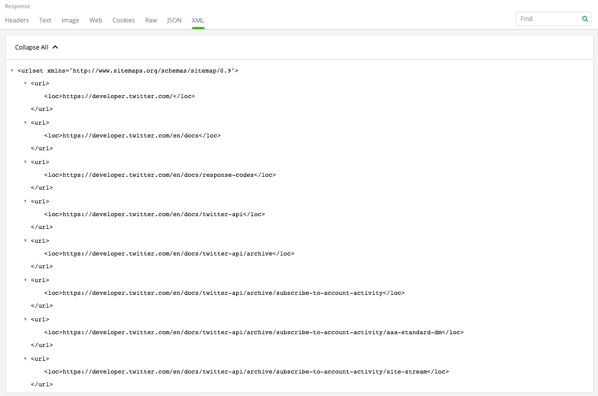
The XML Inspector in Fiddler Everywhere interprets the body as an Extensible Markup Language (XML). It also shows a tree view of the object nodes, with the attributes of the element displayed in square brackets.

Cookie Inspector

Fiddler Everywhere cookie inspector

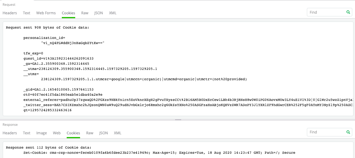
The Cookie Inspector in Fiddler Everywhere enables you to inspect the Cookie content sent in the Request and the Set-Cookie content received in the Response. Additionally, it also shows the size of the cookies sent and received, and the P3P response headers, if any.

Web Forms Inspector

Fiddler Everywhere web form inspector

Fiddler Everywhere automatically detects forms and parses it for HTML form-data. The query string and the body is available as name-value pairs in the Web Forms Inspectors. Since this accepts only the request query, it is available only for the Request.

Image Inspector

Fiddler Everywhere image inspector

Fiddler Everywhere provides an image inspector that lets you view the image responses within the tool. The inspector supports a wide variety of formats, including JPEG, PNG, GIF, WebP, and TIFF.

Web Inspector

Fiddler Everywhere web inspector

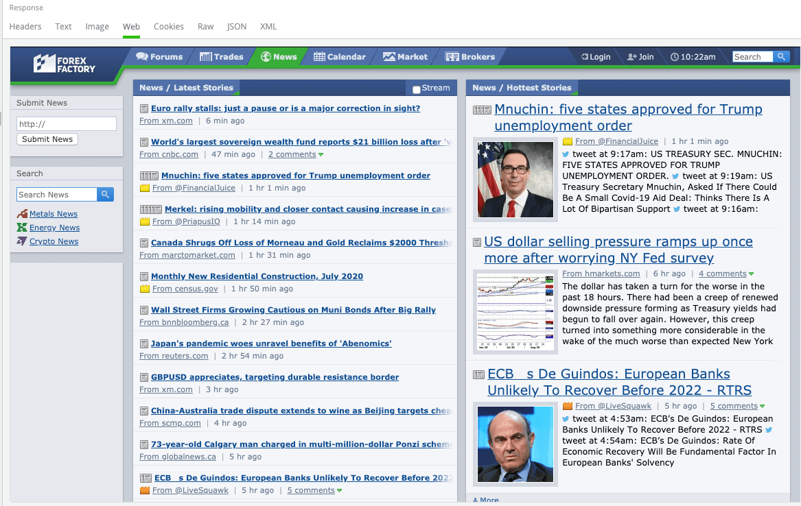
The Web Inspector in Fiddler Everywhere allows you to view the Response as a web page directly in the tool. This inspector lets you get a quick preview of the webpage that you are inspecting without having to check the browser. However, the web browser control prevents additional downloads when rendering the Response, so all functionalities may not work within the control view.

Get Fiddler Everywhere

Now that you know how robust Fiddler Everywhere is to capture and inspect network traffic, go ahead and try it out. Fiddler Everywhere is available on Windows, macOS, and Linux and supports every browser.

Download Fiddler Everywhere now

An Introduction to GraphQL: Authentication

$
0
0
The GraphQL specification that defines a type system, query and schema language for your Web API, and an execution algorithm for how a GraphQL service (or engine), should validate and execute queries against the GraphQL schema. In this article, you'll learn how to implement authentication in a GraphQL server.

GraphQL, described as a data query and manipulation language for APIs, and a runtime for fulfilling queries with existing data, allows varying clients to use your API and query for just the data they need. It helps solve some performance issues that some REST services have—over-fetching and under-fetching. The GraphQL specification defines a type system, query language, and schema language for your Web API, and an execution algorithm for how a GraphQL service (or engine) should validate and execute queries against the GraphQL schema.

There are different ways to handle authentication in a GraphQL server, and in this post, I’ll walk you through building a signup and signin resolvers, then building a wrapper function that will be used to wrap specific resolvers for the root fields we want to only be accessible to authenticated users.

We will be working with an existing GraphQL server—adding new resolvers to it and protecting existing resolvers. If you followed along from previous articles before this one, you should be familiar with the project and probably already have the code from where we stopped in the last article, An Introduction to GraphQL: Subscriptions.

If you don’t already have this project, but want to code along, download the project from GitHub, and copy the files from src-part-3 folder to the main src folder. Then follow the instructions in the README file to set up the project.

Allow Signup and Signin

We will be adding two new operations to the schema: one for users to sign up, and another for sign-in. We will store the user information in the database; therefore, we need to update the database model. Open the file src/prisma/datamodel.prisma and add the model below to it.

type User {
  id: ID! @id
  name: String!
  email: String! @unique
  password: String!
}

The User model represents the user who needs to be authenticated to use the API, and we will store this information in the database. After updating the datamodel, we need to update the Prisma server with this change. Open the terminal and switch to the src/prisma directory and run primsa deploy.

Prisma deploy - GraphQL

When this completes successfully, run the command prisma generate to update the auto-generated prisma client.
Update the GraphQL Schema

With our datamodel updated, we will now update the GraphQL schema with two new root fields on the Mutation type. Open src/index.js and add two new root fields, signup and signin, to the Mutation type.

signup(email: String!, password: String!, name: String!): AuthPayload
signin(email: String!, password: String!): AuthPayload

These mutations will be used for signup and signin requests, and will return data of type AuthPayload. Go ahead and add definition for this new type to the schema:

type AuthPayload {
  token: String!
  user: User!
}

type User {
  id: ID!
  name: String!
  email: String!
}

With those new changes, your schema definition should match what you see below:

const typeDefs = `
type Book {
    id: ID!
    title: String!
    pages: Int
    chapters: Int
    authors: [Author!]!
}

type Author {
    id: ID!
    name: String!
    books: [Book!]!
}

type Query {
  books: [Book!]
  book(id: ID!): Book
  authors: [Author!]
}

type Mutation {
  book(title: String!, authors: [String!]!, pages: Int, chapters: Int): Book!
  signup(email: String!, password: String!, name: String!): AuthPayload
  signin(email: String!, password: String!): AuthPayload
}

type Subscription {
  newBook(containsTitle: String): Book!
}

type AuthPayload {
  token: String!
  user: User!
}

type User {
  id: ID!
  name: String!
  email: String!
}
`;

Implementing the Resolvers

Now that we have added new types and extended the Mutation type, we need to implement resolver functions for them. Open src/index.js, go to line 82 where we can add resolver functions for the mutation root fields and paste in the code below:

signup: async (root, args, context, info) => {
  const password = await bcrypt.hash(args.password, 10);
  const user = await context.prisma.createUser({ ...args, password });
  const token = jwt.sign({ userId: user.id }, APP_SECRET);

  return {
    token,
    user
  };
},
signin: async (root, args, context, info) => {
  const user = await context.prisma.user({ email: args.email });
  if (!user) {
    throw new Error("No such user found");
  }
  const valid = await bcrypt.compare(args.password, user.password);
  if (!valid) {
    throw new Error("Invalid password");
  }

  const token = jwt.sign({ userId: user.id }, APP_SECRET);

  return {
    token,
    user
  };
}

The code you just added will handle signup and signin for the application. We used two libraries bcryptjs and jsonwebtoken (which we’ll add later) to encrypt the password, and handle token creation and validation. In the signup resolver, the password is hashed before saving the user data to the database. Then we use the jsonwebtoken library to generate a JSON web token by calling jwt.sign() with the app secret used to sign the token. We will add in the APP_SECRET later. The signin resolver validates the email and password. If it’s correct, it signs a token and return an object that matches the AuthPayLoad type, which is the return type for the signup and signin mutations.

I’d like to point out that I intentionally skipped adding an expiration time to the generated token. This means that the token a client gets will be used at any time to access the API. In a production app, I’d advise you add an expiration period for the token and validate that in the server.

While we have index.js open, add the code statement below after line 2:

const bcrypt = require("bcryptjs");
const jwt = require("jsonwebtoken");
const APP_SECRET = "GraphQL-Vue-React";

Now open the command line and run the command below to install the needed dependencies.
npm install --save jsonwebtoken bcryptjs

Requiring Authentication for the API

So far we have implemented a mechanism for users to signin and get token that’ll be used to validate them as a user. We’re now going to move to a new requirement for the API. Which is:

Only authenticated users should call the book mutation operation.

We will implement this by validating the token from the request. We’ll be using a login token in an HTTP authorization header. Once validated, we check that the user ID from the token matches a valid user in the database. If valid, we put the user object in the context argument that the resolver functions will receive.

Let’s start by putting the user object in the context. Open src/index.js and go to line 129 where the GraphQL server is being initialized. Update the context field to the following:

context: async ({ request }) => {
  let user;
  let isAuthenticated = false;
  // get the user token from the headers
  const authorization = request.get("Authorization");
  if (authorization) {
    const token = authorization.replace("Bearer ", "");
    // try to retrieve a user with the token
    user = await getUser(token);
    if (user) isAuthenticated = true;
  }

  // add the user and prisma client to the context
  return { isAuthenticated, user, prisma };
};

Before now, we’ve mapped an object that included the prisma client to context. This time around we’re giving it a function and this function will be used to build the context object which every resolver function receives. In this function, we’re getting the token from the request header and passing it to the function getUser(). Once resolved, we return an object that includes the prisma client, the user object, and an additional field used to check if the request is authenticated.

We’re going to define the getUser function which was used earlier in index.js to have the signature below:

async function getUser(token) {
  const { userId } = jwt.verify(token, APP_SECRET);
  return await prisma.user({ id: userId });
}

Our next step will be to define a wrapper function which will be used to wrap the resolvers we want to be authenticated. This function will use info from the context object to determine access to a resolver. Add this new function in src/index.js.

function authenticate(resolver) {
  return function(root, args, context, info) {
    if (context.isAuthenticated) {
      return resolver(root, args, context, info);
    }
    throw new Error(`Access Denied!`);
  };
}

What this function checks is if the user is authenticated. If they’re authenticated, it’ll call the resolver function passed to it. If they’re not, it’ll throw an exception.

Now go to the book resolver function and wrap it with the authenticate function.

book: authenticate(async (root, args, context, info) => {
      let authorsToCreate = [];
      let authorsToConnect = [];

      for (const authorName of args.authors) {
        const author = await context.prisma.author({ name: authorName });
        if (author) authorsToConnect.push(author);
        else authorsToCreate.push({ name: authorName });
      }

      return context.prisma.createBook({
        title: args.title,
        pages: args.pages,
        chapters: args.chapters,
        authors: {
          create: authorsToCreate,
          connect: authorsToConnect
        }
      });
    }),

Testing the Application

Now, we’re set to test the authentication flow we added to the API. Go ahead and open the command line to the root directory of your project. Run node src/index.js to start the server and go to http://localhost:4000 in the browser.
Run the following query to create a new book:

mutation{
  book(title: "GRAND Stack", authors: ["James Blunt"]){
    title
  }
}

You should get the error message Access Denied! as a response. We need a token to be able to run that operation. We'll signup a new user and use the returned token in the authorization header.

Run the following query to create a new user:

mutation{
  signup(email: "test@test.com", name: "Test account", password: "test"){
    token
  }
}

It'll run the mutation and return a token. Open the HTTP HEADERS pane at the bottom-left corner of the playground and specify the Authorization header as follows:

{
  "Authorization": "Bearer __TOKEN__"
}

Replace __TOKEN__ with the token in the response you got from the last mutation query. Now re-run the query to create a new book.

mutation {
  book(title: "GRAND Stack", authors: ["James Blunt"]){
    title
  }
}

This time around we get a response with the title of the book.

That’s a Wrap!

Woohoo! We now have a real-time API that allows for CRUD operations and requires clients to be authenticated to perform some operations. We built our own authentication system by storing user information in the database and encrypting the password using bscriptjs. The context object, which is passed down to every resolver, now includes new properties to determine if the request is authenticated and also a user object. You can access the user object from any resolver and you may need it to store more information (e.g adding a new property to determine which user created or updated the book data). We added a wrapper function that you can use to wrap any resolver that allows access only to authenticated users. This approach to using a wrapper function is similar to using a middleware. I’ll go into more details on GraphQL middleware in a future post.

I hope you’ve enjoyed reading this. Feel free to drop any questions in the comments. You can find the code on GitHub.

Happy Coding!

The New Financial Portfolio Demo using Kendo UI for Angular

$
0
0

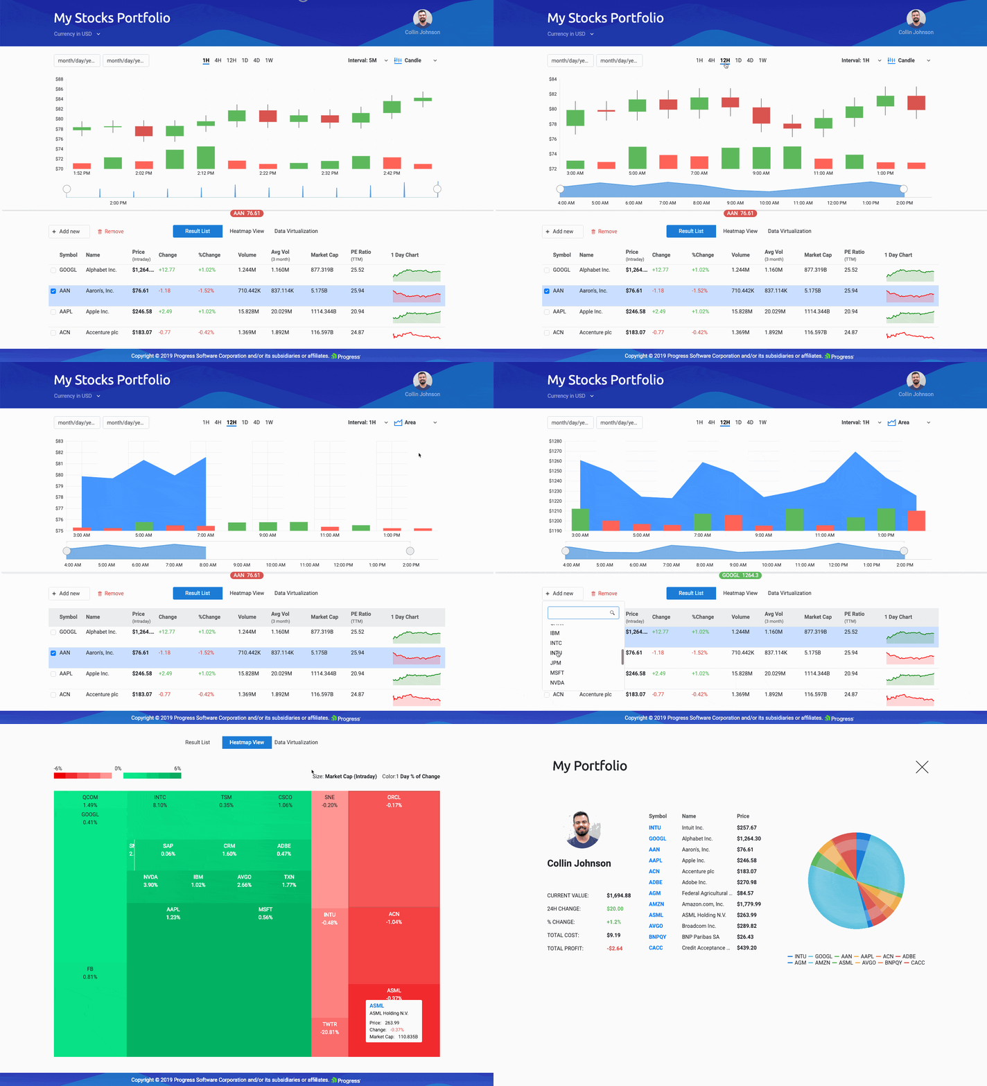
A gif walking through the different pages and features of the Financial Portfolio demo app using Kendo
UI components

In this series I am going to walk through the Angular components that make up this app and delve into the Kendo UI components that each one uses! We will go through the Angular Stock Chart Component, along with other chart components, inputs, buttons, and of course, our infamous Grid Component to build out a Financial Portfolio application, capable of keeping you up-to-date with the stocks of your choice!

I’ve broken the application into five major Angular Components:

  1. Stock Chart
  2. Stock List
  3. User Profile
  4. Real Time Data
  5. Heatmap

To make the reading experience more bite-sized, in this first post, I will cover the Stock Chart and Stock List components (and the child components they employ)—check out part II for the rest to be covered!

screenshot of our Angular components

Following Along

You can pull down the code and follow along—everything is available on GitHub and GitHub Pages!

  1. Clone the repo https://github.com/telerik/kendo-angular/tree/master/examples-standalone/finance-portfolio
  2. Go into the root of the application cd kendo-angular/examples-standalone/finance-portfolio/
  3. Run npm install and npm start
  4. Go to http://localhost:4200 in your web browser

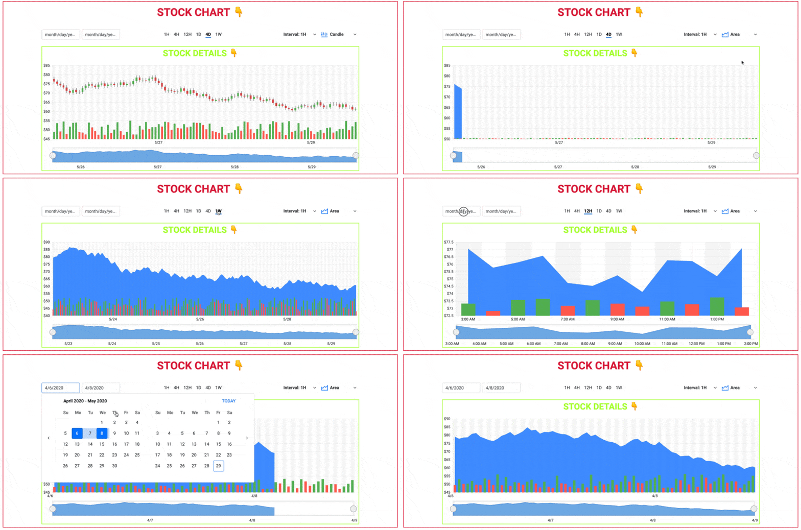
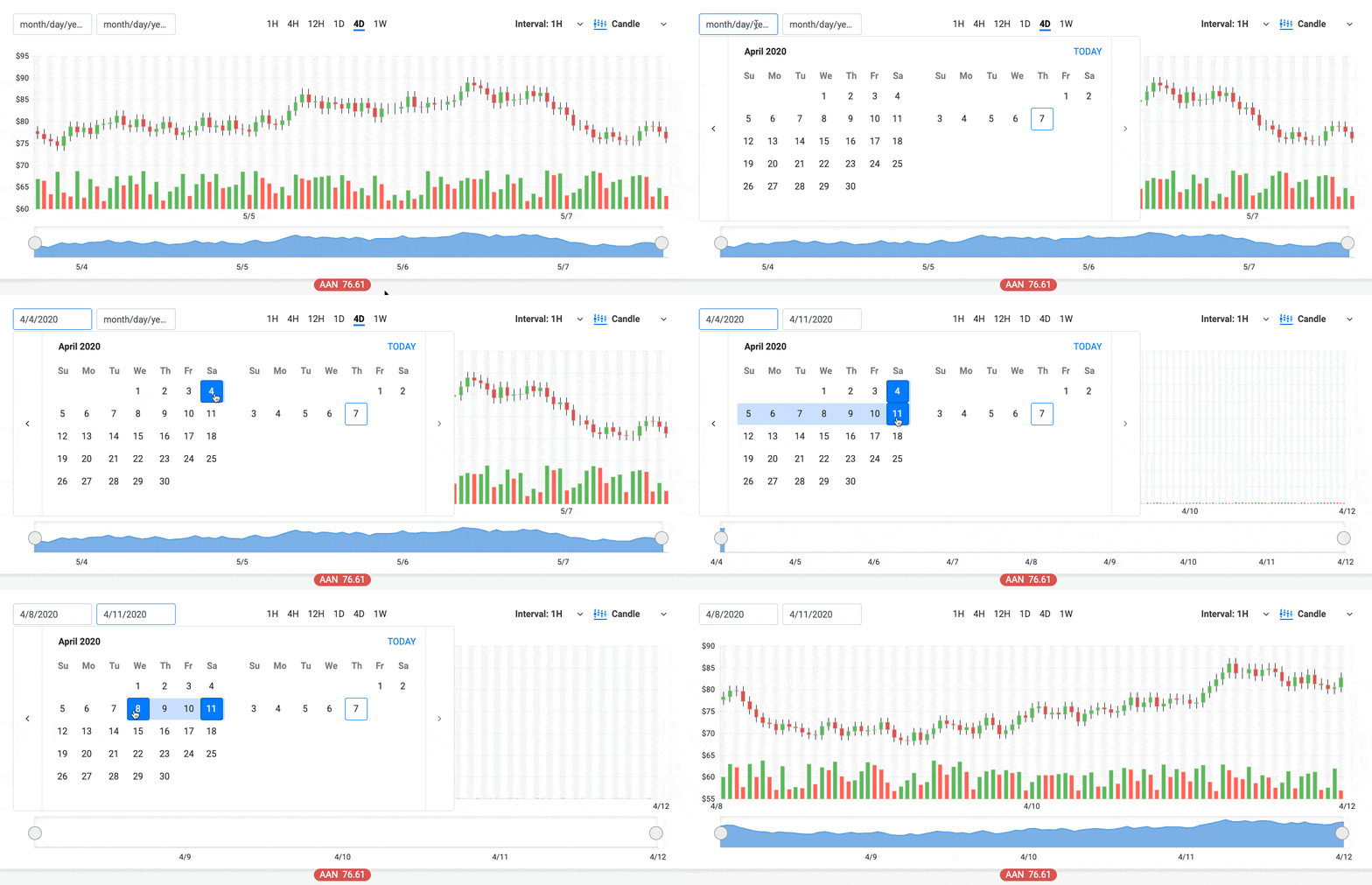
As you can see in the opening GIF, the app shows you the stock information you are interested in with our Kendo UI Stock Chart component. This component comes ready out-of-the-box with features to choose date ranges and time ranges for the stocks you want to look at. You can also toggle the type of chart you are viewing—Candle, Line, or Area.

Our Financial Portfolio application also shows the stocks in a Stock List, a Heatmap, and Stocks moving in real time as well as a user profile page. This demo is fully loaded with so many features! Let’s dive into this incredible demo by component (Angular component, that is).

Stock Chart & Stock Details Angular Components

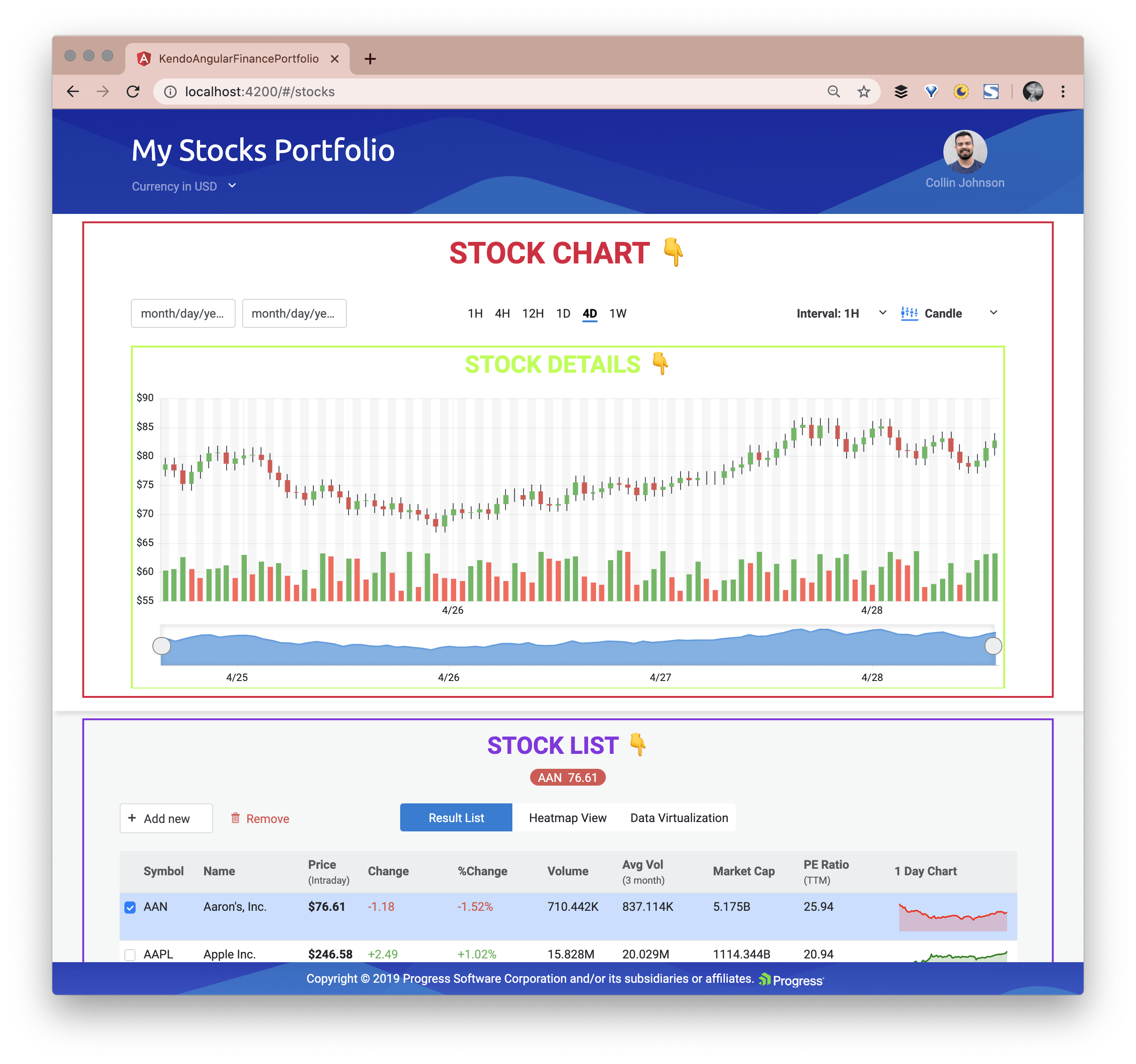
Stock Chart with Stock Details and the Stock List are all visible by default on the dashboard (landing page). I’ve given them titles and outlines here, so you can see where those Angular components visually are:

screenshot outlining the stock chart, details, and stock list component boundaries

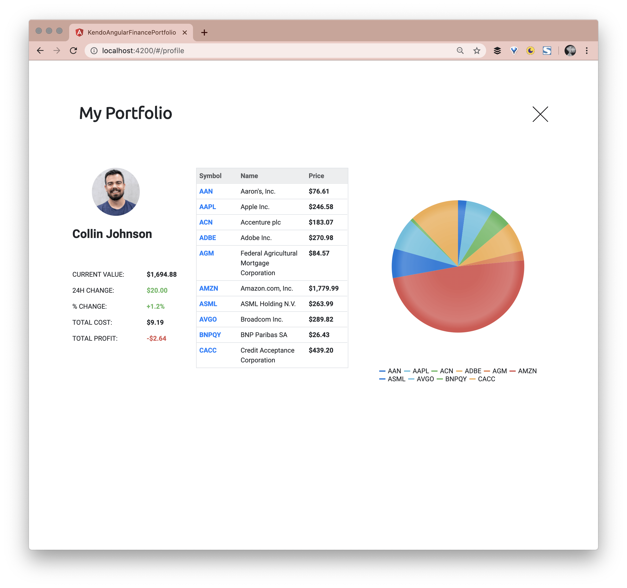
The User Profile is accessible when the avatar in the top right is selected:

User Profile page on the Kendo UI Financial Portfolio Demo App

Both the Heatmap and the Real Time Data views are available because of the Navigation Component. The Navigation Component is used inside the Stocks List Component:

Toggle Stock List options on the Kendo UI Financial Portfolio Demo App

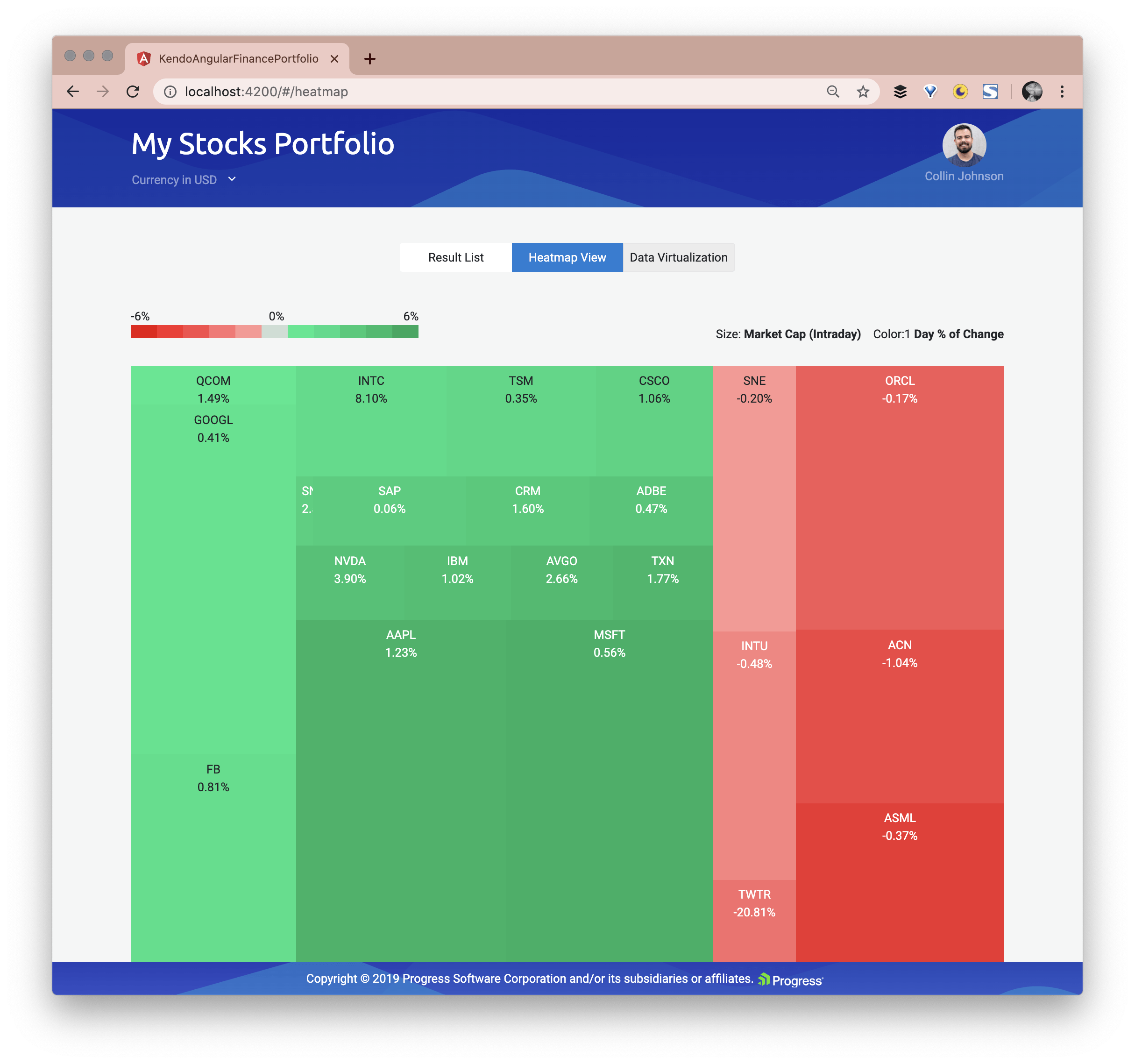
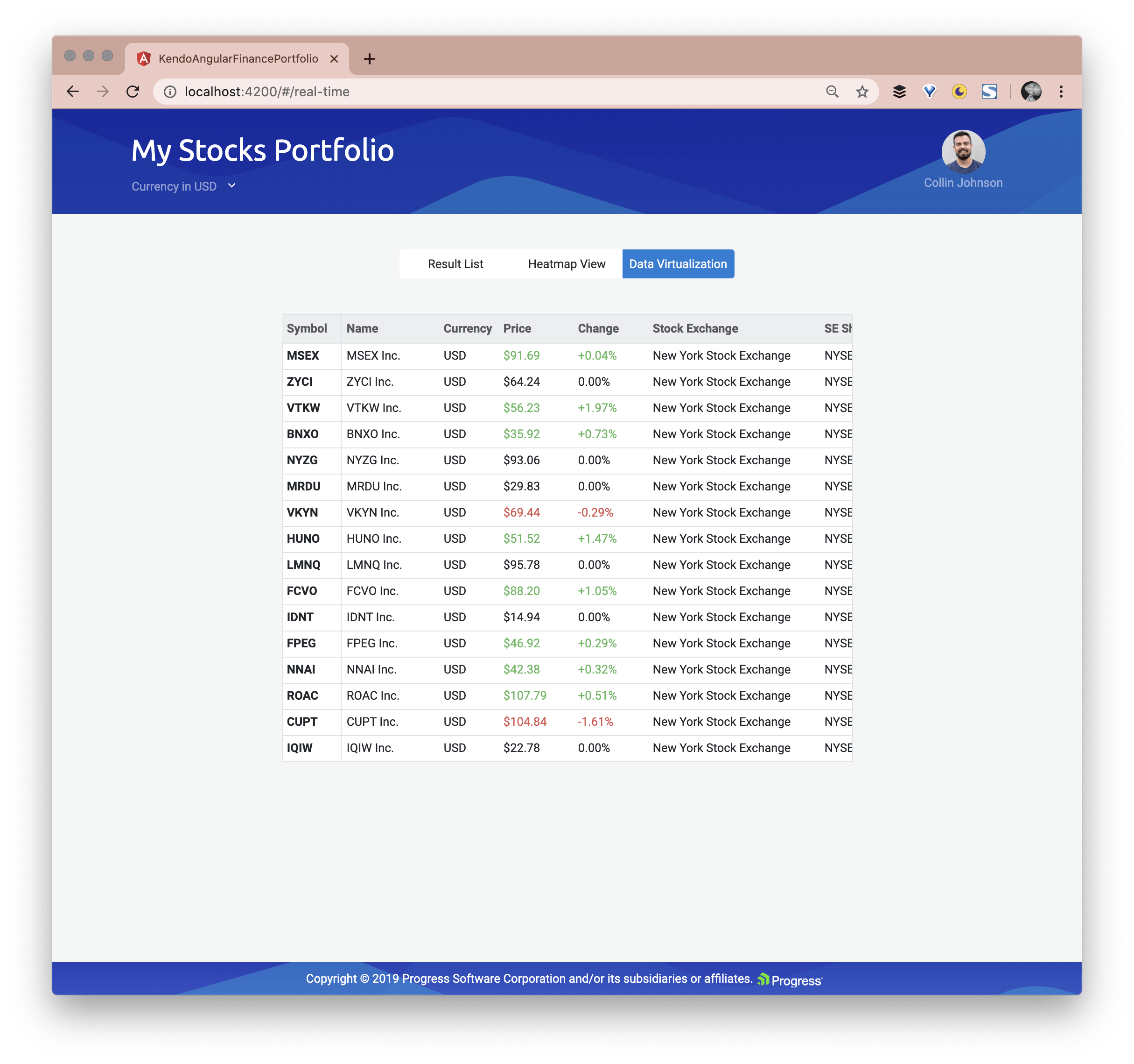
This navigation is created using the Kendo UI Button Group, Kendo UI Buttons and of course uses Angular routing with the routerLink and routerLinkActive directives. Here is the Heatmap view and the Real Time Data view:

Heatmap of stocks on the Kendo UI Financial Portfolio Demo App real time stock prices on the Kendo UI Financial Portfolio Demo App

Now that we have an overview of the larger Angular Components that make up this application, let’s look deeper into the Angular Components to see what Kendo UI Components are being used to make this Portfolio happen.

The Kendo UI Stock Chart

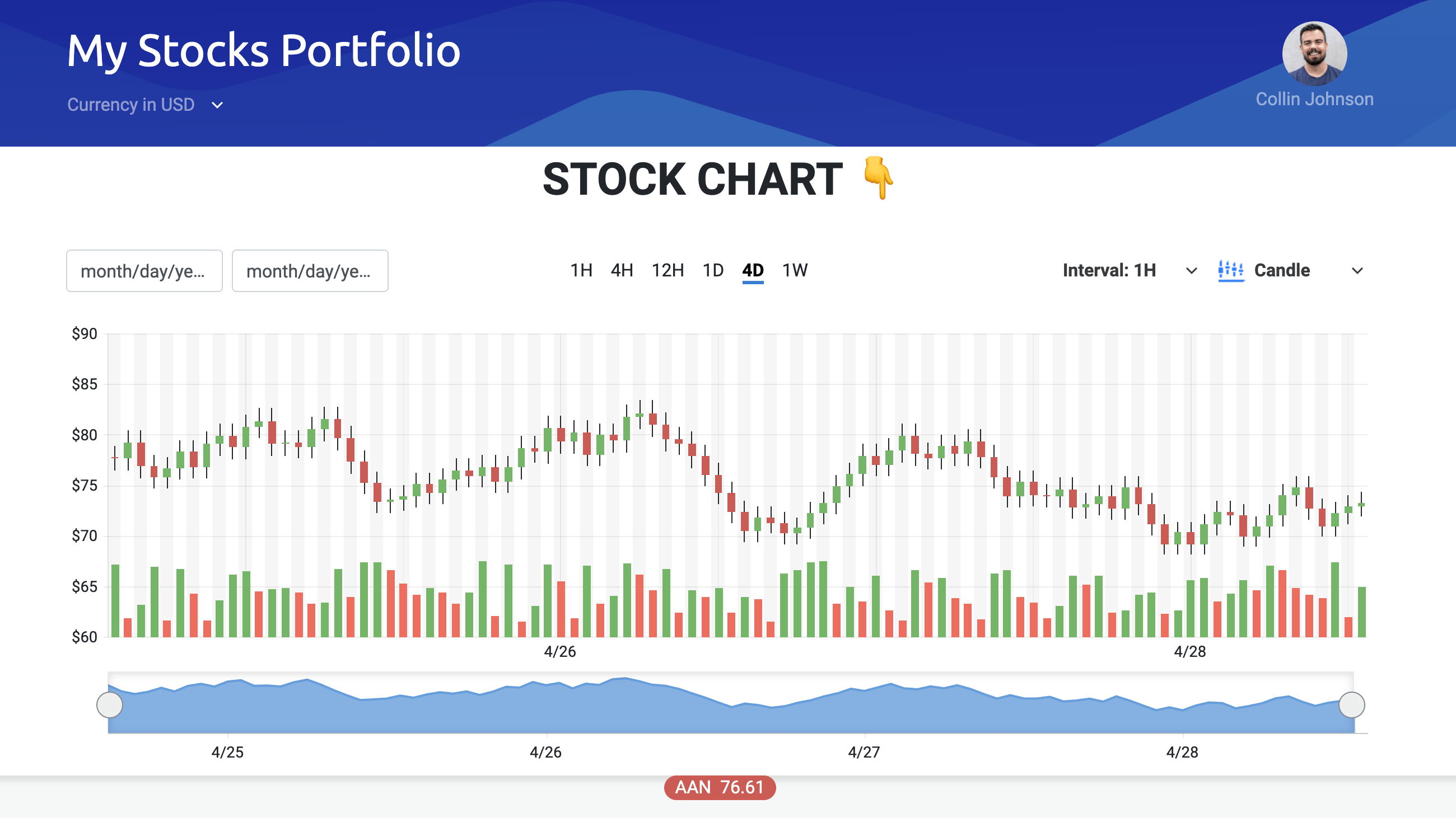
The first thing a user sees on the landing page is the Stock Chart which primarily implements the Kendo UI Stock Chart Component.

The StockChart is a specialized control for visualizing the price movement of a financial instrument over a certain period of time.

Main Stock Chart that is graphing stocks on the Kendo UI Financial Portfolio Demo App

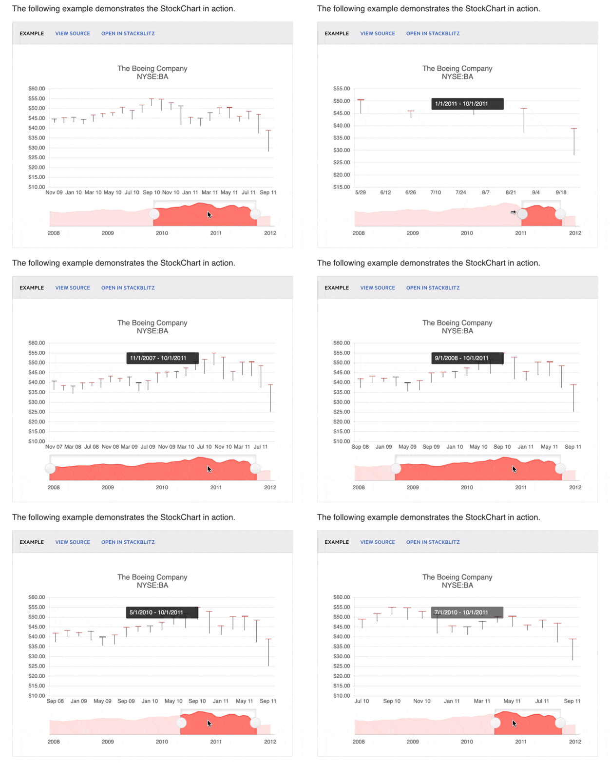
The Stock Chart Component extends the basic Kendo UI Chart, plus has additional features for viewing financial information over a certain period of time. There is a navigator pane that allows you to select a specific chunk of time:

navigator pane to limit the time you are viewing a stock at on the Kendo UI Financial Portfolio Demo
App

GLORIOUS STOCK CHART DOCS

Creating a Stock Chart with least amount of Flexing

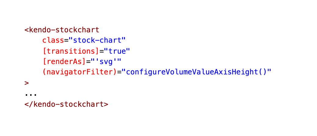
Our Stock Chart Component also has a child Angular Component called Stock Details. This is where our much talked about Kendo UI Stock Chart is actually implemented! If you want to see the full code, expand the block below, or check out the screenshot for the abbreviated version.

stock-details.component.html
the markup for the kendo-stockchart outer wrapper

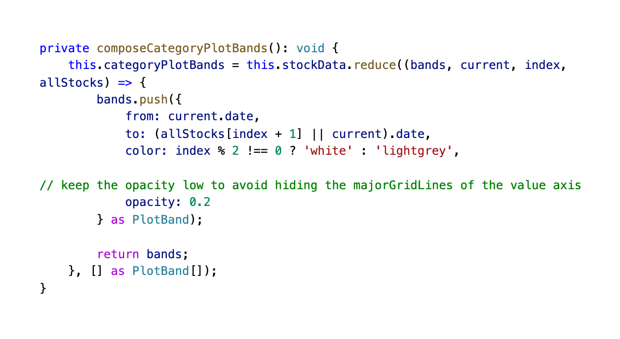
Setting up Plotbands

Here is the markup and functionality for our Stock Chart's Plot Bands!

The Chart plot bands allow you to highlight a specific range of an axis. To display plot bands, set the axis plotBands option to an array of PlotBand.

the mark up for plot bands plotbands functionality

Giving our Stock Chart Two X Axes

The Chart axes provide a value scale for the plotted data series.

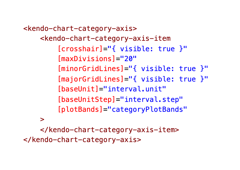
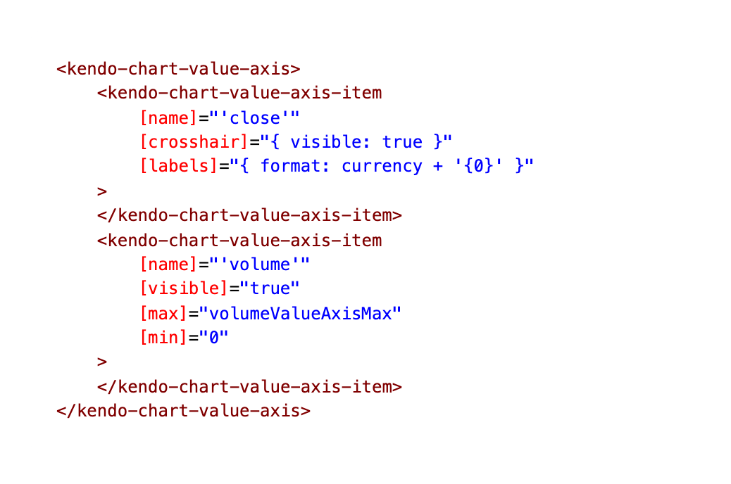
Here we are setting up the axes for our chart. There are two types of axes—category and value.

Category axes are declared through the kendo-chart-category-axis-item configuration components and placed in a kendo-chart-category-axis collection.

Value axes are declared through the kendo-chart-value-axis-item configuration components and placed in a kendo-chart-value-axis collection.

kendo chart value axis

Limiting Displayed Range by Setting Min and Max

We are binding the range.start and range.end to these inputs as well as setting a min and max. Learn more about date range input customizations here in our docs.

Data for our Chart

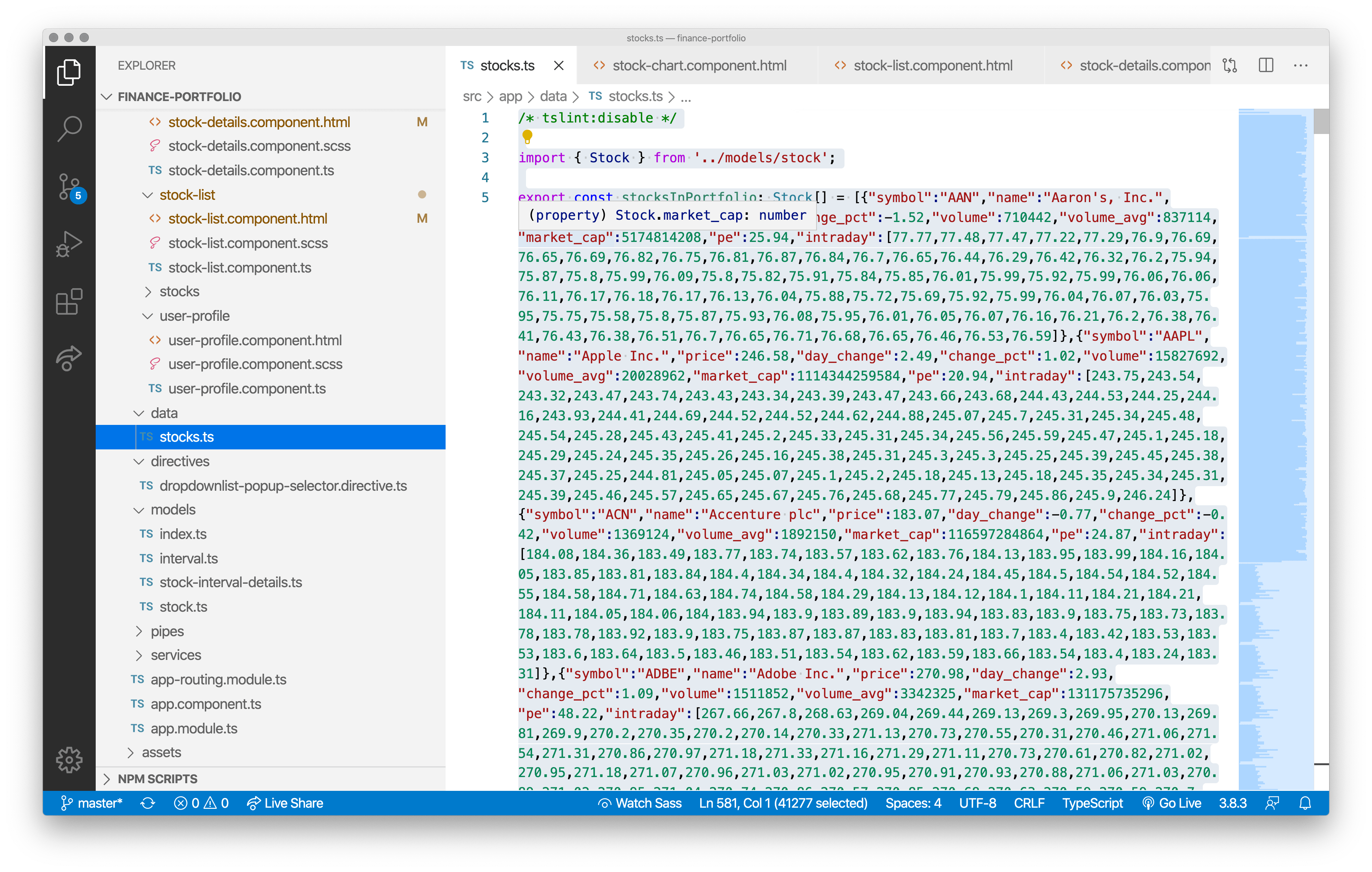
The Angular Stock Chart component is pulling its stock data from this local file:

screenshot of the stocks.ts file with all the local stock data

It is always easier to control a demo app when you can go wireless, so our team believed this was the best move for this particular demo. You can easily swap out the local data for a live Stock API, though.

Passing in Configurable Items to the Stock Details Component

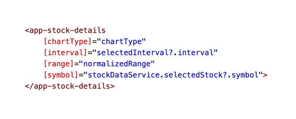
The Kendo UI Stock Chart is being controlled by multiple UI components which pass in things like the chart type and interval:

screenshot of the app-stock-details component inside the stock chart component file gif of the stock chart toggling between chart types

These Kendo UI components—Date Range, Date Input & Drop Down List—are allowing us to customize the stock chart to see the stocks during an exact time frame. If you want to see the full code, expand the block below.

stock-chart.component.html

Modifying the Timeframe Displayed in Our Stock Chart

Kendo Date Range & Date Input

The DateRange Component holds the start and end date inputs and has a fancy date range popup for selecting these.

The date range picker in action in the financial portfolio demo app

You can see in the markup that our kendo-daterange has two kendo-dateinputs. One is for the kendoDateRangeStartInput directive and the other is for the kendoDateRangeEndInput directive.

There are quite a few things you can customize and control on these directives. One thing, for instance, is autoCorrectOn that we are utilizing on change.

autoCorrectOn: Specifies the auto-correction behavior. If the start date is greater than the end date, the directive fixes the date range to a single date either on input change or on blur (see example). By default, the component does not perform any auto-correction.

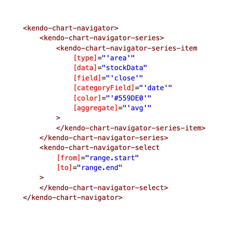
Setting up the Navigator

Out-of-the-box, the stock chart has a navigator pane for scaling the span of time displayed and the whole chart looks something like this:

gif of scrubbing the timespan with the navigator pane on a default stock chart

For more details on the Stock Chart, check out our docs: https://www.telerik.com/kendo-angular-ui/components/charts/stock-chart/

You can check out the exact line of code on GitHub: stock-details.component.html

the mark up for the navigator time scrubber of fun

Toggling Chart Types Within the Kendo UI Stock Chart

Kendo Drop Down List

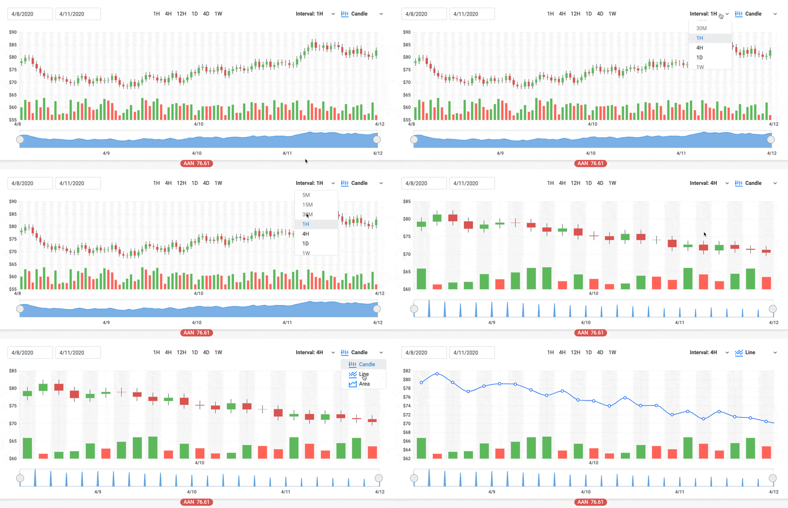
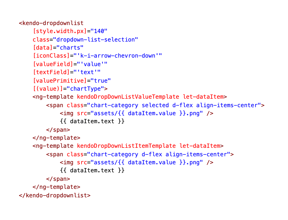
As we mentioned before, we have a dropdown that is allowing us to toggle the chart type. But how are we toggling between the graph types within the Stock Chart? Well, the chart type drop down, is setting the variable chartType to either ‘candle,’ ‘line’ or ‘area.’

gif of the two drop down lists in action in the financial demo app

You can check out the exact line of code on GitHub: stock-chart.component.html

dropdownlist mark up

We are also using the Angular element ng-template (Angular templates not our own templates) to customize the content of our drop downs.

To customize the content of the suggestion list items, use the item template. To define an item template, nest an <ng-template> tag with the kendoDropDownListItemTemplate directive inside a <kendo-dropdownlist> tag.

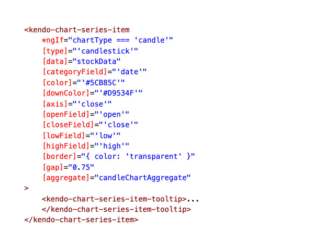
If Chart Type Candlestick

If the chartType is set to ‘candle’ then this is the markup the Stock Chart will use:

You can check out the exact line of code on GitHub: stock-details.component.html

markdown for candlestick chart type in kendo ui

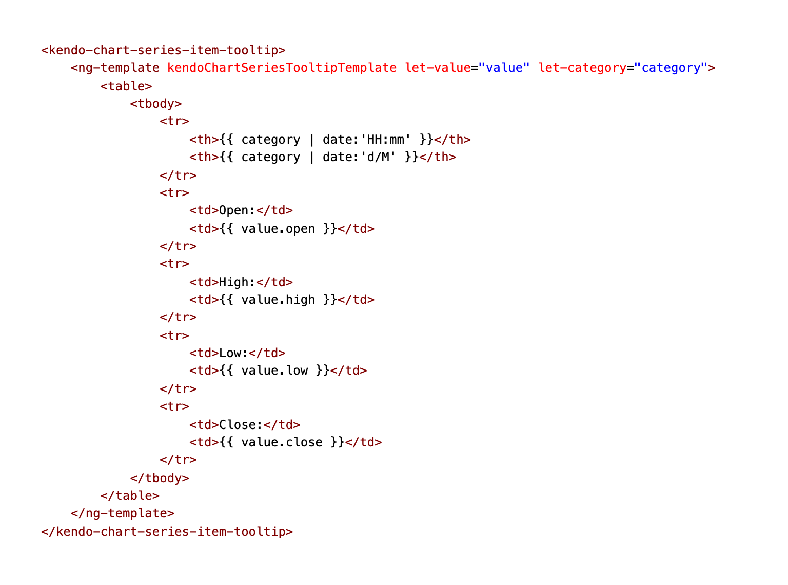
Creating the Tooltip for the Candlestick Chart

We are also using ng-template again to customize the tooltip’s template for the candlestick chart:

You can check out the exact line of code on GitHub: stock-details.component.html

markdown for tooltip for the candlestick chart

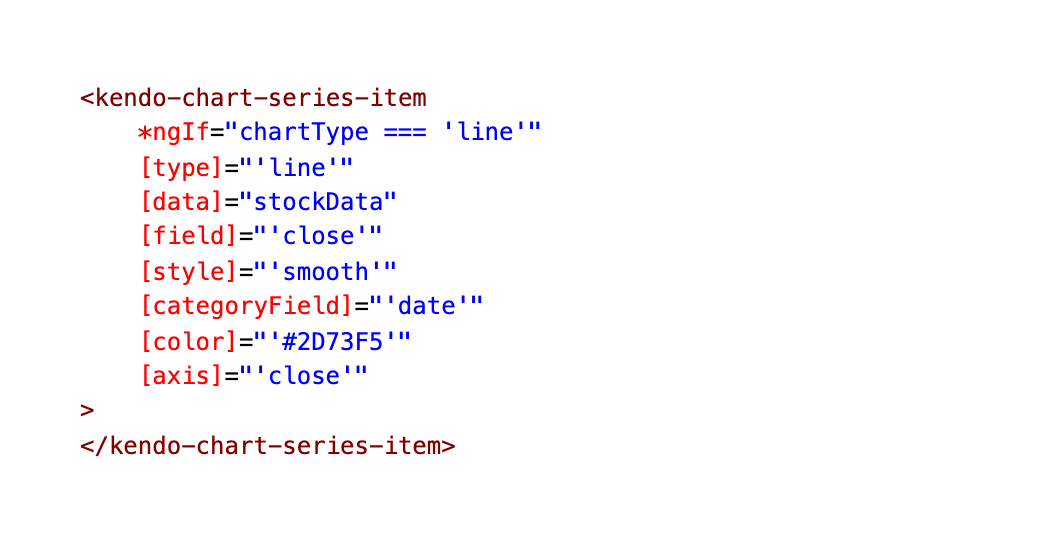
If Chart Type Line

If the chartType is set to ‘line’ the Stock Chart will use this markup:

You can check out the exact line of code on GitHub: stock-details.component.html

markdown for the Kendo UI line chart

If Chart Type Area

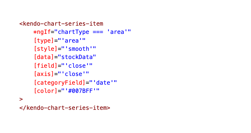
Otherwise, if the chartType is set to ‘area’, the Stock Chart will use this Area Chart.

You can check out the exact line of code on GitHub: stock-details.component.html

markdown for Kendo UI area chart

Displaying Two Charts at Once with Kendo UI

→ Always display the Columns, no matter the Chart type

You might have noticed in the Stock Chart demo, there are always two different types of charts displaying at one time. Here you can see the Area Chart as well as columns.

image of the stock chart showing two graphs at once, column and area

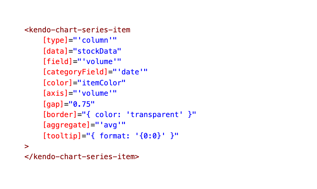
This is because we are giving the chart this column series set to display at all times, along with one of the other three mentioned above.

You can check out the exact line of code on GitHub: stock-details.component.html

column chart mark down

Wrap-up

So we’ve covered the Stock Chart in all its glory, including the ability to toggle between chart types and how to display multiple charts at the same time! I will be covering the rest of the Financial Portfolio in a future post, including the User Profile page, Real Time Data and Heatmap Components! For now, you can clone the demo app and check out the source code here:

Financial Stocks Portfolio on GitHub Pages
Financial Stocks Portfolio Repo on GitHub kendoka asking for feedback

As always, we love love love feedback here on the Kendo UI team! Please let us know if this demo app was useful to you and what kind of other demo apps you’d like to see!

Kendo UI for Angular Feedback Portal

Alyssa is the Angular Developer Advocate for Kendo UI. If you're into Angular, React, Vue or jQuery and also happen to love beautiful and highly detailed components, check out Kendo UI. You can find the Kendo UI for Angular library here or just jump into a free 30 day trial today. Happy Coding!

Building Sophisticated Updates with the Telerik UI for Blazor DataGrid Update Events

$
0
0

The Telerik UI for Blazor DataGrid provides a set of lifecycle events that you can use to not only manage updates, adds, and deletes but extend the grid with additional functionality—like an undo button, for example.

The DataGrid in Telerik UI for Blazor provides a set of lifecycle events that you can use to manage updates, adds, and deletes made through the grid. To take advantage of those events, you just have to do just two things: write the code that updates the collection driving your grid and provide the UI controls that allow the user to trigger the events you put the code in. The grid will take care of the UI-related work for you. Once you’ve done that, though, it doesn’t take much code to leverage these events to implement more sophisticated functionality, including an undo button.

Configuring the Grid

Before taking advantage of the update events (OnEdit, OnCreate, etc.) you need to set up the DataGrid to allow the user to trigger the events. The first step is to assign methods to the ends as this markup does (it also binds the grid to a collection in a field called MyData and uses the grid’s @ref attribute to tie the grid to a field called theGrid):

<TelerikGrid Data="@MyData"
             Pageable="true" PageSize="10"
             @ref="theGrid"
             OnCancel="@Canceling"
             OnCreate="@Creating"
             OnDelete="@Deleting"
             OnEdit="@Editing"
             OnUpdate="@Updating">

With the events wired up, you next need to add the UI elements that the user will interact with. To trigger adding a new row to the grid (and, eventually, raise the OnCreate event), you’ll need to include a GridToolBar element within your TelerikGrid element.

Within the toolbar, you’ll use a GridCommandButton, with its Command attribute set to Add, to trigger adding new rows to the grid. You can supply, between the GridCommandButton’s open and close tags, whatever text you want to appear in the resulting toolbar button. The icon attribute will let you assign one of the standard Kendo icons to the toolbar item. The markup for a typical toolbar with an add button looks like this:

<GridToolBar>
   <GridCommandButton Command="Add" Icon="add">Add Employee</GridCommandButton>
</GridToolBar>

To support editing and deleting individual rows, you’ll need to add a GridCommandColumn within the GridColumns element of the TelerikGrid. Within that GridCommandColumn, you can add buttons to support the edit and delete activities, like this:

 <GridColumns>
        <GridCommandColumn>
            <GridCommandButton Command="Edit" Icon="edit">Edit</GridCommandButton>
            <GridCommandButton Command="Delete" Icon="delete">Delete</GridCommandButton>

Clicking the button with its Command attribute set to Edit will put the row in edit mode. At that point, you’ll want the command button column to display an Update button (to begin the process of saving your changes) and a Cancel button (to exit edit mode without making changes). You can do that by adding Save and Cancel buttons to the GridCommandColumn element and setting these buttons’ ShowInEdit attribute to true to have them only appear when the row is in edit mode:

            <GridCommandButton Command="Save" Icon="save" 
                                                      ShowInEdit="true">Update</GridCommandButton>
            <GridCommandButton Command="Cancel" Icon="cancel" 
                                                       ShowInEdit="true">Cancel</GridCommandButton>
        </GridCommandColumn>

In your code, to support that markup, you need the two fields that hold the data driving the grid and the field tied to the grid’s @ref attribute:

List<Employee> MyData;
TelerikGrid<Employee> theGrid;

Handling Updates

You’re now ready to start putting code in your events. You may need to use all five events but odds are you’ll only need these three:

  • OnUpdate: To commit changes to the collection the grid is bound to
  • OnCreate: To add an item to the collection
  • OnDelete: To remove an item from the collection

All of these events are passed GridCommandEventArgs parameter which has an Item property that holds the object the user is updating, adding, or deleting.

Handling Updates

Typical code for an update method consists of finding the location of the matching object in the collection and replacing it with the object passed in the GridCommandEventArgs parameter’s Item property. A basic version of the update method might look like this:

async Task Updating(GridCommandEventArgs e)
{          
   Employee emp = (Employee) e.Item;
   int i =  MyData.FindIndex(emp => emp.Id == emp.Id);
   MyData[i] = emp;
}

In real life, however, you’ll probably want to validate the data the user entered before making any changes. If the values in the Item property fail validation, you can return control to the user and leave the row in edit mode by setting the GridCommandEventArgs’ IsCancelled property to true before exiting your update method. That’s what this example does when the user leaves the FullName blank:

void Creating(GridCommandEventArgs e)
{
   Employee emp = (Employee) e.Item;
   if (string.IsNullOrWhiteSpace(emp.FullName))
   {
      e.IsCancelled = true;
      return;
   }
   int i =  MyData.FindIndex(empl => empl.Id == emp.Id);
   MyData[i] = emp;
}

If you’re updating a backend data source (i.e. local storage or a web service), then you could perform that update in this method. Alternatively, you might just mark the updated object as changed and perform a batch update of all the flagged items when the user clicks a submit button.

The OnUpate event works with the OnEdit event which is raised when the user clicks on the edit button to put the row in edit mode. You could use the OnEdit event to fetch up-to-date data from your data source (you can’t replace the object in the GridCommandEventArags Item property but you can change its properties). This example, instead, updates a flag on the object to indicate that it’s been edited:

void Editing(GridCommandEventArgs e)
{
   ((Employee) e.Item).Changed = true;
}

Also tied to the OnUpdate event is the OnCancel event. The OnCancel event is fired when the user clicks the Cancel button while in edit mode (which also causes the row to exit edit mode). As an example, this code sets the object’s Changed property back to false since the user isn’t making any changes:

void Canceling(GridCommandEventArgs e)
{
   ((Employee) e.Item).Changed = false;
}

Handling Inserting Items

When the user clicks the Add button in the toolbar, a new row is added to the grid in edit mode. As with updates, the row has both an Update and Cancel mode. However, when the user clicks the Update button during an add, the OnCreate event is fired. In a method tied to the OnCreate event, you’ll want to add an item to the grid’s data collection. That’s what this example does:

void Updating(GridCommandEventArgs e)
{
   MyData.Insert(0, ((Employee) e.Item));
}

As with the update event, you’ll probably want to check for problems with the user’s entries and remain in edit mode if you find a problem. Code like this does the trick:

void Updating(GridCommandEventArgs e)
        {
            Employee emp = (Employee)e.Item;
            if (string.IsNullOrWhiteSpace(emp.FullName))
            {
                e.IsCancelled = true;
                return;
            }
            MyData.Insert(0, emp);
        }

If the user clicks the Cancel button while adding a new item, the OnCancel event is still raised, just like the Update event. Inside the Cancel event, if you want to do something different when adding new objects (as opposed to updating existing objects), you can check the GridCommandEventArgs IsNew property which is set to true when the process of adding an item is cancelled. Upgrading my previous cancel method to handle new items would look like this, for example:

async Task Canceling(GridCommandEventArgs e)
{
   if (!e.IsNew)
   {
      ((Employee) e.Item).Changed = false;
   }
}

When adding an item, you might want to do some processing before the grid is put in edit mode. For example, you might want to provide a new object with some default values for the user to modify rather than giving them a blank row. There isn’t a grid-level event associated with clicking the Add button in a toolbar, but you can replace the button’s Command attribute with an OnClick attribute set to a lambda expression that calls a method of your own.

Here’s an example of some markup that will call a method named Adding when the user clicks the add button:

        <GridCommandButton OnClick="e => Adding(e)" Icon="add">
       Add Employee</GridCommandButton>

Like the grid’s lifecycle events, the method called from a GridCommandButton’s OnClick event is passed a GridCommandEventArgs parameter. Removing the Command attribute, however, also suppresses the default behavior of the button so you’ll have to duplicate adding a new, editable row yourself. Fortunately, that’s easy to do: just create a GridState object, set its InsertedItem to your default object, and then merge your modified GridState object into the grid’s current state with the grid’s SetState method.

Here’s some sample code that provides a default Employee object for the user to modify before the object is added in the Creating event:

async Task Adding(GridCommandEventArgs e)
{
   GridState<Employee> state = new GridState<Employee>();
   state.InsertedItem = new Employee
   {
      Id = MyData.Max(e => e.Id) + 1,
      HireDate = DateTime.Now.Date
   };
   await theGrid.SetState(state);
}

Creating an Undo-able Delete

In the delete event, all you need to do is remove the selected object from the collection. To do that, you just have to pass the Item property of the GridCommandEventArgs to your collection’s Remove method:

async void Deleting(GridCommandEventArgs e)
{            
   MyData.Remove( (Employee) e.Item);
}

Of course, there may be employees you don’t want to delete. As with the other events, when you find that’s the case, you can just set the IsCancelled property to true before exiting the method. However, unlike updates and adds, cancelling a delete does not call the OnCancel method. Here’s some code that checks to see if employees have any unpaid fines before deleting them:

async void Deleting(GridCommandEventArgs e)
{            
   Employee emp = (Employee) e.Item;
   if (emp.OutStandingFines > 0)
   {
      e.IsCancelled = true;
      return;
   }
   MyData.Remove(emp);
}

Since it isn’t possible to check with the user before deleting an item in the grid, the decent thing to do is provide some simple undo functionality. Here’s some code that, before deleting an Employee object from the grid, pushes the object (and its position in the collection) onto a stack:

Stack<Employee> deletedEmployees = new Stack<Employee>();
Stack<int> deletePositions = new Stack<int>();
async void Deleting(GridCommandEventArgs e)
{            
   Employee emp = (Employee) e.Item;
   int pos = MyData.FindIndex(e => e.Id == emp.Id);
   deletedEmployees.Push(emp);
   deletePositions.Push(pos);
   MyData.Remove(emp);
}

To provide the undo functionality, you just need to two things: Insert the top item on the stack of deleted employees back into its old position and update the grid’s state:

async void UndoDelete()
{
   MyData.Insert(deletePositions.Pop(), deletedEmployees.Pop());
   GridState<Employee> state = theGrid.GetState();
   await theGrid.SetState(state);
}

The last step in supporting an undo is to provide a button for the user to call this UndoDelete method (you should also make sure that the button is only enabled when there’s something to undo). That button belongs on the grid’s toolbar with the Add button. Here’s the required markup for that:

<GridToolBar>
        <GridCommandButton OnClick="e => Adding(e)" Icon="add">
Add Employee</GridCommandButton>
        <GridCommandButton OnClick="UndoDelete" 
Enabled="@(deletedEmployees.Count() != 0)">Undo</GridCommandButton>
</GridToolBar>

By leveraging the DataGrid’s lifecycle update/add/delete events, you can not only provide the user with a complete environment for making changes to their data, you can build in additional functionality to support them.

Fiddler Everywhere—Auto Responder

$
0
0

Auto Responder is a very powerful feature in Fiddler Everywhere. See how it can be used to mock requests. 

Fiddler Everywhere is a must-have tool for every developer trying to debug HTTP issues for websites and mobile apps. Other than being able to inspect and monitor web traffic, Fiddler Everywhere also enables you to mock requests using the powerful Auto Responder feature.

Fiddler Everywhere Banner

If you are new here, Fiddler Everywhere is a tool for network debugging and monitoring. It logs all the HTTP(S) traffic between the client and the internet. The tool is handy to inspect, debug, mock, and share network requests and responses. You can check out this starter guide to get you started with Fiddler Everywhere.

Auto Responder

As developers, you frequently need to simulate and test various user conditions to ensure the client-side experience doesn’t suffer due to unexpected issues. For example, it is crucial to know how the site behaves when some resources (JavaScript, CSS) take longer to load or do not load.

Fiddler Everywhere Auto Responder Rulesets

With the Fiddler Everywhere Auto Responder feature, you can simulate such issues locally and test them against various parameters without updating the production server. This feature allows you to quickly test multiple scenarios without having to mess with the code in production. This feature is also handy to reproduce previously captured bugs in isolation.

Rules

When it comes to functionality, the Auto Responder feature in Fiddler Everywhere allows you to create “Rules” that get triggered when the particular request is issued. Fiddler Everywhere has an Auto Responder Rules Editor, which will enable you to create new rules and edit existing rules quickly.

Fiddler Everywhere Rule Editor

To create new rules, you can either click the “Add New Rule” button in the Auto Responder or right-click on the required web session and select “Add New Rule.” The Rules Editor will open up. The Rules Editor has the Match section, which maps to the Action section.

Rules Match

The Match section makes it simple to specify a match condition to identify the specific or multiple requests. You can provide string literals, regular expressions, and even specific match conditions. By default, Fiddler Everywhere performs a case-insensitive match against the request URLs.

You can type a word in the Match section, and all requests having the word would be identified. For example, the word “academic” will match the following request URLs:

  • https://academic.com
  • https://academic.example.com
  • https://example.com/academic
  • https://example.com/search?q=Academic

You can provide specific directives by using following parameters:

  • EXACT:URL” – matches with request URL exactly, case-sensitively.
  • NOT:string” – matches with request URLs that do not contain the mentioned string could be an URL, URL path, or even a word in the URL.
  • regex:string” – matches a regular expression against the request URL. Fiddler Everywhere uses the .NET regular expression engine to evaluate these expressions.

Rules Action

When Fiddler Everywhere identifies a request which matches the Auto Responder Rule, it automatically bypasses the server and maps it to the Action mentioned in the ruleset. The Auto Responder rule actions include:

*reset” – Breaks the client connection without sending a response.

*delay:x” – Delays the request to the server by “x” milliseconds.

*ReplyWithTunnel” – Responds with an HTTP/200 tunnel for HTTPS traffic. Example: CONNECT method.

*CORSPreflightAllow” – Allows access to the Cross-Origin-Resource-Sharing (CORS) requests.

*header:HeaderName=NewValue” – Changes the header value to the specified value.

*redir:https://example.com” – Redirects (HTTP/307) to the target URL mentioned.

https://example.com” – Returns the target URL as a reposnse.

Return manually crafted response” – Allows modifying the current response (HTML, JS, JSON) previously returned by the server.

If you have already selected a web session, the request automatically gets copied in the “Match” section with an Exact match condition. The action by default is to “Return manually crafted response.”

Auto Responder Rules Queue

The Auto Responder tab has the rules in the queue. You can turn on or off any or multiple rules by switching the toggle button next to the rule. Fiddler Everywhere applies rules to the web sessions in the exact order that they appear in the Auto Responder Queue. However, you can promote or demote the rules using the arrow buttons in the queue. You can also group rules to make it simpler to manage.

Sharing Rules

Fiddler Everywhere allows you to share individual rulesets by entering an email id. Alternatively, you can also export the rules by creating a FARX file of the rules. Similarly, you can import the rulesets into Fiddler Everywhere using a FARX file.

Unmatched Requests

When the Auto Responder is enabled, Fiddler Everywhere will match every request against the rules. For any request that does not match the conditions, Fiddler Everywhere will return an “HTTP/404 Not Found” response. To prevent this, you need to enable the “Unmatched Request Passthrough” option to send the requests to the server instead of the Auto Responder.

Get Fiddler Everywhere

Fiddler Everywhere Download Now

These are some of the powerful actions that Fiddler Everywhere can execute on behalf of a live server. These features are especially useful for testing and debugging purposes. If you haven’t tried this out yet, check it out now and let us know what you think. Download it now. Fiddler Everywhere is available on Windows, macOS, and Linux and supports every browser.


Follow the Billionaire's Daily Routine with Telerik AJAX Timeline

$
0
0

Uncover the billionaire's (secret) daily routines with the Telerik timeline control. Learn some useful tips and tricks for the controls too.

I bet that some of you will find the subject catchy, while others worn-out.

You may also wonder, what do billionaire habits and the Telerik UI for ASP.NET AJAX new Timeline component have in common?

Don’t worry, it is just a way to share with you what I have learned from some popular books, tutorials and videos about self-motivation, time management, work-life blend and personal growth in an illustrative way using our brand new component—the Timeline for ASP.NET Web Forms.

Its amazing capabilities for visualizing dates, events and stories will help me summarize and present the wisdom gained during the past few years that may improve your life and career, or at least make you to become a bit more self-confident.

I am thrilled to kick this off, so let’s go: There will always be a first step and it is to build your own Life-changing daily habits. The question is how to do that without a plan, without a schedule, without some guidance. For the purposes of the blog post and to visualize for you some of the most popular daily routines and habits of the highly successful and, of course, richest people . I created a Web Forms timeline example named Day-Plan (click here) which automatically scrolls to the most suitable routine for the current time of the day.

Here is a short animation of how it looks and behaves:

Daily Routines For Success Autoscroll

As you can see everything begins early-early in the morning when everybody else still sleeps. There is nobody else around . Right, only me and it is so quiet, and I can concentrate on the important stuff for me and for the day! The time is mine!

I started to practice the early rising routine two months ago and slowly but surely, I broke the habit to go late to bed, to not sleep enough and to wake up tired. Right now, at this moment, I am feeling great (it’s 5 am) and I can work on the blog super concentrated, creative and productive! I became a morning person!

If you examine a bit more carefully the Day Plan sample, you will count more than 10-15 daily routines, but don’t get anxious, try them out and see which work for you and make your life better. Personally, I am a huge fan of two of them:

  • Time Management—This skill is not about adding more and more into your schedule. It is about making smarter, more purposeful choices with the hours you have.

    Let me share with you some on my favorite ideas for organizing and saving time:

    • Prioritize your goals when managing your time
    • Identify when you are at your sharpest, and use this time effectively (for example in the morning)
    • Recognize what distracts you and refocus quickly
    • Take regular short breaks for a quick stretch and eye training. Use your lunch time!
    • Switch to another task to clear your mind after some amount of time (you can use a timer)
    • Self-audit—track time for each task you do and identify bottlenecks
    • Set Away status on your online communicator after worktime ends if you are still logged in (be sure to restore it in the morning)
    • Set Busy status when needing no-distractions focused time
    • Set clear deadlines and reminders for upcoming deadlines
    • Request tips, second opinions from your colleagues on tasks you work on for more than usual
    • Share and ask for feedback and general tips and tricks
    • Last but not least drink plenty of water since this will keep your brain fresh and productive
  • Long walk/run in the nature—usually this is our neighbor South park (the picture in the demo is from it) or the near Vitosha Mountain. Both of them offer a lot of trees, rivers and make me happy and full of positive energy, and I am also able to achieve my 10,000 steps everyday goal effortlessly and pleasantly.

Just before jumping into the tech specifics of the sample, let’s make a quick overview of RadTimeline features. It displays a collection of events and their data in a chronological succession for each year, month or a day (as in the example). You can scroll through the events and collapse/expand them. The events order can be vertical or horizontal, and you can customize their templates, as well as respond to events and use API control the widget behavior. Other useful features are the out-of-the-box mobile and responsive behavior, flexible client-side and server-side binding mechanism, sorting of items, built-in actions and images support.

Here we go! Here is the desert explaining how the Day Plan example works:

The auto-scroll and expand event functionality is achieved by attaching the JavaScript function below to the OnDataBound client-event of RadTimeLine:

<script>                                                                             
    function onDataBound(timeline, args) {
        var events = timeline.get_dataItems();
        currentDate = new Date();
                  
        for (var i = events.length - 1; i >= 0; i--) {
            if (events[i].date < currentDate) {
                setTimeout(function () {
                    var timeEvent = timeline.get_items()[i];
                    var yOffset = -10;
                    var y = timeEvent.getBoundingClientRect().top + window.pageYOffset + yOffset;
                    //performs a smooth scrolling with a small negative top offset to the most suitable daily event for the current time
                    window.scrollTo({ top: y, behavior: 'smooth' });
  
                    //expands the routine event for the current time
                    timeline.expand(timeline.get_items()[i]);
                }, 500);
                break;
            }
        }
    }
</script>
<telerik:RadTimeline runat="server" CollapsibleEvents="true" DateFormat="HH:mm"AlternatingMode="true" Skin="Bootstrap" Height="3000px" EventHeight="50">
    <ClientEvents OnDataBound="onDataBound" />
...

If you’d like to make the current event more shining, you can highlight it in the desired color with this line:

//style the header background
$telerik.$(timeEvent).find(".k-card-header").css("background-color", "#ebf5eb");
//apply background to the card body
$telerik.$(timeEvent).find(".k-card").css("background-color", "#ebf5eb");

The default larger padding between the vertical events is also reduced by the following CSS class override:

Here is the difference with the original padding:

<style>
.RadTimeline.k-timeline-vertical .k-timeline-event {
    padding: 0px 0px;
}
</style>

timeline-css-padding

Another interesting thing to note is that the timeline usually displays events spread across one or more years. The current sample is special since it showcases the events in the scope of time for the current day. This is easily achieved via the DateFormat="HH:mm" server property of the control. Using this approach, you can display hours, months and years in it.

Of course, you can find more on RadTimeline for ASP.NET AJAX in its live demos and documentation.

Summary

As you can see, you should be fully devoted to the cause, you will need to sacrifice some of your bad habits and incorporate some new ones, but the end results will be worth it. It may be hard to wake up early and get to bed before 11 PM for many of us, but this is highly recommended since it supports the brain regeneration and boosts its activity and learning in the small hours of the morning.

Let me know in the comments what are your habits, your rules and whether they changed your life for good! Maybe there are some real billionaires among the readers so it will be amazing to get some useful tips from them too. Enjoy!

Last but not least if you like the Timeline Web Forms control used in the demo, you can download its absolutely free and fully functional trial and give it a spin.

free-trial

Designing a User Experience for Now While Planning For the Future

$
0
0

Ever wanted to design a user experience but felt limited by your technology stack, language, or framework? Here is a tried and true 5-step user experience workflow to help facilitate building a UX for now while planning for the future.

Platforms, Languages, and Frameworks, Oh My!

The amount of frameworks, platforms, languages that are available to us when designing a User Experience (UX)—whether you sit on the UX analyst side or on the UX practitioner side, you encounter this plethora of things on a daily basis. So how do we tune out all the noise of this digital ocean and design/develop an experience for our users that is agnostic of choices based on these outside factors? How do we provide a user with the best experience we are capable of giving them while planning for future enhancement?

Stick with this article and I'll walk you through my five-step process of doing just that—there are many like it but this one is mine.

Note: This article is written in the context of delivering to an enterprise client with multiple stakeholders, teams, etc. This does not change the premise of this workflow.

Step 1: What Requirements Exist?

You've met with your stakeholders, you've discussed the ins and outs of what you need to do to keep them happy, and now you need to put words into action to start developing your experience strategy and wireframes.

What are the core requirements of their requests? Format them in statements, such as, "As a user I need to X." Or, if you got more specific, "As a specific persona I need to do X," Once you have these statements, start to break down these concepts in to smaller pieces that are functionally possible.

At this stage, don't think about functional possibilities or your specific environment. Purely focus on the platform-agnostic experience. At the end of this step, you should have a list of discrete actions and steps to achieve the stakeholder goals for your project.

a list of stakeholder goals

Step 2: Organizing your Goals & Actions

The next thing you want to do when understanding your goals for this project is to think within the mind of your personas. What are the discrete goals and actions each user needs to take?

Some or most of these will likely come from your list in step 1, or by breaking down items from step 1 into smaller actions. Can you align goals from the stakeholder conversation to individual personas? A great way to visualize this information is a goals & actions table (example below) organized by persona and their primary goal when browsing this site.

a list of goals and actions

Step 3: Aligning User Goals with Your Wireframes

In step 3, we still are not thinking about our frameworks, languages, or any other technical limitations. Sometimes a UX person handles this part, and sometimes it's a combination of a content strategist and a UX person.

Now that we have our goals and actions, we need to plan out the rhythm and flow of these on each page that we are wireframing. On each page, you are designing an experience for a specific persona or multiple personas. What are those primary goals or "Call to actions" (CTA) that these users need to complete on this page? What are the steps and actions that a user will take on this page to take them through to these actions? You should know this based on your step 1 list, and the table you put together on step 2.

It sometimes helps to map these steps out for each persona so that you have a visual representation of how this particular persona might browse the page. This also serves as a great tool for communicating user behaviors to non UX team members.

sample journey of a user, from clicking a button to clicking a category to clicking a product to adding to cart to purchase

Once you have a chart like this for each of your pages, you can start to develop the flow of content on the page in a modular fashion. Each section should drive the persona(s) down the page to a specific CTA to take them down the funnel of their journey toward their goal.

basic wireframe showing all ctas

Step 4: Develop for Today

Now that we have gathered goals & actions, persona journey maps, and base level wireframes, we can start to think how we can accomplish these within our environment.

Now would be a great time to chat with your development team to tell them what you are trying to achieve with your experience using your wireframes to guide that conversations. It should be a partnership, and there should be some shared knowledge and understanding of what is possible. Since ultimately they are building it, they may be able to help you break down certain challenges into smaller functionality chunks.

You should also come armed with your own research about the platform the product is being developed in. Is this being built in React? Maybe read the development documentation or research React components that you might need to use. Is it native iOS? How about reading Apple's Human Interface Guidelines (HIG) for developing iOS apps?

Not only will this knowledge help you when developing your experience—it also will show the development team that you are willing to put in the work to understand their technical limitations and to work within their parameters while also trying to achieve the best experience for your users.

Plan for Tomorrow

Planning for enhancement is about two things: Reducing the overall steps it takes to achieve a goal or complete a task, and enhancing existing experiences to make them better based on new capabilities of your tech stack.

As you start to wireframe, think, "What is the minimum functionality I can provide the user to meet this goal today?" Is there a goal or functionality that you can not accomplish? If the answer is yes, can you break this functionality into more steps in order to facilitate this functionality? Even if this means providing more manual steps for the user?

If you are able to break it out into more steps, it also makes sense to think of the future. What developments in your tech stack would help you reduce the amount of steps it takes to complete this goal?

As an experience designer who is also a developer, I often think of progressive enhancement, which is this exact thought process when it comes to coding a piece of software/website. Your goal is to make a seamless experience for your user. The user should never know that you are providing limited functionality, but you as the experience designer should always be thinking about ways to improve and enhance their experience throughout the lifespan of your product.

Step 5: Don't Just Hand it Off

With siloed teams, it's easy to just "throw something over the wall" and let the next team deal with it. But you are the advocate for the user, and you should work hand in hand with development to ensure the experience you planned translates well within the development cycle.

If you don't have day-to-day communication with the development team, how can you effectively communicate planned functionality? Can you build a prototype with a tool like Adobe XD? Can you collaborate with them using a tool like Unite UX? Can you screenshare? Can you set up a daily or weekly scrum to work with the team remotely to ensure things are getting executed according to your planned experience?

Whatever method you end up using, it's your job to own the UX, which is up to and through the development of the product.

Wrapping Up

Consider this guide a suggested framework for designing a UX for the now while planning for the future.

  1. Gather requirements
  2. Organize your goals & actions
  3. Align your goals to your wireframes
  4. Develop for today, plan for tomorrow
  5. Don't just hand it off

This is the workflow I use day in and day out for my own projects, but I encourage you to tweak and change things to suit your own workflow/environment.

Again, it is important to understand that you, as the UX expert, own the experience for a project. Ensuring your experience is executed exactly as you intended is important not only for your own reputation, but also for the overall experience for your users.

My Favorite 15 Tailwind CSS Plugins and Resources

$
0
0

Tailwind CSS makes styling and designing responsive pages easy. Check out the top 15 Tailwind CSS plugins and resources you need to know about if you are planning to try it out (or if you're already using it).

Usually, the talk is ALL about JavaScript frameworks: React, Vue, Svelte… But a few months ago, I started to become passionate about a sweet little CSS framework that made styling and designing my responsive pages fun and breezy. Introducing Tailwind CSS!

I know there are countless articles about the subject, and I’m not here to bore you with yet another Tailwind CSS tutorial.

On the other hand, I’ll tell you exactly my process to quickly learn the ecosystem that surrounds a given tool. I Google the official awesome-list for this particular technology (i.e., for Tailwind CSS: Awesome TailwindCSS) and I take a look at almost every link. It usually takes a few hours, but when it’s done, the amount of value you get from following this practice is just colossal. Seriously! #tremendous

Anyways… So, Tailwind CSS is still relatively new compared to other CSS frameworks. Nonetheless, there are some great plugins and resources you should know about if you are planning to play with it (or if it’s already part of your workflow). To save you time, I summarized my favorite ones in this article.

So without further ado, let’s get started! ‍

1. Learn Tailwind Faster with a CheatSheet

Tailwind CSS utility classes are quite easy to learn. But at first glance, remembering all those classes can be a little tricky. A great tip I recommend (to save you the trouble of going back and forth to the documentation) is to rely on a cheat sheet.

Here are the best ones I could find:

Resource no. 1: Tailwind Cheat Sheet by NerdCave.

Resource no. 2: Tailwindcss cheatsheet by umeshmek.

Resource no. 3: Tailwind.css Cheatsheet by LeCoupa.

Feel free to bookmark the one you’re most comfortable with.

2. Implement a Dark Mode Theme for Your Application

Oyé, oyé, Dark Mode people! If you were looking for an easy way to include dark mode variants in Tailwind CSS, look no more! ‍♀‍

The following plugins will help you release different themes so your users can quickly change the colors of your interfaces. They are quite different in the way they work, so I suggest you take a few minutes before choosing one of these two:

Plugin: tailwindcss-theming.

Plugin: tailwindcss-dark-mode.

If you are looking for a simple solution with CSS variables, you can also take a look at the video below.

Video: Dark Mode Theme Switcher - Tailwind CSS & Gridsome.

3. A Spinner Utility You Can Implement in a Snap

tailwindcss-spinner

Plugin: tailwindcss-spinner.

Every application needs a loader, ‍♀‍ that’s just a fact. Luckily, I found this extension that lets you implement and customize one of many beautiful spinners (in terms of color, size, border and speed) ⏱ in less than a minute. Then, you will be able to use it with just one single utility class. Personally, this is one of my favorite Tailwind extensions.

4. Elevation Classes to Magnify Your Interface

Plugin: tailwindcss-elevation.

If you’ve already used Material Design, you’re probably familiar with these elevation effects.

25 varieties of elevation visual techniques

The great news is that by switching to Tailwind, you will not have to redesign them all by yourself. This plugin comes with 25 classes .elevation-* that in my opinion are way more than enough to satisfy your need for elevation effects.

5. Left-To-Right (LTR) and Right-To-Left (RTL) Interfaces

Plugin: tailwindcss-dir.

Plugin: tailwindcss-rtl.

Depending on what you are trying to achieve, these two plugins will help you with building LTR and RTL layouts. You will be able to use a custom direction variant in your project and access smart utility classes like ps-*, ms-*, or start-*.

6. Responsive Aspect Ratio

If in the past you’ve tried to embed videos or specific objects with a strict aspect ratio, you might have had some issues with responsiveness.

1️⃣ This first plugin will help you define the different ratios you need in your configuration file and generate all the utility classes (as well as their responsive variants).

Plugin: tailwindcss-aspect-ratio.

2️⃣ Going one step further, this last plugin (which is using the first one) will give you a few more classes that you can add to your embed elements to make them responsive.

Plugin: tailwindcss-responsive-embed.

7. Beautiful Gradients with Tailwind

Four gradient color blocks: .bg-topaz, .bg-emerald, .bg-fireopal, .bg-relay

Here is a simple way to create mind-blowing gradients in Tailwind CSS!

Plugin: tailwindcss-gradients.

Plugin: tailwindcss-border-gradients.

Whether you are trying to generate some utility classes for your gradients or to implement beautiful border gradients, these two packages will solve both problems. They are regularly updated, so I recommend you use them if you want to make fancy colorful interfaces.

☝ Another tool you should take a look at is the Color Shades Generator.

Tool: Color Shades Generator.

Color Shades Generator not only provides you with names and variants for a given color but also the code to inject in your CSS configuration for the shades it generates. Isn’t that something?!

8. Generate Classes to Easily Order Flex-Items

Plugin: tailwindcss-flexbox-order.

With this extension, you will be able to configure and generate the flexbox order classes with all of their responsive variants.

By default, here are the utility classes that are generated:

.-order-1 {
 order: -1;
}

.order-0 {
 order: 0;
}

.order-1 {
 order: 1;
}

.order-2 {
 order: 2;
}

.order-3 {
 order: 3;
}

.order-4 {
 order: 4;
}

.order-5 {
 order: 5;
}

9. Generate Typography Utilities and Text Style Components

If you have a lot of strict rules for your typography, you may be interested in this plugin :

Plugin: tailwindcss-typography.

You will be able to generate a lot of utility classes to customize the indentation, the text-shadow, the hyphens, the font-variant, and so on.

10. Use Hero Patterns Inside Your Application.

Probably my favorite Tailwind extension :

Plugin: tailwind-heropatterns.

If you are not familiar with Hero Patterns, it is a collection of repeatable SVG background patterns.

tailwind hero patterns jigsaw, overcast, formal invitation, topography

With this Tailwind plugin, you will get 80+ utility classes that will allow you to use ALL of them in your project.

11. Generate Truncate Multiline Utilities

Plugin: tailwind-truncate-multiline.

This plugin will generate all the utility classes defined in your configuration file to truncate your text ✂️ to a given number of lines.

.truncate-[key]-lines {
  'overflow': 'hidden',
  'display': '-webkit-box',
  '-webkit-line-clamp': [value],
  '-webkit-box-orient': 'vertical',
}

12. Display the Current Breakpoint in Dev Mode

This component will show the currently active screen (sm, md, lg, xl, etc.) so you can create your responsive designs faster. You just have to add the debug-screens class to your body tag when you are in development mode.

Plugin: tailwindcss-debug-screens.

tailwindcss debug screens demo

⚠️ If you are using Nuxt.js, I recommend using nuxt-breaky instead.

Plugin: nuxt-breaky.

13. Add CSS Scroll Snap Utilities

If you want to take full advantage of CSS Scroll Snap properties in Tailwind CSS, this plugin is the way to go.

Plugin: tailwindcss-scroll-snap.

In case you’re not familiar with CSS Scroll Snap, ‍ it is a CSS property that makes the scroll behavior snap, locking the viewport at a specific point (that you indicate) with each scroll. As opposed to a linear scroll that moves anywhere on a page at the rate of the controller (mouse, touch gesture, or arrow keys).

CSS scroll snap properties are probably the handiest classes to quickly build a responsive slider. If you need to rely on them in one of your Tailwind projects, this extension will generate all the utility classes you will need: .snap-start, .snap-end, .snap-center, etc.

14. Generate Styles for CSS Based Triangle Arrows with Configurable Border and Background

shows tooltip arrows for top, right, bottom, and left arrows

Could adding a quick arrow for your popover menus or your tooltips be any easier?

Plugin: tailwindcss-tooltip-arrow-after.

And by the way, you can customize almost everything in the config file (border-color, border-width, background, size, offset, etc.).

15. Converting an Existing Project into a Tailwind One

The first plugin will help you convert all your Bootstrap CSS code to Tailwind utility classes. The other is more generic and will work with almost any project.

Plugin: tailwindo.

Plugin: tailwind-shift.

It’s a kind of maaaaagic ‍♀‍!

Bonus 1. Editor Extensions for VS Code Addicts

The first tool is a must-have. So simple yet so useful! It will provide you with suggestions so you won’t have to remember and type all these CSS classes’ full names. Neat, right?

Tool: Tailwind CSS IntelliSense.

Tool: Headwind.

The last one will make you so much more productive. Let me explain.

I am a big fan of beautiful and tidy code, so you can guess that adding tons of CSS classes in Tailwind is a visual nightmare for me.

So imagine my delight when I found this Tailwind CSS class sorter: Headwind, an opinionated VS Code Tailwind CSS class sorter that runs on save.

Bonus 2. Build Your Own Tailwind Plugin!

Do you have another issue that Tailwind’s ecosystem does not cover yet? Well, maybe it is time to build your plugin!

If you are looking for some inspiration about how to do that, this repository will come in handy and will provide you with a few examples so you can quickly grasp the process.


That is all I’ve got for you today. So go ahead, code, enjoy, and stay awesome!

And don’t forget to hit me up in the comments if you have something that you feel we should add to this list, or you can reach out to me on Twitter @RifkiNada.

Debugging with Fiddler Everywhere: Resolving an Error... in Production

$
0
0

Ever wondered how to debug an app while it's running in production? Fiddler Everywhere helps you do just that... without impacting your production systems!

If you've been following along with us in this blog series, you'll know I'm a pretty big fan of Fiddler. The ability to inspect and debug HTTP/S requests and responses from apps of all types (desktop, web, and mobile) can be a critical part of our development and debugging experience.

Fiddler Everywhere is a brand new version of Fiddler. Most of what you love (and none of what you hate) about the original Fiddler is in Fiddler Everywhere. It's a cross-platform tool that includes a revamped experience that performs identically across macOS, Linux, and Windows.

NOTE: Fiddler Classic (the original Fiddler) isn't going anywhere! You can still download Fiddler and use it like you always have on Windows.

Today brings us to part four of common debugging scenarios many of us have encountered. We experience failures from remote APIs, we look for 404 and 500 errors, and, like today, are trying to replicate and resolve customer-reported issues while an app is already in production. Yikes!

If you're just tuning in, be sure to check out some other posts from this series:

While on the subject of new Fiddler tooling—take a look at Fiddler Jam if you're interested in inspecting remote customer issues!

On to the dreaded issue of not being able to replicate a production error locally. We've all been there. When we can't effectively diagnose a production-level error, it's obviously difficult to then debug, test, and ultimately resolve, a change.

Our Scenario: Resolving a Production Error... While in Production

As a web developer, I've seen some issues pop up from customers that show an error in the production environment for my app. Unfortunately, with the information I have, it's virtually impossible for me to replicate the issue locally due to one of the following factors.

The error only seems to happen...

  • after scripts are minimized during the build process
  • when files are served from a CDN
  • because my app is part of a massive monolithic solution that cannot be run locally

Fiddler Everywhere's Solution

Using Fiddler Everywhere, we are going to fake out our application and make it think that it is running in production. But instead of loading key assets from our production environment, we are going to tell our production app to load them from a different source (in this case our local desktop).

This way we can run most of the app "in production," while loading individual scripts/files/whatever we suspect as being the culprits, from our local development machine. To do this we can take advantage of Fiddler Everywhere's Auto Responder feature.

Let's see how this works in practice:

  1. Open Fiddler Everywhere and toggle the Live Traffic option to Capturing:

    fiddler everywhere capture traffic

  2. In your favorite browser, open the website in question and make sure all of the suspected problem assets are loaded by navigating to whichever page(s) are throwing errors. Remember, this could be JavaScript bundles, resources served by a CDN, images, or any other components of your application.

  3. Back in Fiddler Everywhere, toggle the Live Traffic option to Paused so as to limit new requests coming into our session pane.

    fiddler sessions

    I mean, the app is using Bower as its package manager! Maybe the error we are looking for is the least of its concerns...

  4. Find the specific session(s) you are interested in. In my case, I'm going to filter by URL to only show me the app.js bundle, which is a minified JavaScript file with my core app logic (a key suspect in the case):

    fiddler session filter

  5. Next I want to build an Auto Responder rule that will capture a request and do something, anything, with it. Right-click the session identified and choose Add New Rule.

    fiddler add new rule

  6. Now, navigate to the Auto Responder tab where you'll see the session URL pre-loaded for you. Edit the rule and in the Action field, paste the location of the file you want to serve from your local file system. For instance:

    • Windows: C:\Users\myuser\Documents\app_unminified.js
    • macOS: /User/myuser/Documents/apps/app_unminified.js

    fiddler auto responder

  7. Save the rule, make sure Enable Auto Responses is checked, head back to your website, and reload! Fiddler Everywhere will intercept the request and replace the remotely-served file with the specified one from your own file system.

    In theory, this allows you to quickly and easily substitute any resource with any other resource like images, videos, libraries, text, etc.

    Auto Responder can do more than just swap out files. Take a look at additional Auto Responder actions that you can experiment with today:

    fiddler auto responder actions

Summary

We took a quick look at how Fiddler Everywhere can be used to diagnose possible issues in production, without negatively impacting existing users or the production system itself.

Want some next steps?

  1. Start your journey with Fiddler Everywhere by downloading it today for either macOS, Linux, or Windows.
  2. Read up on an exciting new product in the Fiddler family: Fiddler Jam.
  3. Enjoy the rest of your summer (or winter for you folks in the southern hemisphere!) and stay safe out there.

DevReach 2.0(20) is Here! #free #online #community

$
0
0

DevReach is happening! We are going ONLINE for a full week of tech goodness Oct 19 - 23. We're diving into Blazor, React, Xamarin & Angular tech chats, live-coding, pair coding, industry insight, career advice and more.

TL;DR:

DevReach is happening, just not in person. We are going ONLINE for a full week October 19 - 23 of tech goodness—tech chats, live-coding, pair coding, industry insight, career advice and more.

Monday through Thursday we’ll focus respectively on Blazor, React, Xamarin and Angular, and on Friday we’ll focus on... partying, trivia, prizes... and the human side of technology.

It’s FREE, it’s live and we’ve prepped some awesome surprises.

Continue reading for the full details or just register here.

2020 has caught us all by surprise... to put it lightly.

Early in January we still hadn’t gotten over the excitement from #DevReach2019 but had started planning for an even bigger, better, bi-continental and frankly, cooler, in-person conference. But then... well, everything we now know to be our daily life happened.

We were faced with three choices—stick to the plan and hope by October the world will be back to normal; cancel; or pivot, but don’t miss out. And... you know us. Historically we’re not ones to miss out.

DevReach is moving ONLINE! Get ready for DevReach 2.0(20).

Deciding to go ONLINE naturally took us towards opening up the event and making it fully free. If we’re going to be online, we thought, we might as well get together with as many people as possible! But once we decided to go online, we were hit by the overwhelming digital fatigue from the rest of the online conferences already happening on our screens. Zoom sessions left, right and center, full days of ‘meetings’ to replicate full days of talks—so much awesome content, so little time to tune in or catch up. And this got us thinking.

How do we make DevReach ONLINE but more chill, more communal, more... well, DevReach?

Those of you who have been with us on the DevReach journey for all or at least part of the past 11 editions—attendees, speakers, sponsors, partners, teammates—know that one of the main things around DevReach is community. We’ve been fortunate to become an integral part of the Bulgarian and CEE Tech conference scene thanks to the thousands of awesome people who have attended, spoken at, helped organize or just supported DevReach.

This is why when we decided to go ONLINE, we zoomed in on the community part of it all. We decided that we’d focus on making this a fun experience where speakers and attendees can still chat, discuss the hot tech topics of the day and generally feel the wholesome goodness of the community… all from the comfort of their homes and/or current working stations.

So, around the same time we started thinking about DevReach going online, we also started streaming heavily on Twitch. Like... every day. And that turned out to be quite fun and very interactive. We got to chat to regular viewers, we got to live code & pair code; we got real time feedback on our code and an advice every so often when googling an issue didn’t cut it.

Having that knowledge and (humble) streaming experience we slowly but surely got to the decision that DevReach, whatever we decide to make out of it in 2020, needs to happen on Twitch.

So, we made it official. DevReach 2.0(20) will stream live on our Twitch channel CodeItLive and on its especially designed web page (Thank you, Web team! <3) for a full week October 19-23.

The format we’ve planned gives everyone the chance to chat almost like they’re in the same room in the section right next to the stream. We’ll have everything—speakers, moderators, guests, Progress colleagues, Telerik, Kendo UI and other engineers, other attendees and viewers. Basically, just a fun hangout spot. But most importantly the speakers streaming at that day will be able to see what’s up in the chatroom in real time as they’re streaming. This means you can ask questions, suggest solutions to coding issues they face or just throw them a friendly greet.

Okay... streamers, speakers, chats... what is actually going to happen?

Apart from being on Twitch, we’d actually like to spruce things up in terms of format, too.

We won’t have keynotes and talks but will rather welcome a string of (sometimes groups of) bright tech people on stream and we’ll focus on one technology each day. We’ll chat code, but we’ll also live-code. We’ll talk industry, career, life and everything in-between with some of the biggest names in Blazor, React, Xamarin and Angular.

Every day will be different from the previous one. We've left it to our hosts—Ed Charbeneau, TJ VanToll, Sam Basu & Alyssa Nicoll - to create a stream around their technology. All we can say for now is—they’re a creative bunch, so you can be sure they’re working hard on coming up with something useful and fun.

Friday? More like FriYAY! We’ll wrap up the week with a #CodeParty, of course—an evening of trivia, prizes and plenty of industry insight from some of the coolest tech cats in the space.

Dive into the full run down of the DevReach 2.0(20) week.

All of this sounds awesome, right? It does to us—we're psyched for it, to put it lightly.

But how do you make most of it?

Register. The event might be #free this year but registering will still offer some exclusive perks and bragging rights, of course. For registered attendees—we've prepped some info, reminders and additional surprises.

To hang out in the chat—you just need to sign up for a free Twitch account (if you don’t already have one). This is super quick and easy and will guarantee you can interact in the chat, use the custom event emotes (Twitch emojis) & most importantly, be part of chat-exclusive giveaways and surprises.

DevReach, as always, will be on social, too. Follow us on Twitter and / or Facebook for updates before the event and some #social fun during. You can bet that we’ve prepped some social-media-exclusive giveaways, too. All I’m going to say is—prep your ears and typing gear, we’ll have some fun with stream quotes, attendee snaps and community shout outs.

Let’s recap.

In short, we are super happy to share that DevReach is indeed happening this year, too. It may not be the grand cool DevReach we planned to have in person, but it’s the absolute best DevReach we can produce online as a team and stay connected with the always so amazing DevReach community (and hopefully grow it).

We’ll be live on CodeItLive and the DevReach 2.0(20) page every day in the week of October 19 – 23 with Monday through Thursday focusing respectively on Blazor, React, Xamarin and Angular from 3 pm to 7 pm EET (8 am to noon EDT / noon to 4 pm UTC), welcoming some of the best minds in those fields right now; and Friday focusing on... partying... and the human side of technology from 7 pm to 10 pm EET (noon to 3 pm EDT / 4 pm to 7 pm UTC) welcoming even more cool tech humans.

Let’s hang out... ONLINE! <3

REGISTER FOR DevReach 2.0(20)

Dynamically Selecting and Filtering Reports with Blazor and the Telerik ReportViewer Control

$
0
0

The Telerik Report Viewer makes it easy to let your user select the report they want to see and filter the data in that report to get the information they need. Here’s how to make that happen in a Blazor app.

The Report Viewer in Telerik Reporting makes it easy to let your users get the information they need both by selecting the report they want and by filtering the data in that report. Here’s how to make that happen in a Blazor app.

While the Telerik ReportViewer control makes it easy to display reports either embedded in your application/Web Service or fetched from the Telerik Report Server, that’s just the start of the story. Out of the box, the ReportViewer gives users the ability to zoom in/zoom out, download the report in a variety of formats (PDF, Excel, PowerPoint, etc.), and control the page display. But, if you’re willing to add about six lines of code, you can also let the user switch between reports and alter the report’s parameters that control the data being displayed, all without leaving the page.

One of the beauties of the ReportViewer is that it supports identical functionality in all the .NET frameworks (Web Forms, MVC, .NET Core). In this post, I’ll cover the code you’ll use in a Blazor application where the report is kept in a Web Service you’ve created.

Blazor: Selecting Reports

Using the ReportViewer in a Blazor app requires UI markup like the following (this markup displays a report called ContactList.trdp, fetched from a Web Service in the same web project as the report viewer’s page at the relative URL api/reports). As far as this post is concerned, the key point in this markup is the @ref attribute that ties the ReportViewer to a variable called reportViewer in my Blazor code:

<ReportViewer ViewerId="rv1"
    @ref="reportViewer"
    ServiceUrl="/api/reports"
    PageMode="@PageMode.SinglePage"
    ReportSource="@(new ReportSourceOptions()
                {
                    Report = "ContactList.trdp"
               })"
    ScaleMode="@ScaleMode.Specific"
    Scale="1.2" />

In my Blazor code I must declare (as ReportViewer) the reportViewer variable that allows me to access the viewer from my code:

ReportViewer reportViewer;

To support the user selecting a different report from the same service, I load a dropdown on the page with a list of available reports, putting the name of the report in the value attribute of each option element. I also tie the dropdown’s onchange event to a method called changeReport, passing the associated event argument object to the method:

<select @onchange="(args) => changeReport(args)">
    <option value="ContactList.trdp">Contact List</option>
    <option value="ContactListModified.trdp">Contact List by City</option>
    …more reports…
</select>

In that changeReport method, I extract the name of the report from the event argument object’s Value property and use that value to change the report being displayed. To display a new report, I just need to change the name of the report held in the viewer’s ReportSourceOptions object. I can do that by creating a new ReportSourceOptions object and setting its Report property to the name of my report. This code creates a ReportSourceOptions object, changes the name of the report, and then sets the viewer’s ReportSource to that new ReportSourceOptions object using the viewer’s SetReportAsync method:

void changeReport(ChangeEventArgs e)
{
   ReportSourceOptions rso = new ReportSourceOptions();       
   rso.Report = e.Value.ToString();
   reportViewer.SetReportSourceAsync(rso);
}

Now, when the user selects a new report, the ReportViwer will display the new report. As part of displaying the report, the ReportViewer also updates the ReportSourceOptions with the new report’s options.

Blazor: Setting Parameters

Updating the ReportSourceOptions matters because it’s not just the report name that’s held in the options object—any report parameters are also held in the options object. Report parameters can be used in a variety of ways in Telerik reports, but if you’re using those parameters to filter the data in the report then you can support letting the user control the data in the report. All you need is some code like the method that let the user select the report.

For example, I have a report that uses a parameter called City that controls the data displayed in the report. To filter the data in the report I just need to change the City value in the report. However, rather than create a new ReportSourceOptions object as I did when changing the report, I use the viewer’s GetReportSourceAsync method to retrieve the ReportSourceOptions object and then update the parameters held in the object.

As with selecting reports, I first provide the user with a dropdown list of cities to pick from. The markup to do that looks like this (and also ties this dropdown to a method called changeCity):

<select @onchange="(args) => changeCity(args)">
    <option value="Minneapolis">Minneapolis</option>
    <option value="Redmond">Redmond</option>
    …more cities…
</select>

In the changeCity event, I retrieve the viewer’s ReportSourceOptions (which now contains both the report name and parameters), set the City parameter to the value passed in the event argument, and update the report options. Because I’m now retrieving a value from an asynchronous method, I have to use the await keyword on my method calls and flag the method with the async keyword. The changeCity method ends up looking like this:

async void changeCity(ChangeEventArgs e)
{
   ReportSourceOptions rso = await reportViewer.GetReportSourceAsync();
   rso.Parameters["City"] = e.Value;
   await reportViewer.SetReportSourceAsync(rso);
}

In a real application, of course, I’d need more than just these six lines of code—I’d need, for example, to make sure that I only displayed my dropdown list of cities when the report supported filtering by city. But, even so, with these six lines of code, I’ve given the user a lot of control. And that’s always a good thing.

Everything You Need to Know to Get Started with Deno

$
0
0

Deno is a simple, modern, and secure runtime for JavaScript and TypeScript that uses V8 and is built in Rust. Recently Deno 1.0.5 was released, which is a stable version of the runtime. This post is the first in a series delineating the runtime.

Deno is not that new, as it was first announced in 2018, but it is starting to gain traction, so I thought now would be a perfect time to write about it, considering it could become the next big thing for JavaScript developers.

However, that doesn't mean Node.js will be swept under the rug. Be cautious about people saying Node.js is dead, or Deno is here to replace it entirely. I don't buy that opinion. Ryan Dahl, the creator of Deno and Node.js, said this in a 2019 conference and I quote: ”Node.js isn't going anywhere.” He also added, "Deno isn't ready for production yet."

In this post, we will be discussing Deno's installation, fundamentals, features, standard library, etc. Everything you will learn here is enough for you to join the Deno train and enjoy what it promises JavaScript developers.

Getting Started with Deno

What is Deno?

With that said, let's dive right into the big question: What is Deno? Deno is a runtime for JavaScript and TypeScript based on the V8 JavaScript engine and the Rust programming language. It was created by Ryan Dahl, the original creator of Node.js, and is focused on productivity. It was announced by Dahl in 2018 during his talk "10 Things I Regret About Node.js".

When I first found out about Deno and the fact that it was created by the creator of Node.js, I had this feeling there must be a significant change, especially in design, so I think we should start going through some interesting features Deno introduced.

Deno Features

This is a list of few of Deno's features:

  • Modern JavaScript: Node.js was created in 2009, and since then JavaScript has gotten a lot of updates and improvements. So Deno, as expected, takes advantage of more modern JavaScript.

  • Top-level await: Normally, when using async/await in Node.js, you have to wrap your awaits inside of an asynchronous function, and you have to label it async. Deno makes it possible to use the await function in the global scope without having to wrap it inside an async function, which is a great feature.

  • Typescript support out of the box: This is my second favorite feature—there is nothing more fun than having a little more control over your types in projects. This is the reason why I started building most of my projects in Go.

  • Built-in testing: Deno has a built-in test runner that you can use for testing JavaScript or TypeScript code.

  • A single executable file: If you have used Golang, the idea of shipping just a single executable file will be familiar. This is now present in JavaScript with the help of Deno. So say bye to downloading hundreds of files to set up your development environment.

  • Redesigned module system: This is my favorite feature:, Deno has no package.json file, nor huge collections of node_modules. It has its package manager shipped in the same executable, fetching all the resources for you. Modules are loaded onto the application using URLs. This helps to remove the dependency on a centralized registry like npm for Node.js.

  • Security: With Deno, a developer can provide permission to scripts using flags like --allow-net and --allow-write. Deno offers a sandbox security layer through permissions. A program can only access the permissions set to the executable as flagged by the user. You're probably asking yourself, "How will I know which flags I have to add to execute the server?" Don't worry; you will get a message in the console log asking you to add a given flag. Here is a list of the flags:

    • --allow-env allow environment access
    • --allow-hrtime allow high resolution time measurement
    • --allow-net=<allow-net> allow network access
    • --allow-plugin allow loading plugins
    • --allow-read=<allow-read> allow file system read access
    • --allow-run allow running subprocesses
    • --allow-write=<allow-write> allow file system write access
    • --allow-all allow all permissions (same as -A)

Is Node.js Dead?

No, but this is what I have to say about this constant comparison between Node and Deno. I think you should have an open mind, follow along with the post and get a first-hand experience. In the end, come to your conclusion which one better suits your style. One thing is sure, Deno will get to Node.js level with the attention it is getting recently, and it will be a Node.js successor.

“For some applications, Deno may be a good choice today, for others not yet. It will depend on the requirements. We want to be transparent about these limitations to help people make informed decisions when considering to use Deno.” - Ryan Dahl.

Should I Learn Deno?

If you already know Node.js and you love TypeScript, or you know any other server-side language, I will give you a big go- ahead. But, if you are starting out learning server-side programming and you want to use JavaScript, I will advise you to learn Node.js first before learning Deno — that way, you will appreciate Deno even more.

Standard Library

Deno ships with a set of standard libraries that is audited by the core team, for example, http, server, fs, etc. And the modules, as stated earlier, are imported using URLs, which is super cool. A module can be imported, as shown below:

import { serve } from "http://deno.land/std/http/server.ts"

Here is a list of Deno standard libraries:

  • archive tar archive utilities
  • async async utilities
  • bytes helpers to manipulate bytes slices
  • datetime date/time parsing
  • encoding encoding/decoding for various formats
  • flags parse command-line flags
  • fmt formatting and printing
  • fs file system API
  • hash crypto lib
  • http HTTP server
  • io I/O lib
  • log logging utilities
  • mime support for multipart data
  • node Node.js compatibility layer
  • path path manipulation
  • ws websockets

Install Deno

There are couple of ways to get Deno installed on your machine.

Using shell (macOS & Linux):

$ curl -fsSL https://deno.land/x/install/install.sh | sh

Using PowerShell (Windows):

$ iwr https://deno.land/x/install/install.ps1 -useb | iex

Using Scoop (Windows):

$ scoop install deno

Using Chocolatey (Windows):

$ choco install deno

Using Homebrew (macOS):

$ brew install deno

Using Cargo (Windows, macOS, Linux):

$ cargo install deno

I’m using Windows so I installed mine using PowerShell:

PS C:\Users\Codak> iwr https://deno.land/x/install/install.ps1 -useb | iex
Deno was installed successfully to C:\Users\Codak\.deno\bin\deno.exe
Run 'deno --help' to get started

Deno Command

To access the deno command, here’s the support that you can get using deno --help:

PS C:\Users\Codak> deno --help
deno 1.0.1
A secure JavaScript and TypeScript runtime

Docs: https://deno.land/manual
Modules: https://deno.land/std/ https://deno.land/x/
Bugs: https://github.com/denoland/deno/issues

To start the REPL:
    deno

To execute a script:
    deno run https://deno.land/std/examples/welcome.ts

To evaluate code in the shell:
    deno eval "console.log(30933 + 404)"

USAGE:
    deno \[OPTIONS\] [SUBCOMMAND]

OPTIONS:
    -h, --help
            Prints help information

    -L, --log-level <log-level>
            Set log level [possible values: debug, info]

    -q, --quiet
            Suppress diagnostic output
            By default, subcommands print human-readable diagnostic messages to stderr.
            If the flag is set, restrict these messages to errors.
    -V, --version
            Prints version information


SUBCOMMANDS:
    bundle         Bundle module and dependencies into single file
    cache          Cache the dependencies
    completions    Generate shell completions
    doc            Show documentation for a module
    eval           Eval script
    fmt            Format source files
    help           Prints this message or the help of the given subcommand(s)
    info           Show info about cache or info related to source file
    install        Install script as an executable
    repl           Read Eval Print Loop
    run            Run a program given a filename or url to the module
    test           Run tests
    types          Print runtime TypeScript declarations
    upgrade        Upgrade deno executable to given version

ENVIRONMENT VARIABLES:
    DENO_DIR             Set deno's base directory (defaults to $HOME/.deno)
    DENO_INSTALL_ROOT    Set deno install output directory
                            (defaults to $HOME/.deno/bin)
    NO_COLOR             Set to disable color
    HTTP_PROXY           Proxy address for HTTP requests
                            (module downloads, fetch)
    HTTPS_PROXY          Same but for HTTPS

The SUBCOMMANDS section lists the commands we can run. You can run deno <subcommand> help to get specific additional documentation for the command, for example deno bundle --help.

We can access the REPL (Read Evaluate Print Loop) using the command deno. While in the REPL, we can write regular JavaScript, for example, to add numbers or assign a value to a variable and print the value:

$ deno
Deno 1.0.0
Exit using ctrl+c or close()
> 1+1
2
> const x = 100
undefined
> x
100
>

Let’s touch on two important commands in the SUBCOMMANDS section:

1. Run command
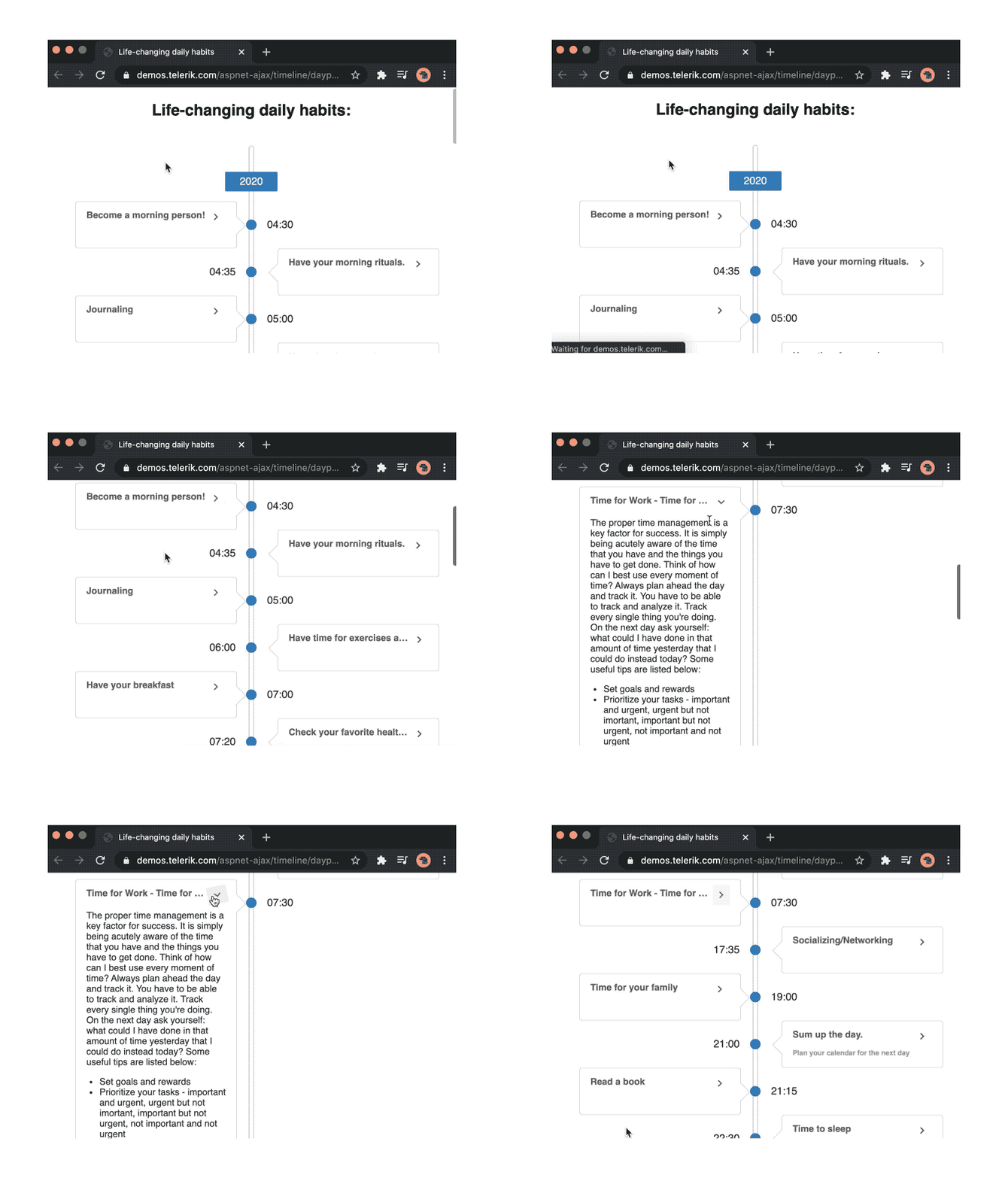
The run command is used to run a script, whether local or using a URL. To showcase an example, we are going to run a script URL found in Deno’s standard library example section on the Deno official website called welcome.ts.

$ deno run https://deno.land/std/examples/welcome.ts
Download https://deno.land/std/examples/welcome.ts
Warning Implicitly using master branch https://deno.land/std/examples/welcome.ts
Compile https://deno.land/std/examples/welcome.ts
>> Welcome to Deno 

The output of the script is Welcome to Deno. You can take a look at the code that gets executed by opening the URL we passed to run in the browser.

Let's run another example that will throw an error if we don't add permission. If you remember earlier, we talked about Deno's security, and how we need to add flags to give access to the scripts because Deno runs every script in a sandbox.

$ deno run https://deno.land/std/http/file_server.ts
Download https://deno.land/std/http/file_server.ts
Compile https://deno.land/std/http/file_server.ts
error: Uncaught PermissionDenied: read access to "C:\Users\Codak", run again with the --allow-read flag
    at unwrapResponse ($deno$/ops/dispatch_json.ts:43:11)
    at Object.sendSync ($deno$/ops/dispatch_json.ts:72:10)
    at cwd ($deno$/ops/fs/dir.ts:5:10)
    at Module.resolve (https://deno.land/std/path/posix.ts:27:17)
    at https://deno.land/std/http/file_server.ts:39:22

Let’s add the required flags and rerun the code. The flags are added immediately after deno run.

$ deno run --allow-read --allow-net https://deno.land/std/http/file_server.ts         >> HTTP server listening on http://0.0.0.0:4507/

Now that our file_server script is running perfectly, you can test it with localhost:4507/.

2. Install command

The install command is used to install script as an executable. We are going to use the file_server script we ran earlier, but this time we are going to install it.

$ deno install --allow-read --allow-net https://deno.land/std/http/file_server.ts
Warning Implicitly using master branch https://deno.land/std/http/file_server.ts
Download https://deno.land/std/path/mod.ts
Compile https://deno.land/std/http/file_server.ts
>> ✅ Successfully installed file_server
C:\Users\<USERNAME>\.deno\bin\file_server.cmd

The file will be downloaded and saved in my base directory C:\Users\username\.deno\bin\file_server.cmd. If you are on a mac it can be found at /Users/username/.deno/bin``/file_server .

To run the file, navigate to the base directory folder and run the name of the file file_server and the server will start up.

$ C:\Users\Codak\.deno\bin> file_server
>> HTTP server listening on http://0.0.0.0:4507/

It will also work if you just run file_server without navigating to the parent folder:

$ file_server

Code Formatting

As a Go developer, I love the go fmt command used to automatically format Go code; with Node.js, you probably use a third-party package like Beautify or Prettier. Deno ships with a deno fmt command, just like Go, that automatically formats the script and adds semicolons if omitted anywhere.

$ deno fmt index.ts

Conclusion

So far, we have touched some important aspects of Deno to get an overview of what Deno has to offer. I will leave a couple of resources here for further reading:

Again, if you’re already a server-side developer, I strongly recommend checking out Deno so you can see for yourself what you think. If you’re new to server-side, maybe start first with Node.js so you have a better understanding of what the Deno experience will mean for you.


Just Announced: Telerik and Kendo UI Release Week Live Webinars

$
0
0

The Telerik and Kendo UI webinars for R3 2020 are coming up! Catch a whole week of webinars from September 28th through October 2nd.
It’s release time of the year again!

The third release of 2020 for Telerik and Kendo UI is coming as planned on September 16, bringing major updates across .NET and JavaScript product lines.
Join our developer experts and products teams for the R3 2020 release week, packed with live webinars, Twitch demo sessions and exciting news.

Find out what’s new in your library of choice! 

Follow three quick steps and sign up for the webinar of your choice:

  1. Select the webinar from the list below
  2. Click the button “Save Your Seat”
  3. Register for the webinar

Each webinar will be complemented with a Twitch session right after, where you will be able to see more examples of using the new components and features, and questions live in the chat.

You can register for more than one webinar.

Telerik Web R3 2020 Webinar

Telerik Web Products R3 2020 Release Webinar

Live Webinar: September 28 @11:00 am – 12:00 pm ET

Blazor Twitch Session: September 28 @ 12:30 pm – 14:30 pm ET

Save Your Seat

Here are some of the highlights we will cover in the Telerik Web Products release webinar, plus a ton of product updates across Telerik UI for Blazor, Telerik UI for ASP.NET Core, Telerik UI for ASP.NET MVC, and Telerik UI for ASP.NET AJAX:

  • Telerik UI for Blazor now shines with 50+ truly native components and the most anticipated Grid features. In addition, Telerik enables Blazor integration across its toolset—Reporting, JustMock, Test Studio and Xamarin. 
  • Telerik UI for ASP.NET Core ships with support for the latest preview of .NET 5, along with many new components and improvements across the entire Core library.

Kendo UI for React Vue R3 2020 Webinar

KendoReact and Kendo UI for Vue R3 2020 Release Webinar

Live Webinar: September 29 @11:00 am – 12:00 pm ET

Twitch Session: September 29 @12:30 pm – 14:30 pm ET

Save Your Seat

Here are some of the highlights we will cover in the KendoReact and Kendo UI for Vue release webinar, plus a ton of product updates across KendoReact and Kendo UI for Vue:

  • KendoReact adds eight new components to its rich library. This includes the highly requested Gantt chart, which provides you with everything you need to add a UI component for performant, clean and good-looking project timelines. 
  • Kendo UI for Vue releases official Vue 3.0 support, along with new native UI components for Vue.

Kendo UI for Angular jQuery R3 2020 Webinar

Kendo UI for Angular and jQuery R3 2020 Release Webinar 

Live Webinar: September 30 @11:00 am – 12:00 pm ET

Twitch Session: September 30 @12:30 pm – 14:30 pm ET

Save Your Seat

Here are some of the highlights we will cover in the Kendo UI for Angular and jQuery release webinar, plus a ton of product updates across Telerik UI for Angular and Telerik UI for jQuery:

  • Kendo UI for Angular releases official Angular 10 support across the entire suite, along with new AppBar, ListView and Range Slider components.
  • Kendo UI for jQuery enriches its library with new Image Editor, Wizard and Loader components, along with many improvements across the entire jQuery library.

Telerik Desktop and Mobile R3 2020 Webinar

Telerik Desktop and Mobile Products R3 2020 Release Webinar

Live Webinar: October 1 @11:00 pm – 12:00 pm ET

Twitch Session: October 1 @12:30 pm – 14:30 pm ET

Save Your Seat

Here are some of the highlights we will cover in the Telerik Web Products release webinar, plus a ton of product updates across Telerik UI for WPF, Telerik UI for WinForms, Telerik UI for WinUI and Telerik UI for Xamarin.

  • Telerik UI for Xamarin ships Blazor Bindings support for AutoCompleteView and DataGrid controls.
  • Telerik UI for WPF and WinForms release support for the latest preview of .NET 5, along with the most requested components and many improvements across both libraries.

Telerik Reporting Testing R3 2020 Webinar

Telerik Reporting and Testing R3 2020 Release Webinar

Live Webinar: October 2 @11:00 am – 12:00 pm ET

Twitch Session: October 2 @12:30 pm – 14:30 pm ET

Save Your Seat

Here are some of the highlights we will cover in the Telerik Reporting and Testing release webianr, plus a ton of product updates across Telerik Reporting, Telerik Report Server, Telerik Test Studio Dev Edition and Telerik JustMock:

  • Telerik Reporting introduces dedicated wizards for new WebService, JSON and CSV data sources to the Web Report Designer.
  • Telerik Test Studio Dev Edition ships exclusive Blazor support through unique ready-to-use translators, enabling easy test automation of the most popular Telerik UI for Blazor components.
  • In addition, Telerik Reporting and Telerik Test Studio Dev Edition enable integration with the full Telerik and Kendo UI suites, including Blazor. 

We’re All Ears!

The live webinars and Twitch sessions are a great opportunity for you to ask questions before and during the webinars. We’ll be waiting to hear from you on Twitter—please use the #heyTelerik and #heyKendoUI hashtag to join the conversationand on CodeItLive, our Twitch channel, via the live chat.

Sign up today to make sure you don’t miss these great events with our experienced developer advocates Ed Charbeneau, Microsoft MVP, speaker, author of Blazor: A Beginner’s Guide and host of Blazing into Summer week of Blazor events, Sam Basu, Microsoft MVP, speaker, DevReach co-organizer and author of numerous articles on Xamarin.forms, Alyssa Nicoll, Google Developer Expert, TJ VanToll, host of React Wednesdays, and Carl Bergenhem, speaker and host of a ton of JavaScript events.

Check Out All Our Webinars

Let’s Get Together: Kendo UI Release Webinars, 29-30 Sept

$
0
0

The R3 2020 release of Kendo UI is almost here! Join us on September 29th and 30th for webinars and Twitch sessions to get the latest.

Check out the latest additions to your favorite JavaScript UI component libraries for Angular, React, Vue and jQuery: the third Kendo UI release for 2020 coming as planned on September 16, bringing major updates!

Join our developer experts Alyssa Nicoll and TJ VanToll, and Kendo UI product manager Carl Bergenhem for the live R3 2020 release webinars and Twitch demo sessions. This way, you’ll be first to hear all the exciting news around this release straight, in live interaction with our team.

The release webinars will feature a concise overview of the major product updates. The follow-up Twitch sessions will show the new components and features in action with demos and code examples.

On Sept 29, join us for the KendoReact & Kendo UI for Vue release webinar & Twitch session:

Kendo UI for React Vue R3 2020 Webinar

Save Your Seat

On Sept 30, join us for the Kendo UI for Angular and Kendo UI for jQuery release webinar & Twitch session:

Kendo UI for Angular jQuery R3 2020 Webinar

Save Your Seat

Kendo UI Libraries R3 2020 Release Highlights

KendoReact adds eight new components to its rich library. This includes the highly requested Gantt chart, which provides you with everything you need to add a UI component for performant, clean and good-looking project timelines. You will also find that your React UI library now includes an App Bar, Text Area, Rating, Chip & ChipList, Badge and Loader components.

Make sure you also check out the new features added to the React Grid and Editor components. A major behind-the-scenes update of our website will surprise you with faster load times for the KendoReact documentation and demos, among other improvements.

Kendo UI for Vue releases official Vue 3.0 support, along with new native UI components for Vue: ComboBox, AutoComplete and MaskedTextBox.

Kendo UI for Angular releases official Angular 10 support for the entire suite, along with new ListView, Loader, AppBar, Input, Breadcrumb, RangeSlider and Badge components. But wait, there’s more: Angular Grid improvements, updated form components and improved documentation and demos pages for faster load times.

Kendo UI for jQuery adds six new components: Wizard, Image Editor, Loader, App Bar, Pager and Text Area, along with many improvements across the entire jQuery library.

We’re All Ears!

The live webinars and Twitch sessions are a great opportunity for you to ask questions before and during the webinars. We’ll be waiting to hear from you on Twitter—please use the #heyKendoUI hashtag to join the conversation—and on CodeItLive, our Twitch channel, via the live chat.

Sign up today to make sure you don’t miss these great events with our experienced developer advocates and product managers, Alyssa Nicoll, Google Developer Expert, and TJ VanToll, host of React Wednesdays, and Carl Bergenhem, speaker and host of a ton of JavaScript events!

Save Your Seat: React & Vue

Save Your Seat: Angular & jQuery

Optical Adventures in Test Automation—to OCR or Not to OCR

$
0
0

It is challenging to automate scenarios where the data inside complex visual elements needs to be verified. With its new OCR features, Test Studio enables the user to extract, validate and reuse content from images, logos, charts and other elements—ensuring tricky and cumbersome scenarios are covered during web UI test automation. 

Do You See What I See?

Being able to make the computer see what you see with your own eyes, and then make the machine apply what it has “seen” to your needs, is an exciting experience. Imagine a scenario, where it feels just natural to look at an element on your website and use its contents in a search field, so that you can extract a filter from it and apply it to a list of items, literally, in a blink of an eye. With OCR you can run this extraction-verification cycle for any visual element on your site, be it a logo, graph, chart, etc., no matter how unconventional it is visually, and disregarding the complexity of the element’s find logic.

Yes, We Can!

We on the Test Studio team have just come up with a simple solution to the task at hand. With the latest release, R2 2020, there’s a set of features that will come in handy in scenarios like the above. You can now verify an entire image or parts of an image through pure visual comparison. You can extract text from a complex image containing both dynamic and static data. Even more, you can extract text from an image, assign it to a variable including validating data against the data source and use the captured string to populate input fields. Let’s put all that into action with a simple demonstration of the power of the brand-new Optical Character Recognition (OCR) features in Test Studio.

Show Me What You’ve Got!

Let’s say we have a conventional mail inbox and all of the navigation buttons are images. 

OCR Automated Testing

How would you verify that the image of the “Inbox” button is not swapped with the “Sent” one? The first thing that comes to mind is to compare the src attribute of the element with the actual one. Would that be enough? Or are there any cases in which we’ll receive a false positive error? Yes, there are. Some common scenarios are:

  • The image is not loading
  • The image at the src location is incorrect

To avoid such scenarios, you can use our new “Image Verification” step, which takes a snapshot of the element during recording and during test execution compares that snapshot with the actual image.

To record such a step, highlight the element which you would like to verify and select “Build Step…” from the drop down. Then from the Recorder window go to the “Verifications” tab, select “Image” and click “Add Step.”

OCR Automated Testing

OCR Test Automation

This is awesome, right? Now you are sure that the image is loaded successfully and is the one you have recorded.

But what will happen if the image of the element we are verifying contains some dynamic content like user input, dates, etc.? The test will fail intermittently with no actual bug at hand. The good news is that we’ve got you covered. You can select a part of the element and verify that the specific part is present in the element during execution. To accomplish this, you just need to uncheck “Verify Entire Image” and adjust the selection according to your preferences.

Verify Image Test Automation

Don’t stop there, go a bit further with our optical adventures. In our mail inbox we have a list of email messages with the sender as a header.

OCR Test Automation

It would be nice to be able to just look at a single sender, extract his name as we see it, apply that name to a search field and see the results for that sender only. And then, do that again for another sender, using the steps we already described above. Let’s see how that works with the new OCR features in Test Studio.

First, we pick the element of the sender of choice, and from the contextual menu of the element we choose the option to Extract—text with OCR from image:

OCR Extract Text

This action has automatically created a DataBindVaribale for us, containing the OCR-ed text from the element, so that we can use it in other steps later. For example, add a step that inputs the text from that variable to the search field of the mailbox.

OCR Extract Text Data Binding

And then, you can use the OCR verification step to make sure you’ve shown only senders that match your filter, again, from the quick context menu:

OCR Verify Text

And you’re done!

Still, there’s an alternative way to get to the OCR features, where you can play around a bit more with the extraction capabilities of Test Studio’s recorder. If you locate the element in the DOM-tree, you’ll find a new action in the step builder—TextFromImage. There, you can select a part of the image to extract text from, in correspondence with your specific scenario.

OCR Image Test Automation

To OCR or Not to OCR?

You’re just a few clicks away from automating a relatively complex scenario, using Test Studio’s new OCR features for advanced test automation. We’ve added these steps to the sample project, which you can explore from Test Studio’s Get Started section on the Welcome Screen, or play around with your own test cases. Just give it a go and let us know what you think.

Want to try out the exciting new OCR features? Start a free 30-day trial today with full support by our dedicated support team to help you complete a successful evaluation.

Try Test Studio

The Reality of Using AR in Mobile Apps in 2020

$
0
0

In this post, we'll explore the pros, cons and valid use cases for using augmented reality in your mobile app development in 2020.

It wasn’t too long ago that augmented reality was predicted to become one of the “it” trends in web development. But in recent years, it’s fallen by the wayside in favor of technologies like chatbots, AI, and voice search.

So, what does that mean for AR?

While AR certainly isn’t a mainstay in mobile app development, it’s not completely out of the picture either.

The fact of the matter is, there are some challenges to building AR into apps. But it’s not as though we don’t have tools and kits to make it easier (thanks to companies like Google, Apple and Progress!).

So, let’s take a look at what’s really going on:

  • Why has AR been sluggish in taking off?  
  • What are some use cases you should consider using AR for in mobile app development? 

The Reality of AR in Mobile App Development

It’s not really complicated to see why there was so much excitement over augmented reality in previous years. Nor is it too complicated to see why it hasn’t been as quick to catch on as many experts predicted.

But let’s start with the positives, shall we?

The Pros of AR

  • Developers can create awe-inspiring and next-level mobile app experiences when merging reality with digital interfaces. 
  • AR can convert mobile apps from passive, observer-like experiences to more engaging ones, and thus, help improve user retention rates.  
  • Depending on how it’s used, developers could effectively streamline the sales funnel and get more users to convert in a shorter amount of time with AR. 
  • AR doesn’t require users to buy expensive headsets or other tech, so developers can continue to build for the existing mobile app user base.  

The Cons of AR

  • Users have grown quite weary in terms of data privacy. Asking them to open their cameras and lives to AR will only give them another thing to be skeptical of.  
  • You need to be extra careful with how it’s designed if it has real-world applications and there’s the possibility of injury while using it (like Pokémon GO).  
  • AR can be expensive and difficult to build. Not only that, it can cause a serious drain on resources. If not accounted for, users could end up with an app that crashes regularly. 

That said, with all the possible objections that exist, there’s no denying how beneficial it would be to get your app into the augmented reality space.

How App Developers Can Put AR to Work

As this data from eMarketer shows, there will continue to be big growth in the number of monthly AR users in 2020 and beyond.

eMarketer- Augmented-Reality-Users

As familiarity grows, so too will the number of use cases in which web developers can put AR to work. And I’m not just talking about social media networks like Instagram or Snapchat.


Instagram-Animal-Filter

In fact, there are a ton of mobile apps that show us what’s possible and why their specific use cases are ideal for AR technology and content. Let’s have a look:

Product Demos

Although consumers seem to have no problem with online shopping, how do your ecommerce clients feel about having to handle higher-than-average returns or refunds because the items weren’t as expected, or didn’t fit right in the real world?

It’s not easy shopping online. Even the most helpful of customer reviews can’t always encapsulate what it’s like to use a product, wear an article of clothing, etc.

Augmented reality can help solve this problem. For example, this is the mobile app for Wanna Kicks:

WannaKicks-Privacy-Statement

From the very beginning, this app does a nice job of putting shoppers’ minds at ease with this Welcome page and description of the company’s privacy policy. If you’re putting AR technologies into your app, then this is a must.

The interior of the app is just as well-thought-out and composed. The layout is simple and easy to follow, and the sneaker pics look fantastic.

WannaKicks-Shoes

Wanna Kicks has sneakers available in the latest styles and from top brands. All users have to do is:

  • Choose the sneakers they want to try on
  • Remove their shoes (and, preferably, socks)
  • Point their phones at their feet

In turn, this is what the AR technology will do:

WannaKicks-Tryon

It’s not flawless. If you turn your feet a certain way, users might see their toes or soles of their feet sticking out the other side.

Nevertheless, it gets the job done. It provides shoppers with a quick and easy way to try on a bunch of shoes without ever having to leave the comfort of their home. If you want more satisfied online shoppers and greater user retention rates, AR could do wonders for your app.

Appearance Changes

It’s not just products that consumers want to or should try on before buying. You could argue that changes to one’s appearance are more important to test out beforehand, as many of them are expensive, non-refundable, and permanent.

L’Oreal, for instance, has the Style My Hair app, which allows people to not only try on new hairstyles and cuts, but also hair colors as well. To save consumers from having to live with a bad haircut until it grows out or an awkward color until it fades, L’Oreal gives them the chance to explore the possibilities virtually.

It’s not just hair, makeup or glasses that users can try on to transform their looks either.

INKHUNTER is a mobile app that enables users to see a tattoo on their body without actually having to get inked.

As AR objects need a physical space to be set down in the real world, INKHUNTER uses that same principle and instructs users how to turn their skin into that physical space.

InkHunter-Quick-Directions

Once they do that, they’re given free rein of the app, either to explore the INKHUNTER tattoo gallery or to upload one of their own:

InkHunter-Tattoos-Gallery

Once the user finds a tattoo they like, all they need to do is click the “Try” button and point the phone at their body to give the tattoo a spin:

InkHunter-Tattoo-Try-Button

In addition to being able to see how the tattoo looks and fits on their body, they can take a picture of it and share with others.

InkHunter-Share

Consumers always want buy-in from others, so not only would they get a boost in confidence from your AR app, but also from others who can yea or nay the decision before it becomes a reality.

Bottom line: if your app is in the business of helping people transform themselves in some way, AR could increase their confidence in making those decisions. In turn, it would lead to more revenue as users spend less time worrying about the what-ifs and more time going after what they want.

Training and Tutorials

One of the nice things about the web is that you can get answers to pretty much any question you have. And what’s especially useful is when you’re looking for help with something tangible and find a video that clearly explains what to do, step by step.

You could certainly integrate written and video tutorials into your mobile app. But one of the problems with providing users with self-guided tutorials is that it can make the process take longer than it needs to as they pause, turn to the thing they’re working on, rewind, make sure they did it correctly, and proceed. Over and over again.

Want to see how AR could help them pick up the pace?

This is JigSpace:

JigSpace-Jig-Library

This app provides a number of resources that break down complicated subjects into easy-to-follow 3D tutorials.

Here’s an example of one of the “How-To” tutorials, Fix a Leaky Tap:

JigSpace-Fix-a-Leaky-Tap

Because this is a tutorial on how to fix an issue in one’s home, the user could realistically set their “Jig” right next to the actual sink they’re working on.

JigSpace-Place-Jig

Here’s a quick walk-through of how this interactive tutorial works.

JigSpace-Tutorial

Note that every time you see something move in or around the sink, it’s triggered by the arrow buttons in the bottom-right corner, making this a much easier tutorial to get through than a video that just keeps going and going.

This kind of AR technology could be used for all kinds of apps:

  • Home improvement 
  • On-the-job training 
  • Education (grade school through college) 
  • Medicine  
  • Advanced technologies 

Basically, if you have complicated ideas or instructions you need to walk your users through, and you have enough of them to share, AR would be a fantastic addition to your app.

Education

It’s not just lessons that students would benefit from seeing broken down by AR. Think about the various subject matter they learn about in school and how difficult it can be for them to stay engaged with it or to recall information after solely reading about it in a book.

There’s a great opportunity here for education apps to turn boring or difficult-to-understand topics into ones that are more engaging and interactive.

Take solAR, a mobile app that provides information on the planets of the Milky Way:

SolAR-Regular-Planet-View

Users don’t have to view the planets in AR, but the experience is exponentially better if they do. While they can interact with the planet model in the example above, there’s something special about being able to walk around a 3D representation of it in your home or at school:

SolAR-Example

Here you can see that I’ve placed the Earth and Moon model in my apartment before switching to a view of Venus. It’s a really neat experience, especially if you compare it to the oftentimes boring and painful studying of material from a book.

What’s more, the app doesn’t just allow users to view a 3D model. They can:

  • Click on it and move the planet around
  • Pause the rotation
  • Pinch to shrink or expand the model
  • Walk around it to observe the planet from various angles
  • Open up brief information about the planet to reinforce what they’re seeing and touching

While this form of AR won’t necessarily lead to an increase in product sales, it will lead to more users. And for a very low cost of entry, you could probably monetize this kind of educational AR app right from the very start considering how valuable it is for learners.

Gaming

This is an obvious one, considering what Pokémon GO did to bring augmented reality to the forefront of pop culture in 2016. However, I don’t just see AR as a way for mobile games to level up. I see AR as a way for console gaming to enter the mobile app space.

With gaming systems costing users hundreds of dollars (e.g. the Playstation 5 is predicted to go for $499)—not to mention the cost of games, memberships, and upgrades—this can easily become a very expensive hobby for gamers. So, what if game studios took their popular but pricey console games to the mobile app market? And, not only that, but created more immersive experiences with AR?

Although this particular mobile app game doesn’t have a console counterpart, I think it’s proof that this kind of concept would work well across platforms. It’s called The Birdcage:

The-Birdcage-Splash-Page

As you can see on this splash page, users can choose one of two modes: Normal or AR.

The augmented reality mode places a locked birdcage into the room of the user. They’re given hints about how they’re to unlock the cage and set the bird free like this:

The-Birdcage-Mission

If you watch the short snippet of my gameplay below, you’ll see that it’s not at all different from the kinds of puzzle games you’d play on your computer or XBOX. The key difference is that you’re forced to move around a virtual object that now exists in your living space.

The-Birdcage-Game

There are lots of game types this would work well for. Adventure, mystery and puzzle games could be translated into shorter form and more cost-effective formats for mobile apps. What’s more, AR applications turn users’ homes into a sort of escape room, which is a very popular concept right now.

Even if there isn’t a console counterpart, there’s a lot that can be done to enhance gameplay by putting it into a real-world setting. If your mobile game does well in terms of users, but retaining them is a problem, this could be the kind of shake-up you need.

Wrap-up

While it’s easy to see why developers and app owners are reluctant to go full-speed ahead with AR, there’s so much that can be gained if you find the right application for it.

As you can see from the examples above, it’s not about using augmented reality as a gimmick. Instead, it should be used to create a more interactive and immersive experience, from trying out products to bringing a game into one’s home.

How to Build a RESTful API with Deno

$
0
0

In this post we are going to build a full-fledged contact API with Deno—a simple, modern, and secure runtime for JavaScript and TypeScript that uses V8 and is built with Rust.


Build a RESTful API with Deno

In the first part of this series, we touched on the fundamentals of Deno, and also covered things like features, standard library, installation, and much more. In this post, we will build a RESTful API. If you are a total newbie to server-side programming, this post will make you comfortable with the runtime.

Here is a list of some REST microframeworks for Deno:

We are going to use the abc framework to build the contact API.

The Contact API

The API we are going to build will be able to:

  • Create a contact and store it in a MongoDB database
  • Retrieve one or more contact from the database depending on the request
  • Update an existing contact in the database
  • Delete any contact in the database upon request

We’ll do this in TypeScript, but nothing stops you from building the API in JavaScript—you can remove the types, and you are good to go.

PS: In the previous post, I have already gone through how to install Deno, so feel free to check that out, or follow the official denoland installation on githhub.

Set up MongoDB Atlas

To be able to use MongoDB’s cloud services, you’ll need a MongoDB Atlas account. To create one, go to its home page and sign up or log in if you have an account.

MongoDB Log in

After successful authentication, you’ll need to create a project. Name the project and click on the Next button.

MongoDB Name Project

Next, click on the Create Project button.

MongoDB Create a Project

NOTE: A MongoDB cluster is the word usually used for sharded cluster in MongoDB. The main purposes of a sharded MongoDB are:

  • Scale reads and writes along several nodes of the cluster
  • Each node does not handle all of the data, so you can separate data along all the nodes of the shard—each node is a member of a shard, and the data are separated on all shards

For more information, read the official docs. Now, we need to create a cluster for our project, so click on Build a Cluster.

MongoDB Build Cluster

Click on the Create Cluster button in the Cluster Tier section and select the Shared Cluster option to create your free tier cluster.

MongoDB Cluster Tier

To minimize network latency, you’d ideally pick a close region. Click on the Create Cluster button.

NOTE: If you are developing on the cloud, choose the corresponding cloud provider.

Create a Starter Cluster

MongoDB Atlas will now take about three to five minutes to set up your cluster.

MongoDB Cluster Sandbox

Before you start using the cluster, you’ll have to provide a few security-related details. Switch to the Database Access tab, and then click on Add New Database User.

MongoDB Add Database User

In the dialog that pops up, type in your desired Username and Password, select the Read and write to any database privilege, and click the Add User button.

MongoDB Add User

Next, in the Network Access section, you must provide a list of IP addresses from which you’ll be accessing the cluster. Click on the Network Access tab and select Add IP Address.

MongoDB Add IP Address

For the sake of this demo, click on the Allow Access From Anywhere to autofill the Whitelist Entry field, then click on the Confirm button.

NOTE: This is just for development; in a production environment, you will need to input the static IP of the server that will be accessing the database.

MongoDB Confirm Added IP Address

Lastly, you will need a valid connection string to connect to your cluster from your application. To get it, go back to the Cluster tab and click on Connect.

MongoDB Connect

Now, click on Connect Your Application.

MongoDB Connect Your Application

So currently, there is no official Deno connection string yet, but we will use the Node.js connection string. Select Node.js in the DRIVER dropdown, VERSION 2.2.12 or later. Click on Copy.

MongoDB Connection String

NOTE: The connection string won’t have your password, so you’ll have to fill it in the placeholder manually.

Set up Server

Create a project directory:

mkdir contactAPI

Create a .env file:

touch .env

Inside the .env file, create a database name and paste the connection string we copied earlier from MongoDB:

DB_NAME=<database name>
DB_HOST_URL=<connection string>

Next, create a folder called utils, and inside it create a file middleware.ts:

mkdir utils
touch middlewares.ts

Below we have two middlewares set up, for logging every request and to handle errors caught in the controllers:

// middlewares.ts
import { MiddlewareFunc, Context } from "https://deno.land/x/abc@v1.0.0-rc2/mod.ts";
export class ErrorHandler extends Error {
status: number;
constructor(message: string, status: number) {
super(message);
this.status = status;
}
}
// LogHandler - Middleware
export const LogMiddleware: MiddlewareFunc = (next) =>
async (c) => {
const start = Date.now()
const { method, url, proto } = c.request
await next(c);
console.log(JSON.stringify({
time: Date(),
method,
url,
proto,
response_time: Date.now() - start + " millisecond",
response_status: c.response.status
}, null, "\t"))
}

// ErrorHandler - Middleware
export const ErrorMiddleware: MiddlewareFunc = (next) =>
async (c) => {
try {
await next(c);
} catch (err) {
const error = err as ErrorHandler;
c.response.status = error.status || 500;
c.response.body = error.message;
}
};

Now, it’s time to write our server code. Let’s start by creating a main.ts file in the project directory:

touch main.ts
// main.ts
import { Application } from "https://deno.land/x/abc@v1.0.0-rc2/mod.ts";
import "https://deno.land/x/dotenv/load.ts";
import {
getAllContact,
createContact,
getOneContact,
updateContact,
deleteContact,
} from "./controllers/contacts.ts";
import {
ErrorMiddleware,
LogMiddleware
} from "./utils/middlewares.ts";
const app = new Application();
app.use(LogMiddleware)
.use(ErrorMiddleware)
app.get("/contacts", getAllContact)
.post("/contact", createContact)
.get("/contact/:id", getOneContact)
.put("/contact/:id", updateContact)
.delete("/contact/:id", deleteContact)
.start({ port: 5000 });
console.log(`server listening on http://localhost:5000`);

In the first line, notice how we import modules from the internet directly using the URL.

The second line imports the dotenv module to load the environment variables from the .env file. The rest of the code is similar to express, nothing special.

Now, we need to configure our database to interact with the server. We are going to use deno_mongo, a MongoDB database driver developed for Deno. It is under active development and does not contain the different methods of a full-fledged MongoDB driver for now.

mkdir models
touch db.ts
// db.ts
import { init, MongoClient } from "https://deno.land/x/mongo@v0.8.0/mod.ts";
class DB {
public client: MongoClient;
constructor(public dbName: string, public url: string) {
this.dbName = dbName;
this.url = url;
this.client = {} as MongoClient;
}
connect() {
const client = new MongoClient();
client.connectWithUri(this.url);
this.client = client;
}
get getDatabase() {
return this.client.database(this.dbName);
}
}
const dbName = Deno.env.get("DB_NAME") || "contactdb";
const dbHostUrl = Deno.env.get("DB_HOST_URL") || "mongodb://localhost:27017";
console.log(dbName, dbHostUrl)
const db = new DB(dbName, dbHostUrl);
db.connect();
export default db;

Here, I created a class DB; then, I instantiated the class with the DB_NAME and DB_HOST_URL parameter retrieved from the environment variable.

NOTE: Deno.env.get() is used to retrieve the environmental variable we set earlier.

Now, it’s time to set up our controllers.

mkdir controllers
touch contracts.ts
// contracts.ts
import { HandlerFunc, Context } from "https://deno.land/x/abc@v1.0.0-rc2/mod.ts";
import db from '../models/db.ts';
import { ErrorHandler } from "../utils/middlewares.ts"
const database = db.getDatabase;
const contacts = database.collection('contacts');
interface Contact {
_id: {
  $oid: string;
};
name: string;
age: number;
email: string;
address: string;
}
...

First of all, we imported the type HandlerFunc from the abc module. It will be the type assigned to all our handler functions. Then we used the getDatabase method we created earlier to retrieve our Database class. Next we used the collection method to set up our collection. The interface Contact is used when we want to fetch all the contacts in our collection.

createContact: Add the contact to the database.

// createContact
export const createContact: HandlerFunc = async (c: Context) => {
try {
if (c.request.headers.get("content-type") !== "application/json") {
throw new ErrorHandler("Invalid body", 422);
}
const body = await (c.body());
if (!Object.keys(body).length) {
throw new ErrorHandler("Request body can not be empty!", 400);
}
const { name, age, email, address } = body;
const insertedContact = await contacts.insertOne({
name,
age,
email,
address
});
return c.json(insertedContact, 201);
} catch (error) {
throw new ErrorHandler(error.message, error.status || 500);
}
};
...

Testing on Postman: Making a POST request on /contact. Start the server, and make sure to use the appropriate flags of course:

deno run --allow-write --allow-read --allow-plugin --allow-net --allow-env --unstable ./main.ts

The first time you run the server, Deno will download and cache the dependencies. The next time should look something similar to this in your terminal.

INFO load deno plugin "deno_mongo" from local "~/.deno_plugins/deno_mongo_40ee79e739a57022e3984775fe5fd0ff.dll"
server listening on http://localhost:5000

Postman Test: Create Contact

getAllContact: This retrieves all the contact in the database.

// getAllContact
export const getOneContact: HandlerFunc = async (c: Context) => {
try {
const { id } = c.params as { id: string };
const getContact = await contacts.findOne({ _id: { "$oid": id } });
if (getContact) {
const { _id: { $oid }, name, age, email, address } = getContact;
return c.json({ id: $oid, name, age, email, address }, 200);
}
throw new ErrorHandler("Contact not found", 404);
} catch (error) {
throw new ErrorHandler(error.message, error.status || 500);
}
};
...

Testing on Postman: Making a GET request on /contacts.

Postman Test; Get All Contact

getOneContact: Retrieve one contact in the database by id.

// getOneContact
export const getOneContact: HandlerFunc = async (c: Context) => {
try {
const { id } = c.params as { id: string };
const getContact = await contacts.findOne({ _id: { "$oid": id } });
if (getContact) {
const { _id: { $oid }, name, age, email, address } = getContact;
return c.json({ id: $oid, name, age, email, address }, 200);
}
throw new ErrorHandler("Contact not found", 404);
} catch (error) {
throw new ErrorHandler(error.message, error.status || 500);
}
};
...

Testing on Postman: Making a GET request on /contact/:id.

Postman Test: Get One Contact

updateContact: It will update the contact with the specified id in the database.

// updateContact
export const updateContact: HandlerFunc = async (c: Context) => {
try {
const { id } = c.params as { id: string };
if (c.request.headers.get("content-type") !== "application/json") {
throw new ErrorHandler("Invalid body", 422);
}
const body = await (c.body()) as {
name?: string;
age?: number;
email?: string;
address?: string;
};
if (!Object.keys(body).length) {
throw new ErrorHandler("Request body can not be empty!", 400);
}
const getContact = await contacts.findOne({ _id: { "$oid": id } });
if (getContact) {
const { matchedCount } = await contacts.updateOne(
{ _id: { "$oid": id } },
{ $set: body },
);
if (matchedCount) {
return c.string("Contact updated successfully!", 204);
}
return c.string("Unable to update contact");
}
throw new ErrorHandler("Contact not found", 404);
} catch (error) {
throw new ErrorHandler(error.message, error.status || 500);
}
};
...

Testing on Postman: Making a PUT request on /contact/:id.

Postman Test: Update Contact

deleteContact: This deletes the contact with the specified id in the database.

export const deleteContact: HandlerFunc = async (c: Context) => {
try {
const { id } = c.params as { id: string };
const getContact = await contacts.findOne({ _id: { "$oid": id } });
if (getContact) {
const deleteCount = await contacts.deleteOne({ _id: { "$oid": id } });
if (deleteCount) {
return c.string("Contact deleted successfully!", 204);
}
throw new ErrorHandler("Unable to delete employee", 400);
}
throw new ErrorHandler("Contact not found", 404);
} catch (error) {
throw new ErrorHandler(error.message, error.status || 500);
}
};

Testing on Postman: Making a DELETE request on /contact/:id.

Postman Test: Delete Contact

You can find the full source code on Github.

Viewing all 4175 articles
Browse latest View live


<script src="https://jsc.adskeeper.com/r/s/rssing.com.1596347.js" async> </script>