Quantcast
Channel: Telerik Blogs
Viewing all 4175 articles
Browse latest View live

Understand Recoil in React

$
0
0

Learn about the new library introduced by Facebook called Recoil, which aims to solve a few problems such as shared state, derived data and queries, app-wide observation, and many more.

A developer never stops learning, especially in this time when new libraries and concepts are created almost every day. Part of a developer’s job is to always be aware of what’s happening, what’s been released, and to know if there’s something new being talked about in the community.

React is known for being the best and most-used JavaScript UI library now, and there’s a lot of reasons for that. One of the main reasons React is so popular is the community—it’s always creating and releasing something new that can improve the job of React developers.

This year at the React Europe 2020 conference, the React community was introduced to a new state management library created by Facebook called Recoil. Another state management library for React? What are the benefits of using this new library and not something more familiar and robust, with more examples and use cases, such as Redux?

So, in this article, we will learn more about this state management library called Recoil and understand its use cases, the differences from other state management libraries, and how we can start to use it in our projects.

Why Recoil?

Most state management libraries serve simple applications really well—those applications that don’t have many complex features and need the job to be done quickly. In some cases, we might need to use something more complex to solve a specific problem, and that’s when conventional libraries might not help us any further.

There’s nothing wrong with Redux or MobX, the most popular libraries for React applications. These libraries are useful and, in the majority of cases, they’re enough to keep your state data in order and allow your application to scale very well. The only problem with these libraries is that they require a lot of configuration and we need to set up a bunch of things before getting started, especially with Redux.

To work with Redux, for example, there’s a lot of work that needs to be done to set up a simple store before starting to manage your application state. Most of the time we use third-party libraries for things such as memorization, computed selector values, etc. In these specific cases, Redux cannot help us. So there’s a limit to what we can do and achieve with Redux alone.

The team inside Facebook that created Recoil faced some problems while working in internal app development. For most of the features that they needed, a conventional state management library could not help them, or they would waste a lot of time on it. Things like state sync between components, derived state, app-wide observation, etc.

A few points that Recoil has that make this new state management library very powerful:

  • Shared state— Share the same state in different components in the React tree in a way that’s really performant and consistent.
  • Derived data and queries — Compute things based on changing state efficiently in a very robust and bug-free way. Derived data are things that are computed or related to the state in some way.
  • App-wide state observation — Observe changes, time-travel debugging, persistence, logging—observe everything that’s happening in the app from some component.

Here are the two core concepts that we should learn before starting to use Recoil:

Atoms

An atom is a changeable, subscribable unit of the state. Imagine atoms as a local React state, which any component can subscribe to. Atoms are updatable and subscribable, and changing the value of an atom will re-render every component that’s subscribed to that specific atom. All the components that are subscribed to an atom are sharing the same state.

This is how we can create an atom using Recoil:


const loadingState = atom({

key: 'loadingState',

default: false

});

To create an atom we need to provide a key, which should be a unique value. This key is used for persistence, debugging, etc. Also, we need to provide the default value of our atom, it can be anything such as arrays, objects, strings, functions, etc.

For a component to subscribe to an atom, we need to use the useRecoilState hook. It’s a hook similar to the useState from React, but inside this hook, we pass the atom that we want to subscribe to.


import { atom } from 'recoil';

const loadingState = atom({

key: 'loadingState',

default: false

});

const App = () => {

const [loading, setLoading] = useRecoilState(loadingState);

...

}

Sometimes, we just want to return the value of a specific state. This is very possible and simple to do with Recoil. We can return only the value of an atom, without the setter function, using the useRecoilValue hook.


import { atom } from 'recoil';

const loadingState = atom({

key: 'loadingState',

default: false

});

const App = () => {

const loading = useRecoilValue(loadingState);

...

}

Selectors

A selector is a pure function that can receive an atom or a selector as an input. Given an input, the selector returns a modified state every time the upstream atoms or selectors are updated. Selectors can also be subscribed to, and again, when the selector changes, every component that’s subscribed to that specific selector will be re-rendered.

To create a selector, we need to provide a key, which needs to be a unique value and a get function. This get function returns a modified piece of an atom.


import { selector } from 'recoil';

const checkLoadingState = selector({

key: 'loadingState',

get: ({ get } ) => {

const loading = get(loadingState)

return `Loading is ${loading ? "true" : "false}`

});

Recoil has a pretty simple and powerful API, so everyone can get started easily and quickly with this new state management library. Now that we know a little bit about Recoil, let’s build something so we can see how it works in practice.

## Getting Started

Now that we know the basics of Recoil, the best way to understand it is by creating something. Let’s create an example where we can share the state of our logged-in user between components.

First, let’s create a new create-react-app:

create-react-app recoil-example

Now, let’s install Recoil:

yarn add recoil

In order to use Recoil state, we need to wrap our desired components with a root component called RecoilRoot. Now, we’re able to use Recoil state inside the components that are inside RecoilRoot.

In our App component, we’re going to import the RecoilRoot and put all our components inside it:


import { RecoilRoot } from 'recoil';

const App = () => {

return (

<_RecoilRoot_>

...

</_RecoilRoot_>

);

}

Now, before we create our components to show our state, we’re going to create an atom and a selector. Let’s create a file called helpers. Inside this file, we will import the atom and selector functions from Recoil.

import { atom, selector } from "recoil";

Here’s what we want to do, so things will get clear. We want to create an atom where we can get the current logged-in user. We’re going to create an atom called loggedInUserState and, as a default value, we can pass any name we want.


export const loggedInUserState = atom({

key: 'loggedInUserState',

default: {

name: "John"

}

})

Now, we’re going to create our selector. Our selector will just return a message by getting the name of the current logged-in user. We’re going to create a selector called loggedInUserSelector, and this is how it will look:


export const loggedInUserSelector = selector({

key: 'loggedInUserSelector',

get: ({ _get_ }) => {

const user = get(loggedInUserState)

return `Hello ${user.name}, you're logged in!`

}

})

Inside our loggedInUserSelector selector, we’re using the get function to get the current logged-in user passing our loggedInUserState atom and returning a message.

We’re going to create two components: Header and Dashboard. Inside our Header component, we will just show the current logged-in user. Let’s create our Header component, like this:


import React from "react";

const Header = () => {

return (

<header>

<h3>Logged in</h3>

</header>

)

};

export default Header;

Inside our Header component, we’re going to import our loggedInUserState atom and a hook from Recoil. We’re going to use the useRecoilValue since in this Header component we’re just going to show the current logged-in user.

Let’s import our loggedInUserState and constant called loggedInUser and display the name of the current logged-in user inside our h3 element. Inside our useRecoilValue, we’re going to pass our loggedInUserState atom, which means that now this component is subscribed to this atom, so every time this atom changes this component will be re-rendered.


import React from "react";

import { useRecoilValue } from 'recoil';

import { loggedInUserState } from "./helpers";

const Header = () => {

const loggedInUser = useRecoilValue(loggedInUserState);

return (

<header>

<h3>Logged in: {loggedInUser.name}</h3>

</header>

)

};

export default Header;

We now have our Header component working fine. Now, let’s create our Dashboard component. Inside this component we will be able to show and change the name of the current logged-in user.

This is how our Dashboard component will look at first:


import React from "react";

const Dashboard = () => {

return (

<main>

<h3>Hello. You're logged in</h3>

<h3>""</h3>

<input _type_="text" _value_="" _onChange_={() => {}} />

<button >Submit</button>

</main>

)

};

export default Dashboard;

Let’s import some things now. We’re going to import the useState hook from React to get the value of our input, the useRecoilValue and useRecoilState from Recoil, and our loggedInUserState atom and loggedInUserSelector selector.

We’re going to use the useRecoilState to get our current logged in user and a setter function to set a new user. The useRecoilValue will just return the current logged in user.


const [user, setUser] = useState('');

const [loggedInUser, setLoggedInUser] = useRecoilState(loggedInUserState);

const userLoggedIn = useRecoilValue(loggedInUserSelector);

Now, we’re going to create a function called onChange to get the actual value of the input, and a function called loginUser, which we will use to set the new name of the logged-in user.


const [user, setUser] = useState('');

const [loggedInUser, setLoggedInUser] = useRecoilState(loggedInUserState);

const userLoggedIn = useRecoilValue(loggedInUserSelector);

const onChange = ({ target: { _value_ }}: _any_) => {

setUser(_value_);

};

const loginUser = () => {

setLoggedInUser({ name: user })

};

This is how our final Dashboard component should look like:


import React, { useState } from "react";

import { useRecoilState, useRecoilValue } from 'recoil';

import { loggedInUserState, loggedInUserSelector } from "./helpers";

const Dashboard = () => {

const [user, setUser] = useState('');

const [loggedInUser, setLoggedInUser] = useRecoilState(loggedInUserState);

const userLoggedIn = useRecoilValue(loggedInUserSelector);

const onChange = ({ target: { _value_ }}: _any_) => {

setUser(_value_);

};

const loginUser = () => {

setLoggedInUser({ name: user })

};

return (

<main>

<h3>Hello, {loggedInUser.name}. You're logged in</h3>

<h3>{userLoggedIn}</h3>

<input _type_="text" _value_={user} _onChange_={onChange} />

<button _onClick_={loginUser}>Submit</button>

</main>

)

};

export default Dashboard;

We’re now able to change the name of the current logged-in user. Recoil is, in fact, really awesome. In an application that has a lot of contexts, Recoil can do some magic and replace a lot of code with some simple and powerful atoms and selectors.

Should I Use it?

That’s a question that a lot of developers ask themselves every time they see a new library released. First, you need to understand the point that it solves before starting to migrate your whole project to Recoil.

Here are some points that might help you decide if you should use it or not:

Is your application going to need to share state between components, and you don’t want to rely on something like React Context? Recoil might be a good solution for this.

Does your application need to keep sync from the state between components, need persistence between URLs, and observe everything that’s happening in your React tree? Recoil might be a good solution for this.

Conclusion

In this article, we learned more about a new state management library introduced by Facebook called Recoil. Recoil brings the concepts of atoms and selectors. Atoms are pieces of React state that can be subscribed to by any component inside the root component. Selectors are pure functions that can receive atoms and selectors and return derived state.
Working with the Telerik Report Server API in ASP.NET MVC

$
0
0

Learn how to use the Telerik Report Server API to enhance the functionality of your applications by giving the user a list of reports they can view.

The Telerik Report Server is, obviously, a repository for the reports that you display in your applications. However, it also includes a rich API that lets you take advantage of that repository to incorporate additional functionality into your applications. You can, for example, give users a list of all the reports they’re allowed to view and then display their selected report. It’s not as easy as you might like, but it will save you from having to create a dedicated View for every report in your ASP.NET MVC application.

To implement this plan, you’ll probably need want to use two Views because the ReportViewer does tend to take over your whole page: One View to display the dropdown list of reports and another View to display the actual report. I’ll start by constructing the View with the dropdown list of reports.

Setting Up to Call the Report Server API

To give the user a list of reports, you first need to retrieve that list from the Telerik Report Server. While you could use the standard .NET HttpClient object and craft your own RESTful requests to the server, Telerik Report Server provides a dedicated client (ReportServerClient) that makes it much easier to work with the server’s API.

To use the Telerik client, you’ll need to add references to Telerik.ReportServer.HttpClient.dll and Telerik.ReportServer.Services.Models.dll. Those are installed with the Telerik Report Server and can be found in the Tools folder of the Report Server’s installation folder (on my computer I found them in C:\Program Files (x86)\Progress\Telerik Report Server\Tools). You’ll also need the NuGet packages for Microsoft.AspNet.WebApi.Client and Newtonsoft.Json.

The next obvious step is to retrieve a set of ReportInfo objects from the server using the client. However, this is where you’ll run into a problem. The ReportInfo object has a number of properties, including the report file’s name (in the Name property), the report file’s extension (Extension property), and the Id of the category that the report belongs to (CategoryId). To use the report with Telerik’s ReportViewer, however, you need to pass the ReportViewer the report’s Uri, consisting of the report’s category name, file name, and file extension. This means that you need assemble the Uri from the ReportInfo’s properties.

This isn’t something that you’ll want to do more than once, so it makes sense to store the generated URIs in the Session object. To support that (and, eventually, to display reports in an ASP.NET dropdown list), I created a class to hold a ReportInfo’s Name and URI:

public class ReportName
{
    public string Name { get; set; }
    public string Uri { get; set; }
}

With that in place, the first thing I do is try and retrieve my collection of ReportName objects from the Session object. If I don’t find it there (if it’s the first time the user has visited this reporting page), I start the process of creating the collection of ReportNames:

public ActionResult Index()
{
   List<ReportName> rNames = (List<ReportName>) Session["ReportNames"];
   if (rNames == null)
  {

Calling the Report Server API

I start the process of retrieving ReportInfo objects by creating a Settings object and setting its BaseAddress to the URL for the Report Server (this example assumes that you’re running against a Report Server running on the same computer as the client):

var st = new Settings();
s.BaseAddress = "http://localhost:83";

Now I’m ready to create the ReportServerClient object that handles talking to the ReportServer, passing it the settings object I created. The client has a Dispose method so I create it in a using block so I can ensure that Dispose method gets called. After creating the client, my next step is to use its Login method, passing a username and password that have been set up on the Report Server. This ensures that the user only sees the reports that user is allowed to run.

In this code, I’ve hardcoded a name and password in this example but, in real life, you’d want to query the user or pull the information from the ASP.NET Identity object:

using (var rsc = new ReportServerClient(st))
{
   rsc.Login("PeterVogel", "milesdavis1");

I can now retrieve a list of all the reports available to the login Id by calling the client’s GetReportInfos method. This code does the job and, additionally, sorts the objects by their CategoryId (this sort will matter later when I retrieve the category name):

IEnumerable<ReportInfo> reps = rsc.GetReportInfos().OrderBy(ri => ri.CategoryId);

If there are no reports that can be accessed by the user, GetReportInfos returns an empty collection which means I can safely use my ReportInfo collection in a loop—if there are no reports accessible for the user, the loop will be skipped.

Building the List

I’m now almost ready to start building my list of report names. I first initialize a collection to hold my ReportName objects. I’m going to (eventually) use this collection in a dropdown list in my first View, so I also load the collection with a dummy object to display an initial message in the list:

rNames = new List<ReportName>();
rNames.Add(new ReportName { Name = "Please Select a Report", Uri = string.Empty });

Now, I’ll loop through my collection of ReportInfo objects building a ReportName object for each one. As the category Ids change, I’ll use the client’s get GetCategory method to retrieve the category name for the report. I set each ReportName object’s to the Name property of the ReportInfo and the Uri property to the concatenation of the category name, the report name, and its extension:

reps.ForEach(ri =>
{
   string cIdOld = string.Empty;
   string cName = string.Empty;
   if (ri.CategoryId != cIdOld)
   {
       cName = rsc.GetCategory(ri.CategoryId).Name;
   }
   rNames.Add(new ReportName { 
                                     Name = ri.Name, 
                                     Uri = cName + "/" + ri.Name + ri.Extension });
   });

Finally, I add my collection of ReportName objects to the Session object so that I don’t have to do this again:

Session["ReportNames"] = rNames;

Since I’m going to display this collection in a dropdown list, regardless of whether I create it or retrieve it from the Session, I create a SelectList from my collection. In creating the SelectList, I specify that the Name property is to be displayed to the user and the Uri property is to be used as the value to be returned to the server when the user has made their selection. Finally, I invoke the View that includes my dropdown list:

ViewBag.ReportList = new SelectList(rNames, "Uri", "Name");
return View("ReportsList");

Displaying the List and the Report

After all that code in the action method, the good news is that the code in the View to create the dropdown list is pretty simple. I just pass the HtmlHelper’s DropDownList method the name I want applied to the HTML element and the SelectList from the ViewBag. I also add some JavaScript code to trigger a page refresh and request the View that will display my report.

I gave my dropdown list the name Uri so I can use the value posted back to the server with my ReportName class:

  <form action="home/report">
       @Html.DropDownList("Uri", 
(SelectList) ViewBag.ReportList, 
new { onchange = "form.submit();" })
</form>

Now, when the user selects a report from the dropdown list, I’ll post the value of the user’s selection (the report’s URI) back to the server under the name Uri. In my action method, I chose to recycle my ReportName class as the method’s parameter—model binding will stuff my dropdown list’s value into the object’s Uri property. After checking that I got a value from the browser, I pass that ReportName object to my View (and if I don’t get a value, I’ll send the user back to my ReportsList View after recreating the SelectList):

public ActionResult Report(ReportName rName)
{
   if (rName.Uri != null)
   {
       return View(rName);
   } 
   List<ReportName> rNames = (List<ReportName>) Session["ReportNames"];
   ViewBag.ReportList = new SelectList(rNames, "Uri", "Name");
   return View(“ReportsList”);
}

To display the selected report in Telerik’s ReportViewer control, all I have to do is to pass the report’s URI to the Report property in the ReportViewer’s ReportSourceOptions object. The following markup in an ASP.NET MVC View will do the trick:

@(Html.TelerikReporting().ReportViewer()
            .Id("reportViewer1")
            .ServiceUrl(Url.Content("http:localhost:83/api/reports"))
            .ReportSource(new UriReportSource() { Uri = Model.Uri })
            .ViewMode(ViewMode.Interactive)
            .ScaleMode(ScaleMode.Specific)
            .Scale(1.0)
            .PersistSession(false)
            .PrintMode(PrintMode.AutoSelect)
           .EnableAccessibility(false))

And there you have it: Two Views that will show the user all the reports they can access and display the report to them.

There are lots of ways to improve this code: It might make more sense to you to keep the SelectList in the Session object than the base collection of ReportNames. Alternatively, if you have lots of users but a small number of report login Ids, it might make sense to keep the list of reports in a dictionary in the MemoryCache, with each list stored under a report user name. And it might also make sense to wrap the code that generates the collection of ReportName objects up in a class because, I bet, you’ll end up using it in other applications.

Comparing Your Performance Options: Telerik DataGrid, JavaScript, and Blazor Code

$
0
0

Can you get a significant performance increase by writing your own Blazor or JavaScript code instead of using the Telerik DataGrid? Probably not.

When you go to create your UI, you have three options: Write it in JavaScript, write in Blazor, use a third-party component. Plainly, the third-party component (like the DataGrid in Telerik UI for Blazor) will give you more functionality with less effort… but what about performance?

My attitude toward improving performance, especially when talking about client-side code, may seem perverse: I’m not really interested in something “running faster” unless my user notices it. Unless a speed improvement elicits a, “Wow, that was faster!” from my user, I don’t care.

But that’s not to say that performance doesn’t matter to me: If I can get that “Wow!” experience, I want it (provided that I don’t have to write an enormous amount of code to get it). Over my last few posts, I’ve been looking at the functionality delivered by the Telerik UI for Blazor DataGrid. I think it’s fair to see what using that grid might be costing me in terms of performance.

In the following discussion, by the way, I ignored the time to download the Blazor infrastructure: I started the clock running some time after my code started executing. In these tests, I compared Blazor against “pure” JavaScript and jQuery. Had I been comparing Blazor against some other framework (e.g. React, Angular, or Vue), I would have considered download time.

My Scenario

Given the chargeback rate of a developer ((hourly rate + benefits + managements costs) x time on job), no one is going to attempt to build a component with as much functionality as the DataGrid in Telerik UI for Blazor—it’s more efficient to get a third-party component. However, you might consider building something that did “just this one thing.”

On that basis, I decided that the scenario driving my comparison would be: “What if I needed a page that just displayed a table of data? What technology will give me performance I would care about: Pure JavaScript, my own dynamic component, or the Telerik DataGrid?” It seemed to me obvious that the DataGrid was going to lose this race: Even stripped down to its basics, the grid is going to be doing (and setting up to do more) than the code I might write to generate a bunch of table tags. But, still, I wanted to know what the cost was going to be.

For this scenario, I ran three tests for each of the technologies: Time to initial display, time to redisplay the page if I used the browser’s refresh button, and time to redisplay if I used a button to recreate the display without re-fetching the data. In all cases, I ignored the time for the first run and only used timings from subsequent runs.

Set Up

You can probably skip this and go straight to the next section where I give my results. You’ll only be interested in this stuff if you question those results and want to challenge how I got to them.

To test the Telerik DataGrid, I added a barebones TelerikGrid to my Razor page. I turned off paging because I wasn’t going to implement paging in either of my other two cases, but I didn’t turn off any other options, either. Here’s the resulting markup:

<TelerikGrid Data="@MyData" Pageable="false">
  <GridColumns>
     <GridCheckboxColumn SelectAll="false" Title="Select" Width="70px" />
     <GridColumn Field="@(nameof(Employee.Id))" Width="120px" />
     <GridColumn Field="@(nameof(Employee.FullName))" Title="Employee Name" />
     <GridColumn Field="@(nameof(Employee.Department))" Title="Team" />
     <GridColumn Field="@(nameof(Employee.HireDate))" Title="Hire Date" />
  </GridColumns>
</TelerikGrid>

I retrieved my objects from a Web Service and loaded them into the collection that my grid was bound to in my component’s OnInitializedAsync method. Here’s that code:

async protected override Task OnInitializedAsync()
{
   HttpClient hc = new HttpClient();
   HttpResponseMessage hrm = await 
            hc.GetAsync("https://localhost:44380/api/EmployeeService");
   MyData = await hrm.Content.ReadFromJsonAsync<List<Employee>>();
   await base.OnInitializedAsync();
}

That took care of my grid test.

To test generating a table without the grid, I used a RenderFragment called from my .razor page to create my table. That code began and ended like this (I won’t include it all… it’s really boring):

RenderFragment CreateTable()
{
   RenderFragment table;

   table = b =>
   {
      b.OpenElement(1, "table");

      b.OpenElement(2, "thead");
      b.AddAttribute(2, "class", "k-grid-table");
      …code omitted…
      foreach (Employee emp in MyData)
      {
         b.OpenElement(3, "tr");
         b.AddAttribute(3, "class", "k-master-row");

         b.OpenElement(4, "td");
         b.AddContent(4, emp.Id);
         b.CloseElement();
         …code omitted…
         b.CloseElement();
      }
      b.CloseElement();
      b.CloseElement();
   };
   return table;
}

For the initial display test, I started my timer right before I created the HttpClient and captured my “end time” in the page’s AfterRender event. To test redisplaying the data with the grid, I set the collection driving my grid to an empty list, started my clock, and then set the grid’s collection back to the data. For the “redisplaying the data” test, I just started the clock at the top of the method that returned the RenderFragment. I did all my tests using a Release build.

To generate the table in JavaScript, for the initial display I used code like this test to grab my objects out of a Web Service and wrap them in a table (again, I won’t include all of the tedious code):

function GetDataAndBuildTable() {
   $.getJSON("https://localhost:44380/api/EmployeeService", buildTable);
}
 
function buildTable(emps) {
   let empTable = $("<table class='k-grid-table'/>")
   buildHeader(empTable);

   let empBody = $("<tbody>")
   emps.forEach(function (emp) {
   buildRow(emp, empBody)
            empTable.append(empBody);
   });
    empTable.append(empBody);
    $("#empDiv").append(empTable);
});
…functions omitted…
function buildCell(prp, emp, row) {
   let empCell = $("<td>" + emp[prp] + "</td>").appendTo(row);
   row.append(empCell);
}

For my JavaScript initial display test, I started my clock running when I called the Web Service. I captured my “end time” after I appended my table element to the div tag on the page. For redisplaying without re-fetching, I just drove my code from the array I’d already fetched.

Taking my end time when I appended the table element may give my JavaScript test an advantage by ignoring render time… but I don’t really care. Obviously, these measurements are crude at best, but I’m only interested in gross differences. I don’t care about the difference between two tests unless there’s at least a quarter of a second difference because I don’t believe users can detect anything smaller.

The Results

The JavaScript code took between 25 and 30 milliseconds to get to the initial display, as did refreshing the browser. Rebuilding the table without re-fetching the data took between 9 and 30 milliseconds (i.e., sometimes it was faster than the initial display).

The DataGrid took between 250 and 280 milliseconds for the initial display. It got faster when I refreshed the browser: between 210 and 230 milliseconds. Refreshing the grid without re-fetching was faster, between 150 and 220 milliseconds. Compared to JavaScript, you could generalize and say things took as much as 200 milliseconds longer (or as little as 120 milliseconds longer).

Building the table in Blazor by using a RenderFragment took between 60 to 100 milliseconds for the initial display. Not as fast as the JavaScript (which was 30 to 40 milliseconds faster). Refreshing the browser took about the same time. Re-executing the code to redisplay the page, on the other hand, was faster than the JavaScript: between 5 to 10 milliseconds.

I first ran all these tests in Chrome, by the way. Obviously, switching to another browser would get different results because I’d be using different JavaScript and WebAssembly engines. Having said that, I did repeat the tests in Internet Edge and not much changed. The only significant difference was that the Telerik DataGrid took longer to get to the initial display in Edge by about 200 milliseconds, a difference approaching, but still within, my “I don’t care” boundary.

While not strictly relevant, I also measured the time to make my Ajax call and parse the resulting JSON. In JavaScript, I measured the time from calling getJSON to the start of the callback function invoked by in getJSON call: that came to between 15 and 20 milliseconds. For Blazor, I measured the time from creating the HttpClient object to just after loading the List that held my data: that turned out to be between 210 and 260 milliseconds. Again, just short of my “I don’t care mark.”

Conclusions

I came to two and a half conclusions.

First conclusion: I’m trying desperately to care. The largest difference I could get was a fifth of a second. The differences were so small that, effectively, all the technologies resulted in an instantaneous display (ignoring, as I said at the start, the time to download the Blazor infrastructure).

One-half conclusion: Considering the time it takes to make a Web Service call in Blazor, you should structure your application to only make one big call at a time, rather than make a series of smaller calls (but that’s just good data management: make as few trips to your data server as possible at any one time).

Second: If you are going to worry about performance and intend to build it all yourself… well, based on these tests (and assuming performance is all that matters to you), then you should do it in Blazor. Which I thought was a pretty cool thing to discover.

But if we’re going to talk about performance, we also need to also talk about efficiency. Displaying the table using the Telerik DataGrid took about 4 lines of code; the JavaScript version took about 40 lines; the Blazor version, about 50 lines. My time is better spent leveraging the DataGrid even if I’m doing the simplest task possible: Just displaying a table. And, of course, you’re never going to be “just displaying a table.”

Deeper into Our Financial Portfolio Demo—Kendo UI for Angular

$
0
0

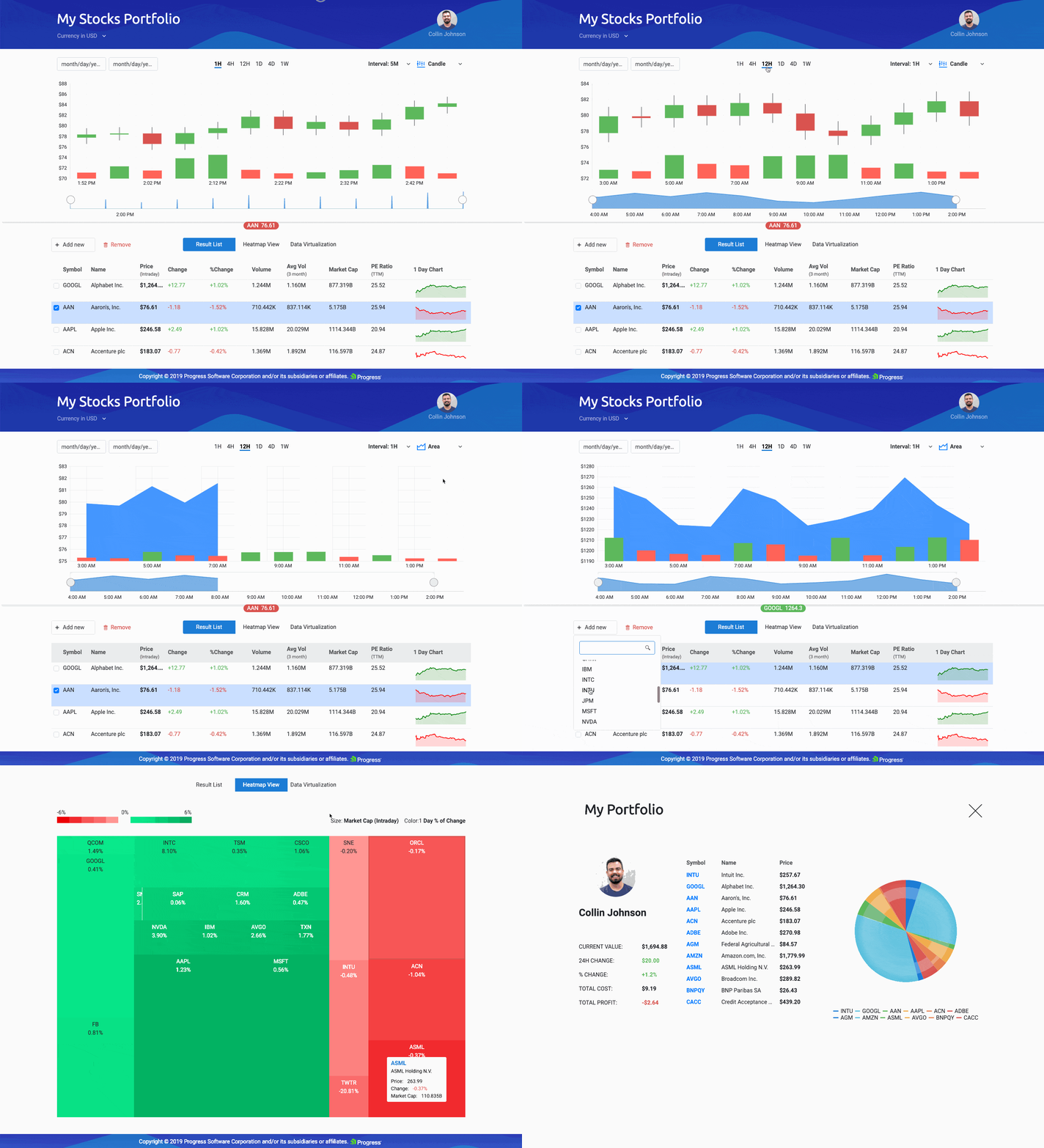
A gif walking through the different pages and features of the Financial Portfolio demo app using Kendo UI components

In this series, I walk through the Angular components that this app is composed of, and delve into the Kendo UI components that each one uses!

I’ve broken the application into five major Angular Components:

  1. Stock Chart
  2. Stock List
  3. User Profile
  4. Real Time Data
  5. Heatmap

In the first post, I covered the Stock Chart and Stock List components (and the child components they employ). Now, let’s find out how we built the User Profile, Real Time Data, and Heatmap Components!

Following Along

You can pull down the code and follow along—everything is available on GitHub and GitHub Pages!

  1. Clone the repo https://github.com/telerik/kendo-angular/tree/master/examples-standalone/finance-portfolio
  2. Go into the root of the application cd kendo-angular/examples-standalone/finance-portfolio/
  3. Run npm install and npm start
  4. Go to http://localhost:4200 in your web browser

Real Time Data—Data Virtualization

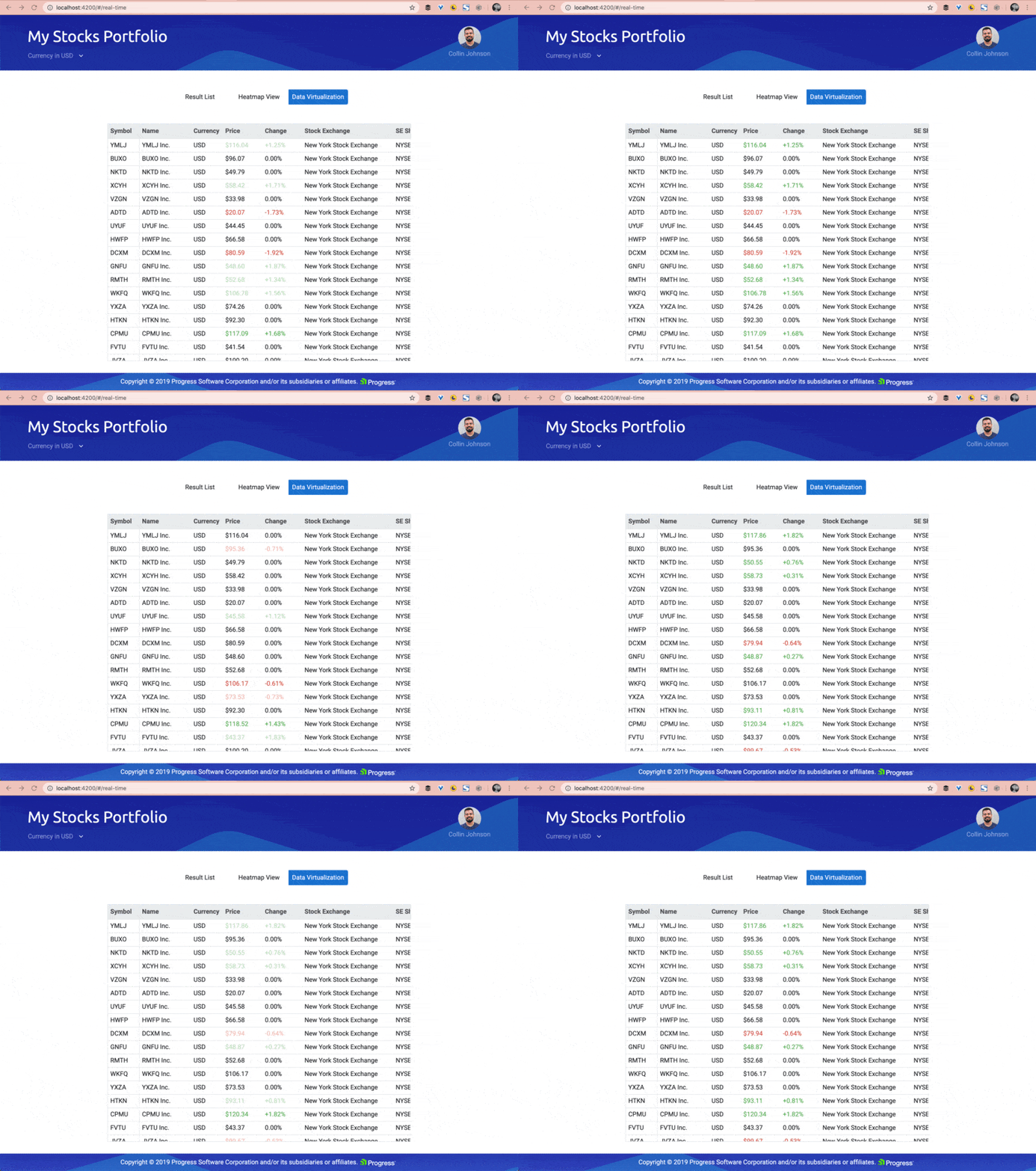
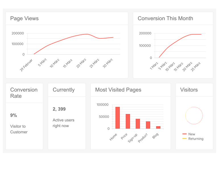
A table with real time stock information updating on the fly. The colors of the stocks change from green to red, indicating the stock going up or down.

Building out the Grid with Kendo UI

I’ve covered the basics of the Kendo UI Grid pretty thoroughly in a video series and in this post here. Check it out if you are just getting started with the Grid from Kendo UI!

Since I’ve already covered the basics elsewhere, let’s go over the highlights of creating this real-time data grid. First, we of course installed and added the grid to our project:

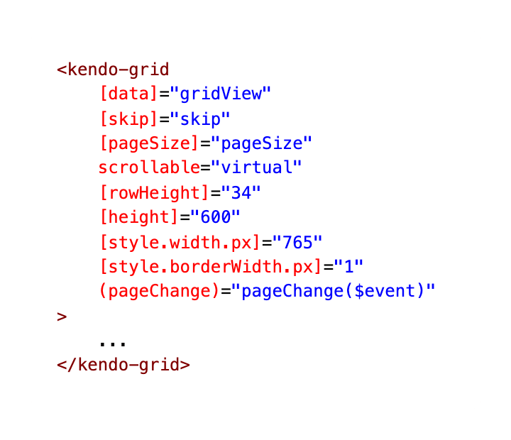
a screenshot of the kendo grid outer wrapper mark down

Virtual Scrolling within the Grid

As you can see, we are setting the scroll mode to virtual. The pageChange event is here for this virtual scrolling feature. In order to know when a page has changed, the virtual scrolling functionality of the Grid relies on calculations based on the fixed rowHeight as well as the set pageSize of the Grid. Read more about virtual scrolling in your Kendo UI Grid here: https://www.telerik.com/kendo-angular-ui/components/grid/scroll-modes/virtual/.

Plugging Data into our Kendo UI Grid

Our [data] is set to gridView, which if we check out the component.ts file, is being set to public gridView: GridDataResult;. The GridDataResult is coming from this file:

real-time-data.component.ts

screenshot of the page change event and the load products event

We are also handling the pageChangeEvent by providing the number of items to be skipped as well as loading in the products that are randomly generated in this file. It is always easier to control a demo app by using demo data, so our team decided to go this direction for the Financial Portfolio Demo App. You can always swap out our fake data for live data, though! Check out the rest of the real-time-data component file to see how we are generating this random data for the real time grid view!

Making the Data Real-Time

Custom Cell in Kendo UI Grid

You can customize any cell in the Kendo UI Grid using the cell template directive combined with ng-template. Here in this Kendo Grid Column, we are creating a custom template for the cells that hold the price data. We bind the data item that is constantly updating and either give it a price-up class (green text) or a price-down class (red text), depending on if the stock rose or fell.

To define the cell template, nest an <ng-template> tag with the kendoGridCellTemplate directive inside a <kendo-grid-column> tag.

the markup for a column from the real time data component using ng-template to customize the cells in the grid

a screenshot of the price column

We are giving the price change column the same treatment and classes, check it out:

the markup for the kendo grid column for the price change

Heatmap

Our heatmap is using a jQuery component (the Kendo UI TreeMap) with ease inside of our heatmap component:

Below you can find the code for instantiating and populating a treemap jQuery component in our heatmap angular component

        public ngAfterViewInit(): void {
            this.treeMap = kendo.jQuery(this.heatmap.nativeElement).kendoTreeMap({
                dataSource: new kendo.data.HierarchicalDataSource({
                    data: this.treeData,
                    schema: {
                        model: {
                            children: 'items'
                        }
                    }
                }),
                valueField: 'value',
                textField: 'symbol',
                colors: [['#09E98B', '#00A95B'], ['#FF9693', '#EC0006']],
                template: ({ dataItem }) => {
                    return `
` + dataItem.symbol + `
${ dataItem.change }%
`; } }).data('kendoTreemap'); this.tooltip = kendo.jQuery(this.heatmap.nativeElement).kendoTooltip({ filter: '.k-leaf', position: 'center', showOn: 'click', content: (e: any) => { const treemap = kendo.jQuery(this.heatmap.nativeElement).data('kendoTreeMap'); const item = treemap.dataItem(e.target.closest('.k-treemap-tile')); const cssClass = (value: number): string => { return value > 0 ? 'positive-value' : 'negative-value'; }; return `
${ item.symbol }
${ item.name }
Price: ${ item.price }
Change: ${ (item.change > 0 ? '+' : '') }${ item.change }%
Market Cap: ${ item.value }
`; } }).data('kendoTooltip'); } public ngOnDestroy(): void { kendo.destroy(this.treeMap); kendo.destroy(this.tooltip); }

The TreeMap is a way of viewing hierarchical data, you give the treemap an object with colors and field values and it will build out a treemap with leaves containing each individual piece of data:

a tree map from kendo ui displaying stock information

You can read more about the TreeMap Component here: https://demos.telerik.com/kendo-ui/treemap/index.

User Profile

A couple of Kendo UI components went into the making of our lovely user portfolio page—another Grid and a Pie Chart Component as well as a mini-table and custom styled avatar.

image of opening the user portfolio page

First, we are building out this mini-grid reviewing our top priority stocks:

the markup for the profile stocks grid on the user portfolio page

Next, we are using another chart to build out this animating pie chart to show our stocks in a different form:

 the markup for the pie chart on the user portfolio page

We are giving our overview pie chart a beveled look by setting the overlay property: [overlay]="{ gradient: 'roundedBevel' }”.

an image showing the normal pie chart and the pie chart with bevel, oooooo

The user portfolio page also has a mini-table below a custom styled avatar image and name. This demo app was created before we had our Avatar Component, which is super handy in spots like this!

a screenshot of the user avatar and summary table in the user portfolio page

The Avatar Component is also super customizable as well as super simple to implement. Check it out if you are in need of user avatars in your Angular app!

Wrap-up

In this article and its prequel, we have covered the Stock List and the Stock Chart on the landing page—with its ability to toggle between chart types and display multiple charts at the same time! We also covered the Real-Time Data Grid, the Heatmap view and the User Portfolio Page with its many Kendo UI components! For more details on this demo app, check out the source code here:

Financial Stocks Portfolio on GitHub Pages Financial Stocks Portfolio Repo on GitHub

As always, we love love love feedback here on the Kendo UI team! Please let us know if this demo app was useful to you and what kind of other demo apps you’d like to see!

endoka asking for your feedback

Kendo UI for Angular Feedback Portal

Alyssa is the Angular Developer Advocate for Kendo UI. If you're into Angular, React, Vue or jQuery and also happen to love beautiful and highly detailed components, check out Kendo UI. You can find the Kendo UI for Angular library here or just jump into a free 30 day trial today. Happy Coding!

How to Convert Your Existing WinForms/WPF Project to .NET Core?

$
0
0

Our Telerik UI for WinForms and WPF suites provide a .NET Core Project Converter via our Visual Studio Extensions. This tool can convert client projects that use .NET Framework 4.8 (or lower) into .NET Core projects to ease the migration.

Having had .NET Framework for almost 20 years, we, as developers, have produced, and are still producing a considerable number of desktop applications. A new era has come with the birth of .NET Core. Even though some developers may choose to continue using .NET Framework for further development, others tend to dive into the new trends.

The next logical question here is what happens with all existing Telerik WinForms/WPF projects out there that are targeting .NET Framework? Is it possible to convert them to .NET Core?

Our main desktop products, Telerik UI for WinForms and Telerik UI for WPF, always strive to deliver more than expected to the clients. This case with converting an existing project to .NET Core is not an exception.

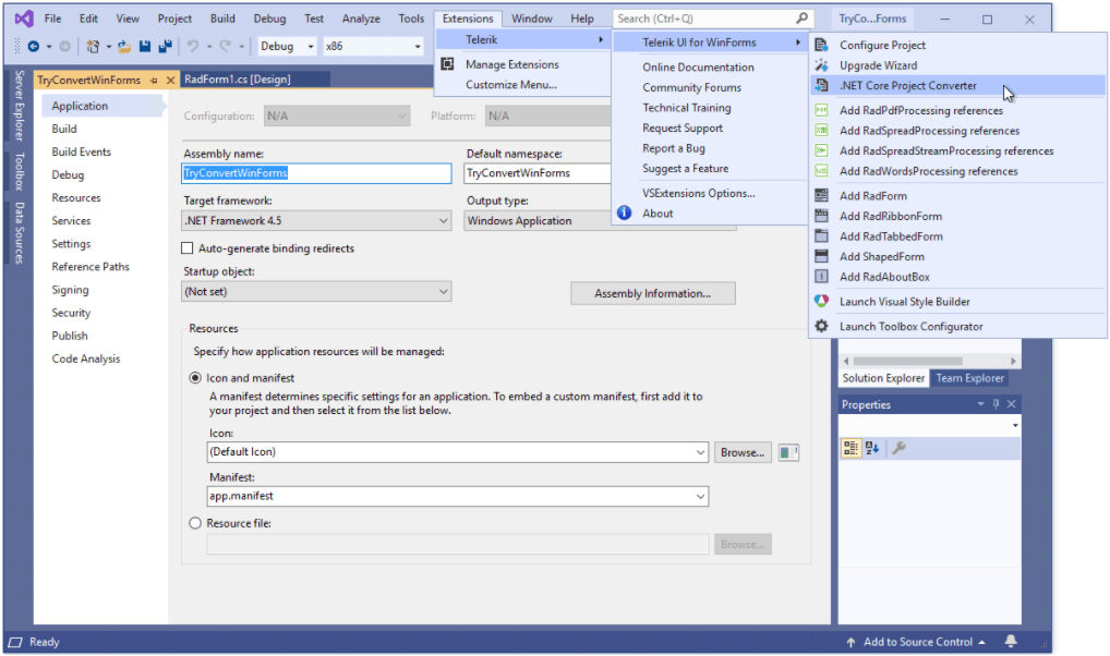
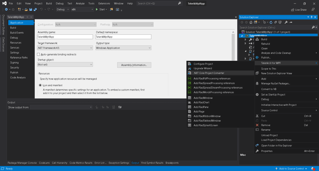
Since R2 2020 both suites provide tooling in Visual Studio 2019, via the Telerik WinForms and WPF Visual Studio Extensions, that will convert client projects that use .NET Framework 4.8 (or lower) into .NET Core projects to ease out the migration. The menu item is visible only when the solution is loaded in VS2019 and it contains any .NET Framework Telerik projects.

Telerik Visual Studio 2019 Extension

Telerik Visual Studio 2019 Extension - WPF

The .NET Core Project Converter is based on the Try-Convert tool and the .NET Portability Analyzer that Microsoft offers to help .NET developers port their projects to .NET Core.

Please have in mind that even though the conversion may be successful, we don't guarantee that the project will be compiled, or it will work properly, and you may need to fine-tune the output.

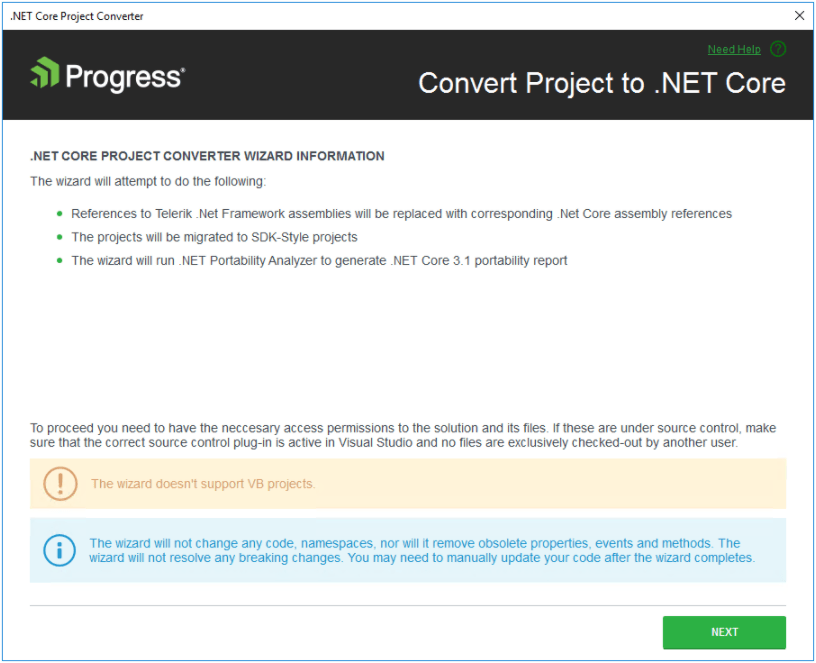
The .NET Core Project Converter Wizard allows you to convert Telerik .NET Framework projects to Telerik .NET Core projects. It shows a warning page as a first step to inform users what will and what will not be updated after running the wizard (we don’t want to mislead anyone that we will resolve breaking changes, etc.).

Telerik .NET Core Project Converter Wizard

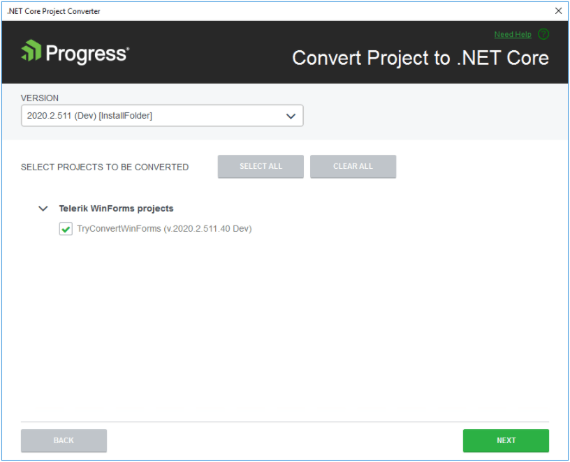
The Converter wizard lists all detected .NET Framework projects and lists all available .NET Core 3.1 distributions in the dropdown:

Telerik .NET Core Project Converter Wizard - Projects List

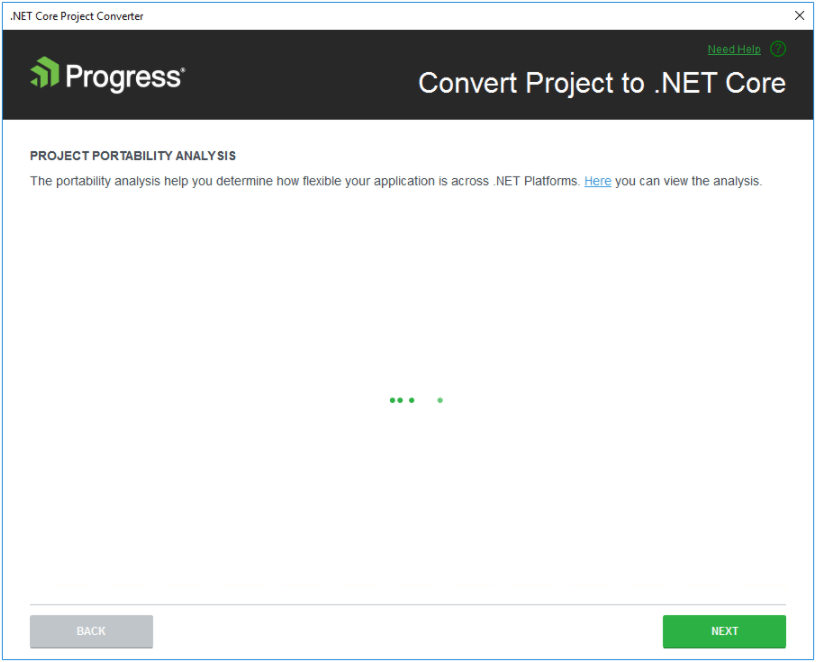
On the next page, the wizard builds the projects and runs the .NET Portability Analyzer tool which analyzes the project outputs and generates a report in the solution folder which shows possible issues when converting to .NET Core 3.1. While the build and analysis are running, the wizard shows busy indication and the Visual Studio Output window opens a new .NET Core Project Converter tab which shows the output from the build and analysis process.

Telerik .NET Core Project Converter Wizard - Working

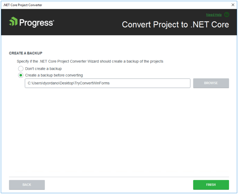
On the next page the user can select whether to create backup of the solution or not and to select location for the backup:

Telerik .NET Core Project Converter Wizard - Backup Creation

After clicking Finish, the wizard replaces the Telerik UI for WinForms / Telerik UI for WPF .NET Framework references with references to the .NET Core assemblies from the selected distribution and runs the try-convert tool which converts the .csproj to .NET Core style project.

Note for Telerik UI for WPF: The RichTextBox assembly is replaced according to the distributions change between the .NET Framework and the .NET Core distributions.

TryConvertWinForms Modification Detection Screen

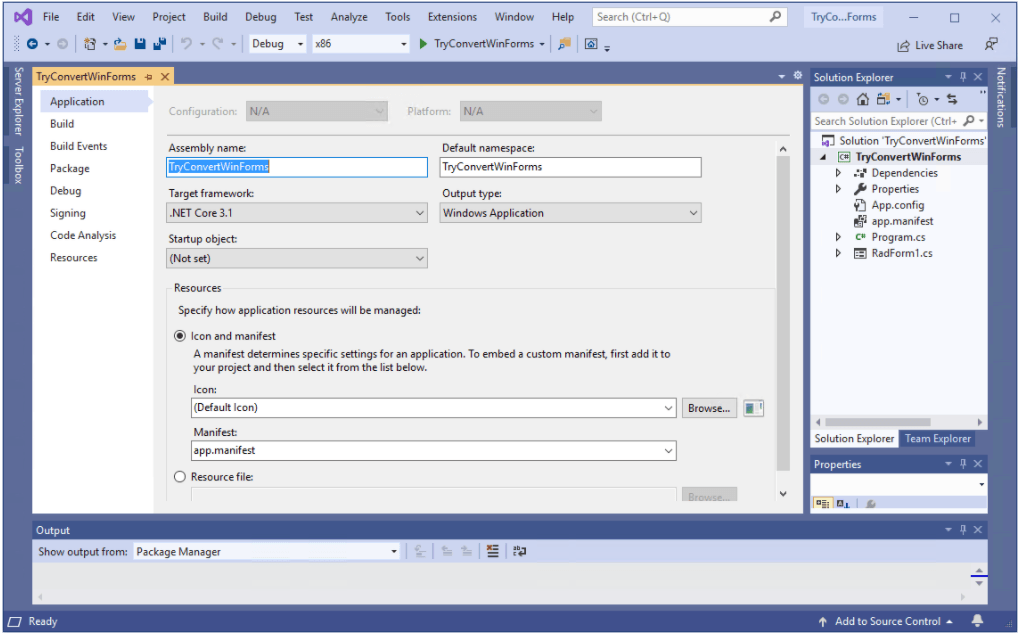
TryConvertWinForms Converted to .NET Core

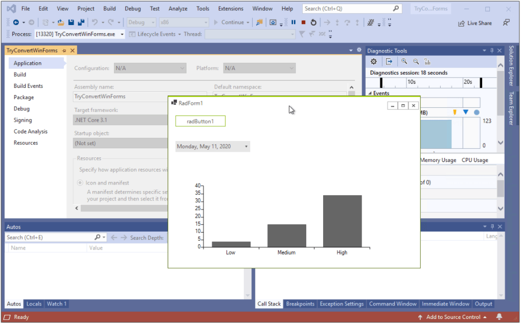
Voilà! Now, the project can be run using .NET Core 3.1:

TryConvertWinForms Run Using .NET Core.png

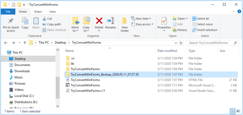
There is a backup folder containing the initial project:

Backup Folder Location

Happy converting!

Telerik Ninja Using a Laptop

Asynchronous Programming in Rust

$
0
0

Asynchronous programming greatly improves our development with faster and more responsive code. Learn about how async works in Rust and when you should use it.

Asynchronous programming is a form of parallel programming that allows a unit of work to run separately from the primary application thread and then proceeds to notify the main thread if said work was executed successfully or not. The benefits of asynchronous code cannot be overemphasized. From better performance to enhanced responsiveness, asynchronous programming has in many ways improved the way we write code and consequently its quality.

Why Async?

We all love how Rust allows us to write fast, safe software, so it’s easy to see why one might ask the point of bothering with async programming in Rust. A simple answer is: it allows us to run multiple tasks concurrently on the same OS thread. For example, a typical way to download two different webpages in a threaded application would be to spread the work across two different threads like this:

#![allow(unused_variables)]
fn main() {
  fn get_two_sites() {
     // Spawn two threads to do work.
      let thread_one = thread::spawn(|| download("https://www.jellof.com"));
      let thread_two = thread::spawn(|| download("https://www.yam.com"));
  
      // Wait for both threads to complete.
      thread_one.join().expect("thread one panicked");
      thread_two.join().expect("thread two panicked");
  }
}

This approach will work very well for most applications, especially as that is what threads were designed to do (run multiple, different tasks at once). However, they inherently come with some limitations—the most obvious being the overhead that arises as a result of switching and sharing data between different threads as a thread which sits idly doing nothing uses up valuable system resources.

The function in the sample above can easily be rewritten with Rust’s async/.await notation, which will allow us to run multiple tasks at once without creating multiple threads:

#![allow(unused_variables)]
fn main() {
  async fn get_two_sites_async() {
      // Create two different "futures" which, when run to completion,
      // will asynchronously download the webpages.
      let future_one = download_async("https://www.foo.com");
      let future_two = download_async("https://www.bar.com");
  
      // Run both futures to completion at the same time.
      join!(future_one, future_two);
  }
}

async/.await in Rust

async/.await is Rust's beautifully syntaxed built-in tool for writing async functions. It is structured in such a way that it looks like synchronous code. The async block changes a block of code into a state machine, which implements a trait called Future. So while calling a blocking function in a synchronous method blocks the entire thread, Futures yield control of the thread, allowing other Futures to execute.
To create an async function, you use the async fn syntax:

async fn do_amazing_stuff() { ... }

The value returned by async fn is called a Future. For anything to happen thereafter, the Future needs to be run on an executor

// `block_on` blocks the current thread until the provided future has run to
// completion. Other executors provide more complex behavior, like scheduling
// multiple futures onto the same thread.
use futures::executor::block_on;

async fn hello_world() {
    println!("hello, world!");
}

fn main() {
    let future = hello_world(); // Nothing is printed
    block_on(future); // `future` is run and "hello, world!" is printed
}

The .await is used inside the async fn to wait for the completion of another type that implements the Future trait (e.g. the output of another async function). It doesn’t block the current thread, but instead asynchronously waits for the Future to complete, allowing other tasks to run if the Future is currently unable to make progress.

The State of Asynchronous Rust

It can be pretty hard to know the right tools to use, what libraries to invest in, or what documentation to read as the ecosystem has evolved over time. However, the Future trait inside the standard library and the async/await language feature has recently been stabilized. The ecosystem as a whole is therefore in the midst of migrating to the newly stabilized API, after which point churn will be significantly reduced.

It is worthy to note that there are still rapid developments being made, and the Rust Asynchronous experience is somewhat unpolished. The async/await language feature is still new. Important extensions like async fn syntax in trait methods are still unimplemented, and the current compiler error messages can be difficult to parse.

Regardless, Rust is well on its way to having some of the most performant and ergonomic support for asynchronous programming around, if you’re not afraid of doing some exploration.

Conclusion

Overall, asynchronous applications have the potential to be much faster and use fewer resources than a corresponding threaded implementation. However, there is a cost. Threads are natively supported by the operating system, and using them doesn’t require any special programming model—any function can create a thread, and calling a function that uses threads is usually just as easy as calling any normal function. Asynchronous functions on the other hand require special support from the language or libraries.

Traditional threaded applications can be quite effective, given Rust’s small memory footprint and predictability, which means that you can get far without ever using async.

The increasing complexity of the asynchronous programming model isn’t always worth it, and it’s important to consider your use case and considering If your application would be better served by using a simpler threaded model.

Enjoy your dive into the world of asynchronous programming in Rust!

A Closer Look at the Fiddler Everywhere Request Composer

$
0
0

Learn how to use the Fiddler Everywhere Composer feature to create and modify your network requests. 

Fiddler Everywhere is best known for inspecting HTTP network requests sent and received by the system. However, another useful feature available in Fiddler Everywhere is the Composer—which allows you to create and edit network requests.

Fiddler Everywhere Composer

Fiddler Everywhere Composer

The Fiddler Everywhere Composer feature is especially useful when creating and testing API requests and other network requests. You can use this feature to fetch a specific response as required.

The Fiddler Everywhere Composer allows you to create, send, and test network requests. The Composer supports HTTP, HTTPS, and even FTP requests. You can make a new request from scratch or edit a request already captured by Fiddler Everywhere.

Request Composer

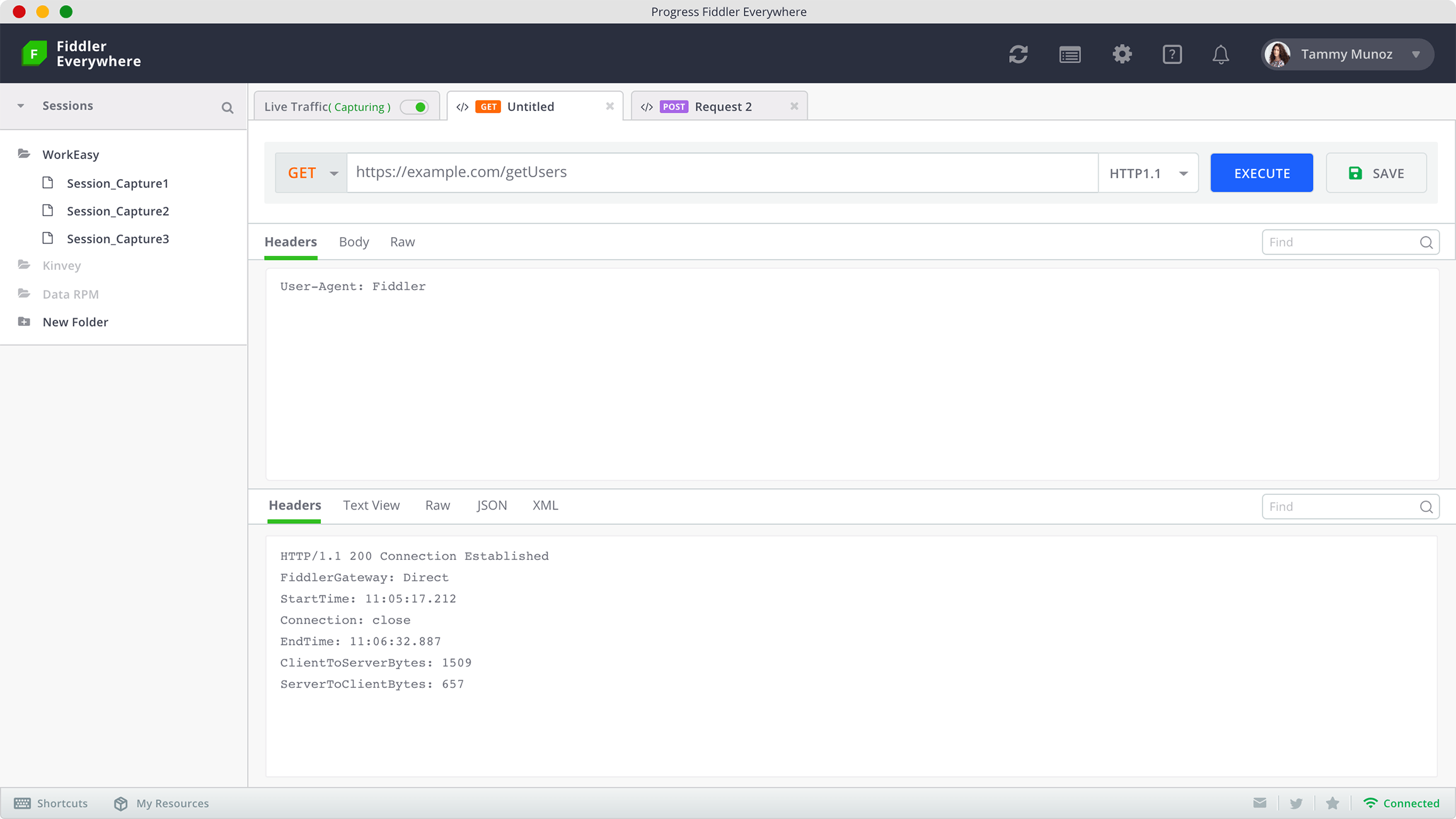
To get started, open the Composer tab next to the Live Traffic tab. You can also open a new Composer tab by clicking on the “New Request” button in the Requests tab. The Composer tab has the Request Composer and the Request Inspector.

Screenshot 2020-09-14 at 4.42.21 PM

Fiddler Everywhere provides a drop-down for you to select the required HTTP method. The Composer supports all recognized HTTP methods like GET, POST, PUT, DELETE. Enter the request URL in the URL field. You can add HTTP, HTTPS, and FTP URLs. If you are editing an existing request, Fiddler Everywhere will automatically populate the URL for you.

Fiddler Everywhere also allows you to specify the HTTP version for the request. You can use any version—right from the limited HTTP/0.9 right up to the modern and evolved HTTP/2.0. By default, the Composer sets the standardized HTTP/1.1 protocol for all requests.

Fiddler Everywhere provides the ability to tweak the request as per the requirements. You can add Headers, Parameters, and the request body to the request. There is also a Raw view to see the composed request in the unstructured form.

Headers

Screenshot 2020-09-14 at 4.43.51 PM

The Headers allow you to add or modify the request headers. You can use the Headers to add details about the request to help the server authorize and process it. For example, you can add authorization tokens or mention the Content-Type. You can add the headers as Key-Value pairs or just the Raw format.

By default, Fiddler Everywhere adds a User-Agent header to enable the server to identify itself. This header is necessary for requests sent to secure servers, especially the servers using the newer versions of TLS.

Parameters

Screenshot 2020-09-14 at 4.44.42 PM

You can use the Params tab to add query parameters to the request. The parameter key-value pairs automatically get added to the request URL. This ability comes in handy if you want to influence responses such as fetch specific responses or limit responses.

The request Body tab allows you to add the data that needs to accompany the request. This function can also submit a JSON object in the request body of the POST request. The object could contain a list of key-value pairs with several levels of nesting.

Once you are satisfied with the composed request, you can hit the Execute button next to the HTTP version and see the network request in action.

Response Inspector

Screenshot 2020-09-14 at 4.46.45 PM

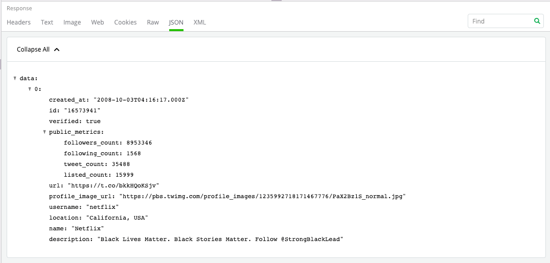
Once you hit execute on the request, Fiddler Everywhere will display the response received from the server. You can use the Response Inspector to inspect the response. The Headers show some of the headers like the HTTP method used, response status, and content type of the response body.

Since the most used response format is JSON, you can open The JSON Inspector. You can see a tree view of the object nodes, which can be expanded and collapsed, as required. You can read more details about all the Inspectors available in Fiddler Everywhere.

Sharing Requests

Screenshot 2020-09-14 at 4.48.22 PM

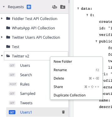
Fiddler Everywhere was designed keeping active collaboration in mind. You can save the requests by clicking on the “Save” button next to the “Execute” button. Further, you can create a collection to organize your requests. The collection allows you to group individual or multiple requests.

You can seamlessly share both individual requests and entire collections with anyone by providing an email address. This feature is useful when working with your teammates.

Get Fiddler Everywhere

Fiddler Everywhere Download Now

Now that you know how easily you can use Fiddler Everywhere to compose and modify network requests go ahead and try it out. Fiddler Everywhere is available on Windows, macOS, and Linux and supports every browser.

Working with GraphQL in Angular: Mutation & Authentication

$
0
0

In this article, I will show you how to run GraphQL mutations and authentication flows in Angular using Apollo Angular client.

GraphQL is a specification that defines a type system, query language, and schema language for building web APIs. The specification is language agnostic, but in this article you will use a GraphQL API built in JavaScript to build an Angular app that will communicate with the API. We will be working with Apollo Angular, which is an Apollo client integration for Angular. It allows you to query any GraphQL server and build reactive UI using the Angular framework.

What We’ll Build

We will build an Angular app that can query for and create books. To be precise, we will focus on GraphQL mutation operations by using the mutation API from the Apollo service and how to configure Apollo client to provide authentication credentials when sending the queries.

We will be using an already-built GraphQL server, which you can download on GitHub. Follow the setup instructions to set it up and start it.

Prerequisite

This article assumes some knowledge of GraphQL, Angular, and how to work with the Angular CLI. If you’re not familiar with those, I’ve got you covered! I have recently written about the fundamental GraphQL concepts and how to build a GraphQL API. It’ll work you through the specification and the query language. I’ve also written about Angular and how to use the CLI. If you’re comfortable with those, you can continue reading.

Preparing the Project

We’re going to use the Angular app that was built for the article titled Working With GraphQL In Angular: How to Make a GraphQL Query. This article builds on the knowledge from that one and we’ll be adding the feature to allow users to submit data for new books.

We’re going to clone the GitHub project and install the dependencies by running the commands

git clone https://github.com/pmbanugo/graphql-angular-intro.git
cd graphql-angular-intro
npm install

Using the Mutation API from the Apollo Service

We’re going to add a new component by running the command ng g c create --module app. This generates a component that we will use to display a form to collect and save data with the GraphQL service. We want users to navigate to this page through the navigation bar. To do this, open app-routing-module.ts and add a route definition for it:

{ path: "create", component: CreateComponent },

We will edit the component’s HTML template to have the markup below. Open src/app/create.component.html and paste the markup below in it:

<h3>Save Book</h3>
<form (ngSubmit)="onSubmit()">
  <div class="form-row">
    <div class="form-group col-md-6">
      <label for="title">Title</label>
      <input
        type="text"
        class="form-control"
        name="title"
        [(ngModel)]="title"
      />
    </div>
    <div class="form-group col-md-6">
      <label for="authors">Authors</label>
      <input
        type="text"
        class="form-control"
        name="authors"
        [(ngModel)]="authors"
      />
    </div>
  </div>
  <div class="form-row">
    <div class="form-group col-md-6">
      <label for="pages">Pages</label>
      <input
        type="number"
        class="form-control"
        name="pages"
        [(ngModel)]="pages"
      />
    </div>
    <div class="form-group col-md-6">
      <label for="chapters">Chapters</label>
      <input
        type="number"
        class="form-control"
        name="chapters"
        [(ngModel)]="chapters"
      />
    </div>
  </div>
  <button type="submit" class="btn btn-primary">
    Submit
  </button>
</form>

The code above will render a form to collect a book’s title, author, number of pages and chapters, as required by the API. We will modify the component’s logic to send that information to the server using the Apollo service. Open src/app/create.component.ts and import the Apollo service, graphql-tag, and the query to submit the mutation.

import { Apollo } from "apollo-angular";
import gql from "graphql-tag";

const submitBook = gql`
  mutation submitBook(
    $title: String!
    $authors: [String!]!
    $pages: Int
    $chapters: Int
  ) {
    book(title: $title, authors: $authors, pages: $pages, chapters: $chapters) {
      id
    }
  }
`;

const getBooksQuery = gql`
  {
    books {
      title
      authors {
        name
      }
    }
  }
`;

Next, we will update the class definition with the code below:

export class CreateComponent {
  title: string;
  authors: string;
  pages: number;
  chapters: number;

  constructor(private apollo: Apollo) {}

  onSubmit() {
    this.apollo
      .mutate({
        mutation: submitBook,
        variables: {
          title: this.title,
          authors: this.authors.split(","),
          pages: this.pages,
          chapters: this.chapters
        },
        update: (store, mutationResult) => {
          // Read the data from our cache for this query.
          const data = store.readQuery({
            query: getBooksQuery
          });
          // Add the book from the mutation to the list of books in the cache.
          data.books = [...data.books, mutationResult.data.book];
          // Write the data back to the cache.
          store.writeQuery({
            query: getBooksQuery,
            data
          });
        }
      })
      .subscribe(
        ({ data }) => {
          alert("Book Saved!")
        },
        error => {
          console.log("there was an error sending the query", error);
        }
      );
  }
}

In the code above, we added properties that will be bound to the form input controls and a method onSubmit() which will be called when the form is submitted. In the onSubmit() method, we call this.apollo.mutate() method to perform the mutation operation. We pass to it an object with a mutation property referencing the submitBook variable which contains the query definition, and a variables property whose value is an object with properties matching the variables we defined in the query.

We also specified the update property, which is a function that we can use to update the Apollo cache based on the result of the mutation. The Apollo cache may already have cached the result of fetching the list of books and, if we add a new book, we want it to be part of the list. It wouldn’t know that it should add the newly created book to the cache, that’s why we use update to modify the Apollo cache to include it when the operation completes. If we don’t do this, when the user goes to see the list of books, the book that was added won’t be on the list.

In the update function, we fetch the data for the query that fetches the list of books, add the new book to the list, and then update the cache by calling store.writeQuery. The getBooksQuery is the same query used in the Home component but copied over to this file. A common way to avoid duplication and mistakes is to define the queries in a file and import them where they’re needed.

With the code we have, we can test out this functionality. But, we’ll get an error because that operation requires the user to be authenticated. So let’s add sign-in and sign-out functionality to the app.

Implement Authentication

The GraphQL API allows only authenticated users to call the book mutation operation. This is done by verifying the JWT in the authentication header when the request is made. We will configure Apollo client’s network interface layer to include the authorization header if it’s available. This network layer is called Apollo Link. Apollo Link can be used to create middleware that lets you modify requests before they are sent to the server. It’s already installed, but we will change the configuration.

Open src/graphql.module.ts and update the createApollo function:

export function createApollo(httpLink: HttpLink) {
  // Get the authentication token from local storage if it exists
  const token = localStorage.getItem("token");
  const auth = setContext((operation, context) => {
    if (token)
      return {
        headers: {
          Authorization: `Bearer ${token}`
        }
      };
  });

  const link = ApolloLink.from([auth, httpLink.create({ uri })]);

  return {
    link: link,
    cache: new InMemoryCache()
  };
}

The code you added checks for the JWT in the localStorage and if it exists, it adds it to the HTTP headers by calling setContext method. After that, it creates an instance of Apollo Link and then returns an object which contains keys for Apollo Link and the cache.

We used setContext and ApolloLink so let’s add the imports for them.

import { setContext } from "apollo-link-context";
import { ApolloLink } from "apollo-link";

We do not have the apollo-link-context package installed, but we will install it later. For now, let’s add a service that’ll handle our sign-in and sign-out process. To generate the service, run the command ng g s auth, open the generated file and paste the code below in it.

import { BehaviorSubject } from "rxjs";
import { Apollo } from "apollo-angular";
import gql from "graphql-tag";

const signin = gql`
  mutation signin($email: String!, $password: String!) {
    signin(email: $email, password: $password) {
      token
      user {
        name
      }
    }
  }
`;

In the code above, we added import statements for needed modules and defined a variable to hold the query that’ll be used to sign in and get the authentication token. Next, we’ll add functions for sign-in and sign-out to the service definition.

export class AuthService {
  isAuthenticated: BehaviorSubject<boolean> = new BehaviorSubject(false);

  constructor(private apollo: Apollo) {
    if (localStorage.getItem("token")) this.isAuthenticated.next(true);
    else this.isAuthenticated.next(false);
  }

  signin(email: string, password: string) {
    this.apollo
      .mutate({
        mutation: signin,
        variables: { email, password }
      })
      .subscribe(
        ({ data }) => {
          localStorage.setItem("token", data.signin.token);
          this.isAuthenticated.next(true);
          window.location.href = "/";
        },
        error => {
          console.log("there was an error sending the query", error);
        }
      );
  }

  signout() {
    localStorage.removeItem("token");
    this.isAuthenticated.next(false);
    window.location.href = "/";
  }
}

The AuthService provides the methods signin and signout. The signin method calls apollo.mutate to query the server and, when the request succeeds, we store the returned token in localStorage and then call window.location.href = "https://www.telerik.com/" to refresh the page which will re-initialize the Apollo client with the new credentials. The signout method removes the token from localStorage and also redirects to the home page with a browser refresh.

We will now create a Signin component that’ll be used to collect the user’s email and password and then use that to get the authentication token. Open your command line and run ng g c signin --module app. Now open the template file for this component and put the markup below in it.

<div class="text-center">
  <form class="form-signin" (ngSubmit)="onSubmit()">
    <h1 class="h3 mb-3 font-weight-normal">Please sign in</h1>
    <label for="email" class="sr-only">Email address</label>
    <input
      type="email"
      name="email"
      class="form-control"
      placeholder="Email address"
      required
      autofocus
      [(ngModel)]="email"
    />
    <label for="password" class="sr-only">Password</label>
    <input
      type="password"
      name="password"
      class="form-control"
      placeholder="Password"
      required
      [(ngModel)]="password"
    />
    <button class="btn btn-lg btn-primary btn-block" type="submit">
      Sign in
    </button>
  </form>
</div>

Open signin.component.ts and update the class with the code below:

export class SigninComponent {
  email: string;
  password: string;
  constructor(private authService: AuthService) {}

  onSubmit() {
    this.authService.signin(this.email, this.password);
  }
}

The code above defines the onSubmit method that gets called when the form is submitted. The method calls the signin method in the AuthService. Since we made reference to the AuthService, let’s import the service. Add the import statement below to the file:

import { AuthService } from "../auth.service";

Next, we will add route definition for the path /signin. Open app-routing.module.ts and add the snippet below as part of the routes array on line 7:

  { path: "signin", component: SigninComponent },

Then add an import statement for the component:

import { SigninComponent } from "./signin/signin.component";

Now that we’ve added the Signin component and added a route for it, let’s update the navigation header to include a SignIn and SignOut button. Open app.component.html and add the code below after line 26.

<a
  *ngIf="!isLoggedIn; else loggedOut"
  class="nav-item nav-link"
  routerLink="/signin"
  >Sign In</a
>
<ng-template #loggedOut>
  <button class="btn btn-link" (click)="signout()">Sign Out</button>
</ng-template>

Lastly, let’s update the component’s logic to include the property and method we referenced in the markup above. Open app.component.ts, then add the import statement to the AuthService and update the class definition:

import { AuthService } from "./auth.service";

@Component({
  selector: "app-root",
  templateUrl: "./app.component.html",
  styleUrls: ["./app.component.css"]
})
export class AppComponent {
  isLoggedIn: boolean;

  constructor(private authService: AuthService) {
    this.authService.isAuthenticated.subscribe(value => {
      this.isLoggedIn = value;
    });
  }

  signout() {
    this.authService.signout();
  }
}

The code we added to the class defines a signout method that in turn calls the signout method in the AuthService, and we set the isLoggedIn property when the value for authService.isAuthenticated changes.

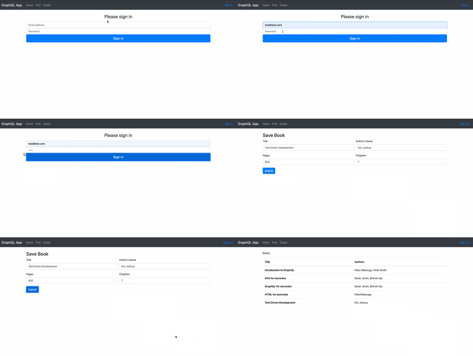
Now we can test the newly added functionalities by running the app. Before we start the app, let’s add the apollo-link-context package which we referenced in graphql.module.ts. Open your command-line application and run npm i apollo-link-context. To start the application, download this GraphQL server project and follow the instruction to start it up. When it’s started, open your command line to the directory of your Angular project and run ng serve -o.

angular graphql mutations and authentication

That’s a Wrap

So far we’ve built an Angular app that uses GraphQL query and mutation to fetch and save data. You saw how we can use update to update the Apollo store after a mutation. We also added authentication flow to the app so that we can attach the authorization header to the GraphQL requests and be able to call the mutation operations that requires users to be authenticated. We added sign-in and sign-out functionality, but I skipped the sign-up process. The GraphQL API has a signup mutation operation which you can use for that, so feel free to implement that yourself.

Here are the links to the Angular and Node projects we used:

  1. Angular Project
  2. GraphQL server in Node.js

Leaving Silverlight: Your Options

$
0
0

Migrating from Silverlight is neither easy nor fun, but there are ways to reduce the pain. In this post we'll discuss your best options for migrating from Silverlight, and their associated costs and benefits.

You have several choices when it comes to migrating away from Silverlight—probably more than you realize. None of those options are perfect so there are trade-offs you’ll have to make.

If you still have Silverlight applications around, it may be because you haven’t seen the need to make any changes to those applications. Or, it may be that you’ve been avoiding the problem because you recognize the amount of work required to recreate those applications. Well, you’re not wrong: Moving from Silverlight to any other platform isn’t going to be a trivial task. I’m not here to tell you there’s a “no effort/no cost” solution. But, as Silverlight reaches its end of life on October 12, 2021, recreating those applications may be becoming unavoidable for you, no matter how much work is involved.

There are ways to reduce the pain, however.

Sticking with .NET?

Assuming you want to stick with Microsoft technologies, you’ll want to move to .NET Core as “the current platform with the longest future” (no sense recreating the “abandoned tech” problem you’re facing now). What will limit your ability to move to .NET Core is the number of .NET Framework libraries your application references. For each of those libraries, you’ll need to assess whether a .NET Core replacement exists and, if it doesn’t, how much work is required to move to equivalent functionality.

If the cost of going to .NET Core is high, then sticking with .NET Framework isn’t a terrible choice. The latest/greatest version is Framework .NET 4.8 and (as of this posting) it had no end-of-life date.

Going to HTML?

But, of course, the elephant in this particular virtual living room is XAML. You don’t have to abandon XAML—there are, at least, two good options that will let you keep some of your XAML. However, part of the problem you’ll face in keeping your XAML is that there are several different versions out there:

  • Windows Presentation Foundation/.NET Framework 3.0
  • Silverlight 3
  • Silverlight 4
  • Windows 8 XAML/Jupiter
  • Xamarin Forms

This means that, even if you want to keep your XAML, you’re going to have to deal with some conversion effort. If you’re going to have to make some conversion effort, you should (at least) be considering converting your XAML to some other format. The obvious choice is HTML, if only because your users have been getting your Silverlight applications through a web browser.

Converting XAML to HTML is, clearly, not a trivial task. You can do it by hand (you might want to check out Colin Eberhardt’s experience from 2011)… but there are tools out there to help you. There is at least one XAML to HTML conversion tool worth considering (complete with a step-by-step tutorial). And there are consulting companies ready to help.

If you do decide to move your XAML to HTML, you could migrate your application to ASP.NET. However, because ASP.NET is a server-side environment, the lack of an interactive event model will force you to significantly restructure your application. My personal opinion is that, if you’re moving to HTML, you’d be better off moving to some client-side environment.

The obvious client-side environment is Blazor which will let you keep at least some of your existing UI code (assuming that your code is in C#). Blazor also throws in an event model as rich as Silverlight’s, something that’s not always true even in some of the XAML environments. I think that Blazor is such a good choice that, even if your code is in Visual Basic, you should consider converting your VB code to C# just to support migrating to Blazor (and, among other vendors, Progress offers a Telerik VB to C# conversion tool). That does, however, mean moving to .NET Core and you may already have determined that isn’t a good choice for you.

If you don’t, for whatever reason, want to go to Blazor but do want to convert to HTML, your other option is to rewrite your code into JavaScript and move to one of the JavaScript client-side environments (personally, these days, I’d pick Vue, but your organization has probably already settled on a client-side framework). If you’re going to make that conversion, consider going to TypeScript, the object-oriented superset of JavaScript, rather than “pure” JavaScript. It will eliminate some problems if you move from one object-oriented language (C# or VB) to another (TypeScript).

Keeping Your XAML

Or you could keep your XAML and move to some existing “XAML-friendly” environment.

The obvious choice here is WPF, which will let you recycle much of your XAML into your new application. With WPF, ClickOnce technology will let users install your application through their browser (not quite the same as running the application in your browser but, probably, “close enough”). You’ll be restricted to running on Windows platforms but, ignoring the Linux Moonlight project (and everybody did), so were your Silverlight applications.

WPF XAML is about as “Silverlight XAML compatible” as you’ll get. If you have do have third-party components, moving to WPF may also reduce your conversion effort. Many of the Telerik Silverlight controls, for example, have corresponding WPF versions. With any luck (and with the right third-party components), much of the XAML that you have in your Silverlight application could be copied and pasted to a new WPF application without much (or, even, any) modification.

You could also consider Microsoft’s Xamarin Forms. While Xamarin is primarily touted as a way to produce smartphone apps (and is very good at it), it also generates desktop UWP applications that support ClickOnce distribution.

The problem is that Xamarin Forms uses a different version of XAML than Silverlight. Your Silverlight TextBlocks will, for example, have to become Xamarin Editors, Entrys, or Labels. Most of the events in Silverlight XAML aren’t supported in Xamarin XAML and, when they are, have different names (Silverlight’s Click attribute corresponds to Xamarin’s Pressed). Clever (and limited) use of Visual Studio’s Find and Replace All could handle some of these changes. However, not all Silverlight attributes have Xamarin equivalents: Xamarin Forms’ HorizontalOptions attribute isn’t really the same thing as Silverlight’s HorizontalAlignment, for example.

But you do have another choice… provided you’re willing to step out of your Microsoft-centric comfort zone: The open-source projects Avalonia and the Uno Platform.

While not Microsoft products, both Avalonia and the Uno Platform deliver cross platform applications using XAML and C#. Both projects use versions of XAML that will minimize your XAML conversion effort (though not, you’ll notice, “eliminate your XAML conversion effort”). The Uno Platform currently delivers applications to Windows, Linux, Mac, Android, iOS, and web browsers (if you’re interested, I’ve written about the experience of creating “your first Uno app”). Avalonia supports a subset of those platforms (smartphone support is still in development and there’s no web browser support). Personally, I think you’d be foolish not to (at least) consider either Avalonia or the Uno Platform.

You may have noticed that I’ve repeatedly used “personal opinion,” “probably,” or “at least” in this post. As that suggests, I doubt that this is an exhaustive list of your options. In fact, if you have more options, I’d appreciate any additions you want to make in the comments. Asking for a friend.

Byteconf React 2020—Day 2 Experience

$
0
0

Byteconf React is a free, two-day conference with some of the best React speakers and teachers in the world. The level of the talks range from beginner to intermediate so you're guaranteed to learn something new, no matter your level. In this post, I share my experience and things I learned on the second day of the conference.

Byteconf React is a free, two-day conference that has some of the best React speakers and teachers in the world. The 2020 conference was streamed on YouTube, for free, so that anyone can attend (even days or months later). It was fun for me because, while I listened to the insightful talks, I also asked questions during the stream and the speakers and other attendees responded to them in real time, and it felt like we were all in the same room talking to each other. The level of the talks ranged from beginner to intermediate, so you’re guaranteed to learn something new, no matter your level.

In a previous post, I shared my experience about how it went for the first day of the conference. In this post, I’ll also highlight the talks from the second day. I’ll share some info about the talks, how I feel about it and links to the videos.

Concurrent React from Scratch

The first talk for day 2 was from Shawn Wang and he talked about Concurrent React. In this talk, you will learn about how React renders components, schedules Time-Slicing updates, add Hooks, and end off with a mini-clone of Suspense. You will create a mini clone of React which will help you understand:

  • How JSX elements are plain JS objects with type and props
  • What React Fiber is and how it’s used in React
  • What the work loop is and how to implement one
  • How to implement the useState hook
  • How Suspense works.

This is one of my favorite talks and I recommend it for React developers of any skill level.

Building Scalable Web Applications with React

Saeed Ahmad presented his talk about building scalable React applications. If you watched the talks from Day 1, you would expect that you’ve learned all there is to know about building performant React apps. But in this talk, Saeed comes at it with a different insight. The talk focuses on how to think like a good software architect and make better decisions when architecting your React apps. This one I’d recommend for intermediate React developers. He talks about what scalability means for a React application, and goes on to show approaches and best practices for scaling a React application.

Adding Accessibility in Your React Apps

The next talk was on accessibility, which I think is one of the areas developers ignore when building a web application. It’s a topic which I’m least knowledgeable about and I was curious about what I was going to learn from it. In this talk, Neha Sharma walks us through a non-accessible React site and shows:

  • How to know that its accessibility is broken
  • How to debug it and fix the issues
  • Tips for making sure accessible components get created
  • Accessibility tools you can use

She explains what accessibility is and why it matters. She talked about accessibility guidelines and the different levels of accessibility. If you’re new to accessibility or want to learn how to build accessible React apps, go watch this talk.

Add Authentication to Your Gatsby App with Auth0

The next talk was delivered by Sam Julien who works for Auth0. This talk is focused on securing a Gatsby app using the Auth0 platform and JS library. He also talked about Gatsby’s build process and runtime, and also some tips and tricks to avoid common pitfalls with adding auth to a Gatsby site.

Lifting State up Is Killing Your App

Lifting state up is one of the concepts you likely have learned when learning React. In this talk, Andrey Goncharov shows why lifting state up might slow down your application. He starts out with an example that lifts state up using standard practice, then shows you where it fails and why. After that he refactors by moving the state down and showing how it improves the app’s performance in this scenario. You’ll also learn how to use the profiler from the React DevTools to track how your components are rendering. So if you want to learn how a misuse of a pattern can slow your application, make sure to watch this talk.

From create-react-app to create-any-app

The next talk that followed is one I like a lot. It’s about speed and productivity. This time not about speeding up your app, but rather your team velocity, thereby making developers productive. In Ema Suriano’s talk, he shows how they built tools/framework that help different teams bootstrap and maintain their projects, deployment configurations. He explains the concept and architecture behind this framework, and shows a demo of a sample project showcasing some use-cases.

React Bandersnatch Experiment: Getting Close to a Real Framework

The next talk by Claudia Bressi explored the concept of using React as a framework. She explored adding different libraries and tools to explore what would likely make a complete framework built on top of React. By the end of the talk, you will have learned what a framework is and when to use one. You’ll also learn how to build one on top of React, and if you combine this knowledge with the previous talk, you can as well have built a framework which can be shared between teams if you work in a large org or want to build one for your own use as an independent developer or consultant.

Speeding up Your Gatsby App in a Day

The last talk of the conference was an amazing one that you’ll love if you using Gatsby. Guess what, it’s also about speed! In Henrique Cavalieri’s talk, he shares five things you can do to speed up your Gatsby app. Some of these tips seem simple but they work magic. Things like how you serve fonts, images and third-party scripts. I don’t want to spill too much information which is better said in the talk. So go watch this talk.

That’s a Wrap!

That’s it for Byteconf React 2020. Watch out for another one next year! I hope just like me, that you learned something from the talks that you can apply today and in the future to speed up your apps and improve your productivity.

Telerik and Kendo UI R3 2020 Release is Here!

$
0
0

Always in step with the rapidly evolving .NET and JavaScript ecosystems, our Telerik and Kendo UI R3 2020 release is here to help developers keep up with the latest innovations in creating stunning web, desktop and mobile apps. Read on for more details!

Building modern, professional looking UI for business applications is hard work. Our developer teams at Progress have been hard at work during the summer to enable you as developers to be always in step with the rapidly evolving .NET and JavaScript technologies so that you can build beautiful, feature-rich and professionally designed web, mobile and desktop applications in less time and with less effort.

With R3 2020, we’ve released 45+ new components across Telerik and Kendo UI product lines, plus great improvements in Blazor and WinUI, support for .NET 5, Angular 10, Vue 3.0 and many new features and updates!

I am super excited to announce that today, the R3 2020 release of Telerik and Kendo UI is LIVE!

In addition, I am pleased to share that we’ve prepared for you Telerik and Kendo UI Release Week Live Session from September 28th to October 1st where our developer advocates will discuss the latest updates from their unique insider perspective into each framework and show them in practice.

Want to join in? Go ahead and save your seat at a release week webinar (or two) now, and then head back up here to read about all the amazing updates in this release.

I'll Go Save My Seat Now

Now let’s dive deeper into what R3 2020 brings, so, grab a cup of coffee, as there is plenty to explore.

Note: Links to individual product blog posts will go live as the posts do over the next few days.

Updates in the Telerik R3 2020 Release

Telerik Kendo UI Release R3 2020

Learn more about newly released gems in our .NET product line below

Telerik Web Products 

Telerik UI for Blazor with 50+ Truly Native Components

  • New components: Editor, Tile Layout, Tree List, Three Charts for the Financial Industry: Stock, Candlestick and OHLC, Loader, Context Menu, Switch, Button Group, Toggle Button 
  • New Grid features: Column Menu, Custom Filtering, Visible Parameter for Columns, Footer Template for Aggregates, Exposed multiple new events for Expand/Collapse, ContextMenu, Row click and double click events, Expanded Grid binding options with support for DataTable and dynamic ExpandoObject, Filter Enum Values support, support for grouping in OnRead  
  • New Chart features: Tooltip, Click event on the Chart element 
  • New TreeView features: Node click event and Node selection 
  • New Textbox features: Additional parameters (AutoComplete, Placeholder, Name, Title, TabIndex) and Password 
  • New Menu features: Menu separator and Disabled Items 
  • New Visual Studio Extensions & Installers features: Converting Blazor projects to Telerik UI for Blazor projects, Installers for Mac & Linux
  • New technical online training for both Blazor as a framework and Telerik UI for Blazor components
  • New and improved documentation and demos for faster load timesand better experience
  • Read More: Release blog post (coming soon) | product page

Telerik UI for ASP.NET MVC & Telerik UI for ASP.NET Core

  • Telerik UI for ASP.NET Core ships with support for the latest preview of .NET 5
  • New components: Wizard, Image Editor, Loader, App Bar, Pager, Text Area
  • New Gantt features: Column templates, Planned vs Actual Comparison, Column options
  • New Grid features: Sticky columns, Foreign Key Binding
  • New TreeList features: Drag, Drop & Reorder, Item Selection
  • New Scheduler features: Recurrence Editor Section 508 and WCAG 2.0 compliant
  • New Spreadsheet features: Render cells using custom HTML
  • New Numeric TextBox feature: Selecting all text on focus
  • Visual Studio Extensions & Installers: Convert ASP.NET Core projects to Telerik UI for ASP.NET Core projects, VS Dashboard project template
  • New and improved documentation and demos for faster load times and better experience
  • Read More: Release ASP.NET Core blog post (coming soon) | product page
  • Read More: Release ASP.NET MVC blog post (coming soon) I product page

Telerik UI for ASP.NET AJAX

  • New components: Card
  • New Chart enhancements: Crosshairs, DashType property for Area, Line and ScatterLine, Appearance settings for the series border, Option to reverse legend items order & turn on/off the highlight effect when series are hovered
  • New and improved documentation and demos for faster load times and better experience
  • Read More: Release blog post (coming soon) | product page

Telerik Desktop and Mobile Products

Telerik UI for Xamarin

  • New components: Combobox, RichTextBox
  • Blazor Bindings support for AutoCompleteView and DataGrid controls
  • New Calendar features: Add and edit appointments in the calendar UI
  • New PdfViewer feature: Search PDF documents for an improved mobile user experience
  • Fully functional Xamarin sample applications: CRM, ERP, ToDo and TagIt 
  • Read More: Release blog post (coming soon) | product page

Telerik UI for WPF

  • Telerik UI for WPF ships with support for the latest preview of .NET 5
  • New SearchTextBox feature: Support auto-filtering search results in real time
  • Dock control enhancements: New navigation commands, keyboard and mouse shortcuts, such as CTRL+Tab for switching between tabs and Ctrl+F7 for navigating  
  • New Slider feature: Multiple thumbs support 
  • New TimeSpanPicker feature: Set TimeSpan from text input, which the control will parse to a valid TimeSpan value
  • New WordsProcessing feature: Support for content controls 
  • New Office 2019 theme: Keep your apps in line with the latest trends of UI and UX with a brand new Office 2019 theme, available in all three colors variations—Colorful, Black and Dark Gray
  • Read More: Release blog post  (coming soon) | product page

Telerik UI for WinForms

  • Telerik UI for WinForms ships with support for latest preview of .NET 5
  • Design Time Support for .NET 5: Design time support for all Telerik UI for WinForms controls enables for building .NET applications right in the designer
  • New TaskDialog control: Theme table and easily customizable alternative to the Windows TaskDialog
  • Vector images themes support: More themes will support vector images
  • Read More: Release blog post (coming soon) | product page

Telerik UI for WinUI

  • New components: Chart, Gauges, BulletGraph
  • Read More: product page

Telerik Reporting and Testing Solutions

Telerik Reporting 

  • New features in Web Report Designer—dedicated wizards for new WebService, JSON and CSV data sources
  • New WPF Report Viewer Theme
  • SVG images support
  • Read More: Release blog post (coming soon) | product page (Reporting / Report Server)

Telerik Report Server

  • New features in Web Report Designer—dedicated wizards for new WebService, JSON and CSV data sources
  • SVG Image support 
  • Report preview canceling
  • Read More: Release blog post (coming soon) | product page (Reporting / Report Server)

Telerik Test Studio Dev Edition 

  • Object Character Recognition (OCR) features
  • Manual DOM refresh and auto-refresh pause/resume inside the Recorder
  • Blazor support through ready-to-use translators for the most popular Telerik UI for Blazor components
  • Read More: Release blog post (coming soon) I Product page

Telerik JustMock 

  • Support for the latest preview of .NET 5 
  • Support for Code Coverage in JustMock Azure Pipeline Task for .NET Core
  • Support for Multiple Instance of Visual Studio for the DebugWindow functionality
  • Read More: Release blog post (coming soon) | product page

Updates in KendoReact and Kendo UI R3 2020 Release

Kendo UI Release R3 2020

Learn more about newly released gems in JavaScript product line below (or check out our blog post covering the entire Kendo UI line of updates)

KendoReact

  • New components: Gantt chart, App Bar, Text Area, Rating, Chip & ChipList, Badge and Loader 
  • Grid updates: Row pinning, customizable pager, column pinning through context and column menu
  • Editor updates: Insert image dialog, font color tool, background color tool, find and replace tool
  • New and improved documentation and demos for faster load times
  • Read More: Release blog post (coming soon) | product page

Kendo UI for Vue

  • New native components: ComboBox, AutoComplete and MaskedTextBox
  • Vue 3.0 support for the entire Kendo UI for Vue library
  • Read More: Release blog post (coming soon) | product page

Kendo UI for Angular 

  • New components: ListView, Loader, AppBar, Input, Breadcrumb, RangeSlider and Badge
  • Grid updates: New Cell Selection
  • Updated all applicable form components to work with form design guidelines
  • New and improved documentation and demos for faster load times
  • Read More: Release blog post (coming soon) | product page

Kendo UI for jQuery

  • New components: Wizard, Image Editor, Loader, App Bar, Pager and Text Area
  • Gantt updates: New Column Template feature, planned vs. actual comparison and new Column Menu options
  • Grid updates: Foreign Key Binding and Sticky Columns
  • TreeList updates: Item Selection
  • Scheduler updates: Revamped recurrence editor with added Section 508 and WCAG 2.0 compliance
  • Spreadsheet updates: Render cell with custom HTML
  • NumericTextBox updates: Select All Text on Focus
  • Read More: Release blog post (coming soon) | product page

Sign Up for the Release Week Live Webinars

Telerik Kendo UI Release Webinars from Sept 28 to Oct 2

Seeing is believing, so register to see all the new features—the webinars are coming up fast! It will help you to follow along easily if you download the latest release here.

Each webinar will be complemented with a Twitch session, where you will be able to see examples of using the new components and features and ask your questions to the speakers via the live chat.

Telerik Web Products R3 2020 Release Webinar

Live Webinar: September 28 @11:00 am – 12:00 pm ET

Save Your Seat

Twitch Session: September 28 @ 12:30 pm – 2:30 pm ET

KendoReact and Kendo UI for Vue R3 2020 Release Webinar

Live Webinar: September 29 @11:00 am – 12:00 pm ET

Save Your Seat

Twitch Session: September 29 @12:30 pm – 2:30 pm ET

Kendo UI for Angular and jQuery R3 2020 Release Webinar 

Live Webinar: September 30 @11:00 am – 12:00 pm ET

Save Your Seat

Twitch Session: September 30 @12:30 pm – 2:30 pm ET

Telerik Desktop and Mobile Products R3 2020 Release Webinar

Live Webinar: October 1 @11:00 pm – 12:00 pm ET

Save Your Seat

Twitch Session: October 1 @12:30 pm – 2:30 pm ET

Telerik Reporting and Testing R3 2020 Release Webinar

Live Webinar: October 2 @11:00 am – 12:00 pm ET

Save Your Seat

Twitch Session: October 2 @12:30 pm – 2:30 pm ET

The live webinars and Twitch sessions are a great opportunity to get your questions answered by the experts. We’ll be waiting to hear from you! Join the conversation on Twitter using the #heyTelerik and #heyKendoUI hashtags and on CodeItLive, our Twitch channel, via the live chat.

Thank You

We recently asked our customers to describe their experience with our tools and support. Thank you for the amazing responses! We were blown away and thought it would be fun to organize your responses in the language that binds us all together—code :). Here it is, using our customers’ own words. As always, you make what we do possible.

DevCraft Customer Words

About DevCraft 

Telerik DevCraft is the finest software developer tools collection across .NET and JavaScript technologies, which includes modern, feature-rich and professionally designed UI components for web, desktop and mobile applications, reporting and report management solutions, document processing libraries, automated testing and mocking tools from the Telerik and Kendo UI suites. DevCraft will arm you with everything you need to deliver outstanding applications in less time and with less effort. With the backing of our legendary support team, which consists of the developers who build the products, and a ton of resources and trainings, you can rest assured that you have a stable partner to rely on for your everyday challenges along your software development journey.

What’s New in Kendo UI with R3 2020

$
0
0

We are now in the middle of September, so you know what that means: the R3 2020 release of Kendo UI is here! This release comes with several updates across all of our jQuery, Angular, React, and Vue UI component libraries.

As a quick note before we get started: since we are covering all products found within Kendo UI this post will be more of a summary of each product, with more detailed blog posts with images and more linked for each product following their section.

Kendo UI for jQuery

New Components

New Component: Wizard

With R3 2020 Kendo UI for jQuery officially introduces the new Wizard component which combines the features and functionality of the Stepper and Form components all in one. This component helps developers break down complex forms into multiple steps while providing a helpful UX to let users navigate between each step.

New Component: Image Editor

The new Kendo UI for jQuery Image Editor component lets end-users edit and manipulate images that they either upload from their machine or developers provide through data binding. Features include resizing, cropping, and more.

New Component: Loader

The Kendo UI for jQuery Loader component is a standalone component designed to show an animation while a process is happening within your application. The jQuery Loader provides several built-in styles and animation types and also has several configuration options that lets developers customize these animations to make them their own.

New Component: AppBar

With the main goal of helping developers position a sleek application header within their applications, the Kendo UI for jQuery AppBar component is a super flexible UI widget that can contain navigation items, action buttons, text, and more.

New Component: TextArea

Extending on the already huge set of form components available within Kendo UI, the new jQuery TextArea component serves scenarios where users need to input long form text that cannot fit in a regular input element.

New Features in Existing Components

Gantt - Column Templates

With the new Column Templates feature the Kendo UI for jQuery Gantt component now allows developers to provide a custom template for any column within the Gantt widget.

Gantt - Planned vs Actual Switch

The Planned vs. Actual Switch of the Kendo UI for jQuery Gantt component lets end-users toggle between showing tasks as they are planned or showing tasks with their actual and current status. This means delayed items have a unique styling while on-time tasks have their own.

Gantt - Column Menu

Similar to the Column Menu within the Kendo UI Grid, the new Column Menu feature of the Kendo UI Gantt component provides additional UX for end-users to show or hide columns, sort by a column, and more—all through a drop down menu associated with each column header.

Grid - Sticky Columns

Sticky Columns within the Kendo UI for jQuery Data Grid let a developer indicate columns which should add themselves to the frozen or locked columns list as users scroll past them. Scrolling past their original index in the reverse order will leave the columns in their initial position.

Grid - Foreign Key Binding

With Foreign Key Binding the Kendo UI for jQuery Grid lets columns do additional data fetching for specific values from different endpoints outside of the original data source definition.

TreeList - Drag & Drop to Reorder

The Kendo UI TreeList has had drag and drop functionality for some time, but with R3 2020 this feature has been updated to allow users to rearrange the data within the TreeList component while providing helpful UX hints.

TreeList - Checkbox Selection

With R3 2020 the Kendo UI TreeList now has built-in checkbox selection, letting users select rows by interacting with a checkbox element on every row.

Spreadsheet - Custom HTML in Cells

The Kendo UI Spreadsheet component has expanded the content that can be inserted in cells by letting custom HTML be entered in a cell.

Scheduler - Updated Accessibility

As a part of our ongoing effort to support the latest accessibility standards, the Kendo UI for jQuery Scheduler has updated its recurrence editor to ensure deeper compliance with WCAG 2.0, Section 508, and WAI-ARIA standards.

NumericTextBox - Select All Text on Focus

As of R3 2020 the NumericTextBox will automatically select all text available in the component upon the NumericTextBox getting focused.

For More Information

To see more in-depth information, along with images and gifs, head on over to the What’s New in Kendo UI for jQuery with R3 2020 blog post! (link coming soon)

Kendo UI for Angular

New Components

New Component: ListView

With R3 2020 Kendo UI for Angular has added the ListView component. This Angular UI component is perfect for large data lists that require a unique template to be used for the data items when they are rendered.

New Component: Loader

The new Kendo UI for Angular Loader component is a standalone component responsible for showing a loading animation. With several built-in styles and configuration options to change the look-and-feel this component can fit into any Angular application with ease.

New Component: AppBar

With the Kendo UI for Angular AppBar developers have a super flexible header element that can contain navigation items, action buttons, header text and more.

New Component: TextBox

The Kendo UI for Angular TextBox component brings the styling of Kendo UI themes to input elements and expands on functionality to include built-in validation icons and styles, as well as the ability to add custom adornments before or after the input element.

New Component: Breadcrumb

For large applications with many pages the Kendo UI for Angular Breadcrumb can provide an easy way for users to navigate to higher levels within the page hierarchy without having to rely on pressing the back button or other messy navigation steps.

New Component: RangeSlider

With the new Kendo UI for Angular RangeSlider components users can drag two separate handles to select a minimum and maximum value range.

New Component: Badge

The Kendo UI for Angular Badge component works both as a standalone component and a component attached to other HTML elements. Often used to indicate notifications or unread messages, the Badge can contain text, icons, or just a color fill and comes with several out-of-the-box shapes.

New Component: Icon & SVGIcon

Take advantage of over 400 icons provided by the Kendo UI themes with the Kendo UI for Angular Icon and SVGIcon components.

New Features in Existing Components

Grid - Cell Selection

The Kendo UI for Angular Grid now comes with the ability for users to select individual cells either by clicking on said cells or dragging a selection area to select a range of cells.

Various Components - Updated Forms

Following the best practices highlighted in the Kendo UI for Angular Forms Guideline, the Kendo UI for Angular team has gone through any UI components with built-in forms and updated them all to follow the form guidelines.

For More Information

To see more in-depth information, along with images and gifs, head on over to the What’s New in Kendo UI for Angular with R3 2020 blog post! (link coming soon)

KendoReact

New Components

New Component: Gantt

With R3 2020 KendoReact introduces the new React Gantt component! This new UI component sports a ton of functionality out of the box and should fit any application that needs a built-in Gantt chart.

New Component: AppBar

Designed to allow developers to easily position a sleek application header within their applications, the KendoReact AppBar component is a super flexible UI widget that can contain navigation items, action buttons, text, and more.

New Component: TextArea

Also known as a Multi-line TextBox, the KendoReact TextArea component expands the available form elements in KendoReact to cover the common scenario of long-form text boxes.

New Component: Rating

The KendoReact Rating widget lets React developers easily integrate rating functionality to their applications. Whether this is read-only or a way for users to set their own rating, the widget is flexible enough to offer support for both read-only and editable modes and can support various shapes and designs to fit any rating UX.

New Component: Chip & ChipList

The KendoReact Chip component lets developers create Chips, or pills, with text, icons, and even images integrated in them. Popularized in email and messaging platforms, this React UI component represents a single Chip element.

To add to this functionality, the KendoReact ChipList component helps developers manage a list of Chips and assists with features such as selecting individual Chips in a list of Chips.

New Component: Badge

The KendoReact Badge component fits in to scenarios where other UI elements need to provide some sort of user experience to, for example, indicate notifications or unread messages.

New Component: Loader

The KendoReact Loader component serves as a standalone loading indicator. With several built-in styles and additional modification possibilities through configuration options, the React Loader component can fit any design.

New Features in Existing Components

Grid - Row Pinning

The KendoReact Data Grid expands upon the ability to pin items by adding the row pinning functionality with R3 2020.

Grid - Customizable Pager

React developers can now completely take over the UX of the KendoReact Grid’s pager. The underlying paging mechanism is still handled by the Grid, but the overall paging experience is completely driven by whatever the developer has implemented.

Grid - Pin Columns Through Column Menu

Columns within the KendoReact Grid can now be pinned via the column’s column menu.

Editor - Insert Image Dialog Updates

The KendoReact Editor expands on the Insert Image Dialog to allow users to upload images from their local file system.

Editor - Font Color & Background Color Tools

With R3 2020 the KendoReact Editor now features built-in tools to handle both the Font Color and the Background Color of content in the React Editor.

Editor - Find and Replace Tool

The KendoReact Editor now features a built-in tool for Finding and Replacing text throughout the content of the Editor.

For More Information

To see more in-depth information, along with images and gifs, head on over to the What’s New in KendoReact with R3 2020 blog post! (link coming soon)

Kendo UI for Vue

New Components

New Native Component: ComboBox

The Kendo UI for Vue ComboBox is a form component that expands upon the default <select> element. The Vue ComboBox supports data binding, filtering, and the ability to input custom text.

New Native Component: AutoComplete

With the new Kendo UI for Vue AutoComplete component we continue to expand the available native Vue UI components targeting forms. The AutoComplete lets users select values from an available popup. The list of items will filter down as the user types.

New Native Component: MaskedTextBox

The Kendo UI for Vue MaskedTextBox component is ideal for scenarios where information that users type in needs to follow a particular format, e.g. phone numbers or zip codes. With several built-in masks, and the ability for developers to create their own, the Vue MaskedTextBox can adhere to any predefined format.

New Features in Existing Components

All Components - Vue.js 3.0 Support

As we get closer to Vue.js 3.0 the Kendo UI for Vue components, both wrapped and native, now officially support the latest Vue 3.0 release candidate.

For More Information

To see more in-depth information, along with images and gifs, head on over to the What’s New in Kendo UI for Vue with R3 2020 blog post! (link coming soon)

Have Some Feedback?

All of the new components and features listed above came from feedback from our customers. If we missed a particular component or feature that you have been waiting for now is the time to make your voice heard! Each of the UI libraries for jQuery, Angular, React, and Vue has its own public feedback portal where you can create new items as well as vote and comment on existing items. To find each portal you can either visit the in-depth articles mentioned above, or head over to the main Telerik Feedback page and find the product you’re interested in.

Join Us for a Live Webinar!

Want to see all the components and features mentioned above (and more) live and in action? For R3 2020 we are doing something unique and we are excited to have you join us! On Tuesday, September 29th at 11 AM ET we will host a webinar showcasing what’s new in R3 2020 with React and Vue, while on Wednesday, September 30th at 11 AM ET we have a webinar for what’s new in R3 2020 with Angular and jQuery. Additionally, after each of these webinars we will be hosting deep dives of this content on Twitch! There will be a lot of content to cover in each session so if you feel like joining one or two of them, or even all four of the sessions, can head on over to the Kendo UI for Vue and KendoReact webinar page or the Kendo UI for jQuery and Kendo UI for Angular webinar page.

Save my Seat (React and Vue)   Save my Seat (Angular and jQuery)

50+ Native Blazor Components with the Telerik UI for Blazor R3 2020 Release!

$
0
0

It’s officially Telerik R3 2020 time and we are happy to share all the new components, features, and extensions that Telerik UI for Blazor has shipped over the last four months!

Telerik UI for Blazor just reached a new milestone of 50+ truly native Blazor components that are feature-rich and easy to customize, and supported by extensive developer resources including new online technical training on Blazor and Telerik UI for Blazor!

Following the earlier announced Editor, TreeList, Stock Chart and ContextMenu components, plus multiple Grid and Chart features, with the current 2.17 release we ship three new components—TileLayout, Loader and Switch, many new features like Grid Search and Column Menu, Visual Studio Dashboard Project Template, Linux installer, and more!

As always, we listened to your feedback and included in the release many of the most voted items. Read ahead and see the details of what’s new in Telerik UI for Blazor!

New Blazor TileLayout Component

TileLayout Overview

The new TileLayout is a container UI component consisting of tiles, where plain content and various other Blazor components can be added, such as Grid, Charts, ListView, or components from your app. The TileLayout allows the end users to reorganize and resize the contained tiles inside of it in order to create a layout that best suits their needs. The TileLayout is a great match for Blazor apps that need to provide a flexible and customizable layout and especially dashboard-like applications.
Telerik UI for Blazor TileLayout Component

Telerik UI for Blazor TileLayout Component

In this code sample you can see how easy it is to add the TileLayout tag and generate a tiled layout:

<TelerikTileLayout>
    <TileLayoutItems>
        <TileLayoutItem HeaderText="Tile 1"></TileLayoutItem>
        <TileLayoutItem HeaderText="Tile 2"></TileLayoutItem>
        ...
    </TileLayoutItems>
</TelerikTileLayout>

In essence, the TileLayout component is a two-dimensional grid-based sandbox surface that enables you to display content in tiles. The dimensions are easily configurable through the following properties: Width, Height, Columns, ColumnWidth, RowHeight, RowSpacing and ColumnSpacing as shown in the example below (you don’t have to set them all, the Columns is the main setting):

<TelerikTileLayout Class="CustomClass"
                    Columns="5"
                    ColumnWidth="350px"
                    RowHeight="235px"
                    RowSpacing="30"
                    ColumnSpacing="30"
                    Width="900px"
                    Height="1000px">
    <TileLayoutItems>
        <TileLayoutItem HeaderText="Tile 1"></TileLayoutItem>
        <TileLayoutItem HeaderText="Tile 2"></TileLayoutItem>
        ...
    </TileLayoutItems>
</TelerikTileLayout>

TileLayout Items

Each tile layout item has configurable dimensions (ColSpan and RowSpan), body content, specified through the <Content> tag, header text and header template that cover both simple cases with plain text, and more advanced with components in it.

<TelerikTileLayout>
    <TileLayoutItems>
        <TileLayoutItem Class="CustomItemClass"
                         ColSpan="1"
                         RowSpan="1"
                         HeaderText="Item Header">
            <Content>
                <p>Item content</p>
            </Content>
            <HeaderTemplate>
                <p>Item header template</p>
            </HeaderTemplate>
        </TileLayoutItem>
        ...
    </TileLayoutItems>
</TelerikTileLayout>

TileLayout Items Resizing

The Tile Layout component allows resizing of its items and can be turned on by its Resizable parameter. Resizing of each item can be done effortlessly by dragging its right-hand side, bottom, or bottom-right-hand corner, which will update its RowSpan or ColSpan respectively.
Telerik UI for Blazor TileLayout - Resizing

Telerik UI for Blazor TileLayout – Resizing Tiles

TileLayout Items Reordering

Along with the resizing of tile items, the component will also allow their reordering via its Reorderable parameter. When reordering is enabled, the user can drag each tile header to reorder the items.
Telerik UI for Blazor TileLayout - Reordering

Telerik UI for Blazor TileLayout – Items Reordering

TileLayout State Management

For scenarios when users need to re-shape a layout and be able to continue to use it later, we implemented state management mechanism for the TileLayout. As tile layout items can be moved around and resized to fit users’ preferences, their respective RowSpan, ColSpan and Order parameter values change. By using the exposed GetState() and SetState(state) methods you can save and load TileLayout items order and dimensions.
Telerik UI for Blazor TileLayout Persist State

Telerik UI for Blazor TileLayout – State Management

TileLayout Events

The component currently exposes two events, that let you further control the business logic when items are resized or reordered (for example, to save the current state):

  • OnResize - raised after an item is resized
  • OnReorder - raised after an item is reordered

New Blazor Loader Component

Loader Component Overview

The Loader UI component is essential in every use case where you need to indicate to users in your Blazor app that a process is in progress. Example of such operations can be loading data, submitting a form or performing a large volume of updates. The Loader provides multiple built-in options for configuring its animation, size and colors.

Telerik UI for Blazor Loader Component 

To add the Telerik UI for Blazor Loader component, simply add the TelerikLoader tag as shown in the code snipped below:

<TelerikLoader Class="loader-indicator"></TelerikLoader>

Loader Component Customization

The Loader component comes in different flavors, shapes and sizes. The Type property lets you set one of the available options: Pulsing (default), InfiniteSpinner and ConvergingSpinner.

<TelerikLoader Class="loader-indicator" Type="LoaderType. InfiniteSpinner"></TelerikLoader>

Using the ThemeColor property of the Telerik Loader component for Blazor, you can easily set its color to one of the predefined colors from the Theme Builder.

<TelerikLoader Class="loader-indicator" Type="LoaderType.Pulsing" ThemeColor="@ThemeColors.Success"></TelerikLoader>

Telerik UI for Blazor Loader Component Options

Telerik UI for Blazor Loader Component Colors

In addition to the colors, you can also adjust the Loader size, so that it fits your app scenario. The possible out-of-the box Loader sizes include: small, medium and large.

<TelerikLoader Class="loader-indicator" Type="LoaderType. InfiniteSpinner" Size="LoaderSize.Large"></TelerikLoader>

Loader Component Integration

The Loader can be easily integrated with other Blazor UI components to indicate that an operation is executing. Check out an example on how to integrate a Loader indicator with a Button component.
Telerik UI for Blazor Loader Integration with Button

Telerik UI for Blazor Loader Component Options

New Blazor Switch Component

Switch Overview

The Switch UI component allows the user toggle between checked and unchecked states. Originally coming from performing a toggle of states on mobile devices, it has turned to a standard in all types of application. The component comes with configurations for its labels (for both on and off states), events and built-in keyboard navigation and localization.

Telerik UI for Blazor Switch Component

Telerik UI for Blazor Switch Component

To add the Telerik Switch in your Blazor apps, add the TelerikSwitch tag and provide a value using one-way data binding (Value property) or two-way data binding (@bind-Value property) as shown in the code sample below:

<TelerikSwitch @bind-Value="@isSelected"/>
 
@code {
    private bool isSelected { get; set; }
}

Switch Labels and Features

You can easily set custom Switch labels for its On and Off states with its OnLabel and OffLabel properties, as shown in the code snippet below:

<TelerikSwitch @bind-Value="@isSelected" OnLabel="Yes" OffLabel="Nope" />
 
@code {
    private bool isSelected { get; set; }
}

The Switch component additionally offers features that let you easily customize it such as: Class (CSS class), Enabled, TabIndex and Width. Like the rest of Telerik UI for Blazor components, the Switch supports and integrates seamlessly into Blazor's Forms and Validation infrastructure.

Telerik UI for Blazor Switch Component Labels

Telerik UI for Blazor Switch Component - Labels

Switch Component Events

To help you handle business logic in your Blazor apps, a couple of events are exposed for the Switch component:

  • ValueChanged -fires every time the Value parameter changes (two-way binding)
  • OnChange - fires after Value Parameter has changed and the ValueChanged event has fired (one-way binding)

Switch Component Built-In Localization

The Switch component labels can be almost auto-magically translated to any language! Thanks to the built-in localization support in Telerik Blazor, UI components react to the current culture automatically, so you can easily translate UI components messages. 

Telerik UI for Blazor Switch Component – Built-In Localization


Switch Component Built-In Keyboard Navigation

Telerik UI for Blazor Switch component comes with built-in support for keyboard navigation, so the end users can change focus on the control and invoke actions such as toggle state by just using keystrokes.

New Blazor Grid Features

Grid Column Menu

Simplify the access to common column actions on your Grid data with the new Column Menu feature. Your Blazor app users will have a convenient way to apply sorting, filtering, and toggle the visible and lock states of the columns from a central spot.

Column menu enablement is as simple as adding and setting to true a single Grid property ShowColumnMenu. In addition, you could easily customize the enabled features in the Column Menu through the GridColumnMenuSettings tag.

Telerik UI for Blazor Grid Column Menu

Grid Search Box

In addition to the current Grid filtering options, we implemented another built-in search option, so users can easily filter only relevant records in the Grid.

Telerik UI for Blazor Grid Search Box

To add a search text box to your Grid, simply plug inside its toolbar a GridSearchBox tag. Additionally, you can configure which fields to be searchable and specify DebounceDelay value (delay between the last keystroke and filtering). 

<GridToolBar>
        <GridSearchBox DebounceDelay="200"></GridSearchBox>
</GridToolBar>

Grid Multi-Column Sorting

With the new Grid SortMode property you can enable data sorting based on multiple grid columns. The SortMode accepts two values:

  • Single (default value) - only one sort criteria can be applied to the data
  • Multiple - sorting on multiple columns. Sorting on a column and then sorting another one applies both sort criteria to the data (in the order specified)

    Telerik UI for Blazor Grid Multi-column Sorting

Telerik UI for Blazor Grid Multi-Column Sorting

Grid Footer Template for Aggregates

You can display aggregate results in the Grid footer template for each data bound column—commonly referred to as Grand Total. In the footer you can show aggregate values of each column, as well as custom content. The footer template will be always visible regardless of the vertical scrolling of the Grid.

Telerik UI for Blazor Grid Footer Template for Aggregates Telerik UI for Blazor Grid Footer Template for Aggregates
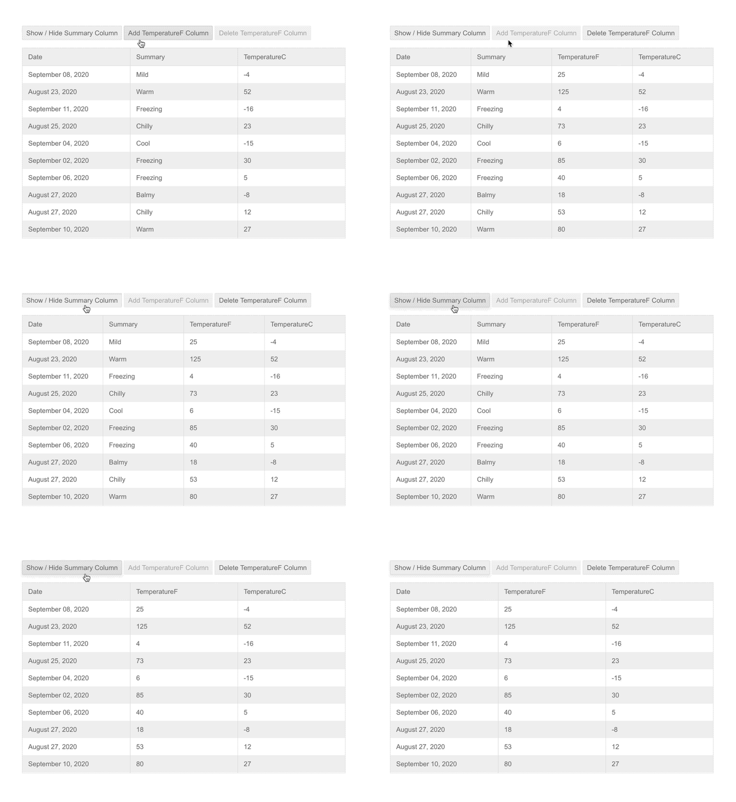
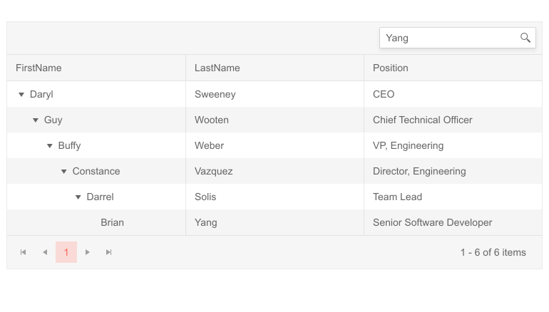
Grid Column Visible Property

With the new Grid column Visible property, you can easily programmatically show/hide Grid columns permanently or based on a condition.

In a basic scenario, when a column needs to stay hidden at all times, you simply set the column property Visible to false. However, you can also use the Visible parameter for cases when you need to provide conditional visibility of a column, toggle column visibility or determine whether to show a column based a result from a bool method. Check out more code samples on how to control column visibility in Blazor Grid here.

Telerik UI for Blazor Grid Column Visible Property

Telerik UI for Blazor - Grid Column Visible Property

New Blazor TreeList Features

TreeList Search Box

Enable your users to quickly search and find relevant data rows in the TreeList with the new built-in feature Search Box.

Telerik UI for Blazor TreeList Search Box Telerik UI for Blazor TreeList Search Box
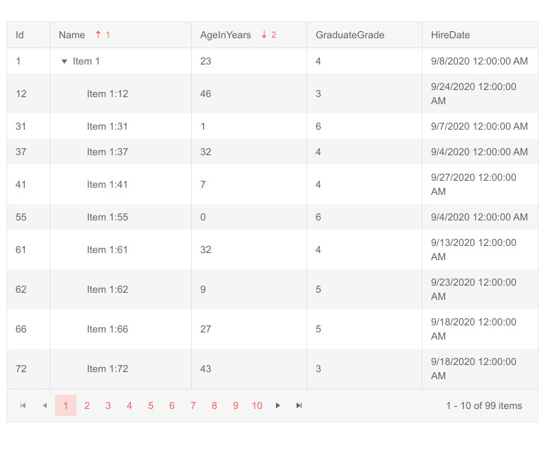
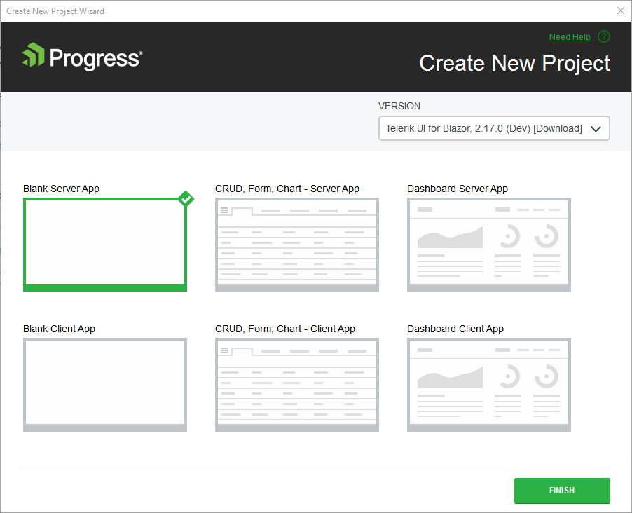
The search feature will add a search text box inside the TreeList toolbar and allow you to configure which columns will be searchable. 

TreeList Column Visible Property

Similarly to the Grid, you can toggle column visibility with the TreeList component using the new column Visible property.

TreeList Multi-Column Sorting

The TreeList can now be sorted based on multiple criteria. With the new SortMode property you can enable data sorting based on single (SortMode="@SortMode.Single") or multiple tree list columns (SortMode="@SortMode.Multiple").
Telerik UI for Blazor TreeList Multi-Column Sorting

Telerik UI for Blazor TreeList Multi-Column Sorting

Visual Studio Extensions and Installers 

Visual Studio Extensions for Mac

With the latest release, the Telerik Blazor Visual Studio Extensions are also available for Visual Studio for Mac. With them you can create new projects and add Telerik Blazor components to existing Blazor projects with just a few clicks.

Visual Studio Dashboard Project Template

The new Visual Studio Dashboard Project Template will come handy for everyone building dashboard-like Blazor applications. The template offers a predefined layout and UI building blocks that you can use directly or customize according to your scenario.

Telerik UI for Blazor Visual Studio Dashboard Project Template

Telerik UI for Blazor Dashboard Project Template

Once you update your Telerik UI for Blazor version with the latest package, you can create a new project and choose the new Dashboard project template (available for both server and client apps) from the Create New Telerik Project Wizard.

Linux Installer

Telerik UI for Blazor can be installed on any platform—now even on Linux.

New Blazor Online Technical Training

Telerik UI for Blazor now comes with a technical online training available for both accounts with active trials and license holders. The training is part the Progress Telerik Video Learning Platform and covers multiple topics related to application development for both Blazor as a framework and Telerik UI for Blazor components.

Telerik UI for Blazor Online Technical Training 

The course provides a great way to onboard team members on Blazor and Telerik UI for Blazor and boosts developer productivity with hands-on experience for building a real-world application, along with multiple how-to topics and code examples. Its format and syllabus allow learning at your own pace and referring to topics of interest when needed.

To access the Telerik UI for Blazor online training, visit our learning portal withall Progress Products Virtual Classroom Courses or jump directly to Telerik UI for Blazor Online Training.

Updated Demos and Documentation

As we know how important the documentation and examples are for developers, we continuously dedicate efforts to improve the resources related to Telerik UI for Blazor. In R3 2020 we completely revamped the demos and documentation with the goal to make your journey better and faster.

Take a look at the Blazor components demos and documentation and let us know what you think in the embedded feedback forms on both portals!
Telerik UI for Blazor Demos Hub Page

Telerik UI for Blazor Demos Hub

Telerik Blazor R1 2021 Roadmap

We will continue to expand the Telerik UI for Blazor suite and we already have exciting plans for the upcoming 2021 releases. If you want a sneak peek of what’s coming, we encourage you to keep an eye on the Telerik UI for Blazor Roadmap Page. Not only will you get an insider’s look at our features pipeline, but you’ll continue to have the opportunity to help us improve with your valuable feedback. Your input helps make the Telerik UI for Blazor bigger and better for everyone.

Download the Latest Version of Telerik UI for Blazor

We would like to thank for the continuous support and encourage you to download a free trial version of Telerik UI for Blazor, or if you are an active license holder you can just grab the latest and greatest from the Your Account page! Share your thoughts with us on our dedicated Blazor feedback portal and help us shape the future of UI for Blazor.

Blazor Twitch Demo & Telerik Web Products R3 2020 Webinar

Join the live webinar dedicated to Telerik Web Products R3 2020 release webinar on Monday, September 28, 2020, starting at 11:00 am ET as Ed Charbeneau and Sam Basu present the major updates in detail.

And in case you need more of Telerik UI for Blazor join the Blazor demo session on Twitch, starting at 12:30 pm ET to see the newly released components and features in action and get ideas on how to use them in your Blazor projects.

Reserve Your Webinar Seat

Happy Blazor Coding from Your Telerik Blazor Team at Progress!

New ASP.NET Core UI Components and Features with Telerik R3 2020 Release

$
0
0

It’s September and time for the R3 2020 release of Telerik UI for ASP.NET Core! It is massive and includes great time-saving controls such as Image Editor, App Bar, Loader, Text Area, Wizard, Pager and new features like Grid Sticky Columns, Gantt Planned vs Actuals, Column Options and Templates, TreeList Checkbox Selection, Drag, Drop & Reorder, compatibility with .NET 5.0 and more!

With the third major release for 2020 we are excited to share all new components, features and enhancements that you can plug into your ASP.NET Core projects and create modern and engaging applications. As always, we listened to your feedback and included in the release many of the most voted items and features. Read ahead and see what’s included in Telerik UI for ASP.NET Core R3 2020!

Compatibility with .NET 5.0 Release Candidate

We are happy to announce that Telerik UI for ASP.NET Core R3 2020 release is compatible with .NET 5.0 Release Candidate, and we aim at staying aligned with all updates by Microsoft with its official release later this year in November.

New Telerik UI for ASP.NET Core Components

UI for ASP.NET Core Image Editor Component

Image Editor Overview

The new Image Editor is a flexible graphics editing UI component that allows end users to modify their images directly in their browser, without installing any third-party software. The ImageEditor comes with a canvas and handy toolbar exposing the built-in options to load, crop, resize, use zooming features, undo and redo commands and download the modified image.
Telerik UI for ASP.NET Core Image Editor Component

Telerik UI for ASP.NET Core Image Editor Component

Image Editor Resizing

When resizing an image, the ImageEditor displays a tool panel with options that will let you adjust width, height and lock aspect ratio. As you modify the image size settings and preview the applied changes, you can easily switch back and forth using the Undo/Redo buttons in the toolbar.
Telerik UI for ASP.NET Core Image Editor Dialog Resize

Telerik UI for ASP.NET Core Image Editor Resizing

Image Editor Cropping

Cropping an image also comes with a tool panel, which enables you to tweak aspect ratio, orientation, width and height of the image. Again, you can view the applied changes in real-time and have the option to revert a step back using the Undo button or confirm the changes and download the modified image.

Telerik UI for ASP.NET Core Image Editor Dialog Crop

Telerik UI for ASP.NET Core Image Editor Cropping

Image Editor Zoom Options

The zooming options are split into easily accessible Zoom-In and Zoom-Out buttons (as more common operations), and a separate dropdown for “Fit to Screen” and “Show Actual Size” operations. When using the “Show Actual Size” option, the image is displayed in its 100% size (if it's bigger than the image area, a scrollbar will be displayed). When the “Fit to Screen” option is selected, the image is displayed at its maximum with regards to the paddings of the area.

Image Editor Built-In Keyboard Support

Like most of the Telerik UI for ASP.NET Core Components, the ImageEditor comes with out-of-the box keyboard navigation support.

UI for ASP.NET Core App Bar Component

AppBar Component Overview

The new App Bar is a component that can serve as header or footer template of a page and is used to provide contextual information and actions related to the application current screen. Using the AppBar templates you can easily include plain text or other controls and customize the component, so it matches your app requirements.

 Telerik UI for ASP.NET Core AppBar Component

Telerik UI for ASP.NET Core AppBar Component

AppBar Configuration and Customization

As application scenarios vary a lot, we ensured that the AppBar is fully customizable, and you can easily adapt it as needed. You can configure the AppBar position mode (static, fixed or sticky), position (none, top, bottom), theme color (light, dark or inherited from the respective theme) and the array of AppBar items. 

AppBar Items Configuration and Customization

Furthermore, as the AppBar component serves as a container for other items, you can configure both the AppBar and each of its items. On the AppBar items level you can specify CSS class name, width, type – spacer item or content item, as well as support for templates.

AppBar Event

The AppBar supports resizing, and we have exposed a resize event that is fired when the window gets resized and let you have control over the showing and hiding of AppBar items when the visible part of the viewport changes.

UI for ASP.NET Core Loader Component

Loader Component Overview

The new ASP.NET Core Loader component is a great match for cases where you need to indicate to users in your apps that a process is in progress—loading data, submitting a form or performing large volume of updates. The Loader provides multiple built-in options for configuring its animation, size and colors.
Telerik UI for ASP.NET Core Loader Component

Telerik UI for ASP.NET Core Loader Component

Loader Component Customization

The Loader component allows for complete customization and comes in different shapes, animations, colors and sizes.

  • Available Loader animations include: Pulsing (default), InfiniteSpinner and ConvergingSpinner.
  • Using the ThemeColor property of the Telerik Loader component, you can easily set its color to one of the predefined colors from the Theme Builder.
  • In addition to the colors, you can also adjust the Loader size, so that it fits your app scenario. The possible out-of-the box Loader sizes include small, medium and large.

    Telerik UI for ASP.NET Core Loader Component Colors

Telerik UI for ASP.NET Core Loader Component Colors

Loader Component Integration

The Loader UI control can be easily integrated with other ASP.NET Core UI components to indicate that an operation is executing. Check out a demo on how to integrate a Loader with a Button component.

Telerik UI for ASP.NET Core Loader Button Integration Telerik UI for ASP.NET Core Loader Component Button Integration

UI for ASP.NET Core Text Area Component

TextArea Component Overview

The Text Area UI component is a nice addition for any application requiring wider or multi-line text editing capabilities such as descriptions, comments or address details. The control comes with multiple built-in features that let you easily customize every aspect of its look and behavior, such as defining maximum length of the text, number of columns and rows, placeholder, enabling/disabling, resizing and labels.  Additionally, it exposes a Change event, to let you handle the business logic of your ASP.NET Core app.

Telerik UI for ASP.NET Core TextArea Component

TextArea Component Labels

The ТextArea can have label associated with it. You can choose from three labeling options—the textarea label can be added in front of the input, within the content or as a fancy floating label.

Telerik UI for ASP.NET Core TextArea with Floating Label Telerik UI for ASP.NET Core TextArea Component with Floating Label
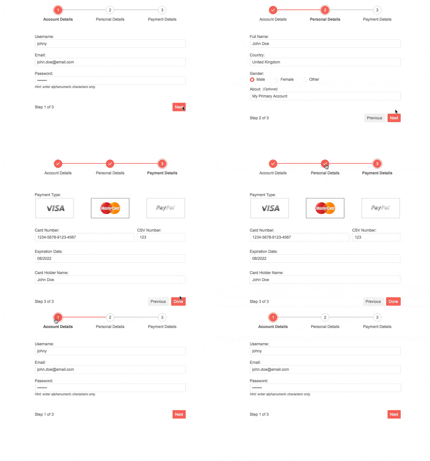
TextArea Right-To-Left Support

Like most of the Telerik UI for ASP.NET Core Components, the Text Area comes with out-of-the box RTL support.

UI for ASP.NET Core Wizard and Pager Components

Earlier in June, we announced the availability of another two gems that are part of R3 2020 scope—the Wizard and Pager for ASP.NET Core components. While we already received quite positive feedback about their usage and benefits, for those of you who missed their announcement, make sure to check out their full review in this blog post.

Telerik UI for ASP.NET Core Wizard Component

Telerik UI for ASP.NET Core Wizard Component

Telerik UI for ASP.NET Core Component Features

Along with the multiple new components, we focused efforts on enhancing some of your favorite components: Grid, Gantt, TreeList, Scheduler, Spreadsheet and Numeric Textbox.

New UI for ASP.NET Core Gantt Component Features

The Gantt component received a lot of enhancements with this release and several highly requested features were included in the latest version of Telerik UI for ASP.NET Core. Namely: comparing planned versus actual task execution, multiple configuration column options for the task section of the Gantt, column templates that let you render custom task content and more! We hope that providing these built-in features will help you save a ton of time when working on ASP.NET Core applications related to project management, task management, resource management and productivity applications.

Gantt Planned vs Actual Comparison

The Gantt is a go-to tool, not just for task planning and execution, but also a great visual way to compare if tasks are progressing according to plan. With the new Gantt feature Planned vs Actuals you can easily compare if a task's actual start and end dates are according to plan. 

You will get visual indicators that show if planned start and end dates are kept, or if a task's actual date is after or before the planned start/end dates.

Telerik UI for ASP.NET Core Gantt - Planned vs Actual Telerik UI for ASP.NET Core Gantt - Planned vs Actual
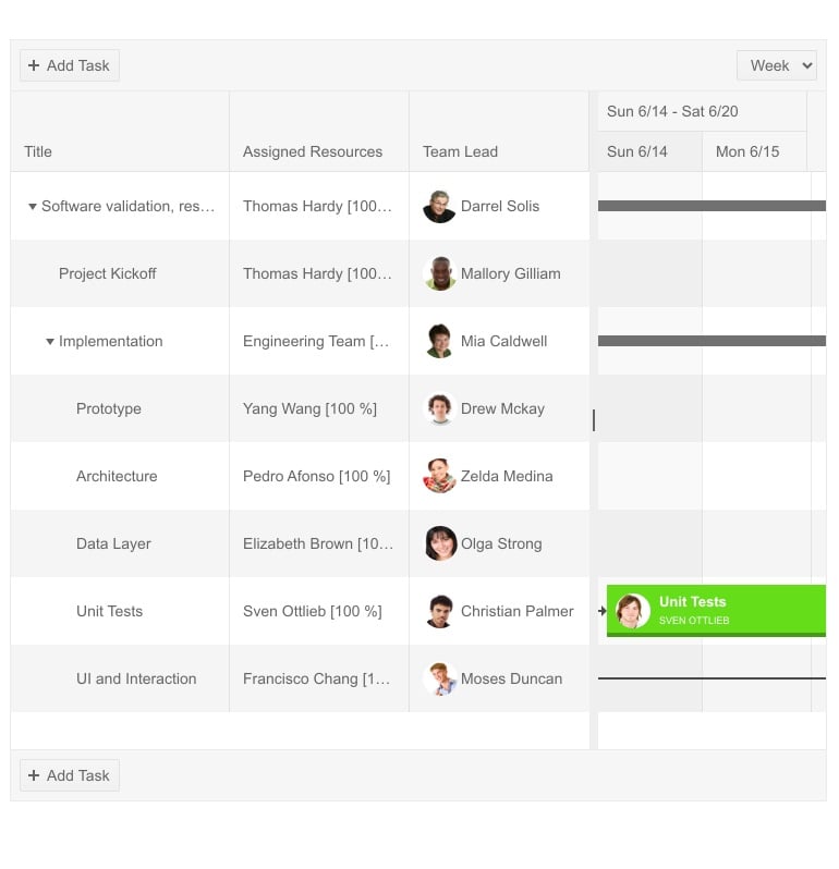
Gantt Column Templates

The Gantt column templates feature will let you render any content you may need, not just plain text. Whether is it images, links, or formatted multi-line description—all of that is now possible.

Telerik UI for ASP.NET Core Gantt Column Templates Telerik UI for ASP.NET Core Gantt Column Templates

Gantt Column Options 

To give further flexibility to both you as a developer and your app users, we enabled multiple Gantt column options and attributes:

  • Sorting
  • Filtering
  • Expanding
  • Header template and attributes
  • Hidden
  • Menu
  • Using editors
  • And more
Telerik UI for ASP.NET Core Gantt Column Sorting

Telerik UI for ASP.NET Core Gantt Column Sorting

New UI for ASP.NET Core Grid Features

Grid Sticky Columns

The new Grid Columns Sticky feature is specifically beneficial for grids with a large number of columns that need to be visualized on limited screen space.  The concept of sticky columns enables certain column(s) to stay visible in the viewable area, while leaving the rest of the non-sticky columns scrollable.

The Sticky columns feature is available alongside frozen columns. If you wonder what the difference between frozen and sticky columns is, here is the answer: while the frozen columns in the Grid are rendered on the left side of the widget, the sticky columns are displayed in the scrollable area with the non-frozen columns.

To try out the new feature, simply set the Sticky property of the corresponding column to true, and this will make the column sticky. Sticking/unsticking columns is enabled in the Grid Column Menu, so end users can easily configure the data in a way they prefer.

Telerik UI for ASP.NET Core Grid Sticky Column Telerik UI for ASP.NET Core Grid Sticky Column
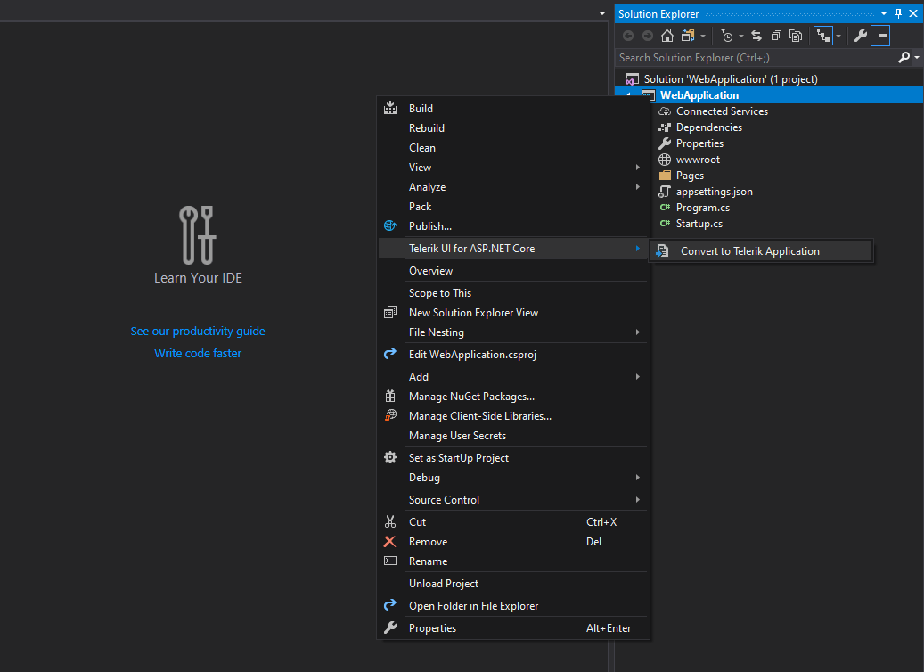
Grid Foreign-Key Binding to Remote Collection

With this new feature you can easily bind a foreign-key column to a remote data source. In order to bind the column to a remote collection of items, supply an URL Action instead of a static collection. In order to ensure that the column values will be bound to the correct foreign value, you also need to supply the DataValueField and DataTextField options. Check out the code sample and demo of implementing grid column foreign-key binding.

New UI for ASP.NET Core TreeList Features

TreeList Component Drag, Drop & Reorder

With the R3 2020 release, we enhanced the TreeList drag-and-drop feature with an option to reorder items. When enabled, the items of the TreeList can be dragged and dropped across all levels (by default reordering is be disabled). The functionality also includes tooltips/markers that show users where exactly the tree list item will be dropped.

TreeList Component Checkbox Selection 

The TreeList now supports checkbox selection: you can select and have access to parent items with all of its related children rows, or just a single tree list item.

Telerik UI for ASP.NET Core TreeList Checkbox Selection

UI for ASP.NET Core PivotGrid Row and Column Header Sorting

With the new PivotGrid feature you can now perform data sorting by row and column header values. This allows you to sort values on top level dimension members, as well as drill-down dimension hierarchy, view sliced values and again sort on lower level dimension members.

UI for ASP.NET Core Spreadsheet: Render Cells Using Custom HTML 

With the R3 2020 release, we shipped a highly requested Spreadsheet feedback portal item. By adding a single property .Html(true) and setting it to true, you can render the Spreadsheet cell value as custom HTML. Additionally, we exposed a method that will let you set the HTML property dynamically. You can try it yourself with a runnable example in the documentation API here.

UI for ASP.NET Core Scheduler Recurrence Editor Section 508 and WCAG 2.0 compliant 

Further improving the accessibility of the Scheduler UI component, in R3 2020 we ensured that recurrence editor conforms to Section 508 and WCAG 2.0 standards.

UI for ASP.NET Core Numeric Textbox: Selecting All Text on Focus 

The new SelectOnFocus property of the numeric textbox editor will be handy for users performing data editing and need to start typing immediately after the focus is placed on specific NumericTextBox. When SelectOnFocus is set to true, the whole text will be selected upon focus.
Telerik ASP.NET Core Numeric TextBox - Selecting all text on focus

Telerik ASP.NET Core Numeric TextBox - Selecting all text on focus

Convert ASP.NET Core Projects to Telerik UI for ASP.NET Core Projects

With the new Visual Studio wizard, you can quickly and easily convert existing ASP.NET Core projects to Telerik UI for ASP.NET Core, meaning you will get automatically all the needed NuGet references and visual studio project templates.

Telerik UI for ASP.NET Core Convert Wizard

Telerik UI for ASP.NET Core Convert Wizard

Visual Studio Dashboard Project Template 

Announced earlier in June, the new Visual Studio Dashboard project template for ASP.NET Core, is already seen as real time-saver by developers creating dashboard-like applications, so make sure you check out its original announcement in the blog post.

Telerik Document Processing Enhancements

SpreadProcessing: Support for XLS Import and Export

The RadSpreadprocessing library now supports import and export to and from XLS file format (Excel 97 - Excel 2003 binary file format, developed by Microsoft for representing spreadsheets).

Check out the features help topic and learn how to work with XLS files in SpreadProcessing, using XlsFormatProvider.

PdfProcessing: CMap Tables support

The CMap Tables in the PDF documents define mappings between character codes and character selectors. Now you can seamlessly import documents containing the predefined in the PDF format CMap Tables and ensure even the custom ones are imported as expected. Find out how to enable the support for them in the CMap Tables help topic.

Improved Documentation and Demos

As we know how important the documentation and examples are for developers, we continuously dedicate efforts to improve the resources related to Telerik UI for ASP.NET Core. With the Telerik R3 2020 release, we completely revamped the ASP.NET Core demos and documentation with the goal of making your journey better and faster.

Check out the new Telerik UI for ASP.NET Core components demos and documentation and let us know what you think!

Download Telerik UI for ASP.NET Core

Download the Latest from Telerik UI for ASP.NET Core

We would like to thank for the continuous support and encourage you to download a free trial version of Telerik UI for ASP.NET Core, or if you are an active license holder you can just grab the latest and greatest from the Your Account page! Share your thoughts with us on our feedback portal and help us shape the future of UI for ASP.NET Core.

Telerik Web Products R3 2020 Webinar

Join the live dedicated to Telerik Web Products R3 2020 release webinar on Monday, September 28, 2020, starting at 11 am ET as Ed Charbeneau and Sam Basu present the major updates for Telerik UI for ASP.NET MVC, Core, AJAX and Blazor in detail.

Reserve Your Webinar Seat

Happy ASP.NET Core Coding!

New ASP.NET MVC UI Components and Features with Telerik R3 2020 Release

$
0
0

The R3 2020 release for Telerik UI for ASP.NET MVC is here! Check out the latest additions of components like Image Editor, App Bar, Loader, Text Area, Wizard, Pager and new features like Grid Sticky Columns, Gantt Planned vs Actuals, Column Options and Templates, Tree List drag, drop and reorder or rows, enhancements to Numeric Textbox, Spreadsheet, Scheduler and more!

With the third release for 2020 we are excited to share all new components and features that you can plug into your projects and create modern and engaging MVC applications. As always, we listened to your feedback and included in the release many of the most voted items and features. Read ahead and see what’s new in Telerik UI for ASP.NET MVC R3 2020!

New Telerik UI for ASP.NET MVC Components

UI for ASP.NET MVC Image Editor Component

Image Editor Overview

The new MVC Image Editor is a flexible graphics UI component that allows end users to edit their images directly in their browser with no need of third-party software. The ImageEditor includes a canvas, handy toolbar with many built-in options to load, crop, resize, zoom, undo and redo commands, as well as downloading the modified image.
Telerik UI for ASP.NET MVC Image Editor Component

Telerik UI for ASP.NET MVC Image Editor Component

Image Editor Resizing

For image resizing, the ImageEditor provides a tool panel with options for adjusting width, height and locking aspect ratio. As you modify the image size settings you can preview the applied changes and can easily go back and forth using the Undo & Redo commands.
Telerik UI for ASP.NET Core Image Editor Dialog Resize

Telerik UI for ASP.NET MVC Image Editor Resizing

Image Editor Cropping

Cropping an image also comes with a tool panel, which enables you to adjust aspect ratio, orientation, width and height of an image. Again, you can view the applied changes in real-time and have the option to revert a step back using the Undo button. Alternatively, you can confirm the changes and download the modified image.

Telerik UI for ASP.NET MVC Image Editor Dialog Crop

Telerik UI for ASP.NET MVC Image Editor Cropping

Image Editor Zoom Options

The Image Editor zooming options can be accessed from the toolbar and are divided in two. Common operations such as Zoom-In and Zoom-Out are directly accessible via buttons, and the “Fit to Screen” and “Show Actual Size” commands are accessible via a dropdown list. When using the “Show Actual Size” option, the image is displayed in its 100% size (if it's bigger than the image area, a scrollbar will be displayed). When the “Fit to Screen” option is selected, the image is displayed at its maximum width regards to the paddings of the area.

Image Editor Built-In Keyboard Support

Like most of the Telerik UI for ASP.NET MVC Components, the ImageEditor comes with out-of-the box keyboard navigation support.

UI for ASP.NET MVC App Bar Component

AppBar Component Overview

The new App Bar is a component that is used to provide context and actions related to the application's current screen. Using the MVC AppBar templates you can easily create your own custom header or footer template and include plain text or other controls, so it matches your app requirements.

Telerik UI for ASP.NET MVC AppBar Component 

Telerik UI for ASP.NET MVC AppBar Component


AppBar Configuration and Customization

The AppBar control is fully customizable, and you can easily configure both the Appbar and its items. On the AppBar level you can set the AppBar position mode (static, fixed or sticky), position (none, top, bottom), theme color (light, dark or inherited from the respective theme) and the array of AppBar items.

On AppBar items level you can specify CSS class, width, type – spacer item or content item, as well as support for templates. 

AppBar Event

The AppBar supports resizing, and we have exposed a resize event that is fired when the window gets resized. You have control over the showing and hiding of AppBar items when the visible part of the viewport changes.

UI for ASP.NET MVC Loader Component

Loader Component Overview

The new MVC Loader component provides visual indication to your app users that a process is in progress, such asprocessing large volumes data, submitting a form or other time consuming operations. The Loader control comes with many built-in configuration options for animation, size and color.

 Telerik UI for ASP.NET MVC Loader Component

Telerik UI for ASP.NET MVC Loader Component

Loader Component Customization

The Loader component allows full customization and comes in different shapes, animations, colors and sizes.

  • Loader animations: Pulsing (default), InfiniteSpinner and ConvergingSpinner
  • Loader colors: You can easily set the color to one of the predefined colors from the Theme Builder
  • Loader sizes: Small, medium and large
Telerik UI for ASP.NET MVC Loader Colors 

Telerik UI for ASP.NET MVC Loader Colors


Loader Component Integration

The Loader UI control can be easily integrated with other MVC UI components to indicate that an operation is executing. Check out a demo on how to integrate MVC Loader with a Button component.

Telerik UI for ASP.NET MVC Loader Button Integration 

Telerik UI for ASP.NET MVC Loader Component Integration with Button

UI for ASP.NET MVC Text Area Component

TextArea Component Overview

The Text Area MVC UI component is a nice addition for apps requiring wider or multi-line text editing capabilities. It comes with multiple built-in features that let you easily customize every aspect of its design and behavior: maximum length of the text, number of columns and rows, placeholder, enabling/disabling, resizing and labels.

Telerik UI for ASP.NET MVC TextArea Component 

Telerik UI for ASP.NET MVC TextArea Component

TextArea Component Labels

The TextArea control provides three labeling options—in front of the input, within the content or as a fancy floating label.

Telerik UI for ASP.NET MVC TextArea with Floating Label

Telerik UI for ASP.NET MVC TextArea Floating Label

TextArea Right-To-Left Support

Like most of the Telerik UI for ASP.NET MVC Components, the Text Area comes with built-in right-to-left support.

UI for ASP.NET MVC Wizard and Pager Components

Telerik UI for ASP.NET MVC Wizard Component

Telerik UI for ASP.NET MVC Wizard Component

Earlier in June, we announced the availability of two great additions that are part of Telerik R3 2020—the ASP.NET MVC Wizard and Pager components. While we are already receiving very positive feedback, for those of you who missed their announcement, make sure to check out their review in the blog post.

Telerik UI for ASP.NET MVC Pager Component

Telerik UI for ASP.NET MVC Pager Component

Telerik UI for ASP.NET MVC Component Features

New UI for ASP.NET MVC Gantt Component Features

The MVC Gantt UI control is now enhanced and expanded with several new cool features such as: comparing planned versus actual task execution, multiple configuration column options for the task section of the Gantt, column templates that let you render custom task content and more! All these built-in features will save a ton of time when working on MVC applications related to project management, task management and productivity applications.
Telerik UI for ASP.NET MVC Gantt Overview                                            Telerik UI for ASP.NET MVC Gantt Component
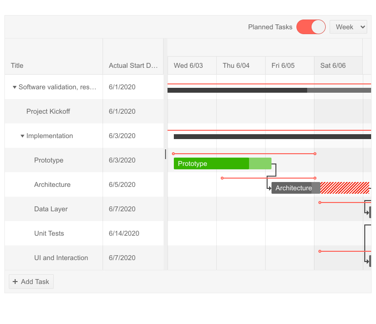
Gantt Planned vs Actual Comparison

The Gantt is a go-to visual tool for task planning, tracking their execution. With the new MVC Gantt feature Planned vs Actuals you can easily compare if a task's actual start and end dates are according to plan.
Telerik UI for ASP.NET MVC Gantt - Planned vs Actual

Telerik UI for ASP.NET MVC Gantt Planned vs. Actual

You will get visual indicators that show if planned start and end dates are kept, or if a task's actual date is after or before the planned start/end dates. 

Gantt Column Templates

The Gantt column templates feature will let you render any content you may need in its columns—plain text, images, links, or formatted multi-line description.

Telerik UI for ASP.NET MVC Gantt Column Template

Telerik UI for ASP.NET MVC Gantt Column Templates

Gantt Column Options 

There are multiple new Gantt column options and attributes that you can easily set and enhance the user experience. Sorting, filtering, expanding, column header template and attributes, column menu and more!

Telerik UI for ASP.NET MVC Gantt Sorting Column

Telerik UI for ASP.NET MVC Gantt Column Options

New UI for ASP.NET MVC Grid Features

Grid Sticky Columns

The new MVC Grid Columns Sticky feature is a great way to handle the challenge with grids containing large number of columns that need to be visualized on limited screen space. The concept of sticky columns enables certain column(s) to stay visible in the viewable area, while leaving the rest of the non-sticky columns scrollable.

You can use the new Sticky columns alongside existing Grid frozen columns. Each of them provides different ways to “pin grid columns”: Frozen columns are rendered on the left side of the Grid, while sticky columns are displayed in the scrollable area with the non-frozen columns.

The Sticky column feature can be turned on by a single property and can be accessed by end users via the Grid Column menu.

Telerik UI for ASP.NET MVC Grid Sticky Column

Telerik UI for ASP.NET MVC Grid Sticky Columns

Binding Grid Foreign-Key Column to a Remote Collection 

With this new feature you can easily bind a ForeignKey column to a remote data source. In order to bind the column to a remote collection of items, supply an URL Action instead of a static collection. Check out the code sample and demo of implementing grid column foreign-key binding.

New UI for ASP.NET MVC TreeList Features

TreeList Drag, Drop & Reorder

With the R3 2020 release, we enhanced the TreeList drag-and-drop feature with an option to reorder items. When enabled, the items of the TreeList can be dragged and dropped across all levels (by default reordering is be disabled). The functionality also includes visual markers that indicates to users where exactly the tree list item will be dropped.

TreeList Checkbox Items Selection 

The MVC TreeList now supports checkbox selection: you can select and have access to parent items with all of its related children rows, or just a single tree list item.

Telerik UI for ASP.NET MVC TreeList Checkbox Selection

Telerik UI for ASP.NET MVC TreeList Checkbox Item Selection

UI for ASP.NET MVC PivotGrid Row and Column Header Sorting

With the new MVC PivotGrid feature you can now perform sorting by row and column header values. This allows you to sort values on top level dimension members, as well as drill-down dimension hierarchy, view sliced values and again sort on lower level dimension members.

UI for ASP.NET MVC Scheduler Recurrence Editor Section 508 and WCAG 2.0 Compliant 

Further improving the accessibility of the MVC Scheduler, in R3 2020 we ensured that recurrence editor conforms to Section 508 and WCAG 2.0 standards.

UI for ASP.NET MVC Spreadsheet: Render Cells Using Custom HTML 

We are happy to ship with this release a highly requested feedback portal item related to the Spreadsheet component. By setting a simple property .Html(true), you can render the cell value as HTML. Additionally, we exposed a method that will let you set the HTML property dynamically.

UI for ASP.NET MVC Numeric Textbox: Selecting All Text on Focus 

The new configuration option SelectOnFocus will bring benefit to users that need to start typing immediately after the focus is placed on specific MVC NumericTextBox. When SelectOnFocus is set to true, the whole input text will be selected upon focus.

Visual Studio Dashboard Project Template 

Announced earlier in June, the new MVC Dashboard project template in Visual Studio, is already seen as real time-saver by developers creating dashboard-like applications, so make sure you check out its original announcement in the blog post.
Visual Studio MVC Dashboard Project Template

Telerik UI for ASP.NET MVC Dashboard Project Template

Telerik Document Processing Enhancements 

SpreadProcessing: Support for xls import & export

The RadSpreadprocessing library now supports XLS file format import and export (Excel 97 - Excel 2003 binary file format). To learn more about how to work with XLS files in SpreadProcessing, using XlsFormatProvider, check out the dedicated documentation article.

PdfProcessing: CMap Tables support

The CMap Tables in the PDF documents define mappings between character codes and character selectors. Now you can seamlessly import documents containing the predefined in the PDF format CMap Tables and ensure even the custom ones are imported as expected. Find out how to enable the support for them in the CMap Tables help topic.

Improved Documentation and Demos

As we know how important the documentation and examples are for developers, we continuously dedicate efforts to improve the resources related to Telerik UI for ASP.NET MVC. With the Telerik R3 2020 release, we completely revamped the MVC demos and documentation with the goal of making your journey better and faster.

Take a look at the ASP.NET MVC components demos and documentation and let us know what you think in the feedback forms on both portals!

Download the Latest from Telerik UI for ASP.NET MVC

We would like to thank for the continuous support and encourage you to download a free trial version of Telerik UI for ASP.NET MVC, or if you are an active license holder you can just grab the latest and greatest from the Your Account page! Share your thoughts with us on our feedback portal and help us shape the future of UI for ASP.NET MVC.

Telerik Web Products R3 2020 Webinar

Join the live dedicated to Telerik Web Products R3 2020 release webinar on Monday, September 28, 2020, starting at 11 am ET as Ed Charbeneau and Sam Basu present the major updates for Telerik UI for ASP.NET MVC, Core, AJAX and Blazor in detail.

Reserve Your Webinar Seat

Happy ASP.NET MVC Coding!


What’s New in Telerik UI for ASP.NET AJAX R3 2020

$
0
0

The R3 2020 Telerik UI for ASP.NET AJAX release is here! Discover more about the new Web Forms Card component, the latest new features in the Chart component, our upcoming Telerik Web Products R3 2020 release webinar and what’s next on the R1 2021 roadmap due in January!

ASP.NET AJAX Card Component

RadCard Overview

The Card UI component will give you a great way to organize page layouts in flexible content containers. It consists of a header element (with title and subtitle), footer, body that serves as container for the Card content, actions, separators and more. Card components are a perfect match for applications such as hub pages, catalogs, analytical dashboards, blogs, ecommerce and social platforms.

Telerik UI for ASP.NET AJAX Card Component

Telerik UI for ASP.NET AJAX Card Component

Card Components

The ease of use of the RadCard comes from its building blocks that let you directly plug them as tags within the main RadCard tag and fully customize them. Depending on the type of Card you need to build, you can add:

  • Header – renders as <div>
  • Title – renders as <h5> element
  • Subtitle – renders as <h6> element
  • Body - renders as <div>
  • Footer - renders as <div>
  • Action containers and actions - renders as <div>, respectively <hr>
  • Media - renders as <div>
  • Separators - renders as <div>

RadCard Styles

There are several predefined states as properties of the RadCard tag, that you can use to change the Card appearance. The available CardState options are default, primary, info, success, warning, error.

RadCard Content and Customization

The RadCard control allows any type of HTML content or control to be accommodated within its body—plain text, links, action buttons, icons, images, videos and more. You also have also full control and flexibility over how the content is arranged, and you can even add or create other components within the Card itself. The Card also provides complete configuration of its header and actions, so you can easily implement any requirement in no time.

Additionally, the RadCard component exposes several CSS classes that let you easily arrange series of cards into various layouts:

  • Deck of Cards – using the .k-card-deck class, you can render a single row of cards detached from one another;
  • Group of Cards – using the .k-card-group class, you can render a single row of cards attached from one another;
  • List of Cards – using the .k-card-list class, you can render a column of cards detached from one another;
  • Custom Layout – to achieve flex layout you can use one of the following classes: .k-vbox, .k-hbox or .k-column;

RadCard Orientation

The Card component can organize its content (Header, Body, Footer, Actions) in vertical and horizontal layout. Additionally, actions alignment can be configured to: start, centered, end, stretched and none.

Telerik UI for ASP.NET AJAX Card - Orientation

Telerik UI for ASP.NET AJAX Card Orientation – Vertical and Horizontal

RadCard Comes with Variety of Skins 

The RadCard component comes with 20+ out-of-the box skins like Material, Bootstrap. You can easily customize the cards to match the needs of your web site and modify the built-in themes as they are based purely on HTML5 and CSS3. 

Telerik UI for ASP.NET AJAX Card Component Skins 

Telerik UI for ASP.NET AJAX Card Component Skins

RadCard Right-to-Left Support

Like most of the Telerik web forms components, the RadCard control provides built-in support for right-to-left presentation.

RadChart New Features

In R3 2020, along with the new Card component, the RadChart has been enhanced with the following features: Crosshairs, DashType property, reverse legend items order and more. Read ahead to learn in detail what new customizations you can apply to your charts.

Crosshairs

Crosshairs are thin vertical and horizontal lines centered on a data point in a chart. Crosshairs in charts allow users to see the exact value of a point at the current cursor position. 

Telerik RadChart - Crosshairs

Telerik RadChart Crosshairs Feature

DashType Property

In R3 2020 we added a DashType Property for Area, Line and ScatterLine charts. You can choose between Dash, DashDot, Solid or any of the other four types and style your chart lines, xAxis, yAxis, major and minor grid lines as needed.

Telerik RadChart - DashType Property

Telerik RadChart DashType Property

Appearance Settings for the Series Border

Series borders can now be customized with additional settings for width, dash type, color and opacity. Checkout the demo (Series settings -> Borders section on the right) and see the various options for configuring chart border series work.

Telerik RadChart Appearance options for the Series border

Telerik RadChart Series Border Settings

Option to Reverse Legend Items Order

With the new feature, you can easily reverse the default order of items in the chart legend. More on chart legend configuration options can be found in the dedicated demo (press the Reverse Items button in the legend configurator).

Turn on/off the Highlight Effect when Series are Hovered

Programmatically turn on and off the highlight effect of series hover, or easily enable your users to do it themselves with a single click. Check out how on the demo page here (go to the Series Settings tab in the configurator and play with the highlights radio list).

New and Improved Documentation and Demos

As we know how important the documentation and examples are for developers, we continuously dedicate efforts to improve the resources related to Telerik UI for ASP.NET AJAX. In R3 2020 we completely revamped the demos and documentation with the goal to make your journey better and faster.

Take a look at the Telerik Web Forms components demos and documentation and let us know what you think!

Telerik Document Processing Libraries New Features

RadSpreadProcessing: XLS Format Support

Create and modify XLS documents in code-behind with the new XlsFormatProvider. The new class enables you to import and export documents of the Excel 97 - Excel 2003 Binary file format.

RadPdfProcessing: CMap Tables Support

The CMap Tables in the PDF documents define mappings between character codes and character selectors. Now you can seamlessly import documents containing the CMap Tables predefined in the PDF format and ensure even the custom ones are imported as expected. Find out how to enable the support for them in the CMap Tables help topic.

Telerik UI for ASP.NET AJAX R1 2021 Roadmap

We will continue to expand the Telerik web forms suite and we already have exciting plans for the next R1 2021 release due in January. If you want a sneak peek of what’s coming, we encourage you to keep using the Telerik UI for ASP.NET AJAX Roadmap Page. Not only will you get an insider’s look at our features pipeline, but you’ll continue to have the opportunity to help us improve with your valuable feedback. Your input helps make the Telerik UI for ASP.NET AJAX suite bigger and better for everyone.

Download Now Telerik UI for ASP.NET AJAX

We would like to thank you for the continuous support and encourage you to download a new Telerik UI for ASP.NET AJAX trial, or if you are an active license holder you can just grab the latest and greatest from the Your Account page!

Once you try it out and let us know what you think on our feedback portal.

Telerik Web Products R3 2020 Webinar

Join the live dedicated to Telerik Web Products R3 2020 release webinar on Monday, September 28, 2020, starting at 11 am ET as Ed Charbeneau and Sam Basu present the major updates for Telerik UI for ASP.NET MVC, Core, AJAX and Blazor in detail.

Reserve Your Webinar Seat

What’s New in KendoReact with R3 2020

$
0
0

The KendoReact R3 2020 release is here, bringing new React UI components like the Gantt Chart, AppBar, TextArea, Rating, and more! The Editor and Grid also received several updates.

The KendoReact team has put the pedal to the metal over the last couple of months, creating seven new UI components and a whole slew of features for existing React components. This includes the new Gantt Chart component along with several layout-focused UI components like the AppBar, Badge, and Chip & ChipList components. If that has you excited let’s cut the intro and jump into what’s new in KendoReact with the R3 2020 release!

New React Components

New Component: Gantt Chart

The KendoReact Gantt Component showcasing a basic Gantt layout with a few columns and several linked tasks
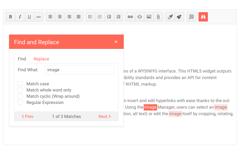
One of the most-anticipated UI components with the R3 2020 release is the new React Gantt Chart!

For those of you not familiar with what a Gantt chart is the quick and dirty is that the Gantt is a type of a bar chart that illustrates a project schedule. It allows for users to see various tasks, how they are related (does Task A need to be finished before Task B can start?), and how long each task should take to complete. As you see in the screenshot above, tasks have a visual bar to indicate the start and end of a task, how far along a particular task is, whether the task is on-time or late, and much more.

There’s a lot to uncover in this component already from v1, way too much to cover in this blog post, so head on over to the KendoReact Gantt documentation section to see the component in action along with a list of available features.

New Component: AppBar

The KendoReact AppBar Component as an application header showcasing a mix of text, action items, and icons

The AppBar has become a staple for many web applications targeting both desktop and mobile devices. A pretty standard scenario can be seen in the image above where the AppBar is rendered at the top of a page and it contains the title of the current page, a Drawer icon to expand or collapse a navigation, as well as some action buttons that are contextual to the current page.

This is just one of many scenarios where this component can fit in though! The goal behind the React AppBar component is to serve as the main area of action for your application, allowing a developer to add several action buttons, change available action items based to change the look and feel as well as available options based on context, and much more!

The KendoReact team designed this component to be as flexible as possible, giving the developer tons of options when adding this React UI component to their applications, so wander on over to the React AppBar UI component docs & demos page to see how you can go about adding this component in your React applications today!

New Component: TextArea

The KendoReact TextArea Component with a long string of text inserted along with a count of how many characters have been entered

Continuing to expand on the list of available form components in KendoReact, we are introducing the new TextArea React component! The KendoReact TextArea component, also known as a Multi-line TextBox, is suitable for any scenario that requires multiple lines of text to be entered as a part of a form. Thanks to the various KendoReact themes, this component fits naturally into any design language and can adjust its look-and-feel based on available UX requirements.

To see the new React TextArea component in action head on over to the KendoReact TextArea documentation page.

New Component: Rating

The KendoReact Rating Component showcasing three filled in starts out of five total

The new React Rating UI component is pretty self-explanatory—it allows users to provide a rating in a very digestible and visual way!

Whether requirements call for just displaying a rating value, or if users should be allowed to change a value through the component, the KendoReact Rating component can handle it with ease. With built-in support for half steps, so a user can rate something 3.5 stars for example, this new React component works well by itself or integrated in to other React UI components (like the KendoReact Grid ).

Check out the KendoReact Rating component documentation for more information!

New Component: Chip & ChipList

The KendoReact Chip and ChipList Components showcasing several chips with various layouts

The new KendoReact Chips and ChipList components lets developers add stylized containers, often referred to as a “pill,” to their React application.

The React Chip component is responsible for a single “pill” and can contain text, an image or avatar (optional), as well as a built-in icon like an “X” to indicate that an action can be taken. The Chip can be used by itself or be used as a part of other components to showcase unique selected values that have been selected by the user.

The React ChipList component takes the React Chip and provides additional functionality related to a list. This includes the ability to manage a collection of Chips, like adding and removing items as well as managing currently selected items from a list of Chips.

Jump over to the KendoReact Chips component demo page or the KendoReact ChipList component page for more information!

New Component: Badge

The KendoReact Badge Component in various scenarios, including the status indicator next to a profile avatar and notification elements for social media icons

Popularized by the icons that mobile operating systems utilize to indicate unread messages or notifications, the Badge component has expanded its usage and has become a big part of web applications. With the new KendoReact Badge component React developers can easily attach their own Badges to existing UI elements. With built-in support for text, visibility, settings for positioning and overlap as well as overall size, and the ability to just showcase a simple dot, the new React Badge component can be added to any existing user experience with just a single line of code and some quick property settings.

Check out the KendoReact Badge component docs and demos page to see the component in action.

New Component: Loader

The KendoReact Loader Component showcasing various loaders like the infinite spinner

While KendoReact has some CSS styling for a loading indicator, the team wanted to take this experience to the next level. With R3 2020 we are introducing the React Loader component—perfect for letting your users know that something is happening on the screen (loading of remote data, or fetching a view) while being visually pleasing. With several built-in animations for indicating that something is loading, as well as a whole slew of configuration options to help make the KendoReact Loader component your own, this component is sure to make your application pop with its gorgeous UX.

To see more available Loader styles, as well as get ideas for how you can customize the component to make your own, head on over to the KendoReact Loader component section in our documentation!

Enhancements to Existing React UI Components

Grid - Row Pinning

The KendoReact Grid with Row Pinning Enabled, pinning rows to the top of the grid

Adding to the growing list of Data Table features in the KendoReact Grid, with the R3 2020 release the React Grid can now pin rows that stick to the header as users scroll through the rows of the Grid.

This is fairly simple to implement in your own Grids, so head on over to the React Data Table documentation to see how!

Grid - Customizable Pager

The KendoReact Grid with a customized pager that has a slider instead of a regular paging mechanism

While the KendoReact Data Grid has had a built-in paging mechanism since its first release, it has been based on exactly that—something that is built-in. With the introduction of the standalone KendoReact Pager component we wanted to move away from something that is purely built-in and move into a more extensible model, which means the KendoReact Grid now uses the KendoReact Pager to serve its paging mechanism.

From most developers' perspectives nothing really changes. However, a bonus effect of using the standalone React Pager component is that the KendoReact team has now opened up the ability for React developers to completely override the paging user experience of the KendoReact Grid without even using the Pager component at all. The KendoReact Data Table provides all the internals that developers can hook in to and at that point any UX can be implemented to page through the React Grid data.

To see examples of what kind of customization you can do, head on over to the KendoReact Grid Paging section of our docs & demos!

Grid - Pin Columns through Column Menu

The KendoReact Grid with a user pinning columns through the available column menu

Column pinning, also known as frozen or sticky columns, is a feature that already exists in the KendoReact Grid. With this release we are enhancing the user experience of the Grid’s end-user, letting them select which columns to pin through the already available column menu.

Check out what the Column Menu Pinning option looks like in action right here!

Editor - Insert Image Dialog Updates

The KendoReact Editor with the Insert Image Dialog

The KendoReact Editor also received some updates with this release, the first feature allowing images from the local file system to be uploaded into the content of the Editor. Previously the Editor was limited to images that were hosted somewhere on the web and required a URL to be added. With this new enhancement, end-users can select images from their own devices and upload them into the Editor content.

Editor - Font Color & Background Color Tools

KendoReact Editor with the Font Color Tool

Extending the KendoReact Editor features further, with R3 2020 we have now added additional tools to control both the Font color and the Font Background—just like the equivalent tools you find in word processors today.

Editor - Find and Replace Tool

The KendoReact Editor with the Find and Replace Tool

A quality of life update to end-users of the React Editor component, the find and replace tool lets users search through the content of the Editor exclusively (no need to rely on browser tools to search through the entire page) and potentially do a find and replace throughout the entire content.

To see this and all of the other Editor tools and features that we added with R3 2020, head on over to the KendoReact Editor demos!

New and Improved Documentation and Demos

Over the last couple of months, we have focused heavily on increasing the performance of our documentation pages. After all, most of you are using these pages multiple times a day and any performance tweaks we can do can have significant impact on daily users of the KendoReact docs & demos.

That’s why I’m excited to note that with R3 2020 we have increased the performance of the KendoReact docs across the board! Our goal was to achieve a score of 90+ on average across all of our KendoReact documentation pages and happy to say we not only met this goal but overachieved in several areas! With this we have seen performance increases upwards of 4x on certain pages, improving the experience for desktop and mobile device users alike.

Got Feedback?

Everything mentioned in this blog post has been requested by KendoReact users. We drive the KendoReact roadmap from your feedback! Did we miss a component or feature that you really need, or do you have any pie-in-the-sky requests for items we should add to KendoReact? Check out the KendoReact public feedback portal where you can submit your ideas or vote on existing ideas to raise their awareness.

Register for our Live R3 2020 Webinar & Stream!

Like always, we are hosting a webinar to cover everything mentioned above! However, this year we are doing things a little bit differently.

On Tuesday, September 29th we are hosting both a webinar and a live Twitch stream where we will dive into the latest content! We kick things off at 11 AM ET where we will cover what is new with KendoReact and Kendo UI for Vue. Then, at 12:30 PM ET we are starting a Twitch live stream where we will do a deep dive session in to the latest and greatest bits. This session will let us do a true deep dive in to the new components and features and should be a fun time for everyone .

To sign up for either session, or both if you’re feeling in the spirit, head on over to the our What’s New in KendoReact and Kendo UI for Vue in R3 2020 Webinar Page and reserve your seat!

What’s New in the Kendo UI Angular Components with R3 2020

$
0
0

The Kendo UI for Angular R3 2020 release is here, bringing new components and features including the ListView, AppBar and Loader components, as well as cell selection within the Angular Grid.

The R3 2020 release of Kendo UI for Angular is here! With it we’re adding a bunch of new components and some highly requested features. As a bonus we even have a new and improved documentation and demo site! Let’s jump straight into things and read about what’s new in Kendo UI for Angular R3 2020 release.

New Angular Components

New Component: ListView

Kendo UI for Angular ListView Component

One of the top-requested components in the Kendo UI for Angular feedback portal has been the ListView component, and with R3 2020 it has finally arrived!

Some of the folks reading this blog post may be familiar with the ListView from other Kendo UI flavors, but for those of you not familiar with this type of component the quick summary is that the Kendo UI for Angular ListView allows you to create a custom template to be used for each item in a list and provides additional functionality like paging to help users navigate through all available data. Used in websites like eBay and Etsy, the ListView is an extremely flexible component and ideal to use for lists of items that may not benefit from having the traditional row and column look-and-feel of a data-centric component like the data grid.

Head on over to the Kendo UI for Angular ListView demo page for a better look at what can be accomplished with this new component!

New Component: AppBar

The Kendo UI for Angular AppBar Component with a drawer icon, header text, and multiple action items

Adding to the list of new components with R3 2020 is the new Kendo UI for Angular AppBar component. The main purpose of this component is to provide a sleek user experience at the top of your application. Everything within the AppBar is customizable and the Angular AppBar provides positioning, content arrangement, and theme coloring. The UI component is extremely flexible and what it contains is completely up to the developer, but layouts like the one provided in the image above can easily be recreated.

To see what the AppBar component can do head on over to the Kendo UI for Angular AppBar demo section.

New Component: Range Slider

The Kendo UI for Angular RangeSlider Component where a user is dragging one handler to increase and decrease the slider value

While Kendo UI for Angular has had a Slider component for some time, with R3 2020 we are covering even more scenarios for letting users select a value using the sliding action by introducing the Kendo UI for Angular Range Slider component! This new component lets users select a range of values by dragging two separate indicators to represent the floor and the ceiling of a particular range—all with a gorgeous user experience!

To play around with the various sliders head on over to the Kendo UI for Angular Range Slider component demo pages.

New Component: Breadcrumb

The Kendo UI for Angular Breadcrumb Component with a few pages in its hierarchy

Extremely useful in applications where users have to navigate through a deep hierarchy of pages (in say, developer documentation ) the new Kendo UI for Angular Breadcrumb component should be a natural addition to many Angular applications out in the wild! The component comes with built-in styling for displaying the current page and previous pages, along with integration with the Angular framework to help navigating through pages as easy as possible.

For more information, the Kendo UI for Angular Breadcrumb demos cover how to add this new component in your apps today.

New Components: Loader

The Kendo UI for Angular Loader Component showcasing several loading animations including two circles infinitely spinning around

There are often scenarios in our web apps that require users to sit and wait for a while. This could be while loading a page, asynchronously calling for some data, or doing some intensive calculations on the page. Whatever the case may be, we know that our applications shouldn’t just sit there frozen, but we should showcase some sort of loading animation.

This is where the new Kendo UI for Angular Loader component comes in to play. With various built-in styles of animation, some seen in the animated gif above, and configuration options to customize the loading animation and help make them truly unique, the Angular Loader component can be used as a standalone component or as a part of other Kendo UI for Angular components.

To play around with the various loading animations head on over to the Kendo UI for Angular Loader component docs & demos page.

New Components: TextBox

The Kendo UI for Angular Textbox Component

Previously Kendo UI for Angular developers looking to add regular input elements for text input in their applications have relied on the CSS primitives that we offer while using a native HTML element to actually render the input. We realized that Kendo UI for Angular can offer more than this, so with R3 2020 we created the Kendo UI for Angular TextBox component. Beyond ensuring a consistent look-and-feel across all form elements in your Angular applications, the Angular TextBox can add elements, or adornments, before or after the input element. These can provide custom content like icons, buttons, text, and more! Additionally, the Angular TextBox provides built-in validation icons which will render upon valid or invalid entries.

The Angular TextBox component docs and demos page covers exactly how to implement this new component along with the various features we have added on top of just the plain text input capability.

New Components: Badge

The Kendo UI for Angular Badge Component in various styles including status indicators next to avatars

Continuing the streak of new Angular UI components, with R3 2020 we have the new Kendo UI for Angular Badge component. As the screenshot above showcases, the uses for this component are pretty endless. Whether it is to showcase that there are unread notifications, the number of unread messages, the status indicator for if a user is online or away, or any myriad of other scenarios that call for a small UI component attached to a HTML element—the Kendo UI for Angular Badge is there for you! This component supports multiple alignment and positioning options, five different shapes and can contain text, icons, be filled with a single color, and more.

For more information, the Kendo UI for Angular Badge component docs is the best place to go.

New Component: Icon & SVGIcon

To wrap up the new UI components added with R3 2020 we have the Kendo UI for Angular Icon and SVGIcon Angular UI components. These components bring functionalities that previously were only available as built-in elements of other Kendo UI for Angular components into standalone UI elements. Between these two components Angular developers have access to all Kendo UI Icons (over 400 of them) and you can control icon color, size, and orientation.

Check out the Kendo UI for Angular Icon documentation section to see the Angular Icon in action.

Expanded Component Features

Grid - Cell Selection

Kendo UI for Angular Grid with Cell Selection with a few cells already selected

While we’ve had a whole slew of improvements across the entire Kendo UI for Angular suite, one of the standout new features is the Kendo UI for Angular Data Grid Cell Selection. With this new selection mode end-users now have the ability to select single or multiple cells through regular clicks and CTRL clicks as well as dragging the mouse over a set of cells in order to select a bigger range of cells at once.

Charts - Plot Band Labels & Legend Titles

With R3 2020 the Kendo UI for Angular team also took a look at potential features to add to our Angular Charts, and specifically the ability to add Plot band Labels and Legend Titles.

Plot bands can be a unique visual added to many of the Kendo UI for Angular Charts and has so far been limited to just the visual style of a band across the chart. Now, thanks to the Plot Band Labels feature each plot band can have an associated label.

For the legend of our Angular Charts developers can now define a Chart Legend Title through a configuration option, giving additional context for users as they view the legend of your charts.

Form Updates Across All Applicable Components

We have already introduced the Angular Forms Guideline; a resource dedicated to building Forms that follow best practices within Angular. If you have not had the chance to read through this document yet I highly recommend it as it covers everything from the overall layout of the form, how to handle validation, hints, and error messages, and even accessibility. All lessons can be applied to any form—even if they do not utilize any Kendo UI for Angular components!

In order to lead by example the Kendo UI for Angular team has gone through existing Kendo UI components and ensured that any built-in form follows the guidelines we have provided. The effect of this may not be felt immediately when updating to the latest version of our packages, but rest assured that any form generated by a Kendo UI for Angular component follows the industry best practices!

Reduced Bundle Size for Many Packages

A hidden little treasure with this release is that the Kendo UI for Angular team has been able to reduce the overall bundle size that is generated when using some of our biggest components (Grid, TreeList, Charts, etc.) thanks to improvements we have done around TreeShaking support throughout the Kendo UI for Angular Drawing and Excel Export packages. These packages are what power our data visualization and export to PDF and Excel features of certain components. Thanks to this updated TreeShaking support we have seen an average reduction of about 15% across generated bundles, with some bundle sizes being reduced by 26%!

Have Some Feedback?

That’s it for the R3 2020 release! Are there any components or features that you need which did not make it for this release? Any new ideas for future UI components? Let us know by submitting feedback in our public feedback portal! All of the above components and features came from customer feedback so make sure your voice is heard by submitting your own feedback items or voting and commenting on existing items!

Register for our Live R3 2020 Webinar & Stream!

Like always, we are hosting a webinar to cover everything mentioned above! However, this year we are doing things a little bit differently and there are some notes that should be highlighted.

On Wednesday, September 30th we are hosting both a webinar and a live Twitch stream where we will dive into the latest content for Angular! We kick things off at 11 AM ET where we will cover what is new with Kendo UI for Angular and Kendo UI for jQuery. Then, at 12:30 PM ET we are starting a Twitch live stream where we will do a deep dive session specifically covering the new components and features available to Angular developers. This session will go beyond what we normally can cover in webinars and we’re excited to be able to host this type of session.

To sign up for either the webinar or live stream, or both if you’re feeling in the spirit, head on over to the our What’s New in Kendo UI for jQuery and Kendo UI for Angular in R3 2020 Webinar Page and reserve your seat!

What’s New in the Kendo UI Vue Components with R3 2020

$
0
0

The R3 2020 release of the Kendo UI for Vue components is here! With this release comes the new native AutoComplete, ComboBox, and MultiSelect components.

The R3 2020 release of the Kendo UI Vue components has finally arrived! Along with support for the latest Vue.js 3.0 RC we have released some new native Vue UI components, and updated our documentation and demos to be faster than ever!

Vue.js 3.0 Support

While Vue.js 3.0 may not be here quite yet, the Kendo UI for Vue team has been hard at work making sure that our existing components are ready for the anticipated new version of Vue. This includes updating both the wrapped UI components, and reworking the existing native UI components. So, feel free to experiment with the Kendo UI components in any project targeting the latest Vue 3.0 RC, and get ready for the official version to drop!

New Native Vue Components

New Component: AutoComplete

The Kendo UI for Vue AutoComplete Component

Adding to our growing list of Form-related components, specifically to the list of drop downs, with R3 2020 Kendo UI for Vue is introducing the Vue AutoComplete component.

For those not familiar with the various differences in drop downs, the AutoComplete is a text box that serves suggestions based on user input. So, the Vue AutoComplete component allows users to type text in to a input element which then provides a drop down of possible items for them to select based on what they have typed in. Of course, items filter down as the user types to help reduce the amount of choices they are served based on what has been typed.

Head on over to the new AutoComplete docs & demo page to see this new native component in action.

New Component: ComboBox

The Kendo UI for Vue ComboBox Component with the user selecting a value after clicking the drop down icon

The new Kendo UI for Vue ComboBox component also lets users select a single value, but the overall user experience showcases a drop down arrow next to the text input of the component. This gives the flexibility for users to type in a value and select the a value from the provided list, or just click on the drop down arrow and start scrolling to find the item they are looking for.

For a live demo of the Kendo UI for Vue ComboBox component head on over to our demos and documentation for the Vue ComboBox right here.

New Component: MaskedTextBox

The Kendo UI for Vue MaskedTextBox Component with a predefined telephone mask

There are several scenarios where users need to type in values like phone numbers, zip codes, or other inputs that need to stick to a certain format. Rather than trusting or hoping that our users type in their text in the correct format we can provide masks to indicate what that particular field expects, and this is where the Kendo UI for Vue MaskedTextBox comes in to play.

With built-in masks, as well as the ability for developers to create their own custom masks, this component is flexible enough to be used in any scenario that requires a specific format to data that needs to be entered correctly.

Jump on over to the Kendo UI for Vue MaskedTextBox component documentation right here for a more hands on look!

Improvements to Documentation and Demos

As a part of an effort to ensure that our documentation and demos are as fast as they can be, after all Kendo UI for Vue developers spend a lot of time referencing these resources, we spent time with this release to revamp the docs & demos with a focus on performance. Thanks to this pages across the Kendo UI for Vue documentation have a Google Pagespeed Score of over 90 as an average, leading to a 4x increase in performance in certain places! Head on over to the Kendo UI for Vue documentation to check out the improvements for yourself.

We Want Your Feedback!

Are there any native Vue UI components that you’re waiting for? Any specific features that we haven’t implemented yet? Head on over to our public feedback portal and submit any and all ideas. Items that we added with R3 2020 were all submitted by users like you and we drive our roadmap based on user feedback. This is your chance to influence what is coming out for Vue from the Kendo UI team!

Register for our Live R3 2020 Webinar!

As with previous releases the Kendo UI for Vue team will be hosting a webinar to cover everything mentioned above.

On Tuesday, September 29th we are hosting a webinar where where we will dive in to the latest content! We kick things off at 11 AM ET where we will cover what is new with KendoReact and Kendo UI for Vue. For the other Kendo UI products (Angular and jQuery) we have a webinar at the same time on September 30th.

Head on over to the what’s new in KendoReact and Kendo UI for Vue in R3 2020 webinar page and reserve your seat!

What’s New in the Kendo UI jQuery Components with R3 2020

$
0
0

The R3 2020 release of the Kendo UI for jQuery components is here! This release brings several new UI components including the Image Editor, Loader, and Wizard components. Additionally big components like the Gantt and Grid received several updates.

The R3 2020 release of Kendo UI has arrived and with it comes a huge list of new components and enhancements to existing components. Let’s jump straight into things and take a look at what’s new with R3 2020!

New Components

New Component: Wizard

The Kendo UI for jQuery Wizard Component with a form broken down in to multiple steps with the last step highlighted

Building off of the efforts from the previous release with the Stepper and Form components, with R3 2020 we are proud to introduce the Kendo UI jQuery Wizard component!

This new UI component is perfect for long forms that need to be broken down into smaller chunks. The Wizard comes with built-in validation at each step (or all at once), the ability to load content asynchronously, and much more!

Check out the Kendo UI Wizard in all of its glory right here.

New Component: Image Editor

The Kendo UI for jQuery Image Editor Component with an image of tulips with amsterdam in the background

A new and unique component that we have added to the Kendo UI library with R3 2020 is the new Image Editor component. This comes directly from our public feedback portal and the main goal of the component is to allow end-users to do some quick image manipulation within any web application. What images to serve, and how, can be driven by a developer implementing the component—same thing goes for saving the edited image. Features include image resizing, cropping, and more!

To see the Image Editor component in action head on over to the Kendo UI Image Editor demo page.

New Component: App Bar

The Kendo UI for jQuery AppBar Component showcasing a sample header with text and action items

Adding to the already growing list of UI components that help developers build gorgeous dashboards, with R3 2020 we have added the new Kendo UI jQuery AppBar component!

The main idea behind the AppBar component is to serve as a constant header throughout any web application. Beyond the visual of having a header at the top of your application, the AppBar component also has Action Buttons that can be added to it, providing users with additional actions that can be taken. Many modern applications have items like the profile, notifications, and log out as items in this header, but what each item does is completely up to the developer!

To see the Kendo UI AppBar and how you can implement it in your applications today, head on over to this demo section.

New Component: Loader

The Kendo UI for jQuery Loader Component showcasing various infinite spinning animations

So far Kendo UI has had some basic animations for loading content into bigger components like the data grid, but this loading indicator was integrated into our components. With R3 2020 we have created a brand-new standalone component called the Kendo UI Loader, which provides a gorgeous UX for indicating that a process is loading information in the background. With simple configuration options developers can utilize any of the built-in animations or customize them to create their own and unique design!

The above animated gif gives some indication of what is possible, and for a full run-down head on over to the Kendo UI Loader demo page.

New Component: Text Area / Multi-line Text Box

The Kendo UI for jQuery TextArea Component with long text already added in

Whether you call it a Text Area or a Multi-line Text Box, this new component covers scenarios that need more than a single line of text in a single input element. The additional benefit here is that the Kendo UI TextArea component ensures consistency from a UX perspective for all input elements with built-in support for all of the available Kendo UI themes.

Adding the TextArea component is potentially just a single line of code, but to see all available options and get some ideas for how to use this component in your application head on over to the Kendo UI TextArea demos.

Expanded Component Features

Gantt - Column Template

The Kendo UI for jQuery Gantt Component with column templates applied to a single column to show an avatar next to a name
The Kendo UI Gantt component has received a whole slew of updates with R3 2020, the first being the new column template feature. With this enhancement, developers can define a custom template for any column within the Gantt component TreeList-structure.

Check out the Kendo UI Gantt Task Template demo right here for more information.

Gantt - Planned vs. Actual

The Kendo UI for jQuery Gantt Component showcasing the actual view with green tasks that are on time and red tasks that are overdue

Continuing the trend of Gantt improvements, the R3 2020 release also features an updated design for planned tasks vs. the actual duration of said task. This has been a highly requested feature for some time, so we are excited to bring this to all developers using the Gantt component in their applications!

While the image above shows what this looks like, head on over to the Gantt Planned vs. Actual demo to see this in action.

Gantt - New Column Menu Options

The Kendo UI for jQuery Gantt Component with a column sorted from interacting with the column menu

Last but not least with R3 2020 the Kendo UI Gantt component is also receiving updates to its column menu! With this latest release the Gantt component can utilize a similar column menu like the one found in the Kendo UI Grid and TreeList to give end-users the ability to tweak the look-and-feel of the Gantt to fit their needs.
To see what the Gantt column menu looks like and what configuration options you need to enable this feature, check out the Kendo UI Gantt Column Menu demo.

Grid - Foreign Key Binding

The Kendo UI Grid also received some updates with R3 2020! First up is the Foreign Key Binding feature, which lets developers easily bind to separate services for specific columns in the Grid whenever additional data may need to be pulled to fill that field. Traditionally this has been done by flattening data either on the server or doing multiple calls on the client. Now, with built-in Foreign Key Binding the Kendo UI Grid can be configured to add a data source on a column-by-column basis to pull in information found in another end point.

The Kendo UI Grid Foreign Key Binding demo shows an example of this with a CategoryID field being tied to another service that is responsible for Categories. This demo also links to additional documentation resources to showcase what can be done with this new feature!

Grid - Sticky Columns

The Kendo UI for jQuery Grid with Sticky Columns

Another feature added to the Kendo UI Grid with R3 2020 is Sticky Columns. This highly requested feature lets columns be added to the frozen columns list as they are scrolled past. If a user scrolls the reverse direction and passes the column’s original index it will un-freeze and be back in the regular column collection - hence “sticky.”

The stickiness of a column is defined on a column-by-column basis, so head on over to the Kendo UI Grid Sticky Columns demo for a detailed sample showing how to add this to your Grids today!

TreeList - Checkbox Item Selection

The Kendo UI for jQuery TreeList with Checkbox Selection and a few rows selected

The Kendo UI TreeList has had row selection for quite some time, but it has lacked the ability to expose built-in check boxes as the method of selection. Well, with R3 2020 the Kendo UI TreeList component has added checkboxes as a way to select rows!
This checkbox selection demo of the Kendo UI TreeList shows how the behavior functions and how to enable check boxes as a form of selection.

TreeList - Updated Drag & Drop Behavior

The Kendo UI for jQuery TreeList with Drag and Drop enabled, with a row about to be dropped to reorder its data items

We have had drag and drop capabilities within the Kendo UI TreeList for a few releases, but we received feedback that the behavior was not 100% intuitive. So, with R3 2020 the Kendo UI team focused on updating the drag & drop behavior of the TreeList component to ensure that it follows a similar behavior to the Kendo UI TreeView, letting users reorganize and reorder the data items within the Kendo UI TreeList.

To see how this updated behavior works, jump over to the Kendo UI TreeList Drag and Drop demo and try it out for yourselves.

Scheduler - Updated Accessibility

Accessibility is a big part of Kendo UI and we strive to improve our accessibility support with every release. As a part of this we evaluated some aspects of the Kendo UI Scheduler and found that the Recurrence Editor could use some sprucing-up, and we updated the rendering to ensure that the recurrence editor follows WCAG 2.0 and WAI-ARIA standards.

Spreadsheet - Render Custom HTML in Cells

The Kendo UI for jQuery Spreadsheet with Custom HTML in its cells

Adding custom HTML to cells of the Kendo UI Spreadsheet component has been a popular request for some time and with R3 2020 I’m excited to say that this feature has officially been added to the Spreadsheet! This gives additional flexibility to the Spreadsheet component and lets developers define templates that can be added to particular cells in any Spreadsheet.
To see just how this can be implemented, check out the Kendo UI Spreadsheet Custom HTML for Cells documentation page for additional information.

NumericTextBox - Select All Text on Focus

The Kendo UI for jQuery NumericTextBox with all content getting selected when the component gets focused

A quick quality of life improvement was added to the NumericTextBox with R3 2020. Specifically, when the Kendo UI NumericTextBox gets focused all of the text in the component will be selected. This NumericTextBox component demo will show just how this works.

Charts - Various Improvements

With R3 2020 the Kendo UI for jQuery Charts also received some updates! This includes the brand new feature for Plotbands Labels, letting developers add labels to any plotbands they may add to a chart, along with the ability to define a Chart Legend Title through a configuration option.

New and Improved Docs & Demos

Another big effort for R3 2020 that should be highlighted is the updated documentation pages and demo site! Not only do both of these resources have a new look-and-feel (seriously, it’s all so pretty) there’s also huge performance improvements across the board. This includes initial loading times of the page, improved demo loading times, and much more! Some pages have even seen a 4x increase in overall performance! This was no small feat, but the results should be a better overall experience when interacting with the various resources in our documentation and demos.

Have Some Feedback?

Did we miss a component or feature that you were waiting for? All of the items we provided with R3 2020 have been requested from customers in the past so if you want to see something added to Kendo UI head on over to our public jQuery feedback portal! We pay close attention to what customers are requesting so make sure that your voice is heard. You can search for other feedback items and see if someone has submitted a similar request and then vote and comment on it or submit your own feedback if it hasn’t been requested previously!

Register for our Live R3 2020 Webinar!

Like always, we are hosting a webinar to cover everything mentioned above!

On Wednesday, September 30th we are hosting a webinar, and at 11 AM ET we will cover what is new with Kendo UI for jQuery and Kendo UI for Angular at a high level. This one-hour webinar will showcase what we brought up in this blog post in a live presentation and will present attendees with a chance to ask questions around any of the new components or features we added.

To sign up for this webinar head on over to our What’s New in Kendo UI for jQuery and Kendo UI for Angular in R3 2020 Webinar Page and reserve your seat!

Viewing all 4175 articles
Browse latest View live


<script src="https://jsc.adskeeper.com/r/s/rssing.com.1596347.js" async> </script>